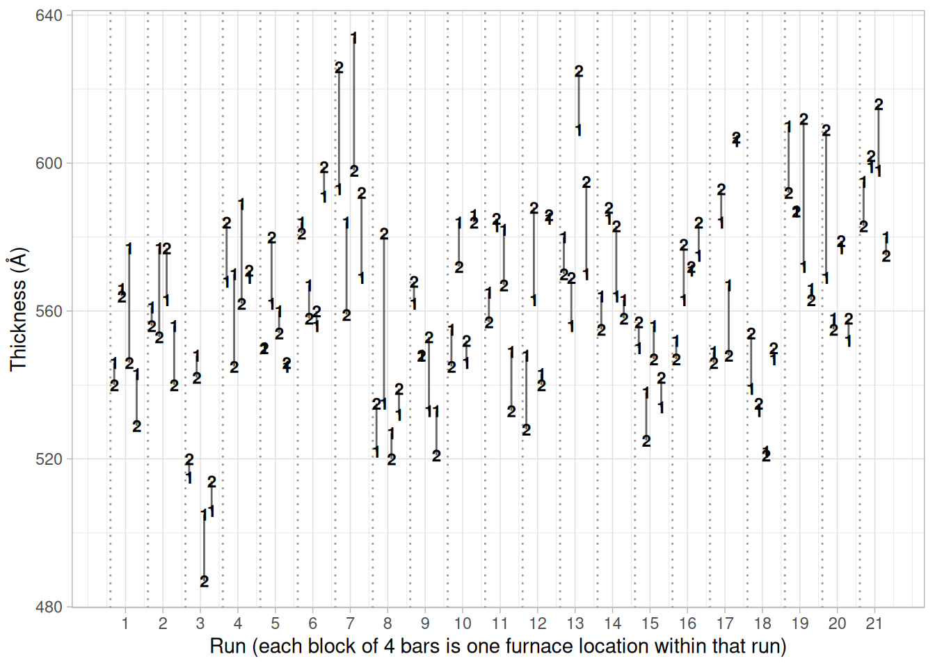
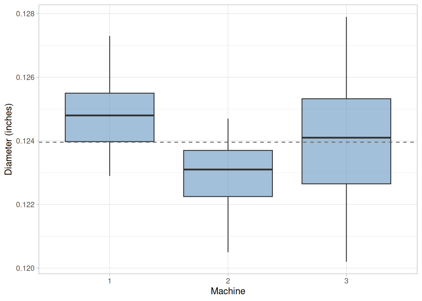
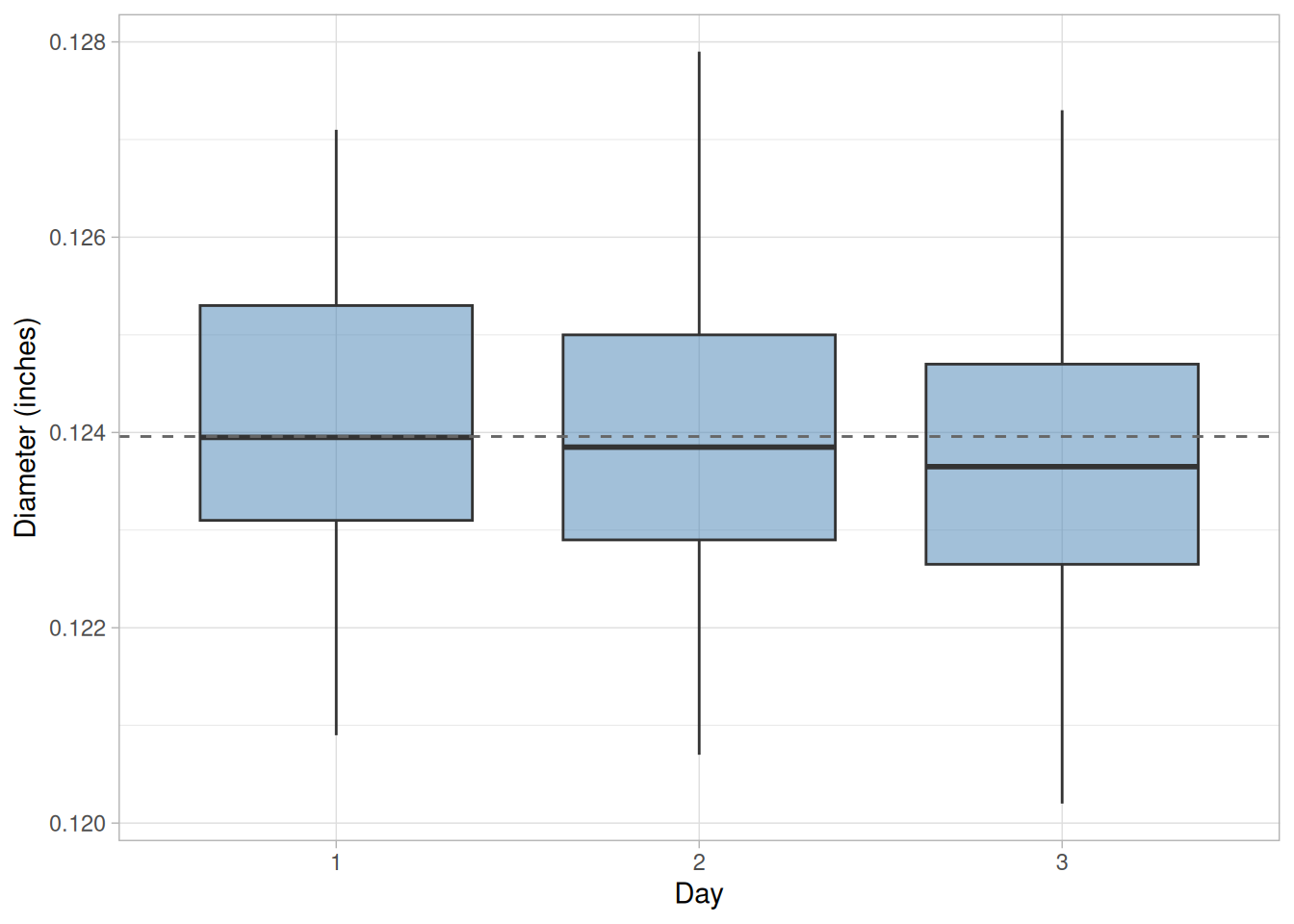
The goal of this chapter is to learn how to plan and conduct a Production Process Characterization Study (PPC) on manufacturing processes. We will learn how to model manufacturing processes and use these models to design a data collection scheme and to guide data analysis activities. We will look in detail at how to analyze the data collected in characterization studies and how to interpret and report the results. The accompanying Case Studies provide detailed examples of several process characterization studies.
3.1 Introduction to Production Process Characterization
The goal of this section is to provide an introduction to PPC. We will define PPC and the terminology used and discuss some of the possible uses of a PPC study. Finally, we will look at the steps involved in designing and executing a PPC study.
Process characterization is an activity in which we:
identify the key inputs and outputs of a process
collect data on their behavior over the entire operating range
estimate the steady-state behavior at optimal operating conditions
and build models describing the parameter relationships across the operating range
The result of this activity is a set of mathematical process models that we can use to monitor and improve the process.
This is a three-step process
This activity is typically a three-step process.
The Screening Step
In this phase we identify all possible significant process inputs and outputs and conduct a series of screening experiments in order to reduce that list to the key inputs and outputs. These experiments will also allow us to develop initial models of the relationships between those inputs and outputs.
The Mapping Step
In this step we map the behavior of the key outputs over their expected operating ranges. We do this through a series of more detailed experiments called Response Surface experiments.
The Passive Step
In this step we allow the process to run at nominal conditions and estimate the process stability and capability.
Not all of the steps need to be performed
The first two steps are only needed for new processes or when the process has undergone some significant engineering change. There are, however, many times throughout the life of a process when the third step is needed. Examples might be: initial process qualification, control chart development, after minor process adjustments, after schedule equipment maintenance, etc.
3.1.2 What are PPC Studies Used For?
PPC is the core of any CI program
Process characterization is an integral part of any continuous improvement program. There are many steps in that program for which process characterization is required. These might include:
When process characterization is required
when we are bringing a new process or tool into use.
when we are bringing a tool or process back up after scheduled/unscheduled maintenance.
when we want to compare tools or processes.
when we want to check the health of our process during the monitoring phase.
when we are troubleshooting a bad process.
The techniques described in this chapter are equally applicable to the other chapters covered in this Handbook. These include:
Process characterization techniques are applicable in other areas
calibration
process monitoring
process improvement
process/product comparison
reliability
3.1.3 Terminology/Concepts
There are just a few fundamental concepts needed for PPC. This section will review these ideas briefly and provide links to other sections in the Handbook where they are covered in more detail.
For basic data analysis, we will need to understand how to estimate location, spread and shape from the data. These three measures comprise what is known as the distribution of the data. We will look at both graphical and numerical techniques.
We need to thoroughly understand the concept of process variability. This includes how variation explains the possible range of expected data values, the various classifications of variability, and the role that variability plays in process stability and capability.
We also need to understand how variation propagates through our manufacturing processes and how to decompose the total observed variation into components attributable to the contributing sources.
It is important to have an understanding of the various issues related to sampling. We will define a population and discuss how to acquire representative random samples from the population of interest. We will also discuss a useful formula for estimating the number of observations required to answer specific questions.
For modeling, we will need to know how to identify important factors and responses. We will also need to know how to graphically and quantitatively build models of the relationships between the factors and responses.
Finally, we will need to know about the basics of designed experiments including screening designs and response surface designs so that we can quantify these relationships. This topic will receive only a cursory treatment in this chapter. It is covered in detail in the process improvement chapter. However, examples of its use are in the case studies.
3.1.3.1 Distribution (Location, Spread and Shape)
Distributions are characterized by location, spread and shape
A fundamental concept in representing any of the outputs from a production process is that of a distribution. Distributions arise because any manufacturing process output will not yield the same value every time it is measured. There will be a natural scattering of the measured values about some central tendency value. This scattering about a central value is known as a distribution. A distribution is characterized by three values:
Location
The location is the expected value of the output being measured. For a stable process, this is the value around which the process has stabilized.
Spread
The spread is the expected amount of variation associated with the output. This tells us the range of possible values that we would expect to see.
Shape
The shape shows how the variation is distributed about the location. This tells us if our variation is symmetric about the mean or if it is skewed or possibly multimodal.
A primary goal of PPC is to estimate the distributions of the process outputs
One of the primary goals of a PPC study is to characterize our process outputs in terms of these three measurements. If we can demonstrate that our process is stabilized about a constant location, with a constant variance and a known stable shape, then we have a process that is both predictable and controllable. This is required before we can set up control charts or conduct experiments.
Click on each item to read more detail
The table below shows the most common numerical and graphical measures of location, spread and shape.
All manufacturing and measurement processes exhibit variation. For example, when we take sample data on the output of a process, such as critical dimensions, oxide thickness, or resistivity, we observe that all the values are NOT the same. This results in a collection of observed values distributed about some location value. This is what we call spread or variability. We represent variability numerically with the variance calculation and graphically with a histogram.
How does the standard deviation describe the spread of the data?
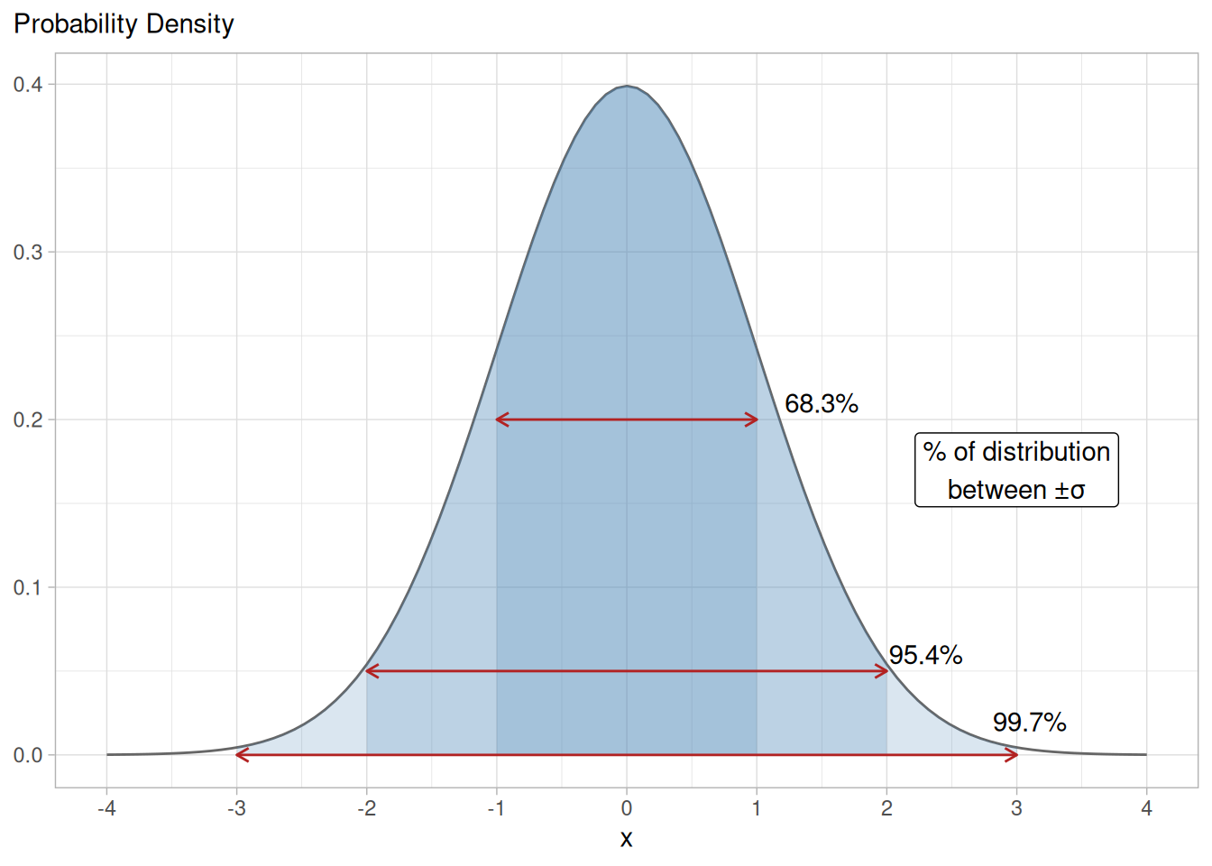
The standard deviation (square root of the variance) gives insight into the spread of the data through the use of what is known as the Empirical Rule. For a normal distribution (shown in the graph below), this rule is:
Approximately 68.3% of the data are within a distance of one standard deviation from the average \((\bar{x} - s, \bar{x} + s)\).
Approximately 95.4% of the data are within a distance of two standard deviations from the average \((\bar{x} - 2s, \bar{x} + 2s)\).
Approximately 99.7% of the data are within a distance of three standard deviations from the average \((\bar{x} - 3s, \bar{x} + 3s)\).
Figure 3.1: The empirical rule: percentage of a normal distribution within 1, 2, and 3 standard deviations of the mean
Variability accumulates from many sources
This observed variability is an accumulation of many different sources of variation that have occurred throughout the manufacturing process. One of the more important activities of process characterization is to identify and quantify these various sources of variation so that they may be minimized.
There are also different types
There are not only different sources of variation, but there are also different types of variation. Two important classifications of variation for the purposes of PPC are controlled variation and uncontrolled variation.
Variation that is characterized by a stable and consistent pattern of variation over time. This type of variation will be random in nature and will be exhibited by a uniform fluctuation about a constant level.
UNCONTROLLED VARIATION
Variation that is characterized by a pattern of variation that changes over time and hence is unpredictable. This type of variation will typically contain some structure.
Stable processes only exhibit controlled variation
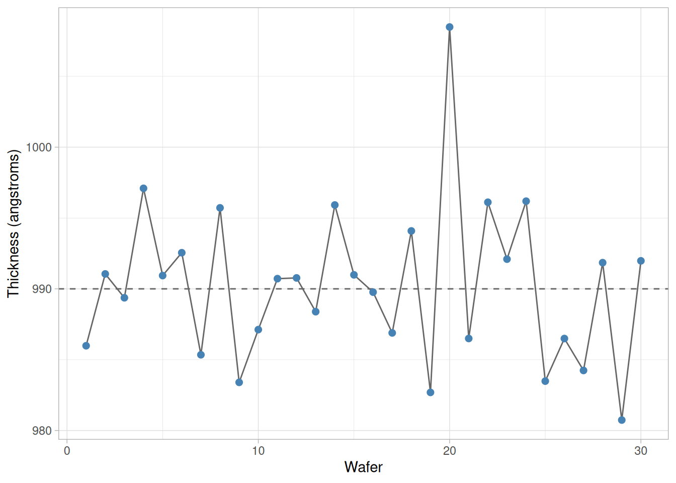
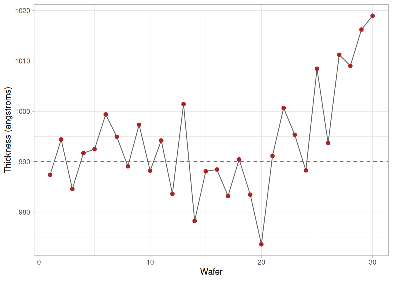
This concept of controlled/uncontrolled variation is important in determining if a process is stable. A process is deemed stable if it runs in a consistent and predictable manner. This means that the average process value is constant and the variability is controlled. If the variation is uncontrolled, then either the process average is changing or the process variation is changing or both. The first process in the example below is stable; the second is not.
In the course of process characterization we should endeavor to eliminate all sources of uncontrolled variation.
3.1.3.2.1 Controlled/Uncontrolled Variation
Two trend plots
The two figures below are two trend plots from two different oxide growth processes. Thirty wafers were sampled from each process: one per day over 30 days. Thickness at the center was measured on each wafer. The x-axis of each graph is the wafer number and the y-axis is the film thickness in angstroms.
Examples of “in control” and “out of control” processes
The first process is an example of a process that is “in control” with random fluctuation about a process location of approximately 990. The second process is an example of a process that is “out of control” with a process location trending upward after observation 20.
NIST’s original examples used real trend-plot images without a downloadable dataset; the figures below are illustrative data, generated to match the description above, reproducing the same qualitative behavior.
Figure 3.3: Illustrative process exhibiting uncontrolled variation – a linear trend after observation 20
3.1.3.3 Propagating Error
The variation we see can come from many sources
When we estimate the variance at a particular process step, this variance is typically not just a result of the current step, but rather is an accumulation of variation from previous steps and from measurement error. Therefore, an important question that we need to answer in PPC is how the variation from the different sources accumulates. This will allow us to partition the total variation and assign the parts to the various sources. Then we can attack the sources that contribute the most.
How do I partition the error?
Usually we can model the contribution of the various sources of error to the total error through a simple linear relationship. If we have a simple linear relationship between two variables, say,
If the variables are not correlated, then there is no covariance and the last term in the above equation drops off. A good example of this is the case in which we have both process error and measurement error. Since these are usually independent of each other, the total observed variance is just the sum of the variances for process and measurement. Remember to never add standard deviations, we must add variances.
How do I calculate the individual components?
Of course, we rarely have the individual components of variation and wish to know the total variation. Usually, we have an estimate of the overall variance and wish to break that variance down into its individual components. This is known as components of variance estimation and is dealt with in detail in the analysis of variance page later in this chapter.
3.1.3.4 Populations and Sampling
We take samples from a target population and make inferences
In survey sampling, if you want to know what everyone thinks about a particular topic, you can just ask everyone and record their answers. Depending on how you define the term, everyone (all the adults in a town, all the males in the USA, etc.), it may be impossible or impractical to survey everyone. The other option is to survey a small group (Sample) of the people whose opinions you are interested in (Target Population), record their opinions and use that information to make inferences about what everyone thinks. Opinion pollsters have developed a whole body of tools for doing just that and many of those tools apply to manufacturing as well. We can use these sampling techniques to take a few measurements from a process and make statements about the behavior of that process.
Facts about a sample are not necessarily facts about a population
If it weren’t for process variation we could just take one sample and everything would be known about the target population. Unfortunately this is never the case. We cannot take facts about the sample to be facts about the population. Our job is to reach appropriate conclusions about the population despite this variation. The more observations we take from a population, the more our sample data resembles the population. When we have reached the point at which facts about the sample are reasonable approximations of facts about the population, then we say the sample is adequate.
Four attributes of samples
Adequacy of a sample depends on the following four attributes:
Representativeness of the sample (is it random?)
Size of the sample
Variability in the population
Desired precision of the estimates
We will learn about choosing representative samples of adequate size in the section on defining sampling plans.
3.1.3.5 Process Models
Black box model and fishbone diagram
As we will see in Section 3 of this chapter, one of the first steps in PPC is to model the process that is under investigation. Two very useful tools for doing this are the black-box model and the fishbone diagram.
We use the black-box model to describe our processes
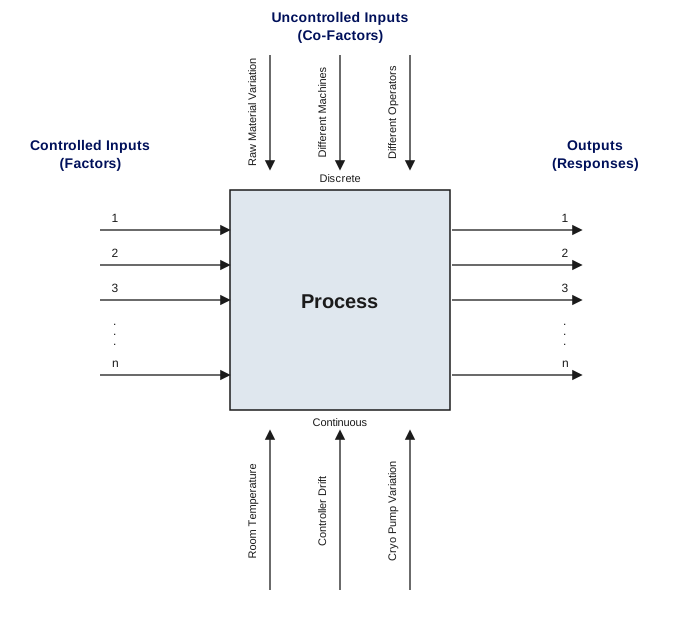
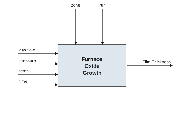
We can use the simple black-box model, shown below, to describe most of the tools and processes we will encounter in PPC. The process will be stimulated by inputs. These inputs can either be controlled (such as recipe or machine settings) or uncontrolled (such as humidity, operators, power fluctuations, etc.). These inputs interact with our process and produce outputs. These outputs are usually some characteristic of our process that we can measure. The measurable inputs and outputs can be sampled in order to observe and understand how they behave and relate to each other.
Diagram of the black box model
Figure 3.4: Black box model describing a process: numbered controlled inputs (factors) enter from the left and produce numbered outputs (responses) on the right, while uncontrolled inputs enter from the top (discrete co-factors, such as different machines or operators) and bottom (continuous co-factors, such as room temperature or controller drift)
These inputs and outputs are also known as Factors and Responses, respectively.
Factors
Observed inputs used to explain response behavior (also called explanatory variables). Factors may be fixed-level controlled inputs or sampled uncontrolled inputs.
Responses
Sampled process outputs. Responses may also be functions of sampled outputs such as average thickness or uniformity.
Factors and Responses are further classified by variable type
We further categorize factors and responses according to their Variable Type, which indicates the amount of information they contain. As the name implies, this classification is useful for data modeling activities and is critical for selecting the proper analysis technique. The table below summarizes this categorization. The types are listed in order of the amount of information they contain with Measurement containing the most information and Nominal containing the least.
Table describing the different variable types
Type
Description
Example
Measurement
discrete/continuous, order is important, infinite range
particle count, oxide thickness, pressure, temperature
Ordinal
discrete, order is important, finite range
run #, wafer #, site, bin
Nominal
discrete, no order, very few possible values
good/bad, bin, high/medium/low, shift, operator
Fishbone diagrams help to decompose complexity
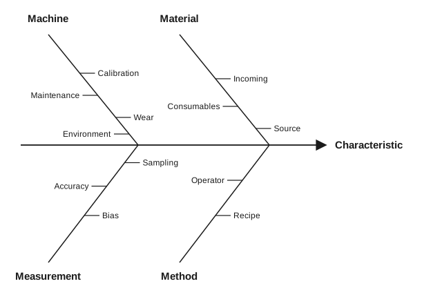
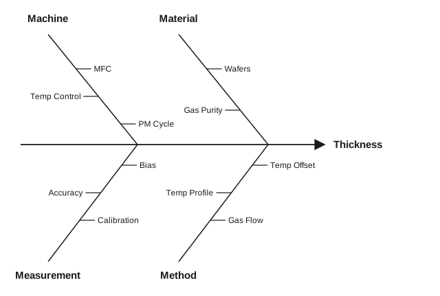
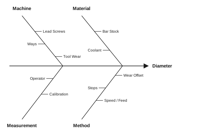
We can use the fishbone diagram to further refine the modeling process. Fishbone diagrams are very useful for decomposing the complexity of our manufacturing processes. Typically, we choose a process characteristic (either Factors or Responses) and list out the general categories that may influence the characteristic (such as material, machine method, environment, etc.), and then provide more specific detail within each category. Examples of how to do this are given in the section on Case Studies.
Sample fishbone diagram
Figure 3.5: Example of a fishbone diagram decomposing a characteristic into four major cause categories – Machine, Material, Measurement, and Method – each with its own contributing sub-causes
3.1.3.6 Experiments and Experimental Design
Factors and responses
Besides just observing our processes for evidence of stability and capability, we quite often want to know about the relationships between the various Factors and Responses.
We look for correlations and causal relationships
There are generally two types of relationships that we are interested in for purposes of PPC. They are:
Correlation
Two variables are said to be correlated if an observed change in the level of one variable is accompanied by a change in the level of another variable. The change may be in the same direction (positive correlation) or in the opposite direction (negative correlation).
Causality
There is a causal relationship between two variables if a change in the level of one variable causes a change in the other variable.
Note that correlation does not imply causality. It is possible for two variables to be associated with each other without one of them causing the observed behavior in the other. When this is the case it is usually because there is a third (possibly unknown) causal factor.
Our goal is to find causal relationships
Generally, our ultimate goal in PPC is to find and quantify causal relationships. Once this is done, we can then take advantage of these relationships to improve and control our processes.
Find correlations and then try to establish causal relationships
Generally, we first need to find and explore correlations and then try to establish causal relationships. It is much easier to find correlations as these are just properties of the data. It is much more difficult to prove causality as this additionally requires sound engineering judgment. There is a systematic procedure we can use to accomplish this in an efficient manner. We do this through the use of designed experiments.
First we screen, then we build models
When we have many potential factors and we want to see which ones are correlated and have the potential to be involved in causal relationships with the responses, we use screening designs to reduce the number of candidates. Once we have a reduced set of influential factors, we can use response surface designs to model the causal relationships with the responses across the operating range of the process factors.
Techniques discussed in process improvement chapter
The techniques are covered in detail in the process improvement section and will not be discussed much in this chapter. Examples of how the techniques are used in PPC are given in the Case Studies.
3.1.4 PPC Steps
Follow these 4 steps to ensure efficient use of resources
The primary activity of a PPC is to collect and analyze data so that we may draw conclusions about and ultimately improve our production processes. In many industrial applications, access to production facilities for the purposes of conducting experiments is very limited. Thus we must be very careful in how we go about these activities so that we can be sure of doing them in a cost-effective manner.
Step 1: Plan
The most important step by far is the planning step. By faithfully executing this step, we will ensure that we only collect data in the most efficient manner possible and still support the goals of the PPC. Planning should generate the following:
a statement of the goals
a descriptive process model (a list of process inputs and outputs)
a description of the sampling plan (including a description of the procedure and settings to be used to run the process during the study with clear assignments for each person involved)
a description of the method of data collection, tasks and responsibilities, formatting, and storage
an outline of the data analysis
All decisions that affect how the characterization will be conducted should be made during the planning phase. The process characterization should be conducted according to this plan, with all exceptions noted.
Step 2: Collect
Data collection is essentially just the execution of the sampling plan part of the previous step. If a good job were done in the planning step, then this step should be pretty straightforward. It is important to execute to the plan as closely as possible and to note any exceptions.
Step 3: Analyze and interpret
This is the combination of quantitative (regression, ANOVA, correlation, etc.) and graphical (histograms, scatter plots, box plots, etc.) analysis techniques that are applied to the collected data in order to accomplish the goals of the PPC.
Step 4: Report
Reporting is an important step that should not be overlooked. By creating an informative report and archiving it in an accessible place, we can ensure that others have access to the information generated by the PPC. Often, the work involved in a PPC can be minimized by using the results of other, similar studies. Examples of PPC reports can be found in the Case Studies section.
Further information
The planning and data collection steps are described in detail in the data collection section. The analysis and interpretation steps are covered in detail in the analysis section. Examples of the reporting step can be seen in the Case Studies.
3.2 Assumptions / Prerequisites
Primary goal is to identify and quantify sources of variation
The primary goal of PPC is to identify and quantify sources of variation. Only by doing this will we be able to define an effective plan for variation reduction and process improvement. Sometimes, in order to achieve this goal, we must first build mathematical/statistical models of our processes. In these models we will identify influential factors and the responses on which they have an effect. We will use these models to understand how the sources of variation are influenced by the important factors. This subsection will review many of the modeling tools we have at our disposal to accomplish these tasks. In particular, the models covered in this section are linear models, Analysis of Variance (ANOVA) models and discrete models.
Assumption: process is sum of a systematic component and a random component
In order to employ the modeling techniques described in this section, there are a few assumptions about the process under study that must be made. First, we must assume that the process can adequately be modeled as the sum of a systematic component and a random component. The systematic component is the mathematical model part and the random component is the error or noise present in the system. We also assume that the systematic component is fixed over the range of operating conditions and that the random component has a constant location, spread and distributional form.
Assumption: data used to fit these models are representative of the process being modeled
Finally, we assume that the data used to fit these models are representative of the process being modeled. As a result, we must additionally assume that the measurement system used to collect the data has been studied and proven to be capable of making measurements to the desired precision and accuracy. If this is not the case, refer to the Measurement Process Characterization chapter of this Handbook.
3.2.2 Continuous Linear Model
Description
The continuous linear model (CLM) is probably the most commonly used model in PPC. It is applicable in many instances ranging from simple control charts to response surface models.
The CLM is a mathematical function that relates explanatory variables (either discrete or continuous) to a single continuous response variable. It is called linear because the coefficients of the terms are expressed as a linear sum. The terms themselves do not have to be linear.
This equation just says that if we have \(p\) explanatory variables then the response is modeled by a constant term plus a sum of functions of those explanatory variables, plus some random error term. This will become clear as we look at some examples below.
Estimation
The coefficients for the parameters in the CLM are estimated by the method of least squares. This is a method that gives estimates which minimize the sum of the squared distances from the observations to the fitted line or plane. See the chapter on Process Modeling for a more complete discussion on estimating the coefficients for these models.
Testing
The tests for the CLM involve testing that the model as a whole is a good representation of the process and whether any of the coefficients in the model are zero or have no effect on the overall fit. Again, the details for testing are given in the chapter on Process Modeling.
Assumptions
For estimation purposes, there are no additional assumptions necessary for the CLM beyond those stated in the general assumptions section. For testing purposes, however, it is necessary to assume that the error term is adequately modeled by a Gaussian distribution.
Uses
The CLM has many uses such as building predictive process models over a range of process settings that exhibit linear behavior, control charts, process capability, building models from the data produced by designed experiments, and building response surface models for automated process control applications.
Examples
Shewhart Control Chart — The simplest example of a very common usage of the CLM is the underlying model used for Shewhart control charts. This model assumes that the process parameter being measured is a constant with additive Gaussian noise and is given by:
\[y = a_{0} + \epsilon\]
Diffusion Furnace — Suppose we want to model the average wafer sheet resistance as a function of the location or zone in a furnace tube, the temperature, and the anneal time. In this case, let there be 3 distinct zones (front, center, back) and temperature and time are continuous explanatory variables. This model is given by the CLM:
Diffusion Furnace (cont.) — Usually, the fitted line for the average wafer sheet resistance is not straight but has some curvature to it. This can be accommodated by adding a quadratic term for the time parameter as follows:
This piecewise model of average wafer sheet resistance by furnace zone, temperature, and anneal time foreshadows the Furnace Case Study later in this chapter.
3.2.3 Analysis of Variance Models (ANOVA)
ANOVA allows us to compare the effects of multiple levels of multiple factors
One of the most common analysis activities in PPC is comparison. We often compare the performance of similar tools or processes. We also compare the effect of different treatments such as recipe settings. When we compare two things, such as two tools running the same operation, we use comparison techniques. When we want to compare multiple things, like multiple tools running the same operation or multiple tools with multiple operators running the same operation, we turn to ANOVA techniques to perform the analysis.
ANOVA splits the data into components
The easiest way to understand ANOVA is through a concept known as value splitting. ANOVA splits the observed data values into components that are attributable to the different levels of the factors. Value splitting is best explained by example.
Example: Turned Pins
The simplest example of value splitting is when we just have one level of one factor. Suppose we have a turning operation in a machine shop where we are turning pins to a diameter of 0.125 ± 0.005 inches. Throughout the course of a day we take five samples of pins and obtain the following measurements: 0.125, 0.127, 0.124, 0.126, 0.128.
We can split these data values into a common value (mean) and residuals (what’s left over) as follows:
While the above example is a trivial structural layout, it illustrates how we can split data values into its components. In the next sections, we will look at more complicated structural layouts for the data. In particular we will look at multiple levels of one factor (One-Way ANOVA) and multiple levels of two factors (Two-Way ANOVA) where the factors are crossed and nested.
3.2.3.1 One-Way ANOVA
Description
A one-way layout consists of a single factor with several levels and multiple observations at each level. With this kind of layout we can calculate the mean of the observations within each level of our factor. The residuals will tell us about the variation within each level. We can also average the means of each level to obtain a grand mean. We can then look at the deviation of the mean of each level from the grand mean to understand something about the level effects. Finally, we can compare the variation within levels to the variation across levels. Hence the name analysis of variance.
Model
It is easy to model all of this with an equation of the form:
\[y_{ij} = m + a_{i} + \epsilon_{ij}\]
The equation indicates that the \(j\)th data value, from level \(i\), is the sum of three components: the common value (grand mean), the level effect (the deviation of each level mean from the grand mean), and the residual (what’s left over).
Estimation
Estimation for the one-way layout can be performed one of two ways. First, we can calculate the total variation, within-level variation and across-level variation. These can be summarized in a table as shown below and tests can be made to determine if the factor levels are significant. The value splitting example illustrates the calculations involved.
ANOVA table for one-way case
In general, the ANOVA table for the one-way case is given by:
The row labeled “Corr. Total” in the ANOVA table contains the corrected total sum of squares and the associated degrees of freedom (DoF).
Level effects must sum to zero
The second way to estimate effects is through the use of CLM techniques. If you look at the model above you will notice that it is in the form of a CLM. The only problem is that the model is saturated and no unique solution exists. We overcome this problem by applying a constraint to the model. Since the level effects are just deviations from the grand mean, they must sum to zero. By applying the constraint that the level effects must sum to zero, we can now obtain a unique solution to the CLM equations. Most analysis programs will handle this for you automatically. See the chapter on Process Modeling for a more complete discussion on estimating the coefficients for these models.
Testing
We are testing to see if the observed data support the hypothesis that the levels of the factor are significantly different from each other. The way we do this is by comparing the within-level variance to the between-level variance.
If we assume that the observations within each level have the same variance, we can calculate the variance within each level and pool these together to obtain an estimate of the overall population variance. This works out to be the mean square of the residuals.
Similarly, if there really were no level effect, the mean square across levels would be an estimate of the overall variance. Therefore, if there really were no level effect, these two estimates would be just two different ways to estimate the same parameter and should be close numerically. However, if there is a level effect, the level mean square will be higher than the residual mean square.
It can be shown that given the assumptions about the data stated below, the ratio of the level mean square and the residual mean square follows an \(F\) distribution with degrees of freedom as shown in the ANOVA table. If the \(F_0\) value is significant at a given significance level (greater than the cut-off value in a \(F\) table), then there is a level effect present in the data.
Assumptions
For estimation purposes, we assume the data can adequately be modeled as the sum of a deterministic component and a random component. We further assume that the fixed (deterministic) component can be modeled as the sum of an overall mean and some contribution from the factor level. Finally, it is assumed that the random component can be modeled with a Gaussian distribution with fixed location and spread.
Uses
The one-way ANOVA is useful when we want to compare the effect of multiple levels of one factor and we have multiple observations at each level. The factor can be either discrete (different machine, different plants, different shifts, etc.) or continuous (different gas flows, temperatures, etc.).
Example
Let’s extend the machining example by assuming that we have five different machines making the same part and we take five random samples from each machine to obtain the following diameter data. The reader can download the data as a text file.
Using ANOVA software or the techniques of the value-splitting example, we summarize the data in an ANOVA table as follows:
Code
fit <-aov(diameter ~ machine, data = machining)summary(fit)
            Df    Sum Sq   Mean Sq F value  Pr(>F)
machine      4 0.0001374 3.436e-05   5.206 0.00486 **
Residuals   20 0.0001320 6.600e-06
---
Signif. codes:  0 '***' 0.001 '**' 0.01 '*' 0.05 '.' 0.1 ' ' 1
Test
Code
qf(0.95, df1 =4, df2 =20)
[1] 2.866081
By dividing the factor-level mean square by the residual mean square, we obtain an \(F_0\) value of 5.21, which is greater than the critical value of 2.87 from the \(F\) distribution with 4 and 20 degrees of freedom and a significance level of 0.05. Therefore, there is sufficient evidence to reject the hypothesis that the levels are all the same.
Note
NIST’s original text reports \(F_0 = 4.86\) for this example, obtained by dividing the displayed mean squares (0.000034/0.000007) after they had already been rounded to one significant figure. Carrying full precision through the calculation (as aov() does above) gives the sum of squares and mean squares NIST reports, but a ratio of 5.21 rather than 4.86. Both values comfortably exceed the critical value of 2.87, so the conclusion — a statistically significant machine effect — is unchanged either way.
Conclusion
From the analysis of these data we can conclude that the factor “machine” has an effect. There is a statistically significant difference in the pin diameters across the machines on which they were manufactured.
3.2.3.1.1 One-Way Value-Splitting
Example
Let’s use the data from the machining example to illustrate how to use the techniques of value-splitting to break each data value into its component parts. Once we have the component parts, it is then a trivial matter to calculate the sums of squares and form the \(F\)-value for the test.
Calculate level-means
Remember from our model, \(y_{ij} = m + a_{i} + \epsilon_{ij}\), we say each observation is the sum of a common value, a level effect and a residual value. Value-splitting just breaks each observation into its component parts. The first step in value-splitting is to calculate the mean values within each machine to get the level means.
The next step is to calculate the grand mean from the individual machine means as:
Code
grand_mean <-mean(level_means$mean)grand_mean
[1] 0.12432
Sweep the grand mean through the level means
Finally, we can sweep the grand mean through the individual level means to obtain the level effects:
Code
level_effects <- level_means |>mutate(effect = mean - grand_mean)level_effects
It is easy to verify that the original data table can be constructed by adding the overall mean, the machine effect and the appropriate residual.
Calculate ANOVA values
Now that we have the data values split and the overlays created, the next step is to calculate the various values in the One-Way ANOVA table. We have three values to calculate for each overlay. They are the sums of squares, the degrees of freedom, and the mean squares.
Total sum of squares
The total sum of squares is calculated by summing the squares of all the data values and subtracting from this number the square of the grand mean times the total number of data values. We usually don’t calculate the mean square for the total sum of squares because we don’t use this value in any statistical test.
Residual sum of squares, degrees of freedom and mean square
The residual sum of squares is calculated by summing the squares of the residual values:
The degrees of freedom is the number of unconstrained values. Since the residuals for each level of the factor must sum to zero, once we know four of them, the last one is determined. This means we have four unconstrained values for each level, or 20 degrees of freedom.
Level sum of squares, degrees of freedom and mean square
Finally, to obtain the sum of squares for the levels, we sum the squares of each value in the level effect overlay and multiply the sum by the number of observations for each level (in this case 5):
Since the deviations from the level means must sum to zero, we have only four unconstrained values so the degrees of freedom for level effects is 4.
Calculate \(F\)-value
The last step is to calculate the \(F\)-value and perform the test of equal level means. The \(F\)-value is just the level mean square divided by the residual mean square:
Code
f_value <- ms_factor / ms_residualf_value
[1] 5.206061
If we look in an \(F\)-table for 4 and 20 degrees of freedom at 95% confidence, we see that the critical value is 2.87 (qf(0.95, 4, 20)), which means that we have a significant result and that there is thus evidence of a strong machine effect. By looking at the level-effect overlay we see that this is driven by machines 2 and 4.
These sums of squares and mean squares match the aov() summary in the previous section exactly — the manual sweep and the software fit are two views of the same calculation.
3.2.3.2 Two-Way Crossed ANOVA
Description
When we have two factors with at least two levels and one or more observations at each level, we say we have a two-way layout. We say that the two-way layout is crossed when every level of Factor A occurs with every level of Factor B. With this kind of layout we can estimate the effect of each factor (Main Effects) as well as any interaction between the factors.
Model
If we assume that we have \(K\) observations at each combination of \(I\) levels of Factor A and \(J\) levels of Factor B, then we can model the two-way layout with an equation of the form:
This equation just says that the \(k\)th data value for the \(j\)th level of Factor B and the \(i\)th level of Factor A is the sum of five components: the common value (grand mean), the level effect for Factor A, the level effect for Factor B, the interaction effect, and the residual. Note that \((ab)\) does not mean multiplication; rather that there is interaction between the two factors.
Estimation
Like the one-way case, the estimation for the two-way layout can be done either by calculating the variance components or by using CLM techniques.
For the two-way ANOVA, we display the data in a two-dimensional table with the levels of Factor A in columns and the levels of Factor B in rows. The replicate observations fill each cell. We can sweep out the common value, the row effects, the column effects, the interaction effects and the residuals using value-splitting techniques. Sums of squares can be calculated and summarized in an ANOVA table as shown below.
The row labeled “Corr. Total” in the ANOVA table contains the corrected total sum of squares and the associated degrees of freedom (DoF).
We can use CLM techniques to do the estimation. We still have the problem that the model is saturated and no unique solution exists. We overcome this problem by applying the constraints to the model that the two main effects and interaction effects each sum to zero.
Testing
Like testing in the one-way case, we are testing that two main effects and the interaction are zero. Again we just form a ratio of each main effect mean square and the interaction mean square to the residual mean square. If the assumptions stated below are true then those ratios follow an \(F\) distribution and the test is performed by comparing the \(F_0\) ratios to values in an \(F\) table with the appropriate degrees of freedom and confidence level.
Assumptions
For estimation purposes, we assume the data can be adequately modeled as described in the model above. It is assumed that the random component can be modeled with a Gaussian distribution with fixed location and spread.
Uses
The two-way crossed ANOVA is useful when we want to compare the effect of multiple levels of two factors and we can combine every level of one factor with every level of the other factor. If we have multiple observations at each level, then we can also estimate the effects of interaction between the two factors.
Example
Let’s extend the one-way machining example by assuming that we want to test if there are any differences in pin diameters due to different types of coolant. We still have five different machines making the same part and we take five samples from each machine for each coolant type to obtain the following data. This data is available as a text file.
By dividing the mean square for machine by the mean square for residuals we obtain an \(F_0\) value of 8.77, which is greater than the critical value of 2.61 based on 4 and 40 degrees of freedom and a 0.05 significance level. Likewise the \(F_0\) values for Coolant and Interaction, obtained by dividing their mean squares by the residual mean square, are 0.45 and 0.42 respectively — both less than their respective critical values of 4.08 and 2.61 (0.05 significance level).
Conclusion
From the ANOVA table we can conclude that machine is the most important factor and is statistically significant. Coolant is not significant and neither is the interaction. These results would lead us to believe that some tool-matching efforts would be useful for improving this process.
3.2.3.2.1 Two-way Crossed Value-Splitting Example
Example: Coolant is completely crossed with machine
The data table below is five samples each collected from five different lathes each running two different types of coolant. The measurement is the diameter of a turned pin. For the crossed two-way case, the first thing we need to do is to sweep the cell means from the data table to obtain the residual values.
The first step is to sweep out the cell means to obtain the residuals and means
interaction_effects <- cell_means |>left_join(row_means, by ="coolant") |>left_join(col_means, by ="machine") |>mutate(interaction = mean - row_mean - col_mean + grand_mean_crossed)interaction_effects |>select(coolant, machine, interaction) |>pivot_wider(names_from = machine, values_from = interaction, names_prefix ="Machine ")
What do these tables tell us?
By looking at the table of residuals, we see that the residuals for coolant B tend to be a little higher than for coolant A. This implies that there may be more variability in diameter when we use coolant B. From the effects table above, we see that machines 2 and 5 produce smaller pin diameters than the other machines. There is also a very slight coolant effect but the machine effect is larger. Finally, there also appears to be slight interaction effects. For instance, machines 1 and 2 had smaller diameters with coolant A but the opposite was true for machines 3, 4 and 5.
Calculate sums of squares and mean squares
We can calculate the values for the ANOVA table according to the formulae in the table on the crossed two-way page. From the \(F\)-values we see that the machine effect is significant but the coolant and the interaction are not:
These sums of squares, mean squares, and \(F\)-values match the value-splitting overlays above exactly — the manual sweep and the software fit are two views of the same calculation.
3.2.3.3 Two-Way Nested ANOVA
Description
Sometimes, constraints prevent us from crossing every level of one factor with every level of the other factor. In these cases we are forced into what is known as a nested layout. We say we have a nested layout when fewer than all levels of one factor occur within each level of the other factor. An example of this might be if we want to study the effects of different machines and different operators on some output characteristic, but we can’t have the operators change the machines they run. In this case, each operator is not crossed with each machine but rather only runs one machine.
Model
If Factor B is nested within Factor A, then a level of Factor B can only occur within one level of Factor A and there can be no interaction. This gives the following model:
\[y_{ijk} = m + a_{i} + b_{j(i)} + \epsilon_{ijk}\]
This equation indicates that each data value is the sum of a common value (grand mean), the level effect for Factor A, the level effect of Factor B nested within Factor A, and the residual.
Estimation
For a nested design we typically use variance components methods to perform the analysis. We can sweep out the common value, the Factor A effects, the Factor B within A effects and the residuals using value-splitting techniques. Sums of squares can be calculated and summarized in an ANOVA table as shown below.
It is important to note that with this type of layout, since each level of one factor is only present with one level of the other factor, we can’t estimate interaction between the two.
The row labeled “Corr. Total” in the ANOVA table contains the corrected total sum of squares and the associated degrees of freedom (DoF).
As with the crossed layout, we can also use CLM techniques. We still have the problem that the model is saturated and no unique solution exists. We overcome this problem by applying to the model the constraints that the two main effects sum to zero.
Testing
We are testing that two main effects are zero. Again we just form a ratio (\(F_0\)) of each main effect mean square to the appropriate mean-squared error term. (Note that the error term for Factor A is not MSE, but is MSB.) If the assumptions stated below are true then those ratios follow an \(F\) distribution and the test is performed by comparing the \(F_0\) ratios to values in an \(F\) table with the appropriate degrees of freedom and confidence level.
Assumptions
For estimation purposes, we assume the data can be adequately modeled by the model above and that there is more than one variance component. It is assumed that the random component can be modeled with a Gaussian distribution with fixed location and spread.
Uses
The two-way nested ANOVA is useful when we are constrained from combining all the levels of one factor with all of the levels of the other factor. These designs are most useful when we have what is called a random effects situation. When the levels of a factor are chosen at random rather than selected intentionally, we say we have a random effects model. An example of this is when we select lots from a production run, then select units from the lot. Here the units are nested within lots and the effect of each factor is random.
Example
Let’s change the two-way machining example slightly by assuming that we have five different machines making the same part and each machine has two operators, one for the day shift and one for the night shift. We take five samples from each machine for each operator. Because “operator” here plays the same structural role that “coolant” played in the crossed example — one factor level occurring alongside every level of the other — the underlying diameter measurements are identical to the crossed example’s; only the factor’s name and interpretation change (each operator only ever runs their own machine, so operator is nested within machine rather than crossed with it):
For analysis details see the nested two-way value splitting example. We can summarize the analysis results in an ANOVA table as follows. Because operator is nested within machine, we fit the model with R’s machine/operator nesting syntax, and — as noted above — the correct denominator for testing the machine effect is the Operator(Machine) mean square, not the residual mean square, so we build the \(F_0\) ratios by hand from the fitted sums of squares rather than reading them off summary() directly:
By dividing the mean square for Machine by the mean square for Operator within Machine, or Operator(Machine), we obtain an \(F_0\) value of 20.38, which is greater than the critical value of 5.19 for 4 and 5 degrees of freedom at the 0.05 significance level. The \(F_0\) value for Operator(Machine), obtained by dividing its mean square by the residual mean square, is 0.43, which is less than the critical value of 2.45 for 5 and 40 degrees of freedom at the 0.05 significance level.
Conclusion
From the ANOVA table we can conclude that the Machine is the most important factor and is statistically significant. The effect of Operator nested within Machine is not statistically significant. Again, any improvement activities should be focused on the tools.
3.2.3.3.1 Two-way Nested Value-Splitting Example
Example: Operator is nested within machine
The data table above contains data collected from five different lathes, each run by two different operators. Note we are concerned here with the effect of operators, so the layout is nested. If we were concerned with shift instead of operator, the layout would be crossed. The measurement is the diameter of a turned pin.
For the nested two-way case, just as in the crossed case, the first thing we need to do is to sweep the cell means from the data table to obtain the residual values. We then sweep the nested factor (Operator) and the top level factor (Machine) to obtain the tables below.
By looking at the residuals we see that machines 2 and 5 have the greatest variability. There does not appear to be much of an operator effect but there is clearly a strong machine effect.
Calculate sums of squares and mean squares
We can calculate the values for the ANOVA table according to the formulae in the table on the nested two-way page. This produces the table below. From the \(F\)-values we see that the machine effect is significant but the operator effect is not (here it is assumed that both factors are fixed):
Code
anova_nested
Code
c(F_machine = f_machine, F_operator = f_operator)
 F_machine F_operator
20.3844086  0.4300578
These sums of squares and mean squares match the value-splitting overlays above exactly — the manual sweep and the software fit are two views of the same calculation.
3.2.4 Discrete Models
Description
There are many instances when we are faced with the analysis of discrete data rather than continuous data. Examples of this are yield (good/bad), speed bins (slow/fast/faster/fastest), survey results (favor/oppose), etc. We then try to explain the discrete outcomes with some combination of discrete and/or continuous explanatory variables. In this situation the modeling techniques we have learned so far (CLM and ANOVA) are no longer appropriate.
Contingency table analysis and log-linear model
There are two primary methods available for the analysis of discrete response data. The first one applies to situations in which we have discrete explanatory variables and discrete responses and is known as Contingency Table Analysis. The model for this is covered in detail in this section. The second model applies when we have both discrete and continuous explanatory variables and is referred to as a Log-Linear Model. That model is beyond the scope of this Handbook, but interested readers should refer to the References at the end of this Handbook for further sources on the topic.
Model
Suppose we have \(n\) individuals that we classify according to two criteria, A and B. Suppose there are \(r\) levels of criterion A and \(s\) levels of criterion B. These responses can be displayed in an \(r \times s\) table. For example, suppose we have a box of manufactured parts that we classify as good or bad and whether they came from supplier 1, 2 or 3.
Now, each cell of this table will have a count of the individuals who fall into its particular combination of classification levels. Let’s call this count \(N_{ij}\). The sum of all of these counts will be equal to the total number of individuals, \(N\). Also, each row of the table will sum to \(N_{i.}\) and each column will sum to \(N_{.j}\).
Under the assumption that there is no interaction between the two classifying variables (like the number of good or bad parts does not depend on which supplier they came from), we can calculate the counts we would expect to see in each cell. Let’s call the expected count for any cell \(E_{ij}\). Then the expected value for a cell is \(E_{ij} = N_{i.} N_{.j}/N\). All we need to do then is to compare the expected counts to the observed counts. If there is a considerable difference between the observed counts and the expected values, then the two variables interact in some way.
Estimation
The estimation is very simple. All we do is make a table of the observed counts and then calculate the expected counts as described above.
Testing
The test is performed using a Chi-Square goodness-of-fit test according to the following formula:
where the summation is across all of the cells in the table.
Given the assumptions stated below, this statistic has approximately a chi-square distribution and is therefore compared against a chi-square table with \((r-1)(s-1)\) degrees of freedom, with \(r\) and \(s\) as previously defined. If the value of the test statistic is less than the chi-square value for a given level of confidence, then the classifying variables are declared independent, otherwise they are judged to be dependent.
Assumptions
The estimation and testing results above hold regardless of whether the sample model is Poisson, multinomial, or product-multinomial. The chi-square results start to break down if the counts in any cell are small, say < 5.
Uses
The contingency table method is really just a test of interaction between discrete explanatory variables for discrete responses. The example given below is for two factors. The methods are equally applicable to more factors, but as with any interaction, as you add more factors the interpretation of the results becomes more difficult.
Example
Suppose we are comparing the yield from two manufacturing processes. We want to know if one process has a higher yield.
          Good Bad Sum
Process A   83  17 100
Process B   83  17 100
Sum        166  34 200
Calculate chi-square statistic and compare to table value
Code
chi_test$statistic
X-squared
 1.275691
Code
qchisq(0.90, df =1)
[1] 2.705543
The chi-square statistic is 1.28. This is below the chi-square value for 1 degree of freedom and 90% confidence of 2.71. Therefore, we conclude that there is not a (significant) difference in process yield.
Conclusion
Therefore, we conclude that there is no statistically significant difference between the two processes.
3.3 Data Collection for PPC
Start with careful planning
The data collection process for PPC starts with careful planning. The planning consists of the definition of clear and concise goals, developing process models and devising a sampling plan.
Many things can go wrong in the data collection
This activity of course ends without the actual collection of the data which is usually not as straightforward as it might appear. Many things can go wrong in the execution of the sampling plan. The problems can be mitigated with the use of check lists and by carefully documenting all exceptions to the original sampling plan.
The goal statement is one of the most important parts of the characterization plan. With clearly and concisely stated goals, the rest of the planning process falls naturally into place.
Goals usually defined in terms of key specifications
The goals are usually defined in terms of key specifications or manufacturing indices. We typically want to characterize a process and compare the results against these specifications. However, this is not always the case. We may, for instance, just want to quantify key process parameters and use our estimates of those parameters in some other activity like controller design or process improvement.
Example goal statements
Click on each of the links below to see Goal Statements for each of the case studies.
Furnace Case Study (Goal)
Machine Case Study (Goal)
3.3.2 Process Modeling
Identify influential parameters
Process modeling begins by identifying all of the important factors and responses. This is usually best done as a team effort and is limited to the scope set by the goal statement.
Document with black-box models
This activity is best documented in the form of a black-box model as seen in the figure below. In this figure all of the outputs are shown on the right and all of the controllable inputs are shown on the left. Any inputs or factors that may be observable but not controllable are shown on the top or bottom.
Figure 3.6: Black-box model: controllable inputs (factors) enter from the left and are numbered 1 through n; outputs (responses) exit to the right, also numbered 1 through n. Uncontrolled discrete co-factors enter from the top and uncontrolled continuous co-factors enter from the bottom.
Model relationships using fishbone diagrams
The next step is to model relationships of the previously identified factors and responses. In this step we choose a parameter and identify all of the other parameters that may have an influence on it. This process is easily documented with fishbone diagrams as illustrated in the figure below. The influenced parameter is put on the center line and the influential factors are listed off of the centerline and can be grouped into major categories like Tool, Material, Work Methods and Environment.
Figure 3.7: Fishbone (Ishikawa) diagram: the influenced parameter sits on the center line, with influential factors grouped into major categories (here Machine, Material, Measurement, Method) branching off of it.
Document relationships and sensitivities
The final step is to document all known information about the relationships and sensitivities between the inputs and outputs. Some of the inputs may be correlated with each other as well as the outputs. There may be detailed mathematical models available from other studies or the information available may be vague such as for a machining process we know that as the feed rate increases, the quality of the finish decreases.
It is best to document this kind of information in a table with all of the inputs and outputs listed both on the left column and on the top row. Then, correlation information can be filled in for each of the appropriate cells. See the case studies for an example.
Examples
Click on each of the links below to see the process models for each of the case studies.
Case Study 1 (Process Model)
Case Study 2 (Process Model)
3.3.3 Define Sampling Plan
Sampling plan is detailed outline of measurements to be taken
A sampling plan is a detailed outline of which measurements will be taken at what times, on which material, in what manner, and by whom. Sampling plans should be designed in such a way that the resulting data will contain a representative sample of the parameters of interest and allow for all questions, as stated in the goals, to be answered.
Steps in the sampling plan
The steps involved in developing a sampling plan are:
Once the sampling plan has been developed, it can be verified and then passed on to the responsible parties for execution.
3.3.3.1 Identifying Parameters, Ranges and Resolution
Our goals and the models we built in the previous steps should provide all of the information needed for selecting parameters and determining the expected ranges and the required measurement resolution.
Goals will tell us what to measure and how
The first step is to carefully examine the goals. This will tell you which response variables need to be sampled and how. For instance, if our goal states that we want to determine if an oxide film can be grown on a wafer to within 10 Angstroms of the target value with a uniformity of <2%, then we know we have to measure the film thickness on the wafers to an accuracy of at least ± 3 Angstroms and we must measure at multiple sites on the wafer in order to calculate uniformity.
The goals and the models we build will also indicate which explanatory variables need to be sampled and how. Since the fishbone diagrams define the known important relationships, these will be our best guide as to which explanatory variables are candidates for measurement.
Ranges help screen outliers
Defining the expected ranges of values is useful for screening outliers. In the machining example, we would not expect to see many values that vary more than ± 0.005” from nominal. Therefore we know that any values that are much beyond this interval are highly suspect and should be remeasured.
Resolution helps choose measurement equipment
Finally, the required resolution for the measurements should be specified. This specification will help guide the choice of metrology equipment and help define the measurement procedures. As a rule of thumb, we would like our measurement resolution to be at least 1/10 of our tolerance. For the oxide growth example, this means that we want to measure with an accuracy of 2 Angstroms. Similarly, for the turning operation we would need to measure the diameter within 0.001”. This means that vernier calipers would be adequate as the measurement device for this application.
Examples
Click on each of the links below to see the parameter descriptions for each of the case studies.
Case Study 1 (Sampling Plan)
Case Study 2 (Sampling Plan)
3.3.3.2 Choosing a Sampling Scheme
A sampling scheme defines what data will be obtained and how
A sampling scheme is a detailed description of what data will be obtained and how this will be done. In PPC we are faced with two different situations for developing sampling schemes. The first is when we are conducting a controlled experiment. There are very efficient and exact methods for developing sampling schemes for designed experiments and the reader is referred to the Process Improvement chapter for details.
Passive data collection
The second situation is when we are conducting a passive data collection (PDC) study to learn about the inherent properties of a process. These types of studies are usually for comparison purposes when we wish to compare properties of processes against each other or against some hypothesis. This is the situation that we will focus on here.
There are two principles that guide our choice of sampling scheme
Once we have selected our response parameters, it would seem to be a rather straightforward exercise to take some measurements, calculate some statistics and draw conclusions. There are, however, many things which can go wrong along the way that can be avoided with careful planning and knowing what to watch for. There are two overriding principles that will guide the design of our sampling scheme.
The first is precision
The first principle is that of precision. If the sampling scheme is properly laid out, the difference between our estimate of some parameter of interest and its true value will be due only to random variation. The size of this random variation is measured by a quantity called standard error. The magnitude of the standard error is known as precision. The smaller the standard error, the more precise are our estimates.
Precision of an estimate depends on several factors
The precision of any estimate will depend on:
the inherent variability of the process estimator
the measurement error
the number of independent replications (sample size)
the efficiency of the sampling scheme.
The second is systematic sampling error (or confounded effects)
The second principle is the avoidance of systematic errors. Systematic sampling error occurs when the levels of one explanatory variable are the same as some other unaccounted for explanatory variable. This is also referred to as confounded effects. Systematic sampling error is best seen by example.
Example 1: We want to compare the effect of two different coolants on the resulting surface finish from a turning operation. It is decided to run one lot, change the coolant and then run another lot. With this sampling scheme, there is no way to distinguish the coolant effect from the lot effect or from tool wear considerations. There is systematic sampling error in this sampling scheme.
Example 2: We wish to examine the effect of two pre-clean procedures on the uniformity of an oxide growth process. We clean one cassette of wafers with one method and another cassette with the other method. We load one cassette in the front of the furnace tube and the other cassette in the middle. To complete the run, we fill the rest of the tube with other lots. With this sampling scheme, there is no way to distinguish between the effect of the different pre-clean methods and the cassette effect or the tube location effect. Again, we have systematic sampling errors.
Stratification helps to overcome systematic error
The way to combat systematic sampling errors (and at the same time increase precision) is through stratification and randomization. Stratification is the process of segmenting our population across levels of some factor so as to minimize variability within those segments or strata. For instance, if we want to try several different process recipes to see which one is best, we may want to be sure to apply each of the recipes to each of the three work shifts. This will ensure that we eliminate any systematic errors caused by a shift effect. This is where the ANOVA designs are particularly useful.
Randomization helps too
Randomization is the process of randomly applying the various treatment combinations. In the above example, we would not want to apply recipe 1, 2 and 3 in the same order for each of the three shifts but would instead randomize the order of the three recipes in each shift. This will avoid any systematic errors caused by the order of the recipes.
Examples
The issues here are many and complicated. Click on each of the links below to see the sampling schemes for each of the case studies.
Case Study 1 (Sampling Plan)
Case Study 2 (Sampling Plan)
3.3.3.3 Selecting Sample Sizes
Consider these things when selecting a sample size
When choosing a sample size, we must consider the following issues:
What population parameters we want to estimate
Cost of sampling (importance of information)
How much is already known
Spread (variability) of the population
Practicality: how hard is it to collect data
How precise we want the final estimates to be
Cost of taking samples
The cost of sampling issue helps us determine how precise our estimates should be. As we will see below, when choosing sample sizes we need to select risk values. If the decisions we will make from the sampling activity are very valuable, then we will want low risk values and hence larger sample sizes.
Prior information
If our process has been studied before, we can use that prior information to reduce sample sizes. This can be done by using prior mean and variance estimates and by stratifying the population to reduce variation within groups.
Inherent variability
We take samples to form estimates of some characteristic of the population of interest. The variance of that estimate is proportional to the inherent variability of the population divided by the sample size:
with \(\hat{p}\) denoting the parameter we are trying to estimate. This means that if the variability of the population is large, then we must take many samples. Conversely, a small population variance means we don’t have to take as many samples.
Practicality
Of course the sample size you select must make sense. This is where the trade-offs usually occur. We want to take enough observations to obtain reasonably precise estimates of the parameters of interest but we also want to do this within a practical resource budget. The important thing is to quantify the risks associated with the chosen sample size.
Sample size determination
In summary, the steps involved in estimating a sample size are:
There must be a statement about what is expected of the sample. We must determine what is it we are trying to estimate, how precise we want the estimate to be, and what are we going to do with the estimate once we have it. This should easily be derived from the goals.
We must find some equation that connects the desired precision of the estimate with the sample size. This is a probability statement. A couple are given below; see your statistician if these are not appropriate for your situation.
This equation may contain unknown properties of the population such as the mean or variance. This is where prior information can help.
If you are stratifying the population in order to reduce variation, sample size determination must be performed for each stratum.
The final sample size should be scrutinized for practicality. If it is unacceptable, the only way to reduce it is to accept less precision in the sample estimate.
Sampling proportions
When we are sampling proportions we start with a probability statement about the desired precision. This is given by:
\[Pr(|\hat{p} - P| \ge \delta) = \alpha\]
where
\(\hat{p}\) is the estimated proportion
P is the unknown population parameter
\(\delta\) is the specified precision of the estimate
\(\alpha\) is the probability value (usually low)
This equation simply shows that we want the probability that the precision of our estimate being less than we want is \(\alpha\). Of course we like to set \(\alpha\) low, usually 0.1 or less. Using some assumptions about the proportion being approximately normally distributed we can obtain an estimate of the required sample size as:
where \(z\) is the ordinate on the Normal curve corresponding to \(\alpha\).
Example
Let’s say we have a new process we want to try. We plan to run the new process and sample the output for yield (good/bad). Our current process has been yielding 65% (\(p\) = 0.65, \(q\) = 0.35). We decide that we want the estimate of the new process yield to be accurate to within \(\delta\) = 0.10 at 95% confidence (\(\alpha\) = 0.05, \(z_{\alpha}\) = -2, the engineering rule-of-thumb approximation to the precise two-sided 95% value of ±1.96). Using the formula above we get a sample size estimate of \(n\) = 91:
Thus, if we draw 91 random parts from the output of the new process and estimate the yield, then we are 95% sure the yield estimate is within 0.10 of the true process yield.
Estimating location: relative error
If we are sampling continuous normally distributed variables, quite often we are concerned about the relative error of our estimates rather than the absolute error. The probability statement connecting the desired precision to the sample size is given by:
where \(\sigma\) is the population standard deviation (but in practice is usually replaced by an engineering guesstimate).
Example
Suppose we want to sample a stable process that deposits a 500 Angstrom film on a semiconductor wafer in order to determine the process mean so that we can set up a control chart on the process. We want to estimate the mean within 10 Angstroms (\(\delta\) = 10) of the true mean with 95% confidence (\(\alpha\) = 0.05, \(z_{\alpha}\) = -2). Our initial guess regarding the variation in the process is that one standard deviation is about 20 Angstroms. This gives a sample size estimate of \(n\) = 16:
Thus, if we take at least 16 samples from this process and estimate the mean film thickness, we can be 95% sure that the estimate is within 10 Angstroms of the true mean value.
3.3.3.4 Data Storage and Retrieval
Data control depends on facility size
If you are in a small manufacturing facility or a lab, you can simply design a sampling plan, run the material, take the measurements, fill in the run sheet and go back to your computer to analyze the results. There really is not much to be concerned with regarding data storage and retrieval.
In most larger facilities, however, the people handling the material usually have nothing to do with the design. Quite often the measurements are taken automatically and may not even be made in the same country where the material was produced. Your data go through a long chain of automatic acquisition, storage, reformatting, and retrieval before you are ever able to see it. All of these steps are fraught with peril and should be examined closely to ensure that valuable data are not lost or accidentally altered.
Know the process involved
In the planning phase of the PPC, be sure to understand the entire data collection process. Things to watch out for include:
automatic measurement machines rejecting outliers
only summary statistics (mean and standard deviation) being saved
values for explanatory variables (location, operator, etc.) are not being saved
how missing values are handled
Consult with support staff early on
It is important to consult with someone from the organization responsible for maintaining the data system early in the planning phase of the PPC. It can also be worthwhile to perform some “dry runs” of the data collection to ensure you will be able to actually acquire the data in the format as defined in the plan.
3.3.3.5 Assign Roles and Responsibilities
PPC is a team effort, get everyone involved early
In today’s manufacturing environment, it is unusual when an investigative study is conducted by a single individual. Most PPC studies will be a team effort. It is important that all individuals who will be involved in the study become a part of the team from the beginning. Many of the various collateral activities will need approvals and sign-offs. Be sure to account for that cycle time in your plan.
Table showing roles and potential responsibilities
A partial list of these individuals along with their roles and potential responsibilities is given in the table below. There may be multiple occurrences of each of these individuals across shifts or process steps, so be sure to include everyone.
Role
Controls
Responsibilities
Tool Owner
Controls Tool Operations
Schedules tool time; ensures tool state; advises on experimental design
Process Owner
Controls Process Recipe
Advises on experimental design; controls recipe settings
Tool Operator
Executes Experimental Plan
Executes experimental runs; may take measurements
Metrology
Own Measurement Tools
Maintains metrology equipment; conducts gauge studies; may take measurements
CIM
Owns Enterprise Information System
Maintains data collection system; maintains equipment interfaces and data formatters; maintains databases and information access
Statistician
Consultant
Consults on experimental design; consults on data analysis
Quality Control
Controls Material
Ensures quality of incoming material; must approve shipment of outgoing material (especially for recipe changes)
3.4 Data Analysis for PPC
In this section we will learn how to analyze and interpret the data we collected in accordance with our data collection plan.
After executing the data collection plan for the characterization study, the data must be gathered up for analysis. Depending on the scope of the study, the data may reside in one place or in many different places. It may be in common factory databases, flat files on individual computers, or handwritten on run sheets. Whatever the case, the first step will be to collect all of the data from the various sources and enter it into a single data file. The most convenient format for most data analyses is the variables-in-columns format. This format has the variable names in column headings and the values for the variables in the rows.
Perform a quality check on the data using graphical and numerical techniques
The next step is to perform a quality check on the data. Here we are typically looking for data entry problems, unusual data values, missing data, etc. The two most useful tools for this step are the scatter plot and the histogram. By constructing scatter plots of all of the response variables, any data entry problems will be easily identified. Histograms of response variables are also quite useful for identifying data entry problems. Histograms of explanatory variables help identify problems with the execution of the sampling plan. If the counts for each level of the explanatory variables are not the same as called for in the sampling plan, you know you may have an execution problem. Running numerical summary statistics on all of the variables (both response and explanatory) also helps to identify data problems.
Summarize data by estimating location, spread and shape
Once the data quality problems are identified and fixed, we should estimate the location, spread and shape for all of the response variables. This is easily done with a combination of histograms and numerical summary statistics.
3.4.2 Exploring Relationships
The first analysis of our data is exploration
Once we have a data file created in the desired format, checked the data integrity, and have estimated the summary statistics on the response variables, the next step is to start exploring the data and to try to understand the underlying structure. The most useful tools will be various forms of the basic scatter plot and box plot.
These techniques will allow pairwise explorations for examining relationships between any pair of response variables, any pair of explanatory and response variables, or a response variable as a function of any two explanatory variables. Beyond three dimensions we are pretty much limited by our human frailties at visualization.
Graph everything that makes sense
In this exploratory phase, the key is to graph everything that makes sense to graph. These pictures will not only reveal any additional quality problems with the data but will also reveal influential data points and will guide the subsequent modeling activities.
Graph responses, then explanatory versus response, then conditional plots
The order that generally proves most effective for data analysis is to first graph all of the responses against each other in a pairwise fashion. Then we graph responses against the explanatory variables. This will give an indication of the main factors that have an effect on response variables. Finally, we graph response variables, conditioned on the levels of explanatory factors. This is what reveals interactions between explanatory variables. We will use nested boxplots and block plots to visualize interactions.
3.4.2.1 Response Correlations
Make scatter plots of all of the response variables
In this first phase of exploring our data, we plot all of the response variables in a pairwise fashion. The individual scatter plots are displayed in a matrix form with the y-axis scaling the same for all plots in a row of the matrix.
Check the slope of the data on the scatter plots
The scatterplot matrix shows how the response variables are related to each other. If there is a linear trend with a positive slope, this indicates that the responses are positively correlated. If there is a linear trend with a negative slope, then the variables are negatively correlated. If the data appear random with no slope, the variables are probably not correlated. This will be important information for subsequent model building steps.
This scatterplot matrix shows examples of both negatively and positively correlated variables
An example of a scatterplot matrix is given below. In this semiconductor manufacturing example, three responses, yield (Bin1), N-channel Id effective (NIDEFF), and P-channel Id effective (PIDEFF) are plotted against each other in a scatterplot matrix. We can see that Bin1 is positively correlated with NIDEFF and negatively correlated with PIDEFF. Also, as expected, NIDEFF is negatively correlated with PIDEFF. This kind of information will prove to be useful when we build models for yield improvement.
Note
NIST’s original example used a real scatterplot matrix image without a downloadable dataset behind it. The figure below is illustrative data, generated with set.seed() to match the correlation pattern described above (Bin1 positively correlated with NIDEFF and negatively correlated with PIDEFF; NIDEFF negatively correlated with PIDEFF), reproduced with GGally::ggpairs().
Figure 3.8: Scatterplot matrix of yield (Bin1), N-channel Id effective (NIDEFF), and P-channel Id effective (PIDEFF)
3.4.2.2 Exploring Main Effects
The next step is to look for main effects
The next step in the exploratory analysis of our data is to see which factors have an effect on which response variables and to quantify that effect. Scatter plots and box plots will be the tools of choice here.
Watch out for varying sample sizes across levels
This step is relatively self explanatory. However there are two points of caution. First, be cognizant of not only the trends in these graphs but also the amount of data represented in those trends. This is especially true for categorical explanatory variables. There may be many more observations in some levels of the categorical variable than in others. In any event, take unequal sample sizes into account when making inferences.
Graph implicit as well as explicit explanatory variables
The second point is to be sure to graph the responses against implicit explanatory variables (such as observation order) as well as the explicit explanatory variables. There may be interesting insights in these hidden explanatory variables.
Example: wafer processing
In the example below, we have collected data on the particles added to a wafer during a particular processing step. We ran a number of cassettes through the process and sampled wafers from certain slots in the cassette. We also kept track of which load lock the wafers passed through. This was done for two different process temperatures. We measured both small particles (< 2 microns) and large particles (> 2 microns). We plot the responses (particle counts) against each of the explanatory variables.
Note
NIST’s original example used real box-plot images without a downloadable dataset behind them. The particle-count data below (and in the next section) is illustrative, generated with set.seed() to match the qualitative patterns NIST describes: no cassette effect, a slot effect (stronger for small particles, one distinct slot for large particles), a slight load-lock effect, and a strong temperature effect on small particles.
We conclude that there may be a slight effect for load lock for small and large particles.
For small particles, temperature has a strong effect on both location and spread. For large particles, there may be a slight temperature effect but this may just be due to the outliers
We next generate box plots of small and large particles for the temperature variable. First, the box plot for small particles.
We conclude that temperature has a strong effect on both location and spread for small particles. We conclude that there might be a small temperature effect for large particles, but this may just be due to outliers.
3.4.2.3 Exploring First Order Interactions
It is important to identify interactions
The final step (and perhaps the most important one) in the exploration phase is to find any first order interactions. When the difference in the response between the levels of one factor is not the same for all of the levels of another factor we say we have an interaction between those two factors. When we are trying to optimize responses based on factor settings, interactions provide for compromise.
The eyes can be deceiving - be careful
Interactions can be seen visually by using nested box plots. However, caution should be exercised when identifying interactions through graphical means alone. Any graphically identified interactions should be verified by numerical methods as well.
Previous example continued
To continue the previous example, given below are nested box plots of the small and large particles. The load lock is nested within the two temperature values. There is some evidence of possible interaction between these two factors. The effect of load lock is stronger at the lower temperature than at the higher one. This effect is stronger for the smaller particles than for the larger ones. As this example illustrates, when you have significant interactions the main effects must be interpreted conditionally. That is, the main effects do not tell the whole story by themselves.
For small particles, the load lock effect is not as strong for high temperature as it is for low temperature
The following is the box plot of small particles for load lock nested within temperature.
Figure 3.18: Large particles: load lock nested within temperature
We conclude from this plot that for large particles, the load lock effect may not be as strong for high temperature as it is for low temperature. However, this effect is not as strong as it is for small particles.
3.4.3 Building Models
Black box models
When we develop a data collection plan we build black box models of the process we are studying like the one below:
Figure 3.19: Black-box model, as drawn in the data collection plan.
Numerical models are explicit representations of our process model pictures
In the Exploring Relationships section, we looked at how to identify the input/output relationships through graphical methods. However, if we want to quantify the relationships and test them for statistical significance, we must resort to building mathematical models.
Polynomial models are generic descriptors of our output surface
There are two cases that we will cover for building mathematical models. If our goal is to develop an empirical prediction equation or to identify statistically significant explanatory variables and quantify their influence on output responses, we typically build polynomial models. As the name implies, these are polynomial functions (typically linear or quadratic functions) that describe the relationships between the explanatory variables and the response variable.
Physical models describe the underlying physics of our processes
On the other hand, if our goal is to fit an existing theoretical equation, then we want to build physical models. Again, as the name implies, this pertains to the case when we already have equations representing the physics involved in the process and we want to estimate specific parameter values.
3.4.3.1 Fitting Polynomial Models
Polynomial models are a great tool for determining which input factors drive responses and in what direction
We use polynomial models to estimate and predict the shape of response values over a range of input parameter values. Polynomial models are a great tool for determining which input factors drive responses and in what direction. These are also the most common models used for analysis of designed experiments. A quadratic (second-order) polynomial model for two explanatory variables has the form of the equation below. The single x-terms are called the main effects. The squared terms are called the quadratic effects and are used to model curvature in the response surface. The cross-product terms are used to model interactions between the explanatory variables.
We generally don’t need more than second-order equations
In most engineering and manufacturing applications we are concerned with at most second-order polynomial models. Polynomial equations obviously could become much more complicated as we increase the number of explanatory variables and hence the number of cross-product terms. Fortunately, we rarely see significant interaction terms above the two-factor level. This helps to keep the equations at a manageable level.
Use multiple regression to fit polynomial models
When the number of factors is small (less than 5), the complete polynomial equation can be fitted using the technique known as multiple regression. When the number of factors is large, we should use a technique known as stepwise regression. Most statistical analysis programs have a stepwise regression capability. We just enter all of the terms of the polynomial models and let the software choose which terms best describe the data. For a more thorough discussion of this topic and some examples, refer to the process improvement chapter.
3.4.3.2 Fitting Physical Models
Sometimes we want to use a physical model
Sometimes, rather than approximating response behavior with polynomial models, we know and can model the physics behind the underlying process. In these cases we would want to fit physical models to our data. This kind of modeling allows for better prediction and is less subject to variation than polynomial models (as long as the underlying process doesn’t change).
We will use a CMP process to illustrate
We will illustrate this concept with an example. We have collected data on a chemical/mechanical planarization process (CMP) at a particular semiconductor processing step. In this process, wafers are polished using a combination of chemicals in a polishing slurry using polishing pads. We polished a number of wafers for differing periods of time in order to calculate material removal rates.
CMP removal rate can be modeled with a non-linear equation
From first principles we know that removal rate changes with time. Early on, removal rate is high and as the wafer becomes more planar the removal rate declines. This is easily modeled with an exponential function of the form:
where \(p_1\), \(p_2\), and \(p_3\) are the parameters we want to estimate.
A non-linear regression routine was used to fit the data to the equation
The equation was fit to the data using a non-linear regression routine. A plot of the original data and the fitted line are given in the image below. The fit is quite good. This fitted equation was subsequently used in process optimization work.
Note
NIST’s original example used a real CMP data plot without a downloadable dataset behind it. The removal-rate data below is illustrative, generated with set.seed() to follow the same exponential-decay shape described above, then fit with nls().
Figure 3.20: CMP removal rate versus polish time, with fitted exponential decay curve
Code
summary(cmp_fit)
Formula: removal_rate ~ p1 + p2 * exp(p3 * time)

Parameters:
     Estimate Std. Error t value Pr(>|t|)
p1  4.989e+01  6.130e+00   8.139 2.17e-10 ***
p2  7.849e+02  9.044e+00  86.786  < 2e-16 ***
p3 -2.920e-02  9.084e-04 -32.149  < 2e-16 ***
---
Signif. codes:  0 '***' 0.001 '**' 0.01 '*' 0.05 '.' 0.1 ' ' 1

Residual standard error: 14.17 on 45 degrees of freedom

Number of iterations to convergence: 3
Achieved convergence tolerance: 7.836e-08
3.4.4 Analyzing Variance Structure
Studying variation is important in PPC
One of the most common activities in process characterization work is to study the variation associated with the process and to try to determine the important sources of that variation. This is called analysis of variance. Refer to the section of this chapter on ANOVA models for a discussion of the theory behind this kind of analysis.
The key is to know the structure
The key to performing an analysis of variance is identifying the structure represented by the data. In the ANOVA models section we discussed one-way layouts and two-way layouts where the factors are either crossed or nested. Review these sections if you want to learn more about ANOVA structural layouts.
To perform the analysis, we just identify the structure, enter the data for each of the factors and levels into a statistical analysis program and then interpret the ANOVA table and other output. This is all illustrated in the example below.
Example: furnace oxide thickness with a 1-way layout
The example is a furnace operation in semiconductor manufacture where we are growing an oxide layer on a wafer. Each lot of wafers is placed on quartz containers (boats) and then placed in a long tube-furnace. They are then raised to a certain temperature and held for a period of time in a gas flow. We want to understand the important factors in this operation. The furnace is broken down into four sections (zones) and two wafers from each lot in each zone are measured for the thickness of the oxide layer.
Look at effect of zone location on oxide thickness
The first thing to look at is the effect of zone location on the oxide thickness. This is a classic one-way layout. The factor is furnace zone and we have four levels. A plot of the data and an ANOVA table are given below.
The zone effect is masked by the lot-to-lot variation
fit_zone <-aov(thickness ~ zone, data = furnace)summary(fit_zone)
             Df Sum Sq Mean Sq F value Pr(>F)
zone          3    913   304.2   0.468  0.705
Residuals   164 106699   650.6
Let’s account for lot with a nested layout
From the graph there does not appear to be much of a zone effect; in fact, the ANOVA table indicates that it is not significant. The problem is that variation due to lots is so large that it is masking the zone effect. We can fix this by adding a factor for lot. By treating this as a nested two-way layout, we obtain the ANOVA table below.
Now both lot and zone are revealed as important
Zone is nested within lot (run), so — just as in the nested ANOVA value-splitting example — the correct denominator for testing the Lot effect is the Zone(Lot) mean square, not the residual mean square. We build the \(F_0\) ratios by hand from the fitted sums of squares rather than reading them off summary() directly:
Code
fit_nested <-aov(thickness ~ run / zone, data = furnace)anova_furnace <- broom::tidy(fit_nested)anova_furnace
Since the \(p\)-value is less than 0.05 for both lot and zone, we know that these factors are statistically significant at the 0.05 significance level.
3.4.5 Assessing Process Stability
A process is stable if it has a constant mean and a constant variance over time
A manufacturing process cannot be released to production until it has been proven to be stable. Also, we cannot begin to talk about process capability until we have demonstrated stability in our process. A process is said to be stable when all of the response parameters that we use to measure the process have both constant means and constant variances over time, and also have a constant distribution. This is equivalent to our earlier definition of controlled variation.
The graphical tool we use to assess stability is the scatter plot or the control chart
The graphical tool we use to assess process stability is the scatter plot. We collect a sufficient number of independent samples (greater than 100) from our process over a sufficiently long period of time (this can be specified in days, hours of processing time or number of parts processed) and plot them on a scatter plot with sample order on the x-axis and the sample value on the y-axis. The plot should look like constant random variation about a constant mean. Sometimes it is helpful to calculate control limits and plot them on the scatter plot along with the data. The two plots in the controlled variation example are good illustrations of stable and unstable processes.
Numerically, we assess its stationarity using the autocorrelation function
Numerically, we evaluate process stability through a times series analysis concept known as stationarity. This is just another way of saying that the process has a constant mean and a constant variance. The numerical technique used to assess stationarity is the autocovariance function.
Graphical methods usually good enough
Typically, graphical methods are good enough for evaluating process stability. The numerical methods are generally only used for modeling purposes.
3.4.6 Assessing Process Capability
Capability compares a process against its specification
Process capability analysis entails comparing the performance of a process against its specifications. We say that a process is capable if virtually all of the possible variable values fall within the specification limits.
Use a capability chart
Graphically, we assess process capability by plotting the process specification limits on a histogram of the observations. If the histogram falls within the specification limits, then the process is capable. This is illustrated in the graph below. Note how the process is shifted below target and the process variation is too large. This is an example of an incapable process.
Notice how the process is off target and has too much variation
Note
NIST’s original example used a real capability histogram without a downloadable dataset behind it. The measurements below are illustrative, generated with set.seed() to be off-target and over-spread relative to the specification limits, matching the description above.
Code
library(tidyverse)set.seed(77)LSL <-90USL <-110target <-100capability_data <-tibble(x =rnorm(200, mean =96, sd =4.2))ggplot(capability_data, aes(x)) +geom_histogram(binwidth =2, fill ="steelblue", alpha =0.6, color ="white") +geom_vline(xintercept =c(LSL, USL), color ="firebrick", linetype ="dashed") +geom_vline(xintercept = target, color ="grey40", linetype ="dotted") +labs(x ="Measurement", y ="Count") +theme_light()
Figure 3.22: Histogram of process observations with specification limits (LSL = 90, USL = 110, target = 100)
Numerically, we measure capability with a capability index. The general equation for the capability index, \(C_p\), is:
Numerically, we use the \(C_p\) index
\[C_{p} = \frac{\text{USL} - \text{LSL}}{6s}\]
Interpretation of the \(C_p\) index
This equation just says that the measure of our process capability is how much of our observed process variation is covered by the process specifications. In this case the process variation is measured by 6 standard deviations (± 3 on each side of the mean). Clearly, if \(C_p\) > 1.0, then the process specification covers almost all of our process observations.
\(C_p\) does not account for process that is off center
The only problem with the \(C_p\) index is that it does not account for a process that is off-center. We can modify this equation slightly to account for off-center processes to obtain the \(C_{pk}\) index as follows:
\(C_{pk}\) accounts for a process being off center
This equation just says to take the minimum distance between our specification limits and the process mean and divide it by 3 standard deviations to arrive at the measure of process capability. This is all covered in more detail in the process capability section of the process monitoring chapter. For the example above, note how the \(C_{pk}\) value is less than the \(C_p\) value. This is because the process distribution is not centered between the specification limits.
Many of the techniques discussed in this chapter, such as hypothesis tests, control charts and capability indices, assume that the underlying structure of the data can be adequately modeled by a normal distribution. Many times we encounter data where this is not the case.
Some causes of non-normality
There are several things that could cause the data to appear non-normal, such as:
The data come from two or more different sources. This type of data will often have a multi-modal distribution. This can be solved by identifying the reason for the multiple sets of data and analyzing the data separately.
The data come from an unstable process. This type of data is nearly impossible to analyze because the results of the analysis will have no credibility due to the changing nature of the process.
The data were generated by a stable, yet fundamentally non-normal mechanism. For example, particle counts are non-normal by the very nature of the particle generation process. Data of this type can be handled using transformations.
We can sometimes transform the data to make it look normal
For the last case, we could try transforming the data using what is known as a power transformation. The power transformation is given by the equation:
where \(Y\) represents the data and lambda is the transformation value. Lambda is typically any value between -2 and 2. Some of the more common values for lambda are 0, 1/2, and -1, which give the following transformations:
\[\ln(y), \qquad \sqrt{y}, \qquad \frac{1}{y}\]
General algorithm for trying to make non-normal data approximately normal
The general algorithm for trying to make non-normal data appear to be approximately normal is to:
Find a transformation that makes the data look approximately normal, if possible. Some data sets may include zeros (i.e., particle data). If the data set does include zeros, you must first add a constant value to the data and then transform the results.
Example: particle count data
As an example, let’s look at some particle count data from a semiconductor processing step. Count data are inherently non-normal. Below are histograms and normal probability plots for the original data and the ln, sqrt and inverse of the data. You can see that the log transform does the best job of making the data appear as if it is normal. All analyses can be performed on the log-transformed data and the assumptions will be approximately satisfied.
Note
NIST’s original example used real histogram/probability-plot images without a downloadable dataset behind them. The particle-count data below is illustrative, generated from a log-normal distribution with set.seed(), which is itself a common model for particle-count data and produces the same right-skewed, non-normal shape NIST describes.
Code
library(tidyverse)library(patchwork)set.seed(9)particle_counts <-pmax(round(rlnorm(300, meanlog =2.5, sdlog =0.8)), 1)transformed <-tibble(original = particle_counts,log =log(particle_counts),sqrt =sqrt(particle_counts),inverse =1/ particle_counts)hist_plot <-function(data, var, label) {ggplot(data, aes(.data[[var]])) +geom_histogram(bins =20, fill ="steelblue", alpha =0.6, color ="white") +labs(x = label, y ="Count") +theme_light()}qq_plot <-function(data, var, label) {ggplot(data, aes(sample = .data[[var]])) +stat_qq(color ="steelblue") +stat_qq_line(color ="firebrick") +labs(x ="Theoretical Quantiles", y = label) +theme_light()}
The original data is non-normal, the log transform looks fairly normal
In a semiconductor manufacturing process flow, we have a step whereby we grow an oxide film on the silicon wafer using a furnace. In this step, a cassette of wafers is placed in a quartz “boat” and the boats are placed in the furnace. The furnace can hold four boats. A gas flow is created in the furnace and it is brought up to temperature and held there for a specified period of time (which corresponds to the desired oxide thickness). This study was conducted to determine if the process was stable and to characterize sources of variation so that a process control strategy could be developed.
Goal
The goal of this study is to determine if this process is capable of consistently growing oxide films with a thickness of 560 Angstroms ± 100 Angstroms. An additional goal is to determine important sources of variation for use in the development of a process control strategy.
Software
The analyses used in this case study can be generated using both Dataplot code and R code. The R code reproduced throughout this case study follows NIST’s own reference R script for it. The reader can download the data as a text file.
Process Model
In the picture below we are modeling this process with one output (film thickness) that is influenced by four controlled factors (gas flow, pressure, temperature and time) and two uncontrolled factors (run and zone). The four controlled factors are part of our recipe and will remain constant throughout this study. We know that there is run-to-run variation that is due to many different factors (input material variation, variation in consumables, etc.). We also know that the different zones in the furnace have an effect. A zone is a region of the furnace tube that holds one boat. There are four zones in these tubes. The zones in the middle of the tube grow oxide a little bit differently from the ones on the ends. In fact, there are temperature offsets in the recipe to help minimize this problem.
Figure 3.25: Process model for the furnace oxide growth study: film thickness is influenced by four controlled factors (gas flow, pressure, temperature, time) and two uncontrolled factors (zone, run).
Sensitivity Model
The sensitivity model for this process is fairly straightforward and is given in the figure below. The effects of the machine are mostly related to the preventative maintenance (PM) cycle. We want to make sure the quartz tube has been cleaned recently, the mass flow controllers are in good shape and the temperature controller has been calibrated recently. The same is true of the measurement equipment where the thickness readings will be taken. We want to make sure a gauge study has been performed. For material, the incoming wafers will certainly have an effect on the outgoing thickness as well as the quality of the gases used. Finally, the recipe will have an effect including gas flow, temperature offset for the different zones, and temperature profile (how quickly we raise the temperature, how long we hold it and how quickly we cool it off).
Figure 3.26: Sensitivity model for the furnace oxide growth study.
Sampling Plan
Given our goal statement and process modeling, we can now define a sampling plan. The primary goal is to determine if the process is capable. This just means that we need to monitor the process over some period of time and compare the estimates of process location and spread to the specifications. An additional goal is to identify sources of variation to aid in setting up a process control strategy. Some obvious sources of variation are incoming wafers, run-to-run variability, variation due to operators or shift, and variation due to zones within a furnace tube. One additional constraint that we must work under is that this study should not have a significant impact on normal production operations.
Given these constraints, the following sampling plan was selected. It was decided to monitor the process for one day (three shifts). Because this process is operator independent, we will not keep shift or operator information but just record run number. For each run, we will randomly assign cassettes of wafers to a zone. We will select two wafers from each zone after processing and measure two sites on each wafer. This plan should give reasonable estimates of run-to-run variation and within zone variability as well as good overall estimates of process location and spread.
We are expecting readings around 560 Angstroms. We would not expect many readings above 700 or below 400. The measurement equipment is accurate to within 0.5 Angstroms which is well within the accuracy needed for this study.
Data
The following are the data that were collected for this study.
The initial step is to assess data quality and to look for anomalies. This is done by generating a normal probability plot, a histogram, and a box plot. For convenience, these are generated on a single page.
Code
library(patchwork)p_qq <-ggplot(furnace, aes(sample = thickness)) +stat_qq(color ="steelblue") +stat_qq_line(color ="firebrick") +labs(x ="Theoretical Quantiles", y ="Thickness (Å)", title ="Normal Probability Plot") +theme_light()p_box <-ggplot(furnace, aes(y = thickness, x ="")) +geom_boxplot(fill ="steelblue", alpha =0.5) +labs(x =NULL, y ="Thickness (Å)", title ="Box Plot") +theme_light()p_hist <-ggplot(furnace, aes(thickness)) +geom_histogram(aes(y =after_stat(density)), bins =15, fill ="steelblue", alpha =0.6, color ="white") +stat_function(fun = dnorm, args =list(mean =mean(furnace$thickness), sd =sd(furnace$thickness)), color ="firebrick", linewidth =1) +labs(x ="Thickness (Å)", y ="Density", title ="Histogram") +theme_light()p_qq + p_box + p_hist
Figure 3.27: Normal probability plot, box plot, and histogram of film thickness
Conclusions From the Plots
We can make the following conclusions based on these initial plots.
The box plot indicates one outlier. However, this outlier is only slightly smaller than the other numbers.
The normal probability plot and the histogram (with an overlaid normal density) indicate that this data set is reasonably approximated by a normal distribution.
Parameter Estimates
Parameter estimates for the film thickness are summarized in the following table.
From the above preliminary analysis, it looks reasonable to proceed with the capability analysis. The lower specification limit is 460, the upper specification limit is 660, and the target specification is 560.
Code
LSL <-460USL <-660Target <-560ggplot(furnace, aes(thickness)) +geom_histogram(binwidth =15, fill ="steelblue", alpha =0.6, color ="white") +geom_vline(xintercept =c(LSL, USL), color ="firebrick", linetype ="dashed") +geom_vline(xintercept = Target, color ="grey40", linetype ="dotted") +labs(x ="Thickness (Å)", y ="Count") +theme_light()
Figure 3.28: Histogram of film thickness with specification limits (LSL = 460, USL = 660, target = 560)
Percent Defective
We summarize the percent defective (i.e., the number of items outside the specification limits) in the following table.
The percent below LSL is \(100\Phi\left(\frac{\text{LSL} - \bar{y}}{s}\right)\) and the percent above USL is \(100\Phi\left(\frac{\text{USL} - \bar{y}}{s}\right)\), where \(\Phi\) denotes the normal cumulative distribution function, \(\bar{y}\) the sample mean, and \(s\) the sample standard deviation.
Capability Index Statistics
We summarize various capability index statistics in the following table.
The above capability analysis indicates that the process is capable and we can proceed with the analysis.
3.5.1.3 Identify Sources of Variation
The next part of the analysis is to break down the sources of variation.
Box Plot by Run
The following is a box plot of the thickness by run number.
Code
ggplot(furnace, aes(run, thickness)) +geom_boxplot(fill ="steelblue", alpha =0.5) +geom_hline(yintercept = mnt, linetype ="dashed", color ="grey40") +labs(x ="Run", y ="Thickness (Å)") +theme_light()
Figure 3.29: Box plot of film thickness by run
Conclusions From Box Plot
We can make the following conclusions from this box plot.
There is significant run-to-run variation.
Although the means of the runs are different, there is no discernable trend due to run.
In addition to the run-to-run variation, there is significant within-run variation as well. This suggests that a box plot by furnace location may be useful as well.
Box Plot by Furnace Location
The following is a box plot of the thickness by furnace location.
Figure 3.30: Box plot of film thickness by furnace location (zone)
Conclusions From Box Plot
We can make the following conclusions from this box plot.
There is considerable variation within a given furnace location.
The variation between furnace locations is small. That is, the locations and scales of each of the four furnace locations are fairly comparable (although furnace location 3 seems to have a few mild outliers).
Box Plot by Wafer
The following is a box plot of the thickness by wafer.
Code
ggplot(furnace, aes(wafer, thickness)) +geom_boxplot(fill ="steelblue", alpha =0.5) +geom_hline(yintercept = mnt, linetype ="dashed", color ="grey40") +labs(x ="Wafer", y ="Thickness (Å)") +theme_light()
Figure 3.31: Box plot of film thickness by wafer
Conclusion From Box Plot
From this box plot, we conclude that wafer does not seem to be a significant factor.
Block Plot
In order to show the combined effects of run, furnace location, and wafer, we draw a block plot of the thickness. Note that for aesthetic reasons, we have used connecting lines rather than enclosing boxes.
Code
wafer_means <- furnace |>summarise(mean_thickness =mean(thickness), .by =c(run, zone, wafer)) |>mutate(x =as.numeric(run) *5+as.numeric(zone))run_boundary <- wafer_means |>distinct(run, x) |>summarise(x =min(x), .by = run) |>pull(x) -0.5ggplot(wafer_means, aes(x, mean_thickness, group =interaction(run, zone))) +geom_vline(xintercept = run_boundary, linetype ="dotted", color ="grey60") +geom_line(color ="grey40") +geom_text(aes(label = wafer), fontface ="bold", size =3.2) +scale_x_continuous(breaks = wafer_means |>summarise(x =mean(x), .by = run) |>pull(x),labels =levels(furnace$run) ) +labs(x ="Run (each block of 4 bars is one furnace location within that run)", y ="Thickness (Å)") +theme_light()
Figure 3.32: Block plot of film thickness by furnace location, blocked within run
Conclusions From Block Plot
We can draw the following conclusions from this block plot.
There is significant variation both between runs and between furnace locations. The between-run variation appears to be greater.
Run 3 seems to be an outlier.
3.5.1.4 Analysis of Variance
Analysis of Variance
The next step is to confirm our interpretation of the plots in the previous section by running a nested analysis of variance. Zone is nested within run, so — just as in the nested ANOVA value-splitting example and the variance-structure example earlier in this chapter — the correct denominator for testing the Run effect is the Zone(Run) mean square, not the residual mean square. We build the \(F_0\) ratios by hand from the fitted sums of squares rather than reading them off summary() directly:
Code
fit_nested <-aov(thickness ~ run / zone, data = furnace)anova_furnace <- broom::tidy(fit_nested)anova_furnace
From the above analysis of variance table, we can compute the components of variance. Recall that for this data set we have 2 wafers measured at 4 furnace locations for 21 runs. This leads to the following set of equations:
Rather than solve this system of equations by hand, we fit the equivalent random-effects model directly with nlme::lme(), which estimates the same variance components by restricted maximum likelihood:
Code
library(nlme)fit_lme <-lme(thickness ~1, random =~1| run / zone, data = furnace, method ="REML")var_corr <-VarCorr(fit_lme)variance_components <-tibble(Component =c("Run", "Furnace Location[Run]", "Within"),`Variance Component`=as.numeric(var_corr[c(2, 4, 5), "Variance"])) |>mutate(`Percent of Total`=round(100*`Variance Component`/sum(`Variance Component`), 2),`Sqrt(Variance Component)`=round(sqrt(`Variance Component`), 3),`Variance Component`=round(`Variance Component`, 5) )variance_components
Solving these equations by hand gives the same result: subtracting the “Within” equation from the “Furnace Location” equation gives \(\text{Var(Furnace Location)} = (571.659 - 120.893)/2\), and subtracting that from the “Run” equation gives \(\text{Var(Run)} = (3072.11 - 571.659)/8\).
3.5.1.5 Final Conclusions
Final Conclusions
This simple study of a furnace oxide growth process indicated that the process is capable and showed that both run-to-run and zone-within-run are significant sources of variation. We should take this into account when designing the control strategy for this process. The results also pointed to where we should look when we perform process improvement activities.
3.5.1.6 Work This Example Yourself
NIST’s original page for this section offers a Dataplot-driven, click-through walkthrough of the case study, running each analysis step interactively in Dataplot. Since this book reproduces the entire analysis directly in executable R throughout the preceding sections, working the example yourself is a matter of re-running the R code shown in each subsection with the downloaded data, rather than stepping through a separate macro-driven tool:
Each step’s code chunk in this book is self-contained and can be copied into an R session (with the tidyverse, patchwork, broom, and nlme packages loaded) to reproduce that step’s output directly.
3.5.2 Machine Screw Case Study
This case study analyzes three automatic screw machines with the intent of replacing one of them.
The case study is broken down into the following steps.
A machine shop has three automatic screw machines that produce various parts. The shop has enough capital to replace one of the machines. The quality control department has been asked to conduct a study and make a recommendation as to which machine should be replaced. It was decided to monitor one of the most commonly produced parts (an 1/8th inch diameter pin) on each of the machines and see which machine is the least stable.
Goal
The goal of this study is to determine which machine is least stable in manufacturing a steel pin with a diameter of 0.125 ± 0.003 inches. Stability will be measured in terms of a constant variance about a constant mean. If all machines are stable, the decision will be based on process variability and throughput. Namely, the machine with the highest variability and lowest throughput will be selected for replacement.
Software
The analyses used in this case study can be generated using both Dataplot code and R code. The R code reproduced throughout this case study follows NIST’s own reference R script for it. The reader can download the data as a text file.
Process Model
The process model for this operation is trivial and need not be addressed.
Sensitivity Model
The sensitivity model, however, is important and is given in the figure below. The material is not very important. All machines will receive barstock from the same source and the coolant will be the same. The method is important. Each machine is slightly different and the operator must make adjustments to the speed (how fast the part rotates), feed (how quickly the cut is made) and stops (where cuts are finished) for each machine. The same operator will be running all three machines simultaneously. Measurement is not too important. An experienced QC engineer will be collecting the samples and making the measurements. Finally, the machine condition is really what this study is all about. The wear on the ways and the lead screws will largely determine the stability of the machining process. Also, tool wear is important. The same type of tool inserts will be used on all three machines. The tool insert wear will be monitored by the operator and they will be changed as needed.
Figure 3.33: Sensitivity model for the machine screw study.
Sampling Plan
Given our goal statement and process modeling, we can now define a sampling plan. The primary goal is to determine if the process is stable and to compare the variances of the three machines. We also need to monitor throughput so that we can compare the productivity of the three machines.
There is an upcoming three-day run of the particular part of interest, so this study will be conducted on that run. There is a suspected time-of-day effect that we must account for. It is sometimes the case that the machines do not perform as well in the morning, when they are first started up, as they do later in the day. To account for this we will sample parts in the morning and in the afternoon. So as not to impact other QC operations too severely, it was decided to sample 10 parts, twice a day, for three days from each of the three machines. Daily throughput will be recorded as well.
We are expecting readings around 0.125 ± 0.003 inches. The parts will be measured using a standard micrometer with readings recorded to 0.0001 of an inch. Throughput will be measured by reading the part counters on the machines at the end of each day.
Data
The following are the data that were collected for this study.
Note
NIST’s original page links this table’s download to FURNACE.DAT, evidently a copy-paste slip from the previous case study — the earlier “Software” paragraph on the same page correctly links to MACHINE.DAT, which is what the table below actually contains.
The initial step is to plot box plots of the measured diameter for each of the explanatory variables.
Box Plot by Machine
The following is a box plot of the diameter by machine.
Code
ggplot(machine_data, aes(machine, diameter)) +geom_boxplot(fill ="steelblue", alpha =0.5) +geom_hline(yintercept =mean(machine_data$diameter), linetype ="dashed", color ="grey40") +labs(x ="Machine", y ="Diameter (inches)") +theme_light()
Figure 3.34: Box plot of diameter by machine
Conclusions From Box Plot
We can make the following conclusions from this box plot.
The location appears to be significantly different for the three machines, with machine 2 having the smallest median diameter and machine 1 having the largest median diameter.
Machines 1 and 2 have comparable variability while machine 3 has somewhat larger variability.
Box Plot by Day
The following is a box plot of the diameter by day.
Code
ggplot(machine_data, aes(day, diameter)) +geom_boxplot(fill ="steelblue", alpha =0.5) +geom_hline(yintercept =mean(machine_data$diameter), linetype ="dashed", color ="grey40") +labs(x ="Day", y ="Diameter (inches)") +theme_light()
Figure 3.35: Box plot of diameter by day
Conclusions From Box Plot
We can draw the following conclusion from this box plot. Neither the location nor the spread seem to differ significantly by day.
ggplot(machine_data, aes(sample, diameter)) +geom_boxplot(fill ="steelblue", alpha =0.5) +geom_hline(yintercept =mean(machine_data$diameter), linetype ="dashed", color ="grey40") +labs(x ="Sample Number", y ="Diameter (inches)") +theme_light()
Figure 3.37: Box plot of diameter by sample number
Conclusion From Box Plot
We can draw the following conclusion from this box plot. Although there are some minor differences in location and spread between the samples, these differences do not show a noticeable pattern and do not seem significant.
3.5.2.3 Analysis of Variance
Analysis of Variance Using All Factors
We can confirm our interpretation of the box plots by running an analysis of variance when all four factors are included.
Code
fit_all <-aov(diameter ~ machine + day + time + sample, data = machine_data)summary(fit_all)
             Df    Sum Sq   Mean Sq F value   Pr(>F)
machine       2 1.107e-04 5.538e-05  29.316 1.28e-11 ***
day           2 3.730e-06 1.870e-06   0.988    0.374
time          1 2.360e-06 2.360e-06   1.248    0.266
sample        9 8.850e-06 9.800e-07   0.521    0.858
Residuals   165 3.117e-04 1.890e-06
---
Signif. codes:  0 '***' 0.001 '**' 0.01 '*' 0.05 '.' 0.1 ' ' 1
These models are mathematically equivalent. The effect estimates in the first model are relative to the overall mean. The effect estimates for the second model can be obtained by simply adding the overall mean to effect estimates from the first model.
Only the machine factor is statistically significant. This confirms what the box plots in the previous section had indicated graphically.
Analysis of Variance Using Only Machine
The previous analysis of variance indicated that only the machine factor was statistically significant. The following table displays the ANOVA results using only the machine factor.
Code
fit_machine <-aov(diameter ~ machine, data = machine_data)summary(fit_machine)
             Df    Sum Sq   Mean Sq F value   Pr(>F)
machine       2 0.0001108 5.538e-05   30.01 5.99e-12 ***
Residuals   177 0.0003266 1.850e-06
---
Signif. codes:  0 '***' 0.001 '**' 0.01 '*' 0.05 '.' 0.1 ' ' 1
Interpretation of ANOVA Output
At this stage, we are interested in the level means for the machine variable. These can be summarized in the following table.
The analysis shows that machines 1 and 2 had about the same variability but significantly different locations. The throughput for machine 2 was also higher with greater variability than for machine 1. An interview with the operator revealed that he realized the second machine was not set correctly. However, he did not want to change the settings because he knew a study was being conducted and was afraid he might impact the results by making changes. Machine 3 had significantly more variation and lower throughput. The operator indicated that the machine had to be taken down several times for minor repairs. Given the preceding analysis results, the team recommended replacing machine 3.
3.5.2.6 Work This Example Yourself
NIST’s original page for this section offers a Dataplot-driven, click-through walkthrough of the case study, running each analysis step interactively in Dataplot. Since this book reproduces the entire analysis directly in executable R throughout the preceding sections, working the example yourself is a matter of re-running the R code shown in each subsection with the downloaded data, rather than stepping through a separate macro-driven tool:
Each step’s code chunk in this book is self-contained and can be copied into an R session (with the tidyverse and patchwork packages loaded) to reproduce that step’s output directly.
Source Code
# Production Process Characterization {#sec-ppc}The goal of this chapter is to learn how to plan and conduct a *Production Process Characterization Study* (PPC) on manufacturing processes. We will learn how to model manufacturing processes and use these models to design a data collection scheme and to guide data analysis activities. We will look in detail at how to analyze the data collected in characterization studies and how to interpret and report the results. The accompanying [Case Studies](#sec-ppc-5) provide detailed examples of several process characterization studies.{{< include introduction/index.qmd >}}{{< include assumptions/index.qmd >}}{{< include data-collection/index.qmd >}}{{< include analysis/index.qmd >}}{{< include case-studies/index.qmd >}}