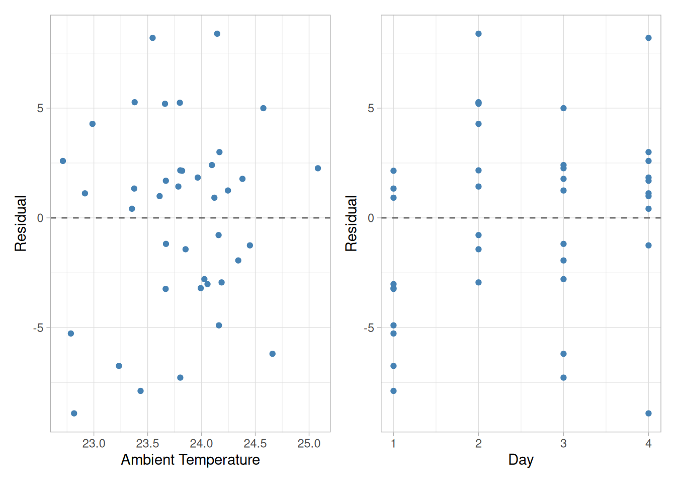
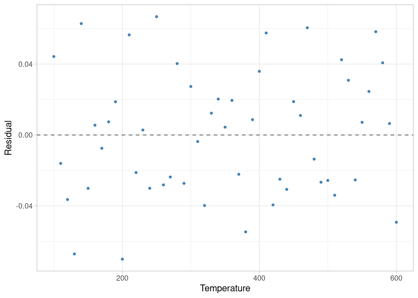
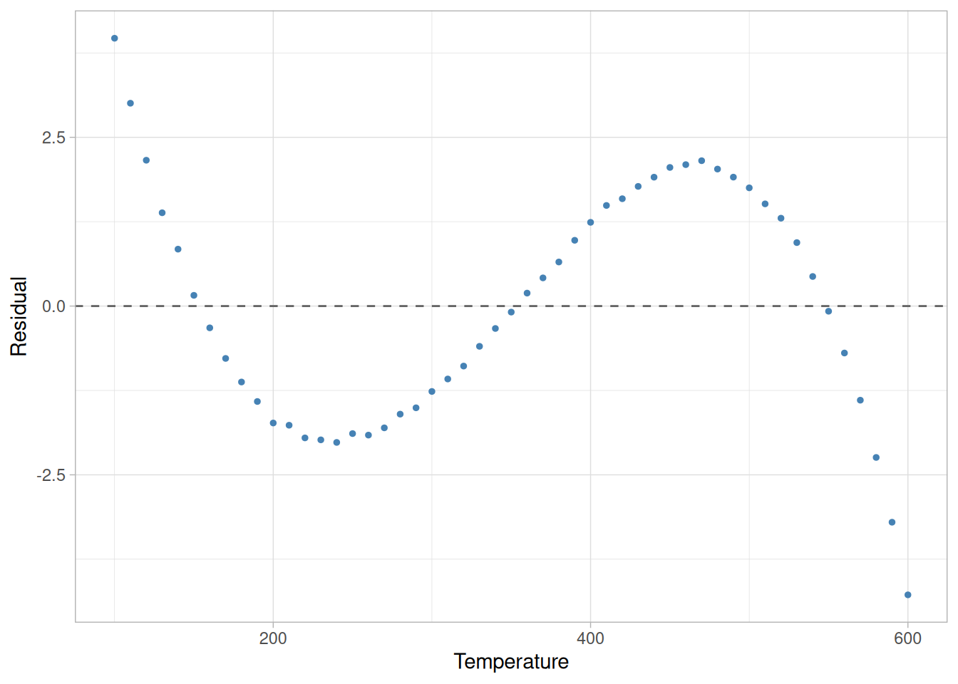
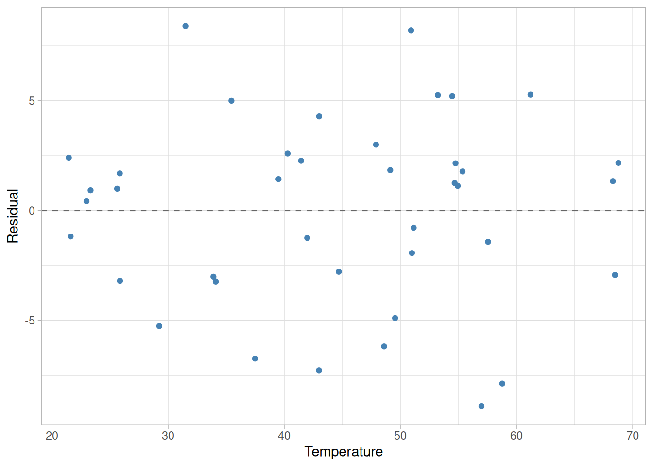
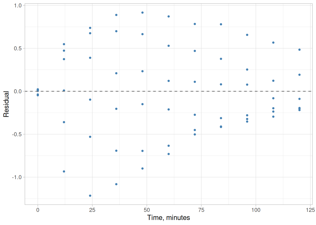
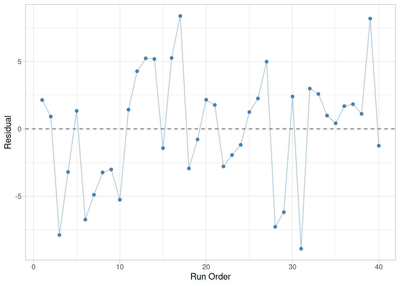
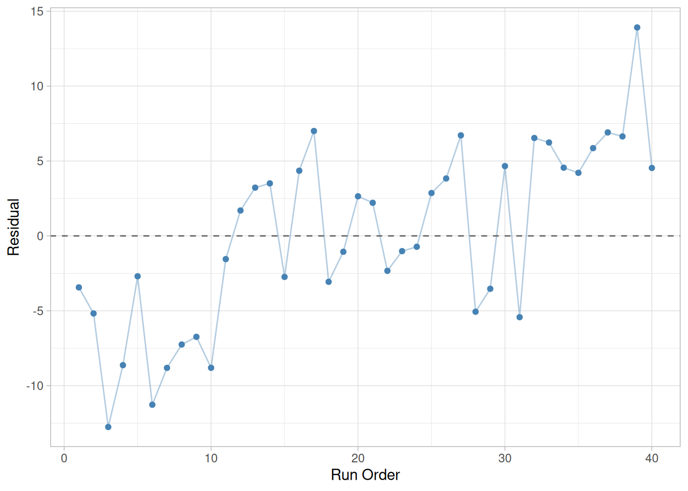
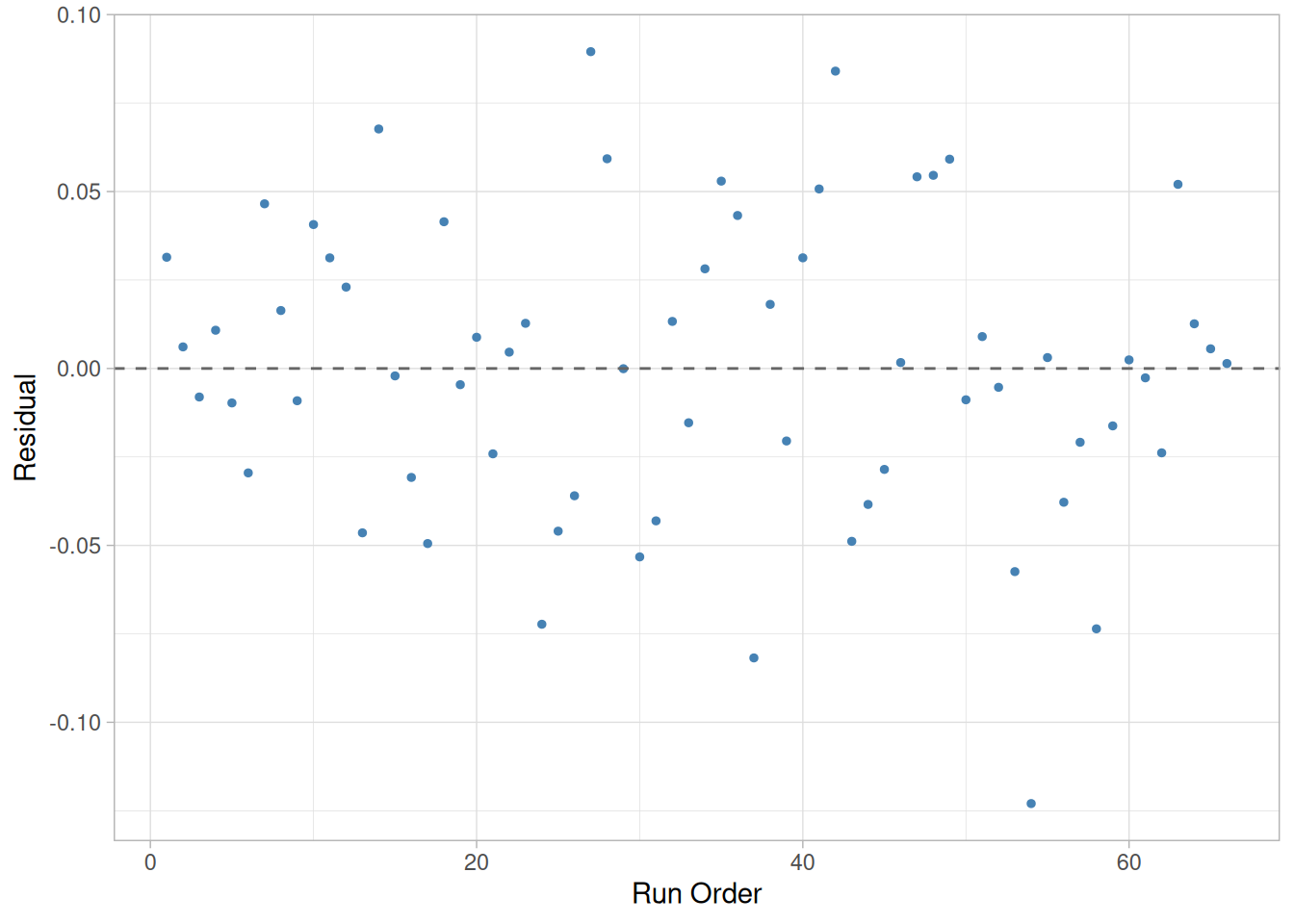
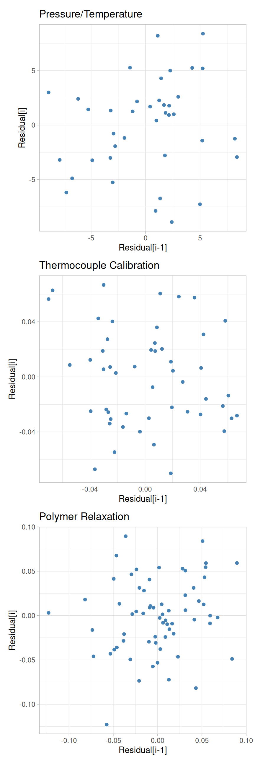
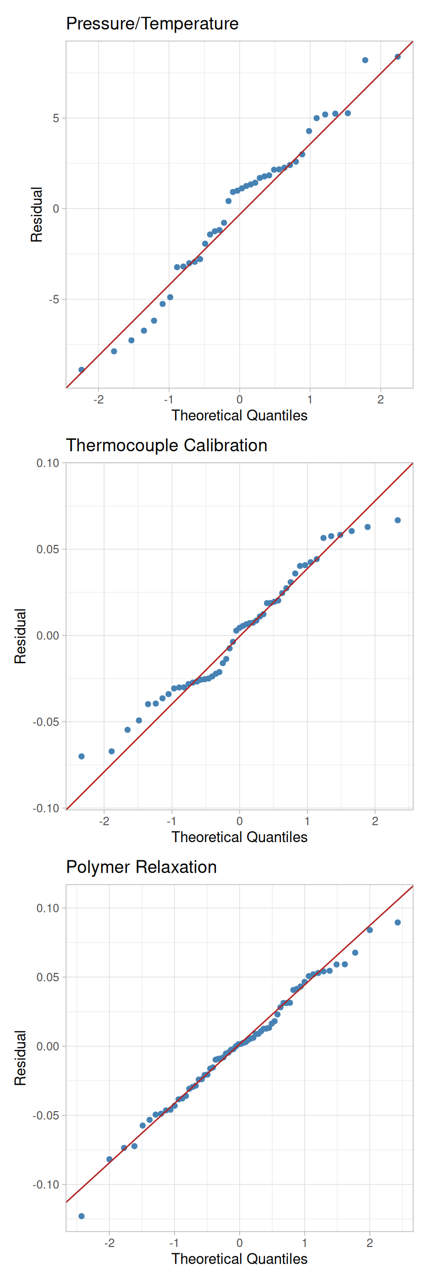
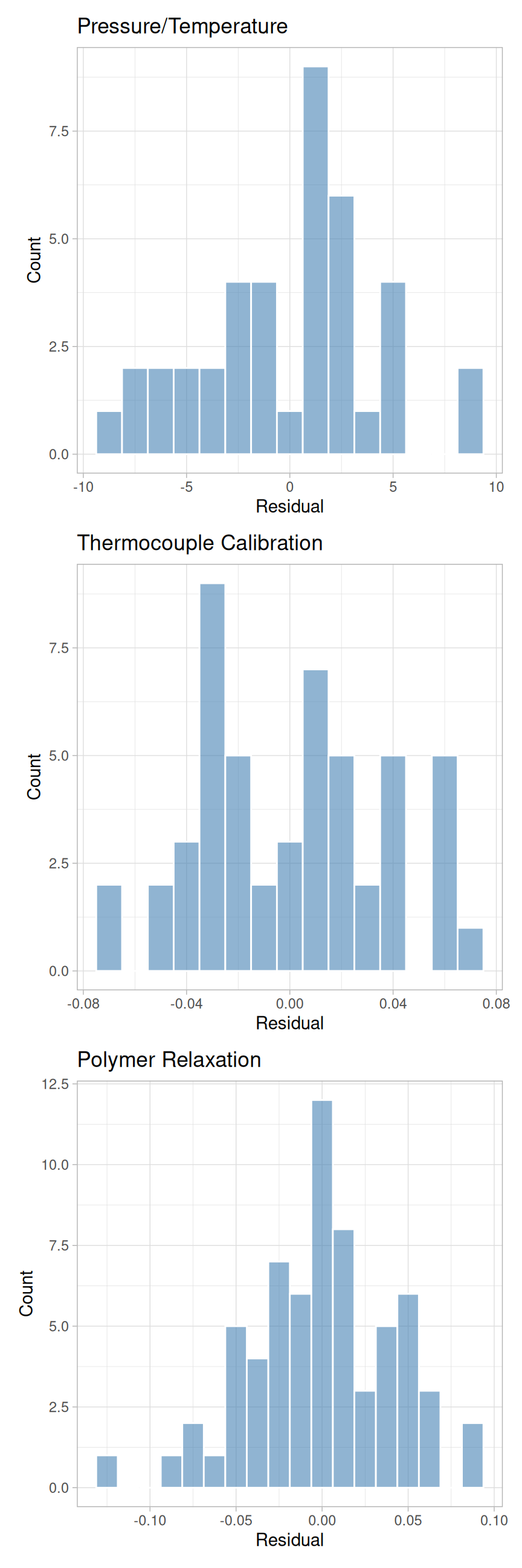
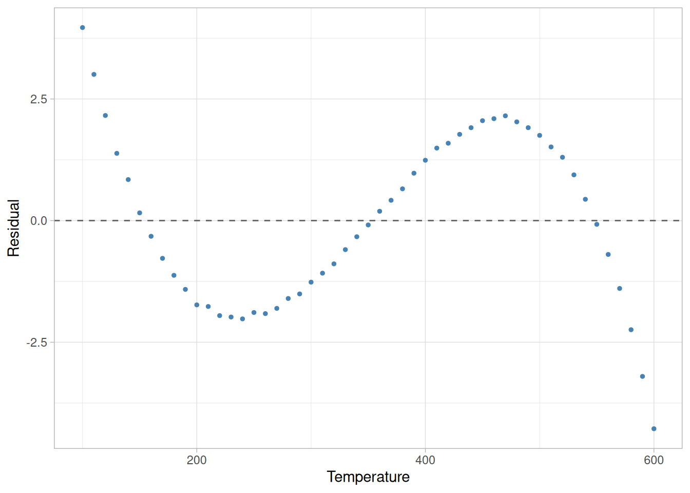
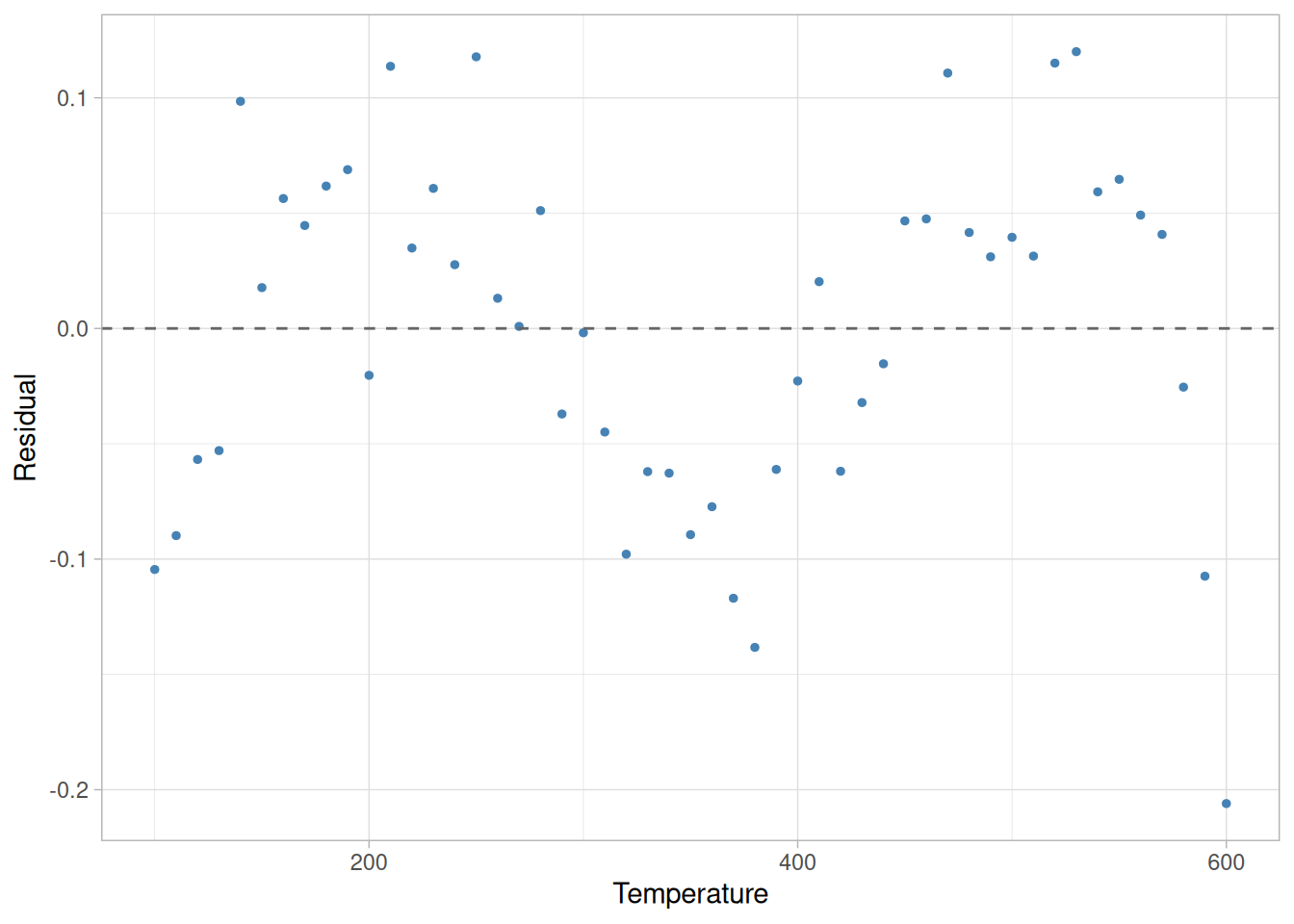
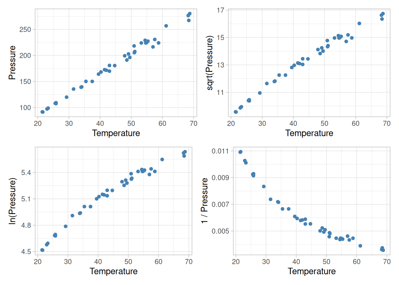
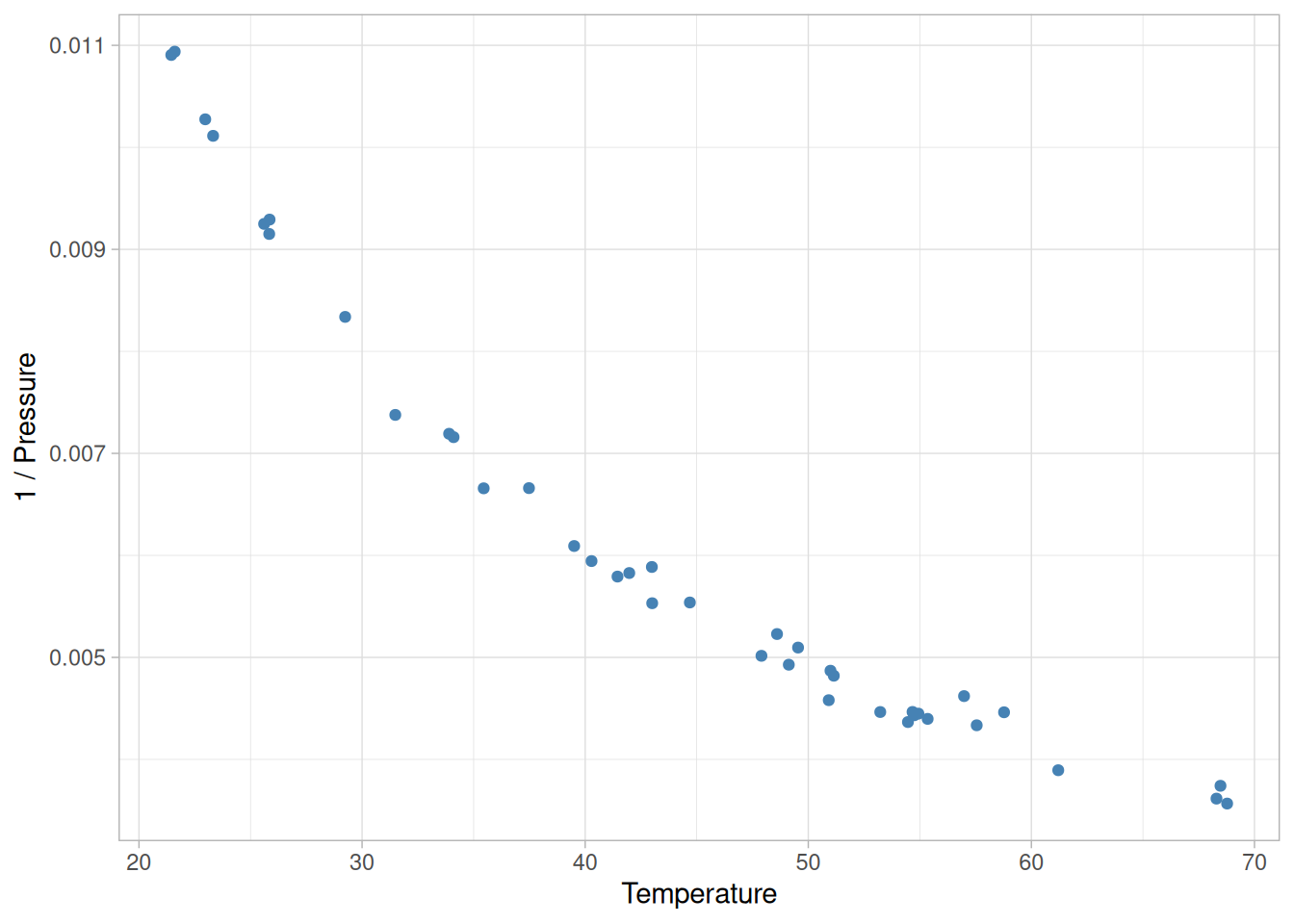
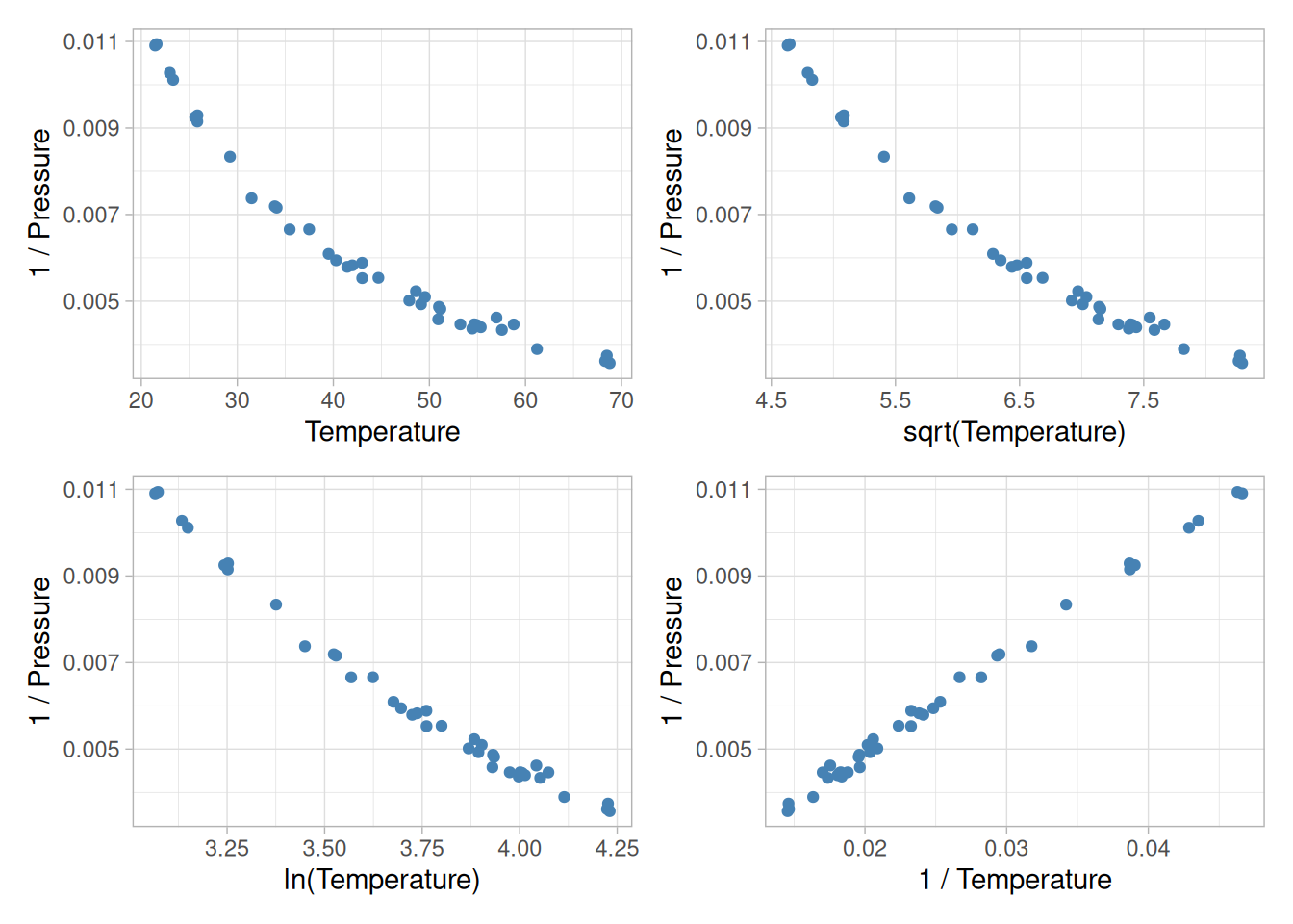
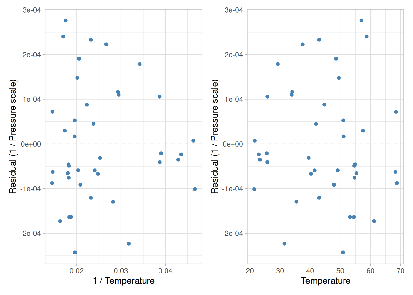
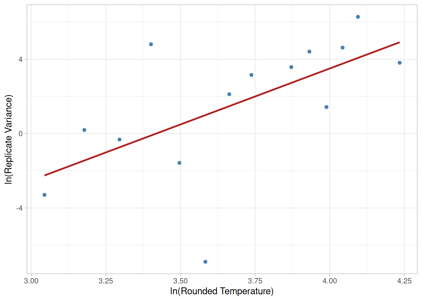
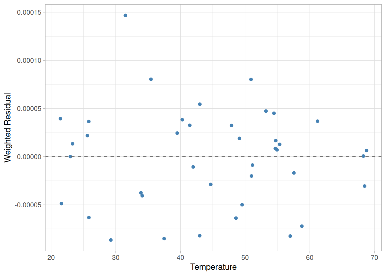
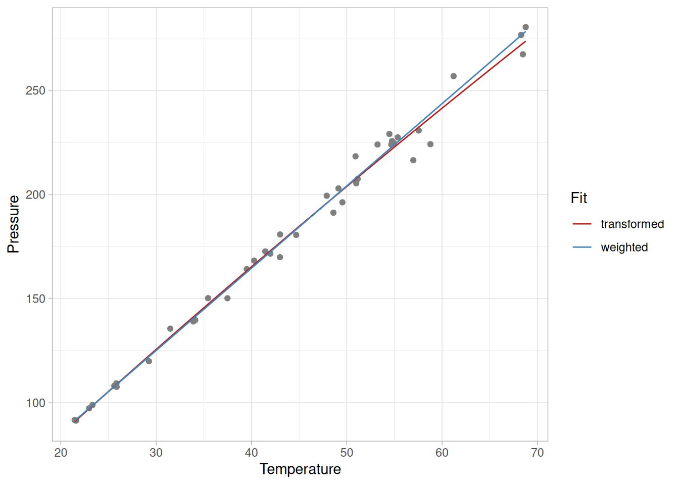
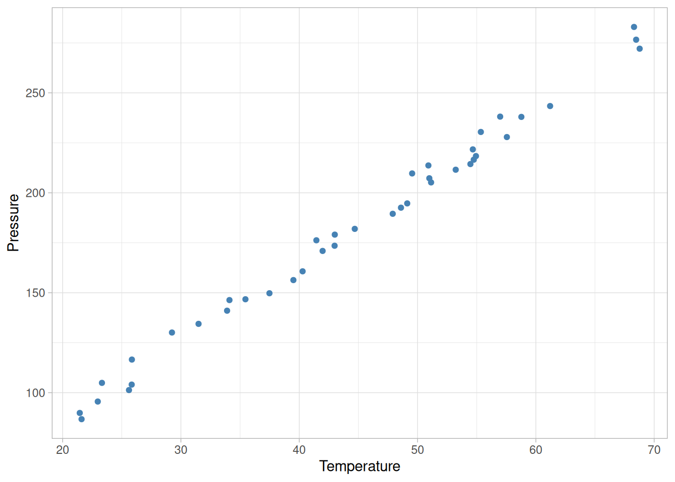
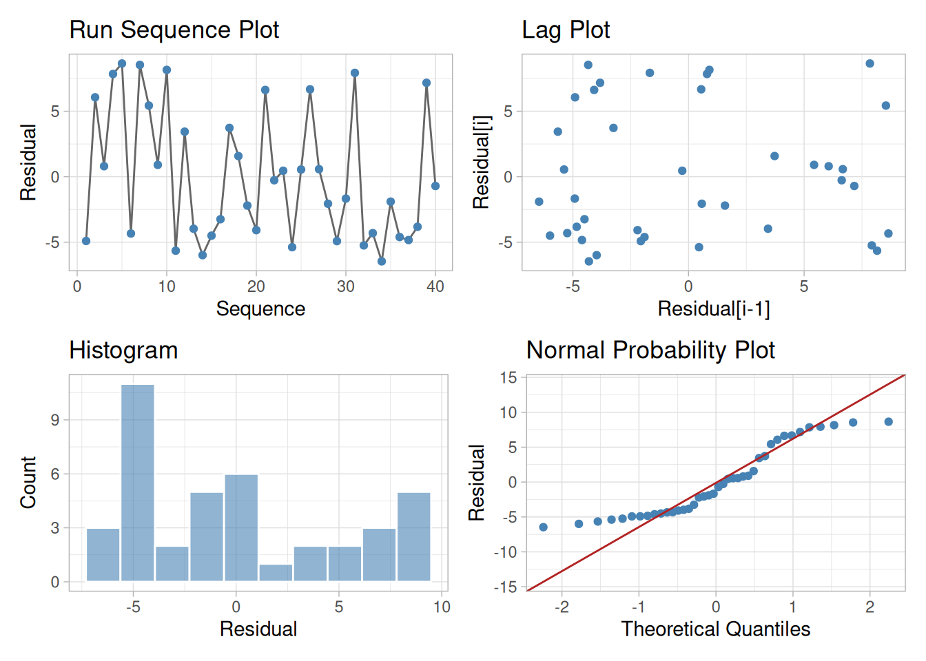
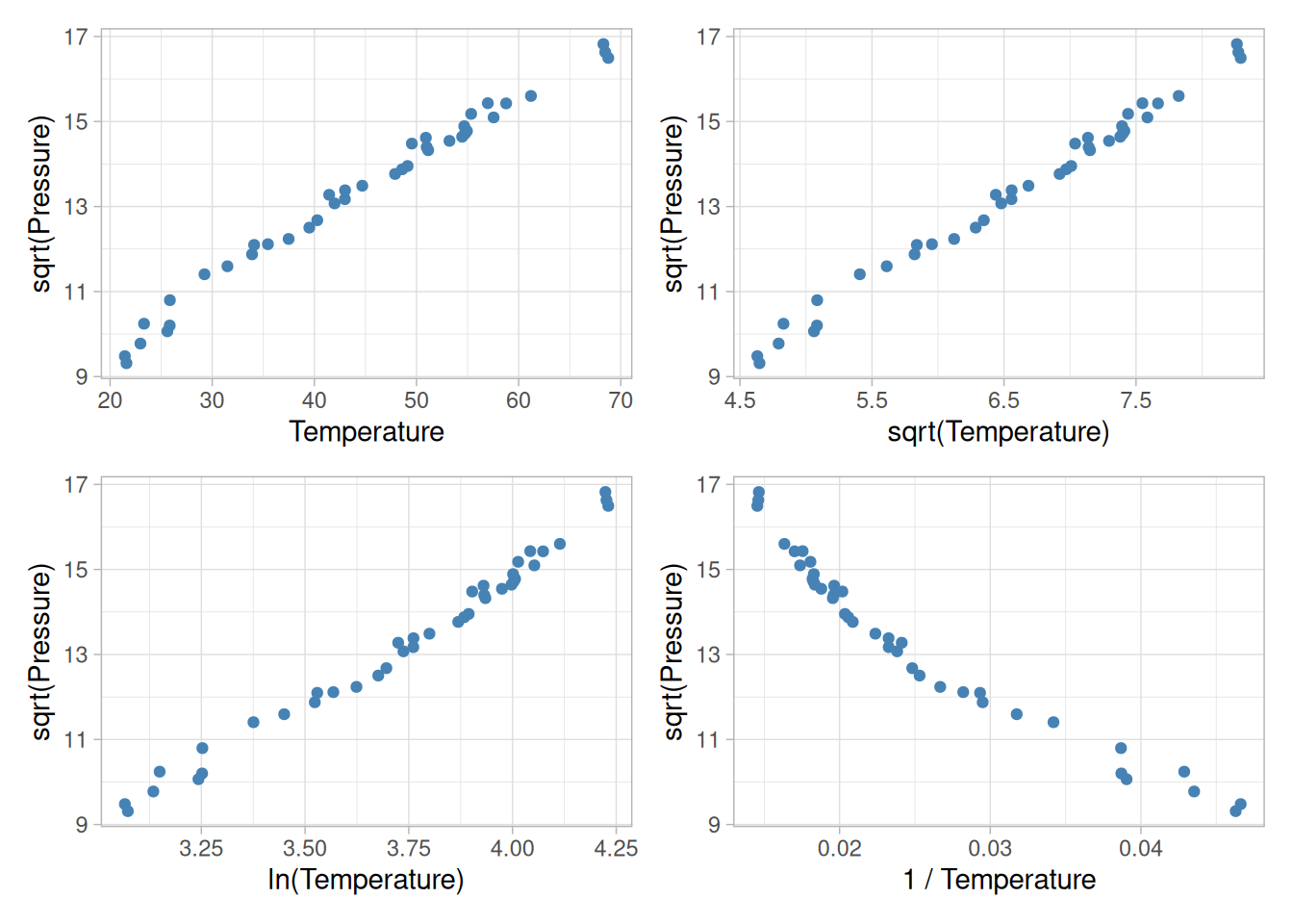
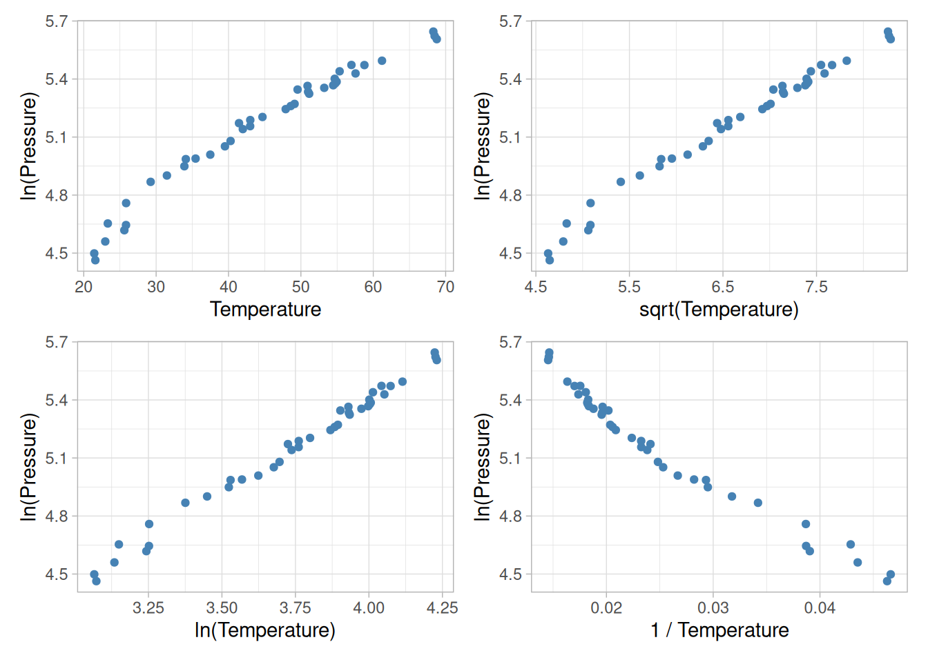
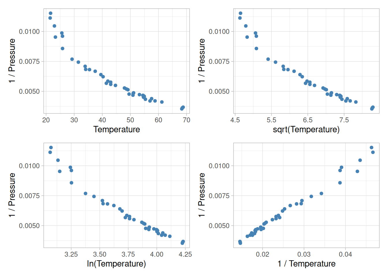
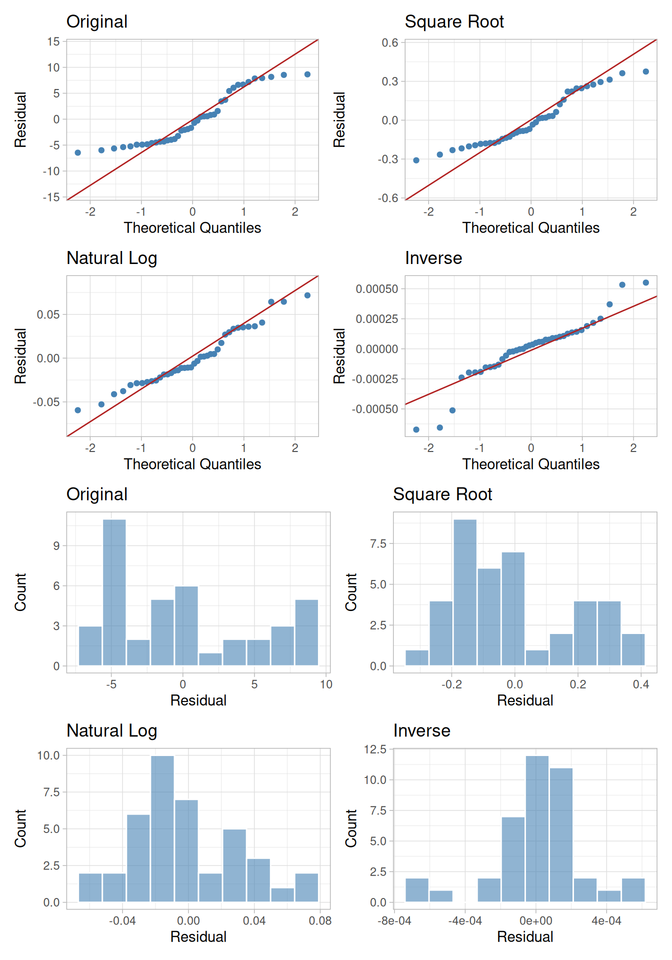
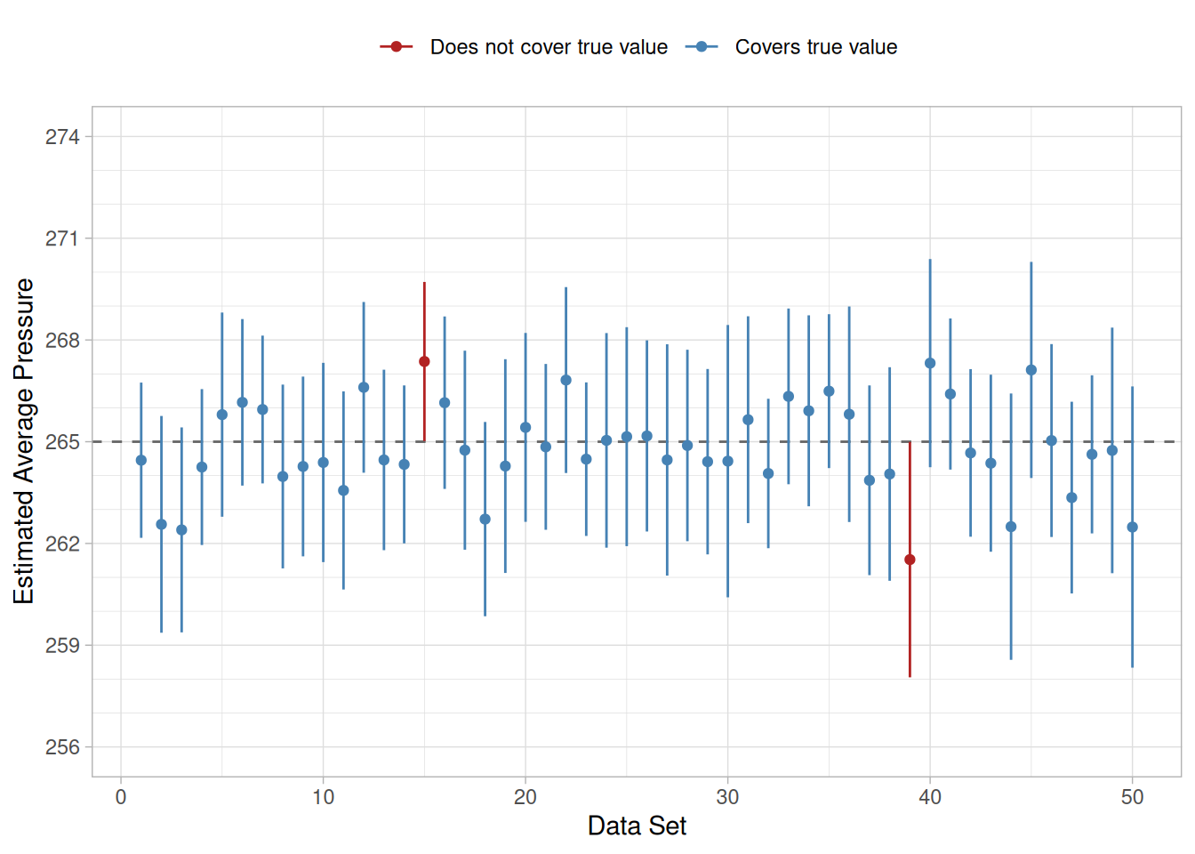
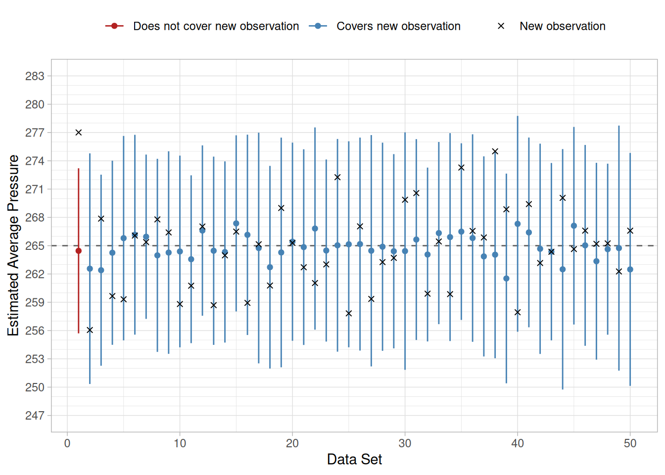
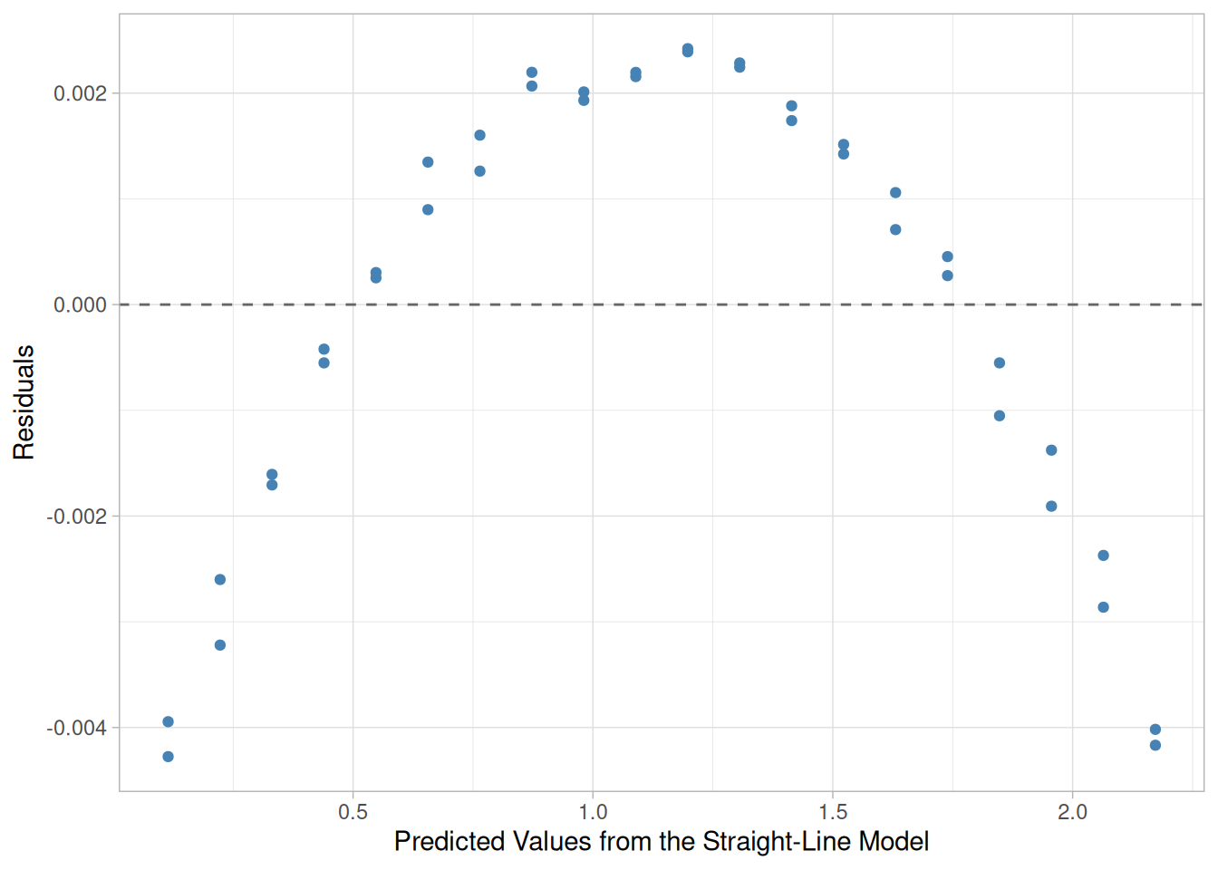
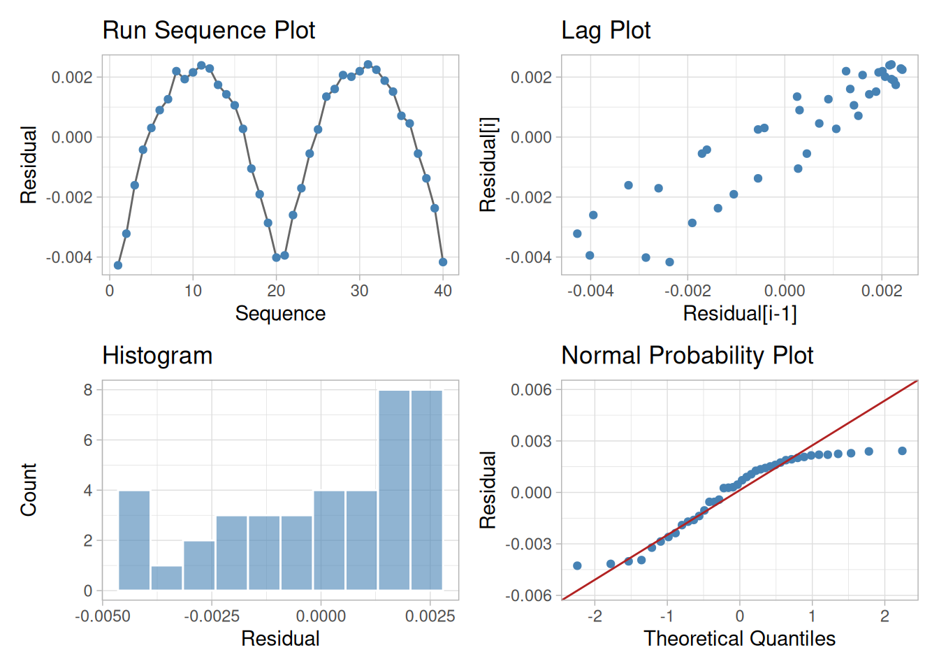
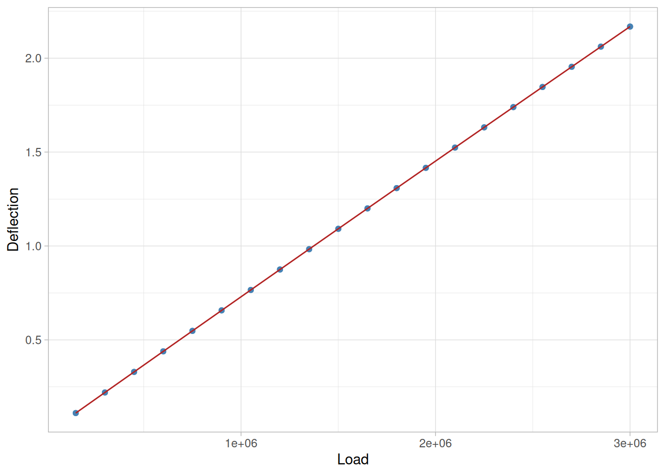
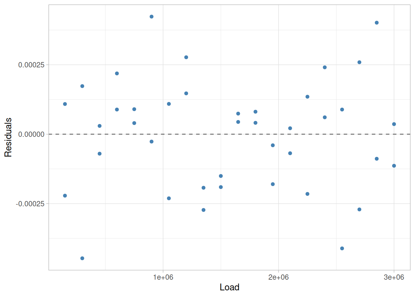
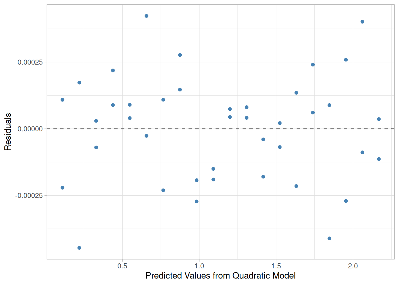
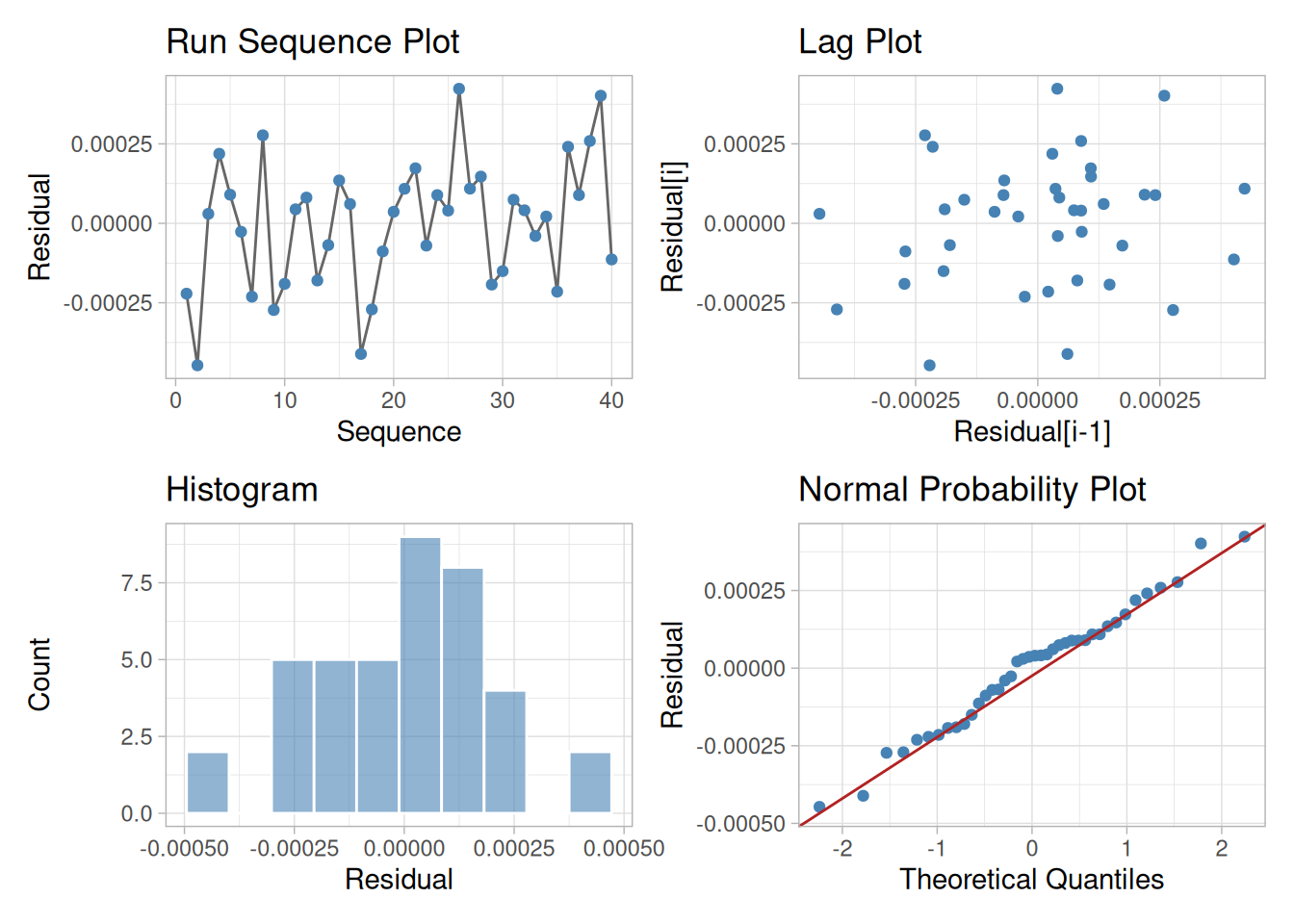
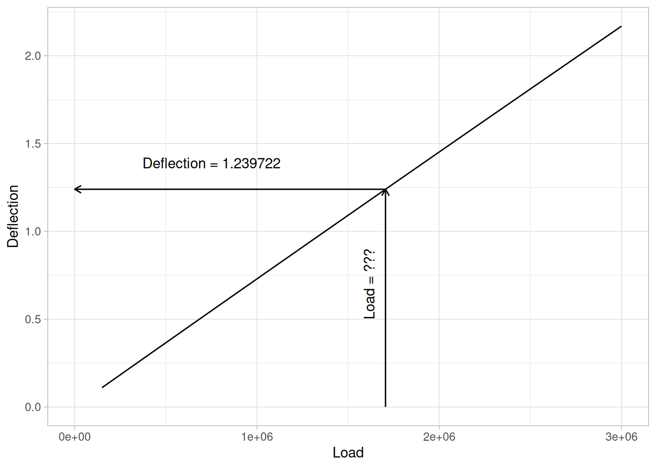
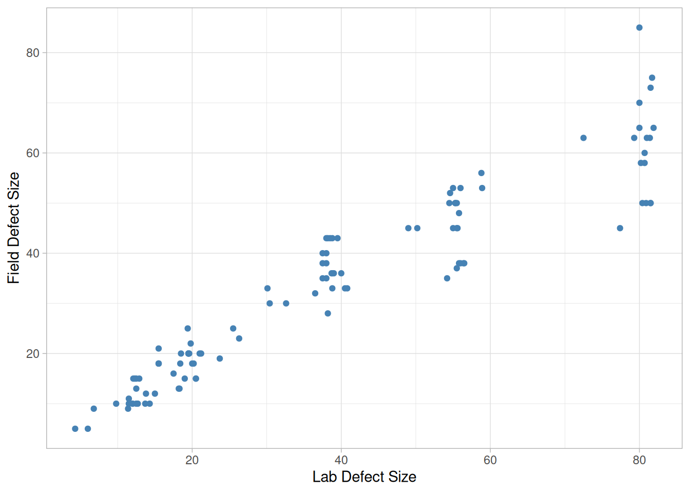
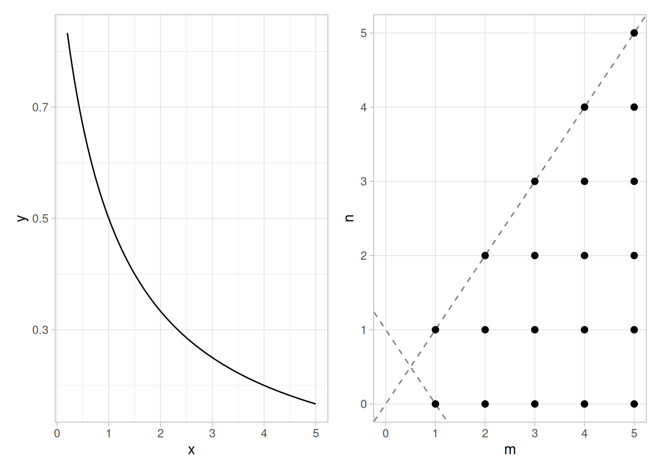
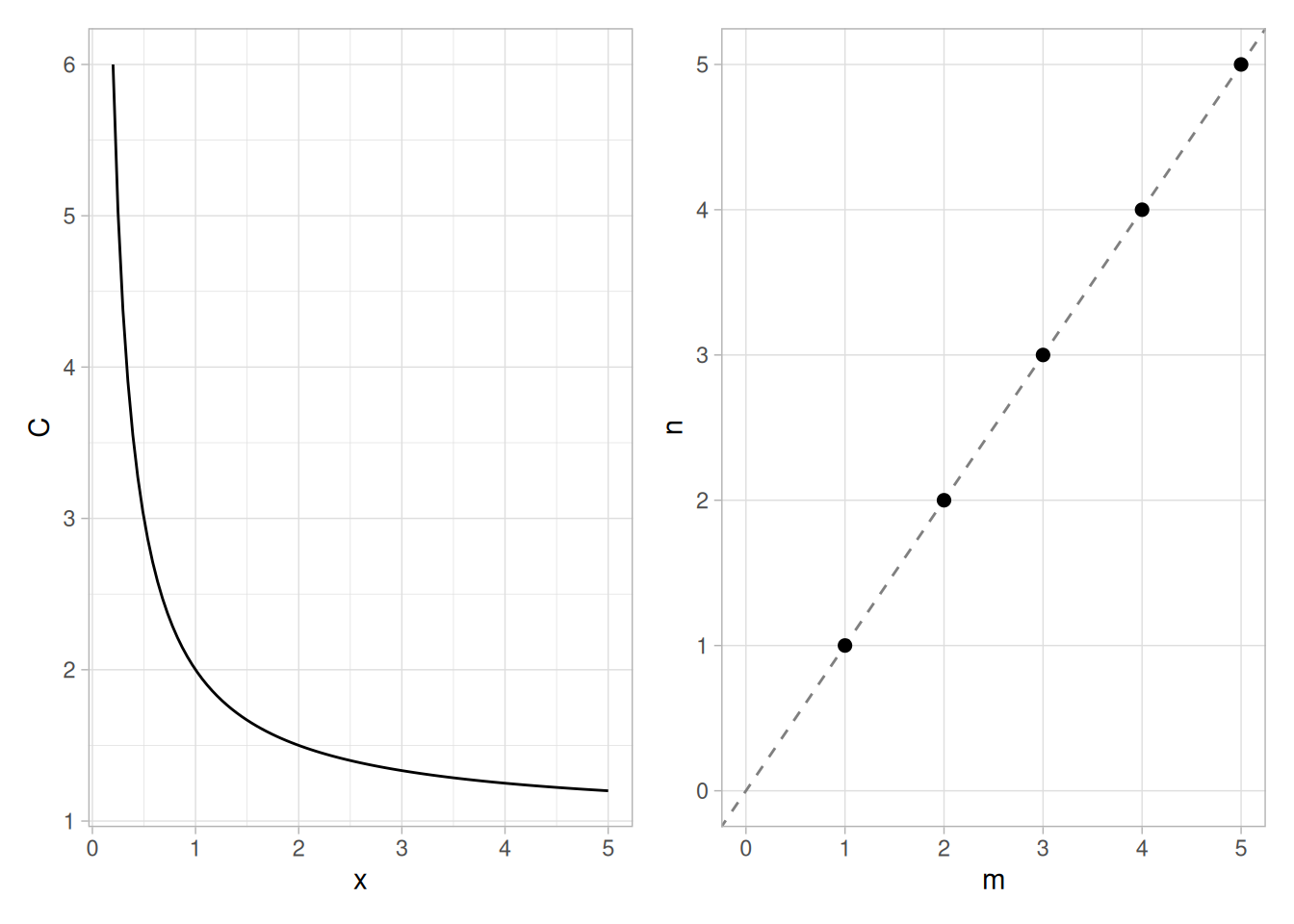
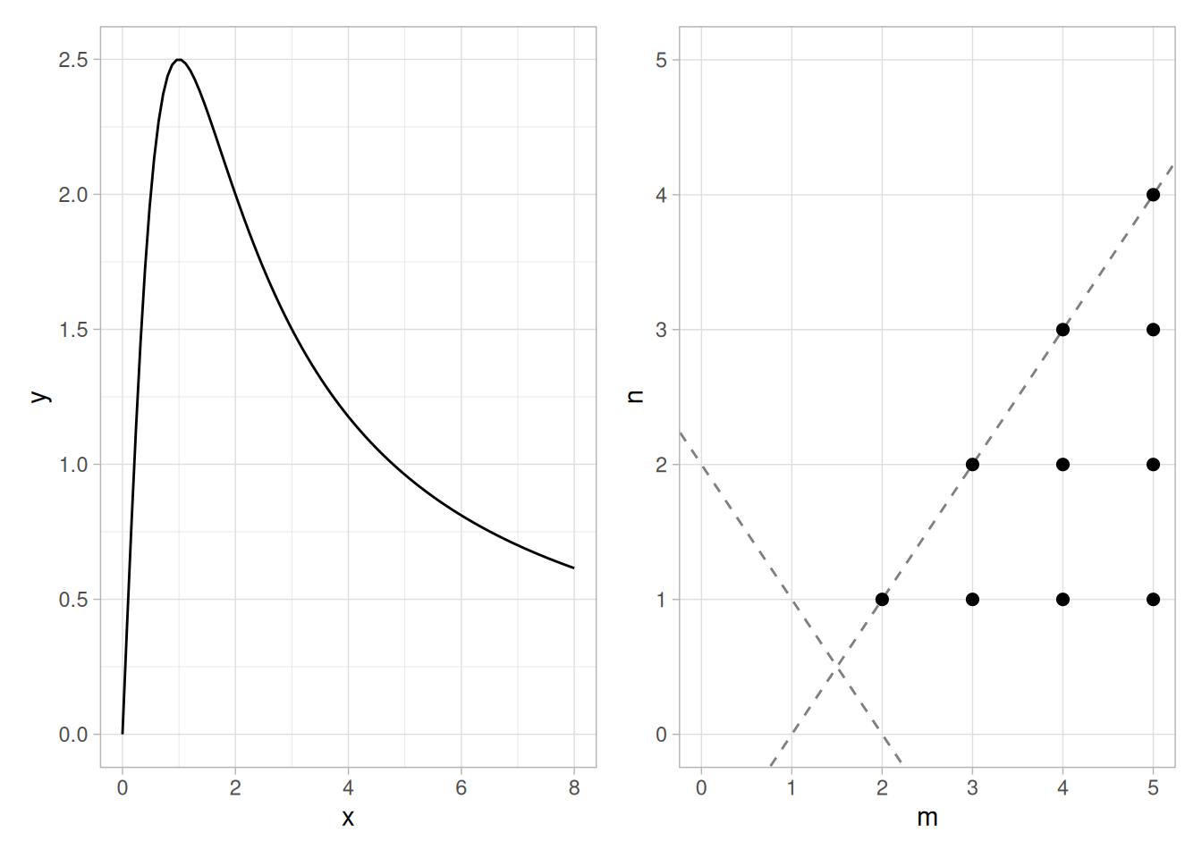
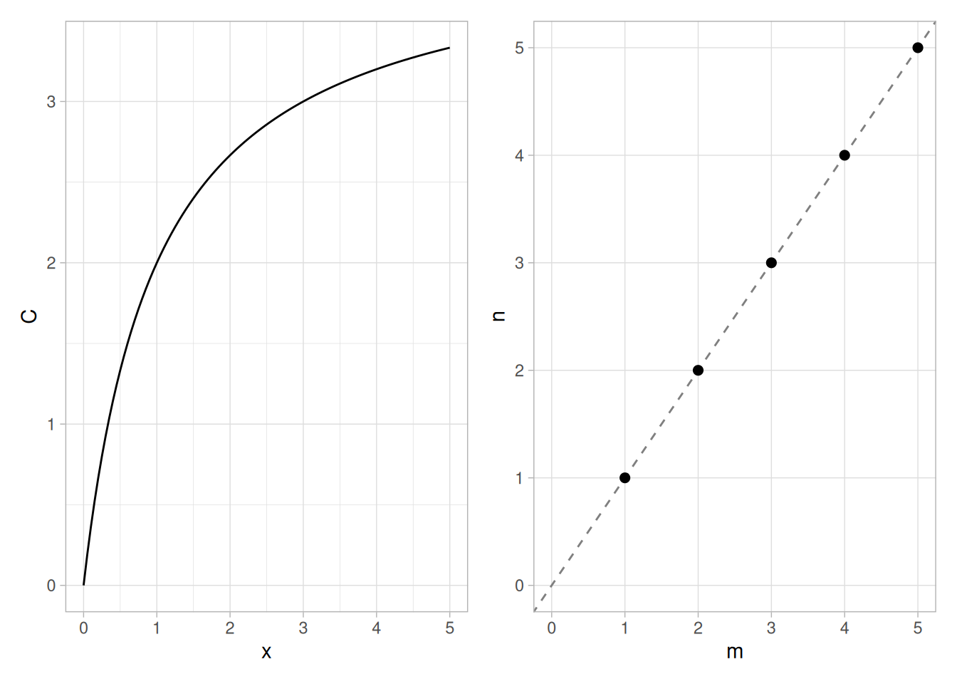
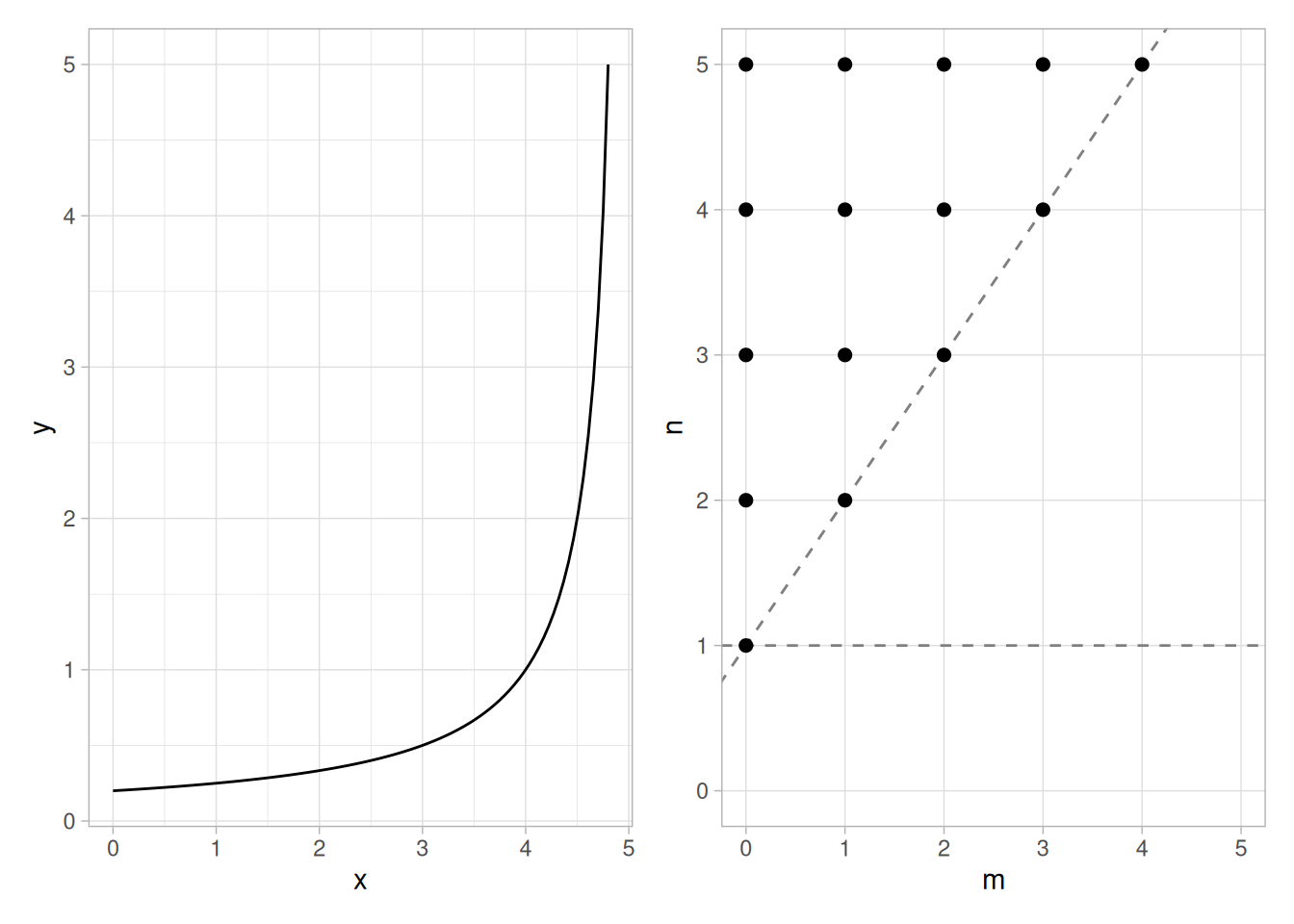
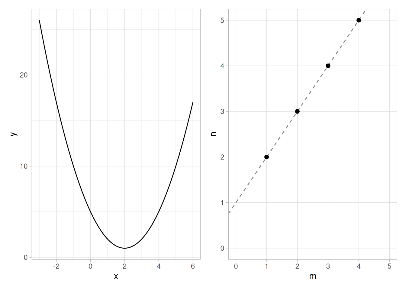
The goal for this chapter is to present the background and specific analysis techniques needed to construct a statistical model that describes a particular scientific or engineering process. The types of models discussed in this chapter are limited to those based on an explicit mathematical function. These types of models can be used for prediction of process outputs, for calibration, or for process optimization.
4.1 Introduction to Process Modeling
The goal for this section is to give the big picture of function-based process modeling. This includes a discussion of what process modeling is, the goals of process modeling, and a comparison of the different statistical methods used for model building. Detailed information on how to collect data, construct appropriate models, interpret output, and use process models is covered in the following sections. The final section of the chapter contains case studies that illustrate the general information presented in the first five sections using data from a variety of scientific and engineering applications.
Process modeling is the concise description of the total variation in one quantity, \(y\), by partitioning it into
a deterministic component given by a mathematical function of one or more other quantities, \(x_1, x_2, \ldots\), plus
a random component that follows a particular probability distribution.
Example
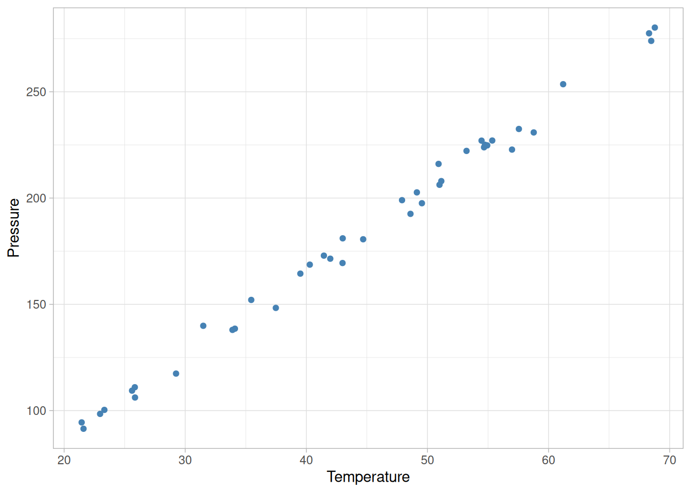
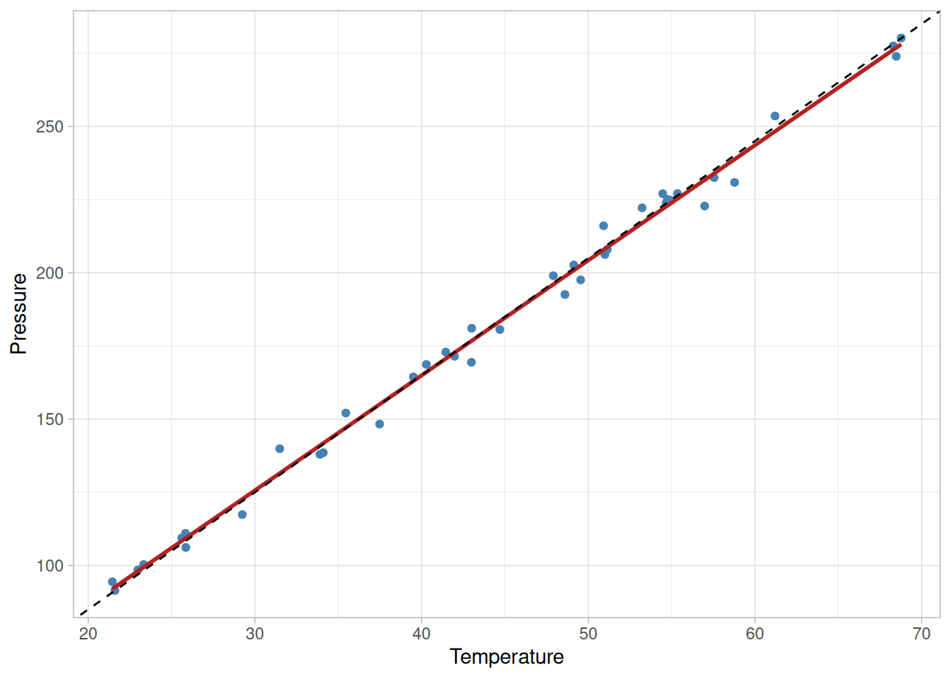
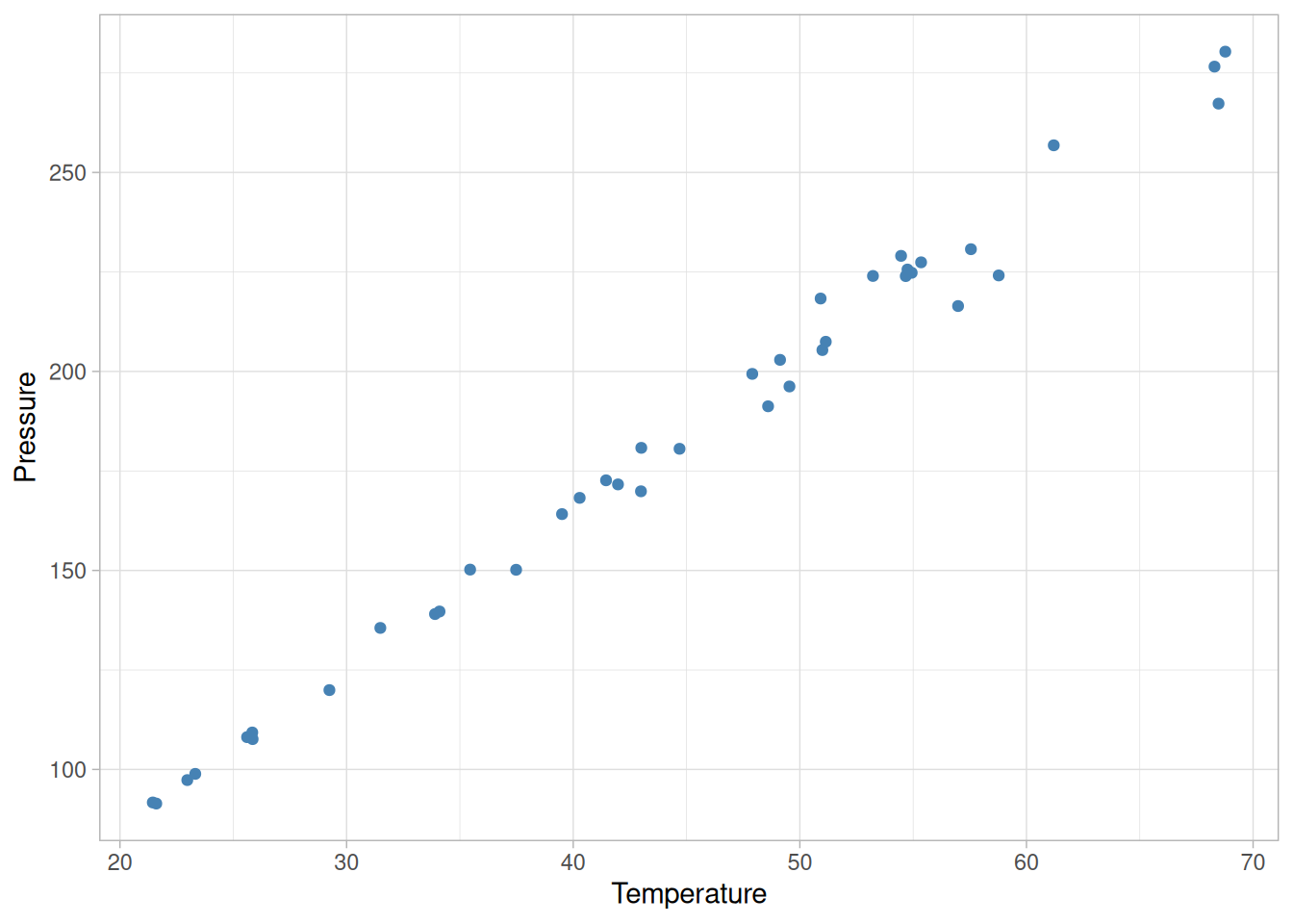
For example, the total variation of the measured pressure of a fixed amount of a gas in a tank can be described by partitioning the variability into its deterministic part, which is a function of the temperature of the gas, plus some left-over random error. Charles’ Law states that the pressure of a gas is proportional to its temperature under the conditions described here, and in this case most of the variation will be deterministic. However, due to measurement error in the pressure gauge, the relationship will not be purely deterministic. The random errors cannot be characterized individually, but will follow some probability distribution that will describe the relative frequencies of occurrence of different-sized errors. The reader can download the pressure/temperature data as a text file.
Graphical Interpretation
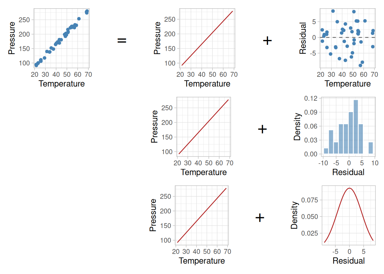
Using the example above, the definition of process modeling can be graphically depicted like this:
Code
library(tidyverse)library(patchwork)pressure_temp <-read_table( here::here("datasets", "MODEL-4_4_4.DAT"),skip =2,col_names =c("run_order", "day", "ambient_temp", "temperature", "pressure", "fitted_nist", "residual_nist"),col_types ="iiddddd")fit <-lm(pressure ~ temperature, data = pressure_temp)pressure_temp <- pressure_temp |>mutate(fitted =fitted(fit), residual =resid(fit))# NIST's original figure (gipm1.gif) is a 3x3 grid: data (top-left) equals the# fitted line (repeated down the middle column) plus, from top to bottom, a# residual scatter, a histogram of the residuals, and a normal density curve.# The bottom-left two cells are blank.operator <-function(label) {ggplot() +annotate("text", x =0, y =0, label = label, size =8) +theme_void()}p_data <-ggplot(pressure_temp, aes(temperature, pressure)) +geom_point(color ="steelblue") +labs(x ="Temperature", y ="Pressure") +theme_light()p_line <-ggplot(pressure_temp, aes(temperature, fitted)) +geom_line(color ="firebrick") +labs(x ="Temperature", y ="Pressure") +theme_light()p_resid <-ggplot(pressure_temp, aes(temperature, residual)) +geom_point(color ="steelblue") +geom_hline(yintercept =0, linetype ="dashed", color ="grey40") +labs(x ="Temperature", y ="Residual") +theme_light()p_hist <-ggplot(pressure_temp, aes(residual)) +geom_histogram(aes(y =after_stat(density)), bins =10, fill ="steelblue", alpha =0.6, color ="white") +labs(x ="Residual", y ="Density") +theme_light()p_dens <-ggplot(pressure_temp, aes(residual)) +stat_function(fun = dnorm, args =list(mean =0, sd =sigma(fit)), color ="firebrick") +xlim(range(pressure_temp$residual)) +labs(x ="Residual", y ="Density") +theme_light()blank <-plot_spacer()partition_design <- (p_data |operator("=") | p_line |operator("+") | p_resid) / (blank |operator("") | p_line |operator("+") | p_hist) / (blank |operator("") | p_line |operator("+") | p_dens)partition_design +plot_layout(widths =c(1, 0.15, 1, 0.15, 1))
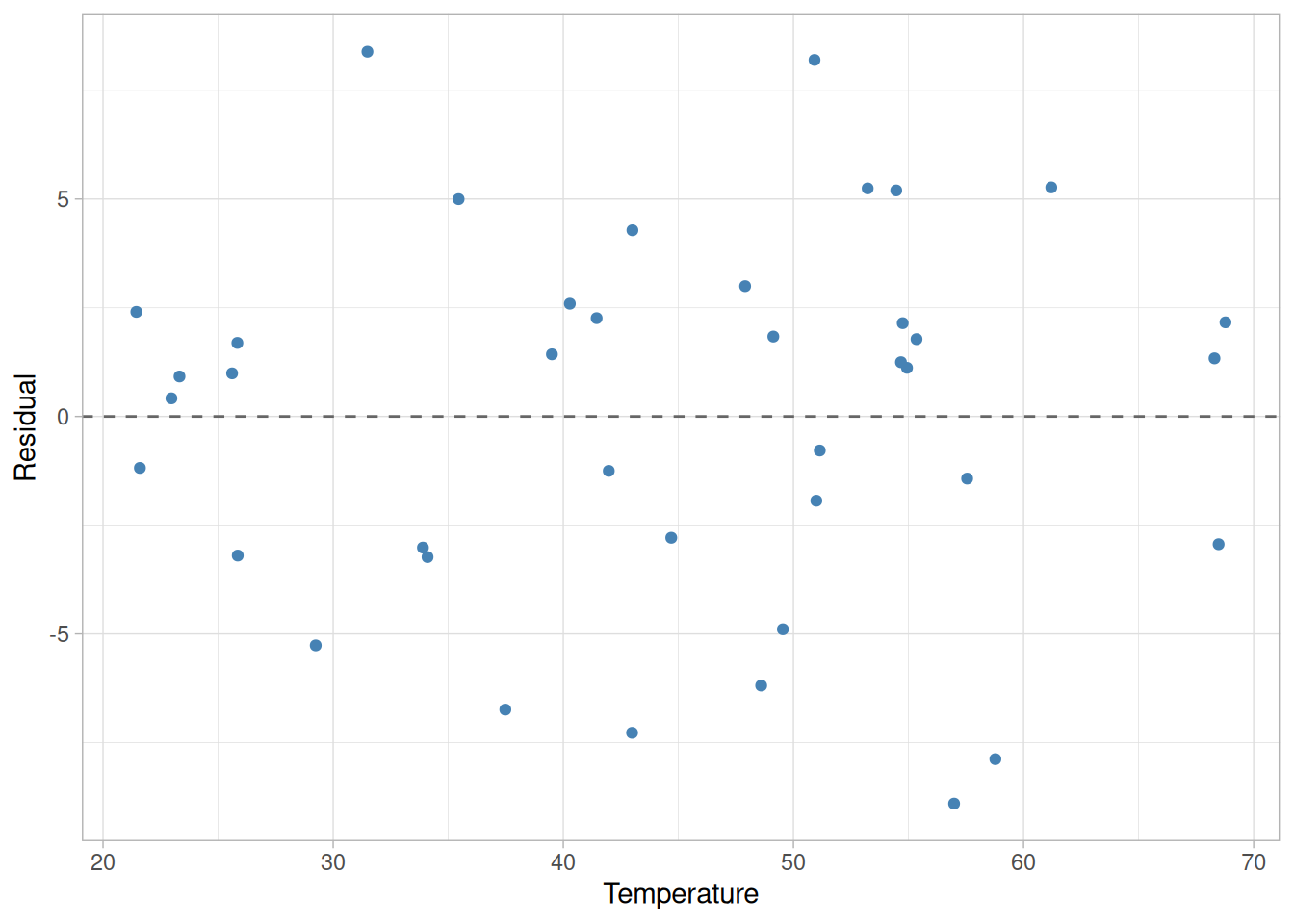
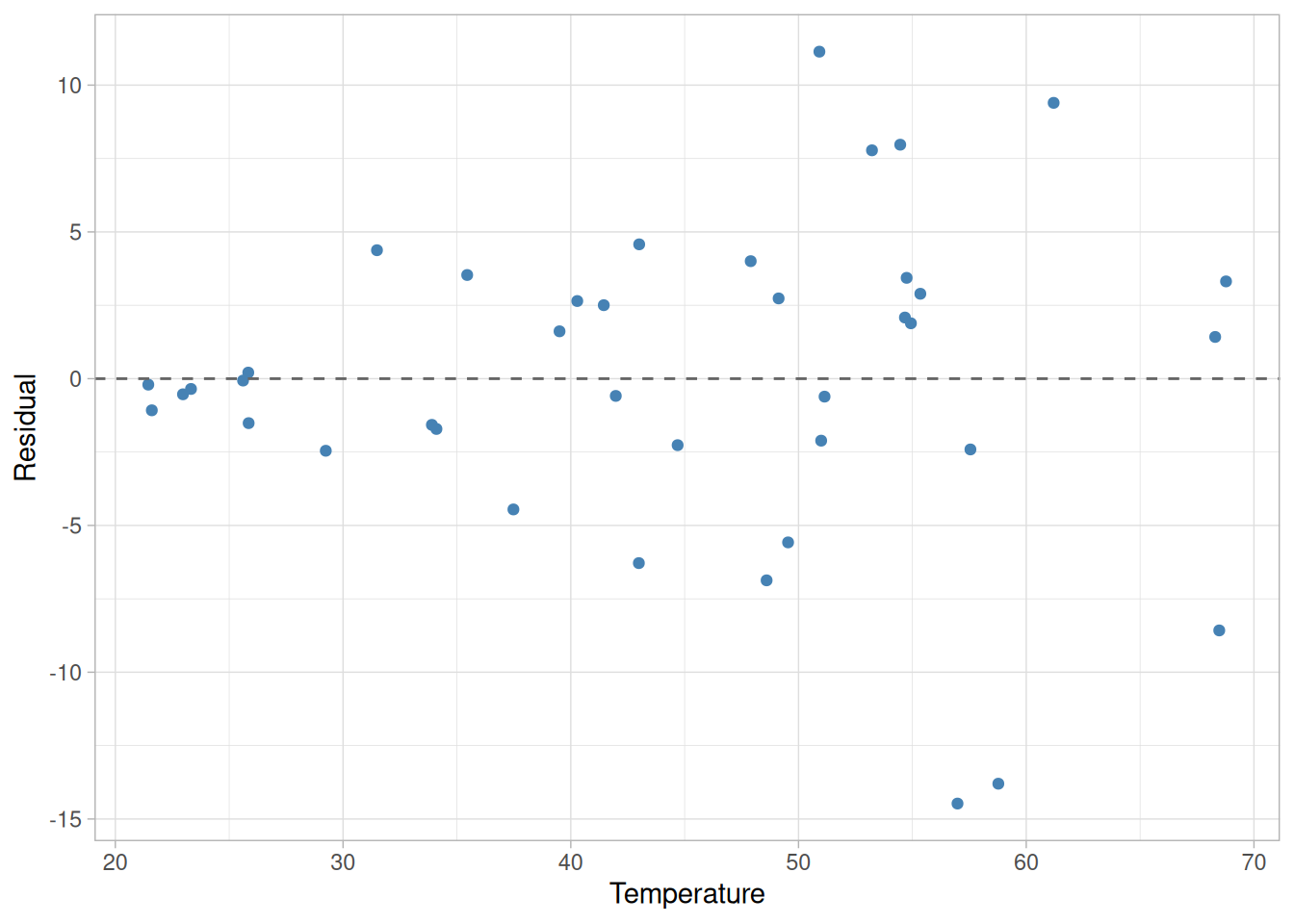
Figure 4.1: Partitioning the pressure/temperature data into a deterministic straight-line component and a random residual component, summarized by a histogram and a normal distribution
The top left plot in the figure shows pressure data that vary deterministically with temperature except for a small amount of random error. The relationship between pressure and temperature is a straight line, but not a perfect straight line. The middle column repeats the deterministic straight-line part of the partition three times. The right column shows three views of the “unexplained” random residual variation left over once the deterministic part is subtracted out: a scatter of the residuals against temperature, a histogram of the residuals, and a fitted normal density – summarizing the relative frequencies of observing different-sized random errors.
An Example from a More Complex Process
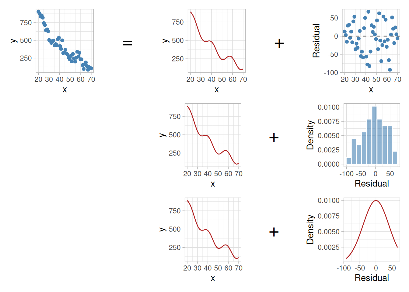
Of course, the straight-line example is one of the simplest functions used for process modeling. Real processes are often more complex, but the concept is identical: the variation in \(y\) is partitioned into a deterministic part, which is a function of another variable, \(x\), plus some left-over random variation, with a probability distribution describing the leftover random variation.
Note
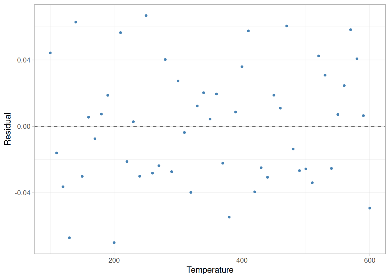
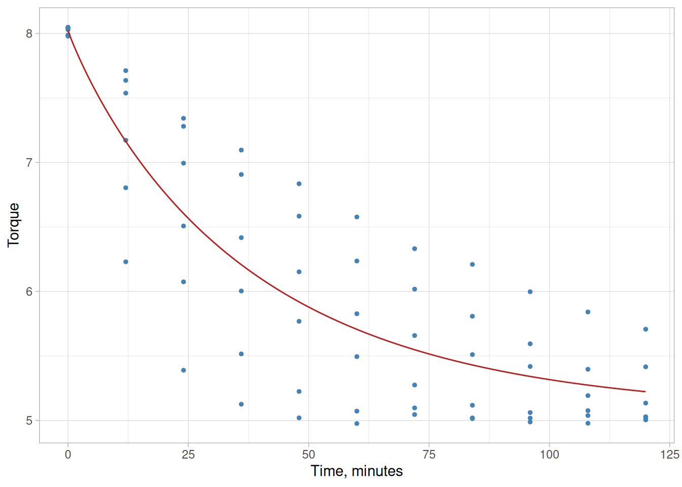
NIST’s original figure for this more complex, single-variable case used an illustrative wavy, decreasing curve without a downloadable dataset. The figure below is illustrative data, generated with set.seed(), showing the same 3x3 partition layout as above for a nonlinear deterministic component.
Figure 4.2: Partitioning a nonlinear deterministic component and random residual variation, in the same layout as above (illustrative data)
An Example with Multiple Explanatory Variables
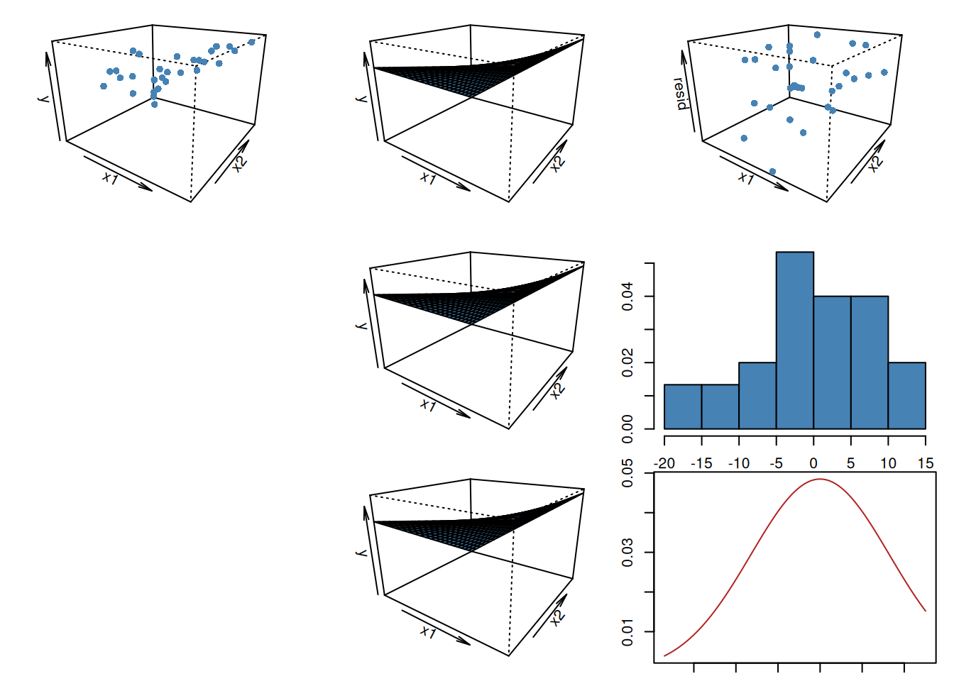
The examples of process modeling shown above have only one explanatory variable but the concept easily extends to cases with more than one explanatory variable. The perspective plot below shows an example with two explanatory variables. Examples with three or more explanatory variables are exactly analogous, but are difficult to show graphically.
Note
As with the nonlinear example above, NIST’s original figure for the two-explanatory-variable case used an illustrative surface without a downloadable dataset. The figure below is illustrative data, generated with set.seed(), following the same 3x3 partition layout: a 3-D scatter of the data, the fitted surface repeated across the middle column, and a 3-D scatter of the residuals, a histogram, and a density curve down the right column.
Figure 4.3: Partitioning a deterministic surface for two explanatory variables and random residual variation, in the same layout as above (illustrative data)
4.1.2 What terminology do statisticians use to describe process models?
Model Components
There are three main parts to every process model. These are
the response variable, usually denoted by \(y\),
the mathematical function, usually denoted as \(f(\vec{x};\vec{\beta})\), and
the random errors, usually denoted by \(\varepsilon\).
Form of Model
The general form of the model is
\[y = f(\vec{x};\vec{\beta}) + \varepsilon\]
All process models discussed in this chapter have this general form. As alluded to earlier, the random errors that are included in the model make the relationship between the response variable and the predictor variables a “statistical” one, rather than a perfect deterministic one. This is because the functional relationship between the response and predictors holds only on average, not for each data point.
Some of the details about the different parts of the model are discussed below, along with alternate terminology for the different components of the model.
Response Variable
The response variable, \(y\), is a quantity that varies in a way that we hope to be able to summarize and exploit via the modeling process. Generally it is known that the variation of the response variable is systematically related to the values of one or more other variables before the modeling process is begun, although testing the existence and nature of this dependence is part of the modeling process itself.
Mathematical Function
The mathematical function consists of two parts. These parts are the predictor variables, \(x_1, x_2, \ldots\), and the parameters, \(\beta_0, \beta_1, \ldots\). The predictor variables are observed along with the response variable. They are the quantities described on the previous page as inputs to the mathematical function, \(f(\vec{x};\vec{\beta})\). The collection of all of the predictor variables is denoted by \(\vec{x}\) for short.
\[\vec{x} \equiv (x_1, x_2, \ldots)\]
The parameters are the quantities that will be estimated during the modeling process. Their true values are unknown and unknowable, except in simulation experiments. As for the predictor variables, the collection of all of the parameters is denoted by \(\vec{\beta}\) for short.
\[\vec{\beta} \equiv (\beta_0, \beta_1, \ldots)\]
The parameters and predictor variables are combined in different forms to give the function used to describe the deterministic variation in the response variable. For a straight line with an unknown intercept and slope, for example, there are two parameters and one predictor variable
\[f(x;\vec{\beta}) = \beta_0 + \beta_1 x \, .\]
For a straight line with a known slope of one, but an unknown intercept, there would only be one parameter
\[f(x;\vec{\beta}) = \beta_0 + x \, .\]
For a quadratic surface with two predictor variables, there are six parameters for the full model.
Like the parameters in the mathematical function, the random errors are unknown. They are simply the difference between the data and the mathematical function. They are assumed to follow a particular probability distribution, however, which is used to describe their aggregate behavior. The probability distribution that describes the errors has a mean of zero and an unknown standard deviation, denoted by \(\sigma\), that is another parameter in the model, like the \(\beta\)’s.
Alternate Terminology
Unfortunately, there are no completely standardized names for the parts of the model discussed above. Other publications or software may use different terminology. For example, another common name for the response variable is “dependent variable”. The response variable is also simply called “the response” for short. Other names for the predictor variables include “explanatory variables”, “independent variables”, “predictors” and “regressors”. The mathematical function used to describe the deterministic variation in the response variable is sometimes called the “regression function”, the “regression equation”, the “smoothing function”, or the “smooth”.
Scope of “Model”
In its correct usage, the term “model” refers to the equation above and also includes the underlying assumptions made about the probability distribution used to describe the variation of the random errors. Often, however, people will also use the term “model” when referring specifically to the mathematical function describing the deterministic variation in the data. Since the function is part of the model, the more limited usage is not wrong, but it is important to remember that the term “model” might refer to more than just the mathematical function.
4.1.3 What are process models used for?
Four Main Purposes
Process models are used for four main purposes:
estimation,
prediction,
calibration, and
optimization.
The rest of this page lists brief explanations of the different uses of process models. More detailed explanations of the uses for process models are given in the subsections of this section listed at the bottom of this page.
Estimation
The goal of estimation is to determine the value of the regression function (i.e., the average value of the response variable), for a particular combination of the values of the predictor variables. Regression function values can be estimated for any combination of predictor variable values, including values for which no data have been measured or observed. Function values estimated for points within the observed space of predictor variable values are sometimes called interpolations. Estimation of regression function values for points outside the observed space of predictor variable values, called extrapolations, are sometimes necessary, but require caution.
Prediction
The goal of prediction is to determine either
the value of a new observation of the response variable, or
the values of a specified proportion of all future observations of the response variable
for a particular combination of the values of the predictor variables. Predictions can be made for any combination of predictor variable values, including values for which no data have been measured or observed. As in the case of estimation, predictions made outside the observed space of predictor variable values are sometimes necessary, but require caution.
Calibration
The goal of calibration is to quantitatively relate measurements made using one measurement system to those of another measurement system. This is done so that measurements can be compared in common units or to tie results from a relative measurement method to absolute units.
Optimization
Optimization is performed to determine the values of process inputs that should be used to obtain the desired process output. Typical optimization goals might be to maximize the yield of a process, to minimize the processing time required to fabricate a product, or to hit a target product specification with minimum variation in order to maintain specified tolerances.
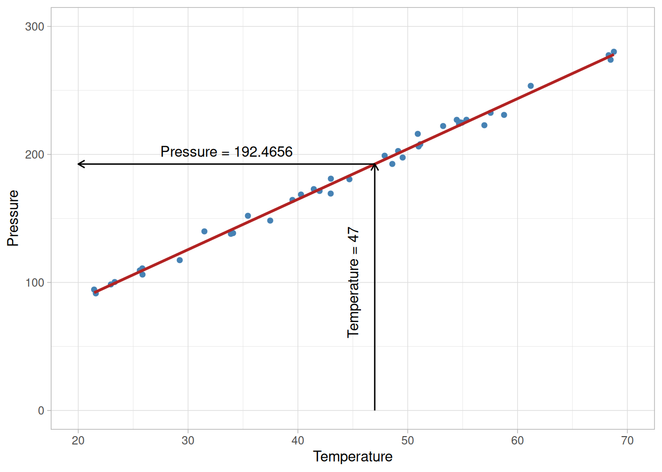
As mentioned on the preceding page, the primary goal of estimation is to determine the value of the regression function that is associated with a specific combination of predictor variable values. The estimated values are computed by plugging the value(s) of the predictor variable(s) into the regression equation, after estimating the unknown parameters from the data. This process is illustrated below using the Pressure/Temperature example from a few pages earlier.
Example
Suppose in this case the predictor variable value of interest is a temperature of 47 degrees. Computing the estimated value of the regression function using the equation
estimated_pressure <-predict(fit, new_point)ggplot(pressure_temp, aes(temperature, pressure)) +geom_point(color ="steelblue") +geom_smooth(method ="lm", formula = y ~ x, se =FALSE, color ="firebrick") +annotate("segment",x =47, xend =20, y = estimated_pressure, yend = estimated_pressure,arrow =arrow(length =unit(0.2, "cm")), color ="black" ) +annotate("segment",x =47, xend =47, y =0, yend = estimated_pressure,arrow =arrow(length =unit(0.2, "cm")), color ="black" ) +annotate("text",x =33.5, y = estimated_pressure +10,label =paste("Pressure =", round(estimated_pressure, 4)),hjust =0.5 ) +annotate("text",x =45, y =100, label ="Temperature = 47", angle =90 ) +scale_x_continuous(limits =c(20, 70)) +scale_y_continuous(limits =c(0, 300)) +labs(x ="Temperature", y ="Pressure") +theme_light()
Figure 4.4: Estimated pressure at a temperature of 47 degrees
Of course, if the pressure/temperature experiment were repeated, the estimates of the parameters of the regression function obtained from the data would differ slightly each time because of the randomness in the data and the need to sample a limited amount of data. Different parameter estimates would, in turn, yield different estimated values.
Uncertainty of the Estimated Value
A critical part of estimation is an assessment of how much an estimated value will fluctuate due to the noise in the data. Without that information there is no basis for comparing an estimated value to a target value or to another estimate. Any method used for estimation should include an assessment of the uncertainty in the estimated value(s). Fortunately it is often the case that the data used to fit the model to a process can also be used to compute the uncertainty of estimated values obtained from the model. In the pressure/temperature example a confidence interval for the value of the regression function at 47 degrees can be computed from the data used to fit the model. The table below shows a 99% confidence interval produced using the original data. This interval gives the range of plausible values for the average pressure for a temperature of 47 degrees based on the parameter estimates and the noise in the data.
Because the confidence interval is an interval for the value of the regression function, the uncertainty only includes the noise that is inherent in the estimates of the regression parameters. The uncertainty in the estimated value can be less than the uncertainty of a single measurement from the process because the data used to estimate the unknown parameters is essentially averaged (in a way that depends on the statistical method being used) to determine each parameter estimate. This “averaging” of the data tends to cancel out errors inherent in each individual observed data point. The noise in this type of result is generally less than the noise in the prediction of one or more future measurements, which must account for both the uncertainty in the estimated parameters and the uncertainty of the new measurement.
More Info
For more information on the interpretation and computation of confidence intervals see Section 4.5.1.
4.1.3.2 Prediction
More on Prediction
As mentioned earlier, the goal of prediction is to determine future value(s) of the response variable that are associated with a specific combination of predictor variable values. As in estimation, the predicted values are computed by plugging the value(s) of the predictor variable(s) into the regression equation, after estimating the unknown parameters from the data. The difference between estimation and prediction arises only in the computation of the uncertainties. These differences are illustrated below using the Pressure/Temperature example in parallel with the example illustrating estimation.
Example
Suppose in this case the predictor variable value of interest is a temperature of 47 degrees. Computing the predicted value using the equation
\[\hat{P} = 7.749695 + 3.930123T\]
yields a predicted pressure of 192.4655 — the same point estimate as before, since prediction and estimation use the same fitted regression equation.
Prediction Uncertainty
A critical part of prediction is an assessment of how much a predicted value will fluctuate due to the noise in the data. Without that information there is no basis for comparing a predicted value to a target value or to another prediction. As a result, any method used for prediction should include an assessment of the uncertainty in the predicted value(s). Fortunately it is often the case that the data used to fit the model to a process can also be used to compute the uncertainty of predictions from the model. In the pressure/temperature example a prediction interval for the value of the regression function at 47 degrees can be computed from the data used to fit the model. The interval below gives the range of plausible values for a single future pressure measurement observed at a temperature of 47 degrees based on the parameter estimates and the noise in the data.
Because the prediction interval is an interval for the value of a single new measurement from the process, the uncertainty includes the noise that is inherent in the estimates of the regression parameters and the uncertainty of the new measurement. This means that the interval for a new measurement will be wider than the confidence interval for the value of the regression function. These intervals are called prediction intervals rather than confidence intervals because the latter are for parameters, and a new measurement is a random variable, not a parameter.
Tolerance Intervals
Like a prediction interval, a tolerance interval brackets the plausible values of new measurements from the process being modeled. However, instead of bracketing the value of a single measurement or a fixed number of measurements, a tolerance interval brackets a specified percentage of all future measurements for a given set of predictor variable values. For example, to monitor future pressure measurements at 47 degrees for extreme values, either low or high, a tolerance interval that brackets 98% of all future measurements with high confidence could be used. If a future value then fell outside of the interval, the system would then be checked to ensure that everything was working correctly. NIST’s original text states a 99% tolerance interval that captures 98% of all future pressure measurements at a temperature of 47 degrees of 192.4655 ± 14.5810.
Our tolerance-interval half-width, computed via the noncentral-\(t\) approximation to the two-sided normal tolerance factor, comes out close to but not exactly matching NIST’s stated 14.5810 — the two-sided tolerance-factor calculation has more than one standard approximation in the literature (e.g., Natrella’s approximation versus an exact noncentral-\(t\) evaluation), and NIST’s original text does not state which one Dataplot used. The point estimate (192.4655) and the qualitative conclusion — that the tolerance interval is wider than the 99% prediction interval above, since it is designed to capture a larger proportion of all future measurements — are unaffected.
This interval is wider than the prediction interval for a single measurement because it is designed to capture a larger proportion of all future measurements. The explanation of tolerance intervals is potentially confusing because there are two percentages used in the description of the interval. One, in this case 99%, describes how confident we are that the interval will capture the quantity that we want it to capture. The other, 98%, describes what the target quantity is, which in this case is 98% of all future measurements at T=47 degrees.
More Info
For more information on the interpretation and computation of prediction and tolerance intervals, see Section 4.5.1.
4.1.3.3 Calibration
More on Calibration
As mentioned in the page introducing the different uses of process models, the goal of calibration is to quantitatively convert measurements made on one of two measurement scales to the other measurement scale. The two scales are generally not of equal importance, so the conversion occurs in only one direction. The primary measurement scale is usually the scientifically relevant scale and measurements made directly on this scale are often more precise (relatively) than measurements made on the secondary scale. A process model describing the relationship between the two measurement scales provides the means for conversion. A process model that is constructed primarily for the purpose of calibration is often referred to as a “calibration curve”.
Example
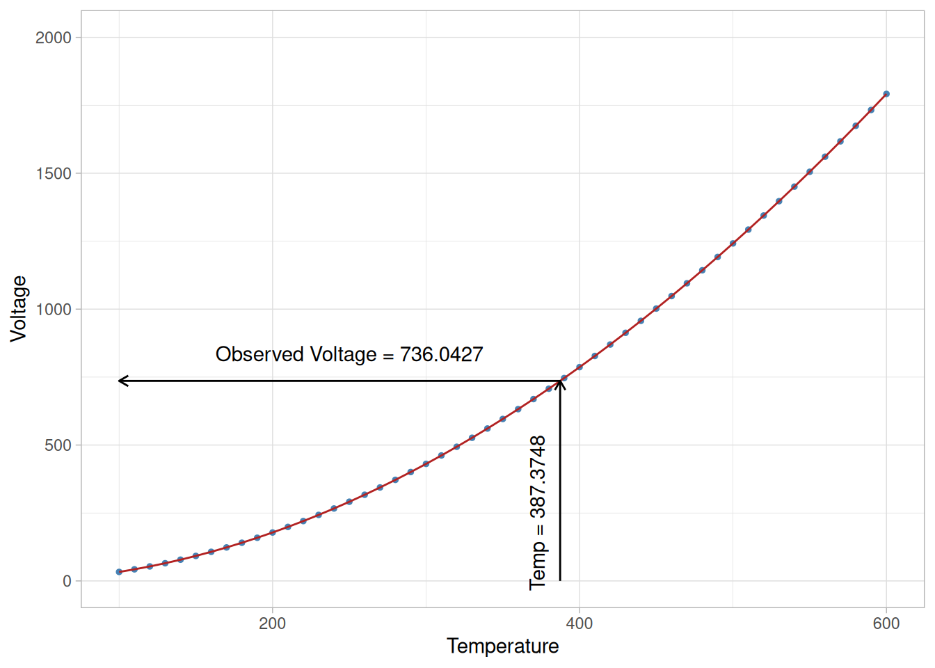
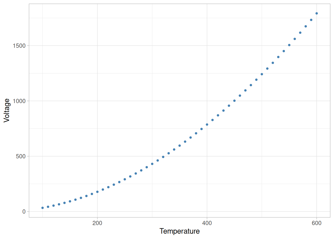
Thermocouples are a common type of temperature measurement device that is often more practical than a thermometer for temperature assessment. Thermocouples measure temperature in terms of voltage, however, rather than directly on a temperature scale. In addition, the response of a particular thermocouple depends on the exact formulation of the metals used to construct it, meaning two thermocouples will respond somewhat differently under identical measurement conditions. As a result, thermocouples need to be calibrated to produce interpretable measurement information. The calibration curve for a thermocouple is often constructed by comparing thermocouple output to relatively precise thermometer data. Then, when a new temperature is measured with the thermocouple, the voltage is converted to temperature terms by plugging the observed voltage into the regression equation and solving for temperature. The reader can download the thermocouple data as a text file.
The plot below shows a calibration curve for a thermocouple fit with a locally quadratic model using a method called LOESS. Traditionally, complicated, high-degree polynomial models have been used for thermocouple calibration, but locally linear or quadratic models offer better computational stability and more flexibility. With the locally quadratic model the solution of the regression equation for temperature is done numerically rather than analytically, but the concept of calibration is identical regardless of which type of model is used. It is important to note that the thermocouple measurements, made on the secondary measurement scale, are treated as the response variable and the more precise thermometer results, on the primary scale, are treated as the predictor variable because this best satisfies the underlying assumptions of the analysis.
Code
library(tidyverse)clb1 <-read_table( here::here("datasets", "CLB1.DAT"),skip =25,col_names =c("temperature", "voltage", "pred_nist"),col_types ="ddd")# span = 0.3 reproduces NIST's own PRED column to within numerical noise (< 0.001)clb1_fit <-loess(voltage ~ temperature, data = clb1, degree =2, span =0.3, family ="gaussian")clb1 <- clb1 |>mutate(fitted =predict(clb1_fit))# invert the loess fit to recover temperature from a new voltage observationinvert_loess <-function(voltage, fit, interval =c(100, 600)) {uniroot(\(t) predict(fit, newdata =data.frame(temperature = t)) - voltage, interval)$root}target_temperature <-387.3748new_voltage <-predict(clb1_fit, newdata =data.frame(temperature = target_temperature))ggplot(clb1, aes(temperature, voltage)) +geom_point(color ="steelblue", size =1) +geom_line(aes(y = fitted), color ="firebrick") +annotate("segment",x = target_temperature, xend =100, y = new_voltage, yend = new_voltage,arrow =arrow(length =unit(0.2, "cm")) ) +annotate("segment",x = target_temperature, xend = target_temperature, y =0, yend = new_voltage,arrow =arrow(length =unit(0.2, "cm")) ) +annotate("text", x =250, y = new_voltage +100, label =paste("Observed Voltage =", round(new_voltage, 4))) +annotate("text", x = target_temperature -15, y =250, label =paste("Temp =", round(target_temperature, 4)), angle =90) +scale_x_continuous(limits =c(100, 600)) +scale_y_continuous(limits =c(0, 2000)) +labs(x ="Temperature", y ="Voltage") +theme_light()
Figure 4.5: LOESS calibration curve for a thermocouple, with a new voltage observation calibrated to a temperature
Repeated Experiment
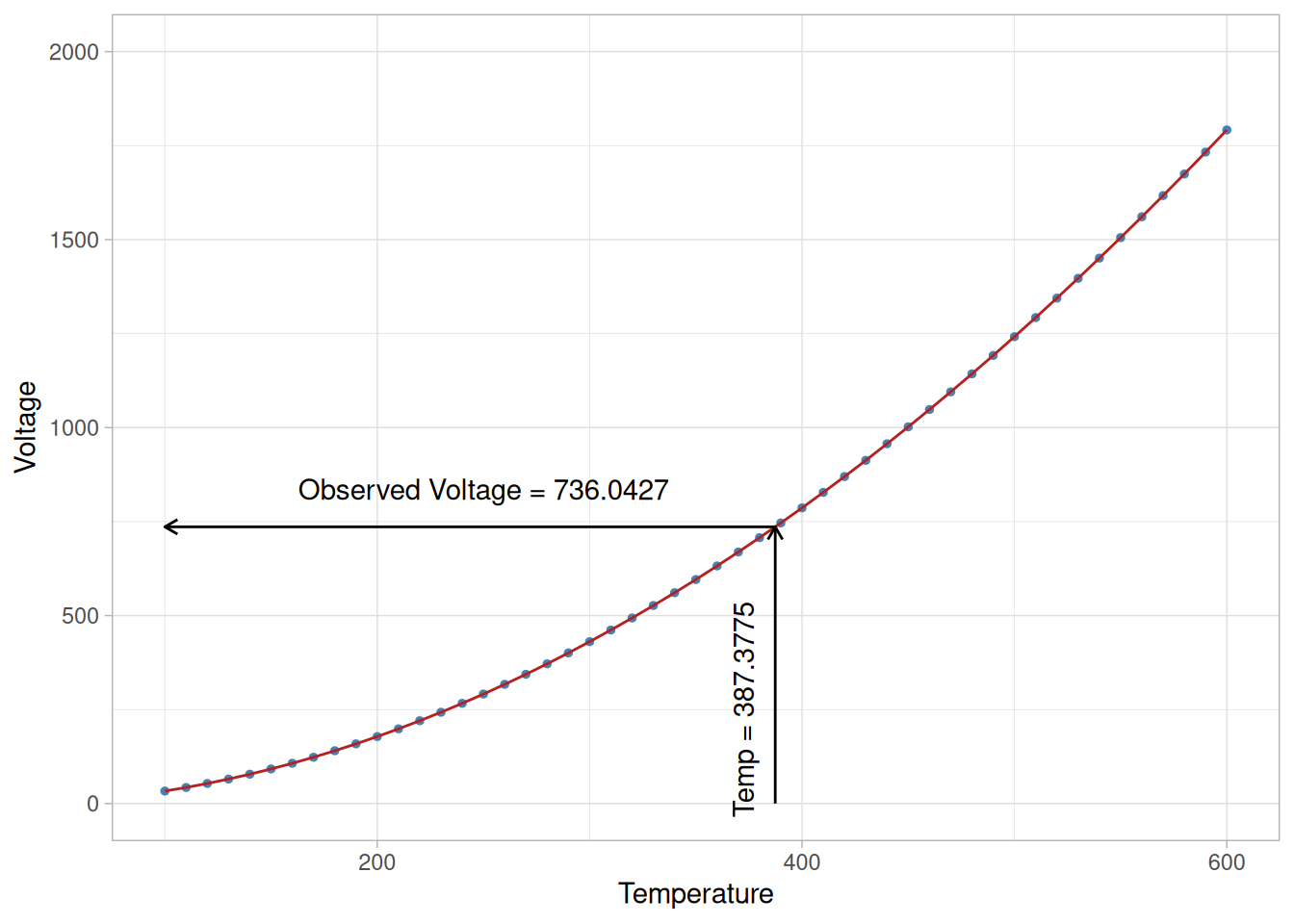
Just as in estimation or prediction, if the calibration experiment were repeated, the results would vary slightly due to the randomness in the data and the need to sample a limited amount of data from the process. This means that an uncertainty statement that quantifies how much the results of a particular calibration could vary due to randomness is necessary. The plot below shows what would happen if the thermocouple calibration were repeated under conditions identical to the first experiment: calibrating the exact same voltage observation against the repeated experiment’s own fitted curve recovers a slightly different temperature. The reader can download the data for the repeated thermocouple experiment as a text file.
Code
clb2 <-read_table( here::here("datasets", "CLB2.DAT"),skip =25,col_names =c("temperature", "voltage", "pred_nist"),col_types ="ddd")clb2_fit <-loess(voltage ~ temperature, data = clb2, degree =2, span =0.3, family ="gaussian")clb2 <- clb2 |>mutate(fitted =predict(clb2_fit))target_temperature_repeated <-invert_loess(new_voltage, clb2_fit)ggplot(clb2, aes(temperature, voltage)) +geom_point(color ="steelblue", size =1) +geom_line(aes(y = fitted), color ="firebrick") +annotate("segment",x = target_temperature_repeated, xend =100, y = new_voltage, yend = new_voltage,arrow =arrow(length =unit(0.2, "cm")) ) +annotate("segment",x = target_temperature_repeated, xend = target_temperature_repeated, y =0, yend = new_voltage,arrow =arrow(length =unit(0.2, "cm")) ) +annotate("text", x =250, y = new_voltage +100, label =paste("Observed Voltage =", round(new_voltage, 4))) +annotate("text", x = target_temperature_repeated -15, y =250, label =paste("Temp =", round(target_temperature_repeated, 4)), angle =90) +scale_x_continuous(limits =c(100, 600)) +scale_y_continuous(limits =c(0, 2000)) +labs(x ="Temperature", y ="Voltage") +theme_light()
Figure 4.6: LOESS calibration curve for the repeated thermocouple experiment, calibrating the same voltage observation
The same voltage measurement calibrates to 387.3748 degrees using the first experiment’s curve, but to 387.3775 degrees using the repeated experiment’s curve – a small difference driven entirely by the noise in each experiment’s calibration data.
Calibration Uncertainty
Again, as with prediction, the data used to fit the process model can also be used to determine the uncertainty in the calibration. Both the variation in the estimated model parameters and in the new voltage observation need to be accounted for. This is similar to uncertainty for the prediction of a new measurement. In fact, calibration intervals are computed by solving for the predictor variable value in the formulas for a prediction interval end points. NIST’s original figure for this calculation (a zoomed-in view of the calibration curve around the target point) shows a 99% calibration interval of 387.3748 ± 0.0307 degrees Celsius for the original calibration data used in the first plot on this page.
NIST’s own prose on this page states the calibration interval as “387.3748 ± 0.307” degrees Celsius, but the original figure that accompanies that calculation (a zoomed-in plot of the calibration curve around the target point) actually shows “± 0.0307” – apparently a dropped leading zero in the prose. Our calibration-interval half-width, computed by inverting the LOESS prediction interval through the local derivative of the fitted curve (the delta method), comes out to about 0.031, matching the figure’s 0.0307 rather than the prose’s 0.307.
In almost all calibration applications the ultimate quantity of interest is the true value of the primary-scale measurement method associated with a measurement made on the secondary scale. As a result, there are no analogs of the prediction interval or tolerance interval in calibration.
More Info
More information on the construction and interpretation of calibration intervals can be found in Section 4.5.2 of this chapter. There is also more information on calibration, especially “one-point” calibrations and other special cases, in the calibration section of the Measurement Process Characterization chapter.
4.1.3.4 Optimization
More on Optimization
As mentioned earlier, the goal of optimization is to determine the necessary process input values to obtain a desired output. Like calibration, optimization involves substitution of an output value for the response variable and solving for the associated predictor variable values. The process model is again the link that ties the inputs and output together. Unlike calibration and prediction, however, successful optimization requires a cause-and-effect relationship between the predictors and the response variable. Designed experiments, run in a randomized order, must be used to ensure that the process model represents a cause-and-effect relationship between the variables. Quadratic models are typically used, along with standard calculus techniques for finding minimums and maximums, to carry out an optimization.
Example
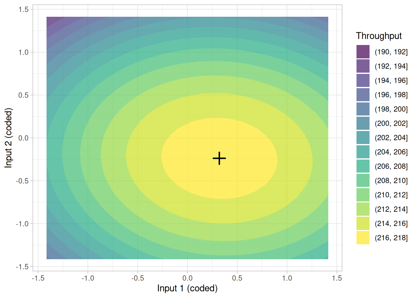
In a manufacturing process that requires a chemical reaction to take place, the temperature and pressure under which the process is carried out can affect reaction time. To maximize the throughput of this process, an optimization experiment was carried out in the neighborhood of the conditions felt to be best, using a central composite design with 13 runs. Calculus was used to determine the input values associated with local extremes in the regression function. The plot below shows the quadratic surface that was fit to the data and conceptually how the input values associated with the maximum throughput are found.
Note
NIST’s original example used a real central composite design without a downloadable dataset. The design and response below are illustrative, generated with set.seed(), using a coded 2-factor central composite design (13 runs: 4 factorial points, 4 axial points, 5 center points) and a quadratic response surface tuned to produce a maximum throughput close to NIST’s stated ~217 units/hour.
Figure 4.7: Quadratic response surface fit to a central composite design (illustrative data)
Of course, as with prediction and calibration, randomness in the data and the need to sample data from the process affect the results. If the optimization experiment were carried out again under identical conditions, the optimal input values computed using the model would be slightly different. Thus, it is important to understand how much random variability there is in the results in order to interpret the results correctly.
Optimization Uncertainty
As with prediction and calibration, the uncertainty in the input values estimated to maximize throughput can also be computed from the data used to fit the model. Unlike prediction or calibration, however, optimization almost always involves simultaneous estimation of several quantities, the values of the process inputs. As a result, we compute a joint confidence region for all of the input values, rather than separate uncertainty intervals for each input. This confidence region contains the complete set of true process inputs that will maximize throughput with high probability. NIST’s original text estimates a throughput of approximately 217 units/hour within the 95% joint confidence region for the two process inputs.
Code
optimum_point
More Info
Computational details for optimization are primarily presented in the Process Improvement chapter along with material on appropriate experimental designs for optimization. Section 5.5.3 of that chapter specifically focuses on optimization methods and their associated uncertainties.
4.1.4 What are some of the different statistical methods for model building?
Selecting an Appropriate Stat Method: General Case
For many types of data analysis problems there are no more than a couple of general approaches to be considered on the route to the problem’s solution. For example, there is often a dichotomy between highly-efficient methods appropriate for data with noise from a normal distribution and more general methods for data with other types of noise. Within the different approaches for a specific problem type, there are usually at most a few competing statistical tools that can be used to obtain an appropriate solution. The bottom line for most types of data analysis problems is that selection of the best statistical method to solve the problem is largely determined by the goal of the analysis and the nature of the data.
Selecting an Appropriate Stat Method: Modeling
Model building, however, is different from most other areas of statistics with regard to method selection. There are more general approaches and more competing techniques available for model building than for most other types of problems. There is often more than one statistical tool that can be effectively applied to a given modeling application. The large menu of methods applicable to modeling problems means that there is both more opportunity for effective and efficient solutions and more potential to spend time doing different analyses, comparing different solutions and mastering the use of different tools. The remainder of this section will introduce and briefly discuss some of the most popular and well-established statistical techniques that are useful for different model building situations.
Linear least squares regression is by far the most widely used modeling method. It is what most people mean when they say they have used “regression”, “linear regression” or “least squares” to fit a model to their data. Not only is linear least squares regression the most widely used modeling method, but it has been adapted to a broad range of situations that are outside its direct scope. It plays a strong underlying role in many other modeling methods, including the other methods discussed in this section: nonlinear least squares regression, weighted least squares regression and LOESS.
Definition of a Linear Least Squares Model
Used directly, with an appropriate data set, linear least squares regression can be used to fit the data with any function of the form
each explanatory variable in the function is multiplied by an unknown parameter,
there is at most one unknown parameter with no corresponding explanatory variable, and
all of the individual terms are summed to produce the final function value.
In statistical terms, any function that meets these criteria would be called a “linear function”. The term “linear” is used, even though the function may not be a straight line, because if the unknown parameters are considered to be variables and the explanatory variables are considered to be known coefficients corresponding to those “variables”, then the problem becomes a system (usually overdetermined) of linear equations that can be solved for the values of the unknown parameters. To differentiate the various meanings of the word “linear”, the linear models being discussed here are often said to be “linear in the parameters” or “statistically linear”.
Why “Least Squares”?
Linear least squares regression also gets its name from the way the estimates of the unknown parameters are computed. The “method of least squares” that is used to obtain parameter estimates was independently developed in the late 1700’s and the early 1800’s by the mathematicians Karl Friedrich Gauss, Adrien Marie Legendre and (possibly) Robert Adrain (Stigler 1978, 1986; Harter 1983) working in Germany, France and America, respectively. In the least squares method the unknown parameters are estimated by minimizing the sum of the squared deviations between the data and the model. The minimization process reduces the overdetermined system of equations formed by the data to a sensible system of \(p\) (where \(p\) is the number of parameters in the functional part of the model) equations in \(p\) unknowns. This new system of equations is then solved to obtain the parameter estimates. To learn more about how the method of least squares is used to estimate the parameters, see Section 4.4.3.1.
Examples of Linear Functions
As just mentioned above, linear models are not limited to being straight lines or planes, but include a fairly wide range of shapes. For example, a simple quadratic curve,
is also linear in the statistical sense because they are linear in the parameters, though not with respect to the observed explanatory variable, \(x\).
Nonlinear Model Example
Just as models that are linear in the statistical sense do not have to be linear with respect to the explanatory variables, nonlinear models can be linear with respect to the explanatory variables, but not with respect to the parameters. For example,
\[f(x;\vec{\beta}) = \beta_0 + \beta_0\beta_1x\]
is linear in \(x\), but it cannot be written in the general form of a linear model presented above. This is because the slope of this line is expressed as the product of two parameters. As a result, nonlinear least squares regression could be used to fit this model, but linear least squares cannot be used. For further examples and discussion of nonlinear models see the next section, Section 4.1.4.2.
Advantages of Linear Least Squares
Linear least squares regression has earned its place as the primary tool for process modeling because of its effectiveness and completeness.
Though there are types of data that are better described by functions that are nonlinear in the parameters, many processes in science and engineering are well-described by linear models. This is because either the processes are inherently linear or because, over short ranges, any process can be well-approximated by a linear model.
The estimates of the unknown parameters obtained from linear least squares regression are the optimal estimates from a broad class of possible parameter estimates under the usual assumptions used for process modeling. Practically speaking, linear least squares regression makes very efficient use of the data. Good results can be obtained with relatively small data sets.
Finally, the theory associated with linear regression is well-understood and allows for construction of different types of easily-interpretable statistical intervals for predictions, calibrations, and optimizations. These statistical intervals can then be used to give clear answers to scientific and engineering questions.
Disadvantages of Linear Least Squares
The main disadvantages of linear least squares are limitations in the shapes that linear models can assume over long ranges, possibly poor extrapolation properties, and sensitivity to outliers.
Linear models with nonlinear terms in the predictor variables curve relatively slowly, so for inherently nonlinear processes it becomes increasingly difficult to find a linear model that fits the data well as the range of the data increases. As the explanatory variables become extreme, the output of the linear model will also always become more extreme. This means that linear models may not be effective for extrapolating the results of a process for which data cannot be collected in the region of interest. Of course extrapolation is potentially dangerous regardless of the model type.
Finally, while the method of least squares often gives optimal estimates of the unknown parameters, it is very sensitive to the presence of unusual data points in the data used to fit a model. One or two outliers can sometimes seriously skew the results of a least squares analysis. This makes model validation, especially with respect to outliers, critical to obtaining sound answers to the questions motivating the construction of the model.
4.1.4.2 Nonlinear Least Squares Regression
Extension of Linear Least Squares Regression
Nonlinear least squares regression extends linear least squares regression for use with a much larger and more general class of functions. Almost any function that can be written in closed form can be incorporated in a nonlinear regression model. Unlike linear regression, there are very few limitations on the way parameters can be used in the functional part of a nonlinear regression model. The way in which the unknown parameters in the function are estimated, however, is conceptually the same as it is in linear least squares regression.
Definition of a Nonlinear Regression Model
As the name suggests, a nonlinear model is any model of the basic form,
\[y = f(\vec{x};\vec{\beta}) + \varepsilon \, ,\]
in which
the functional part of the model is notlinear with respect to the unknown parameters, \(\beta_0, \beta_1, \ldots\), and
Due to the way in which the unknown parameters of the function are usually estimated, however, it is often much easier to work with models that meet two additional criteria:
the function is smooth with respect to the unknown parameters, and
the least squares criterion that is used to obtain the parameter estimates has a unique solution.
These last two criteria are not essential parts of the definition of a nonlinear least squares model, but are of practical importance.
The biggest advantage of nonlinear least squares regression over many other techniques is the broad range of functions that can be fit. Although many scientific and engineering processes can be described well using linear models, or other relatively simple types of models, there are many other processes that are inherently nonlinear. For example, the strengthening of concrete as it cures is a nonlinear process. Research on concrete strength shows that the strength increases quickly at first and then levels off, or approaches an asymptote in mathematical terms, over time. Linear models do not describe processes that asymptote very well because for all linear functions the function value can’t increase or decrease at a declining rate as the explanatory variables go to the extremes. There are many types of nonlinear models, on the other hand, that describe the asymptotic behavior of a process well. Like the asymptotic behavior of some processes, other features of physical processes can often be expressed more easily using nonlinear models than with simpler model types.
Being a “least squares” procedure, nonlinear least squares has some of the same advantages (and disadvantages) that linear least squares regression has over other methods. One common advantage is efficient use of data. Nonlinear regression can produce good estimates of the unknown parameters in the model with relatively small data sets. Another advantage that nonlinear least squares shares with linear least squares is a fairly well-developed theory for computing confidence, prediction and calibration intervals to answer scientific and engineering questions. In most cases the probabilistic interpretation of the intervals produced by nonlinear regression are only approximately correct, but these intervals still work very well in practice.
Disadvantages of Nonlinear Least Squares
The major cost of moving to nonlinear least squares regression from simpler modeling techniques like linear least squares is the need to use iterative optimization procedures to compute the parameter estimates. With functions that are linear in the parameters, the least squares estimates of the parameters can always be obtained analytically, while that is generally not the case with nonlinear models. The use of iterative procedures requires the user to provide starting values for the unknown parameters before the software can begin the optimization. The starting values must be reasonably close to the as yet unknown parameter estimates or the optimization procedure may not converge. Bad starting values can also cause the software to converge to a local minimum rather than the global minimum that defines the least squares estimates.
Disadvantages shared with the linear least squares procedure includes a strong sensitivity to outliers. Just as in a linear least squares analysis, the presence of one or two outliers in the data can seriously affect the results of a nonlinear analysis. In addition there are unfortunately fewer model validation tools for the detection of outliers in nonlinear regression than there are for linear regression.
4.1.4.3 Weighted Least Squares Regression
Handles Cases Where Data Quality Varies
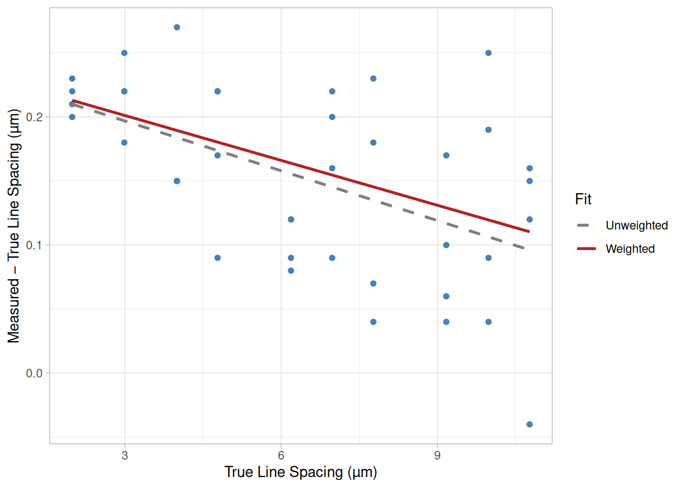
One of the common assumptions underlying most process modeling methods, including linear and nonlinear least squares regression, is that each data point provides equally precise information about the deterministic part of the total process variation. In other words, the standard deviation of the error term is constant over all values of the predictor or explanatory variables. This assumption, however, clearly does not hold, even approximately, in every modeling application. For example, in the semiconductor photomask line-spacing data shown below, it appears that the precision of the line-spacing measurements decreases as the line spacing increases. In situations like this, when it may not be reasonable to assume that every observation should be treated equally, weighted least squares can often be used to maximize the efficiency of parameter estimation. This is done by attempting to give each data point its proper amount of influence over the parameter estimates. A procedure that treats all of the data equally would give less precisely measured points more influence than they should have and would give highly precise points too little influence.
Line-Spacing Measurement Error Data
The reader can download the line-spacing measurement data as a text file.
Code
library(tidyverse)lnspcg <-read_table( here::here("datasets", "LNSPCG.DAT"),skip =25,col_names =c("nbs_value", "observed_value", "difference", "fitted_value", "deviation"),col_types ="ddddd") |>mutate(site =as_factor(rep(letters[1:4], each =10)))# the four line-spacing sites show different amounts of scatter, so weight# each observation by the inverse variance of its own sitesite_variance <- lnspcg |>group_by(site) |>summarise(site_var =var(difference))lnspcg <- lnspcg |>left_join(site_variance, by ="site")ggplot(lnspcg, aes(nbs_value, difference)) +geom_point(color ="steelblue") +geom_smooth(aes(color ="Unweighted", weight =NULL),method ="lm", formula = y ~ x, se =FALSE, linetype ="dashed" ) +geom_smooth(aes(weight =1/ site_var, color ="Weighted"),method ="lm", formula = y ~ x, se =FALSE ) +scale_color_manual(values =c(Unweighted ="grey50", Weighted ="firebrick")) +labs(x ="True Line Spacing (µm)", y ="Measured − True Line Spacing (µm)",color ="Fit" ) +theme_light()
Figure 4.8: True line spacing versus measured minus true line spacing (micrometers), with an unweighted and a weighted least squares fit, photomask line-spacing calibration data
The four measurement sites (a through d) show noticeably different amounts of scatter around the trend, so treating every observation as equally precise, as the dashed unweighted fit does, gives the noisier sites the same influence over the fitted line as the more precise ones. Weighting each observation by the inverse of its site’s variance, \(1/\hat\sigma^2_{\text{site}}\), lets the more precise sites pull the fit toward themselves, producing the solid weighted line shown above.
Model Types and Weighted Least Squares
Unlike linear and nonlinear least squares regression, weighted least squares regression is not associated with a particular type of function used to describe the relationship between the process variables. Instead, weighted least squares reflects the behavior of the random errors in the model; and it can be used with functions that are either linear or nonlinear in the parameters. It works by incorporating extra nonnegative constants, or weights, associated with each data point, into the fitting criterion. The size of the weight indicates the precision of the information contained in the associated observation. Optimizing the weighted fitting criterion to find the parameter estimates allows the weights to determine the contribution of each observation to the final parameter estimates. It is important to note that the weight for each observation is given relative to the weights of the other observations; so different sets of absolute weights can have identical effects.
Advantages of Weighted Least Squares
Like all of the least squares methods discussed so far, weighted least squares is an efficient method that makes good use of small data sets. It also shares the ability to provide different types of easily interpretable statistical intervals for estimation, prediction, calibration and optimization. In addition, as discussed above, the main advantage that weighted least squares enjoys over other methods is the ability to handle regression situations in which the data points are of varying quality. If the standard deviation of the random errors in the data is not constant across all levels of the explanatory variables, using weighted least squares with weights that are inversely proportional to the variance at each level of the explanatory variables yields the most precise parameter estimates possible.
Disadvantages of Weighted Least Squares
The biggest disadvantage of weighted least squares, which many people are not aware of, is probably the fact that the theory behind this method is based on the assumption that the weights are known exactly. This is almost never the case in real applications, of course, so estimated weights must be used instead. The effect of using estimated weights is difficult to assess, but experience indicates that small variations in the weights due to estimation do not often affect a regression analysis or its interpretation. However, when the weights are estimated from small numbers of replicated observations, the results of an analysis can be very badly and unpredictably affected. This is especially likely to be the case when the weights for extreme values of the predictor or explanatory variables are estimated using only a few observations. It is important to remain aware of this potential problem, and to only use weighted least squares when the weights can be estimated precisely relative to one another (Carroll and Ruppert 1988; Ryan 1997).
Weighted least squares regression, like the other least squares methods, is also sensitive to the effects of outliers. If potential outliers are not investigated and dealt with appropriately, they will likely have a negative impact on the parameter estimation and other aspects of a weighted least squares analysis. If a weighted least squares regression actually increases the influence of an outlier, the results of the analysis may be far inferior to an unweighted least squares analysis.
Further Information
Further information on the weighted least squares fitting criterion can be found in Section 4.4.3.2. Discussion of methods for weight estimation can be found in Section 4.4.5.2.
4.1.4.4 LOESS (aka LOWESS)
Useful When \(f(\vec{x};\vec{\beta})\) Unknown and Complicated
LOESS is one of many “modern” modeling methods that build on “classical” methods, such as linear and nonlinear least squares regression. Modern regression methods are designed to address situations in which the classical procedures do not perform well or cannot be effectively applied without undue labor. LOESS combines much of the simplicity of linear least squares regression with the flexibility of nonlinear regression. It does this by fitting simple models to localized subsets of the data to build up a function that describes the deterministic part of the variation in the data, point by point. In fact, one of the chief attractions of this method is that the data analyst is not required to specify a global function of any form to fit a model to the data, only to fit segments of the data.
The trade-off for these features is increased computation. Because it is so computationally intensive, LOESS would have been practically impossible to use in the era when least squares regression was being developed. Most other modern methods for process modeling are similar to LOESS in this respect. These methods have been consciously designed to use our current computational ability to the fullest possible advantage to achieve goals not easily achieved by traditional approaches.
Definition of a LOESS Model
LOESS, originally proposed by (Cleveland 1979) and further developed by (Cleveland and Devlin 1988), specifically denotes a method that is (somewhat) more descriptively known as locally weighted polynomial regression. At each point in the data set a low-degree polynomial is fit to a subset of the data, with explanatory variable values near the point whose response is being estimated. The polynomial is fit using weighted least squares, giving more weight to points near the point whose response is being estimated and less weight to points further away. The value of the regression function for the point is then obtained by evaluating the local polynomial using the explanatory variable values for that data point. The LOESS fit is complete after regression function values have been computed for each of the \(n\) data points. Many of the details of this method, such as the degree of the polynomial model and the weights, are flexible. The range of choices for each part of the method and typical defaults are briefly discussed next.
Localized Subsets of Data
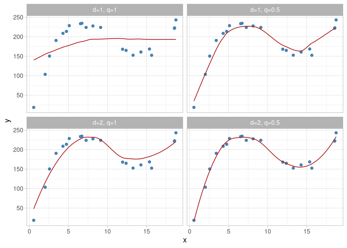
The subsets of data used for each weighted least squares fit in LOESS are determined by a nearest neighbors algorithm. A user-specified input to the procedure called the “bandwidth” or “smoothing parameter” determines how much of the data is used to fit each local polynomial. The smoothing parameter, \(q\), is a number between \((d+1)/n\) and \(1\), with \(d\) denoting the degree of the local polynomial. The value of \(q\) is the proportion of data used in each fit. The subset of data used in each weighted least squares fit is comprised of the \(nq\) (rounded to the next largest integer) points whose explanatory variable values are closest to the point at which the response is being estimated.
\(q\) is called the smoothing parameter because it controls the flexibility of the LOESS regression function. Large values of \(q\) produce the smoothest functions that wiggle the least in response to fluctuations in the data. The smaller \(q\) is, the closer the regression function will conform to the data. Using too small a value of the smoothing parameter is not desirable, however, since the regression function will eventually start to capture the random error in the data. Useful values of the smoothing parameter typically lie in the range 0.25 to 0.5 for most LOESS applications. In R, this smoothing parameter is the span argument to loess() – the thermocouple calibration example used span = 0.3, near the lower end of that typical range.
Degree of Local Polynomials
The local polynomials fit to each subset of the data are almost always of first or second degree; that is, either locally linear (in the straight line sense) or locally quadratic. Using a zero degree polynomial turns LOESS into a weighted moving average. Such a simple local model might work well for some situations, but may not always approximate the underlying function well enough. Higher-degree polynomials would work in theory, but yield models that are not really in the spirit of LOESS. LOESS is based on the ideas that any function can be well approximated in a small neighborhood by a low-order polynomial and that simple models can be fit to data easily. High-degree polynomials would tend to overfit the data in each subset and are numerically unstable, making accurate computations difficult.
Weight Function
As mentioned above, the weight function gives the most weight to the data points nearest the point of estimation and the least weight to the data points that are furthest away. The use of the weights is based on the idea that points near each other in the explanatory variable space are more likely to be related to each other in a simple way than points that are further apart. Following this logic, points that are likely to follow the local model best influence the local model parameter estimates the most. Points that are less likely to actually conform to the local model have less influence on the local model parameter estimates.
The traditional weight function used for LOESS is the tri-cube weight function,
However, any other weight function that satisfies the properties listed in (Cleveland 1979) could also be used. The weight for a specific point in any localized subset of data is obtained by evaluating the weight function at the distance between that point and the point of estimation, after scaling the distance so that the maximum absolute distance over all of the points in the subset of data is exactly one.
Example
A realistic example, showing a LOESS model used for thermocouple calibration, can be found in Section 4.1.3.3.
Advantages of LOESS
As discussed above, the biggest advantage LOESS has over many other methods is the fact that it does not require the specification of a function to fit a model to all of the data in the sample. Instead the analyst only has to provide a smoothing parameter value and the degree of the local polynomial. In addition, LOESS is very flexible, making it ideal for modeling complex processes for which no theoretical models exist. These two advantages, combined with the simplicity of the method, make LOESS one of the most attractive of the modern regression methods for applications that fit the general framework of least squares regression but which have a complex deterministic structure.
Although it is less obvious than for some of the other methods related to linear least squares regression, LOESS also accrues most of the benefits typically shared by those procedures. The most important of those is the theory for computing uncertainties for prediction and calibration. Many other tests and procedures used for validation of least squares models can also be extended to LOESS models.
Disadvantages of LOESS
Although LOESS does share many of the best features of other least squares methods, efficient use of data is one advantage that LOESS doesn’t share. LOESS requires fairly large, densely sampled data sets in order to produce good models. This is not really surprising, however, since LOESS needs good empirical information on the local structure of the process in order to perform the local fitting. In fact, given the results it provides, LOESS could arguably be more efficient overall than other methods like nonlinear least squares. It may simply frontload the costs of an experiment in data collection but then reduce analysis costs.
Another disadvantage of LOESS is the fact that it does not produce a regression function that is easily represented by a mathematical formula. This can make it difficult to transfer the results of an analysis to other people. In order to transfer the regression function to another person, they would need the data set and software for LOESS calculations. In nonlinear regression, on the other hand, it is only necessary to write down a functional form in order to provide estimates of the unknown parameters and the estimated uncertainty. Depending on the application, this could be either a major or a minor drawback to using LOESS.
Finally, as discussed above, LOESS is a computationally intensive method. This is not usually a problem in our current computing environment, however, unless the data sets being used are very large. LOESS is also prone to the effects of outliers in the data set, like other least squares methods. There is an iterative, robust version of LOESS (Cleveland 1979) that can be used to reduce LOESS’ sensitivity to outliers, but extreme outliers can still overcome even the robust method.
4.2 Underlying Assumptions for Process Modeling
Implicit Assumptions Underlie Most Actions
Most, if not all, thoughtful actions that people take are based on ideas, or assumptions, about how those actions will affect the goals they want to achieve. The actual assumptions used to decide on a particular course of action are rarely laid out explicitly, however. Instead, they are only implied by the nature of the action itself. Implicit assumptions are inherent to process modeling actions, just as they are to most other types of action. It is important to understand what the implicit assumptions are for any process modeling method because the validity of these assumptions affect whether or not the goals of the analysis will be met.
Checking Assumptions Provides Feedback on Actions
If the implicit assumptions that underlie a particular action are not true, then that action is not likely to meet expectations either. Sometimes it is abundantly clear when a goal has been met, but unfortunately that is not always the case. In particular, it is usually not possible to obtain immediate feedback on the attainment of goals in most process modeling applications. The goals of process modeling, such as answering a scientific or engineering question, depend on the correctness of a process model, which can often only be directly and absolutely determined over time. In lieu of immediate, direct feedback, however, indirect information on the effectiveness of a process modeling analysis can be obtained by checking the validity of the underlying assumptions. Confirming that the underlying assumptions are valid helps ensure that the methods of analysis were appropriate and that the results will be consistent with the goals.
Overview of Section 4.2
This section discusses the specific underlying assumptions associated with most model-fitting methods. In discussing the underlying assumptions, some background is also provided on the consequences of stopping the modeling process short of completion and leaving the results of an analysis at odds with the underlying assumptions. Specific data analysis methods that can be used to check whether or not the assumptions hold in a particular case are discussed in Section 4.4.4.
4.2.1 What are the typical underlying assumptions in process modeling?
Overview of Section 4.2.1
This section lists the typical assumptions underlying most process modeling methods. On each of the following pages, one of the six major assumptions is described individually; the reasons for its importance are also briefly discussed; and any methods that are not subject to that particular assumption are noted. As discussed on the previous page, these are implicit assumptions based on properties inherent to the process modeling methods themselves. Successful use of these methods in any particular application hinges on the validity of the underlying assumptions, whether their existence is acknowledged or not. Section 4.4.4 discusses methods for checking the validity of these assumptions.
The most basic assumption inherent to all statistical methods for process modeling is that the process to be described is actually a statistical process. This assumption seems so obvious that it is sometimes overlooked by analysts immersed in the details of a process or in a rush to uncover information of interest from an exciting new data set. However, in order to successfully model a process using statistical methods, it must include random variation. Random variation is what makes the process statistical rather than purely deterministic.
Role of Random Variation
The overall goal of all statistical procedures, including those designed for process modeling, is to enable valid conclusions to be drawn from noisy data. As a result, statistical procedures are designed to compare apparent effects found in a data set to the noise in the data in order to determine whether the effects are more likely to be caused by a repeatable underlying phenomenon of some sort or by fluctuations in the data that happened by chance. Thus the random variation in the process serves as a baseline for drawing conclusions about the nature of the deterministic part of the process. If there were no random noise in the process, then conclusions based on statistical methods would no longer make sense or be appropriate.
This Assumption Usually Valid
Fortunately this assumption is valid for most physical processes. There will be random error in the measurements almost any time things need to be measured. In fact, there are often other sources of random error, over and above measurement error, in complex, real-life processes. However, examples of non-statistical processes include
physical processes in which the random error is negligible compared to the systematic errors,
processes based on deterministic computer simulations,
processes based on theoretical calculations.
If models of these types of processes are needed, use of mathematical rather than statistical process modeling tools would be more appropriate.
Distinguishing Process Types
One sure indicator that a process is statistical is if repeated observations of the process response under a particular fixed condition yields different results. The converse, repeated observations of the process response always yielding the same value, is not a sure indication of a non-statistical process, however. For example, in some types of computations in which complex numerical methods are used to approximate the solutions of theoretical equations, the results of a computation might deviate from the true solution in an essentially random way because of the interactions of round-off errors, multiple levels of approximation, stopping rules, and other sources of error. Even so, the result of the computation might be the same each time it is repeated because all of the initial conditions of the calculation are reset to the same values each time the calculation is made. As a result, scientific or engineering knowledge of the process must also always be used to determine whether or not a given process is statistical.
4.2.1.2 The means of the random errors are zero.
Parameter Estimation Requires Known Relationship Between Data and Regression Function
To be able to estimate the unknown parameters in the regression function, it is necessary to know how the data at each point in the explanatory variable space relate to the corresponding value of the regression function. For example, if the measurement system used to observe the values of the response variable drifts over time, then the deterministic variation in the data would be the sum of the drift function and the true regression function. As a result, either the data would need to be adjusted prior to fitting the model or the fitted model would need to be adjusted after the fact to obtain the regression function. In either case, information about the form of the drift function would be needed. Since it would be difficult to generalize an activity like drift correction to a generic process, and since it would also be unnecessary for many processes, most process modeling methods rely on having data in which the observed responses are directly equal, on average, to the regression function values. Another way of expressing this idea is to say the mean of the random errors at each combination of explanatory variable values is zero.
Validity of Assumption Improved by Experimental Design
The validity of this assumption is determined by both the nature of the process and, to some extent, by the data collection methods used. The process may be one in which the data are easily measured and it will be clear that the data have a direct relationship to the regression function. When this is the case, use of optimal methods of data collection are not critical to the success of the modeling effort. Of course, it is rarely known that this will be the case for sure, so it is usually worth the effort to collect the data in the best way possible.
Other processes may be less easily dealt with, being subject to measurement drift or other systematic errors. For these processes it may be possible to eliminate or at least reduce the effects of the systematic errors by using good experimental design techniques, such as randomization of the measurement order. Randomization can effectively convert systematic measurement errors into additional random process error. While adding to the random error of the process is undesirable, this will provide the best possible information from the data about the regression function, which is the current goal.
In the most difficult processes even good experimental design may not be able to salvage a set of data that includes a high level of systematic error. In these situations the best that can be hoped for is recognition of the fact that the true regression function has not been identified by the analysis. Then effort can be put into finding a better way to solve the problem by correcting for the systematic error using additional information, redesigning the measurement system to eliminate the systematic errors, or reformulating the problem to obtain the needed information another way.
Assumption Violated by Errors in Observation of \(\vec{x}\)
Another more subtle violation of this assumption occurs when the explanatory variables are observed with random error. Although it intuitively seems like random errors in the explanatory variables should cancel out on average, just as random errors in the observation of the response variable do, that is unfortunately not the case. The direct linkage between the unknown parameters and the explanatory variables in the functional part of the model makes this situation much more complicated than it is for the random errors in the response variable. More information on why this occurs can be found in Section 4.2.1.6.
4.2.1.3 The random errors have a constant standard deviation.
All Data Treated Equally by Most Process Modeling Methods
Due to the presence of random variation, it can be difficult to determine whether or not all of the data in a data set are of equal quality. As a result, most process modeling procedures treat all of the data equally when using it to estimate the unknown parameters in the model. Most methods also use a single estimate of the amount of random variability in the data for computing prediction and calibration uncertainties. Treating all of the data in the same way also yields simpler, easier-to-use models. Not surprisingly, however, the decision to treat the data like this can have a negative effect on the quality of the resulting model too, if it turns out the data are not all of equal quality.
Data Quality Measured by Standard Deviation
Of course data quality can’t be measured point-by-point since it is clear from direct observation of the data that the amount of error in each point varies. Instead, points that have the same underlying average squared error, or variance, are considered to be of equal quality. Even though the specific process response values observed at points that meet this criterion will have different errors, the data collected at such points will be of equal quality over repeated data collections. Since the standard deviation of the data at each set of explanatory variable values is simply the square root of its variance, the standard deviation of the data for each different combination of explanatory variables can also be used to measure data quality. The standard deviation is preferred, in fact, because it has the advantage of being measured in the same units as the response variable, making it easier to relate to this statistic.
Assumption Not Needed for Weighted Least Squares
The assumption that the random errors have constant standard deviation is not implicit to weighted least squares regression. Instead, it is assumed that the weights provided in the analysis correctly indicate the differing levels of variability present in the response variables. The weights are then used to adjust the amount of influence each data point has on the estimates of the model parameters to an appropriate level. They are also used to adjust prediction and calibration uncertainties to the correct levels for different regions of the data set.
Assumption Does Apply to LOESS
Even though it uses weighted least squares to estimate the model parameters, LOESS still relies on the assumption of a constant standard deviation. The weights used in LOESS actually reflect the relative level of similarity between mean response values at neighboring points in the explanatory variable space rather than the level of response precision at each set of explanatory variable values. Actually, because LOESS uses separate parameter estimates in each localized subset of data, it does not require the assumption of a constant standard deviation of the data for parameter estimation. The subsets of data used in LOESS are usually small enough that the precision of the data is roughly constant within each subset. LOESS normally makes no provisions for adjusting uncertainty computations for differing levels of precision across a data set, however.
4.2.1.4 The random errors follow a normal distribution.
Primary Need for Distribution Information is Inference
After fitting a model to the data and validating it, scientific or engineering questions about the process are usually answered by computing statistical intervals for relevant process quantities using the model. These intervals give the range of plausible values for the process parameters based on the data and the underlying assumptions about the process. Because of the statistical nature of the process, however, the intervals cannot always be guaranteed to include the true process parameters and still be narrow enough to be useful. Instead the intervals have a probabilistic interpretation that guarantees coverage of the true process parameters a specified proportion of the time. In order for these intervals to truly have their specified probabilistic interpretations, the form of the distribution of the random errors must be known. Although the form of the probability distribution must be known, the parameters of the distribution can be estimated from the data.
Of course the random errors from different types of processes could be described by any one of a wide range of different probability distributions in general, including the uniform, triangular, double exponential, binomial and Poisson distributions. With most process modeling methods, however, inferences about the process are based on the idea that the random errors are drawn from a normal distribution. One reason this is done is because the normal distribution often describes the actual distribution of the random errors in real-world processes reasonably well. The normal distribution is also used because the mathematical theory behind it is well-developed and supports a broad array of inferences on functions of the data relevant to different types of questions about the process.
Non-Normal Random Errors May Result in Incorrect Inferences
Of course, if it turns out that the random errors in the process are not normally distributed, then any inferences made about the process may be incorrect. If the true distribution of the random errors is such that the scatter in the data is less than it would be under a normal distribution, it is possible that the intervals used to capture the values of the process parameters will simply be a little longer than necessary. The intervals will then contain the true process parameters more often than expected. It is more likely, however, that the intervals will be too short or will be shifted away from the true mean value of the process parameter being estimated. This will result in intervals that contain the true process parameters less often than expected. When this is the case, the intervals produced under the normal distribution assumption will likely lead to incorrect conclusions being drawn about the process.
Parameter Estimation Methods Can Require Gaussian Errors
The methods used for parameter estimation can also imply the assumption of normally distributed random errors. Some methods, like maximum likelihood, use the distribution of the random errors directly to obtain parameter estimates. Even methods that do not use distributional methods for parameter estimation directly, like least squares, often work best for data that are free from extreme random fluctuations. The normal distribution is one of the probability distributions in which extreme random errors are rare. If some other distribution actually describes the random errors better than the normal distribution does, then different parameter estimation methods might need to be used in order to obtain good estimates of the values of the unknown parameters in the model.
4.2.1.5 The data are randomly sampled from the process.
Data Must Reflect the Process
Since the random variation inherent in the process is critical to obtaining satisfactory results from most modeling methods, it is important that the data reflect that random variation in a representative way. Because of the nearly infinite number of ways non-representative sampling might be done, however, few, if any, statistical methods would ever be able to correct for the effects that would have on the data. Instead, these methods rely on the assumption that the data will be representative of the process. This means that if the variation in the data is not representative of the process, the nature of the deterministic part of the model, described by the function, \(f(\vec{x};\vec{\beta})\), will be incorrect. This, in turn, is likely to lead to incorrect conclusions being drawn when the model is used to answer scientific or engineering questions about the process.
Data Best Reflects the Process Via Unbiased Sampling
Given that we can never determine what the actual random errors in a particular data set are, representative samples of data are best obtained by randomly sampling data from the process. In a simple random sample, every response from the population(s) being sampled has an equal chance of being observed. As a result, while it cannot guarantee that each sample will be representative of the process, random sampling does ensure that the act of data collection does not leave behind any biases in the data, on average. This means that most of the time, over repeated samples, the data will be representative of the process. In addition, under random sampling, probability theory can be used to quantify how often particular modeling procedures will be affected by relatively extreme variations in the data, allowing us to control the error rates experienced when answering questions about the process.
This Assumption Relatively Controllable
Obtaining data is of course something that is actually done by the analyst rather than being a feature of the process itself. This gives the analyst some ability to ensure that this assumption will be valid. Paying careful attention to data collection procedures and employing experimental design principles like randomization of the run order will yield a sample of data that is as close as possible to being perfectly randomly sampled from the process. Section 4.3.3 has additional discussion of some of the principles of good experimental design.
4.2.1.6 The explanatory variables are observed without error.
Assumption Needed for Parameter Estimation
As discussed earlier in this section, the random errors (the \(\varepsilon\)’s) in the basic model,
\[ y = f(\vec{x};\vec{\beta}) + \varepsilon \, , \]
must have a mean of zero at each combination of explanatory variable values to obtain valid estimates of the parameters in the functional part of the process model (the \(\beta\,\)’s). Some of the more obvious sources of random errors with non-zero means include
drift in the process,
drift in the measurement system used to obtain the process data, and
use of a miscalibrated measurement system.
However, the presence of random errors in the measured values of the explanatory variables is another, more subtle, source of \(\varepsilon\)’s with non-zero means.
Explanatory Variables Observed with Random Error Add Terms to \(\varepsilon\)
The values of explanatory variables observed with independent, normally distributed random errors, \(\vec{\delta}\), can be differentiated from their true values using the definition
with \(\varepsilon_y\) denoting the random error associated with the basic form of the model,
\[ y = f(\vec{x}_{true};\vec{\beta}) + \varepsilon_y \, , \]
under all of the usual assumptions (denoted here more carefully than is usually necessary), and \(\vec{x}^{\,*}\) is a value between \(\vec{x}_{true}\) and \(\vec{x}_{obs}\). This extra term in the expression of the random error, \(\vec{\delta}\!\cdot\!\!\vec{f}\:'(\vec{x}^{\,*};\vec{\beta})\), complicates matters because \(\vec{f}\:'(\vec{x}^{\,*};\vec{\beta})\) is typically not a constant. For most functions, \(\vec{f}\:'(\vec{x}^{\,*};\vec{\beta})\) will depend on the explanatory variable values and, more importantly, on \(\vec{\delta}\). This is the source of the problem with observing the explanatory variable values with random error.
\(\vec{\delta}\) Correlated with \(\vec{f}\:'(\vec{x}^{\,*};\vec{\beta})\)
Because each of the components of \(\vec{x}^{\,*}\), denoted by \(x^{\,*}_j\), are functions of the components of \(\vec{\delta}\), similarly denoted by \(\delta_j\), whenever any of the components of \(\vec{f}\:'(\vec{x}^{\,*};\vec{\beta})\) simplify to expressions that are not constant, the random variables \(\delta_j\) and \(f_{j}\,\!'(\vec{x}^{\,*};\vec{\beta})\) will be correlated. This correlation will then usually induce a non-zero mean in the product \(\vec{\delta}\!\cdot\!\!\vec{f}\:'(\vec{x}^{\,*};\vec{\beta})\).
For example, a positive correlation between \(\delta_j\) and \(f_{j}\,\!'(\vec{x}^{\,*};\vec{\beta})\) means that when \(\delta_j\) is large, \(f_{j}\,\!'(\vec{x}^{\,*};\vec{\beta})\) will also tend to be large. Similarly, when \(\delta_j\) is small, \(f_{j}\,\!'(\vec{x}^{\,*};\vec{\beta})\) will also tend to be small. This could cause \(\delta_j\) and \(f_{j}\,\!'(\vec{x}^{\,*};\vec{\beta})\) to always have the same sign, which would preclude their product having a mean of zero since all of the values of \(\delta_j f_j\,\!'(\vec{x}^{\,*};\vec{\beta})\) would be greater than or equal to zero. A negative correlation, on the other hand, could mean that these two random variables would always have opposite signs, resulting in a negative mean for \(\delta_j f_j\,\!'(\vec{x}^{\,*};\vec{\beta})\). These examples are extreme, but illustrate how correlation can cause trouble even if both \(\vec{\delta}\) and \(\vec{f}\:'(\vec{x}^{\,*};\vec{\beta})\) have zero means individually. What will happen in any particular modeling situation will depend on the variability of the \(\vec{\delta}\)’s, the form of the function, the true values of the \(\beta\,\)’s, and the values of the explanatory variables.
Biases Can Affect Parameter Estimates When Means of \(\varepsilon\)’s are 0
Even if the \(\varepsilon\)’s have zero means, observation of the explanatory variables with random error can still bias the parameter estimates. Depending on the method used to estimate the parameters, the explanatory variables can be used in the computation of the parameter estimates in ways that keep the \(\vec{\delta}\)’s from canceling out. One unfortunate example of this phenomenon is the use of least squares to estimate the parameters of a straight line. In this case, because of the simplicity of the model,
the term \(\vec{\delta}\!\cdot\!\!\vec{f}\:'(\vec{x}^{\,*};\vec{\beta})\) simplifies to \(\delta\beta_1\). Because this term does not involve \(\vec{x}^{\,*}\), it does not induce non-zero means in the \(\varepsilon\)’s. With the way the explanatory variables enter into the formulas for the estimates of the \(\beta\,\)’s, the random errors in the explanatory variables do not cancel out on average. This results in parameter estimators that are biased and will not approach the true parameter values no matter how much data are collected.
Berkson Model Does Not Depend on this Assumption
There is one type of model in which errors in the measurement of the explanatory variables do not bias the parameter estimates. The Berkson model (Berkson 1950) is a model in which the observed values of the explanatory variables are directly controlled by the experimenter while their true values vary for each observation. The differences between the observed and true values for each explanatory variable are assumed to be independent random variables from a normal distribution with a mean of zero. In addition, the errors associated with each explanatory variable must be independent of the errors associated with all of the other explanatory variables, and also independent of the observed values of each explanatory variable. Finally, the Berkson model requires the functional part of the model to be a straight line, a plane, or a higher-dimension first-order model in the explanatory variables. When these conditions are all met, the errors in the explanatory variables can be ignored.
Applications for which the Berkson model correctly describes the data are most often situations in which the experimenter can adjust equipment settings so that the observed values of the explanatory variables will be known ahead of time. For example, in a study of the relationship between the temperature used to dry a sample for chemical analysis and the resulting concentration of a volatile constituent, an oven might be used to prepare samples at temperatures of 300 to 500 degrees in 50 degree increments. In reality, however, the true temperature inside the oven will probably not exactly equal 450 degrees each time that setting is used (or 300 when that setting is used, etc). The Berkson model would apply, though, as long as the errors in measuring the temperature randomly differed from one another each time an observed value of 450 degrees was used and the mean of the true temperatures over many repeated runs at an oven setting of 450 degrees really was 450 degrees. Then, as long as the model was also a straight line relating the concentration to the observed values of temperature, the errors in the measurement of temperature would not bias the estimates of the parameters.
The validity of this assumption requires careful consideration in scientific and engineering applications. In these types of applications it is most often the case that the response variable and the explanatory variables will all be measured with some random error. Fortunately, however, there is also usually some knowledge of the relative amount of information in the observed values of each variable. This allows a rough assessment of how much bias there will be in the estimated values of the parameters. As long as the biases in the parameter estimators have a negligible effect on the intended use of the model, then this assumption can be considered valid from a practical viewpoint. Section 4.4.4, which covers model validation, points to a discussion of a practical method for checking the validity of this assumption.
4.3 Data Collection for Process Modeling
Collecting Good Data
This section lays out some general principles for collecting data for construction of process models. Using well-planned data collection procedures is often the difference between successful and unsuccessful experiments. In addition, well-designed experiments are often less expensive than those that are less well thought-out, regardless of overall success or failure.
Specifically, this section will answer the question:
What can the analyst do even prior to collecting the data (that is, at the experimental design stage) that would allow the analyst to do an optimal job of modeling the process?
Design of experiments (DOE) is a systematic, rigorous approach to engineering problem-solving that applies principles and techniques at the data collection stage so as to ensure the generation of valid, defensible, and supportable engineering conclusions. In addition, all of this is carried out under the constraint of a minimal expenditure of engineering runs, time, and money.
DOE Problem Areas
There are four general engineering problem areas in which DOE may be applied:
Comparative
Screening/Characterizing
Modeling
Optimizing
Comparative
In the first case, the engineer is interested in assessing whether a change in a single factor has in fact resulted in a change/improvement to the process as a whole.
Screening/Characterization
In the second case, the engineer is interested in “understanding” the process as a whole in the sense that he/she wishes (after design and analysis) to have in hand a ranked list of important through unimportant factors (most important to least important) that affect the process.
Modeling
In the third case, the engineer is interested in functionally modeling the process with the output being a good-fitting (= high predictive power) mathematical function, and to have good (= maximal accuracy) estimates of the coefficients in that function.
Optimizing
In the fourth case, the engineer is interested in determining optimal settings of the process factors; that is, to determine for each factor the level of the factor that optimizes the process response.
In this section, we focus on case 3: modeling.
4.3.2 Why is experimental design important for process modeling?
Output from Process Model is Fitted Mathematical Function
The output from process modeling is a fitted mathematical function with estimated coefficients. For example, in modeling resistivity, \(y\), as a function of dopant density, \(x\), an analyst may suggest the function
in which the coefficients to be estimated are \(\beta_0\), \(\beta_1\), and \(\beta_{11}\). Even for a given functional form, there is an infinite number of potential coefficient values that potentially may be used. Each of these coefficient values will in turn yield predicted values.
What are Good Coefficient Values?
Poor values of the coefficients are those for which the resulting predicted values are considerably different from the observed raw data \(y\). Good values of the coefficients are those for which the resulting predicted values are close to the observed raw data \(y\). The best values of the coefficients are those for which the resulting predicted values are close to the observed raw data \(y\), and the statistical uncertainty connected with each coefficient is small.
There are two considerations that are useful for the generation of “best” coefficients:
Least squares criterion
Design of experiment principles
Least Squares Criterion
For a given data set (e.g., 10 \((x,y)\) pairs), the most common procedure for obtaining the coefficients for
\[ y = f(x;\vec{\beta} + \varepsilon) \]
is the least squares estimation criterion. This criterion yields coefficients with predicted values that are closest to the raw data \(y\) in the sense that the sum of the squared differences between the raw data and the predicted values is as small as possible.
The overwhelming majority of regression programs today use the least squares criterion for estimating the model coefficients. Least squares estimates are popular because
the estimators are statistically optimal (BLUEs: Best Linear Unbiased Estimators);
the estimation algorithm is mathematically tractable, in closed form, and therefore easily programmable.
How then can this be improved? For a given set of \(x\) values it cannot be; but frequently the choice of the \(x\) values is under our control. If we can select the \(x\) values, the coefficients will have less variability than if the \(x\) are not controlled.
Design of Experiment Principles
As to what values should be used for the \(x\)’s, we look to established experimental design principles for guidance.
The first principle of experimental design is to control the values within the \(x\) vector such that after the \(y\) data are collected, the subsequent model coefficients are as good, in the sense of having the smallest variation, as possible.
The key underlying point with respect to design of experiments and process modeling is that even though (for simple \((x,y)\) fitting, for example) the least squares criterion may yield optimal (minimal variation) estimators for a given distribution of \(x\) values, some distributions of data in the \(x\) vector may yield better (smaller variation) coefficient estimates than other \(x\) vectors. If the analyst can specify the values in the \(x\) vector, then he or she may be able to drastically change and reduce the noisiness of the subsequent least squares coefficient estimates.
Five Designs
To see the effect of experimental design on process modeling, consider the following simplest case of fitting a line:
\[ y = \beta_{0} + \beta_{1}x + \varepsilon \]
Suppose the analyst can afford 10 observations (that is, 10 \((x,y)\) pairs) for the purpose of determining optimal (that is, minimal variation) estimators of \(\beta_0\) and \(\beta_1\). What 10 \(x\) values should be used for the purpose of collecting the corresponding 10 \(y\) values? Colloquially, where should the 10 \(x\) values be sprinkled along the horizontal axis so as to minimize the variation of the least squares estimated coefficients for \(\beta_0\) and \(\beta_1\)? Should the 10 \(x\) values be:
ten equi-spaced values across the range of interest?
five replicated equi-spaced values across the range of interest?
five values at the minimum of the \(x\) range and five values at the maximum of the \(x\) range?
one value at the minimum, eight values at the mid-range, and one value at the maximum?
four values at the minimum, two values at mid-range, and four values at the maximum?
or (in terms of “quality” of the resulting estimates for \(\beta_0\) and \(\beta_1\)) perhaps it doesn’t make any difference?
For each of the above five experimental designs, there will of course be \(y\) data collected, followed by the generation of least squares estimates for \(\beta_0\) and \(\beta_1\), and so each design will in turn yield a fitted line.
Are the Fitted Lines Better for Some Designs?
But are the fitted lines, i.e., the fitted process models, better for some designs than for others? Are the coefficient estimator variances smaller for some designs than for others? For given estimates, are the resulting predicted values better (that is, closer to the observed \(y\) values) than for other designs? The answer to all of the above is YES. It DOES make a difference.
The most popular answer to the above question about which design to use for linear modeling is design #1 with ten equi-spaced points. It can be shown, however, that the variance of the estimated slope parameter depends on the design according to the relationship
Therefore to obtain minimum variance estimators, one maximizes the denominator on the right. To maximize the denominator, it is (for an arbitrarily fixed \(\bar{x}\)), best to position the \(x\)’s as far away from \(\bar{x}\) as possible. This is done by positioning half of the \(x\)’s at the lower extreme and the other half at the upper extreme. This is design #3 above, and this “dumbbell” design (half low and half high) is in fact the best possible design for fitting a line. Upon reflection, this is intuitively arrived at by the adage that “2 points define a line”, and so it makes the most sense to determine those 2 points as far apart as possible (at the extremes) and as well as possible (having half the data at each extreme). Hence the design of experiment solution to model processing when the model is a line is the “dumbbell” design–half the \(x\)’s at each extreme.
What is the Worst Design?
What is the worst design in the above case? Of the five designs, the worst design is the one that has maximum variation. In the mathematical expression above, it is the one that minimizes the denominator, and so this is design #4 above, for which almost all of the data are located at the mid-range. Clearly the estimated line in this case is going to chase the solitary point at each end and so the resulting linear fit is intuitively inferior.
Designs 1, 2, and 5
What about the other 3 designs? Designs 1, 2, and 5 are useful only for the case when we think the model may be linear, but we are not sure, and so we allow additional points that permit fitting a line if appropriate, but build into the design the “capacity” to fit beyond a line (e.g., quadratic, cubic, etc.) if necessary. In this regard, the ordering of the designs would be
design 5 (if our worst-case model is quadratic),
design 2 (if our worst-case model is quartic)
design 1 (if our worst-case model is quintic and beyond)
4.3.3 What are some general design principles for process modeling?
Experimental Design Principles Applied to Process Modeling
There are six principles of experimental design as applied to process modeling:
Capacity for Primary Model
Capacity for Alternative Model
Minimum Variance of Coefficient Estimators
Sample where the Variation Is
Replication
Randomization
We discuss each in detail below.
Capacity for Primary Model
For your best-guess model, make sure that the design has the capacity for estimating the coefficients of that model. For a simple example of this, if you are fitting a quadratic model, then make sure you have at least three distinct horizontal axis points.
Capacity for Alternative Model
If your best-guess model happens to be inadequate, make sure that the design has the capacity to estimate the coefficients of your best-guess back-up alternative model (which means implicitly that you should have already identified such a model). For a simple example, if you suspect (but are not positive) that a linear model is appropriate, then it is best to employ a globally robust design (say, four points at each extreme and three points in the middle, for a ten-point design) as opposed to the locally optimal design (such as five points at each extreme). The locally optimal design will provide a best fit to the line, but have no capacity to fit a quadratic. The globally robust design will provide a good (though not optimal) fit to the line and additionally provide a good (though not optimal) fit to the quadratic.
Minimum Variance of Coefficient Estimators
For a given model, make sure the design has the property of minimizing the variation of the least squares estimated coefficients. This is a general principle that is always in effect but which in practice is hard to implement for many models beyond the simpler 1-factor
\[ y = f(x;\vec{\beta} + \varepsilon) \]
models. For more complicated 1-factor models, and for most multi-factor
\[ y = f(\vec{x};\vec{\beta} + \varepsilon) \]
models, the expressions for the variance of the least squares estimators, although available, are complicated and assume more than the analyst typically knows. The net result is that this principle, though important, is harder to apply beyond the simple cases.
Sample Where the Variation Is (Non Constant Variance Case)
Regardless of the simplicity or complexity of the model, there are situations in which certain regions of the curve are noisier than others. A simple case is when there is a linear relationship between \(x\) and \(y\) but the recording device is proportional rather than absolute and so larger values of \(y\) are intrinsically noisier than smaller values of \(y\). In such cases, sampling where the variation is means to have more replicated points in those regions that are noisier. The practical answer to how many such replicated points there should be is
\[ n_{i} = \frac{1} {\sigma_{i}^{2}} \]
with \(\sigma_{i}\) denoting the theoretical standard deviation for that given region of the curve. Usually \(\sigma_{i}\) is estimated by a-priori guesses for what the local standard deviations are.
Sample Where the Variation Is (Steep Curve Case)
A common occurrence for non-linear models is for some regions of the curve to be steeper than others. For example, in fitting an exponential model (small \(x\) corresponding to large \(y\), and large \(y\) corresponding to small \(x\)) it is often the case that the \(y\) data in the steep region are intrinsically noisier than the \(y\) data in the relatively flat regions. The reason for this is that commonly the \(x\) values themselves have a bit of noise and this \(x\)-noise gets translated into larger \(y\)-noise in the steep sections than in the shallow sections. In such cases, when we know the shape of the response curve well enough to identify steep-versus-shallow regions, it is often a good idea to sample more heavily in the steep regions than in the shallow regions. A practical rule-of-thumb for where to position the \(x\) values in such situations is to
sketch out your best guess for what the resulting curve will be;
partition the vertical (that is the \(y\)) axis into \(n\) equi-spaced points (with \(n\) denoting the total number of data points that you can afford);
draw horizontal lines from each vertical axis point to where it hits the sketched-in curve.
drop a vertical projection line from the curve intersection point to the horizontal axis.
These will be the recommended \(x\) values to use in the design.
The above rough procedure for an exponentially decreasing curve would thus yield a logarithmic preponderance of points in the steep region of the curve and relatively few points in the flatter part of the curve.
Replication
If affordable, replication should be part of every design. Replication allows us to compute a model-independent estimate of the process standard deviation. Such an estimate may then be used as a criterion in an objective lack-of-fit test to assess whether a given model is adequate. Such an objective lack-of-fit F-test can be employed only if the design has built-in replication. Some replication is essential; replication at every point is ideal.
Randomization
Just because the \(x\)’s have some natural ordering does not mean that the data should be collected in the same order as the \(x\)’s. Some aspect of randomization should enter into every experiment, and experiments for process modeling are no exception. Thus if you are sampling ten points on a curve, the ten \(y\) values should not be collected by sequentially stepping through the \(x\) values from the smallest to the largest. If you do so, and if some extraneous drifting or wear occurs in the machine, the operator, the environment, the measuring device, etc., then that drift will unwittingly contaminate the \(y\) values and in turn contaminate the final fit. To minimize the effect of such potential drift, it is best to randomize (use random number tables) the sequence of the \(x\) values. This will not make the drift go away, but it will spread the drift effect evenly over the entire curve, realistically inflating the variation of the fitted values, and providing some mechanism after the fact (at the residual analysis model validation stage) for uncovering or discovering such a drift. If you do not randomize the run sequence, you give up your ability to detect such a drift if it occurs.
4.3.4 I’ve heard some people refer to “optimal” designs, shouldn’t I use those?
Classical Designs Heavily Used in Industry
The most heavily used designs in industry are the “classical designs” (full factorial designs, fractional factorial designs, Latin square designs, Box-Behnken designs, etc.). They are so heavily used because they are optimal in their own right and have served superbly well in providing efficient insight into the underlying structure of industrial processes.
Reasons Classical Designs May Not Work
Cases do arise, however, for which the tabulated classical designs do not cover a particular practical situation. That is, user constraints preclude the use of tabulated classical designs because such classical designs do not accommodate user constraints. Such constraints include:
Limited maximum number of runs:
User constraints in budget and time may dictate a maximum allowable number of runs that is too small or too “irregular” (e.g., “13”) to be accommodated by classical designs–even fractional factorial designs.
Impossible factor combinations:
The user may have some factor combinations that are impossible to run. Such combinations may at times be specified (to maintain balance and orthogonality) as part of a recommended classical design. If the user simply omits this impossible run from the design, the net effect may be a reduction in the quality and optimality of the classical design.
Too many levels:
The number of factors and/or the number of levels of some factors intended for use may not be included in tabulations of classical designs.
Complicated underlying model:
The user may be assuming an underlying model that is too complicated (or too non-linear), so that classical designs would be inappropriate.
What to Do If Classical Designs Do Not Exist?
If user constraints are such that classical designs do not exist to accommodate such constraints, then what is the user to do?
The previous section’s list of design criteria (capability for the primary model, capability for the alternate model, minimum variation of estimated coefficients, etc.) is a good passive target to aim for in terms of desirable design properties, but provides little help in terms of an active formal construction methodology for generating a design.
Common Optimality Criteria
To satisfy this need, an “optimal design” methodology has been developed to generate a design when user constraints preclude the use of tabulated classical designs. Optimal designs may be optimal in many different ways, and what may be an optimal design according to one criterion may be suboptimal for other criteria. Competing criteria have led to a literal alphabet-soup collection of optimal design methodologies. The four most popular ingredients in that “soup” are:
Design
Criterion
D-optimal designs
minimize the generalized variance of the parameter estimators.
A-optimal designs
minimize the average variance of the parameter estimators.
G-optimal designs
minimize the maximum variance of the predicted values.
V-optimal designs
minimize the average variance of the predicted values.
Need 1: a Model
The motivation for optimal designs is the practical constraints that the user has. The advantage of optimal designs is that they do provide a reasonable design-generating methodology when no other mechanism exists. The disadvantage of optimal designs is that they require a model from the user. The user may not have this model.
All optimal designs are model-dependent, and so the quality of the final engineering conclusions that result from the ensuing design, data, and analysis is dependent on the correctness of the analyst’s assumed model. For example, if the responses from a particular process are actually being drawn from a cubic model and the analyst assumes a linear model and uses the corresponding optimal design to generate data and perform the data analysis, then the final engineering conclusions will be flawed and invalid. Hence one price for obtaining an in-hand generated design is the designation of a model. All optimal designs need a model; without a model, the optimal design-generation methodology cannot be used, and general design principles must be reverted to.
Need 2: a Candidate Set of Points
The other price for using optimal design methodology is a user-specified set of candidate points. Optimal designs will not generate the best design points from some continuous region–that is too much to ask of the mathematics. Optimal designs will generate the best subset of \(n\) points from a larger superset of candidate points. The user must specify this candidate set of points. Most commonly, the superset of candidate points is the full factorial design over a fine-enough grid of the factor space with which the analyst is comfortable. If the grid is too fine, and the resulting superset overly large, then the optimal design methodology may prove computationally challenging.
Optimal Designs are Computationally Intensive
The optimal design-generation methodology is computationally intensive. Some of the designs (e.g., D-optimal) are better than other designs (such as A-optimal and G-optimal) in regard to efficiency of the underlying search algorithm. Like most mathematical optimization techniques, there is no iron-clad guarantee that the result from the optimal design methodology is in fact the true optimum. However, the results are usually satisfactory from a practical point of view, and are far superior than any ad hoc designs.
For further details about optimal designs, the analyst is referred to (Montgomery 2001).
4.3.5 How can I tell if a particular experimental design is good for my application?
Assess Relative to the Six Design Principles
If you have a design, generated by whatever method, in hand, how can you assess its after-the-fact goodness? Such checks can potentially parallel the list of the six general design principles. The design can be assessed relative to each of these six principles. For example, does it have capacity for the primary model, does it have capacity for an alternative model, etc.
Some of these checks are quantitative and complicated; other checks are simpler and graphical. The graphical checks are the most easily done and yet are among the most informative. We include two such graphical checks and one quantitative check.
Graphically Check for Univariate Balance
If you have a design that claims to be globally good in \(k\) factors, then generally that design should be locally good in each of the individual \(k\) factors. Checking high-dimensional global goodness is difficult, but checking low-dimensional local goodness is easy. Generate \(k\) counts plots, with the levels of factors \(x_i\) plotted on the horizontal axis of each plot and the number of design points for each level in factor \(x_i\) on the vertical axis. For most good designs, these counts should be about the same (equal balance) for all levels of a factor. Exceptions exist, but such balance is a low-level characteristic of most good designs.
Graphically Check for Bivariate Balance
If you have a design that is purported to be globally good in \(k\) factors, then generally that design should be locally good in all pairs of the individual \(k\) factors. Graphically check for such 2-way balance by generating plots for all pairs of factors, where the horizontal axis of a given plot is \(x_i\) and the vertical axis is \(x_j\). The response variable \(y\) does NOT come into play in these plots. We are only interested in characteristics of the design, and so only the \(x\) variables are involved. The 2-way plots of most good designs have a certain symmetric and balanced look about them–all combination points should be covered and each combination point should have about the same number of points.
Check for Minimal Variation
For optimal designs, metrics exist (D-efficiency, A-efficiency, etc.) that can be computed and that reflect the quality of the design. Further, relative ratios of standard deviations of the coefficient estimators and relative ratios of predicted values can be computed and compared for such designs. Such calculations are commonly performed in computer packages which specialize in the generation of optimal designs.
4.4 Data Analysis for Process Modeling
Building a Good Model
This section contains detailed discussions of the necessary steps for developing a good process model after data have been collected. A general model-building framework, applicable to multiple statistical methods, is described with method-specific points included when necessary.
4.4.1 What are the basic steps for developing an effective process model?
Basic Steps Provide Universal Framework
The basic steps used for model-building are the same across all modeling methods. The details vary somewhat from method to method, but an understanding of the common steps, combined with the typical underlying assumptions needed for the analysis, provides a framework in which the results from almost any method can be interpreted and understood.
Basic Steps of Model Building
The basic steps of the model-building process are:
model selection
model fitting, and
model validation.
These three basic steps are used iteratively until an appropriate model for the data has been developed. In the model selection step, plots of the data, process knowledge and assumptions about the process are used to determine the form of the model to be fit to the data. Then, using the selected model and possibly information about the data, an appropriate model-fitting method is used to estimate the unknown parameters in the model. When the parameter estimates have been made, the model is then carefully assessed to see if the underlying assumptions of the analysis appear plausible. If the assumptions seem valid, the model can be used to answer the scientific or engineering questions that prompted the modeling effort. If the model validation identifies problems with the current model, however, then the modeling process is repeated using information from the model validation step to select and/or fit an improved model.
A Variation on the Basic Steps
The three basic steps of process modeling described in the paragraph above assume that the data have already been collected and that the same data set can be used to fit all of the candidate models. Although this is often the case in model-building situations, one variation on the basic model-building sequence comes up when additional data are needed to fit a newly hypothesized model based on a model fit to the initial data. In this case two additional steps, experimental design and data collection, can be added to the basic sequence between model selection and model-fitting. The flow chart below shows the basic model-fitting sequence with the integration of the related data collection steps into the model-building process.
Model Building Sequence
flowchart TD
    Start([Start]) --> A["Select form of model based on current data or results from prior model."]
    A --> B{"New data needed to fit model?"}
    B -- Yes --> C["Design new experiment."]
    C --> D["Collect new data."]
    D --> E["Fit model using parameter estimation method suggested by data and/or process knowledge."]
    B -- No --> E
    E --> F["Validate model to assess its adequacy."]
    F --> G{"New model describes the data well?"}
    G -- Yes --> End([End])
    G -- No --> A
Figure 4.9: Model-building sequence
Examples illustrating the model-building sequence in real applications can be found in the case studies in Section 4.6. The specific tools and techniques used in the basic model-building steps are described in the remainder of this section.
Design of Initial Experiment
Of course, considering the model selection and fitting before collecting the initial data is also a good idea. Without data in hand, a hypothesis about what the data will look like is needed in order to guess what the initial model should be. Hypothesizing the outcome of an experiment is not always possible, of course, but efforts made in the earliest stages of a project often maximize the efficiency of the whole model-building process and result in the best possible models for the process. More details about experimental design can be found in Section 4.3 and in the Process Improvement chapter.
4.4.2 How do I select a function to describe my process?
Synthesis of Process Information Necessary
Selecting a model of the right form to fit a set of data usually requires the use of empirical evidence in the data, knowledge of the process and some trial-and-error experimentation. As mentioned on the previous page, model building is always an iterative process. Much of the need to iterate stems from the difficulty in initially selecting a function that describes the data well. Details about the data are often not easily visible in the data as originally observed. The fine structure in the data can usually only be elicited by use of model-building tools such as residual plots and repeated refinement of the model form. As a result, it is important not to overlook any of the sources of information that indicate what the form of the model should be.
Answer Not Provided by Statistics Alone
Sometimes the different sources of information that need to be integrated to find an effective model will be contradictory. An open mind and a willingness to think about what the data are saying is important. Maintaining balance and looking for alternate sources for unusual effects found in the data are also important. For example, in the load cell calibration case study the statistical analysis pointed out that the model initially thought to be appropriate did not account for all of the structure in the data. A refined model was developed, but the appearance of an unexpected result brings up the question of whether the original understanding of the problem was inaccurate, or whether the need for an alternate model was due to experimental artifacts. In the load cell problem it was easy to accept that the refined model was closer to the truth, but in a more complicated case additional experiments might have been needed to resolve the issue.
Knowing Function Types Helps
Another helpful ingredient in model selection is a wide knowledge of the shapes that different mathematical functions can assume. Knowing something about the models that have been found to work well in the past for different application types also helps. A menu of different functions on the next page, Section 4.4.2.1, provides one way to learn about the function shapes and flexibility. Section 4.4.2.2 discusses how general function features and qualitative scientific information can be combined to help with model selection. Finally, Section 4.4.2.3 points to methods that don’t require specification of a particular function to be fit to the data, and how models of those types can be refined.
4.4.2.1 Incorporating Scientific Knowledge into Function Selection
Choose Functions Whose Properties Match the Process
Incorporating scientific knowledge into selection of the function used in a process model is clearly critical to the success of the model. When a scientific theory describing the mechanics of a physical system can provide a complete functional form for the process, then that type of function makes an ideal starting point for model development. There are many cases, however, for which there is incomplete scientific information available. In these cases it is considerably less clear how to specify a functional form to initiate the modeling process. A practical approach is to choose the simplest possible functions that have properties ascribed to the process.
Example: Concrete Strength Versus Curing Time
For example, if you are modeling concrete strength as a function of curing time, scientific knowledge of the process indicates that the strength will increase rapidly at first, but then level off as the hydration reaction progresses and the reactants are converted to their new physical form. The leveling off of the strength occurs because the speed of the reaction slows down as the reactants are converted and unreacted materials are less likely to be in proximity all of the time. In theory, the reaction will actually stop altogether when the reactants are fully hydrated and are completely consumed. However, a full stop of the reaction is unlikely in reality because there is always some unreacted material remaining that reacts increasingly slowly. As a result, the process will approach an asymptote at its final strength.
Polynomial Models for Concrete Strength Deficient
Considering this general scientific information, modeling this process using a straight line would not reflect the physical aspects of this process very well. For example, using the straight-line model, the concrete strength would be predicted to continue increasing at the same rate over its entire lifetime, though we know that is not how it behaves. The fact that the response variable in a straight-line model is unbounded as the predictor variable becomes extreme is another indication that the straight-line model is not realistic for concrete strength. In fact, this relationship between the response and predictor as the predictor becomes extreme is common to all polynomial models, so even a higher-degree polynomial would probably not make a good model for describing concrete strength. A higher-degree polynomial might be able to curve toward the data as the strength leveled off, but it would eventually have to diverge from the data because of its mathematical properties.
Rational Function Accommodates Scientific Knowledge about Concrete Strength
A more reasonable function for modeling this process might be a rational function. A rational function, which is a ratio of two polynomials of the same predictor variable, approaches an asymptote if the degrees of the polynomials in the numerator and denominator are the same. It is still a very simple model, although it is nonlinear in the unknown parameters. Even if a rational function does not ultimately prove to fit the data well, it makes a good starting point for the modeling process because it incorporates the general scientific knowledge we have of the process, without being overly complicated. Within the family of rational functions, the simplest model is the “linear over linear” rational function
so this would probably be the best model with which to start. If the linear-over-linear model is not adequate, then the initial fit can be followed up using a higher-degree rational function, or some other type of model that also has a horizontal asymptote.
Focus on the Region of Interest
Although the concrete strength example makes a good case for incorporating scientific knowledge into the model, it is not necessarily a good idea to force a process model to follow all of the physical properties that the process must follow. At first glance it seems like incorporating physical properties into a process model could only improve it; however, incorporating properties that occur outside the region of interest for a particular application can actually sacrifice the accuracy of the model “where it counts” for increased accuracy where it isn’t important. As a result, physical properties should only be incorporated into process models when they directly affect the process in the range of the data used to fit the model or in the region in which the model will be used.
Information on Function Shapes
In order to translate general process properties into mathematical functions whose forms may be useful for model development, it is necessary to know the different shapes that various mathematical functions can assume. Unfortunately there is no easy, systematic way to obtain this information. Families of mathematical functions, like polynomials or rational functions, can assume quite different shapes that depend on the parameter values that distinguish one member of the family from another. Because of the wide range of potential shapes these functions may have, even determining and listing the general properties of relatively simple families of functions can be complicated. Section 4.7 of this chapter gives some of the properties of a short list of simple functions that are often useful for process modeling. Another reference that may be useful is the Handbook of Mathematical Functions by (Abramowitz and Stegun 1964). The Digital Library of Mathematical Functions, an electronic successor to the Handbook of Mathematical Functions that is under development at NIST, may also be helpful.
4.4.2.2 Using the Data to Select an Appropriate Function
Plot the Data
The best way to select an initial model is to plot the data. Even if you have a good idea of what the form of the regression function will be, plotting allows a preliminary check of the underlying assumptions required for the model fitting to succeed. Looking at the data also often provides other insights about the process or the methods of data collection that cannot easily be obtained from numerical summaries of the data alone.
Example
The data from the Pressure/Temperature example is plotted below. From the plot it looks like a straight-line model will fit the data well. This is as expected based on Charles’ Law. In this case there are no signs of any problems with the process or data collection.
Figure 4.10: Pressure/temperature data; a straight-line model looks appropriate
Start with Least Complex Functions First
A key point when selecting a model is to start with the simplest function that looks as though it will describe the structure in the data. Complex models are fine if required, but they should not be used unnecessarily. Fitting models that are more complex than necessary means that random noise in the data will be modeled as deterministic structure. This will unnecessarily reduce the amount of data available for estimation of the residual standard deviation, potentially increasing the uncertainties of the results obtained when the model is used to answer engineering or scientific questions. Fortunately, many physical systems can be modeled well with straight-line, polynomial, or simple nonlinear functions. For the data from the thermocouple calibration example shown below, a quadratic model might be appropriate.
Figure 4.11: Thermocouple calibration data; a quadratic polynomial looks like a good starting point
Developing Models in Higher Dimensions
When the function describing the deterministic variability in the response variable depends on several predictor (input) variables, it can be difficult to see how the different variables relate to one another. One way to tackle this problem that often proves useful is to plot cross-sections of the data and build up a function one dimension at a time. This approach will often shed more light on the relationships between the different predictor variables and the response than plots that lump different levels of one or more predictor variables together on plots of the response variable versus another predictor variable.
Polymer Relaxation Example
For example, materials scientists are interested in how cylindrical polymer samples that have been twisted by a fixed amount relax over time. They are also interested in finding out how temperature may affect this process. As a result, both time and temperature are thought to be important factors for describing the systematic variation in the relaxation data plotted below. The reader can download the polymer relaxation data as a text file.
When the torque is plotted against time, however, the nature of the relationship is not clearly shown. Similarly, when torque is plotted versus the temperature the effect of temperature is also unclear. The difficulty in interpreting these plots arises because the plot of torque versus time includes data for several different temperatures and the plot of torque versus temperature includes data observed at different times. If both temperature and time are necessary parts of the function that describes the data, these plots are collapsing what really should be displayed as a three-dimensional surface onto a two-dimensional plot, muddying the picture of the data.
Figure 4.12: Polymer relaxation data: torque versus time (left) and torque versus temperature (right)
Multiplots Reveal Structure
If cross-sections of the data are plotted in multiple plots instead of lumping different explanatory variable values together, the relationships between the variables can become much clearer. Each cross-sectional plot below shows the relationship between torque and time for a particular temperature. Now the relationship between torque and time for each temperature is clear. It is also easy to see that the relationship differs for different temperatures. At a temperature of 25 degrees there is a sharp drop in torque between 0 and 20 minutes and then the relaxation slows. At a temperature of 75 degrees, however, the relaxation drops at a rate that is nearly constant over the whole experimental time period. The fact that the profiles of torque versus time vary with temperature confirms that any functional description of the polymer relaxation process will need to include temperature.
Cross-Sectional Models Provide Further Insight
Further insight into the appropriate function to use can be obtained by separately modeling each cross-section of the data and then relating the individual models to one another. Fitting the accepted stretched exponential relationship between torque (\(y\)) and time (\(x_1\)),
\[ y = \beta_0 + \beta_1\exp\left[-\left(\frac{x_1}{\beta_2}\right)^{\beta_3}\right] + \varepsilon \]
to each cross-section of the polymer data and then examining plots of the estimated parameters versus temperature roughly indicates how temperature should be incorporated into a model of the polymer relaxation data. The individual stretched exponentials fit to each cross-section of the data are shown in the plot below as solid curves through the data.
Figure 4.14: Estimated stretched-exponential parameters versus temperature, with a reference line at the mean and approximate bounds at plus or minus two typical standard errors
The solid line near the center of each plot of the cross-sectional parameters from the stretched exponential is the mean of the estimated parameter values across all six levels of temperature. The dashed lines above and below the solid reference line provide approximate bounds on how much the parameter estimates could vary due to random variation in the data. These bounds are based on the typical value of the standard deviations of the estimates from each individual stretched exponential fit. From these plots it is clear that only the values of \(\beta_2\) significantly differ from one another across the temperature range. In addition, there is a clear increasing trend in the parameter estimates for \(\beta_2\). For each of the other parameters, the estimate at each temperature falls within the uncertainty bounds and no clear structure is visible.
Based on the plot of estimated \(\beta_2\) values above, augmenting the \(\beta_2\) term in the standard stretched exponential so that the new denominator is quadratic in temperature (denoted by \(x_2\)) should provide a good starting model for the polymer relaxation process. The choice of a quadratic in temperature is suggested by the slight curvature in the plot of the individually estimated parameter values. The resulting model is
4.4.2.3 Using Methods that Do Not Require Function Specification
Functional Form Not Needed, but Some Input Required
Although many modern regression methods, like LOESS, do not require the user to specify a single type of function to fit the entire data set, some initial information still usually needs to be provided by the user. Because most of these types of regression methods fit a series of simple local models to the data, one quantity that usually must be specified is the size of the neighborhood each simple function will describe. This type of parameter is usually called the bandwidth or smoothing parameter for the method. For some methods the form of the simple functions must also be specified, while for others the functional form is a fixed property of the method.
Input Parameters Control Function Shape
The smoothing parameter controls how flexible the functional part of the model will be. This, in turn, controls how closely the function will fit the data, just as the choice of a straight line or a polynomial of higher degree determines how closely a traditional regression model will track the deterministic structure in a set of data. The exact information that must be specified in order to fit the regression function to the data will vary from method to method. Some methods may require other user-specified parameters, in addition to a smoothing parameter, to fit the regression function. However, the purpose of the user-supplied information is similar for all methods.
Starting Simple still Best
As for more traditional methods of regression, simple regression functions are better than complicated ones in local regression. The complexity of a regression function can be gauged by its potential to track the data. With traditional modeling methods, in which a global function that describes the data is given explicitly, it is relatively easy to differentiate between simple and complicated models. With local regression methods, on the other hand, it can sometimes be difficult to tell how simple a particular regression function actually is based on the inputs to the procedure. This is because of the different ways of specifying local functions, the effects of changes in the smoothing parameter, and the relationships between the different inputs. Generally, however, any local functions should be as simple as possible and the smoothing parameter should be set so that each local function is fit to a large subset of the data. For example, if the method offers a choice of local functions, a straight line would typically be a better starting point than a higher-order polynomial or a statistically nonlinear function.
Function Specification for LOESS
To use LOESS, the user must specify the degree, \(d\), of the local polynomial to be fit to the data, and the fraction of the data, \(q\), to be used in each fit. In this case, the simplest possible initial function specification is \(d=1\) and \(q=1\). While it is relatively easy to understand how the degree of the local polynomial affects the simplicity of the initial model, it is not as easy to determine how the smoothing parameter affects the function. However, plots of simulated data with four potential choices of the initial regression function show that the simplest LOESS function, with \(d=1\) and \(q=1\), is too simple to capture much of the structure in the data. The reader can download the simulated data as a text file.
Figure 4.15: LOESS regression functions for four combinations of the local polynomial degree and the smoothing parameter
Experience Suggests Good Values to Use
Although the simplest possible LOESS function is not flexible enough to describe the data well, any of the other functions shown in the figure would be reasonable choices. All of the latter functions track the data well enough to allow assessment of the different assumptions that need to be checked before deciding that the model really describes the data well. None of these functions is probably exactly right, but they all provide a good enough fit to serve as a starting point for model refinement. The fact that there are several LOESS functions that are similar indicates that additional information is needed to determine the best of these functions. Although it is debatable, experience indicates that it is probably best to keep the initial function simple and set the smoothing parameter so each local function is fit to a relatively small subset of the data. Accepting this principle, the best of these initial models is the one in the upper right corner of the figure with \(d=1\) and \(q=0.5\).
4.4.3 How are estimates of the unknown parameters obtained?
Parameter Estimation in General
After selecting the basic form of the functional part of the model, the next step in the model-building process is estimation of the unknown parameters in the function. In general, this is accomplished by solving an optimization problem in which the objective function (the function being minimized or maximized) relates the response variable and the functional part of the model containing the unknown parameters in a way that will produce parameter estimates that will be close to the true, unknown parameter values. The unknown parameters are, loosely speaking, treated as variables to be solved for in the optimization, and the data serve as known coefficients of the objective function in this stage of the modeling process.
In theory, there are as many different ways of estimating parameters as there are objective functions to be minimized or maximized. However, a few principles have dominated because they result in parameter estimators that have good statistical properties. The two major methods of parameter estimation for process models are maximum likelihood and least squares. Both of these methods provide parameter estimators that have many good properties. Both maximum likelihood and least squares are sensitive to the presence of outliers, however. There are also many newer methods of parameter estimation, called robust methods, that try to balance the efficiency and desirable properties of least squares and maximum likelihood with a lower sensitivity to outliers.
Overview of Section 4.3
Although robust techniques are valuable, they are not as well developed as the more traditional methods and often require specialized software that is not readily available. Maximum likelihood also requires specialized algorithms in general, although there are important special cases that do not have such a requirement. For example, for data with normally distributed random errors, the least squares and maximum likelihood parameter estimators are identical. As a result of these software and developmental issues, and the coincidence of maximum likelihood and least squares in many applications, this section currently focuses on parameter estimation only by least squares methods. The remainder of this section offers some intuition into how least squares works and illustrates the effectiveness of this method.
In least squares (LS) estimation, the unknown values of the parameters, \(\beta_0, \, \beta_1, \, \ldots \,\), in the regression function, \(f(\vec{x};\vec{\beta})\), are estimated by finding numerical values for the parameters that minimize the sum of the squared deviations between the observed responses and the functional portion of the model. Mathematically, the least (sum of) squares criterion that is minimized to obtain the parameter estimates is
As previously noted, \(\beta_0, \, \beta_1, \, \ldots \,\) are treated as the variables in the optimization and the predictor variable values, \(x_1, \, x_2, \, \ldots \,\) are treated as coefficients. To emphasize the fact that the estimates of the parameter values are not the same as the true values of the parameters, the estimates are denoted by \(\hat{\beta}_0, \, \hat{\beta}_1, \, \ldots \,\). For linear models, the least squares minimization is usually done analytically using calculus. For nonlinear models, on the other hand, the minimization must almost always be done using iterative numerical algorithms.
LS for Straight Line
To illustrate, consider the straight-line model,
\[ y = \beta_0 + \beta_1x + \varepsilon \, . \]
For this model the least squares estimates of the parameters would be computed by minimizing
These formulas are instructive because they show that the parameter estimators are functions of both the predictor and response variables and that the estimators are not independent of each other unless \(\bar{x} = 0\). This is clear because the formula for the estimator of the intercept depends directly on the value of the estimator of the slope, except when the second term in the formula for \(\hat{\beta}_0\) drops out due to multiplication by zero. This means that if the estimate of the slope deviates a lot from the true slope, then the estimate of the intercept will tend to deviate a lot from its true value too. This lack of independence of the parameter estimators, or more specifically the correlation of the parameter estimators, becomes important when computing the uncertainties of predicted values from the model. Although the formulas discussed in this paragraph only apply to the straight-line model, the relationship between the parameter estimators is analogous for more complicated models, including both statistically linear and statistically nonlinear models.
Quality of Least Squares Estimates
From the preceding discussion, which focused on how the least squares estimates of the model parameters are computed and on the relationship between the parameter estimates, it is difficult to picture exactly how good the parameter estimates are. They are, in fact, often quite good. The plot below shows the data from the Pressure/Temperature example with the fitted regression line and the true regression line, which is known in this case because the data were simulated.
Note
The parameters used to simulate this data are not published on the NIST web page, but they are recoverable from NIST’s own Dataplot macro for this figure (pmd/section4/plots/mfpt1.dp), which generates the true line as yt = 5 + 4*x with normal random errors of standard deviation 5. That gives a true intercept of 5 and a true slope of 4, which we use for the dashed line below.
Code
library(tidyverse)pressure_temp <-read_table( here::here("datasets", "MODEL-4_4_4.DAT"),skip =2,col_names =c("run_order", "day", "ambient_temp", "temperature", "pressure", "fitted_nist", "residual_nist"),col_types ="iiddddd")fit <-lm(pressure ~ temperature, data = pressure_temp)true_beta0 <-5true_beta1 <-4ggplot(pressure_temp, aes(temperature, pressure)) +geom_point(color ="steelblue") +geom_smooth(method ="lm", formula = y ~ x, se =FALSE, color ="firebrick") +geom_abline(intercept = true_beta0, slope = true_beta1,color ="black", linetype ="dashed" ) +labs(x ="Temperature", y ="Pressure") +theme_light()
Figure 4.16: Pressure/temperature data with the fitted least squares regression line and the true regression line
It is clear from the plot that the two lines, the solid one estimated by least squares and the dashed one based on the true parameters used to simulate the data, are almost identical over the range of the data. Because the least squares line approximates the true line so well in this case, the least squares line will serve as a useful description of the deterministic portion of the variation in the data, even though it is not a perfect description. While this plot is just one example, the relationship between the estimated and true regression functions shown here is fairly typical.
Quantifying the Quality of the Fit for Real Data
From the plot above it is easy to see that the line based on the least squares estimates of \(\beta_0\) and \(\beta_1\) is a good estimate of the true line for these simulated data. For real data, of course, this type of direct comparison is not possible. Plots comparing the model to the data can, however, provide valuable information on the adequacy and usefulness of the model. In addition, another measure of the average quality of the fit of a regression function to a set of data by least squares can be quantified using the remaining parameter in the model, \(\sigma\), the standard deviation of the error term in the model.
Like the parameters in the functional part of the model, \(\sigma\) is generally not known, but it can also be estimated from the least squares equations. The formula for the estimate is
with \(n\) denoting the number of observations in the sample and \(p\) is the number of parameters in the functional part of the model. \(\hat{\sigma}\) is often referred to as the “residual standard deviation” of the process.
Code
sigma(fit)
[1] 4.299099
Because \(\sigma\) measures how the individual values of the response variable vary with respect to their true values under \(f(\vec{x};\vec{\beta})\), it also contains information about how far from the truth quantities derived from the data, such as the estimated values of the parameters, could be. Knowledge of the approximate value of \(\sigma\) plus the values of the predictor variable values can be combined to provide estimates of the average deviation between the different aspects of the model and the corresponding true values, quantities that can be related to properties of the process generating the data that we would like to know.
More information on the correlation of the parameter estimators and computing uncertainties for different functions of the estimated regression parameters can be found in Section 4.5.
4.4.3.2 Weighted Least Squares
As mentioned in Section 4.1, weighted least squares (WLS) regression is useful for estimating the values of model parameters when the response values have differing degrees of variability over the combinations of the predictor values. As suggested by the name, parameter estimation by the method of weighted least squares is closely related to parameter estimation by “ordinary”, “regular”, “unweighted” or “equally-weighted” least squares.
General WLS Criterion
In weighted least squares parameter estimation, as in regular least squares, the unknown values of the parameters, \(\beta_0, \, \beta_1, \, \ldots \,\), in the regression function are estimated by finding the numerical values for the parameter estimates that minimize the sum of the squared deviations between the observed responses and the functional portion of the model. Unlike least squares, however, each term in the weighted least squares criterion includes an additional weight, \(w_i\), that determines how much each observation in the data set influences the final parameter estimates. The weighted least squares criterion that is minimized to obtain the parameter estimates is
Some Points Mostly in Common with Regular LS (But Not Always!!!)
Like regular least squares estimators:
The weighted least squares estimators are denoted by \(\hat{\beta}_0, \, \hat{\beta}_1, \, \ldots \,\) to emphasize the fact that the estimators are not the same as the true values of the parameters.
\(\hat{\beta}_0, \hat{\beta}_1, \ldots \,\) are treated as the “variables” in the optimization, while values of the response and predictor variables and the weights are treated as constants.
The parameter estimators will be functions of both the predictor and response variables and will generally be correlated with one another. (WLS estimators are also functions of the weights, \(w_i\).)
Weighted least squares minimization is usually done analytically for linear models and numerically for nonlinear models.
4.4.4 How can I tell if a model fits my data?
\(R^2\) Is Not Enough!
Model validation is possibly the most important step in the model building sequence. It is also one of the most overlooked. Often the validation of a model seems to consist of nothing more than quoting the \(R^2\) statistic from the fit (which measures the fraction of the total variability in the response that is accounted for by the model). Unfortunately, a high \(R^2\) value does not guarantee that the model fits the data well. Use of a model that does not fit the data well cannot provide good answers to the underlying engineering or scientific questions under investigation.
Main Tool: Graphical Residual Analysis
There are many statistical tools for model validation, but the primary tool for most process modeling applications is graphical residual analysis. Different types of plots of the residuals from a fitted model provide information on the adequacy of different aspects of the model. Numerical methods for model validation, such as the \(R^2\) statistic, are also useful, but usually to a lesser degree than graphical methods. Graphical methods have an advantage over numerical methods for model validation because they readily illustrate a broad range of complex aspects of the relationship between the model and the data. Numerical methods for model validation tend to be narrowly focused on a particular aspect of the relationship between the model and the data and often try to compress that information into a single descriptive number or test result.
Numerical Methods’ Forte
Numerical methods do play an important role as confirmatory methods for graphical techniques, however. For example, the lack-of-fit test for assessing the correctness of the functional part of the model can aid in interpreting a borderline residual plot. There are also a few modeling situations in which graphical methods cannot easily be used. In these cases, numerical methods provide a fallback position for model validation. One common situation when numerical validation methods take precedence over graphical methods is when the number of parameters being estimated is relatively close to the size of the data set. In this situation residual plots are often difficult to interpret due to constraints on the residuals imposed by the estimation of the unknown parameters. One area in which this typically happens is in optimization applications using designed experiments. Logistic regression with binary data is another area in which graphical residual analysis can be difficult.
Residuals
The residuals from a fitted model are the differences between the responses observed at each combination values of the explanatory variables and the corresponding prediction of the response computed using the regression function. Mathematically, the definition of the residual for the \(i\)th observation in the data set is written
\[ e_i = y_i - f(\vec{x}_i;\hat{\vec{\beta}}) \]
with \(y_i\) denoting the \(i\)th response in the data set and \(\vec{x}_i\) represents the list of explanatory variables, each set at the corresponding values found in the \(i\)th observation in the data set.
Example
The data listed below are from the Pressure/Temperature example introduced in Section 4.1.1. The first column shows the order in which the observations were made, the second column indicates the day on which each observation was made, and the third column gives the ambient temperature recorded when each measurement was made. The fourth column lists the temperature of the gas itself (the explanatory variable) and the fifth column contains the observed pressure of the gas (the response variable). Finally, the sixth column gives the corresponding values from the fitted straight-line regression function.
\[ \hat{P} = 7.749695 + 3.930123T \]
and the last column lists the residuals, the difference between columns five and six. The reader can download the pressure/temperature data as a text file.
If the model fit to the data were correct, the residuals would approximate the random errors that make the relationship between the explanatory variables and the response variable a statistical relationship rather than a purely deterministic one. Therefore, if the residuals appear to behave randomly, it suggests that the model fits the data well. On the other hand, if non-random structure is evident in the residuals, it is a clear sign that the model fits the data poorly. The subsections listed below detail the types of plots to use to test different aspects of a model and give guidance on the correct interpretations of different results that could be observed for each type of plot.
4.4.4.1 How can I assess the sufficiency of the functional part of the model?
Main Tool: Scatter Plots
Scatter plots of the residuals versus the predictor variables in the model and versus potential predictors that are not included in the model are the primary plots used to assess sufficiency of the functional part of the model. Plots in which the residuals do not exhibit any systematic structure indicate that the model fits the data well. Plots of the residuals versus other predictor variables, or potential predictors, that exhibit systematic structure indicate that the form of the function can be improved in some way.
Pressure / Temperature Example
The residual scatter plot below, of the residuals from a straight line fit to the Pressure/Temperature data introduced in Section 4.1.1 and also discussed in the previous section, does not indicate any problems with the model. The reference line at 0 emphasizes that the residuals are split about 50-50 between positive and negative. There are no systematic patterns apparent in this plot. Of course, just as the \(R^2\) statistic cannot justify a particular model on its own, no single residual plot can completely justify the adoption of a particular model either. If a plot of these residuals versus another variable did show systematic structure, the form of model with respect to that variable would need to be changed or that variable, if not in the model, would need to be added to the model. It is important to plot the residuals versus every available variable to ensure that a candidate model is the best model possible.
Figure 4.17: Residuals from a straight-line fit to the pressure/temperature data, plotted versus temperature
Importance of Environmental Variables
One important class of potential predictor variables that is often overlooked is environmental variables. Environmental variables include things like ambient temperature in the area where measurements are being made and ambient humidity. In most cases environmental variables are not expected to have any noticeable effect on the process, but it is always good practice to check for unanticipated problems caused by environmental conditions. Sometimes the catch-all environmental variables can also be used to assess the validity of a model. For example, if an experiment is run over several days, a plot of the residuals versus day can be used to check for differences in the experimental conditions at different times. Any differences observed will not necessarily be attributable to a specific cause, but could justify further experiments to try to identify factors missing from the model, or other model misspecifications. The two residual plots below show the pressure/temperature residuals versus ambient lab temperature and day. In both cases the plots provide further evidence that the straight line model gives an adequate description of the data. The plot of the residuals versus day does look a little suspicious with a slight cyclic pattern between days, but doesn’t indicate any overwhelming problems. It is likely that this apparent difference between days is just due to the random variation in the data.
Code
library(patchwork)p_ambient <-ggplot(pressure_temp, aes(ambient_temp, residual)) +geom_point(color ="steelblue") +geom_hline(yintercept =0, linetype ="dashed", color ="grey40") +labs(x ="Ambient Temperature", y ="Residual") +theme_light()p_day <-ggplot(pressure_temp, aes(day, residual)) +geom_point(color ="steelblue") +geom_hline(yintercept =0, linetype ="dashed", color ="grey40") +labs(x ="Day", y ="Residual") +theme_light()p_ambient + p_day
Figure 4.18: Pressure/temperature residuals versus ambient lab temperature (left) and versus day (right)
Residual Scatter Plots Work Well for All Methods
The examples of residual plots given above are for the simplest possible case, straight line regression via least squares, but the residual plots are used in exactly the same way for almost all of the other statistical methods used for model building. For example, the residual plot below is for the LOESS model fit to the thermocouple calibration data introduced in Section 4.1.3.3. Like the plots above, this plot does not signal any problems with the fit of the LOESS model to the data. The residuals are scattered both above and below the reference line at all temperatures. Residuals adjacent to one another in the plot do not tend to have similar signs. There are no obvious systematic patterns of any type in this plot.
Figure 4.19: Residuals from the LOESS model fit to the thermocouple calibration data
An Alternative to the LOESS Model
Based on the plot of voltage (response) versus the temperature (predictor) for the thermocouple calibration data, a quadratic model would have been a reasonable initial model for these data. The quadratic model is the simplest possible model that could account for the curvature in the data. The scatter plot of the residuals versus temperature for a quadratic model fit to the data clearly indicates that it is a poor fit, however. This residual plot shows strong cyclic structure in the residuals. If the quadratic model did fit the data, then this structure would not be left behind in the residuals. One thing to note in comparing the residual plots for the quadratic and LOESS models, besides the amount of structure remaining in the data in each case, is the difference in the scales of the two plots. The residuals from the quadratic model have a range that is approximately fifty times the range of the LOESS residuals.
Code
clb1_quad_fit <-lm(voltage ~poly(temperature, 2, raw =TRUE), data = clb1)clb1 <- clb1 |>mutate(residual_quad =resid(clb1_quad_fit))ggplot(clb1, aes(temperature, residual_quad)) +geom_point(color ="steelblue", size =1) +geom_hline(yintercept =0, linetype ="dashed", color ="grey40") +labs(x ="Temperature", y ="Residual") +theme_light()
Figure 4.20: Residuals from a quadratic model fit to the thermocouple calibration data
4.4.4.2 How can I detect non-constant variation across the data?
Scatter Plots Allow Comparison of Random Variation Across Data
Similar to their use in checking the sufficiency of the functional form of the model, scatter plots of the residuals are also used to check the assumption of constant standard deviation of random errors. Scatter plots of the residuals versus the explanatory variables and versus the predicted values from the model allow comparison of the amount of random variation in different parts of the data. For example, the plot below shows residuals from a straight-line fit to the Pressure/Temperature data. In this plot the range of the residuals looks essentially constant across the levels of the predictor variable, temperature. The scatter in the residuals at temperatures between 20 and 30 degrees is similar to the scatter in the residuals between 40 and 50 degrees and between 55 and 70 degrees. This suggests that the standard deviation of the random errors is the same for the responses observed at each temperature.
Figure 4.21: Residuals from the straight-line fit to the pressure/temperature data
Modification of Example
To illustrate how the residuals from the Pressure/Temperature data would look if the standard deviation was not constant across the different temperature levels, a modified version of the data was simulated. The reader can download the modified Pressure/Temperature data as a text file. In the modified version, the standard deviation increases with increasing values of pressure. Situations like this, in which the standard deviation increases with increasing values of the response, are among the most common ways that non-constant random variation occurs in physical science and engineering applications. A plot of the data is shown below. A comparison of these two versions of the data is interesting because in the original units of the data they don’t look strikingly different.
Figure 4.22: Modified pressure/temperature data with non-constant residual standard deviation
Residuals Indicate Non-Constant Standard Deviation
The residual plot from a straight-line fit to the modified data, however, highlights the non-constant standard deviation in the data. The horn-shaped residual plot, starting with residuals close together around 20 degrees and spreading out more widely as the temperature (and the pressure) increases, is a typical plot indicating that the assumptions of the analysis are not satisfied with this model. Other residual plot shapes besides the horn shape could indicate non-constant standard deviation as well. For example, if the response variable for a data set peaked in the middle of the range of the predictors and was small for extreme values of the predictors, the residuals plotted versus the predictors would look like two horns with the bells facing one another. In a case like this, a plot of the residuals versus the predicted values would exhibit the single horn shape, however.
Code
pressure_mod_fit <-lm(pressure ~ temperature, data = pressure_mod)pressure_mod <- pressure_mod |>mutate(residual =resid(pressure_mod_fit))ggplot(pressure_mod, aes(temperature, residual)) +geom_point(color ="steelblue") +geom_hline(yintercept =0, linetype ="dashed", color ="grey40") +labs(x ="Temperature", y ="Residual") +theme_light()
Figure 4.23: Residuals from a straight-line fit to the modified pressure data
Residual Plots Comparing Variability Apply to Most Methods
The use of residual plots to check the assumption of constant standard deviation works in the same way for most modeling methods. It is not limited to least squares regression even though that is almost always the context in which it is explained. The plot below shows the residuals from a LOESS fit to the data from the Thermocouple Calibration example. The even spread of the residuals across the range of the data does not indicate any changes in the standard deviation, leading us to the conclusion that this assumption is not unreasonable for these data.
Figure 4.24: Residuals from the LOESS fit to the thermocouple calibration data
Correct Function Needed to Check for Constant Standard Deviation
One potential pitfall in using residual plots to check for constant standard deviation across the data is that the functional part of the model must adequately describe the systematic variation in the data. If that is not the case, then the typical horn shape observed in the residuals could be due to an artifact of the function fit to the data rather than to non-constant variation. For example, in the Polymer Relaxation example it was hypothesized that both time and temperature are related to the response variable, torque. However, if a single stretched exponential model in time was the initial model used for the process, the residual plots could be misinterpreted fairly easily, leading to the false conclusion that the standard deviation is not constant across the data. When the functional part of the model does not fit the data well, the residuals do not reflect purely random variations in the process. Instead, they reflect the remaining structure in the data not accounted for by the function. Because the residuals are not random, they cannot be used to answer questions about the random part of the model. This also emphasizes the importance of plotting the data before fitting the initial model, even if a theoretical model for the data is available. Looking at the data before fitting the initial model, at least in this case, would likely forestall this potential problem.
Note
NIST’s original figure for this fit (mvpr1_r.gif) shows a curve that predicts torque of only about 7 at time zero, well below the data (which cluster near 8), consistent with NIST’s own description of a residual “near one” at time zero. NIST’s Dataplot macro for this figure (pmd/section4/plots/mvpr1.dp) confirms this is a genuine nonlinear least squares fit, starting from the same parameter values used below. Reproducing that fit in R from those same starting values – and from a broad grid of other starting values – consistently converges to a single, better-fitting global optimum (\(b_0 \approx 5.06\), \(b_1 \approx 2.97\), \(b_2 \approx 38.1\), \(b_3 \approx 0.93\)) that correctly predicts torque near 8 at time zero. The curve shown below uses that fully-converged fit; it still leaves the same kind of horn-shaped, systematic residual structure that NIST’s page is illustrating, just with a different curve shape than NIST’s own (apparently under-converged) figure.
Figure 4.26: Residuals from the single stretched exponential model, ignoring temperature
Getting Back on Course After a Bad Start
Fortunately, even if the initial model were incorrect, and the residual plot above was made, there are clues in this plot that indicate that the horn shape (pointing left this time) is not caused by non-constant standard deviation. The cluster of residuals at time zero that have a residual torque near one indicate that the functional part of the model does not fit the data. In addition, even when the residuals occur with equal frequency above and below zero, the spacing of the residuals at each time does not really look random. The spacing is too regular to represent random measurement errors. At measurement times near the low end of the scale, the spacing of the points increases as the residuals decrease and at the upper end of the scale the spacing decreases as the residuals decrease. The patterns in the spacing of the residuals also points to the fact that the functional form of the model is not correct and needs to be corrected before drawing conclusions about the distribution of the residuals.
4.4.4.3 How can I tell if there was drift in the measurement process?
Run Order Plots Reveal Drift in the Process
“Run order” or “run sequence” plots of the residuals are used to check for drift in the process. The run order residual plot is a special type of scatter plot in which each residual is plotted versus an index that indicates the order (in time) in which the data were collected. This plot is useful, however, only if data have been collected in a randomized run order, or some other order that is not increasing or decreasing in any of the predictor variables used in the model. If the data have been collected in a time order that is increasing or decreasing with the predictor variables, then any drift in the process may not be able to be separated from the functional relationship between the predictors and the response. This is why randomization is emphasized in experiment design.
Pressure / Temperature Example
To show in a more concrete way how run order plots work, the plot below shows the residuals from a straight-line fit to the Pressure/Temperature data plotted in run order. Comparing the run order plot to a listing of the data with the residuals shows how the residual for the first data point collected is plotted versus the run order index value 1, the second residual is plotted versus an index value of 2, and so forth.
Figure 4.27: Run sequence plot for the pressure/temperature data
No Drift Indicated
Taken as a whole, this plot essentially shows that there is only random scatter in the relationship between the observed pressures and order in which the data were collected, rather than any systematic relationship. Although there appears to be a slight trend in the residuals when plotted in run order, the trend is small when measured against short-term random variation in the data, indicating that it is probably not a real effect. The presence of this apparent trend does emphasize, however, that practice and judgment are needed to correctly interpret these plots. Although residual plots are a very useful tool, if critical judgment is not used in their interpretation, you can see things that aren’t there or miss things that are. One hint that the slight slope visible in the data is not worrisome in this case is the fact that the residuals overlap zero across all runs. If the process was drifting significantly, it is likely that there would be some parts of the run sequence in which the residuals would not overlap zero. If there is still some doubt about the slight trend visible in the data after using this graphical procedure, a term describing the drift can be added to the model and tested numerically to see if it has a significant impact on the results.
Modification of Example
To illustrate how the residuals from the Pressure/Temperature data would look if there were drift in the process, a modified version of the data was simulated. A small drift of 0.3 units/measurement was added to the process. A plot of the data is shown below. In this run sequence plot a clear, strong trend is visible and there are portions of the run order where the residuals do not overlap zero. Because the structure is so evident in this case, it is easy to conclude that some sort of drift is present. Then, of course, its cause needs to be determined so that appropriate steps can be taken to eliminate the drift from the process or to account for it in the model.
Figure 4.28: Run sequence plot for pressure/temperature data with a simulated drift of 0.3 units per measurement
As in the case when the standard deviation was not constant across the data set, comparison of these two versions of the data is interesting because the drift is not apparent in either data set when viewed in the scale of the data. This highlights the need for graphical residual analysis when developing process models.
Applicable to Most Regression Methods
The run sequence plot, like most types of residual plots, can be used to check for drift in many regression methods. It is not limited to least squares fitting or one particular type of model. The run sequence plot below shows the residuals from the fit of the nonlinear model
\[ y = \beta_0 + \beta_1\exp\left[-\left(\frac{x_1}{\beta_2+\beta_4x_2+\beta_5x_2^2}\right)^{\beta_3}\right] + \varepsilon \]
to the data from the Polymer Relaxation example. The even spread of the residuals across the range of the data indicates that there is no apparent drift in this process.
Figure 4.29: Run sequence plot for the polymer relaxation data, fitted with temperature incorporated into the beta2 term
4.4.4.4 How can I assess whether the random errors are independent from one to the next?
Lag Plot Shows Dependence Between Residuals
The lag plot of the residuals, another special type of scatter plot, suggests whether or not the errors are independent. If the errors are not independent, then the estimate of the error standard deviation will be biased, potentially leading to improper inferences about the process. The lag plot works by plotting each residual value versus the value of the successive residual (in chronological order of observation). The first residual is plotted versus the second, the second versus the third, etc. Because of the way the residuals are paired, there will be one less point on this plot than on most other types of residual plots.
Interpretation
If the errors are independent, there should be no pattern or structure in the lag plot. In this case the points will appear to be randomly scattered across the plot in a scattershot fashion. If there is significant dependence between errors, however, some sort of deterministic pattern will likely be evident.
Examples
Lag plots for the Pressure/Temperature example, the Thermocouple Calibration example, and the Polymer Relaxation example are shown below. The lag plots for these three examples suggest that the errors from each fit are independent. In each case, the residuals are randomly scattered about the origin with no apparent structure. The last plot, for the Polymer Relaxation data, shows an apparent slight correlation between the residuals and the lagged residuals, but experience suggests that this could easily be due to random error and is not likely to be a real issue. In fact, the lag plot can also emphasize outlying observations and a few of the larger residuals (in absolute terms) may be pulling our eyes unduly. The normal probability plot, which is also good at identifying outliers, will be discussed next, and will shed further light on any unusual points in the data set.
Figure 4.30: Lag plots of the residuals for the pressure/temperature, thermocouple calibration, and polymer relaxation examples
Next Steps
Some of the different patterns that might be found in the residuals when the errors are not independent are illustrated in the general discussion of the lag plot. If the residuals are not random, then time series methods might be required to fully model the data. Some time series basics are given in Section 4 of the chapter on Process Monitoring. Before jumping to conclusions about the need for time series methods, however, be sure that a run order plot does not show any trends, or other structure, in the data. If there is a trend in the run order plot, whether caused by drift or by the use of the wrong functional form, the source of the structure shown in the run order plot will also induce structure in the lag plot. Structure induced in the lag plot in this way does not necessarily indicate dependence in successive random errors. The lag plot can only be interpreted clearly after accounting for any structure in the run order plot.
4.4.4.5 How can I test whether or not the random errors are distributed normally?
Histogram and Normal Probability Plot Used for Normality Checks
The histogram and the normal probability plot are used to check whether or not it is reasonable to assume that the random errors inherent in the process have been drawn from a normal distribution. The normality assumption is needed for the error rates we are willing to accept when making decisions about the process. If the random errors are not from a normal distribution, incorrect decisions will be made more or less frequently than the stated confidence levels for our inferences indicate.
Normal Probability Plot
The normal probability plot is constructed by plotting the sorted values of the residuals versus the associated theoretical values from the standard normal distribution. Unlike most residual scatter plots, however, a random scatter of points does not indicate that the assumption being checked is met in this case. Instead, if the random errors are normally distributed, the plotted points will lie close to a straight line. Distinct curvature or other significant deviations from a straight line indicate that the random errors are probably not normally distributed. A few points that are far off the line suggest that the data has some outliers in it.
Examples
Normal probability plots for the Pressure/Temperature example, the Thermocouple Calibration example, and the Polymer Relaxation example are shown below. The normal probability plots for these three examples indicate that it is reasonable to assume that the random errors for these processes are drawn from approximately normal distributions. In each case there is a strong linear relationship between the residuals and the theoretical values from the standard normal distribution. Of course the plots do show that the relationship is not perfectly deterministic (and it never will be), but the linear relationship is still clear. Since none of the points in these plots deviate much from the linear relationship defined by the residuals, it is also reasonable to conclude that there are no outliers in any of these data sets.
Figure 4.31: Normal probability plots of the residuals for the pressure/temperature, thermocouple calibration, and polymer relaxation examples
Further Discussion and Examples
If the random errors from one of these processes were not normally distributed, then significant curvature may have been visible in the relationship between the residuals and the quantiles from the standard normal distribution, or there would be residuals at the upper and/or lower ends of the line that clearly did not fit the linear relationship followed by the bulk of the data. Examples of some typical cases obtained with non-normal random errors are illustrated in the general discussion of the normal probability plot.
Histogram
The normal probability plot helps us determine whether or not it is reasonable to assume that the random errors in a statistical process can be assumed to be drawn from a normal distribution. An advantage of the normal probability plot is that the human eye is very sensitive to deviations from a straight line that might indicate that the errors come from a non-normal distribution. However, when the normal probability plot suggests that the normality assumption may not be reasonable, it does not give us a very good idea what the distribution does look like. A histogram of the residuals from the fit, on the other hand, can provide a clearer picture of the shape of the distribution. The fact that the histogram provides more general distributional information than does the normal probability plot suggests that it will be harder to discern deviations from normality than with the more specifically-oriented normal probability plot.
Examples
Histograms for the three examples used to illustrate the normal probability plot are shown below. The histograms are all more-or-less bell-shaped, confirming the conclusions from the normal probability plots. Additional examples can be found in the gallery of graphical techniques.
Figure 4.32: Histograms of the residuals for the pressure/temperature, thermocouple calibration, and polymer relaxation examples
Important Note
One important detail to note about the normal probability plot and the histogram is that they provide information on the distribution of the random errors from the process only if
the functional part of the model is correctly specified,
the standard deviation is constant across the data,
there is no drift in the process, and
the random errors are independent from one run to the next.
If the other residual plots indicate problems with the model, the normal probability plot and histogram will not be easily interpretable.
4.4.4.6 How can I test whether any significant terms are missing or misspecified in the functional part of the model?
Statistical Tests Can Augment Ambiguous Residual Plots
Although the residual plots discussed on pages 4.4.4.1 and 4.4.4.3 will often indicate whether any important variables are missing or misspecified in the functional part of the model, a statistical test of the hypothesis that the model is sufficient may be helpful if the plots leave any doubt. Although it may seem tempting to use this type of statistical test in place of residual plots since it apparently assesses the fit of the model objectively, no single test can provide the rich feedback to the user that a graphical analysis of the residuals can provide. Furthermore, while model completeness is one of the most important aspects of model adequacy, this type of test does not address other important aspects of model quality. In statistical jargon, this type of test for model adequacy is usually called a “lack-of-fit” test.
General Strategy
The most common strategy used to test for model adequacy is to compare the amount of random variation in the residuals from the data used to fit the model with an estimate of the random variation in the process using data that are independent of the model. If these two estimates of the random variation are similar, that indicates that no significant terms are likely to be missing from the model. If the model-dependent estimate of the random variation is larger than the model-independent estimate, then significant terms probably are missing or misspecified in the functional part of the model.
Testing Model Adequacy Requires Replicate Measurements
The need for a model-independent estimate of the random variation means that replicate measurements made under identical experimental conditions are required to carry out a lack-of-fit test. If no replicate measurements are available, then there will not be any baseline estimate of the random process variation to compare with the results from the model. This is the main reason that the use of replication is emphasized in experimental design.
Data Used to Fit Model Can Be Partitioned to Compute Lack-of-Fit Statistic
Although it might seem like two sets of data would be needed to carry out the lack-of-fit test using the strategy described above, one set of data to fit the model and compute the residual standard deviation and the other to compute the model-independent estimate of the random variation, that is usually not necessary. In most regression applications, the same data used to fit the model can also be used to carry out the lack-of-fit test, as long as the necessary replicate measurements are available. In these cases, the lack-of-fit statistic is computed by partitioning the residual standard deviation into two independent estimators of the random variation in the process. One estimator depends on the model and the sample means of the replicated sets of data (\(\hat{\sigma}_m\)), while the other estimator is a pooled standard deviation based on the variation observed in each set of replicated measurements (\(\hat{\sigma}_r\)). The squares of these two estimators of the random variation are often called the “mean square for lack-of-fit” and the “mean square for pure error,” respectively, in statistics texts. The notation \(\hat{\sigma}_m\) and \(\hat{\sigma}_r\) is used here instead to emphasize the fact that, if the model fits the data, these quantities should both be good estimators of \(\sigma\).
Estimating \(\sigma\) Using Replicate Measurements
The model-independent estimator of \(\sigma\) is computed using the formula
with \(n\) denoting the sample size of the data set used to fit the model, \(n_u\) is the number of unique combinations of predictor variable levels, \(n_i\) is the number of replicated observations at the \(i\)th combination of predictor variable levels, the \(y_{ij}\) are the regression responses indexed by their predictor variable levels and number of replicate measurements, and \(\bar{y}_i\) is the mean of the responses at the \(i\)th combination of predictor variable levels. Notice that the formula for \(\hat{\sigma}_r\) depends only on the data and not on the functional part of the model. This shows that \(\hat{\sigma}_r\) will be a good estimator of \(\sigma\), regardless of whether the model is a complete description of the process or not.
Estimating \(\sigma\) Using the Model
Unlike the formula for \(\hat{\sigma}_r\), the formula for \(\hat{\sigma}_m\)
(with \(p\) denoting the number of unknown parameters in the model) does depend on the functional part of the model. If the model were correct, the value of the function would be a good estimate of the mean value of the response for every combination of predictor variable values. When the function provides good estimates of the mean response at the \(i\)th combination, then \(\hat{\sigma}_m\) should be close in value to \(\hat{\sigma}_r\) and should also be a good estimate of \(\sigma\). If, on the other hand, the function is missing any important terms (within the range of the data), or if any terms are misspecified, then the function will provide a poor estimate of the mean response for some combinations of the predictors and \(\hat{\sigma}_m\) will tend to be greater than \(\hat{\sigma}_r\).
Carrying Out the Test for Lack-of-Fit
Combining the ideas presented in the previous two paragraphs, following the general strategy outlined above, the adequacy of the functional part of the model can be assessed by comparing the values of \(\hat{\sigma}_m\) and \(\hat{\sigma}_r\). If \(\hat{\sigma}_m > \hat{\sigma}_r\), then one or more important terms may be missing or misspecified in the functional part of the model. Because of the random error in the data, however, we know that \(\hat{\sigma}_m\) will sometimes be larger than \(\hat{\sigma}_r\) even when the model is adequate. To make sure that the hypothesis that the model is adequate is not rejected by chance, it is necessary to understand how much greater than \(\hat{\sigma}_r\) the value of \(\hat{\sigma}_m\) might typically be when the model does fit the data. Then the hypothesis can be rejected only when \(\hat{\sigma}_m\) is significantly greater than \(\hat{\sigma}_r\).
When the model does fit the data, it turns out that the ratio
\[ L = \frac{\hat{\sigma}_m^2}{\hat{\sigma}_r^2} \]
follows an F distribution. Knowing the probability distribution that describes the behavior of the statistic, \(L\), we can control the probability of rejecting the hypothesis that the model is adequate in cases when the model actually is adequate. Rejecting the hypothesis that the model is adequate only when \(L\) is greater than an upper-tail cut-off value from the F distribution with a user-specified probability of wrongly rejecting the hypothesis gives us a precise, objective, probabilistic definition of when \(\hat{\sigma}_m\) is significantly greater than \(\hat{\sigma}_r\). The user-specified probability used to obtain the cut-off value from the F distribution is called the “significance level” of the test. The significance level for most statistical tests is denoted by \(\alpha\). The most commonly used value for the significance level is \(\alpha=0.05\), which means that the hypothesis of an adequate model will only be rejected in 5% of tests for which the model really is adequate. Cut-off values can be computed using most statistical software or from tables of the F distribution. In addition to needing the significance level to obtain the cut-off value, the F distribution is indexed by the degrees of freedom associated with each of the two estimators of \(\sigma\). \(\hat{\sigma}_m\), which appears in the numerator of \(L\), has \(n_u-p\) degrees of freedom. \(\hat{\sigma}_r\), which appears in the denominator of \(L\), has \(n-n_u\) degrees of freedom.
Alternative Formula for \(\hat{\sigma}_m\)
Although the formula given above more clearly shows the nature of \(\hat{\sigma}_m\), the numerically equivalent formula below is easier to use in computations
4.4.4.7 How can I test whether all of the terms in the functional part of the model are necessary?
Unnecessary Terms in the Model Affect Inferences
Models that are generally correct in form, but that include extra, unnecessary terms are said to “over-fit” the data. The term over-fitting is used to describe this problem because the extra terms in the model make it more flexible than it should be, allowing it to fit some of the random variation in the data as if it were deterministic structure. Because the parameters for any unnecessary terms in the model usually have estimated values near zero, it may seem as though leaving them in the model would not hurt anything. It is true, actually, that having one or two extra terms in the model does not usually have much negative impact. However, if enough extra terms are left in the model, the consequences can be serious. Among other things, including unnecessary terms in the model can cause the uncertainties estimated from the data to be larger than necessary, potentially impacting scientific or engineering conclusions to be drawn from the analysis of the data.
Empirical and Local Models Most Prone to Over-fitting the Data
Over-fitting is especially likely to occur when developing purely empirical models for processes when there is no external understanding of how much of the total variation in the data might be systematic and how much is random. It also happens more frequently when using regression methods that fit the data locally instead of using an explicitly specified function to describe the structure in the data. Explicit functions are usually relatively simple and have few terms. It is usually difficult to know how to specify an explicit function that fits the noise in the data, since noise will not typically display much structure. This is why over-fitting is not usually a problem with these types of models. Local models, on the other hand, can easily be made to fit very complex patterns, allowing them to find apparent structure in process noise if care is not exercised.
Statistical Tests for Over-fitting
Just as statistical tests can be used to check for significant missing or misspecified terms in the functional part of a model, they can also be used to determine if any unnecessary terms have been included. In fact, checking for over-fitting of the data is one area in which statistical tests are more effective than residual plots. To test for over-fitting, however, individual tests of the importance of each parameter in the model are used rather than following using a single test as done when testing for terms that are missing or misspecified in the model.
Tests of Individual Parameters
Most output from regression software also includes individual statistical tests that compare the hypothesis that each parameter is equal to zero with the alternative that it is not zero. These tests are convenient because they are automatically included in most computer output, do not require replicate measurements, and give specific information about each parameter in the model. However, if the different predictor variables included in the model have values that are correlated, these tests can also be quite difficult to interpret. This is because these tests are actually testing whether or not each parameter is zero given that all of the other predictors are included in the model.
Test Statistics Based on Student’s t Distribution
The test statistics for testing whether or not each parameter is zero are typically based on Student’s \(t\) distribution. Each parameter estimate in the model is measured in terms of how many standard deviations it is from its hypothesized value of zero. If the parameter’s estimated value is close enough to the hypothesized value that any deviation can be attributed to random error, the hypothesis that the parameter’s true value is zero is not rejected. If, on the other hand, the parameter’s estimated value is so far away from the hypothesized value that the deviation cannot be plausibly explained by random error, the hypothesis that the true value of the parameter is zero is rejected.
Because the hypothesized value of each parameter is zero, the test statistic for each of these tests is simply the estimated parameter value divided by its estimated standard deviation,
\[ T = \frac{(\hat{\beta}_i-0)}{\hat{\sigma}_{\hat{\beta}_i}} = \frac{\hat{\beta}_i}{\hat{\sigma}_{\hat{\beta}_i}} \]
which provides a measure of the distance between the estimated and hypothesized values of the parameter in standard deviations. Based on the assumptions that the random errors are normally distributed and the true value of the parameter is zero (as we have hypothesized), the test statistic has a Student’s \(t\) distribution with \(n-p\) degrees of freedom. Therefore, cut-off values for the \(t\) distribution can be used to determine how extreme the test statistic must be in order for each parameter estimate to be too far away from its hypothesized value for the deviation to be attributed to random error. Because these tests are generally used to simultaneously test whether or not a parameter value is greater than or less than zero, the tests should each be used with cut-off values with a significance level of \(\alpha/2\). This will guarantee that the hypothesis that each parameter equals zero will be rejected by chance with probability \(\alpha\). Because of the symmetry of the \(t\) distribution, only one cut-off value, the upper or the lower one, needs to be determined, and the other will be its negative. Equivalently, many people simply compare the absolute value of the test statistic to the upper cut-off value.
Parameter Tests for the Pressure / Temperature Example
To illustrate the use of significance tests for each parameter in a model, the regression results for the Pressure/Temperature example are shown below. In this case a straight-line model was fit to the data, so the output includes tests of the significance of the intercept and slope. The estimates of the intercept and the slope are 7.74899 and 3.93014, respectively. Their estimated standard deviations are listed in the next column followed by the test statistics to determine whether or not each parameter is zero. The estimated residual standard deviation, \(\hat{\sigma}\), and its degrees of freedom are also listed.
Call:
lm(formula = pressure ~ temperature, data = pressure_temp)

Residuals:
   Min     1Q Median     3Q    Max
-8.902 -2.958  1.054  2.297  8.389

Coefficients:
            Estimate Std. Error t value Pr(>|t|)
(Intercept)   7.7490     2.3538   3.292  0.00215 **
temperature   3.9301     0.0507  77.515  < 2e-16 ***
---
Signif. codes:  0 '***' 0.001 '**' 0.01 '*' 0.05 '.' 0.1 ' ' 1

Residual standard error: 4.299 on 38 degrees of freedom
Multiple R-squared:  0.9937,    Adjusted R-squared:  0.9936
F-statistic:  6009 on 1 and 38 DF,  p-value: < 2.2e-16
Looking up the cut-off value from the tables of the \(t\) distribution using a significance level of \(\alpha = 0.05\) and 38 degrees of freedom yields a critical value of 2.024 (the critical value is obtained from the column labeled “0.975” since this is a two-sided test and 1-0.05/2 = 0.975). Since both of the test statistics are larger in absolute value than the critical value of 2.024, the appropriate conclusion is that both the slope and intercept are significantly different from zero at the 95% significance level.
Code
qt(0.975, df =38)
[1] 2.024394
4.4.5 If my current model does not fit the data well, how can I improve it?
What Next?
Validating a model using residual plots, formal hypothesis tests and descriptive statistics would be quite frustrating if discovery of a problem meant restarting the modeling process back at square one. Fortunately, however, there are also techniques and tools to remedy many of the problems uncovered using residual analysis. In some cases the model validation methods themselves suggest appropriate changes to a model at the same time problems are uncovered. This is especially true of the graphical tools for model validation, though tests on the parameters in the regression function also offer insight into model refinement. Treatments for the various model deficiencies that were diagnosed in Section 4.4.4 are demonstrated and discussed in the subsections listed below.
4.4.5.1 Updating the Function Based on Residual Plots
Residual Plots Guide Model Refinement
If the plots of the residuals used to check the adequacy of the functional part of the model indicate problems, the structure exhibited in the plots can often be used to determine how to improve the functional part of the model. For example, suppose the initial model fit to the thermocouple calibration data was a quadratic polynomial. The scatter plot of the residuals versus temperature showed that there was structure left in the data when this model was used.
Code
library(tidyverse)clb1 <-read_table( here::here("datasets", "CLB1.DAT"),skip =25,col_names =c("temperature", "voltage", "pred_nist"),col_types ="ddd")clb1_quad_fit <-lm(voltage ~poly(temperature, 2, raw =TRUE), data = clb1)clb1 <- clb1 |>mutate(residual_quad =resid(clb1_quad_fit))ggplot(clb1, aes(temperature, residual_quad)) +geom_point(color ="steelblue", size =1) +geom_hline(yintercept =0, linetype ="dashed", color ="grey40") +labs(x ="Temperature", y ="Residual") +theme_light()
Figure 4.33: Residuals versus temperature from the quadratic model fit to the thermocouple calibration data
The shape of the residual plot, which looks like a cubic polynomial, suggests that adding another term to the polynomial might account for the structure left in the data by the quadratic model. After fitting the cubic polynomial, the magnitude of the residuals is greatly reduced, indicating a big improvement in the model.
Code
clb1_cubic_fit <-lm(voltage ~poly(temperature, 3, raw =TRUE), data = clb1)clb1 <- clb1 |>mutate(residual_cubic =resid(clb1_cubic_fit))ggplot(clb1, aes(temperature, residual_cubic)) +geom_point(color ="steelblue", size =1) +geom_hline(yintercept =0, linetype ="dashed", color ="grey40") +labs(x ="Temperature", y ="Residual") +theme_light()
Figure 4.34: Residuals versus temperature from the cubic model fit to the thermocouple calibration data
Code
range(clb1$residual_quad) |>diff()
[1] 8.245746
Code
range(clb1$residual_cubic) |>diff()
[1] 0.3260096
Going from the quadratic to the cubic model reduces the range of the residuals by a factor of roughly 25, similar to NIST’s reported improvement of about a factor of 30 for this same refinement.
Increasing Residual Complexity Suggests LOESS Model
Although the model is improved, there is still structure in the residuals. Based on this structure, a higher-degree polynomial looks like it would fit the data. Polynomial models become numerically unstable as their degree increases, however. Therefore, after a few iterations like this, leading to polynomials of ever-increasing degree, the structure in the residuals is indicating that a polynomial does not actually describe the data very well. As a result, a different type of model, such as a nonlinear model or a LOESS model, is probably more appropriate for these data – consistent with our use of LOESS for this data set throughout the rest of the book. The type of model needed to describe the data, however, can be arrived at systematically using the structure in the residuals at each step.
4.4.5.2 Accounting for Non-Constant Variation Across the Data
Two Basic Approaches: Transformation and Weighting
There are two basic approaches to obtaining improved parameter estimators for data in which the standard deviation of the error is not constant across all combinations of predictor variable values:
Both methods work well in a wide range of situations. The choice of which to use often hinges on personal preference because in many engineering and industrial applications the two methods often provide practically the same results. In fact, in most experiments there is usually not enough data to determine which of the two models works better. Sometimes, however, when there is scientific information about the nature of the model, one method or the other may be preferred because it is more consistent with an existing theory. In other cases, the data may make one of the methods more convenient to use than the other.
Using Transformations
The basic steps for using transformations to handle data with unequal subpopulation standard deviations are:
Transform the response variable to equalize the variation across the levels of the predictor variables.
Transform the predictor variables, if necessary, to attain or restore a simple functional form for the regression function.
Fit and validate the model in the transformed variables.
Transform the predicted values back into the original units using the inverse of the transformation applied to the response variable.
Typical Transformations for Stabilization of Variation
Appropriate transformations to stabilize the variability may be suggested by scientific knowledge or selected using the data. Three transformations that are often effective for equalizing the standard deviations across the values of the predictor variables are:
\(\sqrt{y}\),
\(\ln{(y)}\) (note: the base of the logarithm does not really matter), and
\(\frac{1}{y}\).
Other transformations can be considered, of course, but in a surprisingly wide range of problems one of these three transformations will work well. As a result, these are good transformations to start with, before moving on to more specialized transformations.
Modified Pressure / Temperature Example
To illustrate how to use transformations to stabilize the variation in the data, we will return to the modified version of the Pressure/Temperature example. The residuals from a straight-line fit to that data, shown in Figure 4.23, clearly showed that the standard deviation of the measurements was not constant across the range of temperatures.
Stabilizing the Variation
The first step in the process is to compare different transformations of the response variable, pressure, to see which one, if any, stabilizes the variation across the range of temperatures. The straight-line relationship will not hold for all of the transformations, but at this stage of the process that is not a concern. The functional relationship can usually be corrected after stabilizing the variation. The key for this step is to find a transformation that makes the uncertainty in the data approximately the same at the lowest and highest temperatures (and in between). The plots below show the modified Pressure/Temperature data in its original units, and with the response variable transformed using each of the three typical transformations.
Figure 4.35: Modified pressure/temperature data with the response in its original units and transformed by square root, natural log, and reciprocal
Inverse Pressure Has Constant Variation
After comparing the effects of the different transformations, it looks like using the inverse of the pressure will make the standard deviation approximately constant across all temperatures. However, it is somewhat difficult to tell how the standard deviations really compare on a plot of this size and scale. To better see the variation, a full-sized plot of temperature versus the inverse of the pressure is shown below. In that plot it is easier to compare the variation across temperatures. For example, comparing the variation in the pressure values at a temperature of about 25 with the variation in the pressure values at temperatures near 45 and 70, this plot shows about the same level of variation at all three temperatures. It will still be critical to look at residual plots after fitting the model to the transformed variables, however, to really see whether or not the transformation we’ve chosen is effective. The residual scale is really the only scale that can reveal that level of detail.
Code
p_inv +labs(title =NULL)
Figure 4.36: Enlarged view of temperature versus 1/pressure
Transforming Temperature to Linearity
Having found a transformation that appears to stabilize the standard deviations of the measurements, the next step in the process is to find a transformation of the temperature that will restore the straight-line relationship, or some other simple relationship, between the temperature and pressure. The same three basic transformations that can often be used to stabilize the variation are also usually able to transform the predictor to restore the original relationship between the variables. Plots of the temperature and the three transformations of the temperature versus the inverse of the pressure are shown below.
Figure 4.37: 1/pressure versus temperature in its original units and transformed by square root, natural log, and reciprocal
Comparing the plots of the various transformations of the temperature versus the inverse of the pressure, it appears that the straight-line relationship between the variables is restored when the inverse of the temperature is used. This makes intuitive sense because if the temperature and pressure are related by a straight line, then the same transformation applied to both variables should change them both similarly, retaining their original relationship. Now, after fitting a straight line to the transformed data, the residuals plotted versus both the transformed and original values of temperature indicate that the straight-line model fits the data and that the random variation no longer increases with increasing temperature.
Optimal results, which minimize the uncertainty in the parameter estimators, are obtained when the weights, \(w_i\), used to estimate the values of the unknown parameters are inversely proportional to the variances at each combination of predictor variable values:
\[ w_i \propto \frac{1}{\sigma^2_i} \, .\]
Unfortunately, however, these optimal weights, which are based on the true variances of each data point, are never known. Estimated weights have to be used instead. When estimated weights are used, the optimality properties associated with known weights no longer strictly apply. However, if the weights can be estimated with high enough precision, their use can significantly improve the parameter estimates compared to the results that would be obtained if all of the data points were equally weighted.
Direct Estimation of Weights
If there are replicates in the data, the most obvious way to estimate the weights is to set the weight for each data point equal to the reciprocal of the sample variance obtained from the set of replicate measurements to which the data point belongs. Mathematically, this would be
where \(w_{ij}\) are the weights indexed by their predictor variable levels and replicate measurements, \(i\) indexes the unique combinations of predictor variable values, \(j\) indexes the replicates within each combination of predictor variable values, \(\hat{\sigma}_i\) is the sample standard deviation of the response variable at the \(i\)th combination of predictor variable values, \(n_i\) is the number of replicate observations at the \(i\)th combination of predictor variable values, \(y_{ij}\) are the individual data points indexed by their predictor variable levels and replicate measurements, and \(\bar{y}_i\) is the mean of the responses at the \(i\)th combination of predictor variable levels.
Unfortunately, although this method is attractive, it rarely works well. This is because when the weights are estimated this way, they are usually extremely variable. As a result, the estimated weights do not correctly control how much each data point should influence the parameter estimates. This method can work, but it requires a very large number of replicates at each combination of predictor variables. In fact, if this method is used with too few replicate measurements, the parameter estimates can actually be more variable than they would have been if the unequal variation were ignored.
A Better Strategy for Estimating the Weights
A better strategy for estimating the weights is to find a function that relates the standard deviation of the response at each combination of predictor variable values to the predictor variables themselves. This means that if
This approach to estimating the weights usually provides more precise estimates than direct estimation because fewer quantities have to be estimated and there is more data to estimate each one.
Estimating Weights Without Replicates
If there are only very few or no replicate measurements for each combination of predictor variable values, then approximate replicate groups can be formed so that weights can be estimated. There are several possible approaches to forming the replicate groups.
One method is to manually form the groups based on plots of the response against the predictor variables. Although this allows a lot of flexibility to account for the features of a specific data set, it often impractical. However, this approach may be useful for relatively small data sets in which the spacing of the predictor variable values is very uneven.
Another approach is to divide the data into equal-sized groups of observations after sorting by the values of the response variable. It is important when using this approach not to make the size of the replicate groups too large. If the groups are too large, the standard deviations of the response in each group will be inflated because the approximate replicates will differ from each other too much because of the deterministic variation in the data. Again, plots of the response variable versus the predictor variables can be used as a check to confirm that the approximate sets of replicate measurements look reasonable.
A third approach is to choose the replicate groups based on ranges of predictor variable values. That is, instead of picking groups of a fixed size, the ranges of the predictor variables are divided into equal size increments or bins and the responses in each bin are treated as replicates. Because the sizes of the groups may vary, there is a tradeoff in this case between defining the intervals for approximate replicates to be too narrow or too wide. As always, plots of the response variable against the predictor variables can serve as a guide.
Although the exact estimates of the weights will be somewhat dependent on the approach used to define the replicate groups, the resulting weighted fit is typically not particularly sensitive to small changes in the definition of the weights when the weights are based on a simple, smooth function.
Power Function Model for the Weights
One particular function that often works well for modeling the variances is a power of the mean at each combination of predictor variable values,
Iterative procedures for simultaneously fitting a weighted least squares model to the original data and a power function model for the weights are discussed in (Carroll and Ruppert 1988) and (Ryan 1997).
Fitting the Model for Estimation of the Weights
When fitting the model for the estimation of the weights,
it is important to note that the usual regression assumptions do not hold. In particular, the variation of the random errors is not constant across the different sets of replicates and their distribution is not normal. However, this can often be accounted for by using transformations (the ln transformation often stabilizes the variation), as described above.
Validating the Model for Estimation of the Weights
Of course, it is always a good idea to check the assumptions of the analysis, as in any model-building effort, to make sure the model of the weights seems to fit the weight data reasonably well. The fit of the weights model often does not need to meet all of the usual standards to be effective, however.
Using Weighted Residuals to Validate WLS Models
Once the weights have been estimated and the model has been fit to the original data using weighted least squares, the validation of the model follows as usual, with one exception. In a weighted analysis, the distribution of the residuals can vary substantially with the different values of the predictor variables. This necessitates the use of weighted residuals (Graybill and Iyer 1994) when carrying out a graphical residual analysis so that the plots can be interpreted as usual. The weighted residuals are given by the formula
It is important to note that most statistical software packages do not compute and return weighted residuals when a weighted fit is done, so the residuals will usually have to be weighted manually in an additional step. If after computing a weighted least squares fit using carefully estimated weights, the residual plots still show the same funnel-shaped pattern as they did for the initial equally-weighted fit, it is likely that you may have forgotten to compute or plot the weighted residuals.
Example of WLS Using the Power Function Model
The power function model for the weights, mentioned above, is often especially convenient when there is only one predictor variable. In this situation the general model given above can usually be simplified to the power function
which does not require the use of iterative fitting methods. This model will be used with the modified version of the Pressure/Temperature data to illustrate the steps needed to carry out a weighted least squares fit.
Defining Sets of Approximate Replicate Measurements
From the data, it is clear that there are not many true replicates in this data set. As a result, sets of approximate replicate measurements need to be defined in order to use the power function model to estimate the weights. In this case, this was done by rounding a multiple of the temperature to the nearest degree and then converting the rounded data back to the original scale.
This is an easy way to identify sets of measurements that have temperatures that are relatively close together. If this process had produced too few sets of replicates, a smaller factor than three could have been used to spread the data out further before rounding. If fewer replicate sets were needed, then a larger factor could have been used. The appropriate value to use is a matter of judgment. An ideal value is one that doesn’t combine values that are too different and that yields sets of replicates that aren’t too different in size. The reader can download the modified Pressure/Temperature data, which includes the rounded temperatures that define the approximate replicates and the replicate standard deviations, as a text file.
With the replicate groups defined, a plot of the ln of the replicate variances versus the ln of the temperature shows the transformed data for estimating the weights does appear to follow the power function model. This is because the ln-ln transformation linearizes the power function, as well as stabilizing the variation of the random errors and making their distribution approximately normal.
weight_data <- pressure_mod |>distinct(rounded_temperature, pressure_sd) |>drop_na()weight_fit <-lm(log(pressure_sd^2) ~log(rounded_temperature), data = weight_data)ggplot(weight_data, aes(log(rounded_temperature), log(pressure_sd^2))) +geom_point(color ="steelblue") +geom_smooth(method ="lm", formula = y ~ x, se =FALSE, color ="firebrick") +labs(x ="ln(Rounded Temperature)", y ="ln(Replicate Variance)") +theme_light()
Figure 4.39: ln(replicate variance) versus ln(rounded temperature), with the fitted power-function model
Specification of Weight Function
The output from the fit of the weight estimation model is shown below. Based on the output and the associated residual plots, the model of the weights seems reasonable, and
should be an appropriate weight function for the modified Pressure/Temperature data. The weight function is based only on the slope from the fit to the transformed weight data because the weights only need to be proportional to the replicate variances. As a result, we can ignore the estimate of \(\gamma_1\) in the power function since it is only a proportionality constant (in original units of the model). The exponent on the temperature in the weight function is usually rounded to the nearest digit or single decimal place for convenience, since that small change in the weight function will not affect the results of the final fit significantly.
Code
summary(weight_fit)
Call:
lm(formula = log(pressure_sd^2) ~ log(rounded_temperature), data = weight_data)

Residuals:
    Min      1Q  Median      3Q     Max
-7.8893 -1.0876  0.7472  1.2978  4.9084

Coefficients:
                         Estimate Std. Error t value Pr(>|t|)
(Intercept)               -20.590      8.499  -2.422   0.0322 *
log(rounded_temperature)    6.023      2.297   2.622   0.0223 *
---
Signif. codes:  0 '***' 0.001 '**' 0.01 '*' 0.05 '.' 0.1 ' ' 1

Residual standard error: 3.025 on 12 degrees of freedom
Multiple R-squared:  0.3642,    Adjusted R-squared:  0.3112
F-statistic: 6.874 on 1 and 12 DF,  p-value: 0.02231
Fit of the WLS Model to the Pressure / Temperature Data
With the weight function estimated, the fit of the model with weighted least squares produces the residual plot below. This plot, which shows the weighted residuals from the fit versus temperature, indicates that use of the estimated weight function has stabilized the increasing variation in pressure observed with increasing temperature.
Code
wls_fit <-lm(pressure ~ temperature, data = pressure_mod, weights = temperature^-6)pressure_mod <- pressure_mod |>mutate(weighted_residual =weighted.residuals(wls_fit))ggplot(pressure_mod, aes(temperature, weighted_residual)) +geom_point(color ="steelblue") +geom_hline(yintercept =0, linetype ="dashed", color ="grey40") +labs(x ="Temperature", y ="Weighted Residual") +theme_light()
Figure 4.40: Weighted residuals from the weighted least squares fit of the pressure/temperature data, using weight = temperature^-6
Comparison of Transformed and Weighted Results
Having modeled the data using both transformed variables and weighted least squares to account for the non-constant standard deviations observed in pressure, it is interesting to compare the two resulting models. Logically, at least one of these two models cannot be correct (actually, probably neither one is exactly correct). With the random error inherent in the data, however, there is no way to tell which of the two models actually describes the relationship between pressure and temperature better. The fact that the two models lie right on top of one another over almost the entire range of the data tells us that. Even at the highest temperatures, where the models diverge slightly, both models match the small amount of data that is available reasonably well. The only way to differentiate between these models is to use additional scientific knowledge or collect a lot more data. The good news, though, is that the models should work equally well for predictions or calibrations based on these data, or for basic understanding of the relationship between temperature and pressure.
Figure 4.41: Fitted pressure versus temperature from the transformed-variable fit and the weighted least squares fit
4.4.5.3 Accounting for Errors with a Non-Normal Distribution
Basic Approach: Transformation
Unlike when correcting for non-constant variation in the random errors, there is really only one basic approach to handling data with non-normal random errors for most regression methods. This is because most methods rely on the assumption of normality and the use of linear estimation methods (like least squares) to make probabilistic inferences to answer scientific or engineering questions. For methods that rely on normality of the data, direct manipulation of the data to make the random errors approximately normal is usually the best way to try to bring the data in line with this assumption. The main alternative to transformation is to use a fitting criterion that directly takes the distribution of the random errors into account when estimating the unknown parameters. Using these types of fitting criteria, such as maximum likelihood, can provide very good results. However, they are often much harder to use than the general fitting criteria used in most process modeling methods.
Using Transformations
The basic steps for using transformations to handle data with non-normally distributed random errors are essentially the same as those used to handle non-constant variation of the random errors.
Transform the response variable to make the distribution of the random errors approximately normal.
Transform the predictor variables, if necessary, to attain or restore a simple functional form for the regression function.
Fit and validate the model in the transformed variables.
Transform the predicted values back into the original units using the inverse of the transformation applied to the response variable.
The main difference between using transformations to account for non-constant variation and non-normality of the random errors is that it is harder to directly see the effect of a transformation on the distribution of the random errors. It is very often the case, however, that non-normality and non-constant standard deviation of the random errors go together, and that the same transformation will correct both problems at once. In practice, therefore, if you choose a transformation to fix any non-constant variation in the data, you will often also improve the normality of the random errors. If the data appear to have non-normally distributed random errors, but do have a constant standard deviation, you can always fit models to several sets of transformed data and then check to see which transformation appears to produce the most normally distributed residuals.
Typical Transformations for Meeting Distributional Assumptions
Not surprisingly, three transformations that are often effective for making the distribution of the random errors approximately normal are:
\(\sqrt{y}\),
\(\ln{(y)}\) (note: the base of the logarithm does not really matter), and
\(\frac{1}{y}\).
These are the same transformations often used for stabilizing the variation in the data. Other appropriate transformations to improve the distributional properties of the random errors may be suggested by scientific knowledge or selected using the data. However, these three transformations are good ones to start with since they work well in so many situations.
Example
To illustrate how to use transformations to change the distribution of the random errors, we will look at a modified version of the Pressure/Temperature example in which the errors are uniformly distributed rather than normally distributed. Comparing the results obtained from fitting the data in their original units and under different transformations will directly illustrate the effects of the transformations on the distribution of the random errors.
Note
NIST’s original page used an illustrative modified version of the Pressure/Temperature data with uniformly distributed random errors, without a downloadable data set. The data below are generated with set.seed(), using the real fitted line from the Pressure/Temperature example plus uniform random errors scaled to match the original residual standard deviation.
Code
library(tidyverse)library(patchwork)pressure_temp <-read_table( here::here("datasets", "MODEL-4_4_4.DAT"),skip =2,col_names =c("run_order", "day", "ambient_temp", "temperature", "pressure", "fitted_nist", "residual_nist"),col_types ="iiddddd")set.seed(452)b0 <-7.749695b1 <-3.930123sigma_res <-4.299098half_width <- sigma_res *sqrt(3) # matches the variance of a normal with this sdpressure_unif <- pressure_temp |>mutate(pressure_unif = b0 + b1 * temperature +runif(n(), -half_width, half_width))ggplot(pressure_unif, aes(temperature, pressure_unif)) +geom_point(color ="steelblue") +labs(x ="Temperature", y ="Pressure") +theme_light()
Figure 4.42: Modified pressure/temperature data with uniform random errors (illustrative data)
Fit of Model to the Untransformed Data
A four-plot of the residuals obtained after fitting a straight-line model to the Pressure/Temperature data with uniformly distributed random errors is shown below. The histogram and normal probability plot on the bottom row of the four-plot are the most useful plots for assessing the distribution of the residuals. In this case the histogram suggests that the distribution is more rectangular than bell-shaped, indicating the random errors are not likely to be normally distributed. The curvature in the normal probability plot also suggests that the random errors are not normally distributed. If the random errors were normally distributed the normal probability plot should be a fairly straight line. Of course it wouldn’t be perfectly straight, but smooth curvature or several points lying far from the line are fairly strong indicators of non-normality.
Code
four_plot <-function(residual) { d <-tibble(residual = residual) |>mutate(order =row_number(), lag_residual =lag(residual)) p1 <-ggplot(d, aes(order, residual)) +geom_line(color ="grey40") +geom_point(color ="steelblue") +labs(x ="Sequence", y ="Residual", title ="Run Sequence Plot") +theme_light() p2 <-ggplot(d, aes(lag_residual, residual)) +geom_point(color ="steelblue") +labs(x ="Residual[i-1]", y ="Residual[i]", title ="Lag Plot") +theme_light() p3 <-ggplot(d, aes(residual)) +geom_histogram(bins =10, fill ="steelblue", alpha =0.6, color ="white") +labs(x ="Residual", y ="Count", title ="Histogram") +theme_light() p4 <-ggplot(d, aes(sample = residual)) +stat_qq(color ="steelblue") +stat_qq_line(color ="firebrick") +labs(x ="Theoretical Quantiles", y ="Residual", title ="Normal Probability Plot") +theme_light() (p1 + p2) / (p3 + p4)}fit_orig <-lm(pressure_unif ~ temperature, data = pressure_unif)four_plot(resid(fit_orig))
Figure 4.43: 4-plot of the residuals from the straight-line model fit to the untransformed data with uniform random errors
Selection of Appropriate Transformations
Going through a set of steps similar to those used to find transformations to stabilize the random variation, different pairs of transformations of the response and predictor which have a simple functional form and will potentially have more normally distributed residuals are chosen. In the plots below, all of the possible combinations of basic transformations are applied to the temperature and pressure to find the pairs which have simple functional forms. In this case, which is typical, the data with square root-square root, ln-ln, and inverse-inverse transformations all appear to follow a straight-line model. The next step will be to fit lines to each of these sets of data and then to compare the residual plots to see whether any have random errors which appear to be normally distributed.
Figure 4.46: 1/Pressure versus temperature in its original units and transformed by square root, natural log, and reciprocal
Fit of Model to Transformed Variables
The normal probability plots and histograms below show the results of fitting straight-line models to the three sets of transformed data, along with the results from the fit of the model to the data in its original units for comparison.
Figure 4.47: Normal probability plots (top) and histograms (bottom) of the residuals for the original, square-root, natural-log, and inverse fits
From the four normal probability plots it looks like the model fit using the ln-ln transformation produces the most normally distributed random errors. Because the normal probability plot for the ln-ln data is comparatively straight, it seems reasonable to conclude that taking the ln of the pressure makes the distribution of the random errors approximately normal. The histograms are broadly consistent with this, since the histogram of the ln-ln data looks more bell-shaped than the histograms for the other fits. Therefore, assuming the other residual plots also indicated that a straight line model fit this transformed data, the use of ln-ln transformations appears to be appropriate for analysis of this data.
4.5 Use and Interpretation of Process Models
Overview of Section 4.5
This section covers the interpretation and use of the models developed from the collection and analysis of data using the procedures discussed in Section 4.3 and Section 4.4. Three of the main uses of such models, estimation, prediction and calibration, are discussed in detail. Optimization, another important use of this type of model, is primarily discussed in Chapter 5: Process Improvement.
4.5.1 What types of predictions can I make using the model?
Detailed Information on Prediction
This section details some of the different types of predictions that can be made using the various process models whose development is discussed in Section 4.1 through Section 4.4. Computational formulas or algorithms are given for each different type of estimation or prediction, along with simulation examples showing its probabilistic interpretation. An introduction to the different types of estimation and prediction can be found in Section 4.1.3.1. A brief description of estimation and prediction versus the other uses of process models is given in Section 4.1.3.
4.5.1.1 How do I estimate the average response for a particular set of predictor variable values?
Step 1: Plug Predictors Into Estimated Function
Once a model that gives a good description of the process has been developed, it can be used for estimation or prediction. To estimate the average response of the process, or, equivalently, the value of the regression function, for any particular combination of predictor variable values, the values of the predictor variables are simply substituted in the estimated regression function itself. These estimated function values are often called “predicted values” or “fitted values”.
Pressure / Temperature Example
For example, in the Pressure/Temperature process, which is well described by a straight-line model relating pressure (\(y\)) to temperature (\(x\)), the estimated regression function is found to be
\[ \hat{y} = 7.74899 + 3.93014 \cdot x \]
by substituting the estimated parameter values into the functional part of the model. Then to estimate the average pressure at a temperature of 65, the predictor value of interest is substituted in the estimated regression function.
This estimation process works analogously for nonlinear models, LOESS models, and all other types of functional process models.
Polymer Relaxation Example
Based on the output from fitting the stretched exponential model in time (\(x_1\)) and temperature (\(x_2\)), the estimated regression function for the polymer relaxation data is
Knowing that the estimated average pressure is about 263.21 at a temperature of 65, or that the estimated average torque on a polymer sample under particular conditions is about 5.26, however, is not enough information to make scientific or engineering decisions about the process. This is because the pressure value of 263.21 is only an estimate of the average pressure at a temperature of 65. Because of the random error in the data, there is also random error in the estimated regression parameters, and in the values predicted using the model. To use the model correctly, therefore, the uncertainty in the prediction must also be quantified. For example, if the safe operational pressure of a particular type of gas tank that will be used at a temperature of 65 is 300, different engineering conclusions would be drawn from knowing the average actual pressure in the tank is likely to lie somewhere in the range \(263 \pm 52\) versus lying in the range \(263.21 \pm 0.52\).
Confidence Intervals
In order to provide the necessary information with which to make engineering or scientific decisions, predictions from process models are usually given as intervals of plausible values that have a probabilistic interpretation. In particular, intervals that specify a range of values that will contain the value of the regression function with a pre-specified probability are often used. These intervals are called confidence intervals. The probability with which the interval will capture the true value of the regression function is called the confidence level, and is most often set by the user to be 0.95, or 95% in percentage terms. Any value between 0% and 100% could be specified, though it would almost never make sense to consider values outside a range of about 80% to 99%. The higher the confidence level is set, the more likely the true value of the regression function is to be contained in the interval. The trade-off for high confidence, however, is wide intervals. As the sample size is increased, however, the average width of the intervals typically decreases for any fixed confidence level. The confidence level of an interval is usually denoted symbolically using the notation \(1-\alpha\), with \(\alpha\) denoting a user-specified probability, called the significance level, that the interval will not capture the true value of the regression function. The significance level is most often set to be 5% so that the associated confidence level will be 95%.
Computing Confidence Intervals
Confidence intervals are computed using the estimated standard deviations of the estimated regression function values and a coverage factor that controls the confidence level of the interval and accounts for the variation in the estimate of the residual standard deviation.
The standard deviations of the predicted values of the estimated regression function depend on the standard deviation of the random errors in the data, the experimental design used to collect the data and fit the model, and the values of the predictor variables used to obtain the predicted values. These standard deviations are not simple quantities that can be read off of the output summarizing the fit of the model, but they can often be obtained from the software used to fit the model. This is the best option, if available, because there are a variety of numerical issues that can arise when the standard deviations are calculated directly using typical theoretical formulas. Carefully written software should minimize the numerical problems encountered. If necessary, however, matrix formulas that can be used to directly compute these values are given in texts such as (Neter et al. 1983).
The coverage factor used to control the confidence level of the intervals depends on the distributional assumption about the errors and the amount of information available to estimate the residual standard deviation of the fit. For procedures that depend on the assumption that the random errors have a normal distribution, the coverage factor is typically a cut-off value from the Student’s \(t\) distribution at the user’s pre-specified confidence level and with the same number of degrees of freedom as used to estimate the residual standard deviation in the fit of the model. Tables of the \(t\) distribution (or functions in software) may be indexed by the confidence level (\(1-\alpha\)) or the significance level \(\alpha\). It is also important to note that since these are two-sided intervals, half of the probability denoted by the significance level is usually assigned to each side of the interval, so the proper entry in a \(t\) table or in a software function may also be labeled with the value of \(\alpha/2\), or \(1-\alpha/2\), if the table or software is not exclusively designed for use with two-sided tests.
The estimated values of the regression function, their standard deviations, and the coverage factor are combined using the formula
with \(\hat{y}\) denoting the estimated value of the regression function, \(t_{1-\alpha/2,\nu}\) is the coverage factor, indexed by a function of the significance level and by its degrees of freedom, and \(\hat{\sigma}_f\) is the standard deviation of \(\hat{y}\). Some software may provide the total uncertainty for the confidence interval given by the equation above, or may provide the lower and upper confidence bounds by adding and subtracting the total uncertainty from the estimate of the average response. This can save some computational effort when making predictions, if available. Since there are many types of predictions that might be offered in a software package, however, it is a good idea to test the software on an example for which confidence limits are already available to make sure that the software is computing the expected type of intervals.
For a linear model like the straight-line fit to the Pressure/Temperature data, predict() computes \(\hat{\sigma}_f\) directly. For a nonlinear model like the polymer relaxation fit, \(\hat{\sigma}_f\) is not returned automatically, but it can be computed from the delta method: the gradient of the fitted function with respect to the model’s parameters, combined with the parameter covariance matrix.
Code
delta_se <-function(fit, newdata, eps =1e-6) { p <-coef(fit) rhs <-formula(fit)[[3]] eval_at <-function(par) eval(rhs, envir =as.list(c(par, newdata))) base <-eval_at(p) g <-numeric(length(p))for (i inseq_along(p)) { p_up <- p p_up[i] <- p_up[i] + eps p_dn <- p p_dn[i] <- p_dn[i] - eps g[i] <- (eval_at(p_up) -eval_at(p_dn)) / (2* eps) } se_fit <-sqrt(as.numeric(t(g) %*%vcov(fit) %*% g))c(fit =unname(base), se_fit = se_fit)}
Confidence Intervals for the Example Applications
Computing confidence intervals for the average pressure in the Pressure/Temperature example, for temperatures of 25, 45, and 65, and for the average torque on specimens from the polymer relaxation example at different times and temperatures gives the results listed in the tables below.
As mentioned above, confidence intervals capture the true value of the regression function with a user-specified probability, the confidence level, using the estimated regression function and the associated estimate of the error. Simulation of many sets of data from a process model provides a good way to obtain a detailed understanding of the probabilistic nature of these intervals. The advantage of using simulation is that the true model parameters are known, which is never the case for a real process. This allows direct comparison of how confidence intervals constructed from a limited amount of data relate to the true values that are being estimated.
Note
NIST’s original page simulated 50, 5000, and 10000 data sets using a specific, undocumented random number stream, so the exact data sets and the specific count of intervals that fail to cover the true value cannot be reproduced exactly. The simulation below follows the same approach – generating data from the true generating line recovered from NIST’s own Dataplot macro, \(y = 5 + 4x + \varepsilon\) with \(\varepsilon \sim N(0, 5^2)\) – using set.seed() for reproducibility, and reports whatever coverage results from our own random draws rather than NIST’s specific reported percentages.
From the plot it is easy to see that not all of the intervals contain the true value of the average pressure. Sometimes the interval may fail to cover the true value because the estimated pressure is unusually high or low because of the random errors in the data set. In other cases, the variability in the data may be underestimated, leading to an interval that is too short to cover the true value. However, close to 95% of the 50 simulated data sets produced intervals that did cover the true average pressure. Repeating the simulation with many more data sets shows this coverage rate holding up in the long run.
Code
coverage_rate <-function(n_datasets) {mean(map_lgl(1:n_datasets, function(seed) {set.seed(seed +100000) x <-20+50*runif(40) y <- true_beta0 + true_beta1 * x +rnorm(40, 0, true_sigma) fit <-lm(y ~ x) ci <-predict(fit, data.frame(x = target_temperature), interval ="confidence", level =0.95) ci[, "lwr"] <= true_value & true_value <= ci[, "upr"] }))}c(n_5000 =coverage_rate(5000), n_10000 =coverage_rate(10000))
 n_5000 n_10000
 0.9504  0.9510
Thus, the simulation shows that although any particular confidence interval might not cover its associated true value, in repeated experiments this method of constructing intervals produces intervals that cover the true value at close to the rate specified by the user as the confidence level. Unfortunately, when dealing with real processes with unknown parameters, it is impossible to know whether or not a particular confidence interval does contain the true value. It is nice to know that the error rate can be controlled, however, and can be set so that it is far more likely than not that each interval produced does contain the true value.
Interpretation Summary
To summarize the interpretation of the probabilistic nature of confidence intervals in words: in independent, repeated experiments, \(100(1-\alpha)\%\) of the intervals will cover the true values, given that the assumptions needed for the construction of the intervals hold.
4.5.1.2 How can I predict the value and estimate the uncertainty of a single response?
A Different Type of Prediction
In addition to estimating the average value of the response variable for a given combination of predictor values, as discussed in the previous section, it is also possible to make predictions of the values of new measurements or observations from a process. Unlike the true average response, a new measurement is often actually observable in the future. However, there are a variety of different situations in which a prediction of a measurement value may be more desirable than actually making an observation from the process.
Example
For example, suppose that a concrete supplier needs to supply concrete of a specified measured strength for a particular contract, but knows that strength varies systematically with the ambient temperature when the concrete is poured. In order to be sure that the concrete will meet the specification, prior to pouring, samples from the batch of raw materials can be mixed, poured, and measured in advance, and the relationship between temperature and strength can be modeled. Then predictions of the strength across the range of possible field temperatures can be used to ensure the product is likely to meet the specification. Later, after the concrete is poured (and the temperature is recorded), the accuracy of the prediction can be verified.
\(\hat{y}=f(\vec{x},\hat{\vec{\beta}})\)
The mechanics of predicting a new measurement value associated with a combination of predictor variable values are similar to the steps used in the estimation of the average response value. In fact, the actual estimate of the new measured value is obtained by evaluating the estimated regression function at the relevant predictor variable values, exactly as is done for the average response. The estimates are the same for these two quantities because, assuming the model fits the data, the only difference between the average response and a particular measured response is a random error. Because the error is random, and has a mean of zero, there is no additional information in the model that can be used to predict the particular response beyond the information that is available when predicting the average response.
Uncertainties Do Differ
As when estimating the average response, a probabilistic interval is used when predicting a new measurement to provide the information needed to make engineering or scientific conclusions. However, even though the estimates of the average response and particular response values are the same, the uncertainties of the two estimates do differ. This is because the uncertainty of the measured response must include both the uncertainty of the estimated average response and the uncertainty of the new measurement that could conceptually be observed. This uncertainty must be included if the interval that will be used to summarize the prediction result is to contain the new measurement with the specified confidence. To help distinguish the two types of predictions, the probabilistic intervals for estimation of a new measurement value are called prediction intervals rather than confidence intervals.
Standard Deviation of Prediction
The estimate of the standard deviation of the predicted value, \(\hat{\sigma}_f\), is obtained as described earlier. Because the residual standard deviation describes the random variation in each individual measurement or observation from the process, \(\hat{\sigma}\), the estimate of the residual standard deviation obtained when fitting the model to the data, is used to account for the extra uncertainty needed to predict a measurement value. Since the new observation is independent of the data used to fit the model, the estimates of the two standard deviations are then combined by “root-sum-of-squares” or “in quadrature”, according to standard formulas for computing variances, to obtain the standard deviation of the prediction of the new measurement, \(\hat{\sigma}_p\). The formula for \(\hat{\sigma}_p\) is
Because both \(\hat{\sigma}_f\) and \(\hat{\sigma}_p\) are mathematically nothing more than different scalings of \(\hat{\sigma}\), and coverage factors from the \(t\) distribution only depend on the amount of data available for estimating \(\hat{\sigma}\), the coverage factors are the same for confidence and prediction intervals. Combining the coverage factor and the standard deviation of the prediction, the formula for constructing prediction intervals is given by
As with the computation of confidence intervals, some software may provide the total uncertainty for the prediction interval given the equation above, or may provide the lower and upper prediction bounds. As suggested before, however, it is a good idea to test the software on an example for which prediction limits are already available to make sure that the software is computing the expected type of intervals.
Prediction Intervals for the Example Applications
Computing prediction intervals for the measured pressure in the Pressure/Temperature example, at temperatures of 25, 45, and 65, and for the measured torque on specimens from the polymer relaxation example at different times and temperatures, gives the results listed in the tables below.
Simulation of many sets of data from a process model provides a good way to obtain a detailed understanding of the probabilistic nature of the prediction intervals. The main advantage of using simulation is that it allows direct comparison of how prediction intervals constructed from a limited amount of data relate to the measured values that are being estimated.
Note
As on the previous page, the exact random number stream NIST used for this simulation is not available, so the specific data sets and count of intervals that fail to cover the new observation cannot be reproduced exactly. The simulation below uses the same true generating line, \(y = 5 + 4x + \varepsilon\) with \(\varepsilon \sim N(0, 5^2)\), with set.seed() for reproducibility.
Figure 4.49: 95% prediction intervals for a newly observed pressure at a temperature of 65, computed from 50 independently simulated data sets, with the newly observed value marked by an X
From the plot it is easy to see that not all of the intervals contain the pressure values observed after the prediction was made. However, close to 95% of the simulated data sets produce prediction intervals that do capture the newly observed measurement. Repeating the simulation with many more data sets shows this coverage rate holding up in the long run.
Thus, the simulation shows that although any particular prediction interval might not cover its associated new measurement, in repeated experiments this method produces intervals that contain the new measurements at close to the rate specified by the user as the confidence level.
Comparison with Confidence Intervals
It is also interesting to compare these results to the analogous results for confidence intervals. Clearly the most striking difference between the two plots is in the sizes of the uncertainties. The uncertainties for the prediction intervals are much larger because they must include the standard deviation of a single new measurement, as well as the standard deviation of the estimated average response value. The standard deviation of the estimated average response value is lower because a lot of the random error that is in each measurement cancels out when the data are used to estimate the unknown parameters in the model. In fact, if as the sample size increases, the limit on the width of a confidence interval approaches zero while the limit on the width of the prediction interval as the sample size increases approaches \(z_{1-\alpha/2} \, \hat{\sigma}\). Understanding the different types of intervals and the bounds on interval width can be important when planning an experiment that requires a result to have no more than a specified level of uncertainty to have engineering value.
Interpretation Summary
To summarize the interpretation of the probabilistic nature of confidence intervals in words: in independent, repeated experiments, \(100(1-\alpha)\%\) of the intervals will be expected to cover their true values, given that the assumptions needed for the construction of the intervals hold.
4.5.2 How can I use my process model for calibration?
Detailed Calibration Information
This section details some of the different types of calibrations that can be made using the various process models whose development was discussed in previous sections. Computational formulas or algorithms are given for each different type of calibration, along with simulation examples showing its probabilistic interpretation. An introduction to calibration can be found in Section 4.1.3.2. A brief comparison of calibration versus the other uses of process models is given in Section 4.1.3. Additional information on calibration is available in Section 3 of Chapter 2: Measurement Process Characterization.
As mentioned in Section 4.1.3, the goal of calibration (also called inverse prediction by some authors) is to quantitatively convert measurements made on one of two measurement scales to the other measurement scale. Typically the two scales are not of equal importance, so the conversion occurs in only one direction. The model fit to the data that relates the two measurement scales and a new measurement made on the secondary scale provide the means for the conversion. The results from the fit of the model also allow for computation of the associated uncertainty in the estimate of the true value on the primary measurement scale. Just as for prediction, estimates of both the value on the primary scale and its uncertainty are needed in order to make sound engineering or scientific decisions or conclusions. Approximate confidence intervals for the true value on the primary measurement scale are typically used to summarize the results probabilistically. An example, which will help make the calibration process more concrete, is given in Section 4.1.3.3 using thermocouple calibration data.
Calibration Estimates
Like prediction estimates, calibration estimates can be computed relatively easily using the regression equation. They are computed by setting a newly observed value of the response variable, \(y^*\), which does not have an accompanying value of the predictor variable, equal to the estimated regression function and solving for the unknown value of the predictor variable. Depending on the complexity of the regression function, this may be done analytically, but sometimes numerical methods are required. Fortunately, the numerical methods needed are not complicated, and once implemented are often easier to use than analytical methods, even for simple regression functions.
Pressure / Temperature Example
In the Pressure/Temperature example, pressure measurements could be used to measure the temperature of the system by observing a new pressure value, setting it equal to the estimated regression function,
\[ f(x;\hat{\vec{\beta}}) = 7.74899 + 3.93014 \cdot x \]
and solving for the temperature. If a pressure of 178 were measured, the associated temperature would be estimated to be about 43.
Although this is a simple process for the straight-line model, note that even for this simple regression function the estimate of the temperature is not linear in the parameters of the model.
Numerical Approach
To set this up to be solved numerically, the equation simply has to be set up in the form
\[ 178 - (7.74899 + 3.93014 \cdot x) = 0 \]
and then the function of temperature (\(x\)) defined by the left-hand side of the equation can be used as the argument in an arbitrary root-finding function.
It is typically necessary to provide the root-finding software with endpoints on opposite sides of the root. These can be obtained from a plot of the calibration data and usually do not need to be very precise. In fact, it is often adequate to simply set the endpoints equal to the range of the calibration data, since calibration functions tend to be increasing or decreasing functions without local minima or maxima in the range of the data. For the pressure/temperature data, the endpoints used in the root-finding software could even be set to values like -5 and 100, broader than the range of the data. This choice of end points would even allow for extrapolation if new pressure values outside the range of the original calibration data were observed.
Thermocouple Calibration Example
For the more realistic thermocouple calibration example, which is well fit by a LOESS model that does not require an explicit functional form, the numerical approach must be used to obtain calibration estimates. The LOESS model is set up identically to the straight-line model for the numerical solution, using the estimated regression function from the software used to fit the model.
\[ y^* - f(x;\hat{\vec{\beta}}) = 0 \]
Again the function of temperature (\(x\)) on the left-hand side of the equation would be used as the main argument in an arbitrary root-finding function.
If for some reason \(f(x;\hat{\vec{\beta}})\) were not available in the software used to fit the model, it could always be created manually since LOESS can ultimately be reduced to a series of weighted least squares fits. Based on the plot of the thermocouple data, endpoints of 100 and 600 would probably work well for all calibration estimates. Wider values for the endpoints are not useful here since extrapolations do not make much sense for this type of local model.
Software
Since the verbal descriptions of these numerical techniques can be hard to follow, these ideas may become clearer by looking at the actual computer code for a quadratic calibration, which can be found in the Load Cell Calibration case study.
Calibration Uncertainties
As in prediction, the data used to fit the process model can also be used to determine the uncertainty of the calibration. Both the variation in the average response and in the new observation of the response value need to be accounted for. This is similar to the uncertainty for the prediction of a new measurement. In fact, approximate calibration confidence intervals are actually computed by solving for the predictor variable value in the formulas for prediction interval end points (Graybill 1976). Because \(\hat{\sigma}_p\), the standard deviation of the prediction of a measured response, is a function of the predictor variable, like the regression function itself, the inversion of the prediction interval endpoints is usually messy. However, like the inversion of the regression function to obtain estimates of the predictor variable, it can be easily solved numerically.
The equations to be solved to obtain approximate lower and upper calibration confidence limits, are, respectively,
with \(\hat{\sigma}_p\) denoting the estimated standard deviation of the prediction of a new measurement. \(f(x;\hat{\vec{\beta}})\) and \(\hat{\sigma}_p\) are both denoted as functions of the predictor variable, \(x\), here to make it clear that those terms must be written as functions of the unknown value of the predictor variable. The left-hand sides of the two equations above are used as arguments in the root-finding software, just as the expression \(y^* - f(x;\hat{\vec{\beta}})\) is used when computing the estimate of the predictor variable.
Confidence Intervals for the Example Applications
Confidence intervals for the true predictor variable values associated with the observed values of pressure (178) and voltage (1522) are given in the table below for the Pressure/Temperature example and the Thermocouple Calibration example, respectively. The approximate confidence limits and estimated values of the predictor variables were obtained numerically in both cases.
Although calibration confidence intervals have some unique features, viewed as confidence intervals, their interpretation is essentially analogous to that of confidence intervals for the true average response. Namely, in repeated calibration experiments, when one calibration is made for each set of data used to fit a calibration function and each single new observation of the response, then approximately \(100(1-\alpha)\%\) of the intervals computed as described above will capture the true value of the predictor variable, which is a measurement on the primary measurement scale.
Note
NIST’s original page simulated 50, 5000, and 10000 data sets that follow the thermocouple calibration model using a specific, undocumented random number stream, so the exact percentages reported there cannot be reproduced exactly. The simulation below instead treats our own fitted LOESS curve as the “true” calibration curve, simulates new data sets by adding normal noise (with the fitted model’s own residual standard deviation) at the same temperatures used in the original experiment, refits a LOESS model to each simulated data set, and checks whether each data set’s calibration interval for a voltage of 1522 covers the temperature that the true curve associates with that voltage.
Code
sigma_true <-summary(clb1_fit)$strue_temperature <- tc_estimatetrue_target_voltage_mean <-predict(clb1_fit, newdata =data.frame(temperature = true_temperature))simulate_calibration <-function(seed) {set.seed(seed) voltage_sim <-fitted(clb1_fit) +rnorm(length(clb1$temperature), 0, sigma_true) d <-tibble(temperature = clb1$temperature, voltage = voltage_sim) fit <-loess(voltage ~ temperature, data = d, degree =2, span =0.3, family ="gaussian")# a fresh, independently noisy voltage observation of the true temperature,# since the actual calibration experiment involves a genuinely new measurement new_voltage <- true_target_voltage_mean +rnorm(1, 0, sigma_true) t_hat <-tryCatch(invert_loess(new_voltage, fit), error =function(e) NA)if (is.na(t_hat)) {return(tibble(estimate =NA, lower =NA, upper =NA)) } eps <-0.01 dV_dT <- (predict(fit, newdata =data.frame(temperature = t_hat + eps)) -predict(fit, newdata =data.frame(temperature = t_hat - eps))) / (2* eps) p <-predict(fit, newdata =data.frame(temperature = t_hat), se =TRUE) se_pred_voltage <-sqrt(p$se.fit^2+summary(fit)$s^2) halfwidth <-qt(0.975, df = p$df) * se_pred_voltage /abs(dV_dT)tibble(estimate = t_hat, lower = t_hat - halfwidth, upper = t_hat + halfwidth)}sim_50_cal <-map(1:50, simulate_calibration) |>list_rbind(names_to ="data_set") |>mutate(data_set =as.integer(data_set),covers = lower <= true_temperature & true_temperature <= upper )ggplot(sim_50_cal, aes(data_set, estimate)) +geom_hline(yintercept = true_temperature, linetype ="dashed", color ="grey40") +geom_errorbar(aes(ymin = lower, ymax = upper, color = covers), width =0) +geom_point(aes(color = covers)) +scale_color_manual(values =c(`TRUE`="steelblue", `FALSE`="firebrick"),labels =c(`TRUE`="Covers true value", `FALSE`="Does not cover true value") ) +labs(x ="Data Set", y ="Estimated Temperature", color =NULL) +theme_light() +theme(legend.position ="top")
Figure 4.50: 95% calibration confidence intervals for the true temperature associated with a voltage of 1522, computed from 50 independently simulated data sets
Code
sum(sim_50_cal$covers, na.rm =TRUE)
[1] 46
It is easy to see that most of the intervals do contain the true value. Repeating the simulation with many more data sets shows how close the long-run coverage rate comes to the nominal 95% level.
While these intervals do not necessarily attain their stated coverage exactly, as the confidence intervals for the average response do, the coverage should be reasonably close to the specified level and probably adequate from a practical point of view.
4.5.3 How can I optimize my process using the process model?
Detailed Information on Process Optimization
Process optimization using models fit to data collected using response surface designs is primarily covered in Section 5.5.3 of Chapter 5: Process Improvement. In that section detailed information is given on how to determine the correct process inputs to hit a target output value or to maximize or minimize process output. Some background on the use of process models for optimization can be found in Section 4.1.3.4 of this chapter, however, and information on the basic analysis of data from optimization experiments is covered along with that of other types of models in Section 4.1 through Section 4.4 of this chapter.
Contents of Chapter 5 Section 5.5.3
Optimizing a Process
Single response case
Path of steepest ascent
Confidence region for search path
Choosing the step length
Optimization when there is adequate quadratic fit
Effect of sampling error on optimal solution
Optimization subject to experimental region constraints
Multiple response case
Path of steepest ascent
Desirability function approach
Mathematical programming approach
4.6 Case Studies in Process Modeling
Detailed, Realistic Examples
The general points of the first five sections are illustrated in this section using data from physical science and engineering applications. Each example is presented step-by-step in the text and is often cross-linked with the relevant sections of the chapter describing the analysis in general. Each analysis can also be repeated using a worksheet linked to the appropriate Dataplot macros. The worksheet is also linked to the step-by-step analysis presented in the text for easy reference.
Note
This book does not use Dataplot. Instead, every step of each case study below is reproduced with executable R code shown inline in the text, so working through a case study is a matter of reading and re-running the code in place rather than following a separate worksheet.
This example illustrates the construction of a linear regression model for load cell data that relates a known load applied to a load cell to the deflection of the cell. The model is then used to calibrate future cell readings associated with loads of unknown magnitude.
The data collected in the calibration experiment consisted of a known load, applied to the load cell, and the corresponding deflection of the cell from its nominal position. Forty measurements were made over a range of loads from 150,000 to 3,000,000 units. The data were collected in two sets in order of increasing load. The systematic run order makes it difficult to determine whether or not there was any drift in the load cell or measuring equipment over time. Assuming there is no drift, however, the experiment should provide a good description of the relationship between the load applied to the cell and its response.
Software
The analyses used in this case study can be generated using both Dataplot code and R code. The R code reproduced throughout this case study follows NIST’s own reference R script for it. The reader can download the data as a text file.
The first step in analyzing the data is to select a candidate model. In the case of a measurement system like this one, a fairly simple function should describe the relationship between the load and the response of the load cell. One of the hallmarks of an effective measurement system is a straightforward link between the instrumental response and the property being quantified.
Plot the Data
Plotting the data indicates that the hypothesized, simple relationship between load and deflection is reasonable. The plot below shows the data. It indicates that a straight-line model is likely to fit the data. It does not indicate any other problems, such as presence of outliers or nonconstant standard deviation of the response.
Figure 4.51: Load cell data: a straight-line model looks appropriate
4.6.1.3 Model Fitting - Initial Model
Least Squares Estimation
Using software for computing least squares parameter estimates, the straight-line model,
\[ D = \beta_0 + \beta_1L + \varepsilon \, ,\]
is easily fit to the data. The regression results are shown below. Before trying to interpret all of the numerical output, however, it is critical to check that the assumptions underlying the parameter estimation are met reasonably well. The next two sections show how the underlying assumptions about the data and model are checked using graphical and numerical methods.
Call:
lm(formula = deflection ~ load, data = pontius)

Residuals:
       Min         1Q     Median         3Q        Max
-0.0042751 -0.0016308  0.0005818  0.0018932  0.0024211

Coefficients:
             Estimate Std. Error  t value Pr(>|t|)
(Intercept) 6.150e-03  7.132e-04    8.623 1.77e-10 ***
load        7.221e-07  3.969e-10 1819.289  < 2e-16 ***
---
Signif. codes:  0 '***' 0.001 '**' 0.01 '*' 0.05 '.' 0.1 ' ' 1

Residual standard error: 0.002171 on 38 degrees of freedom
Multiple R-squared:      1, Adjusted R-squared:      1
F-statistic: 3.31e+06 on 1 and 38 DF,  p-value: < 2.2e-16
Code
lof <-lm(deflection ~factor(load), data = pontius)anova(fit1, lof)
4.6.1.4 Graphical Residual Analysis - Initial Model
Potentially Misleading Plot
After fitting a straight line to the data, many people like to check the quality of the fit with a plot of the data overlaid with the estimated regression function. The plot below shows this for the load cell data. Based on this plot, there is no clear evidence of any deficiencies in the model.
Figure 4.52: Load cell data overlaid with the fitted straight-line model
Avoiding the Trap
This type of overlaid plot is useful for showing the relationship between the data and the predicted values from the regression function; however, it can obscure important detail about the model. Plots of the residuals, on the other hand, show this detail well, and should be used to check the quality of the fit. Graphical analysis of the residuals is the single most important technique for determining the need for model refinement or for verifying that the underlying assumptions of the analysis are met.
Residual plots of interest for this model include:
A plot of the residuals versus load is shown below.
Hidden Structure Revealed
Code
ggplot(pontius, aes(load, residual1)) +geom_point(color ="steelblue") +geom_hline(yintercept =0, linetype ="dashed", color ="grey40") +labs(x ="Load", y ="Residuals") +theme_light()
Figure 4.53: Residuals versus load for the straight-line model
Scale of Plot Key
The structure in the relationship between the residuals and the load clearly indicates that the functional part of the model is misspecified. The ability of the residual plot to clearly show this problem, while the plot of the data did not show it, is due to the difference in scale between the plots. The curvature in the response is much smaller than the linear trend. Therefore the curvature is hidden when the plot is viewed in the scale of the data. When the linear trend is subtracted, however, as it is in the residual plot, the curvature stands out.
The plot of the residuals versus the predicted deflection values shows essentially the same structure as the last plot of the residuals versus load. For more complicated models, however, this plot can reveal problems that are not clear from plots of the residuals versus the predictor variables.
Similar Residual Structure
Code
ggplot(pontius, aes(fitted1, residual1)) +geom_point(color ="steelblue") +geom_hline(yintercept =0, linetype ="dashed", color ="grey40") +labs(x ="Predicted Values from the Straight-Line Model", y ="Residuals") +theme_light()
Figure 4.54: Residuals versus predicted deflection for the straight-line model
Additional Diagnostic Plots
Further residual diagnostic plots are shown below. The plots include a run order plot, a lag plot, a histogram, and a normal probability plot. Shown in a two-by-two array like this, these plots comprise a 4-plot of the data that is very useful for checking the assumptions underlying the model.
4-plot
Code
four_plot <-function(residual) { d <-tibble(residual = residual) |>mutate(order =row_number(), lag_residual =lag(residual)) p1 <-ggplot(d, aes(order, residual)) +geom_line(color ="grey40") +geom_point(color ="steelblue") +labs(x ="Sequence", y ="Residual", title ="Run Sequence Plot") +theme_light() p2 <-ggplot(d, aes(lag_residual, residual)) +geom_point(color ="steelblue") +labs(x ="Residual[i-1]", y ="Residual[i]", title ="Lag Plot") +theme_light() p3 <-ggplot(d, aes(residual)) +geom_histogram(bins =10, fill ="steelblue", alpha =0.6, color ="white") +labs(x ="Residual", y ="Count", title ="Histogram") +theme_light() p4 <-ggplot(d, aes(sample = residual)) +stat_qq(color ="steelblue") +stat_qq_line(color ="firebrick") +labs(x ="Theoretical Quantiles", y ="Residual", title ="Normal Probability Plot") +theme_light() (p1 + p2) / (p3 + p4)}four_plot(pontius$residual1)
Figure 4.55: 4-plot of the residuals from the straight-line model
Interpretation of Plots
The structure evident in these residual plots also indicates potential problems with different aspects of the model. Under ideal circumstances, the plots in the top row would not show any systematic structure in the residuals. The histogram would have a symmetric, bell shape, and the normal probability plot would be a straight line. Taken at face value, the structure seen here indicates a time trend in the data, autocorrelation of the measurements, and a non-normal distribution of the residuals.
It is likely, however, that these plots will look fine once the function describing the systematic relationship between load and deflection has been corrected. Problems with one aspect of a regression model often show up in more than one type of residual plot. Thus there is currently no clear evidence from the 4-plot that the distribution of the residuals from an appropriate model would be non-normal, or that there would be autocorrelation in the process, etc. If the 4-plot still indicates these problems after the functional part of the model has been fixed, however, the possibility that the problems are real would need to be addressed.
4.6.1.5 Interpretation of Numerical Output - Initial Model
Lack-of-Fit Statistic Interpretable
The fact that the residual plots clearly indicate a problem with the specification of the function describing the systematic variation in the data means that there is little point in looking at most of the numerical results from the fit. However, since there are replicate measurements in the data, the lack-of-fit test can also be used as part of the model validation. The numerical results of the fit are shown below.
Regression Results
Code
pontius <-read_table( here::here("datasets", "PONTIUS.DAT"),skip =25,col_names =c("deflection", "load"),col_types ="dd")fit1 <-lm(deflection ~ load, data = pontius)lof <-lm(deflection ~factor(load), data = pontius)summary(fit1)
Call:
lm(formula = deflection ~ load, data = pontius)

Residuals:
       Min         1Q     Median         3Q        Max
-0.0042751 -0.0016308  0.0005818  0.0018932  0.0024211

Coefficients:
             Estimate Std. Error  t value Pr(>|t|)
(Intercept) 6.150e-03  7.132e-04    8.623 1.77e-10 ***
load        7.221e-07  3.969e-10 1819.289  < 2e-16 ***
---
Signif. codes:  0 '***' 0.001 '**' 0.01 '*' 0.05 '.' 0.1 ' ' 1

Residual standard error: 0.002171 on 38 degrees of freedom
Multiple R-squared:      1, Adjusted R-squared:      1
F-statistic: 3.31e+06 on 1 and 38 DF,  p-value: < 2.2e-16
Code
anova(fit1, lof)
Function Incorrect
The lack-of-fit test statistic, 214.7464, clearly indicates that the functional part of the model is not right. The critical value for a test having a significance level of 0.05 is 2.15. Any value greater than the critical value indicates that the hypothesis of a straight-line model for this data should be rejected.
Code
qf(0.95, 18, 20)
[1] 2.151124
4.6.1.6 Model Refinement
After ruling out the straight line model for these data, the next task is to decide what function would better describe the systematic variation in the data.
Reviewing the plots of the residuals versus all potential predictor variables can offer insight into selection of a new model, just as a plot of the data can aid in selection of an initial model. Iterating through a series of models selected in this way will often lead to a function that describes the data well.
Residual Structure Indicates Quadratic
The horseshoe-shaped structure in the plot of the residuals versus load, shown again in Figure 4.53, suggests that a quadratic polynomial might fit the data well. Since that is also the simplest polynomial model, after a straight line, it is the next function to consider.
4.6.1.7 Model Fitting - Model #2
New Function
Based on the residual plots, the function used to describe the data should be the quadratic polynomial,
The regression results are shown below. As for the straight-line model, however, it is important to check that the assumptions underlying the parameter estimation are met before trying to interpret the numerical output. The steps used to complete the graphical residual analysis are essentially identical to those used for the previous model.
Figure 4.56: Load cell data overlaid with the fitted quadratic model
This plot is almost identical to the analogous plot for the straight-line model, again illustrating the lack of detail in the plot due to the scale. In this case, however, the residual plots will show that the model does fit well.
Plot Indicates Model Fits Well
Code
ggplot(pontius, aes(load, residual2)) +geom_point(color ="steelblue") +geom_hline(yintercept =0, linetype ="dashed", color ="grey40") +labs(x ="Load", y ="Residuals") +theme_light()
Figure 4.57: Residuals versus load for the quadratic model
The residuals randomly scattered around zero, indicate that the quadratic is a good function to describe these data. There is also no indication of non-constant variability over the range of loads.
Plot Also Indicates Model OK
Code
ggplot(pontius, aes(fitted2, residual2)) +geom_point(color ="steelblue") +geom_hline(yintercept =0, linetype ="dashed", color ="grey40") +labs(x ="Predicted Values from Quadratic Model", y ="Residuals") +theme_light()
Figure 4.58: Residuals versus predicted deflection for the quadratic model
This plot also looks good. There is no evidence of changes in variability across the range of deflection.
No Problems Indicated
Code
four_plot <-function(residual) { d <-tibble(residual = residual) |>mutate(order =row_number(), lag_residual =lag(residual)) p1 <-ggplot(d, aes(order, residual)) +geom_line(color ="grey40") +geom_point(color ="steelblue") +labs(x ="Sequence", y ="Residual", title ="Run Sequence Plot") +theme_light() p2 <-ggplot(d, aes(lag_residual, residual)) +geom_point(color ="steelblue") +labs(x ="Residual[i-1]", y ="Residual[i]", title ="Lag Plot") +theme_light() p3 <-ggplot(d, aes(residual)) +geom_histogram(bins =10, fill ="steelblue", alpha =0.6, color ="white") +labs(x ="Residual", y ="Count", title ="Histogram") +theme_light() p4 <-ggplot(d, aes(sample = residual)) +stat_qq(color ="steelblue") +stat_qq_line(color ="firebrick") +labs(x ="Theoretical Quantiles", y ="Residual", title ="Normal Probability Plot") +theme_light() (p1 + p2) / (p3 + p4)}four_plot(pontius$residual2)
Figure 4.59: 4-plot of the residuals from the quadratic model
All of these residual plots have become satisfactory by simply by changing the functional form of the model. There is no evidence in the run order plot of any time dependence in the measurement process, and the lag plot suggests that the errors are independent. The histogram and normal probability plot suggest that the random errors affecting the measurement process are normally distributed.
4.6.1.9 Interpretation of Numerical Output - Model #2
Quadratic Confirmed
The numerical results from the fit are shown below. For the quadratic model, the lack-of-fit test statistic is 0.8107. The fact that the test statistic is approximately one indicates there is no evidence to support a claim that the functional part of the model does not fit the data. The test statistic would have had to have been greater than 2.17 to reject the hypothesis that the quadratic model is correct at the 0.05 significance level.
Call:
lm(formula = deflection ~ load + load2, data = pontius)

Residuals:
       Min         1Q     Median         3Q        Max
-4.468e-04 -1.578e-04  3.817e-05  1.088e-04  4.235e-04

Coefficients:
              Estimate Std. Error t value Pr(>|t|)
(Intercept)  6.736e-04  1.079e-04    6.24 2.97e-07 ***
load         7.321e-07  1.578e-10 4638.65  < 2e-16 ***
load2       -3.161e-15  4.867e-17  -64.95  < 2e-16 ***
---
Signif. codes:  0 '***' 0.001 '**' 0.01 '*' 0.05 '.' 0.1 ' ' 1

Residual standard error: 0.0002052 on 37 degrees of freedom
Multiple R-squared:      1, Adjusted R-squared:      1
F-statistic: 1.853e+08 on 2 and 37 DF,  p-value: < 2.2e-16
Code
anova(fit2, lof)
Code
qf(0.95, 17, 20)
[1] 2.166701
Regression Function
From the numerical output, we can also find the regression function that will be used for the calibration. The function, with its estimated parameters, is
All of the parameters are significantly different from zero, as indicated by the associated \(t\) statistics. The critical value for the \(t\) distribution with 37 degrees of freedom and \(1-\alpha/2 = 0.975\) is 2.026. Since all of the \(t\) values are well above this critical value, we can safely conclude that none of the estimated parameters is equal to zero.
Code
qt(0.975, 37)
[1] 2.026192
4.6.1.10 Use of the Model for Calibration
Using the Model
Now that a good model has been found for these data, it can be used to estimate load values for new measurements of deflection. For example, suppose a new deflection value of 1.239722 is observed. The regression function can be solved for load to determine an estimated load value without having to observe it directly. The plot below illustrates the calibration process graphically.
Figure 4.60: Illustration of the calibration process: a new deflection of 1.239722 is converted to an estimated load
Finding Bounds on the Load
From the plot, it is clear that the load that produced the deflection of 1.239722 should be about 1,750,000, and would certainly lie between 1,500,000 and 2,000,000. This rough estimate of the possible load range will be used to compute the load estimate numerically.
Obtaining a Numerical Calibration Value
To solve for the numerical estimate of the load associated with the observed deflection, the observed value substituting in the regression function and the equation is solved for load. Typically this will be done using a root finding procedure in a statistical or mathematical package. That is one reason why rough bounds on the value of the load to be estimated are needed.
Even though the rough estimate of the load associated with an observed deflection is not necessary to solve the equation, the other reason is to determine which solution to the equation is correct, if there are multiple solutions. The quadratic calibration equation, in fact, has two solutions. As we saw from the plot above, however, there is really no confusion over which root of the quadratic function is the correct load. Essentially, the load value must be between 150,000 and 3,000,000 for this problem. The other root of the regression equation and the new deflection value correspond to a load of over 229,899,600. Looking at the data at hand, it is safe to assume that a load of 229,899,600 would yield a deflection much greater than 1.24.
+/- What?
The final step in the calibration process, after determining the estimated load associated with the observed deflection, is to compute an uncertainty or confidence interval for the load. A single-use 95% confidence interval for the load, is obtained by inverting the formulas for the upper and lower bounds of a 95% prediction interval for a new deflection value. These inequalities, shown below, are usually solved numerically, just as the calibration equation was, to find the end points of the confidence interval. For some models, including this one, the solution could actually be obtained algebraically, but it is easier to let the computer do the work using a generic algorithm.
The three terms on the right-hand side of each inequality are the regression function (\(f\)), a \(t\)-distribution multiplier, and the standard deviation of a new measurement from the process (\(\hat{\sigma}_p\)). Regression software often provides convenient methods for computing these quantities for arbitrary values of the predictor variables, which can make computation of the confidence interval end points easier. Although this interval is not symmetric mathematically, the asymmetry is very small, so for all practical purposes, the interval can be written as
\[ 1705106 \pm 593 \]
if desired.
4.6.1.11 Work This Example Yourself
NIST’s original page for this section offers a Dataplot-driven, click-through walkthrough of the case study, running each analysis step interactively in Dataplot. Since this book reproduces the entire analysis directly in executable R throughout the preceding sections, working the example yourself is a matter of re-running the R code shown in each subsection with the downloaded data, rather than stepping through a separate macro-driven tool:
Each step’s code chunk in this book is self-contained and can be copied into an R session (with the tidyverse and patchwork packages loaded) to reproduce that step’s output directly.
Summary of the Analysis
NIST’s original page for this section presents the case study as a table of clickable Dataplot macros. The table below reproduces the same step-by-step structure and its results and conclusions, without the Dataplot links, as a summary of the full analysis.
Data Analysis Steps
Results and Conclusions
1. Get set up and started.
Read in the data.
Two columns of numbers, deflection and load.
2. Fit and validate initial model.
Plot deflection vs. load.
Based on the plot, a straight-line model should describe the data well.
Fit a straight-line model to the data.
The straight-line fit was carried out. Before trying to interpret the numerical output, do a graphical residual analysis.
Plot the predicted values from the model and the data on the same plot.
The superposition of the predicted and observed values suggests the model is ok.
Plot the residuals vs. load.
The residuals are not random, indicating that a straight line is not adequate.
Plot the residuals vs. the predicted values.
This plot echoes the information in the previous plot.
Make a 4-plot of the residuals.
All four plots indicate problems with the model.
Refer to the numerical output from the fit.
The large lack-of-fit F statistic (>214) confirms that the straight-line model is inadequate.
3. Fit and validate refined model.
Refer to the plot of the residuals vs. load.
The structure in the plot indicates a quadratic model would better describe the data.
Fit a quadratic model to the data.
The quadratic fit was carried out. Remember to do the graphical residual analysis before trying to interpret the numerical output.
Plot the predicted values from the model and the data on the same plot.
The superposition of the predicted and observed values again suggests the model is ok.
Plot the residuals vs. load.
The residuals appear random, suggesting the quadratic model is ok.
Plot the residuals vs. the predicted values.
The plot of the residuals vs. the predicted values also suggests the quadratic model is ok.
Do a 4-plot of the residuals.
None of these plots indicates a problem with the model.
Refer to the numerical output from the fit.
The small lack-of-fit F statistic (<1) confirms that the quadratic model fits the data.
4. Use the model to make a calibrated measurement.
Observe a new deflection value.
The new deflection is associated with an unobserved and unknown load.
Determine the associated load.
Solving the calibration equation yields the load value without having to observe it.
Compute the uncertainty of the load estimate.
Computing a confidence interval for the load value lets us judge the range of plausible load values, since we know measurement noise affects the process.
4.6.2 Alaska Pipeline Ultrasonic Calibration
Non-Homogeneous Variances
This example illustrates the construction of a linear regression model for Alaska pipeline ultrasonic calibration data. This case study demonstrates the use of transformations and weighted fits to deal with the violation of the assumption of constant standard deviations for the random errors. This assumption is also called homogeneous variances for the errors.
The Alaska pipeline data consists of in-field ultrasonic measurements of the depths of defects in the Alaska pipeline. The depth of the defects were then re-measured in the laboratory. These measurements were performed in six different batches.
The data were analyzed to calibrate the bias of the field measurements relative to the laboratory measurements. In this analysis, the field measurement is the response variable and the laboratory measurement is the predictor variable.
These data were provided by Harry Berger, who was at the time a scientist for the Office of the Director of the Institute of Materials Research (now the Materials Science and Engineering Laboratory) of NIST. These data were used for a study conducted for the Materials Transportation Bureau of the U.S. Department of Transportation.
Software
The analyses used in this case study can be generated using both Dataplot code and R code. The R code reproduced throughout this case study follows NIST’s own reference R script for it. The reader can download the data as a text file.
Figure 4.61: Alaska pipeline ultrasonic calibration data
This scatter plot shows that a straight line fit is a good initial candidate model for these data.
Plot by Batch
These data were collected in six distinct batches. The first step in the analysis is to determine if there is a batch effect.
In this case, the scientist was not inherently interested in the batch. That is, batch is a nuisance factor and, if reasonable, we would like to analyze the data as if it came from a single batch. However, we need to know that this is, in fact, a reasonable assumption to make.
Conditional Plot
We first generate a conditional plot where we condition on the batch.
Figure 4.62: Field versus lab defect size, conditioned on batch
This conditional plot shows a scatter plot for each of the six batches on a single page. Each of these plots shows a similar pattern.
Linear Correlation and Related Plots
We can follow up the conditional plot with a linear correlation plot, a linear intercept plot, a linear slope plot, and a linear residual standard deviation plot. These four plots show the correlation, the intercept and slope from a linear fit, and the residual standard deviation for linear fits applied to each batch. These plots show how a linear fit performs across the six batches.
Code
library(patchwork)library(broom)batch_fits <- berger |>group_by(batch) |>nest() |>ungroup() |>mutate(fit =map(data, ~lm(field ~ lab, data = .x)),glance =map(fit, glance) ) |>select(batch, glance) |>unnest(glance) |>mutate(correlation =sqrt(r.squared))p_corr <-ggplot(batch_fits, aes(batch, correlation, group =1)) +geom_point(color ="steelblue") +geom_hline(aes(yintercept =mean(correlation)), color ="grey40") +labs(x ="Batch Number", y ="Correlation") +theme_light()batch_coefs <- berger |>group_by(batch) |>nest() |>ungroup() |>mutate(fit =map(data, ~lm(field ~ lab, data = .x)),coefs =map(fit, tidy) ) |>select(batch, coefs) |>unnest(coefs) |>select(batch, term, estimate) |>pivot_wider(names_from = term, values_from = estimate) |>rename(intercept =`(Intercept)`, slope = lab)p_intercept <-ggplot(batch_coefs, aes(batch, intercept, group =1)) +geom_point(color ="steelblue") +geom_hline(aes(yintercept =mean(intercept)), color ="grey40") +labs(x ="Batch Number", y ="Intercept") +theme_light()p_slope <-ggplot(batch_coefs, aes(batch, slope, group =1)) +geom_point(color ="steelblue") +geom_hline(aes(yintercept =mean(slope)), color ="grey40") +labs(x ="Batch Number", y ="Slope") +theme_light()p_ressd <-ggplot(batch_fits, aes(batch, sigma, group =1)) +geom_point(color ="steelblue") +geom_hline(aes(yintercept =mean(sigma)), color ="grey40") +labs(x ="Batch Number", y ="RESSD") +theme_light()(p_corr + p_intercept) / (p_slope + p_ressd)
Figure 4.63: Correlation, intercept, slope, and residual standard deviation of a linear fit to each batch
The linear correlation plot (upper left), which shows the correlation between field and lab defect sizes versus the batch, indicates that batch six has a somewhat stronger linear relationship between the measurements than the other batches do. This is also reflected in the significantly lower residual standard deviation for batch six shown in the residual standard deviation plot (lower right), which shows the residual standard deviation versus batch. The slopes all lie within a range of 0.6 to 0.9 in the linear slope plot (lower left) and the intercepts all lie between 2 and 8 in the linear intercept plot (upper right).
Treat Batch as Homogeneous
These summary plots, in conjunction with the conditional plot above, show that treating the data as a single batch is a reasonable assumption to make. None of the batches behaves badly compared to the others and none of the batches requires a significantly different fit from the others.
These two plots provide a good pair. The plot of the fit statistics allows quick and convenient comparisons of the overall fits. However, the conditional plot can reveal details that may be hidden in the summary plots. For example, we can more readily determine the existence of clusters of points and outliers, curvature in the data, and other similar features.
Based on these plots we will ignore the batch variable for the remaining analysis.
4.6.2.3 Initial Linear Fit
Linear Fit Results
Based on the initial plot of the data, we first fit a straight-line model to the data.
Code
berger <-read_table( here::here("datasets", "BERGER1.DAT"),skip =25,col_names =c("field", "lab", "batch"),col_types ="ddi")fit1 <-lm(field ~ lab, data = berger)lof1 <-lm(field ~factor(lab), data = berger)summary(fit1)
Call:
lm(formula = field ~ lab, data = berger)

Residuals:
     Min       1Q   Median       3Q      Max
-16.5817  -3.8259   0.1283   3.7432  21.5174

Coefficients:
            Estimate Std. Error t value Pr(>|t|)
(Intercept)  4.99368    1.12566   4.436 2.26e-05 ***
lab          0.73111    0.02455  29.778  < 2e-16 ***
---
Signif. codes:  0 '***' 0.001 '**' 0.01 '*' 0.05 '.' 0.1 ' ' 1

Residual standard error: 6.081 on 105 degrees of freedom
Multiple R-squared:  0.8941,    Adjusted R-squared:  0.8931
F-statistic: 886.7 on 1 and 105 DF,  p-value: < 2.2e-16
Code
anova(fit1, lof1)
The intercept parameter is estimated to be 4.99368 and the slope parameter is estimated to be 0.73111. Both parameters are statistically significant.
6-Plot for Model Validation
When there is a single independent variable, the 6-plot provides a convenient method for initial model validation.
Code
library(patchwork)berger <- berger |>mutate(residual1 =resid(fit1), fitted1 =fitted(fit1))six_plot <-function(x, y, residual, fitted) { d <-tibble(x = x, y = y, residual = residual, fitted = fitted) |>mutate(lag_residual =lag(residual)) p1 <-ggplot(d, aes(x, y)) +geom_point(color ="steelblue") +geom_line(aes(y = fitted), color ="firebrick") +labs(x ="Lab Defect Size", y ="Field Defect Size", title ="Data with Fit") +theme_light() p2 <-ggplot(d, aes(x, residual)) +geom_point(color ="steelblue") +geom_hline(yintercept =0, linetype ="dashed", color ="grey40") +labs(x ="Lab Defect Size", y ="Residual", title ="Residuals vs Lab") +theme_light() p3 <-ggplot(d, aes(fitted, residual)) +geom_point(color ="steelblue") +geom_hline(yintercept =0, linetype ="dashed", color ="grey40") +labs(x ="Predicted", y ="Residual", title ="Residuals vs Predicted") +theme_light() p4 <-ggplot(d, aes(lag_residual, residual)) +geom_point(color ="steelblue") +labs(x ="Residual[i-1]", y ="Residual[i]", title ="Lag Plot") +theme_light() p5 <-ggplot(d, aes(residual)) +geom_histogram(bins =15, fill ="steelblue", alpha =0.6, color ="white") +labs(x ="Residual", y ="Count", title ="Histogram") +theme_light() p6 <-ggplot(d, aes(sample = residual)) +stat_qq(color ="steelblue") +stat_qq_line(color ="firebrick") +labs(x ="Theoretical Quantiles", y ="Residual", title ="Normal Probability Plot") +theme_light() (p1 + p2 + p3) / (p4 + p5 + p6)}six_plot(berger$lab, berger$field, berger$residual1, berger$fitted1)
Figure 4.64: 6-plot for the unweighted straight-line fit
The basic assumptions for regression models are that the errors are random observations from a normal distribution with mean of zero and constant standard deviation (or variance).
The plots on the first row show that the residuals have increasing variance as the value of the independent variable (lab) increases in value. This indicates that the assumption of constant standard deviation, or homogeneity of variances, is violated.
In order to see this more clearly, we will generate full-size plots of the predicted values with the data and the residuals against the independent variable.
Plot of Predicted Values with Original Data
Code
ggplot(berger, aes(lab, field)) +geom_point(color ="steelblue") +geom_line(aes(y = fitted1), color ="firebrick") +labs(x ="Lab Defect Size", y ="Field Defect Size") +theme_light()
Figure 4.65: Alaska pipeline data overlaid with the unweighted straight-line fit
This plot shows more clearly that the assumption of homogeneous variances for the errors may be violated.
Plot of Residual Values Against Independent Variable
Code
ggplot(berger, aes(lab, residual1)) +geom_point(color ="steelblue") +geom_hline(yintercept =0, linetype ="dashed", color ="grey40") +labs(x ="Lab Defect Size", y ="Residuals") +theme_light()
Figure 4.66: Residuals from the unweighted straight-line fit versus lab defect size
This plot also shows more clearly that the assumption of homogeneous variances is violated. This assumption, along with the assumption of constant location, are typically easiest to see on this plot.
Non-Homogeneous Variances
Because the last plot shows that the variances may differ more than slightly, we will address this issue by transforming the data or using weighted least squares.
4.6.2.4 Transformations to Improve Fit and Equalize Variances
Transformations
In regression modeling, we often apply transformations to achieve the following two goals:
to satisfy the homogeneity of variances assumption for the errors.
to linearize the fit as much as possible.
Some care and judgment is required in that these two goals can conflict. We generally try to achieve homogeneous variances first and then address the issue of trying to linearize the fit.
Plot of Common Transformations to Obtain Homogeneous Variances
The first step is to try transforming the response variable to find a transformation that will equalize the variances. In practice, the square root, ln, and reciprocal transformations often work well for this purpose. We will try these first.
Figure 4.67: Field defect size versus lab defect size in its original units and transformed by square root, natural log, and reciprocal
In examining these plots, we are looking for the plot that shows the most constant variability across the horizontal range of the plot.
This plot indicates that the ln transformation is a good candidate model for achieving the most homogeneous variances.
Plot of Common Transformations to Linearize the Fit
One problem with applying the above transformation is that the plot indicates that a straight-line fit will no longer be an adequate model for the data. We address this problem by attempting to find a transformation of the predictor variable that will result in the most linear fit. In practice, the square root, ln, and reciprocal transformations often work well for this purpose. We will try these first.
Figure 4.68: ln(Field defect size) versus lab defect size in its original units and transformed by square root, natural log, and reciprocal
This plot shows that the ln transformation of the predictor variable is a good candidate model.
Box-Cox Linearity Plot
The previous step can be approached more formally by the use of the Box-Cox linearity plot. The \(\alpha\) value on the \(x\) axis corresponding to the maximum correlation value on the \(y\) axis indicates the power transformation that yields the most linear fit.
Figure 4.69: Box-Cox linearity plot for ln(field defect size) versus a power-transformed lab defect size
This plot indicates that a value of -0.1 achieves the most linear fit.
Code
boxcox_grid |>slice_max(correlation, n =1)
In practice, for ease of interpretation, we often prefer to use a common transformation, such as the ln or square root, rather than the value that yields the mathematical maximum. However, the Box-Cox linearity plot still indicates whether our choice is a reasonable one. That is, we might sacrifice a small amount of linearity in the fit to have a simpler model.
In this case, a value of 0.0 would indicate a ln transformation. Although the optimal value from the plot is -0.1, the plot indicates that any value between -0.2 and 0.2 will yield fairly similar results. For that reason, we choose to stick with the common ln transformation.
ln-ln Fit
Based on the above plots, we choose to fit a ln-ln model.
Code
outt <-lm(log(field) ~log(lab), data = berger)loft <-lm(log(field) ~factor(lab), data = berger)summary(outt)
Call:
lm(formula = log(field) ~ log(lab), data = berger)

Residuals:
     Min       1Q   Median       3Q      Max
-0.33360 -0.13982  0.03105  0.12745  0.33701

Coefficients:
            Estimate Std. Error t value Pr(>|t|)
(Intercept)  0.28138    0.08093   3.477 0.000739 ***
log(lab)     0.88518    0.02302  38.457  < 2e-16 ***
---
Signif. codes:  0 '***' 0.001 '**' 0.01 '*' 0.05 '.' 0.1 ' ' 1

Residual standard error: 0.1683 on 105 degrees of freedom
Multiple R-squared:  0.9337,    Adjusted R-squared:  0.9331
F-statistic:  1479 on 1 and 105 DF,  p-value: < 2.2e-16
Code
anova(outt, loft)
Note that although the residual standard deviation is significantly lower than it was for the original fit, we cannot compare them directly since the fits were performed on different scales.
Figure 4.70: Transformed Alaska pipeline data overlaid with the fitted ln-ln model
The plot of the predicted values with the transformed data indicates a good fit. In addition, the variability of the data across the horizontal range of the plot seems relatively constant.
6-Plot of Fit
Since we transformed the data, we need to check that all of the regression assumptions are now valid.
Code
six_plot <-function(x, y, residual, fitted, xlab, ylab) { d <-tibble(x = x, y = y, residual = residual, fitted = fitted) |>mutate(lag_residual =lag(residual)) p1 <-ggplot(d, aes(x, y)) +geom_point(color ="steelblue") +geom_line(aes(y = fitted), color ="firebrick") +labs(x = xlab, y = ylab, title ="Data with Fit") +theme_light() p2 <-ggplot(d, aes(x, residual)) +geom_point(color ="steelblue") +geom_hline(yintercept =0, linetype ="dashed", color ="grey40") +labs(x = xlab, y ="Residual", title ="Residuals vs Predictor") +theme_light() p3 <-ggplot(d, aes(fitted, residual)) +geom_point(color ="steelblue") +geom_hline(yintercept =0, linetype ="dashed", color ="grey40") +labs(x ="Predicted", y ="Residual", title ="Residuals vs Predicted") +theme_light() p4 <-ggplot(d, aes(lag_residual, residual)) +geom_point(color ="steelblue") +labs(x ="Residual[i-1]", y ="Residual[i]", title ="Lag Plot") +theme_light() p5 <-ggplot(d, aes(residual)) +geom_histogram(bins =15, fill ="steelblue", alpha =0.6, color ="white") +labs(x ="Residual", y ="Count", title ="Histogram") +theme_light() p6 <-ggplot(d, aes(sample = residual)) +stat_qq(color ="steelblue") +stat_qq_line(color ="firebrick") +labs(x ="Theoretical Quantiles", y ="Residual", title ="Normal Probability Plot") +theme_light() (p1 + p2 + p3) / (p4 + p5 + p6)}six_plot(berger$log_lab, berger$log_field, berger$residualt, berger$fittedt, "ln(Lab Defect Size)", "ln(Field Defect Size)")
Figure 4.71: 6-plot for the ln-ln fit
The 6-plot of the residuals indicates that all of the regression assumptions are now satisfied.
Plot of Residuals
Code
ggplot(berger, aes(log_lab, residualt)) +geom_point(color ="steelblue") +geom_hline(yintercept =0, linetype ="dashed", color ="grey40") +labs(x ="ln(Lab Defect Size)", y ="Residuals") +theme_light()
Figure 4.72: Residuals from the ln-ln fit versus ln(lab defect size)
In order to see more detail, we generate a full-size plot of the residuals versus the predictor variable, as shown above. This plot suggests that the assumption of homogeneous variances is now met.
4.6.2.5 Weighting to Improve Fit
Weighting
Another approach when the assumption of constant standard deviation of the errors (i.e. homogeneous variances) is violated is to perform a weighted fit. In a weighted fit, we give less weight to the less precise measurements and more weight to more precise measurements when estimating the unknown parameters in the model.
Fit for Estimating Weights
For the pipeline data, we chose approximate replicate groups so that each group has four observations (the last group only has three). This was done by first sorting the data by the predictor variable and then taking four points in succession to form each replicate group.
Using the power function model with the data for estimating the weights, the following results for the fit of ln(variances) against ln(means) for the replicate groups were generated.
Call:
lm(formula = log(var_field) ~ log(mean_field), data = replicate_groups)

Residuals:
    Min      1Q  Median      3Q     Max
-2.0038 -0.5934  0.1245  0.5605  1.7062

Coefficients:
                Estimate Std. Error t value Pr(>|t|)
(Intercept)      -3.1573     0.8696  -3.631  0.00127 **
log(mean_field)   1.7087     0.2552   6.694 5.14e-07 ***
---
Signif. codes:  0 '***' 0.001 '**' 0.01 '*' 0.05 '.' 0.1 ' ' 1

Residual standard error: 0.8391 on 25 degrees of freedom
Multiple R-squared:  0.6419,    Adjusted R-squared:  0.6276
F-statistic: 44.82 on 1 and 25 DF,  p-value: 5.143e-07
Note
NIST’s own reference R script for this case study (pmd621.r) produces this exact fit (\(\hat{\beta}_0 = -3.1573\), \(\hat{\beta}_1 = 1.7087\)), which is what is reproduced above. The prose on NIST’s web page states slightly different coefficients (-3.18451 and 1.69001), likely from a Dataplot run that formed the replicate groups in a slightly different order; the two are close enough that they lead to the same choice of exponent below.
Code
replicate_groups <- replicate_groups |>mutate(residual_weight =resid(weight_fit))ggplot(replicate_groups, aes(log(mean_field), log(var_field))) +geom_point(color ="steelblue") +geom_smooth(method ="lm", formula = y ~ x, se =FALSE, color ="firebrick") +labs(x ="ln(Replicate Means)", y ="ln(Replicate Variances)") +theme_light()
Figure 4.73: ln(Replicate variances) versus ln(replicate means), with the fitted power-function model
The numerical fitting results and the plot of the replicate variances against the replicate means shows that a linear fit provides a reasonable fit with an estimated slope of 1.69.
We used an estimate of 1.5 for the exponent in the weighting function.
Residual Plot for Weight Function
Code
ggplot(replicate_groups, aes(log(mean_field), residual_weight)) +geom_point(color ="steelblue") +geom_hline(yintercept =0, linetype ="dashed", color ="grey40") +labs(x ="ln(Replicate Means)", y ="Residuals") +theme_light()
Figure 4.74: Residuals from the fit for estimating the weight function
The residual plot from the fit to determine an appropriate weighting function reveals no obvious problems.
Numerical Results from Weighted Fit
The weighted fit of the model that relates the field measurements to the lab measurements is shown below.
Code
outw <-lm(field ~ lab, data = berger, weights =1/ (lab^1.5))summary(outw)
Call:
lm(formula = field ~ lab, data = berger, weights = 1/(lab^1.5))

Weighted Residuals:
     Min       1Q   Median       3Q      Max
-0.75742 -0.30420  0.07279  0.25865  0.78715

Coefficients:
            Estimate Std. Error t value Pr(>|t|)
(Intercept)  2.35234    0.54312   4.331  3.4e-05 ***
lab          0.80636    0.02265  35.595  < 2e-16 ***
---
Signif. codes:  0 '***' 0.001 '**' 0.01 '*' 0.05 '.' 0.1 ' ' 1

Residual standard error: 0.3646 on 105 degrees of freedom
Multiple R-squared:  0.9235,    Adjusted R-squared:  0.9227
F-statistic:  1267 on 1 and 105 DF,  p-value: < 2.2e-16
The resulting slope and intercept are 0.81 and 2.35, respectively. These are compared to a slope of 0.73 and an intercept of 4.99 in the original model.
Figure 4.75: Alaska pipeline data overlaid with the weighted straight-line fit
The plot of the predicted values with the data indicates a good fit.
Diagnostic Plots of Weighted Residuals
We need to verify that the weighting did not result in the other regression assumptions being violated. A 6-plot, after weighting the residuals, indicates that the regression assumptions are satisfied.
Code
library(patchwork)six_plot <-function(x, y, residual, fitted, xlab, ylab) { d <-tibble(x = x, y = y, residual = residual, fitted = fitted) |>mutate(lag_residual =lag(residual)) p1 <-ggplot(d, aes(x, y)) +geom_point(color ="steelblue") +geom_line(aes(y = fitted), color ="firebrick") +labs(x = xlab, y = ylab, title ="Data with Fit") +theme_light() p2 <-ggplot(d, aes(x, residual)) +geom_point(color ="steelblue") +geom_hline(yintercept =0, linetype ="dashed", color ="grey40") +labs(x = xlab, y ="Weighted Residual", title ="Residuals vs Predictor") +theme_light() p3 <-ggplot(d, aes(fitted, residual)) +geom_point(color ="steelblue") +geom_hline(yintercept =0, linetype ="dashed", color ="grey40") +labs(x ="Predicted", y ="Weighted Residual", title ="Residuals vs Predicted") +theme_light() p4 <-ggplot(d, aes(lag_residual, residual)) +geom_point(color ="steelblue") +labs(x ="Residual[i-1]", y ="Residual[i]", title ="Lag Plot") +theme_light() p5 <-ggplot(d, aes(residual)) +geom_histogram(bins =15, fill ="steelblue", alpha =0.6, color ="white") +labs(x ="Weighted Residual", y ="Count", title ="Histogram") +theme_light() p6 <-ggplot(d, aes(sample = residual)) +stat_qq(color ="steelblue") +stat_qq_line(color ="firebrick") +labs(x ="Theoretical Quantiles", y ="Weighted Residual", title ="Normal Probability Plot") +theme_light() (p1 + p2 + p3) / (p4 + p5 + p6)}six_plot(berger$lab, berger$field, berger$wresid, berger$fittedw, "Lab Defect Size", "Field Defect Size")
Figure 4.76: 6-plot for the weighted straight-line fit, using weighted residuals
Plot of Weighted Residuals vs Lab Defect Size
Code
ggplot(berger, aes(lab, wresid)) +geom_point(color ="steelblue") +geom_hline(yintercept =0, linetype ="dashed", color ="grey40") +labs(x ="Lab Defect Size", y ="Weighted Residuals") +theme_light()
Figure 4.77: Weighted residuals from the weighted fit versus lab defect size
In order to check the assumption of homogeneous variances for the errors in more detail, we generate a full sized plot of the weighted residuals versus the predictor variable. This plot suggests that the errors now have homogeneous variances.
4.6.2.6 Compare the Fits
Three Fits to Compare
It is interesting to compare the results of the three fits:
Figure 4.78: Alaska pipeline data with the unweighted, transformed, and weighted fits overlaid
This plot shows that, compared to the original fit, the transformed and weighted fits generate smaller predicted values for low values of lab defect size and larger predicted values for high values of lab defect size. The three fits match fairly closely for intermediate values of lab defect size. The transformed and weighted fit tend to agree for the low values of lab defect size. However, for large values of lab defect size, the weighted fit tends to generate higher values for the predicted values than does the transformed fit.
Conclusion
Although the original fit was not bad, it violated the assumption of homogeneous variances for the error term. Both the fit of the transformed data and the weighted fit successfully address this problem without violating the other regression assumptions.
4.6.2.7 Work This Example Yourself
NIST’s original page for this section offers a Dataplot-driven, click-through walkthrough of the case study, running each analysis step interactively in Dataplot. Since this book reproduces the entire analysis directly in executable R throughout the preceding sections, working the example yourself is a matter of re-running the R code shown in each subsection with the downloaded data, rather than stepping through a separate macro-driven tool:
Each step’s code chunk in this book is self-contained and can be copied into an R session (with the tidyverse, patchwork, and broom packages loaded) to reproduce that step’s output directly.
Summary of the Analysis
NIST’s original page for this section presents the case study as a table of clickable Dataplot macros. The table below reproduces the same step-by-step structure and its results and conclusions, without the Dataplot links, as a summary of the full analysis.
Data Analysis Steps
Results and Conclusions
1. Get set up and started.
Read in the data.
Three columns of numbers, field, lab, and batch.
2. Plot data and check for batch effect.
Plot field versus lab.
Initial plot indicates that a simple linear model is a good initial model.
Condition plot on batch.
Condition plot on batch indicates no significant batch effect.
Check batch effect with linear fit plots by batch.
Plots of fit by batch indicate no significant batch effect.
3. Fit and validate initial model.
Linear fit of field versus lab. Plot predicted values with the data.
The linear fit was carried out. Although the initial fit looks good, the plot indicates that the residuals do not have homogeneous variances.
Generate a 6-plot for model validation.
The 6-plot does not indicate any other problems with the model, beyond the evidence of non-constant error variance.
Plot the residuals against the predictor variable.
The detailed residual plot shows the inhomogeneity of the error variation more clearly.
4. Improve the fit with transformations.
Plot several common transformations of the response variable (field) versus the predictor variable (lab).
The plots indicate that a ln transformation of the dependent variable (field) stabilizes the variation.
Plot ln(field) versus several common transformations of the predictor variable (lab).
The plots indicate that a ln transformation of the predictor variable (lab) linearizes the model.
Box-Cox linearity plot.
The Box-Cox linearity plot indicates an optimum transform value of -0.1, although a ln transformation should work well.
Linear fit of ln(field) versus ln(lab). Plot predicted values with the data.
The plot of the predicted values with the data indicates that the errors should now have homogeneous variances.
Generate a 6-plot for model validation.
The 6-plot shows that the model assumptions are satisfied.
Plot the residuals against the predictor variable.
The detailed residual plot shows more clearly that the assumption of homogeneous variances is now satisfied.
5. Improve the fit using weighting.
Fit function to determine appropriate weight function. Determine value for the exponent in the power model.
The fit to determine an appropriate weight function indicates that an exponent between 1.5 and 2.0 should be reasonable.
Examine residuals from weight fit to check adequacy of weight function.
The residuals from this fit indicate no major problems.
Weighted linear fit of field versus lab. Plot predicted values with the data.
The weighted fit was carried out. The plot of the predicted values with the data indicates that the fit of the model is improved.
Generate a 6-plot after weighting the residuals for model validation.
The 6-plot shows that the model assumptions are satisfied.
Plot the weighted residuals against the predictor variable.
The detailed residual plot shows the constant variability of the weighted residuals.
6. Compare the fits.
Plot predicted values from each of the three models with the data.
The transformed and weighted fits generate lower predicted values for low values of defect size and larger predicted values for high values of defect size.
4.6.3 Ultrasonic Reference Block Study
Non-Linear Fit with Non-Homogeneous Variances
This example illustrates the construction of a non-linear regression model for ultrasonic calibration data. This case study demonstrates fitting a non-linear model and the use of transformations and weighted fits to deal with the violation of the assumption of constant standard deviations for the errors. This assumption is also called homogeneous variances for the errors.
The ultrasonic reference block data consist of a response variable and a predictor variable. The response variable is ultrasonic response and the predictor variable is metal distance.
These data were provided by the NIST scientist Dan Chwirut.
Software
The analyses used in this case study can be generated using both Dataplot code and R code. The R code reproduced throughout this case study follows NIST’s own reference R script for it.
Note
NIST’s original page links the downloadable data file for this case study to CHWIRUT2.DAT, a NIST Statistical Reference Dataset of only 54 observations that is explicitly documented (in its own header) as “a subset of CHWIRUT1.DAT.” However, the 214-observation data table displayed on NIST’s page, and the resp/dist vectors hard-coded into NIST’s own reference R script for this case study, both match the full CHWIRUT1.DAT dataset instead, not the linked CHWIRUT2.DAT file. CHWIRUT1.DAT is not included among the data files distributed with the handbook. For this book, the 214-observation dataset has been reconstructed directly from the vectors embedded in NIST’s reference R script (confirmed to exactly reproduce every fitting result reported throughout this case study) and is provided as CHWIRUT1.DAT alongside the rest of the book’s downloaded data.
Figure 4.79: Ultrasonic response versus metal distance
This plot shows an exponentially decaying pattern in the data. This suggests that some type of exponential function might be an appropriate model for the data.
Initial Model Selection
There are two issues that need to be addressed in the initial model selection when fitting a nonlinear model.
We need to determine an appropriate functional form for the model.
We need to determine appropriate starting values for the estimation of the model parameters.
Determining an Appropriate Functional Form for the Model
Due to the large number of potential functions that can be used for a nonlinear model, the determination of an appropriate model is not always obvious. Some guidelines for selecting an appropriate model were given in the analysis chapter.
The plot of the data will often suggest a well-known function. In addition, we often use scientific and engineering knowledge in determining an appropriate model. In scientific studies, we are frequently interested in fitting a theoretical model to the data. We also often have historical knowledge from previous studies (either our own data or from published studies) of functions that have fit similar data well in the past. In the absence of a theoretical model or experience with prior data sets, selecting an appropriate function will often require a certain amount of trial and error.
Regardless of whether or not we are using scientific knowledge in selecting the model, model validation is still critical in determining if our selected model is adequate.
Determining Appropriate Starting Values
Nonlinear models are fit with iterative methods that require starting values. In some cases, inappropriate starting values can result in parameter estimates for the fit that converge to a local minimum or maximum rather than the global minimum or maximum. Some models are relatively insensitive to the choice of starting values while others are extremely sensitive.
If you have prior data sets that fit similar models, these can often be used as a guide for determining good starting values. We can also sometimes make educated guesses from the functional form of the model. For some models, there may be specific methods for determining starting values. For example, sinusoidal models that are commonly used in time series are quite sensitive to good starting values. The beam deflection case study shows an example of obtaining starting values for a sinusoidal model.
In the case where you do not know what good starting values would be, one approach is to create a grid of values for each of the parameters of the model and compute some measure of goodness of fit, such as the residual standard deviation, at each point on the grid. The idea is to create a broad grid that encloses reasonable values for the parameter. However, we typically want to keep the number of grid points for each parameter relatively small to keep the computational burden down (particularly as the number of parameters in the model increases). The idea is to get in the right neighborhood, not to find the optimal fit. We would pick the grid point that corresponds to the smallest residual standard deviation as the starting values.
Fitting Data to a Theoretical Model
For this particular data set, the scientist was trying to fit the following theoretical model.
Figure 4.80: Ultrasonic reference block data overlaid with the initial nonlinear fit
This plot shows a reasonably good fit. It is difficult to detect any violations of the fit assumptions from this plot. The estimated model is
\[\hat y = \frac{e^{-0.190 x}}{0.00613 + 0.0105 x}\]
6-Plot for Model Validation
When there is a single predictor variable, the 6-plot is a convenient method for initial model validation.
Code
library(patchwork)six_plot <-function(x, y, residual, fitted) { d <-tibble(x = x, y = y, residual = residual, fitted = fitted) |>mutate(lag_residual =lag(residual)) p1 <-ggplot(d, aes(x, y)) +geom_point(color ="steelblue") +geom_line(aes(y = fitted), color ="firebrick") +labs(x ="Metal Distance", y ="Ultrasonic Response", title ="Data with Fit") +theme_light() p2 <-ggplot(d, aes(x, residual)) +geom_point(color ="steelblue") +geom_hline(yintercept =0, linetype ="dashed", color ="grey40") +labs(x ="Metal Distance", y ="Residual", title ="Residuals vs Metal Distance") +theme_light() p3 <-ggplot(d, aes(fitted, residual)) +geom_point(color ="steelblue") +geom_hline(yintercept =0, linetype ="dashed", color ="grey40") +labs(x ="Predicted", y ="Residual", title ="Residuals vs Predicted") +theme_light() p4 <-ggplot(d, aes(lag_residual, residual)) +geom_point(color ="steelblue") +labs(x ="Residual[i-1]", y ="Residual[i]", title ="Lag Plot") +theme_light() p5 <-ggplot(d, aes(residual)) +geom_histogram(bins =15, fill ="steelblue", alpha =0.6, color ="white") +labs(x ="Residual", y ="Count", title ="Histogram") +theme_light() p6 <-ggplot(d, aes(sample = residual)) +stat_qq(color ="steelblue") +stat_qq_line(color ="firebrick") +labs(x ="Theoretical Quantiles", y ="Residual", title ="Normal Probability Plot") +theme_light() (p1 + p2 + p3) / (p4 + p5 + p6)}six_plot(chwirut$metal_distance, chwirut$response, chwirut$residual1, chwirut$fitted1)
Figure 4.81: 6-plot for the initial nonlinear fit
The basic assumptions for regression models are that the errors are random observations from a normal distribution with zero mean and constant standard deviation (or variance). These plots suggest that the variance of the errors is not constant. In order to see this more clearly, we generate full-sized plots of the predicted values from the model overlaid with the data, and of the residuals against the independent variable, metal distance.
Plot of Residual Values Against Independent Variable
Code
ggplot(chwirut, aes(metal_distance, residual1)) +geom_point(color ="steelblue") +geom_hline(yintercept =0, linetype ="dashed", color ="grey40") +labs(x ="Metal Distance", y ="Residuals") +theme_light()
Figure 4.82: Residuals from the initial nonlinear fit versus metal distance
This plot suggests that the errors have greater variance for the values of metal distance less than one than elsewhere. That is, the assumption of homogeneous variances seems to be violated.
Non-Homogeneous Variances
Except when the metal distance is less than or equal to one, there is not strong evidence that the error variances differ. Nevertheless, we will use transformations or weighted fits to see if we can eliminate this problem.
4.6.3.3 Transformations to Improve Fit
Transformations
One approach to the problem of non-homogeneous variances is to apply transformations to the data.
Plot of Common Transformations to Obtain Homogeneous Variances
The first step is to try transformations of the response variable that will result in homogeneous variances. In practice, the square root, ln, and reciprocal transformations often work well for this purpose. We will try these first.
Figure 4.83: Ultrasonic response versus metal distance in its original units and transformed by square root, natural log, and reciprocal
In examining these four plots, we are looking for the plot that shows the most constant variability of the ultrasonic response across values of metal distance. Although the scales of these plots differ widely, which would seem to make comparisons difficult, we are not comparing the absolute levels of variability between plots here. Instead we are comparing only how constant the variation within each plot is for these four plots. The plot with the most constant variation will indicate which transformation is best. Based on constancy of the variation in the residuals, the square root transformation is probably the best transformation to use for this data.
Plot of Common Transformations to Predictor Variable
After transforming the response variable, it is often helpful to transform the predictor variable as well. In practice, the square root, ln, and reciprocal transformations often work well for this purpose. We will try these first.
Figure 4.84: sqrt(Ultrasonic response) versus metal distance in its original units and transformed by square root, natural log, and reciprocal
This plot shows that none of the proposed transformations offers an improvement over using the raw predictor variable.
Square Root Fit
Based on the above plots, we choose to fit a model with a square root transformation for the response variable and no transformation for the predictor variable.
Formula: sqrt_response ~ exp(-b1 * metal_distance)/(b2 + b3 * metal_distance)

Parameters:
    Estimate Std. Error t value Pr(>|t|)
b1 -0.015428   0.008611  -1.792   0.0746 .
b2  0.080672   0.001506  53.577   <2e-16 ***
b3  0.063857   0.002880  22.173   <2e-16 ***
---
Signif. codes:  0 '***' 0.001 '**' 0.01 '*' 0.05 '.' 0.1 ' ' 1

Residual standard error: 0.2972 on 211 degrees of freedom

Number of iterations to convergence: 6
Achieved convergence tolerance: 5.624e-07
Although the residual standard deviation is lower than it was for the original fit, we cannot compare them directly since the fits were performed on different scales.
Since we transformed the data, we need to check that all of the regression assumptions are now valid.
Code
six_plot <-function(x, y, residual, fitted, ylab) { d <-tibble(x = x, y = y, residual = residual, fitted = fitted) |>mutate(lag_residual =lag(residual)) p1 <-ggplot(d, aes(x, y)) +geom_point(color ="steelblue") +geom_line(aes(y = fitted), color ="firebrick") +labs(x ="Metal Distance", y = ylab, title ="Data with Fit") +theme_light() p2 <-ggplot(d, aes(x, residual)) +geom_point(color ="steelblue") +geom_hline(yintercept =0, linetype ="dashed", color ="grey40") +labs(x ="Metal Distance", y ="Residual", title ="Residuals vs Metal Distance") +theme_light() p3 <-ggplot(d, aes(fitted, residual)) +geom_point(color ="steelblue") +geom_hline(yintercept =0, linetype ="dashed", color ="grey40") +labs(x ="Predicted", y ="Residual", title ="Residuals vs Predicted") +theme_light() p4 <-ggplot(d, aes(lag_residual, residual)) +geom_point(color ="steelblue") +labs(x ="Residual[i-1]", y ="Residual[i]", title ="Lag Plot") +theme_light() p5 <-ggplot(d, aes(residual)) +geom_histogram(bins =15, fill ="steelblue", alpha =0.6, color ="white") +labs(x ="Residual", y ="Count", title ="Histogram") +theme_light() p6 <-ggplot(d, aes(sample = residual)) +stat_qq(color ="steelblue") +stat_qq_line(color ="firebrick") +labs(x ="Theoretical Quantiles", y ="Residual", title ="Normal Probability Plot") +theme_light() (p1 + p2 + p3) / (p4 + p5 + p6)}six_plot(chwirut$metal_distance, chwirut$sqrt_response, chwirut$residuals_t, chwirut$fitted_t, "sqrt(Ultrasonic Response)")
Figure 4.86: 6-plot for the square-root transformed fit
The 6-plot of the data using this model indicates no obvious violations of the assumptions.
Plot of Residuals
Code
ggplot(chwirut, aes(metal_distance, residuals_t)) +geom_point(color ="steelblue") +geom_hline(yintercept =0, linetype ="dashed", color ="grey40") +labs(x ="Metal Distance", y ="Residuals") +theme_light()
Figure 4.87: Residuals from the square-root transformed fit versus metal distance
In order to see more detail, we generate a full size version of the residuals versus predictor variable plot. This plot suggests that the errors now satisfy the assumption of homogeneous variances.
4.6.3.4 Weighting to Improve Fit
Weighting
Another approach when the assumption of constant variance of the errors is violated is to perform a weighted fit. In a weighted fit, we give less weight to the less precise measurements and more weight to more precise measurements when estimating the unknown parameters in the model.
Finding an Appropriate Weight Function
Techniques for determining an appropriate weight function were discussed in detail in Section 4.4.5.2. In this case, we have replication in the data, so we can fit the power model
Call:
lm(formula = log(var_response) ~ log(metal_distance), data = replicate_groups)

Residuals:
     Min       1Q   Median       3Q      Max
-1.14713 -0.43651  0.09851  0.42708  1.02686

Coefficients:
                    Estimate Std. Error t value Pr(>|t|)
(Intercept)           2.5369     0.1919   13.22 2.42e-11 ***
log(metal_distance)  -1.1128     0.1741   -6.39 3.11e-06 ***
---
Signif. codes:  0 '***' 0.001 '**' 0.01 '*' 0.05 '.' 0.1 ' ' 1

Residual standard error: 0.6099 on 20 degrees of freedom
Multiple R-squared:  0.6712,    Adjusted R-squared:  0.6548
F-statistic: 40.83 on 1 and 20 DF,  p-value: 3.106e-06
Code
replicate_groups <- replicate_groups |>mutate(residual_weight =resid(weight_fit))ggplot(replicate_groups, aes(log(metal_distance), log(var_response))) +geom_point(color ="steelblue") +geom_smooth(method ="lm", formula = y ~ x, se =FALSE, color ="firebrick") +labs(x ="ln(Metal Distance)", y ="ln(Replicate Variances)") +theme_light()
Figure 4.88: ln(Replicate variances) versus ln(metal distance), with the fitted power-function model
The fit output and plot from the replicate variances against the replicate means shows that the linear fit provides a reasonable fit, with an estimated slope of -1.1128.
Based on this fit, we used an estimate of -1.0 for the exponent in the weighting function, so the weight for each observation is
\[w_i = \frac{1}{x_i^{-1}} = x_i\]
Residual Plot for Weight Function
Code
ggplot(replicate_groups, aes(log(metal_distance), residual_weight)) +geom_point(color ="steelblue") +geom_hline(yintercept =0, linetype ="dashed", color ="grey40") +labs(x ="ln(Metal Distance)", y ="Residuals") +theme_light()
Figure 4.89: Residuals from the fit for estimating the weight function
The residual plot from the fit to determine an appropriate weighting function reveals no obvious problems.
Formula: response ~ exp(-b1 * metal_distance)/(b2 + b3 * metal_distance)

Parameters:
    Estimate Std. Error t value Pr(>|t|)
b1 0.1469999  0.0150471   9.769   <2e-16 ***
b2 0.0052801  0.0004021  13.131   <2e-16 ***
b3 0.0123875  0.0007362  16.826   <2e-16 ***
---
Signif. codes:  0 '***' 0.001 '**' 0.01 '*' 0.05 '.' 0.1 ' ' 1

Residual standard error: 4.111 on 211 degrees of freedom

Number of iterations to convergence: 7
Achieved convergence tolerance: 2.669e-06
Note
NIST’s own reference R script for this case study fits the weighted model using a manually constructed zero-formula weighted least squares call, nls(~ sqrt(w) * (resp - exp(-b1*dist)/(b2 + b3*dist)), start = list(...)), rather than R’s weights = argument to nls(). The two approaches produce identical parameter estimates and standard errors, so this book uses the simpler weights = form shown above.
Plot of Predicted Values
To assess the quality of the weighted fit, we first generate a plot of the predicted line with the original data.
Figure 4.90: Ultrasonic reference block data overlaid with the weighted fit
The plot of the predicted values with the data indicates a good fit. The model for the weighted fit is
\[\hat y = \frac{e^{-0.147 x}}{0.00528 + 0.0124 x}\]
6-Plot of Fit
We need to verify that the weighted fit does not violate the regression assumptions. The 6-plot indicates that the regression assumptions are satisfied.
Code
chwirut <- chwirut |>mutate(weighted_residuals =sqrt(w) * residuals_w)six_plot <-function(x, y, residual, fitted) { d <-tibble(x = x, y = y, residual = residual, fitted = fitted) |>mutate(lag_residual =lag(residual)) p1 <-ggplot(d, aes(x, y)) +geom_point(color ="steelblue") +geom_line(aes(y = fitted), color ="firebrick") +labs(x ="Metal Distance", y ="Ultrasonic Response", title ="Data with Fit") +theme_light() p2 <-ggplot(d, aes(x, residual)) +geom_point(color ="steelblue") +geom_hline(yintercept =0, linetype ="dashed", color ="grey40") +labs(x ="Metal Distance", y ="Weighted Residual", title ="Residuals vs Metal Distance") +theme_light() p3 <-ggplot(d, aes(fitted, residual)) +geom_point(color ="steelblue") +geom_hline(yintercept =0, linetype ="dashed", color ="grey40") +labs(x ="Predicted", y ="Weighted Residual", title ="Residuals vs Predicted") +theme_light() p4 <-ggplot(d, aes(lag_residual, residual)) +geom_point(color ="steelblue") +labs(x ="Residual[i-1]", y ="Residual[i]", title ="Lag Plot") +theme_light() p5 <-ggplot(d, aes(residual)) +geom_histogram(bins =15, fill ="steelblue", alpha =0.6, color ="white") +labs(x ="Weighted Residual", y ="Count", title ="Histogram") +theme_light() p6 <-ggplot(d, aes(sample = residual)) +stat_qq(color ="steelblue") +stat_qq_line(color ="firebrick") +labs(x ="Theoretical Quantiles", y ="Weighted Residual", title ="Normal Probability Plot") +theme_light() (p1 + p2 + p3) / (p4 + p5 + p6)}six_plot(chwirut$metal_distance, chwirut$response, chwirut$weighted_residuals, chwirut$fitted_w)
Figure 4.91: 6-plot for the weighted fit, using weighted residuals
Plot of Residuals
Code
ggplot(chwirut, aes(metal_distance, weighted_residuals)) +geom_point(color ="steelblue") +geom_hline(yintercept =0, linetype ="dashed", color ="grey40") +labs(x ="Metal Distance", y ="Weighted Residuals") +theme_light()
Figure 4.92: Weighted residuals from the weighted fit versus metal distance
In order to check the assumption of equal error variances in more detail, we generate a full-sized version of the residuals versus the predictor variable. This plot suggests that the residuals now have approximately equal variability.
4.6.3.5 Compare the Fits
Three Fits to Compare
It is interesting to compare the results of the three fits:
Unweighted fit
Transformed fit (square root of the response)
Weighted fit
Plot of Fits with Data
The first step in comparing the fits is to plot all three sets of predicted values (in the original units) on the same plot with the raw data.
Figure 4.93: Ultrasonic reference block data with the unweighted, transformed, and weighted fits overlaid
This plot shows that all three fits generate comparable predicted values. We can also compare the residual standard deviations (RESSD) from the fits. The RESSD for the transformed data is calculated after translating the predicted values back to the original scale.
NIST’s own page for this section states RESSD values of 3.361673, 3.306732, and 3.392797 for the unweighted, transformed, and weighted fits, respectively. NIST’s own reference R script for this case study, when run, instead computes 3.361672, 3.323509, and 3.40894 (reproduced above), which agree with the unweighted RESSD but differ slightly from the prose for the transformed and weighted RESSD values. Either set of values leads to the same conclusion: the RESSD is quite close for all three fits.
In this case, the RESSD is quite close for all three fits, which is to be expected based on the plot above.
Conclusion
Given that the transformed and weighted fits generate predicted values that are quite close to the original fit, why would we want to make the extra effort to generate a transformed or weighted fit? We do so to develop a model that satisfies the model assumptions for fitting a nonlinear model. This gives us more confidence that conclusions and analyses based on the model are justified and appropriate.
4.6.3.6 Work This Example Yourself
NIST’s original page for this section offers a Dataplot-driven, click-through walkthrough of the case study, running each analysis step interactively in Dataplot. Since this book reproduces the entire analysis directly in executable R throughout the preceding sections, working the example yourself is a matter of re-running the R code shown in each subsection with the downloaded data, rather than stepping through a separate macro-driven tool:
Each step’s code chunk in this book is self-contained and can be copied into an R session (with the tidyverse and patchwork packages loaded) to reproduce that step’s output directly.
Summary of the Analysis
NIST’s original page for this section presents the case study as a table of clickable Dataplot macros. The table below reproduces the same step-by-step structure and its results and conclusions, without the Dataplot links, as a summary of the full analysis.
Data Analysis Steps
Results and Conclusions
1. Get set up and started.
Read in the data.
You have read 2 columns of numbers, the ultrasonic response and metal distance.
2. Plot data, pre-fit for starting values, and fit nonlinear model.
Plot the ultrasonic response versus metal distance.
Initial plot indicates that a nonlinear model is required. Theory dictates an exponential over linear for the initial model.
Run PREFIT to generate good starting values.
Pre-fit indicated starting values of 0.1 for all 3 parameters.
Nonlinear fit of the ultrasonic response versus metal distance. Plot predicted values and overlay the data.
The nonlinear fit was carried out. Initial fit looks pretty good.
Generate a 6-plot for model validation.
The 6-plot shows that the model assumptions are satisfied except for the non-homogeneous variances.
Plot the residuals against the predictor variable.
The detailed residual plot shows the non-homogeneous variances more clearly.
3. Improve the fit with transformations.
Plot several common transformations of the dependent variable (ultrasonic response).
The plots indicate that a square root transformation on the dependent variable (ultrasonic response) is a good candidate model.
Plot several common transformations of the predictor variable (metal distance).
The plots indicate that no transformation on the predictor variable (metal distance) is a good candidate model.
Nonlinear fit of transformed data. Plot predicted values with the data.
Carry out the fit on the transformed data. The plot of the predicted values overlaid with the data indicates a good fit.
Generate a 6-plot for model validation.
The 6-plot suggests that the model assumptions, specifically homogeneous variances for the errors, are satisfied.
Plot the residuals against the predictor variable.
The detailed residual plot shows more clearly that the homogeneous variances assumption is now satisfied.
4. Improve the fit using weighting.
Fit function to determine appropriate weight function. Determine value for the exponent in the power model.
The fit to determine an appropriate weight function indicates that a value for the exponent in the range -1.0 to -1.1 should be reasonable.
Plot residuals from fit to determine appropriate weight function.
The residuals from this fit indicate no major problems.
Weighted nonlinear fit of the ultrasonic response versus metal distance. Plot predicted values with the data.
The weighted fit was carried out. The plot of the predicted values overlaid with the data suggests that the variances are homogeneous.
Generate a 6-plot for model validation.
The 6-plot shows that the model assumptions are satisfied.
Plot the residuals against the predictor variable.
The detailed residual plot suggests the homogeneous variances for the errors more clearly.
5. Compare the fits.
Plot predicted values from each of the three models with the data.
The transformed and weighted fits generate only slightly different predicted values, but the model assumptions are not violated.
4.6.4 Thermal Expansion of Copper Case Study
Rational Function Models
This case study illustrates the use of a class of nonlinear models called rational function models. The data set used is the thermal expansion of copper related to temperature. This data set was provided by the NIST scientist Thomas Hahn.
The response variable for this data set is the coefficient of thermal expansion for copper. The predictor variable is temperature in degrees kelvin. There were 236 data points collected.
These data were provided by the NIST scientist Thomas Hahn.
Software
The analyses used in this case study can be generated using both Dataplot code and R code. The R code reproduced throughout this case study follows NIST’s own reference R script for it. The reader can download the data as a text file.
with \(n\) denoting a non-negative integer that defines the degree of the polynomial. A polynomial with a degree of 0 is simply a constant, with a degree of 1 is a line, with a degree of 2 is a quadratic, with a degree of 3 is a cubic, and so on.
Rational Functions
A rational function is simply the ratio of two polynomial functions,
with \(n\) denoting a non-negative integer that defines the degree of the numerator and \(m\) is a non-negative integer that defines the degree of the denominator. For fitting rational function models, the constant term in the denominator is usually set to 1.
Rational functions are typically identified by the degrees of the numerator and denominator. For example, a quadratic for the numerator and a cubic for the denominator is identified as a quadratic/cubic rational function. The graphs of some common rational functions are shown in an appendix.
Polynomial Models
Historically, polynomial models are among the most frequently used empirical models for fitting functions. These models are popular for the following reasons.
Polynomial models have a simple form.
Polynomial models have well known and understood properties.
Polynomial models have moderate flexibility of shapes.
Polynomial models are a closed family. Changes of location and scale in the raw data result in a polynomial model being mapped to a polynomial model. That is, polynomial models are not dependent on the underlying metric.
Polynomial models are computationally easy to use.
However, polynomial models also have the following limitations.
Polynomial models have poor interpolatory properties. High-degree polynomials are notorious for oscillations between exact-fit values.
Polynomial models have poor extrapolatory properties. Polynomials may provide good fits within the range of data, but they will frequently deteriorate rapidly outside the range of the data.
Polynomial models have poor asymptotic properties. By their nature, polynomials have a finite response for finite \(x\) values and have an infinite response if and only if the \(x\) value is infinite. Thus polynomials may not model asymptotic phenomena very well.
Polynomial models have a shape/degree tradeoff. In order to model data with a complicated structure, the degree of the model must be high, indicating and the associated number of parameters to be estimated will also be high. This can result in highly unstable models.
Rational Function Models
A rational function model is a generalization of the polynomial model. Rational function models contain polynomial models as a subset (i.e., the case when the denominator is a constant).
If modeling via polynomial models is inadequate due to any of the limitations above, you should consider a rational function model.
Advantages
Rational function models have the following advantages.
Rational function models have a moderately simple form.
Rational function models are a closed family. As with polynomial models, this means that rational function models are not dependent on the underlying metric.
Rational function models can take on an extremely wide range of shapes, accommodating a much wider range of shapes than does the polynomial family.
Rational function models have better interpolatory properties than polynomial models. Rational functions are typically smoother and less oscillatory than polynomial models.
Rational functions have excellent extrapolatory powers. Rational functions can typically be tailored to model the function not only within the domain of the data, but also so as to be in agreement with theoretical/asymptotic behavior outside the domain of interest.
Rational function models have excellent asymptotic properties. Rational functions can be either finite or infinite for finite values, or finite or infinite for infinite \(x\) values. Thus, rational functions can easily be incorporated into a rational function model.
Rational function models can often be used to model complicated structure with a fairly low degree in both the numerator and denominator. This in turn means that fewer coefficients will be required compared to the polynomial model.
Rational function models are moderately easy to handle computationally. Although they are nonlinear models, rational function models are a particularly easy nonlinear models to fit.
Disadvantages
Rational function models have the following disadvantages.
The properties of the rational function family are not as well known to engineers and scientists as are those of the polynomial family. The literature on the rational function family is also more limited. Because the properties of the family are often not well understood, it can be difficult to answer the following modeling question: given that data has a certain shape, what values should be chosen for the degree of the numerator and the degree on the denominator?
Unconstrained rational function fitting can, at times, result in undesired nuisance asymptotes (vertically) due to roots in the denominator polynomial. The range of \(x\) values affected by the function “blowing up” may be quite narrow, but such asymptotes, when they occur, are a nuisance for local interpolation in the neighborhood of the asymptote point. These asymptotes are easy to detect by a simple plot of the fitted function over the range of the data. Such asymptotes should not discourage you from considering rational function models as a choice for empirical modeling. These nuisance asymptotes occur occasionally and unpredictably, but the gain in flexibility of shapes is well worth the chance that they may occur.
Starting Values for Rational Function Models
One common difficulty in fitting nonlinear models is finding adequate starting values. A major advantage of rational function models is the ability to compute starting values using a linear least squares fit.
To do this, choose \(p\) points from the data set, with \(p\) denoting the number of parameters in the rational model. For example, given the linear/quadratic model,
\[\frac{A_0 + A_1 x}{1 + B_1 x + B_2 x^2} \, ,\]
we need to select four representative points. We then perform a linear fit on the model
Here, \(p_n\) and \(p_d\) are the degrees of the numerator and denominator, respectively, and the \(x\) and \(y\) contain the subset of points, not the full data set. The estimated coefficients from this linear fit are used as the starting values for fitting the nonlinear model to the full data set.
Note
This type of fit, with the response variable appearing on both sides of the function, should only be used to obtain starting values for the nonlinear fit. The statistical properties of fits like this are not well understood.
The subset of points should be selected over the range of the data. It is not critical which points are selected, although you should avoid points that are obvious outliers.
4.6.4.3 Initial Plot of Data
Plot of Data
The first step in fitting a nonlinear function is to simply plot the data.
Code
hahn <-read_table( here::here("datasets", "HAHN1.DAT"),skip =25,col_names =c("temperature", "thermal_expansion"))ggplot(hahn, aes(temperature, thermal_expansion)) +geom_point(color ="steelblue") +labs(x ="Temperature (K)", y ="Coefficient of Thermal Expansion") +theme_light()
Figure 4.94: Coefficient of thermal expansion versus temperature
This plot initially shows a fairly steep slope that levels off to a more gradual slope. This type of curve can often be modeled with a rational function model. The plot also indicates that there do not appear to be any outliers in this data.
4.6.4.4 Quadratic/Quadratic Rational Function Model
Q/Q Rational Function Model Starting Values
Based on the procedure described in 4.6.4.2, we fit the model:
\[y = A_0 + A_1 x + A_2 x^2 - B_1 x - B_2 x^2 + \varepsilon \, ,\]
using the following five representative points to generate the starting values for the Q/Q rational function.
Temp
THERMEXP
10
0
50
5
120
12
200
15
800
20
The coefficients from the preliminary linear fit of the five points are:
Code
x <-c(10, 50, 120, 200, 800)y <-c(0, 5, 12, 15, 20)x2 <- x * xxy <--x * yx2y <--(x * x * y)start_fit_qq <-lm(y ~ x + x2 + xy + x2y)coef(start_fit_qq)
  (Intercept)             x            x2            xy           x2y
-3.0054502985  0.3688294835 -0.0068284454 -0.0112341033 -0.0003061251
Nonlinear Fit Results
The results for the nonlinear fit are shown below.
We generate a plot of the fitted rational function model with the raw data.
Code
hahn <- hahn |>mutate(residual_qq =resid(fit_qq), fitted_qq =fitted(fit_qq))ggplot(hahn, aes(temperature, thermal_expansion)) +geom_point(color ="steelblue") +geom_line(aes(y = fitted_qq), color ="firebrick") +labs(x ="Temperature (K)", y ="Coefficient of Thermal Expansion") +theme_light()
Figure 4.95: Thermal expansion of copper data overlaid with the Q/Q rational function fit
Looking at the fitted function with the raw data appears to show a reasonable fit.
6-Plot for Model Validation
Although the plot of the fitted function with the raw data appears to show a reasonable fit, we need to validate the model assumptions. The 6-plot is an effective tool for this purpose.
Code
library(patchwork)six_plot <-function(x, y, residual, fitted) { d <-tibble(x = x, y = y, residual = residual, fitted = fitted) |>mutate(lag_residual =lag(residual)) p1 <-ggplot(d, aes(x, y)) +geom_point(color ="steelblue") +geom_line(aes(y = fitted), color ="firebrick") +labs(x ="Temperature (K)", y ="Coefficient of Thermal Expansion", title ="Data with Fit") +theme_light() p2 <-ggplot(d, aes(x, residual)) +geom_point(color ="steelblue") +geom_hline(yintercept =0, linetype ="dashed", color ="grey40") +labs(x ="Temperature (K)", y ="Residual", title ="Residuals vs Temperature") +theme_light() p3 <-ggplot(d, aes(fitted, residual)) +geom_point(color ="steelblue") +geom_hline(yintercept =0, linetype ="dashed", color ="grey40") +labs(x ="Predicted", y ="Residual", title ="Residuals vs Predicted") +theme_light() p4 <-ggplot(d, aes(lag_residual, residual)) +geom_point(color ="steelblue") +labs(x ="Residual[i-1]", y ="Residual[i]", title ="Lag Plot") +theme_light() p5 <-ggplot(d, aes(residual)) +geom_histogram(bins =15, fill ="steelblue", alpha =0.6, color ="white") +labs(x ="Residual", y ="Count", title ="Histogram") +theme_light() p6 <-ggplot(d, aes(sample = residual)) +stat_qq(color ="steelblue") +stat_qq_line(color ="firebrick") +labs(x ="Theoretical Quantiles", y ="Residual", title ="Normal Probability Plot") +theme_light() (p1 + p2 + p3) / (p4 + p5 + p6)}six_plot(hahn$temperature, hahn$thermal_expansion, hahn$residual_qq, hahn$fitted_qq)
Figure 4.96: 6-plot for the Q/Q rational function fit
The plot of the residuals versus the predictor variable temperature (row 1, column 2) and of the residuals versus the predicted values (row 1, column 3) indicate a distinct pattern in the residuals. This suggests that the assumption of random errors is badly violated.
Residual Plot
We generate a full-sized residual plot in order to show more detail.
Code
ggplot(hahn, aes(temperature, residual_qq)) +geom_point(color ="steelblue") +geom_hline(yintercept =0, linetype ="dashed", color ="grey40") +labs(x ="Temperature (K)", y ="Residuals") +theme_light()
Figure 4.97: Residuals from the Q/Q rational function fit versus temperature
The full-sized residual plot clearly shows the distinct pattern in the residuals. When residuals exhibit a clear pattern, the corresponding errors are probably not random.
4.6.4.5 Cubic/Cubic Rational Function Model
C/C Rational Function Model
Since the Q/Q model did not describe the data well, we next fit a cubic/cubic (C/C) rational function model.
Based on the procedure described in 4.6.4.2, we fit the model:
NIST’s own page for this section reports slightly different standard errors and t-values for a3 and b3 than NIST’s own reference R script produces when run (reproduced above): the page states a3 = -1.42848e-06 (SE 2.610e-07, t = -5.5) and b3 = -1.23254e-07 (SE 1.217e-08, t = -10.1), while the script’s output gives a3 = -1.426e-06 (SE 2.758e-07, t = -5.172) and b3 = -1.231e-07 (SE 1.303e-08, t = -9.453). The point estimates agree; only the standard errors and t-values for these two coefficients differ, likely due to a different fitting routine (Dataplot vs. R) reaching the same optimum with slightly different numerical Jacobians. The overall conclusion – that this model fits well – is unaffected.
The regression analysis yields the following estimated model.
We generate a plot of the fitted rational function model with the raw data.
Code
hahn <- hahn |>mutate(residual_cc =resid(fit_cc), fitted_cc =fitted(fit_cc))ggplot(hahn, aes(temperature, thermal_expansion)) +geom_point(color ="steelblue") +geom_line(aes(y = fitted_cc), color ="firebrick") +labs(x ="Temperature (K)", y ="Coefficient of Thermal Expansion") +theme_light()
Figure 4.98: Thermal expansion of copper data overlaid with the C/C rational function fit
The fitted function with the raw data appears to show a reasonable fit.
6-Plot for Model Validation
Although the plot of the fitted function with the raw data appears to show a reasonable fit, we need to validate the model assumptions. The 6-plot is an effective tool for this purpose.
Code
library(patchwork)six_plot <-function(x, y, residual, fitted) { d <-tibble(x = x, y = y, residual = residual, fitted = fitted) |>mutate(lag_residual =lag(residual)) p1 <-ggplot(d, aes(x, y)) +geom_point(color ="steelblue") +geom_line(aes(y = fitted), color ="firebrick") +labs(x ="Temperature (K)", y ="Coefficient of Thermal Expansion", title ="Data with Fit") +theme_light() p2 <-ggplot(d, aes(x, residual)) +geom_point(color ="steelblue") +geom_hline(yintercept =0, linetype ="dashed", color ="grey40") +labs(x ="Temperature (K)", y ="Residual", title ="Residuals vs Temperature") +theme_light() p3 <-ggplot(d, aes(fitted, residual)) +geom_point(color ="steelblue") +geom_hline(yintercept =0, linetype ="dashed", color ="grey40") +labs(x ="Predicted", y ="Residual", title ="Residuals vs Predicted") +theme_light() p4 <-ggplot(d, aes(lag_residual, residual)) +geom_point(color ="steelblue") +labs(x ="Residual[i-1]", y ="Residual[i]", title ="Lag Plot") +theme_light() p5 <-ggplot(d, aes(residual)) +geom_histogram(bins =15, fill ="steelblue", alpha =0.6, color ="white") +labs(x ="Residual", y ="Count", title ="Histogram") +theme_light() p6 <-ggplot(d, aes(sample = residual)) +stat_qq(color ="steelblue") +stat_qq_line(color ="firebrick") +labs(x ="Theoretical Quantiles", y ="Residual", title ="Normal Probability Plot") +theme_light() (p1 + p2 + p3) / (p4 + p5 + p6)}six_plot(hahn$temperature, hahn$thermal_expansion, hahn$residual_cc, hahn$fitted_cc)
Figure 4.99: 6-plot for the C/C rational function fit
The 6-plot indicates no significant violation of the model assumptions. That is, the errors appear to have constant location and scale (from the residual plot in row 1, column 2), seem to be random (from the lag plot in row 2, column 1), and approximated well by a normal distribution (from the histogram and normal probability plots in row 2, columns 2 and 3).
Residual Plot
We generate a full-sized residual plot in order to show more detail.
Code
ggplot(hahn, aes(temperature, residual_cc)) +geom_point(color ="steelblue") +geom_hline(yintercept =0, linetype ="dashed", color ="grey40") +labs(x ="Temperature (K)", y ="Residuals") +theme_light()
Figure 4.100: Residuals from the C/C rational function fit versus temperature
The full-sized residual plot suggests that the assumptions of constant location and scale for the errors are valid. No distinguishing pattern is evident in the residuals.
Conclusion
We conclude that the cubic/cubic rational function model does in fact provide a satisfactory model for this data set.
4.6.4.6 Work This Example Yourself
NIST’s original page for this section offers a Dataplot-driven, click-through walkthrough of the case study, running each analysis step interactively in Dataplot. Since this book reproduces the entire analysis directly in executable R throughout the preceding sections, working the example yourself is a matter of re-running the R code shown in each subsection with the downloaded data, rather than stepping through a separate macro-driven tool:
Each step’s code chunk in this book is self-contained and can be copied into an R session (with the tidyverse and patchwork packages loaded) to reproduce that step’s output directly.
Summary of the Analysis
NIST’s original page for this section presents the case study as a table of clickable Dataplot macros. The table below reproduces the same step-by-step structure and its results and conclusions, without the Dataplot links, as a summary of the full analysis.
Data Analysis Steps
Results and Conclusions
1. Get set up and started.
Read in the data.
You have read 2 columns of numbers into Dataplot, variables thermexp and temp.
2. Plot the data.
Plot thermexp versus temp.
Initial plot indicates that a nonlinear model is required.
3. Fit a Q/Q rational function model.
Perform the Q/Q fit and plot the predicted values with the raw data.
The model parameters are estimated. The plot of the predicted values with the raw data seems to indicate a reasonable fit.
Perform model validation by generating a 6-plot.
The 6-plot shows that the residuals follow a distinct pattern and suggests that the randomness assumption for the errors is violated.
Generate a full-sized plot of the residuals to show greater detail.
The full-sized residual plot shows the non-random pattern more clearly.
4. Fit a C/C rational function model.
Perform the C/C fit and plot the predicted values with the raw data.
The model parameters are estimated. The plot of the predicted values with the raw data seems to indicate a reasonable fit.
Perform model validation by generating a 6-plot.
The 6-plot does not indicate any notable violations of the assumptions.
Generate a full-sized plot of the residuals to show greater detail.
The full-sized residual plot shows no notable assumption violations.
4.7 Some Useful Functions for Process Modeling
Overview of Section 4.7
This section lists some functions commonly-used for process modeling. Constructing an exhaustive list of useful functions is impossible, of course, but the functions given here will often provide good starting points when an empirical model must be developed to describe a particular process.
Each function listed here is classified into a family of related functions, if possible. Its statistical type, linear or nonlinear in the parameters, is also given. Special features of each function, such as asymptotes, are also listed along with the function’s domain (the set of allowable input values) and range (the set of possible output values). Plots of some of the different shapes that each function can assume are also included.
4.7.1 Univariate Functions
Overview of Section 4.7.1
Univariate functions are listed in this section. They are useful for modeling in their own right and they can serve as the basic building blocks for functions of higher dimension. Section 4.4.2.1 offers some advice on the development of empirical models for higher-dimension processes from univariate functions.
with \(n\) denoting a non-negative integer that defines the degree of the polynomial. A polynomial with a degree of 0 is simply a constant, with a degree of 1 is a line, with a degree of 2 is a quadratic, with a degree of 3 is a cubic, and so on.
Polynomial Models: Advantages
Historically, polynomial models are among the most frequently used empirical models for fitting functions. These models are popular for the following reasons.
Polynomial models have a simple form.
Polynomial models have well known and understood properties.
Polynomial models have moderate flexibility of shapes.
Polynomial models are a closed family. Changes of location and scale in the raw data result in a polynomial model being mapped to a polynomial model. That is, polynomial models are not dependent on the underlying metric.
Polynomial models are computationally easy to use.
Polynomial Model: Limitations
However, polynomial models also have the following limitations.
Polynomial models have poor interpolatory properties. High degree polynomials are notorious for oscillations between exact-fit values.
Polynomial models have poor extrapolatory properties. Polynomials may provide good fits within the range of data, but they will frequently deteriorate rapidly outside the range of the data.
Polynomial models have poor asymptotic properties. By their nature, polynomials have a finite response for finite \(x\) values and have an infinite response if and only if the \(x\) value is infinite. Thus polynomials may not model asymptotic phenomena very well.
Polynomial models have a shape/degree tradeoff. In order to model data with a complicated structure, the degree of the model must be high, indicating and the associated number of parameters to be estimated will also be high. This can result in highly unstable models.
Example
The load cell calibration case study contains an example of fitting a quadratic polynomial model.
with \(n\) denoting a non-negative integer that defines the degree of the numerator and \(m\) denoting a non-negative integer that defines the degree of the denominator. When fitting rational function models, the constant term in the denominator is usually set to 1.
Rational functions are typically identified by the degrees of the numerator and denominator. For example, a quadratic for the numerator and a cubic for the denominator is identified as a quadratic/cubic rational function.
Rational Function Models
A rational function model is a generalization of the polynomial model. Rational function models contain polynomial models as a subset (i.e., the case when the denominator is a constant).
If modeling via polynomial models is inadequate due to any of the limitations above, you should consider a rational function model. Note that fitting rational function models is also referred to as the Pade approximation.
Advantages
Rational function models have the following advantages.
Rational function models have a moderately simple form.
Rational function models are a closed family. As with polynomial models, this means that rational function models are not dependent on the underlying metric.
Rational function models can take on an extremely wide range of shapes, accommodating a much wider range of shapes than does the polynomial family.
Rational function models have better interpolatory properties than polynomial models. Rational functions are typically smoother and less oscillatory than polynomial models.
Rational functions have excellent extrapolatory powers. Rational functions can typically be tailored to model the function not only within the domain of the data, but also so as to be in agreement with theoretical/asymptotic behavior outside the domain of interest.
Rational function models have excellent asymptotic properties. Rational functions can be either finite or infinite for finite values, or finite or infinite for infinite \(x\) values. Thus, rational functions can easily be incorporated into a rational function model.
Rational function models can often be used to model complicated structure with a fairly low degree in both the numerator and denominator. This in turn means that fewer coefficients will be required compared to the polynomial model.
Rational function models are moderately easy to handle computationally. Although they are nonlinear models, rational function models are a particularly easy nonlinear models to fit.
Disadvantages
Rational function models have the following disadvantages.
The properties of the rational function family are not as well known to engineers and scientists as are those of the polynomial family. The literature on the rational function family is also more limited. Because the properties of the family are often not well understood, it can be difficult to answer the following modeling question: given that data has a certain shape, what values should be chosen for the degree of the numerator and the degree on the denominator?
Unconstrained rational function fitting can, at times, result in undesired nuisance asymptotes (vertically) due to roots in the denominator polynomial. The range of \(x\) values affected by the function “blowing up” may be quite narrow, but such asymptotes, when they occur, are a nuisance for local interpolation in the neighborhood of the asymptote point. These asymptotes are easy to detect by a simple plot of the fitted function over the range of the data. Such asymptotes should not discourage you from considering rational function models as a choice for empirical modeling. These nuisance asymptotes occur occasionally and unpredictably, but the gain in flexibility of shapes is well worth the chance that they may occur.
General Properties of Rational Functions
The following are general properties of rational functions.
If the numerator and denominator are of the same degree (\(n = m\)), then \(y = a_n / b_m\) is a horizontal asymptote of the function.
If the degree of the denominator is greater than the degree of the numerator, then \(y = 0\) is a horizontal asymptote.
If the degree of the denominator is less than the degree of the numerator, then there are no horizontal asymptotes.
When \(x\) is equal to a root of the denominator polynomial, the denominator is zero and there is a vertical asymptote. The exception is the case when the root of the denominator is also a root of the numerator. However, for this case we can cancel a factor from both the numerator and denominator (and we effectively have a lower-degree rational function).
Starting Values for Rational Function Models
One common difficulty in fitting nonlinear models is finding adequate starting values. A major advantage of rational function models is the ability to compute starting values using a linear least squares fit.
To do this, choose \(p\) points from the data set, with \(p\) denoting the number of parameters in the rational model. For example, given the linear/quadratic model,
\[\frac{A_0 + A_1 x}{1 + B_1 x + B_2 x^2} \, ,\]
we need to select four representative points. We then perform a linear fit on the model,
Here, \(p_n\) and \(p_d\) are the degrees of the numerator and denominator, respectively, and the \(x\) and \(y\) contain the subset of points, not the full data set. The estimated coefficients from this fit made using the linear least squares algorithm are used as the starting values for fitting the nonlinear model to the full data set.
Note
This type of fit, with the response variable appearing on both sides of the function, should only be used to obtain starting values for the nonlinear fit. The statistical properties of models like this are not well understood.
The subset of points should be selected over the range of the data. It is not critical which points are selected, although you should avoid points that are obvious outliers.
Domain:\((-\infty, \infty)\) with undefined points at \(x = \dfrac{-\beta_2 \pm \sqrt{\beta_2^2 - 4\beta_3}}{2\beta_3}\). There will be 0, 1, or 2 real solutions to this equation, corresponding to whether \(\beta_2^2 - 4\beta_3\) is negative, zero, or positive.
Range:\((-\infty, \infty)\)
Special Features: Horizontal asymptote at \(y = 0\) and vertical asymptotes at \(x = \dfrac{-\beta_2 \pm \sqrt{\beta_2^2 - 4\beta_3}}{2\beta_3}\). There will be 0, 1, or 2 real solutions to this equation corresponding to whether \(\beta_2^2 - 4\beta_3\) is negative, zero, or positive.
4.7.1.2.4 Quadratic / Linear Rational Function
Code
p1 <-ggplot(tibble(x =c(-1.5, 1.5)), aes(x)) +stat_function(fun = \(x) (1+2* x -3* x^2) / (1-4* x)) +labs(title ="y = (1+2x-3x^2)/(1-4x)", x ="x", y ="y") +theme_light()p2 <-ggplot(tibble(x =c(-3, 4)), aes(x)) +stat_function(fun = \(x) (1+2* x +5* x^2) / (1+7* x)) +labs(title ="y = (1+2x+5x^2)/(1+7x)", x ="x", y ="y") +theme_light()p1 + p2
Figure 4.107: Examples of quadratic/linear rational functions
Domain:\((-\infty, \infty)\) with undefined points at \(x = \dfrac{-\beta_3 \pm \sqrt{\beta_3^2 - 4\beta_4}}{2\beta_4}\). There will be 0, 1, or 2 real solutions to this equation corresponding to whether \(\beta_3^2 - 4\beta_4\) is negative, zero, or positive.
Range: The range is complicated and depends on the specific values of \(\beta_1, \ldots, \beta_5\).
Special Features: Horizontal asymptotes at \(y = \dfrac{\beta_2}{\beta_4}\) and vertical asymptotes at \(x = \dfrac{-\beta_3 \pm \sqrt{\beta_3^2 - 4\beta_4}}{2\beta_4}\). There will be 0, 1, or 2 real solutions to this equation corresponding to whether \(\beta_3^2 - 4\beta_4\) is negative, zero, or positive.
4.7.1.2.6 Cubic / Linear Rational Function
Code
p1 <-ggplot(tibble(x =c(-10, 10)), aes(x)) +stat_function(fun = \(x) (1- (5/6) * x - (1/3) * x^2+ (1/6) * x^3) / (1+2* x)) +labs(title ="y = (1-(5/6)x-(1/3)x^2+(1/6)x^3)/(1+2x)", x ="x", y ="y") +theme_light()p2 <-ggplot(tibble(x =c(-10, 10)), aes(x)) +stat_function(fun = \(x) (1+2* x +3* x^2+ x^3) / (1+0.5* x)) +labs(title ="y = (1+2x+3x^2+x^3)/(1+0.5x)", x ="x", y ="y") +theme_light()p3 <-ggplot(tibble(x =c(-10, 10)), aes(x)) +stat_function(fun = \(x) (1-2* x +3* x^2- x^3) / (1+0.5* x)) +labs(title ="y = (1-2x+3x^2-x^3)/(1+0.5x)", x ="x", y ="y") +theme_light()(p1 + p2) / p3
Figure 4.109: Examples of cubic/linear rational functions
Domain:\((-\infty, \infty)\) with undefined points at \(x = \dfrac{-\beta_4 \pm \sqrt{\beta_4^2 - 4\beta_5}}{2\beta_5}\). There will be 0, 1, or 2 real solutions to this equation corresponding to whether \(\beta_4^2 - 4\beta_5\) is negative, zero, or positive.
Range:\((-\infty, \infty)\)
Special Features: Vertical asymptotes at \(x = \dfrac{-\beta_4 \pm \sqrt{\beta_4^2 - 4\beta_5}}{2\beta_5}\). There will be 0, 1, or 2 real solutions to this equation corresponding to whether \(\beta_4^2 - 4\beta_5\) is negative, zero, or positive.
4.7.1.2.8 Linear / Cubic Rational Function
Code
p1 <-ggplot(tibble(x =c(-5, 5)), aes(x)) +stat_function(fun = \(x) (1+2* x) / (1+ x +3* x^2+ x^3)) +labs(title ="y = (1+2x)/(1+x+3x^2+x^3)", x ="x", y ="y") +theme_light()p2 <-ggplot(tibble(x =c(-10, 20)), aes(x)) +stat_function(fun = \(x) (1+2* x) / (1+ x -3* x^2+0.3* x^3)) +labs(title ="y = (1+2x)/(1+x-3x^2+0.3x^3)", x ="x", y ="y") +theme_light()p3 <-ggplot(tibble(x =c(-5, 5)), aes(x)) +stat_function(fun = \(x) (1+2* x) / (1+ x -3* x^2- x^3)) +labs(title ="y = (1+2x)/(1+x-3x^2-x^3)", x ="x", y ="y") +theme_light()p4 <-ggplot(tibble(x =c(-15, 5)), aes(x)) +stat_function(fun = \(x) (1-2* x) / (1+ x +3* x^2+0.3* x^3)) +labs(title ="y = (1-2x)/(1+x+3x^2+0.3x^3)", x ="x", y ="y") +theme_light()(p1 + p2) / (p3 + p4)
Figure 4.111: Examples of linear/cubic rational functions
Domain:\((-\infty, \infty)\) with undefined points at the roots of \(1 + \beta_2 x + \beta_3 x^2 + \beta_4 x^3\). There will be 1, 2, or 3 roots, depending on the particular values of the parameters. Explicit solutions for the roots of a cubic polynomial are complicated and are not given here. Many mathematical and statistical software programs can determine the roots of a polynomial equation numerically, and it is recommended that you use one of these programs if you need to know where these roots occur.
Range:\((-\infty, \infty)\) with the possible exception that zero may be excluded.
Special Features: Horizontal asymptote at \(y = 0\) and vertical asymptotes at the roots of \(1 + \beta_2 x + \beta_3 x^2 + \beta_4 x^3\). There will be 1, 2, or 3 roots, depending on the particular values of the parameters. Explicit solutions for the roots of a cubic polynomial are complicated and are not given here. Many mathematical and statistical software programs can determine the roots of a polynomial equation numerically, and it is recommended that you use one of these programs if you need to know where these roots occur.
4.7.1.2.9 Quadratic / Cubic Rational Function
Code
p1 <-ggplot(tibble(x =c(-3, 3)), aes(x)) +stat_function(fun = \(x) (1+2* x + x^2) / (1+3* x + x^2+ x^3)) +labs(title ="y = (1+2x+x^2)/(1+3x+x^2+x^3)", x ="x", y ="y") +theme_light()p2 <-ggplot(tibble(x =c(-10, 10)), aes(x)) +stat_function(fun = \(x) (8-6* x - x^2) / (1+3* x +0.5* x^2+2* x^3)) +labs(title ="y = (8-6x-x^2)/(1+3x+0.5x^2+2x^3)", x ="x", y ="y") +theme_light()p3 <-ggplot(tibble(x =c(-10, 10)), aes(x)) +stat_function(fun = \(x) (-1.5+2.5* x + x^2) / (1+2* x +4* x^2+0.3* x^3)) +labs(title ="y = (-1.5+2.5x+x^2)/(1+2x+4x^2+0.3x^3)", x ="x", y ="y") +theme_light()p4 <-ggplot(tibble(x =c(-15, 15)), aes(x)) +stat_function(fun = \(x) (8+6* x + x^2) / (1+ x + x^2+0.1* x^3)) +labs(title ="y = (8+6x+x^2)/(1+x+x^2+0.1x^3)", x ="x", y ="y") +theme_light()(p1 + p2) / (p3 + p4)
Figure 4.112: Examples of quadratic/cubic rational functions
Domain:\((-\infty, \infty)\) with undefined points at the roots of \(1 + \beta_3 x + \beta_4 x^2 + \beta_5 x^3\). There will be 1, 2, or 3 roots, depending on the particular values of the parameters. Explicit solutions for the roots of a cubic polynomial are complicated and are not given here. Many mathematical and statistical software programs can determine the roots of a polynomial equation numerically, and it is recommended that you use one of these programs if you need to know where these roots occur.
Range:\((-\infty, \infty)\) with the possible exception that zero may be excluded.
Special Features: Horizontal asymptote at \(y = 0\) and vertical asymptotes at the roots of \(1 + \beta_3 x + \beta_4 x^2 + \beta_5 x^3\). There will be 1, 2, or 3 roots, depending on the particular values of the parameters. Explicit solutions for the roots of a cubic polynomial are complicated and are not given here. Many mathematical and statistical software programs can determine the roots of a polynomial equation numerically, and it is recommended that you use one of these programs if you need to know where these roots occur.
4.7.1.2.10 Cubic / Cubic Rational Function
Code
p1 <-ggplot(tibble(x =c(-1000, 1000)), aes(x)) +stat_function(fun = \(x) (-2.3+0.35* x -0.014* x^2+0.018* x^3) / (1-0.034* x +0.00011* x^2+0.0000079* x^3)) +labs(title ="Cubic/cubic example 1", x ="x", y ="y") +theme_light()p2 <-ggplot(tibble(x =c(-20, 20)), aes(x)) +stat_function(fun = \(x) (2-5* x + x^2+2* x^3) / (1-0.2* x - x^2+0.2* x^3)) +labs(title ="Cubic/cubic example 2", x ="x", y ="y") +theme_light()p3 <-ggplot(tibble(x =c(-50, 50)), aes(x)) +stat_function(fun = \(x) (-1.5+2.5* x + x^2-2* x^3) / (1+2* x +4* x^2+0.3* x^3)) +labs(title ="Cubic/cubic example 3", x ="x", y ="y") +theme_light()p4 <-ggplot(tibble(x =c(-50, 50)), aes(x)) +stat_function(fun = \(x) (8+6* x + x^2-2* x^3) / (1+ x + x^2+0.1* x^3)) +labs(title ="Cubic/cubic example 4", x ="x", y ="y") +theme_light()(p1 + p2) / (p3 + p4)
Figure 4.113: Examples of cubic/cubic rational functions
Domain:\((-\infty, \infty)\) with undefined points at the roots of \(1 + \beta_4 x + \beta_5 x^2 + \beta_6 x^3\). There will be 1, 2, or 3 roots, depending on the particular values of the parameters. Explicit solutions for the roots of a cubic polynomial are complicated and are not given here. Many mathematical and statistical software programs can determine the roots of a polynomial equation numerically, and it is recommended that you use one of these programs if you need to know where these roots occur.
Range:\((-\infty, \infty)\) with the exception that \(y = \beta_3 / \beta_6\) may be excluded.
Special Features: Horizontal asymptote at \(y = \beta_3 / \beta_6\) and vertical asymptotes at the roots of \(1 + \beta_4 x + \beta_5 x^2 + \beta_6 x^3\). There will be 1, 2, or 3 roots, depending on the particular values of the parameters. Explicit solutions for the roots of a cubic polynomial are complicated and are not given here. Many mathematical and statistical software programs can determine the roots of a polynomial equation numerically, and it is recommended that you use one of these programs if you need to know where these roots occur.
4.7.1.2.11 Determining m and n for Rational Function Models
General Question
A general question for rational function models is: I have data to which I wish to fit a rational function. What degrees \(n\) and \(m\) should I use for the numerator and denominator, respectively?
Four Questions
To answer the above broad question, the following four specific questions need to be answered.
What value should the function have at \(x = \infty\)? Specifically, is the value zero, a constant, or plus or minus infinity?
What slope should the function have at \(x = \infty\)? Specifically, is the derivative of the function zero, a constant, or plus or minus infinity?
How many times should the function equal zero (i.e., \(f(x) = 0\)) for finite \(x\)?
How many times should the slope equal zero (i.e., \(f'(x) = 0\)) for finite \(x\)?
These questions are answered by the analyst by inspection of the data and by theoretical considerations of the phenomenon under study. Each of these questions is addressed separately below.
Question 1: What Value Should the Function Have at \(x = \infty\)?
\[\begin{eqnarray} P_n(x) &=& a_0 + a_1 x + \ldots + a_n x^n \\ P'_n(x) &=& a_1 + 2a_2 x + \ldots + n a_n x^{n-1} \\ P_m(x) &=& b_0 + b_1 x + \ldots + b_m x^m \\ P'_m(x) &=& b_1 + 2b_2 x + \ldots + m b_m x^{m-1} \, . \end{eqnarray}\]
Asymptotically,
\[R'(x) \approx (n - m) \left(\frac{a_n}{b_m}\right) x^{n-m-1} \, .\]
From this, it follows that
if \(n < m\), \(R'(\infty) = 0\),
if \(n = m\), \(R'(\infty) = 0\),
if \(n = m + 1\), \(R'(\infty) = a_n / b_n\), and
if \(n > m + 1\), \(R'(\infty) = \pm\infty\).
Conversely, if the fitted function, \(f(x)\), is such that
\(f'(\infty) = 0\), this implies \(n \le m\).
\(f'(\infty) = \text{constant}\), this implies \(n = m + 1\).
\(f'(\infty) = \pm\infty\), this implies \(n > m + 1\).
Question 3: How Many Times Should the Function Equal Zero for Finite \(x\)?
For finite \(x\), \(R(x) = 0\) only when the numerator polynomial, \(P_n\), equals zero. The numerator polynomial, and thus \(R(x)\) as well, can have between zero and \(n\) real roots. Thus, for a given \(n\), the number of real roots of \(R(x)\) is less than or equal to \(n\).
Conversely, if the fitted function \(f(x)\) is such that, for finite \(x\), the number of times \(f(x) = 0\) is \(k_3\), then \(n\) is greater than or equal to \(k_3\).
Question 4: How Many Times Should the Slope Equal Zero for Finite \(x\)?
The derivative function, \(R'(x)\), of the rational function will equal zero when the numerator polynomial equals zero. The number of real roots of a polynomial is between zero and the degree of the polynomial. For \(n \neq m\), the numerator polynomial of \(R'(x)\) has order \(n + m - 1\). For \(n = m\), the numerator polynomial of \(R'(x)\) has order \(n + m - 2\).
From this, it follows that
if \(n \neq m\), the number of real roots of \(R'(x)\), \(k_4\), is \(\le n + m - 1\).
if \(n = m\), the number of real roots of \(R'(x)\), \(k_4\), is \(\le n + m - 2\).
Conversely, if the fitted function \(f(x)\) is such that, for finite \(x\) and \(n \neq m\), the number of times \(f'(x) = 0\) is \(k_4\), then \(n + m - 1\) is \(\ge k_4\). Similarly, if the fitted function \(f(x)\) is such that, for finite \(x\) and \(n = m\), the number of times \(f'(x) = 0\) is \(k_4\), then \(n + m - 2 \ge k_4\).
Tables for Determining Admissible Combinations of m and n
In summary, we can determine the admissible combinations of \(n\) and \(m\) by using the following four tables to generate an \(n\) versus \(m\) graph. Choose the simplest \((n, m)\) combination for the degrees of the initial rational function model.
1. Desired value of \(f(\infty)\)
Relation of \(n\) to \(m\)
\(0\)
\(n < m\)
constant
\(n = m\)
\(\infty\)
\(n > m\)
2. Desired value of \(f'(\infty)\)
Relation of \(n\) to \(m\)
\(0\)
\(n < m + 1\)
constant
\(n = m + 1\)
\(\infty\)
\(n > m + 1\)
3. For finite \(x\), desired number, \(k_3\), of times \(f(x) = 0\)
Relation of \(n\) to \(k_3\)
\(k_3\)
\(n \ge k_3\)
4. For finite \(x\), desired number, \(k_4\), of times \(f'(x) = 0\)
Relation of \(n\) to \(k_4\) and \(m\)
\(k_4 \, (n \neq m)\)
\(n \ge (1 + k_4) - m\)
\(k_4 \, (n = m)\)
\(n \ge (2 + k_4) - m\)
Examples for Determining m and n
The goal is to go from a sample data set to a specific rational function. The graphs below summarize some common shapes that rational functions can have and shows the admissible values and the simplest case for \(n\) and \(m\). We typically start with the simplest case. If the model validation indicates an inadequate model, we then try other rational functions in the admissible region.
Code
library(tidyverse)library(patchwork)nm_grid <-function(admissible, hlines =tibble(), ablines =tibble()) { p <-ggplot(admissible, aes(m, n)) +scale_x_continuous(limits =c(0, 5), breaks =0:5) +scale_y_continuous(limits =c(0, 5), breaks =0:5) +labs(x ="m", y ="n") +theme_light() +theme(panel.grid.minor =element_blank())if (nrow(ablines) >0) { p <- p +geom_abline(data = ablines, aes(slope = slope, intercept = intercept), linetype ="dashed", color ="grey50") }if (nrow(hlines) >0) { p <- p +geom_hline(data = hlines, aes(yintercept = yintercept), linetype ="dashed", color ="grey50") } p +geom_point(size =2)}nm_pairs <-function(constraint) {expand_grid(n =0:5, m =0:5) |>filter(constraint(n, m))}
p_curve <-ggplot(tibble(x =c(0.2, 5)), aes(x)) +stat_function(fun = \(x) 1/ x +1) +labs(x ="x", y ="C") +theme_light()p_grid <-nm_grid(nm_pairs(\(n, m) n == m & n >=0& n >=1- m),ablines =tibble(slope =1, intercept =0))p_curve + p_grid
p_curve <-ggplot(tibble(x =c(0, 5)), aes(x)) +stat_function(fun = \(x) 4* x / (1+ x)) +labs(x ="x", y ="C") +theme_light()p_grid <-nm_grid(nm_pairs(\(n, m) n == m & n >=1& n >=1- m),ablines =tibble(slope =1, intercept =0))p_curve + p_grid
p_curve <-ggplot(tibble(x =c(0, 5)), aes(x)) +stat_function(fun = \(x) x^2) +labs(x ="x", y ="y") +theme_light()p_grid <-nm_grid(nm_pairs(\(n, m) n >= m +1& n >= m +2& n >=1& n >=1- m),ablines =tibble(slope =c(1, 1), intercept =c(1, 2)),hlines =tibble(yintercept =1))p_curve + p_grid
p_curve <-ggplot(tibble(x =c(-3, 6)), aes(x)) +stat_function(fun = \(x) (x -2)^2+1) +labs(x ="x", y ="y") +theme_light()p_grid <-nm_grid(nm_pairs(\(n, m) n == m +1& n >=0& n >=2- m),ablines =tibble(slope =1, intercept =1))p_curve + p_grid
Figure 4.123: Shape 10: admissible n and m
Abramowitz, Milton, and Irene A. Stegun, eds. 1964. Handbook of Mathematical Functions with Formulas, Graphs and Mathematical Tables. U.S. Government Printing Office.
Berkson, Joseph. 1950. “Are There Two Regressions?”Journal of the American Statistical Association 45: 164–80.
Carroll, Raymond J., and David Ruppert. 1988. Transformation and Weighting in Regression. Chapman; Hall.
Cleveland, William S. 1979. “Robust Locally Weighted Regression and Smoothing Scatterplots.”Journal of the American Statistical Association 74: 829–36.
Cleveland, William S., and Susan J. Devlin. 1988. “Locally Weighted Regression: An Approach to Regression Analysis by Local Fitting.”Journal of the American Statistical Association 83: 596–610.
Graybill, Franklin A. 1976. Theory and Application of the Linear Model. Duxbury Press.
Graybill, Franklin A., and Hariharan K. Iyer. 1994. Regression Analysis: Concepts and Applications. Duxbury Press.
Harter, H. Leon. 1983. “Least Squares.” In Encyclopedia of Statistical Sciences, edited by Samuel Kotz and Norman L. Johnson.
Montgomery, Douglas C. 2001. Design and Analysis of Experiments. 5th ed. Wiley.
Neter, John, William Wasserman, and Michael Kutner. 1983. Applied Linear Regression Models. Richard D. Irwin Inc.
Ryan, Thomas. 1997. Modern Regression Methods. John Wiley.
Seber, G. A. F., and C. F. Wild. 1989. Nonlinear Regression. John Wiley; Sons.
Stigler, Stephen M. 1978. “Mathematical Statistics in the Early States.”The Annals of Statistics 6: 239–65.
Stigler, Stephen M. 1986. The History of Statistics: The Measurement of Uncertainty Before 1900. The Belknap Press of Harvard University Press.
Source Code
# Process Modeling {#sec-pmd}The goal for this chapter is to present the background and specific analysis techniques needed to construct a statistical model that describes a particular scientific or engineering process. The types of models discussed in this chapter are limited to those based on an explicit mathematical function. These types of models can be used for prediction of process outputs, for calibration, or for process optimization.{{< include introduction/index.qmd >}}{{< include assumptions/index.qmd >}}{{< include data-collection/index.qmd >}}{{< include data-analysis/index.qmd >}}{{< include interpretation/index.qmd >}}{{< include case-studies/index.qmd >}}{{< include useful-functions/index.qmd >}}