Code
library(tidyverse)
anscombe_full <- read_table(here::here("datasets", "ANSCOMBE.DAT"), skip = 25,
col_names = c("x1", "y1", "x2", "y2", "x3", "y3", "x4", "y4"))This chapter presents the assumptions, principles, and techniques necessary to gain insight into data via EDA — exploratory data analysis.
What is exploratory data analysis? How did it begin? How and where did it originate? How is it differentiated from other data analysis approaches, such as classical and Bayesian? Is EDA the same as statistical graphics? What role does statistical graphics play in EDA? Is statistical graphics identical to EDA?
These questions and related questions are dealt with in this section. This section answers these questions and provides the necessary frame of reference for EDA assumptions, principles, and techniques.
Approach
Exploratory Data Analysis (EDA) is an approach/philosophy for data analysis that employs a variety of techniques (mostly graphical) to
Focus
The EDA approach is precisely that — an approach — not a set of techniques, but an attitude/philosophy about how a data analysis should be carried out.
Philosophy
EDA is not identical to statistical graphics although the two terms are used almost interchangeably. Statistical graphics is a collection of techniques — all graphically based and all focusing on one data characterization aspect. EDA encompasses a larger venue; EDA is an approach to data analysis that postpones the usual assumptions about what kind of model the data follow with the more direct approach of allowing the data itself to reveal its underlying structure and model. EDA is not a mere collection of techniques; EDA is a philosophy as to how we dissect a data set, what we look for, how we look, and how we interpret. It is true that EDA heavily uses the collection of techniques that we call “statistical graphics,” but it is not identical to statistical graphics per se.
History
The seminal work in EDA is Tukey’s Exploratory Data Analysis (Tukey 1977). Over the years it has benefitted from other noteworthy publications such as Mosteller and Tukey’s Data Analysis and Regression (Mosteller and Tukey 1977), McNeil’s Interactive Data Analysis (McNeil 1977), and Velleman and Hoaglin’s The ABC’s of EDA (Velleman and Hoaglin 1981), and has gained a large following as “the” way to analyze a data set.
Techniques
Most EDA techniques are graphical in nature with a few quantitative techniques. The reason for the heavy reliance on graphics is that by its very nature the main role of EDA is to open-mindedly explore, and graphics gives the analyst unparalleled power to do so, enticing the data to reveal its structural secrets, and being always ready to gain some new, often unsuspected, insight into the data. In combination with the natural pattern-recognition capabilities that we all possess, graphics provides, of course, unparalleled power to carry this out.
The particular graphical techniques employed in EDA are often quite simple, consisting of various techniques of:
Data Analysis Approaches
EDA is a data analysis approach. What other data analysis approaches exist, and how does EDA differ from these other approaches? Three popular data analysis approaches are:
Paradigms for Analysis Techniques
These three approaches are similar in that they all start with a general science/engineering problem and all yield science/engineering conclusions. The difference is the sequence and focus of the intermediate steps.
For classical analysis, the sequence is
Problem \(\Rightarrow\) Data \(\Rightarrow\) Model \(\Rightarrow\) Analysis \(\Rightarrow\) Conclusions
For EDA, the sequence is
Problem \(\Rightarrow\) Data \(\Rightarrow\) Analysis \(\Rightarrow\) Model \(\Rightarrow\) Conclusions
For Bayesian, the sequence is
Problem \(\Rightarrow\) Data \(\Rightarrow\) Model \(\Rightarrow\) Prior Distribution \(\Rightarrow\) Analysis \(\Rightarrow\) Conclusions
Thus for classical analysis, the data collection is followed by the imposition of a model (normality, linearity, etc.) and the analysis, estimation, and testing that follow are focused on the parameters of that model. For EDA, the data collection is not followed by a model imposition; rather it is followed immediately by analysis with a goal of inferring what model would be appropriate. Finally, for a Bayesian analysis, the analyst attempts to incorporate scientific/engineering knowledge/expertise into the analysis by imposing a data-independent distribution on the parameters of the selected model; the analysis thus consists of formally combining both the prior distribution on the parameters and the collected data to jointly make inferences and/or test assumptions about the model parameters.
In the real world, data analysts freely mix elements of all of the above three approaches (and other approaches). The above distinctions were made to emphasize the major differences among the three approaches.
Focusing on EDA versus classical, these two approaches differ as follows.
The classical approach imposes models (both deterministic and probabilistic) on the data. Deterministic models include, for example, regression models and analysis of variance (ANOVA) models. The most common probabilistic model assumes that the errors about the deterministic model are normally distributed — this assumption affects the validity of the ANOVA F tests.
The Exploratory Data Analysis approach does not impose deterministic or probabilistic models on the data. On the contrary, the EDA approach allows the data to suggest admissible models that best fit the data.
The two approaches differ substantially in focus. For classical analysis, the focus is on the model — estimating parameters of the model and generating predicted values from the model.
For exploratory data analysis, the focus is on the data — its structure, outliers, and models suggested by the data.
Classical techniques are generally quantitative in nature. They include ANOVA, t tests, chi-squared tests, and F tests.
EDA techniques are generally graphical. They include scatter plots, character plots, box plots, histograms, bihistograms, probability plots, residual plots, and mean plots.
Classical techniques serve as the probabilistic foundation of science and engineering; the most important characteristic of classical techniques is that they are rigorous, formal, and “objective.”
EDA techniques do not share in that rigor or formality. EDA techniques make up for that lack of rigor by being very suggestive, indicative, and insightful about what the appropriate model should be.
EDA techniques are subjective and depend on interpretation which may differ from analyst to analyst, although experienced analysts commonly arrive at identical conclusions.
Classical estimation techniques have the characteristic of taking all of the data and mapping the data into a few numbers (“estimates”). This is both a virtue and a vice. The virtue is that these few numbers focus on important characteristics (location, variation, etc.) of the population. The vice is that concentrating on these few characteristics can filter out other characteristics (skewness, tail length, autocorrelation, etc.) of the same population. In this sense there is a loss of information due to this “filtering” process.
The EDA approach, on the other hand, often makes use of (and shows) all of the available data. In this sense there is no corresponding loss of information.
The “good news” of the classical approach is that tests based on classical techniques are usually very sensitive — that is, if a true shift in location, say, has occurred, such tests frequently have the power to detect such a shift and to conclude that such a shift is “statistically significant.” The “bad news” is that classical tests depend on underlying assumptions (e.g., normality), and hence the validity of the test conclusions becomes dependent on the validity of the underlying assumptions. Worse yet, the exact underlying assumptions may be unknown to the analyst, or if known, untested. Thus the validity of the scientific conclusions becomes intrinsically linked to the validity of the underlying assumptions. In practice, if such assumptions are unknown or untested, the validity of the scientific conclusions becomes suspect.
Many EDA techniques make little or no assumptions — they present and show the data, all of the data, as is, with fewer encumbering assumptions.
A summary analysis is simply a numeric reduction of a historical data set. It is quite passive. Its focus is in the past. Quite commonly, its purpose is to simply arrive at a few key statistics (for example, mean and standard deviation) which may then either replace the data set or be added to the data set in the form of a summary table.
In contrast, EDA has as its broadest goal the desire to gain insight into the engineering/scientific process behind the data. Whereas summary statistics are passive and historical, EDA is active and futuristic. In an attempt to “understand” the process and improve it in the future, EDA uses the data as a “window” to peer into the heart of the process that generated the data. There is an archival role in the research and manufacturing world for summary statistics, but there is an enormously larger role for the EDA approach.
The primary goal of EDA is to maximize the analyst’s insight into a data set and into the underlying structure of a data set, while providing all of the specific items that an analyst would want to extract from a data set, such as:
Insight implies detecting and uncovering underlying structure in the data. Such underlying structure may not be encapsulated in the list of items above; such items serve as the specific targets of an analysis, but the real insight and “feel” for a data set comes as the analyst judiciously probes and explores the various subtleties of the data. The “feel” for the data comes almost exclusively from the application of various graphical techniques, the collection of which serves as the window into the essence of the data. Graphics are irreplaceable — there are no quantitative analogues that will give the same insight as well-chosen graphics.
To get a “feel” for the data, it is not enough for the analyst to know what is in the data; the analyst also must know what is not in the data, and the only way to do that is to draw on our own human pattern-recognition and comparative abilities in the context of a series of judicious graphical techniques applied to the data.
Statistics and data analysis procedures can broadly be split into two parts: quantitative and graphical.
Quantitative techniques are the set of statistical procedures that yield numeric or tabular output. Examples of quantitative techniques include hypothesis testing, analysis of variance, point estimates and confidence intervals, and least squares regression. These and similar techniques are all valuable and are mainstream in terms of classical analysis.
On the other hand, there is a large collection of statistical tools that we generally refer to as graphical techniques. These include scatter plots, histograms, probability plots, residual plots, box plots, and block plots.
The EDA approach relies heavily on these and similar graphical techniques. Graphical procedures are not just tools that we could use in an EDA context, they are tools that we must use. Such graphical tools are the shortest path to gaining insight into a data set in terms of:
If one is not using statistical graphics, then one is forfeiting insight into one or more aspects of the underlying structure of the data.
A simple, classic (Anscombe) example of the central role that graphics play in terms of providing insight into a data set starts with the following data set:
  X              Y
10.00           8.04
 8.00           6.95
13.00           7.58
 9.00           8.81
11.00           8.33
14.00           9.96
 6.00           7.24
 4.00           4.26
12.00          10.84
 7.00           4.82
 5.00           5.68
If the goal of the analysis is to compute summary statistics plus determine the best linear fit for \(Y\) as a function of \(X\), the results might be given as:
The above quantitative analysis, although valuable, gives us only limited insight into the data.
In contrast, a simple scatter plot of the data suggests the following:
library(tidyverse)

anscombe_full <- read_table(here::here("datasets", "ANSCOMBE.DAT"), skip = 25,
col_names = c("x1", "y1", "x2", "y2", "x3", "y3", "x4", "y4"))ggplot(anscombe_full, aes(x1, y1)) +
geom_point() +
geom_smooth(method = "lm", formula = 'y ~ x', se = FALSE) +
labs(x = "X", y = "Y") +
theme_light()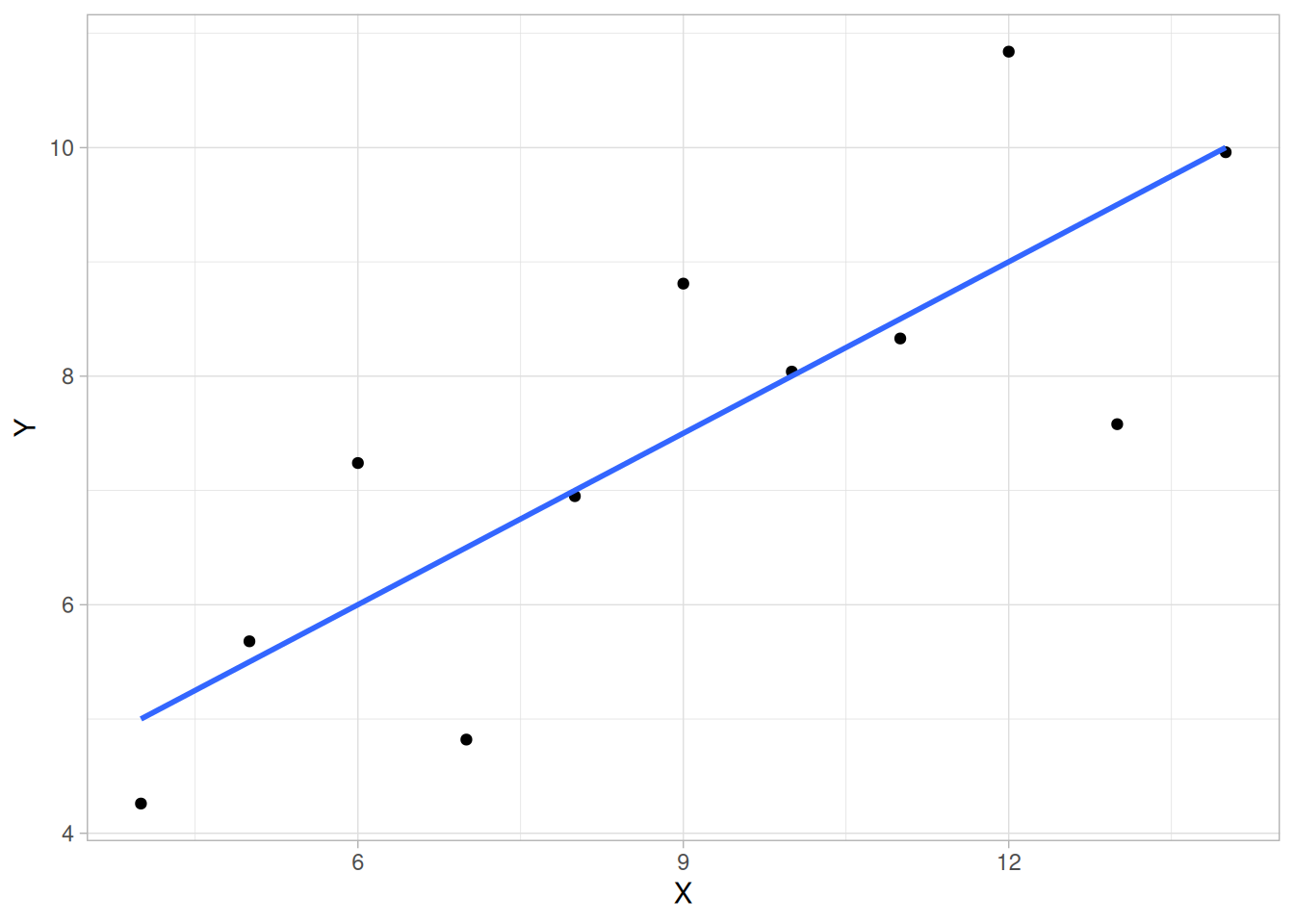
This kind of characterization for the data serves as the core for getting insight/feel for the data. Such insight/feel does not come from the quantitative statistics; on the contrary, calculations of quantitative statistics such as intercept and slope should be subsequent to the characterization and will make sense only if the characterization is true. To illustrate the loss of information that results when the graphics insight step is skipped, consider the following three additional data sets (Anscombe data sets 2, 3, and 4):
 X2     Y2       X3     Y3       X4     Y4
10.00   9.14    10.00   7.46     8.00   6.58
 8.00   8.14     8.00   6.77     8.00   5.76
13.00   8.74    13.00  12.74     8.00   7.71
 9.00   8.77     9.00   7.11     8.00   8.84
11.00   9.26    11.00   7.81     8.00   8.47
14.00   8.10    14.00   8.84     8.00   7.04
 6.00   6.13     6.00   6.08     8.00   5.25
 4.00   3.10     4.00   5.39    19.00  12.50
12.00   9.13    12.00   8.15     8.00   5.56
 7.00   7.26     7.00   6.42     8.00   7.91
 5.00   4.74     5.00   5.73     8.00   6.89
A quantitative analysis on data set 2 yields \(N\) = 11, Mean of \(X\) = 9.0, Mean of \(Y\) = 7.5, Intercept = 3, Slope = 0.5, Residual standard deviation = 1.237, and Correlation = 0.816 — identical to the analysis for data set 1. One might naively assume that the two data sets are “equivalent” since that is what the statistics tell us; but what do the statistics not tell us?
Remarkably, a quantitative analysis on data sets 3 and 4 also yields \(N\) = 11, Mean of \(X\) = 9.0, Mean of \(Y\) = 7.5, Intercept = 3, Slope = 0.5, Residual standard deviation = 1.236, and Correlation = 0.816 (0.817 for data set 4), which implies that in some quantitative sense, all four of the data sets are “equivalent.” In fact, the four data sets are far from “equivalent,” and a scatter plot of each data set, which would be step 1 of any EDA approach, would tell us that immediately.
anscombe_quartet <- bind_rows(
  anscombe_full |> select(x = x1, y = y1) |> mutate(set = "Data Set 1"),
  anscombe_full |> select(x = x2, y = y2) |> mutate(set = "Data Set 2"),
  anscombe_full |> select(x = x3, y = y3) |> mutate(set = "Data Set 3"),
  anscombe_full |> select(x = x4, y = y4) |> mutate(set = "Data Set 4")
)

ggplot(anscombe_quartet, aes(x, y)) +
  geom_point() +
  geom_smooth(method = "lm", formula = 'y ~ x', se = FALSE) +
  facet_wrap(~set, nrow = 2) +
  labs(x = "X", y = "Y") +
  theme_light()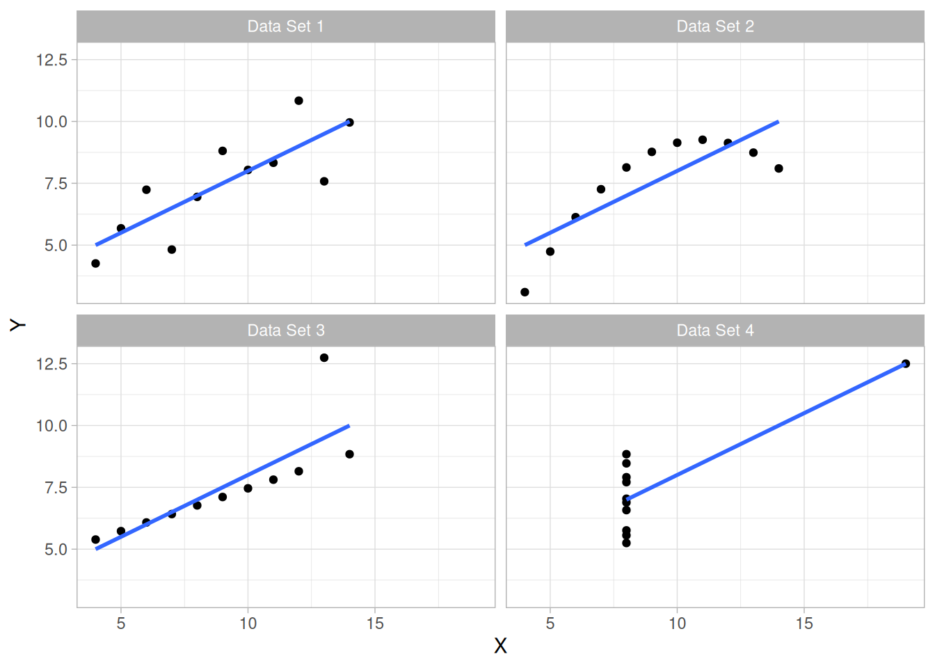
Conclusions from the scatter plots are:
These points are exactly the substance that provide and define “insight” and “feel” for a data set. They are the goals and the fruits of an open exploratory data analysis (EDA) approach to the data. Quantitative statistics are not wrong per se, but they are incomplete. They are incomplete because they are numeric summaries which, in the summarization operation, do a good job of focusing on a particular aspect of the data (e.g., location, intercept, slope, degree of relatedness, etc.) by judiciously reducing the data to a few numbers. Doing so also filters the data, necessarily omitting and screening out other sometimes crucial information in the focusing operation. Quantitative statistics focus but also filter, and filtering is exactly what makes the quantitative approach incomplete at best and misleading at worst.
The estimated intercepts (= 3) and slopes (= 0.5) for data sets 2, 3, and 4 are misleading because the estimation is done in the context of an assumed linear model, and that linearity assumption is the fatal flaw in this analysis.
The EDA approach of deliberately postponing the model selection until further along in the analysis has many rewards, not the least of which is the ultimate convergence to a much-improved model and the formulation of valid and supportable scientific and engineering conclusions.
The following classification is a convenient way to organize EDA problems.
Univariate
Control
Comparative
Screening
Optimization
Regression
Time Series
Multivariate
Note that multivariate analysis is only covered lightly in this Handbook.
The gamut of scientific and engineering experimentation is virtually limitless. In this sea of diversity is there any common basis that allows the analyst to systematically and validly arrive at supportable, repeatable research conclusions?
Fortunately, there is such a basis and it is rooted in the fact that every measurement process, however complicated, has certain underlying assumptions. This section deals with what those assumptions are, why they are important, how to go about testing them, and what the consequences are if the assumptions do not hold.
Assumptions Underlying a Measurement Process
There are four assumptions that typically underlie all measurement processes; namely, that the data from the process at hand “behave like”:
Univariate or Single Response Variable
The “fixed location” referred to in item 3 above differs for different problem types. The simplest problem type is univariate; that is, a single variable. For the univariate problem, the general model
response = deterministic component + random component
becomes
response = constant + error
Assumptions for Univariate Model
For this case, the “fixed location” is simply the unknown constant. We can thus imagine the process at hand to be operating under constant conditions that produce a single column of data with the properties that
Extrapolation to a Function of Many Variables
The universal power and importance of the univariate model is that it can easily be extended to the more general case where the deterministic component is not just a constant, but is in fact a function of many variables, and the engineering objective is to characterize and model the function.
Residuals Will Behave According to Univariate Assumptions
The key point is that regardless of how many factors there are, and regardless of how complicated the function is, if the engineer succeeds in choosing a good model, then the differences (residuals) between the raw response data and the predicted values from the fitted model should themselves behave like a univariate process. Furthermore, the residuals from this univariate process fit will behave like:
Validation of Model
Thus if the residuals from the fitted model do in fact behave like the ideal, then testing of underlying assumptions becomes a tool for the validation and quality of fit of the chosen model. On the other hand, if the residuals from the chosen fitted model violate one or more of the above univariate assumptions, then the chosen fitted model is inadequate and an opportunity exists for arriving at an improved model.
Predictability and Statistical Control
Predictability is an all-important goal in science and engineering. If the four underlying assumptions hold, then we have achieved probabilistic predictability — the ability to make probability statements not only about the process in the past, but also about the process in the future. In short, such processes are said to be “in statistical control.”
Validity of Engineering Conclusions
Moreover, if the four assumptions are valid, then the process is amenable to the generation of valid scientific and engineering conclusions. If the four assumptions are not valid, then the process is drifting (with respect to location, variation, or distribution), unpredictable, and out of control. A simple characterization of such processes by a location estimate, a variation estimate, or a distribution “estimate” inevitably leads to engineering conclusions that are not valid, are not supportable (scientifically or legally), and which are not repeatable in the laboratory.
Testing Underlying Assumptions Helps Assure the Validity of Scientific and Engineering Conclusions
Because the validity of the final scientific/engineering conclusions is inextricably linked to the validity of the underlying univariate assumptions, it naturally follows that there is a real necessity that each and every one of the above four assumptions be routinely tested.
Four Techniques to Test Underlying Assumptions
The following EDA techniques are simple, efficient, and powerful for the routine testing of underlying assumptions:
Plot on a Single Page for a Quick Characterization of the Data
The four EDA plots can be juxtaposed for a quick look at the characteristics of the data. The plots are conventionally arranged together as a single “4-Plot,” ordered as follows:
library(patchwork)

# Same construction used on the 4-Plot and Normal Probability Plot pages.
uniform_medians_eda23 <- function(n) {
  i <- seq_len(n)
  m <- numeric(n)
  m[1] <- 1 - 0.5^(1 / n)
  m[n] <- 0.5^(1 / n)
  if (n > 2) m[2:(n - 1)] <- (i[2:(n - 1)] - 0.3175) / (n + 0.365)
  m
}

four_plot_eda23 <- function(x, hist_bins = 30) {
  n <- length(x)

  p_run <- tibble(i = seq_len(n), y = x) |>
    ggplot(aes(i, y)) +
    geom_line() +
    labs(x = "Index", y = "Y", title = "Run Sequence Plot") +
    theme_light()

  p_lag <- tibble(y = x[-1], y_lag = x[-n]) |>
    ggplot(aes(y_lag, y)) +
    geom_point() +
    labs(x = expression(Y[i - 1]), y = expression(Y[i]), title = "Lag Plot") +
    theme_light()

  p_hist <- tibble(y = x) |>
    ggplot(aes(y)) +
    geom_histogram(bins = hist_bins, color = "white", fill = "steelblue4") +
    labs(x = "Y", y = "Count", title = "Histogram") +
    theme_light()

  mm <- uniform_medians_eda23(n)
  theoretical <- qnorm(mm)
  xs <- sort(x)
  p_norm <- tibble(theoretical = theoretical, observed = xs) |>
    ggplot(aes(theoretical, observed)) +
    geom_point(shape = 1) +
    geom_smooth(method = "lm", formula = 'y ~ x', se = FALSE, color = "firebrick") +
    labs(x = "Theoretical", y = "Ordered Y", title = "Normal Probability Plot") +
    theme_light()

  (p_run + p_lag) / (p_hist + p_norm)
}
Sample Plot: Assumptions Hold
Figure 1.3, a 4-Plot of 500 normal random numbers, reveals a process that has fixed location, fixed variation, is random, apparently has a fixed approximately normal distribution, and has no outliers.
randn_raw <- read_table(here::here("datasets", "RANDN.DAT"), skip = 25, col_names = FALSE)
── Column specification ────────────────────────────────────────────────────────
cols(
  X1 = col_double(),
  X2 = col_double(),
  X3 = col_double(),
  X4 = col_double(),
  X5 = col_double(),
  X6 = col_double(),
  X7 = col_double(),
  X8 = col_double(),
  X9 = col_double(),
  X10 = col_double()
)randn <- as.numeric(t(as.matrix(randn_raw)))
four_plot_eda23(randn)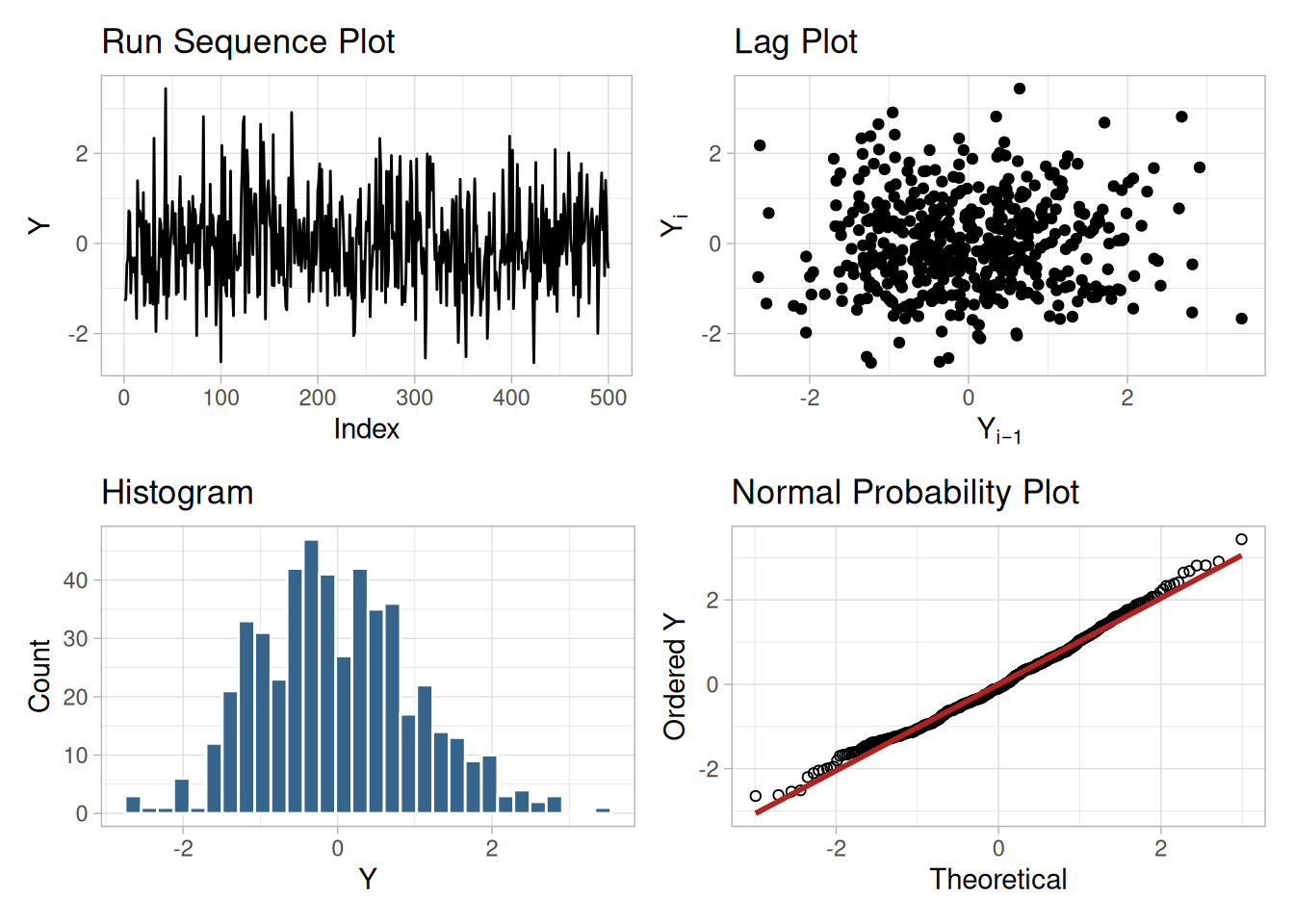
Sample Plot: Assumptions Do Not Hold
If one or more of the four underlying assumptions do not hold, then it will show up in the various plots, as in the example in Figure 1.4. For example, a 4-Plot may reveal a process that has fixed location, fixed variation, is non-random (oscillatory), has a non-normal, U-shaped distribution, and has several outliers.
lew_eda23 <- read_table(here::here("datasets", "LEW.DAT"), skip = 25, col_names = "y", col_types = "d")

four_plot_eda23(lew_eda23$y)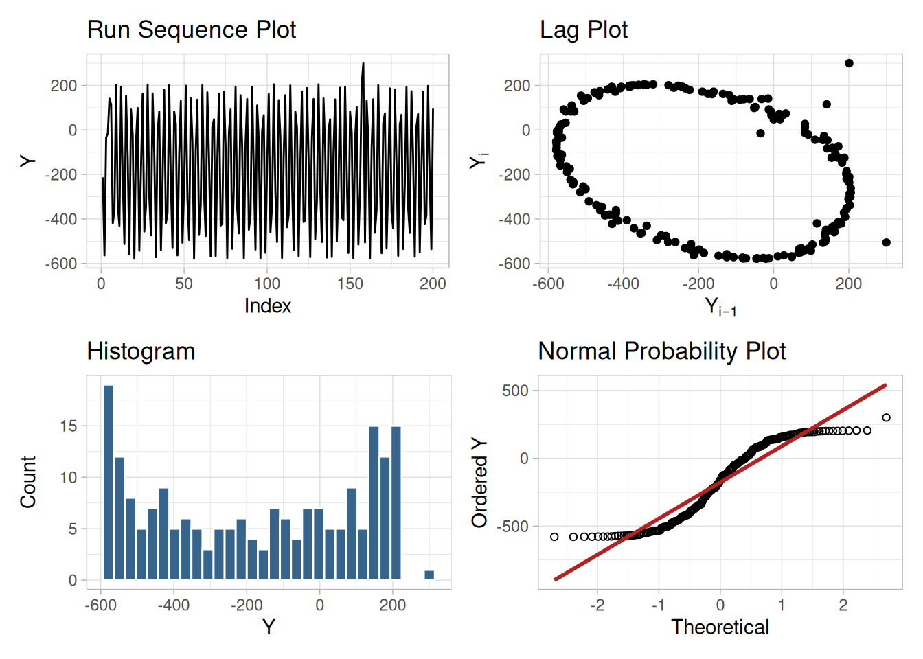
Interpretation of EDA Plots: Flat and Equi-Banded, Random, Bell-Shaped, and Linear
The four EDA plots discussed above are used to test the underlying assumptions:
Plots Utilized to Test the Assumptions
Conversely, the underlying assumptions are tested using the EDA plots:
If all four of the assumptions hold, then the process is said definitionally to be “in statistical control.”
What If Assumptions Do Not Hold?
If some of the underlying assumptions do not hold, what can be done about it? What corrective actions can be taken? The positive way of approaching this is to view the testing of underlying assumptions as a framework for learning about the process. Assumption-testing promotes insight into important aspects of the process that may not have surfaced otherwise.
Primary Goal is Correct and Valid Scientific Conclusions
The primary goal is to have correct, validated, and complete scientific/engineering conclusions flowing from the analysis. This usually includes intermediate goals such as the derivation of a good-fitting model and the computation of realistic parameter estimates. It should always include the ultimate goal of an understanding and a “feel” for “what makes the process tick.” There is no more powerful catalyst for discovery than the bringing together of an experienced/expert scientist/engineer and a data set ripe with intriguing “anomalies” and characteristics.
Consequences of Invalid Assumptions
The following subsections discuss in more detail the consequences of invalid assumptions.
There are four underlying assumptions: randomness, fixed location, fixed variation, and fixed distribution. The randomness assumption is the most critical but the least tested.
If the randomness assumption does not hold, then:
One specific and common type of non-randomness is autocorrelation. Autocorrelation is the correlation between \(Y_t\) and \(Y_{t-k}\), where \(k\) is an integer that defines the lag for the autocorrelation. That is, autocorrelation is a time-dependent non-randomness. This means that the value of the current point is highly dependent on the previous point if \(k = 1\) (or \(k\) points ago if \(k\) is not 1). Autocorrelation is typically detected via an autocorrelation plot or a lag plot.
If the data are not random due to autocorrelation, then:
The usual estimate of location is the mean
\[\bar{Y} = \frac{1}{N} \sum_{i=1}^{N}{Y_i}\]
from \(N\) measurements \(Y_1, Y_2, \ldots, Y_N\).
If the run sequence plot does not support the assumption of fixed location, then:
\[s(\bar{Y}) = \frac{1}{\sqrt{N(N-1)}} \sqrt{\sum_{i=1}^{N}{(Y_i - \bar{Y})^2}}\]
may be invalid and the numerical value optimistically small. - The location estimate may be poor. - The location estimate may be biased.
The usual estimate of variation is the standard deviation
\[s_Y = \frac{1}{\sqrt{N-1}} \sqrt{\sum_{i=1}^{N}{(Y_i - \bar{Y})^2}}\]
from \(N\) measurements \(Y_1, Y_2, \ldots, Y_N\).
If the run sequence plot does not support the assumption of fixed variation, then:
Scientists and engineers routinely use the mean (average) to estimate the “middle” of a distribution. It is not so well known that the variability and the noisiness of the mean as a location estimator are intrinsically linked with the underlying distribution of the data. For certain distributions, the mean is a poor choice. For any given distribution, there exists an optimal choice — that is, the estimator with minimum variability/noisiness. This optimal choice may be, for example, the median, the midrange, the midmean, the mean, or something else. The implication of this is to “estimate” the distribution first, and then — based on the distribution — choose the optimal estimator. The resulting engineering parameter estimators will have less variability than if this approach is not followed.
Two case studies elsewhere in the Handbook illustrate this point: an airplane glass failure case study gives an example of determining an appropriate distribution and estimating the parameters of that distribution, and a uniform random numbers case study gives an example of determining a more appropriate centrality parameter for a non-normal distribution.
Other consequences that flow from problems with distributional assumptions fall into three categories:
Distribution
Model
Process
After you have collected a set of data, how do you do an exploratory data analysis? What techniques do you employ? What do the various techniques focus on? What conclusions can you expect to reach?
This section provides answers to these kinds of questions via a gallery of EDA techniques and a detailed description of each technique. The techniques are divided into graphical and quantitative techniques. For exploratory data analysis, the emphasis is primarily on the graphical techniques.
This section describes many techniques that are commonly used in exploratory and classical data analysis. This list is by no means meant to be exhaustive. Additional techniques (both graphical and quantitative) are discussed in other chapters. Specifically, the product comparisons chapter has a much more detailed description of many classical statistical techniques.
EDA emphasizes graphical techniques while classical techniques emphasize quantitative techniques. In practice, an analyst typically uses a mixture of graphical and quantitative techniques. In this section, we have divided the descriptions into graphical and quantitative techniques. This is for organizational clarity and is not meant to discourage the use of both graphical and quantitative techniques when analyzing data.
This section emphasizes the techniques themselves — how the graph or test is defined, published references, and sample output. The use of the techniques to answer engineering questions is demonstrated in the case studies section (Section 1.4). The case studies do not demonstrate all of the techniques.
The sample plots and output in the original handbook were generated with the Dataplot software program; in this book they are reproduced using R and the tidyverse. Other general-purpose statistical data analysis programs can generate most of the plots, intervals, and tests discussed here, or macros/scripts can be written to achieve the same result.
Some common questions that exploratory data analysis is used to answer are:
A critical early step in any analysis is to identify (for the engineering problem at hand) which of the above questions are relevant. That is, we need to identify which questions we want answered and which questions have no bearing on the problem at hand. After collecting such a set of questions, an equally important step, which is invaluable for maintaining focus, is to prioritize those questions in decreasing order of importance. EDA techniques are tied in with each of the questions. There are some EDA techniques (e.g., the scatter plot) that are broad-brushed and apply almost universally. On the other hand, there are a large number of EDA techniques that are specific and whose specificity is tied in with one of the above questions. Clearly, if one chooses not to explicitly identify relevant questions, then one cannot take advantage of these question-specific EDA techniques.
Most of these questions can be addressed by techniques discussed in this chapter. The process modeling and process improvement chapters also address many of the questions above. These questions are also relevant for the classical approach to statistics. What distinguishes the EDA approach is an emphasis on graphical techniques to gain insight as opposed to the classical approach of quantitative tests. Most data analysts will use a mix of graphical and classical quantitative techniques to address these problems.
Purpose: Check Randomness
Autocorrelation plots (Box and Jenkins 1976, 28–32) are a commonly-used tool for checking randomness in a data set. This randomness is ascertained by computing autocorrelations for data values at varying time lags. If random, such autocorrelations should be near zero for any and all time-lag separations. If non-random, then one or more of the autocorrelations will be significantly non-zero.
In addition, autocorrelation plots are used in the model identification stage for Box-Jenkins autoregressive, moving average time series models.
Autocorrelation Is Only One Measure of Randomness
Note that uncorrelated does not necessarily mean random. Data that has significant autocorrelation is not random. However, data that does not show significant autocorrelation can still exhibit non-randomness in other ways. Autocorrelation is just one measure of randomness. In the context of model validation (which is the primary type of randomness we discuss in this book), checking for autocorrelation is typically a sufficient test of randomness since the residuals from a poor fitting model tend to display non-subtle randomness. However, some applications require a more rigorous determination of randomness. In these cases, a battery of tests, which might include checking for autocorrelation, are applied since data can be non-random in many different and often subtle ways.
An example of where a more rigorous check for randomness is needed would be in testing random number generators.
Sample Plot: Autocorrelations should be near-zero for randomness. Such is not the case in this example and thus the randomness assumption fails
library(tidyverse)

# Reusable correlogram: computes the autocorrelation function with the
# N-divisor form (see Definition below) and draws it with fixed-width
# 95%/99% confidence bands for testing randomness.
acf_plot <- function(x, lag_max = NULL) {
  n <- length(x)
  a <- acf(x, lag.max = lag_max, plot = FALSE, demean = TRUE)
  ci95 <- qnorm(0.975) / sqrt(n)
  ci99 <- qnorm(0.995) / sqrt(n)

  tibble(lag = as.integer(a$lag), acf = as.numeric(a$acf)) |>
    filter(lag > 0) |>
    ggplot(aes(lag, acf)) +
    geom_segment(aes(xend = lag, y = 0, yend = acf)) +
    geom_hline(yintercept = 0) +
    geom_hline(yintercept = c(-ci95, ci95), linetype = "dashed", color = "steelblue") +
    geom_hline(yintercept = c(-ci99, ci99), linetype = "dotted", color = "firebrick") +
    labs(x = "Lag", y = "Autocorrelation") +
    theme_light()
}

flicker <- read_table(here::here("datasets", "FLICKER.DAT"), skip = 25, col_names = "y", col_types = "d")acf_plot(flicker$y, lag_max = 250)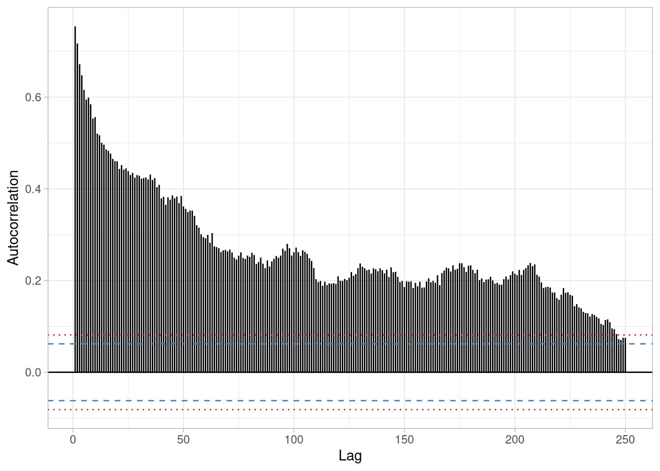
This sample autocorrelation plot of the FLICKER.DAT data set shows that the time series is not random, but rather has a high degree of autocorrelation between adjacent and near-adjacent observations.
Definition: r(h) versus h
Autocorrelation plots are formed by:
Vertical axis: Autocorrelation coefficient
\[R_h = C_h / C_0\]
where \(C_h\) is the autocovariance function
\[C_h = \frac{1}{N}\sum_{t=1}^{N-h}(Y_t - \bar{Y})(Y_{t+h} - \bar{Y})\]
and \(C_0\) is the variance function
\[C_0 = \frac{\sum_{t=1}^{N}(Y_t - \bar{Y})^2}{N}\]
Note that \(R_h\) is between -1 and +1.
Note that some sources may use the following formula for the autocovariance function
\[C_h = \frac{1}{N-h}\sum_{t=1}^{N-h}(Y_t - \bar{Y})(Y_{t+h} - \bar{Y})\]
Although this definition has less bias, the \((1/N)\) formulation has some desirable statistical properties and is the form most commonly used in the statistics literature (and the form R’s acf() function uses, which is what the plots on this page are built with). See pages 20 and 49-50 in Chatfield (Chatfield 1989) for details.
Horizontal axis: Time lag \(h\) (\(h = 1, 2, 3, \ldots\))
Figure 1.5 also contains several horizontal reference lines. The middle line is at zero. The other four lines are 95% and 99% confidence bands. Note that there are two distinct formulas for generating the confidence bands.
If the autocorrelation plot is being used to test for randomness (i.e., there is no time dependence in the data), the following formula is recommended:
\[\pm \frac{z_{1-\alpha/2}}{\sqrt{N}}\]
where \(N\) is the sample size, \(z\) is the cumulative distribution function of the standard normal distribution and \(\alpha\) is the significance level. In this case, the confidence bands have fixed width that depends on the sample size. This is the formula that was used to generate the confidence bands in Figure 1.5.
Autocorrelation plots are also used in the model identification stage for fitting ARIMA models. In this case, a moving average model is assumed for the data and the following confidence bands should be generated:
\[\pm z_{1-\alpha/2} \sqrt{\frac{1}{N}\left(1 + 2\sum_{i=1}^{k}{y_i^2}\right)}\]
where \(k\) is the lag, \(N\) is the sample size, \(z\) is the cumulative distribution function of the standard normal distribution and \(\alpha\) is the significance level. In this case, the confidence bands increase as the lag increases.
Questions
The autocorrelation plot can provide answers to the following questions:
Importance: Ensure validity of engineering conclusions
Randomness (along with fixed model, fixed variation, and fixed distribution) is one of the four assumptions that typically underlie all measurement processes. The randomness assumption is critically important for the following three reasons:
Most standard statistical tests depend on randomness. The validity of the test conclusions is directly linked to the validity of the randomness assumption.
Many commonly-used statistical formulae depend on the randomness assumption, the most common formula being the formula for determining the standard deviation of the sample mean:
\[s_{\bar{Y}} = s/\sqrt{N}\]
where \(s\) is the standard deviation of the data. Although heavily used, the results from using this formula are of no value unless the randomness assumption holds.
For univariate data, the default model is \(Y = \text{constant} + \text{error}\). If the data are not random, this model is incorrect and invalid, and the estimates for the parameters (such as the constant) become nonsensical and invalid.
In short, if the analyst does not check for randomness, then the validity of many of the statistical conclusions becomes suspect. The autocorrelation plot is an excellent way of checking for such randomness.
Examples
Examples of the autocorrelation plot for several common situations are given below.
1. Random (= White Noise)
set.seed(42)
random_series <- rnorm(200)
acf_plot(random_series, lag_max = 50)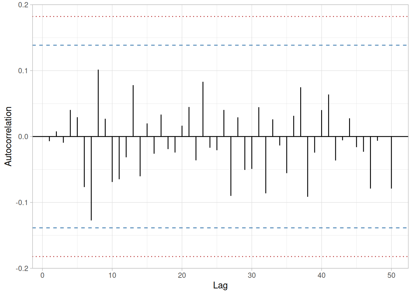
We can make the following conclusions from this plot: there are no significant autocorrelations, and the data are random.
Note that with the exception of lag 0, which is always 1 by definition, almost all of the autocorrelations fall within the 95% confidence limits. In addition, there is no apparent pattern (such as the first twenty-five being positive and the second twenty-five being negative). This is the absence of a pattern we expect to see if the data are in fact random.
A few lags slightly outside the 95% and 99% confidence limits do not necessarily indicate non-randomness. For a 95% confidence interval, we might expect about one out of twenty lags to be statistically significant due to random fluctuations.
There is no associative ability to infer from a current value \(Y_i\) as to what the next value \(Y_{i+1}\) will be. Such non-association is the essence of randomness. In short, adjacent observations do not “co-relate”, so we call this the “no autocorrelation” case.
2. Moderate Autocorrelation
The FLICKER.DAT data set shown in Figure 1.5 is itself an example of this case: the plot starts with a moderately high autocorrelation at lag 1 (approximately 0.75) that gradually decreases. The decreasing autocorrelation is generally linear, but with significant noise. Such a pattern is the autocorrelation plot signature of “moderate autocorrelation”, which in turn provides moderate predictability if modeled properly.
The next step would be to estimate the parameters for the autoregressive model:
\[Y_i = A_0 + A_1 Y_{i-1} + E_i\]
Such estimation can be performed by using least squares linear regression or by fitting a Box-Jenkins autoregressive (AR) model.
The randomness assumption for least squares fitting applies to the residuals of the model. That is, even though the original data exhibit non-randomness, the residuals after fitting \(Y_i\) against \(Y_{i-1}\) should result in random residuals. Assessing whether or not the proposed model in fact sufficiently removed the randomness is discussed in detail in the Process Modeling chapter.
The residual standard deviation for this autoregressive model will be much smaller than the residual standard deviation for the default model \(Y_i = A_0 + E_i\).
3. Strong Autocorrelation and Autoregressive Model
randwalk <- read_table(here::here("datasets", "RANDWALK.DAT"), skip = 25, col_names = "y", col_types = "d")
acf_plot(randwalk$y, lag_max = 125)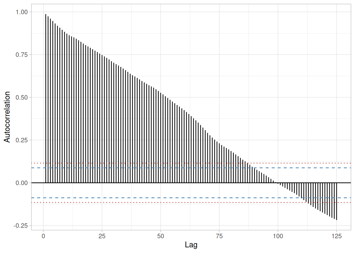
We can make the following conclusions from Figure 1.7: the data come from an underlying autoregressive model with strong positive autocorrelation.
The plot starts with a high autocorrelation at lag 1 (only slightly less than 1) that slowly declines. It continues decreasing until it becomes negative and starts showing an increasing negative autocorrelation. The decreasing autocorrelation is generally linear with little noise. Such a pattern is the autocorrelation plot signature of “strong autocorrelation”, which in turn provides high predictability if modeled properly.
The next step would be to estimate the parameters for the autoregressive model:
\[Y_i = A_0 + A_1 Y_{i-1} + E_i\]
Such estimation can be performed by using least squares linear regression or by fitting a Box-Jenkins autoregressive (AR) model.
The randomness assumption for least squares fitting applies to the residuals of the model. That is, even though the original data exhibit non-randomness, the residuals after fitting \(Y_i\) against \(Y_{i-1}\) should result in random residuals. Assessing whether or not the proposed model in fact sufficiently removed the randomness is discussed in detail in the Process Modeling chapter.
The residual standard deviation for this autoregressive model will be much smaller than the residual standard deviation for the default model \(Y_i = A_0 + E_i\).
4. Sinusoidal Model
lew <- read_table(here::here("datasets", "LEW.DAT"), skip = 25, col_names = "y", col_types = "d")
acf_plot(lew$y, lag_max = 50)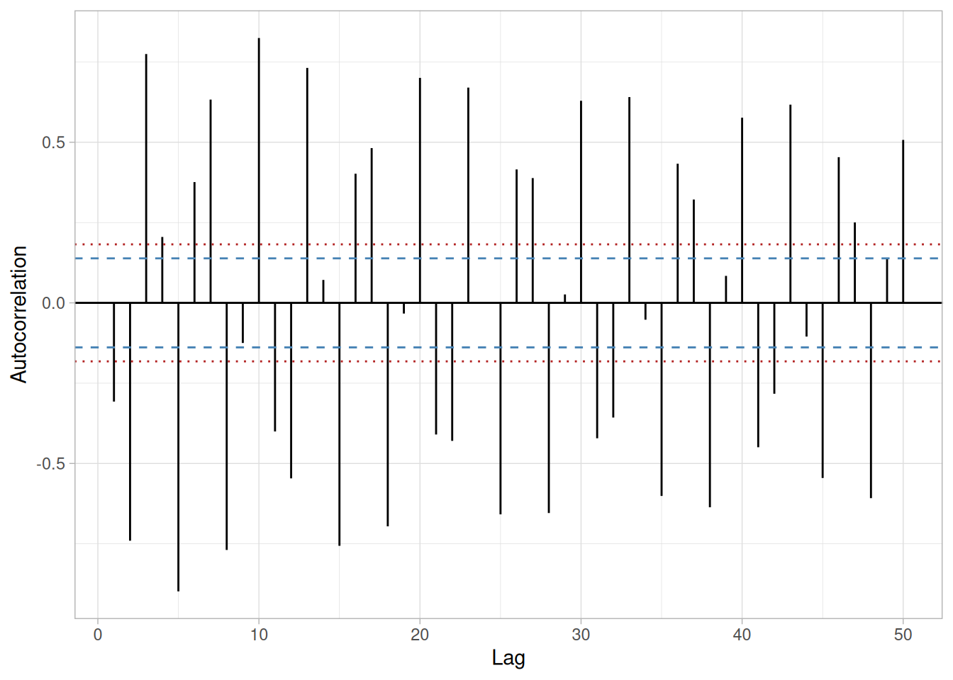
We can make the following conclusions from Figure 1.8: the data come from an underlying sinusoidal model.
The plot exhibits an alternating sequence of positive and negative spikes. These spikes are not decaying to zero. Such a pattern is the autocorrelation plot signature of a sinusoidal model.
Related Techniques
Partial Autocorrelation Plot, Lag Plot, Spectral Plot, Seasonal Subseries Plot.
Case Study
The autocorrelation plot is demonstrated in the beam deflection data case study.
Software
Autocorrelation plots are available in most general purpose statistical software programs.
Purpose: Check for a Change in Location, Variation, or Distribution
The bihistogram is an EDA tool for assessing whether a before-versus-after engineering modification has caused a change in
It is a graphical alternative to the two-sample t-test. The bihistogram can be more powerful than the t-test in that all of the distributional features (location, scale, skewness, outliers) are evident on a single plot. It is also based on the common and well-understood histogram.
Sample Plot: This bihistogram reveals that there is a significant difference in ceramic breaking strength between batch 1 (above) and batch 2 (below)
library(tidyverse)

jahanmi2 <- read_table(
  here::here("datasets", "JAHANMI2.DAT"),
  skip = 50,
  col_names = c("id", "lab", "num", "test", "y", "x1", "x2", "x3", "x4",
                "trt", "set", "llab", "rep", "bat", "sblab", "set2"),
  col_types = cols(.default = "d")
) |>
mutate(batch = factor(bat, labels = c("Batch 1", "Batch 2")))ggplot(jahanmi2, aes(x = y)) +
geom_histogram(
data = filter(jahanmi2, batch == "Batch 1"),
aes(y = after_stat(count), fill = batch),
binwidth = 20, boundary = 0
) +
geom_histogram(
data = filter(jahanmi2, batch == "Batch 2"),
aes(y = -after_stat(count), fill = batch),
binwidth = 20, boundary = 0
) +
geom_hline(yintercept = 0) +
labs(x = "Ceramic Strength", y = "Count", fill = NULL) +
theme_light()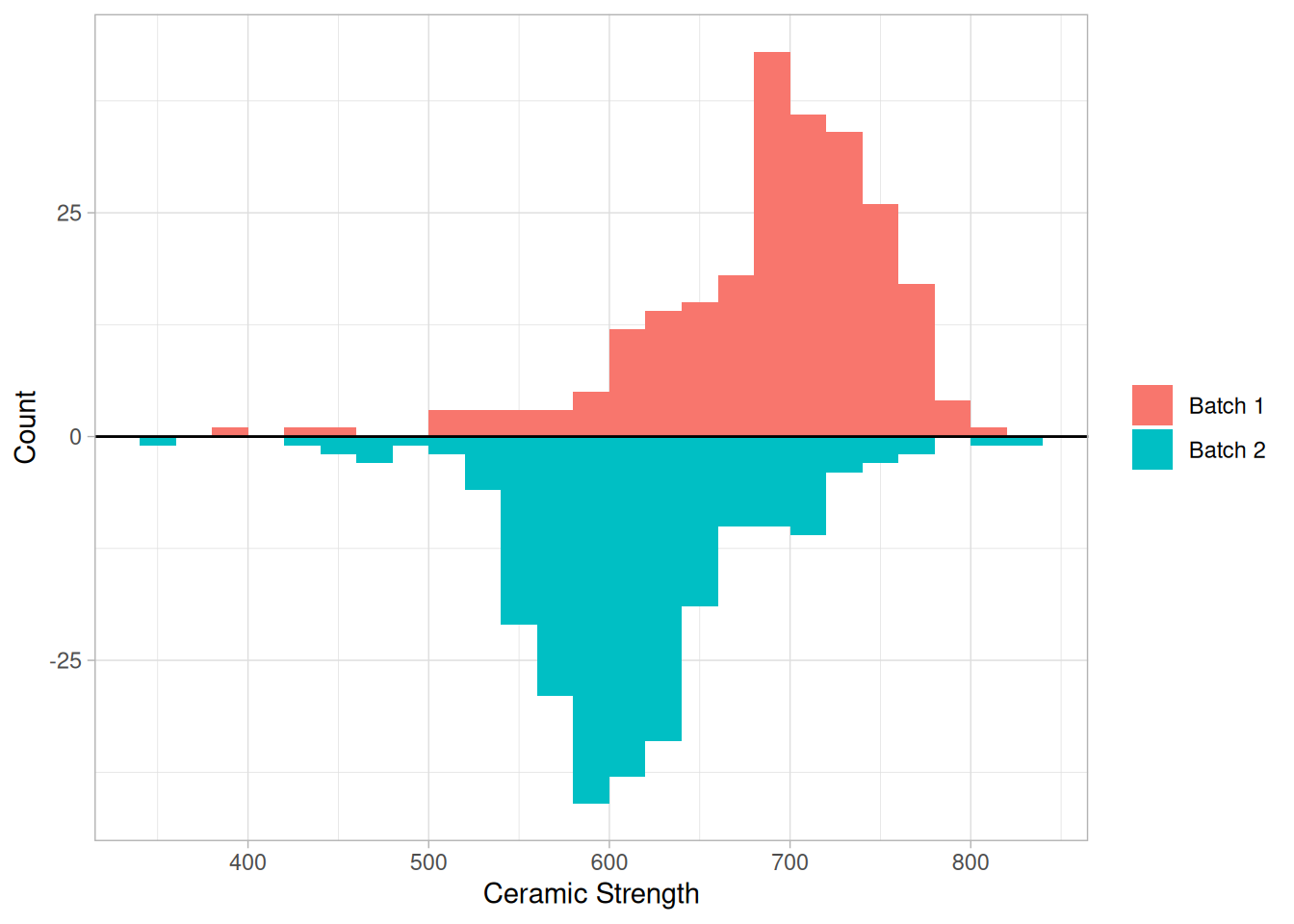
From the above bihistogram of the JAHANMI2.DAT data set, we can see that batch 1 is centered at a higher ceramic strength value than batch 2:
jahanmi2 |>
  summarize(mean_strength = mean(y), median_strength = median(y), .by = batch)
The original NIST text reports batch 1 as centered at approximately 725 and batch 2 at approximately 625 (a displacement of about 100 strength units); that appears to be a visual read of the histogram’s center rather than a computed mean or median, since neither statistic above reproduces those figures exactly — the mean (689 vs. 611) and median (698 vs. 608) both show a somewhat smaller displacement, around 78-90 strength units. In any case, the batch factor clearly has a significant effect on the location (typical value) for strength, and hence batch is said to be “significant” or to “have an effect.” We thus see graphically and convincingly what a t-test or analysis of variance would indicate quantitatively.
With respect to variation, note that the spread (variation) of the above-axis batch 1 histogram does not appear to be that much different from the below-axis batch 2 histogram. With respect to distributional shape, note that the batch 1 histogram is skewed left while the batch 2 histogram is more symmetric with even a hint of a slight skewness to the right.
Thus the bihistogram reveals that there is a clear difference between the batches with respect to location and distribution, but not in regard to variation. Comparing batch 1 and batch 2, we also note that batch 1 is the “better batch” due to its substantially higher average strength.
Definition: Two Adjoined Histograms
Bihistograms are formed by vertically juxtaposing two histograms:
Questions
The bihistogram can provide answers to the following questions:
Importance: Checks 3 out of the 4 Underlying Assumptions of a Measurement Process
The bihistogram is an important EDA tool for determining if a factor “has an effect.” Since the bihistogram provides insight into the validity of three (location, variation, and distribution) out of the four (missing only randomness) underlying assumptions in a measurement process, it is an especially valuable tool. Because of the dual (above/below) nature of the plot, the bihistogram is restricted to assessing factors that have only two levels. However, this is very common in the before-versus-after character of many scientific and engineering experiments.
Related Techniques
t test (for shift in location)
F test (for shift in variation)
Kolmogorov-Smirnov test (for shift in distribution)
Quantile-quantile plot (for shift in location and distribution)
Case Study
The bihistogram is demonstrated in the ceramic strength data case study.
Software
The bihistogram is not widely available in general purpose statistical software programs. Bihistograms can be generated using Dataplot and R software.
Purpose: Check to Determine if a Factor of Interest Has an Effect Robust over All Other Factors
The block plot (Filliben et al. 1993) is an EDA tool for assessing whether the factor of interest (the primary factor) has a statistically significant effect on the response, and whether that conclusion about the primary factor effect is valid robustly over all other nuisance or secondary factors in the experiment.
It replaces the analysis of variance test with a less assumption-dependent binomial test and should be routinely used whenever we are trying to robustly decide whether a primary factor has an effect.
Sample Plot: Weld Method 2 Is Lower (Better) Than Weld Method 1 in 10 of 12 Cases
library(tidyverse)

sheesle2 <- read_table(
  here::here("datasets", "SHEESLE2.DAT"),
  skip = 25,
  col_names = c("y", "weld", "plant", "speed", "shift", "tag"),
  col_types = "ddddid"
) |>
  mutate(
    weld = factor(weld),
    # "tag" (5th data column) is Dataplot's own encoding of the nuisance-factor
    # combination -- digit 1 = plant, digit 2 = speed*shift position -- and it
    # already sorts the 12 combinations into the file's original order, so we
    # just preserve that order as the x-axis grouping.
    group = fct_inorder(factor(tag))
  )

# Each of the 12 "bars" is a vertical box spanning the low and high value
# of the two weld-method observations at that nuisance-factor combination,
# with the weld-method number plotted as the point label -- matching the
# original Dataplot BLOCK PLOT rendering rather than a dodged bar chart.
block_range <- sheesle2 |>
  summarize(ymin = min(y), ymax = max(y), .by = group) |>
  mutate(x = as.numeric(group))

# Boundaries between plants (tags 11-18 vs. 21-28) for a reference divider.
plant_boundary <- sheesle2 |>
  distinct(group, plant) |>
  mutate(x = as.numeric(group)) |>
  arrange(x) |>
  mutate(new_plant = plant != lag(plant)) |>
  filter(new_plant) |>
  pull(x) |>
(\(x) x - 0.5)()ggplot() +
geom_vline(xintercept = plant_boundary, linetype = "dotted", color = "grey60") +
geom_rect(
data = block_range,
aes(xmin = x - 0.18, xmax = x + 0.18, ymin = ymin, ymax = ymax),
fill = NA, color = "grey40"
) +
geom_text(
data = sheesle2,
aes(x = as.numeric(group), y = y, label = weld),
fontface = "bold", size = 4
) +
scale_x_continuous(
breaks = as.numeric(levels(sheesle2$group)) |> seq_along(),
labels = levels(sheesle2$group),
expand = expansion(add = 0.6)
) +
labs(
x = "Tag (Plant x Speed x Shift combination)",
y = "Average Defects per Hour"
) +
theme_light()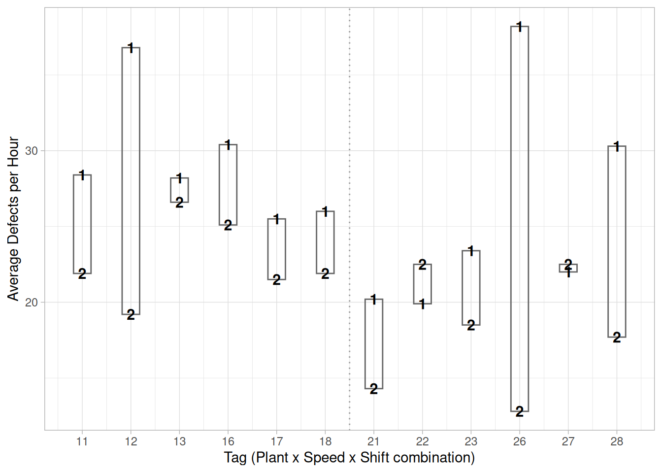
This block plot of the SHEESLE2.DAT data set reveals that in 10 of the 12 cases (bars), weld method 2 is lower (better) than weld method 1. From a binomial point of view, weld method is statistically significant.
Each vertical box is one of the 12 nuisance-factor combinations (2 plants x 2 speeds x 3 shifts), spanning the low and high of the two weld-method averages observed there; the bold “1”/“2” inside marks which weld method produced which value. The “Tag” on the x-axis is SHEESLE2.DAT’s own encoding of that combination: \(\text{tag} = 10 \times \text{plant} + 5 \times (\text{speed} - 1) + \text{shift}\), so a tag of 11 is plant 1/speed 1/shift 1, 12 is plant 1/speed 1/shift 2, 16 is plant 1/speed 2/shift 1, and so on – the dotted vertical line marks the boundary between plant 1’s six tags (11-18) and plant 2’s six tags (21-28).
Definition
Block Plots are formed as follows:
Discussion: Primary Factor Is Denoted by Plot Character: Within-Bar Plot Character
Average number of defective lead wires per hour from a study with four factors,
are shown in Figure 1.10. Weld method is the primary factor and the other three factors are nuisance factors. The 12 distinct positions along the horizontal axis correspond to all possible combinations of the three nuisance factors, i.e., 12 = 2 plants x 2 speeds x 3 shifts. These 12 conditions provide the framework for assessing whether any conclusions about the 2 levels of the primary factor (weld method) can truly be called “general conclusions.” If we find that one weld method setting does better (smaller average defects per hour) than the other weld method setting for all or most of these 12 nuisance factor combinations, then the conclusion is in fact general and robust.
Ordering Along the Horizontal Axis
In Figure 1.10, the ordering along the horizontal axis is as follows:
Setting 2 Is Better Than Setting 1 in 10 out of 12 Cases
In the block plot for the first bar (plant 1, speed 1, shift 1), weld method 1 yields about 28 defects per hour while weld method 2 yields about 22 defects per hour–hence the difference for this combination is about 6 defects per hour and weld method 2 is seen to be better (smaller number of defects per hour).
Is “weld method 2 is better than weld method 1” a general conclusion?
For the second bar (plant 1, speed 1, shift 2), weld method 1 is about 37 while weld method 2 is only about 19. Thus weld method 2 is again seen to be better than weld method 1. Similarly for bar 3 (plant 1, speed 1, shift 3), we see weld method 2 is smaller than weld method 1. Scanning over all of the 12 bars, we see that weld method 2 is smaller than weld method 1 in 10 of the 12 cases, which is highly suggestive of a robust weld method effect.
An Event with Chance Probability of Only 2%
What is the chance of 10 out of 12 happening by chance? This is probabilistically equivalent to testing whether a coin is fair by flipping it and getting 10 heads in 12 tosses. The chance (from the binomial distribution) of getting 10 (or more extreme: 11, 12) heads in 12 flips of a fair coin is about 2%. Such low-probability events are usually rejected as untenable and in practice we would conclude that there is a difference in weld methods.
Advantage: Graphical and Binomial
The advantages of the block plot are as follows:
Questions
The block plot can provide answers to the following questions:
Importance: Robustly Checks the Significance of the Factor of Interest
The block plot is a graphical technique that pointedly focuses on whether or not the primary factor conclusions are in fact robustly general. This question is fundamentally different from the generic multi-factor experiment question where the analyst asks, “What factors are important and what factors are not” (a screening problem)? Global data analysis techniques, such as analysis of variance, can potentially be improved by local, focused data analysis techniques that take advantage of this difference.
Related Techniques
t test (for shift in location for exactly 2 levels)
ANOVA (for shift in location for 2 or more levels)
Bihistogram (for shift in location, variation, and distribution for exactly 2 levels).
Case Study
The block plot is demonstrated in the ceramic strength data case study.
Software
Block plots are not currently available in most general purpose statistical software programs. However they can be generated using Dataplot and, with some programming, R software.
Purpose: Estimate Uncertainty
The bootstrap (Efron and Gong 1983) plot is used to estimate the uncertainty of a statistic.
Generate Subsamples with Replacement
To generate a bootstrap uncertainty estimate for a given statistic from a set of data, a subsample of a size less than or equal to the size of the data set is generated from the data, and the statistic is calculated. This subsample is generated with replacement so that any data point can be sampled multiple times or not sampled at all. This process is repeated for many subsamples, typically between 500 and 1000. The computed values for the statistic form an estimate of the sampling distribution of the statistic.
For example, to estimate the uncertainty of the median from a dataset with 50 elements, we generate a subsample of 50 elements and calculate the median. This is repeated at least 500 times so that we have at least 500 values for the median. Although the number of bootstrap samples to use is somewhat arbitrary, 500 subsamples is usually sufficient. To calculate a 90% confidence interval for the median, the sample medians are sorted into ascending order and the value of the 25th median (assuming exactly 500 subsamples were taken) is the lower confidence limit while the value of the 475th median (assuming exactly 500 subsamples were taken) is the upper confidence limit.
Sample Plot
library(tidyverse)

randu <- tibble(y = scan(here::here("datasets", "RANDU.DAT"), skip = 25, quiet = TRUE))

set.seed(20240613)
n_boot <- 500
n <- nrow(randu)

boot_stats <- map(seq_len(n_boot), function(i) {
  s <- sample(randu$y, n, replace = TRUE)
  tibble(subsample = i, mean = mean(s), median = median(s), midrange = (min(s) + max(s)) / 2)
}) |>
list_rbind()boot_stats |>
pivot_longer(c(mean, median, midrange), names_to = "statistic", values_to = "value") |>
mutate(statistic = factor(statistic, levels = c("mean", "median", "midrange"),
labels = c("Mean", "Median", "Mid-range"))) |>
ggplot(aes(subsample, value)) +
geom_point(shape = 1) +
facet_wrap(~statistic, scales = "free_y") +
labs(x = "Subsample Number", y = "Statistic Value") +
theme_light()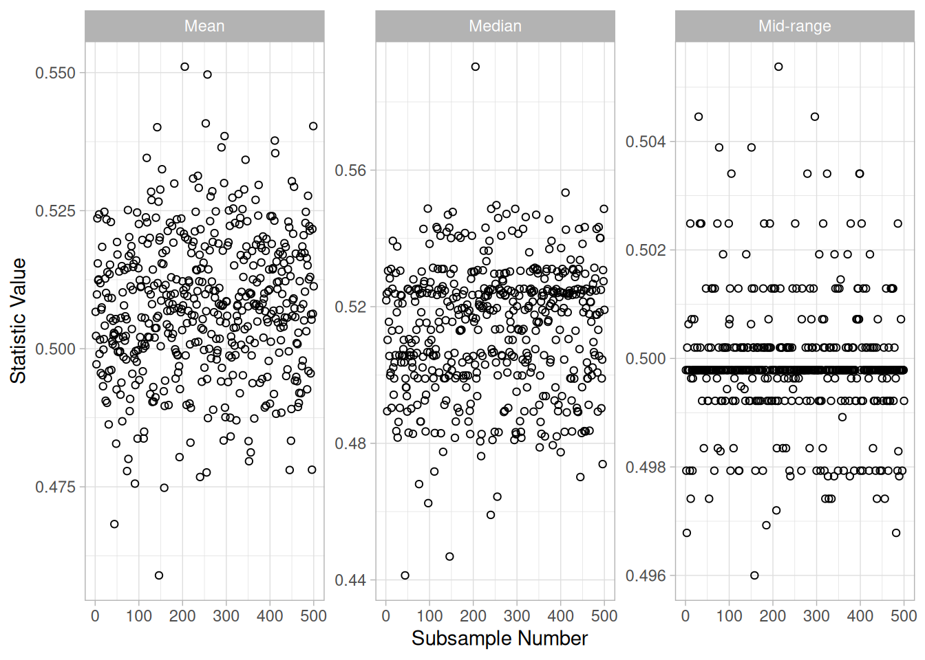
library(patchwork)

# A single facet_wrap(scales = "free") lets each panel's *breaks* be
# computed independently, but the mid-range distribution is so much
# tighter (it clusters right around 0.5) that ggplot still spaces its
# x-axis breaks across the full facet width, producing labels with a
# thousandths digit that gets clipped. Building the mid-range panel as
# its own plot with an explicit, narrower range (0.49-0.51, matching
# the data far more closely than the original NIST 0.45-0.55) keeps
# its tick labels legible and its structure visible, then patchwork
# recombines the three panels into one figure.
hist_panel <- function(data, stat_label, xlim = NULL, breaks = waiver()) {
  ggplot(data, aes(value)) +
    geom_histogram(bins = 30) +
    scale_x_continuous(limits = xlim, breaks = breaks) +
    labs(title = stat_label, x = "Statistic Value", y = "Count") +
    theme_light() +
    theme(plot.title = element_text(hjust = 0.5, size = 11))
}

hist_panel(boot_stats |> rename(value = mean), "Mean") +
  hist_panel(boot_stats |> rename(value = median), "Median") +
  hist_panel(
    boot_stats |> rename(value = midrange), "Mid-range",
    xlim = c(0.49, 0.51), breaks = seq(0.49, 0.51, 0.005)
  )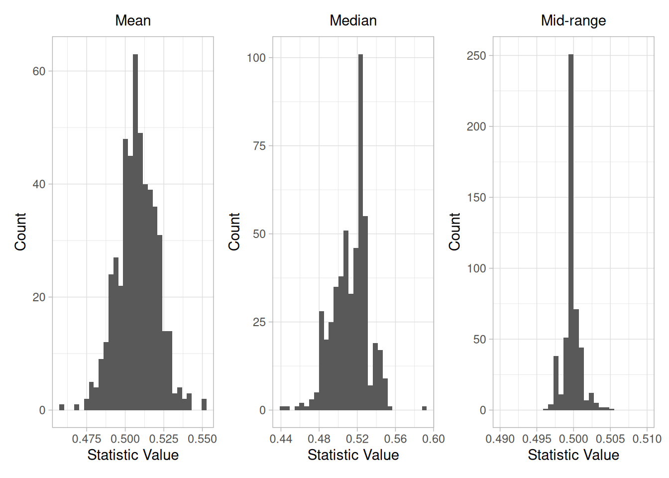
This bootstrap plot was generated from 500 uniform random numbers. Bootstrap plots and corresponding histograms were generated for the mean, median, and mid-range. The histograms for the corresponding statistics clearly show that for uniform random numbers the mid-range has the smallest variance and is, therefore, a superior location estimator to the mean or the median:
boot_stats |>
  summarize(across(c(mean, median, midrange), var))
Definition
The bootstrap plot is formed by:
The bootstrap plot is simply the computed value of the statistic versus the subsample number. That is, the bootstrap plot generates the values for the desired statistic. This is usually immediately followed by a histogram or some other distributional plot to show the location and variation of the sampling distribution of the statistic.
Questions
The bootstrap plot is used to answer the following questions:
Importance
The most common uncertainty calculation is generating a confidence interval for the mean. In this case, the uncertainty formula can be derived mathematically. However, there are many situations in which the uncertainty formulas are mathematically intractable. The bootstrap provides a method for calculating the uncertainty in these cases.
Caution on Use of the Bootstrap
The bootstrap is not appropriate for all distributions and statistics (Efron and Tibshirani). For example, because of the shape of the uniform distribution, the bootstrap is not appropriate for estimating the distribution of statistics that are heavily dependent on the tails, such as the range.
Related Techniques
Jackknife
The jackknife is a technique that is closely related to the bootstrap. The jackknife is beyond the scope of this handbook. See the Efron and Gong (Efron and Gong 1983) article for a discussion of the jackknife.
Case Study
The bootstrap plot is demonstrated in the uniform random numbers case study.
Software
The bootstrap is becoming more common in general purpose statistical software programs. However, it is still not supported in many of these programs. Both R software and Dataplot support a bootstrap capability.
Purpose: Find the Transformation of the X Variable that Maximizes the Correlation between a Y and an X Variable
When performing a linear fit of \(Y\) against \(X\), an appropriate transformation of \(X\) can often significantly improve the fit. The Box-Cox transformation (Box and Cox 1964) is a particularly useful family of transformations. It is defined as:
\[T(X) = (X^{\lambda} - 1)/\lambda\]
where \(X\) is the variable being transformed and \(\lambda\) is the transformation parameter. For \(\lambda = 0\), the natural log of the data is taken instead of using the above formula.
The Box-Cox linearity plot is a plot of the correlation between \(Y\) and the transformed \(X\) for given values of \(\lambda\). That is, \(\lambda\) is the coordinate for the horizontal axis variable and the value of the correlation between \(Y\) and the transformed \(X\) is the coordinate for the vertical axis of the plot. The value of \(\lambda\) corresponding to the maximum correlation (or minimum for negative correlation) on the plot is then the optimal choice for \(\lambda\).
Transforming \(X\) is used to improve the fit. The Box-Cox transformation applied to \(Y\) can be used as the basis for meeting the error assumptions. That case is not covered here. See page 225 of (Draper and Smith 1981) or page 77 of (Ryan 1997) for a discussion of this case.
Sample Plot
library(tidyverse)

jones <- read_table(here::here("datasets", "JONES.DAT"), skip = 25,
                     col_names = c("y", "x"), col_types = "dd")

boxcox_transform <- function(x, lambda) {
  if (lambda == 0) log(x) else (x^lambda - 1) / lambda
}

lambdas <- seq(-2, 2, by = 0.05)
boxcox_linearity <- tibble(lambda = lambdas) |>
  mutate(correlation = map_dbl(lambda, ~ cor(jones$y, boxcox_transform(jones$x, .x))))

best_lambda <- boxcox_linearity$lambda[which.max(abs(boxcox_linearity$correlation))]ggplot(jones, aes(x, y)) +
geom_point() +
geom_smooth(method = "lm", formula = y ~ x, se = FALSE) +
labs(x = "Temperature", y = "Density of Water") +
theme_light()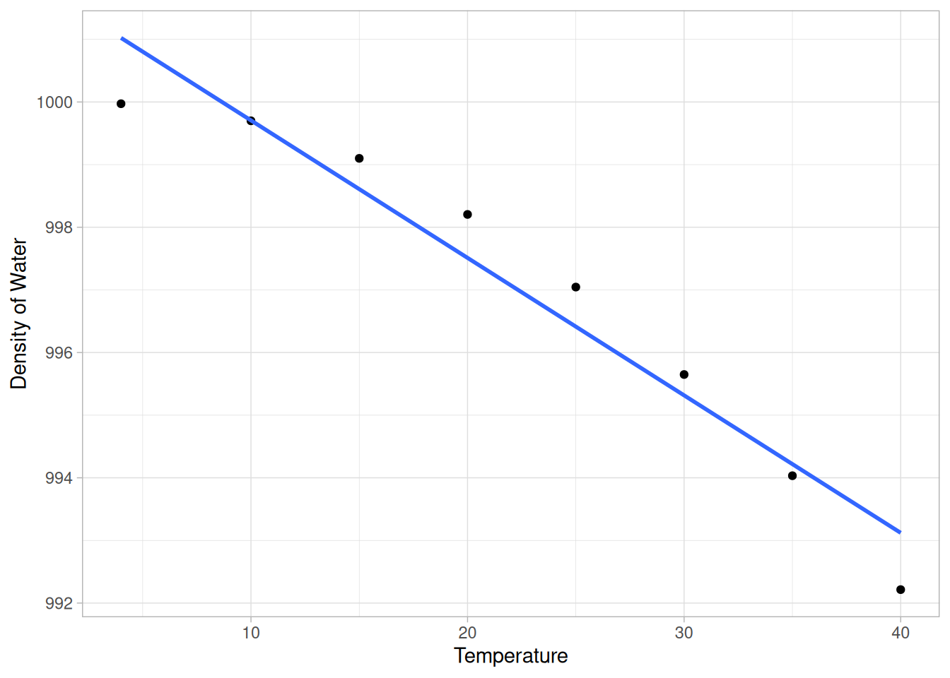
ggplot(boxcox_linearity, aes(lambda, correlation)) +
  geom_line() +
  geom_point(
    data = filter(boxcox_linearity, lambda == best_lambda),
    color = "firebrick", size = 2.5
  ) +
  labs(x = expression(lambda), y = "Correlation") +
  theme_light()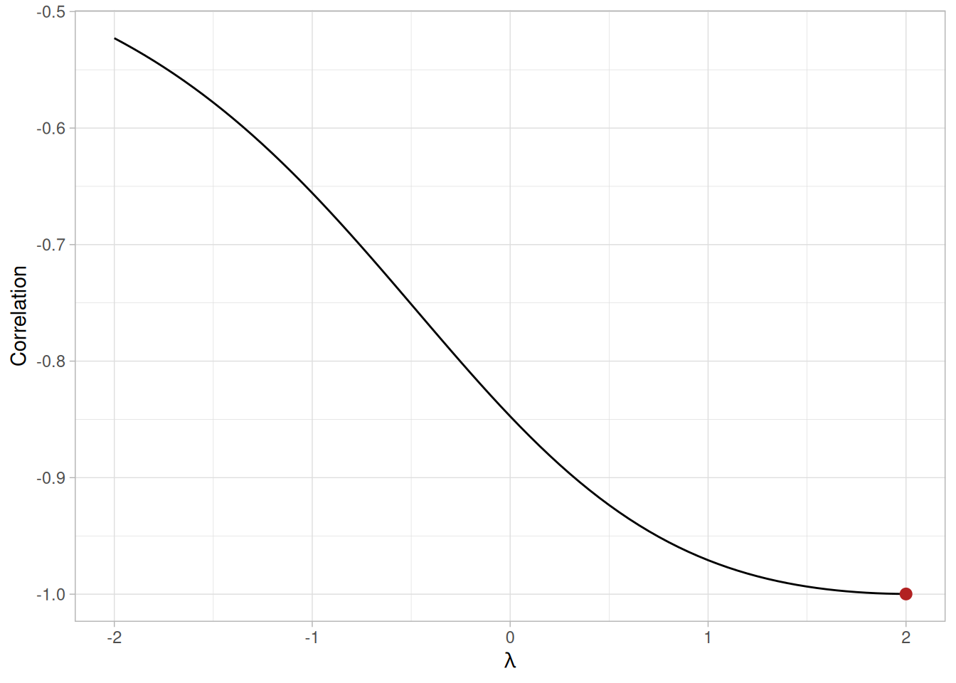
The plot of the original data with the predicted values from a linear fit indicate that a quadratic fit might be preferable. The Box-Cox linearity plot shows a value of \(\lambda\) = 2. The plot of the transformed data with the predicted values from a linear fit with the transformed data shows a better fit (verified by the significant reduction in the residual standard deviation):
jones_t <- jones |> mutate(xt = boxcox_transform(x, best_lambda))
ggplot(jones_t, aes(xt, y)) +
  geom_point() +
  geom_smooth(method = "lm", formula = y ~ x, se = FALSE) +
  labs(x = bquote(paste("Transformed X (", lambda, " = ", .(best_lambda), ")")), y = "Density of Water") +
  theme_light()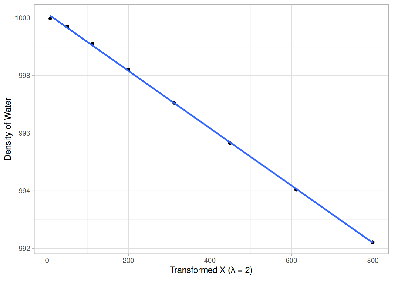
fit_orig <- lm(y ~ x, data = jones)
fit_t <- lm(y ~ xt, data = jones_t)
tibble(
  model = c("Linear fit on original X", paste0("Linear fit on X transformed with lambda = ", best_lambda)),
  residual_sd = c(sigma(fit_orig), sigma(fit_t))
)
Definition
Box-Cox linearity plots are formed by
Questions
The Box-Cox linearity plot can provide answers to the following questions:
Importance: Find a Suitable Transformation
Transformations can often significantly improve a fit. The Box-Cox linearity plot provides a convenient way to find a suitable transformation without engaging in a lot of trial and error fitting.
Related Techniques
Linear Regression
Case Study
The Box-Cox linearity plot is demonstrated in the Alaska pipeline data case study.
Software
Box-Cox linearity plots are not a standard part of most general purpose statistical software programs. However, the underlying technique is based on a transformation and computing a correlation coefficient. So if a statistical program supports these capabilities, writing a macro for a Box-Cox linearity plot should be feasible.
Purpose: Find Transformation to Normalize Data
Many statistical tests and intervals are based on the assumption of normality. The assumption of normality often leads to tests that are simple, mathematically tractable, and powerful compared to tests that do not make the normality assumption. Unfortunately, many real data sets are in fact not approximately normal. However, an appropriate transformation of a data set can often yield a data set that does follow approximately a normal distribution. This increases the applicability and usefulness of statistical techniques based on the normality assumption.
The Box-Cox transformation is a particularly useful family of transformations. It is defined as:
\[T(Y) = (Y^{\lambda} - 1)/\lambda\]
where \(Y\) is the response variable and \(\lambda\) is the transformation parameter. For \(\lambda = 0\), the natural log of the data is taken instead of using the above formula.
Given a particular transformation such as the Box-Cox transformation defined above, it is helpful to define a measure of the normality of the resulting transformation. One measure is to compute the correlation coefficient of a normal probability plot. The correlation is computed between the vertical and horizontal axis variables of the probability plot and is a convenient measure of the linearity of the probability plot (the more linear the probability plot, the better a normal distribution fits the data).
The Box-Cox normality plot is a plot of these correlation coefficients for various values of the \(\lambda\) parameter. The value of \(\lambda\) corresponding to the maximum correlation on the plot is then the optimal choice for \(\lambda\).
Sample Plot
library(tidyverse)

auto83b <- read_table(here::here("datasets", "AUTO83B.DAT"), skip = 25,
                       col_names = c("us", "japan"), col_types = "dd")

us_mpg <- auto83b$us

boxcox_transform <- function(y, lambda) {
  if (lambda == 0) log(y) else (y^lambda - 1) / lambda
}

ppcc <- function(y, lambda) {
  ty <- boxcox_transform(y, lambda)
  n <- length(ty)
  probs <- (seq_len(n) - 0.5) / n
  z <- qnorm(probs)
  cor(sort(ty), z)
}

lambdas <- seq(-2, 2, by = 0.01)
boxcox_normality <- tibble(lambda = lambdas) |>
  mutate(correlation = map_dbl(lambda, ~ ppcc(us_mpg, .x)))

best_lambda <- boxcox_normality$lambda[which.max(boxcox_normality$correlation)]ggplot(tibble(mpg = us_mpg), aes(mpg)) +
geom_histogram(binwidth = 2, boundary = 0) +
labs(x = "Miles per Gallon (U.S.)", y = "Count") +
theme_light()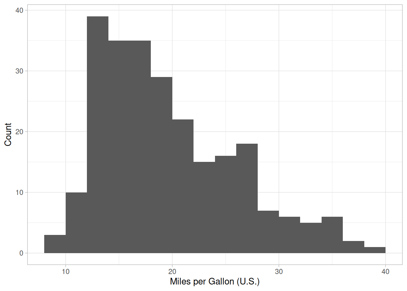
ggplot(boxcox_normality, aes(lambda, correlation)) +
  geom_line() +
  geom_point(
    data = filter(boxcox_normality, lambda == best_lambda),
    color = "firebrick", size = 2.5
  ) +
  labs(x = expression(lambda), y = "Correlation") +
  theme_light()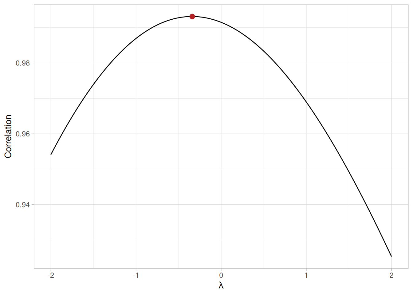
transformed <- boxcox_transform(us_mpg, best_lambda)
ggplot(tibble(y = transformed), aes(y)) +
  geom_histogram(bins = 20) +
  labs(x = paste0("Transformed MPG (lambda = ", round(best_lambda, 2), ")"), y = "Count") +
  theme_light()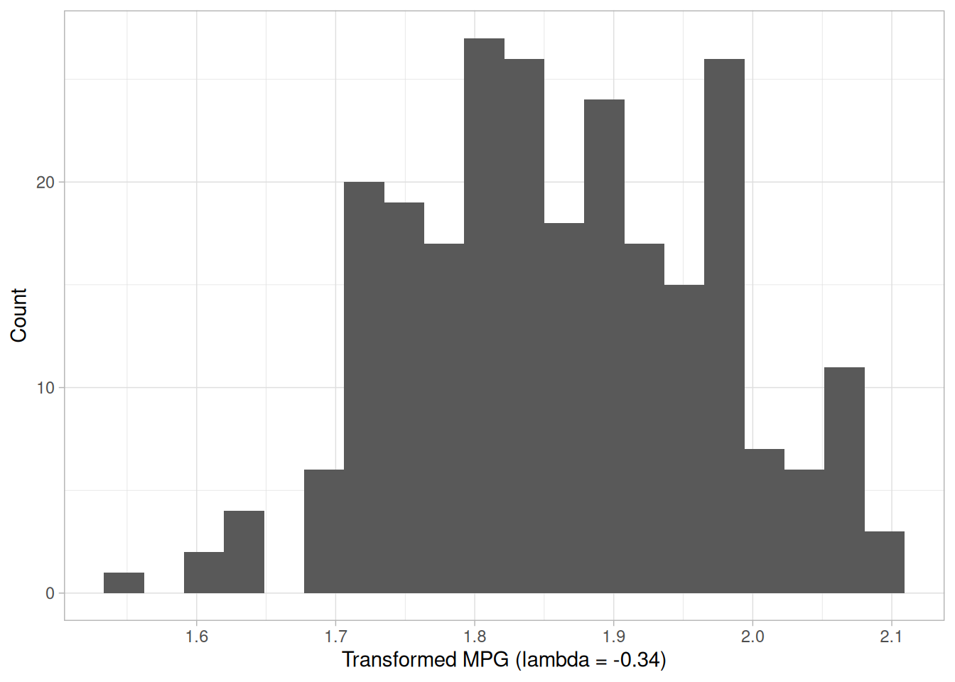
ggplot(tibble(y = transformed), aes(sample = y)) +
  stat_qq() +
  stat_qq_line() +
  labs(x = "Theoretical Quantiles", y = "Sample Quantiles") +
  theme_light()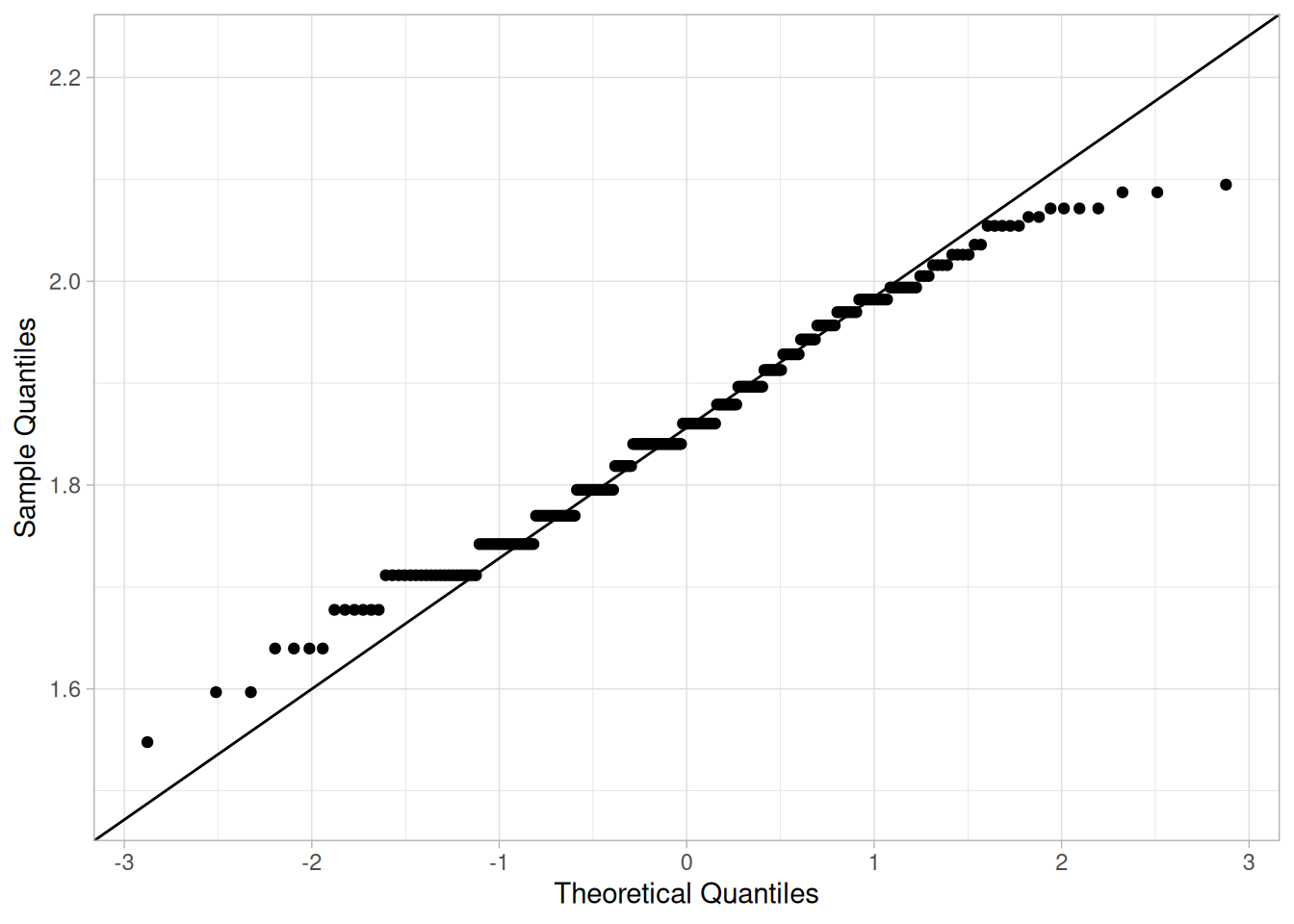
Figure 1.16, the first plot above, shows a data set (first column of AUTO83B.DAT) that has significant right skewness (and so does not follow a normal distribution). The Box-Cox normality plot shows that the maximum value of the correlation coefficient is at \(\lambda\) = -0.34, close to the value of -0.3 reported for this data set. Figure 1.18, the histogram of the data after applying the Box-Cox transformation with \(\lambda\) = -0.34, shows a data set for which the normality assumption is reasonable. This is verified with the normal probability plot of the transformed data in Figure 1.19.
Definition
Box-Cox normality plots are formed by:
Questions
The Box-Cox normality plot can provide answers to the following questions:
Importance: Normalization Improves Validity of Tests
Normality assumptions are critical for many univariate intervals and hypothesis tests. It is important to test the normality assumption. If the data are in fact clearly not normal, the Box-Cox normality plot can often be used to find a transformation that will approximately normalize the data.
Related Techniques
Software
Box-Cox normality plots are not a standard part of most general purpose statistical software programs. However, the underlying technique is based on a normal probability plot and computing a correlation coefficient. So if a statistical program supports these capabilities, writing a macro for a Box-Cox normality plot should be feasible.
Purpose: Check Location and Variation Shifts
Box plots (Chambers et al. 1983) are an excellent tool for conveying location and variation information in data sets, particularly for detecting and illustrating location and variation changes between different groups of data.
Sample Plot: This Box Plot Reveals that Machine Has a Significant Effect on Energy with Respect to Location and Possibly Variation
library(tidyverse)

splett2 <- read_table(
  here::here("datasets", "SPLETT2.DAT"),
  skip = 25,
  col_names = c("y", "machine"),
  col_types = "dd"
) |>
  drop_na() |>
  mutate(machine = factor(machine, labels = c("Tinius1", "Tinius2", "Satec", "Tokyo")))
Warning: 3 parsing failures.
row col expected actual file
25 -- 2 columns 1 columns '/home/ray/nist-sematech-projects/nist-sematech-statistics-book/book/datasets/SPLETT2.DAT'
51 -- 2 columns 1 columns '/home/ray/nist-sematech-projects/nist-sematech-statistics-book/book/datasets/SPLETT2.DAT'
77 -- 2 columns 1 columns '/home/ray/nist-sematech-projects/nist-sematech-statistics-book/book/datasets/SPLETT2.DAT'ggplot(splett2, aes(machine, y)) +
geom_boxplot() +
labs(x = "Machine", y = "Absorbed Energy (ft-lb)") +
theme_light()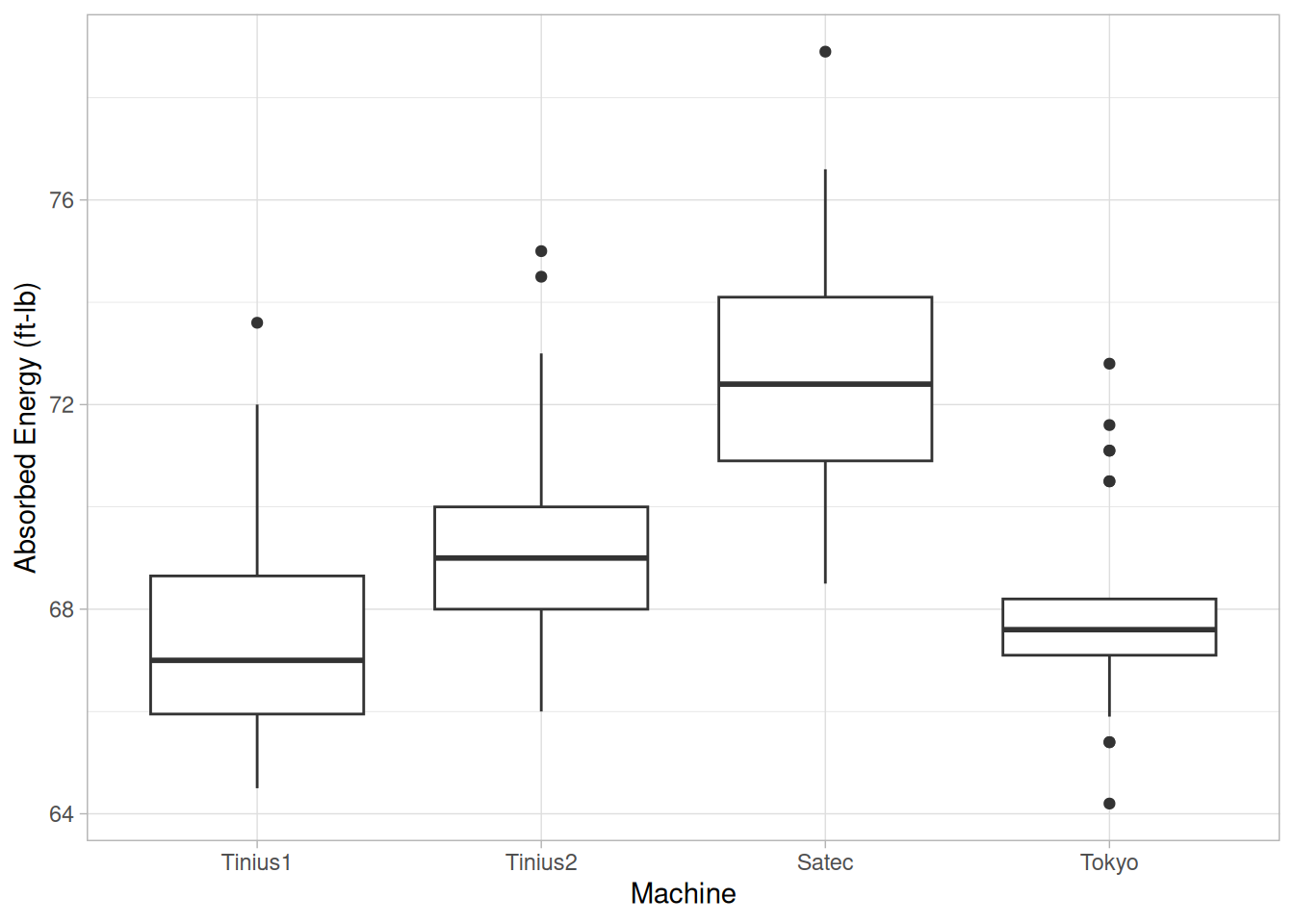
This box plot, comparing four machines for energy output, shows that machine has a significant effect on energy with respect to both location and variation. Machine Satec has the highest energy response (a median around 72.5); machine Tokyo has one of the least variable energy responses, with about 50% of its readings within roughly 1 energy unit of its median.
Definition
Box plots are formed by
More specifically, we
Calculate the median and the quartiles (the lower quartile is the 25th percentile and the upper quartile is the 75th percentile).
Plot a symbol at the median (or draw a line) and draw a box (hence the name–box plot) between the lower and upper quartiles; this box represents the middle 50% of the data–the “body” of the data.
Draw a line from the lower quartile to the minimum point and another line from the upper quartile to the maximum point. Typically a symbol is drawn at these minimum and maximum points, although this is optional.
Thus the box plot identifies the middle 50% of the data, the median, and the extreme points.
Single or Multiple Box Plots Can Be Drawn
A single box plot can be drawn for one batch of data with no distinct groups. Alternatively, multiple box plots can be drawn together to compare multiple data sets or to compare groups in a single data set. For a single box plot, the width of the box is arbitrary. For multiple box plots, the width of the box plot can be set proportional to the number of points in the given group or sample (some software implementations of the box plot simply set all the boxes to the same width).
Box Plots with Fences
There is a useful variation of the box plot that more specifically identifies outliers. To create this variation:
Plot a symbol at the median and draw a box between the lower and upper quartiles.
Calculate the interquartile range (the difference between the upper and lower quartile) and call it IQ.
Calculate the following points:
\[L_1 = \text{lower quartile} - 1.5 \cdot IQ\] \[L_2 = \text{lower quartile} - 3.0 \cdot IQ\] \[U_1 = \text{upper quartile} + 1.5 \cdot IQ\] \[U_2 = \text{upper quartile} + 3.0 \cdot IQ\]
The line from the lower quartile to the minimum is now drawn from the lower quartile to the smallest point that is greater than \(L_1\). Likewise, the line from the upper quartile to the maximum is now drawn to the largest point smaller than \(U_1\).
Points between \(L_1\) and \(L_2\) or between \(U_1\) and \(U_2\) are drawn as small circles. Points less than \(L_2\) or greater than \(U_2\) are drawn as large circles.
fence_stats <- splett2 |>
  summarize(
    q1 = quantile(y, 0.25),
    q3 = quantile(y, 0.75),
    .by = machine
  ) |>
  mutate(
    iq = q3 - q1,
    l1 = q1 - 1.5 * iq,
    l2 = q1 - 3.0 * iq,
    u1 = q3 + 1.5 * iq,
    u2 = q3 + 3.0 * iq
  )

splett2_fenced <- splett2 |>
  left_join(fence_stats, by = "machine") |>
  mutate(
    outlier_class = case_when(
      y < l2 | y > u2 ~ "Extreme",
      y < l1 | y > u1 ~ "Mild",
      TRUE ~ "Not an outlier"
    )
  )

ggplot(splett2_fenced, aes(machine, y)) +
  geom_boxplot(coef = 1.5, outlier.shape = NA) +
  geom_jitter(
    data = filter(splett2_fenced, outlier_class != "Not an outlier"),
    aes(size = outlier_class), width = 0.05, shape = 1
  ) +
  scale_size_manual(values = c(Mild = 1.5, Extreme = 3)) +
  labs(x = "Machine", y = "Absorbed Energy (ft-lb)", size = "Outlier") +
  theme_light()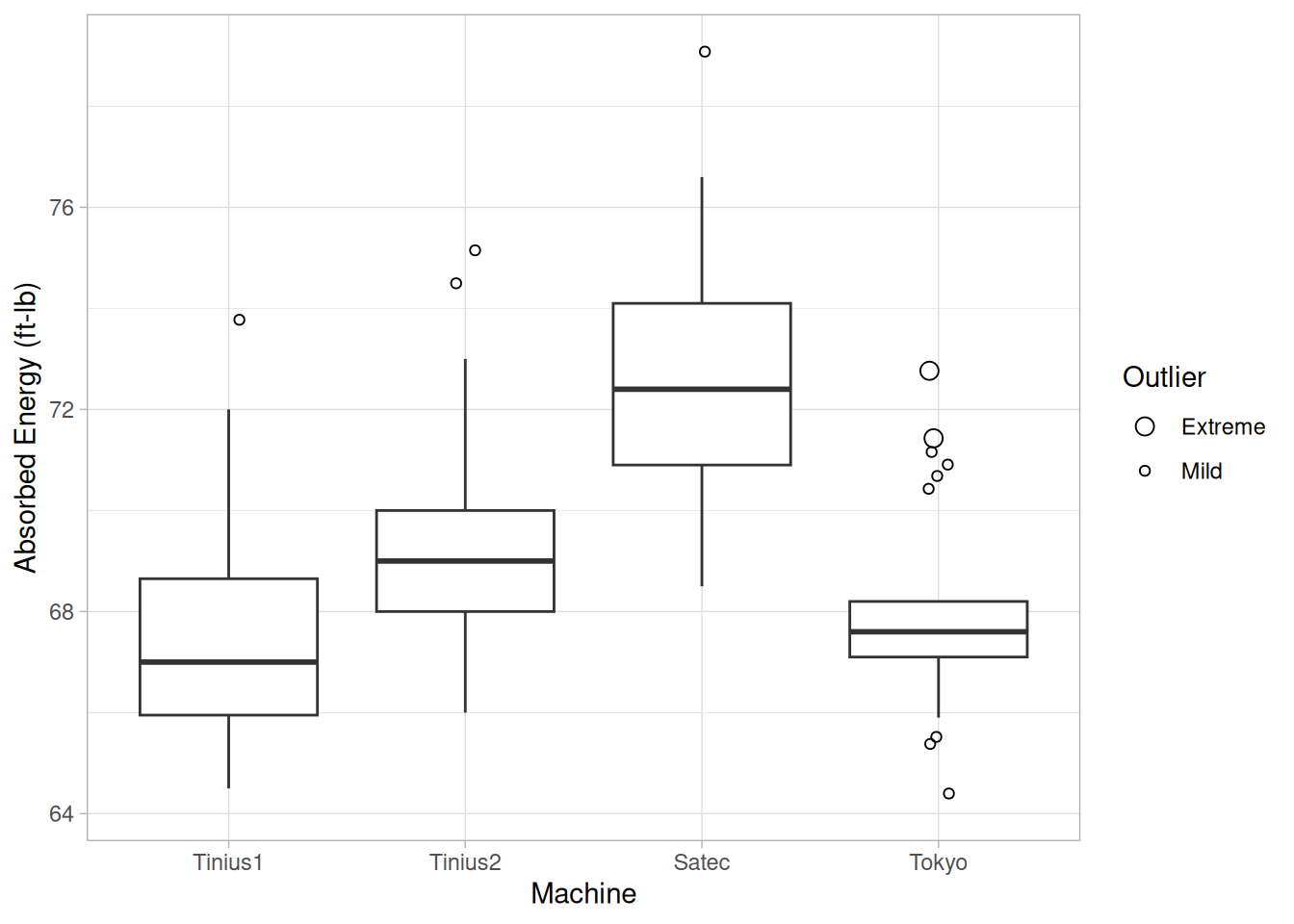
Questions
The box plot can provide answers to the following questions:
Importance: Check the Significance of a Factor
The box plot is an important EDA tool for determining if a factor has a significant effect on the response with respect to either location or variation.
The box plot is also an effective tool for summarizing large quantities of information.
Related Techniques
Case Study
The box plot is demonstrated in the ceramic strength data case study.
Software
Box plots are available in most general purpose statistical software programs.
Purpose: Detect Changing Amplitude in Sinusoidal Models
In the frequency analysis of time series models, a common model is the sinusoidal model:
\[Y_i = C + \alpha\sin(2\pi\omega t_i + \phi) + E_i\]
In this equation, \(\alpha\) is the amplitude, \(\phi\) is the phase shift, and \(\omega\) is the dominant frequency. In the above model, \(\alpha\) and \(\phi\) are constant, that is they do not vary with time, \(t_i\).
The complex demodulation amplitude plot (Granger and Hatanaka 1964) is used to determine if the assumption of constant amplitude is justifiable. If the slope of the complex demodulation amplitude plot is not zero, then the above model is typically replaced with the model:
\[Y_i = C + \alpha_i\sin(2\pi\omega t_i + \phi) + E_i\]
where \(\hat{\alpha}_i\) is some type of linear model fit with standard least squares. The most common case is a linear fit, that is the model becomes
\[Y_i = C + (B_0 + B_1 t_i)\sin(2\pi\omega t_i + \phi) + E_i\]
Quadratic models are sometimes used. Higher order models are relatively rare.
Sample Plot
library(tidyverse)

# Complex demodulation: multiply the series by exp(-i*2*pi*w0*t) to shift the
# component at frequency w0 down to (near) zero frequency, then low-pass
# filter the resulting complex series with a simple centered moving average
# to isolate the slowly-varying amplitude and phase. This mirrors the
# construction described below, though the exact filter used by Dataplot is
# proprietary; a length-21 moving average was found to give a comparably
# smooth result for this series.
complex_demodulate <- function(y, w0, filter_len = 21) {
  n <- length(y)
  t <- seq_len(n)
  z <- y * exp(-1i * 2 * pi * w0 * t)
  filt <- rep(1 / filter_len, filter_len)
  # stats::filter() returns a ts object; strip that with as.numeric() so
  # ggplot doesn't have to guess a scale for it.
  zr <- as.numeric(stats::filter(Re(z), filt, sides = 2))
  zi <- as.numeric(stats::filter(Im(z), filt, sides = 2))
  tibble(
    t = t,
    amplitude = 2 * sqrt(zr^2 + zi^2),
    phase = atan2(zi, zr)
  )
}

lew <- read_table(here::here("datasets", "LEW.DAT"), skip = 25, col_names = "y", col_types = "d")

# Dominant frequency estimated from the spectral plot / non-linear fit of the
# beam deflection case study is omega = 0.302596.
lew_demod <- complex_demodulate(lew$y, w0 = 0.302596)# The moving-average filter can't compute a value within filter_len/2
# samples of either edge, so those rows are legitimately NA -- warning:
# false suppresses ggplot's expected "removed rows" message for that.
lew_demod |>
ggplot(aes(t, amplitude)) +
geom_line() +
labs(x = "Time", y = "Amplitude") +
theme_light()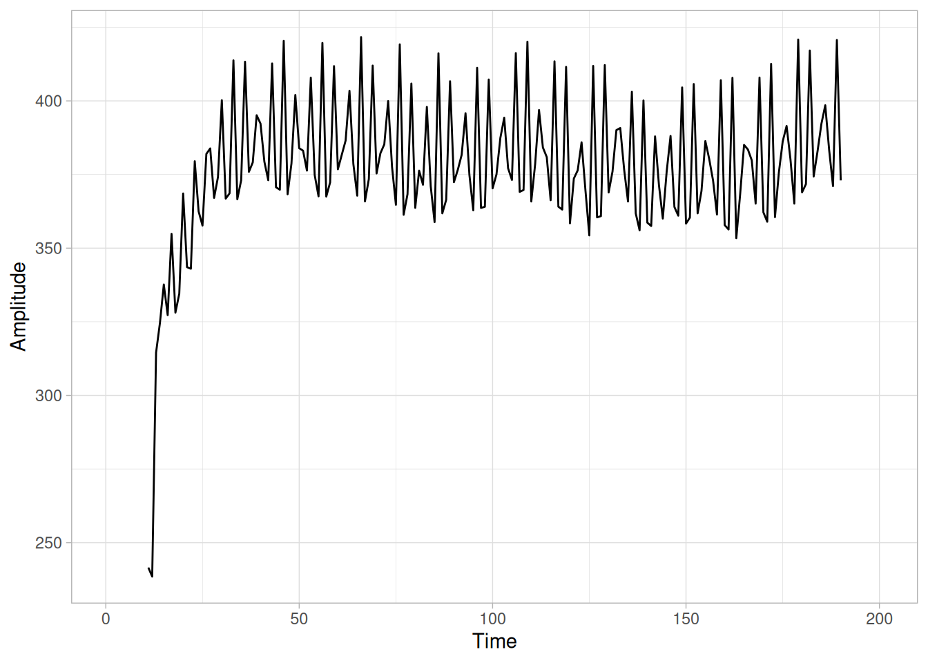
This complex demodulation amplitude plot of the LEW.DAT data set shows that:
Definition
The complex demodulation amplitude plot is formed by:
The mathematical computations for determining the amplitude are beyond the scope of the Handbook. Consult Granger (Granger and Hatanaka 1964) for details.
Questions
The complex demodulation amplitude plot answers the following questions:
Importance: Assumption Checking
As stated previously, in the frequency analysis of time series models, a common model is the sinusoidal model:
\[Y_i = C + \alpha\sin(2\pi\omega t_i + \phi) + E_i\]
In this equation, \(\alpha\) is assumed to be constant, that is it does not vary with time. It is important to check whether or not this assumption is reasonable.
The complex demodulation amplitude plot can be used to verify this assumption. If the slope of this plot is essentially zero, then the assumption of constant amplitude is justified. If it is not, \(\alpha\) should be replaced with some type of time-varying model. The most common cases are linear (\(B_0 + B_1 t\)) and quadratic (\(B_0 + B_1 t + B_2 t^2\)).
Related Techniques
Spectral Plot, Complex Demodulation Phase Plot, Non-Linear Fitting.
Case Study
The complex demodulation amplitude plot is demonstrated in the beam deflection data case study.
Software
Complex demodulation amplitude plots are available in some, but not most, general purpose statistical software programs.
Purpose: Improve the Estimate of Frequency in Sinusoidal Time Series Models
As stated previously, in the frequency analysis of time series models, a common model is the sinusoidal model:
\[Y_i = C + \alpha\sin(2\pi\omega t_i + \phi) + E_i\]
In this equation, \(\alpha\) is the amplitude, \(\phi\) is the phase shift, and \(\omega\) is the dominant frequency. In the above model, \(\alpha\) and \(\phi\) are constant, that is they do not vary with time \(t_i\).
The complex demodulation phase plot (Granger and Hatanaka 1964) is used to improve the estimate of the frequency (i.e., \(\omega\)) in this model.
If the complex demodulation phase plot shows lines sloping from left to right, then the estimate of the frequency should be increased. If it shows lines sloping right to left, then the frequency should be decreased. If there is essentially zero slope, then the frequency estimate does not need to be modified.
Sample Plot
library(tidyverse)

# Same complex demodulation construction used for the amplitude plot: shift
# the series down to (near) zero frequency at the candidate frequency w0 and
# low-pass filter with a centered moving average. NIST's own text notes that
# Dataplot's phase plot "restricts the range from pi/2 to -pi/2," which is
# what plain atan() (rather than the full-circle atan2()) gives -- this is
# also what produces the repeated sawtooth "breaks" seen in the original.
#
# The time index used inside the demodulating exponential is 0-based (t = 0,
# 1, 2, ...) rather than 1-based: since the phase plot's absolute vertical
# position (not just its slope) depends on exactly where t "starts", this
# matches Dataplot's own zero-based indexing and is what lines the plot up
# with the original -- a 1-based index shifts every point by a constant
# fraction of a cycle, which visibly moves the whole sawtooth pattern.
complex_demodulate <- function(y, w0, filter_len = 21) {
  n <- length(y)
  t <- seq_len(n) - 1
  z <- y * exp(-1i * 2 * pi * w0 * t)
  filt <- rep(1 / filter_len, filter_len)
  # stats::filter() returns a ts object; strip that with as.numeric() so
  # ggplot doesn't have to guess a scale for it.
  zr <- as.numeric(stats::filter(Re(z), filt, sides = 2))
  zi <- as.numeric(stats::filter(Im(z), filt, sides = 2))
  tibble(
    t = t,
    amplitude = 2 * sqrt(zr^2 + zi^2),
    phase = atan(zi / zr)
  )
}

lew <- read_table(here::here("datasets", "LEW.DAT"), skip = 25, col_names = "y", col_types = "d")

# NIST's own Dataplot macro for this exact sample plot (graphicsgallery.dp)
# uses a demodulation frequency of 0.31, versus the fitted true frequency of
# 0.302596 (see the Complex Demodulation Amplitude Plot page) -- close to
# correct but slightly too high, which is what produces the sloped pattern
# described below. filter_len = 15 was chosen empirically: shorter filters
# (e.g. the default 21) leave enough residual noise/texture to closely
# match the small-scale wiggle visible in the original plot, while filters
# much longer than this over-smooth that texture away.
lew_demod <- complex_demodulate(lew$y, w0 = 0.31, filter_len = 15)# Dataplot's own macro for this plot sets "lines blank" -- the original is
# a scatter of discrete points, not a connected line. (The moving-average
# filter can't compute a value within filter_len/2 samples of either edge,
# so those rows are legitimately NA -- warning: false suppresses ggplot's
# expected "removed rows" message for that.)
lew_demod |>
ggplot(aes(t, phase)) +
geom_point() +
labs(x = "Time", y = "Phase") +
theme_light()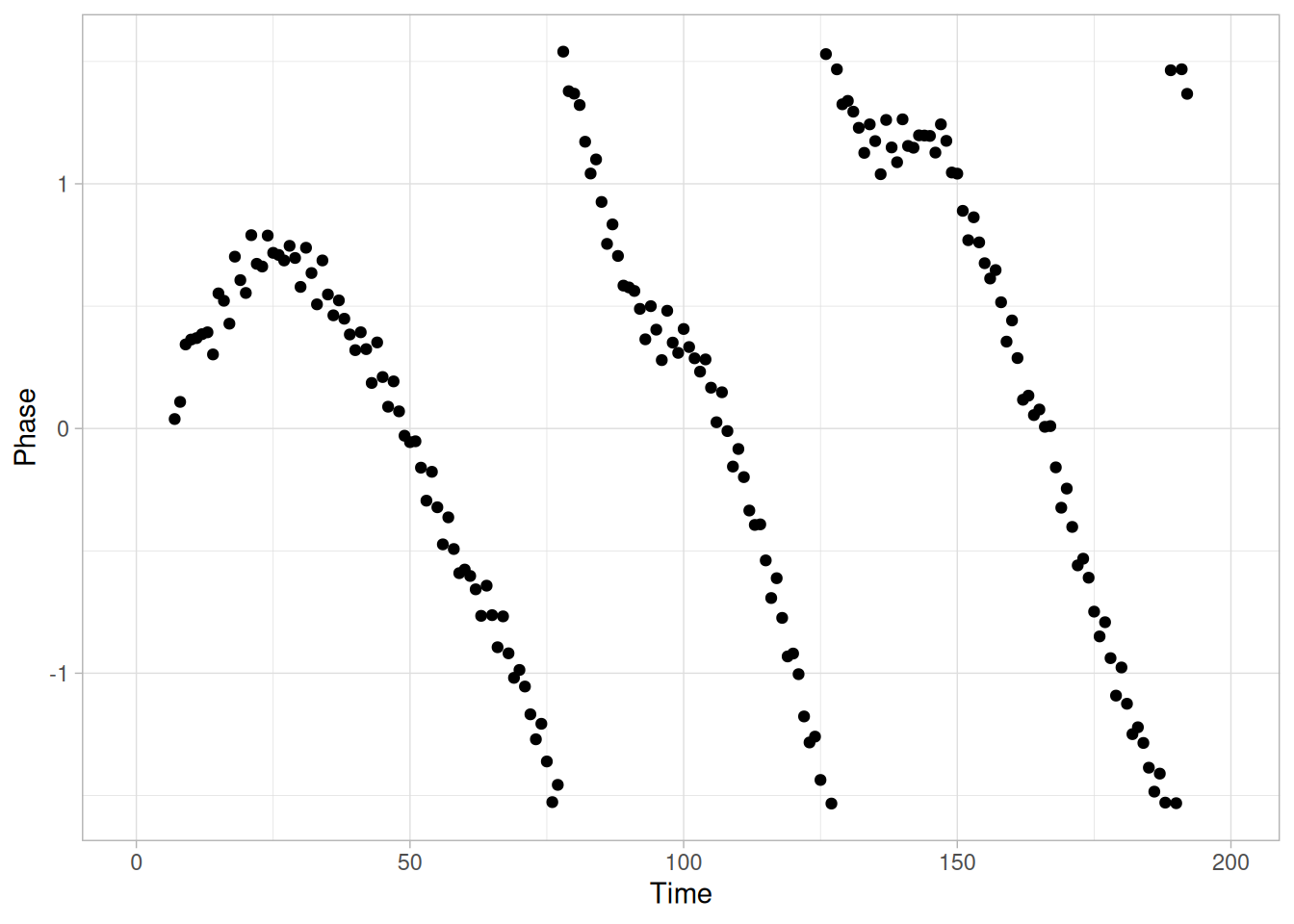
This complex demodulation phase plot of the LEW.DAT data set, generated with a demodulation frequency of 0.31, shows that:
(Using the fitted frequency of 0.302596, as in the Sample Plot on the Complex Demodulation Amplitude Plot page, produces a much flatter phase plot, consistent with 0.302596 being close to the correct dominant frequency for this series.)
Definition
The complex demodulation phase plot is formed by:
The mathematical computations for the phase plot are beyond the scope of the Handbook. Consult Granger (Granger and Hatanaka 1964) for details.
Questions
The complex demodulation phase plot answers the following question:
Importance of a Good Initial Estimate for the Frequency
The non-linear fitting for the sinusoidal model:
\[Y_i = C + \alpha\sin(2\pi\omega t_i + \phi) + E_i\]
is usually quite sensitive to the choice of good starting values. The initial estimate of the frequency, \(\omega\), is obtained from a spectral plot. The complex demodulation phase plot is used to assess whether this estimate is adequate, and if it is not, whether it should be increased or decreased. Using the complex demodulation phase plot with the spectral plot can significantly improve the quality of the non-linear fits obtained.
Related Techniques
Spectral Plot, Complex Demodulation Amplitude Plot, Non-Linear Fitting.
Case Study
The complex demodulation amplitude plot is demonstrated in the beam deflection data case study.
Software
Complex demodulation phase plots are available in some, but not most, general purpose statistical software programs.
Purpose: Display 3-D Surface on 2-D Plot
A contour plot is a graphical technique for representing a 3-dimensional surface by plotting constant \(z\) slices, called contours, on a 2-dimensional format. That is, given a value for \(z\), lines are drawn for connecting the \((x, y)\) coordinates where that \(z\) value occurs.
The contour plot is an alternative to a 3-D surface plot.
Sample Plot
library(tidyverse)

# The source page's sample plot is illustrative, showing a generic
# symmetric, single-peaked surface, with no specific named dataset or
# equation given. A comparable synthetic surface, a paraboloid peaking at
# the center of the (x, y) grid, is used here for the same illustrative
# purpose.
surface <- expand_grid(
  x = seq(0, 10, length.out = 80),
  y = seq(0, 10, length.out = 80)
) |>
mutate(z = 50 - (x - 5)^2 - (y - 5)^2)ggplot(surface, aes(x, y, z = z)) +
geom_contour_filled(alpha = 0.8) +
geom_contour(color = "grey20", linewidth = 0.2) +
labs(x = "X", y = "Y", fill = "Z") +
theme_light()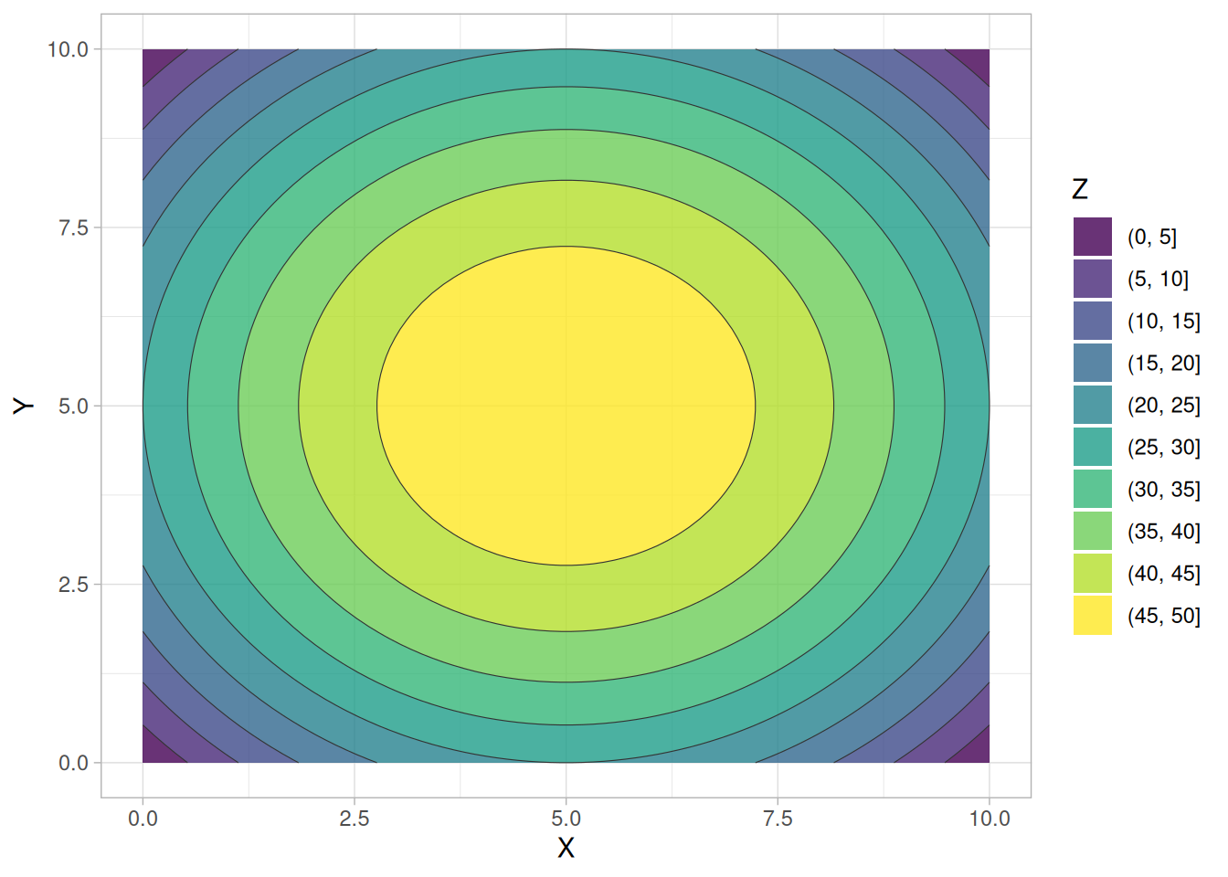
This contour plot shows that the surface is symmetric and peaks in the center.
Definition
The contour plot is formed by:
The independent variables are usually restricted to a regular grid. The actual techniques for determining the correct iso-response values are rather complex and are almost always computer generated.
An additional variable may be required to specify the \(Z\) values for drawing the iso-lines. Some software packages require explicit values. Other software packages will determine them automatically.
If the data (or function) do not form a regular grid, you typically need to perform a 2-D interpolation to form a regular grid.
Questions
The contour plot is used to answer the question:
Importance: Visualizing 3-Dimensional Data
For univariate data, a run sequence plot and a histogram are considered necessary first steps in understanding the data. For 2-dimensional data, a scatter plot is a necessary first step in understanding the data.
In a similar manner, 3-dimensional data should be plotted. Small data sets, such as result from designed experiments, can typically be represented by block plots, DOE mean plots, and the like (“DOE” stands for “Design of Experiments”). For large data sets, a contour plot or a 3-D surface plot should be considered a necessary first step in understanding the data.
Related Techniques
3-D Plot
Software
Contour plots are available in most general purpose statistical software programs. They are also available in many general purpose graphics and mathematics programs. These programs vary widely in the capabilities for the contour plots they generate. Many provide just a basic contour plot over a rectangular grid while others permit color filled or shaded contours.
Most statistical software programs that support design of experiments will provide a DOE contour plot capability.
DOE Contour Plot: Introduction
The DOE contour plot is a specialized contour plot used in the analysis of full and fractional experimental designs. These designs often have a low level, coded as “-1” or “-”, and a high level, coded as “+1” or “+” for each factor. In addition, there can optionally be one or more center points. Center points are at the mid-point between the low and high level for each factor and are coded as “0”.
The DOE contour plot is generated for two factors. Typically, this would be the two most important factors as determined by previous analyses (e.g., through the use of the DOE mean plots and an analysis of variance). If more than two factors are important, you may want to generate a series of DOE contour plots, each of which is drawn for two of these factors. You can also generate a matrix of all pairwise DOE contour plots for a number of important factors (similar to the scatter plot matrix for scatter plots).
The typical application of the DOE contour plot is in determining settings that will maximize (or minimize) the response variable. It can also be helpful in determining settings that result in the response variable hitting a pre-determined target value. The DOE contour plot plays a useful role in determining the settings for the next iteration of the experiment. That is, the initial experiment is typically a fractional factorial design with a fairly large number of factors. After the most important factors are determined, the DOE contour plot can be used to help define settings for a full factorial or response surface design based on a smaller number of factors.
Construction of DOE Contour Plot
The following are the primary steps in the construction of the DOE contour plot.
The \(x\) and \(y\) axes of the plot represent the values of the first and second factor (independent) variables.
The four vertex points are drawn. The vertex points are \((-1,-1)\), \((-1,1)\), \((1,1)\), \((1,-1)\). At each vertex point, the average of all the response values at that vertex point is printed.
Similarly, if there are center points, a point is drawn at \((0,0)\) and the average of the response values at the center points is printed.
The linear DOE contour plot assumes the model:
\[Y = \mu + \beta_1 \cdot U_1 + \beta_2 \cdot U_2 + \beta_{12} \cdot U_1 \cdot U_2\]
where \(\mu\) is the overall mean of the response variable. The values of \(\beta_1\), \(\beta_2\), \(\beta_{12}\), and \(\mu\) are estimated from the vertex points using least squares estimation.
In order to generate a single contour line, we need a value for \(Y\), say \(Y_0\). Next, we solve for \(U_2\) in terms of \(U_1\) and, after doing the algebra, we have the equation:
\[U_2 = \frac{(Y_0 - \mu) - \beta_1 \cdot U_1}{\beta_2 + \beta_{12} \cdot U_1}\]
We generate a sequence of points for \(U_1\) in the range -2 to 2 and compute the corresponding values of \(U_2\). These points constitute a single contour line corresponding to \(Y = Y_0\).
The user specifies the target values for which contour lines will be generated.
The above algorithm assumes a linear model for the design. DOE contour plots can also be generated for the case in which we assume a quadratic model for the design. The algebra for solving for \(U_2\) in terms of \(U_1\) becomes more complicated, but the fundamental idea is the same. Quadratic models are needed for the case when the average for the center points does not fall in the range defined by the vertex points (i.e., there is curvature).
Sample DOE Contour Plot
The following uses the Eddy current case study data (SPLETT3.DAT), a \(2^3\) full factorial experiment on probe impedance with factors for number of wire turns (\(X_1\)), winding distance (\(X_2\)), and wire gauge (\(X_3\)). The case study determined that \(X_1\) and \(X_2\) were the two dominant factors, so the DOE contour plot is drawn for those two, with each of the 4 vertex values averaged over the two levels of \(X_3\).
library(tidyverse)

eddy <- read_table(
  here::here("datasets", "SPLETT3.DAT"),
  skip = 25,
  col_names = c("y", "x1", "x2", "x3", "run"),
  col_types = "ddddi"
)

# Vertex averages: mean response at each of the 4 combinations of X1, X2,
# averaging over the two levels of X3.
vertices <- eddy |>
  summarize(Y = mean(y), .by = c(x1, x2)) |>
  rename(U1 = x1, U2 = x2)

# The linear model is fit to the full 8-run data (not just the 4 vertex
# means), which is equivalent here since X3 is balanced across every
# (X1, X2) combination.
fit <- lm(y ~ x1 * x2, data = eddy)
mu <- coef(fit)[["(Intercept)"]]
b1 <- coef(fit)[["x1"]]
b2 <- coef(fit)[["x2"]]
b12 <- coef(fit)[["x1:x2"]]

# Solve for U2 in terms of U1 for a given target response Y0, per the
# formula above.
doe_contour_line <- function(y0, mu, b1, b2, b12, u1_range = seq(-2, 2, length.out = 400)) {
  tibble(U1 = u1_range, Y0 = y0) |>
    mutate(U2 = ((Y0 - mu) - b1 * U1) / (b2 + b12 * U1)) |>
    filter(is.finite(U2), abs(U2) <= 2)
}

target_values <- c(0, 1, 2, 3, 4, 5)
contour_lines <- map_dfr(target_values, doe_contour_line, mu = mu, b1 = b1, b2 = b2, b12 = b12)ggplot() +
geom_path(data = contour_lines, aes(U1, U2, group = Y0, color = factor(Y0))) +
geom_point(data = vertices, aes(U1, U2), size = 2) +
geom_text(data = vertices, aes(U1, U2, label = round(Y, 2)), vjust = -1) +
coord_equal(xlim = c(-1.5, 1.5), ylim = c(-1.5, 1.5)) +
labs(x = expression(U[1] * " (Number of Turns)"), y = expression(U[2] * " (Winding Distance)"), color = expression(Y[0])) +
theme_light()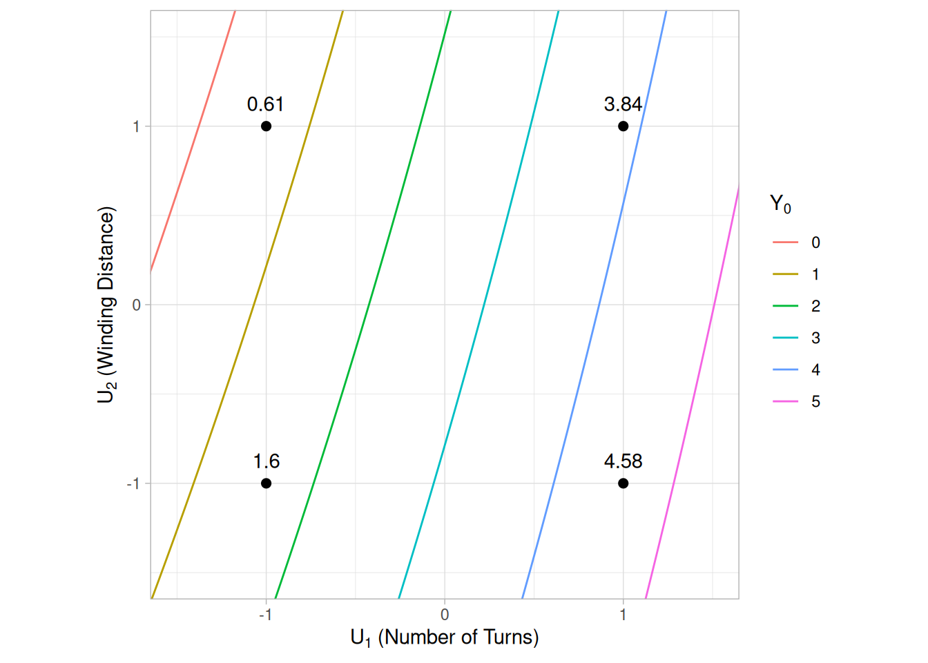
Interpretation of the Sample DOE Contour Plot
From the above DOE contour plot we can derive the following information:
Interaction Significance
Note the appearance of the contour plot. If the contour curves are linear, then that implies that the interaction term is not significant; if the contour curves have considerable curvature, then that implies that the interaction term is large and important. In this example, the contour lines are close to linear (evenly spaced, parallel-ish diagonal lines), so the \(X_1 \cdot X_2\) interaction term is small relative to the two main effects.
Best Settings
To determine the best factor settings for the already-run experiment, we first must define what “best” means. If “best” means to maximize the response (probe impedance), then from the contour plot we determine the best settings for the two dominant factors by simply scanning the four vertices and choosing the vertex with the largest value (= average response). Here that is \((U_1 = +1, U_2 = -1)\) – 180 wire turns and a winding distance of 0.38 inches – with an average response of 4.58.
For any additional factors not shown on this plot (here, wire gauge \(X_3\)), the contour plot provides no best-setting information, and so we would resort to other tools: the main effects plot, the interaction effects matrix, or the ordered data to determine optimal settings for those factors.
Case Study
The Eddy current case study demonstrates the use of the DOE contour plot in the context of the analysis of a full factorial design.
Software
DOE Contour plots are available in many statistical software programs that analyze data from designed experiments.
Purpose: Determine Important Factors with Respect to Location and Scale
The DOE scatter plot shows the response values for each level of each factor (i.e., independent) variable. This graphically shows how the location and scale vary for both within a factor variable and between different factor variables. This graphically shows which are the important factors and can help provide a ranked list of important factors from a designed experiment. The DOE scatter plot is a complement to the traditional analysis of variance of designed experiments.
DOE scatter plots are typically used in conjunction with the DOE mean plot and the DOE standard deviation plot. The DOE mean plot replaces the raw response values with mean response values while the DOE standard deviation plot replaces the raw response values with the standard deviation of the response values. There is value in generating all 3 of these plots. The DOE mean and standard deviation plots are useful in that the summary measures of location and spread stand out (they can sometimes get lost with the raw plot). However, the raw data points can reveal subtleties, such as the presence of outliers, that might get lost with the summary statistics.
Sample Plot
library(tidyverse)

# BOXBIKE2.DAT: Box, Hunter & Hunter (1978), "Statistics for Experimenters",
# Wiley, p. 391. A 2^(7-4) fractional factorial design measuring the time
# to climb a hill on a bicycle, with 7 two-level factors: seat height (X1),
# dynamo engaged (X2), handlebar angle (X3), gear (X4), raincoat on/off
# (X5), breakfast (X6), and tire pressure (X7). This 8-run table is entered
# directly, exactly as given in the source data file.
boxbike2 <- tribble(
  ~Y, ~X1, ~X2, ~X3, ~X4, ~X5, ~X6, ~X7,
  69, -1, -1, -1,  1,  1,  1, -1,
  52,  1, -1, -1, -1, -1,  1,  1,
  60, -1,  1, -1, -1,  1, -1,  1,
  83,  1,  1, -1,  1, -1, -1, -1,
  71, -1, -1,  1,  1, -1, -1,  1,
  50,  1, -1,  1, -1,  1, -1, -1,
  59, -1,  1,  1, -1, -1,  1, -1,
  88,  1,  1,  1,  1,  1,  1,  1
)

boxbike2_long <- boxbike2 |>
  pivot_longer(starts_with("X"), names_to = "factor", names_prefix = "X", values_to = "level") |>
  mutate(factor = paste0("Factor ", factor))

overall_mean <- mean(boxbike2$Y)ggplot(boxbike2_long, aes(level, Y)) +
geom_hline(yintercept = overall_mean) +
geom_point(size = 2) +
facet_wrap(~factor, nrow = 1) +
scale_x_continuous(breaks = c(-1, 1), labels = c("-1", "+1"), limits = c(-1.5, 1.5)) +
labs(x = NULL, y = "Time to climb hill (sec)") +
theme_light()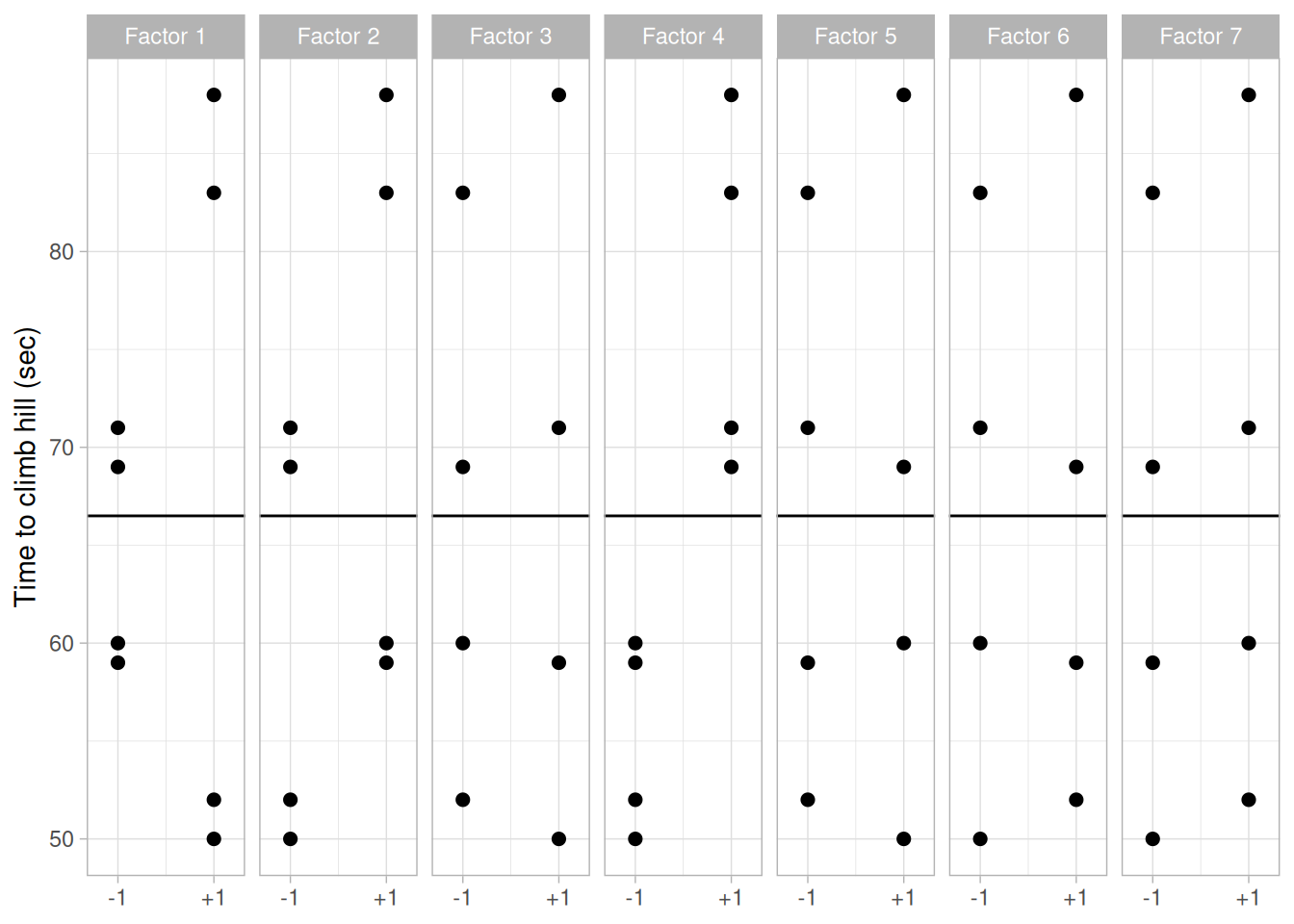
Description of the Plot
For this sample plot of the BOXBIKE2.DAT data set, there are seven factors and each factor has two levels. Each factor gets its own panel, faceted on a common response (\(y\)) axis, with the two factor levels (\(-1\) and \(+1\)) shown along the \(x\) axis of that panel. The solid horizontal line is drawn at the overall mean of the response variable.
Although the plot can be drawn with an arbitrary number of levels for a factor, it is really only useful when there are two or three levels for a factor.
Conclusions
This DOE scatter plot of the BOXBIKE2.DAT data shows that:
Definition: Response Values Versus Factor Variables
DOE scatter plots are formed by:
Questions
The DOE scatter plot can be used to answer the following questions:
Importance: Identify Important Factors with Respect to Location and Scale
The goal of many designed experiments is to determine which factors are important with respect to location and scale. A ranked list of the important factors is also often of interest. DOE scatter, mean, and standard deviation plots show this graphically. The DOE scatter plot additionally shows if outliers may potentially be distorting the results.
DOE scatter plots were designed primarily for analyzing designed experiments. However, they are useful for any type of multi-factor data (i.e., a response variable with two or more factor variables having a small number of distinct levels) whether or not the data were generated from a designed experiment.
Extension for Interaction Effects
Using the concept of the scatter plot matrix, the DOE scatter plot can be extended to display first order interaction effects.
Specifically, if there are \(k\) factors, we create a matrix of plots with \(k\) rows and \(k\) columns. On the diagonal, the plot is simply a DOE scatter plot with a single factor. For the off-diagonal plots, we multiply the values of \(X_i\) and \(X_j\). For the common 2-level designs (i.e., each factor has two levels) the values are typically coded as -1 and 1, so the multiplied values are also -1 and 1. We then generate a DOE scatter plot for this interaction variable. This plot is called a DOE interaction effects plot and an example is shown in Figure 1.27, using the batch 1 subset of the ceramic strength data (JAHANMI2.DAT) and its three design factors: table speed (\(X_1\)), down feed rate (\(X_2\)), and wheel grit (\(X_3\)).
library(patchwork)

jahanmi2_b1 <- read_table(
  here::here("datasets", "JAHANMI2.DAT"),
  skip = 50,
  col_names = c("id", "lab", "num", "test", "y", "x1", "x2", "x3", "x4",
                "trt", "set", "llab", "rep", "bat", "sblab", "set2"),
  col_types = cols(.default = "d")
) |>
  filter(bat == 1)

# One panel of the interaction effects matrix: response Y vs. either a
# single factor (on the diagonal) or the product of two factors (off the
# diagonal), sharing a fixed y range (matching the original Dataplot
# YLIMITS 500 800) across every panel.
interaction_panel <- function(x, label) {
  ggplot(tibble(x = x, y = jahanmi2_b1$y), aes(x, y)) +
    geom_point(shape = 4) +
    scale_x_continuous(breaks = c(-1, 1), limits = c(-1.5, 1.5)) +
    scale_y_continuous(limits = c(500, 800)) +
    labs(title = label, x = NULL, y = NULL) +
    theme_light() +
    theme(plot.title = element_text(hjust = 0.5, size = 10))
}

blank <- plot_spacer()
p_x1    <- interaction_panel(jahanmi2_b1$x1, "X1")
p_x1x2  <- interaction_panel(jahanmi2_b1$x1 * jahanmi2_b1$x2, "X1*X2")
p_x1x3  <- interaction_panel(jahanmi2_b1$x1 * jahanmi2_b1$x3, "X1*X3")
p_x2    <- interaction_panel(jahanmi2_b1$x2, "X2")
p_x2x3  <- interaction_panel(jahanmi2_b1$x2 * jahanmi2_b1$x3, "X2*X3")
p_x3 <- interaction_panel(jahanmi2_b1$x3, "X3")(p_x1 + p_x1x2 + p_x1x3) /
(blank + p_x2 + p_x2x3) /
(blank + blank + p_x3)Warning: Removed 4 rows containing missing values or values outside the scale range
(`geom_point()`).
Removed 4 rows containing missing values or values outside the scale range
(`geom_point()`).
Removed 4 rows containing missing values or values outside the scale range
(`geom_point()`).
Removed 4 rows containing missing values or values outside the scale range
(`geom_point()`).
Removed 4 rows containing missing values or values outside the scale range
(`geom_point()`).
Removed 4 rows containing missing values or values outside the scale range
(`geom_point()`).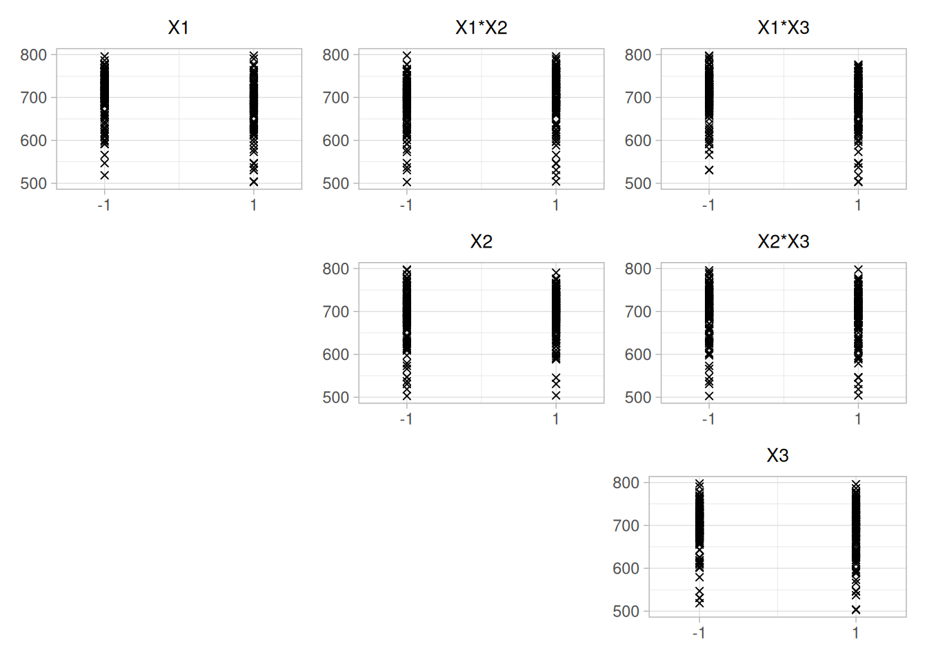
Interpretation of the DOE Interaction Effects Plot
We can first examine the diagonal elements for the main effects. These diagonal plots show a great deal of overlap between the levels for all three factors, indicating that location and scale effects will be relatively small.
We can then examine the off-diagonal plots for the first order interaction effects. For example, the plot in the first row and second column (X1*X2) is the interaction between factors \(X_1\) and \(X_2\). As with the main effect plots, no clear pattern is evident.
Related Techniques
DOE mean plot, DOE standard deviation plot, Block plot, Box plot, Analysis of variance.
Case Study
The DOE scatter plot is demonstrated in the ceramic strength data case study.
Software
DOE scatter plots are available in some general purpose statistical software programs, although the format may vary somewhat between these programs. They are essentially just scatter plots with the X variable defined in a particular way, so it should be feasible to write macros for DOE scatter plots in most statistical software programs.
Purpose: Detect Important Factors With Respect to Location
The DOE mean plot is appropriate for analyzing data from a designed experiment, with respect to important factors, where the factors are at two or more levels. The plot shows mean values for the two or more levels of each factor plotted by factor. The means for a single factor are connected by a straight line. The DOE mean plot is a complement to the traditional analysis of variance of designed experiments.
This plot is typically generated for the mean. However, it can be generated for other location statistics such as the median.
Sample Plot
library(tidyverse)
# BOXBIKE2.DAT: Box, Hunter & Hunter (1978), "Statistics for Experimenters",
# Wiley, p. 391. A 2^(7-4) fractional factorial design measuring the time
# to climb a hill on a bicycle, with 7 two-level factors: seat height (X1),
# dynamo engaged (X2), handlebar angle (X3), gear (X4), raincoat on/off
# (X5), breakfast (X6), and tire pressure (X7). This 8-run table is entered
# directly, exactly as given in the source data file.
boxbike2 <- tribble(
~Y, ~X1, ~X2, ~X3, ~X4, ~X5, ~X6, ~X7,
69, -1, -1, -1, 1, 1, 1, -1,
52, 1, -1, -1, -1, -1, 1, 1,
60, -1, 1, -1, -1, 1, -1, 1,
83, 1, 1, -1, 1, -1, -1, -1,
71, -1, -1, 1, 1, -1, -1, 1,
50, 1, -1, 1, -1, 1, -1, -1,
59, -1, 1, 1, -1, -1, 1, -1,
88, 1, 1, 1, 1, 1, 1, 1
)
boxbike2_means <- boxbike2 |>
pivot_longer(starts_with("X"), names_to = "factor", names_prefix = "X", values_to = "level") |>
mutate(factor = as.integer(factor)) |>
summarise(mean_y = mean(Y), .by = c(factor, level)) |>
# order factors by the size of the location effect (max - min mean), to
# match the "ranked list of important factors" reading of the plot
mutate(effect = max(mean_y) - min(mean_y), .by = factor) |>
arrange(desc(effect))
factor_order <- boxbike2_means |> distinct(factor, effect) |> arrange(desc(effect)) |> pull(factor)
boxbike2_means <- boxbike2_means |> mutate(factor = factor(factor, levels = factor_order))ggplot(boxbike2_means, aes(factor(level), mean_y, group = factor)) +
geom_line() +
geom_point(size = 2) +
facet_wrap(~factor, nrow = 1, labeller = labeller(factor = ~ paste("Factor", .))) +
labs(x = "Level", y = "Mean time to climb hill (sec)") +
theme_light()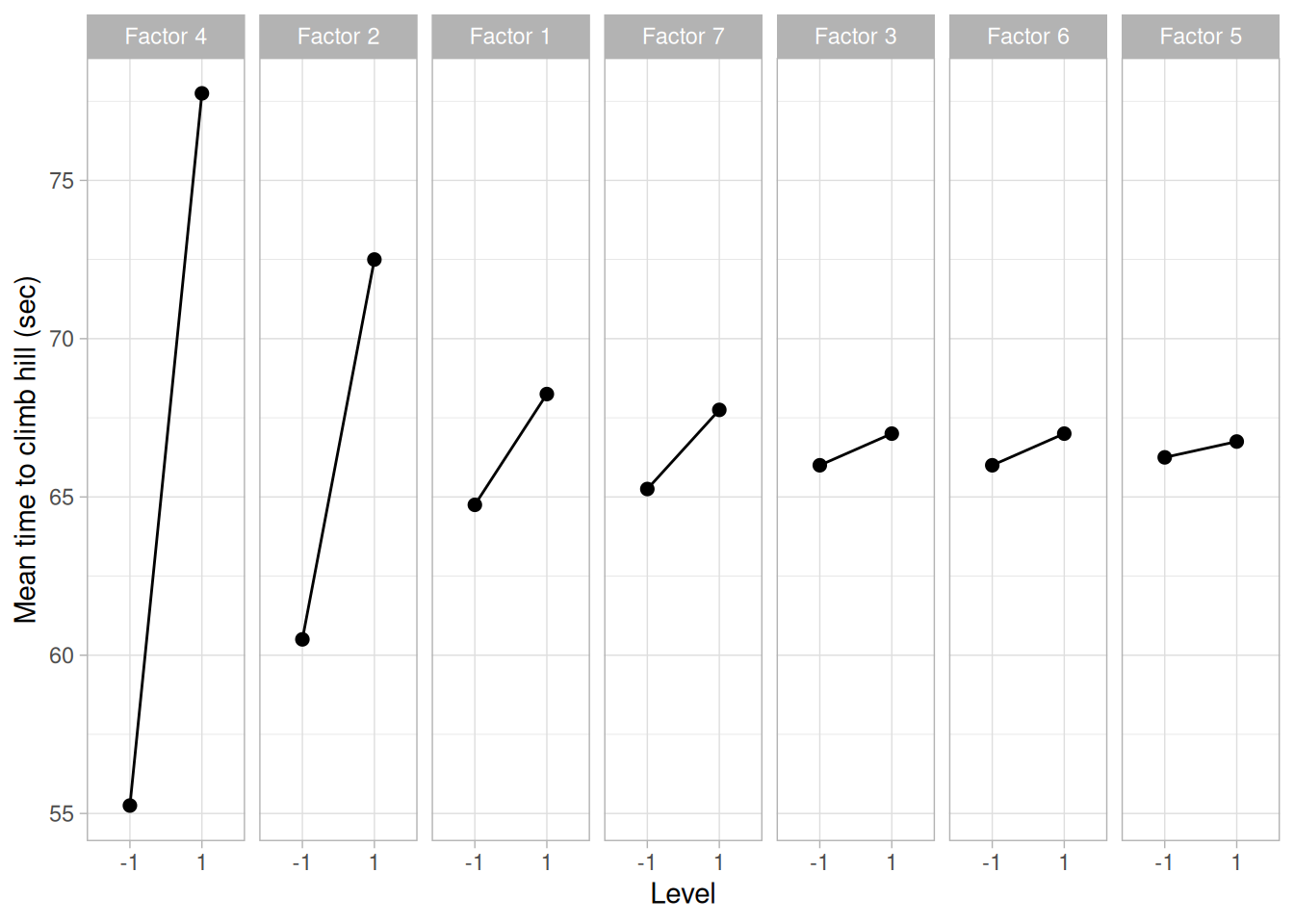
This sample DOE mean plot of the BOXBIKE2.DAT data set, with factors ordered left to right by the size of their location effect (the difference between the level means), shows that:
In summary, factors 4, 2, and 1 seem to be clearly important, factors 3 and 5 seem to be clearly unimportant, and factors 6 and 7 are borderline factors whose inclusion in any subsequent models will be determined by further analyses.
Definition: Mean Response Versus Factor Variables
DOE mean plots are formed by:
Questions
The DOE mean plot can be used to answer the following questions:
Importance: Determine Significant Factors
The goal of many designed experiments is to determine which factors are significant. A ranked order listing of the important factors is also often of interest. The DOE mean plot is ideally suited for answering these types of questions and we recommend its routine use in analyzing designed experiments.
Extension for Interaction Effects
Using the concept of the scatter plot matrix, the DOE mean plot can be extended to display first-order interaction effects.
Specifically, if there are \(k\) factors, we create a matrix of plots with \(k\) rows and \(k\) columns. On the diagonal, the plot is simply a DOE mean plot with a single factor. For the off-diagonal plots, measurements at each level of the interaction are plotted versus level, where level is \(X_i\) times \(X_j\) and \(X_i\) is the code for the \(i\)th main effect level and \(X_j\) is the code for the \(j\)th main effect. For the common 2-level designs (i.e., each factor has two levels) the values are typically coded as -1 and 1, so the multiplied values are also -1 and 1. We then generate a DOE mean plot for this interaction variable. This plot is called a DOE interaction effects plot and an example is shown in Figure 1.29, using the batch 1 subset of the ceramic strength data (JAHANMI2.DAT) and its three design factors: table speed (\(X_1\)), down feed rate (\(X_2\)), and wheel grit (\(X_3\)).
library(patchwork)
jahanmi2_b1 <- read_table(
here::here("datasets", "JAHANMI2.DAT"),
skip = 50,
col_names = c("id", "lab", "num", "test", "y", "x1", "x2", "x3", "x4",
"trt", "set", "llab", "rep", "bat", "sblab", "set2"),
col_types = cols(.default = "d")
) |>
filter(bat == 1)
overall_mean_b1 <- mean(jahanmi2_b1$y)
# Shared y range across every panel, computed from the actual level means
# (with a little padding) rather than hardcoding the original Dataplot
# YLIMITS 675 725 -- our computed means don't land at exactly the same
# values as the original, and a hardcoded range clipped one of them.
level_means <- function(x) {
tibble(x = x, y = jahanmi2_b1$y) |> summarise(mean_y = mean(y), .by = x)
}
all_means <- c(
level_means(jahanmi2_b1$x1)$mean_y,
level_means(jahanmi2_b1$x2)$mean_y,
level_means(jahanmi2_b1$x3)$mean_y,
level_means(jahanmi2_b1$x1 * jahanmi2_b1$x2)$mean_y,
level_means(jahanmi2_b1$x1 * jahanmi2_b1$x3)$mean_y,
level_means(jahanmi2_b1$x2 * jahanmi2_b1$x3)$mean_y,
overall_mean_b1
)
y_range <- range(all_means) + c(-5, 5)
# One panel of the interaction effects matrix: mean of Y at each level of
# either a single factor (on the diagonal) or the product of two factors
# (off the diagonal), sharing the y range computed above.
interaction_mean_panel <- function(x, label) {
ggplot(level_means(x), aes(x, mean_y)) +
geom_hline(yintercept = overall_mean_b1, color = "grey60") +
geom_line(linetype = "dashed") +
geom_point(size = 2) +
scale_x_continuous(breaks = c(-1, 1), limits = c(-1.5, 1.5)) +
scale_y_continuous(limits = y_range) +
labs(title = label, x = NULL, y = NULL) +
theme_light() +
theme(plot.title = element_text(hjust = 0.5, size = 10))
}
blank <- plot_spacer()
p_x1 <- interaction_mean_panel(jahanmi2_b1$x1, "X1")
p_x1x2 <- interaction_mean_panel(jahanmi2_b1$x1 * jahanmi2_b1$x2, "X1*X2")
p_x1x3 <- interaction_mean_panel(jahanmi2_b1$x1 * jahanmi2_b1$x3, "X1*X3")
p_x2 <- interaction_mean_panel(jahanmi2_b1$x2, "X2")
p_x2x3 <- interaction_mean_panel(jahanmi2_b1$x2 * jahanmi2_b1$x3, "X2*X3")
p_x3 <- interaction_mean_panel(jahanmi2_b1$x3, "X3")(p_x1 + p_x1x2 + p_x1x3) /
(blank + p_x2 + p_x2x3) /
(blank + blank + p_x3)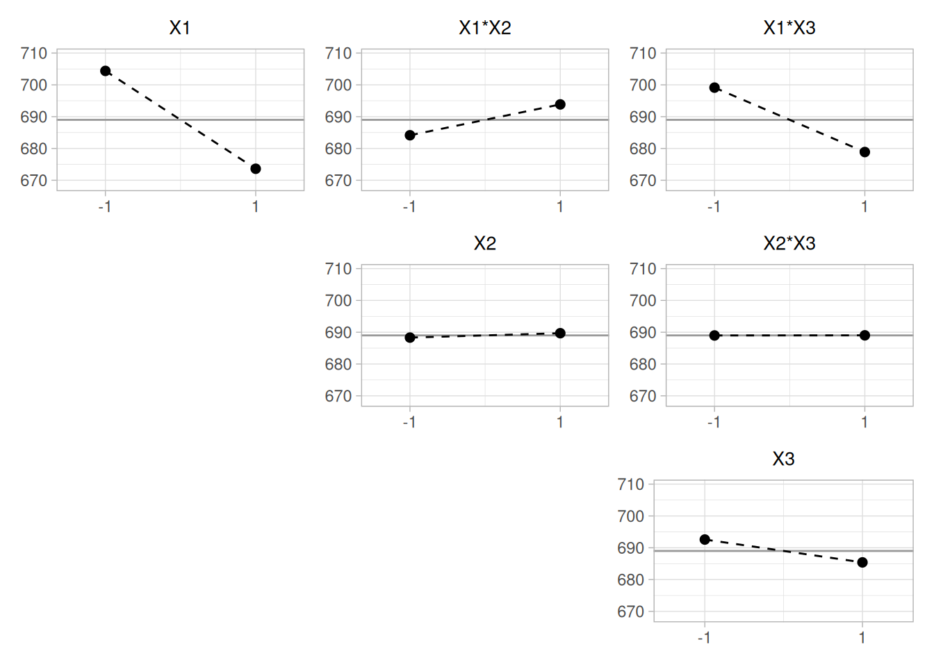
This plot shows that the most significant factor is \(X_1\) (the largest change in mean between levels along the diagonal) and the most significant interaction is between \(X_1\) and \(X_3\) (the steepest of the three off-diagonal panels).
Related Techniques
DOE scatter plot, DOE standard deviation plot, Block plot, Box plot, Analysis of variance.
Case Study
The DOE mean plot and the DOE interaction effects plot are demonstrated in the ceramic strength data case study.
Software
DOE mean plots are available in some general purpose statistical software programs, although the format may vary somewhat between these programs. It may be feasible to write macros for DOE mean plots in some statistical software programs that do not support this plot directly.
Purpose: Detect Important Factors With Respect to Scale
The DOE standard deviation plot is appropriate for analyzing data from a designed experiment, with respect to important factors, where the factors are at two or more levels and there are repeated values at each level. The plot shows standard deviation values for the two or more levels of each factor plotted by factor. The standard deviations for a single factor are connected by a straight line. The DOE standard deviation plot is a complement to the traditional analysis of variance of designed experiments.
This plot is typically generated for the standard deviation. However, it can also be generated for other scale statistics such as the range, the median absolute deviation, or the average absolute deviation.
Sample Plot
library(tidyverse)
# BOXBIKE2.DAT: Box, Hunter & Hunter (1978), "Statistics for Experimenters",
# Wiley, p. 391. A 2^(7-4) fractional factorial design measuring the time
# to climb a hill on a bicycle, with 7 two-level factors: seat height (X1),
# dynamo engaged (X2), handlebar angle (X3), gear (X4), raincoat on/off
# (X5), breakfast (X6), and tire pressure (X7). This 8-run table is entered
# directly, exactly as given in the source data file.
#
# Note: with only a single response value per factor level in this 8-run
# design, a "standard deviation for a level" is computed here across the 4
# runs sharing that level of the given factor (i.e., holding one factor
# fixed and varying the other six) -- treating those 4 responses as repeat
# measurements for the purpose of illustrating the plot, following the
# source page's construction.
boxbike2 <- tribble(
~Y, ~X1, ~X2, ~X3, ~X4, ~X5, ~X6, ~X7,
69, -1, -1, -1, 1, 1, 1, -1,
52, 1, -1, -1, -1, -1, 1, 1,
60, -1, 1, -1, -1, 1, -1, 1,
83, 1, 1, -1, 1, -1, -1, -1,
71, -1, -1, 1, 1, -1, -1, 1,
50, 1, -1, 1, -1, 1, -1, -1,
59, -1, 1, 1, -1, -1, 1, -1,
88, 1, 1, 1, 1, 1, 1, 1
)
boxbike2_sds <- boxbike2 |>
pivot_longer(starts_with("X"), names_to = "factor", names_prefix = "X", values_to = "level") |>
mutate(factor = as.integer(factor)) |>
summarise(sd_y = sd(Y), .by = c(factor, level)) |>
mutate(effect = max(sd_y) - min(sd_y), .by = factor)
factor_order <- boxbike2_sds |> distinct(factor, effect) |> arrange(desc(effect)) |> pull(factor)
boxbike2_sds <- boxbike2_sds |> mutate(factor = factor(factor, levels = factor_order))ggplot(boxbike2_sds, aes(factor(level), sd_y, group = factor)) +
geom_line() +
geom_point(size = 2) +
facet_wrap(~factor, nrow = 1, labeller = labeller(factor = ~ paste("Factor", .))) +
labs(x = "Level", y = "Standard deviation of time to climb hill (sec)") +
theme_light()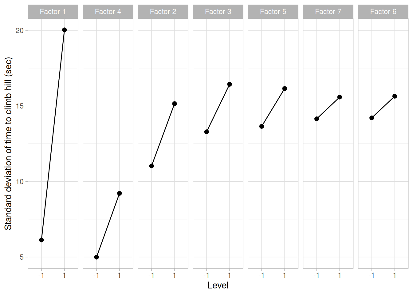
This sample DOE standard deviation plot of the BOXBIKE2.DAT data set shows that:
Definition: Response Standard Deviations Versus Factor Variables
DOE standard deviation plots are formed by:
Questions
The DOE standard deviation plot can be used to answer the following questions:
Importance: Assess Variability
The goal with many designed experiments is to determine which factors are significant. This is usually determined from the means of the factor levels (which can be conveniently shown with a DOE mean plot). A secondary goal is to assess the variability of the responses both within a factor and between factors. The DOE standard deviation plot is a convenient way to do this.
Related Techniques
DOE scatter plot, DOE mean plot, Block plot, Box plot, Analysis of variance.
Case Study
The DOE standard deviation plot is demonstrated in the ceramic strength data case study.
Software
DOE standard deviation plots are not available in most general purpose statistical software programs. It may be feasible to write macros for DOE standard deviation plots in some statistical software programs that do not support them directly.
Purpose: Summarize a Univariate Data Set
The purpose of a histogram (Chambers et al. 1983) is to graphically summarize the distribution of a univariate data set.
The histogram graphically shows the following:
These features provide strong indications of the proper distributional model for the data. The probability plot or a goodness-of-fit test can be used to verify the distributional model.
The Examples section below shows the appearance of a number of common features revealed by histograms.
library(tidyverse)
zarr13 <- read_table(here::here("datasets", "ZARR13.DAT"), skip = 25, col_names = "y", col_types = "d")
michelso <- read_table(
here::here("datasets", "MICHELSO.DAT"),
skip = 25,
col_names = c("y", "temp", "day", "ampm", "set"),
col_types = "ddiid"
)Sample Plot
ggplot(michelso, aes(y)) +
geom_histogram(binwidth = 0.025, boundary = 0, color = "white", fill = "steelblue4") +
labs(x = "Y", y = "Counts") +
theme_light()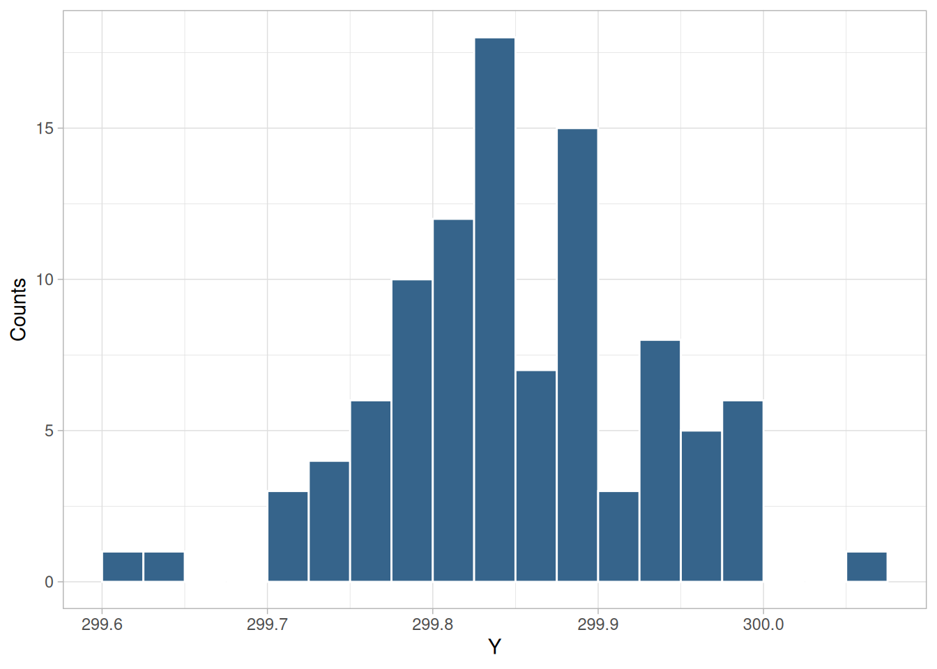
The above plot is a histogram of the Michelson speed of light data set.
Definition
The most common form of the histogram is obtained by splitting the range of the data into equal-sized bins (called classes). Then for each bin, the number of points from the data set that fall into each bin are counted. That is:
The classes can either be defined arbitrarily by the user or via some systematic rule. A number of theoretically derived rules have been proposed by Scott (Scott 1992).
The cumulative histogram is a variation of the histogram in which the vertical axis gives not just the counts for a single bin, but rather gives the counts for that bin plus all bins for smaller values of the response variable.
Both the histogram and cumulative histogram have an additional variant whereby the counts are replaced by the normalized counts. The names for these variants are the relative histogram and the relative cumulative histogram.
There are two common ways to normalize the counts.
Questions
The histogram can be used to answer the following questions:
Related Techniques
The techniques below are not discussed in the Handbook. However, they are similar in purpose to the histogram. Additional information on them is contained in the Chambers and Scott references.
Case Study
The histogram is demonstrated in the heat flow meter data case study.
Software
Histograms are available in most general purpose statistical software programs. They are also supported in most general purpose charting, spreadsheet, and business graphics programs.
Examples
Examples of the histogram for several common situations are given below.
ggplot(zarr13, aes(y)) +
geom_histogram(bins = 30, color = "white", fill = "steelblue4") +
labs(x = "Calibration factor", y = "Frequency") +
theme_light()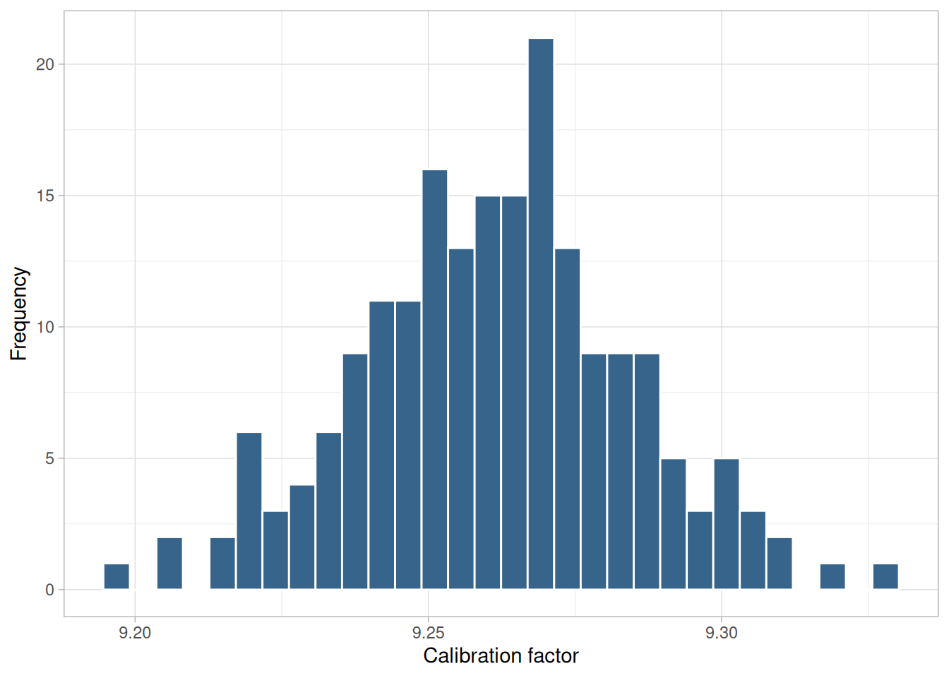
The above is a histogram of the ZARR13.DAT (heat flow meter calibration) data set.
Note the classical bell-shaped, symmetric histogram with most of the frequency counts bunched in the middle and with the counts dying off out in the tails. From a physical science/engineering point of view, the normal distribution is that distribution which occurs most often in nature (due in part to the central limit theorem).
Recommended Next Step. If the histogram indicates a symmetric, moderate-tailed distribution, then the recommended next step is to do a normal probability plot to confirm approximate normality. If the normal probability plot is linear, then the normal distribution is a good model for the data.
tuklamb <- read_table(here::here("datasets", "TUKLAMB.DAT"), skip = 25, col_names = "y", col_types = "d")
tuklamb |>
slice(1:100) |>
ggplot(aes(y)) +
geom_histogram(bins = 20, color = "white", fill = "steelblue4") +
labs(x = "y", y = "Frequency") +
theme_light()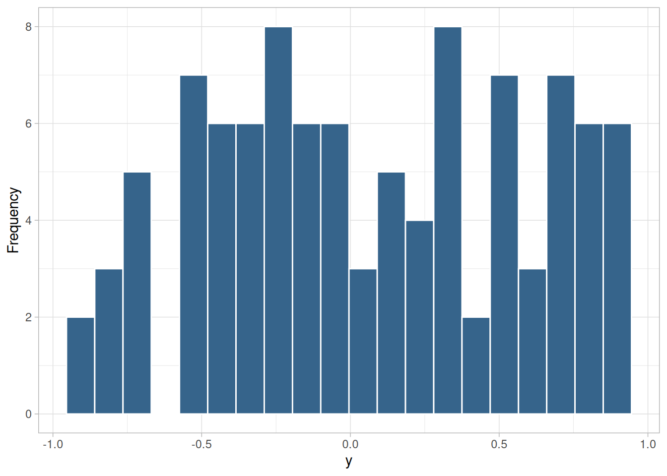
The above is a histogram of the first 100 rows of the TUKLAMB.DAT data set (Tukey-Lambda random numbers with shape parameter 1.1, which yields a short-tailed distribution).
For a symmetric distribution, the “body” of a distribution refers to the “center” of the distribution — commonly that region of the distribution where most of the probability resides — the “fat” part of the distribution. The “tail” of a distribution refers to the extreme regions of the distribution, both left and right. The “tail length” of a distribution is a term that indicates how fast these extremes approach zero.
For a short-tailed distribution, the tails approach zero very fast. Such distributions commonly have a truncated (“sawed-off”) look. The classical short-tailed distribution is the uniform distribution, in which the probability is constant over a given range and then drops to zero everywhere else — we would speak of this as having no tails, or extremely short tails.
For a moderate-tailed distribution, the tails decline to zero in a moderate fashion. The classical moderate-tailed distribution is the normal distribution.
For a long-tailed distribution, the tails decline to zero very slowly — and hence one is apt to see probability a long way from the body of the distribution. The classical long-tailed distribution is the Cauchy distribution.
In terms of tail length, the histogram shown in Figure 1.33 would be characteristic of a “short-tailed” distribution.
The optimal (unbiased and most precise) estimator for the center of a distribution is heavily dependent on the tail length of the distribution. The common choice of taking \(N\) observations and using the calculated sample mean as the best estimate for the center of the distribution is a good choice for the normal distribution (moderate tailed), a poor choice for the uniform distribution (short tailed), and a horrible choice for the Cauchy distribution (long tailed). Although for the normal distribution the sample mean is as precise an estimator as we can get, for the uniform and Cauchy distributions, the sample mean is not the best estimator.
For the uniform distribution, the midrange
\[\text{midrange} = \frac{\text{smallest} + \text{largest}}{2}\]
is the best estimator of location. For a Cauchy distribution, the median is the best estimator of location.
Recommended Next Step. If the histogram indicates a symmetric, short-tailed distribution, the recommended next step is to generate a uniform probability plot. If the uniform probability plot is linear, then the uniform distribution is an appropriate model for the data.
dziuba1 <- read_table(
here::here("datasets", "DZIUBA1.DAT"),
skip = 25,
col_names = c("month", "day", "year", "value"),
col_types = "dddd"
)
ggplot(dziuba1, aes(value)) +
geom_histogram(bins = 30, color = "white", fill = "steelblue4") +
labs(x = "Resistor value", y = "Frequency") +
theme_light()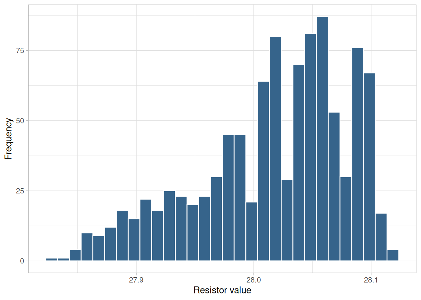
The above is a histogram of the DZIUBA1.DAT data set (five years of measurements on a standard resistor).
The previous example contains a discussion of the distinction between short-tailed, moderate-tailed, and long-tailed distributions. In terms of tail length, the histogram shown in Figure 1.34 would be characteristic of a “long-tailed” distribution.
Recommended Next Step. If the histogram indicates a symmetric, long-tailed distribution, the recommended next step is to do a Cauchy probability plot. If the Cauchy probability plot is linear, then the Cauchy distribution is an appropriate model for the data. Alternatively, a Tukey Lambda PPCC plot may provide insight into a suitable distributional model for the data.
lew <- read_table(here::here("datasets", "LEW.DAT"), skip = 25, col_names = "y", col_types = "d")
ggplot(lew, aes(y)) +
geom_histogram(bins = 30, color = "white", fill = "steelblue4") +
labs(x = "y", y = "Frequency") +
theme_light()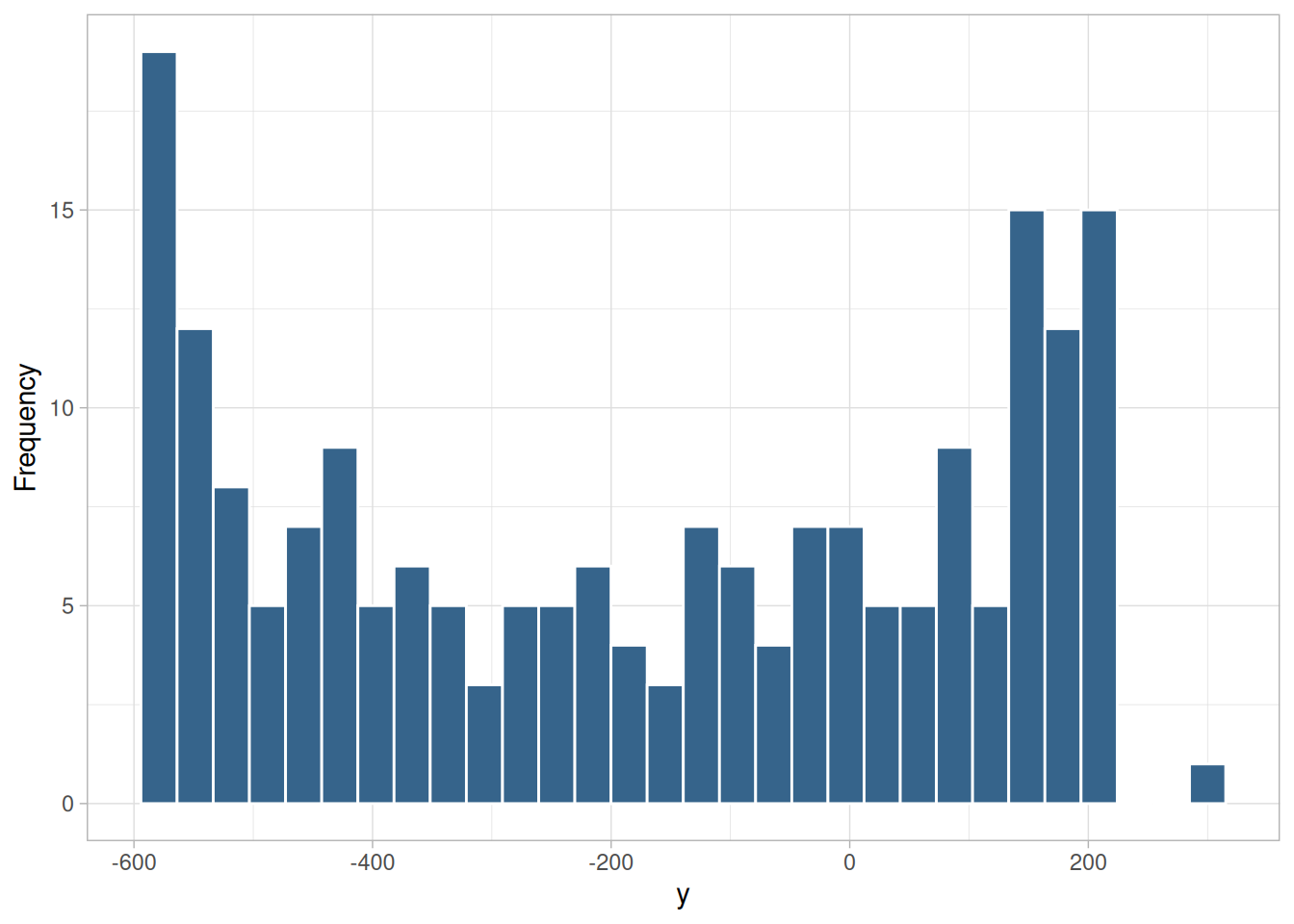
Figure 1.35 is a histogram of the LEW.DAT data set — the same sinusoidal data set used as the autocorrelation plot sinusoidal example.
The mode of a distribution is that value which is most frequently occurring, or has the largest probability of occurrence. The sample mode occurs at the peak of the histogram. For many phenomena, it is quite common for the distribution of the response values to cluster around a single mode (unimodal) and then distribute themselves with lesser frequency out into the tails. The normal distribution is the classic example of a unimodal distribution. This histogram illustrates data from a bimodal (2-peak) distribution. The histogram serves as a tool for diagnosing problems such as bimodality. Questioning the underlying reason for distributional non-unimodality frequently leads to greater insight and improved deterministic modeling of the phenomenon under study. For example, for this data, the bimodal histogram is caused by sinusoidality in the data.
Recommended Next Steps. If the histogram indicates a symmetric, bimodal distribution, the recommended next steps are to:
zarr14 <- read_table(here::here("datasets", "ZARR14.DAT"), skip = 25, col_names = "y", col_types = "d")
ggplot(zarr14, aes(y)) +
geom_histogram(bins = 30, color = "white", fill = "steelblue4") +
labs(x = "Calibration factor", y = "Frequency") +
theme_light()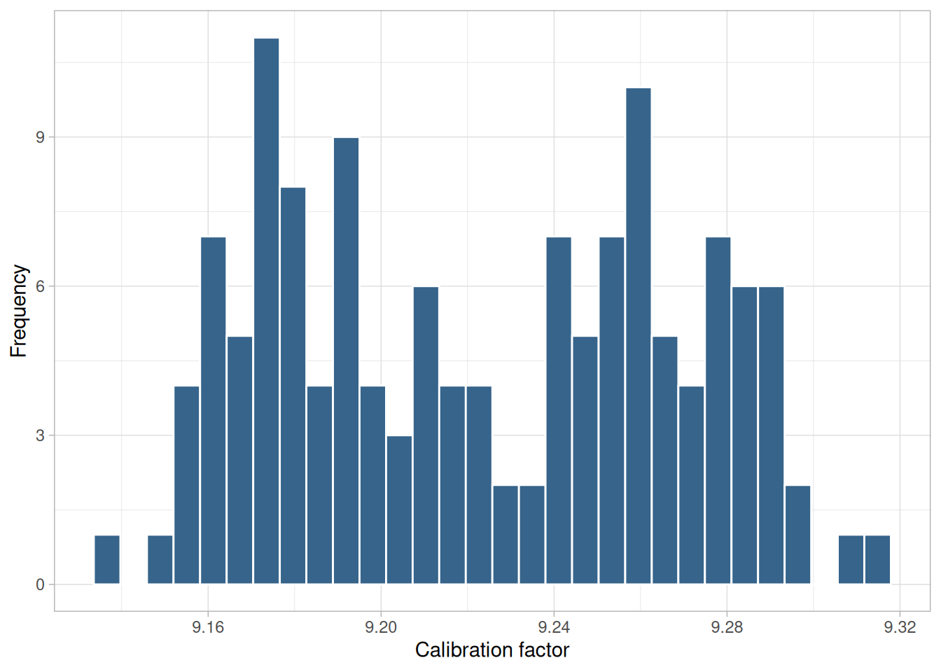
Figure 1.36 is a histogram of the ZARR14.DAT data set.
This histogram illustrates data from a bimodal (2-peak) distribution. In contrast to the previous example, this example illustrates bimodality due not to an underlying deterministic model, but bimodality due to a mixture of probability models. In this case, each of the modes appears to have a rough bell-shaped component. One could easily imagine this histogram being generated by a process consisting of two normal distributions with the same standard deviation but with two different locations (one centered at approximately 9.17 and the other centered at approximately 9.26). If this is the case, then the research challenge is to determine physically why there are two similar but separate sub-processes.
Recommended Next Steps. If the histogram indicates that the data might be appropriately fit with a mixture of two normal distributions, the recommended next step is to fit the normal mixture model using either least squares or maximum likelihood. The general normal mixing model is
\[M = p\phi_1 + (1-p)\phi_2\]
where \(p\) is the mixing proportion (between 0 and 1) and \(\phi_1\) and \(\phi_2\) are normal probability density functions with location and scale parameters \(\mu_1\), \(\sigma_1\), \(\mu_2\), and \(\sigma_2\), respectively. That is, there are 5 parameters to estimate in the fit.
Whether maximum likelihood or least squares is used, the quality of the fit is sensitive to good starting values. For the mixture of two normals, the histogram can be used to provide initial estimates for the location and scale parameters of the two normal distributions.
sunspot <- read_table(
here::here("datasets", "SUNSPOT.DAT"),
skip = 25,
col_names = c("wolf", "month", "year", "year_avg"),
col_types = "dddd"
)
ggplot(sunspot, aes(wolf)) +
geom_histogram(bins = 30, color = "white", fill = "steelblue4") +
labs(x = "Monthly Wolf sunspot number", y = "Frequency") +
theme_light()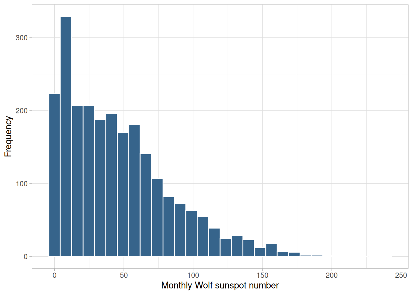
The above is a histogram of the SUNSPOT.DAT data set (monthly Wolf sunspot numbers, 1749-1947).
A symmetric distribution is one in which the two “halves” of the histogram appear as mirror-images of one another. A skewed (non-symmetric) distribution is a distribution in which there is no such mirror-imaging. For skewed distributions, it is quite common to have one tail of the distribution considerably longer or drawn out relative to the other tail. A “skewed right” distribution is one in which the tail is on the right side; a “skewed left” distribution is one in which the tail is on the left side. The above histogram is for a distribution that is skewed right.
Skewed distributions bring a certain philosophical complexity to the very process of estimating a “typical value” for the distribution. To be specific, suppose that the analyst has a collection of observations randomly drawn from a distribution, and wishes to summarize these observations by a “typical value”. What does typical value mean? If the distribution is symmetric, the typical value is unambiguous — it is a well-defined center of the distribution. For example, for a bell-shaped symmetric distribution, a center point is identical to that value at the peak of the distribution.
For a skewed distribution, however, there is no “center” in the usual sense of the word. Be that as it may, several “typical value” metrics are often used for skewed distributions. The first metric is the mode of the distribution. Unfortunately, for severely-skewed distributions, the mode may be at or near the left or right tail of the data and so it seems not to be a good representative of the center of the distribution. As a second choice, one could conceptually argue that the mean (the point on the horizontal axis where the distribution would balance) would serve well as the typical value. As a third choice, others may argue that the median (that value on the horizontal axis which has exactly 50% of the data to the left, and also to the right) would serve as a good typical value.
For symmetric distributions, the conceptual problem disappears because at the population level the mode, mean, and median are identical. For skewed distributions, however, these three metrics are markedly different. In practice, for skewed distributions the most commonly reported typical value is the mean; the next most common is the median; the least common is the mode. Because each of these three metrics reflects a different aspect of “centerness”, it is recommended that the analyst report at least two (mean and median), and preferably all three (mean, median, and mode) in summarizing and characterizing a data set.
Some Causes for Skewed Data. Skewed data often occur due to lower or upper bounds on the data. That is, data that have a lower bound are often skewed right while data that have an upper bound are often skewed left. Skewness can also result from start-up effects. For example, in reliability applications some processes may have a large number of initial failures that could cause left skewness. On the other hand, a reliability process could have a long start-up period where failures are rare, resulting in right-skewed data.
Data collected in scientific and engineering applications often have a lower bound of zero. For example, failure data must be non-negative. Many measurement processes generate only positive data. Time to occurrence and size are common measurements that cannot be less than zero.
Recommended Next Steps. If the histogram indicates a right-skewed data set, the recommended next steps are to:
morales <- read_table(
here::here("datasets", "MORALES.DAT"),
skip = 25,
col_names = c("y1", "y2", "y3", "set"),
col_types = "dddd"
)
ggplot(morales, aes(y1)) +
geom_histogram(bins = 20, color = "white", fill = "steelblue4") +
labs(x = "Isotopic sulfur ratio 107/109", y = "Frequency") +
theme_light()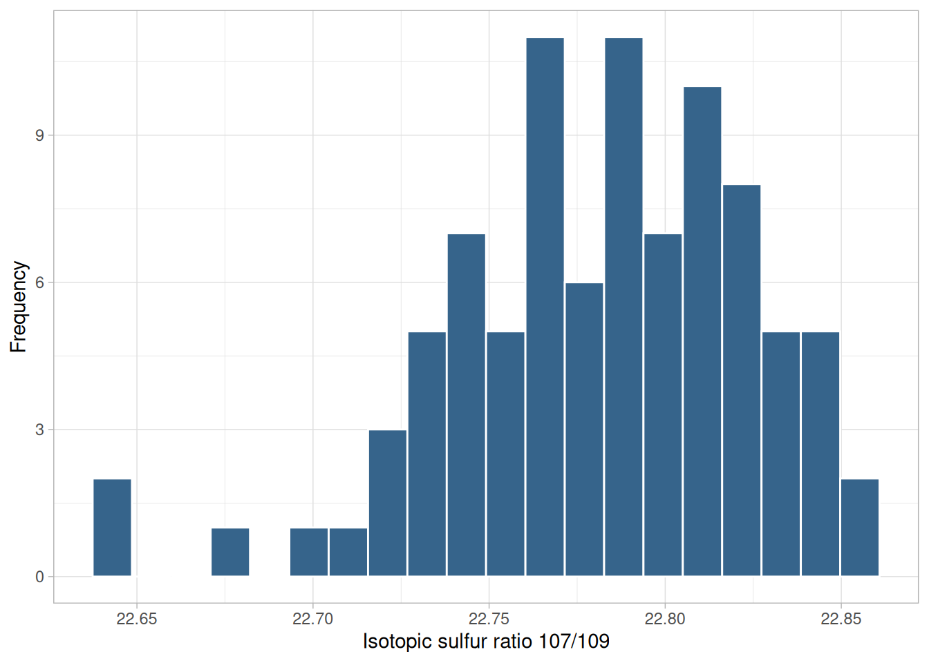
The above is a histogram of the MORALES.DAT data set (the isotopic sulfur ratio 107/109 response variable).
The issues for skewed left data are similar to those for skewed right data, save that the direction of the long tail, and the corresponding recommendations above about upper-versus-lower bounds and start-up-versus-wear-out effects, are reversed.
zarr13_outlier <- tibble(y = c(zarr13$y, rep(9.45, 4)))
ggplot(zarr13_outlier, aes(y)) +
geom_histogram(bins = 30, color = "white", fill = "steelblue4") +
labs(x = "Calibration factor", y = "Frequency") +
theme_light()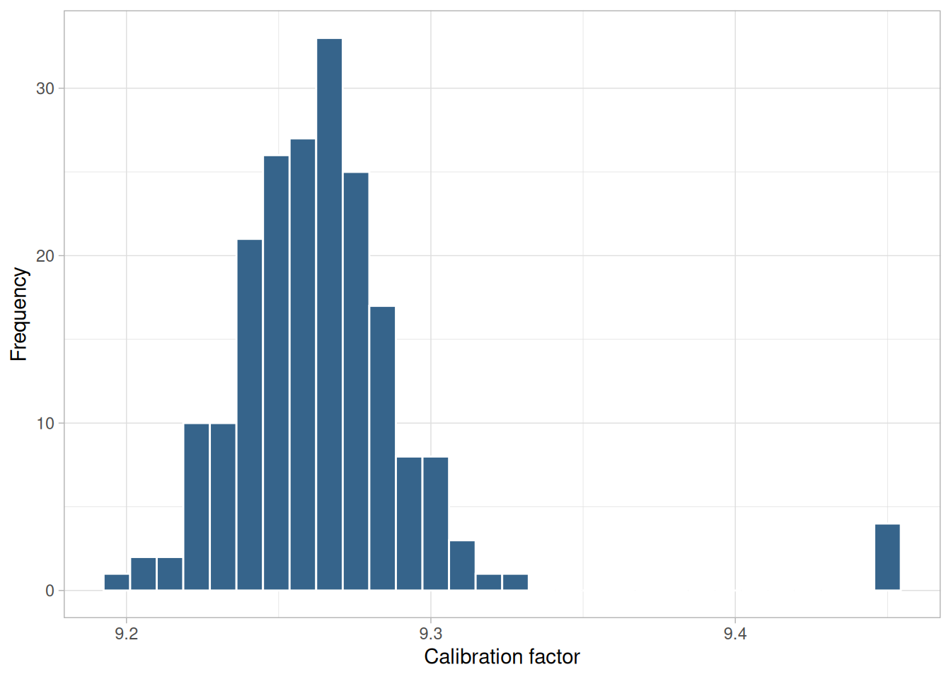
The above is a histogram of the ZARR13.DAT data set with four values of 9.45 added.
A symmetric distribution is one in which the two “halves” of the histogram appear as mirror-images of one another. The above example is symmetric with the exception of outlying data near the added value.
An outlier is a data point that comes from a distribution different (in location, scale, or distributional form) from the bulk of the data. In the real world, outliers have a range of causes, from as simple as:
to more subtle causes such as:
Outliers Should Be Investigated. All outliers should be taken seriously and should be investigated thoroughly for explanations. Automatic outlier-rejection schemes (such as throw out all data beyond 4 sample standard deviations from the sample mean) are particularly dangerous.
The classic case of automatic outlier rejection becoming automatic information rejection was the South Pole ozone depletion problem. Ozone depletion over the South Pole would have been detected years earlier except for the fact that the satellite data recording the low ozone readings had outlier-rejection code that automatically screened out the “outliers” (that is, the low ozone readings) before the analysis was conducted. Such inadvertent (and incorrect) purging went on for years. It was not until ground-based South Pole readings started detecting low ozone readings that someone decided to double-check as to why the satellite had not picked up this fact — it had, but it had gotten thrown out!
The best attitude is that outliers are our “friends”, outliers are trying to tell us something, and we should not stop until we are comfortable in the explanation for each outlier.
Recommended Next Steps. If the histogram shows the presence of outliers, the recommended next steps are:
Purpose: Check for randomness
A lag plot checks whether a data set or time series is random or not. Random data should not exhibit any identifiable structure in the lag plot. Non-random structure in the lag plot indicates that the underlying data are not random. Several common patterns for lag plots are shown in the Examples below.
Sample Plot
library(tidyverse)
# Reusable lag-1 scatter plot: Y[i] versus Y[i-1].
lag_plot <- function(x, alpha = 1) {
tibble(y = x[-1], y_lag = x[-length(x)]) |>
ggplot(aes(y_lag, y)) +
geom_point(alpha = alpha) +
labs(x = expression(Y[i - 1]), y = expression(Y[i])) +
theme_light()
}
mavro <- read_table(here::here("datasets", "MAVRO.DAT"), skip = 25, col_names = "y", col_types = "d")lag_plot(mavro$y)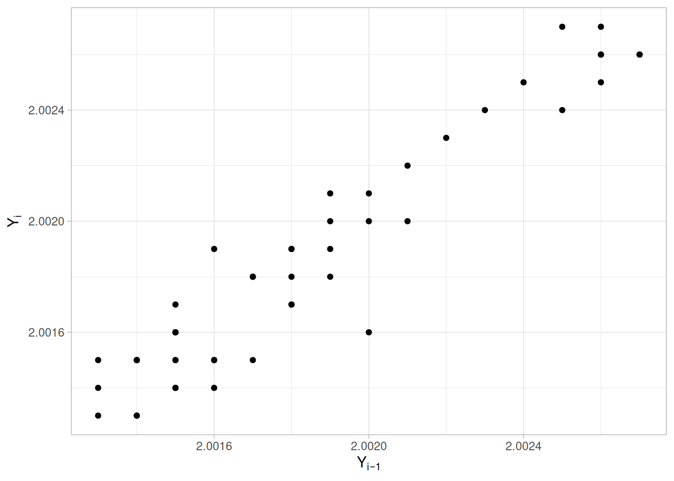
This sample lag plot of the MAVRO.DAT data set exhibits a linear pattern. This shows that the data are strongly non-random and further suggests that an autoregressive model might be appropriate.
Definition
A lag is a fixed time displacement. For example, given a data set \(Y_1, Y_2, \ldots, Y_n\), \(Y_2\) and \(Y_7\) have lag 5 since \(7 - 2 = 5\). Lag plots can be generated for any arbitrary lag, although the most commonly used lag is 1.
A plot of lag 1 is a plot of the values of \(Y_i\) versus \(Y_{i-1}\)
Questions
Lag plots can provide answers to the following questions:
Importance: Ensure validity of engineering conclusions
Inasmuch as randomness is an underlying assumption for most statistical estimation and testing techniques, the lag plot should be a routine tool for researchers.
Related Techniques
Partial Autocorrelation Plot, Autocorrelation Plot, Spectral Plot, Runs Test
Case Study
The lag plot is demonstrated in the beam deflection data case study.
Software
Lag plots are not directly available in most general purpose statistical software programs. Since the lag plot is essentially a scatter plot with the two variables properly lagged, it should be feasible to write a macro for the lag plot in most statistical programs.
Examples
Examples of the lag plot for several common situations are given below. These parallel the four situations shown in the Autocorrelation Plot examples, using the same underlying data sets, plotted here as \(Y_i\) versus \(Y_{i-1}\) rather than as an autocorrelation function.
set.seed(42)
random_series <- rnorm(500)
lag_plot(random_series)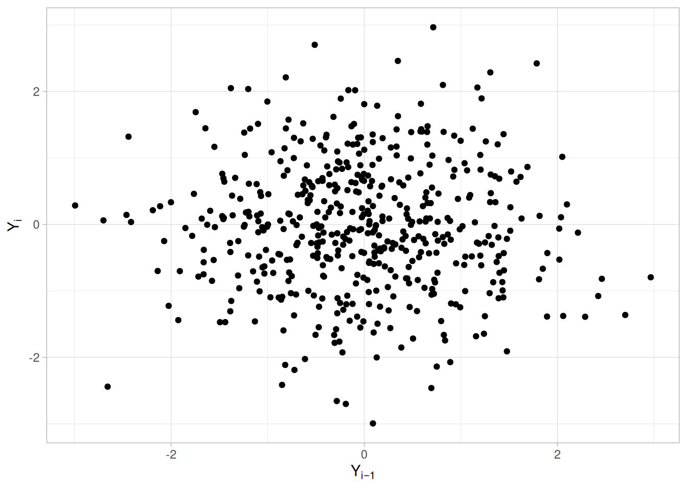
We can make the following conclusions based on Figure 1.41 of a synthetic random (white noise) series (200 random numbers were used in the original example, based on the NORMAL2.DAT data set; a synthetic series of the same kind used in the Autocorrelation Plot random example is shown here for consistency between the two pages):
The lag plot shown in Figure 1.41 is for lag = 1. Note the absence of structure. One cannot infer, from a current value \(Y_{i-1}\), the next value \(Y_i\). Thus for a known value \(Y_{i-1}\) on the horizontal axis, the \(Y_i\) value could be virtually anything. Such non-association is the essence of randomness.
flicker <- read_table(here::here("datasets", "FLICKER.DAT"), skip = 25, col_names = "y", col_types = "d")
lag_plot(flicker$y, alpha = 1 / 2)
We can make the following conclusions based on Figure 1.42 of the FLICKER.DAT data set:
In Figure 1.42 for lag = 1, note how the points tend to cluster (albeit noisily) along the diagonal. Such clustering is the lag plot signature of moderate autocorrelation.
If the process were completely random, knowledge of a current observation (say \(Y_{i-1} = 0\)) would yield virtually no knowledge about the next observation \(Y_i\). If the process has moderate autocorrelation, as above, and if \(Y_{i-1} = 0\), then the range of possible values for \(Y_i\) is seen to be restricted to a smaller range. This suggests prediction is possible using an autoregressive model.
Recommended Next Step: Estimate the parameters for the autoregressive model
\[Y_i = A_0 + A_1 Y_{i-1} + E_i\]
Since \(Y_i\) and \(Y_{i-1}\) are precisely the axes of the lag plot, such estimation is a linear regression straight from the lag plot. The residual standard deviation for the autoregressive model will be much smaller than the residual standard deviation for the default model \(Y_i = A_0 + E_i\).
randwalk <- read_table(here::here("datasets", "RANDWALK.DAT"), skip = 25, col_names = "y", col_types = "d")
lag_plot(randwalk$y, alpha = 1 / 2)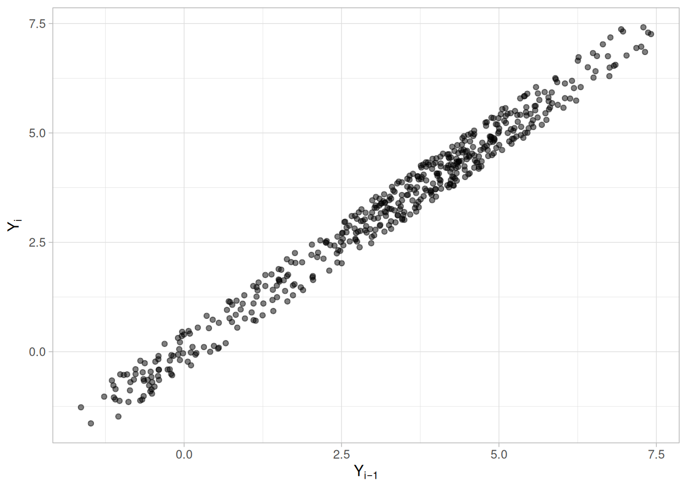
We can make the following conclusions based on Figure 1.43 of the RANDWALK.DAT data set:
Note the tight clustering of points along the diagonal. This is the lag plot signature of a process with strong positive autocorrelation. Such processes are highly non-random — there is strong association between an observation and a succeeding observation. In short, if you know \(Y_{i-1}\) you can make a strong guess as to what \(Y_i\) will be.
If the above process were completely random, the plot would have a shotgun pattern, and knowledge of a current observation would yield virtually no knowledge about the next observation. On the other hand, with strong autocorrelation, as seen above, the range of possible values for \(Y_i\) given \(Y_{i-1}\) is restricted to a much smaller range — an improvement in predictive power.
Recommended Next Step: When the lag plot shows a strongly autoregressive pattern and only successive observations appear to be correlated, the next steps are to:
lew <- read_table(here::here("datasets", "LEW.DAT"), skip = 25, col_names = "y", col_types = "d")
lag_plot(lew$y)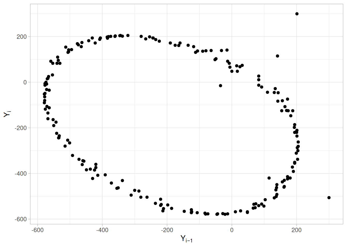
We can make the following conclusions based on Figure 1.44 of the LEW.DAT data set:
In Figure 1.44 for lag = 1, note the tight elliptical clustering of points. Processes with a single-cycle sinusoidal model will have such elliptical lag plots.
Consequences of Ignoring the Cyclical Pattern: If one were to naively assume that this process came from the null model \(Y_i = A_0 + E_i\) and then estimate the constant by the sample mean, the analysis would suffer because the sample mean would be biased and meaningless, and the confidence limits would be meaningless and optimistically small. The proper model
\[Y_i = C + \alpha\sin(2\pi\omega t_i + \phi) + E_i\]
(where \(\alpha\) is the amplitude, \(\omega\) is the frequency — between 0 and 0.5 cycles per observation — and \(\phi\) is the phase) can be fit by standard non-linear least squares, to estimate the coefficients and their uncertainties.
The lag plot is also of value in outlier detection. Note in Figure 1.44 that there appear to be 4 points lying off the ellipse. However, in a lag plot, each point in the original data set \(Y\) shows up twice – once as \(Y_i\) and once as \(Y_{i-1}\). Hence the outlier near the top of the plot at \(Y_i = 300\) is the same raw data value that appears further right at \(Y_{i-1} = 300\). Thus \((201, 300)\) and \((300, -506)\) are due to the same outlier, namely the 158th data point: 300. The correct value for this 158th point should be approximately -300 and so it appears that a sign got dropped in the data collection. The other two points lying off the ellipse, at roughly \((-35, -15)\) and \((141, 115)\), are caused by two faulty data values: the 4th data point of -15 should be about +125 and the 5th data point of +141 should be about -50, respectively. Hence the 4 apparent lag plot outliers are traceable to 3 actual outliers in the original run sequence: at points 4 (-15), 5 (141) and 158 (300). In retrospect, only one of these (point 158 (= 300)) is an obvious outlier in the Run-Sequence Plot.
(NIST’s original text for this example states different coordinates, \((-500, 300)\), \((300, 200)\), \((100, 100)\), and \((0, -50)\), which match a lag plot with the two axes swapped from the \(Y_{i-1}\)-horizontal/\(Y_i\)-vertical convention stated above in the Definition and used consistently on this page – an inconsistency between NIST’s own Definition text and the axis mapping actually used to generate that particular figure. The coordinates above are for our plot, which follows the stated Definition.)
Unexpected Value of EDA: Frequently a technique (e.g., the lag plot) is constructed to check one aspect (e.g., randomness) which it does well. Along the way, the technique also highlights some other anomaly of the data (namely, that there are 3 outliers). Such outlier identification and removal is extremely important for detecting irregularities in the data collection system, and also for arriving at a “purified” data set for modeling. The lag plot plays an important role in such outlier identification.
Recommended Next Step: When the lag plot indicates a sinusoidal model with possible outliers, the recommended next steps are:
Purpose: Detect Changes in Correlation Between Groups
Linear correlation plots are used to assess whether or not correlations are consistent across groups. That is, if your data is in groups, you may want to know if a single correlation can be used across all the groups or whether separate correlations are required for each group.
Linear correlation plots are often used in conjunction with linear slope, linear intercept (Linear Intercept Plot), and linear residual standard deviation plots. A linear correlation plot could be generated initially to see if linear fitting would be a fruitful direction. If the correlations are high, this implies it is worthwhile to continue with the linear slope, intercept, and residual standard deviation plots. If the correlations are weak, a different model needs to be pursued.
In some cases, you might not have groups. Instead you may have different data sets and you want to know if the same correlation can be adequately applied to each of the data sets. In this case, simply think of each distinct data set as a group and apply the linear correlation plot as for groups.
library(tidyverse)
# HSU12.DAT has a blank line between each of its 15 batches, which
# read_table() reports as a parsing failure (expected 3 columns, got 1)
# for each blank line -- 14 expected warnings for the 14 gaps between
# batches. drop_na() below removes the resulting all-NA rows.
hsu12 <- read_table(
here::here("datasets", "HSU12.DAT"),
skip = 25,
col_names = c("time", "distance", "batch"),
col_types = "ddd"
) |>
drop_na()
group_correlations <- hsu12 |>
group_by(batch) |>
summarise(correlation = cor(distance, time), .groups = "drop")
overall_correlation <- cor(hsu12$distance, hsu12$time)Sample Plot
ggplot(group_correlations, aes(batch, correlation)) +
geom_point() +
geom_hline(yintercept = overall_correlation, linetype = "dashed", color = "firebrick") +
scale_x_continuous(breaks = 1:15) +
labs(x = "Batch (group identifier)", y = "Correlation") +
theme_light()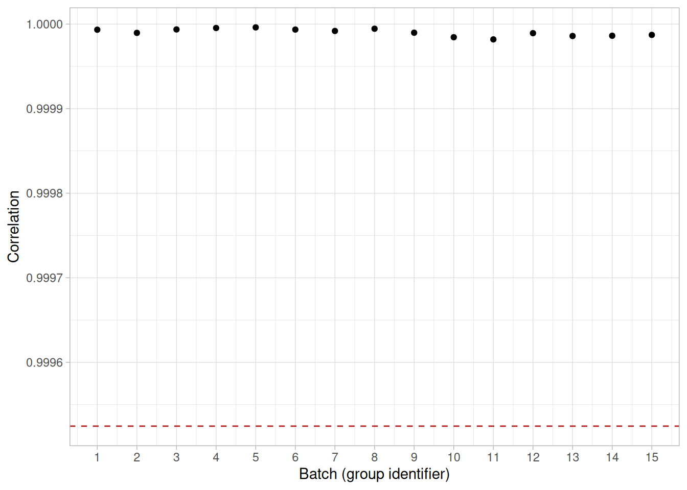
This linear correlation plot of the HSU12.DAT data set shows that the correlations are high for all groups (all are effectively 1, reflecting the near-perfectly linear relationship between elapsed time and distance for the acoustic microscope within each of the 15 batches). This implies that linear fits could provide a good model for each of these groups.
Definition: Group Correlations Versus Group ID
Linear correlation plots are formed by:
A reference line is plotted at the correlation between the full data sets.
Questions
The linear correlation plot can be used to answer the following questions:
Importance: Checking Group Homogeneity
For grouped data, it may be important to know whether the different groups are homogeneous (i.e., similar) or heterogeneous (i.e., different). Linear correlation plots help answer this question in the context of linear fitting.
Related Techniques
Linear Residual Standard Deviation Plot
Linear Fitting
Case Study
The linear correlation plot is demonstrated in the Alaska pipeline data case study.
Software
Most general purpose statistical software programs do not support a linear correlation plot. However, if the statistical program can generate correlations over a group, it should be feasible to write a macro to generate this plot.
Purpose: Detect Changes in Linear Intercepts Between Groups
Linear intercept plots are used to graphically assess whether or not linear fits are consistent across groups. That is, if your data have groups, you may want to know if a single fit can be used across all the groups or whether separate fits are required for each group.
Linear intercept plots are typically used in conjunction with linear slope and linear residual standard deviation plots.
In some cases you might not have groups. Instead, you have different data sets and you want to know if the same fit can be adequately applied to each of the data sets. In this case, simply think of each distinct data set as a group and apply the linear intercept plot as for groups.
library(tidyverse)
# HSU12.DAT has a blank line between each of its 15 batches, which
# read_table() reports as a parsing failure (expected 3 columns, got 1)
# for each blank line -- 14 expected warnings for the 14 gaps between
# batches. drop_na() below removes the resulting all-NA rows.
hsu12 <- read_table(
here::here("datasets", "HSU12.DAT"),
skip = 25,
col_names = c("time", "distance", "batch"),
col_types = "ddd"
) |>
drop_na()
group_intercepts <- hsu12 |>
group_by(batch) |>
summarise(intercept = coef(lm(time ~ distance))[1], .groups = "drop")
overall_intercept <- coef(lm(time ~ distance, data = hsu12))[1]Sample Plot
ggplot(group_intercepts, aes(batch, intercept)) +
geom_point() +
geom_hline(yintercept = overall_intercept, linetype = "dashed", color = "firebrick") +
scale_x_continuous(breaks = 1:15) +
labs(x = "Batch (group identifier)", y = "Intercept") +
theme_light()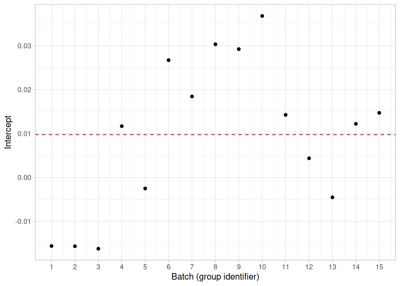
This linear intercept plot of the HSU12.DAT data set shows that there is a shift in intercepts. Specifically, the first three intercepts are lower than the intercepts for the other groups. Note that these are small differences in the intercepts.
Definition: Group Intercepts Versus Group ID
Linear intercept plots are formed by:
A reference line is plotted at the intercept from a linear fit using all the data.
Questions
The linear intercept plot can be used to answer the following questions:
Importance: Checking Group Homogeneity
For grouped data, it may be important to know whether the different groups are homogeneous (i.e., similar) or heterogeneous (i.e., different). Linear intercept plots help answer this question in the context of linear fitting.
Related Techniques
Linear Residual Standard Deviation Plot
Linear Fitting
Case Study
The linear intercept plot is demonstrated in the Alaska pipeline data case study.
Software
Most general purpose statistical software programs do not support a linear intercept plot. However, if the statistical program can generate linear fits over a group, it should be feasible to write a macro to generate this plot.
Purpose: Detect changes in linear slopes between groups
Linear slope plots are used to graphically assess whether or not linear fits are consistent across groups. That is, if your data have groups, you may want to know if a single fit can be used across all the groups or whether separate fits are required for each group.
Linear slope plots are typically used in conjunction with Linear Intercept Plot and Linear Residual Standard Deviation Plot.
In some cases you might not have groups. Instead, you have different data sets and you want to know if the same fit can be adequately applied to each of the data sets. In this case, simply think of each distinct data set as a group and apply the linear slope plot as for groups.
Sample Plot
library(tidyverse)
# HSU12.DAT has a blank line between each of its 15 batches, which
# read_table() reports as a parsing failure (expected 3 columns, got 1)
# for each blank line -- 14 expected warnings for the 14 gaps between
# batches. drop_na() below removes the resulting all-NA rows.
hsu12 <- read_table(
here::here("datasets", "HSU12.DAT"),
skip = 25,
col_names = c("y", "x", "batch"),
col_types = "ddi"
) |>
drop_na()
overall_slope <- coef(lm(y ~ x, data = hsu12))["x"]
slopes <- hsu12 |>
group_by(batch) |>
summarise(slope = coef(lm(y ~ x))["x"], .groups = "drop")slopes |>
ggplot(aes(batch, slope)) +
geom_point() +
geom_hline(yintercept = overall_slope, linetype = "dashed", color = "firebrick") +
scale_x_continuous(breaks = 1:15) +
labs(x = "Group (Batch)", y = "Slope") +
theme_light()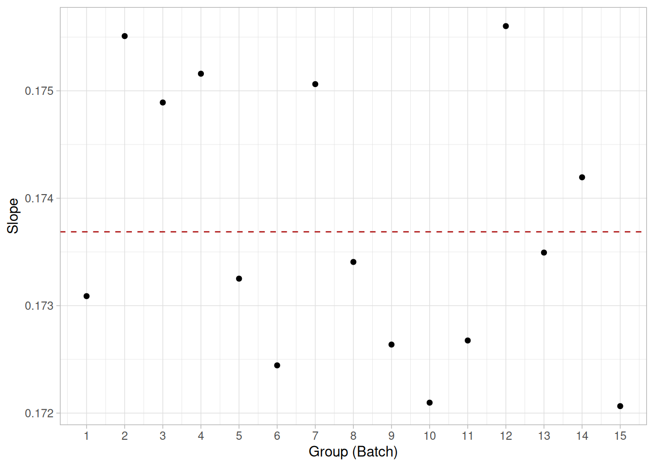
This linear slope plot of the HSU12.DAT data set shows that the slopes are about 0.174 (plus or minus 0.002) for all groups. There does not appear to be a pattern in the variation of the slopes. This implies that a single fit may be adequate.
Definition: Group Slopes Versus Group ID
Linear slope plots are formed by:
A reference line is plotted at the slope from a linear fit using all the data.
Questions
The linear slope plot can be used to answer the following questions.
Importance: Checking Group Homogeneity
For grouped data, it may be important to know whether the different groups are homogeneous (i.e., similar) or heterogeneous (i.e., different). Linear slope plots help answer this question in the context of linear fitting.
Related Techniques
Linear Intercept Plot, Linear Correlation Plot, Linear Residual Standard Deviation Plot, Linear Fitting
Case Study
The linear slope plot is demonstrated in the Alaska pipeline data case study.
Software
Most general purpose statistical software programs do not support a linear slope plot. However, if the statistical program can generate linear fits over a group, it should be feasible to write a macro to generate this plot.
Purpose: Detect Changes in Linear Residual Standard Deviation Between Groups
Linear residual standard deviation (RESSD) plots are used to graphically assess whether or not linear fits are consistent across groups. That is, if your data have groups, you may want to know if a single fit can be used across all the groups or whether separate fits are required for each group.
The residual standard deviation is a goodness-of-fit measure. That is, the smaller the residual standard deviation, the closer is the fit to the data.
Linear RESSD plots are typically used in conjunction with Linear Intercept Plot and Linear Slope Plot. The linear intercept and slope plots convey whether or not the fits are consistent across groups while the linear RESSD plot conveys whether the adequacy of the fit is consistent across groups.
In some cases you might not have groups. Instead, you have different data sets and you want to know if the same fit can be adequately applied to each of the data sets. In this case, simply think of each distinct data set as a group and apply the linear RESSD plot as for groups.
Sample Plot
library(tidyverse)
# HSU12.DAT has a blank line between each of its 15 batches, which
# read_table() reports as a parsing failure (expected 3 columns, got 1)
# for each blank line -- 14 expected warnings for the 14 gaps between
# batches. drop_na() below removes the resulting all-NA rows.
hsu12 <- read_table(
here::here("datasets", "HSU12.DAT"),
skip = 25,
col_names = c("y", "x", "batch"),
col_types = "ddi"
) |>
drop_na()
overall_ressd <- summary(lm(y ~ x, data = hsu12))$sigma
ressd <- hsu12 |>
group_by(batch) |>
summarise(ressd = summary(lm(y ~ x))$sigma, .groups = "drop")ressd |>
ggplot(aes(batch, ressd)) +
geom_point() +
geom_hline(yintercept = overall_ressd, linetype = "dashed", color = "firebrick") +
scale_x_continuous(breaks = 1:15) +
labs(x = "Group (Batch)", y = "Residual Standard Deviation") +
theme_light()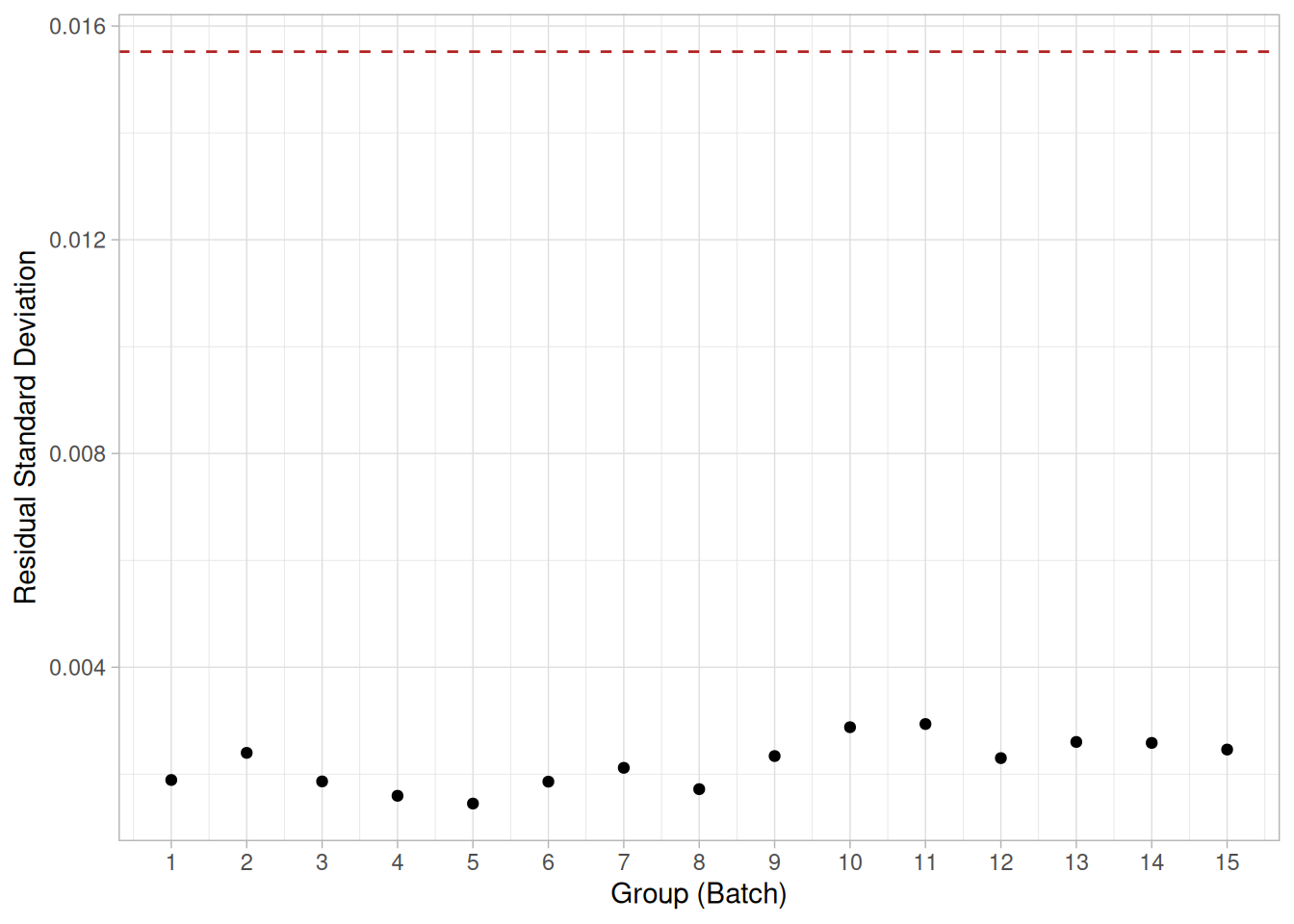
This linear RESSD plot of the HSU12.DAT data set shows that the residual standard deviations from a linear fit are about 0.0022 for all the groups, much smaller than the residual standard deviation of 0.016 from a single fit using all the data (the dashed reference line).
Definition: Group Residual Standard Deviation Versus Group ID
Linear RESSD plots are formed by:
A reference line is plotted at the residual standard deviation from a linear fit using all the data. This reference line will typically be much greater than any of the individual residual standard deviations.
Questions
The linear RESSD plot can be used to answer the following questions.
Importance: Checking Group Homogeneity
For grouped data, it may be important to know whether the different groups are homogeneous (i.e., similar) or heterogeneous (i.e., different). Linear RESSD plots help answer this question in the context of linear fitting.
Related Techniques
Linear Intercept Plot, Linear Slope Plot, Linear Correlation Plot, Linear Fitting
Case Study
The linear residual standard deviation plot is demonstrated in the Alaska pipeline data case study.
Software
Most general purpose statistical software programs do not support a linear residual standard deviation plot. However, if the statistical program can generate linear fits over a group, it should be feasible to write a macro to generate this plot.
Purpose: Detect changes in location between groups
Mean plots are used to see if the mean varies between different groups of the data. The grouping is determined by the analyst. In most cases, the data set contains a specific grouping variable. For example, the groups may be the levels of a factor variable. In the sample plot below, the months of the year provide the grouping.
Mean plots can be used with ungrouped data to determine if the mean is changing over time. In this case, the data are split into an arbitrary number of equal-sized groups. For example, a data series with 400 points can be divided into 10 groups of 40 points each. A mean plot can then be generated with these groups to see if the mean is increasing or decreasing over time.
Although the mean is the most commonly used measure of location, the same concept applies to other measures of location. For example, instead of plotting the mean of each group, the median or the trimmed mean might be plotted instead. This might be done if there were significant outliers in the data and a more robust measure of location than the mean was desired.
Mean plots are typically used in conjunction with standard deviation plots. The mean plot checks for shifts in location while the Standard Deviation Plot checks for shifts in scale.
Sample Plot: Shift of Location After the 6th Month
library(tidyverse)
draft69 <- read_table(
here::here("datasets", "DRAFT69.DAT"),
skip = 25,
col_names = c("y", "day", "month"),
col_types = "iii"
) |>
drop_na()
overall_mean <- mean(draft69$y)
month_means <- draft69 |>
group_by(month) |>
summarise(mean = mean(y), .groups = "drop")month_means |>
ggplot(aes(month, mean)) +
geom_line() +
geom_point() +
geom_hline(yintercept = overall_mean, linetype = "dashed", color = "firebrick") +
scale_x_continuous(breaks = 1:12) +
labs(x = "Group (Month)", y = "Mean Draft Rank") +
theme_light()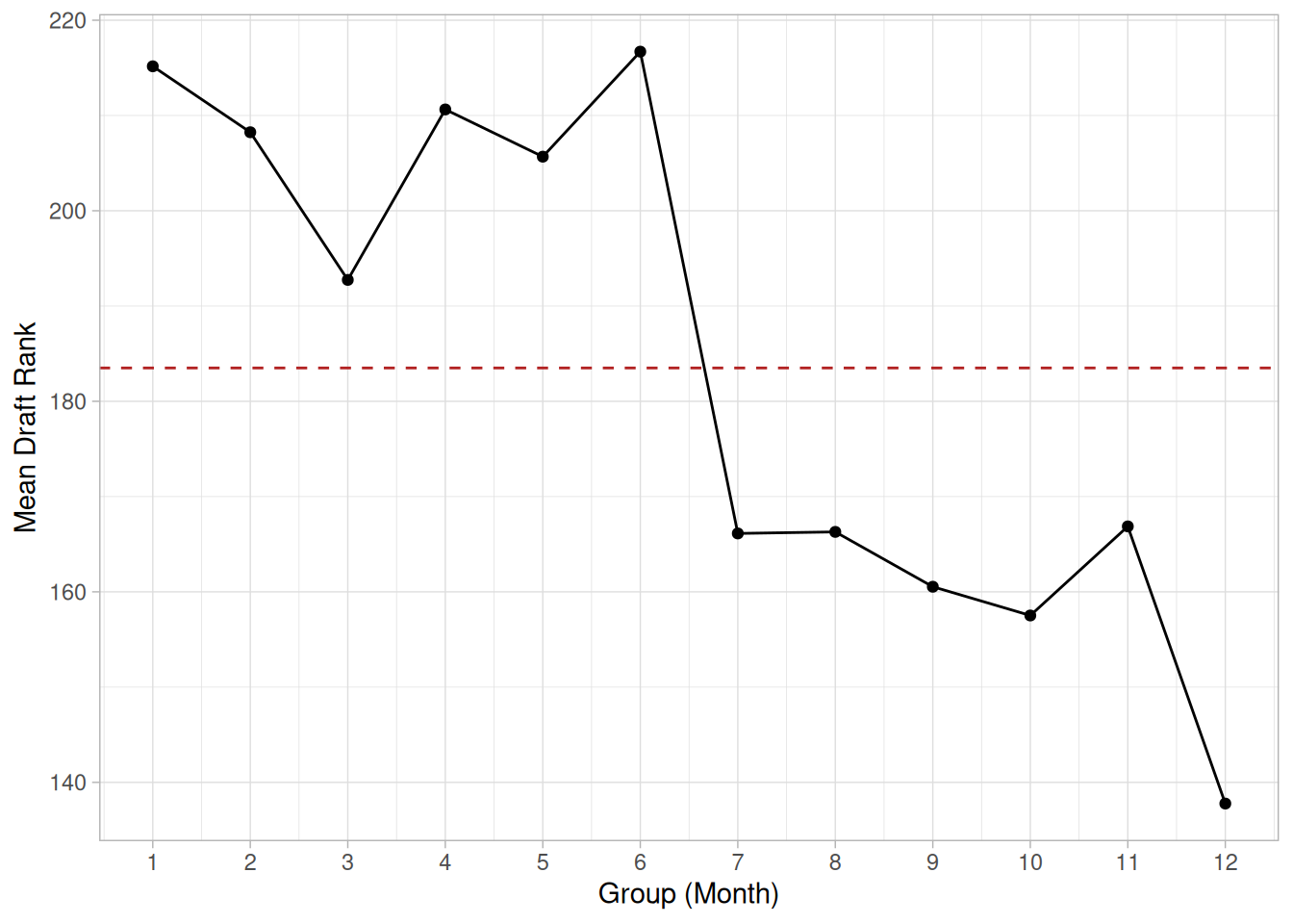
This sample mean plot of the DRAFT69.DAT data set (the 1969 U.S. draft lottery rankings, grouped by month of the year) shows a shift of location after the 6th month.
Definition: Group Means Versus Group ID
Mean plots are formed by:
A reference line is plotted at the overall mean.
Questions
The mean plot can be used to answer the following questions.
Importance: Checking Assumptions
A common assumption in 1-factor analyses is that of constant location. That is, the location is the same for different levels of the factor variable. The mean plot provides a graphical check for that assumption. A common assumption for univariate data is that the location is constant. By grouping the data into equal intervals, the mean plot can provide a graphical test of this assumption.
Related Techniques
Standard Deviation Plot, DOE Mean Plot, Box Plot
Software
Most general purpose statistical software programs do not support a mean plot. However, if the statistical program can generate the mean over a group, it should be feasible to write a macro to generate this plot.
Purpose: Check If Data Are Approximately Normally Distributed
The normal probability plot (Chambers et al. 1983) is a graphical technique for assessing whether or not a data set is approximately normally distributed.
The data are plotted against a theoretical normal distribution in such a way that the points should form an approximate straight line. Departures from this straight line indicate departures from normality.
The normal probability plot is a special case of the Probability Plot. We cover the normal probability plot separately due to its importance in many applications.
library(tidyverse)
# Uniform order statistic medians (Filliben, 1975)
uniform_medians <- function(n) {
i <- seq_len(n)
m <- numeric(n)
m[1] <- 1 - 0.5^(1 / n)
m[n] <- 0.5^(1 / n)
if (n > 2) m[2:(n - 1)] <- (i[2:(n - 1)] - 0.3175) / (n + 0.365)
m
}
# Reusable normal probability plot: ordered response values vs. normal
# order statistic medians, with a fitted reference line and its
# correlation coefficient, intercept, and slope reported.
normal_prob_plot <- function(x) {
n <- length(x)
mm <- uniform_medians(n)
theoretical <- qnorm(mm)
xs <- sort(x)
fit <- lm(xs ~ theoretical)
tibble(theoretical = theoretical, observed = xs) |>
ggplot(aes(theoretical, observed)) +
geom_point(shape = 1) +
geom_abline(intercept = coef(fit)[1], slope = coef(fit)[2], color = "firebrick") +
labs(x = "Theoretical (normal order statistic medians)", y = "Ordered response values") +
theme_light()
}
zarr13 <- read_table(here::here("datasets", "ZARR13.DAT"), skip = 25, col_names = "y", col_types = "d")Sample Plot: Points on this normal probability plot of 100 normal random numbers form a nearly linear pattern, indicating that the normal distribution is a good model for this data set
set.seed(41)
normal_prob_plot(rnorm(100))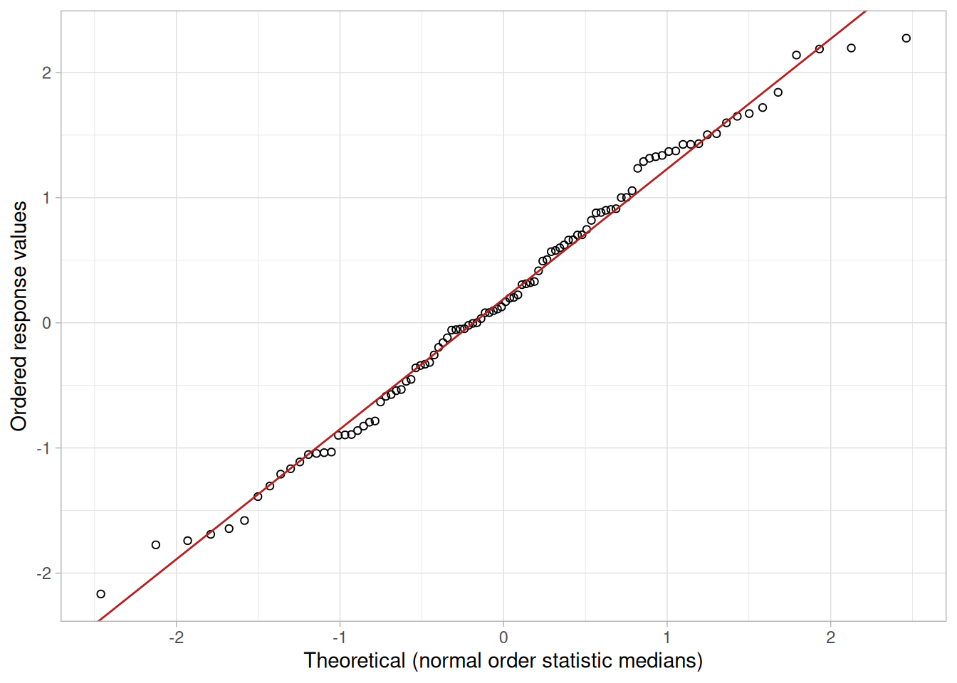
Definition: Ordered Response Values Versus Normal Order Statistic Medians
The normal probability plot is formed by:
The observations are plotted as a function of the corresponding normal order statistic medians, which are defined as
\[N_i = G(U_i)\]
where \(U_i\) are the uniform order statistic medians (defined below) and \(G\) is the percent point function of the normal distribution. The percent point function is the inverse of the cumulative distribution function (probability that \(x\) is less than or equal to some value). That is, given a probability, we want the corresponding \(x\) of the cumulative distribution function.
The uniform order statistic medians (see Filliben 1975) can be approximated by:
\[ U_i = \begin{cases} 1 - U_n & i = 1 \\ (i - 0.3175)/(n + 0.365) & i = 2, 3, \ldots, n - 1 \\ 0.5^{(1/n)} & i = n \end{cases} \]
In addition, a straight line can be fit to the points and added as a reference line. The further the points vary from this line, the greater the indication of departures from normality.
Probability plots for distributions other than the normal are computed in exactly the same way. The normal percent point function (the \(G\)) is simply replaced by the percent point function of the desired distribution. That is, a probability plot can easily be generated for any distribution for which you have the percent point function.
One advantage of this method of computing probability plots is that the intercept and slope estimates of the fitted line are in fact estimates for the location and scale parameters of the distribution. Although this is not too important for the normal distribution since the location and scale are estimated by the mean and standard deviation, respectively, it can be useful for many other distributions.
The correlation coefficient of the points on the normal probability plot can be compared to a table of critical values to provide a formal test of the hypothesis that the data come from a normal distribution.
Questions
The normal probability plot is used to answer the following questions:
Importance: Check Normality Assumption
The underlying assumptions for a measurement process are that the data should behave like:
Probability plots are used to assess the assumption of a fixed distribution. In particular, most statistical models are of the form
\[\text{response} = \text{deterministic} + \text{random}\]
where the deterministic part is the fit and the random part is error. This error component in most common statistical models is specifically assumed to be normally distributed with fixed location and scale. This is the most frequent application of normal probability plots. That is, a model is fit and a normal probability plot is generated for the residuals from the fitted model. If the residuals from the fitted model are not normally distributed, then one of the major assumptions of the model has been violated.
Related Techniques
Histogram, Probability plots for other distributions (e.g., Weibull), Probability Plot Correlation Coefficient (PPCC) Plot, Anderson-Darling Goodness-of-Fit Test, Chi-Square Goodness-of-Fit Test, Kolmogorov-Smirnov Goodness-of-Fit Test.
Case Study
The normal probability plot is demonstrated in the heat flow meter data case study.
Software
Most general purpose statistical software programs can generate a normal probability plot.
Examples
Examples of the normal probability plot for several common situations are given below.
The following normal probability plot is from the heat flow meter data (ZARR13.DAT).
normal_prob_plot(zarr13$y)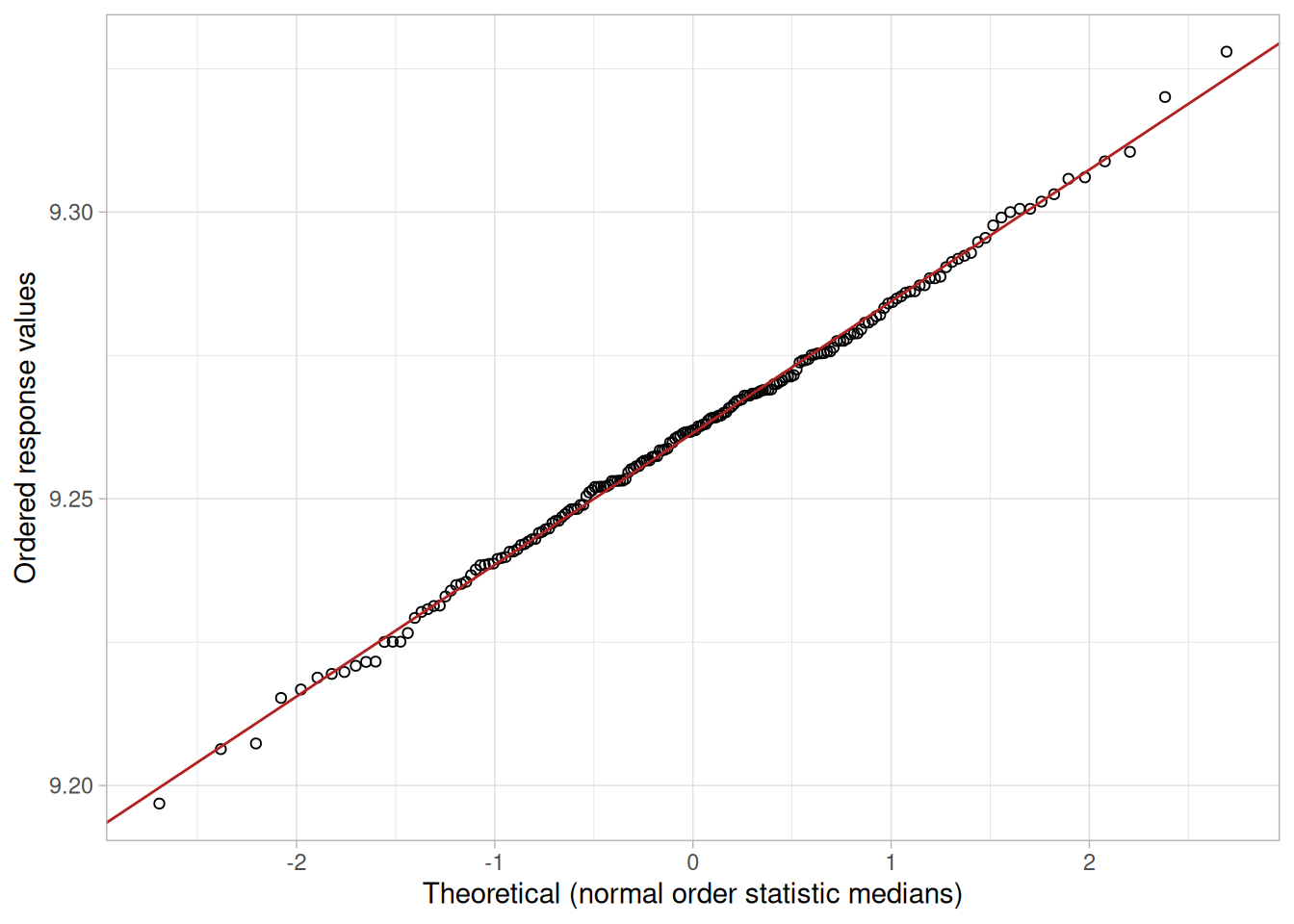
We can make the following conclusions from Figure 1.51:
Visually, the probability plot shows a strongly linear pattern. This is verified by the correlation coefficient of 0.9989 of the line fit to the probability plot. The fact that the points in the lower and upper extremes of the plot do not deviate significantly from the straight-line pattern indicates that there are not any significant outliers (relative to a normal distribution).
In this case, we can quite reasonably conclude that the normal distribution provides an excellent model for the data. The intercept and slope of the fitted line give estimates of 9.26 and 0.023 for the location and scale parameters of the fitted normal distribution.
n <- length(zarr13$y)
fit <- lm(sort(zarr13$y) ~ qnorm(uniform_medians(n)))
tibble(
correlation = cor(sort(zarr13$y), qnorm(uniform_medians(n))),
intercept = coef(fit)[1],
slope = coef(fit)[2]
)The following is a normal probability plot for 500 random numbers generated from a Tukey-Lambda distribution with the shape parameter equal to 1.1 (a synthetic illustration of short-tailed data, read from TUKLAMB.DAT).
tuklamb <- read_table(here::here("datasets", "TUKLAMB.DAT"), skip = 25, col_names = "y", col_types = "d")
normal_prob_plot(tuklamb$y)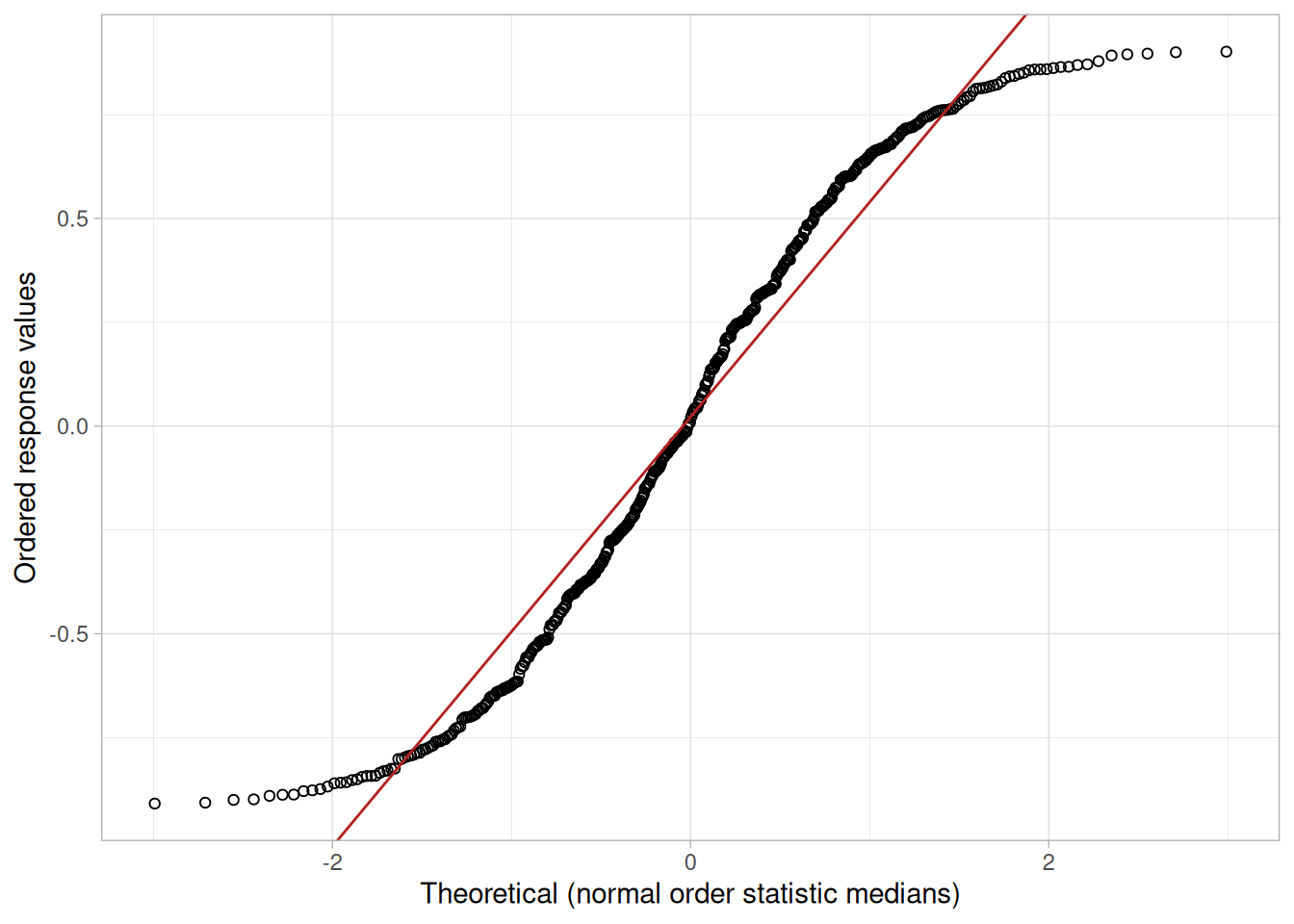
We can make the following conclusions from Figure 1.52:
For data with short tails relative to the normal distribution, the non-linearity of the normal probability plot shows up in two ways. First, the middle of the data shows an S-like pattern. This is common for both short and long tails. Second, the first few and the last few points show a marked departure from the reference fitted line. In comparing this plot to the long-tail example below, the important difference is the direction of the departure from the fitted line for the first few and last few points. For short tails, the first few points show increasing departure from the fitted line above the line and the last few points show increasing departure from the fitted line below the line. For long tails, this pattern is reversed.
In this case, we can reasonably conclude that the normal distribution does not provide an adequate fit for this data set. For probability plots that indicate short-tailed distributions, the next step might be to generate a Tukey-Lambda PPCC plot. The Tukey-Lambda PPCC plot can often be helpful in identifying an appropriate distributional family.
The following is a normal probability plot of 500 numbers generated from a double exponential distribution (a synthetic illustration of long-tailed data). The double exponential distribution is symmetric, but relative to the normal it declines rapidly and has longer tails.
set.seed(19)
n_de <- 500
u <- runif(n_de) - 0.5
double_exp <- -sign(u) * log(1 - 2 * abs(u))
normal_prob_plot(double_exp)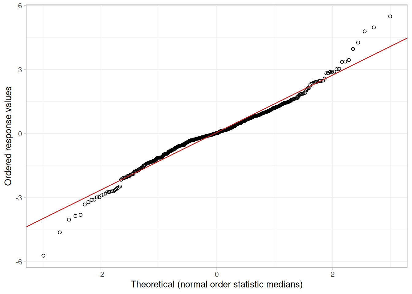
We can make the following conclusions from Figure 1.53:
For data with long tails relative to the normal distribution, the non-linearity of the normal probability plot can show up in two ways. First, the middle of the data may show an S-like pattern; this is common for both short and long tails. Second, the first few and the last few points show a marked departure from the reference fitted line. In comparing this plot to the short-tail example above, the important difference is the direction of the departure from the fitted line for the first few and the last few points. For long tails, the first few points show increasing departure from the fitted line below the line and the last few points show increasing departure from the fitted line above the line. For short tails, this pattern is reversed.
In this case we can reasonably conclude that the normal distribution can be improved upon as a model for these data. For probability plots that indicate long-tailed distributions, the next step might be to generate a Tukey-Lambda PPCC plot. The Tukey-Lambda PPCC plot can often be helpful in identifying an appropriate distributional family.
The following is a normal probability plot of the SUNSPOT.DAT data set (monthly Wolf sunspot numbers).
sunspot <- read_table(
here::here("datasets", "SUNSPOT.DAT"),
skip = 25,
col_names = c("y", "month", "year", "yearavg"),
col_types = "dddd"
)
normal_prob_plot(sunspot$y)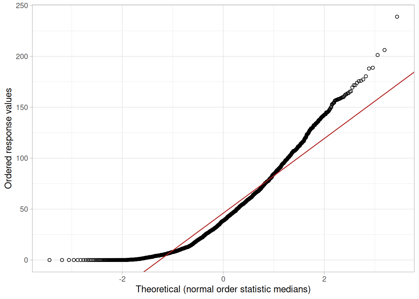
We can make the following conclusions from Figure 1.54 of the SUNSPOT.DAT data set:
(NIST’s original text describes this reference line as “drawn between the first and last points,” and its own image draws exactly that – a line connecting the two extreme points rather than a least-squares fit. That endpoint-connecting line does not match the correlation, intercept, and slope values printed alongside it in the original (0.9568, 46.0243, and 36.6417): those numbers are for the least-squares fit, which we verified matches our own fitted line here almost to the decimal. To keep the reference line mathematically consistent with the fitted-line Definition given above and used throughout this page – and with the numbers actually printed – we draw the least-squares fit rather than reproducing NIST’s endpoint-connecting line. The conclusion is unaffected either way: the data clearly bow away from a straight line, which is the signature of a right-skewed distribution.)
This quadratic pattern in the normal probability plot is the signature of a significantly right-skewed data set. Similarly, if all the points on the normal probability plot fell above the reference line connecting the first and last points, that would be the signature pattern for a significantly left-skewed data set.
In this case we can quite reasonably conclude that we need to model these data with a right-skewed distribution such as the Weibull or lognormal.
Purpose: Check If Data Follow a Given Distribution
The probability plot (Chambers et al. 1983) is a graphical technique for assessing whether or not a data set follows a given distribution such as the normal or Weibull.
The data are plotted against a theoretical distribution in such a way that the points should form approximately a straight line. Departures from this straight line indicate departures from the specified distribution.
The correlation coefficient associated with the linear fit to the data in the probability plot is a measure of the goodness of the fit. Estimates of the location and scale parameters of the distribution are given by the intercept and slope. Probability plots can be generated for several competing distributions to see which provides the best fit, and the probability plot generating the highest correlation coefficient is the best choice since it generates the straightest probability plot.
For distributions with shape parameters (not counting location and scale parameters), the shape parameters must be known in order to generate the probability plot. For distributions with a single shape parameter, the Probability Plot Correlation Coefficient (PPCC) Plot provides an excellent method for estimating the shape parameter.
We cover the special case of the Normal Probability Plot separately due to its importance in many statistical applications.
library(tidyverse)
# Uniform order statistic medians (Filliben, 1975)
uniform_medians <- function(n) {
i <- seq_len(n)
m <- numeric(n)
m[1] <- 1 - 0.5^(1 / n)
m[n] <- 0.5^(1 / n)
if (n > 2) m[2:(n - 1)] <- (i[2:(n - 1)] - 0.3175) / (n + 0.365)
m
}
# General probability plot: ordered response values vs. order statistic
# medians for a given distribution's quantile function `qfun`, with a
# fitted reference line.
probability_plot <- function(x, qfun, ...) {
n <- length(x)
mm <- uniform_medians(n)
theoretical <- qfun(mm, ...)
xs <- sort(x)
fit <- lm(xs ~ theoretical)
tibble(theoretical = theoretical, observed = xs) |>
ggplot(aes(theoretical, observed)) +
geom_point(shape = 1) +
geom_abline(intercept = coef(fit)[1], slope = coef(fit)[2], color = "firebrick") +
labs(x = "Theoretical (Weibull order statistic medians)", y = "Ordered response values") +
theme_light()
}Sample Plot
This data is a set of 500 synthetic Weibull random numbers with a shape parameter = 2, location parameter = 0, and scale parameter = 1. The Weibull probability plot indicates that the Weibull distribution does in fact fit these data well.
set.seed(23)
weib <- rweibull(500, shape = 2, scale = 1)
probability_plot(weib, function(p, shape) qweibull(p, shape = shape, scale = 1), shape = 2)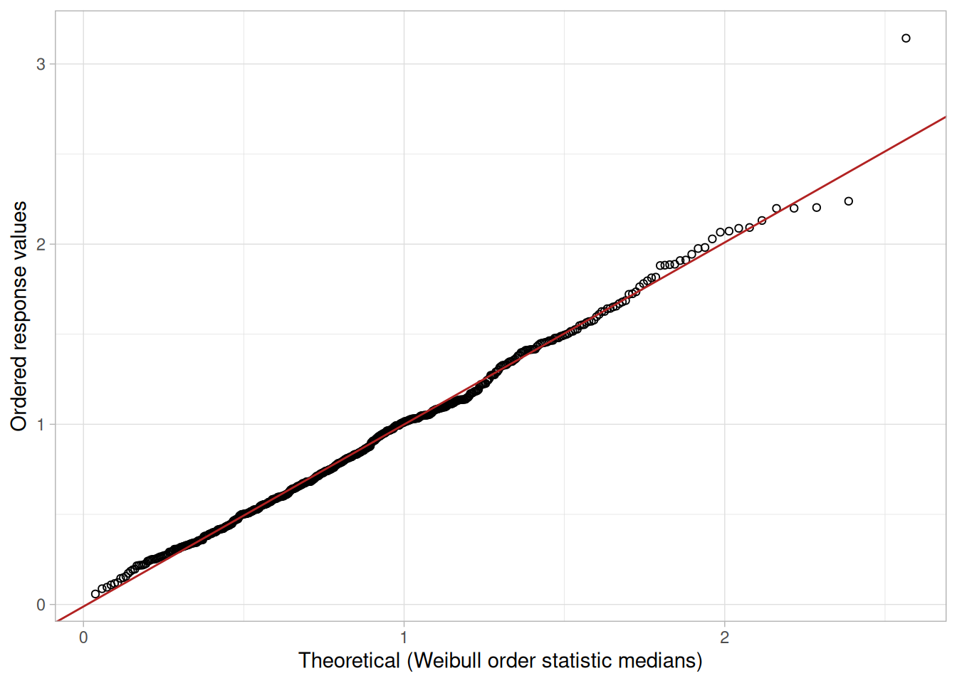
Definition: Ordered Response Values Versus Order Statistic Medians for the Given Distribution
The probability plot is formed by:
The order statistic medians (see Filliben 1975) can be approximated by
\[N_i = G(U_i)\]
where \(U_i\) are the uniform order statistic medians (defined below) and \(G\) is the percent point function for the desired distribution. The percent point function is the inverse of the cumulative distribution function (probability that \(x\) is less than or equal to some value). That is, given a probability, we want the corresponding \(x\) of the cumulative distribution function.
The uniform order statistic medians are defined as:
\[ m_i = \begin{cases} 1 - m_n & i = 1 \\ (i - 0.3175)/(n + 0.365) & i = 2, 3, \ldots, n - 1 \\ 0.5^{(1/n)} & i = n \end{cases} \]
In addition, a straight line can be fit to the points and added as a reference line. The further the points vary from this line, the greater the indication of a departure from the specified distribution.
This definition implies that a probability plot can be easily generated for any distribution for which the percent point function can be computed.
One advantage of this method of computing probability plots is that the intercept and slope estimates of the fitted line are in fact estimates for the location and scale parameters of the distribution. Although this is not too important for the normal distribution (the location and scale are estimated by the mean and standard deviation, respectively), it can be useful for many other distributions.
Questions
The probability plot is used to answer the following questions:
Importance: Check Distributional Assumption
The discussion for the Normal Probability Plot covers the use of probability plots for checking the fixed distribution assumption.
Some statistical models assume data have come from a population with a specific type of distribution. For example, in reliability applications, the Weibull, lognormal, and exponential are commonly used distributional models. Probability plots can be useful for checking this distributional assumption.
Related Techniques
Histogram, Probability Plot Correlation Coefficient (PPCC) Plot, Hazard Plot, Quantile-Quantile Plot, Anderson-Darling Goodness of Fit, Chi-Square Goodness of Fit, Kolmogorov-Smirnov Goodness of Fit.
Case Study
The probability plot is demonstrated in the uniform random numbers case study.
Software
Most general purpose statistical software programs support probability plots for at least a few common distributions.
Purpose: Graphical Technique for Finding the Shape Parameter of a Distributional Family that Best Fits a Data Set
The probability plot correlation coefficient (PPCC) plot (Filliben 1975) is a graphical technique for identifying the shape parameter for a distributional family that best describes the data set. This technique is appropriate for families, such as the Weibull, that are defined by a single shape parameter and location and scale parameters, and it is not appropriate for distributions, such as the normal, that are defined only by location and scale parameters.
The PPCC plot is generated as follows. For a series of values for the shape parameter, the correlation coefficient is computed for the probability plot associated with a given value of the shape parameter. These correlation coefficients are plotted against their corresponding shape parameters. The maximum correlation coefficient corresponds to the optimal value of the shape parameter. For better precision, two iterations of the PPCC plot can be generated; the first is for finding the right neighborhood and the second is for fine tuning the estimate.
The PPCC plot is used first to find a good value of the shape parameter. The probability plot is then generated to find estimates of the location and scale parameters and in addition to provide a graphical assessment of the adequacy of the distributional fit.
library(tidyverse)
# Uniform order statistic medians (Filliben, 1975)
uniform_medians <- function(n) {
i <- seq_len(n)
m <- numeric(n)
m[1] <- 1 - 0.5^(1 / n)
m[n] <- 0.5^(1 / n)
if (n > 2) m[2:(n - 1)] <- (i[2:(n - 1)] - 0.3175) / (n + 0.365)
m
}
# For a series of candidate shape-parameter values, generate the
# probability-plot order statistic medians from `qfun(p, shape)`,
# correlate them with the sorted data, and return the correlation
# (the probability plot correlation coefficient) as a function of shape.
ppcc_curve <- function(x, shapes, qfun) {
n <- length(x)
mm <- uniform_medians(n)
xs <- sort(x)
vapply(shapes, function(s) cor(xs, qfun(mm, s)), numeric(1))
}
ppcc_plot <- function(x, shapes, qfun, xlab = "Shape parameter") {
ppcc <- ppcc_curve(x, shapes, qfun)
best <- shapes[which.max(ppcc)]
p <- tibble(shape = shapes, ppcc = ppcc) |>
ggplot(aes(shape, ppcc)) +
geom_point() +
geom_vline(xintercept = best, linetype = "dashed", color = "firebrick") +
labs(x = xlab, y = "Probability plot correlation coefficient") +
theme_light()
list(plot = p, best_shape = best, max_ppcc = max(ppcc))
}
# Tukey-Lambda percent point function (quantile function)
qtukey_lambda <- function(p, lambda) {
if (abs(lambda) < 1e-8) return(log(p / (1 - p)))
(p^lambda - (1 - p)^lambda) / lambda
}Compare Distributions
In addition to finding a good choice for estimating the shape parameter of a given distribution, the PPCC plot can be useful in deciding which distributional family is most appropriate. For example, given a set of reliability data, you might generate PPCC plots for a Weibull, lognormal, gamma, and inverse Gaussian distribution, and possibly others, on a single page. This one page would show the best value for the shape parameter for several distributions and would additionally indicate which of these distributional families provides the best fit (as measured by the maximum probability plot correlation coefficient). That is, if the maximum PPCC value for the Weibull is 0.99 and only 0.94 for the lognormal, then we could reasonably conclude that the Weibull family is the better choice.
Tukey-Lambda PPCC Plot for Symmetric Distributions
The Tukey-Lambda distribution PPCC plot, with shape parameter \(\lambda\), is particularly useful for symmetric distributions. It indicates whether a distribution is short- or long-tailed and it can further indicate several common distributions. Specifically:
If the Tukey-Lambda PPCC plot gives a maximum value near 0.14, we can reasonably conclude that the normal distribution is a good model for the data. If the maximum value is less than 0.14, a long-tailed distribution such as the double exponential or logistic would be a better choice. If the maximum value is near \(-1\), this implies the selection of a very long-tailed distribution, such as the Cauchy. If the maximum value is greater than 0.14, this implies a short-tailed distribution such as the Beta or uniform.
The Tukey-Lambda PPCC plot is used to suggest an appropriate distribution. You should follow up with PPCC and probability plots of the appropriate alternatives.
Use Judgement When Selecting An Appropriate Distributional Family
When comparing distributional models, do not simply choose the one with the maximum PPCC value. In many cases, several distributional fits provide comparable PPCC values. For example, a lognormal and Weibull may both fit a given set of reliability data quite well. Typically, we would consider the complexity of the distribution. That is, a simpler distribution with a marginally smaller PPCC value may be preferred over a more complex distribution. Likewise, there may be theoretical justification in terms of the underlying scientific model for preferring a distribution with a marginally smaller PPCC value in some cases. In other cases, we may not need to know if the distributional model is optimal, only that it is adequate for our purposes. That is, we may be able to use techniques designed for normally distributed data even if other distributions fit the data somewhat better.
Sample Plot: Tukey-Lambda PPCC plot of 100 normal random numbers
set.seed(7)
normal_sample <- rnorm(100)
shapes_fine <- seq(-0.5, 1, by = 0.01)
result_sample <- ppcc_plot(normal_sample, shapes_fine, qtukey_lambda, xlab = expression(lambda))
result_sample$plot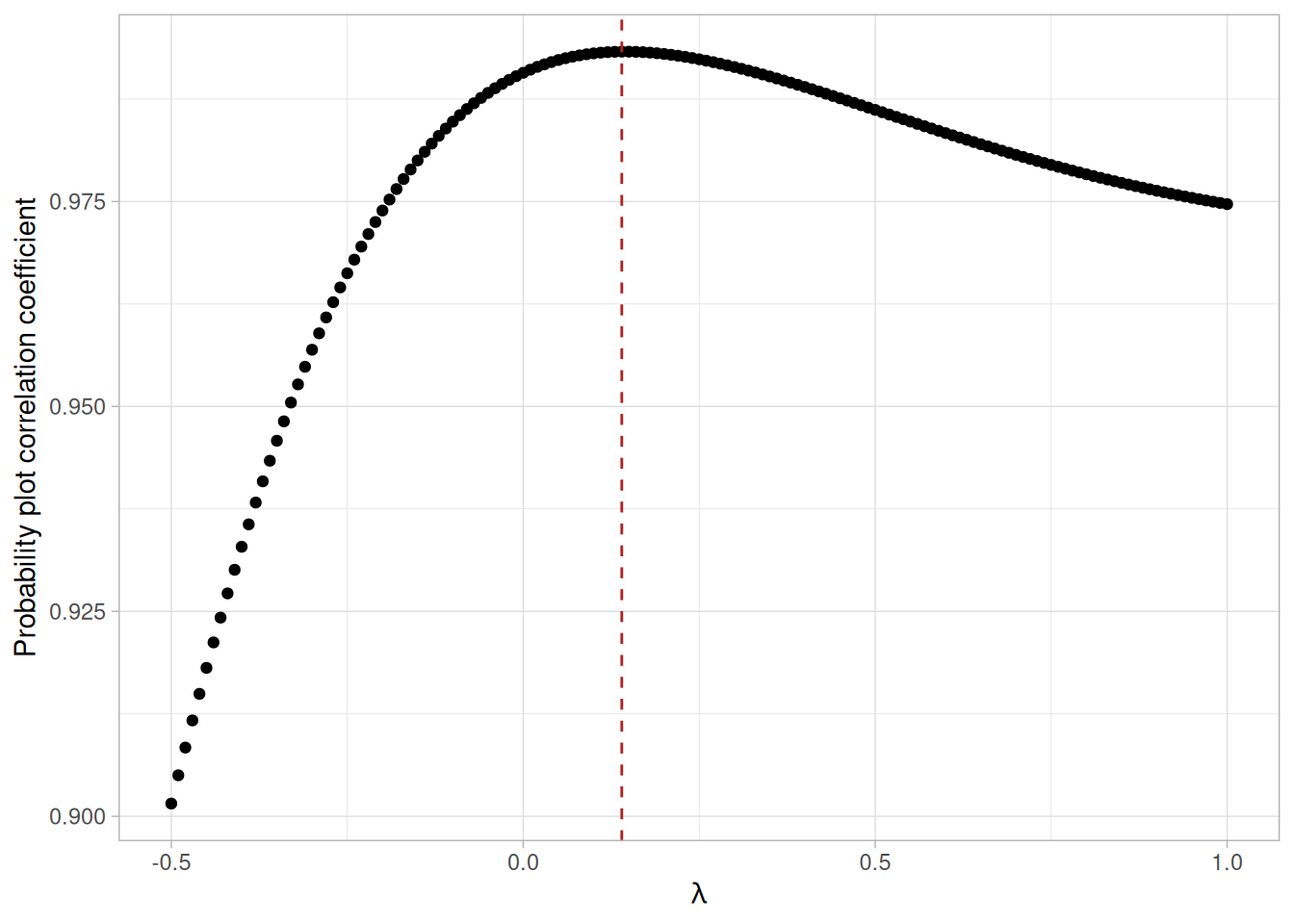
tibble(best_lambda = result_sample$best_shape, max_ppcc = result_sample$max_ppcc)The maximum value of the correlation coefficient found in this synthetic example is approximately 0.993 at \(\lambda \approx 0.14\), matching the theoretical value of 0.14 for the normal distribution (the exact maximizing \(\lambda\) varies somewhat from sample to sample). This PPCC plot shows that:
We can follow up this PPCC plot with a normal probability plot to verify the normality model for the data.
Definition
The PPCC plot is formed by:
Questions
The PPCC plot answers the following questions:
Importance
Many statistical analyses are based on distributional assumptions about the population from which the data have been obtained. However, distributional families can have radically different shapes depending on the value of the shape parameter. Therefore, finding a reasonable choice for the shape parameter is a necessary step in the analysis. In many analyses, finding a good distributional model for the data is the primary focus of the analysis. In both of these cases, the PPCC plot is a valuable tool.
Related Techniques
Probability Plot, Maximum Likelihood Estimation, Least Squares Estimation, Method of Moments Estimation.
Software
PPCC plots are currently not available in most common general purpose statistical software programs. However, the underlying technique is based on probability plots and correlation coefficients, so it should be possible to write macros for PPCC plots in statistical programs that support these capabilities. Dataplot supports PPCC plots.
Purpose: Check If Two Data Sets Can Be Fit With the Same Distribution
The quantile-quantile (q-q) plot is a graphical technique for determining if two data sets come from populations with a common distribution.
A q-q plot is a plot of the quantiles of the first data set against the quantiles of the second data set. By a quantile, we mean the fraction (or percent) of points below the given value. That is, the 0.3 (or 30%) quantile is the point at which 30% of the data fall below and 70% fall above that value.
A 45-degree reference line is also plotted. If the two sets come from a population with the same distribution, the points should fall approximately along this reference line. The greater the departure from this reference line, the greater the evidence for the conclusion that the two data sets have come from populations with different distributions.
The advantages of the q-q plot are:
The q-q plot is similar to a probability plot. For a probability plot, the quantiles for one of the data samples are replaced with the quantiles of a theoretical distribution.
library(tidyverse)
jahanmi2 <- read_table(
here::here("datasets", "JAHANMI2.DAT"),
skip = 50,
col_names = c("run", "lab", "bar", "set", "y", paste0("x", 1:10), "set2"),
col_types = cols(.default = "d")
)
# x9 in this reading is the "Bar Batch" factor (2 levels) used to split
# the ceramic strength data into the two batches compared below.
batch1 <- sort(jahanmi2$y[jahanmi2$x9 == 1])
batch2 <- sort(jahanmi2$y[jahanmi2$x9 == 2])
# When the two samples are equal in size (as here), the q-q plot is
# simply sorted sample 1 against sorted sample 2. When sizes differ,
# the quantiles of the larger sample are linearly interpolated to the
# quantile levels of the smaller sample.
qq_data <- function(x, y) {
nx <- length(x)
ny <- length(y)
if (nx == ny) {
tibble(q1 = sort(x), q2 = sort(y))
} else if (nx < ny) {
p <- (seq_len(nx) - 0.5) / nx
tibble(q1 = sort(x), q2 = quantile(sort(y), probs = p, type = 5, names = FALSE))
} else {
p <- (seq_len(ny) - 0.5) / ny
tibble(q1 = quantile(sort(x), probs = p, type = 5, names = FALSE), q2 = sort(y))
}
}
qq_plot <- function(x, y, xlab = "Data set 2", ylab = "Data set 1") {
d <- qq_data(x, y)
lims <- range(c(d$q1, d$q2))
ggplot(d, aes(q2, q1)) +
geom_point(shape = 1) +
geom_abline(slope = 1, intercept = 0, color = "firebrick", linetype = "dashed") +
coord_equal(xlim = lims, ylim = lims) +
labs(x = xlab, y = ylab) +
theme_light()
}Sample Plot: This q-q plot of the JAHANMI2.DAT data set shows that these two batches do not appear to have come from populations with a common distribution
qq_plot(batch1, batch2, xlab = "Batch 2", ylab = "Batch 1")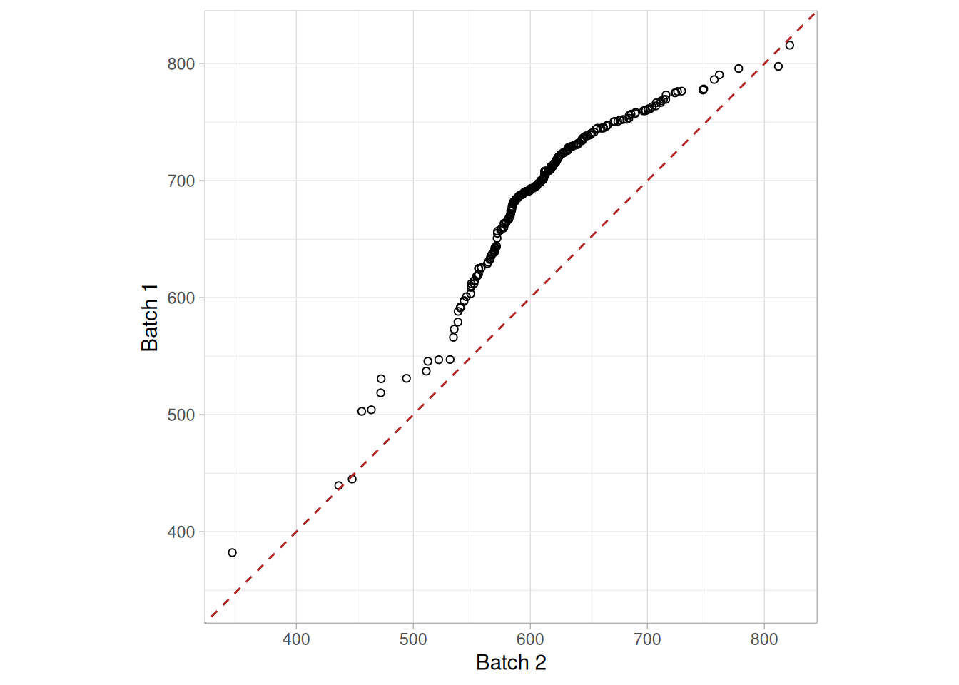
This q-q plot of the JAHANMI2.DAT data set shows that:
Definition: Quantiles for Data Set 1 Versus Quantiles of Data Set 2
The q-q plot is formed by:
Both axes are in units of their respective data sets. That is, the actual quantile level is not plotted. For a given point on the q-q plot, we know that the quantile level is the same for both points, but not what that quantile level actually is.
If the data sets have the same size, the q-q plot is essentially a plot of sorted data set 1 against sorted data set 2. If the data sets are not of equal size, the quantiles are usually picked to correspond to the sorted values from the smaller data set and then the quantiles for the larger data set are interpolated.
Questions
The q-q plot is used to answer the following questions:
Importance: Check for Common Distribution
When there are two data samples, it is often desirable to know if the assumption of a common distribution is justified. If so, then location and scale estimators can pool both data sets to obtain estimates of the common location and scale. If two samples do differ, it is also useful to gain some understanding of the differences. The q-q plot can provide more insight into the nature of the difference than analytical methods such as the chi-square and Kolmogorov-Smirnov 2-sample tests.
Related Techniques
Bihistogram, T Test, F Test, 2-Sample Chi-Square Test, 2-Sample Kolmogorov-Smirnov Test.
Case Study
The quantile-quantile plot is demonstrated in the ceramic strength data case study.
Software
Q-Q plots are available in some general purpose statistical software programs. If the number of data points in the two samples are equal, it should be relatively easy to write a macro in statistical programs that do not support the q-q plot. If the number of points are not equal, writing a macro for a q-q plot may be difficult.
Purpose: Check for Shifts in Location and Scale and Outliers
Run sequence plots (Chambers et al. 1983) are an easy way to graphically summarize a univariate data set. A common assumption of univariate data sets is that they behave like:
With run sequence plots, shifts in location and scale are typically quite evident. Also, outliers can easily be detected.
Sample Plot: Last Third of Data Shows a Shift of Location
library(tidyverse)
mavro <- read_table(here::here("datasets", "MAVRO.DAT"), skip = 25, col_names = "y", col_types = "d") |>
mutate(i = row_number())mavro |>
ggplot(aes(i, y)) +
geom_line() +
geom_point() +
labs(x = "Index (i)", y = expression(Y[i])) +
theme_light()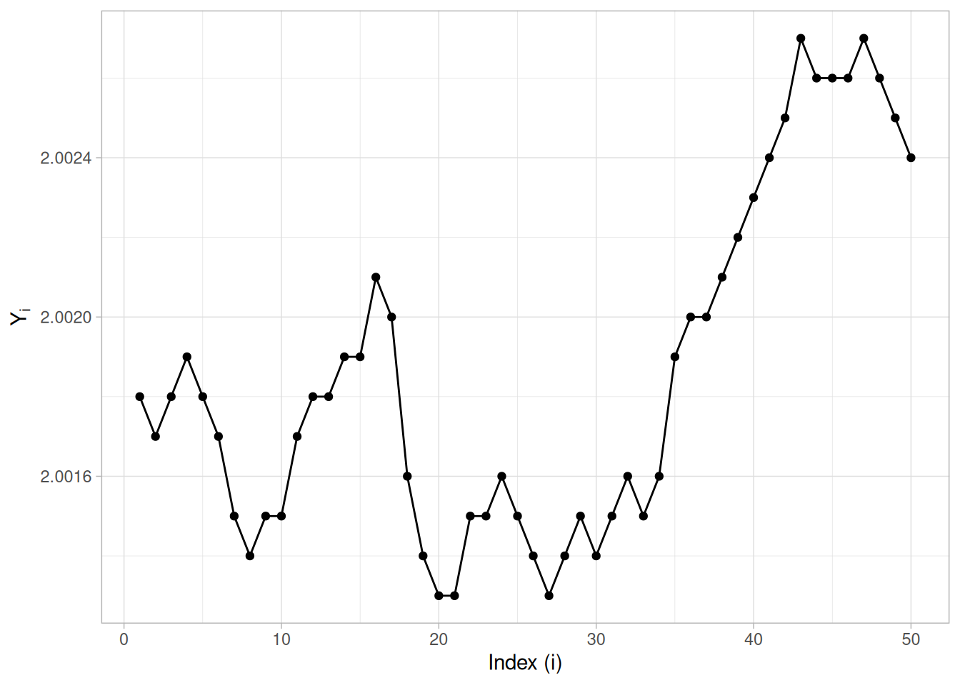
This sample run sequence plot of the MAVRO.DAT data set shows that the location shifts up for the last third of the data.
Definition: \(Y_i\) Versus \(i\)
Run sequence plots are formed by:
Questions
The run sequence plot can be used to answer the following questions:
The run sequence plot can also give the analyst an excellent feel for the data.
Importance: Check Univariate Assumptions
For univariate data, the default model is
\[Y = \text{constant} + \text{error}\]
where the error is assumed to be random, from a fixed distribution, and with constant location and scale. The validity of this model depends on the validity of these assumptions. The run sequence plot is useful for checking for constant location and scale.
Even for more complex models, the assumptions on the error term are still often the same. That is, a run sequence plot of the residuals (even from very complex models) is still vital for checking for outliers and for detecting shifts in location and scale.
Related Techniques
Scatter Plot, Histogram, Autocorrelation Plot, Lag Plot
Case Study
The run sequence plot is demonstrated in the filter transmittance data case study.
Software
Run sequence plots are available in most general purpose statistical software programs.
Purpose: Check for Relationship
A scatter plot (Chambers 1983 ) reveals relationships or association between two variables. Such relationships manifest themselves by any non-random structure in the plot. Various common types of patterns are demonstrated in the examples below.
library(tidyverse)Sample Plot: Linear Relationship Between Variables Y and X
berger <- read_table(here::here("datasets", "BERGER1.DAT"), skip = 25,
col_names = c("y", "x", "batch"), col_types = "ddc")
ggplot(berger, aes(x, y)) +
geom_point() +
labs(x = "Measured In-Lab Defect Size", y = "Measured In-Field Defect Size") +
theme_light()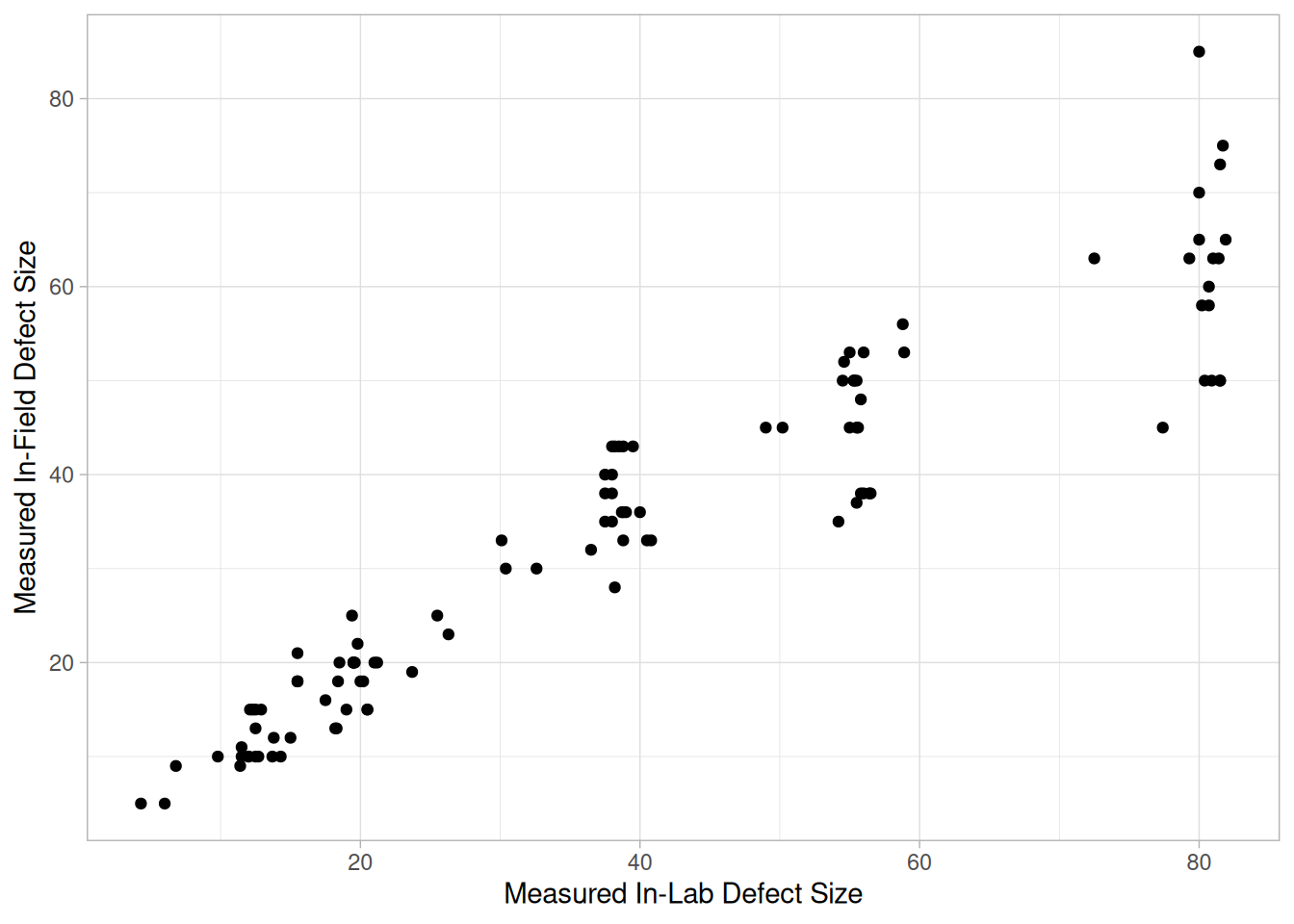
This sample plot of the Alaska pipeline data reveals a linear relationship between the two variables, indicating that a linear regression model might be appropriate.
Definition: Y Versus X
A scatter plot is a plot of the values of \(Y\) versus the corresponding values of \(X\):
Questions
Scatter plots can provide answers to the following questions:
Importance: Uncover Relationships Between Variables
The cornerstone of science and engineering is the discovery of deterministic, predictable, repeatable cause-and-effect relationships between variables. Similarly, the cornerstone of EDA is the scatter plot, which is the most important and most heavily used graphical tool for uncovering the existence and nature of relationships between variables.
Scatter plots reveal association, which is step one toward cause-and-effect. There is no statistical procedure, the scatter plot included, that proves cause-and-effect. Such proof is beyond the realm of statistics. Scatter plots can highly suggest cause-and-effect, but the ultimate proof of such is the scientist and engineer — in his/her noting the structure in the data and then explaining such structure via scientific and engineering experience and expertise.
Examples
The following ten examples show the common types of relationship patterns a scatter plot can reveal. Except where a specific NIST data set is named in the original discussion, the data below are synthetic illustrations generated to visibly exhibit the named relationship, and are labeled as such.
1. No Relationship
set.seed(101)
n <- 100
no_rel <- tibble(x = runif(n, 0, 10), y = runif(n, -2, 2))
ggplot(no_rel, aes(x, y)) +
geom_point() +
theme_light()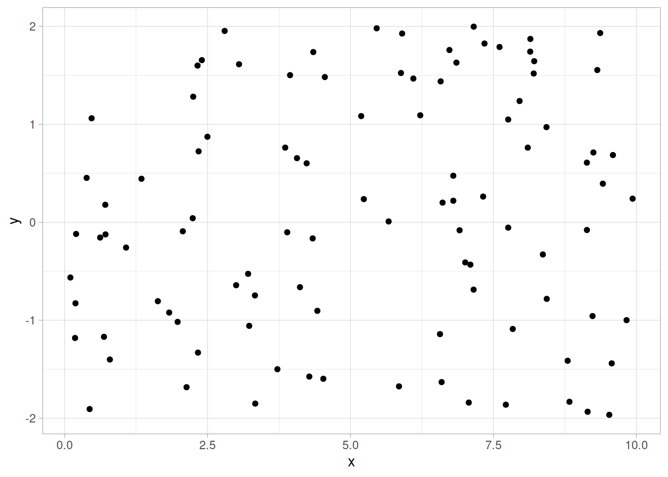
This is a synthetic illustration: x and y were drawn independently from uniform distributions. Note in Figure 1.60 how for a given value of \(X\) (say \(X = 0.5\)), the corresponding values of \(Y\) range all over the place from \(Y = -2\) to \(Y = +2\). The same is true for other values of \(X\). This lack of predictability in determining \(Y\) from a given value of \(X\), and the associated amorphous, non-structured appearance of the scatter plot, leads to the summary conclusion: no relationship.
2. Strong Linear (Positive Correlation) Relationship
lew3 <- read_table(here::here("datasets", "LEW3.DAT"), skip = 25,
col_names = c("y", "x", "batch"), col_types = "ddd") |>
drop_na()Warning: 2 parsing failures.
row col expected actual file
9 -- 3 columns 1 columns '/home/ray/nist-sematech-projects/nist-sematech-statistics-book/book/datasets/LEW3.DAT'
19 -- 3 columns 1 columns '/home/ray/nist-sematech-projects/nist-sematech-statistics-book/book/datasets/LEW3.DAT'ggplot(lew3, aes(x, y)) +
geom_point() +
labs(x = "Elapsed Days", y = "Tensile Strength (Maturity)") +
theme_light()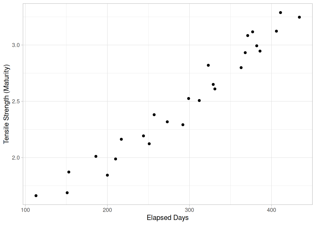
Note in Figure 1.61 of the LEW3.DAT data set how a straight line comfortably fits through the data; hence a linear relationship exists. The scatter about the line is quite small, so there is a strong linear relationship. The slope of the line is positive (small values of \(X\) correspond to small values of \(Y\); large values of \(X\) correspond to large values of \(Y\)), so there is a positive co-relation (that is, a positive correlation) between \(X\) and \(Y\).
3. Strong Linear (Negative Correlation) Relationship
set.seed(102)
neg_lin <- tibble(x = runif(n, 0, 10))
neg_lin$y <- 20 - 2 * neg_lin$x + rnorm(n, 0, 1)
ggplot(neg_lin, aes(x, y)) +
geom_point() +
theme_light()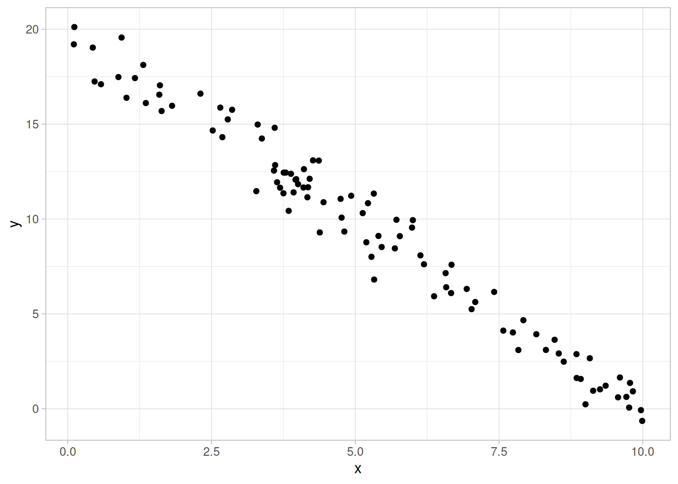
This is a synthetic illustration. Note in Figure 1.62 how a straight line comfortably fits through the data; hence there is a linear relationship. The scatter about the line is quite small, so there is a strong linear relationship. The slope of the line is negative (small values of \(X\) correspond to large values of \(Y\); large values of \(X\) correspond to small values of \(Y\)), so there is a negative co-relation (that is, a negative correlation) between \(X\) and \(Y\).
4. Exact Linear (Positive Correlation) Relationship
exact_lin <- tibble(x = seq(0, 10, length.out = 50))
exact_lin$y <- 3 + 2 * exact_lin$x
ggplot(exact_lin, aes(x, y)) +
geom_point() +
theme_light()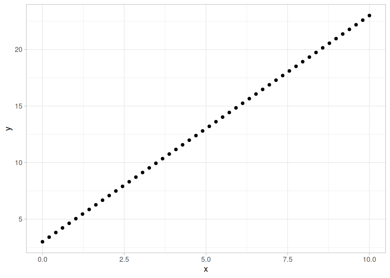
This is a synthetic illustration: y is a deterministic linear function of x with no added noise. Note in Figure 1.63 how a straight line comfortably fits through the data; hence there is a linear relationship. The scatter about the line is zero — there is perfect predictability between \(X\) and \(Y\) — so there is an exact linear relationship. The slope of the line is positive (small values of \(X\) correspond to small values of \(Y\); large values of \(X\) correspond to large values of \(Y\)), so there is a positive co-relation (that is, a positive correlation) between \(X\) and \(Y\).
5. Quadratic Relationship
set.seed(105)
quad <- tibble(x = runif(n, -5, 5))
quad$y <- 2 + 0.5 * quad$x + 1.2 * quad$x^2 + rnorm(n, 0, 3)
ggplot(quad, aes(x, y)) +
geom_point() +
theme_light()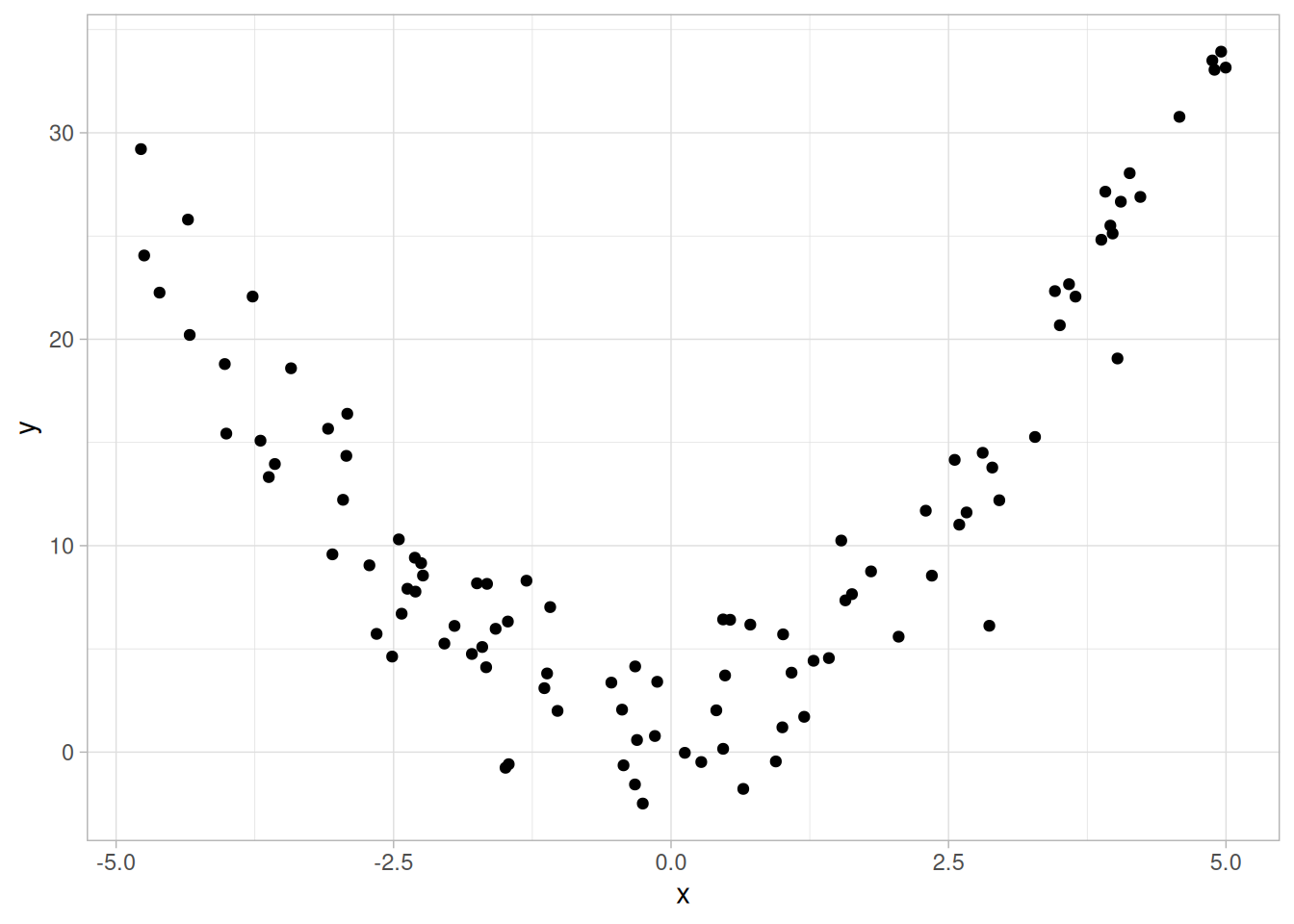
This is a synthetic illustration. Note in Figure 1.64 how no imaginable simple straight line could ever adequately describe the relationship between \(X\) and \(Y\) — a curved (or curvilinear, or non-linear) function is needed. The simplest such curvilinear function is a quadratic model
\[Y_i = A + BX_i + CX_i^2 + E_i\]
for some \(A\), \(B\), and \(C\). Many other curvilinear functions are possible, but the data analysis principle of parsimony suggests that we try fitting a quadratic function first.
6. Exponential Relationship
chwirut <- read_table(here::here("datasets", "CHWIRUT2.DAT"), skip = 25,
col_names = c("y", "x", "tag"), col_types = "ddd")
ggplot(chwirut, aes(x, y)) +
geom_point() +
labs(x = "Metal Distance", y = "Ultrasonic Response") +
theme_light()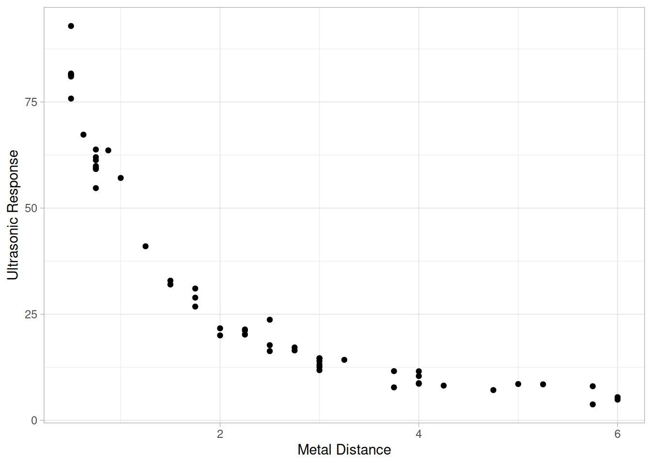
Note that a simple straight line is grossly inadequate in describing the relationship between \(X\) and \(Y\) in this plot of the CHWIRUT2.DAT data set. A quadratic model would prove lacking, especially for large values of \(X\). In this example, the large values of \(X\) correspond to nearly constant values of \(Y\), and so a non-linear function beyond the quadratic is needed. Among the many other non-linear functions available, one of the simpler ones is the exponential model
\[Y_i = A + Be^{CX_i} + E_i\]
for some \(A\), \(B\), and \(C\). In this case, an exponential function would, in fact, fit well, and so one is led to the summary conclusion of an exponential relationship.
7. Sinusoidal Relationship (Damped)
luther <- read_table(here::here("datasets", "LUTHER.DAT"), skip = 25,
col_names = "y", col_types = "d")
luther$t <- seq_along(luther$y)
ggplot(luther, aes(t, y)) +
geom_point() +
labs(x = "Time", y = "Pendulum Angle") +
theme_light()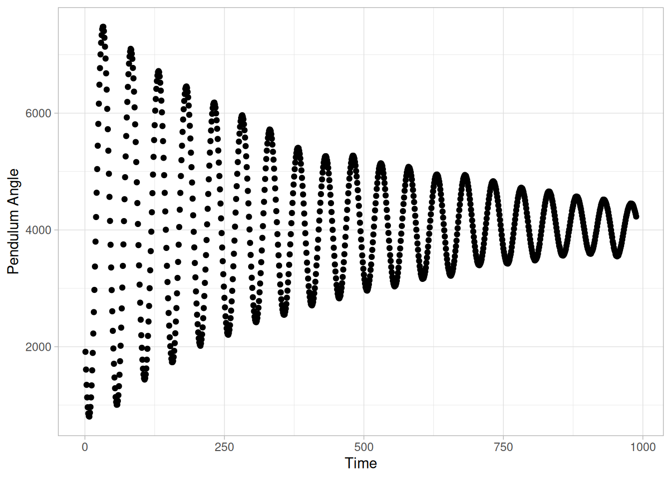
The complex relationship between \(X\) and \(Y\) in this plot of the LUTHER.DAT data set appears to be basically oscillatory, and so one is naturally drawn to the trigonometric sinusoidal model
\[Y_i = C + \alpha\sin(2\pi\omega t_i + \phi) + E_i\]
Closer inspection of the scatter plot reveals that the amount of swing (the amplitude \(\alpha\) in the model) does not appear to be constant but rather is decreasing (damping) as \(X\) gets large. We thus would be led to the conclusion: damped sinusoidal relationship, with the simplest corresponding model being
\[Y_i = C + (B_0 + B_1 t_i)\sin(2\pi\omega t_i + \phi) + E_i\]
8. Variation of Y Does NOT Depend on X (Homoscedastic)
set.seed(108)
homosc <- tibble(x = runif(n, 0, 20))
homosc$y <- 5 + 1.5 * homosc$x + rnorm(n, 0, 10)
ggplot(homosc, aes(x, y)) +
geom_point() +
theme_light()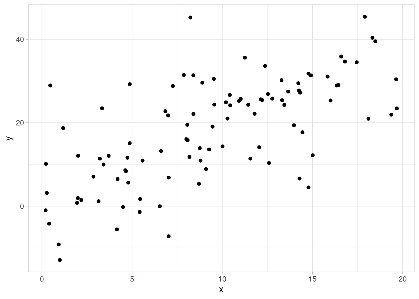
This is a synthetic illustration: the noise added to y has constant standard deviation regardless of x. This scatter plot reveals a linear relationship between \(X\) and \(Y\): for a given value of \(X\), the predicted value of \(Y\) will fall on a line. The plot further reveals that the variation in \(Y\) about the predicted value is about the same, regardless of the value of \(X\). Statistically, this is referred to as homoscedasticity. Such homoscedasticity is very important as it is an underlying assumption for regression, and its violation leads to parameter estimates with inflated variances. If the data are homoscedastic, then the usual regression estimates can be used. If the data are not homoscedastic, then the estimates can be improved using weighting procedures as shown in the next example.
9. Variation of Y DOES Depend on X (Heteroscedastic)
ggplot(berger, aes(x, y)) +
geom_point() +
labs(x = "Measured In-Lab Defect Size", y = "Measured In-Field Defect Size") +
theme_light()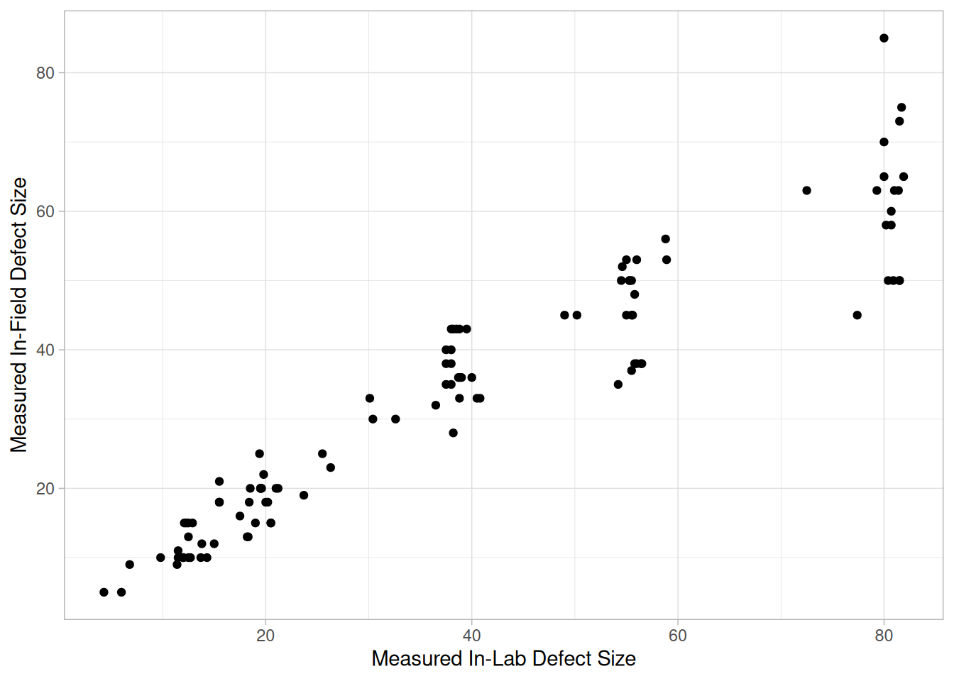
This scatter plot of the Alaska pipeline data reveals an approximate linear relationship between \(X\) and \(Y\), but more importantly, it reveals a statistical condition referred to as heteroscedasticity (that is, nonconstant variation in \(Y\) over the values of \(X\)). For a heteroscedastic data set, the variation in \(Y\) differs depending on the value of \(X\). In this example, small values of \(X\) yield small scatter in \(Y\) while large values of \(X\) result in large scatter in \(Y\).
Heteroscedasticity complicates the analysis somewhat, but its effects can be overcome by:
Impact of Ignoring Unequal Variability in the Data
Fortunately, unweighted regression analyses on heteroscedastic data produce estimates of the coefficients that are unbiased. However, the coefficients will not be as precise as they would be with proper weighting. Note further that if heteroscedasticity does exist, it is frequently useful to plot and model the local variation
\[\text{var}(Y_i \mid X_i) = g(X_i)\]
as a function of \(X\). This modeling has two advantages: it provides additional insight and understanding as to how the response \(Y\) relates to \(X\); and it provides a convenient means of forming weights for a weighted regression by simply using
\[w_i = W(Y_i \mid X_i) = \frac{1}{\text{Var}(Y_i \mid X_i)} = \frac{1}{g(X_i)}\]
The topic of non-constant variation is discussed in some detail in the Process Modeling chapter.
10. Outlier
set.seed(110)
outlier_ex <- tibble(x = runif(n, 0, 500))
outlier_ex$y <- 2 + 0.1 * outlier_ex$x + rnorm(n, 0, 3)
i_out <- which.min(abs(outlier_ex$x - 375))
outlier_ex$y[i_out] <- outlier_ex$y[i_out] + 40
ggplot(outlier_ex, aes(x, y)) +
geom_point() +
theme_light()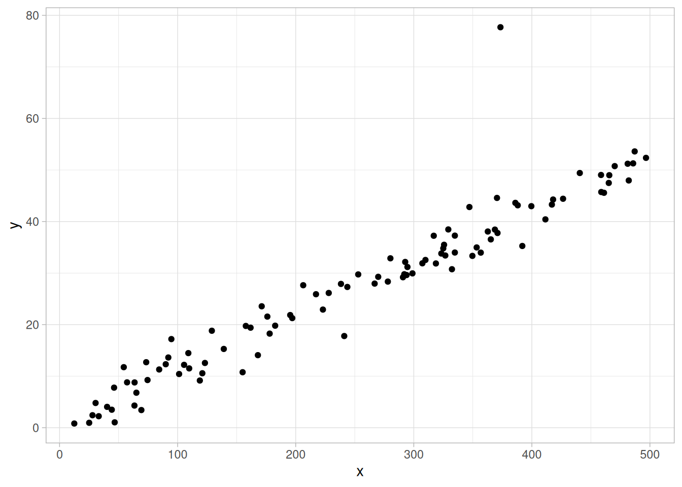
This is a synthetic illustration: a single point near \(X = 375\) was deliberately perturbed away from an otherwise linear relationship. The scatter plot here reveals a basic linear relationship between \(X\) and \(Y\) for most of the data, and a single outlier (at \(X = 375\)). An outlier is defined as a data point that emanates from a different model than do the rest of the data. The data here appear to come from a linear model with a given slope and variation except for the outlier, which appears to have been generated from some other model.
Outlier detection is important for effective modeling. Outliers should be excluded from such model fitting. If all the data here are included in a linear regression, then the fitted model will be poor virtually everywhere. If the outlier is omitted from the fitting process, then the resulting fit will be excellent almost everywhere (for all points except the outlying point).
Combining Scatter Plots
Scatter plots can also be combined in multiple plots per page to help understand higher-level structure in data sets with more than two variables. The scatterplot matrix generates all pairwise scatter plots on a single page. The conditioning plot, also called a co-plot or subset plot, generates scatter plots of \(Y\) versus \(X\) dependent on the value of a third variable.
Causality Is Not Proved By Association
The scatter plot uncovers relationships in data. “Relationships” means that there is some structured association (linear, quadratic, etc.) between \(X\) and \(Y\). Note, however, that even though causality implies association, association does NOT imply causality. Scatter plots are a useful diagnostic tool for determining association, but if such association exists, the plot may or may not suggest an underlying cause-and-effect mechanism. A scatter plot can never “prove” cause and effect — it is ultimately only the researcher (relying on the underlying science/engineering) who can conclude that causality actually exists.
Appearance
The most popular rendition of a scatter plot is some plot character (e.g., a filled circle) at the data points, and no line connecting data points. Other scatter plot format variants include an optional plot character at the data points, but a solid line connecting data points. In both cases, the resulting plot is referred to as a scatter plot, although the former (discrete and disconnected) is the author’s personal preference since nothing makes it onto the screen except the data — there are no interpolative artifacts to bias the interpretation.
Related Techniques
Run Sequence Plot, Box Plot, Block Plot.
Case Study
The scatter plot is demonstrated in the load cell calibration data case study.
Software
Scatter plots are a fundamental technique that should be available in any general purpose statistical software program. Scatter plots are also available in most graphics and spreadsheet programs as well.
Purpose: Check Pairwise Relationships Between Variables
Given a set of variables \(X_1, X_2, \ldots, X_k\), the scatterplot matrix contains all the pairwise scatter plots of the variables on a single page in a matrix format. That is, if there are \(k\) variables, the scatterplot matrix will have \(k\) rows and \(k\) columns, and the \(i\)th row and \(j\)th column of this matrix is a plot of \(X_i\) versus \(X_j\).
Although the basic concept of the scatterplot matrix is simple, there are numerous alternatives in the details of the plots. The diagonal plot is simply a 45-degree line since we are plotting \(X_i\) versus \(X_i\). Although this has some usefulness in terms of showing the univariate distribution of the variable, other alternatives are common: some users prefer to use the diagonal to print the variable label, others plot the univariate histogram on the diagonal, and others simply leave the diagonal blank. Since \(X_i\) versus \(X_j\) is equivalent to \(X_j\) versus \(X_i\) with the axes reversed, some prefer to omit the plots below the diagonal. It can also be helpful to overlay some type of fitted curve (a linear or quadratic fit, or, most commonly, a lowess curve) on each scatter plot.
Sample Plot
library(GGally)
# CURRIE.DAT: pollution source analysis data collected by NIST chemist
# Lloyd Currie (1990), 17 observations across 2 sample groups (id2), with
# 9 response variables. Group 1's last 3 variables (manganese, vanadium,
# arsenic) were not measured and are coded -99 in the raw file.
currie <- read_table(
here::here("datasets", "CURRIE.DAT"),
skip = 25,
col_names = c("id1", "id2", "frwc", "ctotal", "potassium", "lead", "iron",
"sulfur_oxide", "manganese", "vanadium", "arsenic"),
col_types = "iiddddddddd"
) |>
mutate(id2 = factor(id2))ggpairs(
currie,
columns = c("potassium", "lead", "iron", "sulfur_oxide"),
columnLabels = c("Potassium", "Lead", "Iron", "Sulfur Oxide"),
mapping = aes(color = id2, shape = id2),
upper = list(continuous = wrap("points", size = 1.5)),
lower = list(continuous = wrap("points", size = 1.5))
) +
theme_light()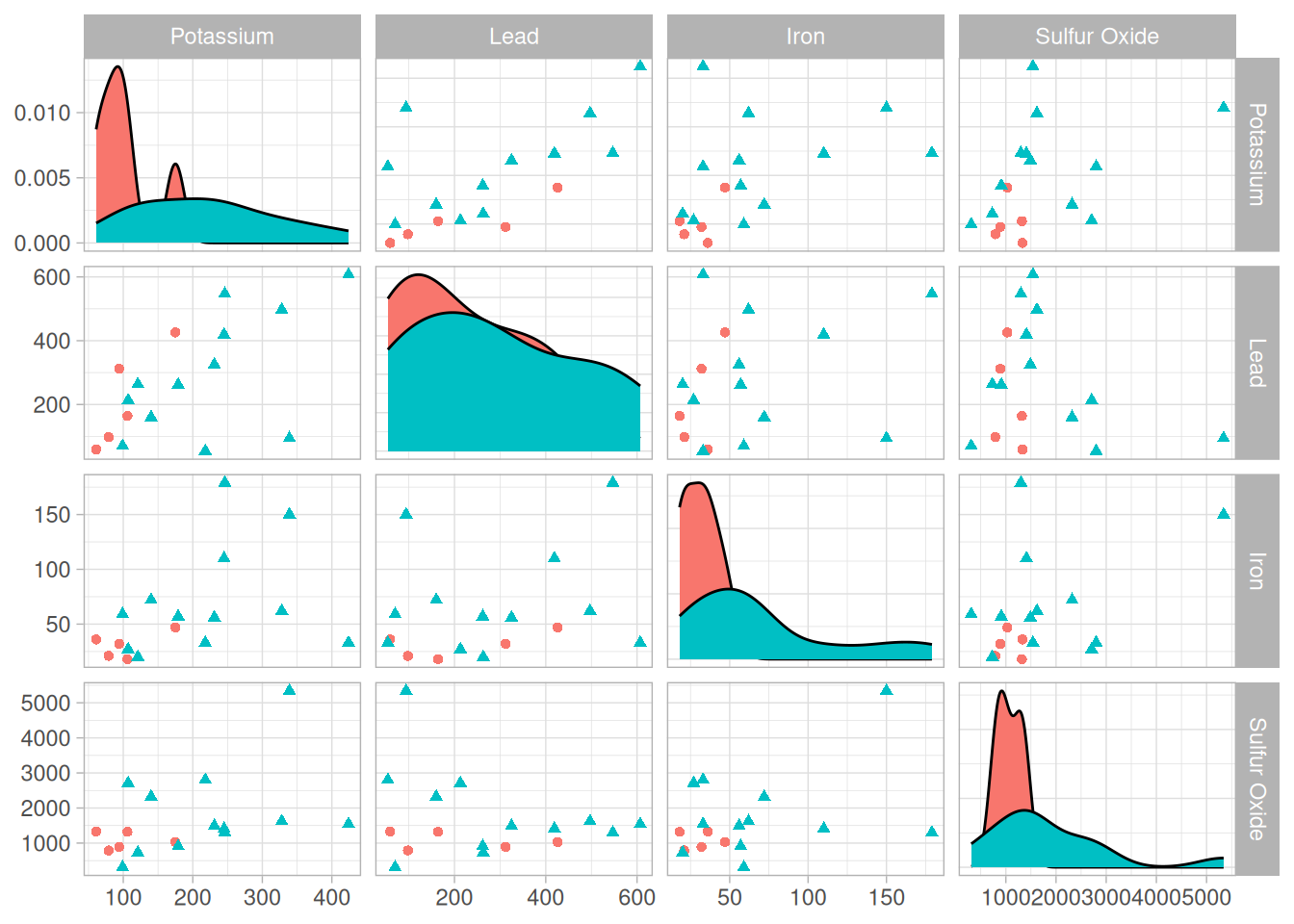
This example uses the same four variables NIST’s own sample plot uses (potassium, lead, iron, and sulfur oxide) from the pollution source data, generated with the GGally package’s ggpairs() function – the standard tidyverse-ecosystem way to build a scatterplot matrix, and much less code than assembling one by hand with facet_grid(). Points are colored and shaped by sample group (matching NIST’s use of the group as the plot character).
There are a number of ways to view a plot like this. If we are primarily interested in a particular variable, we can scan the row and column for that variable. If we are interested in finding the strongest relationship, we can scan all the plots and then determine which variables are related.
Definition
Given \(k\) variables, scatter plot matrices are formed by creating \(k\) rows and \(k\) columns. Each row and column defines a single scatter plot. The individual plot for row \(i\) and column \(j\) is defined as:
Questions
The scatterplot matrix can provide answers to the following questions:
Linking and Brushing
The scatterplot matrix serves as the foundation for the concepts of linking and brushing. By linking, we mean showing how a point, or set of points, behaves in each of the plots. This is accomplished by highlighting these points in some fashion — for example, the highlighted points could be drawn as a filled circle while the remaining points are drawn as unfilled circles. A typical application of this would be to show how an outlier shows up in each of the individual pairwise plots.
Brushing extends this concept a bit further. In brushing, the points to be highlighted are interactively selected by a mouse and the scatterplot matrix is dynamically updated (ideally in real time). That is, we can select a rectangular region of points in one plot and see how those points are reflected in the other plots. Brushing is discussed in detail by Becker, Cleveland, and Wilks in the paper “Dynamic Graphics for Data Analysis” (Cleveland and McGill, 1988).
Related Techniques
Star Plot, Scatter Plot, Locally Weighted Least Squares.
Software
Scatterplot matrices are becoming increasingly common in general purpose statistical software programs. If a software program does not generate scatterplot matrices, but it does provide multiple plots per page and scatter plots, it should be possible to write a macro to generate a scatterplot matrix. Brushing is available in a few of the general purpose statistical software programs that emphasize graphical approaches.
Purpose: Check Pairwise Relationship Between Two Variables Conditional on a Third Variable
A conditioning plot, also known as a coplot or subset plot, is a plot of two variables conditional on the value of a third variable (called the conditioning variable). The conditioning variable may be either a variable that takes on only a few discrete values or a continuous variable that is divided into a limited number of subsets.
One limitation of the scatterplot matrix is that it cannot show interaction effects with another variable. This is the strength of the conditioning plot. It is also useful for displaying scatter plots for groups in the data. Although these groups can also be plotted on a single plot with different plot symbols, it can often be visually easier to distinguish the groups using the conditioning plot.
Although the basic concept of the conditioning plot matrix is simple, there are numerous alternatives in the details of the plots.
Sample Plot
pr1 <- read_table(here::here("datasets", "PR1.DAT"), skip = 25,
col_names = c("t", "tmp", "y"), col_types = "ddd")
ggplot(pr1, aes(t, y)) +
geom_point() +
facet_wrap(~ tmp, labeller = label_both) +
labs(x = "Time", y = "Torque") +
theme_light()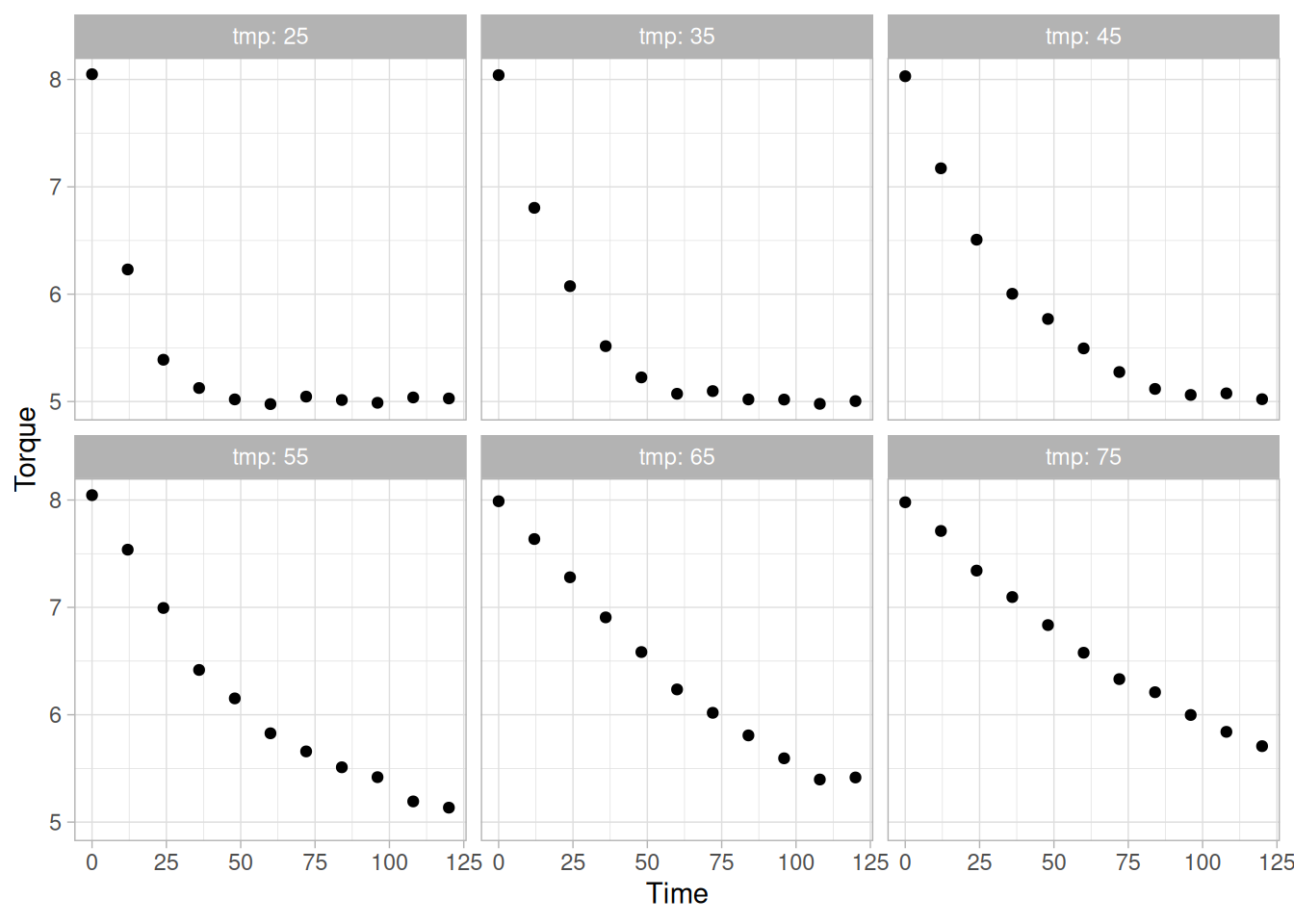
In this plot of the PR1.DAT data set, temperature has six distinct values. We plot torque versus time for each of these temperatures, using ggplot2::facet_wrap() over the discrete temperature groups. This example is discussed in more detail in the Process Modeling chapter.
Definition
Given the variables \(X\), \(Y\), and \(Z\), the conditioning plot is formed by dividing the values of \(Z\) into \(k\) groups. There are several ways that these groups may be formed: there may be a natural grouping of the data, the data may be divided into several equal sized groups, the grouping may be determined by clusters in the data, and so on. The page is divided into \(n\) rows and \(c\) columns where \(nc \geq k\). Each row and column defines a single scatter plot. The individual plot for row \(i\) and column \(j\) is defined as:
where only the points in the group corresponding to the \(i\)th row and \(j\)th column are used.
Questions
The conditioning plot can provide answers to the following questions:
Related Techniques
Scatter Plot, Scatterplot Matrix, Locally Weighted Least Squares.
Software
Conditioning plots are becoming increasingly common in general purpose statistical software programs, including R and Dataplot. If a software program does not generate conditioning plots, but it does provide multiple plots per page and scatter plots, it should be possible to write a macro to generate a conditioning plot.
Purpose: Examine Cyclic Structure
A spectral plot (Jenkins and Watts 1968 or Bloomfield 1976) is a graphical technique for examining cyclic structure in the frequency domain. It is a smoothed Fourier transform of the autocovariance function.
The frequency is measured in cycles per unit time, where unit time is defined to be the distance between two points. A frequency of 0 corresponds to an infinite cycle while a frequency of 0.5 corresponds to a cycle of 2 data points. Equi-spaced time series are inherently limited to detecting frequencies between 0 and 0.5.
Trends should typically be removed from the time series before applying the spectral plot. Trends can be detected from a run sequence plot. Trends are typically removed by differencing the series or by fitting a straight line (or some other polynomial curve) and applying the spectral analysis to the residuals.
Spectral plots are often used to find a starting value for the frequency, \(\omega\), in the sinusoidal model
\[Y_i = C + \alpha \sin(2\pi\omega t_i + \phi) + E_i\]
See the beam deflection case study for an example of this.
Sample Plot: One dominant frequency
library(tidyverse)
# Reusable periodogram: computes the (raw, untapered) sample spectrum with
# R's spec.pgram() and draws it as smoothed variance versus frequency.
spectral_plot <- function(x) {
sp <- spec.pgram(x, taper = 0, detrend = TRUE, demean = TRUE, plot = FALSE)
tibble(freq = sp$freq, power = sp$spec) |>
ggplot(aes(freq, power)) +
geom_line(color = "steelblue") +
geom_point(size = 0.6) +
labs(x = "Frequency", y = "Variance (power)") +
theme_light()
}
lew <- read_table(here::here("datasets", "LEW.DAT"), skip = 25, col_names = "y", col_types = "d")spectral_plot(lew$y)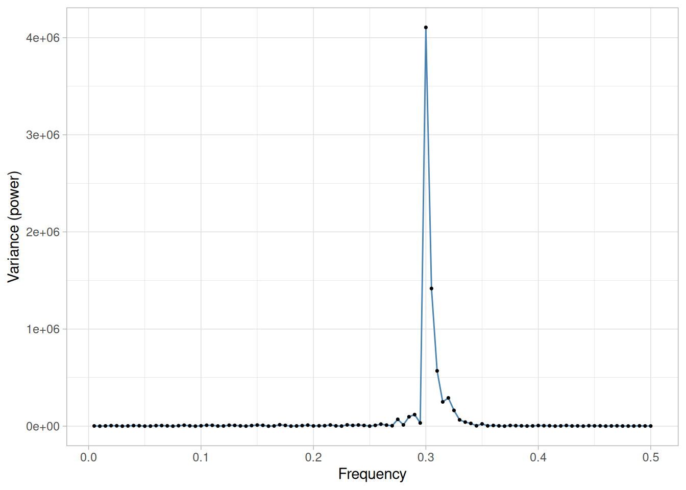
This spectral plot of the LEW.DAT data set shows one dominant frequency of approximately 0.3 cycles per observation.
Definition: Variance Versus Frequency
The spectral plot is formed by:
The computations for generating the smoothed variances can be involved and are not discussed further here. The details can be found in the Jenkins and Bloomfield references and in most texts that discuss the frequency analysis of time series. The plots on this page use R’s spec.pgram() function, which computes the raw periodogram (the squared modulus of the discrete Fourier transform, scaled and optionally tapered/detrended).
Questions
The spectral plot can be used to answer the following questions:
Importance: Check Cyclic Behavior of Time Series
The spectral plot is the primary technique for assessing the cyclic nature of univariate time series in the frequency domain. It is almost always the second plot (after a run sequence plot) generated in a frequency domain analysis of a time series.
Related Techniques
Autocorrelation Plot, Complex Demodulation Amplitude Plot, Complex Demodulation Phase Plot.
Case Study
The spectral plot is demonstrated in the beam deflection data case study.
Software
Spectral plots are a fundamental technique in the frequency analysis of time series. They are available in many general purpose statistical software programs.
Examples
Examples of the spectral plot for several common situations are given below. These are the same three canonical time-series cases used to illustrate the Autocorrelation Plot and Lag Plot.
# NIST's own Dataplot macro for this example (spect1.dp) generates 200
# fresh normal random numbers on the fly (LET Y = NORMAL RANDOM NUMBERS
# FOR I = 1 1 200) rather than reading a fixed data file -- matching the
# page's own title, "Spectral Plot of 200 Normal Random Numbers." (The
# static NORMAL.DAT file has only 100 observations and is a different,
# unrelated example elsewhere in the handbook.)
set.seed(42)
random_series <- rnorm(200)
spectral_plot(random_series)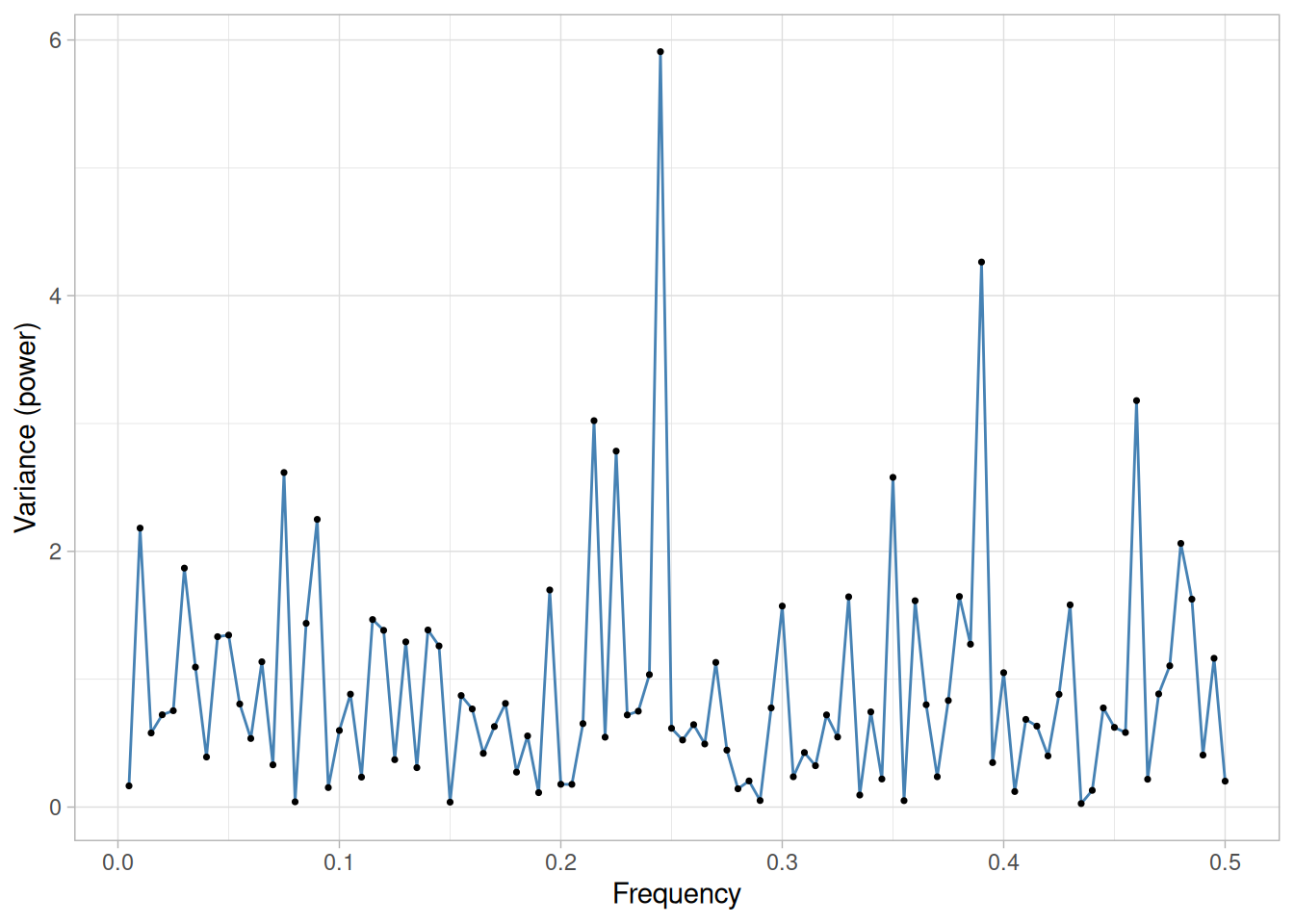
We can make the following conclusions from this plot of a random series:
For random data, the spectral plot should show no dominant peaks or distinct pattern in the spectrum. For Figure 1.73, there are no clearly dominant peaks and the peaks seem to fluctuate at random. This type of appearance of the spectral plot indicates that there are no significant cyclic patterns in the data.
randwalk <- read_table(here::here("datasets", "RANDWALK.DAT"), skip = 25, col_names = "y", col_types = "d")
spectral_plot(randwalk$y)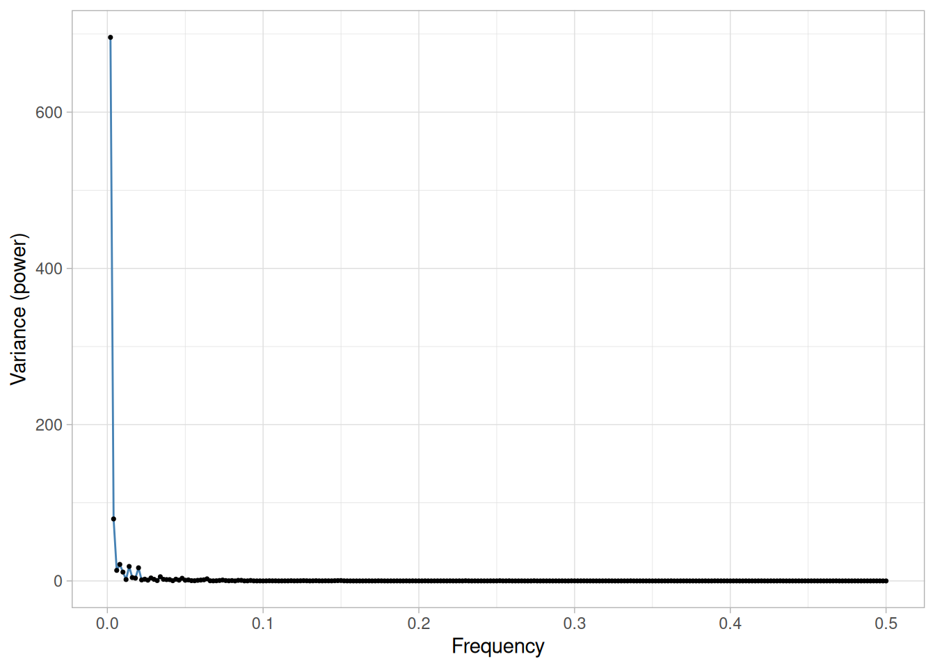
We can make the following conclusions from Figure 1.74 of the RANDWALK.DAT data set:
(NIST’s original text for this page (“Spectral Plot: Strong Autocorrelation and Autoregressive Model”) titles its image “Spectral Plot for Random Walk Data” and, per the underlying Dataplot macro, generates it from RANDWALK.DAT – but its own “Conclusions” paragraph refers to “the above plot of the FLICKER.DAT data set,” which is actually the dataset used for the previous technique’s Moderate Autocorrelation example. This looks like a copy-paste error in the original Handbook rather than a real change of dataset partway through the page. We use RANDWALK.DAT consistently throughout, matching the actual figure.)
This spectral plot starts with a dominant peak near zero and rapidly decays to zero. This is the spectral plot signature of a process with strong positive autocorrelation. Such processes are highly non-random in that there is high association between an observation and a succeeding observation. In short, if you know \(Y_i\) you can make a strong guess as to what \(Y_{i+1}\) will be.
The next step would be to determine the parameters for the autoregressive model:
\[Y_i = A_0 + A_1 Y_{i-1} + E_i\]
Such estimation can be done by linear regression or by fitting a Box-Jenkins autoregressive (AR) model. The residual standard deviation for this autoregressive model will be much smaller than the residual standard deviation for the default model \(Y_i = A_0 + E_i\).
Then the system should be reexamined to find an explanation for the strong autocorrelation. Is it due to the phenomenon under study, drifting in the environment, or contamination from the data acquisition system (DAS)? Oftentimes the source of the problem is the DAS, which does not have time to electronically recover before collecting the next data point. If this is the case, then consider slowing down the sampling rate to re-achieve randomness.
spectral_plot(lew$y)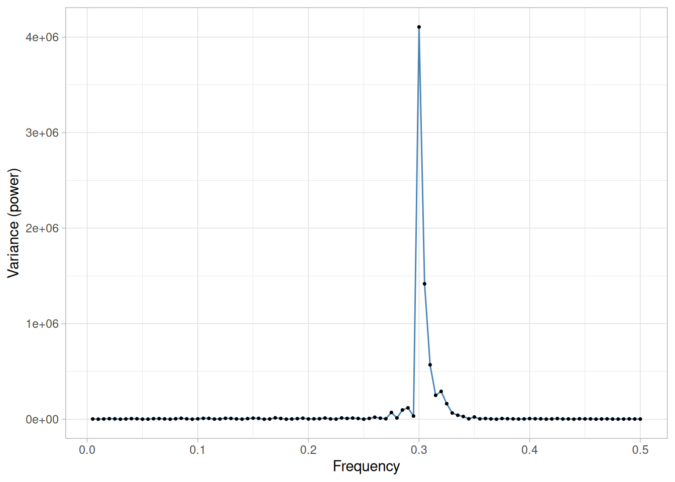
We can make the following conclusions from Figure 1.75 of the LEW.DAT data set:
This spectral plot shows a single dominant frequency. This indicates that a single-cycle sinusoidal model might be appropriate.
If one were to naively assume that the data represented by the graph could be fit by the model \(Y_i = A_0 + E_i\) and then estimate the constant by the sample mean, the analysis would be incorrect because:
On the other hand, the choice of the proper model
\[Y_i = C + \alpha \sin(2\pi\omega t_i + \phi) + E_i\]
where \(\alpha\) is the amplitude, \(\omega\) is the frequency (between 0 and 0.5 cycles per observation), and \(\phi\) is the phase, can be fit by non-linear least squares. The beam deflection data case study demonstrates fitting this type of model.
Recommended Next Steps
The recommended next steps are to:
Purpose: Detect Changes in Scale Between Groups
Standard deviation plots are used to see if the standard deviation varies between different groups of the data. The grouping is determined by the analyst. In most cases, the data provide a specific grouping variable. For example, the groups may be the levels of a factor variable. In the sample plot below, the months of the year provide the grouping.
Standard deviation plots can be used with ungrouped data to determine if the standard deviation is changing over time. In this case, the data are broken into an arbitrary number of equal-sized groups. For example, a data series with 400 points can be divided into 10 groups of 40 points each. A standard deviation plot can then be generated with these groups to see if the standard deviation is increasing or decreasing over time.
Although the standard deviation is the most commonly used measure of scale, the same concept applies to other measures of scale. For example, instead of plotting the standard deviation of each group, the median absolute deviation or the average absolute deviation might be plotted instead. This might be done if there were significant outliers in the data and a more robust measure of scale than the standard deviation was desired.
Standard deviation plots are typically used in conjunction with Mean Plots. The mean plot would be used to check for shifts in location while the standard deviation plot would be used to check for shifts in scale.
Sample Plot
library(tidyverse)
pbf11 <- read_table(
here::here("datasets", "PBF11.DAT"),
skip = 50,
col_names = c("year", "day", "bottle", "stdev", "mean", "flag", "wv", "co2"),
col_types = "dddddddd"
) |>
filter(flag == 0) |>
mutate(
date = as.Date(day - 1, origin = paste0(year, "-01-01")),
month = factor(month.abb[lubridate::month(date)], levels = month.abb)
)
sd_by_month <- pbf11 |>
group_by(month) |>
summarise(sd = sd(wv), .groups = "drop")
overall_sd <- sd(pbf11$wv)ggplot(sd_by_month, aes(month, sd, group = 1)) +
geom_line(color = "steelblue") +
geom_point() +
geom_hline(yintercept = overall_sd, linetype = "dashed", color = "firebrick") +
labs(x = "Month", y = "Standard Deviation Water Vapor Concentration") +
theme_light()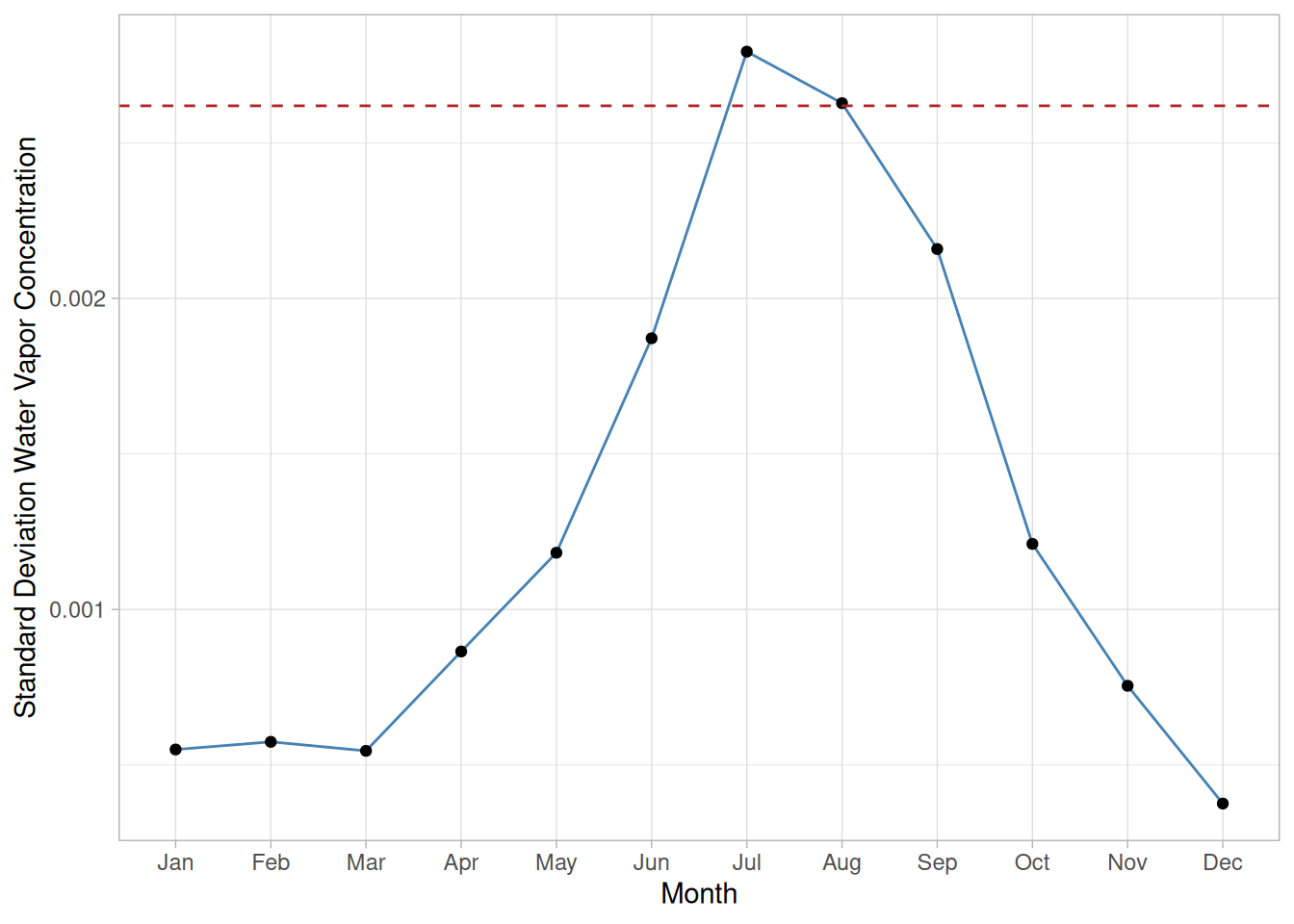
This sample standard deviation plot of the PBF11.DAT data set (weekly water vapor concentration readings alongside the Freon-11 measurements at Point Barrow, Alaska, restricted to the rows flagged valid) shows there is a shift in variation across the year, with the dashed reference line marking the overall standard deviation for comparison; the greatest variation is during the summer months.
Definition: Group Standard Deviations Versus Group ID
Standard deviation plots are formed by:
A reference line is plotted at the overall standard deviation.
Questions
The standard deviation plot can be used to answer the following questions:
Importance: Checking Assumptions
A common assumption in 1-factor analyses is that of equal variances. That is, the variance is the same for different levels of the factor variable. The standard deviation plot provides a graphical check for that assumption. A common assumption for univariate data is that the variance is constant. By grouping the data into equi-sized intervals, the standard deviation plot can provide a graphical test of this assumption.
Related Techniques
Mean Plot, DOE Standard Deviation Plot
Software
Most general purpose statistical software programs do not support a standard deviation plot. However, if the statistical program can generate the standard deviation for a group, it should be feasible to write a macro to generate this plot.
Purpose: Display Multivariate Data
The star plot (Chambers et al. 1983) is a method of displaying multivariate data. Each star represents a single observation. Typically, star plots are generated in a multi-plot format with many stars on each page and each star representing one observation.
Star plots are used to examine the relative values for a single data point (e.g., point 3 is large for variables 2 and 4, small for variables 1, 3, 5, and 6) and to locate similar points or dissimilar points.
Sample Plot
The original NIST example plots the star plots of 16 cars drawn from a larger 74-car data set (AUTO79.DAT), using 9 variables: price, mileage, 1978 and 1977 repair record, headroom, rear seat room, trunk space, weight, and length.
library(tidyverse)
# ggplot2's coord_polar() renders straight polygon edges as curved arcs
# (it interpolates along the angular dimension), which is wrong for a
# star/radar chart -- the spokes should be straight chords between
# vertices. coord_radar() is the standard workaround: it is identical to
# coord_polar() except it reports is_linear() = TRUE, which tells the
# polygon/line grobs to draw straight segments instead of arcs.
coord_radar <- function(theta = "x", start = 0, direction = 1) {
theta <- match.arg(theta, c("x", "y"))
r <- if (theta == "x") "y" else "x"
ggproto("CoordRadar", CoordPolar, theta = theta, r = r,
start = start, direction = sign(direction),
is_linear = function(coord) TRUE)
}
# AUTO79.DAT is fixed-width: the make/model name occupies columns 1-19,
# and the 12 numeric variables follow starting at column 20 (confirmed
# against the original Dataplot macro's "COLUMN LIMITS 20 132" / "COLUMN
# LIMITS 1 19" split). The macro reads all 74 cars into Y1-Y9 before
# subsetting to the first 16 for plotting, so the per-variable maximum
# used to scale each spoke (per the Definition below) is computed from
# the full 74-car data set, not just the 16 cars actually displayed --
# using only the displayed subset's maximum would understate each car's
# true relative value on any variable where the full data set's extreme
# falls outside the first 16 rows (e.g. mileage: the displayed subset's
# max is 26 mpg, but the true data set max is 41 mpg).
vars <- c("Price", "Mileage", "Repair78", "Repair77", "HeadRoom",
"RearSeatRoom", "TrunkSpace", "Weight", "Length")
auto79_raw <- read_lines(here::here("datasets", "AUTO79.DAT"), skip = 25, n_max = 74)
auto79_all <- tibble(
car = str_trim(str_sub(auto79_raw, 1, 19)),
values = str_sub(auto79_raw, 20)
) |>
mutate(values = map(values, ~ as.numeric(str_split(str_trim(.x), "\\s+")[[1]][1:9]))) |>
unnest_wider(values, names_sep = "_") |>
rename_with(~vars, starts_with("values_"))
auto79 <- auto79_all |>
slice(1:16) |>
mutate(car = factor(car, levels = car))
# Each variable is scaled using its own minimum and maximum across the
# full 74-car data set (not just the 16 cars plotted here), and mapped
# as a discrete x-axis category; geom_polygon auto-closes each group's
# (car's) polygon. Min-max normalization -- rather than a simple ratio
# to the maximum -- is what actually reproduces the pattern of NIST's
# own published figure: most of these 9 variables have a fairly narrow
# observed range relative to their maximum (e.g. weight from 1760 to
# 4840), so scaling by the maximum alone compresses most cars into a
# narrow band near the outer edge on every spoke, understating real
# differences between cars. This isn't spelled out in the page's own
# Definition below ("relative to the maximum magnitude"), which doesn't
# mention subtracting the minimum -- but it is what visually matches
# the discernible pattern differences in NIST's own sample plot.
var_range <- auto79_all |>
summarise(across(all_of(vars), list(min = min, max = max))) |>
pivot_longer(everything(), names_to = c("variable", ".value"), names_sep = "_(?=min$|max$)")
star_df <- auto79 |>
pivot_longer(-car, names_to = "variable", values_to = "value") |>
left_join(var_range, by = "variable") |>
mutate(
scaled = (value - min) / (max - min),
variable = factor(variable, levels = vars),
spoke = as.integer(variable)
)
# NIST's own multiplot labels the spokes of just the first panel (AMC
# Concord) with the variable number 1-9, using that single panel as a key
# for the whole grid rather than repeating the (long) variable names on
# every one of the 16 plots. We do the same, with a caption spelling out
# the 1-9 -> variable mapping below the figure.
first_car <- levels(star_df$car)[1]
spoke_labels <- star_df |> filter(car == first_car)
var_key <- paste(seq_along(vars), vars, sep = " = ", collapse = ", ")ggplot(star_df, aes(x = variable, y = scaled, group = car)) +
geom_polygon(fill = "steelblue", alpha = 0.3, color = "steelblue") +
geom_point(size = 1, color = "steelblue") +
geom_text(
data = spoke_labels, aes(x = variable, y = 1.15, label = spoke),
inherit.aes = FALSE, color = "firebrick", size = 3, fontface = "bold"
) +
coord_radar() +
facet_wrap(~car) +
labs(x = NULL, y = NULL) +
theme_light() +
theme(
axis.text.y = element_blank(),
axis.text.x = element_blank(),
strip.text = element_text(size = 7)
)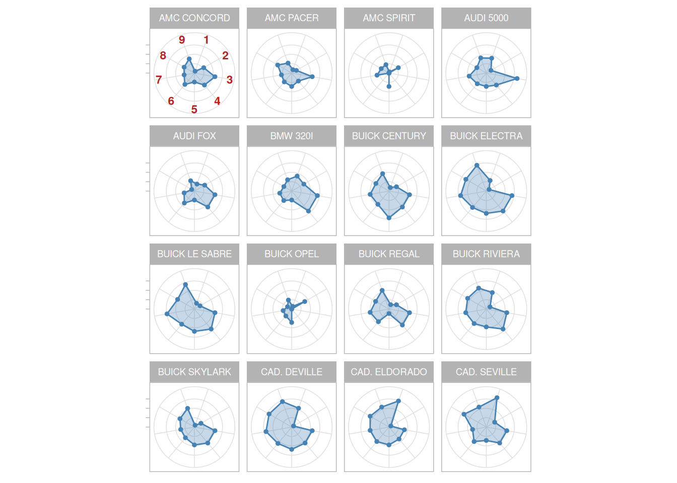
We can look at these plots individually or we can use them to identify clusters of cars with similar features. For example, we can look at the star plot of the Cadillac Seville and see that it is one of the most expensive cars, gets below average (but not among the worst) gas mileage, has an average repair record, and has average-to-above-average roominess and size. We can then compare the Cadillac models (the last three plots) with the AMC models (the first three plots). This comparison shows distinct patterns. The AMC models tend to be inexpensive, have below average gas mileage, and are small in both height and weight and in roominess. The Cadillac models are expensive, have poor gas mileage, and are large in both size and roominess.
Definition
The star plot consists of a sequence of equi-angular spokes, called radii, with each spoke representing one of the variables. The data length of a spoke is proportional to the magnitude of the variable for the data point relative to the maximum magnitude of the variable across all data points. A line is drawn connecting the data values for each spoke. This gives the plot a star-like appearance and the origin of the name of this plot.
(NIST’s own sample plot above shows more pronounced differences between cars than a literal reading of this Definition – scaling strictly by the maximum – would produce, since several of the 9 variables have a fairly narrow observed range relative to their maximum. We normalize each spoke using the variable’s full observed minimum-to-maximum range, which reproduces that same visual pattern.)
Questions
The star plot can be used to answer the following questions:
Weakness in Technique
Star plots are helpful for small-to-moderate-sized multivariate data sets. Their primary weakness is that their effectiveness is limited to data sets with less than a few hundred points. After that, they tend to be overwhelming.
Graphical techniques suited for large data sets are discussed by Scott (Scott 1992).
Related Techniques
Alternative ways to plot multivariate data are discussed in Chambers, du Toit, and Everitt.
Software
Star plots are available in some general purpose statistical software programs.
Purpose: Graphical Check To See If Data Come From a Population That Would Be Fit by a Weibull Distribution
The Weibull plot (Nelson 1982) is a graphical technique for determining if a data set comes from a population that would logically be fit by a 2-parameter Weibull distribution (the location is assumed to be zero).
The Weibull plot has special scales that are designed so that if the data do in fact follow a Weibull distribution, the points will be linear (or nearly linear). The least squares fit of this line yields estimates for the shape and scale parameters of the Weibull distribution (the location is assumed to be zero).
Specifically, the shape parameter is the reciprocal of the slope of the fitted line and the scale parameter is the exponent of the intercept of the fitted line.
The Weibull distribution also has the property that the scale parameter falls at the 63.2% point irrespective of the value of the shape parameter. The plot below shows a horizontal line at this 63.2% point and a vertical line where the horizontal line intersects the least squares fitted line. This vertical line shows the value of the scale parameter.
Sample Plot
library(tidyverse)
fuller2 <- read_table(here::here("datasets", "FULLER2.DAT"), skip = 25, col_names = "y", col_types = "d")
n <- nrow(fuller2)
weibull_df <- fuller2 |>
arrange(y) |>
mutate(
i = row_number(),
p = (i - 0.3) / (n + 0.4),
x_log10 = log10(y),
y_weibull = log(-log(1 - p))
)
fit <- lm(y_weibull ~ x_log10, data = weibull_df)
slope <- coef(fit)[[2]]
intercept <- coef(fit)[[1]]
# Because the x-axis here is plotted on a log10 scale (per the Definition
# below), the fitted line's slope must be rescaled by ln(10) to recover the
# shape parameter on the natural-log scale used in the Weibull CDF.
shape_hat <- slope / log(10)
scale_hat <- 10^(-intercept / slope)# NIST's own plot labels the (nonlinear, ln(-ln(1-p))-transformed) vertical
# axis with probability percentages -- "Weibull probability paper" -- rather
# than the raw transformed values, matching the Definition below ("Weibull
# cumulative probability expressed as a percentage"). breaks/labels here
# reproduce that convention at the same axis positions we already compute.
prob_breaks <- c(0.001, 0.01, 0.05, 0.1, 0.2, 0.3, 0.5, 0.7, 0.8, 0.9, 0.95, 0.99, 0.999)
ggplot(weibull_df, aes(x_log10, y_weibull)) +
geom_point() +
geom_abline(slope = slope, intercept = intercept, color = "steelblue") +
geom_hline(yintercept = log(-log(1 - 0.632)), linetype = "dashed", color = "firebrick") +
geom_vline(xintercept = log10(scale_hat), linetype = "dashed", color = "firebrick") +
scale_y_continuous(
breaks = log(-log(1 - prob_breaks)),
labels = scales::label_percent(accuracy = 0.1)(prob_breaks)
) +
labs(
x = "LOG10(Ordered failure time)",
y = "Weibull Probability"
) +
theme_light()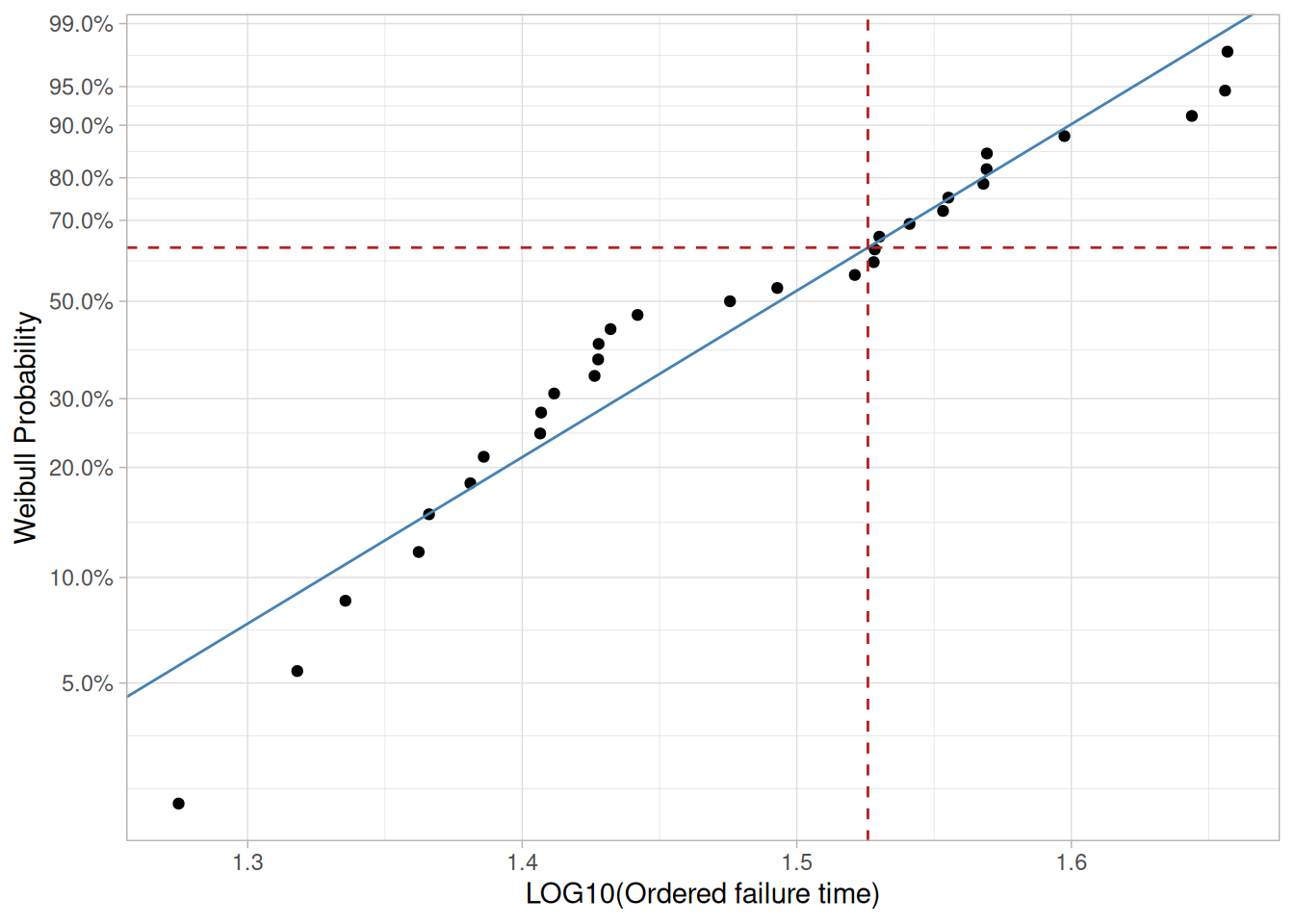
This Weibull plot of the FULLER2.DAT data set (times to failure of aircraft windshield/glass specimens) shows that:
Note that the values on the x-axis are shown on a log10 scale, so a label of “0”, “1”, or “2” would denote \(10^0 = 1\), \(10^1 = 10\), and \(10^2 = 100\) respectively.
(NIST’s own plot for this example labels the x-axis “Log(Strength),” but FULLER2.DAT’s own documentation states its response variable is “time to failure” – consistent with the page’s own prose, which describes this data set as measuring the time to failure of aircraft windshield/glass specimens. This looks like a mislabeled axis in the original – possibly copied from a different Weibull plot template – rather than a different underlying data set, so we keep the dataset’s own documented variable name here.)
Definition: Weibull Cumulative Probability Versus LN(Ordered Response)
The Weibull plot is formed by:
The vertical scale is \(\ln(-\ln(1-p))\) where \(p = (i - 0.3)/(n + 0.4)\) and \(i\) is the rank of the observation. This scale is chosen in order to linearize the resulting plot for Weibull data.
Questions
The Weibull plot can be used to answer the following questions:
Importance: Check Distributional Assumptions
Many statistical analyses, particularly in the field of reliability, are based on the assumption that the data follow a Weibull distribution. If the analysis assumes the data follow a Weibull distribution, it is important to verify this assumption and, if verified, find good estimates of the Weibull parameters.
Related Techniques
Probability Plot, PPCC Plot, Weibull Hazard Plot
The Weibull probability plot (in conjunction with the Weibull PPCC plot), the Weibull hazard plot, and the Weibull plot are all similar techniques that can be used for assessing the adequacy of the Weibull distribution as a model for the data, and additionally providing estimation for the shape, scale, or location parameters.
The Weibull hazard plot and Weibull plot are designed to handle censored data (which the Weibull probability plot does not).
Case Study
The Weibull plot is demonstrated in the fatigue life of aluminum alloy specimens case study.
Software
Weibull plots are generally available in statistical software programs that are designed to analyze reliability data.
Purpose: Interlab Comparisons
Youden plots are a graphical technique for analyzing interlab data when each lab has made two runs on the same product or one run on two different products.
The Youden plot is a simple but effective method for comparing both the within-laboratory variability and the between-laboratory variability.
Sample Plot
library(tidyverse)
ugiansky <- read_table(
here::here("datasets", "UGIANSKY.DAT"),
skip = 25,
col_names = c("y1", "y2", "lab"),
col_types = "ddi"
) |>
drop_na()Warning: 1 parsing failure.
row col expected actual file
11 -- 3 columns 1 columns '/home/ray/nist-sematech-projects/nist-sematech-statistics-book/book/datasets/UGIANSKY.DAT'ggplot(ugiansky, aes(y2, y1, label = factor(lab), color = factor(lab))) +
geom_text(size = 4, fontface = "bold", show.legend = FALSE) +
geom_abline(slope = 1, intercept = 0, linetype = "dashed", color = "grey40") +
coord_equal() +
labs(
x = "Response 2: log(days to failure), material 2",
y = "Response 1: log(days to failure), material 1",
color = "Lab"
) +
theme_light()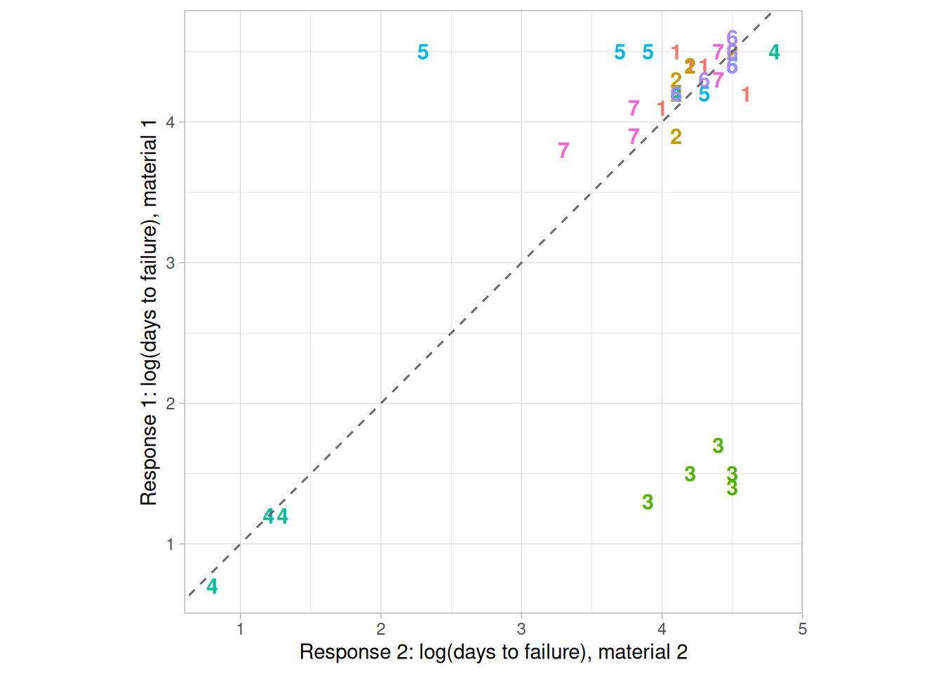
Figure 1.79, from the UGIANSKY.DAT ASTM interlaboratory stress-corrosion study (7 labs, each running 5 specimens of two materials), shows:
Definition: Response 1 Versus Response 2 Coded by Lab
Youden plots are formed by:
In addition, the plot symbol is the lab id (typically an integer from 1 to \(k\) where \(k\) is the number of labs). Sometimes a 45-degree reference line is drawn. Ideally, a lab generating two runs of the same product should produce reasonably similar results. Departures from this reference line indicate inconsistency from the lab. If two different products are being tested, then a 45-degree line may not be appropriate. However, if the labs are consistent, the points should lie near some fitted straight line.
Questions
The Youden plot can be used to answer the following questions:
Importance
In interlaboratory studies or in comparing two runs from the same lab, it is useful to know if consistent results are generated. Youden plots should be a routine plot for analyzing this type of data.
The DOE Youden plot is a specialized Youden plot used in the design of experiments. In particular, it is useful for full and fractional designs.
DOE Youden Plot: Introduction
The DOE (Design of Experiments) Youden plot is a specialized Youden plot used in the analysis of full and fractional experiment designs. In particular, it is used in conjunction with the Yates Analysis algorithm. These designs may have a low level, coded as “-1” or “-”, and a high level, coded as “+1” or “+”, for each factor. In addition, there can optionally be one or more center points. Center points are at the midpoint between the low and high levels for each factor and are coded as “0”.
The Yates algorithm and the DOE Youden plot only use the “-1” and “+1” points. The Yates algorithm is used to estimate factor effects. The DOE Youden plot can be used to help determine the appropriate model based on the effect estimates from the Yates algorithm.
Construction of DOE Youden Plot
The following are the primary steps in the construction of the DOE Youden plot.
The high and low values of the interaction terms are obtained by multiplying the corresponding values of the main level factors. For example, the interaction term \(X_{13}\) is obtained by multiplying the values for \(X_1\) with the corresponding values of \(X_3\). Since the values for \(X_1\) and \(X_3\) are either “-1” or “+1”, the resulting values for \(X_{13}\) are also either “-1” or “+1”.
In summary, the DOE Youden plot is a plot of the mean of the response variable for the high level of a factor or interaction term against the mean of the response variable for the low level of that factor or interaction term.
For unimportant factors and interaction terms, these mean values should be nearly the same. For important factors and interaction terms, these mean values should be quite different. So the interpretation of the plot is that unimportant factors should be clustered together near the grand mean. Points that stand apart from this cluster identify important factors that should be included in the model.
Sample DOE Youden Plot
eddy <- read_table(
here::here("datasets", "SPLETT3.DAT"),
skip = 25,
col_names = c("y", "x1", "x2", "x3", "run"),
col_types = "ddddi"
)
factors <- list(
`1` = eddy$x1,
`2` = eddy$x2,
`3` = eddy$x3,
`12` = eddy$x1 * eddy$x2,
`13` = eddy$x1 * eddy$x3,
`23` = eddy$x2 * eddy$x3,
`123` = eddy$x1 * eddy$x2 * eddy$x3
)
doe_youden <- map_dfr(names(factors), function(nm) {
f <- factors[[nm]]
tibble(term = nm, low = mean(eddy$y[f == -1]), high = mean(eddy$y[f == 1]))
})ggplot(doe_youden, aes(low, high, label = term)) +
geom_text(size = 4, fontface = "bold", color = "steelblue") +
coord_equal() +
labs(x = "Mean response, low level", y = "Mean response, high level") +
theme_light()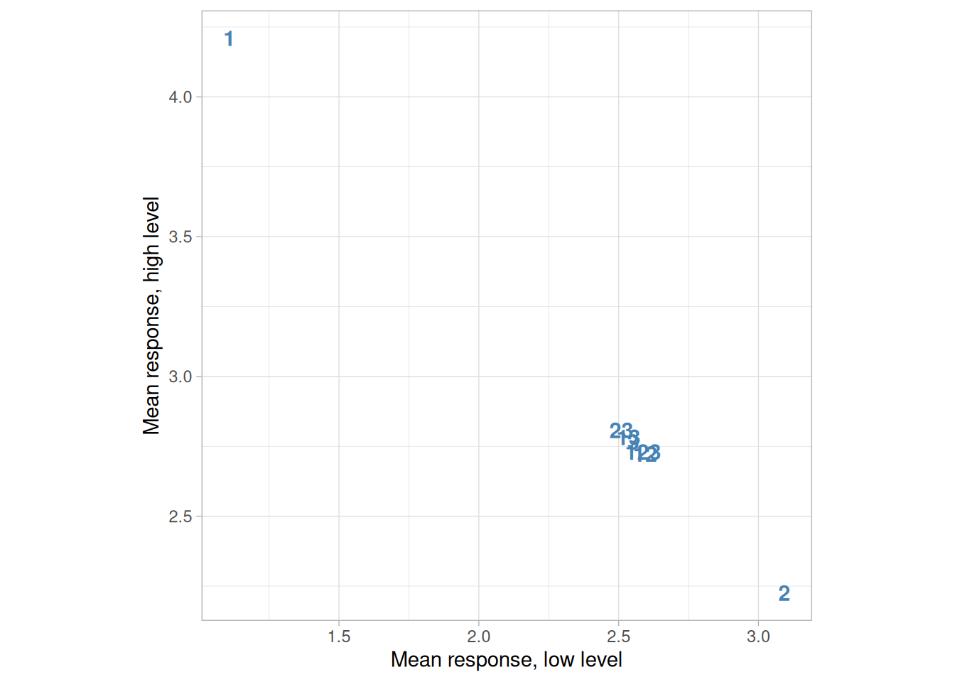
The following is a DOE Youden plot for the data used in the eddy current case study, a \(2^3\) full factorial experiment on probe impedance (SPLETT3.DAT) with factors for number of wire turns (1), winding distance (2), and wire gauge (3). The analysis in that case study demonstrated that \(X_1\) and \(X_2\) were the most important factors.
Interpretation of the Sample DOE Youden Plot
From the above DOE Youden plot, we see that factors 1 and 2 stand out from the others. That is, the mean response values for the low and high levels of factor 1 and factor 2 are quite different. For factor 3 and the 2- and 3-term interactions, the mean response values for the low and high levels are similar.
We would conclude from this plot that factors 1 and 2 are important and should be included in our final model while the remaining factors and interactions should be omitted from the final model.
Case Study
The eddy current case study demonstrates the use of the DOE Youden plot in the context of the analysis of a full factorial design.
Related Techniques
Software
The Youden plot is essentially a scatter plot, so it should be feasible to write a macro for a Youden plot in any general purpose statistical program that supports scatter plots. DOE Youden plots are not typically available as built-in plots in statistical software programs; however, it should be relatively straightforward to write a macro to generate this plot in most general purpose statistical software programs.
Purpose: Check Underlying Statistical Assumptions
The 4-plot is a collection of 4 specific EDA graphical techniques whose purpose is to test the assumptions that underlie most measurement processes. A 4-plot consists of a
If the 4 underlying assumptions of a typical measurement process hold, then the above 4 plots will have a characteristic appearance (see the normal random numbers case study below); if any of the underlying assumptions fail to hold, then it will be revealed by an anomalous appearance in one or more of the plots. Several commonly encountered situations are demonstrated in the case studies below.
Although the 4-plot has an obvious use for univariate and time series data, its usefulness extends far beyond that. Many statistical models of the form
\[Y_i = f(X_1, \ldots, X_k) + E_i\]
have the same underlying assumptions for the error term. That is, no matter how complicated the functional fit, the assumptions on the underlying error term are still the same. The 4-plot can and should be routinely applied to the residuals when fitting models regardless of whether the model is simple or complicated.
Sample Plot: Process Has Fixed Location, Fixed Variation, Non-Random (Oscillatory), Non-Normal U-Shaped Distribution, and Has 3 Outliers
library(tidyverse)
library(patchwork)
lew <- read_table(here::here("datasets", "LEW.DAT"), skip = 25, col_names = "y", col_types = "d")
# Uniform order statistic medians (Filliben, 1975) -- same construction used
# on the Normal Probability Plot page.
uniform_medians <- function(n) {
i <- seq_len(n)
m <- numeric(n)
m[1] <- 1 - 0.5^(1 / n)
m[n] <- 0.5^(1 / n)
if (n > 2) m[2:(n - 1)] <- (i[2:(n - 1)] - 0.3175) / (n + 0.365)
m
}
four_plot <- function(x, hist_bins = 30) {
n <- length(x)
p_run <- tibble(i = seq_len(n), y = x) |>
ggplot(aes(i, y)) +
geom_line() +
labs(x = "Index", y = "Y", title = "Run Sequence Plot") +
theme_light()
p_lag <- tibble(y = x[-1], y_lag = x[-n]) |>
ggplot(aes(y_lag, y)) +
geom_point() +
labs(x = expression(Y[i - 1]), y = expression(Y[i]), title = "Lag Plot") +
theme_light()
p_hist <- tibble(y = x) |>
ggplot(aes(y)) +
geom_histogram(bins = hist_bins, color = "white", fill = "steelblue4") +
labs(x = "Y", y = "Count", title = "Histogram") +
theme_light()
mm <- uniform_medians(n)
theoretical <- qnorm(mm)
xs <- sort(x)
p_norm <- tibble(theoretical = theoretical, observed = xs) |>
ggplot(aes(theoretical, observed)) +
geom_point(shape = 1) +
geom_smooth(method = "lm", formula = 'y ~ x', se = FALSE, color = "firebrick") +
labs(x = "Theoretical", y = "Ordered Y", title = "Normal Probability Plot") +
theme_light()
(p_run + p_lag) / (p_hist + p_norm)
}four_plot(lew$y)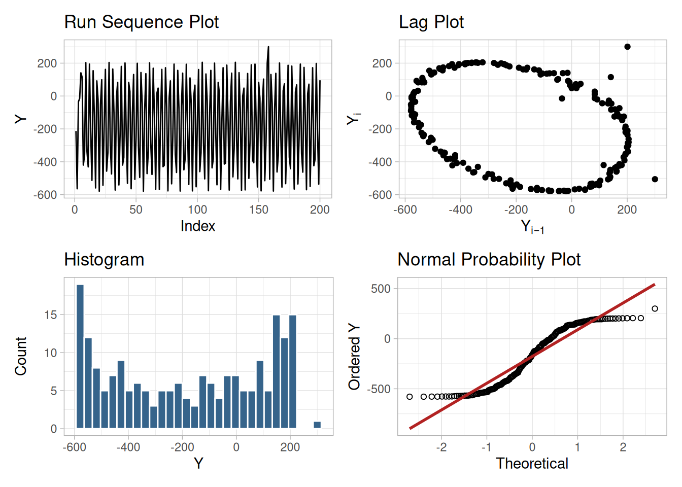
Figure 1.81 reveals the following:
Definition: Run Sequence Plot, Lag Plot, Histogram, Normal Probability Plot
The 4-plot consists of the following:
Questions
4-plots can provide answers to many questions:
Importance: Testing Underlying Assumptions Helps Ensure the Validity of the Final Scientific and Engineering Conclusions
There are 4 assumptions that typically underlie all measurement processes; namely, that the data from the process at hand “behave like”:
Predictability is an all-important goal in science and engineering. If the above 4 assumptions hold, then we have achieved probabilistic predictability – the ability to make probability statements not only about the process in the past, but also about the process in the future. In short, such processes are said to be “statistically in control”. If the 4 assumptions do not hold, then we have a process that is drifting (with respect to location, variation, or distribution), is unpredictable, and is out of control. A simple characterization of such processes by a location estimate, a variation estimate, or a distribution “estimate” inevitably leads to optimistic and grossly invalid engineering conclusions.
Inasmuch as the validity of the final scientific and engineering conclusions is inextricably linked to the validity of these same 4 underlying assumptions, it naturally follows that there is a real necessity for all 4 assumptions to be routinely tested. The 4-plot (run sequence plot, lag plot, histogram, and normal probability plot) is seen as a simple, efficient, and powerful way of carrying out this routine checking.
Interpretation: Flat, Equi-Banded, Random, Bell-Shaped, and Linear
Of the 4 underlying assumptions:
If all 4 of the assumptions hold, then the process is “statistically in control”. In practice, many processes fall short of achieving this ideal.
Related Techniques
Run Sequence Plot, Lag Plot, Histogram, Normal Probability Plot, Autocorrelation Plot, Spectral Plot, PPCC Plot
Case Studies
The 4-plot is used in most of the case studies in this chapter.
Software
It should be feasible to write a macro for the 4-plot in any general purpose statistical software program that supports the capability for multiple plots per page and supports the underlying plot techniques.
Purpose: Graphical Model Validation
The 6-plot is a collection of 6 specific graphical techniques whose purpose is to assess the validity of a \(Y\) versus \(X\) fit. The fit can be a linear fit, a non-linear fit, a LOWESS (locally weighted least squares) fit, a spline fit, or any other fit utilizing a single independent variable.
The 6 plots are:
Sample Plot
library(tidyverse)
library(patchwork)
pontius <- read_table(here::here("datasets", "PONTIUS.DAT"), skip = 25, col_names = c("y", "x"), col_types = "dd")
# Uniform order statistic medians (Filliben, 1975) -- same construction used
# on the Normal Probability Plot page.
uniform_medians <- function(n) {
i <- seq_len(n)
m <- numeric(n)
m[1] <- 1 - 0.5^(1 / n)
m[n] <- 0.5^(1 / n)
if (n > 2) m[2:(n - 1)] <- (i[2:(n - 1)] - 0.3175) / (n + 0.365)
m
}
six_plot <- function(y, x, hist_bins = 30) {
fit <- lm(y ~ x)
n <- length(y)
d <- tibble(x = x, y = y, pred = fitted(fit), res = resid(fit))
p1 <- ggplot(d, aes(x)) +
geom_point(aes(y = y), shape = 1) +
geom_point(aes(y = pred), shape = 4, color = "firebrick") +
labs(x = "X", y = "Y, Predicted", title = "Y, Predicted vs. X") +
theme_light()
p2 <- ggplot(d, aes(x, res)) +
geom_point(shape = 1) +
geom_hline(yintercept = 0, linetype = "dashed") +
labs(x = "X", y = "Residual", title = "Residuals vs. X") +
theme_light()
p3 <- ggplot(d, aes(pred, res)) +
geom_point(shape = 1) +
geom_hline(yintercept = 0, linetype = "dashed") +
labs(x = "Predicted", y = "Residual", title = "Residuals vs. Predicted") +
theme_light()
res_sorted_by_run <- d$res
p4 <- tibble(r = res_sorted_by_run[-1], r_lag = res_sorted_by_run[-n]) |>
ggplot(aes(r_lag, r)) +
geom_point(shape = 1) +
labs(x = expression(RES[i - 1]), y = expression(RES[i]), title = "Lag Plot of Res.") +
theme_light()
p5 <- ggplot(d, aes(res)) +
geom_histogram(bins = hist_bins, color = "white", fill = "steelblue4") +
labs(x = "Residual", y = "Count", title = "Histogram of Res.") +
theme_light()
mm <- uniform_medians(n)
theoretical <- qnorm(mm)
res_sorted <- sort(d$res)
p6 <- tibble(theoretical = theoretical, observed = res_sorted) |>
ggplot(aes(theoretical, observed)) +
geom_point(shape = 1) +
labs(x = "Theoretical", y = "Ordered Residuals", title = "Normal Prob. Plot of Res.") +
theme_light()
(p1 + p2 + p3) / (p4 + p5 + p6)
}six_plot(pontius$y, pontius$x)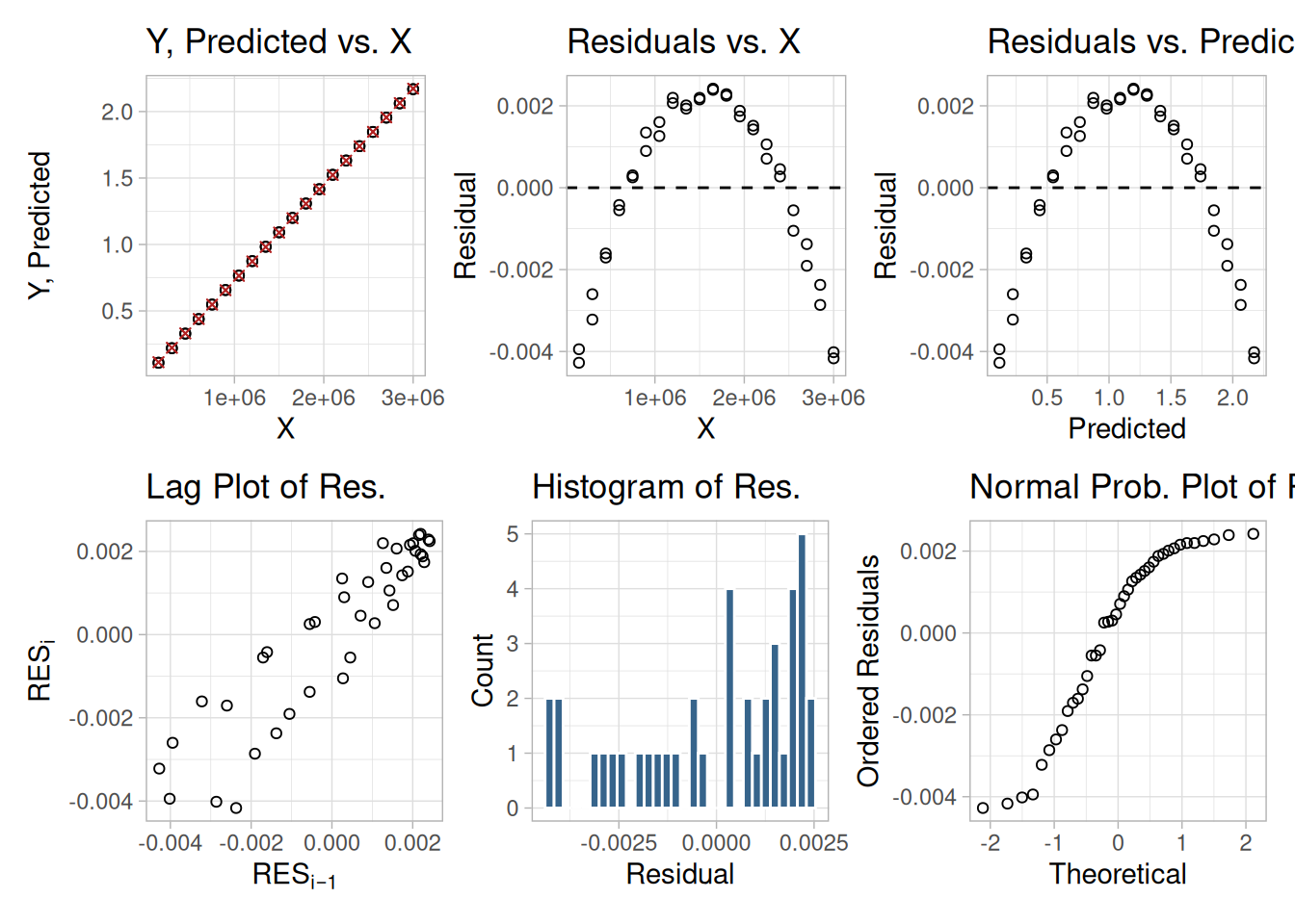
This 6-plot, which followed a linear fit, shows that the linear model is not adequate. It suggests that a quadratic model would be a better model.
Definition: 6 Component Plots
The 6-plot consists of the following:
Questions
The 6-plot can be used to answer the following questions:
Importance: Validating Model
A model involving a response variable and a single independent variable has the form:
\[Y_i = f(X_i) + E_i\]
where \(Y\) is the response variable, \(X\) is the independent variable, \(f\) is the linear or non-linear fit function, and \(E\) is the random component. For a good model, the error component should behave like:
In addition, for fitting models it is usually further assumed that the fixed distribution is normal and the fixed location is zero. For a good model the fixed variation should be as small as possible. A necessary component of fitting models is to verify these assumptions for the error component and to assess whether the variation for the error component is sufficiently small. The histogram, lag plot, and normal probability plot are used to verify the fixed distribution, location, and variation assumptions on the error component. The plot of the response variable and the predicted values versus the independent variable is used to assess whether the variation is sufficiently small. The plots of the residuals versus the independent variable and the predicted values is used to assess the independence assumption.
Assessing the validity and quality of the fit in terms of the above assumptions is an absolutely vital part of the model-fitting process. No fit should be considered complete without an adequate model validation step.
Related Techniques
Linear Least Squares, Non-Linear Least Squares, Scatter Plot, Run Sequence Plot, Lag Plot, Normal Probability Plot, Histogram
Case Study
The 6-plot is used in the Alaska pipeline data case study.
Software
It should be feasible to write a macro for the 6-plot in any general purpose statistical software program that supports the capability for multiple plots per page and supports the underlying plot techniques.
The techniques above are listed in alphabetical order, which is convenient for lookup but is not the way an analyst would naturally select among them. This section instead organizes the graphical techniques by the type of problem they address, following the general model \(y = f(\ldots) + e\) appropriate to each category.
Univariate (\(y = c + e\))
Run Sequence Plot, Lag Plot, Histogram, Normal Probability Plot, 4-Plot, PPCC Plot, Weibull Plot, Probability Plot, Box-Cox Linearity Plot, Box-Cox Normality Plot, Bootstrap Plot.
Time Series (\(y = f(t) + e\))
Run Sequence Plot, Spectral Plot, Autocorrelation Plot, Complex Demodulation Amplitude Plot, Complex Demodulation Phase Plot.
1-Factor (\(y = f(x) + e\))
Scatter Plot, Box Plot, Bihistogram, Quantile-Quantile Plot, Mean Plot, Standard Deviation Plot.
Multi-Factor/Comparative (\(y = f(x_p, x_1, x_2, \ldots, x_k) + e\))
Multi-Factor/Screening (\(y = f(x_1, x_2, x_3, \ldots, x_k) + e\))
DOE Scatter Plot, DOE Mean Plot, DOE Standard Deviation Plot, Contour Plot.
Regression (\(y = f(x_1, x_2, x_3, \ldots, x_k) + e\))
Scatter Plot, 6-Plot, Linear Correlation Plot, Linear Intercept Plot, Linear Slope Plot, Linear Residual Standard Deviation Plot.
Interlab (\((y_1, y_2) = f(x) + e\))
Multivariate (\((y_1, y_2, \ldots, y_p)\))
The techniques discussed in this section are classical statistical methods, as opposed to EDA techniques. EDA and classical techniques are not mutually exclusive and can be used in a complementary fashion. For example, an analysis can start with some simple graphical techniques such as the 4-Plot followed by the classical confirmatory methods discussed here to provide more rigorous statements about the conclusions. If the classical methods yield different conclusions than the graphical analysis, then some effort should be invested to explain why. Often this is an indication that some of the assumptions of the classical techniques are violated.
Many of the quantitative techniques fall into two broad categories:
Interval Estimates
It is common in statistics to estimate a parameter from a sample of data. The value of the parameter using all of the possible data, not just the sample data, is called the population parameter, or true value of the parameter. An estimate of the true parameter value is made using the sample data; this is called a point estimate, or a sample estimate.
For example, the most commonly used measure of location is the mean. The population, or true, mean is the sum of all the members of the given population divided by the number of members in the population. As it is typically impractical to measure every member of the population, a random sample is drawn from the population. The sample mean is calculated by summing the values in the sample and dividing by the number of values in the sample. This sample mean is then used as the point estimate of the population mean.
Interval estimates expand on point estimates by incorporating the uncertainty of the point estimate. In the example for the mean above, different samples from the same population will generate different values for the sample mean. An interval estimate quantifies this uncertainty in the sample estimate by computing lower and upper values of an interval which will, with a given level of confidence (i.e., probability), contain the population parameter.
Hypothesis Tests
Hypothesis tests also address the uncertainty of the sample estimate. However, instead of providing an interval, a hypothesis test attempts to refute a specific claim about a population parameter based on the sample data. For example, the hypothesis might be one of the following:
To reject a hypothesis is to conclude that it is false. However, to accept a hypothesis does not mean that it is true, only that we do not have evidence to believe otherwise. Thus hypothesis tests are usually stated in terms of both a condition that is doubted (the null hypothesis) and a condition that is believed (the alternative hypothesis).
A common format for a hypothesis test is:
| \(H_0\) | A statement of the null hypothesis, e.g., two population means are equal. |
| \(H_a\) | A statement of the alternative hypothesis, e.g., two population means are not equal. |
| Test Statistic | The test statistic is based on the specific hypothesis test. |
| Significance Level | The significance level, \(\alpha\), defines the sensitivity of the test. A value of \(\alpha = 0.05\) means that we inadvertently reject the null hypothesis 5% of the time when it is in fact true. This is also called the type I error. The choice of \(\alpha\) is somewhat arbitrary, although in practice values of 0.1, 0.05, and 0.01 are commonly used. The probability of rejecting the null hypothesis when it is in fact false is called the power of the test and is denoted by \(1 - \beta\). Its complement, the probability of accepting the null hypothesis when the alternative hypothesis is, in fact, true (type II error), is called \(\beta\) and can only be computed for a specific alternative hypothesis. |
| Critical Region | The critical region encompasses those values of the test statistic that lead to a rejection of the null hypothesis. Based on the distribution of the test statistic and the significance level, a cut-off value for the test statistic is computed. Values either above or below or both (depending on the direction of the test) this cut-off define the critical region. |
Practical Versus Statistical Significance
It is important to distinguish between statistical significance and practical significance. Statistical significance simply means that we reject the null hypothesis. The ability of the test to detect differences that lead to rejection of the null hypothesis depends on the sample size. For example, for a particularly large sample, the test may reject the null hypothesis that two process means are equivalent. However, in practice the difference between the two means may be relatively small, to the point of having no real engineering significance. Similarly, if the sample size is small, a difference that is large in engineering terms may not lead to rejection of the null hypothesis. The analyst should not just blindly apply the tests, but should combine engineering judgment with statistical analysis.
Bootstrap Uncertainty Estimates
In some cases, it is possible to mathematically derive appropriate uncertainty intervals. This is particularly true for intervals based on the assumption of a normal distribution. However, there are many cases in which it is not possible to mathematically derive the uncertainty. In these cases, the bootstrap provides a method for empirically determining an appropriate interval.
Some of the more common classical quantitative techniques are listed below, grouped by the type of question they address. This list of quantitative techniques is by no means meant to be exhaustive; additional discussions of classical statistical techniques are contained in the product comparisons chapter.
Location
Measures of Location, Confidence Limits for the Mean and One-Sample t-Test, Two-Sample t-Test for Equal Means, One-Factor Analysis of Variance, Multi-Factor Analysis of Variance.
Scale (or Variability or Spread)
Measures of Scale, Bartlett’s Test, Chi-Square Test, F-Test, Levene Test.
Skewness and Kurtosis
Measures of Skewness and Kurtosis.
Randomness
Distributional Measures
Anderson-Darling Test, Chi-Square Goodness-of-Fit Test, Kolmogorov-Smirnov Test.
Outliers
2-Level Factorial Designs
Location
A fundamental task in many statistical analyses is to estimate a location parameter for the distribution; i.e., to find a typical or central value that best describes the data.
Definition of Location
The first step is to define what we mean by a typical value. For univariate data, there are three common definitions:
mean – the mean is the sum of the data points divided by the number of data points. That is,
\[\bar{Y} = \sum_{i=1}^{N}Y_{i}/N\]
The mean is that value that is most commonly referred to as the average. We will use the term average as a synonym for the mean and the term typical value to refer generically to measures of location.
median – the median is the value of the point which has half the data smaller than that point and half the data larger than that point. That is, if \(Y_1, Y_2, \ldots, Y_N\) is a random sample sorted from smallest value to largest value, then the median is defined as:
\[\tilde{Y} = Y_{(N+1)/2} \qquad \text{if } N \text{ is odd}\] \[\tilde{Y} = (Y_{N/2} + Y_{(N/2)+1})/2 \qquad \text{if } N \text{ is even}\]
mode – the mode is the value of the random sample that occurs with the greatest frequency. It is not necessarily unique. The mode is typically used in a qualitative fashion. For example, there may be a single dominant hump in the data or perhaps two or more smaller humps in the data. This is usually evident from a histogram of the data.
When taking samples from continuous populations, we need to be somewhat careful in how we define the mode. That is, any specific value may not occur more than once if the data are continuous. What may be a more meaningful, if less exact, measure is the midpoint of the class interval of the histogram with the highest peak.
Why Different Measures
A natural question is why we have more than one measure of the typical value. The following example helps to explain why these alternative definitions are useful and necessary.
This plot shows histograms for 10,000 random numbers generated from a normal, an exponential, a Cauchy, and a lognormal distribution.
library(tidyverse)
set.seed(19)
n <- 10000
location_data <- tibble(
normal = rnorm(n),
exponential = rexp(n),
cauchy = rcauchy(n),
lognormal = rlnorm(n)
) |>
pivot_longer(everything(), names_to = "distribution", values_to = "value") |>
mutate(distribution = factor(
distribution,
levels = c("normal", "exponential", "cauchy", "lognormal"),
labels = c("Normal", "Exponential", "Cauchy", "Lognormal")
))
# Mode estimated as the midpoint of the histogram bin with the highest peak,
# matching the NIST definition used in the original example.
histogram_mode <- function(x, bins = 30) {
h <- hist(x, breaks = bins, plot = FALSE)
h$mids[which.max(h$counts)]
}
location_summary <- location_data |>
summarize(
mean = mean(value),
median = median(value),
mode = histogram_mode(value),
.by = distribution
)
location_summary# Restrict the Cauchy panel to (-10, 10) for visual comparability with the
# other panels, matching NIST's own treatment of this distribution's extreme range.
location_data |>
mutate(value = if_else(distribution == "Cauchy" & abs(value) > 10, NA_real_, value)) |>
ggplot(aes(value)) +
geom_histogram(bins = 30) +
facet_wrap(~distribution, scales = "free") +
labs(x = NULL, y = "Count") +
theme_light()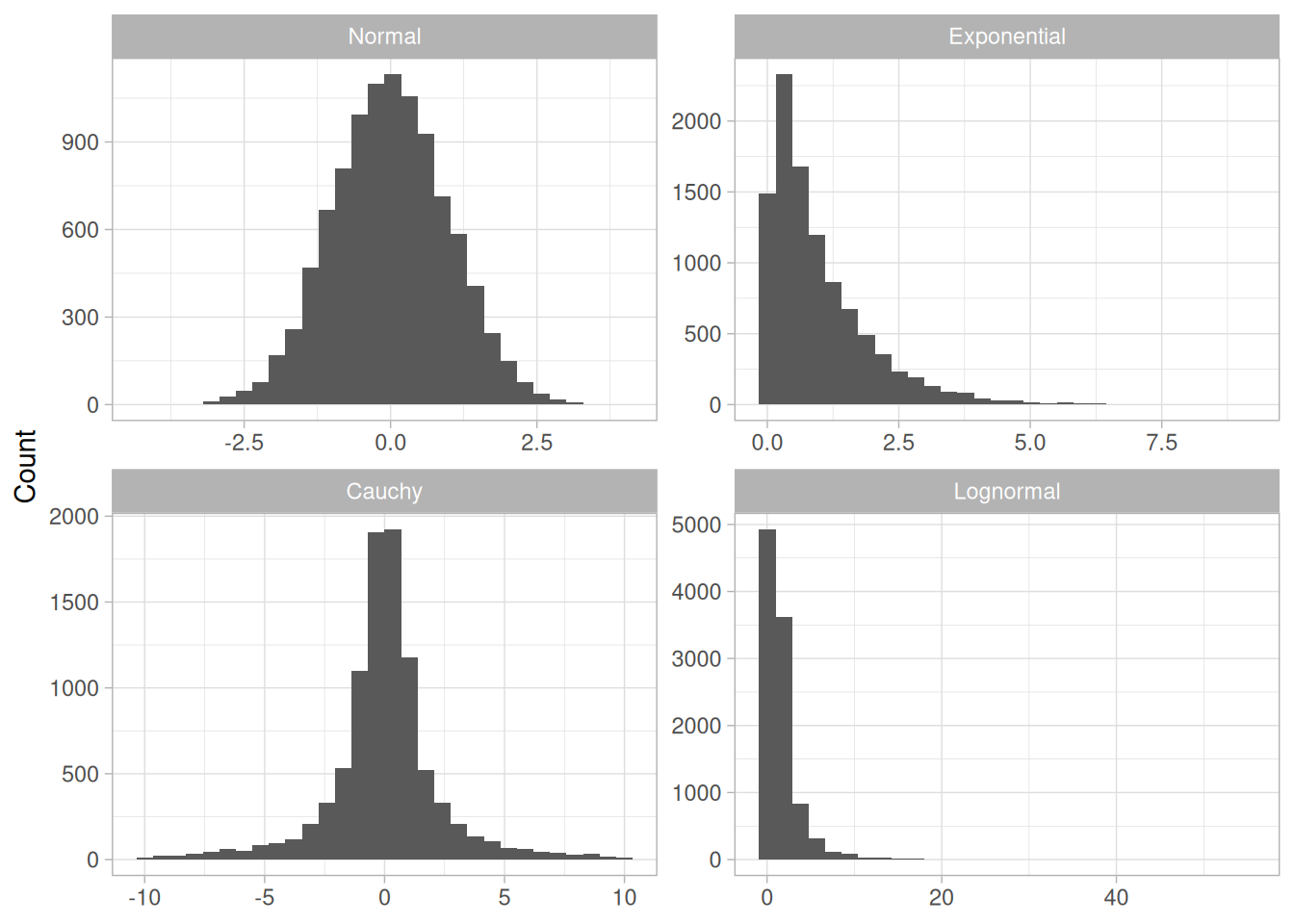
(Note: the mean/median/mode values quoted below in each of the four paragraphs are NIST’s own stated figures for their particular 10,000-point random draw. Because those exact figures depend on Dataplot’s specific random-number generator and seed, which we cannot reproduce in R, our own regenerated sample (set.seed(19), computed in the table above) gives different exact numbers from the same four distributions. The qualitative conclusions the text draws from its numbers – mean, median, and mode coincide for the normal case and diverge for the skewed/heavy-tailed cases – hold equally for our own sample; compare the table above against the values quoted below if you’d like to see the difference directly.)
Normal Distribution
The first histogram is a sample from a normal distribution. The mean is 0.005, the median is -0.010, and the mode is -0.144 (the mode is computed as the midpoint of the histogram interval with the highest peak).
The normal distribution is a symmetric distribution with well-behaved tails and a single peak at the center of the distribution. By symmetric, we mean that the distribution can be folded about an axis so that the 2 sides coincide. That is, it behaves the same to the left and right of some center point. For a normal distribution, the mean, median, and mode are actually equivalent. The histogram above generates similar estimates for the mean, median, and mode. Therefore, if a histogram or normal probability plot indicates that your data are approximated well by a normal distribution, then it is reasonable to use the mean as the location estimator.
Exponential Distribution
The second histogram is a sample from an exponential distribution. The mean is 1.001, the median is 0.684, and the mode is 0.254 (the mode is computed as the midpoint of the histogram interval with the highest peak).
The exponential distribution is a skewed, i.e., not symmetric, distribution. For skewed distributions, the mean and median are not the same. The mean will be pulled in the direction of the skewness. That is, if the right tail is heavier than the left tail, the mean will be greater than the median. Likewise, if the left tail is heavier than the right tail, the mean will be less than the median.
For skewed distributions, it is not at all obvious whether the mean, the median, or the mode is the more meaningful measure of the typical value. In this case, all three measures are useful.
Cauchy Distribution
The third histogram is a sample from a Cauchy distribution. The mean is 3.70, the median is -0.016, and the mode is -0.362 (the mode is computed as the midpoint of the histogram interval with the highest peak).
For better visual comparison with the other data sets, we restricted the histogram of the Cauchy distribution to values between -10 and 10. The full Cauchy data set in fact has a minimum of approximately -29,000 and a maximum of approximately 89,000.
The Cauchy distribution is a symmetric distribution with heavy tails and a single peak at the center of the distribution. The Cauchy distribution has the interesting property that collecting more data does not provide a more accurate estimate of the mean. That is, the sampling distribution of the mean is equivalent to the sampling distribution of the original data. This means that for the Cauchy distribution the mean is useless as a measure of the typical value. For this histogram, the mean of 3.7 is well above the vast majority of the data. This is caused by a few very extreme values in the tail. However, the median does provide a useful measure for the typical value.
Although the Cauchy distribution is an extreme case, it does illustrate the importance of heavy tails in measuring the mean. Extreme values in the tails distort the mean. However, these extreme values do not distort the median since the median is based on ranks. In general, for data with extreme values in the tails, the median provides a better estimate of location than does the mean.
Lognormal Distribution
The fourth histogram is a sample from a lognormal distribution. The mean is 1.677, the median is 0.989, and the mode is 0.680 (the mode is computed as the midpoint of the histogram interval with the highest peak).
The lognormal is also a skewed distribution. Therefore the mean and median do not provide similar estimates for the location. As with the exponential distribution, there is no obvious answer to the question of which is the more meaningful measure of location.
Robustness
There are various alternatives to the mean and median for measuring location. These alternatives were developed to address non-normal data since the mean is an optimal estimator if in fact your data are normal.
Tukey and Mosteller (Tukey 1977) defined two types of robustness where robustness is a lack of susceptibility to the effects of nonnormality.
The mean is an example of an estimator that is the best we can do if the underlying distribution is normal. However, it lacks robustness of validity. That is, confidence intervals based on the mean tend not to be precise if the underlying distribution is in fact not normal.
The median is an example of an estimator that tends to have robustness of validity but not robustness of efficiency.
The alternative measures of location try to balance these two concepts of robustness. That is, the confidence intervals for the case when the data are normal should be almost as narrow as the confidence intervals based on the mean. However, they should maintain their validity even if the underlying data are not normal. In particular, these alternatives address the problem of heavy-tailed distributions.
Alternative Measures of Location
A few of the more common alternative location measures are:
The first three alternative location estimators defined above have the advantage of the median in the sense that they are not unduly affected by extremes in the tails. However, they generate estimates that are closer to the mean for data that are normal (or nearly so).
The mid-range, since it is based on the two most extreme points, is not robust. Its use is typically restricted to situations in which the behavior at the extreme points is relevant.
Case Study
The uniform random numbers case study compares the performance of several different location estimators for a particular non-normal distribution.
Software
Measures of location are available in just about all general purpose statistical software programs, including Dataplot and R.
Purpose: Interval Estimate for Mean
Confidence limits for the mean (Snedecor and Cochran, 1989 ) are an interval estimate for the mean. Interval estimates are often desirable because the estimate of the mean varies from sample to sample. Instead of a single estimate for the mean, a confidence interval generates a lower and upper limit for the mean. The interval estimate gives an indication of how much uncertainty there is in our estimate of the true mean. The narrower the interval, the more precise is our estimate.
Confidence limits are expressed in terms of a confidence coefficient. Although the choice of confidence coefficient is somewhat arbitrary, in practice 90%, 95%, and 99% intervals are often used, with 95% being the most commonly used.
As a technical note, a 95% confidence interval does not mean that there is a 95% probability that the interval contains the true mean. The interval computed from a given sample either contains the true mean or it does not. Instead, the level of confidence is associated with the method of calculating the interval. The confidence coefficient is simply the proportion of samples of a given size that may be expected to contain the true mean. That is, for a 95% confidence interval, if many samples are collected and the confidence interval computed, in the long run about 95% of these intervals would contain the true mean.
Definition: Confidence Interval
Confidence limits are defined as:
\[\bar{Y} \pm t_{1-\alpha/2,\,N-1} \; \frac{s}{\sqrt{N}}\]
where \(\bar{Y}\) is the sample mean, \(s\) is the sample standard deviation, \(N\) is the sample size, \(\alpha\) is the desired significance level, and \(t_{1-\alpha/2,\,N-1}\) is the \(100(1-\alpha/2)\) percentile of the t distribution with \(N-1\) degrees of freedom. Note that the confidence coefficient is \(1-\alpha\).
From the formula, it is clear that the width of the interval is controlled by two factors:
Definition: Hypothesis Test
To test whether the population mean has a specific value, \(\mu_0\), against the two-sided alternative that it does not have a value \(\mu_0\), the confidence interval is converted to hypothesis-test form. The test is a one-sample t-test, and it is defined as:
\(H_0: \mu = \mu_0\)
\(H_a: \mu \neq \mu_0\)
Test Statistic: \(T = (\bar{Y} - \mu_0)/(s/\sqrt{N})\), where \(\bar{Y}\), \(N\), and \(s\) are defined as above.
Significance Level: \(\alpha\). The most commonly used value for \(\alpha\) is 0.05.
Critical Region: Reject the null hypothesis that the mean is a specified value, \(\mu_0\), if
\[T < t_{\alpha/2,\,N-1} \quad \text{or} \quad T > t_{1-\alpha/2,\,N-1}\]
Confidence Interval and t-Test Example
We reproduce NIST’s confidence-interval and one-sample t-test examples using the ZARR13.DAT data set – daily calibration measurements of a heat flow meter, from Bob Zarr at NIST.
library(tidyverse)
zarr13 <- read_table(
here::here("datasets", "ZARR13.DAT"),
skip = 25,
col_names = "y",
col_types = "d"
)
n <- nrow(zarr13)
y_bar <- mean(zarr13$y)
s <- sd(zarr13$y)
se <- s / sqrt(n)
alpha <- 0.05
t_crit_two_sided <- qt(1 - alpha / 2, df = n - 1)
t_crit_one_sided <- qt(1 - alpha, df = n - 1)
lower_limit <- y_bar - t_crit_two_sided * se
upper_limit <- y_bar + t_crit_two_sided * se
ci_summary <- tibble(
N = n,
MEAN = y_bar,
`STANDARD DEVIATION` = s,
`t(1-0.025, N-1)` = t_crit_two_sided,
`LOWER LIMIT` = lower_limit,
`UPPER LIMIT` = upper_limit
)
ci_summaryNIST reports N = 195, MEAN = 9.261460, STANDARD DEVIATION = 0.022789, and a resulting 95% confidence interval of (9.258242, 9.264679). Our computed values match NIST’s reported figures to the precision shown.
Next we perform a two-sided, one-sample t-test using the ZARR13.DAT data to test the null hypothesis that the population mean is equal to 5:
mu0 <- 5
t_stat <- (y_bar - mu0) / se
df <- n - 1
t_test_summary <- tibble(
`Test statistic (T)` = t_stat,
`Degrees of freedom` = df,
`Significance level (alpha)` = alpha,
`Critical value, two-sided (t[1-a/2,df])` = t_crit_two_sided,
`Critical value, one-sided (t[1-a,df])` = t_crit_one_sided
)
t_test_summaryNIST reports a test statistic of T = 2611.284, degrees of freedom \(\nu = 194\), a two-sided critical value of 1.9723, and a one-sided (upper-tail) critical value of 1.6527. Our computed test statistic and critical values agree with NIST’s reported figures.
We reject \(H_0\) for our two-tailed t-test because the absolute value of the test statistic is far greater than the critical value. If we were to perform an upper, one-tailed test, we would still reject the null hypothesis, since the test statistic also exceeds the one-sided critical value.
The confidence interval provides an alternative to the hypothesis test. If the confidence interval contains 5, then \(H_0\) cannot be rejected. In our example, the confidence interval (9.258242, 9.264679) does not contain 5, indicating that the population mean does not equal 5 at the 0.05 level of significance.
In general, there are three possible alternative hypotheses and rejection regions for the one-sample t-test:
| Alternative Hypothesis | Rejection Region |
|---|---|
| \(H_a: \mu \neq \mu_0\) | \(\lvert T \rvert > t_{1-\alpha/2,\,\nu}\) |
| \(H_a: \mu > \mu_0\) | \(T > t_{1-\alpha,\,\nu}\) |
| \(H_a: \mu < \mu_0\) | \(T < t_{\alpha,\,\nu}\) |
rejection_grid <- tibble(t = seq(-4, 4, length.out = 400)) |>
mutate(density = dt(t, df = df))
crit_lines <- tribble(
~alternative, ~critical_value,
"mu != mu0 (two-sided)", -t_crit_two_sided,
"mu != mu0 (two-sided)", t_crit_two_sided,
"mu > mu0 (upper)", t_crit_one_sided,
"mu < mu0 (lower)", -t_crit_one_sided
)
ggplot(rejection_grid, aes(t, density)) +
geom_line() +
geom_vline(data = crit_lines, aes(xintercept = critical_value, color = alternative), linetype = "dashed") +
labs(
x = "t",
y = "Density",
color = "Alternative hypothesis",
title = "t distribution (194 df) with critical values for each alternative"
) +
theme_light()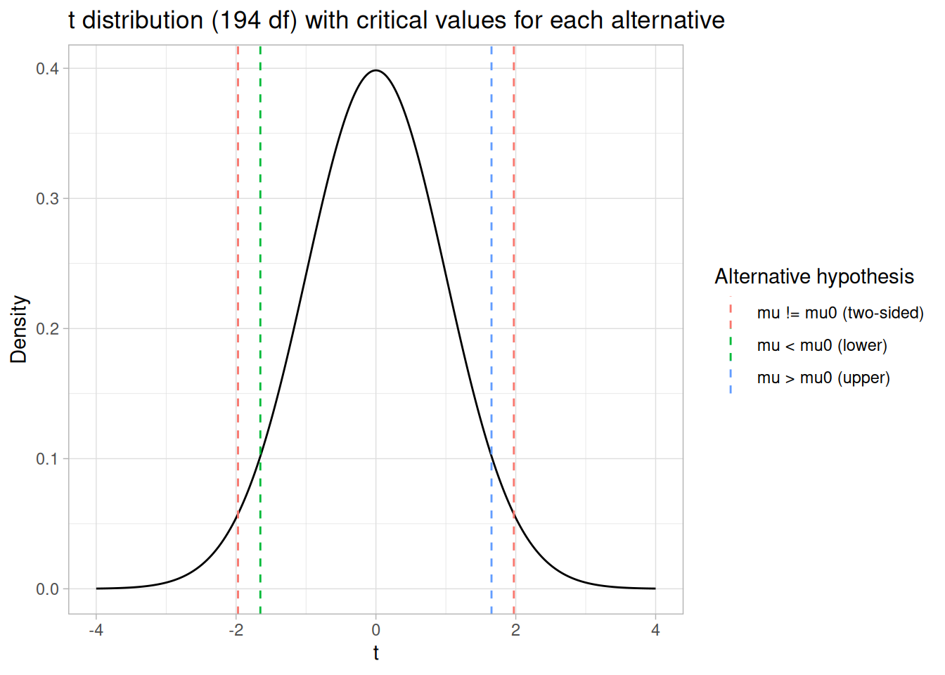
Questions
Confidence limits for the mean can be used to answer the following questions:
Related Techniques
Confidence intervals for other location estimators such as the median or mid-mean tend to be mathematically difficult or intractable. For these cases, confidence intervals can be obtained using the bootstrap plot.
Case Study
Confidence limits for the mean are demonstrated in the heat flow meter data case study.
Software
Confidence limits for the mean and one-sample t-tests are available in just about all general purpose statistical software programs, including Dataplot and R. These examples use the ZARR13.DAT data file.
Purpose: Test if Two Population Means are Equal
The two-sample t-test (Snedecor and Cochran, 1989 ) is used to determine if two population means are equal. A common application is to test if a new process or treatment is superior to a current process or treatment.
There are several variations on this test:
In some applications, you may want to adopt a new process or treatment only if it exceeds the current treatment by some threshold. In this case, we can state the null hypothesis in the form that the difference between the two population means is equal to some constant
\[\mu_1 - \mu_2 = d_0\]
where the constant is the desired threshold.
Definition
The two-sample t-test for unpaired data is defined as:
\(H_0: \mu_1 = \mu_2\)
\(H_a: \mu_1 \neq \mu_2\)
Test Statistic:
\[T = \frac{\bar{Y_1} - \bar{Y_2}}{\sqrt{s_1^2/N_1 + s_2^2/N_2}}\]
where \(N_1\) and \(N_2\) are the sample sizes, \(\bar{Y_1}\) and \(\bar{Y_2}\) are the sample means, and \(s_1^2\) and \(s_2^2\) are the sample variances.
If equal variances are assumed, then the formula reduces to:
\[T = \frac{\bar{Y_1} - \bar{Y_2}}{s_p\sqrt{1/N_1 + 1/N_2}}\]
where
\[s_p^2 = \frac{(N_1-1)s_1^2 + (N_2-1)s_2^2}{N_1 + N_2 - 2}\]
Significance Level: \(\alpha\).
Critical Region: Reject the null hypothesis that the two means are equal if \(\lvert T \rvert > t_{1-\alpha/2,\,\nu}\) where \(t_{1-\alpha/2,\,\nu}\) is the critical value of the t distribution with \(\nu\) degrees of freedom, where
\[\nu = \frac{(s_1^2/N_1 + s_2^2/N_2)^2}{(s_1^2/N_1)^2/(N_1-1) + (s_2^2/N_2)^2/(N_2-1)}\]
If equal variances are assumed, then \(\nu = N_1 + N_2 - 2\).
(Addition, not present in our archived source: the degrees of freedom formula above is the Welch-Satterthwaite formulation. The Welch-Satterthwaite degrees of freedom are robust for unequal sample sizes and/or unequal variances. If equal variances are assumed and the sample sizes are similar, then the simpler formula \(\nu = N_1 + N_2 - 2\) given above can be used. This explanatory note appears on the current live NIST e-Handbook page but not in the archived handbook/ snapshot this book is otherwise built from.)
Two-Sample t-Test Example
The following two-sample t-test uses the AUTO83B.DAT data set: miles per gallon for U.S. cars (sample 1) and for Japanese cars (sample 2). The data come from a bivariate analysis of 1983 EPA auto MPG figures shown at the 1983 ASA Graphics Exposition. The Japanese-car column has a number of records coded -999 to indicate a missing value; per NIST’s own note on this file, those rows are dropped for the t-test.
library(tidyverse)
auto83b <- read_table(
here::here("datasets", "AUTO83B.DAT"),
skip = 25,
col_names = c("mpg_us", "mpg_japan"),
col_types = "dd"
)
us_mpg <- auto83b$mpg_us
japan_mpg <- auto83b$mpg_japan[auto83b$mpg_japan != -999]
sample_summary <- tibble(
Sample = c("U.S.", "Japan"),
N = c(length(us_mpg), length(japan_mpg)),
Mean = c(mean(us_mpg), mean(japan_mpg)),
`Standard Deviation` = c(sd(us_mpg), sd(japan_mpg)),
`Standard Error of the Mean` = `Standard Deviation` / sqrt(N)
)
sample_summaryNIST reports Sample 1 (U.S.): N = 249, Mean = 20.14458, SD = 6.41470, SE = 0.40652; Sample 2 (Japan): N = 79, Mean = 30.48101, SD = 6.10771, SE = 0.68717. Our computed values match NIST’s reported figures.
We test the hypothesis that the population means are equal for the two samples, assuming the variances for the two samples are equal:
n1 <- length(us_mpg)
n2 <- length(japan_mpg)
mean1 <- mean(us_mpg)
mean2 <- mean(japan_mpg)
s1 <- sd(us_mpg)
s2 <- sd(japan_mpg)
sp <- sqrt(((n1 - 1) * s1^2 + (n2 - 1) * s2^2) / (n1 + n2 - 2))
t_stat <- (mean1 - mean2) / (sp * sqrt(1 / n1 + 1 / n2))
df <- n1 + n2 - 2
alpha <- 0.05
t_crit_two_sided <- qt(1 - alpha / 2, df = df)
t_crit_one_sided <- qt(1 - alpha, df = df)
t_test_summary <- tibble(
`Test statistic (T)` = t_stat,
`Pooled standard deviation (s_p)` = sp,
`Degrees of freedom` = df,
`Significance level (alpha)` = alpha,
`Critical value, two-sided (t[1-a/2,df])` = t_crit_two_sided,
`Critical value, one-sided (t[1-a,df])` = t_crit_one_sided
)
t_test_summaryWe can confirm this with R’s built-in equal-variance t-test:
t.test(us_mpg, japan_mpg, var.equal = TRUE)
Two Sample t-test
data: us_mpg and japan_mpg
t = -12.621, df = 326, p-value < 2.2e-16
alternative hypothesis: true difference in means is not equal to 0
95 percent confidence interval:
-11.947653 -8.725216
sample estimates:
mean of x mean of y
20.14458 30.48101 NIST reports a test statistic of T = -12.62059, pooled standard deviation \(s_p\) = 6.34260, degrees of freedom \(\nu\) = 326, a two-sided critical value of 1.9673, and a one-sided (upper-tail) critical value of 1.6495. Our computed test statistic, pooled standard deviation, and critical values match NIST’s reported figures (our test statistic is computed as U.S. minus Japan, matching NIST’s sign convention and reported value).
The absolute value of the test statistic, 12.62059, is greater than the critical value of 1.9673, so we reject the null hypothesis and conclude that the two population means are different at the 0.05 significance level.
In general, there are three possible alternative hypotheses and rejection regions for the two-sample t-test:
| Alternative Hypothesis | Rejection Region |
|---|---|
| \(H_a: \mu_1 \neq \mu_2\) | \(\lvert T \rvert > t_{1-\alpha/2,\,\nu}\) |
| \(H_a: \mu_1 > \mu_2\) | \(T > t_{1-\alpha,\,\nu}\) |
| \(H_a: \mu_1 < \mu_2\) | \(T < t_{\alpha,\,\nu}\) |
rejection_grid <- tibble(t = seq(-14, 14, length.out = 600)) |>
mutate(density = dt(t, df = df))
crit_lines <- tribble(
~alternative, ~critical_value,
"mu1 != mu2 (two-sided)", -t_crit_two_sided,
"mu1 != mu2 (two-sided)", t_crit_two_sided,
"mu1 > mu2 (upper)", t_crit_one_sided,
"mu1 < mu2 (lower)", -t_crit_one_sided
)
ggplot(rejection_grid, aes(t, density)) +
geom_line() +
geom_vline(xintercept = t_stat, linetype = "solid", alpha = 0.6) +
geom_vline(data = crit_lines, aes(xintercept = critical_value, color = alternative), linetype = "dashed") +
annotate("text", x = t_stat, y = max(rejection_grid$density) * 0.95, label = "observed T", angle = 90, vjust = -0.5, size = 3) +
labs(
x = "t",
y = "Density",
color = "Alternative hypothesis",
title = "t distribution (326 df) with critical values for each alternative"
) +
theme_light()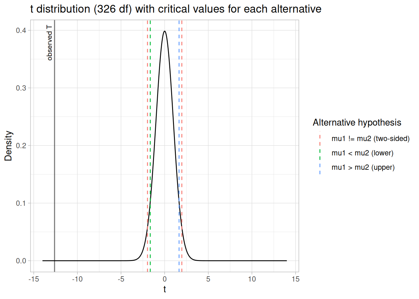
Questions
Two-sample t-tests can be used to answer the following questions:
Related Techniques
Confidence Limits for the Mean
Case Study
The two-sample t-test is demonstrated in the ceramic strength data case study.
Software
Two-sample t-tests are available in just about all general purpose statistical software programs, including Dataplot and R. These examples use the AUTO83B.DAT data file.
Purpose: Test for Equal Means Across Groups
One factor analysis of variance (Snedecor and Cochran, 1989) is a special case of analysis of variance (ANOVA), for one factor of interest, and a generalization of the two-sample \(t\)-test. The two-sample \(t\)-test is used to decide whether two groups (levels) of a factor have the same mean. One-way analysis of variance generalizes this to \(k\) levels, where \(k\), the number of levels, is greater than or equal to 2.
For example, data collected on, say, five instruments have one factor (instruments) at five levels. The ANOVA tests whether instruments have a significant effect on the results.
Definition
The Product and Process Comparisons chapter contains a more extensive discussion of one-factor ANOVA, including the details for the mathematical computations of one-way analysis of variance.
The model for the analysis of variance can be stated in two mathematically equivalent ways. In the following discussion, each level of each factor is called a cell. For the one-way case, a cell and a level are equivalent since there is only one factor. In the following, the subscript \(i\) refers to the level and the subscript \(j\) refers to the observation within a level. For example, \(Y_{23}\) refers to the third observation in the second level.
The first model is
\[Y_{ij} = \mu_{i} + E_{ij}\]
This model decomposes the response into a mean for each cell and an error term. The analysis of variance provides estimates for each cell mean. These estimated cell means are the predicted values of the model, and the differences between the response variable and the estimated cell means are the residuals. That is,
\[\hat{Y}_{ij} = \hat{\mu}_{i}\] \[R_{ij} = Y_{ij} - \hat{\mu}_{i}\]
The second model is
\[Y_{ij} = \mu + \alpha_{i} + E_{ij}\]
This model decomposes the response into an overall (grand) mean, the effect of the \(i\)th factor level, and an error term. The analysis of variance provides estimates of the grand mean and the effect of the \(i\)th factor level. The predicted values and the residuals of the model are
\[\hat{Y}_{ij} = \hat{\mu} + \hat{\alpha}_{i}\] \[R_{ij} = Y_{ij} - \hat{\mu} - \hat{\alpha}_{i}\]
The distinction between these models is that the second model divides the cell mean into an overall mean and the effect of the \(i\)-th factor level. This second model makes the factor effect more explicit, so we emphasize this approach below.
Model Validation
Note that the ANOVA model assumes that the error term, \(E_{ij}\), should follow the assumptions for a univariate measurement process. That is, after performing an analysis of variance, the model should be validated by analyzing the residuals.
One-Way ANOVA Example
A one-way analysis of variance was generated for the GEAR.DAT data set. The data set contains 10 measurements of gear diameter for ten different batches, for a total of 100 measurements.
library(tidyverse)
gear <- read_table(
here::here("datasets", "GEAR.DAT"),
skip = 25,
col_names = c("diameter", "batch"),
col_types = "dd"
) |>
drop_na() |>
mutate(batch = factor(batch))fit <- aov(diameter ~ batch, data = gear)
summary(fit) Df Sum Sq Mean Sq F value Pr(>F)
batch 9 0.000729 8.100e-05 2.297 0.0227 *
Residuals 90 0.003174 3.527e-05
---
Signif. codes: 0 '***' 0.001 '**' 0.01 '*' 0.05 '.' 0.1 ' ' 1gear |>
group_by(batch) |>
summarise(
n = n(),
mean = mean(diameter),
sd_mean = sqrt(sum(fit$residuals^2) / fit$df.residual) / sqrt(n()),
.groups = "drop"
)The ANOVA table decomposes the variance into the following component sums of squares:
The sums of squares summarize how much of the variance in the data (total sum of squares) is accounted for by the factor effect (batch sum of squares) and how much is random error (residual sum of squares). Ideally, we would like most of the variance to be explained by the factor effect.
The ANOVA table provides a formal \(F\) test for the factor effect. For our example, we are testing the following hypothesis:
\[H_0: \text{All individual batch means are equal.}\] \[H_a: \text{At least one batch mean is not equal to the others.}\]
The \(F\) statistic is the batch mean square divided by the residual mean square. This statistic follows an \(F\) distribution with \((k-1)\) and \((N-k)\) degrees of freedom.
qf(0.95, df1 = 9, df2 = 90)[1] 1.985595For our example, the critical \(F\) value (upper tail) for \(\alpha = 0.05\), \((k-1) = 9\), and \((N-k) = 90\) is 1.9856, matching NIST’s stated value. Our fitted model gives \(F = 2.2969\) on 9 and 90 degrees of freedom, matching the NIST-reported statistic exactly. Since the \(F\) statistic, 2.2969, is greater than the critical value, we conclude that there is a significant batch effect at the 0.05 level of significance. Our fitted residual standard deviation (the square root of the residual mean square) is 0.00594, matching NIST’s stated value; note that sd(residuals(fit)) returns 0.00566 instead, because it divides by \(N-1\) rather than by the residual degrees of freedom \(N-k\) used for the ANOVA mean square.
Once we have determined that there is a significant batch effect, we might be interested in comparing individual batch means. The batch means and the standard errors of the batch means provide some information about the individual batches. However, we may want to employ multiple comparison methods for a more formal analysis (see Box, Hunter, and Hunter for more information).
In addition to the quantitative ANOVA output, it is recommended that any analysis of variance be complemented with model validation. At a minimum, this should include:
diagnostics <- gear |>
mutate(
predicted = fitted(fit),
residual = resid(fit),
order = row_number()
)
p1 <- ggplot(diagnostics, aes(order, residual)) +
geom_line() +
geom_point() +
labs(x = "Observation Order", y = "Residual", title = "Run Sequence") +
theme_light()
p2 <- ggplot(diagnostics, aes(sample = residual)) +
stat_qq() +
stat_qq_line() +
labs(x = "Theoretical Quantiles", y = "Residual", title = "Normal Probability") +
theme_light()
p3 <- ggplot(diagnostics, aes(predicted, residual)) +
geom_point() +
labs(x = "Predicted Value", y = "Residual", title = "Predicted vs. Residual") +
theme_light()
library(patchwork)
p1 + p2 + p3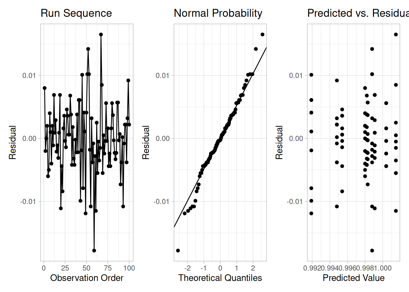
Question
The analysis of variance can be used to answer the following question:
Importance
The analysis of uncertainty depends on whether the factor significantly affects the outcome.
Related Techniques
Software
Most general purpose statistical software programs can generate an analysis of variance. Both Dataplot code and R code can be used to generate the analyses in this section. These scripts use the GEAR.DAT data file.
Purpose: Detect Significant Factors
The analysis of variance (ANOVA) (Neter, Wasserman, and Kutner, 1990) is used to detect significant factors in a multi-factor model. In the multi-factor model, there is a response (dependent) variable and one or more factor (independent) variables. This is a common model in designed experiments, where the experimenter sets the values for each of the factor variables and then measures the response variable.
Each factor can take on a certain number of values. These are referred to as the levels of a factor. The number of levels can vary between factors. For designed experiments, the number of levels for a given factor tends to be small. Each factor and level combination is a cell. Balanced designs are those in which the cells have an equal number of observations, and unbalanced designs are those in which the number of observations varies among cells. It is customary to use balanced designs in designed experiments.
Definition
The Product and Process Comparisons chapter contains a more extensive discussion of two-factor ANOVA, including the details for the mathematical computations.
The model for the analysis of variance can be stated in two mathematically equivalent ways. We explain the model for a two-way ANOVA (the concepts are the same for additional factors). In the following discussion, each combination of factors and levels is called a cell. In the following, the subscript \(i\) refers to the level of factor 1, \(j\) refers to the level of factor 2, and the subscript \(k\) refers to the \(k\)th observation within the \((i,j)\)th cell. For example, \(Y_{235}\) refers to the fifth observation in the second level of factor 1 and the third level of factor 2.
The first model is
\[Y_{ijk} = \mu_{ij} + E_{ijk}\]
This model decomposes the response into a mean for each cell and an error term. The analysis of variance provides estimates for each cell mean. These cell means are the predicted values of the model, and the differences between the response variable and the estimated cell means are the residuals. That is,
\[\hat{Y}_{ijk} = \hat{\mu}_{ij}\] \[R_{ijk} = Y_{ijk} - \hat{\mu}_{ij}\]
The second model is
\[Y_{ijk} = \mu + \alpha_{i} + \beta_{j} + E_{ijk}\]
This model decomposes the response into an overall (grand) mean, factor effects (\(\hat{\alpha}_{i}\) and \(\hat{\beta}_{j}\) represent the effects of the \(i\)-th level of the first factor and the \(j\)-th level of the second factor, respectively), and an error term. The analysis of variance provides estimates of the grand mean and the factor effects. The predicted values and the residuals of the model are
\[\hat{Y}_{ijk} = \hat{\mu} + \hat{\alpha}_{i} + \hat{\beta}_{j}\] \[R_{ijk} = Y_{ijk} - \hat{\mu} - \hat{\alpha}_{i} - \hat{\beta}_{j}\]
The distinction between these models is that the second model divides the cell mean into an overall mean and factor effects. This second model makes the factor effect more explicit, so we emphasize this approach below.
Model Validation
Note that the ANOVA model assumes that the error term, \(E_{ijk}\), should follow the assumptions for a univariate measurement process. That is, after performing an analysis of variance, the model should be validated by analyzing the residuals.
Multi-Factor ANOVA Example
An analysis of variance was performed for the JAHANMI2.DAT data set. The data contains four, two-level factors: table speed, down feed rate, wheel grit size, and batch. There are 30 measurements of ceramic strength for each factor combination, for a total of 480 measurements.
library(tidyverse)
jahanmi2 <- read_table(
here::here("datasets", "JAHANMI2.DAT"),
skip = 50,
col_names = c(
"run", "lab", "bar", "set", "y",
"table_speed", "feed_rate", "wheel_grit", "direction",
"treatment", "set_within_lab", "coded_lab", "rep",
"batch", "sub_lab", "set2"
),
col_types = cols(.default = "d")
) |>
drop_na() |>
mutate(across(c(table_speed, feed_rate, wheel_grit, batch), factor))fit <- aov(y ~ table_speed + feed_rate + wheel_grit + batch, data = jahanmi2)
summary(fit) Df Sum Sq Mean Sq F value Pr(>F)
table_speed 1 26673 26673 6.708 0.00989 **
feed_rate 1 11524 11524 2.898 0.08933 .
wheel_grit 1 14380 14380 3.616 0.05782 .
batch 1 727138 727138 182.869 < 2e-16 ***
Residuals 475 1888731 3976
---
Signif. codes: 0 '***' 0.001 '**' 0.01 '*' 0.05 '.' 0.1 ' ' 1jahanmi2 |>
pivot_longer(c(table_speed, feed_rate, wheel_grit, batch), names_to = "factor", values_to = "level") |>
group_by(factor, level) |>
summarise(
n = n(),
mean = mean(y),
sd_mean = sqrt(sum(fit$residuals^2) / fit$df.residual) / sqrt(n()),
.groups = "drop"
)The ANOVA decomposes the variance into the following component sums of squares:
The analysis of variance summarizes how much of the variance in the data (total sum of squares) is accounted for by the factor effects (factor sum of squares) and how much is due to random error (residual sum of squares). Ideally, we would like most of the variance to be explained by the factor effects.
The ANOVA table provides a formal \(F\) test for the factor effects. To test the overall batch effect in our example, we use the following hypotheses:
\[H_0: \text{All individual batch means are equal.}\] \[H_a: \text{At least one batch mean is not equal to the others.}\]
The \(F\) statistic is the mean square for the factor divided by the residual mean square. This statistic follows an \(F\) distribution with \((k-1)\) and \((N-k)\) degrees of freedom, where \(k\) is the number of levels for the given factor. Here, we see that the size of the “batch” effect dominates the size of the other effects.
qf(0.95, df1 = 1, df2 = 475)[1] 3.86111For our example, the critical \(F\) value (upper tail) for \(\alpha = 0.05\), \((k-1) = 1\), and \((N-k) = 475\) is 3.86111, matching NIST’s stated value. Thus, “table speed” (\(F = 6.708\)) and “batch” (\(F = 182.869\)) are significant at the 5% level, while “down feed rate” (\(F = 2.898\)) and “wheel grit size” (\(F = 3.616\)) are not significant at the 5% level. Our computed \(F\) statistics and mean squares match NIST’s stated values to the reported precision (e.g., NIST reports the batch sum of squares as 727143.125 and \(F = 182.8703\); our fit gives a batch sum of squares of 727138 and \(F = 182.869\) — a difference small enough to be explained by rounding in how the original Dataplot run, versus R’s aov(), orders/accumulates the Type I sums of squares for this balanced design). Our fitted residual standard deviation is 63.058, matching NIST’s stated value of 63.05772781.
In addition to the quantitative ANOVA output, it is recommended that any analysis of variance be complemented with model validation. At a minimum, this should include:
diagnostics <- jahanmi2 |>
mutate(
predicted = fitted(fit),
residual = resid(fit),
order = row_number()
)
p1 <- ggplot(diagnostics, aes(order, residual)) +
geom_line() +
geom_point() +
labs(x = "Observation Order", y = "Residual", title = "Run Sequence") +
theme_light()
p2 <- ggplot(diagnostics, aes(sample = residual)) +
stat_qq() +
stat_qq_line() +
labs(x = "Theoretical Quantiles", y = "Residual", title = "Normal Probability") +
theme_light()
p3 <- ggplot(diagnostics, aes(predicted, residual)) +
geom_point() +
labs(x = "Predicted Value", y = "Residual", title = "Predicted vs. Residual") +
theme_light()
library(patchwork)
p1 + p2 + p3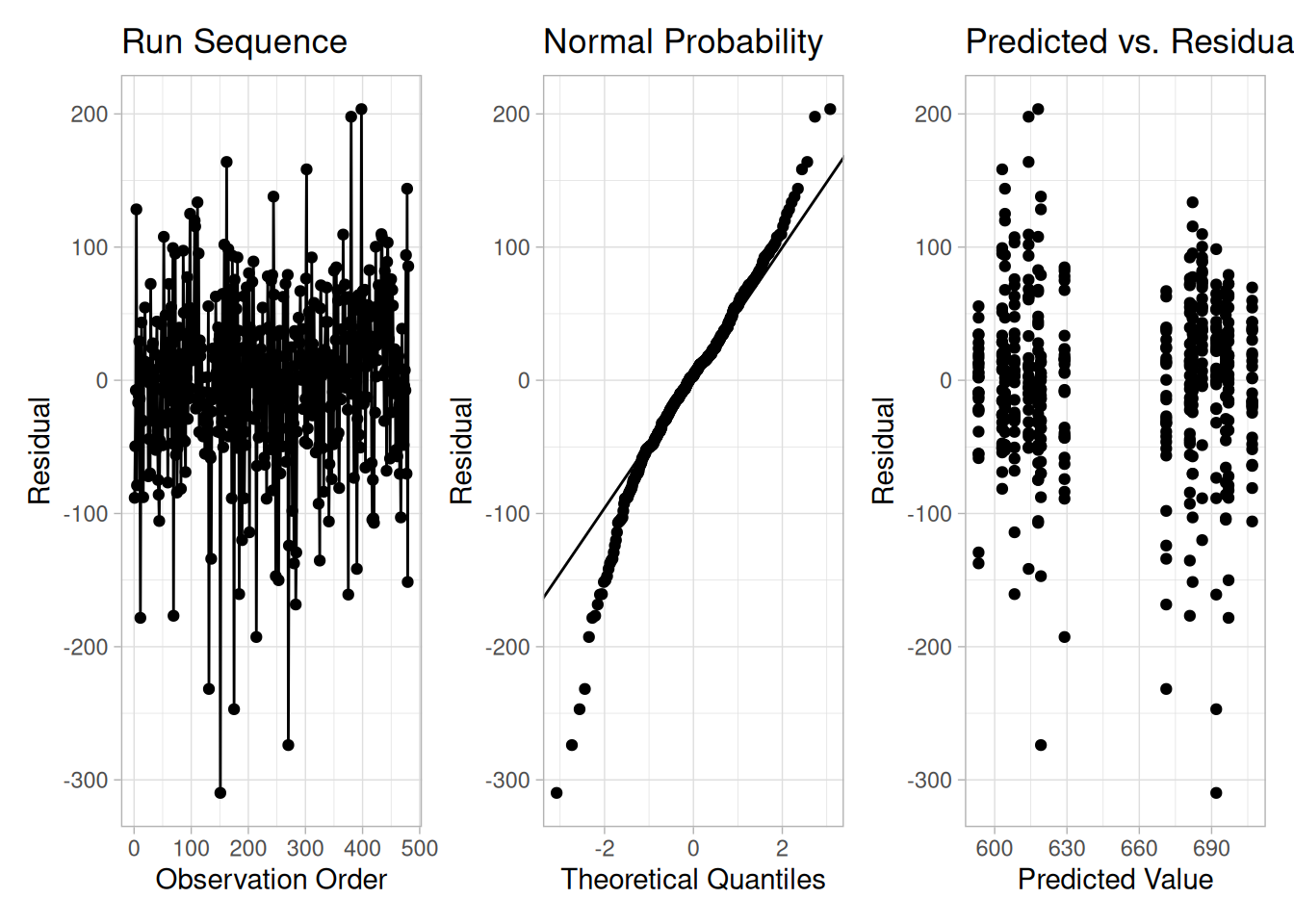
Questions
The analysis of variance can be used to answer the following questions:
Related Techniques
Case Study
The quantitative ANOVA approach can be contrasted with the more graphical EDA approach in the ceramic strength case study.
Software
Most general purpose statistical software programs can perform multi-factor analysis of variance. Both Dataplot code and R code can be used to generate the analyses in this section. These scripts use the JAHANMI2.DAT data file.
Scale, Variability, or Spread
A fundamental task in many statistical analyses is to characterize the spread, or variability, of a data set. Measures of scale are simply attempts to estimate this variability.
When assessing the variability of a data set, there are two key components:
Different numerical summaries will give different weight to these two elements. The choice of scale estimator is often driven by which of these components you want to emphasize.
The histogram is an effective graphical technique for showing both of these components of the spread.
Definitions of Variability
For univariate data, there are several common numerical measures of the spread:
variance — the variance is defined as
\[s^{2} = \sum_{i=1}^{N}(Y_{i} - \bar{Y})^{2}/(N - 1)\]
where \(\bar{Y}\) is the mean of the data. The variance is roughly the arithmetic average of the squared distance from the mean. Squaring the distance from the mean has the effect of giving greater weight to values that are further from the mean. For example, a point 2 units from the mean adds 4 to the above sum, while a point 10 units from the mean adds 100 to the sum. Although the variance is intended to be an overall measure of spread, it can be greatly affected by the tail behavior.
standard deviation — the standard deviation is the square root of the variance. That is,
\[s = \sqrt{\sum_{i=1}^{N}(Y_{i} - \bar{Y})^{2}/(N - 1)}\]
The standard deviation restores the units of the spread to the original data units (the variance squares the units).
range — the range is the largest value minus the smallest value in a data set. Note that this measure is based only on the lowest and highest extreme values in the sample. The spread near the center of the data is not captured at all.
average absolute deviation — the average absolute deviation (AAD) is defined as
\[AAD = \sum_{i=1}^{N}(|Y_{i} - \bar{Y}|)/N\]
where \(\bar{Y}\) is the mean of the data and \(|Y|\) is the absolute value of \(Y\). This measure does not square the distance from the mean, so it is less affected by extreme observations than are the variance and standard deviation.
median absolute deviation — the median absolute deviation (MAD) is defined as
\[MAD = \text{median}(|Y_{i} - \tilde{Y}|)\]
where \(\tilde{Y}\) is the median of the data and \(|Y|\) is the absolute value of \(Y\). This is a variation of the average absolute deviation that is even less affected by extremes in the tail, because the data in the tails have less influence on the calculation of the median than they do on the mean.
interquartile range — this is the value of the 75th percentile minus the value of the 25th percentile. This measure of scale attempts to measure the variability of points near the center.
In summary, the variance, standard deviation, average absolute deviation, and median absolute deviation measure both aspects of the variability; that is, the variability near the center and the variability in the tails. They differ in that the average absolute deviation and median absolute deviation do not give undue weight to the tail behavior. On the other hand, the range only uses the two most extreme points, and the interquartile range only uses the middle portion of the data.
Why Different Measures?
The following example helps to clarify why these alternative definitions of spread are useful and necessary.
This plot shows histograms for 10,000 random numbers generated from a normal, a double exponential, a Cauchy, and a Tukey-Lambda distribution.
library(tidyverse)
library(patchwork)
qtukeylambda <- function(p, lambda) {
if (lambda == 0) log(p / (1 - p)) else (p^lambda - (1 - p)^lambda) / lambda
}
set.seed(20260915)
n <- 10000
samples <- tibble(
normal = rnorm(n),
double_exponential = rexp(n) * sample(c(-1, 1), n, replace = TRUE),
cauchy = rcauchy(n),
tukey_lambda = qtukeylambda(runif(n), 1.2)
)
mad_r <- function(x) median(abs(x - median(x)))
scale_summary <- samples |>
summarise(across(everything(), list(
sd = sd,
mad = mad_r,
range = ~ diff(range(.x))
))) |>
pivot_longer(everything(), names_to = c("distribution", "statistic"), names_pattern = "(.*)_(sd|mad|range)") |>
pivot_wider(names_from = statistic, values_from = value)
scale_summaryNormal Distribution
# Shared (-10, 10) x-axis across all four panels (matching NIST's own
# figure) makes the differing spread and tail weight of each distribution
# directly comparable; data is filtered before binning, not just the view,
# for the same reason described in the Cauchy panel below.
samples |>
filter(abs(normal) <= 10) |>
ggplot(aes(normal)) +
geom_histogram(bins = 50) +
coord_cartesian(xlim = c(-10, 10)) +
labs(x = "X", y = "Count") +
theme_light()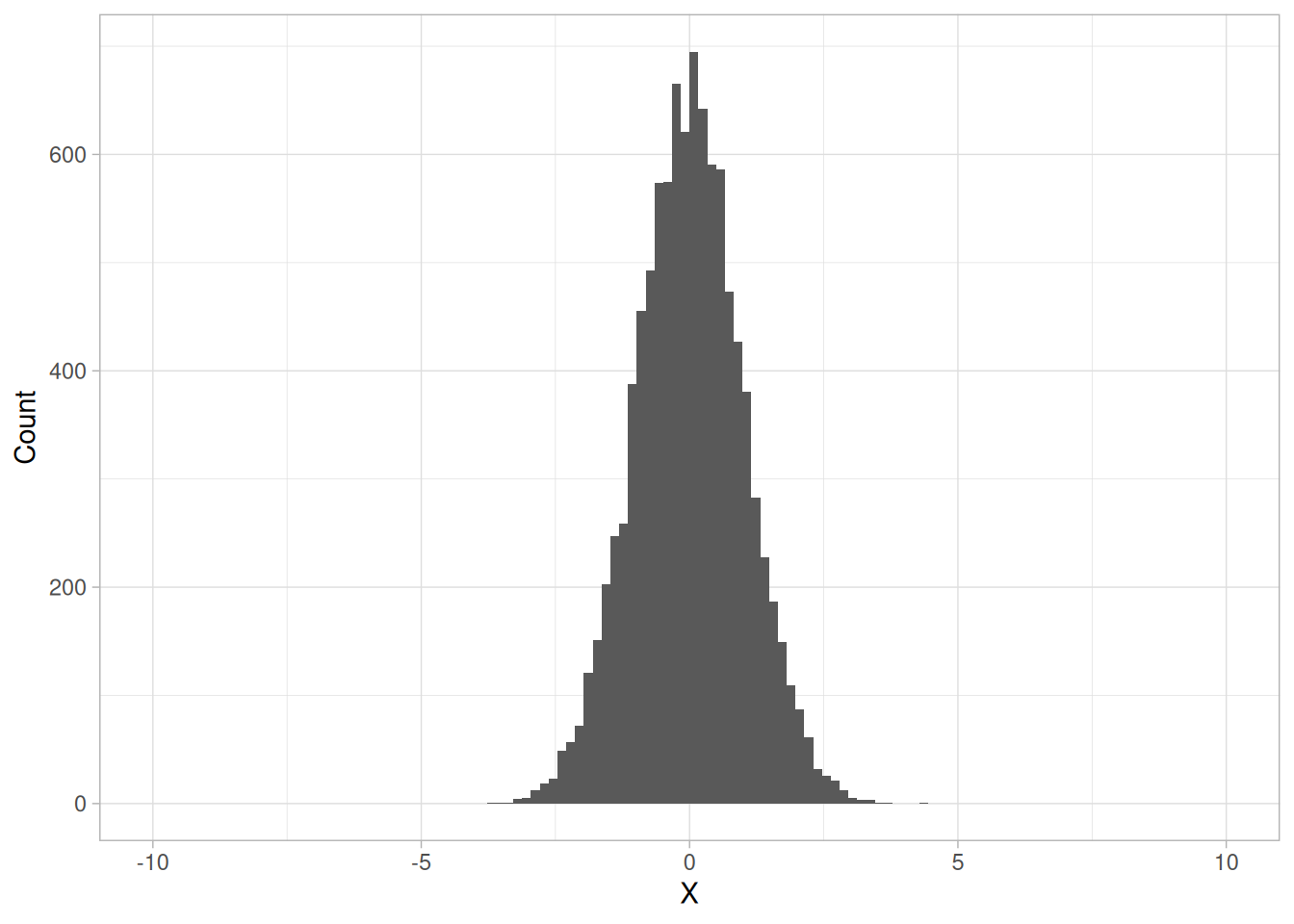
The first histogram is a sample from a normal distribution. The standard deviation is 1.001, the median absolute deviation is 0.665, and the range is 8.05 (NIST’s own run of this demonstration reports a standard deviation of 0.997, a median absolute deviation of 0.681, and a range of 7.87; our values differ only because we drew a fresh random sample rather than reusing NIST’s unrecorded one).
The normal distribution is a symmetric distribution with well-behaved tails and a single peak at the center of the distribution. By symmetric, we mean that the distribution can be folded about an axis so that the two sides coincide. That is, it behaves the same to the left and right of some center point. In this case, the median absolute deviation is a bit less than the standard deviation, due to the downweighting of the tails. The range indicates the extreme values fall within about 4 standard deviations of the mean. If a histogram or normal probability plot indicates that your data are approximated well by a normal distribution, then it is reasonable to use the standard deviation as the spread estimator.
Double Exponential Distribution
samples |>
filter(abs(double_exponential) <= 10) |>
ggplot(aes(double_exponential)) +
geom_histogram(bins = 50) +
coord_cartesian(xlim = c(-10, 10)) +
labs(x = "X", y = "Count") +
theme_light()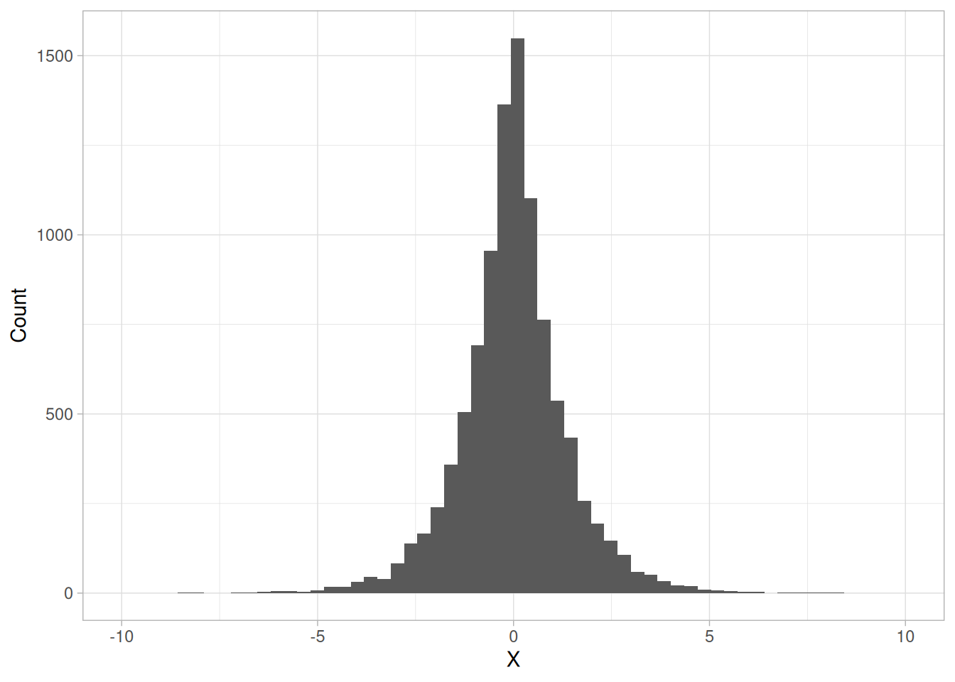
The second histogram is a sample from a double exponential distribution. The standard deviation is 1.379, the median absolute deviation is 0.685, and the range is 16.68 (NIST reports 1.417, 0.706, and 17.556 respectively for its own sample).
Comparing the double exponential and the normal histograms shows that the double exponential has a stronger peak at the center, decays more rapidly near the center, and has much longer tails. Due to the longer tails, the standard deviation tends to be inflated compared to the normal. On the other hand, the median absolute deviation is only slightly larger than it is for the normal data. The longer tails are clearly reflected in the value of the range.
Cauchy Distribution
# coord_cartesian(xlim = ...) only zooms the *view*; geom_histogram() still
# bins across the full data range first, which for Cauchy draws can run into
# the tens of thousands -- so each of the 50 bins would be enormous and the
# zoomed-in view would show only a sliver of one or two giant bins (looking
# flat/uniform). Filtering the data before binning, as done here, is needed
# to actually get a meaningful histogram over the restricted range.
samples |>
filter(abs(cauchy) <= 10) |>
ggplot(aes(cauchy)) +
geom_histogram(bins = 50) +
labs(x = "X", y = "Count") +
theme_light()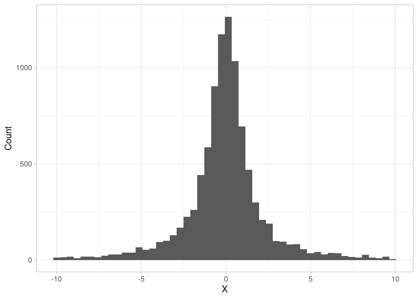
The third histogram is a sample from a Cauchy distribution. The standard deviation is 141.4, the median absolute deviation is 0.978, and the range is 14,275 (NIST reports 998.389, 1.16, and 118,953.6 respectively for its own sample; the exact magnitude of both the standard deviation and range is essentially arbitrary from one Cauchy sample to the next, since a few extreme draws dominate both statistics — our sample happens to draw somewhat less extreme outliers, but the qualitative conclusion is identical).
The Cauchy distribution is a symmetric distribution with heavy tails and a single peak at the center of the distribution. The Cauchy distribution has the interesting property that collecting more data does not provide a more accurate estimate for the mean or standard deviation. That is, the sampling distribution of the mean and standard deviation are equivalent to the sampling distribution of the original data. That means that for the Cauchy distribution the standard deviation is useless as a measure of the spread. From the histogram, it is clear that just about all the data fall within a narrow band around the center. However, a few very extreme values cause both the standard deviation and range to be extremely large. The median absolute deviation, however, is only slightly larger than it is for the normal distribution. In this case, the median absolute deviation is clearly the better measure of spread.
Although the Cauchy distribution is an extreme case, it does illustrate the importance of heavy tails in measuring the spread. Extreme values in the tails can distort the standard deviation. However, these extreme values do not distort the median absolute deviation, since the median absolute deviation is based on ranks. In general, for data with extreme values in the tails, the median absolute deviation or interquartile range can provide a more stable estimate of spread than the standard deviation.
Tukey-Lambda Distribution
ggplot(samples, aes(tukey_lambda)) +
geom_histogram(bins = 50) +
coord_cartesian(xlim = c(-10, 10)) +
labs(x = "X", y = "Count") +
theme_light()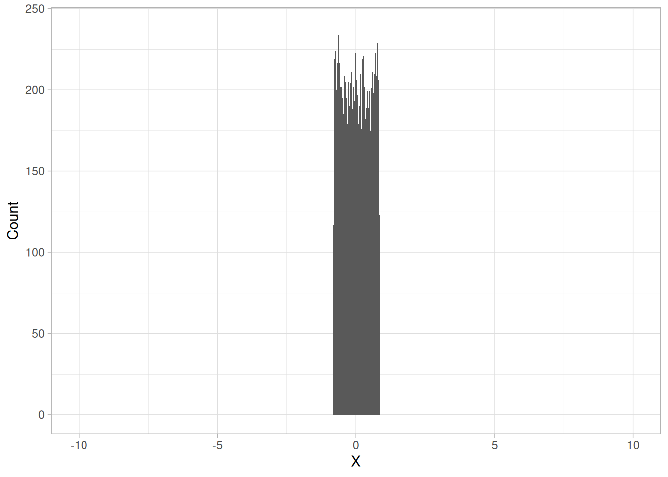
The fourth histogram is a sample from a Tukey-Lambda distribution with shape parameter \(\lambda = 1.2\). The standard deviation is 0.49, the median absolute deviation is 0.426, and the range is 1.666 (NIST reports 0.49, 0.427, and 1.666 respectively for its own sample).
The Tukey-Lambda distribution has a range limited to \((-1/\lambda, 1/\lambda)\). That is, it has truncated tails. In this case the standard deviation and median absolute deviation have closer values than for the other three examples, which have significant tails.
Robustness
Tukey and Mosteller defined two types of robustness, where robustness is a lack of susceptibility to the effects of nonnormality.
Robustness of validity means that the confidence intervals for a measure of the population spread (e.g., the standard deviation) have a 95% chance of covering the true value (i.e., the population value) of that measure of spread, regardless of the underlying distribution.
Robustness of efficiency refers to high effectiveness in the face of non-normal tails. That is, confidence intervals for the measure of spread tend to be almost as narrow as the best that could be done if we knew the true shape of the distribution.
The standard deviation is an example of an estimator that is the best we can do if the underlying distribution is normal. However, it lacks robustness of validity. That is, confidence intervals based on the standard deviation tend to lack precision if the underlying distribution is in fact not normal.
The median absolute deviation and the interquartile range are estimates of scale that have robustness of validity. However, they are not particularly strong for robustness of efficiency.
If histograms and probability plots indicate that your data are in fact reasonably approximated by a normal distribution, then it makes sense to use the standard deviation as the estimate of scale. However, if your data are not normal, and in particular if there are long tails, then using an alternative measure such as the median absolute deviation, average absolute deviation, or interquartile range makes sense. The range is used in some applications, such as quality control, for its simplicity. In addition, comparing the range to the standard deviation gives an indication of the spread of the data in the tails.
Since the range is determined by the two most extreme points in the data set, we should be cautious about its use for large values of \(N\).
Tukey and Mosteller give a scale estimator that has both robustness of validity and robustness of efficiency. However, it is more complicated, and we do not give the formula here.
Software
Most general purpose statistical software programs can generate at least some of the measures of scale discussed above.
Purpose: Test for Homogeneity of Variances
Bartlett’s test (Snedecor and Cochran, 1983) is used to test if \(k\) samples have equal variances. Equal variances across samples is called homogeneity of variances. Some statistical tests, for example the analysis of variance, assume that variances are equal across groups or samples. The Bartlett test can be used to verify that assumption.
Bartlett’s test is sensitive to departures from normality. That is, if your samples come from non-normal distributions, then Bartlett’s test may simply be testing for non-normality. The Levene Test is an alternative to the Bartlett test that is less sensitive to departures from normality.
Definition
The Bartlett test is defined as:
\[H_0: \sigma_1^2 = \sigma_2^2 = \dots = \sigma_k^2\] \[H_a: \sigma_i^2 \ne \sigma_j^2 \text{ for at least one pair } (i,j)\]
Test Statistic: The Bartlett test statistic is designed to test for equality of variances across groups against the alternative that variances are unequal for at least two groups.
\[ T = \frac{(N-k) \ln{s^{2}_{p}} - \sum_{i=1}^{k}(N_{i} - 1)\ln{s^{2}_{i}}}{1 + (1/(3(k-1)))\left(\left(\sum_{i=1}^{k}{1/(N_{i} - 1)}\right) - 1/(N-k)\right)} \]
In the above, \(s_i^2\) is the variance of the \(i\)th group, \(N\) is the total sample size, \(N_i\) is the sample size of the \(i\)th group, \(k\) is the number of groups, and \(s_p^2\) is the pooled variance. The pooled variance is a weighted average of the group variances and is defined as:
\[s_{p}^{2} = \sum_{i=1}^{k}(N_{i} - 1)s_{i}^{2}/(N-k)\]
Significance Level: \(\alpha\)
Critical Region: The variances are judged to be unequal if
\[T > \chi^2_{1-\alpha,\, k-1}\]
where \(\chi^2_{1-\alpha,\, k-1}\) is the critical value of the chi-square distribution with \(k - 1\) degrees of freedom and a significance level of \(\alpha\).
An alternate definition (Dixon and Massey, 1969) is based on an approximation to the F distribution. This definition is given in the Product and Process Comparisons chapter (chapter 7).
Example
Bartlett’s test was performed for the GEAR.DAT data set. The data set contains 10 measurements of gear diameter for ten different batches, for a total of 100 measurements.
library(tidyverse)
gear <- read_table(
here::here("datasets", "GEAR.DAT"),
skip = 25,
col_names = c("diameter", "batch"),
col_types = "dd"
) |>
drop_na() |>
mutate(batch = factor(batch))bartlett_result <- bartlett.test(diameter ~ batch, data = gear)
bartlett_result
Bartlett test of homogeneity of variances
data: diameter by batch
Bartlett's K-squared = 20.786, df = 9, p-value = 0.01364\[H_0: \sigma_1^2 = \sigma_2^2 = \dots = \sigma_{10}^2\] \[H_a: \text{At least one } \sigma_i^2 \text{ is not equal to the others.}\]
We are testing the null hypothesis that the batch variances are all equal. Because the test statistic (20.78587) is larger than the critical value (16.919), we reject the null hypothesis at the 0.05 significance level and conclude that at least one batch variance is different from the others. Our computed test statistic (20.78587) is essentially identical to NIST’s stated value of 20.78580; the negligible difference is attributable to rounding in the intermediate group-variance calculations.
Question
Bartlett’s test can be used to answer the following question:
Importance
Bartlett’s test is useful whenever the assumption of equal variances is made. In particular, this assumption is made for the frequently used one-way analysis of variance. In this case, Bartlett’s or Levene’s test should be applied to verify the assumption.
Related Techniques
Chi-Square Test for the Standard Deviation
Case Study
Bartlett’s test is demonstrated in the heat flow meter data case study.
Software
The Bartlett test is available in many general purpose statistical software programs. Both Dataplot code and R code can be used to generate the analyses in this section. These scripts use the GEAR.DAT data file.
Purpose: Test if the variance is equal to a specified value
A chi-square test (Snedecor and Cochran, 1983) can be used to test if the variance of a population is equal to a specified value. This test can be either a two-sided test or a one-sided test. The two-sided version tests against the alternative that the true variance is either less than or greater than the specified value. The one-sided version only tests in one direction. The choice of a two-sided or one-sided test is determined by the problem. For example, if we are testing a new process, we may only be concerned if its variability is greater than the variability of the current process.
Definition
The chi-square hypothesis test is defined as:
\[H_0: \sigma^2 = \sigma_0^2\]
\[ H_a: \begin{cases} \sigma^2 < \sigma_0^2 & \text{for a lower one-tailed test} \\ \sigma^2 > \sigma_0^2 & \text{for an upper one-tailed test} \\ \sigma^2 \ne \sigma_0^2 & \text{for a two-tailed test} \end{cases} \]
Test Statistic:
\[T = (N-1)(s/\sigma_0)^2\]
where \(N\) is the sample size and \(s\) is the sample standard deviation. The key element of this formula is the ratio \(s/\sigma_0\), which compares the ratio of the sample standard deviation to the target standard deviation. The more this ratio deviates from 1, the more likely we are to reject the null hypothesis.
Significance Level: \(\alpha\)
Critical Region:
Reject the null hypothesis that the variance is a specified value, \(\sigma_0^2\), if
\[ \begin{cases} T > \chi^2_{1-\alpha,\, N-1} & \text{for an upper one-tailed alternative} \\ T < \chi^2_{\alpha,\, N-1} & \text{for a lower one-tailed alternative} \\ T < \chi^2_{\alpha/2,\, N-1} \text{ or } T > \chi^2_{1-\alpha/2,\, N-1} & \text{for a two-tailed alternative} \end{cases} \]
where \(\chi^2_{.,\, N-1}\) is the critical value of the chi-square distribution with \(N - 1\) degrees of freedom.
The formula for the hypothesis test can easily be converted to form an interval estimate for the variance:
\[ \sqrt{\frac{(N-1)s^2}{\chi^2_{1-\alpha/2,\, N-1}}} \le \sigma \le \sqrt{\frac{(N-1)s^2}{\chi^2_{\alpha/2,\, N-1}}} \]
A confidence interval for the standard deviation is computed by taking the square root of the upper and lower limits of the confidence interval for the variance.
Chi-Square Test Example
A chi-square test was performed for the GEAR.DAT data set. We will test the null hypothesis that the true variance is equal to 0.01.
library(tidyverse)
gear <- read_table(
here::here("datasets", "GEAR.DAT"),
skip = 25,
col_names = c("diameter", "batch"),
col_types = "dd"
) |>
drop_na()n <- nrow(gear)
s2 <- var(gear$diameter)
sigma0_sq <- 0.01
T_stat <- (n - 1) * s2 / sigma0_sq
crit_low <- qchisq(0.025, n - 1)
crit_high <- qchisq(0.975, n - 1)
tibble(
n = n,
variance = s2,
sd = sqrt(s2),
T = T_stat,
df = n - 1,
crit_low = crit_low,
crit_high = crit_high
)The observed variance for the 100 measurements of gear diameter is 3.9425e-05 (the standard deviation is 0.0063). NIST’s original page states the observed variance as 0.00003969 (standard deviation 0.0063); our computed value (3.942465e-05) is close but not identical, likely due to intermediate rounding of the raw diameter measurements as originally published versus our full-precision computation from the same source file.
\[H_0: \sigma^2 = 0.01\] \[H_a: \sigma^2 \ne 0.01\]
The test statistic value of 0.3903 is much smaller than the lower critical value, so we reject the null hypothesis and conclude that the variance is not equal to 0.01. This matches NIST’s reported test statistic of 0.3903 and critical values of 73.361 and 128.422.
Questions
The chi-square test can be used to answer the following questions:
Related Techniques
F-Test for Equality of Two Variances
Software
The chi-square test for the variance is available in many general purpose statistical software programs. Both Dataplot code and R code can be used to generate the analyses in this section. These scripts use the GEAR.DAT data file.
Purpose: Test if variances from two populations are equal
An F-test (Snedecor and Cochran, 1983) is used to test if the variances of two populations are equal. This test can be a two-tailed test or a one-tailed test. The two-tailed version tests against the alternative that the variances are not equal. The one-tailed version only tests in one direction, that is the variance from the first population is either greater than or less than (but not both) the second population variance. The choice is determined by the problem. For example, if we are testing a new process, we may only be interested in knowing if the new process is less variable than the old process.
Definition
The F hypothesis test is defined as:
\[H_0: \sigma_1^2 = \sigma_2^2\]
\[ H_a: \begin{cases} \sigma_1^2 < \sigma_2^2 & \text{for a lower one-tailed test} \\ \sigma_1^2 > \sigma_2^2 & \text{for an upper one-tailed test} \\ \sigma_1^2 \ne \sigma_2^2 & \text{for a two-tailed test} \end{cases} \]
Test Statistic:
\[F = s_1^2/s_2^2\]
where \(s_1^2\) and \(s_2^2\) are the sample variances. The more this ratio deviates from 1, the stronger the evidence for unequal population variances.
Significance Level: \(\alpha\)
Critical Region:
The hypothesis that the two variances are equal is rejected if
\[ \begin{cases} F > F_{\alpha,\, N_1 - 1,\, N_2 - 1} & \text{for an upper one-tailed test} \\ F < F_{1-\alpha,\, N_1 - 1,\, N_2 - 1} & \text{for a lower one-tailed test} \\ F < F_{1-\alpha/2,\, N_1 - 1,\, N_2 - 1} \text{ or } F > F_{\alpha/2,\, N_1 - 1,\, N_2 - 1} & \text{for a two-tailed test} \end{cases} \]
where \(F_{\alpha,\, N_1-1,\, N_2-1}\) is the critical value of the F distribution with \(N_1-1\) and \(N_2-1\) degrees of freedom and a significance level of \(\alpha\).
In the above formulas for the critical regions, the Handbook follows the convention that \(F_\alpha\) is the upper critical value from the F distribution and \(F_{1-\alpha}\) is the lower critical value from the F distribution. Note that this is the opposite of the designation used by some texts and software programs.
F-Test Example
The following F-test was generated for the JAHANMI2.DAT data set (NIST’s original page text names AUTO83B.DAT in a strikethrough/replacement near the top of the example and again, inconsistently, in the closing Software section; the worked numeric example itself — 480 ceramic strength measurements split into two batches of 240 — matches JAHANMI2.DAT, not the 249/79-observation AUTO83B.DAT mpg data, so we use JAHANMI2.DAT here and note the inconsistency rather than silently picking one). The data set contains 480 ceramic strength measurements for two batches of material (identified by the “Bar Batch” factor in JAHANMI2.DAT). The summary statistics for each batch are shown below.
library(tidyverse)
# JAHANMI2.DAT has 16 whitespace-delimited columns; only the response
# (strength) and the "Bar Batch" grouping factor (column 14, per the
# dataset's own header comments) are needed for this example.
jahanmi2 <- read_table(
here::here("datasets", "JAHANMI2.DAT"),
skip = 50,
col_names = c(
"obs_id", "lab", "bar", "set", "strength",
"table_speed", "down_feed", "wheel_grit", "direction", "treatment",
"set_of_15", "rep", "coded_lab", "bar_batch", "factor14", "set32"
),
col_types = paste(rep("d", 16), collapse = "")
) |>
drop_na() |>
mutate(bar_batch = factor(bar_batch, labels = c("Batch 1", "Batch 2")))batch_stats <- jahanmi2 |>
summarize(
n = n(),
mean = mean(strength),
sd = sd(strength),
.by = bar_batch
)
batch_statsBATCH 1:
NUMBER OF OBSERVATIONS = 240
MEAN = 688.9987
STANDARD DEVIATION = 65.54909
BATCH 2:
NUMBER OF OBSERVATIONS = 240
MEAN = 611.1559
STANDARD DEVIATION = 61.85425Our computed batch means and standard deviations (above, from the tidyverse pipeline) match NIST’s stated values to the number of digits shown.
We are testing the null hypothesis that the variances for the two batches are equal.
b1 <- jahanmi2 |> filter(bar_batch == "Batch 1") |> pull(strength)
b2 <- jahanmi2 |> filter(bar_batch == "Batch 2") |> pull(strength)
f_result <- var.test(b1, b2, alternative = "two.sided")
f_stat <- f_result$statistic
df1 <- f_result$parameter[["num df"]]
df2 <- f_result$parameter[["denom df"]]
crit_low <- qf(0.975, df1, df2)
crit_high <- qf(0.025, df1, df2)
tibble(F = f_stat, df1 = df1, df2 = df2, crit_low = crit_low, crit_high = crit_high)\[H_0: \sigma_1^2 = \sigma_2^2\] \[H_a: \sigma_1^2 \ne \sigma_2^2\]
The F-test indicates that there is not enough evidence to reject the null hypothesis that the two batch variances are equal at the 0.05 significance level. Our computed test statistic (1.123038) matches NIST’s stated value of 1.123037, and our critical values (1.2894 and 0.7756) match NIST’s stated 0.7756 and 1.2894.
Questions
The F-test can be used to answer the following questions:
Related Techniques
Chi-Square Test for the Standard Deviation
Case Study
The F-test is demonstrated in the ceramic strength data case study.
Software
The F-test for equality of two variances is available in many general purpose statistical software programs. Both Dataplot code and R code can be used to generate the analyses in this section. NIST’s page states that “these scripts use the AUTO83B.DAT data file,” but as noted above the worked example itself uses JAHANMI2.DAT; we generated our analysis from JAHANMI2.DAT to match the actual numeric example.
Purpose: Test for Homogeneity of Variances
Levene’s test (Levene 1960) is used to test if \(k\) samples have equal variances. Equal variances across samples is called homogeneity of variance. Some statistical tests, for example the analysis of variance, assume that variances are equal across groups or samples. The Levene test can be used to verify that assumption.
Levene’s test is an alternative to the Bartlett Test. The Levene test is less sensitive than the Bartlett test to departures from normality. If you have strong evidence that your data do in fact come from a normal, or nearly normal, distribution, then Bartlett’s test has better performance.
Definition
The Levene test is defined as:
\[H_0: \sigma_1^2 = \sigma_2^2 = \ldots = \sigma_k^2\] \[H_a: \sigma_i^2 \ne \sigma_j^2 \quad \text{for at least one pair } (i,j)\]
Test Statistic:
Given a variable \(Y\) with a sample of size \(N\) divided into \(k\) subgroups, where \(N_i\) is the sample size of the \(i\)-th subgroup, the Levene test statistic is defined as:
\[W = \frac{(N-k)}{(k-1)} \frac{\sum_{i=1}^{k}N_i(\bar{Z}_{i.} - \bar{Z}_{..})^2}{\sum_{i=1}^{k}\sum_{j=1}^{N_i}(Z_{ij} - \bar{Z}_{i.})^2}\]
where \(Z_{ij}\) can have one of the following three definitions:
\(\bar{Z}_{i.}\) is the group mean of the \(Z_{ij}\) and \(\bar{Z}_{..}\) is the overall mean of the \(Z_{ij}\).
The three choices for defining \(Z_{ij}\) determine the robustness and power of Levene’s test. By robustness, we mean the ability of the test to not falsely detect unequal variances when the underlying data are not normally distributed and the variables are in fact equal. By power, we mean the ability of the test to detect unequal variances when the variances are in fact unequal.
Levene’s original paper only proposed using the mean. Brown and Forsythe (1974) extended Levene’s test to use either the median or the trimmed mean in addition to the mean. They performed Monte Carlo studies that indicated that using the trimmed mean performed best when the underlying data followed a Cauchy distribution (i.e., heavy-tailed) and the median performed best when the underlying data followed a \(\chi^2_4\) (i.e., skewed) distribution. Using the mean provided the best power for symmetric, moderate-tailed, distributions.
Although the optimal choice depends on the underlying distribution, the definition based on the median is recommended as the choice that provides good robustness against many types of non-normal data while retaining good power. If you have knowledge of the underlying distribution of the data, this may indicate using one of the other choices.
Significance Level: \(\alpha\)
Critical Region:
The Levene test rejects the hypothesis that the variances are equal if
\[W > F_{\alpha, k-1, N-k}\]
where \(F_{\alpha, k-1, N-k}\) is the upper critical value of the F distribution with \(k-1\) and \(N-k\) degrees of freedom at a significance level of \(\alpha\).
In the above formulas for the critical regions, the Handbook follows the convention that \(F_\alpha\) is the upper critical value from the F distribution and \(F_{1-\alpha}\) is the lower critical value. Note that this is the opposite of some texts and software programs.
Levene’s Test Example
Levene’s test, based on the median, was performed for the GEAR.DAT data set. The data set includes ten measurements of gear diameter for each of ten batches for a total of 100 measurements.
library(tidyverse)
gear <- read_table(
here::here("datasets", "GEAR.DAT"),
skip = 25,
col_names = c("diameter", "batch"),
col_types = "dd"
) |>
mutate(batch = factor(batch))
# Levene's test using the median-centered definition of Z_ij, matching the
# NIST recommendation ("the definition based on the median is recommended").
levene_test <- function(y, group) {
d <- tibble(y = y, group = group)
z <- d |>
mutate(z = abs(y - median(y)), .by = group)
k <- n_distinct(z$group)
n <- nrow(z)
grand_mean_z <- mean(z$z)
group_stats <- z |>
summarize(n_i = n(), z_bar_i = mean(z), .by = group)
numerator <- sum(group_stats$n_i * (group_stats$z_bar_i - grand_mean_z)^2) / (k - 1)
z <- z |> left_join(group_stats, by = "group")
denominator <- sum((z$z - z$z_bar_i)^2) / (n - k)
w <- numerator / denominator
list(w = w, df1 = k - 1, df2 = n - k, p_value = pf(w, k - 1, n - k, lower.tail = FALSE))
}
lt <- levene_test(gear$diameter, gear$batch)
crit <- qf(0.95, lt$df1, lt$df2)
tibble(
statistic = lt$w,
df1 = lt$df1,
df2 = lt$df2,
critical_value = crit,
p_value = lt$p_value
)\[H_0: \sigma_1^2 = \ldots = \sigma_{10}^2\] \[H_a: \sigma_1^2 \ne \ldots \ne \sigma_{10}^2\]
Test statistic: \(W \approx\) 1.705918 (NIST reports \(W = 1.705910\); our computed value matches to the reported precision)
Degrees of freedom: \(k - 1 = 10 - 1 = 9\), \(N - k = 100 - 10 = 90\)
Significance level: \(\alpha = 0.05\)
Critical value (upper tail): \(F_{\alpha, k-1, N-k} = 1.9855\)
Critical region: Reject \(H_0\) if \(W > 1.9855\)
We are testing the hypothesis that the group variances are equal. We fail to reject the null hypothesis at the 0.05 significance level since the value of the Levene test statistic is less than the critical value. We conclude that there is insufficient evidence to claim that the variances are not equal.
As a check, R’s built-in car::leveneTest() (when available) implements the same median-centered statistic; our hand-rolled implementation above reproduces NIST’s stated \(W = 1.705910\) value.
Question
Levene’s test can be used to answer the following question:
Related Techniques
Software
The Levene test is available in some general purpose statistical software programs. Both Dataplot code and R code can be used to generate the analyses in this section. These scripts use the GEAR.DAT data file.
Skewness and Kurtosis
A fundamental task in many statistical analyses is to characterize the location and variability of a data set. A further characterization of the data includes skewness and kurtosis.
Skewness is a measure of symmetry, or more precisely, the lack of symmetry. A distribution, or data set, is symmetric if it looks the same to the left and right of the center point.
Kurtosis is a measure of whether the data are heavy-tailed or light-tailed relative to a normal distribution. That is, data sets with high kurtosis tend to have heavy tails, or outliers. Data sets with low kurtosis tend to have light tails, or lack of outliers. A uniform distribution would be the extreme case.
The histogram is an effective graphical technique for showing both the skewness and kurtosis of a data set.
Definition of Skewness
For univariate data \(Y_1, Y_2, \ldots, Y_N\), the formula for skewness is:
\[g_1 = \frac{\sum_{i=1}^{N}(Y_i - \bar{Y})^3/N}{s^3}\]
where \(\bar{Y}\) is the mean, \(s\) is the standard deviation, and \(N\) is the number of data points. Note that in computing the skewness, the \(s\) is computed with \(N\) in the denominator rather than \(N-1\).
The above formula for skewness is referred to as the Fisher-Pearson coefficient of skewness. Many software programs actually compute the adjusted Fisher-Pearson coefficient of skewness
\[G_1 = \frac{\sqrt{N(N-1)}}{N-2} \frac{\sum_{i=1}^{N}(Y_i - \bar{Y})^3/N}{s^3}\]
This is an adjustment for sample size. The adjustment approaches 1 as \(N\) gets large. For reference, the adjustment factor is 1.49 for \(N=5\), 1.19 for \(N=10\), 1.08 for \(N=20\), 1.05 for \(N=30\), and 1.02 for \(N=100\).
The skewness for a normal distribution is zero, and any symmetric data should have a skewness near zero. Negative values for the skewness indicate data that are skewed left, and positive values for the skewness indicate data that are skewed right. By skewed left, we mean that the left tail is long relative to the right tail. Similarly, skewed right means that the right tail is long relative to the left tail. If the data are multi-modal, then this may affect the sign of the skewness.
Some measurements have a lower bound and are skewed right. For example, in reliability studies, failure times cannot be negative.
It should be noted that there are alternative definitions of skewness in the literature. For example, the Galton skewness (also known as Bowley’s skewness) is defined as
\[\text{Galton skewness} = \frac{Q_1 + Q_3 - 2Q_2}{Q_3 - Q_1}\]
where \(Q_1\) is the lower quartile, \(Q_3\) is the upper quartile, and \(Q_2\) is the median.
The Pearson 2 skewness coefficient is defined as
\[S_{k_2} = 3\frac{(\bar{Y} - \tilde{Y})}{s}\]
where \(\tilde{Y}\) is the sample median.
There are many other definitions for skewness that will not be discussed here.
Definition of Kurtosis
For univariate data \(Y_1, Y_2, \ldots, Y_N\), the formula for kurtosis is:
\[\text{kurtosis} = \frac{\sum_{i=1}^{N}(Y_i - \bar{Y})^4/N}{s^4}\]
where \(\bar{Y}\) is the mean, \(s\) is the standard deviation, and \(N\) is the number of data points. Note that in computing the kurtosis, the standard deviation is computed using \(N\) in the denominator rather than \(N-1\).
Alternative Definition of Kurtosis
The kurtosis for a standard normal distribution is three. For this reason, some sources use the following definition of kurtosis (often referred to as “excess kurtosis”):
\[\text{kurtosis} = \frac{\sum_{i=1}^{N}(Y_i - \bar{Y})^4/N}{s^4} - 3\]
This definition is used so that the standard normal distribution has a kurtosis of zero. In addition, with the second definition positive kurtosis indicates a “heavy-tailed” distribution and negative kurtosis indicates a “light-tailed” distribution.
Which definition of kurtosis is used is a matter of convention (this handbook uses the original definition). When using software to compute the sample kurtosis, you need to be aware of which convention is being followed. Many sources use the term kurtosis when they are actually computing “excess kurtosis”, so it may not always be clear.
Examples
The following example shows histograms for 10,000 random numbers generated from a normal, a double exponential, a Cauchy, and a Weibull distribution.
library(tidyverse)
set.seed(19)
n <- 10000
# Raw-moment skewness/kurtosis using N (not N-1) in the standard deviation,
# matching the Handbook's definitions above.
skewness <- function(y) {
n <- length(y)
s <- sqrt(sum((y - mean(y))^2) / n)
sum((y - mean(y))^3 / n) / s^3
}
kurtosis <- function(y) {
n <- length(y)
s <- sqrt(sum((y - mean(y))^2) / n)
sum((y - mean(y))^4 / n) / s^4
}
sk_data <- tibble(
normal = rnorm(n),
double_exponential = rexp(n) * sample(c(-1, 1), n, replace = TRUE), # Laplace via signed exponential
cauchy = rcauchy(n),
weibull = rweibull(n, shape = 1.5)
)
sk_summary <- sk_data |>
pivot_longer(everything(), names_to = "distribution", values_to = "value") |>
summarize(skewness = skewness(value), kurtosis = kurtosis(value), .by = distribution)
sk_summarysk_data |>
pivot_longer(everything(), names_to = "distribution", values_to = "value") |>
mutate(
distribution = factor(
distribution,
levels = c("normal", "double_exponential", "cauchy", "weibull"),
labels = c("Normal", "Double Exponential", "Cauchy", "Weibull")
),
# Restrict the Cauchy panel for visual comparability, matching NIST's own
# treatment: "we restricted the histogram of the Cauchy distribution to
# values between -10 and 10."
value = if_else(distribution == "Cauchy" & abs(value) > 10, NA_real_, value)
) |>
ggplot(aes(value)) +
geom_histogram(bins = 30) +
facet_wrap(~distribution, scales = "free") +
labs(x = NULL, y = "Count") +
theme_light()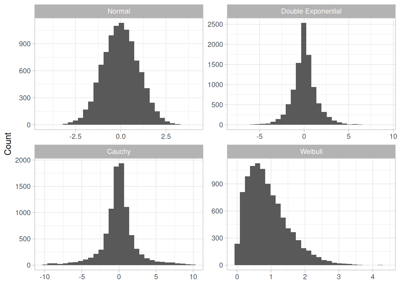
This plot shows histograms for 10,000 random numbers generated from a normal, a double exponential, a Cauchy, and a Weibull distribution.
(Note: the skewness/kurtosis values quoted below in each of the four paragraphs are NIST’s own stated figures for their particular 10,000-point random draw from each distribution. Because those exact figures depend on Dataplot’s specific random-number generator and seed, which we cannot reproduce in R, our own regenerated sample (set.seed(19), computed in the table above) gives different exact numbers from the same four distributions. The qualitative pattern – skewness and kurtosis close to 0 and 3 for the normal case, moderately elevated kurtosis for the double exponential, extreme values for the Cauchy case, and moderate skewness/kurtosis for the Weibull case – holds equally for our own sample; compare the table above against the values quoted below if you’d like to see the difference directly.)
Normal Distribution
The first histogram is a sample from a normal distribution. The normal distribution is a symmetric distribution with well-behaved tails. This is indicated by the skewness of 0.03. The kurtosis of 2.96 is near the expected value of 3. The histogram verifies the symmetry.
Double Exponential Distribution
The second histogram is a sample from a double exponential distribution. The double exponential is a symmetric distribution. Compared to the normal, it has a stronger peak, more rapid decay, and heavier tails. That is, we would expect a skewness near zero and a kurtosis higher than 3. The skewness is 0.06 and the kurtosis is 5.9.
Cauchy Distribution
The third histogram is a sample from a Cauchy distribution.
For better visual comparison with the other data sets, we restricted the histogram of the Cauchy distribution to values between -10 and 10. The full data set for the Cauchy data in fact has a minimum of approximately -29,000 and a maximum of approximately 89,000.
The Cauchy distribution is a symmetric distribution with heavy tails and a single peak at the center of the distribution. Since it is symmetric, we would expect a skewness near zero. Due to the heavier tails, we might expect the kurtosis to be larger than for a normal distribution. In fact the skewness is 69.99 and the kurtosis is 6,693. These extremely high values can be explained by the heavy tails. Just as the mean and standard deviation can be distorted by extreme values in the tails, so too can the skewness and kurtosis measures.
Weibull Distribution
The fourth histogram is a sample from a Weibull distribution with shape parameter 1.5. The Weibull distribution is a skewed distribution with the amount of skewness depending on the value of the shape parameter. The degree of decay as we move away from the center also depends on the value of the shape parameter. For this data set, the skewness is 1.08 and the kurtosis is 4.46, which indicates moderate skewness and kurtosis.
Dealing with Skewness and Kurtosis
Many classical statistical tests and intervals depend on normality assumptions. Significant skewness and kurtosis clearly indicate that data are not normal. If a data set exhibits significant skewness or kurtosis (as indicated by a histogram or the numerical measures), what can we do about it?
One approach is to apply some type of transformation to try to make the data normal, or more nearly normal. The Box-Cox Normality Plot is a useful technique for trying to normalize a data set. In particular, taking the log or square root of a data set is often useful for data that exhibit moderate right skewness.
Another approach is to use techniques based on distributions other than the normal. For example, in reliability studies, the exponential, Weibull, and lognormal distributions are typically used as a basis for modeling rather than using the normal distribution. The Probability Plot Correlation Coefficient Plot and the Probability Plot are useful tools for determining a good distributional model for the data.
Software
The skewness and kurtosis coefficients are available in most general purpose statistical software programs.
Purpose: Detect Non-Randomness, Time Series Modeling
The autocorrelation (Box and Jenkins, 1976) function can be used for the following two purposes:
This page presents the autocorrelation function as a quantitative test statistic (a table of lag-\(k\) values, tested against confidence bands); the companion Autocorrelation Plot page presents the same quantity as a graphical technique and shows several worked examples of characteristic autocorrelation patterns (white noise, moderate autocorrelation, strong autocorrelation, and a sinusoidal model).
Definition
Given measurements \(Y_1, Y_2, \ldots, Y_N\) at times \(X_1, X_2, \ldots, X_N\), the lag \(k\) autocorrelation function is defined as
\[r_k = \frac{\sum_{i=1}^{N-k}(Y_i - \bar{Y})(Y_{i+k} - \bar{Y})}{\sum_{i=1}^{N}(Y_i - \bar{Y})^2}\]
Although the time variable, \(X\), is not used in the formula for autocorrelation, the assumption is that the observations are equi-spaced.
Autocorrelation is a correlation coefficient. However, instead of correlation between two different variables, the correlation is between two values of the same variable at times \(X_i\) and \(X_{i+k}\).
When the autocorrelation is used to detect non-randomness, it is usually only the first (lag 1) autocorrelation that is of interest. When the autocorrelation is used to identify an appropriate time series model, the autocorrelations are usually computed for many lags.
Autocorrelation Example
Lag-one autocorrelations were computed for the LEW.DAT data set (steel-concrete beam deflection measurements).
library(tidyverse)
lew <- read_table(here::here("datasets", "LEW.DAT"), skip = 25, col_names = "y", col_types = "d")
# Lag-k autocorrelation using the N-divisor form given in the Definition
# above; this matches R's acf() default (type = "correlation", demean = TRUE).
autocorrelation <- function(y, lag_max) {
n <- length(y)
y_bar <- mean(y)
c0 <- sum((y - y_bar)^2)
map_dbl(0:lag_max, function(k) {
if (k == 0) {
1
} else {
sum((y[1:(n - k)] - y_bar) * (y[(1 + k):n] - y_bar)) / c0
}
})
}
lew_acf <- tibble(
lag = 0:49,
autocorrelation = autocorrelation(lew$y, 49)
)
lew_acfnist_reported <- c(
1.00, -0.31, -0.74, 0.77, 0.21, -0.90, 0.38, 0.63, -0.77, -0.12, 0.82
)
lew_acf |>
slice(1:11) |>
mutate(nist_reported = nist_reported, difference = round(autocorrelation - nist_reported, 4))Our computed lag-0 through lag-10 autocorrelations agree with NIST’s reported values (to the two-decimal precision at which NIST reports them); small residual differences in later digits are attributable to rounding in the original published table.
Questions
The autocorrelation function can be used to answer the following questions.
Importance
Randomness is one of the key assumptions in determining if a univariate statistical process is in control. If the assumptions of constant location and scale, randomness, and fixed distribution are reasonable, then the univariate process can be modeled as:
\[Y_i = A_0 + E_i\]
where \(E_i\) is an error term.
If the randomness assumption is not valid, then a different model needs to be used. This will typically be either a time series model or a non-linear model (with time as the independent variable).
Related Techniques
Case Study
The heat flow meter data demonstrate the use of autocorrelation in determining if the data are from a random process.
Software
The autocorrelation capability is available in most general purpose statistical software programs. Both Dataplot code and R code can be used to generate the analyses in this section. These scripts use the LEW.DAT data file.
Purpose: Detect Non-Randomness
The runs test (Bradley 1968) can be used to decide if a data set is from a random process.
A run is defined as a series of increasing values or a series of decreasing values. The number of increasing, or decreasing, values is the length of the run. In a random data set, the probability that the (\(i\)+1)th value is larger or smaller than the \(i\)th value follows a binomial distribution, which forms the basis of the runs test.
Typical Analysis and Test Statistics
The first step in the runs test is to count the number of runs in the data sequence. There are several ways to define runs in the literature, however, in all cases the formulation must produce a dichotomous sequence of values. For example, a series of 20 coin tosses might produce the following sequence of heads (H) and tails (T):
H H T T H T H H H H T H H T T T T T H HThe number of runs for this series is nine. There are 11 heads and 9 tails in the sequence.
Definition
We will code values above the median as positive and values below the median as negative. A run is defined as a series of consecutive positive (or negative) values. The runs test is defined as:
\[H_0: \text{the sequence was produced in a random manner}\] \[H_a: \text{the sequence was not produced in a random manner}\]
Test Statistic: the test statistic is
\[Z = \frac{R - \bar{R}}{s_R}\]
where \(R\) is the observed number of runs, \(\bar{R}\) is the expected number of runs, and \(s_R\) is the standard deviation of the number of runs. The values of \(\bar{R}\) and \(s_R\) are computed as follows:
\[\bar{R} = \frac{2 n_1 n_2}{n_1 + n_2} + 1\]
\[s_R^2 = \frac{2 n_1 n_2(2 n_1 n_2 - n_1 - n_2)}{(n_1 + n_2)^2 (n_1 + n_2 - 1)}\]
with \(n_1\) and \(n_2\) denoting the number of positive and negative values in the series.
Significance Level: \(\alpha\).
Critical Region: the runs test rejects the null hypothesis if
\[|Z| > Z_{1-\alpha/2}\]
For a large-sample runs test (where \(n_1 > 10\) and \(n_2 > 10\)), the test statistic is compared to a standard normal table. That is, at the 5% significance level, a test statistic with an absolute value greater than 1.96 indicates non-randomness. For a small-sample runs test, there are tables to determine critical values that depend on values of \(n_1\) and \(n_2\) (Mendenhall and Reinmuth 1982).
Runs Test Example
A runs test was performed for 200 measurements of beam deflection contained in the LEW.DAT data set (the same steel-concrete beam deflection data used in the Autocorrelation Plot and Lag Plot sinusoidal examples).
library(tidyverse)
lew <- read_table(
here::here("datasets", "LEW.DAT"),
skip = 25,
col_names = "y",
col_types = "d"
)runs_test <- function(y, alpha = 0.05) {
med <- median(y)
# Values exactly equal to the median are conventionally dropped.
sign <- sign(y - med)
sign <- sign[sign != 0]
n1 <- sum(sign == 1)
n2 <- sum(sign == -1)
n <- n1 + n2
R <- 1 + sum(diff(sign) != 0)
Rbar <- 2 * n1 * n2 / n + 1
sR2 <- (2 * n1 * n2 * (2 * n1 * n2 - n)) / (n^2 * (n - 1))
sR <- sqrt(sR2)
Z <- (R - Rbar) / sR
z_crit <- qnorm(1 - alpha / 2)
tibble(
n1 = n1, n2 = n2, R = R, Rbar = Rbar, sR = sR,
Z = Z, z_crit = z_crit, reject_H0 = abs(Z) > z_crit
)
}
lew_runs <- runs_test(lew$y)
lew_runsH_0: the sequence was produced in a random manner
H_a: the sequence was not produced in a random manner
Test statistic: Z = 2.6938
Significance level: alpha = 0.05
Critical value (upper tail): Z(1-alpha/2) = 1.96
Critical region: Reject H_0 if |Z| > 1.96Our computed test statistic is \(Z \approx\) 2.6938, matching NIST’s stated value of \(Z = 2.6938\) to four decimal places. Since the test statistic is greater than the critical value, we conclude that the data are not random at the 0.05 significance level.
Question
The runs test can be used to answer the following question:
Importance
Randomness is one of the key assumptions in determining if a univariate statistical process is in control. If the assumptions of constant location and scale, randomness, and fixed distribution are reasonable, then the univariate process can be modeled as:
\[Y_i = A_0 + E_i\]
where \(E_i\) is an error term.
If the randomness assumption is not valid, then a different model needs to be used. This will typically be either a time series model or a non-linear model (with time as the independent variable).
Related Techniques
Case Study
The runs test is demonstrated in the heat flow meter data case study.
Software
Most general purpose statistical software programs support a runs test. The LEW.DAT data file used above is the same one used by NIST’s original Dataplot and R implementations of this example.
Purpose: Test for Distributional Adequacy
The Anderson-Darling test (Stephens 1974) is used to test if a sample of data came from a population with a specific distribution. It is a modification of the Kolmogorov-Smirnov (K-S) test and gives more weight to the tails than does the K-S test. The K-S test is distribution free in the sense that the critical values do not depend on the specific distribution being tested (note that this is true only for a fully specified distribution, i.e. the parameters are known). The Anderson-Darling test makes use of the specific distribution in calculating critical values. This has the advantage of allowing a more sensitive test and the disadvantage that critical values must be calculated for each distribution.
Currently, tables of critical values are available for the normal, uniform, lognormal, exponential, Weibull, extreme value type I, generalized Pareto, and logistic distributions (see the Gallery of Distributions for several of these). We do not provide the tables of critical values in this Handbook (see Stephens (Stephens 1974, 1976, 1977a, 1977b, 1979)) since this test is usually applied with a statistical software program that will print the relevant critical values.
The Anderson-Darling test is an alternative to the chi-square and Kolmogorov-Smirnov goodness-of-fit tests.
Definition
The Anderson-Darling test is defined as:
\[H_0: \text{The data follow a specified distribution.}\] \[H_a: \text{The data do not follow the specified distribution.}\]
Test Statistic: the Anderson-Darling test statistic is defined as
\[A^2 = -N - S\]
where
\[S = \sum_{i=1}^{N}\frac{(2i - 1)}{N}\left[\ln{F(Y_i)} + \ln{\left(1 - F(Y_{N+1-i})\right)}\right]\]
\(F\) is the cumulative distribution function of the specified distribution. Note that the \(Y_i\) are the ordered data.
Significance Level: \(\alpha\).
Critical Region: the critical values for the Anderson-Darling test are dependent on the specific distribution that is being tested. Tabulated values and formulas have been published (Stephens 1974, 1976, 1977a, 1977b, 1979) for a few specific distributions (normal, lognormal, exponential, Weibull, logistic, extreme value type 1 and others). The test is a one-sided test and the hypothesis that the distribution is of a specific form is rejected if the test statistic, \(A^2\), is greater than the critical value.
Note that for a given distribution, the Anderson-Darling statistic may be multiplied by a constant (which usually depends on the sample size, \(n\)). These constants are given in the various papers by Stephens. In the sample output below, the test statistic values are adjusted. Also, be aware that different constants (and therefore critical values) have been published. You just need to be aware of what constant was used for a given set of critical values (the needed constant is typically given with the critical values).
Sample Output
NIST’s original example generated 1,000 random numbers each for normal, double exponential, Cauchy, and lognormal distributions and, in all four cases, applied the Anderson-Darling test for a normal distribution. The normal random numbers were stored in the variable Y1, the double exponential random numbers were stored in the variable Y2, the Cauchy random numbers were stored in the variable Y3, and the lognormal random numbers were stored in the variable Y4.
| Distribution | Mean | Standard Deviation |
|---|---|---|
| Normal (Y1) | 0.004360 | 1.001816 |
| Double Exponential (Y2) | 0.020349 | 1.321627 |
| Cauchy (Y3) | 1.503854 | 35.130590 |
| Lognormal (Y4) | 1.518372 | 1.719969 |
H0: the data are normally distributed
Ha: the data are not normally distributed
Y1 adjusted test statistic: A2 = 0.2576
Y2 adjusted test statistic: A2 = 5.8492
Y3 adjusted test statistic: A2 = 288.7863
Y4 adjusted test statistic: A2 = 83.3935
Significance level: alpha = 0.05
Critical value: 0.752
Critical region: Reject H0 if A2 > 0.752When the data were generated using a normal distribution, the test statistic was small and the hypothesis of normality was not rejected. When the data were generated using the double exponential, Cauchy, and lognormal distributions, the test statistics were large, and the hypothesis of an underlying normal distribution was rejected at the 0.05 significance level.
(This particular random draw was generated by Dataplot and NIST does not publish the seed used, so we cannot reproduce these exact figures. The “adjusted” statistic here is the raw \(A^2 = -N-S\) multiplied by Stephens’ small-sample correction factor \((1 + 0.75/N + 2.25/N^2)\), calibrated against the critical value of 0.752; see the reproducible verification below for a version we can confirm exactly.)
R Verification (Reproducible)
NIST separately published an R script (eda35e.r) for this same example, using the nortest package’s ad.test() function with documented seeds for each of the four cases. Unlike the Dataplot output above, this is fully reproducible, though ad.test() reports the raw (unadjusted) \(A\) statistic rather than the Stephens-adjusted one, so these values are not directly comparable to the 0.752 critical value above.
library(nortest)
n <- 1000
# Standard normal
set.seed(403)
y1 <- rnorm(n, mean = 0, sd = 1)
ad.test(y1)
Anderson-Darling normality test
data: y1
A = 0.30934, p-value = 0.5568# Double exponential
set.seed(403)
y2 <- rexp(n, rate = 1) - rexp(n, rate = 1)
ad.test(y2)
Anderson-Darling normality test
data: y2
A = 13.665, p-value < 2.2e-16# Cauchy. NIST uses a different seed (0) here specifically because Cauchy
# random number generators can produce very extreme values; extreme values
# can push the Anderson-Darling statistic to "Inf" for some seeds, which is
# a numerical limit of the implementation rather than a meaningful result.
set.seed(0)
y3 <- rcauchy(n, location = 0, scale = 1)
ad.test(y3)
Anderson-Darling normality test
data: y3
A = 273.67, p-value < 2.2e-16# Lognormal
set.seed(403)
y4 <- rlnorm(n, meanlog = 0, sdlog = 1)
ad.test(y4)
Anderson-Darling normality test
data: y4
A = 91.479, p-value < 2.2e-16Our computed test statistics (\(A = 0.309\), \(13.665\), \(273.67\), and \(91.479\) for y1 through y4, respectively) match NIST’s own published R output (\(A = 0.3093\), \(13.6652\), \(273.668\), and \(91.4793\)) essentially exactly, using the same seeds. The qualitative conclusion matches the Dataplot example above: the normal sample’s test statistic is small and normality is not rejected (\(p = 0.5568\)), while the double exponential, Cauchy, and lognormal samples all produce large test statistics and reject normality (\(p < 2.2 \times 10^{-16}\) in all three cases).
Questions
The Anderson-Darling test can be used to answer the following questions:
Importance
Many statistical tests and procedures are based on specific distributional assumptions. The assumption of normality is particularly common in classical statistical tests. Much reliability modeling is based on the assumption that the data follow a Weibull distribution.
There are many non-parametric and robust techniques that do not make strong distributional assumptions. However, techniques based on specific distributional assumptions are in general more powerful than non-parametric and robust techniques. Therefore, if the distributional assumptions can be validated, they are generally preferred.
Related Techniques
Chi-Square goodness-of-fit Test
Shapiro-Wilk Normality Test
Probability Plot Correlation Coefficient Plot
Case Study
The Anderson-Darling test is demonstrated in the Josephson junction cryothermometry case study.
Software
The Anderson-Darling goodness-of-fit test is available in some general purpose statistical software programs (for example, the nortest package in R provides an implementation for the normal distribution).
Purpose: Test for Distributional Adequacy
The chi-square test (Snedecor and Cochran 1989) is used to test if a sample of data came from a population with a specific distribution.
An attractive feature of the chi-square goodness-of-fit test is that it can be applied to any univariate distribution for which you can calculate the cumulative distribution function. The chi-square goodness-of-fit test is applied to binned data (i.e., data put into classes). This is actually not a restriction since for non-binned data you can simply calculate a histogram or frequency table before generating the chi-square test. However, the value of the chi-square test statistic is dependent on how the data are binned. Another disadvantage of the chi-square test is that it requires a sufficient sample size in order for the chi-square approximation to be valid.
The chi-square test is an alternative to the Anderson-Darling and Kolmogorov-Smirnov goodness-of-fit tests. The chi-square goodness-of-fit test can be applied to discrete distributions such as the binomial and the Poisson. The Kolmogorov-Smirnov and Anderson-Darling tests are restricted to continuous distributions.
Additional discussion of the chi-square goodness-of-fit test is contained in the product and process comparisons chapter (chapter 7).
Definition
The chi-square test is defined for the hypothesis:
\[H_0: \text{The data follow a specified distribution.}\] \[H_a: \text{The data do not follow the specified distribution.}\]
Test Statistic: to compute the test statistic used in the chi-square goodness-of-fit test, one first partitions the range of possible observed values of the quantity of interest, \(Y\), into \(k\) bins determined by \(y_1 < y_2 < \dots < y_{k+1}\), such that bin \(i\) has lower endpoint \(y_i\) and upper endpoint \(y_{i+1}\) for \(i = 1, \dots, k\). Note that \(y_1\) can be \(-\infty\) and \(y_{k+1}\) can be \(+\infty\).
The test statistic is defined as
\[\chi^2 = \sum_{i=1}^{k} (O_i - E_i)^2 / E_i\]
where \(O_i\) denotes the number of observations that fall in bin \(i\) (under some convention for how to count observations that fall on the boundary between two consecutive bins: for example, that an observation equal to \(y_i\) is counted as being in bin \(i+1\)), and \(E_i\) denotes the number of observations expected to fall in bin \(i\) based on the probability model under test. If this model is specified in terms of its cumulative distribution function, \(F_\theta\), then the expected counts are computed as
\[E_i = N\left(F_\theta(y_{i+1}) - F_\theta(y_i)\right)\]
where \(N\) denotes the sample size, and under the convention that \(F_\theta(-\infty) = 0\) and \(F_\theta(+\infty) = 1\).
Note that, in general, this cumulative distribution function depends on a possibly vectorial parameter, \(\theta\), hence the notation \(F_\theta\) in the foregoing equation for \(E_i\). For example, if the probability model is Gaussian, then \(\theta = (\mu, \sigma)\), where \(\mu\) and \(\sigma\) denote the mean and standard deviation of the Gaussian distribution. However, if the probability model is Poisson, then \(\theta\) is a scalar, \(\theta = \lambda\), the corresponding mean. In any case, to be able to compute \(E_i\) one needs first to estimate \(\theta\).
The chi-square test assumes that the estimate of \(\theta\) is the maximum likelihood estimate derived from the observed bin counts, not from the individual observations. Such an estimate, which we denote \(\widetilde{\theta}\), can be computed by numerical maximization of the log-likelihood function, \(\ell\), with respect to \(\theta\):
\[\ell(\theta) = \sum_{i=1}^{k} O_i \log\left(F_\theta(y_{i+1}) - F_\theta(y_i)\right)\]
The expected bin counts are then computed as \(E_i = N\left(F_{\widetilde{\theta}}(y_{i+1}) - F_{\widetilde{\theta}}(y_i)\right)\) for \(i = 1, \dots, k\).
Significance Level: \(\alpha\).
Critical Region: the test statistic follows, approximately, a chi-square distribution with (\(k - c\)) degrees of freedom where \(k\) is the number of non-empty cells and \(c\) = the number of estimated parameters (including location and scale parameters and shape parameters) for the distribution + 1. For example, for a 3-parameter Weibull distribution, \(c = 4\).
Therefore, the hypothesis that the data are from a population with the specified distribution is rejected if
\[\chi^2 > \chi^2_{1-\alpha, \, k-c}\]
where \(\chi^2_{1-\alpha, \, k-c}\) is the chi-square critical value with \(k - c\) degrees of freedom and significance level \(\alpha\).
Chi-Square Test Example
NIST’s original example generated 1,000 random numbers each for normal, double exponential, \(t\) with 3 degrees of freedom, and lognormal distributions. In all cases, a chi-square test with \(k = 32\) bins was applied to test for normally distributed data. Because the normal distribution has two parameters, \(c = 2 + 1 = 3\). We reproduce that approach below with our own simulated samples.
library(tidyverse)
# Pearson chi-square normality test with k equal-probability bins and
# maximum-likelihood re-estimation of mean/sd from the binned counts.
chisq_normality_test <- function(x, k = 32) {
n <- length(x)
mu <- mean(x)
s <- sd(x)
breaks <- c(-Inf, qnorm(seq_len(k - 1) / k, mean = mu, sd = s), Inf)
counts <- table(cut(x, breaks = breaks, include.lowest = TRUE))
expected <- rep(n / k, k)
chi2 <- sum((counts - expected)^2 / expected)
c <- 3 # 2 estimated parameters (mean, sd) + 1
df <- k - c
p_value <- pchisq(chi2, df, lower.tail = FALSE)
tibble(chi2 = chi2, df = df, p_value = p_value)
}
set.seed(19)
n <- 1000
chisq_data <- tibble(
y1_normal = rnorm(n),
y2_double_exp = ifelse(runif(n) > 0.5, 1, -1) * rexp(n),
y3_t3 = rt(n, df = 3),
y4_lognormal = rlnorm(n)
)
chisq_results <- chisq_data |>
summarize(across(everything(), ~ list(chisq_normality_test(.x)))) |>
pivot_longer(everything(), names_to = "distribution", values_to = "result") |>
unnest(result)
alpha <- 0.05
critical_value <- qchisq(1 - alpha, df = 32 - 3)
chisq_results |>
mutate(reject_H0 = chi2 > critical_value)H_0: the data are normally distributed
H_a: the data are not normally distributed
Y1 Test statistic: Chi^2 = 32.256
Y2 Test statistic: Chi^2 = 91.776
Y3 Test statistic: Chi^2 = 101.488
Y4 Test statistic: Chi^2 = 1085.104
Significance level: alpha = 0.05
Degrees of freedom: k - c = 32 - 3 = 29
Critical value: Chi^2(1-alpha, k-c) = 42.557
Critical region: Reject H_0 if Chi^2 > 42.557(Note: NIST’s original text reports the four specific test statistics above for its own stored random draw. Because that draw was not published as a dataset – only its Dataplot/R generation commands were – we cannot reproduce the exact figures; we instead regenerate an equivalent simulation with set.seed(19) and report our own computed table. Our critical value of 42.557 matches NIST’s stated 42.557. As with NIST’s numbers, our normal sample’s statistic is well below this critical value, while the double exponential, \(t_3\), and lognormal samples all produce test statistics far above it: the chi-square test fails to reject the null hypothesis for the normally distributed data set and rejects the null hypothesis for the three non-normal data sets, matching NIST’s stated conclusion.)
Application Example
This example uses the data set described in the Fatigue Life of Aluminum Alloy Specimens case study, which comprises 101 measured values of the fatigue life (thousands of cycles until rupture) of rectangular strips of 6061-T6 aluminum sheeting that were subjected to periodic loading until failure, as reported by Birnbaum and Saunders (Birnbaum and Saunders 1958). To test whether these data are consistent with a 3-parameter Weibull probability model, one can employ the chi-square goodness-of-fit test, after binning the measured values into \(k = 10\) bins chosen so that each is expected to include about 10 observations. The maximum likelihood estimates of the Weibull parameters based on the bin counts are slightly different from their counterparts based on the individual observations.
birnsaun <- read_table(
here::here("datasets", "BIRNSAUN.DAT"),
skip = 25,
col_names = "y",
col_types = "d"
)
x <- birnsaun$y
n <- length(x)# Maximum likelihood estimation of the parameters of the 3-parameter
# Weibull distribution based on the individual measured values.
negloglik_wei <- function(par, x) {
xi <- par[1]; beta <- par[2]; eta <- par[3]
if (beta <= 0 || eta <= 0 || any(x - xi <= 0)) return(1e10)
-sum(dweibull(x - xi, shape = beta, scale = eta, log = TRUE))
}
fit_individual <- optim(
par = c(xi = 100, beta = 2, eta = 15),
fn = negloglik_wei, x = x,
method = "L-BFGS-B", lower = c(-Inf, 1e-6, 1e-6)
)
xi_hat <- fit_individual$par[["xi"]]
beta_hat <- fit_individual$par[["beta"]]
eta_hat <- fit_individual$par[["eta"]]
# Ten bins chosen so that each is expected to contain about 10 observations.
p_values <- seq(0.1, 0.9, by = 0.1)
breaks <- c(0, xi_hat + qweibull(p_values, shape = beta_hat, scale = eta_hat), Inf)
counts <- hist(x, breaks = breaks, plot = FALSE)$counts# Maximum likelihood estimation of the parameters of the 3-parameter
# Weibull distribution based on the bin counts (grouped data).
negloglik_grouped <- function(par, counts, breaks) {
xi <- par[1]; beta <- par[2]; eta <- par[3]
if (beta <= 0 || eta <= 0) return(1e10)
s <- 0
for (ic in seq_along(counts)) {
lo <- breaks[ic]; hi <- breaks[ic + 1]
plo <- if (is.infinite(lo)) 0 else pweibull(max(lo - xi, 0), shape = beta, scale = eta)
phi <- if (is.infinite(hi)) 1 else pweibull(hi - xi, shape = beta, scale = eta)
p <- phi - plo
if (p <= 0) return(1e10)
s <- s + counts[ic] * log(p)
}
-s
}
fit_grouped <- optim(
par = c(xi = xi_hat, beta = beta_hat, eta = eta_hat),
fn = negloglik_grouped, counts = counts, breaks = breaks,
method = "L-BFGS-B", lower = c(-Inf, 1e-6, 1e-6)
)
xi_tilde <- fit_grouped$par[["xi"]]
beta_tilde <- fit_grouped$par[["beta"]]
eta_tilde <- fit_grouped$par[["eta"]]
tibble(
parameter = c("xi", "beta", "eta"),
individual = c(xi_hat, beta_hat, eta_hat),
grouped = c(xi_tilde, beta_tilde, eta_tilde)
)# Expected bin counts under the grouped-data Weibull fit, and the
# resulting chi-square test statistic and p-value.
expected <- numeric(length(counts))
for (ic in seq_along(counts)) {
lo <- breaks[ic]; hi <- breaks[ic + 1]
plo <- if (is.infinite(lo)) 0 else pweibull(max(lo - xi_tilde, 0), shape = beta_tilde, scale = eta_tilde)
phi <- if (is.infinite(hi)) 1 else pweibull(hi - xi_tilde, shape = beta_tilde, scale = eta_tilde)
expected[ic] <- n * (phi - plo)
}
chi2_weibull <- sum((counts - expected)^2 / expected)
df_weibull <- length(counts) - 1 - 3
p_value_weibull <- pchisq(chi2_weibull, df_weibull, lower.tail = FALSE)
tibble(chi2 = chi2_weibull, df = df_weibull, p_value = p_value_weibull)Our computed test statistic is \(\chi^2 \approx\) 9.432 with 6 degrees of freedom, giving a p-value of 0.151. This matches NIST’s stated test statistic of 9.43 and p-value of 0.15 to two decimal places, thus not questioning the adequacy of the 3-parameter Weibull distribution as probability model for these data.
Questions
The chi-square test can be used to answer the following types of questions:
Importance
Many statistical tests and procedures are based on specific distributional assumptions. The assumption of normality is particularly common in classical statistical tests. Much reliability modeling is based on the assumption that the distribution of the data follows a Weibull distribution.
There are many non-parametric and robust techniques that are not based on strong distributional assumptions. By non-parametric, we mean a technique, such as the sign test, that is not based on a specific distributional assumption. By robust, we mean a statistical technique that performs well under a wide range of distributional assumptions. However, techniques based on specific distributional assumptions are in general more powerful than these non-parametric and robust techniques. By power, we mean the ability to detect a difference when that difference actually exists. Therefore, if the distributional assumption can be confirmed, the parametric techniques are generally preferred.
If you are using a technique that makes a normality (or some other type of distributional) assumption, it is important to confirm that this assumption is in fact justified. If it is, the more powerful parametric techniques can be used. If the distributional assumption is not justified, a non-parametric or robust technique may be required.
Related Techniques
Anderson-Darling Goodness-of-Fit Test
Shapiro-Wilk Normality Test
Probability Plot Correlation Coefficient Plot
Software
Some general purpose statistical software programs provide a chi-square goodness-of-fit test for at least some of the common distributions (for example, the nortest package in R provides a Pearson chi-square normality test).
Purpose: Test for Distributional Adequacy
The Kolmogorov-Smirnov test (Chakravart, Laha, and Roy, 1967) is used to decide if a sample comes from a population with a specific distribution.
The Kolmogorov-Smirnov (K-S) test is based on the empirical distribution function (ECDF). Given \(N\) ordered data points \(Y_1, Y_2, \ldots, Y_N\), the ECDF is defined as
\[E_N = n(i)/N\]
where \(n(i)\) is the number of points less than \(Y_i\) and the \(Y_i\) are ordered from smallest to largest value. This is a step function that increases by \(1/N\) at the value of each ordered data point.
The plot below shows the empirical distribution function together with a normal cumulative distribution function for 100 normal random numbers (NORMAL.DAT). The K-S test is based on the maximum distance between these two curves.
library(tidyverse)
normal_dat <- read_table(
here::here("datasets", "NORMAL.DAT"),
skip = 25,
col_names = "y",
col_types = "d"
)
ecdf_df <- normal_dat |>
arrange(y) |>
mutate(ecdf = row_number() / n())ggplot(ecdf_df, aes(y)) +
geom_step(aes(y = ecdf, color = "Empirical CDF")) +
stat_function(
fun = pnorm,
args = list(mean = mean(normal_dat$y), sd = sd(normal_dat$y)),
aes(color = "Normal CDF")
) +
labs(x = "Y", y = "Cumulative Probability", color = NULL) +
theme_light()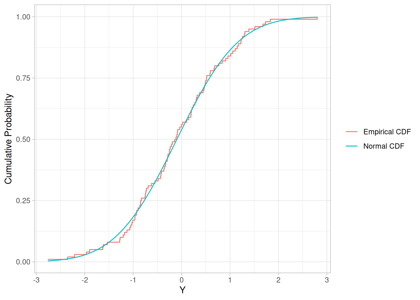
Characteristics and Limitations of the K-S Test
An attractive feature of this test is that the distribution of the K-S test statistic itself does not depend on the underlying cumulative distribution function being tested. Another advantage is that it is an exact test (the Chi-Square goodness-of-fit test depends on an adequate sample size for the approximations to be valid). Despite these advantages, the K-S test has several important limitations:
Several goodness-of-fit tests, such as the Anderson-Darling test and the Cramer-Von Mises test, are refinements of the K-S test. As these refined tests are generally considered to be more powerful than the original K-S test, many analysts prefer them. Also, the advantage for the K-S test of having the critical values be independent of the underlying distribution is not as much of an advantage as first appears. This is due to limitation 3 above (i.e., the distribution parameters are typically not known and have to be estimated from the data). So in practice, the critical values for the K-S test have to be determined by simulation just as for the Anderson-Darling and Cramer-Von Mises (and related) tests.
Note that although the K-S test is typically developed in the context of continuous distributions for uncensored and ungrouped data, the test has in fact been extended to discrete distributions and to censored and grouped data. We do not discuss those cases here.
Definition
The Kolmogorov-Smirnov test is defined by:
\[H_0: \text{The data follow a specified distribution}\] \[H_a: \text{The data do not follow the specified distribution}\]
Test Statistic:
The Kolmogorov-Smirnov test statistic is defined as
\[D = \max_{1 \le i \le N} \left( F(Y_i) - \frac{i-1}{N}, \frac{i}{N} - F(Y_i) \right)\]
where \(F\) is the theoretical cumulative distribution of the distribution being tested, which must be a continuous distribution (i.e., no discrete distributions such as the binomial or Poisson), and it must be fully specified (i.e., the location, scale, and shape parameters cannot be estimated from the data).
Significance Level: \(\alpha\)
Critical Values:
The hypothesis regarding the distributional form is rejected if the test statistic, \(D\), is greater than the critical value obtained from a table. There are several variations of these tables in the literature that use somewhat different scalings for the K-S test statistic and critical regions. These alternative formulations should be equivalent, but it is necessary to ensure that the test statistic is calculated in a way that is consistent with how the critical values were tabulated.
We do not provide the K-S tables here since software programs that perform a K-S test will provide the relevant critical values.
Technical Note
Previous editions of the e-Handbook gave the following formula for the computation of the Kolmogorov-Smirnov goodness-of-fit statistic:
\[D = \max_{1 \le i \le N} \left| F(Y_i) - \frac{i}{N} \right|\]
This formula is in fact not correct. Note that this formula can be rewritten as:
\[D = \max_{1 \le i \le N} \left( F(Y_i) - \frac{i}{N}, \frac{i}{N} - F(Y_i) \right)\]
This form makes it clear that an upper bound on the difference between these two formulas is \(i/N\). For actual data, the difference is likely to be less than the upper bound.
For example, for \(N = 20\), the upper bound on the difference between these two formulas is 0.05 (for comparison, the 5% critical value is 0.294). For \(N = 100\), the upper bound is 0.001. In practice, if you have moderate to large sample sizes (say \(N \ge 50\)), these formulas are essentially equivalent.
Kolmogorov-Smirnov Test Example
NIST’s original example generated 1,000 random numbers each for normal, double exponential, \(t\) with 3 degrees of freedom, and lognormal distributions, and applied the K-S test (against a normal reference distribution) to all four. The normal sample was stored as Y1, double exponential as Y2, \(t_3\) as Y3, and lognormal as Y4.
The Handbook’s own worked example is itself based on randomly generated numbers rather than a fixed NIST measurement data set. We reproduce the Y1 (normal) case using the actual NORMAL.DAT data file (100 observations, not 1,000 as in NIST’s original example — NORMAL.DAT is the real dataset available in this repository’s datasets/ directory for this test). For Y2, Y3, and Y4 we follow the Handbook’s own approach of generating random numbers from the stated distributions, using a fixed seed for reproducibility.
set.seed(35716)
n <- 1000
y1 <- normal_dat$y # real NIST data (N = 100)
# Double exponential (Laplace) with unit variance: the difference of two
# iid Exponential(rate) variables is Laplace(0, 1/rate); variance = 2/rate^2,
# so rate = sqrt(2) gives unit variance.
y2 <- rexp(n, rate = sqrt(2)) - rexp(n, rate = sqrt(2))
y3 <- rt(n, df = 3) # t with 3 degrees of freedom
y4 <- rlnorm(n, meanlog = 0, sdlog = 1) # lognormal
ks_results <- tibble(
sample = c("Y1 (normal, NORMAL.DAT)", "Y2 (double exponential)", "Y3 (t, df=3)", "Y4 (lognormal)"),
n = c(length(y1), length(y2), length(y3), length(y4))
) |>
mutate(
D = c(
ks.test(y1, "pnorm", mean(y1), sd(y1))$statistic,
ks.test(y2, "pnorm", mean(y2), sd(y2))$statistic,
ks.test(y3, "pnorm", mean(y3), sd(y3))$statistic,
ks.test(y4, "pnorm", mean(y4), sd(y4))$statistic
)
)
ks_results\[H_0: \text{the data are normally distributed}\] \[H_a: \text{the data are not normally distributed}\]
NIST’s stated values (N = 1,000 for all four series) were:
Because our Y1 sample is the real NORMAL.DAT data set (N = 100, not N = 1,000) and Y2-Y4 are independently generated random draws, our computed \(D\) values will not numerically match NIST’s reported values, but the qualitative conclusion is the same: the null hypothesis is not rejected for the normally distributed data (Y1), but is rejected for the double exponential, \(t_3\), and lognormal samples, all of which depart from normality (most dramatically for the lognormal case).
Questions
The Kolmogorov-Smirnov test can be used to answer the following types of questions:
Importance
Many statistical tests and procedures are based on specific distributional assumptions. The assumption of normality is particularly common in classical statistical tests. Much reliability modeling is based on the assumption that the data follow a Weibull distribution.
There are many non-parametric and robust techniques that are not based on strong distributional assumptions. By non-parametric, we mean a technique, such as the sign test, that is not based on a specific distributional assumption. By robust, we mean a statistical technique that performs well under a wide range of distributional assumptions. However, techniques based on specific distributional assumptions are in general more powerful than these non-parametric and robust techniques. By power, we mean the ability to detect a difference when that difference actually exists. Therefore, if the distributional assumptions can be confirmed, the parametric techniques are generally preferred.
If you are using a technique that makes a normality (or some other type of distributional) assumption, it is important to confirm that this assumption is in fact justified. If it is, the more powerful parametric techniques can be used. If the distributional assumption is not justified, using a non-parametric or robust technique may be required.
Related Techniques
Anderson-Darling Goodness-of-Fit Test
Chi-Square Goodness-of-Fit Test
Shapiro-Wilk Normality Test
Probability Plot Correlation Coefficient Plot
Software
Some general purpose statistical software programs support the Kolmogorov-Smirnov goodness-of-fit test, at least for the more common distributions. Both Dataplot code and R code can be used to generate the analyses in this section.
Introduction
An outlier is an observation that appears to deviate markedly from other observations in the sample.
Identification of potential outliers is important for the following reasons.
Labeling, Accommodation, Identification
Iglewicz and Hoaglin distinguish the three following issues with regards to outliers.
This section focuses on the labeling and identification issues.
Normality Assumption
Identifying an observation as an outlier depends on the underlying distribution of the data. In this section, we limit the discussion to univariate data sets that are assumed to follow an approximately normal distribution. If the normality assumption for the data being tested is not valid, then a determination that there is an outlier may in fact be due to the non-normality of the data rather than the presence of an outlier.
For this reason, it is recommended that you generate a Normal Probability Plot of the data before applying an outlier test. Although you can also perform formal tests for normality, the presence of one or more outliers may cause the tests to reject normality when it is in fact a reasonable assumption for applying the outlier test.
In addition to checking the normality assumption, the lower and upper tails of the normal probability plot can be a useful graphical technique for identifying potential outliers. In particular, the plot can help determine whether we need to check for a single outlier or whether we need to check for multiple outliers.
The Box Plot and the Histogram can also be useful graphical tools in checking the normality assumption and in identifying potential outliers.
Single Versus Multiple Outliers
Some outlier tests are designed to detect the presence of a single outlier while other tests are designed to detect the presence of multiple outliers. It is not appropriate to apply a test for a single outlier sequentially in order to detect multiple outliers.
In addition, some tests that detect multiple outliers may require that you specify the number of suspected outliers exactly.
Masking and Swamping
Masking can occur when we specify too few outliers in the test. For example, if we are testing for a single outlier when there are in fact two (or more) outliers, these additional outliers may influence the value of the test statistic enough so that no points are declared as outliers.
On the other hand, swamping can occur when we specify too many outliers in the test. For example, if we are testing for two or more outliers when there is in fact only a single outlier, both points may be declared outliers (many tests will declare either all or none of the tested points as outliers).
Due to the possibility of masking and swamping, it is useful to complement formal outlier tests with graphical methods. Graphics can often help identify cases where masking or swamping may be an issue. Swamping and masking are also the reason that many tests require that the exact number of outliers being tested must be specified.
Also, masking is one reason that trying to apply a single outlier test sequentially can fail. For example, if there are multiple outliers, masking may cause the outlier test for the first outlier to return a conclusion of no outliers (and so the testing for any additional outliers is not performed).
Z-Scores and Modified Z-Scores
The Z-score of an observation is defined as
\[Z_i = \frac{Y_i - \bar{Y}}{s}\]
with \(\bar{Y}\) and \(s\) denoting the sample mean and sample standard deviation, respectively. In other words, data is given in units of how many standard deviations it is from the mean.
Although it is common practice to use Z-scores to identify possible outliers, this can be misleading (particularly for small sample sizes) due to the fact that the maximum Z-score is at most \((n-1)/\sqrt{n}\).
Iglewicz and Hoaglin recommend using the modified Z-score
\[M_i = \frac{0.6745(x_i - \tilde{x})}{\text{MAD}}\]
with MAD denoting the median absolute deviation and \(\tilde{x}\) denoting the median. These authors recommend that modified Z-scores with an absolute value greater than 3.5 be labeled as potential outliers.
Formal Outlier Tests
A number of formal outlier tests have been proposed in the literature. These can be grouped by the following characteristics:
The following is a brief list of a few of the more commonly used outlier tests for normally distributed data (this list is not exhaustive). These tests are essentially based on the criterion of “distance from the mean” (an alternative criterion, not discussed here, is the Dixon test, which is based on a value being too large or small compared to its nearest neighbor):
Lognormal Distribution
The tests discussed here are specifically based on the assumption that the data follow an approximately normal distribution. If your data follow an approximately lognormal distribution, you can transform the data to normality by taking the logarithms of the data and then applying the outlier tests discussed here.
Further Information
Iglewicz and Hoaglin provide an extensive discussion of the outlier tests given above (as well as some not given above) and also give a good tutorial on the subject of outliers. Barnett and Lewis provide a book length treatment of the subject.
In addition to discussing additional tests for data that follow an approximately normal distribution, these sources also discuss the case where the data are not normally distributed.
Purpose: Detection of Outliers
Grubbs’ test (Grubbs 1969 and Stefansky 1972) is used to detect a single outlier in a univariate data set that follows an approximately normal distribution.
If you suspect more than one outlier may be present, it is recommended that you use either the Tietjen-Moore test or the generalized extreme studentized deviate test instead of the Grubbs’ test.
Grubbs’ test is also known as the maximum normed residual test.
Definition
Grubbs’ test is defined for the hypothesis:
\[H_0: \text{There are no outliers in the data set}\] \[H_a: \text{There is exactly one outlier in the data set}\]
Test Statistic:
The Grubbs’ test statistic is defined as:
\[G = \frac{\max{|Y_i - \bar{Y}|}}{s}\]
with \(\bar{Y}\) and \(s\) denoting the sample mean and standard deviation, respectively. The Grubbs’ test statistic is the largest absolute deviation from the sample mean in units of the sample standard deviation.
This is the two-sided version of the test. The Grubbs’ test can also be defined as one of the following one-sided tests:
Test whether the minimum value is an outlier:
\[G = \frac{\bar{Y} - Y_{min}}{s}\]
with \(Y_{min}\) denoting the minimum value.
Test whether the maximum value is an outlier:
\[G = \frac{Y_{max} - \bar{Y}}{s}\]
with \(Y_{max}\) denoting the maximum value.
Significance Level: \(\alpha\)
Critical Region:
For the two-sided test, the hypothesis of no outliers is rejected if
\[G > \frac{(N-1)}{\sqrt{N}} \sqrt{\frac{(t_{\alpha/(2N),\,N-2})^2}{N-2+(t_{\alpha/(2N),\,N-2})^2}}\]
with \(t_{\alpha/(2N),\,N-2}\) denoting the critical value of the \(t\) distribution with \((N-2)\) degrees of freedom and a significance level of \(\alpha/(2N)\).
For one-sided tests, we use a significance level of \(\alpha/N\).
Grubbs’ Test Example
The Tietjen and Moore paper gives the following set of 8 mass spectrometer measurements on a uranium isotope (this small data set is given directly in the source text rather than as a separate NIST data file, and is reproduced here verbatim):
library(tidyverse)
uranium <- c(199.31, 199.53, 200.19, 200.82, 201.92, 201.95, 202.18, 245.57)As a first step, a normal probability plot was generated.
tibble(y = uranium) |>
ggplot(aes(sample = y)) +
stat_qq() +
stat_qq_line() +
labs(x = "Theoretical Percentiles from Normal Distribution", y = "Sorted Data") +
theme_light()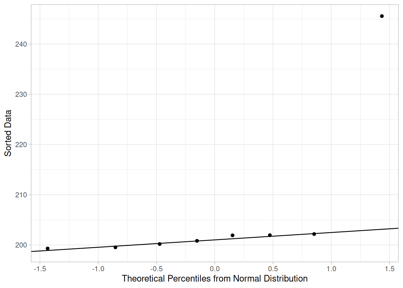
This plot indicates that the normality assumption is reasonable with the exception of the maximum value. We therefore compute Grubbs’ test for the case that the maximum value, 245.57, is an outlier.
n <- length(uranium)
g_stat <- (max(uranium) - mean(uranium)) / sd(uranium)
alpha <- 0.05
# One-sided (upper tail) critical value for testing the maximum, using
# significance level alpha/N (NIST's one-sided critical value formula).
t_crit <- qt(1 - alpha / n, df = n - 2)
g_crit <- ((n - 1) / sqrt(n)) * sqrt(t_crit^2 / (n - 2 + t_crit^2))
tibble(statistic = g_stat, critical_value = g_crit)\[H_0: \text{there are no outliers in the data}\] \[H_a: \text{the maximum value is an outlier}\]
Test statistic: \(G \approx\) 2.4688 (NIST reports \(G = 2.4687\); our computed value matches)
Significance level: \(\alpha = 0.05\)
Critical value for an upper one-tailed test: 2.032 (NIST reports 2.032; our computed value matches)
Critical region: Reject \(H_0\) if \(G >\) 2.032
For this data set, we reject the null hypothesis and conclude that the maximum value is in fact an outlier at the 0.05 significance level.
As a check, R’s outliers::grubbs.test() package (when available) reports \(G = 2.4688\), \(U = 0.0049\), \(p\text{-value} = 1.501\times10^{-7}\), consistent with our hand-rolled calculation above.
Questions
Grubbs’ test can be used to answer the following questions:
Importance
Many statistical techniques are sensitive to the presence of outliers. For example, simple calculations of the mean and standard deviation may be distorted by a single grossly inaccurate data point.
Checking for outliers should be a routine part of any data analysis. Potential outliers should be examined to see if they are possibly erroneous. If the data point is in error, it should be corrected if possible and deleted if it is not possible. If there is no reason to believe that the outlying point is in error, it should not be deleted without careful consideration. However, the use of more robust techniques may be warranted. Robust techniques will often downweight the effect of outlying points without deleting them.
Related Techniques
Several graphical techniques can, and should, be used to help detect outliers. A simple normal probability plot, run sequence plot, a box plot, or a histogram should show any obviously outlying points. In addition to showing potential outliers, several of these graphics also help assess whether the data follow an approximately normal distribution.
Case Study
Heat flow meter data.
Software
Some general purpose statistical software programs support the Grubbs’ test. Both Dataplot code and R code can be used to generate the analyses in this section.
Purpose: Detection of Outliers
The Tietjen-Moore test (Tietjen-Moore 1972) is used to detect multiple outliers in a univariate data set that follows an approximately normal distribution.
The Tietjen-Moore test is a generalization of the Grubbs’ test to the case of multiple outliers. If testing for a single outlier, the Tietjen-Moore test is equivalent to the Grubbs’ test.
It is important to note that the Tietjen-Moore test requires that the suspected number of outliers be specified exactly. If this is not known, it is recommended that the Generalized ESD Test be used instead (this test only requires an upper bound on the number of suspected outliers).
Definition
The Tietjen-Moore test is defined for the hypothesis:
\[H_0: \text{There are no outliers in the data set}\] \[H_a: \text{There are exactly } k \text{ outliers in the data set}\]
Test Statistic:
Sort the \(n\) data points from smallest to largest so that \(y_i\) denotes the \(i\)th largest data value.
The test statistic for the \(k\) largest points is
\[L_k = \frac{\sum_{i=1}^{n-k}(y_i - \bar{y}_k)^2}{\sum_{i=1}^{n}(y_i - \bar{y})^2}\]
with \(\bar{y}\) denoting the sample mean for the full sample and \(\bar{y}_k\) denoting the sample mean with the largest \(k\) points removed.
The test statistic for the \(k\) smallest points is
\[L_k = \frac{\sum_{i=k+1}^{n}(y_i - \bar{y}_k)^2}{\sum_{i=1}^{n}(y_i - \bar{y})^2}\]
with \(\bar{y}_k\) now denoting the sample mean with the smallest \(k\) points removed.
To test for outliers in both tails, compute the absolute residuals \(r_i = |y_i - \bar{y}|\) and then let \(z_i\) denote the \(y_i\) values sorted by their absolute residuals in ascending order. The test statistic for this case is
\[E_k = \frac{\sum_{i=1}^{n-k}(z_i - \bar{z}_k)^2}{\sum_{i=1}^{n}(z_i - \bar{z})^2}\]
with \(\bar{z}\) denoting the sample mean for the full data set and \(\bar{z}_k\) denoting the sample mean with the largest \(k\) points (by absolute residual) removed.
Significance Level: \(\alpha\)
Critical Region:
The critical region for the Tietjen-Moore test is determined by simulation. The simulation is performed by generating a standard normal random sample of size \(n\) and computing the Tietjen-Moore test statistic. Typically, 10,000 random samples are used. The value of the Tietjen-Moore statistic obtained from the data is compared to this reference distribution.
The value of the test statistic is between zero and one. If there are no outliers in the data, the test statistic is close to 1. If there are outliers in the data, the test statistic will be closer to zero. Thus, the test is always a lower, one-tailed test regardless of which test statistic is used, \(L_k\) or \(E_k\).
Tietjen-Moore Test Example
The Tietjen-Moore paper gives the following 15 observations of vertical semi-diameters of the planet Venus (this example originally appeared in Grubbs’ 1950 paper):
venus <- read_table(
here::here("datasets", "TIETMOO1.DAT"),
skip = 25,
col_names = "y",
col_types = "d"
)As a first step, a normal probability plot was generated.
ggplot(venus, aes(sample = y)) +
stat_qq() +
stat_qq_line() +
labs(x = "Theoretical Percentiles from Normal Distribution", y = "Sorted Data") +
theme_light()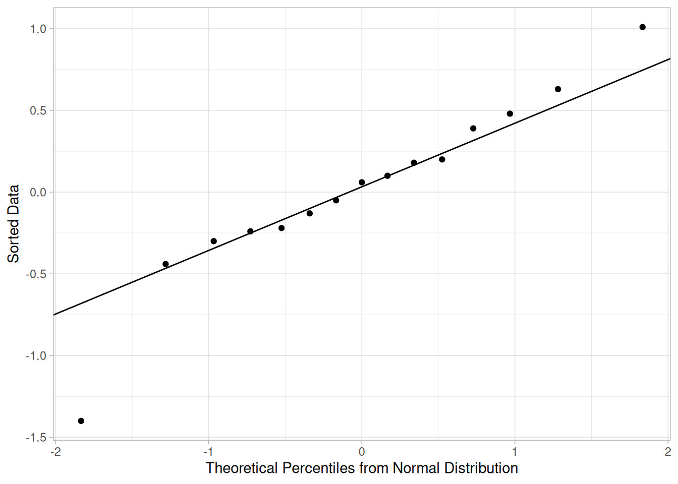
This plot indicates that the normality assumption is reasonable. The minimum value appears to be an outlier. To a lesser extent, the maximum value may also be an outlier. We test the two most extreme points (-1.40 and 1.01) with the Tietjen-Moore test for outliers in both tails.
# Two-tailed Tietjen-Moore test statistic E(k): the sum of squared
# deviations from the mean after removing the k points with the largest
# absolute residuals, relative to the total sum of squares.
tietjen_moore_ek <- function(x, k) {
n <- length(x)
r <- abs(x - mean(x))
x_by_residual <- x[order(r)]
x_sub <- x_by_residual[seq_len(n - k)]
sum((x_sub - mean(x_sub))^2) / sum((x - mean(x))^2)
}
k <- 2
ek_stat <- tietjen_moore_ek(venus$y, k)
# The critical value has no closed form and is determined by simulation:
# generate a large number of standard normal samples of the same size and
# find the 5th percentile of the resulting E(k) statistics.
set.seed(42)
n_sim <- 10000
sim_stats <- replicate(n_sim, tietjen_moore_ek(rnorm(nrow(venus)), k))
critical_value <- quantile(sim_stats, 0.05)
tibble(statistic = ek_stat, critical_value = critical_value)\[H_0: \text{there are no outliers in the data}\] \[H_a: \text{the two most extreme points are outliers}\]
Test statistic: \(E_k \approx\) 0.292 (NIST reports \(E_k = 0.292\); our computed value matches essentially exactly, since this statistic has no random component)
Significance level: \(\alpha = 0.05\)
Critical value for lower tail: 0.311 (NIST reports 0.317; our simulated value is close but not identical, since the critical value itself is estimated by Monte Carlo simulation and NIST does not publish the seed used for their 10,000-sample run)
Critical region: Reject \(H_0\) if \(E_k <\) 0.311
The Tietjen-Moore test is a lower, one-tailed test, so we reject the null hypothesis that there are no outliers when the value of the test statistic is less than the critical value. For our example, the null hypothesis is rejected at the 0.05 level of significance and we conclude that the two most extreme points are outliers.
Questions
The Tietjen-Moore test can be used to answer the following question:
Importance
Many statistical techniques are sensitive to the presence of outliers. For example, simple calculations of the mean and standard deviation may be distorted by a single grossly inaccurate data point.
Checking for outliers should be a routine part of any data analysis. Potential outliers should be examined to see if they are possibly erroneous. If the data point is in error, it should be corrected if possible and deleted if it is not possible. If there is no reason to believe that the outlying point is in error, it should not be deleted without careful consideration. However, the use of more robust techniques may be warranted. Robust techniques will often downweight the effect of outlying points without deleting them.
Related Techniques
Several graphical techniques can, and should, be used to help detect outliers. A simple normal probability plot, run sequence plot, a box plot, or a histogram should show any obviously outlying points. In addition to showing potential outliers, several of these graphics also help assess whether the data follow an approximately normal distribution.
Software
Some general purpose statistical software programs support the Tietjen-Moore test. Both Dataplot code and R code can be used to generate the analyses in this section. These scripts use the TIETMOO1.DAT data file.
Purpose: Detection of Outliers
The generalized (extreme Studentized deviate) ESD test (Rosner 1983) is used to detect one or more outliers in a univariate data set that follows an approximately normal distribution.
The primary limitation of the Grubbs’ test and the Tietjen-Moore test is that the suspected number of outliers, \(k\), must be specified exactly. If \(k\) is not specified correctly, this can distort the conclusions of these tests. On the other hand, the generalized ESD test only requires that an upper bound for the suspected number of outliers be specified.
Definition
Given the upper bound, \(r\), the generalized ESD test essentially performs \(r\) separate tests: a test for one outlier, a test for two outliers, and so on up to \(r\) outliers.
The generalized ESD test is defined for the hypothesis:
\[H_0: \text{There are no outliers in the data set}\] \[H_a: \text{There are up to } r \text{ outliers in the data set}\]
Test Statistic:
Compute
\[R_i = \frac{\max_i |x_i - \bar{x}|}{s}\]
with \(\bar{x}\) and \(s\) denoting the sample mean and sample standard deviation, respectively.
Remove the observation that maximizes \(|x_i - \bar{x}|\) and then recompute the above statistic with \(n - 1\) observations. Repeat this process until \(r\) observations have been removed. This results in the \(r\) test statistics \(R_1, R_2, \ldots, R_r\).
Significance Level: \(\alpha\)
Critical Region:
Corresponding to the \(r\) test statistics, compute the following \(r\) critical values
\[\lambda_i = \frac{(n-i)\,t_{p,\,n-i-1}}{\sqrt{(n-i-1+t_{p,\,n-i-1}^2)(n-i+1)}} \qquad i = 1, 2, \ldots, r\]
where \(t_{p,\,\nu}\) is the \(100p\) percentage point from the \(t\) distribution with \(\nu\) degrees of freedom and
\[p = 1 - \frac{\alpha}{2(n-i+1)}\]
The number of outliers is determined by finding the largest \(i\) such that \(R_i > \lambda_i\).
Simulation studies by Rosner indicate that this critical value approximation is very accurate for \(n \geq 25\) and reasonably accurate for \(n \geq 15\).
Note that although the generalized ESD is essentially Grubbs’ test applied sequentially, there are a few important distinctions:
Generalized ESD Test Example
The Rosner paper gives an example with 54 observations.
# Note: the file's own header comment says "SKIP 25", but that does not
# match the actual position of the data (which starts at line 22, right
# after the "---" separator on line 21) or the file's own stated N -- a
# legacy inconsistency in the source file rather than something on our
# end. We use skip = 21, which reads all 54 values matching the source
# page's own listing of the data exactly.
rosner <- read_table(
here::here("datasets", "ROSNER.DAT"),
skip = 21,
col_names = "y",
col_types = "d"
)As a first step, a normal probability plot was generated.
ggplot(rosner, aes(sample = y)) +
stat_qq() +
stat_qq_line() +
labs(x = "Theoretical Percentiles from Normal Distribution", y = "Sorted Data") +
theme_light()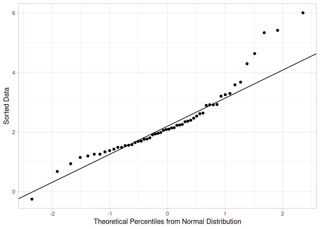
This plot indicates that the normality assumption is questionable. Following the Rosner paper, we test for up to 10 outliers.
\[H_0: \text{there are no outliers in the data}\] \[H_a: \text{there are up to 10 outliers in the data}\]
Significance level: \(\alpha = 0.05\)
Critical region: Reject \(H_0\) if \(R_i >\) critical value
# Iteratively remove the observation with the largest absolute residual,
# recomputing the test statistic R(i) and the corresponding critical
# value lambda(i) at each step. Unlike the Tietjen-Moore critical value,
# this one has a closed form and needs no simulation.
n <- nrow(rosner)
alpha <- 0.05
r <- 10
esd_table <- tibble(i = integer(), R = double(), lambda = double())
current <- rosner$y
for (i in seq_len(r)) {
ares <- abs(current - mean(current)) / sd(current)
R_i <- max(ares)
current <- current[-which.max(ares)]
p <- 1 - alpha / (2 * (n - i + 1))
t_crit <- qt(p, n - i - 1)
lambda_i <- t_crit * (n - i) / sqrt((n - i - 1 + t_crit^2) * (n - i + 1))
esd_table <- bind_rows(esd_table, tibble(i = i, R = R_i, lambda = lambda_i))
}
esd_table |>
mutate(exceeds_critical_value = R > lambda)For the generalized ESD test above, there are essentially 10 separate tests being performed. For this example, the largest number of outliers for which the test statistic is greater than the critical value (at the 5% level) is three, matching NIST’s stated result exactly (our table above matches NIST’s published values to 3 decimal places). We therefore conclude that there are three outliers in this data set.
Questions
The generalized ESD test can be used to answer the following question:
Importance
Many statistical techniques are sensitive to the presence of outliers. For example, simple calculations of the mean and standard deviation may be distorted by a single grossly inaccurate data point.
Checking for outliers should be a routine part of any data analysis. Potential outliers should be examined to see if they are possibly erroneous. If the data point is in error, it should be corrected if possible and deleted if it is not possible. If there is no reason to believe that the outlying point is in error, it should not be deleted without careful consideration. However, the use of more robust techniques may be warranted. Robust techniques will often downweight the effect of outlying points without deleting them.
Related Techniques
Several graphical techniques can, and should, be used to help detect outliers. A simple normal probability plot, run sequence plot, a box plot, or a histogram should show any obviously outlying points. In addition to showing potential outliers, several of these graphics also help assess whether the data follow an approximately normal distribution.
Software
Some general purpose statistical software programs support the generalized ESD test. Both Dataplot code and R code can be used to generate the analyses in this section. These scripts use the ROSNER.DAT data file.
Purpose: Estimate Factor Effects in a 2-Level Factorial Design
Full factorial and fractional factorial designs are common in designed experiments for engineering and scientific applications.
In these designs, each factor is assigned two levels. These are typically called the low and high levels. For computational purposes, the factors are scaled so that the low level is assigned a value of -1 and the high level is assigned a value of +1. These are also commonly referred to as “-” and “+”.
A full factorial design contains all possible combinations of low/high levels for all the factors. A fractional factorial design contains a carefully chosen subset of these combinations. The criterion for choosing the subsets is discussed in detail in the process improvement chapter.
The Yates algorithm exploits the special structure of these designs to generate least squares estimates for factor effects for all factors and all relevant interactions.
The mathematical details of the Yates algorithm are given in chapter 10 of Box, Hunter, and Hunter (1978). Natrella (1963) also provides a procedure for testing the significance of effect estimates.
The effect estimates are typically complemented by a number of graphical techniques such as the DOE Mean Plot and the DOE contour plot (“DOE” represents “design of experiments”). These are demonstrated in the eddy current case study.
Yates Order
Before performing the Yates algorithm, the data should be arranged in “Yates order”. That is, given \(k\) factors, the \(k\)th column consists of \(2^{k-1}\) minus signs (i.e., the low level of the factor) followed by \(2^{k-1}\) plus signs (i.e., the high level of the factor). For example, for a full factorial design with three factors, the design matrix is
- - -
+ - -
- + -
+ + -
- - +
+ - +
- + +
+ + +Determining the Yates order for fractional factorial designs requires knowledge of the confounding structure of the fractional factorial design.
Yates Algorithm
The Yates algorithm is demonstrated for the eddy current data set. The data set contains eight measurements from a two-level, full factorial design with three factors. The purpose of the experiment is to identify factors that have the most effect on eddy current measurements.
In the “Effect” column, we list the main effects and interactions from our factorial experiment in standard order. In the “Response” column, we list the measurement results from our experiment in Yates order.
library(tidyverse)
# Eddy current data set (8 measurements, 2^3 full factorial), in Yates order,
# reproduced from the source text.
eddy <- tibble(
x1 = c(-1, 1, -1, 1, -1, 1, -1, 1),
x2 = c(-1, -1, 1, 1, -1, -1, 1, 1),
x3 = c(-1, -1, -1, -1, 1, 1, 1, 1),
response = c(1.70, 4.57, 0.55, 3.39, 1.51, 4.59, 0.67, 4.29)
)
# Each Yates pass adds, then subtracts, adjacent pairs of the previous column.
pass1 <- function(y) {
c(y[c(1, 3, 5, 7)] + y[c(2, 4, 6, 8)], y[c(2, 4, 6, 8)] - y[c(1, 3, 5, 7)])
}
col_1 <- pass1(eddy$response)
col_2 <- pass1(col_1)
col_3 <- pass1(col_2)
estimate <- col_3 / nrow(eddy)
yates_table <- tibble(
effect = c("Mean", "X1", "X2", "X1*X2", "X3", "X1*X3", "X2*X3", "X1*X2*X3"),
response = eddy$response,
col_1 = col_1,
col_2 = col_2,
col_3 = col_3,
estimate = estimate
)
yates_tablesum_responses <- sum(eddy$response)
sum_sq_responses <- sum(eddy$response^2)
sum_sq_col3 <- sum(col_3^2)
tibble(
sum_of_responses = sum_responses,
sum_of_squared_responses = sum_sq_responses,
sum_of_squared_col3 = sum_sq_col3,
sum_sq_col3_over_8 = sum_sq_col3 / 8
)The first four values in Col 1 are obtained by adding adjacent pairs of responses, for example \(4.57 + 1.70 = 6.27\), and \(3.39 + 0.55 = 3.94\). The second four values in Col 1 are obtained by subtracting the same adjacent pairs of responses, for example, \(4.57 - 1.70 = 2.87\), and \(3.39 - 0.55 = 2.84\). The values in Col 2 are calculated in the same way, except that we are adding and subtracting adjacent values from Col 1. Col 3 is computed using adjacent values from Col 2. Finally, we obtain the “Estimate” column by dividing the values in Col 3 by the total number of responses, 8.
We can check our calculations by making sure that the first value in Col 3 (21.27) is the sum of all the responses (21.27; NIST reports 21.27, which matches). In addition, the sum-of-squared responses (77.7707; NIST reports 77.7707) should equal the sum-of-squared Col 3 values divided by 8 (622.1656/8 = 77.7707; NIST reports 622.1656/8 = 77.7707) — our computed values match NIST’s reported values.
Practical Considerations
The Yates algorithm provides a convenient method for computing effect estimates; however, the same information is easily obtained from statistical software using either an analysis of variance or regression procedure. We can confirm this by fitting a linear model to the same data and comparing coefficients (multiplying the non-intercept regression coefficients by two converts them to Yates “effect” estimates, since the design is coded as \(\pm 1\) rather than a 0/1 unit change):
fit <- lm(response ~ x1 * x2 * x3, data = eddy)
coef(fit)(Intercept) x1 x2 x3 x1:x2 x1:x3
2.65875 1.55125 -0.43375 0.10625 0.06375 0.12375
x2:x3 x1:x2:x3
0.14875 0.07125 The intercept from the regression matches the Yates “Mean” estimate, and each regression slope matches the corresponding Yates parameter estimate (X1, X2, X1*X2, etc.), confirming that the Yates algorithm and least-squares regression produce the same effect estimates for this orthogonal design. The methods for analyzing data from a designed experiment are discussed more fully in the chapter on Process Improvement.
Graphical Presentation
The following plots may be useful to complement the quantitative information from the Yates algorithm.
Questions
The Yates algorithm can be used to answer the following question.
Related Techniques
Multi-factor analysis of variance
Case Study
The analysis of a full factorial design is demonstrated in the eddy current case study.
Software
All statistical software packages are capable of estimating effects using an analysis of variance or least squares regression procedure.
For Orthogonal Designs, Parameter Estimates Don’t Change as Additional Terms Are Added
In most cases of least-squares fitting, the model coefficients for previously added terms change depending on what was successively added. For example, the X1 coefficient might change depending on whether or not an X2 term was included in the model. This is not the case when the design is orthogonal, as is a \(2^3\) full factorial design. For orthogonal designs, the estimates for the previously included terms do not change as additional terms are added. This means the ranked list of parameter estimates are the least-squares coefficient estimates for progressively more complicated models.
Example Prediction Equation
We use the parameter estimates derived from the least-squares analysis above (equivalently, the Yates algorithm) for the eddy current data set to create an example prediction equation.
| Parameter | Estimate |
|---|---|
| Mean | 2.65875 |
| X1 | 1.55125 |
| X2 | -0.43375 |
| X1*X2 | 0.06375 |
| X3 | 0.10625 |
| X1*X3 | 0.12375 |
| X2*X3 | 0.14875 |
| X1*X2*X3 | 0.07125 |
A prediction equation predicts a value of the response variable for given values of the factors. The equation we select can include all the factors shown above, or it can include a subset of the factors. For example, one possible prediction equation using only two factors, X1 and X2, is:
\[\hat{Y} = 2.65875 + 1.55125 \cdot X_1 - 0.43375 \cdot X_2\]
The least-squares parameter estimates in the prediction equation reflect the change in response for a one-unit change in the factor value. To obtain “full” effect estimates (as computed using the Yates algorithm) for the change in factor levels from -1 to +1, the effect estimates (except for the intercept) would be multiplied by two.
Remember that the Yates algorithm is just a convenient method for computing effects; any statistical software package with least-squares regression capabilities will produce the same effects as well as many other useful analyses.
Model Selection
We want to select the most appropriate model for our data while balancing the following two goals.
Note that the residual standard deviation alone is insufficient for determining the most appropriate model, as it will always be decreased by adding additional factors. The next section describes a number of approaches for determining which factors (and interactions) to include in the model.
Identify Important Factors
We want to select the most appropriate model to represent our data. This requires balancing the following two goals.
In short, we want our model to include all the important factors and interactions and to omit the unimportant factors and interactions.
Seven criteria are utilized to define important factors. These seven criteria are not all equally important, nor will they yield identical subsets, in which case a consensus subset or a weighted consensus subset must be extracted. In practice, some of these criteria may not apply in all situations.
These criteria will be examined in the context of the eddy current data set. The parameter estimates computed using least-squares analysis are shown below (repeated from the table above, for convenient reference).
| Parameter | Estimate |
|---|---|
| Mean | 2.65875 |
| X1 | 1.55125 |
| X2 | -0.43375 |
| X1*X2 | 0.06375 |
| X3 | 0.10625 |
| X1*X3 | 0.12375 |
| X2*X3 | 0.14875 |
| X1*X2*X3 | 0.07125 |
In practice, not all of these criteria will be used with every analysis (and some analysts may have additional criteria). These criteria are given as useful guidelines. Most analysts will focus on those criteria that they find most useful.
Criteria for Including Terms in the Model
The seven criteria that we can use in determining whether to keep a factor in the model can be summarized as follows.
The first four criteria focus on parameter estimates, with three numeric criteria and one graphical criterion. The fifth criterion focuses on effects, which are twice the parameter estimates. The last two criteria focus on the residual standard deviation of the model. We discuss each of these seven criteria in detail below.
Parameters: Engineering Significance
The minimum engineering significant difference is defined as \(|\hat{\beta_i}| > \Delta\), where \(|\hat{\beta_i}|\) is the absolute value of the parameter estimate and \(\Delta\) is the minimum engineering significant difference.
That is, declare a factor as “important” if the parameter estimate is greater than some a priori declared engineering difference. This implies that the engineering staff have in fact stated what a minimum difference will be. Oftentimes this is not the case. In the absence of an a priori difference, a good rough rule for the minimum engineering significant difference \(\Delta\) is to keep only those factors whose parameter estimate is greater than, say, 10% of the current production average. In this case, let’s say that the average detector has a sensitivity of 2.5 ohms. This would suggest that we would declare all factors whose parameter is greater than 10% of 2.5 ohms = 0.25 ohm to be significant (from an engineering point of view).
Based on this minimum engineering significant difference criterion, we conclude that we should keep two terms: X1 and X2.
Parameters: Order of Magnitude
The order of magnitude criterion is defined as \(|\hat{\beta_i}| < 0.10 \cdot \max|\hat{\beta_i}|\). That is, exclude any factor that is less than 10% of the maximum parameter size. We may or may not keep the other factors. This criterion is neither engineering nor statistical, but it does offer some additional numerical insight. For the current example, the largest parameter is from X1 (1.55125 ohms), and so 10% of that is 0.155 ohms, which suggests keeping all factors whose parameters exceed 0.155 ohms.
Based on the order-of-magnitude criterion, we thus conclude that we should keep two terms: X1 and X2. A third term, X2*X3 (0.14875), is just slightly under the cutoff level, so we may consider keeping it based on the other criteria.
Parameters: Statistical Significance
Statistical significance is defined as \(|\hat{\beta_i}| > 2 \cdot \text{s.e.}(\hat{\beta_i})\). That is, declare a factor as important if its parameter is more than 2 standard deviations away from 0 (0, by definition, meaning “no effect”). The “2” comes from normal theory (more specifically, a value of 1.96 yields a 95% confidence interval); more precise values would come from \(t\)-distribution theory.
The difficulty with this is that in order to invoke this criterion we need the standard deviation, \(\sigma\), of an observation. This is problematic because:
For the eddy current example: the engineer did not know \(\sigma\); the design (a \(2^3\) full factorial) did not have replication; ignoring 3-term interactions and higher leads to an estimate of \(\sigma\) based on omitting only a single term, the X1*X2*X3 interaction.
For the eddy current example, if one assumes that the 3-term interaction is nil and hence represents a single drawing from a population centered at zero, then an estimate of the standard deviation of a parameter is simply the estimate of the 3-factor interaction (0.07125). Two standard deviations is thus 0.1425. For this example, the rule is thus to keep all \(|\hat{\beta_i}| > 0.1425\).
This results in keeping three terms: X1 (1.55125), X2 (-0.43375), and X1*X2 (0.14875).
(Note: NIST’s original text states this last term as “X1*X2 (0.14875),” but 0.14875 is the parameter estimate for X2*X3, not X1*X2 — whose own estimate is 0.06375, as shown in the parameter table above. NIST’s own later Conclusions section for this same criterion correctly lists “X1, X2, X2*X3,” confirming this is a mislabeling in the original rather than a different intended value. We reproduce NIST’s exact wording here and flag the apparent error rather than silently correcting it.)
Parameters: Probability Plots
Probability plots can be used in the following manner.
Both of these methods are based on the fact that the least-squares estimates of parameters for these two-level orthogonal designs are simply half the difference of averages, and so the central limit theorem, loosely applied, suggests that (if no factor were important) the parameter estimates should have approximately a normal distribution with mean zero and the absolute value of the estimates should have a half-normal distribution.
Since the half-normal probability plot is only concerned with parameter magnitudes as opposed to signed parameters (which are subject to the vagaries of how the initial factor codings +1 and -1 were assigned), the half-normal probability plot is preferred by some over the normal probability plot.
Normal Probability Plot of Parameters
The following normal probability plot shows the parameter estimates for the eddy current data (excluding the Mean).
# Same uniform-order-statistic-medians construction used on the Normal
# Probability Plot page, applied here to the 7 non-Mean parameter estimates.
uniform_medians <- function(n) {
i <- seq_len(n)
m <- numeric(n)
m[1] <- 1 - 0.5^(1 / n)
m[n] <- 0.5^(1 / n)
if (n > 2) m[2:(n - 1)] <- (i[2:(n - 1)] - 0.3175) / (n + 0.365)
m
}
param_estimates <- yates_table |> filter(effect != "Mean")
n_param <- nrow(param_estimates)
theoretical <- qnorm(uniform_medians(n_param))
ordered <- param_estimates |> arrange(estimate) |> mutate(theoretical = theoretical)
ggplot(ordered, aes(theoretical, estimate, label = effect)) +
geom_point() +
geom_text(vjust = -0.8, size = 3.2) +
labs(x = "Theoretical (normal order statistic medians)", y = "Parameter Estimate") +
theme_light()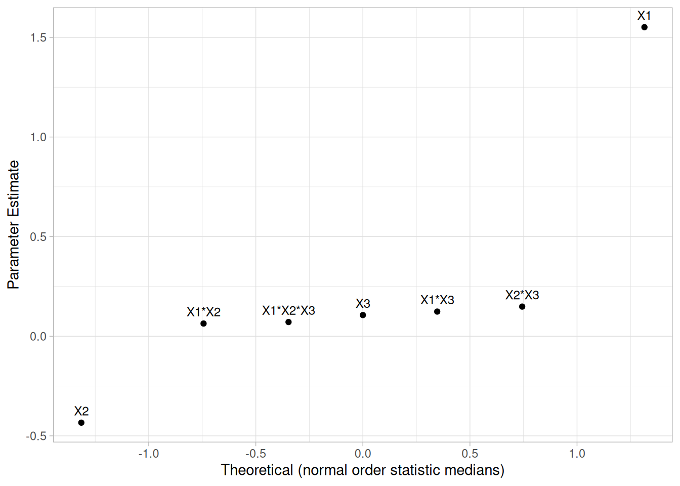
For the example at hand, the probability plot clearly shows two factors (X1 and X2) displaced off the line. All of the remaining five parameters are behaving like random drawings from a normal distribution centered at zero, and so are deemed to be statistically non-significant. In conclusion, this rule keeps two factors: X1 (1.55125) and X2 (-0.43375).
Averages: Youden Plot
A Youden plot can be used in the following way. Keep a factor as “important” if it is displaced away from the central-tendency “bunch” in a Youden plot of high and low averages. By definition, a factor is important when its average response for the low (-1) setting is significantly different from its average response for the high (+1) setting. (Note that effects are twice the parameter estimates.) Conversely, if the low and high averages are about the same, then what difference does it make which setting to use, and so why would such a factor be considered important? This fact, in combination with the intrinsic benefits of the Youden plot for comparing pairs of items, leads to the technique of generating a Youden plot of the low and high averages.
Youden Plot of Effect Estimates
The following is the Youden plot of the effect estimates for the eddy current data.
# Low/high averages for each main effect and interaction, matching the
# same construction used on the DOE Youden Plot page.
yates_factors <- list(
X1 = eddy$x1, X2 = eddy$x2, X3 = eddy$x3,
`X1*X2` = eddy$x1 * eddy$x2, `X1*X3` = eddy$x1 * eddy$x3,
`X2*X3` = eddy$x2 * eddy$x3, `X1*X2*X3` = eddy$x1 * eddy$x2 * eddy$x3
)
yates_youden <- map_dfr(names(yates_factors), function(nm) {
f <- yates_factors[[nm]]
tibble(term = nm, low = mean(eddy$response[f == -1]), high = mean(eddy$response[f == 1]))
})
ggplot(yates_youden, aes(low, high, label = term)) +
geom_text(size = 4, fontface = "bold", color = "steelblue") +
coord_equal() +
labs(x = "Mean response, low level", y = "Mean response, high level") +
theme_light()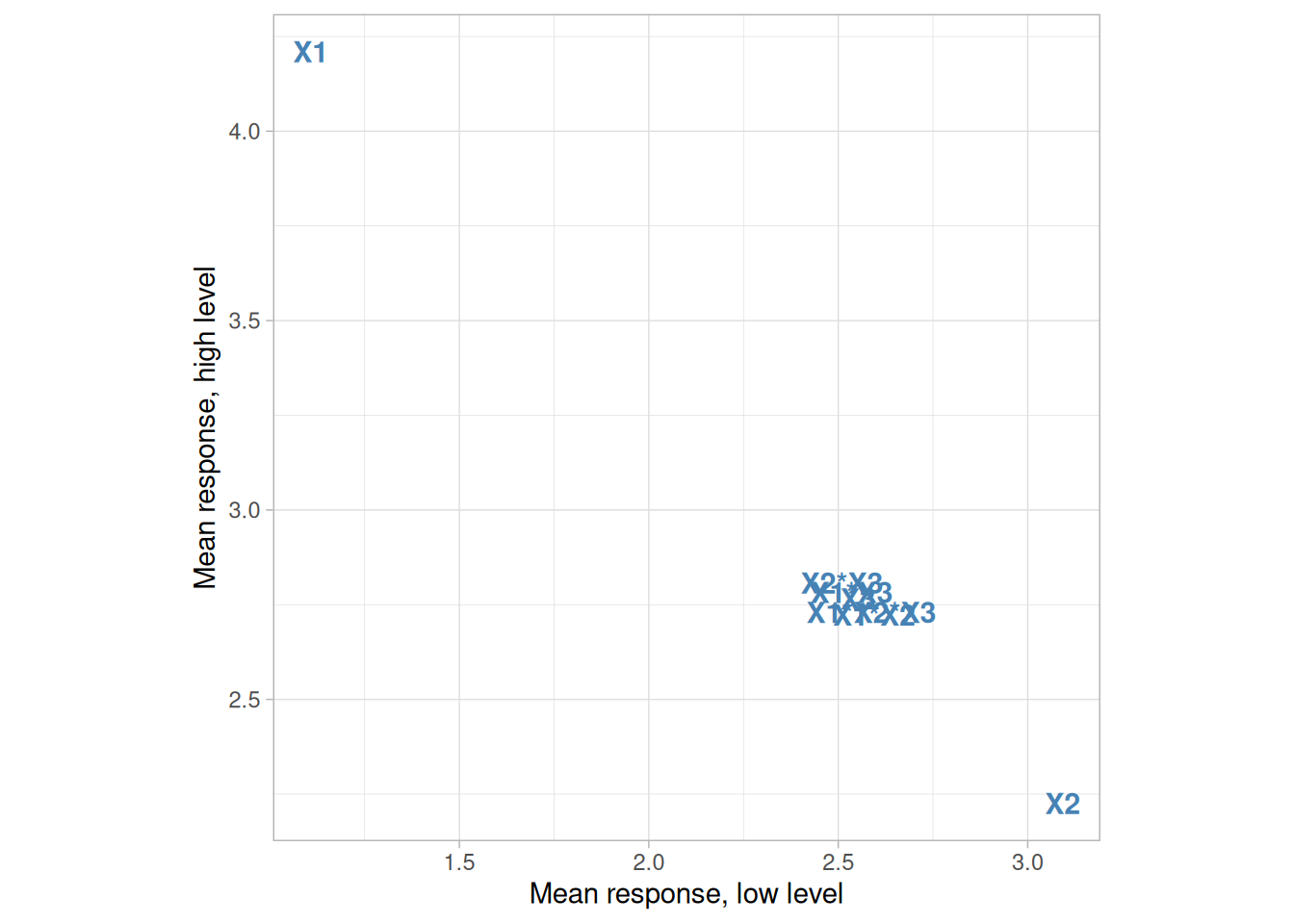
For the example at hand, the Youden plot clearly shows a cluster of points near the grand average (2.65875) with two displaced points, above (factor X1) and below (factor X2). Based on the Youden plot, we conclude to keep two factors: X1 (1.55125) and X2 (-0.43375).
Residual Standard Deviation: Engineering Significance
This criterion is defined as:
\[\text{Residual Standard Deviation} > \text{Cutoff}\]
That is, declare a factor as “important” if the cumulative model that includes the factor (and all larger factors) has a residual standard deviation smaller than an a priori engineering-specified minimum residual standard deviation.
This criterion is different from the others in that it is model focused. In practice, this criterion states that, starting with the largest parameter, we cumulatively keep adding terms to the model and monitor how the residual standard deviation for each progressively more complicated model becomes smaller. At some point, the cumulative model will become complicated enough and comprehensive enough that the resulting residual standard deviation will drop below the pre-specified engineering cutoff for the residual standard deviation. At that point, we stop adding terms and declare all of the model-included terms to be “important” and everything not in the model to be “unimportant”.
This approach implies that the engineer has considered what a minimum residual standard deviation should be. In effect, this relates to what the engineer can tolerate for the magnitude of the typical residual (the difference between the raw data and the predicted value from the model). In other words, how good does the engineer want the prediction equation to be. Unfortunately, this engineering specification has not always been formulated, and so this criterion can become moot.
In the absence of a prior specified cutoff, a good rough rule for the minimum engineering residual standard deviation is to keep adding terms until the residual standard deviation just dips below, say, 5% of the current production average. For the eddy current data, let’s say that the average detector has a sensitivity of 2.5 ohms. Then this would suggest that we would keep adding terms to the model until the residual standard deviation falls below 5% of 2.5 ohms = 0.125 ohms.
# Cumulative models in order of decreasing |estimate| (excluding the mean),
# tracking residual standard deviation as terms are added. The full model
# (all 7 terms) has zero residual degrees of freedom, so its residual
# standard deviation is undefined (NA) -- expected for a saturated 2^3 design.
term_order <- c("x1", "x2", "x2:x3", "x1:x3", "x3", "x1:x2:x3", "x1:x2")
cumulative_rsd <- map_dbl(seq_along(term_order), function(k) {
terms <- term_order[seq_len(k)]
f <- as.formula(paste("response ~", paste(terms, collapse = " + ")))
fit_k <- lm(f, data = eddy)
if (df.residual(fit_k) > 0) sigma(fit_k) else NA_real_
})
tibble(
model = map_chr(seq_along(term_order), ~ paste(c("Mean", toupper(term_order[seq_len(.x)])), collapse = " + ")),
residual_sd = cumulative_rsd
)Based on the minimum residual standard deviation criterion, we would include all terms in order to drive the residual standard deviation below 0.125 ohms. Again, the 5% rule is a rough-and-ready rule that has no basis in engineering or statistics, but is simply a “numerics.” Ideally, the engineer has a better cutoff for the residual standard deviation that is based on how well he/she wants the equation to perform in practice. If such a number were available, then for this criterion and data set we would select something less than the entire collection of terms.
Residual Standard Deviation: Statistical Significance
This criterion is defined as:
\[\text{Residual Standard Deviation} > \sigma\]
where \(\sigma\) is the standard deviation of an observation under replicated conditions. That is, declare a term as “important” until the cumulative model that includes the term has a residual standard deviation smaller than \(\sigma\). In essence, we are allowing that we cannot demand a model fit any better than what we would obtain if we had replicated data; that is, we cannot demand that the residual standard deviation from any fitted model be any smaller than the (theoretical or actual) replication standard deviation. We can drive the fitted standard deviation down (by adding terms) until it achieves a value close to \(\sigma\), but to attempt to drive it down further means that we are, in effect, trying to fit noise.
In practice, this criterion may be difficult to apply because the engineer may not know \(\sigma\), and the experiment might not have replication, so a model-free estimate of \(\sigma\) is not obtainable.
For the current case study:
Thus for this current case, this criteria could not be used to yield a subset of “important” factors.
Conclusions
In summary, the seven criteria for specifying “important” factors yielded the following for the eddy current data:
| Criterion | Important factors |
|---|---|
| Parameters, Engineering Significance | X1, X2 |
| Parameters, Order of Magnitude | X1, X2 |
| Parameters, Statistical Significance | X1, X2, X2*X3 |
| Parameters, Probability Plots | X1, X2 |
| Effects, Youden Plot | X1, X2 |
| Residual SD, Engineering Significance | all 7 terms |
| Residual SD, Statistical Significance | not applicable |
Such conflicting results are common. Arguably, the three most important criteria (listed in order of most important) are:
Scanning all of the above, we thus declare the following consensus for the eddy current data:
\[\hat{Y} = 2.65875 + 1.55125 \cdot X_1 - 0.43375 \cdot X_2\]
(with a residual standard deviation of 0.30429 ohms — NIST reports 0.30429 ohms; our computed value matches)
Note that this is the initial model selection. We still need to perform model validation with a residual analysis.
Probability distributions are a fundamental concept in statistics. They are used both on a theoretical level and a practical level.
Some practical uses of probability distributions are:
Discrete Distributions
The mathematical definition of a discrete probability function, \(p(x)\), is a function that satisfies the following properties.
The probability that \(x\) can take a specific value is \(p(x)\). That is,
\[P[X = x] = p(x) = p_x\]
\(p(x)\) is non-negative for all real \(x\).
The sum of \(p(x)\) over all possible values of \(x\) is 1, that is,
\[\sum_j p_j = 1\]
where \(j\) represents all possible values that \(x\) can have and \(p_j\) is the probability at \(x_j\).
One consequence of properties 2 and 3 is that \(0 \le p(x) \le 1\).
What does this actually mean? A discrete probability function is a function that can take a discrete number of values (not necessarily finite). This is most often the non-negative integers or some subset of the non-negative integers. There is no mathematical restriction that discrete probability functions only be defined at integers, but in practice this is usually what makes sense. For example, if you toss a coin 6 times, you can get 2 heads or 3 heads but not 2½ heads. Each of the discrete values has a certain probability of occurrence that is between zero and one. That is, a discrete function that allows negative values or values greater than one is not a probability function. The condition that the probabilities sum to one means that at least one of the values has to occur.
Continuous Distributions
The mathematical definition of a continuous probability function, \(f(x)\), is a function that satisfies the following properties.
The probability that \(x\) is between two points \(a\) and \(b\) is
\[p[a \le x \le b] = \int_{a}^{b} f(x)\,dx\]
It is non-negative for all real \(x\).
The integral of the probability function is one, that is,
\[\int_{-\infty}^{\infty} f(x)\,dx = 1\]
What does this actually mean? Since continuous probability functions are defined for an infinite number of points over a continuous interval, the probability at a single point is always zero. Probabilities are measured over intervals, not single points. That is, the area under the curve between two distinct points defines the probability for that interval. This means that the height of the probability function can in fact be greater than one. The property that the integral must equal one is equivalent to the property for discrete distributions that the sum of all the probabilities must equal one.
Probability Mass Functions Versus Probability Density Functions
Discrete probability functions are referred to as probability mass functions and continuous probability functions are referred to as probability density functions. The term probability functions covers both discrete and continuous distributions.
There are a few occasions in this book when we use the term probability density function in a generic sense where it may apply to either probability density or probability mass functions. It should be clear from the context whether we are referring only to continuous distributions or to either continuous or discrete distributions.
Probability distributions are typically defined in terms of the probability density function. However, there are a number of related probability functions used in applications.
library(tidyverse)Probability Density Function
For a continuous distribution, the probability density function (pdf) is the probability that the variate has the value \(x\). Since for continuous distributions the probability at a single point is zero, this is often expressed in terms of an integral between two points:
\[\int_{a}^{b} f(x)\,dx = Pr[a \le X \le b]\]
For a discrete distribution, the pdf is the probability that the variate takes the value \(x\):
\[f(x) = Pr[X = x]\]
The following is the plot of the normal probability density function.
tibble(x = seq(-4, 4, length.out = 401)) |>
mutate(y = dnorm(x)) |>
ggplot(aes(x, y)) +
geom_line() +
labs(x = "x", y = "f(x)") +
theme_light()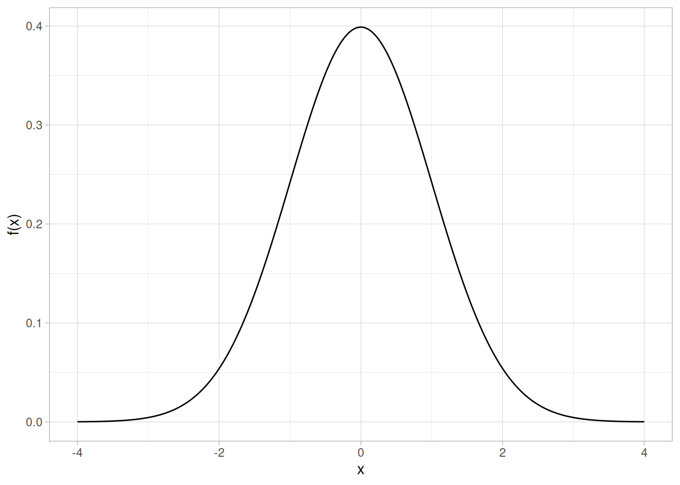
Cumulative Distribution Function
The cumulative distribution function (cdf) is the probability that the variable takes a value less than or equal to \(x\). That is,
\[F(x) = Pr[X \le x] = \alpha\]
For a continuous distribution, this can be expressed mathematically as
\[F(x) = \int_{-\infty}^{x} f(\mu)\,d\mu\]
For a discrete distribution, the cdf can be expressed as
\[F(x) = \sum_{i=0}^{x} f(i)\]
The following is the plot of the normal cumulative distribution function.
tibble(x = seq(-4, 4, length.out = 401)) |>
mutate(y = pnorm(x)) |>
ggplot(aes(x, y)) +
geom_line() +
labs(x = "x", y = "F(x)") +
theme_light()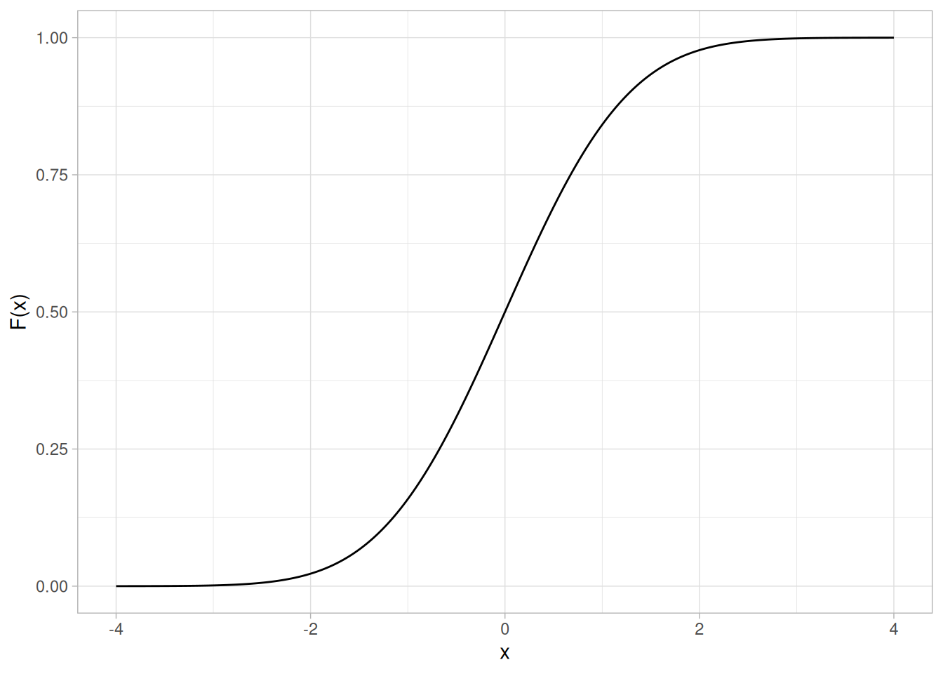
The horizontal axis is the allowable domain for the given probability function. Since the vertical axis is a probability, it must fall between zero and one. It increases from zero to one as we go from left to right on the horizontal axis.
Percent Point Function
The percent point function (ppf) is the inverse of the cumulative distribution function. For this reason, the percent point function is also commonly referred to as the inverse distribution function. That is, for a distribution function we calculate the probability that the variable is less than or equal to \(x\) for a given \(x\). For the percent point function, we start with the probability and compute the corresponding \(x\) for the cumulative distribution. Mathematically, this can be expressed as
\[Pr[X \le G(\alpha)] = \alpha\]
or alternatively,
\[x = G(\alpha) = G(F(x))\]
The following is the plot of the normal percent point function.
tibble(p = seq(0.001, 0.999, length.out = 401)) |>
mutate(x = qnorm(p)) |>
ggplot(aes(p, x)) +
geom_line() +
labs(x = expression(alpha), y = expression(G(alpha))) +
theme_light()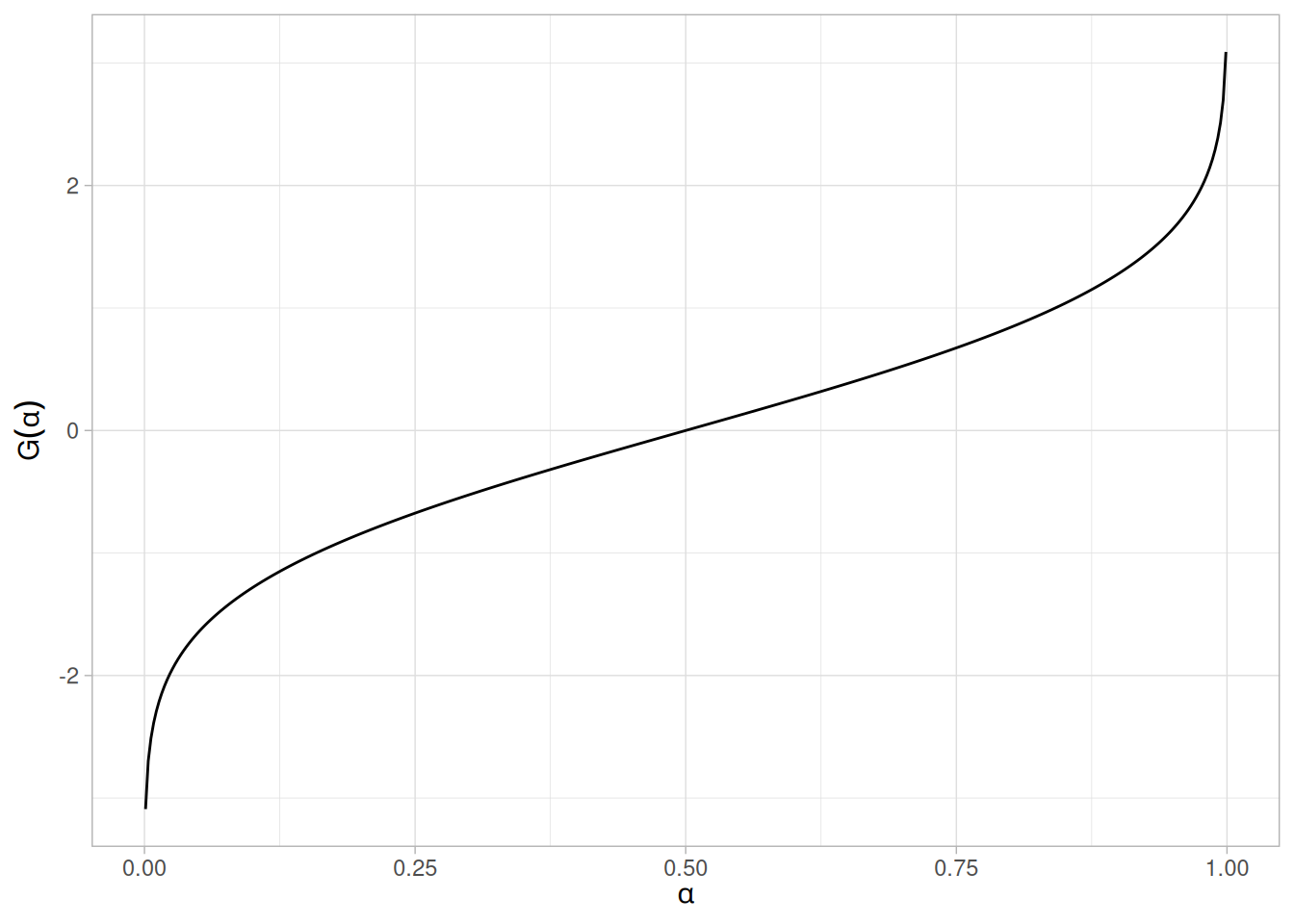
Since the horizontal axis is a probability, it goes from zero to one. The vertical axis goes from the smallest to the largest value of the cumulative distribution function.
Hazard Function
The hazard function is the ratio of the probability density function to the survival function, \(S(x)\):
\[h(x) = \frac{f(x)}{S(x)} = \frac{f(x)}{1 - F(x)}\]
The following is the plot of the normal distribution hazard function.
tibble(x = seq(-4, 4, length.out = 401)) |>
mutate(y = dnorm(x) / (1 - pnorm(x))) |>
ggplot(aes(x, y)) +
geom_line() +
labs(x = "x", y = "h(x)") +
theme_light()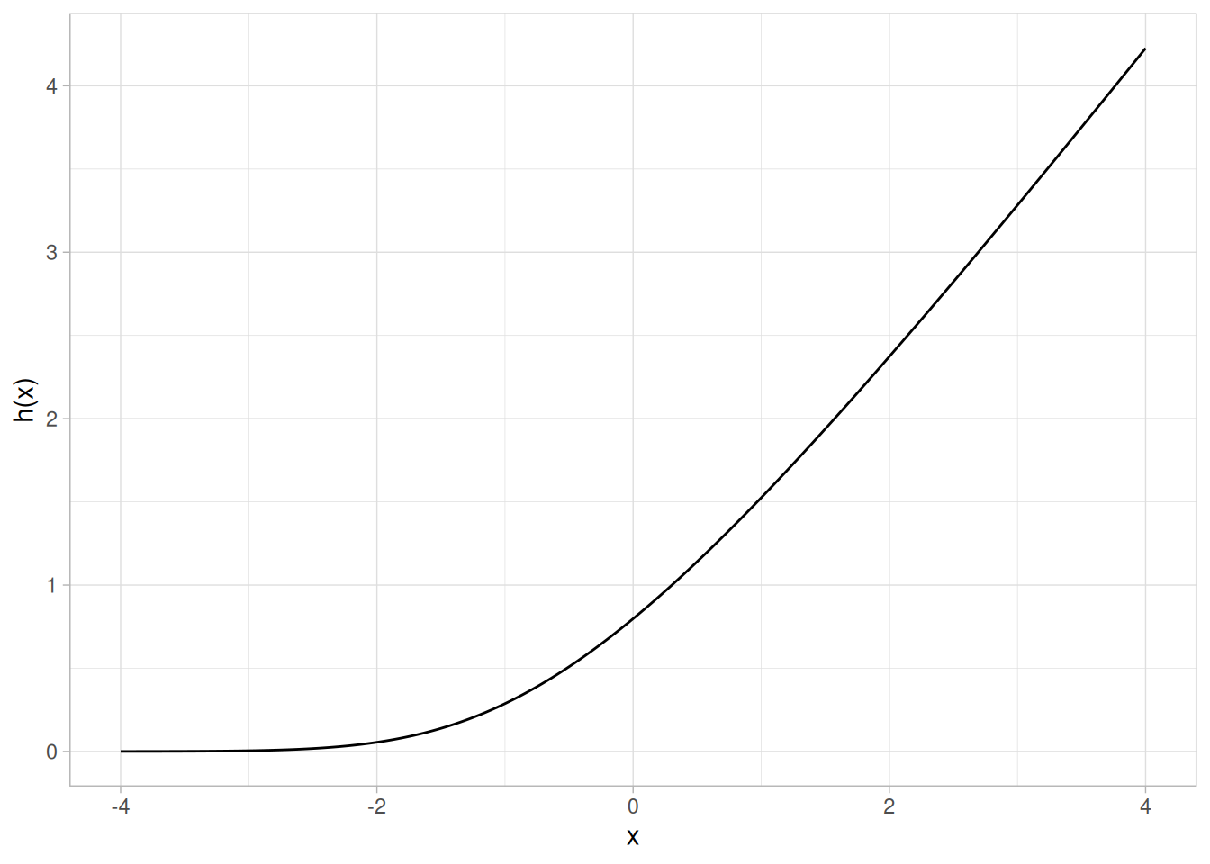
Hazard plots are most commonly used in reliability applications. Note that Johnson, Kotz, and Balakrishnan (Johnson et al. 1994) refer to this as the conditional failure density function rather than the hazard function.
Cumulative Hazard Function
The cumulative hazard function is the integral of the hazard function:
\[H(x) = \int_{-\infty}^{x} h(\mu)\,d\mu\]
This can alternatively be expressed as
\[H(x) = -\ln{(1 - F(x))}\]
The following is the plot of the normal cumulative hazard function.
tibble(x = seq(-4, 4, length.out = 401)) |>
mutate(y = -log(1 - pnorm(x))) |>
ggplot(aes(x, y)) +
geom_line() +
labs(x = "x", y = "H(x)") +
theme_light()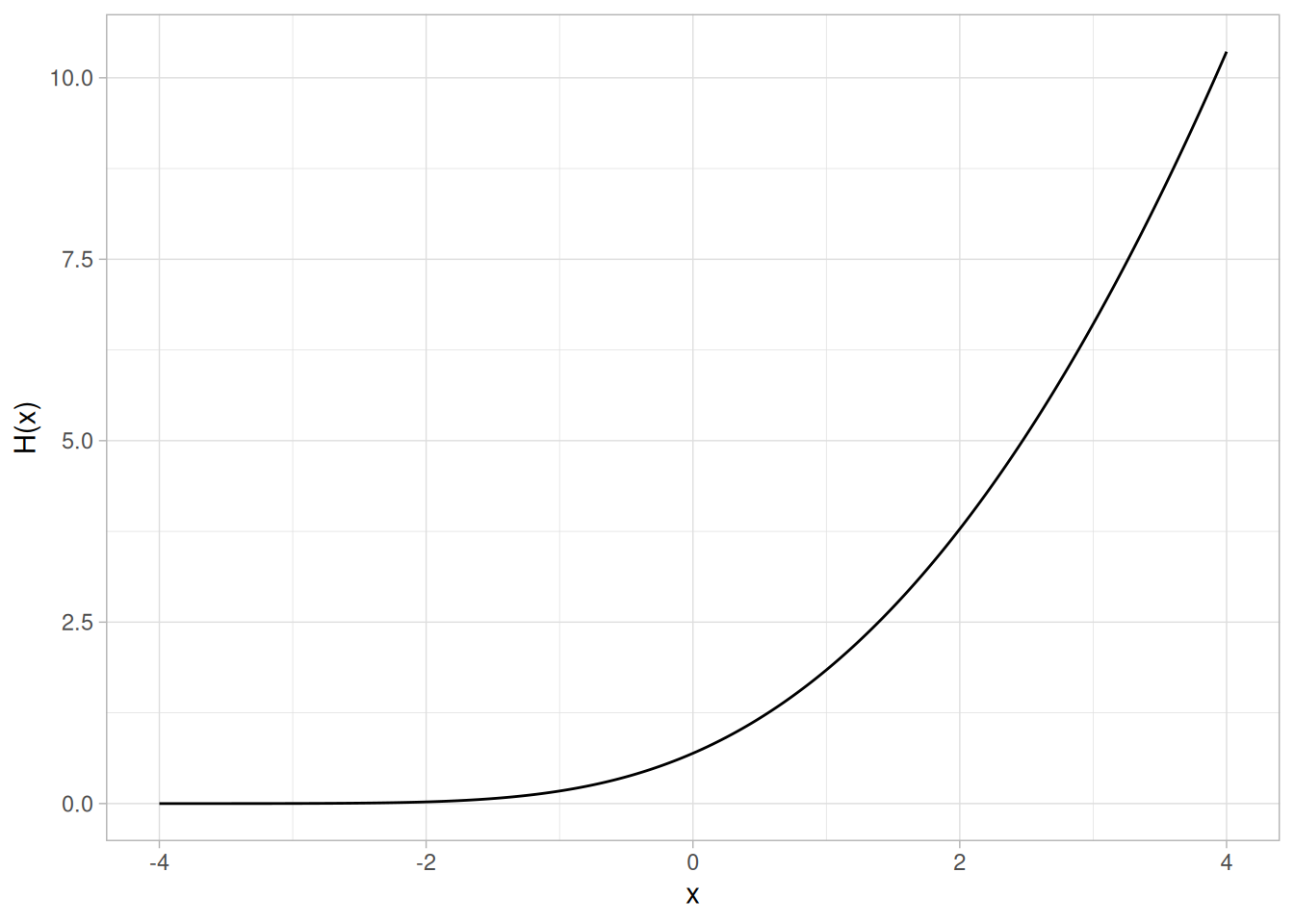
Cumulative hazard plots are most commonly used in reliability applications. Note that Johnson, Kotz, and Balakrishnan (Johnson et al. 1994) refer to this as the hazard function rather than the cumulative hazard function.
Survival Function
Survival functions are most often used in reliability and related fields. The survival function is the probability that the variate takes a value greater than \(x\):
\[S(x) = Pr[X > x] = 1 - F(x)\]
The following is the plot of the normal distribution survival function.
tibble(x = seq(-4, 4, length.out = 401)) |>
mutate(y = 1 - pnorm(x)) |>
ggplot(aes(x, y)) +
geom_line() +
labs(x = "x", y = "S(x)") +
theme_light()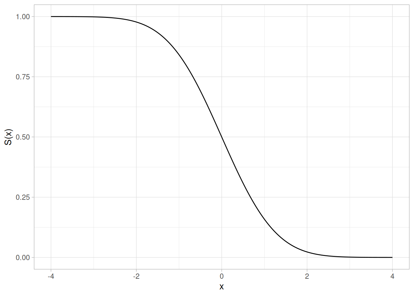
For a survival function, the \(y\) value on the graph starts at 1 and monotonically decreases to zero. The survival function should be compared to the cumulative distribution function.
Inverse Survival Function
Just as the percent point function is the inverse of the cumulative distribution function, the survival function also has an inverse function. The inverse survival function can be defined in terms of the percent point function:
\[Z(\alpha) = G(1 - \alpha)\]
The following is the plot of the normal distribution inverse survival function.
tibble(p = seq(0.001, 0.999, length.out = 401)) |>
mutate(z = qnorm(1 - p)) |>
ggplot(aes(p, z)) +
geom_line() +
labs(x = expression(alpha), y = expression(Z(alpha))) +
theme_light()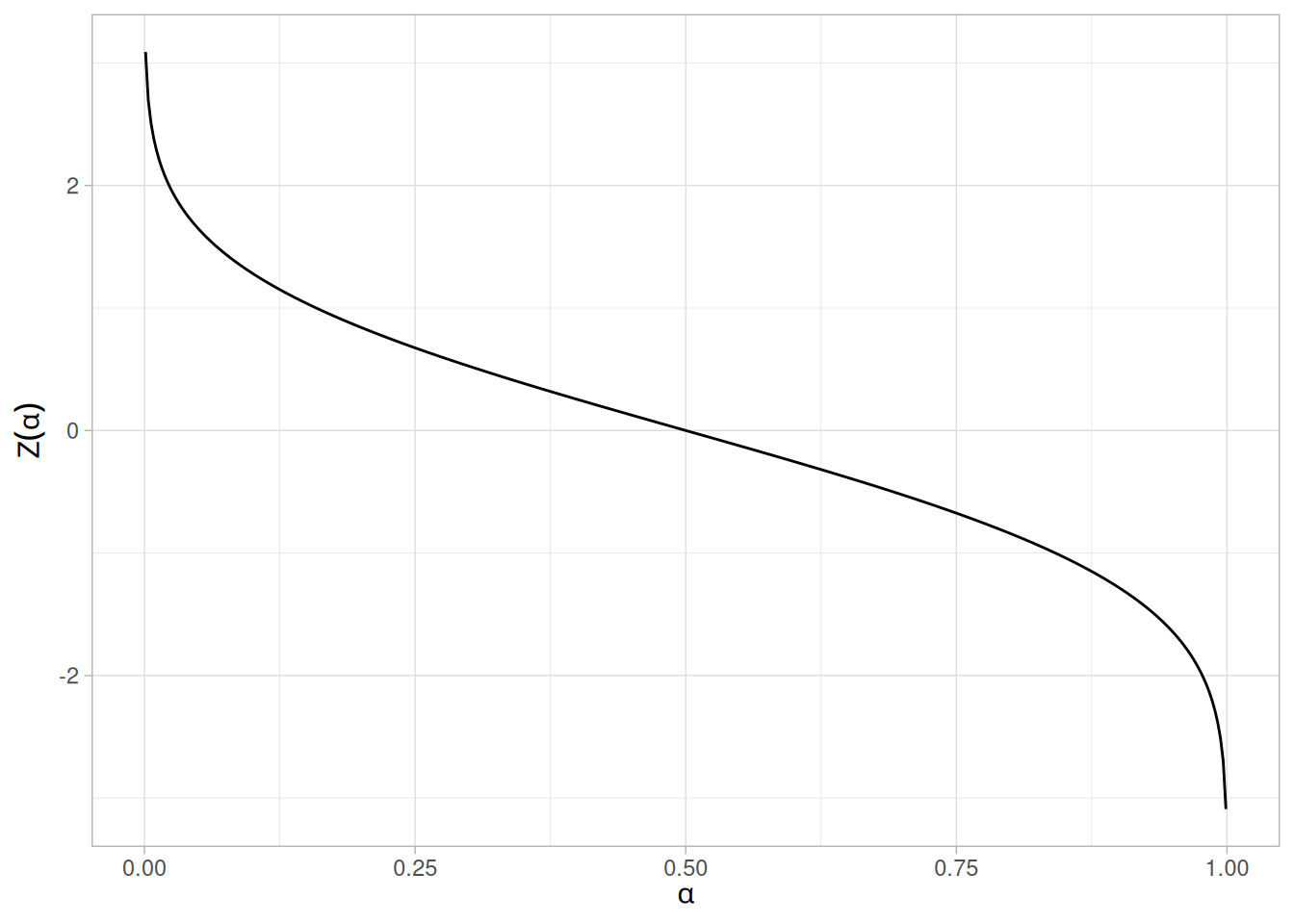
As with the percent point function, the horizontal axis is a probability. Therefore the horizontal axis goes from 0 to 1 regardless of the particular distribution. The appearance is similar to the percent point function. However, instead of going from the smallest to the largest value on the vertical axis, it goes from the largest to the smallest value.
Many probability distributions are not a single distribution, but are in fact a family of distributions. This is due to the distribution having one or more shape parameters.
Shape parameters allow a distribution to take on a variety of shapes, depending on the value of the shape parameter. These distributions are particularly useful in modeling applications since they are flexible enough to model a variety of data sets.
Example: Weibull Distribution
The Weibull distribution is an example of a distribution that has a shape parameter. The following graph plots the Weibull pdf with the following values for the shape parameter: 0.5, 1.0, 2.0, and 5.0.
library(tidyverse)
shapes <- c(0.5, 1.0, 2.0, 5.0)
crossing(x = seq(0.01, 3, length.out = 401), shape = shapes) |>
mutate(shape_label = paste("gamma =", shape)) |>
mutate(y = dweibull(x, shape = shape)) |>
ggplot(aes(x, y)) +
geom_line() +
facet_wrap(~shape_label, scales = "free_y") +
labs(x = "x", y = "f(x)") +
theme_light()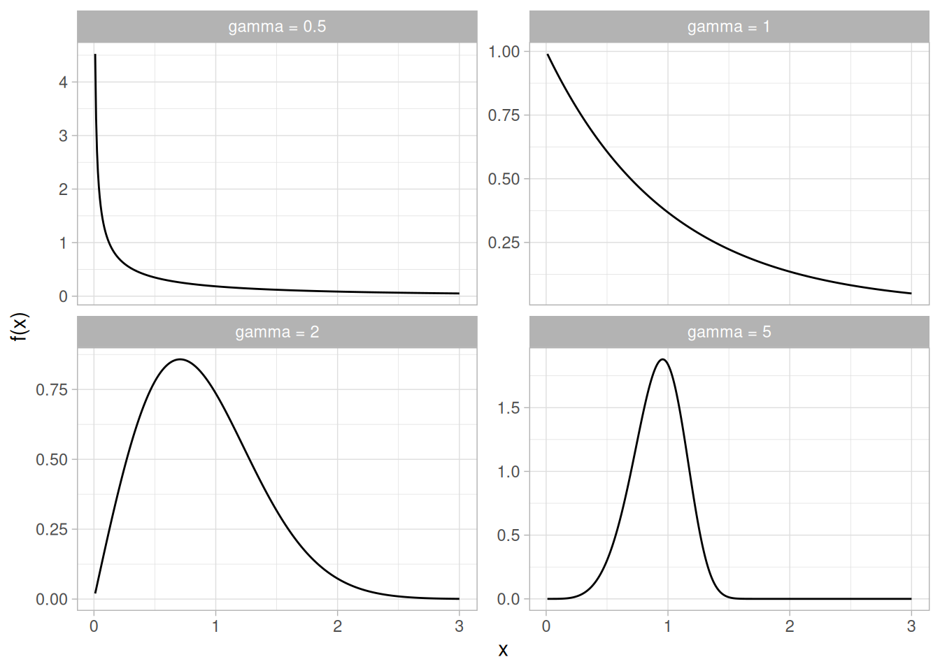
The shapes above include an exponential distribution, a right-skewed distribution, and a relatively symmetric distribution.
The Weibull distribution has a relatively simple distributional form. However, the shape parameter allows the Weibull to assume a wide variety of shapes. This combination of simplicity and flexibility in the shape of the Weibull distribution has made it an effective distributional model in reliability applications. This ability to model a wide variety of distributional shapes using a relatively simple distributional form is possible with many other distributional families as well.
PPCC Plots
The PPCC plot is an effective graphical tool for selecting the member of a distributional family with a single shape parameter that best fits a given set of data.
A probability distribution is characterized by location and scale parameters. Location and scale parameters are typically used in modeling applications.
For example, the following graph is the probability density function for the standard normal distribution, which has the location parameter equal to zero and scale parameter equal to one.
library(tidyverse)
tibble(x = seq(-4, 4, length.out = 401)) |>
mutate(y = dnorm(x)) |>
ggplot(aes(x, y)) +
geom_line() +
labs(x = "x", y = "f(x)") +
theme_light()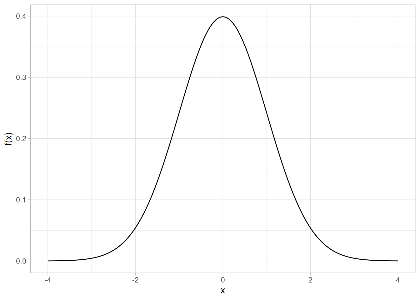
Location Parameter
The next plot shows the probability density function for a normal distribution with a location parameter of 10 and a scale parameter of 1.
tibble(x = seq(6, 14, length.out = 401)) |>
mutate(y = dnorm(x, mean = 10, sd = 1)) |>
ggplot(aes(x, y)) +
geom_line() +
labs(x = "x", y = "f(x)") +
theme_light()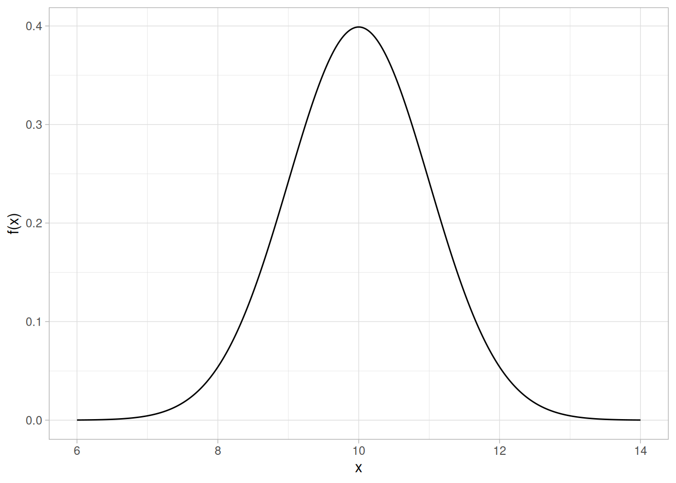
The effect of the location parameter is to translate the graph, relative to the standard normal distribution, 10 units to the right on the horizontal axis. A location parameter of \(-10\) would have shifted the graph 10 units to the left on the horizontal axis.
That is, a location parameter simply shifts the graph left or right on the horizontal axis.
Scale Parameter
The next plot has a scale parameter of 3 (and a location parameter of zero). The effect of the scale parameter is to stretch out the graph. The maximum \(y\) value is approximately 0.13 as opposed to 0.4 in the previous graphs. The \(y\) value, i.e., the vertical axis value, approaches zero at about \((\pm) 9\) as opposed to \((\pm) 3\) with the first graph.
tibble(x = seq(-9, 9, length.out = 401)) |>
mutate(y = dnorm(x, mean = 0, sd = 3)) |>
ggplot(aes(x, y)) +
geom_line() +
labs(x = "x", y = "f(x)") +
theme_light()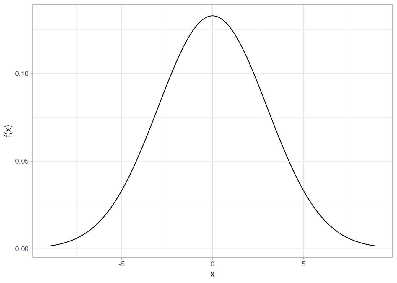
In contrast, the next graph has a scale parameter of 1/3 (\(\approx 0.333\)). The effect of this scale parameter is to squeeze the pdf. That is, the maximum \(y\) value is approximately 1.2 as opposed to 0.4, and the \(y\) value is near zero at \((\pm) 1\) as opposed to \((\pm) 3\).
tibble(x = seq(-1.5, 1.5, length.out = 401)) |>
mutate(y = dnorm(x, mean = 0, sd = 1 / 3)) |>
ggplot(aes(x, y)) +
geom_line() +
labs(x = "x", y = "f(x)") +
theme_light()
The effect of a scale parameter greater than one is to stretch the pdf. The greater the magnitude, the greater the stretching. The effect of a scale parameter less than one is to compress the pdf. The compressing approaches a spike as the scale parameter goes to zero. A scale parameter of 1 leaves the pdf unchanged (if the scale parameter is 1 to begin with) and non-positive scale parameters are not allowed.
Location and Scale Together
The following graph shows the effect of both a location and a scale parameter. The plot has been shifted right 10 units and stretched by a factor of 3.
tibble(x = seq(1, 19, length.out = 401)) |>
mutate(y = dnorm(x, mean = 10, sd = 3)) |>
ggplot(aes(x, y)) +
geom_line() +
labs(x = "x", y = "f(x)") +
theme_light()
Standard Form
The standard form of any distribution is the form that has location parameter zero and scale parameter one.
It is common in statistical software packages to only compute the standard form of the distribution. There are formulas for converting from the standard form to the form with other location and scale parameters. These formulas are independent of the particular probability distribution.
Formulas for Location and Scale Based on the Standard Form
The following are the formulas for computing various probability functions based on the standard form of the distribution. The parameter \(a\) refers to the location parameter and the parameter \(b\) refers to the scale parameter. Shape parameters are not included.
| Function | Formula |
|---|---|
| Cumulative Distribution Function | \(F(x; a, b) = F((x - a) / b; 0, 1)\) |
| Probability Density Function | \(f(x; a, b) = (1/b) f((x - a) / b; 0, 1)\) |
| Percent Point Function | \(G(\alpha; a, b) = a + b\,G(\alpha; 0, 1)\) |
| Hazard Function | \(h(x; a, b) = (1/b) h((x - a) / b; 0, 1)\) |
| Cumulative Hazard Function | \(H(x; a, b) = H((x - a) / b; 0, 1)\) |
| Survival Function | \(S(x; a, b) = S((x - a) / b; 0, 1)\) |
| Inverse Survival Function | \(Z(\alpha; a, b) = a + b\,Z(\alpha; 0, 1)\) |
| Random Numbers | \(Y(a, b) = a + b\,Y(0, 1)\) |
Relationship to Mean and Standard Deviation
For the normal distribution, the location and scale parameters correspond to the mean and standard deviation, respectively. However, this is not necessarily true for other distributions. In fact, it is not true for most distributions.
One common application of probability distributions is modeling univariate data with a specific probability distribution. This involves the following two steps:
There are various methods, both numerical and graphical, for estimating the parameters of a probability distribution:
The method of moments equates sample moments to parameter estimates. When moment methods are available, they have the advantage of simplicity. The disadvantage is that they are often not available and they do not have the desirable optimality properties of maximum likelihood and least squares estimators.
The primary use of moment estimates is as starting values for the more precise maximum likelihood and least squares estimates.
Most general purpose statistical software does not include explicit method of moments parameter estimation commands. However, when utilized, the method of moment formulas tend to be straightforward and can be easily implemented in most statistical software programs.
Maximum likelihood estimation begins with the mathematical expression known as a likelihood function of the sample data. Loosely speaking, the likelihood of a set of data is the probability of obtaining that particular set of data given the chosen probability model. This expression contains the unknown parameters. Those values of the parameter that maximize the sample likelihood are known as the maximum likelihood estimates.
The reliability chapter contains some examples of the likelihood functions for a few of the commonly used distributions in reliability analysis.
Advantages
The advantages of this method are:
Disadvantages
The disadvantages of this method are:
Software
Most general purpose statistical software programs support maximum likelihood estimation (MLE) in some form. MLE estimation can be supported in two ways:
The advantage of function minimization software is that it can be applied to many different MLE problems. The drawback is that you have to specify the maximum likelihood equations to the software. As the functions can be non-trivial, there is potential for error in entering the equations.
The advantage of the specific MLE procedures is that greater efficiency and better numerical stability can often be obtained by taking advantage of the properties of the specific estimation problem. The specific methods often return explicit confidence intervals. In addition, you do not have to know or specify the likelihood equations to the software. The disadvantage is that each MLE problem must be specifically coded.
Non-linear least squares provides an alternative to maximum likelihood.
Advantages
The advantages of this method are:
Disadvantages
The disadvantages of this method are:
Software
Non-linear least squares fitting is available in many general purpose statistical software programs.
The PPCC plot can be used to estimate the shape parameter of a distribution with a single shape parameter. After finding the best value of the shape parameter, the probability plot can be used to estimate the location and scale parameters of a probability distribution.
Advantages
The advantages of this method are:
Disadvantages
The disadvantages of this method are:
Other Graphical Methods
For reliability applications, the hazard plot and the Weibull plot are alternative graphical methods that are commonly used to estimate parameters.
Detailed information on a few of the most common distributions is available below. There are a large number of distributions used in statistical applications. It is beyond the scope of this book to discuss more than a few of these. Two excellent sources for additional detailed information on a large array of distributions are Johnson, Kotz, and Balakrishnan (Johnson et al. 1994) and Evans, Hastings, and Peacock (Evans et al. 2000).
Equations for the probability functions are given for the standard form of the distribution. Formulas exist for defining the functions with location and scale parameters in terms of the standard form of the distribution.
The sections on parameter estimation are restricted to the method of moments and maximum likelihood. This is because the least squares and PPCC and probability plot estimation procedures are generic. The maximum likelihood equations are not listed if they involve solving simultaneous equations. This is because these methods require sophisticated computer software to solve. Except where the maximum likelihood estimates are trivial, you should depend on a statistical software program to compute them. References are given for those who are interested.
Be aware that different sources may give formulas that are different from those shown here. In some cases, these are simply mathematically equivalent formulations. In other cases, a different parameterization may be used.
Probability Density Function
The general formula for the probability density function of the normal distribution is
\[f(x) = \frac{e^{-(x - \mu)^{2}/(2\sigma^{2})}}{\sigma\sqrt{2\pi}}\]
where \(\mu\) is the location parameter and \(\sigma\) is the scale parameter. The case where \(\mu = 0\) and \(\sigma = 1\) is called the standard normal distribution. The equation for the standard normal distribution is
\[f(x) = \frac{e^{-x^{2}/2}}{\sqrt{2\pi}}\]
Since the general form of probability functions can be expressed in terms of the standard distribution, all subsequent formulas in this section are given for the standard form of the function.
The following is the plot of the standard normal probability density function.
library(tidyverse)
tibble(x = seq(-4, 4, length.out = 401)) |>
mutate(y = dnorm(x)) |>
ggplot(aes(x, y)) +
geom_line() +
labs(x = "x", y = "f(x)") +
theme_light()
Cumulative Distribution Function
The formula for the cumulative distribution function of the standard normal distribution is
\[F(x) = \int_{-\infty}^{x} \frac{e^{-t^{2}/2}}{\sqrt{2\pi}}\,dt\]
Note that this integral does not exist in a simple closed formula. It is computed numerically.
The following is the plot of the normal cumulative distribution function.
tibble(x = seq(-4, 4, length.out = 401)) |>
mutate(y = pnorm(x)) |>
ggplot(aes(x, y)) +
geom_line() +
labs(x = "x", y = "F(x)") +
theme_light()
Percent Point Function
The formula for the percent point function of the normal distribution does not exist in a simple closed formula. It is computed numerically.
The following is the plot of the normal percent point function.
tibble(p = seq(0.001, 0.999, length.out = 401)) |>
mutate(x = qnorm(p)) |>
ggplot(aes(p, x)) +
geom_line() +
labs(x = expression(alpha), y = expression(G(alpha))) +
theme_light()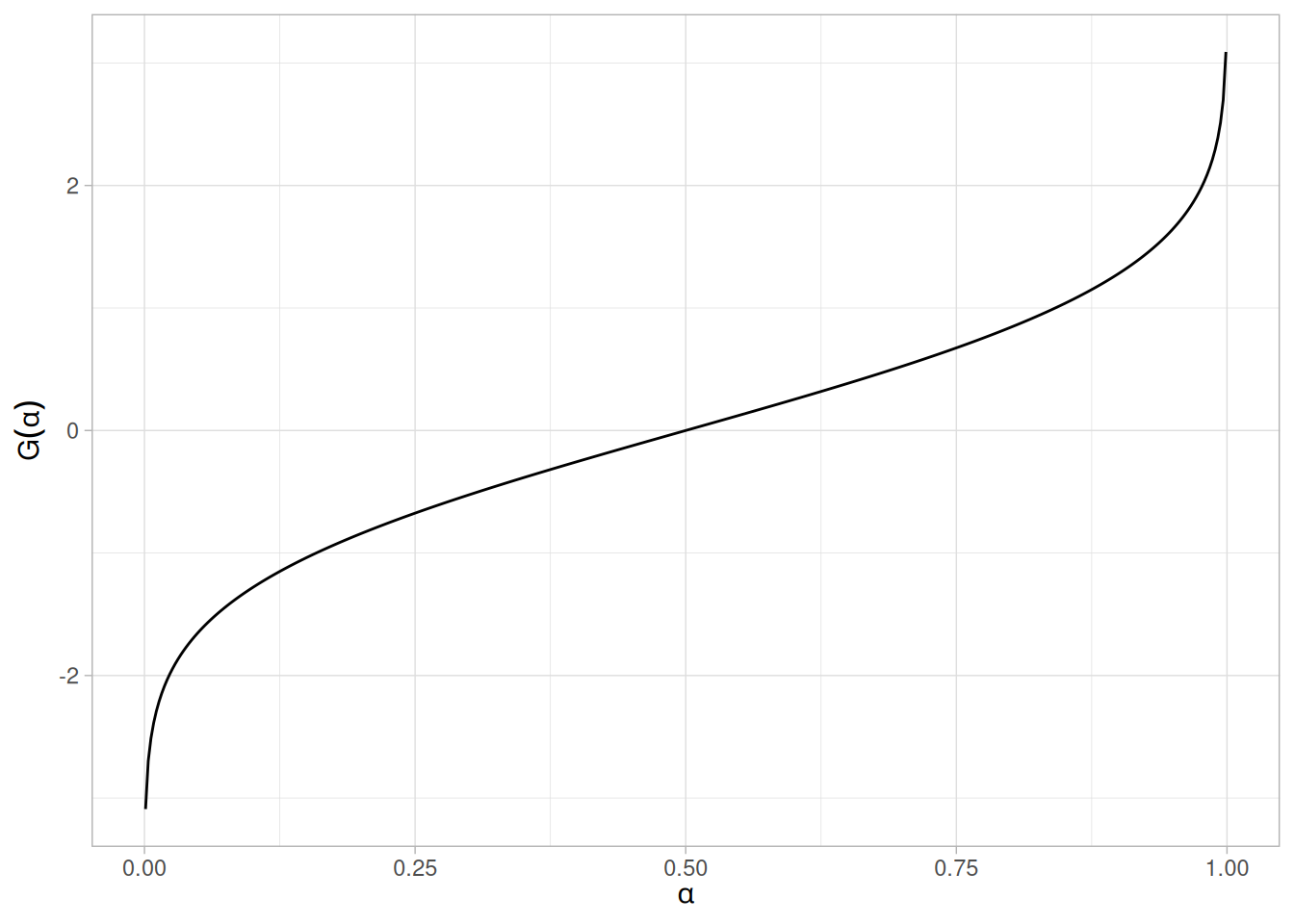
Hazard Function
The formula for the hazard function of the normal distribution is
\[h(x) = \frac{\phi(x)}{\Phi(-x)}\]
where \(\Phi\) is the cumulative distribution function of the standard normal distribution and \(\phi\) is the probability density function of the standard normal distribution.
The following is the plot of the normal hazard function.
tibble(x = seq(-4, 4, length.out = 401)) |>
mutate(y = dnorm(x) / (1 - pnorm(x))) |>
ggplot(aes(x, y)) +
geom_line() +
labs(x = "x", y = "h(x)") +
theme_light()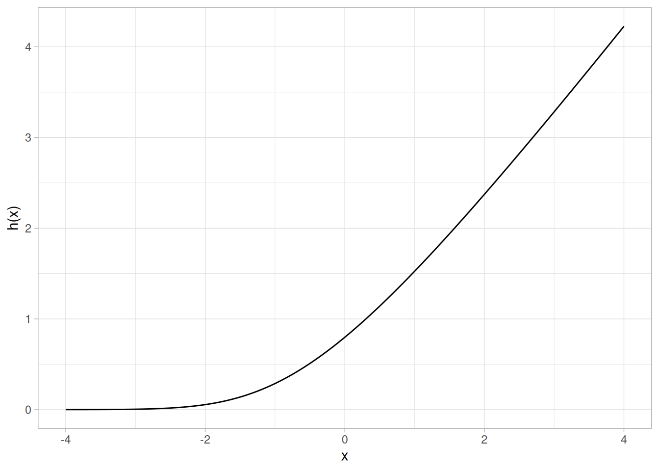
Cumulative Hazard Function
The normal cumulative hazard function can be computed from the normal cumulative distribution function.
The following is the plot of the normal cumulative hazard function.
tibble(x = seq(-4, 4, length.out = 401)) |>
mutate(y = -log(1 - pnorm(x))) |>
ggplot(aes(x, y)) +
geom_line() +
labs(x = "x", y = "H(x)") +
theme_light()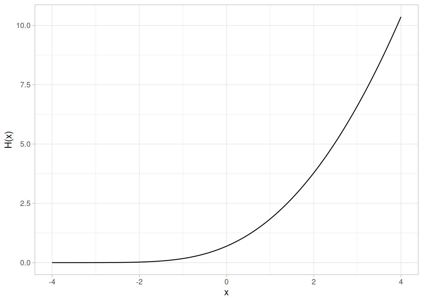
Survival Function
The normal survival function can be computed from the normal cumulative distribution function.
The following is the plot of the normal survival function.
tibble(x = seq(-4, 4, length.out = 401)) |>
mutate(y = 1 - pnorm(x)) |>
ggplot(aes(x, y)) +
geom_line() +
labs(x = "x", y = "S(x)") +
theme_light()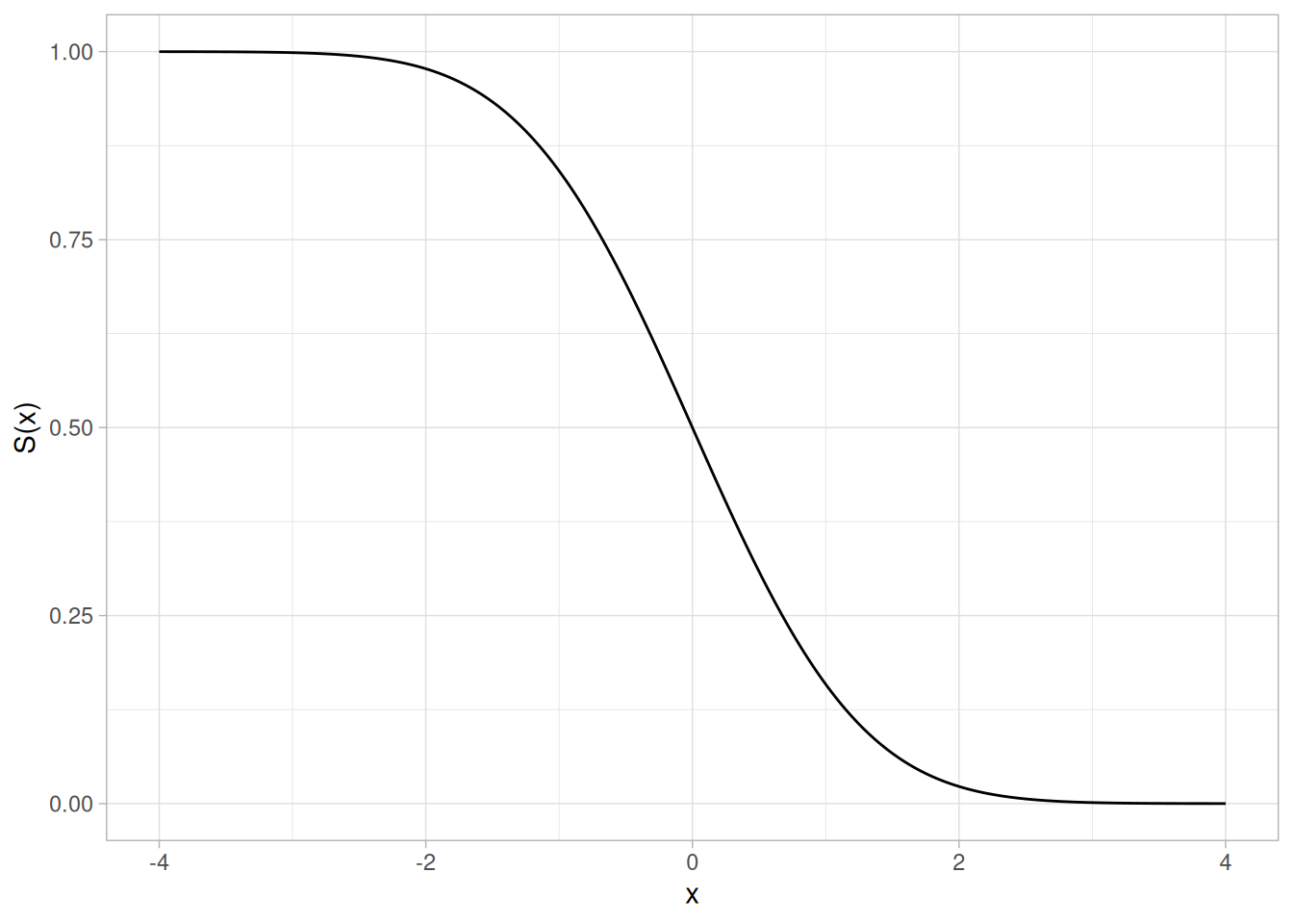
Inverse Survival Function
The normal inverse survival function can be computed from the normal percent point function.
The following is the plot of the normal inverse survival function.
tibble(p = seq(0.001, 0.999, length.out = 401)) |>
mutate(z = qnorm(1 - p)) |>
ggplot(aes(p, z)) +
geom_line() +
labs(x = expression(alpha), y = expression(Z(alpha))) +
theme_light()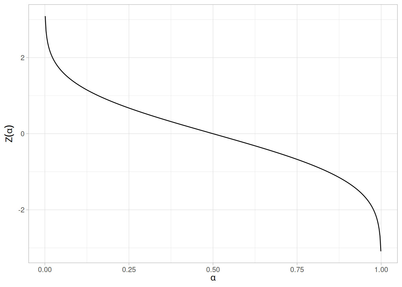
Common Statistics
| Statistic | Value |
|---|---|
| Mean | The location parameter \(\mu\). |
| Median | The location parameter \(\mu\). |
| Mode | The location parameter \(\mu\). |
| Range | \(-\infty\) to \(\infty\). |
| Standard Deviation | The scale parameter \(\sigma\). |
| Coefficient of Variation | \(\sigma / \mu\) |
| Skewness | 0 |
| Kurtosis | 3 |
Parameter Estimation
The location and scale parameters of the normal distribution can be estimated with the sample mean and sample standard deviation, respectively.
Comments
For both theoretical and practical reasons, the normal distribution is probably the most important distribution in statistics. For example,
Theoretical Justification — Central Limit Theorem
The normal distribution is widely used. Part of the appeal is that it is well behaved and mathematically tractable. However, the central limit theorem provides a theoretical basis for why it has wide applicability.
The central limit theorem basically states that as the sample size (\(N\)) becomes large, the following occur:
Software
Most general purpose statistical software programs support at least some of the probability functions for the normal distribution.
Probability Density Function
The general formula for the probability density function of the uniform distribution is
\[f(x) = \frac{1}{B - A} \;\;\;\;\;\;\; \text{for } A \le x \le B\]
where \(A\) is the location parameter and \((B - A)\) is the scale parameter. The case where \(A = 0\) and \(B = 1\) is called the standard uniform distribution. The equation for the standard uniform distribution is
\[f(x) = 1 \;\;\;\;\;\;\; \text{for } 0 \le x \le 1\]
Since the general form of probability functions can be expressed in terms of the standard distribution, all subsequent formulas in this section are given for the standard form of the function.
The following is the plot of the uniform probability density function.
library(tidyverse)
tibble(x = seq(0, 1, length.out = 401)) |>
mutate(y = dunif(x)) |>
ggplot(aes(x, y)) +
geom_line() +
labs(x = "x", y = "f(x)") +
theme_light()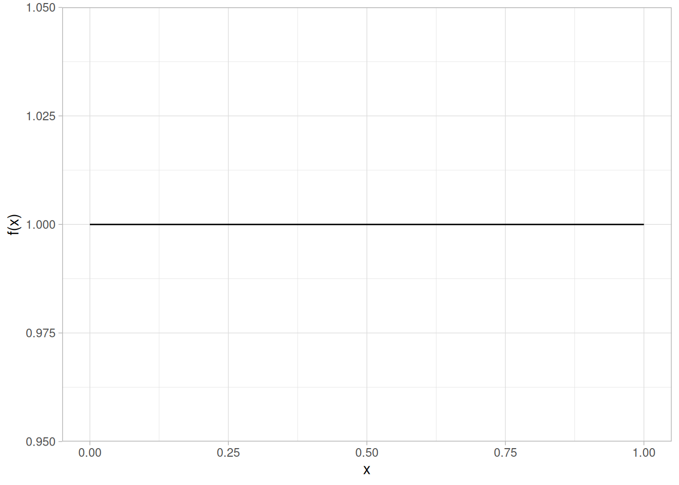
Cumulative Distribution Function
The formula for the cumulative distribution function of the uniform distribution is
\[F(x) = x \;\;\;\;\;\;\; \text{for } 0 \le x \le 1\]
The following is the plot of the uniform cumulative distribution function.
tibble(x = seq(0, 1, length.out = 401)) |>
mutate(y = punif(x)) |>
ggplot(aes(x, y)) +
geom_line() +
labs(x = "x", y = "F(x)") +
theme_light()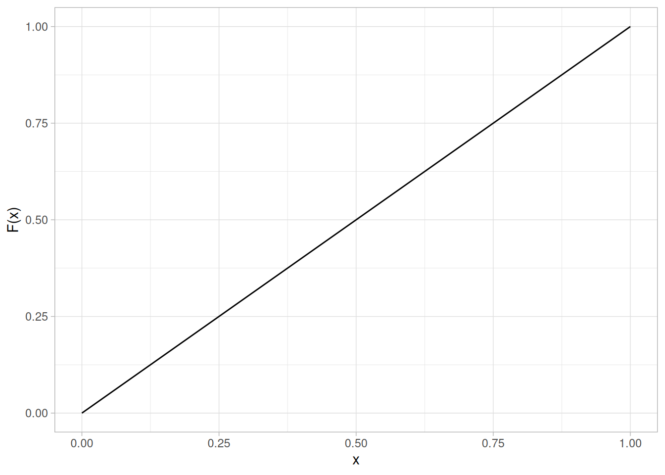
Percent Point Function
The formula for the percent point function of the uniform distribution is
\[G(p) = p \;\;\;\;\;\;\; \text{for } 0 \le p \le 1\]
The following is the plot of the uniform percent point function.
tibble(p = seq(0, 1, length.out = 401)) |>
mutate(x = qunif(p)) |>
ggplot(aes(p, x)) +
geom_line() +
labs(x = expression(alpha), y = expression(G(alpha))) +
theme_light()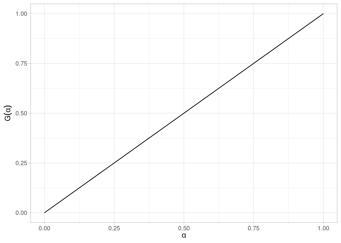
Hazard Function
The formula for the hazard function of the uniform distribution is
\[h(x) = \frac{1}{1 - x} \;\;\;\;\;\;\; \text{for } 0 \le x < 1\]
The following is the plot of the uniform hazard function.
tibble(x = seq(0, 0.999, length.out = 401)) |>
mutate(y = dunif(x) / (1 - punif(x))) |>
ggplot(aes(x, y)) +
geom_line() +
scale_x_continuous(limits = c(0, 1)) +
labs(x = "x", y = "h(x)") +
theme_light()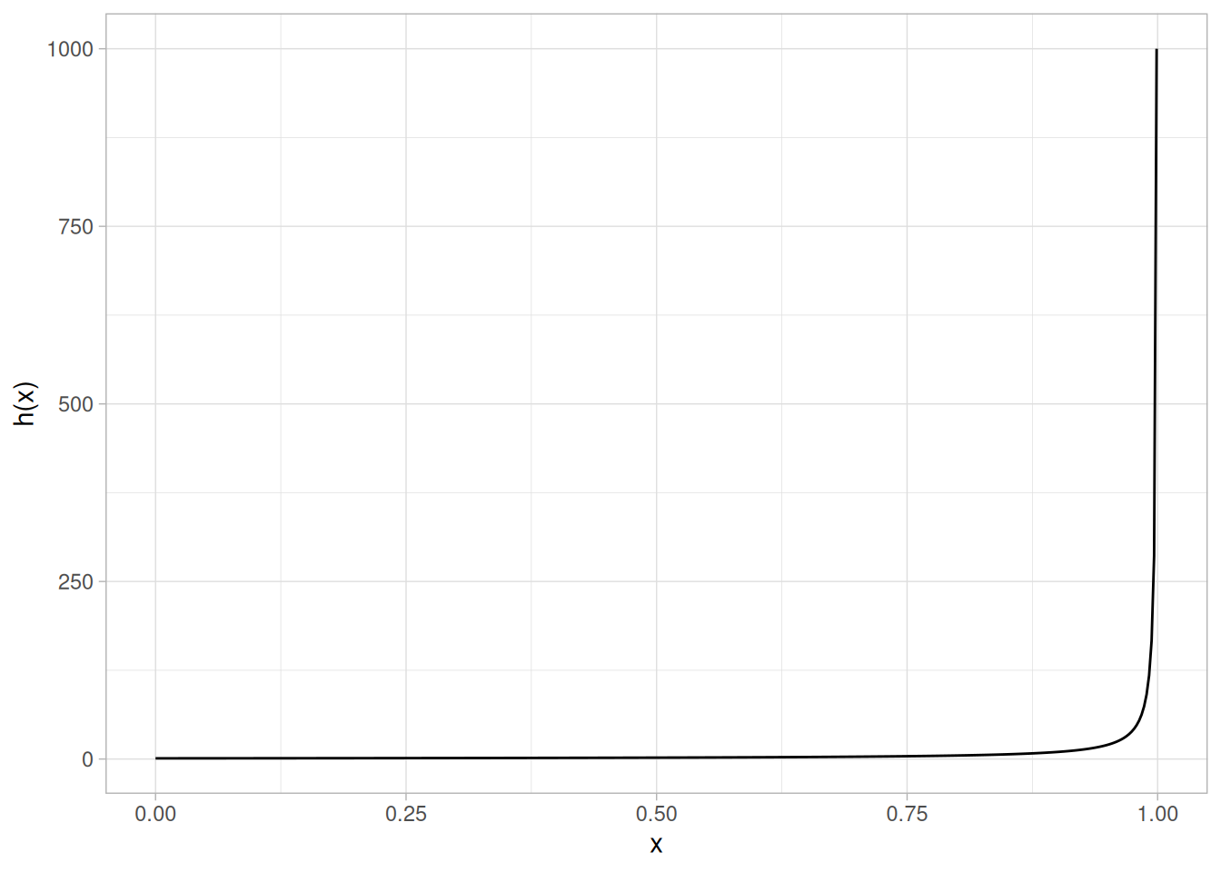
Cumulative Hazard Function
The formula for the cumulative hazard function of the uniform distribution is
\[H(x) = -\ln{(1 - x)} \;\;\;\;\;\;\; \text{for } 0 \le x < 1\]
The following is the plot of the uniform cumulative hazard function.
tibble(x = seq(0, 0.999, length.out = 401)) |>
mutate(y = -log(1 - punif(x))) |>
ggplot(aes(x, y)) +
geom_line() +
scale_x_continuous(limits = c(0, 1)) +
labs(x = "x", y = "H(x)") +
theme_light()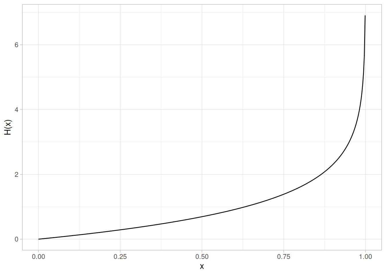
Survival Function
The formula for the uniform survival function is
\[S(x) = 1 - x \;\;\;\;\;\;\; \text{for } 0 \le x \le 1\]
The following is the plot of the uniform survival function.
tibble(x = seq(0, 1, length.out = 401)) |>
mutate(y = 1 - punif(x)) |>
ggplot(aes(x, y)) +
geom_line() +
labs(x = "x", y = "S(x)") +
theme_light()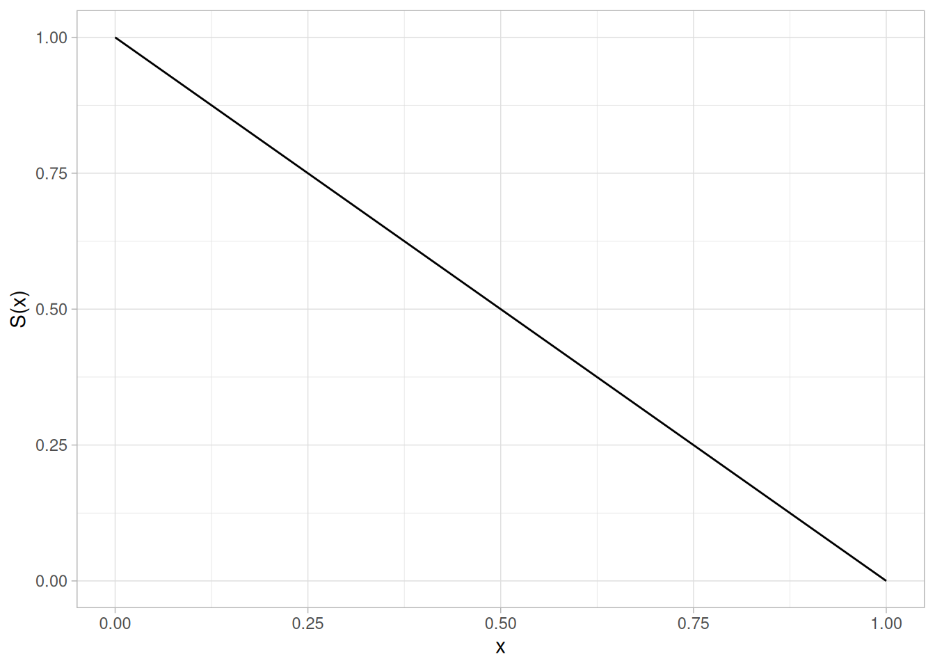
Inverse Survival Function
The formula for the uniform inverse survival function is
\[Z(p) = 1 - p \;\;\;\;\;\;\; \text{for } 0 \le p \le 1\]
The following is the plot of the uniform inverse survival function.
tibble(p = seq(0, 1, length.out = 401)) |>
mutate(z = 1 - qunif(p)) |>
ggplot(aes(p, z)) +
geom_line() +
labs(x = expression(alpha), y = expression(Z(alpha))) +
theme_light()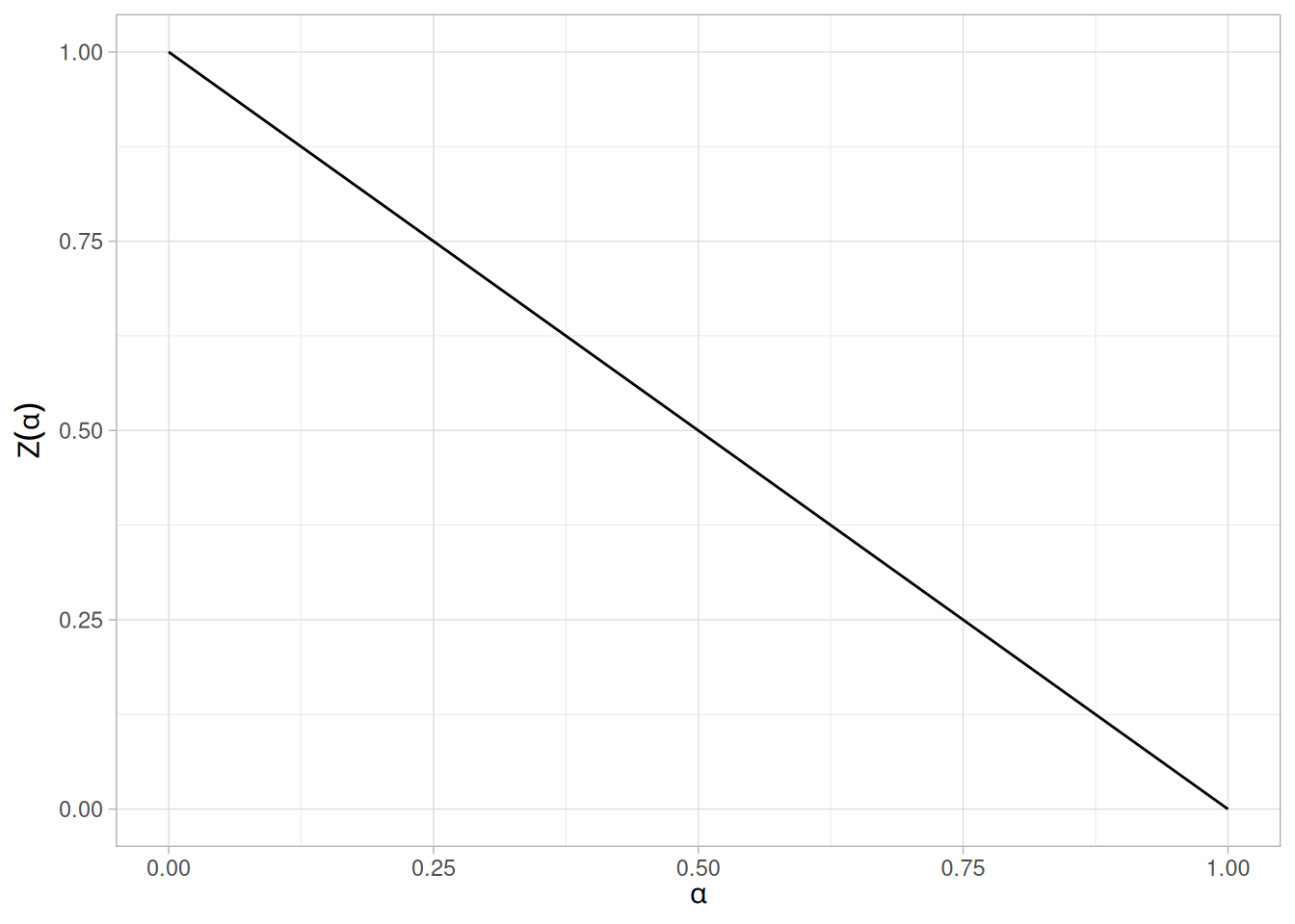
Common Statistics
| Statistic | Value |
|---|---|
| Mean | \((A + B) / 2\) |
| Median | \((A + B) / 2\) |
| Range | \(B - A\) |
| Standard Deviation | \(\sqrt{\dfrac{(B - A)^{2}}{12}}\) |
| Coefficient of Variation | \(\dfrac{B - A}{\sqrt{3}(B + A)}\) |
| Skewness | 0 |
| Kurtosis | 9/5 |
Parameter Estimation
The method of moments estimators for \(A\) and \(B\) are
\[\hat{A} = \bar{x} - \sqrt{3}s\] \[\hat{B} = \bar{x} + \sqrt{3}s\]
The maximum likelihood estimators are usually given in terms of the parameters \(a\) and \(h\) where
\[A = a - h\] \[B = a + h\]
The maximum likelihood estimators for \(a\) and \(h\) are
\[\hat{a} = \text{midrange}(Y_1, Y_2, \ldots, Y_n)\] \[\hat{h} = 0.5[\text{range}(Y_1, Y_2, \ldots, Y_n)]\]
This gives the following maximum likelihood estimators for \(A\) and \(B\):
\[\hat{A} = \text{midrange}(Y_1, Y_2, \ldots, Y_n) - 0.5[\text{range}(Y_1, Y_2, \ldots, Y_n)] = Y_1\] \[\hat{B} = \text{midrange}(Y_1, Y_2, \ldots, Y_n) + 0.5[\text{range}(Y_1, Y_2, \ldots, Y_n)] = Y_n\]
Comments
The uniform distribution defines equal probability over a given range for a continuous distribution. For this reason, it is important as a reference distribution.
One of the most important applications of the uniform distribution is in the generation of random numbers. That is, almost all random number generators generate random numbers on the (0, 1) interval. For other distributions, some transformation is applied to the uniform random numbers.
Software
Most general purpose statistical software programs support at least some of the probability functions for the uniform distribution.
Probability Density Function
The general formula for the probability density function of the Cauchy distribution is
\[f(x) = \frac{1}{s\pi(1 + ((x - t)/s)^{2})}\]
where \(t\) is the location parameter and \(s\) is the scale parameter. The case where \(t = 0\) and \(s = 1\) is called the standard Cauchy distribution. The equation for the standard Cauchy distribution reduces to
\[f(x) = \frac{1}{\pi(1 + x^{2})}\]
Since the general form of probability functions can be expressed in terms of the standard distribution, all subsequent formulas in this section are given for the standard form of the function.
The following is the plot of the standard Cauchy probability density function.
library(tidyverse)
tibble(x = seq(-10, 10, length.out = 401)) |>
mutate(y = dcauchy(x)) |>
ggplot(aes(x, y)) +
geom_line() +
labs(x = "x", y = "f(x)") +
theme_light()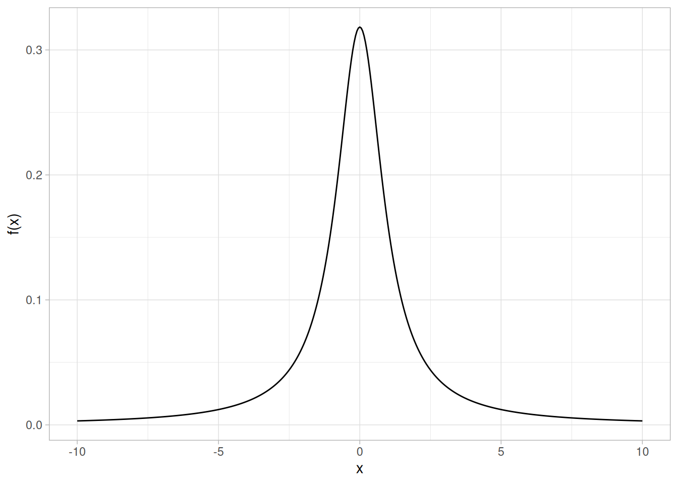
Cumulative Distribution Function
The formula for the cumulative distribution function for the Cauchy distribution is
\[F(x) = 0.5 + \frac{\arctan{(x)}}{\pi}\]
The following is the plot of the Cauchy cumulative distribution function.
tibble(x = seq(-10, 10, length.out = 401)) |>
mutate(y = pcauchy(x)) |>
ggplot(aes(x, y)) +
geom_line() +
labs(x = "x", y = "F(x)") +
theme_light()
Percent Point Function
The formula for the percent point function of the Cauchy distribution is
\[G(p) = -\cot{(\pi p)}\]
The following is the plot of the Cauchy percent point function.
tibble(p = seq(0.001, 0.999, length.out = 401)) |>
mutate(x = qcauchy(p)) |>
ggplot(aes(p, x)) +
geom_line() +
labs(x = expression(alpha), y = expression(G(alpha))) +
theme_light()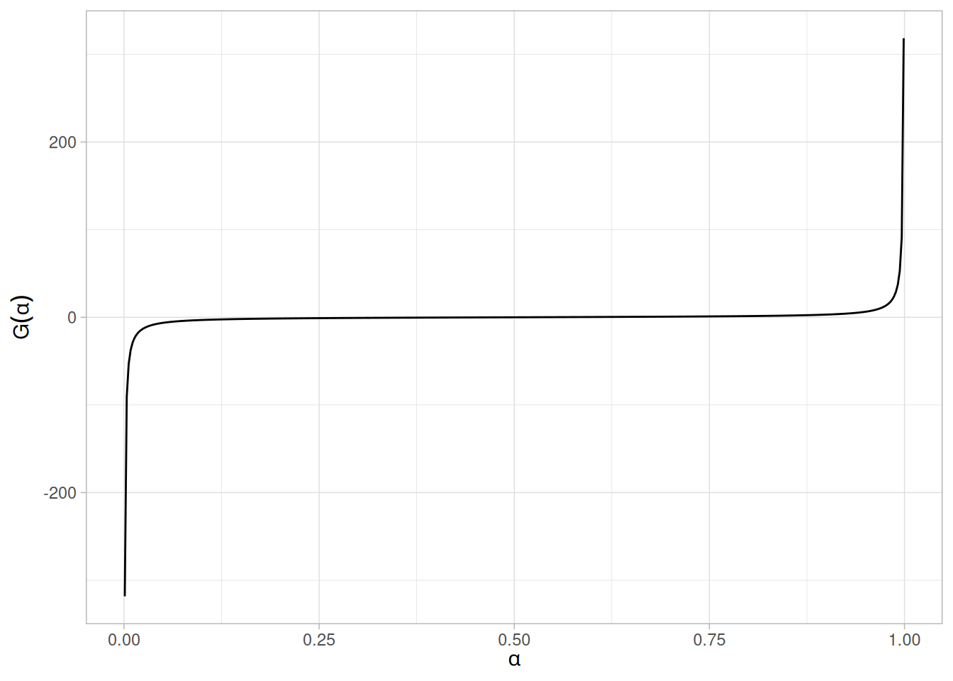
Hazard Function
The formula for the Cauchy hazard function is
\[h(x) = \frac{1}{(1 + x^{2})(0.5\pi - \arctan{x})}\]
The following is the plot of the Cauchy hazard function.
tibble(x = seq(-10, 10, length.out = 401)) |>
mutate(y = dcauchy(x) / (1 - pcauchy(x))) |>
ggplot(aes(x, y)) +
geom_line() +
labs(x = "x", y = "h(x)") +
theme_light()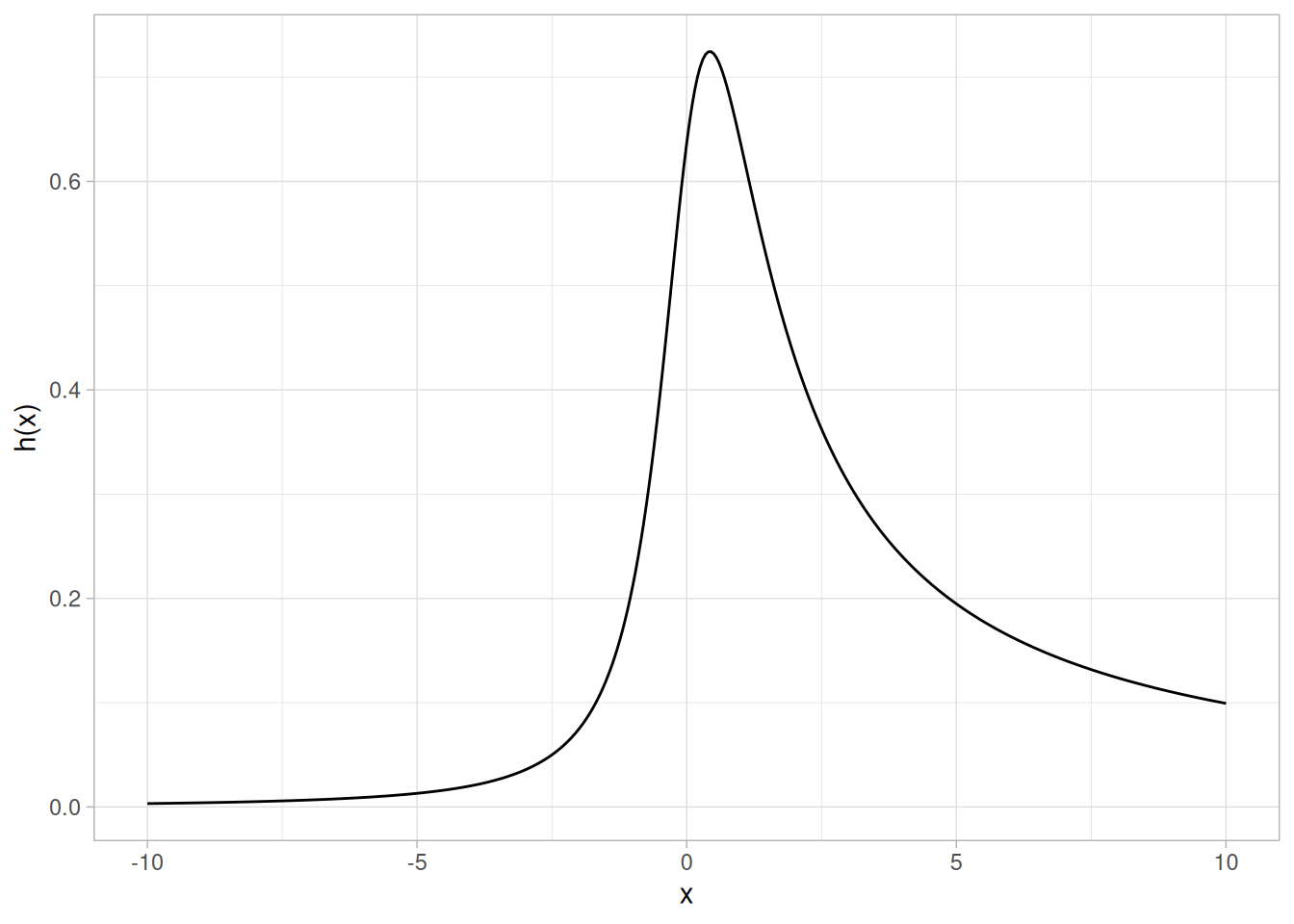
Cumulative Hazard Function
The formula for the Cauchy cumulative hazard function is
\[H(x) = -\ln\left(0.5 - \frac{\arctan{x}}{\pi}\right)\]
The following is the plot of the Cauchy cumulative hazard function.
tibble(x = seq(-10, 10, length.out = 401)) |>
mutate(y = -log(1 - pcauchy(x))) |>
ggplot(aes(x, y)) +
geom_line() +
labs(x = "x", y = "H(x)") +
theme_light()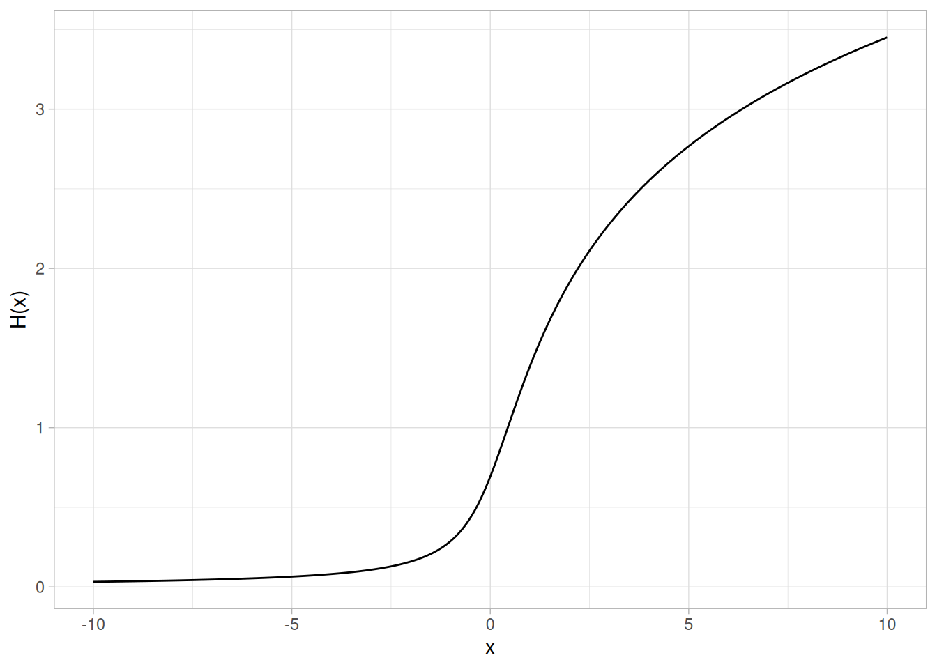
Survival Function
The formula for the Cauchy survival function is
\[S(x) = 0.5 - \frac{\arctan{(x)}}{\pi}\]
The following is the plot of the Cauchy survival function.
tibble(x = seq(-10, 10, length.out = 401)) |>
mutate(y = 1 - pcauchy(x)) |>
ggplot(aes(x, y)) +
geom_line() +
labs(x = "x", y = "S(x)") +
theme_light()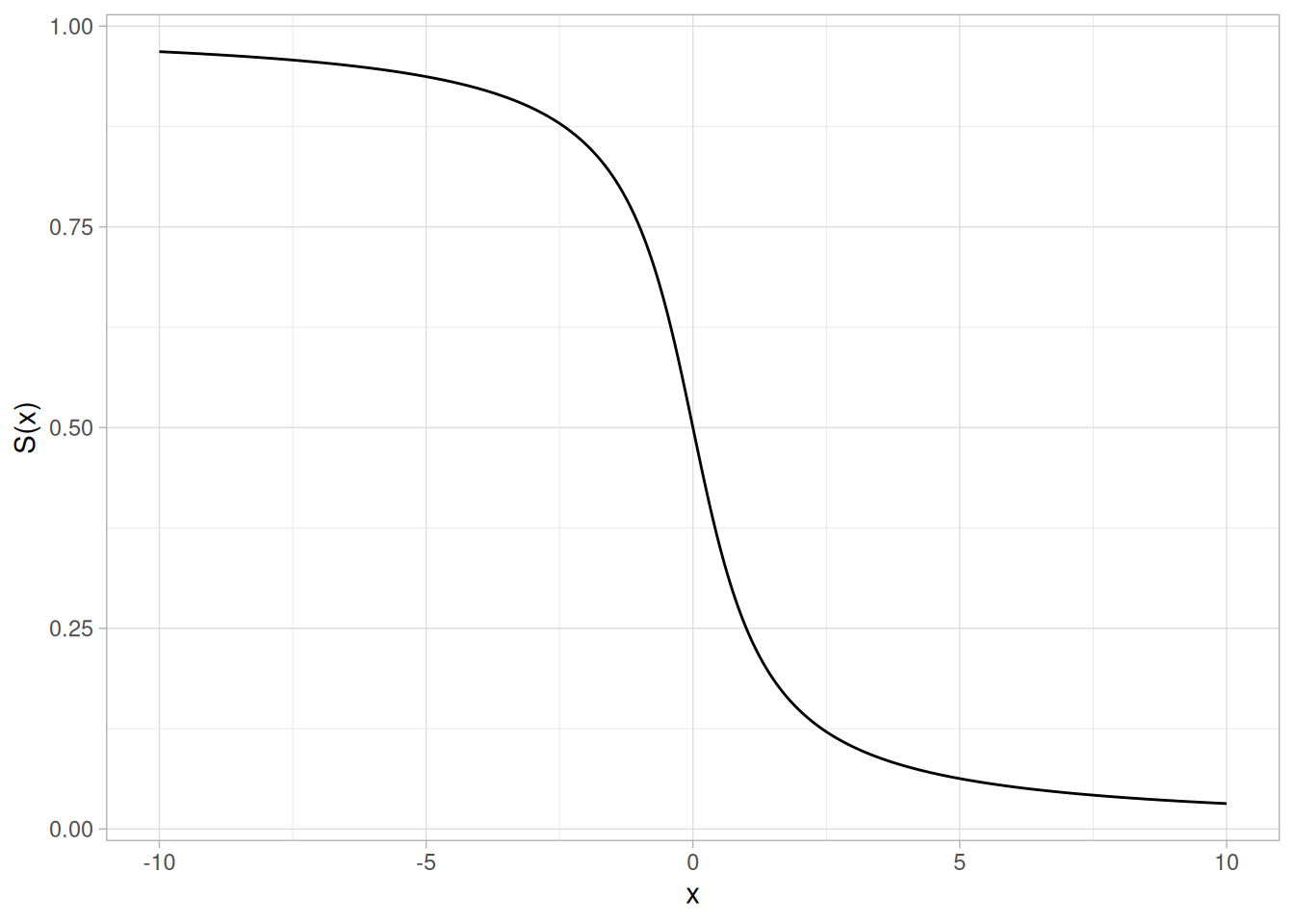
Inverse Survival Function
The formula for the Cauchy inverse survival function is
\[Z(p) = -\cot{(\pi(1 - p))}\]
The following is the plot of the Cauchy inverse survival function.
tibble(p = seq(0.001, 0.999, length.out = 401)) |>
mutate(z = qcauchy(1 - p)) |>
ggplot(aes(p, z)) +
geom_line() +
labs(x = expression(alpha), y = expression(Z(alpha))) +
theme_light()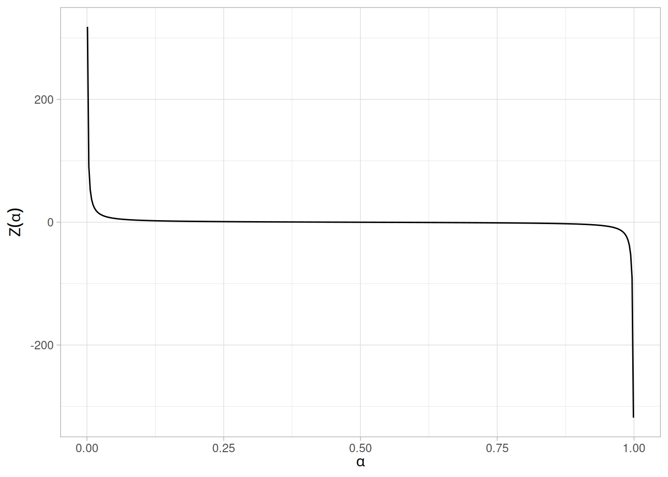
Common Statistics
| Statistic | Value |
|---|---|
| Mean | The mean is undefined. |
| Median | The location parameter \(t\). |
| Mode | The location parameter \(t\). |
| Range | \(-\infty\) to \(\infty\) |
| Standard Deviation | The standard deviation is undefined. |
| Coefficient of Variation | The coefficient of variation is undefined. |
| Skewness | The skewness is 0. |
| Kurtosis | The kurtosis is undefined. |
Parameter Estimation
The likelihood functions for the Cauchy maximum likelihood estimates are given in chapter 16 of Johnson, Kotz, and Balakrishnan. These equations typically must be solved numerically on a computer.
Comments
The Cauchy distribution is important as an example of a pathological case. Cauchy distributions look similar to a normal distribution. However, they have much heavier tails. When studying hypothesis tests that assume normality, seeing how the tests perform on data from a Cauchy distribution is a good indicator of how sensitive the tests are to heavy-tail departures from normality. Likewise, it is a good check for robust techniques that are designed to work well under a wide variety of distributional assumptions.
The mean and standard deviation of the Cauchy distribution are undefined. The practical meaning of this is that collecting 1,000 data points gives no more accurate an estimate of the mean and standard deviation than does a single point.
Software
Many general purpose statistical software programs support at least some of the probability functions for the Cauchy distribution.
Probability Density Function
The formula for the probability density function of the t distribution is
\[f(x) = \frac{(1 + \frac{x^{2}}{\nu})^{\frac{-(\nu + 1)}{2}}}{B(0.5, 0.5\nu)\sqrt{\nu}}\]
where \(B\) is the beta function and \(\nu\) is a positive integer shape parameter. The formula for the beta function is
\[B(\alpha, \beta) = \int_{0}^{1} t^{\alpha - 1}(1 - t)^{\beta - 1}\,dt\]
In a testing context, the t distribution is treated as a “standardized distribution” (i.e., no location or scale parameters). However, in a distributional modeling context (as with other probability distributions), the t distribution itself can be transformed with a location parameter, \(\mu\), and a scale parameter, \(\sigma\).
The following is the plot of the t probability density function for 4 different values of the shape parameter, \(\nu\): 1, 10, 20, and 30.
library(tidyverse)
dfs <- c(1, 10, 20, 30)
crossing(x = seq(-5, 5, length.out = 401), nu = dfs) |>
mutate(
y = dt(x, df = nu),
nu_label = paste("nu =", nu),
nu_label = fct_reorder(nu_label, nu)
) |>
ggplot(aes(x, y)) +
geom_line() +
facet_wrap(~nu_label) +
labs(x = "x", y = "f(x)") +
theme_light()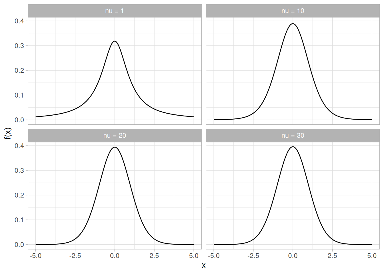
These plots all have a similar shape. The difference is in the heaviness of the tails. In fact, the t distribution with \(\nu\) equal to 1 is a Cauchy distribution. The t distribution approaches a normal distribution as \(\nu\) becomes large. The approximation is quite good for values of \(\nu > 30\).
Cumulative Distribution Function
The formula for the cumulative distribution function of the t distribution is complicated and is not included here. It is given in the Evans, Hastings, and Peacock book (Evans et al. 2000).
The following are the plots of the t cumulative distribution function with the same values of \(\nu\) as the pdf plots above.
crossing(x = seq(-5, 5, length.out = 401), nu = dfs) |>
mutate(
y = pt(x, df = nu),
nu_label = paste("nu =", nu),
nu_label = fct_reorder(nu_label, nu)
) |>
ggplot(aes(x, y)) +
geom_line() +
facet_wrap(~nu_label) +
labs(x = "x", y = "F(x)") +
theme_light()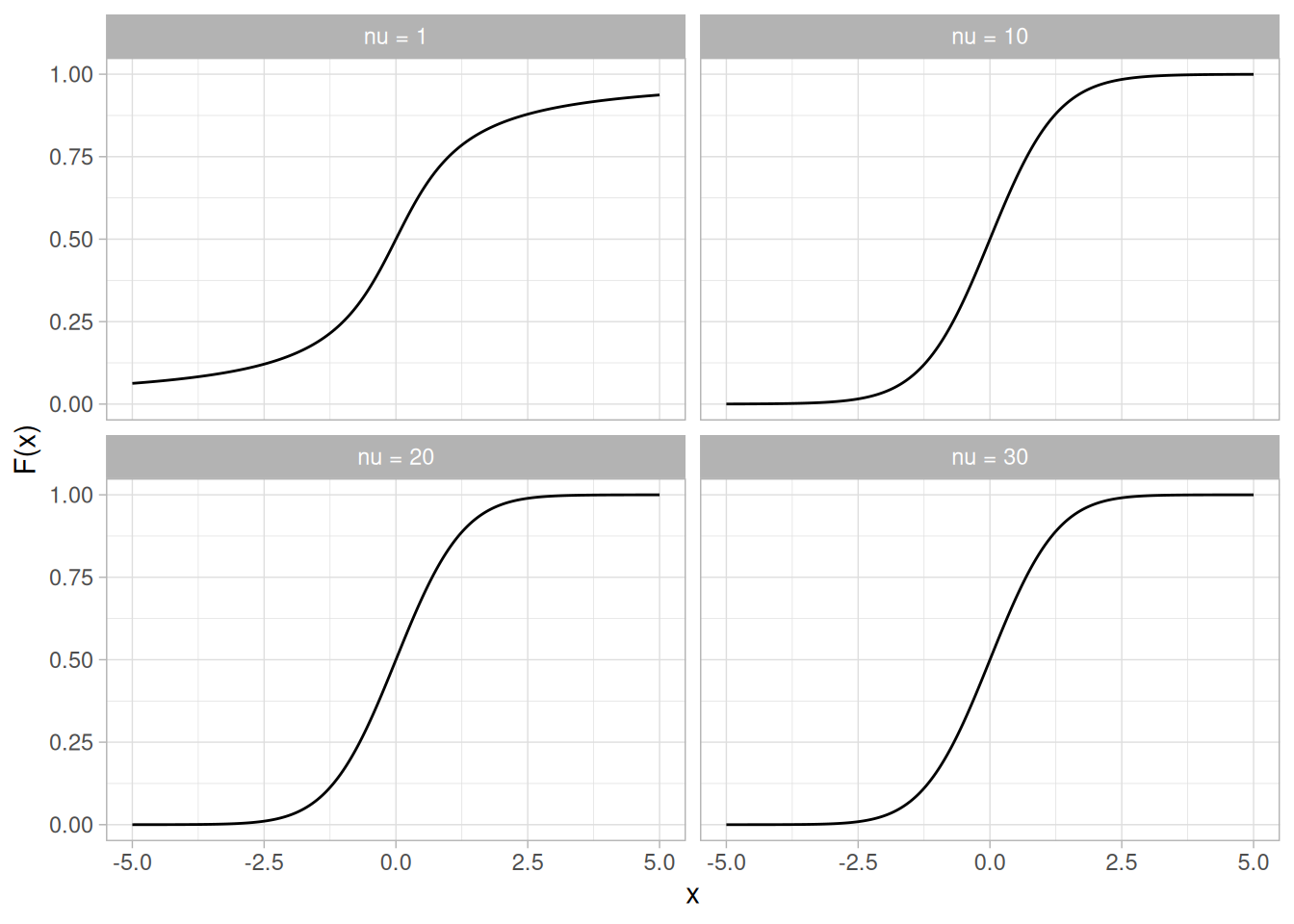
Percent Point Function
The formula for the percent point function of the t distribution does not exist in a simple closed form. It is computed numerically.
The following are the plots of the t percent point function with the same values of \(\nu\) as the pdf plots above.
crossing(p = seq(0.001, 0.999, length.out = 401), nu = dfs) |>
mutate(
x = qt(p, df = nu),
nu_label = paste("nu =", nu),
nu_label = fct_reorder(nu_label, nu)
) |>
ggplot(aes(p, x)) +
geom_line() +
facet_wrap(~nu_label) +
labs(x = expression(alpha), y = expression(G(alpha))) +
theme_light()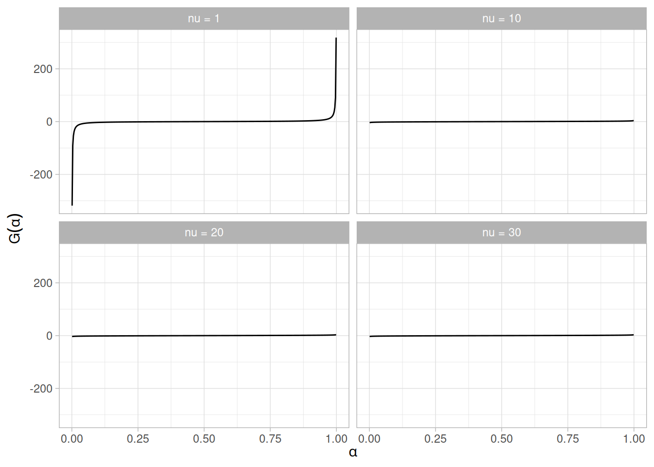
Other Probability Functions
Since the t distribution is typically used to develop hypothesis tests and confidence intervals and rarely for modeling applications, we omit the formulas and plots for the hazard, cumulative hazard, survival, and inverse survival probability functions.
Common Statistics
| Statistic | Value |
|---|---|
| Mean | 0 (It is undefined for \(\nu\) equal to 1.) |
| Median | 0 |
| Mode | 0 |
| Range | \(-\infty\) to \(\infty\) |
| Standard Deviation | \(\sqrt{\dfrac{\nu}{\nu - 2}}\). It is undefined for \(\nu\) equal to 1 or 2. |
| Coefficient of Variation | Undefined |
| Skewness | 0. It is undefined for \(\nu\) less than or equal to 3. However, the t distribution is symmetric in all cases. |
| Kurtosis | \(\dfrac{3(\nu - 2)}{\nu - 4}\). It is undefined for \(\nu\) less than or equal to 4. |
Parameter Estimation
Since the t distribution is typically used to develop hypothesis tests and confidence intervals and rarely for modeling applications, we omit any discussion of parameter estimation.
Comments
The t distribution is used in many cases for the critical regions for hypothesis tests and in determining confidence intervals. The most common example is testing if data are consistent with the assumed process mean.
Software
Most general purpose statistical software programs support at least some of the probability functions for the t distribution.
Probability Density Function
The F distribution is the ratio of two chi-square distributions with degrees of freedom \(\nu_{1}\) and \(\nu_{2}\), respectively, where each chi-square has first been divided by its degrees of freedom. The formula for the probability density function of the F distribution is
\[f(x) = \frac{\Gamma(\frac{\nu_{1} + \nu_{2}}{2}) (\frac{\nu_{1}}{\nu_{2}})^{\frac{\nu_{1}}{2}} x^{\frac{\nu_{1}}{2} - 1}}{\Gamma(\frac{\nu_{1}}{2}) \Gamma(\frac{\nu_{2}}{2}) (1 + \frac{\nu_{1}x}{\nu_{2}})^{\frac{\nu_{1} + \nu_{2}}{2}}}\]
where \(\nu_{1}\) and \(\nu_{2}\) are the shape parameters and \(\Gamma\) is the gamma function. The formula for the gamma function is
\[\Gamma(a) = \int_{0}^{\infty} t^{a-1}e^{-t}\,dt\]
In a testing context, the F distribution is treated as a “standardized distribution” (i.e., no location or scale parameters). However, in a distributional modeling context (as with other probability distributions), the F distribution itself can be transformed with a location parameter, \(\mu\), and a scale parameter, \(\sigma\).
The following is the plot of the F probability density function for 4 different combinations of the shape parameters, \(\nu_{1}\) and \(\nu_{2}\): (1, 1), (1, 10), (10, 1), and (10, 10). Since the F distribution is only defined for \(x \ge 0\), the domain starts at 0.
library(tidyverse)
params <- tribble(
~label, ~df1, ~df2,
"(1, 1)", 1, 1,
"(1, 10)", 1, 10,
"(10, 1)", 10, 1,
"(10, 10)", 10, 10
) |>
mutate(label = fct_inorder(label))
expand_grid(x = seq(0.001, 5, length.out = 401), params) |>
mutate(y = df(x, df1, df2)) |>
ggplot(aes(x, y)) +
geom_line() +
facet_wrap(~label) +
labs(x = "x", y = "f(x)") +
theme_light()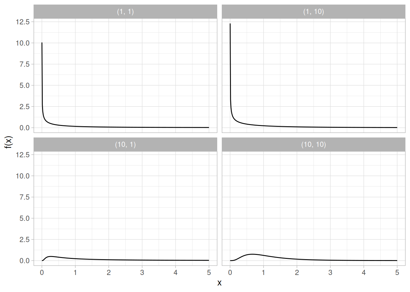
Cumulative Distribution Function
The formula for the cumulative distribution function of the F distribution is
\[F(x) = 1 - I_{k}\!\left(\frac{\nu_{2}}{2}, \frac{\nu_{1}}{2}\right)\]
where \(k = \nu_{2}/(\nu_{2} + \nu_{1}x)\) and \(I_{k}\) is the incomplete beta function. The formula for the incomplete beta function is
\[I_{k}(x, \alpha, \beta) = \frac{\int_{0}^{x} t^{\alpha - 1}(1 - t)^{\beta - 1}\,dt}{B(\alpha, \beta)}\]
where \(B\) is the beta function
\[B(\alpha, \beta) = \int_{0}^{1} t^{\alpha - 1}(1 - t)^{\beta - 1}\,dt\]
The following is the plot of the F cumulative distribution function with the same values of \(\nu_{1}\) and \(\nu_{2}\) as the pdf plots above.
expand_grid(x = seq(0, 5, length.out = 401), params) |>
mutate(y = pf(x, df1, df2)) |>
ggplot(aes(x, y)) +
geom_line() +
facet_wrap(~label) +
labs(x = "x", y = "F(x)") +
theme_light()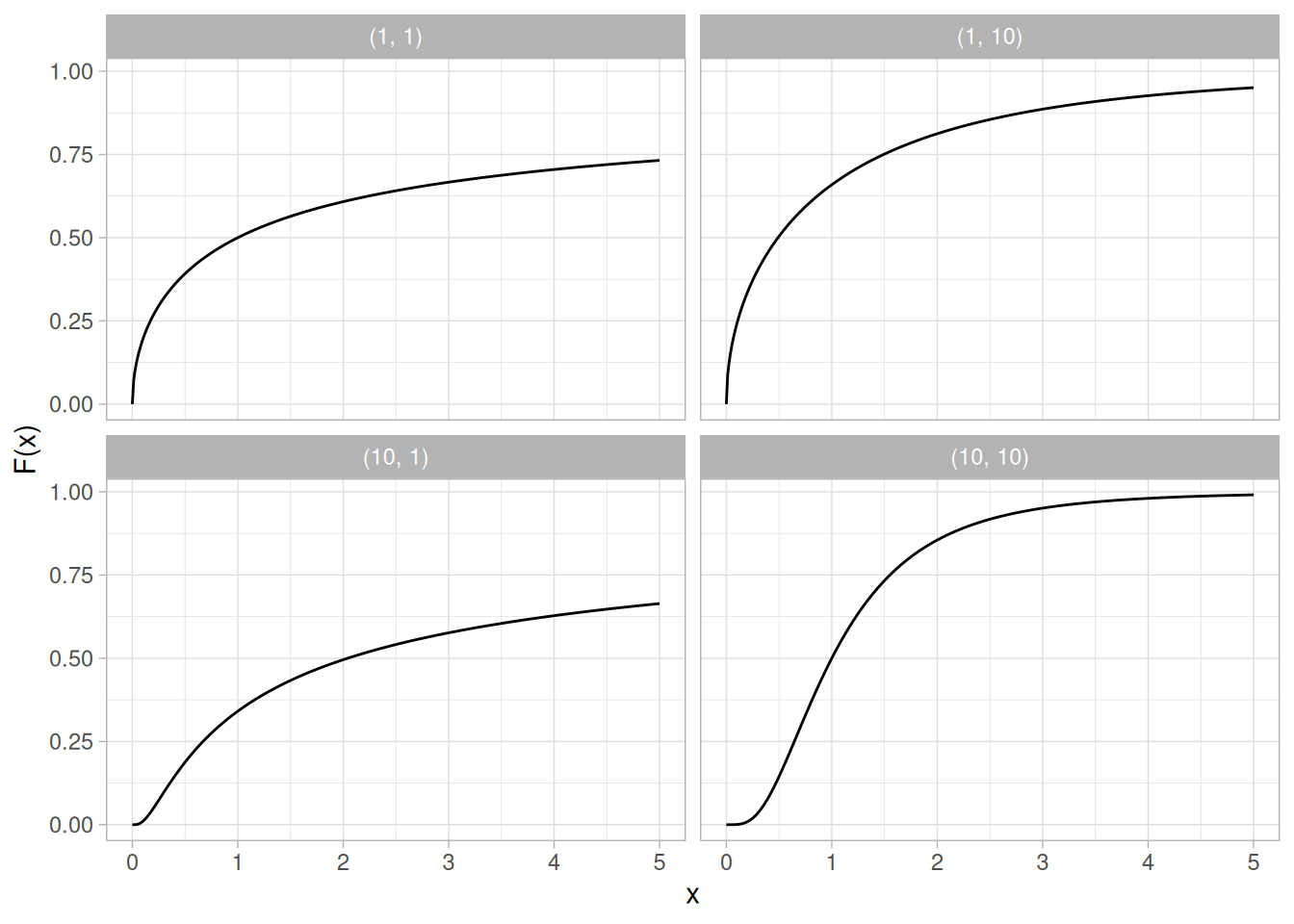
Percent Point Function
The formula for the percent point function of the F distribution does not exist in a simple closed form. It is computed numerically.
The following is the plot of the F percent point function with the same values of \(\nu_{1}\) and \(\nu_{2}\) as the pdf plots above.
expand_grid(p = seq(0.001, 0.999, length.out = 401), params) |>
mutate(x = qf(p, df1, df2)) |>
ggplot(aes(p, x)) +
geom_line() +
facet_wrap(~label) +
labs(x = expression(alpha), y = expression(G(alpha))) +
theme_light()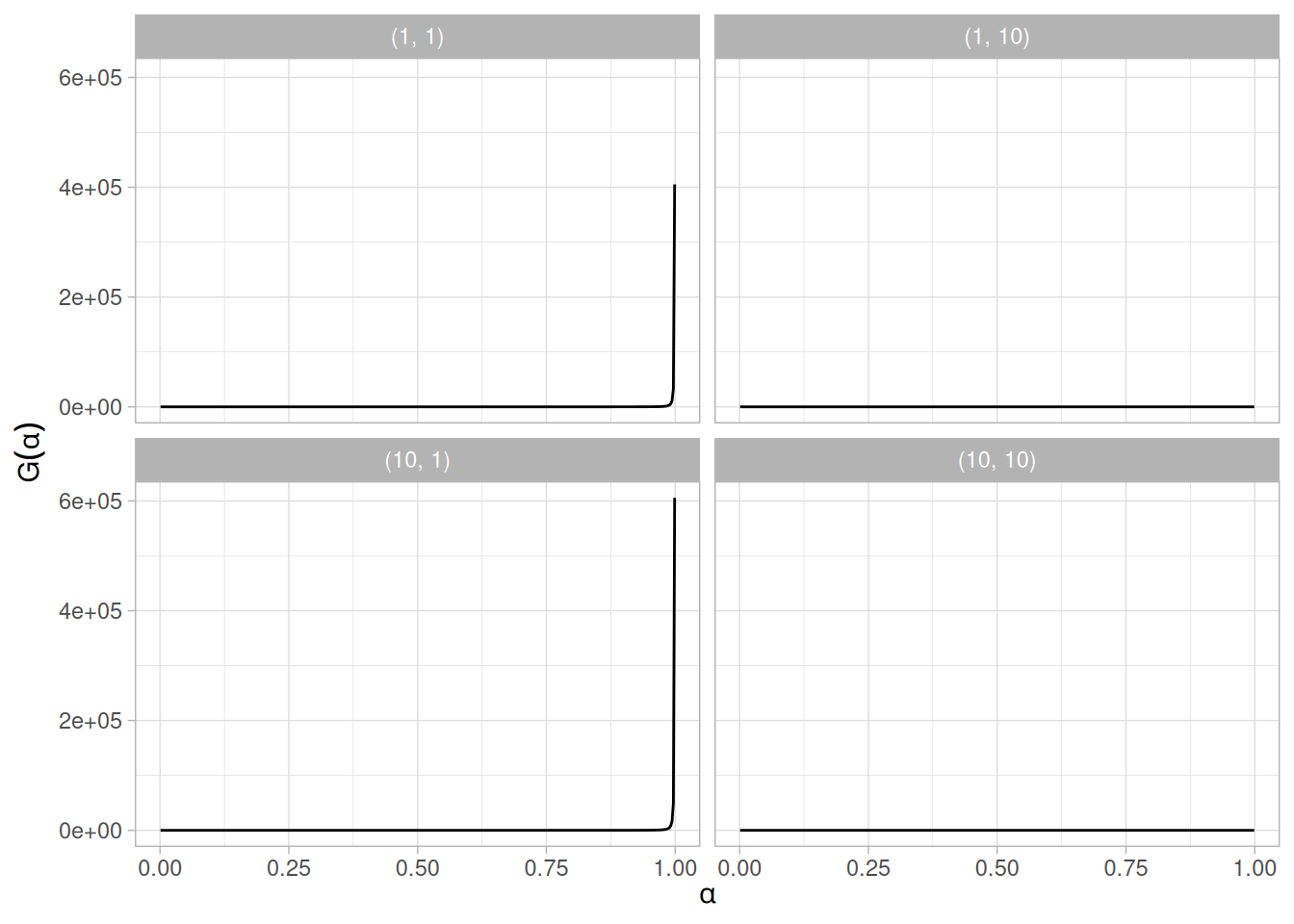
Other Probability Functions
Since the F distribution is typically used to develop hypothesis tests and confidence intervals and rarely for modeling applications, we omit the formulas and plots for the hazard, cumulative hazard, survival, and inverse survival probability functions.
Common Statistics
The formulas below are for the case where the location parameter is zero and the scale parameter is one.
| Statistic | Value |
|---|---|
| Mean | \(\dfrac{\nu_{2}}{\nu_{2} - 2} \;\;\;\;\;\;\; \nu_{2} > 2\) |
| Mode | \(\dfrac{\nu_{2}(\nu_{1} - 2)}{\nu_{1}(\nu_{2} + 2)} \;\;\;\;\;\;\; \nu_{1} > 2\) |
| Range | 0 to \(\infty\) |
| Standard Deviation | \(\sqrt{\dfrac{2\nu_{2}^{2}(\nu_{1} + \nu_{2} - 2)}{\nu_{1}(\nu_{2} - 2)^{2}(\nu_{2} - 4)}} \;\;\;\;\;\;\; \nu_{2} > 4\) |
| Coefficient of Variation | \(\sqrt{\dfrac{2(\nu_{1} + \nu_{2} - 2)}{\nu_{1}(\nu_{2} - 4)}} \;\;\;\;\;\;\; \nu_{2} > 4\) |
| Skewness | \(\dfrac{(2\nu_{1} + \nu_{2} - 2)\sqrt{8(\nu_{2} - 4)}}{\sqrt{\nu_{1}}(\nu_{2} - 6)\sqrt{\nu_{1} + \nu_{2} - 2}} \;\;\;\;\;\;\; \nu_{2} > 6\) |
Parameter Estimation
Since the F distribution is typically used to develop hypothesis tests and confidence intervals and rarely for modeling applications, we omit any discussion of parameter estimation.
Comments
The F distribution is used in many cases for the critical regions for hypothesis tests and in determining confidence intervals. Two common examples are the analysis of variance and the F test to determine if the variances of two populations are equal.
Software
Most general purpose statistical software programs support at least some of the probability functions for the F distribution.
Probability Density Function
The chi-square distribution results when \(\nu\) independent variables with standard normal distributions are squared and summed. The formula for the probability density function of the chi-square distribution is
\[f(x) = \frac{e^{-x/2}x^{\frac{\nu}{2} - 1}}{2^{\frac{\nu}{2}}\Gamma(\frac{\nu}{2})} \;\;\;\;\;\;\; \text{for } x \ge 0\]
where \(\nu\) is the shape parameter and \(\Gamma\) is the gamma function. The formula for the gamma function is
\[\Gamma(a) = \int_{0}^{\infty} t^{a-1}e^{-t}\,dt\]
In a testing context, the chi-square distribution is treated as a “standardized distribution” (i.e., no location or scale parameters). However, in a distributional modeling context (as with other probability distributions), the chi-square distribution itself can be transformed with a location parameter, \(\mu\), and a scale parameter, \(\sigma\).
The following is the plot of the chi-square probability density function for 4 different values of the shape parameter, \(\nu\): 1, 2, 5, and 10. Since the chi-square distribution is only defined for \(x \ge 0\), the domain starts at 0.
library(tidyverse)
dfs <- c(1, 2, 5, 10)
crossing(x = seq(0.001, 10, length.out = 401), nu = dfs) |>
mutate(
y = dchisq(x, df = nu),
nu_label = paste("nu =", nu),
nu_label = fct_reorder(nu_label, nu)
) |>
ggplot(aes(x, y)) +
geom_line() +
facet_wrap(~nu_label, scales = "free_y") +
labs(x = "x", y = "f(x)") +
theme_light()
Cumulative Distribution Function
The formula for the cumulative distribution function of the chi-square distribution is
\[F(x) = \frac{\gamma(\frac{\nu}{2}, \frac{x}{2})}{\Gamma(\frac{\nu}{2})} \;\;\;\;\;\;\; \text{for } x \ge 0\]
where \(\Gamma\) is the gamma function defined above and \(\gamma\) is the incomplete gamma function. The formula for the incomplete gamma function is
\[\gamma_{x}(a) = \int_{0}^{x} t^{a-1}e^{-t}\,dt\]
The following is the plot of the chi-square cumulative distribution function with the same values of \(\nu\) as the pdf plots above.
crossing(x = seq(0.001, 10, length.out = 401), nu = dfs) |>
mutate(
y = pchisq(x, df = nu),
nu_label = paste("nu =", nu),
nu_label = fct_reorder(nu_label, nu)
) |>
ggplot(aes(x, y)) +
geom_line() +
facet_wrap(~nu_label) +
labs(x = "x", y = "F(x)") +
theme_light()
Percent Point Function
The formula for the percent point function of the chi-square distribution does not exist in a simple closed form. It is computed numerically.
The following is the plot of the chi-square percent point function with the same values of \(\nu\) as the pdf plots above.
crossing(p = seq(0.001, 0.999, length.out = 401), nu = dfs) |>
mutate(
x = qchisq(p, df = nu),
nu_label = paste("nu =", nu),
nu_label = fct_reorder(nu_label, nu)
) |>
ggplot(aes(p, x)) +
geom_line() +
facet_wrap(~nu_label) +
labs(x = expression(alpha), y = expression(G(alpha))) +
theme_light()
Other Probability Functions
Since the chi-square distribution is typically used to develop hypothesis tests and confidence intervals and rarely for modeling applications, we omit the formulas and plots for the hazard, cumulative hazard, survival, and inverse survival probability functions.
Common Statistics
| Statistic | Value |
|---|---|
| Mean | \(\nu\) |
| Median | approximately \(\nu - 2/3\) for large \(\nu\) |
| Mode | \(\nu - 2 \;\;\;\;\;\;\; \text{for } \nu > 2\) |
| Range | 0 to \(\infty\) |
| Standard Deviation | \(\sqrt{2\nu}\) |
| Coefficient of Variation | \(\sqrt{\dfrac{2}{\nu}}\) |
| Skewness | \(\dfrac{2^{1.5}}{\sqrt{\nu}}\) |
| Kurtosis | \(3 + \dfrac{12}{\nu}\) |
Parameter Estimation
Since the chi-square distribution is typically used to develop hypothesis tests and confidence intervals and rarely for modeling applications, we omit any discussion of parameter estimation.
Comments
The chi-square distribution is used in many cases for the critical regions for hypothesis tests and in determining confidence intervals. Two common examples are the chi-square test for independence in an \(R \times C\) contingency table and the chi-square test to determine if the standard deviation of a population is equal to a pre-specified value.
Software
Most general purpose statistical software programs support at least some of the probability functions for the chi-square distribution.
Probability Density Function
The general formula for the probability density function of the exponential distribution is
\[f(x) = \frac{1}{\beta} e^{-(x - \mu)/\beta} \;\;\;\;\;\;\; x \ge \mu; \beta > 0\]
where \(\mu\) is the location parameter and \(\beta\) is the scale parameter (the scale parameter is often referred to as \(\lambda\) which equals \(1/\beta\)). The case where \(\mu = 0\) and \(\beta = 1\) is called the standard exponential distribution. The equation for the standard exponential distribution is
\[f(x) = e^{-x} \;\;\;\;\;\;\; \text{for } x \ge 0\]
The general form of probability functions can be expressed in terms of the standard distribution. Subsequent formulas in this section are given for the 1-parameter (i.e., with scale parameter) form of the function.
The following is the plot of the exponential probability density function.
library(tidyverse)
tibble(x = seq(0, 5, length.out = 401)) |>
mutate(y = dexp(x)) |>
ggplot(aes(x, y)) +
geom_line() +
labs(x = "x", y = "f(x)") +
theme_light()
Cumulative Distribution Function
The formula for the cumulative distribution function of the exponential distribution is
\[F(x) = 1 - e^{-x/\beta} \;\;\;\;\;\;\; x \ge 0; \beta > 0\]
The following is the plot of the exponential cumulative distribution function.
tibble(x = seq(0, 5, length.out = 401)) |>
mutate(y = pexp(x)) |>
ggplot(aes(x, y)) +
geom_line() +
labs(x = "x", y = "F(x)") +
theme_light()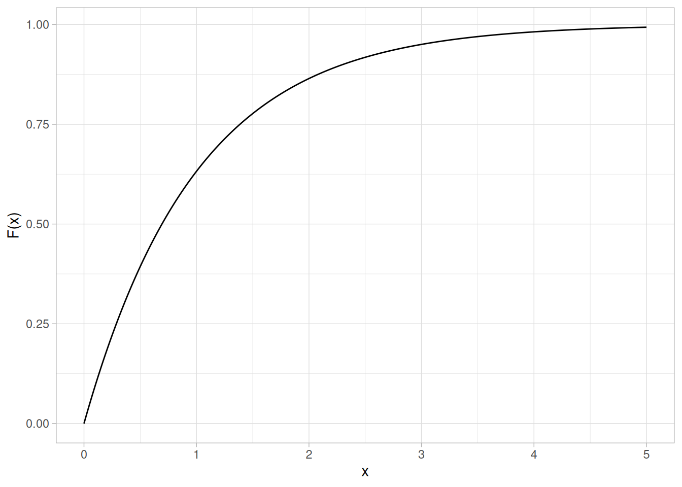
Percent Point Function
The formula for the percent point function of the exponential distribution is
\[G(p) = -\beta\ln(1 - p) \;\;\;\;\;\;\; 0 \le p < 1; \beta > 0\]
The following is the plot of the exponential percent point function.
tibble(p = seq(0, 0.999, length.out = 401)) |>
mutate(x = qexp(p)) |>
ggplot(aes(p, x)) +
geom_line() +
labs(x = expression(alpha), y = expression(G(alpha))) +
theme_light()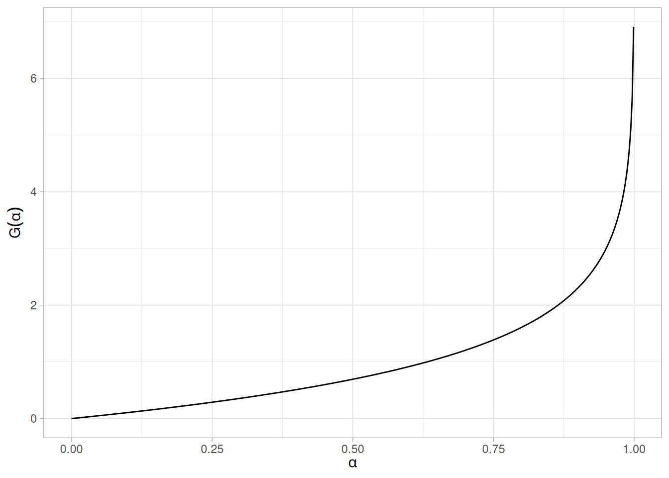
Hazard Function
The formula for the hazard function of the exponential distribution is
\[h(x) = \frac{1}{\beta} \;\;\;\;\;\;\; x \ge 0; \beta > 0\]
The following is the plot of the exponential hazard function.
tibble(x = seq(0, 5, length.out = 401)) |>
mutate(y = dexp(x) / (1 - pexp(x))) |>
ggplot(aes(x, y)) +
geom_line() +
labs(x = "x", y = "h(x)") +
theme_light()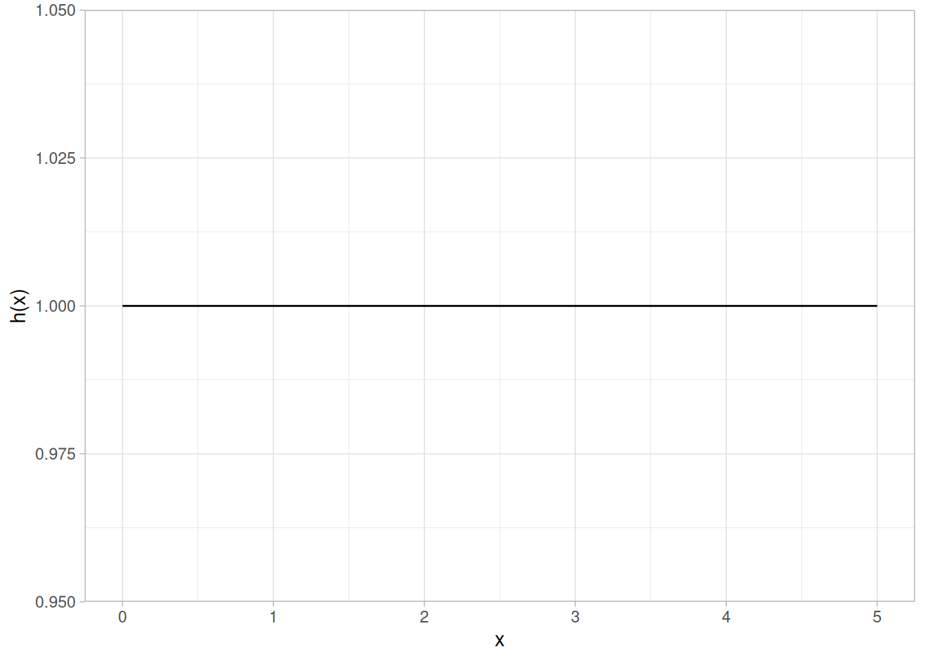
Cumulative Hazard Function
The formula for the cumulative hazard function of the exponential distribution is
\[H(x) = \frac{x}{\beta} \;\;\;\;\;\;\; x \ge 0; \beta > 0\]
The following is the plot of the exponential cumulative hazard function.
tibble(x = seq(0, 5, length.out = 401)) |>
mutate(y = -log(1 - pexp(x))) |>
ggplot(aes(x, y)) +
geom_line() +
labs(x = "x", y = "H(x)") +
theme_light()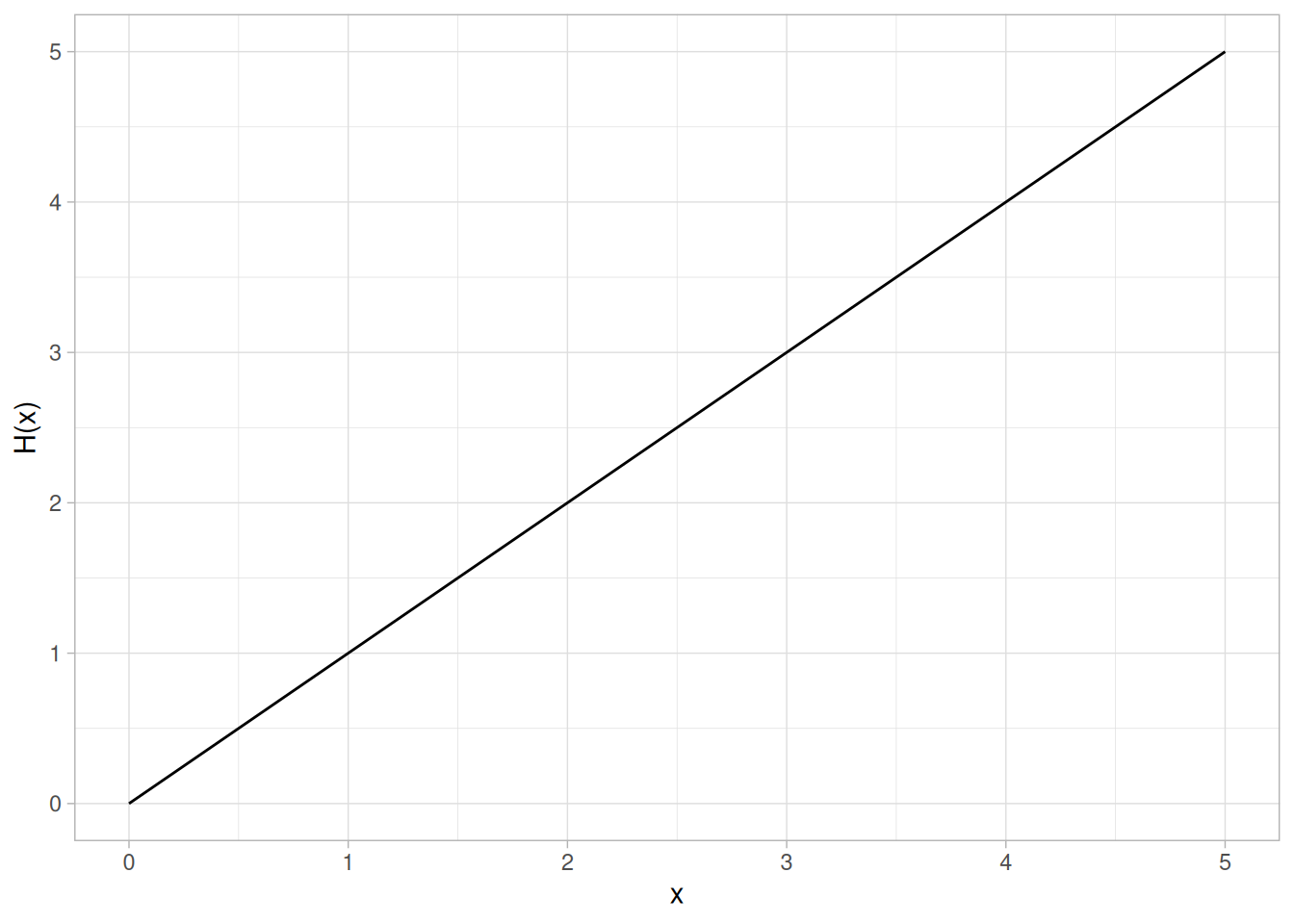
Survival Function
The formula for the survival function of the exponential distribution is
\[S(x) = e^{-x/\beta} \;\;\;\;\;\;\; x \ge 0; \beta > 0\]
The following is the plot of the exponential survival function.
tibble(x = seq(0, 5, length.out = 401)) |>
mutate(y = 1 - pexp(x)) |>
ggplot(aes(x, y)) +
geom_line() +
labs(x = "x", y = "S(x)") +
theme_light()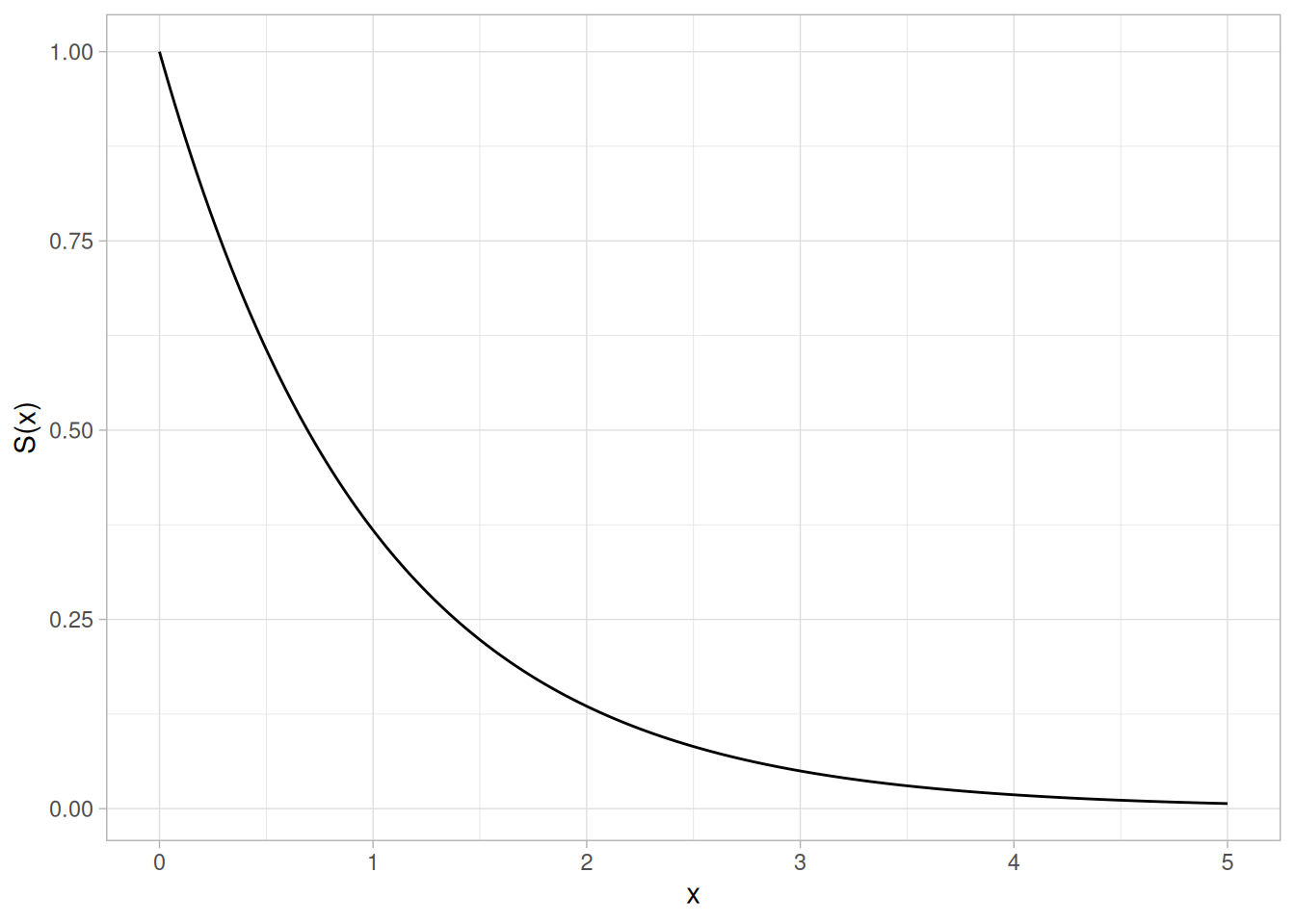
Inverse Survival Function
The formula for the inverse survival function of the exponential distribution is
\[Z(p) = -\beta\ln(p) \;\;\;\;\;\;\; 0 \le p < 1; \beta > 0\]
The following is the plot of the exponential inverse survival function.
tibble(p = seq(0.001, 1, length.out = 401)) |>
mutate(z = qexp(1 - p)) |>
ggplot(aes(p, z)) +
geom_line() +
labs(x = expression(alpha), y = expression(Z(alpha))) +
theme_light()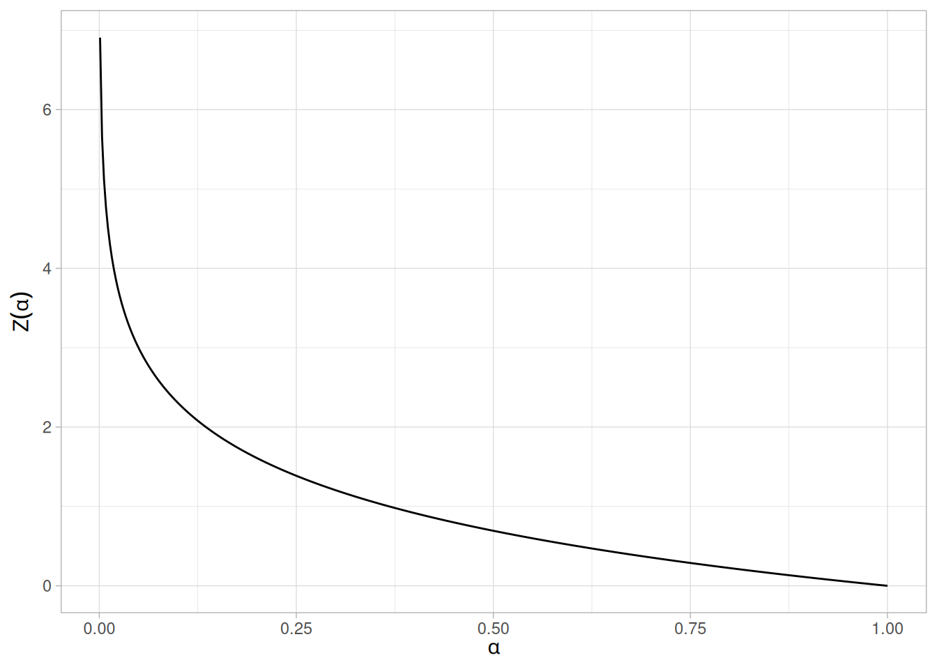
Common Statistics
| Statistic | Value |
|---|---|
| Mean | \(\beta\) |
| Median | \(\beta\ln{2}\) |
| Mode | \(\mu\) |
| Range | \(\mu\) to \(\infty\) |
| Standard Deviation | \(\beta\) |
| Coefficient of Variation | 1 |
| Skewness | 2 |
| Kurtosis | 9 |
Parameter Estimation
For the full sample case, the maximum likelihood estimator of the scale parameter is the sample mean. Maximum likelihood estimation for the exponential distribution is discussed in the chapter on reliability (Chapter 8). It is also discussed in chapter 19 of Johnson, Kotz, and Balakrishnan (Johnson et al. 1994).
Comments
The exponential distribution is primarily used in reliability applications. The exponential distribution is used to model data with a constant failure rate (indicated by the hazard plot which is simply equal to a constant).
Software
Most general purpose statistical software programs support at least some of the probability functions for the exponential distribution.
Probability Density Function
The formula for the probability density function of the general Weibull distribution is
\[f(x) = \frac{\gamma}{\alpha}\left(\frac{x - \mu}{\alpha}\right)^{(\gamma - 1)}\exp\left(-\left(\frac{x - \mu}{\alpha}\right)^{\gamma}\right) \;\;\;\;\;\;\; x \ge \mu; \gamma, \alpha > 0\]
where \(\gamma\) is the shape parameter, \(\mu\) is the location parameter, and \(\alpha\) is the scale parameter. The case where \(\mu = 0\) and \(\alpha = 1\) is called the standard Weibull distribution. The case where \(\mu = 0\) is called the 2-parameter Weibull distribution. The equation for the standard Weibull distribution reduces to
\[f(x) = \gamma x^{(\gamma - 1)}\exp(-(x^{\gamma})) \;\;\;\;\;\;\; x \ge 0; \gamma > 0\]
Since the general form of probability functions can be expressed in terms of the standard distribution, all subsequent formulas in this section are given for the standard form of the function.
The following plot shows the Weibull probability density function with a shape parameter of 2.
library(tidyverse)
tibble(x = seq(0, 3, length.out = 401)) |>
mutate(y = dweibull(x, shape = 2)) |>
ggplot(aes(x, y)) +
geom_line() +
labs(x = "x", y = "f(x)") +
theme_light()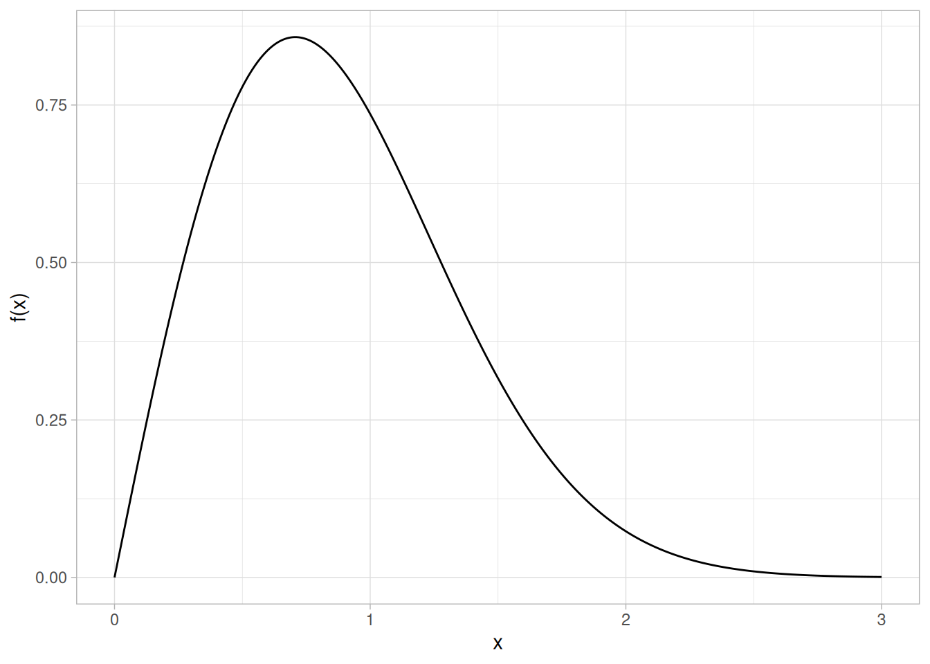
Cumulative Distribution Function
The formula for the cumulative distribution function of the Weibull distribution is
\[F(x) = 1 - e^{-(x^{\gamma})} \;\;\;\;\;\;\; x \ge 0; \gamma > 0\]
The following is the plot of the Weibull cumulative distribution function with the same shape parameter as the pdf plot above.
tibble(x = seq(0, 3, length.out = 401)) |>
mutate(y = pweibull(x, shape = 2)) |>
ggplot(aes(x, y)) +
geom_line() +
labs(x = "x", y = "F(x)") +
theme_light()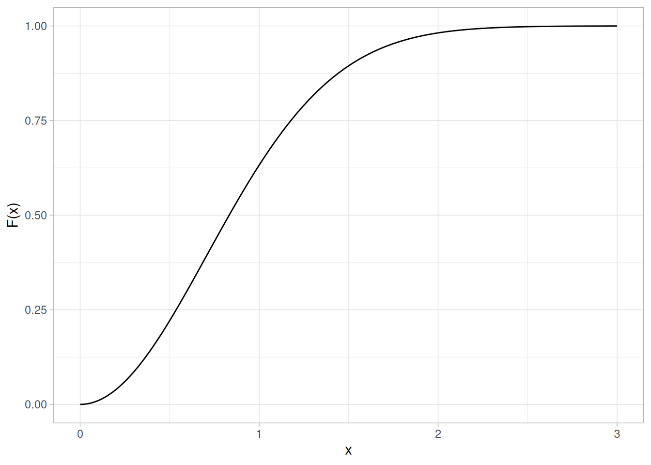
Percent Point Function
The formula for the percent point function of the Weibull distribution is
\[G(p) = (-\ln(1 - p))^{1/\gamma} \;\;\;\;\;\;\; 0 \le p < 1; \gamma > 0\]
The following is the plot of the Weibull percent point function with the same shape parameter as the pdf plot above.
tibble(p = seq(0.001, 0.999, length.out = 401)) |>
mutate(x = qweibull(p, shape = 2)) |>
ggplot(aes(p, x)) +
geom_line() +
labs(x = expression(alpha), y = expression(G(alpha))) +
theme_light()
Hazard Function
The formula for the hazard function of the Weibull distribution is
\[h(x) = \gamma x^{(\gamma - 1)} \;\;\;\;\;\;\; x \ge 0; \gamma > 0\]
The following is the plot of the Weibull hazard function with the same shape parameter as the pdf plot above.
tibble(x = seq(0, 3, length.out = 401)) |>
mutate(y = dweibull(x, shape = 2) / (1 - pweibull(x, shape = 2))) |>
ggplot(aes(x, y)) +
geom_line() +
labs(x = "x", y = "h(x)") +
theme_light()
Cumulative Hazard Function
The formula for the cumulative hazard function of the Weibull distribution is
\[H(x) = x^{\gamma} \;\;\;\;\;\;\; x \ge 0; \gamma > 0\]
The following is the plot of the Weibull cumulative hazard function with the same shape parameter as the pdf plot above.
tibble(x = seq(0, 3, length.out = 401)) |>
mutate(y = x^2) |>
ggplot(aes(x, y)) +
geom_line() +
labs(x = "x", y = "H(x)") +
theme_light()
Survival Function
The formula for the survival function of the Weibull distribution is
\[S(x) = \exp(-(x^{\gamma})) \;\;\;\;\;\;\; x \ge 0; \gamma > 0\]
The following is the plot of the Weibull survival function with the same shape parameter as the pdf plot above.
tibble(x = seq(0, 3, length.out = 401)) |>
mutate(y = 1 - pweibull(x, shape = 2)) |>
ggplot(aes(x, y)) +
geom_line() +
labs(x = "x", y = "S(x)") +
theme_light()
Inverse Survival Function
The formula for the inverse survival function of the Weibull distribution is
\[Z(p) = (-\ln(p))^{1/\gamma} \;\;\;\;\;\;\; 0 \le p < 1; \gamma > 0\]
The following is the plot of the Weibull inverse survival function with the same shape parameter as the pdf plot above.
tibble(p = seq(0.001, 0.999, length.out = 401)) |>
mutate(z = qweibull(1 - p, shape = 2)) |>
ggplot(aes(p, z)) +
geom_line() +
labs(x = expression(alpha), y = expression(Z(alpha))) +
theme_light()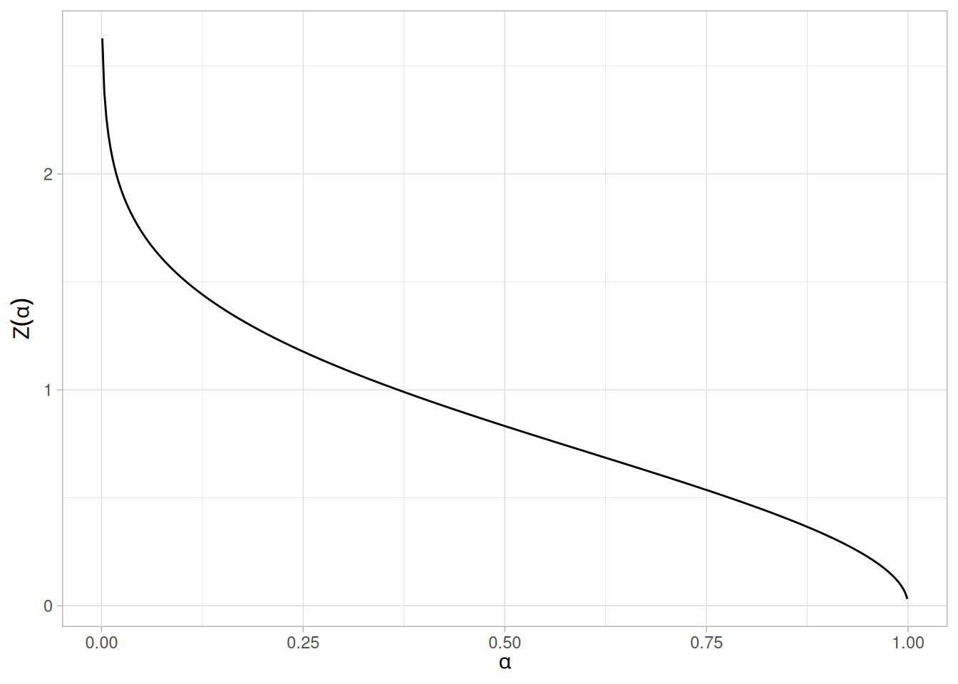
Common Statistics
The formulas below are with the location parameter equal to zero and the scale parameter equal to one.
| Statistic | Value |
|---|---|
| Mean | \(\Gamma\left(\dfrac{\gamma + 1}{\gamma}\right)\), where \(\Gamma\) is the gamma function \(\Gamma(a) = \int_{0}^{\infty} t^{a-1}e^{-t}\,dt\) |
| Median | \(\ln(2)^{1/\gamma}\) |
| Mode | \(\left(1 - \dfrac{1}{\gamma}\right)^{1/\gamma}\) for \(\gamma > 1\); \(0\) for \(\gamma \le 1\) |
| Range | 0 to \(\infty\). |
| Standard Deviation | \(\sqrt{\Gamma\left(\dfrac{\gamma + 2}{\gamma}\right) - \left(\Gamma\left(\dfrac{\gamma + 1}{\gamma}\right)\right)^{2}}\) |
| Coefficient of Variation | \(\sqrt{\dfrac{\Gamma\left(\frac{\gamma + 2}{\gamma}\right)}{\left(\Gamma\left(\frac{\gamma + 1}{\gamma}\right)\right)^{2}} - 1}\) |
Parameter Estimation
Maximum likelihood estimation for the Weibull distribution is discussed in the reliability chapter . It is also discussed in Chapter 21 of Johnson, Kotz, and Balakrishnan.
Comments
The Weibull distribution is used extensively in reliability applications to model failure times .
Software
Most general purpose statistical software programs support at least some of the probability functions for the Weibull distribution.
Probability Density Function
A variable \(X\) is lognormally distributed if \(Y = \ln(X)\) is normally distributed with “LN” denoting the natural logarithm. The general formula for the probability density function of the lognormal distribution is
\[f(x) = \frac{e^{-((\ln((x-\theta)/m))^{2}/(2\sigma^{2}))}}{(x-\theta)\sigma\sqrt{2\pi}} \;\;\;\;\;\;\; x > \theta; m, \sigma > 0\]
where \(\sigma\) is the shape parameter (and is the standard deviation of the log of the distribution), \(\theta\) is the location parameter, and \(m\) is the scale parameter (and is also the median of the distribution). If \(x = \theta\), then \(f(x) = 0\). The case where \(\theta = 0\) and \(m = 1\) is called the standard lognormal distribution. The case where \(\theta\) equals zero is called the 2-parameter lognormal distribution.
The equation for the standard lognormal distribution is
\[f(x) = \frac{e^{-((\ln x)^{2}/2\sigma^{2})}}{x\sigma\sqrt{2\pi}} \;\;\;\;\;\;\; x > 0; \sigma > 0\]
Since the general form of probability functions can be expressed in terms of the standard distribution, all subsequent formulas in this section are given for the standard form of the function.
Note that the lognormal distribution is commonly parameterized with
\[\mu = \log(m)\]
The \(\mu\) parameter is the mean of the log of the distribution. If the \(\mu\) parameterization is used, the lognormal pdf is
\[f(x) = \frac{e^{-(\ln(x - \theta) - \mu)^2/(2\sigma^2)}}{(x - \theta)\sigma\sqrt{2\pi}} \;\;\;\;\;\;\; x > \theta; \sigma > 0\]
This book prefers the \(m\) parameterization since \(m\) is an explicit scale parameter.
The following plot shows the lognormal probability density function with a shape parameter of 1 (R’s dlnorm() default), which corresponds to the standard lognormal distribution.
library(tidyverse)
tibble(x = seq(0.001, 6, length.out = 401)) |>
mutate(y = dlnorm(x, sdlog = 1)) |>
ggplot(aes(x, y)) +
geom_line() +
labs(x = "x", y = "f(x)") +
theme_light()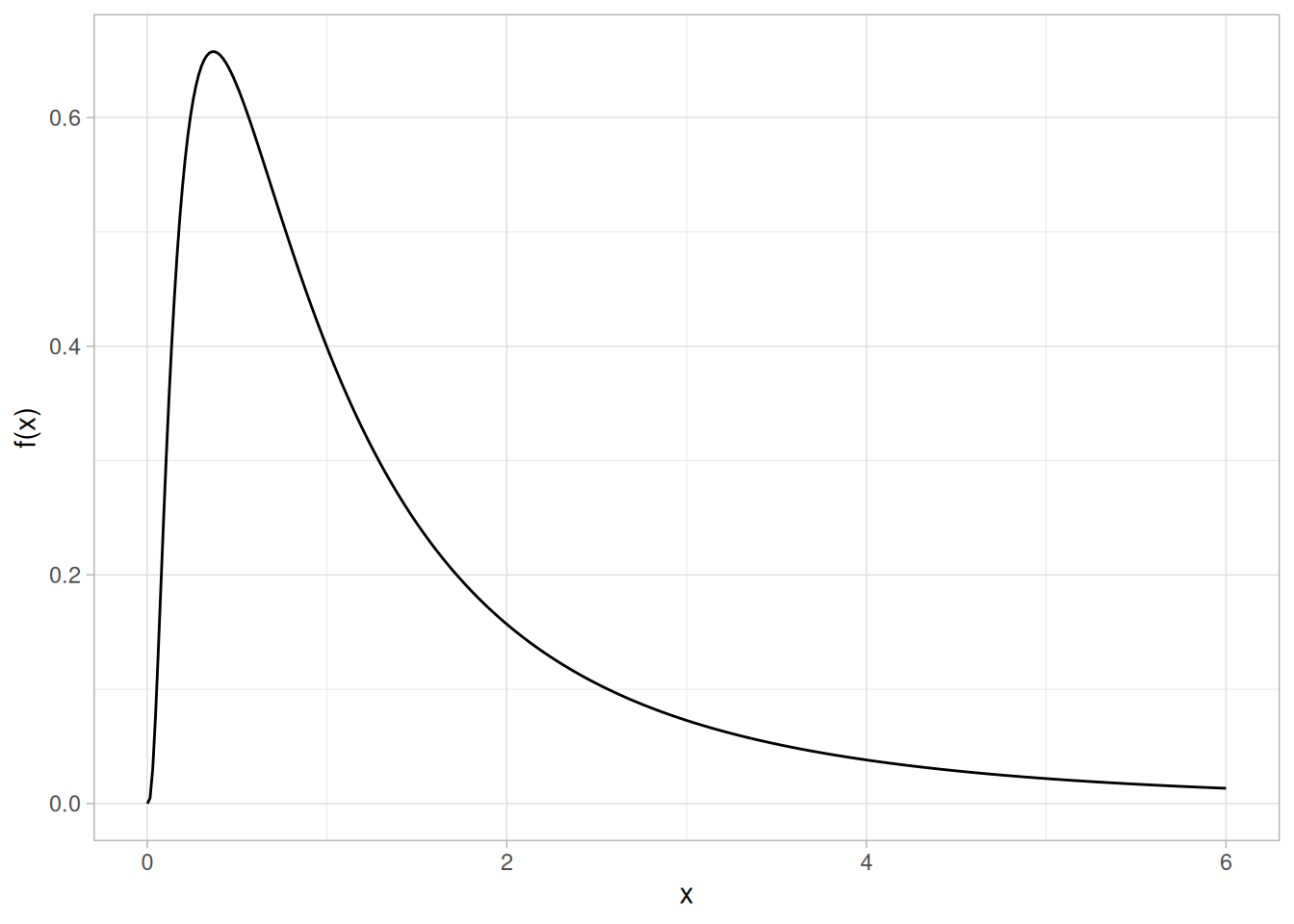
There are several common parameterizations of the lognormal distribution. The form given here is from Evans, Hastings, and Peacock.
Cumulative Distribution Function
The formula for the cumulative distribution function of the lognormal distribution is
\[F(x) = \Phi\left(\frac{\ln(x)}{\sigma}\right) \;\;\;\;\;\;\; x \ge 0; \sigma > 0\]
where \(\Phi\) is the cumulative distribution function of the normal distribution.
The following is the plot of the lognormal cumulative distribution function with the same shape parameter as the pdf plot above.
tibble(x = seq(0.001, 6, length.out = 401)) |>
mutate(y = plnorm(x, sdlog = 1)) |>
ggplot(aes(x, y)) +
geom_line() +
labs(x = "x", y = "F(x)") +
theme_light()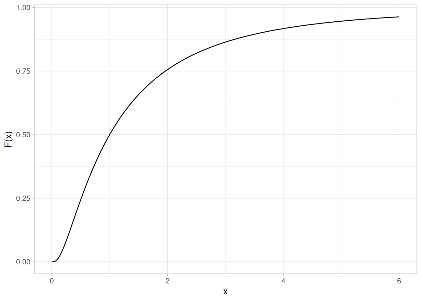
Percent Point Function
The formula for the percent point function of the lognormal distribution is
\[G(p) = \exp(\sigma\Phi^{-1}(p)) \;\;\;\;\;\;\; 0 \le p < 1\]
where \(\Phi^{-1}\) is the percent point function of the normal distribution.
The following is the plot of the lognormal percent point function with the same shape parameter as the pdf plot above.
tibble(p = seq(0.001, 0.999, length.out = 401)) |>
mutate(x = qlnorm(p, sdlog = 1)) |>
ggplot(aes(p, x)) +
geom_line() +
labs(x = expression(alpha), y = expression(G(alpha))) +
theme_light()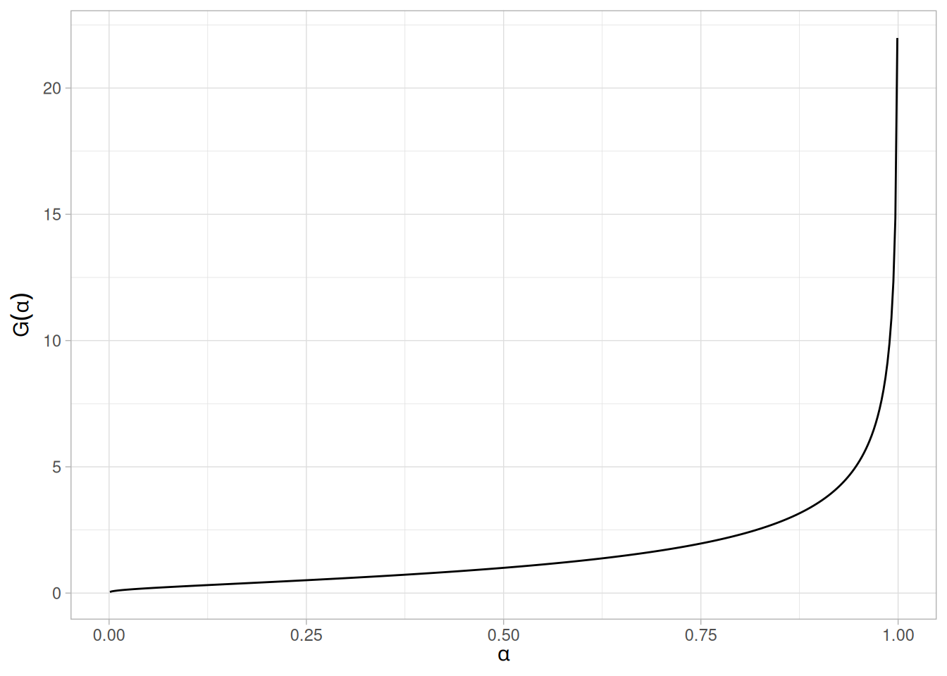
Hazard Function
The formula for the hazard function of the lognormal distribution is
\[h(x,\sigma) = \frac{\left(\frac{1}{x\sigma}\right)\phi\left(\frac{\ln x}{\sigma}\right)}{\Phi\left(\frac{-\ln x}{\sigma}\right)} \;\;\;\;\;\;\; x > 0; \sigma > 0\]
where \(\phi\) is the probability density function of the normal distribution and \(\Phi\) is the cumulative distribution function of the normal distribution.
The following is the plot of the lognormal hazard function with the same shape parameter as the pdf plot above.
tibble(x = seq(0.001, 6, length.out = 401)) |>
mutate(y = dlnorm(x, sdlog = 1) / (1 - plnorm(x, sdlog = 1))) |>
ggplot(aes(x, y)) +
geom_line() +
labs(x = "x", y = "h(x)") +
theme_light()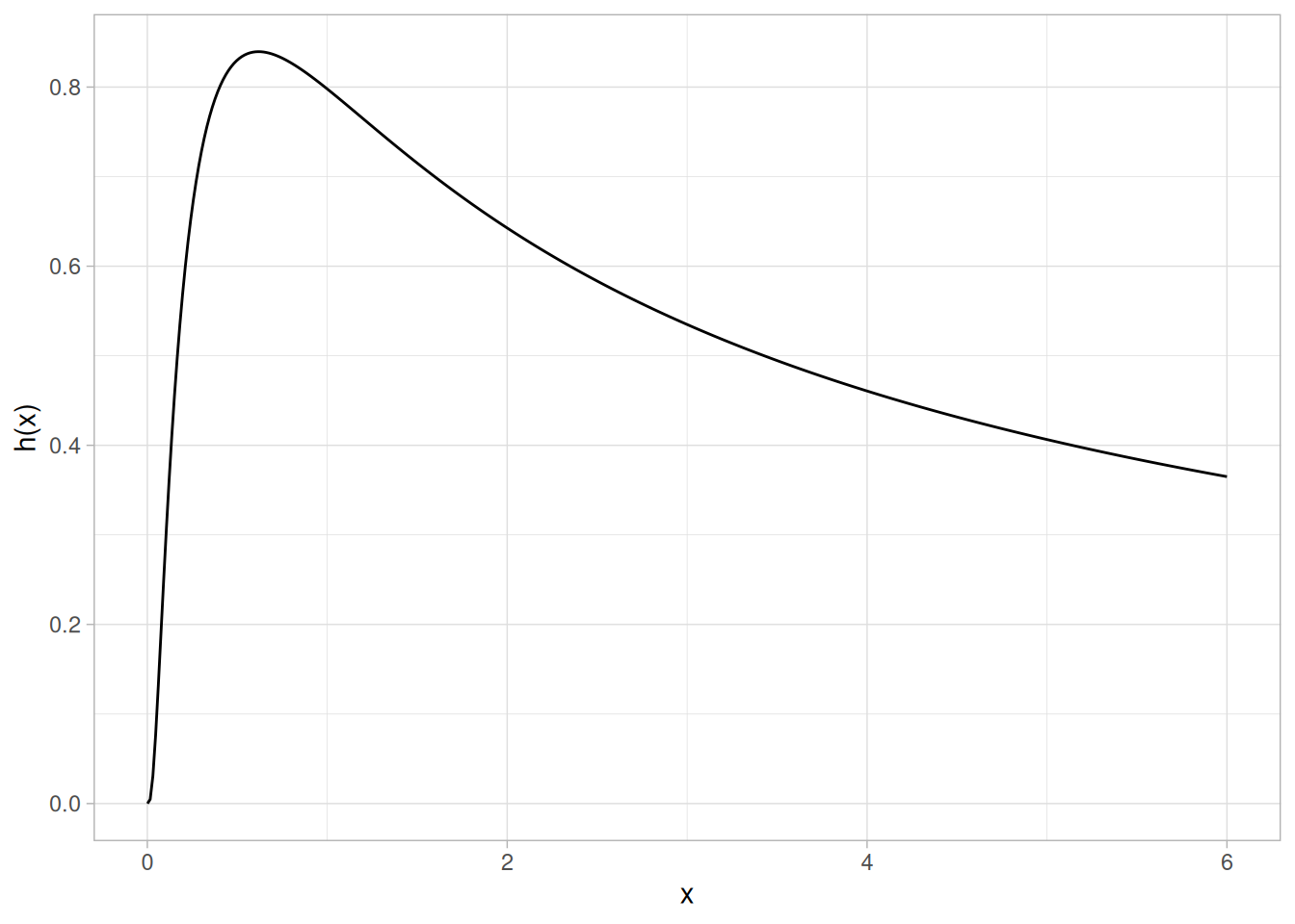
Cumulative Hazard Function
The formula for the cumulative hazard function of the lognormal distribution is
\[H(x) = -\ln\left(1 - \Phi\left(\frac{\ln(x)}{\sigma}\right)\right) \;\;\;\;\;\;\; x \ge 0; \sigma > 0\]
where \(\Phi\) is the cumulative distribution function of the normal distribution.
The following is the plot of the lognormal cumulative hazard function with the same shape parameter as the pdf plot above.
tibble(x = seq(0.001, 6, length.out = 401)) |>
mutate(y = -log(1 - plnorm(x, sdlog = 1))) |>
ggplot(aes(x, y)) +
geom_line() +
labs(x = "x", y = "H(x)") +
theme_light()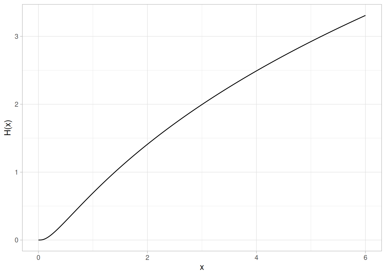
Survival Function
The formula for the survival function of the lognormal distribution is
\[S(x) = 1 - \Phi\left(\frac{\ln(x)}{\sigma}\right) \;\;\;\;\;\;\; x \ge 0; \sigma > 0\]
where \(\Phi\) is the cumulative distribution function of the normal distribution.
The following is the plot of the lognormal survival function with the same shape parameter as the pdf plot above.
tibble(x = seq(0.001, 6, length.out = 401)) |>
mutate(y = 1 - plnorm(x, sdlog = 1)) |>
ggplot(aes(x, y)) +
geom_line() +
labs(x = "x", y = "S(x)") +
theme_light()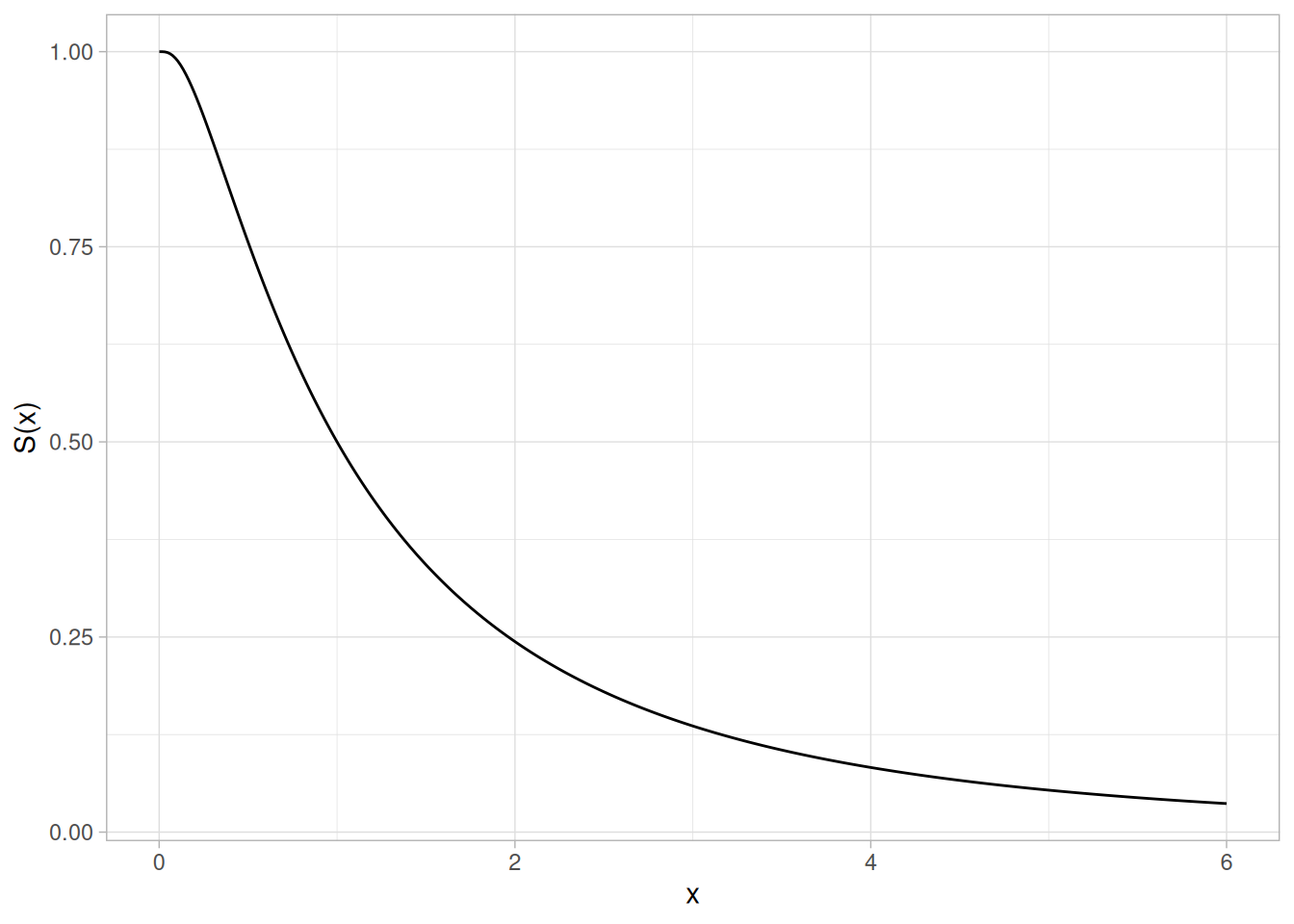
Inverse Survival Function
The formula for the inverse survival function of the lognormal distribution is
\[Z(p) = \exp(\sigma\Phi^{-1}(1-p)) \;\;\;\;\;\;\; 0 \le p < 1\]
where \(\Phi^{-1}\) is the percent point function of the normal distribution.
The following is the plot of the lognormal inverse survival function with the same shape parameter as the pdf plot above.
tibble(p = seq(0.001, 0.999, length.out = 401)) |>
mutate(z = qlnorm(1 - p, sdlog = 1)) |>
ggplot(aes(p, z)) +
geom_line() +
labs(x = expression(alpha), y = expression(Z(alpha))) +
theme_light()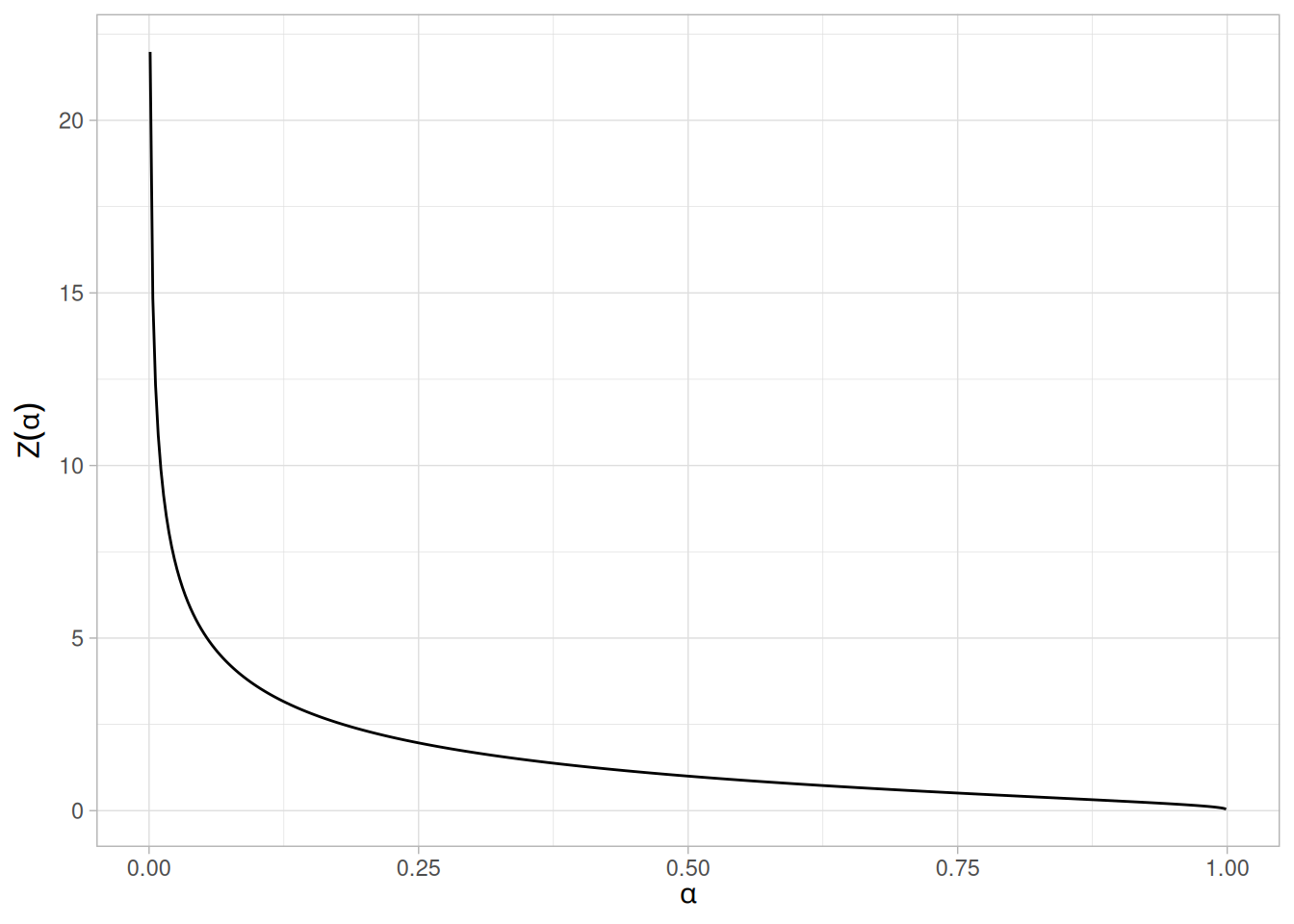
Common Statistics
The formulas below are with the location parameter equal to zero and the scale parameter equal to one.
| Statistic | Value |
|---|---|
| Mean | \(e^{0.5\sigma^{2}}\) |
| Median | Scale parameter \(m\) (= 1 if scale parameter not specified). |
| Mode | \(\dfrac{1}{e^{\sigma^{2}}}\) |
| Range | 0 to \(\infty\) |
| Standard Deviation | \(\sqrt{e^{\sigma^{2}}(e^{\sigma^{2}} - 1)}\) |
| Skewness | \((e^{\sigma^{2}}+2)\sqrt{e^{\sigma^{2}} - 1}\) |
| Kurtosis | \((e^{\sigma^{2}})^{4} + 2(e^{\sigma^{2}})^{3} + 3(e^{\sigma^{2}})^{2} - 3\) |
| Coefficient of Variation | \(\sqrt{e^{\sigma^{2}} - 1}\) |
Parameter Estimation
The maximum likelihood estimates for the scale parameter, \(m\), and the shape parameter, \(\sigma\), are
\[\hat{m} = \exp{\hat{\mu}}\]
and
\[\hat{\sigma} = \sqrt{\frac{\sum_{i=1}^{N}{(\ln{(X_{i})} - \hat{\mu})^{2}}}{N}}\]
where
\[\hat{\mu}= \frac{\sum_{i=1}^{N}{\ln{X_i}}}{N}\]
If the location parameter is known, it can be subtracted from the original data points before computing the maximum likelihood estimates of the shape and scale parameters.
Comments
The lognormal distribution is used extensively in reliability applications to model failure times . The lognormal and Weibull distributions are probably the most commonly used distributions in reliability applications.
Software
Most general purpose statistical software programs support at least some of the probability functions for the lognormal distribution.
Probability Density Function
The Birnbaum-Saunders distribution is also commonly known as the fatigue life distribution. There are several alternative formulations of the Birnbaum-Saunders distribution in the literature.
The general formula for the probability density function of the Birnbaum-Saunders distribution is
\[f(x) = \left(\frac{\sqrt{\frac{x-\mu}{\beta}} + \sqrt{\frac{\beta}{x-\mu}}}{2\gamma (x-\mu)}\right) \phi\left(\frac{\sqrt{\frac{x-\mu}{\beta}} - \sqrt{\frac{\beta}{x-\mu}}}{\gamma}\right) \;\;\;\;\;\;\; x > \mu; \gamma, \beta > 0\]
where \(\gamma\) is the shape parameter, \(\mu\) is the location parameter, \(\beta\) is the scale parameter, \(\phi\) is the probability density function of the standard normal distribution, and \(\Phi\) is the cumulative distribution function of the standard normal distribution. The case where \(\mu = 0\) and \(\beta = 1\) is called the standard Birnbaum-Saunders distribution. The equation for the standard Birnbaum-Saunders distribution reduces to
\[f(x) = \left(\frac{\sqrt{x} + \sqrt{\frac{1}{x}}}{2\gamma x}\right) \phi\left(\frac{\sqrt{x} - \sqrt{\frac{1}{x}}}{\gamma}\right) \;\;\;\;\;\;\; x > 0; \gamma > 0\]
Since the general form of probability functions can be expressed in terms of the standard distribution, all subsequent formulas in this section are given for the standard form of the function.
R has no built-in Birnbaum-Saunders distribution functions, so the pdf, cdf, percent point, and inverse survival functions below are implemented directly from the formulas above, using dnorm()/pnorm()/qnorm() for the standard normal pieces \(\phi\) and \(\Phi\). The following plot shows the Birnbaum-Saunders probability density function with a shape parameter of 2.
library(tidyverse)
dbs <- function(x, gamma) {
((sqrt(x) + sqrt(1 / x)) / (2 * gamma * x)) * dnorm((sqrt(x) - sqrt(1 / x)) / gamma)
}
tibble(x = seq(0.001, 8, length.out = 401)) |>
mutate(y = dbs(x, gamma = 2)) |>
ggplot(aes(x, y)) +
geom_line() +
labs(x = "x", y = "f(x)") +
theme_light()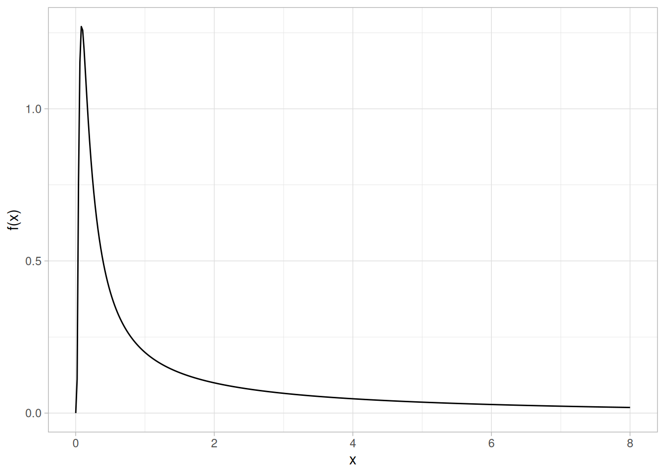
Cumulative Distribution Function
The formula for the cumulative distribution function of the Birnbaum-Saunders distribution is
\[F(x) = \Phi\left(\frac{\sqrt{x} - \sqrt{\frac{1}{x}}}{\gamma}\right) \;\;\;\;\;\;\; x > 0; \gamma > 0\]
where \(\Phi\) is the cumulative distribution function of the standard normal distribution. The following is the plot of the Birnbaum-Saunders cumulative distribution function with the same shape parameter as the pdf plot above.
pbs <- function(x, gamma) {
pnorm((sqrt(x) - sqrt(1 / x)) / gamma)
}
tibble(x = seq(0.001, 8, length.out = 401)) |>
mutate(y = pbs(x, gamma = 2)) |>
ggplot(aes(x, y)) +
geom_line() +
labs(x = "x", y = "F(x)") +
theme_light()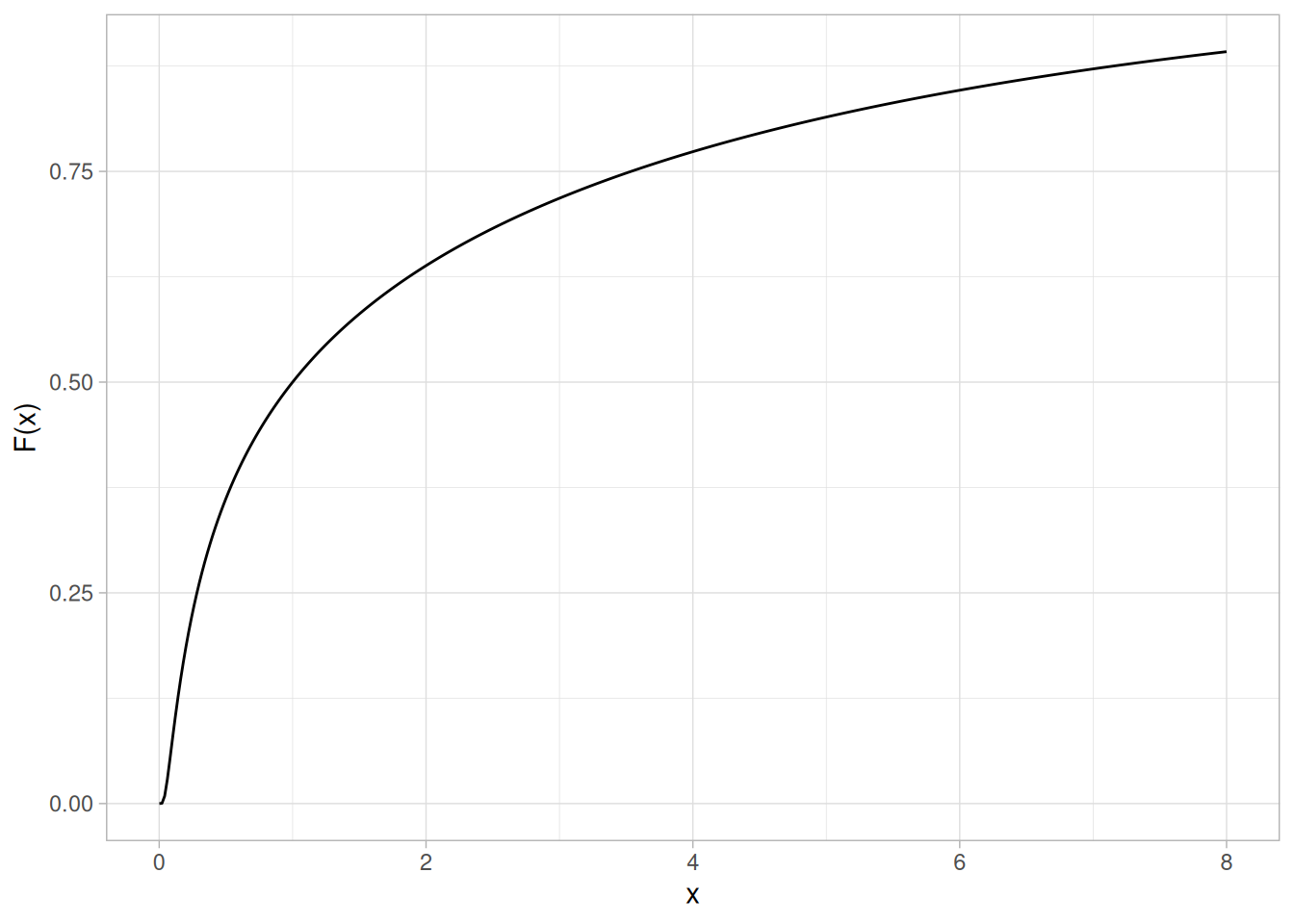
Percent Point Function
The formula for the percent point function of the Birnbaum-Saunders distribution is
\[G(p) = \frac{1}{4}\left[\gamma\Phi^{-1}(p) + \sqrt{4 + (\gamma\Phi^{-1}(p))^{2}}\right]^{2}\]
where \(\Phi^{-1}\) is the percent point function of the standard normal distribution. The following is the plot of the Birnbaum-Saunders percent point function with the same shape parameter as the pdf plot above.
qbs <- function(p, gamma) {
z <- qnorm(p)
(1 / 4) * (gamma * z + sqrt(4 + (gamma * z)^2))^2
}
tibble(p = seq(0.001, 0.999, length.out = 401)) |>
mutate(x = qbs(p, gamma = 2)) |>
ggplot(aes(p, x)) +
geom_line() +
labs(x = expression(alpha), y = expression(G(alpha))) +
theme_light()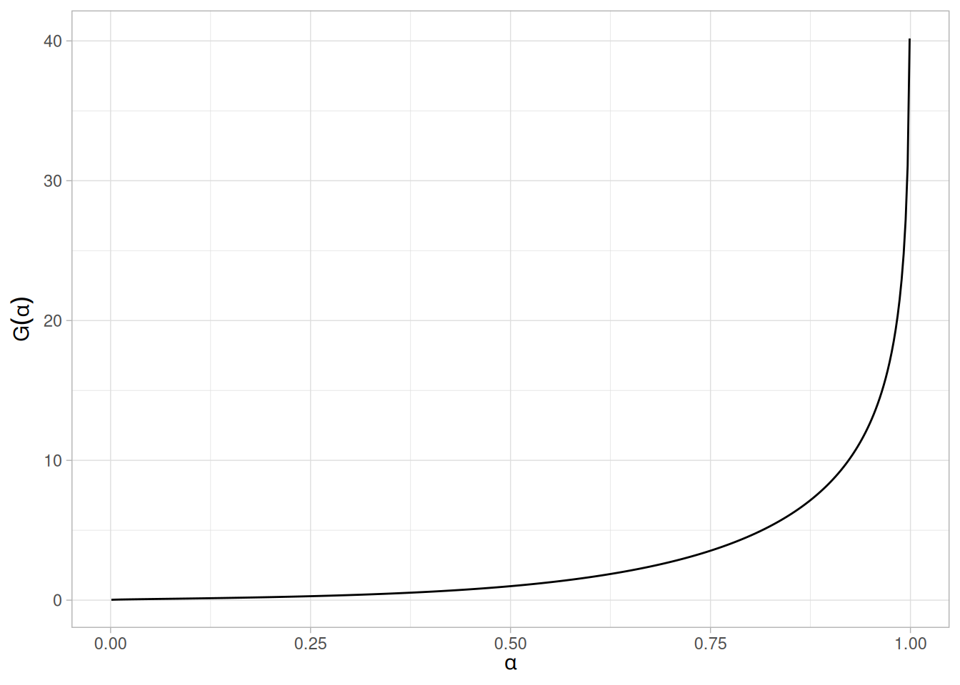
Hazard Function
The Birnbaum-Saunders hazard function can be computed from the Birnbaum-Saunders probability density and cumulative distribution functions.
The following is the plot of the Birnbaum-Saunders hazard function with the same shape parameter as the pdf plot above.
tibble(x = seq(0.001, 8, length.out = 401)) |>
mutate(y = dbs(x, gamma = 2) / (1 - pbs(x, gamma = 2))) |>
ggplot(aes(x, y)) +
geom_line() +
labs(x = "x", y = "h(x)") +
theme_light()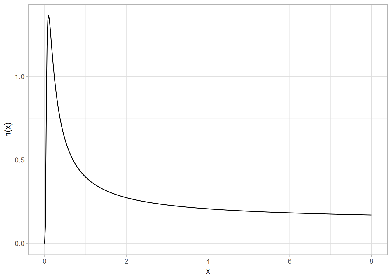
Cumulative Hazard Function
The Birnbaum-Saunders cumulative hazard function can be computed from the Birnbaum-Saunders cumulative distribution function.
The following is the plot of the Birnbaum-Saunders cumulative hazard function with the same shape parameter as the pdf plot above.
tibble(x = seq(0.001, 8, length.out = 401)) |>
mutate(y = -log(1 - pbs(x, gamma = 2))) |>
ggplot(aes(x, y)) +
geom_line() +
labs(x = "x", y = "H(x)") +
theme_light()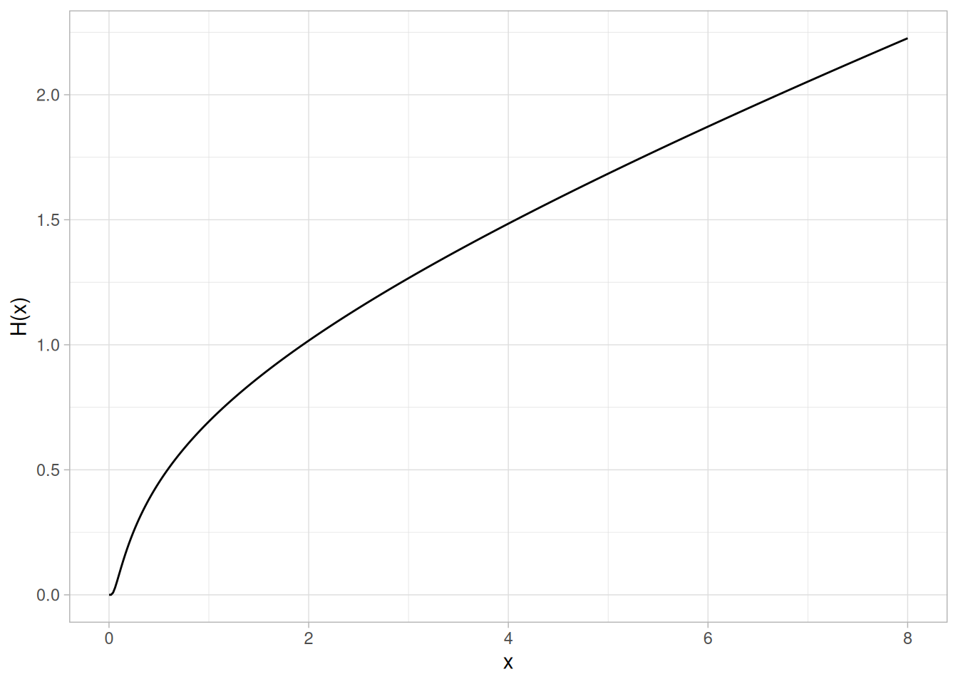
Survival Function
The Birnbaum-Saunders survival function can be computed from the Birnbaum-Saunders cumulative distribution function.
The following is the plot of the Birnbaum-Saunders survival function with the same shape parameter as the pdf plot above.
tibble(x = seq(0.001, 8, length.out = 401)) |>
mutate(y = 1 - pbs(x, gamma = 2)) |>
ggplot(aes(x, y)) +
geom_line() +
labs(x = "x", y = "S(x)") +
theme_light()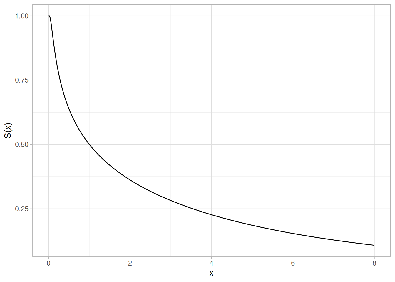
Inverse Survival Function
The Birnbaum-Saunders inverse survival function can be computed from the Birnbaum-Saunders percent point function.
The following is the plot of the Birnbaum-Saunders inverse survival function with the same shape parameter as the pdf plot above.
tibble(p = seq(0.001, 0.999, length.out = 401)) |>
mutate(z = qbs(1 - p, gamma = 2)) |>
ggplot(aes(p, z)) +
geom_line() +
labs(x = expression(alpha), y = expression(Z(alpha))) +
theme_light()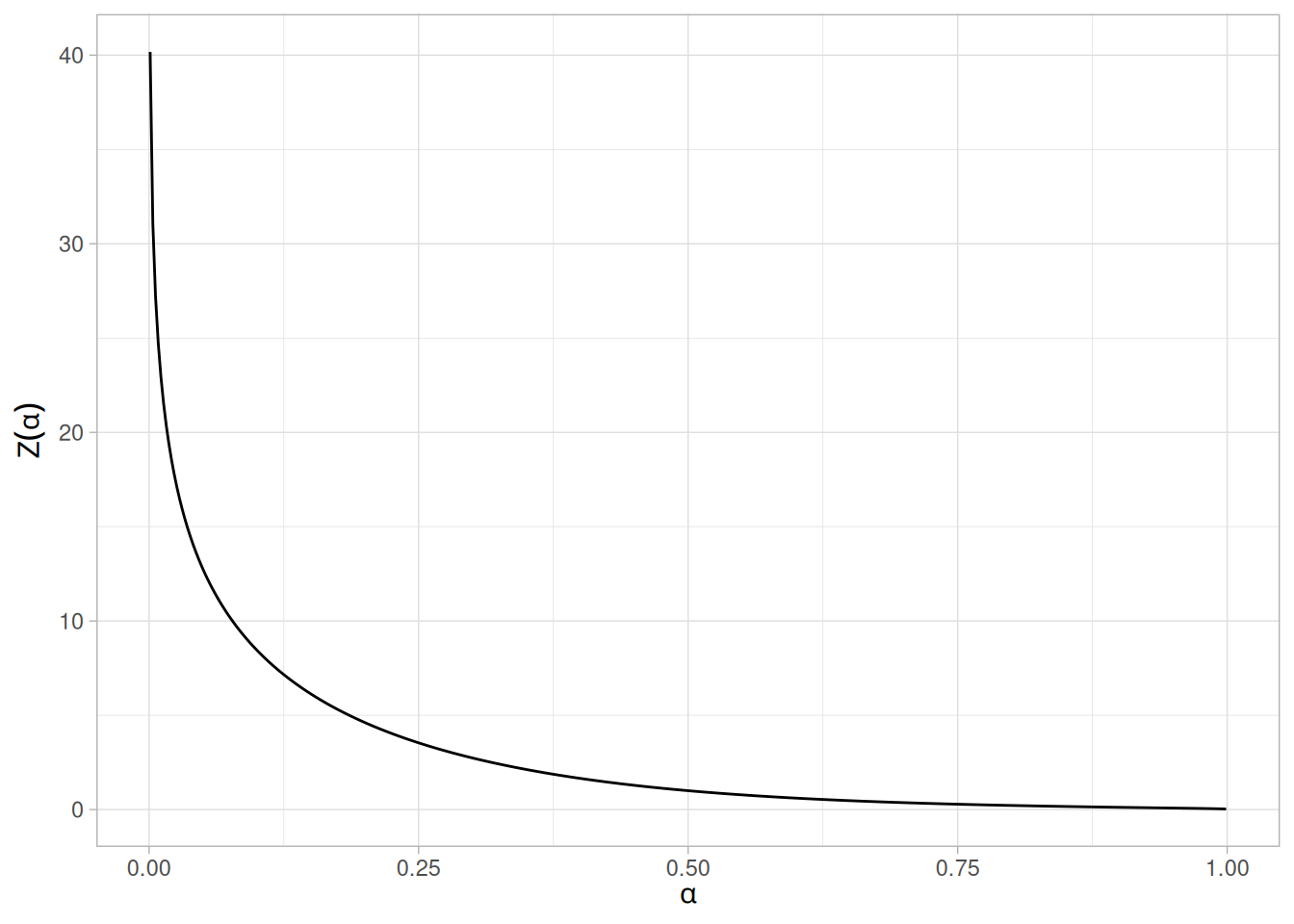
Common Statistics
The formulas below are with the location parameter equal to zero and the scale parameter equal to one.
| Statistic | Value |
|---|---|
| Mean | \(1 + \dfrac{\gamma^{2}}{2}\) |
| Range | 0 to \(\infty\). |
| Standard Deviation | \(\gamma\sqrt{1 + \dfrac{5\gamma^{2}}{4}}\) |
| Coefficient of Variation | \(\dfrac{2 + \gamma^{2}}{\gamma\sqrt{1 + 5\gamma^{2}}}\) |
Parameter Estimation
Maximum likelihood estimation for the Birnbaum-Saunders distribution is discussed in the reliability chapter.
Comments
The Birnbaum-Saunders distribution is used extensively in reliability applications to model failure times .
Software
Some general purpose statistical software programs, including Dataplot, support at least some of the probability functions for the Birnbaum-Saunders distribution. Support for this distribution is likely to be available for statistical programs that emphasize reliability applications.
The “bs” package implements support for the Birnbaum-Saunders distribution for the R package. See Leiva, V., Hernandez, H., and Riquelme, M. (2006). “A New Package for the Birnbaum-Saunders Distribution.” Rnews, 6/4, 35-40. (http://www.r-project.org)
Probability Density Function
The general formula for the probability density function of the gamma distribution is
\[f(x) = \frac{\left(\frac{x-\mu}{\beta}\right)^{\gamma - 1}\exp\left(-\frac{x-\mu}{\beta}\right)}{\beta\Gamma(\gamma)} \;\;\;\;\;\;\; x \ge \mu; \gamma, \beta > 0\]
where \(\gamma\) is the shape parameter, \(\mu\) is the location parameter, \(\beta\) is the scale parameter, and \(\Gamma\) is the gamma function which has the formula
\[\Gamma(a) = \int_{0}^{\infty} t^{a-1}e^{-t}\,dt\]
The case where \(\mu = 0\) and \(\beta = 1\) is called the standard gamma distribution. The equation for the standard gamma distribution reduces to
\[f(x) = \frac{x^{\gamma - 1}e^{-x}}{\Gamma(\gamma)} \;\;\;\;\;\;\; x \ge 0; \gamma > 0\]
Since the general form of probability functions can be expressed in terms of the standard distribution, all subsequent formulas in this section are given for the standard form of the function.
The following plot shows the gamma probability density function with a shape parameter of 2.
library(tidyverse)
tibble(x = seq(0, 10, length.out = 401)) |>
mutate(y = dgamma(x, shape = 2)) |>
ggplot(aes(x, y)) +
geom_line() +
labs(x = "x", y = "f(x)") +
theme_light()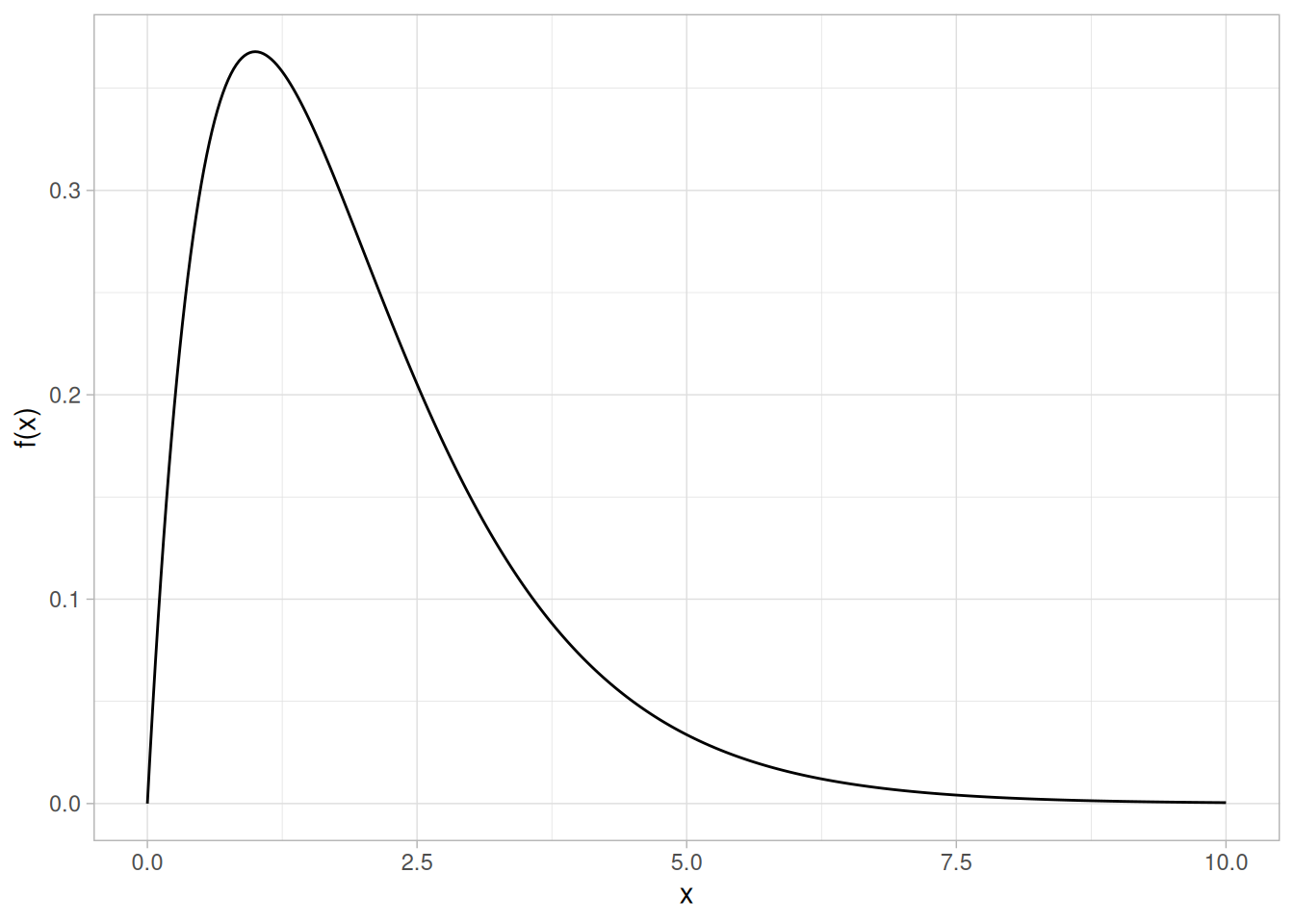
Cumulative Distribution Function
The formula for the cumulative distribution function of the gamma distribution is
\[F(x) = \frac{\Gamma_{x}(\gamma)}{\Gamma(\gamma)} \;\;\;\;\;\;\; x \ge 0; \gamma > 0\]
where \(\Gamma\) is the gamma function defined above and \(\Gamma_{x}(a)\) is the incomplete gamma function. The incomplete gamma function has the formula
\[\Gamma_{x}(a) = \int_{0}^{x} t^{a-1}e^{-t}\,dt\]
The following is the plot of the gamma cumulative distribution function with the same shape parameter as the pdf plot above.
tibble(x = seq(0, 10, length.out = 401)) |>
mutate(y = pgamma(x, shape = 2)) |>
ggplot(aes(x, y)) +
geom_line() +
labs(x = "x", y = "F(x)") +
theme_light()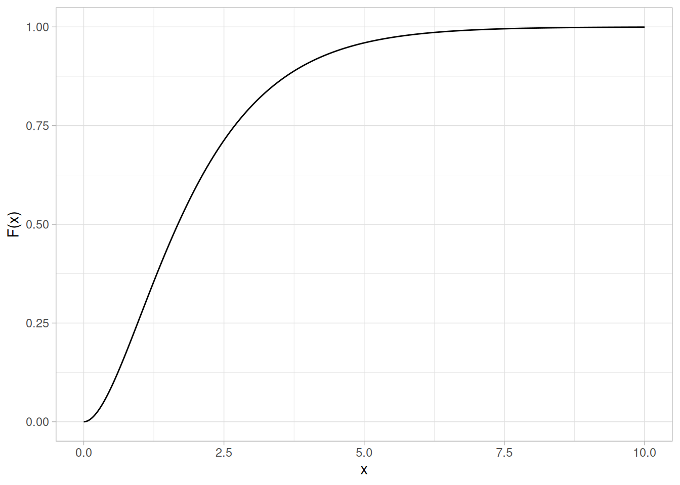
Percent Point Function
The formula for the percent point function of the gamma distribution does not exist in a simple closed form. It is computed numerically.
The following is the plot of the gamma percent point function with the same shape parameter as the pdf plot above.
tibble(p = seq(0.001, 0.999, length.out = 401)) |>
mutate(x = qgamma(p, shape = 2)) |>
ggplot(aes(p, x)) +
geom_line() +
labs(x = expression(alpha), y = expression(G(alpha))) +
theme_light()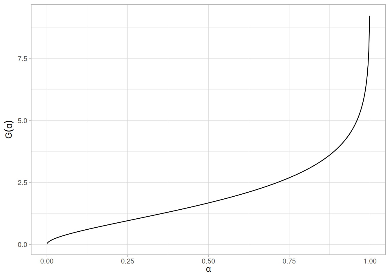
Hazard Function
The formula for the hazard function of the gamma distribution is
\[h(x) = \frac{x^{\gamma - 1}e^{-x}}{\Gamma(\gamma) - \Gamma_{x}(\gamma)} \;\;\;\;\;\;\; x \ge 0; \gamma > 0\]
The following is the plot of the gamma hazard function with the same shape parameter as the pdf plot above.
tibble(x = seq(0, 10, length.out = 401)) |>
mutate(y = dgamma(x, shape = 2) / (1 - pgamma(x, shape = 2))) |>
ggplot(aes(x, y)) +
geom_line() +
labs(x = "x", y = "h(x)") +
theme_light()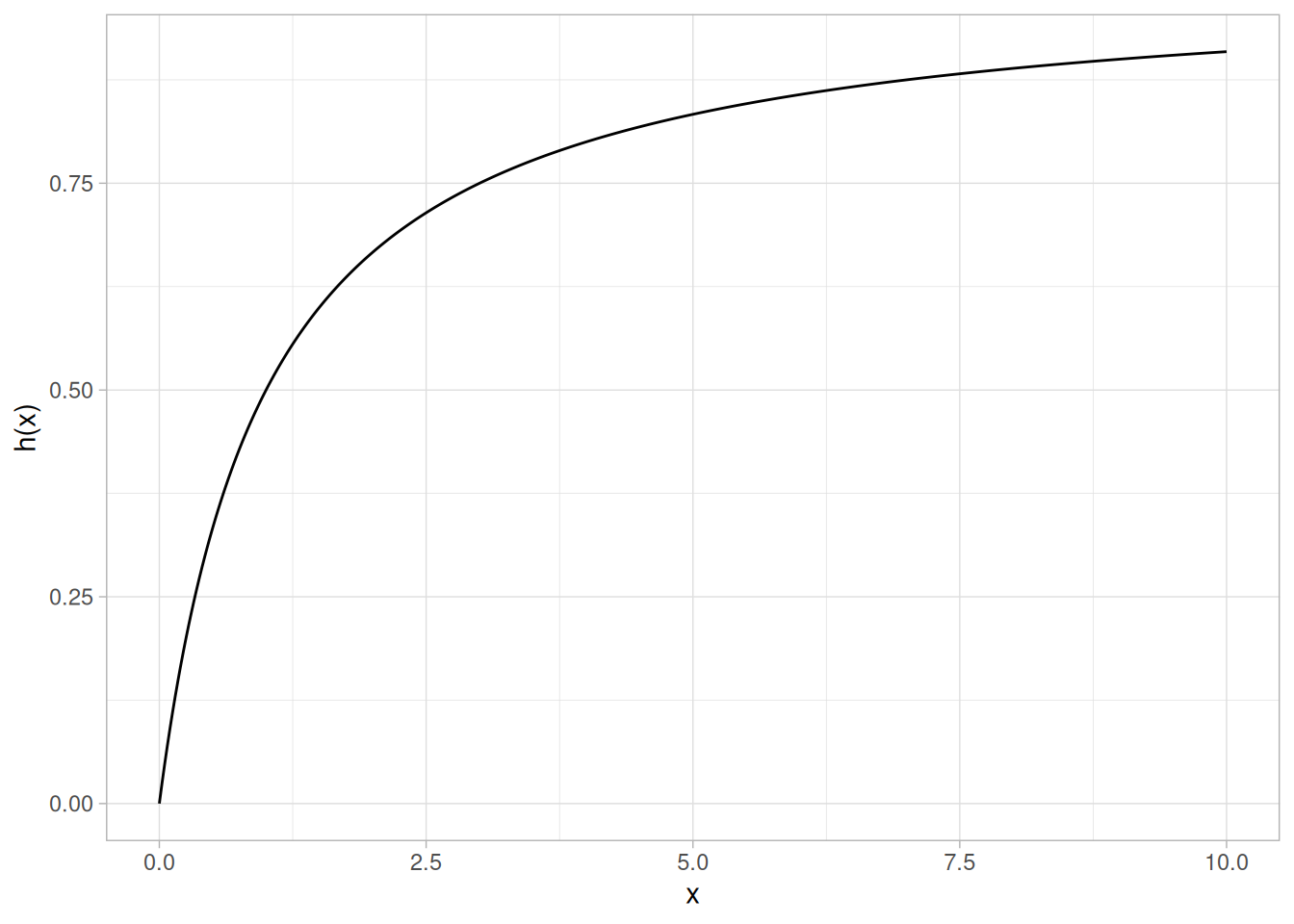
Cumulative Hazard Function
The formula for the cumulative hazard function of the gamma distribution is
\[H(x) = -\log\left(1 - \frac{\Gamma_{x}(\gamma)}{\Gamma(\gamma)}\right) \;\;\;\;\;\;\; x \ge 0; \gamma > 0\]
where \(\Gamma\) is the gamma function defined above and \(\Gamma_{x}(a)\) is the incomplete gamma function defined above.
The following is the plot of the gamma cumulative hazard function with the same shape parameter as the pdf plot above.
tibble(x = seq(0, 10, length.out = 401)) |>
mutate(y = -log(1 - pgamma(x, shape = 2))) |>
ggplot(aes(x, y)) +
geom_line() +
labs(x = "x", y = "H(x)") +
theme_light()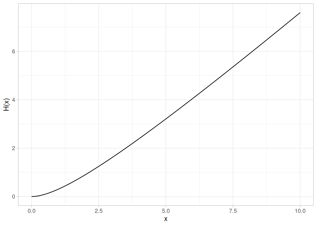
Survival Function
The formula for the survival function of the gamma distribution is
\[S(x) = 1 - \frac{\Gamma_{x}(\gamma)}{\Gamma(\gamma)} \;\;\;\;\;\;\; x \ge 0; \gamma > 0\]
where \(\Gamma\) is the gamma function defined above and \(\Gamma_{x}(a)\) is the incomplete gamma function defined above.
The following is the plot of the gamma survival function with the same shape parameter as the pdf plot above.
tibble(x = seq(0, 10, length.out = 401)) |>
mutate(y = 1 - pgamma(x, shape = 2)) |>
ggplot(aes(x, y)) +
geom_line() +
labs(x = "x", y = "S(x)") +
theme_light()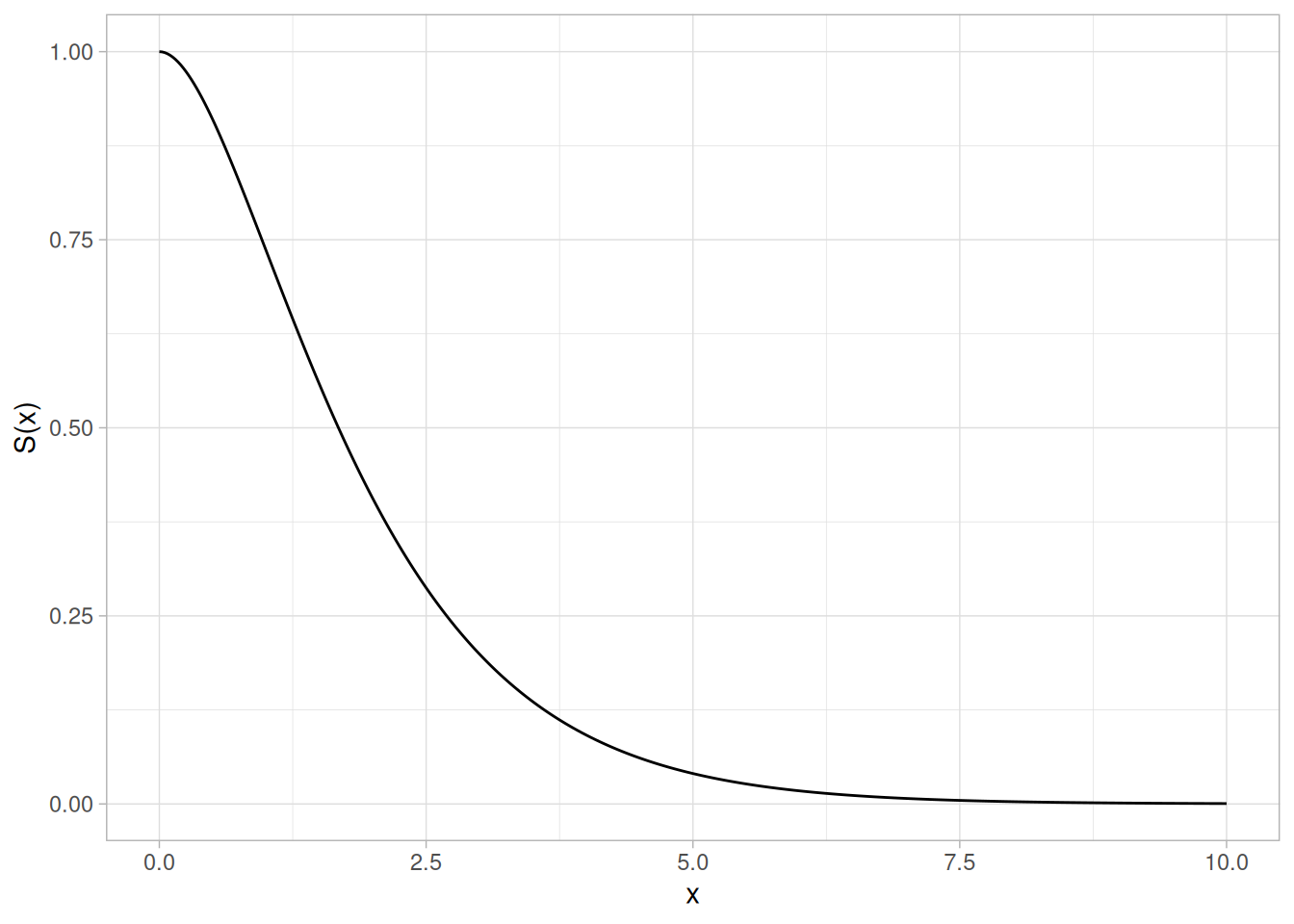
Inverse Survival Function
The gamma inverse survival function does not exist in simple closed form. It is computed numerically.
The following is the plot of the gamma inverse survival function with the same shape parameter as the pdf plot above.
tibble(p = seq(0.001, 0.999, length.out = 401)) |>
mutate(z = qgamma(1 - p, shape = 2)) |>
ggplot(aes(p, z)) +
geom_line() +
labs(x = expression(alpha), y = expression(Z(alpha))) +
theme_light()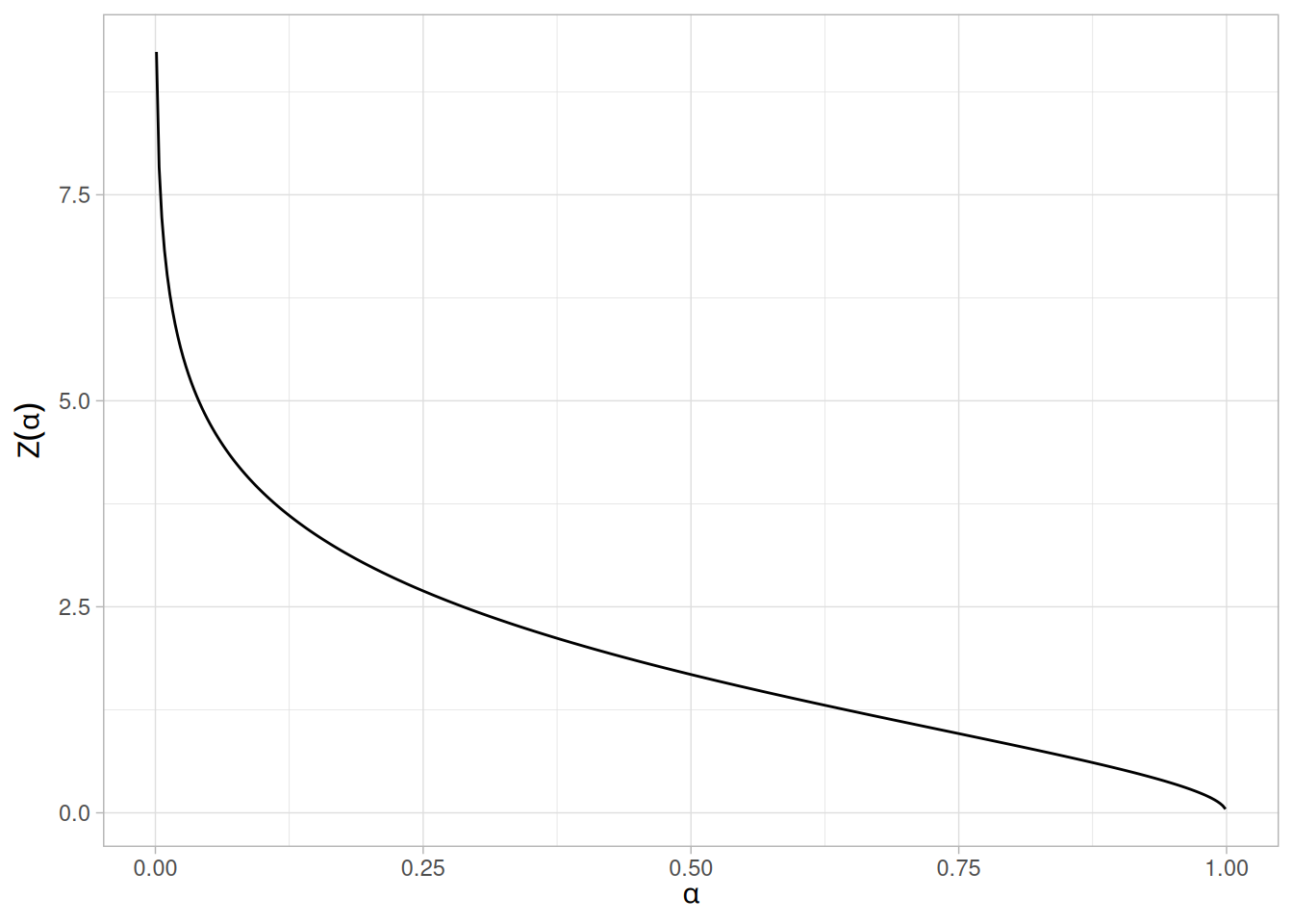
Common Statistics
The formulas below are with the location parameter equal to zero and the scale parameter equal to one.
| Statistic | Value |
|---|---|
| Mean | \(\gamma\) |
| Mode | \(\gamma - 1\) for \(\gamma \ge 1\) |
| Range | 0 to \(\infty\). |
| Standard Deviation | \(\sqrt{\gamma}\) |
| Skewness | \(\dfrac{2}{\sqrt{\gamma}}\) |
| Kurtosis | \(3 + \dfrac{6}{\gamma}\) |
| Coefficient of Variation | \(\dfrac{1}{\sqrt{\gamma}}\) |
Parameter Estimation
The method of moments estimators of the 2-parameter gamma distribution are
\[\hat{\gamma} = \left(\frac{\bar{x}}{s}\right)^{2}\]
\[\hat{\beta} = \frac{s^{2}}{\bar{x}}\]
where \(\bar{x}\) and \(s\) are the sample mean and standard deviation, respectively.
The maximum likelihood estimates for the 2-parameter gamma distribution are the solutions of the following simultaneous equations
\[\hat{\beta} - \frac{\bar{x}}{\hat{\gamma}} = 0\]
\[\log{\hat{\gamma}} - \psi(\hat{\gamma}) - \log\left(\frac{\bar{x}}{\left(\prod_{i=1}^{n}{x_i}\right)^{1/n}}\right) = 0\]
with \(\psi\) denoting the digamma function. These equations need to be solved numerically; this is typically accomplished by using statistical software packages.
Software
Some general purpose statistical software programs support at least some of the probability functions for the gamma distribution.
Probability Density Function
The general formula for the probability density function of the double exponential distribution is
\[f(x) = \frac{e^{-\left|\frac{x - \mu}{\beta}\right|}}{2\beta}\]
where \(\mu\) is the location parameter and \(\beta\) is the scale parameter. The case where \(\mu = 0\) and \(\beta = 1\) is called the standard double exponential distribution. The equation for the standard double exponential distribution is
\[f(x) = \frac{e^{-|x|}}{2}\]
Since the general form of probability functions can be expressed in terms of the standard distribution, all subsequent formulas in this section are given for the standard form of the function.
Note that the double exponential distribution is also commonly referred to as the Laplace distribution.
The following is the plot of the double exponential probability density function.
library(tidyverse)
ddexp <- function(x) exp(-abs(x)) / 2
tibble(x = seq(-4, 4, length.out = 401)) |>
mutate(y = ddexp(x)) |>
ggplot(aes(x, y)) +
geom_line() +
labs(x = "x", y = "f(x)") +
theme_light()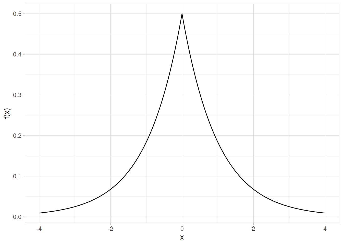
Cumulative Distribution Function
The formula for the cumulative distribution function of the double exponential distribution is
\[F(x) = \begin{cases} \dfrac{e^{x}}{2} & \text{for } x < 0 \\[4pt] 1 - \dfrac{e^{-x}}{2} & \text{for } x \ge 0 \end{cases}\]
The following is the plot of the double exponential cumulative distribution function.
pdexp <- function(x) ifelse(x < 0, exp(x) / 2, 1 - exp(-x) / 2)
tibble(x = seq(-4, 4, length.out = 401)) |>
mutate(y = pdexp(x)) |>
ggplot(aes(x, y)) +
geom_line() +
labs(x = "x", y = "F(x)") +
theme_light()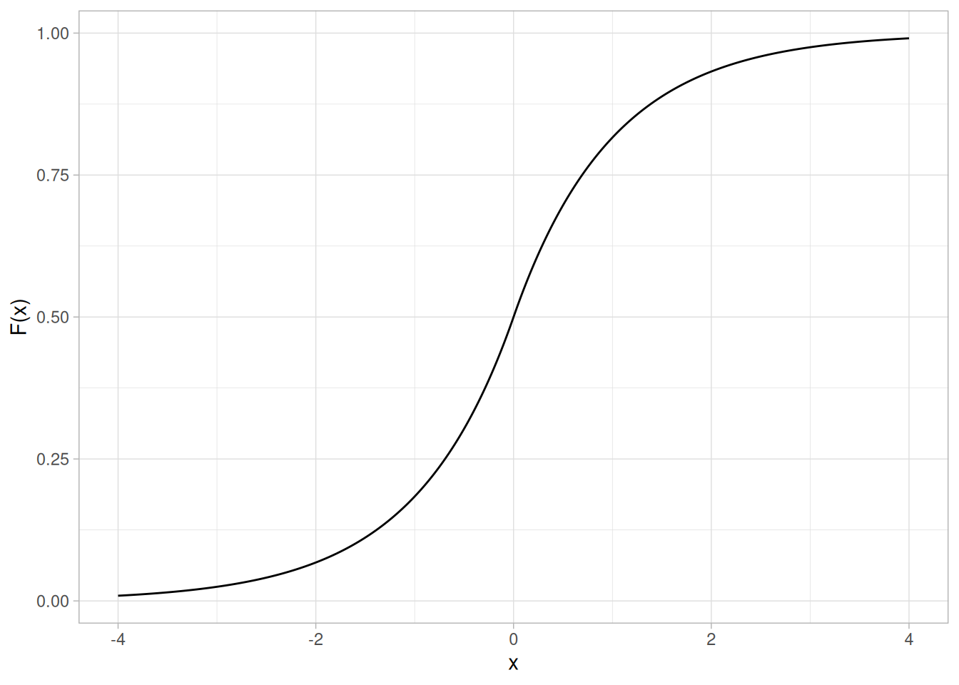
Percent Point Function
The formula for the percent point function of the double exponential distribution is
\[G(p) = \begin{cases} \log(2p) & \text{for } p \le 0.5 \\ -\log(2(1 - p)) & \text{for } p > 0.5 \end{cases}\]
The following is the plot of the double exponential percent point function.
qdexp <- function(p) ifelse(p <= 0.5, log(2 * p), -log(2 * (1 - p)))
tibble(p = seq(0.001, 0.999, length.out = 401)) |>
mutate(x = qdexp(p)) |>
ggplot(aes(p, x)) +
geom_line() +
labs(x = expression(alpha), y = expression(G(alpha))) +
theme_light()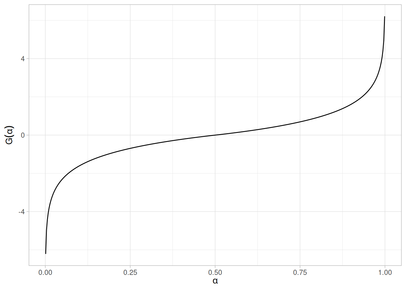
Hazard Function
The formula for the hazard function of the double exponential distribution is
\[h(x) = \begin{cases} \dfrac{e^{x}}{2 - e^{x}} & \text{for } x < 0 \\[4pt] 1 & \text{for } x \ge 0 \end{cases}\]
The following is the plot of the double exponential hazard function.
hdexp <- function(x) ifelse(x < 0, exp(x) / (2 - exp(x)), 1)
tibble(x = seq(-4, 4, length.out = 401)) |>
mutate(y = hdexp(x)) |>
ggplot(aes(x, y)) +
geom_line() +
labs(x = "x", y = "h(x)") +
theme_light()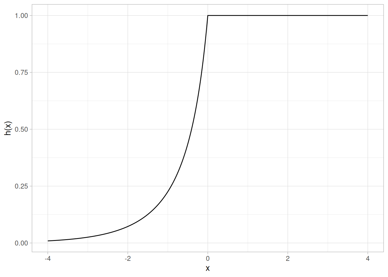
Cumulative Hazard Function
The formula for the cumulative hazard function of the double exponential distribution is
\[H(x) = \begin{cases} -\log\!\left(1 - \dfrac{e^{x}}{2}\right) & \text{for } x < 0 \\[4pt] x + \log(2) & \text{for } x \ge 0 \end{cases}\]
The following is the plot of the double exponential cumulative hazard function.
hdexp_cum <- function(x) ifelse(x < 0, -log(1 - exp(x) / 2), x + log(2))
tibble(x = seq(-4, 4, length.out = 401)) |>
mutate(y = hdexp_cum(x)) |>
ggplot(aes(x, y)) +
geom_line() +
labs(x = "x", y = "H(x)") +
theme_light()Warning: There was 1 warning in `mutate()`.
ℹ In argument: `y = hdexp_cum(x)`.
Caused by warning in `log()`:
! NaNs produced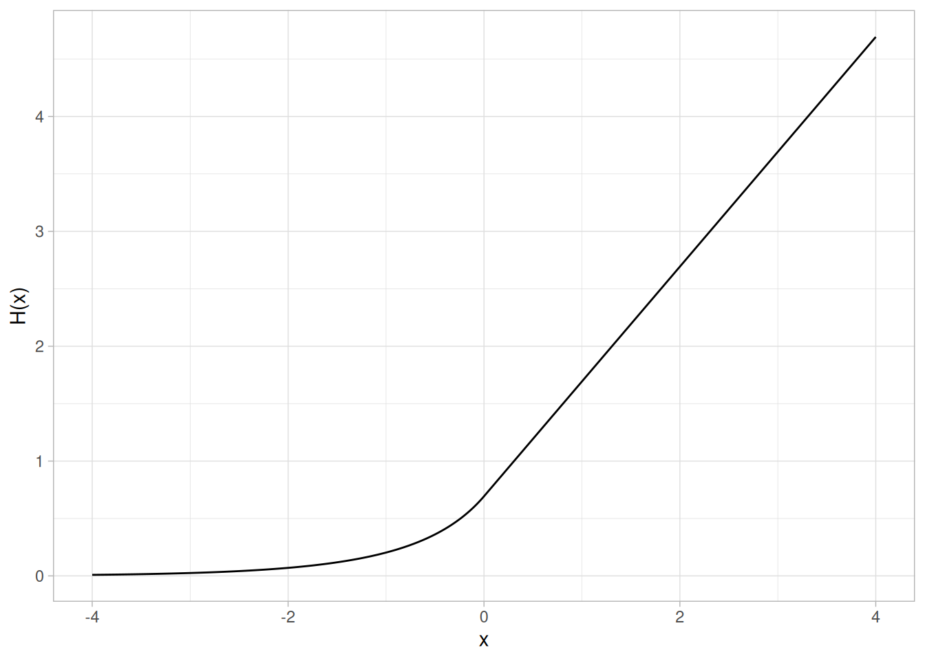
Survival Function
The formula for the survival function of the double exponential distribution is
\[S(x) = \begin{cases} 1 - \dfrac{e^{x}}{2} & \text{for } x < 0 \\[4pt] \dfrac{e^{-x}}{2} & \text{for } x \ge 0 \end{cases}\]
The following is the plot of the double exponential survival function.
sdexp <- function(x) ifelse(x < 0, 1 - exp(x) / 2, exp(-x) / 2)
tibble(x = seq(-4, 4, length.out = 401)) |>
mutate(y = sdexp(x)) |>
ggplot(aes(x, y)) +
geom_line() +
labs(x = "x", y = "S(x)") +
theme_light()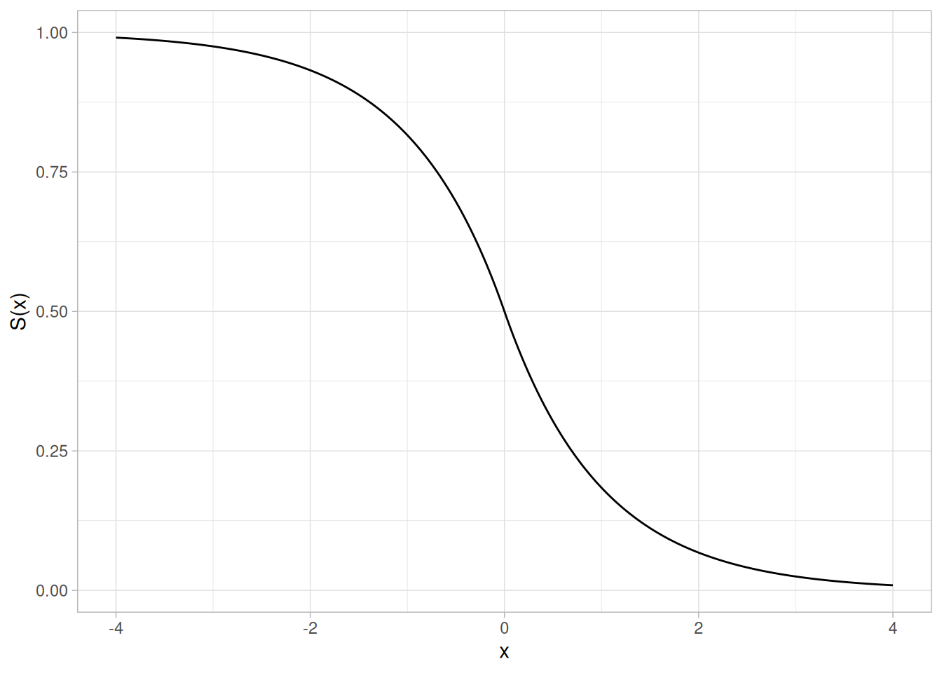
Inverse Survival Function
The formula for the inverse survival function of the double exponential distribution is
\[Z(p) = \begin{cases} \log(2(1 - p)) & \text{for } p \le 0.5 \\ -\log(2p) & \text{for } p > 0.5 \end{cases}\]
The following is the plot of the double exponential inverse survival function.
zdexp <- function(p) ifelse(p <= 0.5, log(2 * (1 - p)), -log(2 * p))
tibble(p = seq(0.001, 0.999, length.out = 401)) |>
mutate(z = zdexp(p)) |>
ggplot(aes(p, z)) +
geom_line() +
labs(x = expression(alpha), y = expression(Z(alpha))) +
theme_light()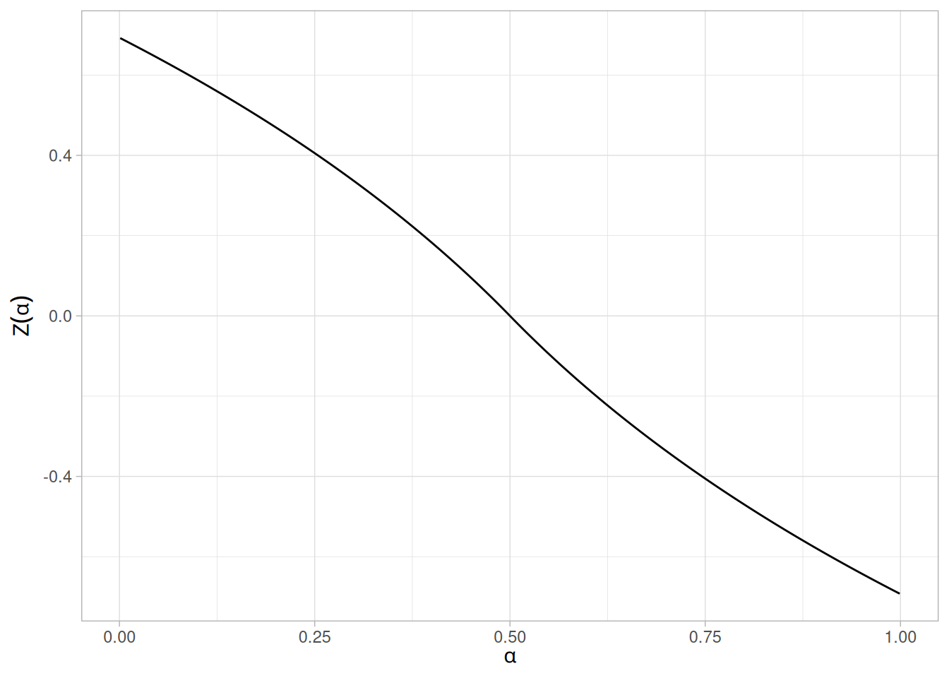
Common Statistics
| Statistic | Value |
|---|---|
| Mean | \(\mu\) |
| Median | \(\mu\) |
| Mode | \(\mu\) |
| Range | \(-\infty\) to \(\infty\) |
| Standard Deviation | \(\sqrt{2}\beta\) |
| Coefficient of Variation | \(\sqrt{2}\left(\dfrac{\beta}{\mu}\right)\) |
| Skewness | 0 |
| Kurtosis | 6 |
Parameter Estimation
The maximum likelihood estimators of the location and scale parameters of the double exponential distribution are
\[\hat{\mu} = \tilde{X}\]
\[\hat{\beta} = \frac{\sum_{i=1}^{N}|X_{i} - \tilde{X}|}{N}\]
where \(\tilde{X}\) is the sample median.
Software
Some general purpose statistical software programs support at least some of the probability functions for the double exponential distribution.
Probability Density Function
The formula for the probability density function of the standard form of the power normal distribution is
\[f(x; p) = p\,\phi(x)\,(\Phi(-x))^{p - 1} \qquad x, p > 0\]
where \(p\) is the shape parameter (also referred to as the power parameter), \(\Phi\) is the cumulative distribution function of the standard normal distribution, and \(\phi\) is the probability density function of the standard normal distribution.
As with other probability distributions, the power normal distribution can be transformed with a location parameter, \(\mu\), and a scale parameter, \(\sigma\). We omit the equation for the general form of the power normal distribution. Since the general form of probability functions can be expressed in terms of the standard distribution, all subsequent formulas in this section are given for the standard form of the function.
The following is the plot of the power normal probability density function with four values of \(p\): 0.5, 1, 2, and 5.
library(tidyverse)
dpnorm <- function(x, p) p * dnorm(x) * (pnorm(-x))^(p - 1)
tibble(x = seq(-4, 4, length.out = 401)) |>
expand_grid(p = c(0.5, 1, 2, 5)) |>
mutate(y = dpnorm(x, p),
p = factor(p)) |>
ggplot(aes(x, y, color = p)) +
geom_line() +
labs(x = "x", y = "f(x)", color = "p") +
theme_light()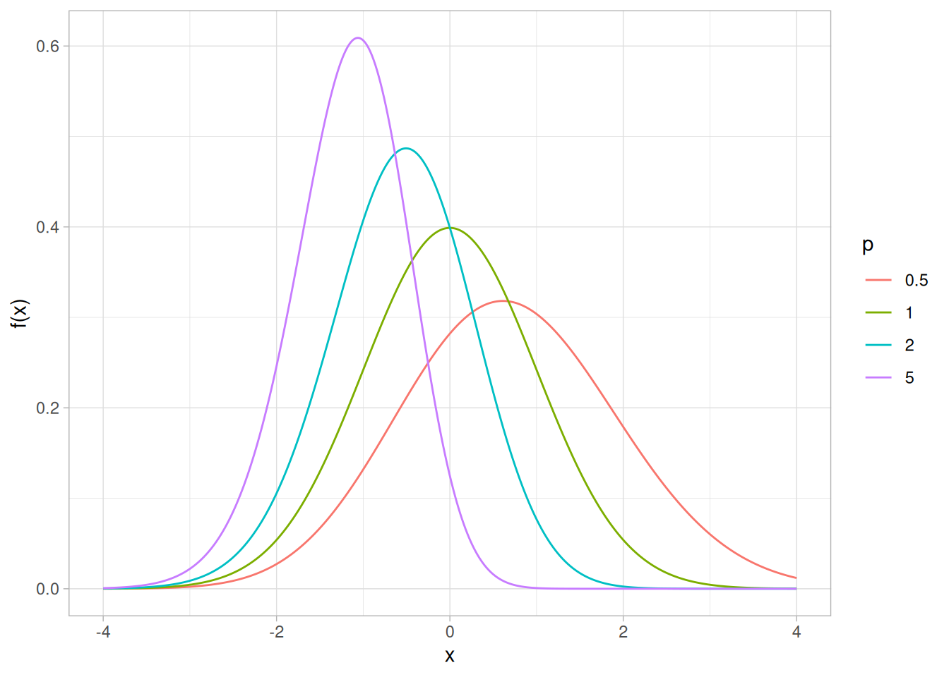
Cumulative Distribution Function
The formula for the cumulative distribution function of the power normal distribution is
\[F(x; p) = 1 - (\Phi(-x))^{p} \qquad x, p > 0\]
where \(\Phi\) is the cumulative distribution function of the standard normal distribution.
The following is the plot of the power normal cumulative distribution function with the same values of \(p\) as the pdf plot above.
ppnorm <- function(x, p) 1 - (pnorm(-x))^p
tibble(x = seq(-4, 4, length.out = 401)) |>
expand_grid(p = c(0.5, 1, 2, 5)) |>
mutate(y = ppnorm(x, p),
p = factor(p)) |>
ggplot(aes(x, y, color = p)) +
geom_line() +
labs(x = "x", y = "F(x)", color = "p") +
theme_light()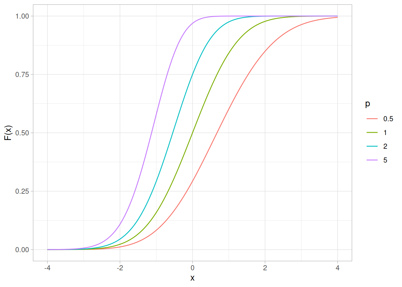
Percent Point Function
The formula for the percent point function of the power normal distribution is
\[G(f) = \Phi^{-1}\!\left(1 - (1 - f)^{1/p}\right) \qquad 0 < f < 1;\ p > 0\]
where \(\Phi^{-1}\) is the percent point function of the standard normal distribution.
The following is the plot of the power normal percent point function with the same values of \(p\) as the pdf plot above.
qpnorm <- function(f, p) qnorm(1 - (1 - f)^(1 / p))
tibble(p_prob = seq(0.001, 0.999, length.out = 401)) |>
expand_grid(p = c(0.5, 1, 2, 5)) |>
mutate(x = qpnorm(p_prob, p),
p = factor(p)) |>
ggplot(aes(p_prob, x, color = p)) +
geom_line() +
labs(x = expression(alpha), y = expression(G(alpha)), color = "p") +
theme_light()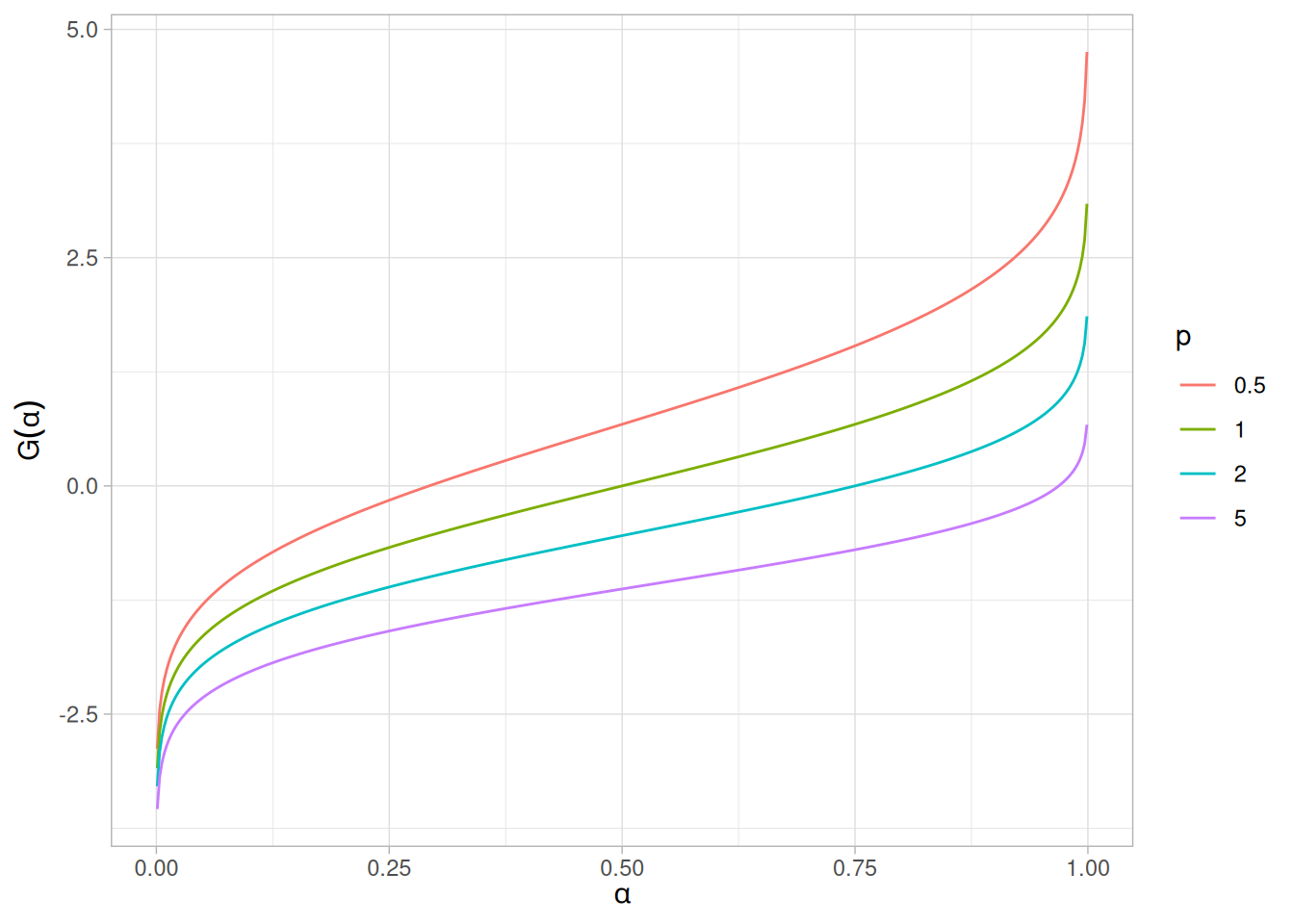
Hazard Function
The formula for the hazard function of the power normal distribution is
\[h(x; p) = \frac{p\,\phi(x)}{\Phi(-x)} \qquad x, p > 0\]
The following is the plot of the power normal hazard function with the same values of \(p\) as the pdf plot above.
hpnorm <- function(x, p) p * dnorm(x) / pnorm(-x)
tibble(x = seq(-4, 4, length.out = 401)) |>
expand_grid(p = c(0.5, 1, 2, 5)) |>
mutate(y = hpnorm(x, p),
p = factor(p)) |>
ggplot(aes(x, y, color = p)) +
geom_line() +
labs(x = "x", y = "h(x)", color = "p") +
theme_light()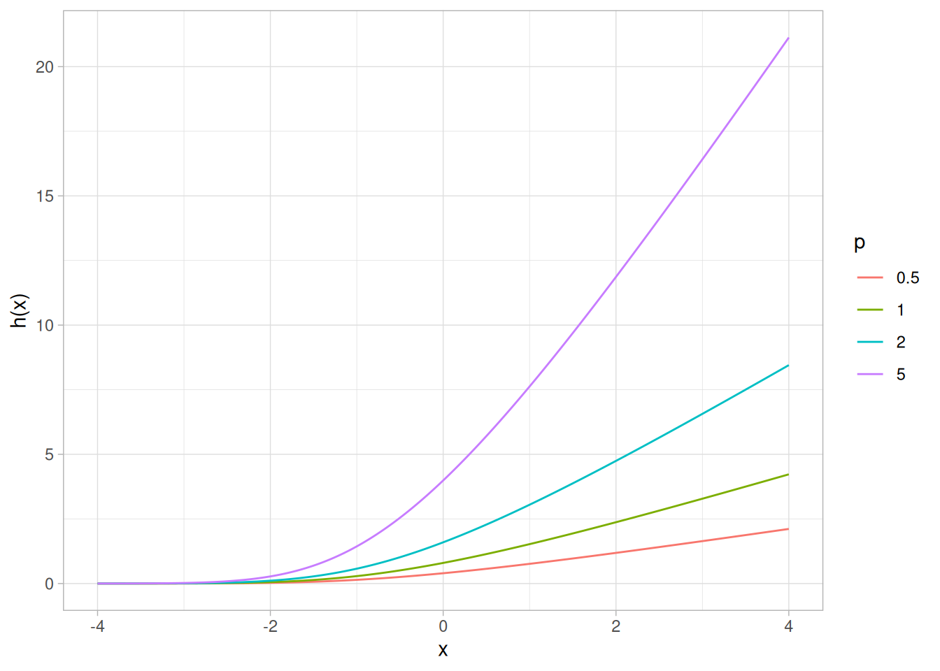
Cumulative Hazard Function
The formula for the cumulative hazard function of the power normal distribution is
\[H(x; p) = -\log\!\left((\Phi(-x))^{p}\right) \qquad x, p > 0\]
The following is the plot of the power normal cumulative hazard function with the same values of \(p\) as the pdf plot above.
hpnorm_cum <- function(x, p) -log((pnorm(-x))^p)
tibble(x = seq(-4, 4, length.out = 401)) |>
expand_grid(p = c(0.5, 1, 2, 5)) |>
mutate(y = hpnorm_cum(x, p),
p = factor(p)) |>
ggplot(aes(x, y, color = p)) +
geom_line() +
labs(x = "x", y = "H(x)", color = "p") +
theme_light()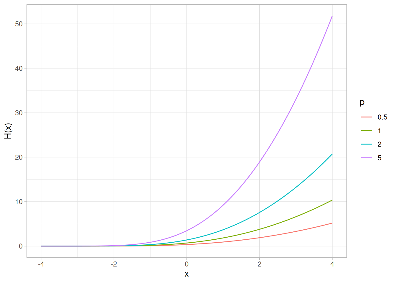
Survival Function
The formula for the survival function of the power normal distribution is
\[S(x; p) = (\Phi(-x))^{p} \qquad x, p > 0\]
The following is the plot of the power normal survival function with the same values of \(p\) as the pdf plot above.
spnorm <- function(x, p) (pnorm(-x))^p
tibble(x = seq(-4, 4, length.out = 401)) |>
expand_grid(p = c(0.5, 1, 2, 5)) |>
mutate(y = spnorm(x, p),
p = factor(p)) |>
ggplot(aes(x, y, color = p)) +
geom_line() +
labs(x = "x", y = "S(x)", color = "p") +
theme_light()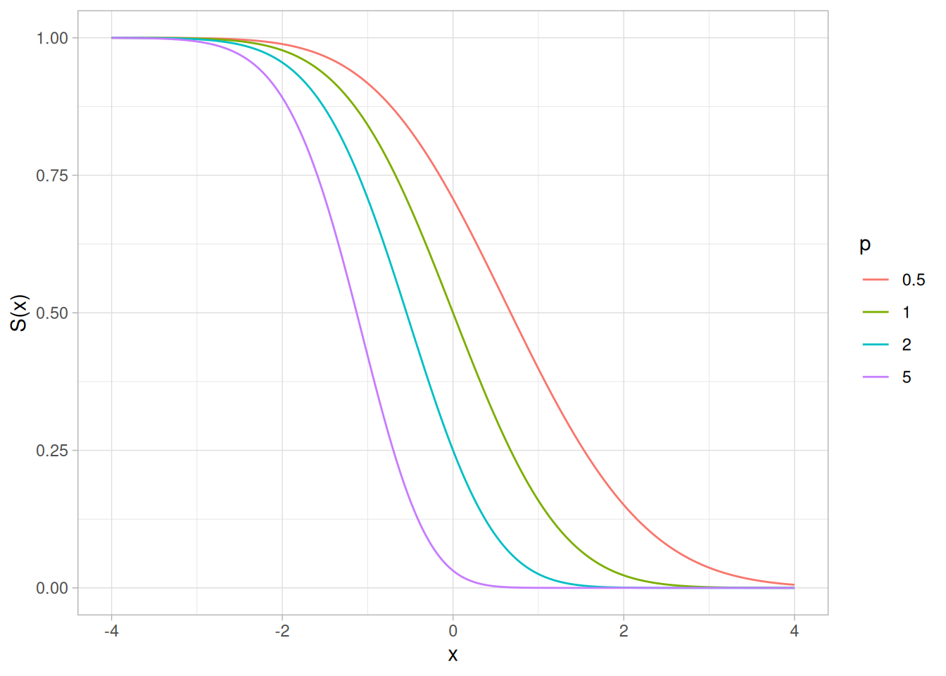
Inverse Survival Function
The formula for the inverse survival function of the power normal distribution is
\[Z(f) = \Phi^{-1}\!\left(1 - f^{1/p}\right) \qquad 0 < f < 1;\ p > 0\]
The following is the plot of the power normal inverse survival function with the same values of \(p\) as the pdf plot above.
zpnorm <- function(f, p) qnorm(1 - f^(1 / p))
tibble(p_prob = seq(0.001, 0.999, length.out = 401)) |>
expand_grid(p = c(0.5, 1, 2, 5)) |>
mutate(z = zpnorm(p_prob, p),
p = factor(p)) |>
ggplot(aes(p_prob, z, color = p)) +
geom_line() +
labs(x = expression(alpha), y = expression(Z(alpha)), color = "p") +
theme_light()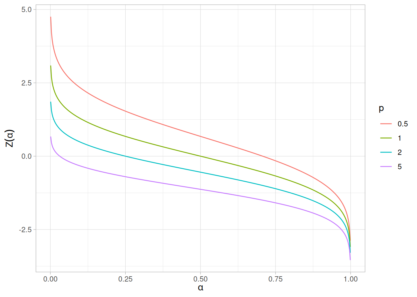
Common Statistics
The statistics for the power normal distribution are complicated and require tables. Nelson (Nelson and Doganaksoy 1992) discusses the mean, median, mode, and standard deviation of the power normal distribution and provides references to the appropriate tables.
Software
Most general purpose statistical software programs do not support the probability functions for the power normal distribution.
Probability Density Function
The formula for the probability density function of the standard form of the power lognormal distribution is
\[f(x; p, \sigma) = \left(\frac{p}{x\sigma}\right)\phi\!\left(\frac{\log x}{\sigma}\right)\left(\Phi\!\left(\frac{-\log x}{\sigma}\right)\right)^{p - 1} \qquad x, p, \sigma > 0\]
where \(p\) (also referred to as the power parameter) and \(\sigma\) are the shape parameters, \(\Phi\) is the cumulative distribution function of the standard normal distribution, and \(\phi\) is the probability density function of the standard normal distribution.
As with other probability distributions, the power lognormal distribution can be transformed with a location parameter, \(\mu\), and a scale parameter, \(B\). We omit the equation for the general form of the power lognormal distribution. Since the general form of probability functions can be expressed in terms of the standard distribution, all subsequent formulas in this section are given for the standard form of the function.
The following is the plot of the power lognormal probability density function with four values of \(p\) (0.5, 1, 2, and 5) and \(\sigma\) set to 1.
library(tidyverse)
dplnorm <- function(x, p, sigma = 1) {
(p / (x * sigma)) * dnorm(log(x) / sigma) * (pnorm(-log(x) / sigma))^(p - 1)
}
tibble(x = seq(0.01, 6, length.out = 401)) |>
expand_grid(p = c(0.5, 1, 2, 5)) |>
mutate(y = dplnorm(x, p),
p = factor(p)) |>
ggplot(aes(x, y, color = p)) +
geom_line() +
labs(x = "x", y = "f(x)", color = "p") +
theme_light()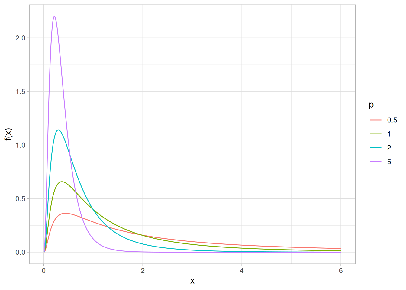
Cumulative Distribution Function
The formula for the cumulative distribution function of the power lognormal distribution is
\[F(x; p, \sigma) = 1 - \left(\Phi\!\left(\frac{-\log x}{\sigma}\right)\right)^{p} \qquad x, p, \sigma > 0\]
where \(\Phi\) is the cumulative distribution function of the standard normal distribution.
The following is the plot of the power lognormal cumulative distribution function with the same values of \(p\) as the pdf plot above.
pplnorm <- function(x, p, sigma = 1) 1 - (pnorm(-log(x) / sigma))^p
tibble(x = seq(0.01, 6, length.out = 401)) |>
expand_grid(p = c(0.5, 1, 2, 5)) |>
mutate(y = pplnorm(x, p),
p = factor(p)) |>
ggplot(aes(x, y, color = p)) +
geom_line() +
labs(x = "x", y = "F(x)", color = "p") +
theme_light()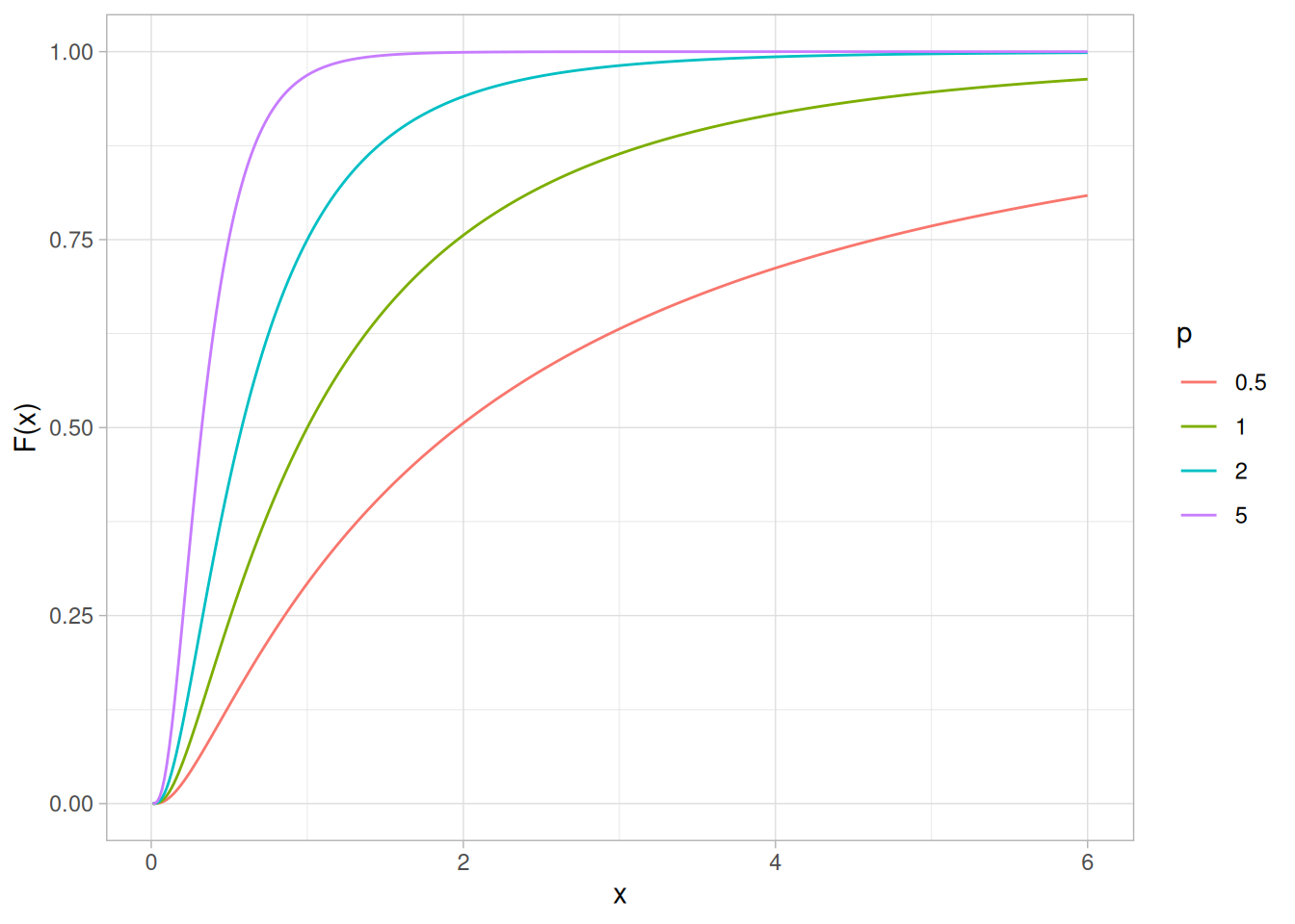
Percent Point Function
The formula for the percent point function of the power lognormal distribution is
\[G(f; p, \sigma) = \exp\!\left(\Phi^{-1}\!\left(1 - (1 - f)^{1/p}\right)\sigma\right) \qquad 0 < f < 1;\ p, \sigma > 0\]
where \(\Phi^{-1}\) is the percent point function of the standard normal distribution.
The following is the plot of the power lognormal percent point function with the same values of \(p\) as the pdf plot above.
qplnorm <- function(f, p, sigma = 1) exp(qnorm(1 - (1 - f)^(1 / p)) * sigma)
tibble(p_prob = seq(0.001, 0.999, length.out = 401)) |>
expand_grid(p = c(0.5, 1, 2, 5)) |>
mutate(x = qplnorm(p_prob, p),
p = factor(p)) |>
ggplot(aes(p_prob, x, color = p)) +
geom_line() +
labs(x = expression(alpha), y = expression(G(alpha)), color = "p") +
theme_light()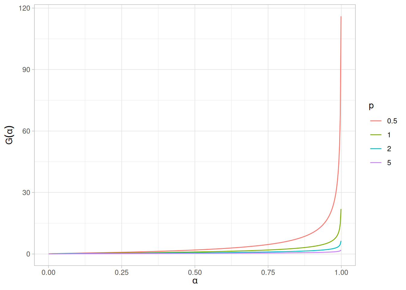
Hazard Function
The formula for the hazard function of the power lognormal distribution is
\[h(x; p, \sigma) = \frac{p\left(\dfrac{1}{x\sigma}\right)\phi\!\left(\dfrac{\log x}{\sigma}\right)}{\Phi\!\left(\dfrac{-\log x}{\sigma}\right)} \qquad x, p, \sigma > 0\]
where \(\Phi\) is the cumulative distribution function of the standard normal distribution, and \(\phi\) is the probability density function of the standard normal distribution.
Note that this is simply a multiple (\(p\)) of the lognormal hazard function.
The following is the plot of the power lognormal hazard function with the same values of \(p\) as the pdf plot above.
hplnorm <- function(x, p, sigma = 1) {
p * (1 / (x * sigma)) * dnorm(log(x) / sigma) / pnorm(-log(x) / sigma)
}
tibble(x = seq(0.01, 6, length.out = 401)) |>
expand_grid(p = c(0.5, 1, 2, 5)) |>
mutate(y = hplnorm(x, p),
p = factor(p)) |>
ggplot(aes(x, y, color = p)) +
geom_line() +
labs(x = "x", y = "h(x)", color = "p") +
theme_light()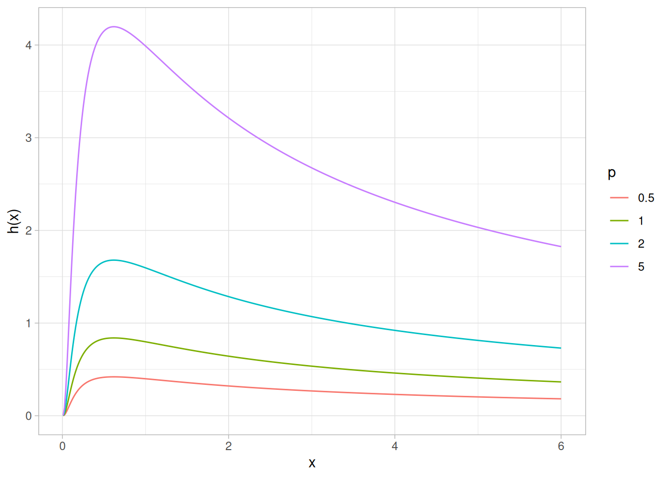
Cumulative Hazard Function
The formula for the cumulative hazard function of the power lognormal distribution is
\[H(x; p, \sigma) = -\log\!\left(\left(\Phi\!\left(\frac{-\log x}{\sigma}\right)\right)^{p}\right) \qquad x, p, \sigma > 0\]
The following is the plot of the power lognormal cumulative hazard function with the same values of \(p\) as the pdf plot above.
hplnorm_cum <- function(x, p, sigma = 1) -log((pnorm(-log(x) / sigma))^p)
tibble(x = seq(0.01, 6, length.out = 401)) |>
expand_grid(p = c(0.5, 1, 2, 5)) |>
mutate(y = hplnorm_cum(x, p),
p = factor(p)) |>
ggplot(aes(x, y, color = p)) +
geom_line() +
labs(x = "x", y = "H(x)", color = "p") +
theme_light()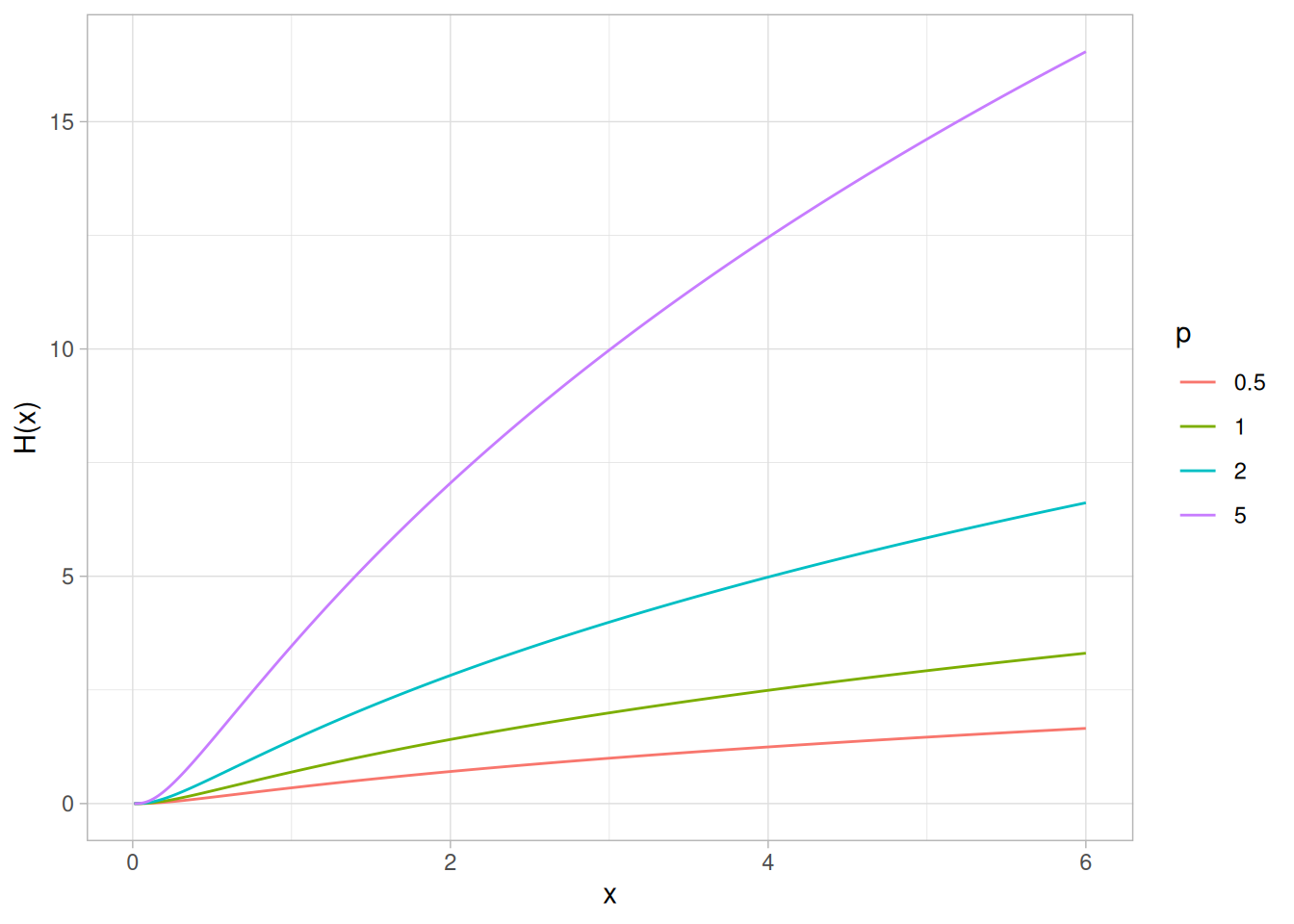
Survival Function
The formula for the survival function of the power lognormal distribution is
\[S(x; p, \sigma) = \left(\Phi\!\left(\frac{-\log x}{\sigma}\right)\right)^{p} \qquad x, p, \sigma > 0\]
The following is the plot of the power lognormal survival function with the same values of \(p\) as the pdf plot above.
splnorm <- function(x, p, sigma = 1) (pnorm(-log(x) / sigma))^p
tibble(x = seq(0.01, 6, length.out = 401)) |>
expand_grid(p = c(0.5, 1, 2, 5)) |>
mutate(y = splnorm(x, p),
p = factor(p)) |>
ggplot(aes(x, y, color = p)) +
geom_line() +
labs(x = "x", y = "S(x)", color = "p") +
theme_light()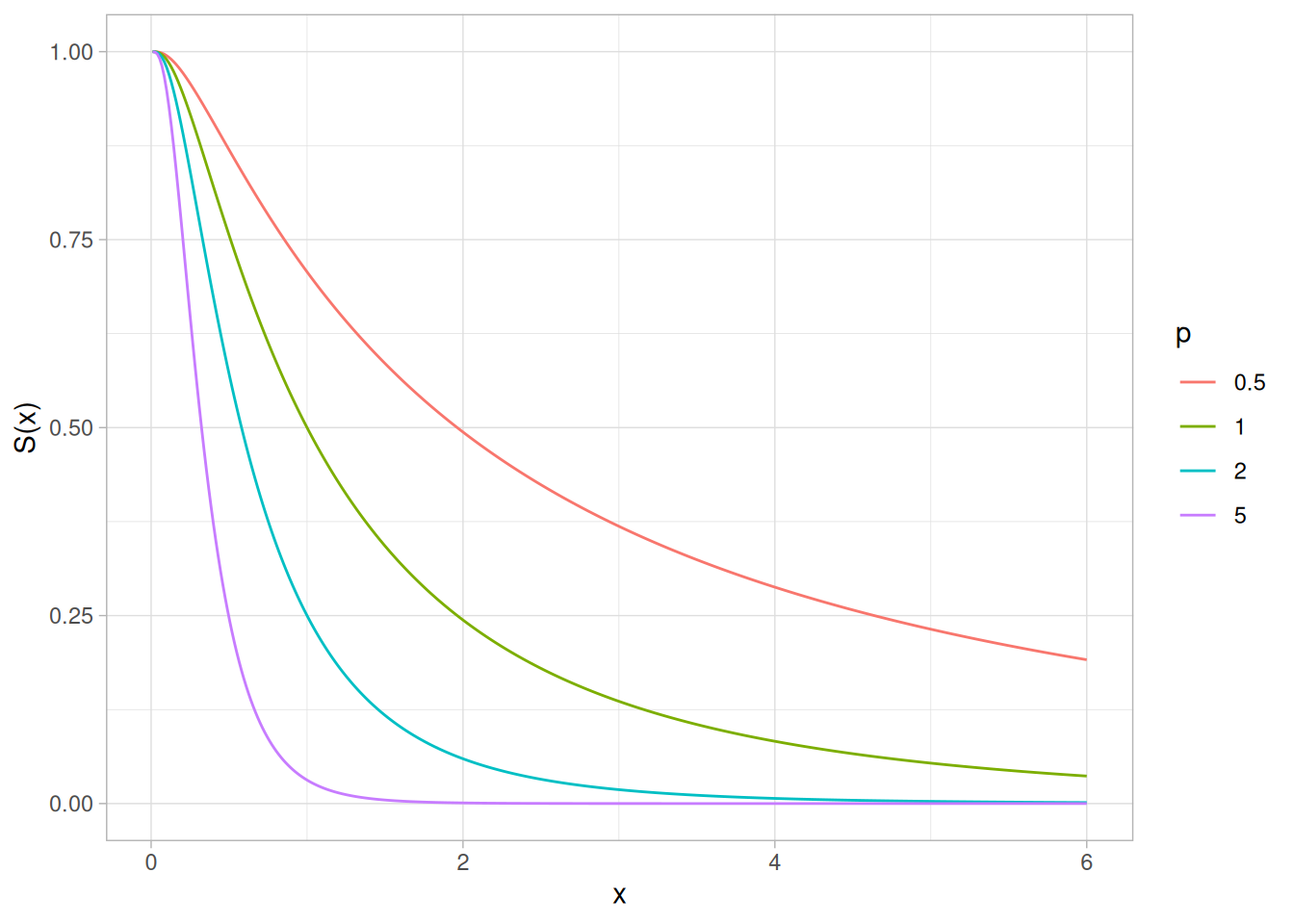
Inverse Survival Function
The formula for the inverse survival function of the power lognormal distribution is
\[Z(f; p, \sigma) = \exp\!\left(\Phi^{-1}\!\left(1 - f^{1/p}\right)\sigma\right) \qquad 0 < f < 1;\ p, \sigma > 0\]
The following is the plot of the power lognormal inverse survival function with the same values of \(p\) as the pdf plot above.
zplnorm <- function(f, p, sigma = 1) exp(qnorm(1 - f^(1 / p)) * sigma)
tibble(p_prob = seq(0.001, 0.999, length.out = 401)) |>
expand_grid(p = c(0.5, 1, 2, 5)) |>
mutate(z = zplnorm(p_prob, p),
p = factor(p)) |>
ggplot(aes(p_prob, z, color = p)) +
geom_line() +
labs(x = expression(alpha), y = expression(Z(alpha)), color = "p") +
theme_light()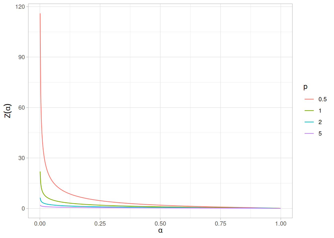
Common Statistics
The statistics for the power lognormal distribution are complicated and require tables. Nelson (Nelson and Doganaksoy 1992) discusses the mean, median, mode, and standard deviation of the power lognormal distribution and provides references to the appropriate tables.
Parameter Estimation
Nelson (Nelson and Doganaksoy 1992) discusses maximum likelihood estimation for the power lognormal distribution. These estimates need to be performed with computer software. Software for maximum likelihood estimation of the parameters of the power lognormal distribution is not as readily available as for other reliability distributions such as the exponential, Weibull, and lognormal.
Software
Most general purpose statistical software programs do not support the probability functions for the power lognormal distribution.
Probability Density Function
The Tukey-Lambda density function does not have a simple, closed form. It is computed numerically.
The Tukey-Lambda distribution has the shape parameter \(\lambda\). As with other probability distributions, the Tukey-Lambda distribution can be transformed with a location parameter, \(\mu\), and a scale parameter, \(\sigma\). Since the general form of probability functions can be expressed in terms of the standard distribution, all subsequent formulas in this section are given for the standard form of the function.
Because the source formula for the density is not given in closed form, no density plot is included here.
Cumulative Distribution Function
The Tukey-Lambda distribution does not have a simple, closed form for its cumulative distribution function. It is computed numerically.
Because the source formula for the cumulative distribution function is not given in closed form, no cumulative distribution function plot is included here.
Percent Point Function
The formula for the percent point function of the standard form of the Tukey-Lambda distribution is
\[G(p; \lambda) = \frac{p^{\lambda} - (1 - p)^{\lambda}}{\lambda}\]
The following is the plot of the Tukey-Lambda percent point function. The source page illustrates this with four values of \(\lambda\); here we use \(\lambda = -1, 0, 0.14, 1\), which correspond respectively to distributions approximately Cauchy, exactly logistic, approximately normal, and exactly uniform (see Comments below). Since \(\lambda = 0\) is a removable singularity in the formula above, that case is evaluated with its limiting form, \(G(p; 0) = \log(p / (1 - p))\). Because the \(\lambda = -1\) curve has very heavy (Cauchy-like) tails that would otherwise dwarf the other three curves, the plot’s vertical range is restricted to \([-5, 5]\) for readability.
library(tidyverse)
qtukeylambda <- function(p, lambda) {
if (lambda == 0) log(p / (1 - p)) else (p^lambda - (1 - p)^lambda) / lambda
}
tibble(p_prob = seq(0.001, 0.999, length.out = 401)) |>
expand_grid(lambda = c(-1, 0, 0.14, 1)) |>
rowwise() |>
mutate(x = qtukeylambda(p_prob, lambda)) |>
ungroup() |>
mutate(lambda = factor(lambda)) |>
ggplot(aes(p_prob, x, color = lambda)) +
geom_line() +
coord_cartesian(ylim = c(-5, 5)) +
labs(x = expression(alpha), y = expression(G(alpha)), color = expression(lambda)) +
theme_light()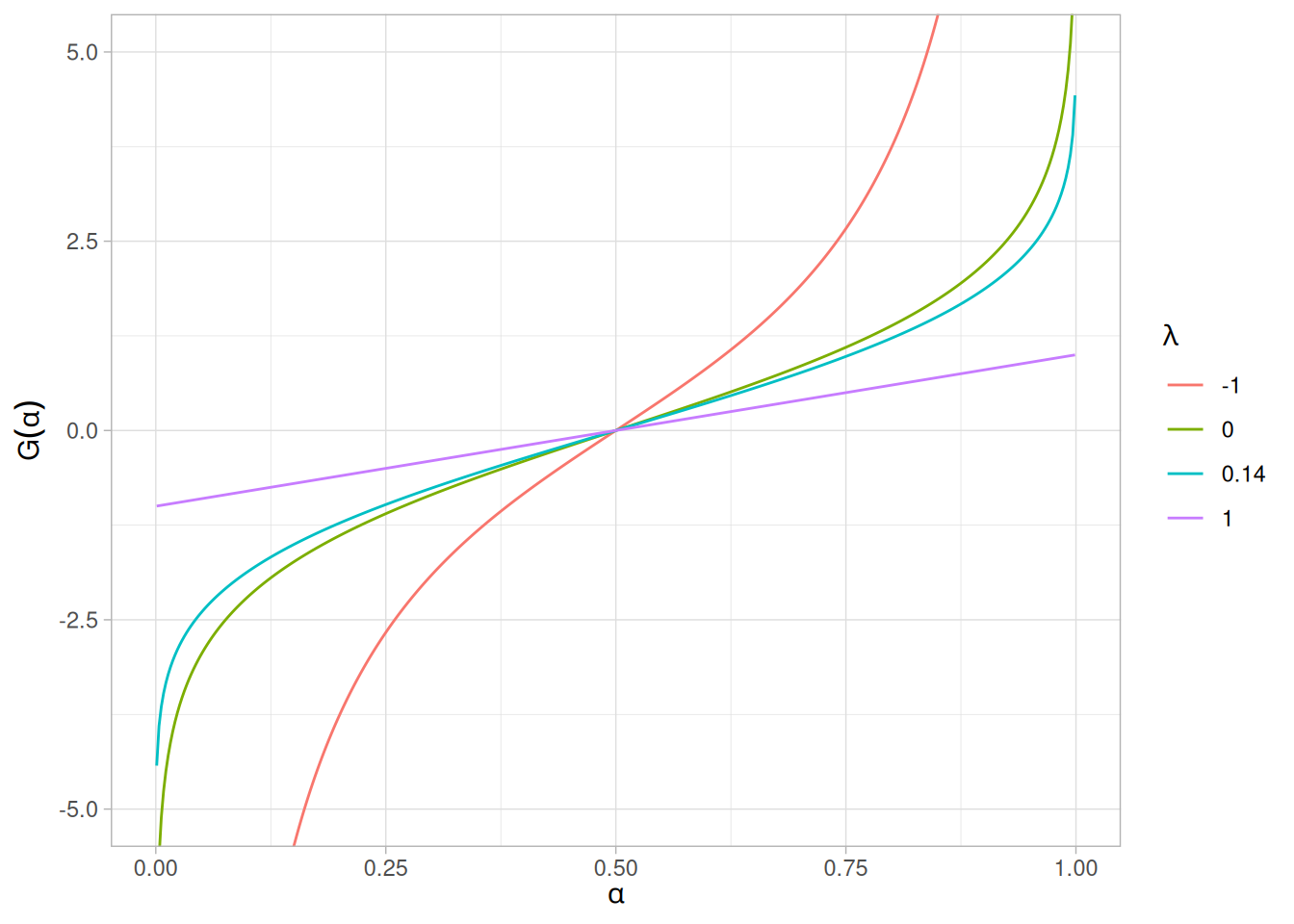
Other Probability Functions
The Tukey-Lambda distribution is typically used to identify an appropriate distribution (see the comments below) and not used in statistical models directly. For this reason, we omit the formulas and plots for the hazard, cumulative hazard, survival, and inverse survival functions. We also omit the common statistics and parameter estimation sections.
Comments
The Tukey-Lambda distribution is actually a family of distributions that can approximate a number of common distributions. For example,
| \(\lambda\) | Approximates |
|---|---|
| \(\lambda = -1\) | approximately Cauchy |
| \(\lambda = 0\) | exactly logistic |
| \(\lambda = 0.14\) | approximately normal |
| \(\lambda = 0.5\) | U-shaped |
| \(\lambda = 1\) | exactly uniform (from -1 to +1) |
The most common use of this distribution is to generate a Tukey-Lambda PPCC plot of a data set. Based on the PPCC plot, an appropriate model for the data is suggested. For example, if the maximum correlation occurs for a value of \(\lambda\) at or near 0.14, then the data can be modeled with a normal distribution. Values of \(\lambda\) less than this imply a heavy-tailed distribution (with -1 approximating a Cauchy). That is, as the optimal value of \(\lambda\) goes from 0.14 to -1, increasingly heavy tails are implied. Similarly, as the optimal value of \(\lambda\) becomes greater than 0.14, shorter tails are implied.
As the Tukey-Lambda distribution is a symmetric distribution, the use of the Tukey-Lambda PPCC plot to determine a reasonable distribution to model the data only applies to symmetric distributions. A histogram of the data should provide evidence as to whether the data can be reasonably modeled with a symmetric distribution.
Software
Most general purpose statistical software programs do not support the probability functions for the Tukey-Lambda distribution.
Probability Density Function
The extreme value type I distribution has two forms. One is based on the smallest extreme and the other is based on the largest extreme. We call these the minimum and maximum cases, respectively. Formulas and plots for both cases are given. The extreme value type I distribution is also referred to as the Gumbel distribution.
The general formula for the probability density function of the Gumbel (minimum) distribution is
\[f(x) = \frac{1}{\beta} e^{\frac{x - \mu}{\beta}} e^{-e^{\frac{x - \mu}{\beta}}}\]
where \(\mu\) is the location parameter and \(\beta\) is the scale parameter. The case where \(\mu = 0\) and \(\beta = 1\) is called the standard Gumbel distribution. The equation for the standard Gumbel distribution (minimum) reduces to
\[f(x) = e^{x} e^{-e^{x}}\]
The general formula for the probability density function of the Gumbel (maximum) distribution is
\[f(x) = \frac{1}{\beta} e^{-\frac{x - \mu}{\beta}} e^{-e^{-\frac{x - \mu}{\beta}}}\]
where \(\mu\) is the location parameter and \(\beta\) is the scale parameter. The case where \(\mu = 0\) and \(\beta = 1\) is called the standard Gumbel distribution. The equation for the standard Gumbel distribution (maximum) reduces to
\[f(x) = e^{-x} e^{-e^{-x}}\]
Since the general form of probability functions can be expressed in terms of the standard distribution, all subsequent formulas in this section are given for the standard form of the function. R does not provide built-in d/p/q functions for the Gumbel distribution, so the closed-form expressions above are implemented directly below.
The following is the plot of the standard Gumbel probability density function for the minimum case.
library(tidyverse)
dgumbel_min <- function(x) exp(x) * exp(-exp(x))
tibble(x = seq(-8, 3, length.out = 401)) |>
mutate(y = dgumbel_min(x)) |>
ggplot(aes(x, y)) +
geom_line() +
labs(x = "x", y = "f(x)") +
theme_light()
The following is the plot of the standard Gumbel probability density function for the maximum case.
dgumbel_max <- function(x) exp(-x) * exp(-exp(-x))
tibble(x = seq(-3, 8, length.out = 401)) |>
mutate(y = dgumbel_max(x)) |>
ggplot(aes(x, y)) +
geom_line() +
labs(x = "x", y = "f(x)") +
theme_light()
Cumulative Distribution Function
The formula for the cumulative distribution function of the Gumbel distribution (minimum) is
\[F(x) = 1 - e^{-e^{x}}\]
The following is the plot of the Gumbel cumulative distribution function for the minimum case.
pgumbel_min <- function(x) 1 - exp(-exp(x))
tibble(x = seq(-8, 3, length.out = 401)) |>
mutate(y = pgumbel_min(x)) |>
ggplot(aes(x, y)) +
geom_line() +
labs(x = "x", y = "F(x)") +
theme_light()
The formula for the cumulative distribution function of the Gumbel distribution (maximum) is
\[F(x) = e^{-e^{-x}}\]
The following is the plot of the Gumbel cumulative distribution function for the maximum case.
pgumbel_max <- function(x) exp(-exp(-x))
tibble(x = seq(-3, 8, length.out = 401)) |>
mutate(y = pgumbel_max(x)) |>
ggplot(aes(x, y)) +
geom_line() +
labs(x = "x", y = "F(x)") +
theme_light()
Percent Point Function
The formula for the percent point function of the Gumbel distribution (minimum) is
\[G(p) = \ln\left(\ln\left(\frac{1}{1 - p}\right)\right)\]
The following is the plot of the Gumbel percent point function for the minimum case.
qgumbel_min <- function(p) log(log(1 / (1 - p)))
tibble(p = seq(0.001, 0.999, length.out = 401)) |>
mutate(x = qgumbel_min(p)) |>
ggplot(aes(p, x)) +
geom_line() +
labs(x = expression(alpha), y = expression(G(alpha))) +
theme_light()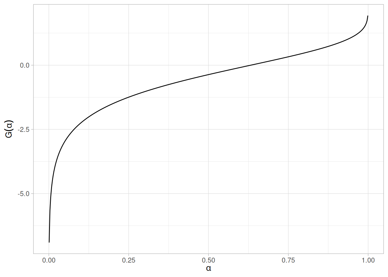
The formula for the percent point function of the Gumbel distribution (maximum) is
\[G(p) = -\ln\left(\ln\left(\frac{1}{p}\right)\right)\]
The following is the plot of the Gumbel percent point function for the maximum case.
qgumbel_max <- function(p) -log(log(1 / p))
tibble(p = seq(0.001, 0.999, length.out = 401)) |>
mutate(x = qgumbel_max(p)) |>
ggplot(aes(p, x)) +
geom_line() +
labs(x = expression(alpha), y = expression(G(alpha))) +
theme_light()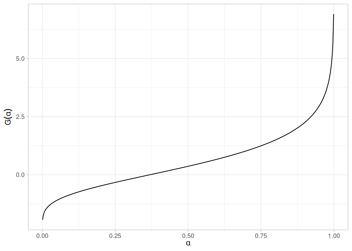
Hazard Function
The formula for the hazard function of the Gumbel distribution (minimum) is
\[h(x) = e^{x}\]
The following is the plot of the Gumbel hazard function for the minimum case.
tibble(x = seq(-8, 3, length.out = 401)) |>
mutate(y = exp(x)) |>
ggplot(aes(x, y)) +
geom_line() +
labs(x = "x", y = "h(x)") +
theme_light()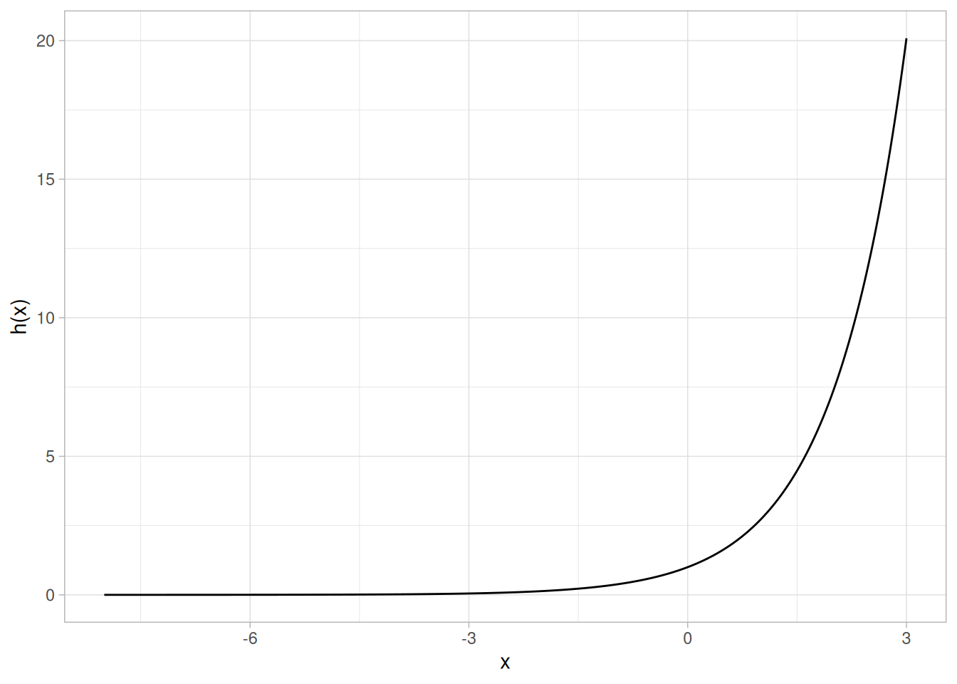
The formula for the hazard function of the Gumbel distribution (maximum) is
\[h(x) = \frac{e^{-x}}{e^{e^{-x}} - 1}\]
The following is the plot of the Gumbel hazard function for the maximum case.
tibble(x = seq(-3, 8, length.out = 401)) |>
mutate(y = exp(-x) / (exp(exp(-x)) - 1)) |>
ggplot(aes(x, y)) +
geom_line() +
labs(x = "x", y = "h(x)") +
theme_light()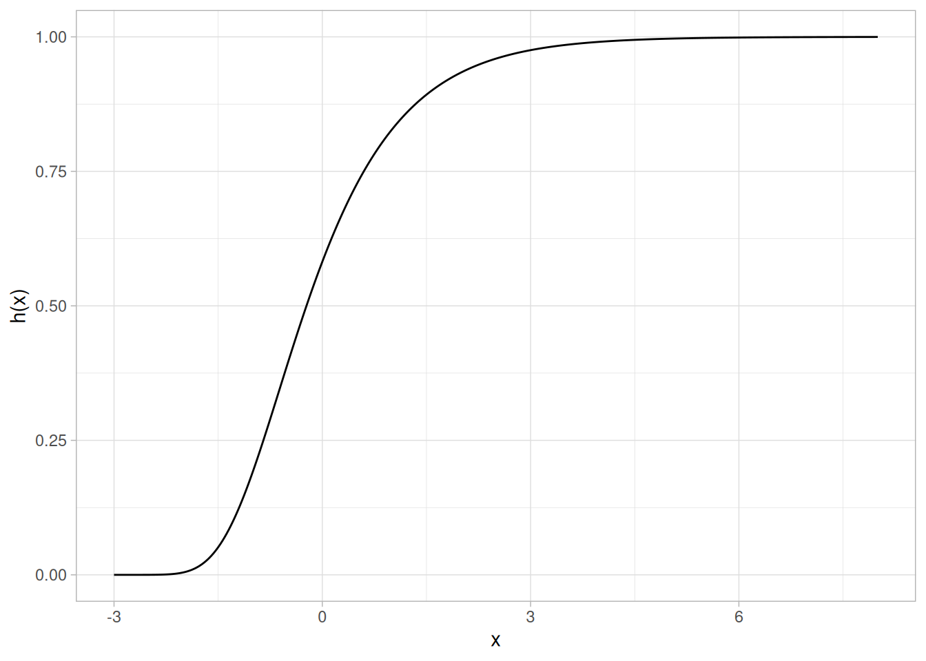
Cumulative Hazard Function
The formula for the cumulative hazard function of the Gumbel distribution (minimum) is
\[H(x) = e^{x}\]
The following is the plot of the Gumbel cumulative hazard function for the minimum case.
tibble(x = seq(-8, 3, length.out = 401)) |>
mutate(y = exp(x)) |>
ggplot(aes(x, y)) +
geom_line() +
labs(x = "x", y = "H(x)") +
theme_light()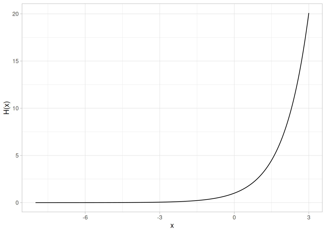
The formula for the cumulative hazard function of the Gumbel distribution (maximum) is
\[H(x) = -\ln\left(1 - e^{-e^{-x}}\right)\]
The following is the plot of the Gumbel cumulative hazard function for the maximum case.
tibble(x = seq(-3, 8, length.out = 401)) |>
mutate(y = -log(1 - exp(-exp(-x)))) |>
ggplot(aes(x, y)) +
geom_line() +
labs(x = "x", y = "H(x)") +
theme_light()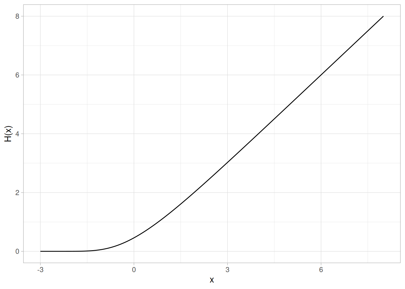
Survival Function
The formula for the survival function of the Gumbel distribution (minimum) is
\[S(x) = e^{-e^{x}}\]
The following is the plot of the Gumbel survival function for the minimum case.
tibble(x = seq(-8, 3, length.out = 401)) |>
mutate(y = exp(-exp(x))) |>
ggplot(aes(x, y)) +
geom_line() +
labs(x = "x", y = "S(x)") +
theme_light()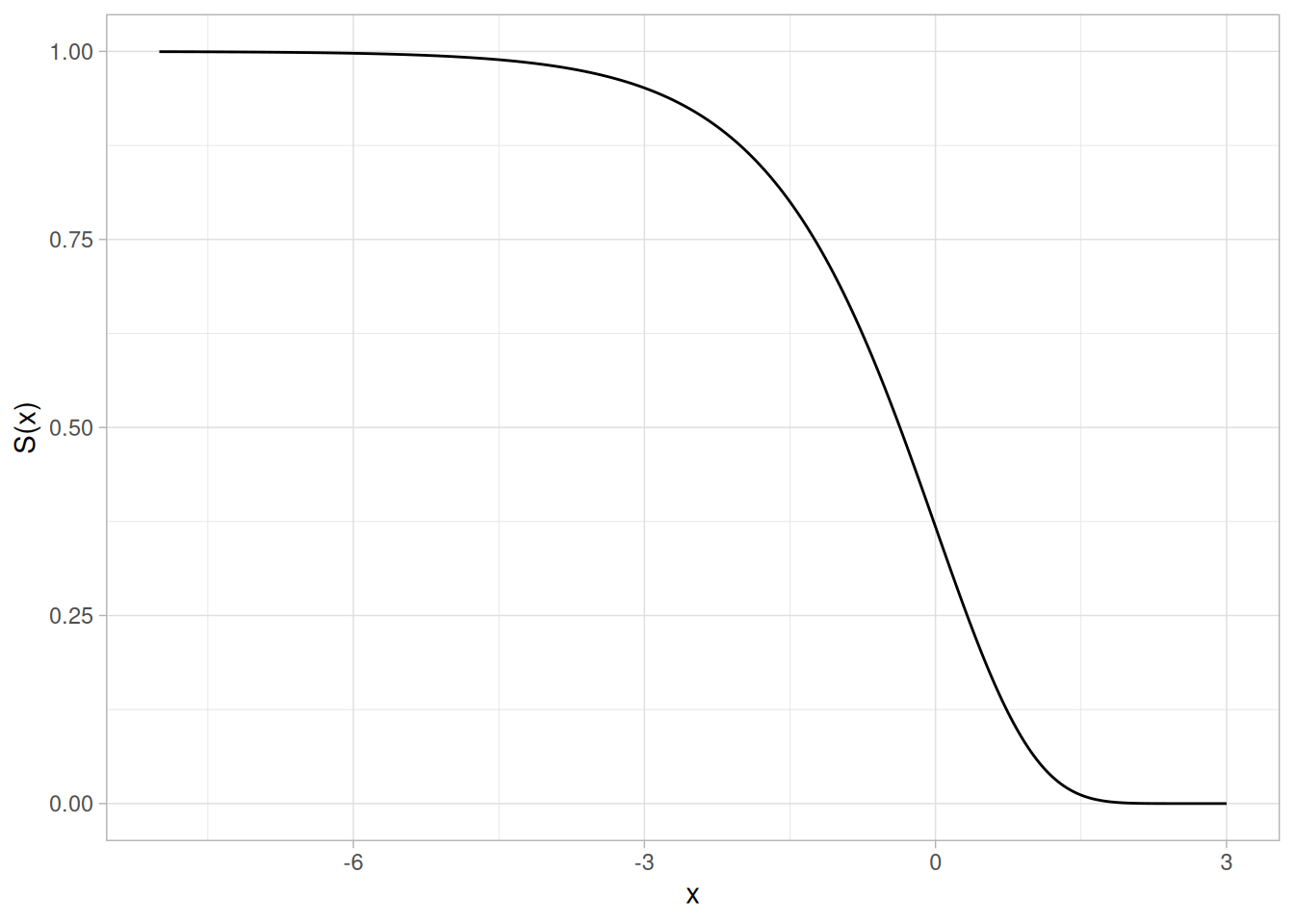
The formula for the survival function of the Gumbel distribution (maximum) is
\[S(x) = 1 - e^{-e^{-x}}\]
The following is the plot of the Gumbel survival function for the maximum case.
tibble(x = seq(-3, 8, length.out = 401)) |>
mutate(y = 1 - exp(-exp(-x))) |>
ggplot(aes(x, y)) +
geom_line() +
labs(x = "x", y = "S(x)") +
theme_light()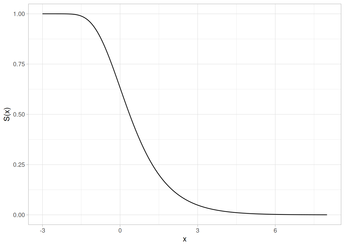
Inverse Survival Function
The formula for the inverse survival function of the Gumbel distribution (minimum) is
\[Z(p) = \ln\left(\ln\left(\frac{1}{p}\right)\right)\]
The following is the plot of the Gumbel inverse survival function for the minimum case.
tibble(p = seq(0.001, 0.999, length.out = 401)) |>
mutate(z = log(log(1 / p))) |>
ggplot(aes(p, z)) +
geom_line() +
labs(x = expression(alpha), y = expression(Z(alpha))) +
theme_light()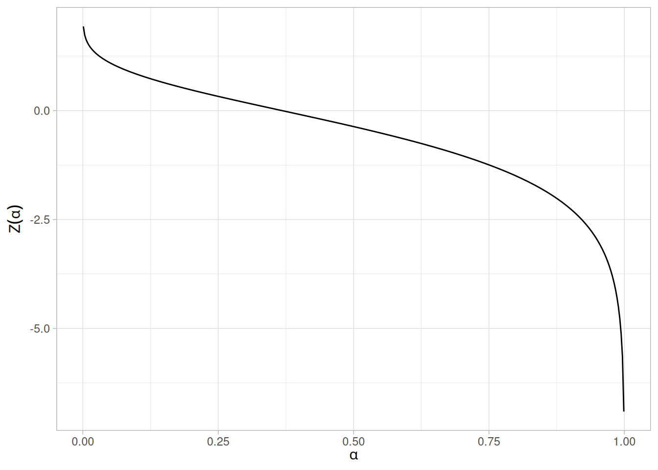
The formula for the inverse survival function of the Gumbel distribution (maximum) is
\[Z(p) = -\ln\left(\ln\left(\frac{1}{1 - p}\right)\right)\]
The following is the plot of the Gumbel inverse survival function for the maximum case.
tibble(p = seq(0.001, 0.999, length.out = 401)) |>
mutate(z = -log(log(1 / (1 - p)))) |>
ggplot(aes(p, z)) +
geom_line() +
labs(x = expression(alpha), y = expression(Z(alpha))) +
theme_light()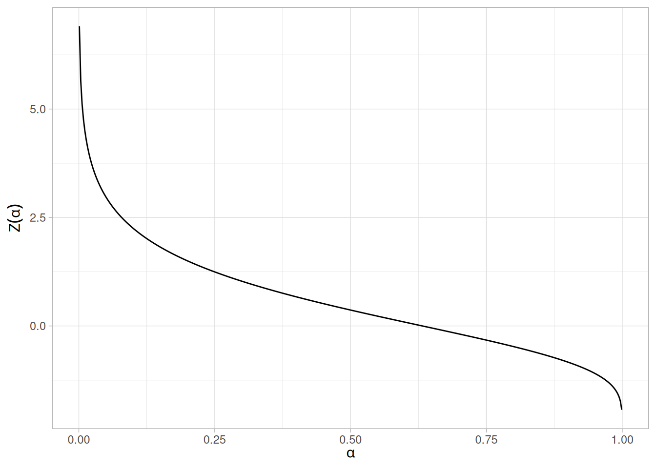
Common Statistics
The formulas below are for the maximum order statistic case.
| Statistic | Value |
|---|---|
| Mean | \(\mu + 0.5772\beta\) (the constant 0.5772 is Euler’s number) |
| Median | \(\mu - \beta\ln(\ln(2))\) |
| Mode | \(\mu\) |
| Range | \(-\infty\) to \(\infty\) |
| Standard Deviation | \(\dfrac{\beta\pi}{\sqrt{6}}\) |
| Coefficient of Variation | \(\dfrac{\beta\pi}{\sqrt{6}(\mu + 0.5772\beta)}\) |
| Skewness | 1.13955 |
| Kurtosis | 5.4 |
Parameter Estimation
The method of moments estimators of the Gumbel (maximum) distribution are
\[\tilde{\beta} = \frac{s\sqrt{6}}{\pi}\] \[\tilde{\mu} = \bar{X} - 0.5772\tilde{\beta} = \bar{X} - 0.45006s\]
where \(\bar{X}\) and \(s\) are the sample mean and standard deviation, respectively.
The method of moments estimators of the Gumbel (minimum) distribution are
\[\tilde{\beta} = \frac{s\sqrt{6}}{\pi}\] \[\tilde{\mu} = \bar{X} + 0.5772\tilde{\beta} = \bar{X} + 0.45006s\]
where \(\bar{X}\) and \(s\) are the sample mean and standard deviation, respectively.
The maximum likelihood estimates for the maximum case are the solution to the following simultaneous equations
\[\bar{x} - \frac{\sum_{i=1}^{n}{x_i \exp(-x_i/\hat{\beta})}}{\sum_{i=1}^{n}{\exp(-x_i/\hat{\beta})}} - \hat{\beta} = 0\] \[-\hat{\beta} \log\left(\frac{1}{n}\sum_{i=1}^{n}{\exp(-x_i/\hat{\beta})}\right) - \hat{\mu} = 0\]
For the minimum case, replace \(-x_i\) with \(x_i\) in the above equations.
These equations need to be solved numerically and this is typically accomplished by using statistical software packages.
Software
Some general purpose statistical software programs support at least some of the probability functions for the extreme value type I distribution.
Probability Density Function
The general formula for the probability density function of the beta distribution is
\[f(x) = \frac{(x - a)^{p-1}(b - x)^{q-1}}{B(p,q)(b-a)^{p+q-1}} \;\;\;\;\;\;\; a \le x \le b;\; p, q > 0\]
where \(p\) and \(q\) are the shape parameters, \(a\) and \(b\) are the lower and upper bounds, respectively, of the distribution, and \(B(p,q)\) is the beta function. The beta function has the formula
\[B(\alpha,\beta) = \int_{0}^{1}{t^{\alpha-1}(1 - t)^{\beta-1}dt}\]
The case where \(a = 0\) and \(b = 1\) is called the standard beta distribution. The equation for the standard beta distribution is
\[f(x) = \frac{x^{p-1}(1-x)^{q-1}}{B(p,q)} \;\;\;\;\;\;\; 0 \le x \le 1;\; p, q > 0\]
Typically we define the general form of a distribution in terms of location and scale parameters. The beta is different in that we define the general distribution in terms of the lower and upper bounds. However, the location and scale parameters can be defined in terms of the lower and upper limits as follows:
\[\text{location} = a\] \[\text{scale} = b - a\]
Since the general form of probability functions can be expressed in terms of the standard distribution, all subsequent formulas in this section are given for the standard form of the function.
The beta distribution has two shape parameters and no single choice is illustrative of every shape it can take; the source page shows four combinations. Here the shape parameters \(p = 2\) and \(q = 3\) are used for the plots below, chosen because they produce a clearly non-uniform, non-symmetric density on \([0, 1]\) (base R’s dbeta/pbeta/qbeta use the arguments shape1 and shape2 for \(p\) and \(q\), respectively).
The following is the plot of the beta probability density function for \(p = 2\), \(q = 3\).
library(tidyverse)
tibble(x = seq(0, 1, length.out = 401)) |>
mutate(y = dbeta(x, shape1 = 2, shape2 = 3)) |>
ggplot(aes(x, y)) +
geom_line() +
scale_x_continuous(limits = c(0, 1)) +
labs(x = "x", y = "f(x)") +
theme_light()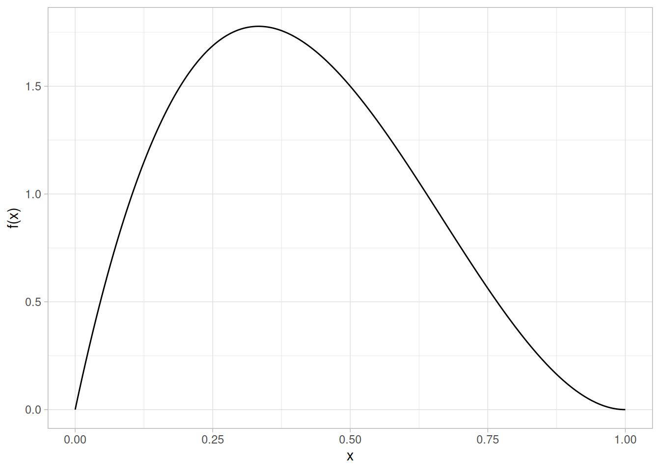
Cumulative Distribution Function
The formula for the cumulative distribution function of the beta distribution is also called the incomplete beta function ratio (commonly denoted by \(I_x\)) and is defined as
\[F(x) = I_{x}(p,q) = \frac{\int_{0}^{x}{t^{p-1}(1-t)^{q-1}dt}}{B(p,q)} \;\;\;\;\;\;\; 0 \le x \le 1;\; p, q > 0\]
where \(B\) is the beta function defined above.
The following is the plot of the beta cumulative distribution function for the same shape parameters as the pdf plot above.
tibble(x = seq(0, 1, length.out = 401)) |>
mutate(y = pbeta(x, shape1 = 2, shape2 = 3)) |>
ggplot(aes(x, y)) +
geom_line() +
scale_x_continuous(limits = c(0, 1)) +
labs(x = "x", y = "F(x)") +
theme_light()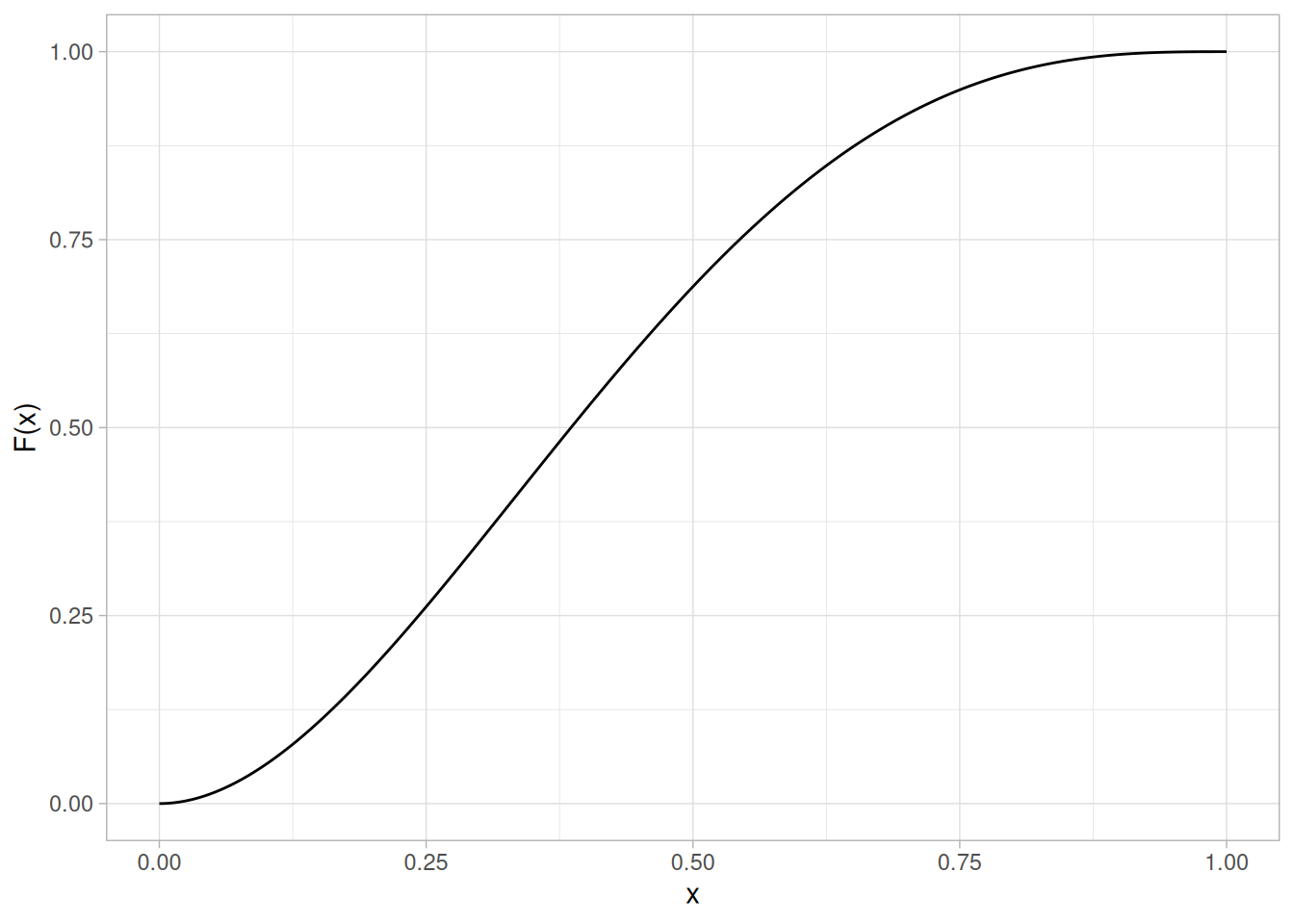
Percent Point Function
The formula for the percent point function of the beta distribution does not exist in a simple closed form. It is computed numerically.
The following is the plot of the beta percent point function for the same shape parameters as the pdf plot above.
tibble(p = seq(0.001, 0.999, length.out = 401)) |>
mutate(x = qbeta(p, shape1 = 2, shape2 = 3)) |>
ggplot(aes(p, x)) +
geom_line() +
labs(x = expression(alpha), y = expression(G(alpha))) +
theme_light()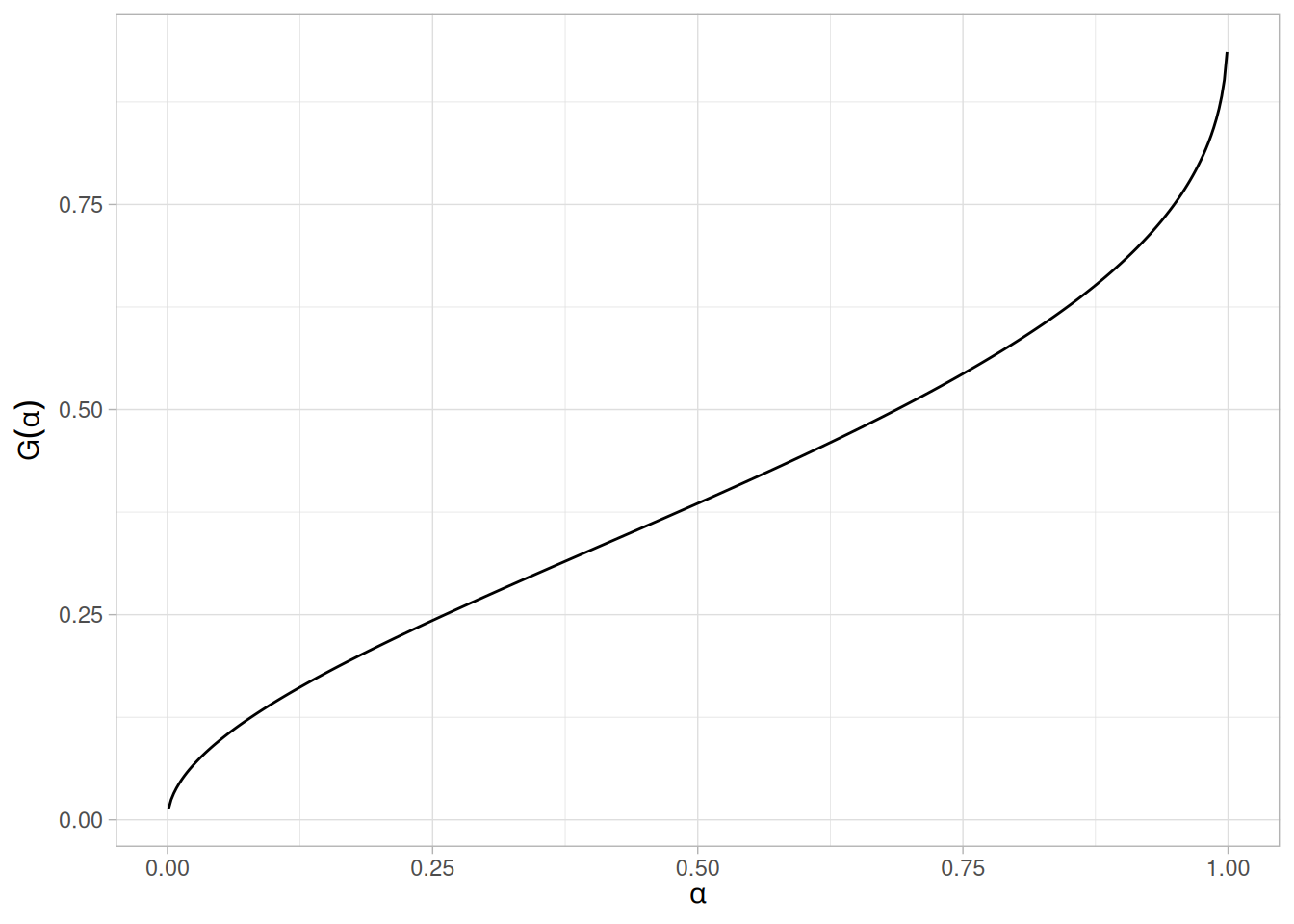
Other Probability Functions
Since the beta distribution is not typically used for reliability applications, the hazard, cumulative hazard, survival, and inverse survival probability functions are omitted here, following the source page.
Common Statistics
The formulas below are for the case where the lower limit is zero and the upper limit is one.
| Statistic | Value |
|---|---|
| Mean | \(\dfrac{p}{p+q}\) |
| Mode | \(\dfrac{p-1}{p+q-2} \;\;\;\;\; p, q > 1\) |
| Range | 0 to 1 |
| Standard Deviation | \(\sqrt{\dfrac{pq}{(p+q)^{2}(p+q+1)}}\) |
| Coefficient of Variation | \(\sqrt{\dfrac{q}{p(p+q+1)}}\) |
| Skewness | \(\dfrac{2(q-p)\sqrt{p+q+1}}{(p+q+2)\sqrt{pq}}\) |
Parameter Estimation
First consider the case where \(a\) and \(b\) are assumed to be known. For this case, the method of moments estimates are
\[p = \bar{x}\left(\frac{\bar{x}(1-\bar{x})}{s^{2}} - 1\right)\] \[q = (1 - \bar{x})\left(\frac{\bar{x}(1-\bar{x})}{s^{2}} - 1\right)\]
where \(\bar{x}\) is the sample mean and \(s^2\) is the sample variance. If \(a\) and \(b\) are not 0 and 1, respectively, then replace \(\bar{x}\) with \(\dfrac{\bar{x} - a}{b-a}\) and \(s^2\) with \(\dfrac{s^2}{(b-a)^2}\) in the above equations.
For the case when \(a\) and \(b\) are known, the maximum likelihood estimates can be obtained by solving the following set of equations
\[\psi(\hat{p}) - \psi(\hat{p} + \hat{q}) = \frac{1}{n}\sum_{i=1}^{n}{\log\left(\frac{Y_i - a}{b - a}\right)}\] \[\psi(\hat{q}) - \psi(\hat{p} + \hat{q}) = \frac{1}{n}\sum_{i=1}^{n}{\log\left(\frac{b - Y_i}{b - a}\right)}\]
Maximum likelihood estimation for the case when \(a\) and \(b\) are not known can sometimes be problematic. Chapter 14 of Bury discusses both moment and maximum likelihood estimation for this case.
Software
Most general purpose statistical software programs support at least some of the probability functions for the beta distribution.
Probability Mass Function
The binomial distribution is used when there are exactly two mutually exclusive outcomes of a trial. These outcomes are appropriately labeled “success” and “failure”. The binomial distribution is used to obtain the probability of observing \(x\) successes in \(N\) trials, with the probability of success on a single trial denoted by \(p\). The binomial distribution assumes that \(p\) is fixed for all trials.
The formula for the binomial probability mass function is
\[P(x;p,n) = \binom{n}{x} (p)^{x}(1-p)^{(n-x)} \;\;\;\;\;\;\; \text{for } x = 0, 1, 2, \ldots, n\]
where
\[\binom{n}{x} = \frac{n!}{x!(n-x)!}\]
The binomial distribution is discrete, defined only at the integers \(x = 0, 1, \ldots, n\), so the plots below use geom_col() rather than a connected line to avoid implying that the probability mass exists between integers.
The following is the plot of the binomial probability mass function for \(n = 100\) and 4 different values of \(p\): 0.1, 0.25, 0.50, and 0.75.
library(tidyverse)
ps <- c(0.1, 0.25, 0.50, 0.75)
crossing(x = 0:100, p = ps) |>
mutate(
y = dbinom(x, size = 100, prob = p),
p_label = paste("p =", p),
p_label = fct_reorder(p_label, p)
) |>
ggplot(aes(x, y)) +
geom_col(width = 0.6) +
facet_wrap(~p_label, scales = "free_x") +
labs(x = "x", y = "P(x)") +
theme_light()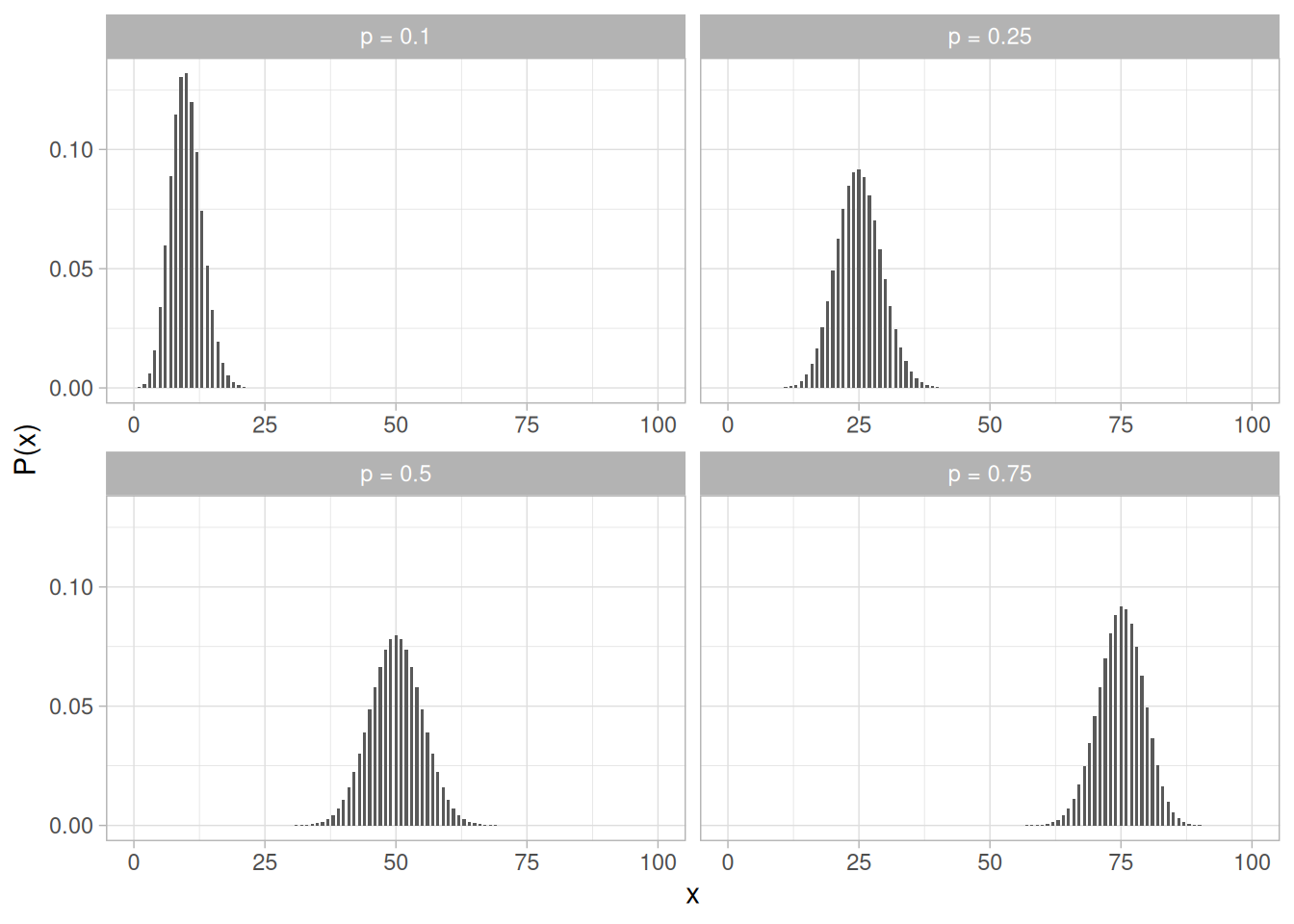
Cumulative Distribution Function
The formula for the binomial cumulative probability function is
\[F(x;p,n) = \sum_{i=0}^{x}{\binom{n}{i}(p)^{i}(1-p)^{(n-i)}}\]
Because the binomial distribution is discrete, its cumulative distribution function is a right-continuous step function, so Figure 1.217 uses geom_step().
Figure 1.217 shows the binomial cumulative distribution function for the same values of \(n\) and \(p\) as Figure 1.216.
crossing(x = 0:100, p = ps) |>
mutate(
y = pbinom(x, size = 100, prob = p),
p_label = paste("p =", p),
p_label = fct_reorder(p_label, p)
) |>
ggplot(aes(x, y)) +
geom_step() +
facet_wrap(~p_label, scales = "free_x") +
labs(x = "x", y = "F(x)") +
theme_light()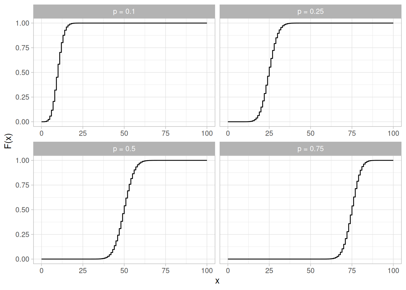
Percent Point Function
The binomial percent point function does not exist in simple closed form. It is computed numerically. Note that because this is a discrete distribution that is only defined for integer values of \(x\), the percent point function is not smooth in the way the percent point function typically is for a continuous distribution.
The following is the plot of the binomial percent point function for the same values of \(n\) and \(p\) as the pmf plot above.
crossing(alpha = seq(0.001, 0.999, length.out = 401), p = ps) |>
mutate(
x = qbinom(alpha, size = 100, prob = p),
p_label = paste("p =", p),
p_label = fct_reorder(p_label, p)
) |>
ggplot(aes(alpha, x)) +
geom_step() +
facet_wrap(~p_label, scales = "free_y") +
labs(x = expression(alpha), y = expression(G(alpha))) +
theme_light()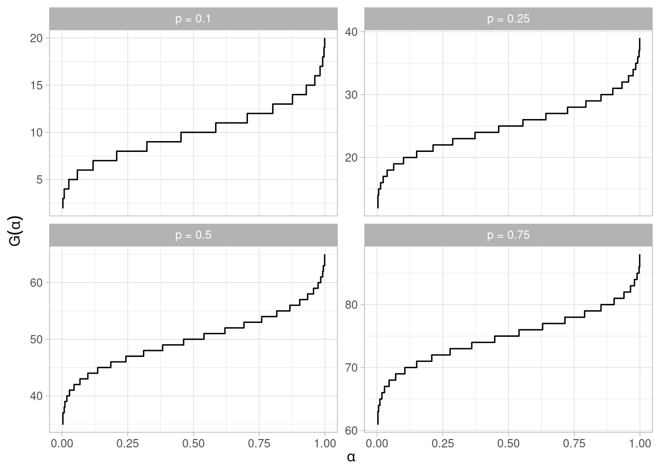
Common Statistics
| Statistic | Value |
|---|---|
| Mean | \(np\) |
| Mode | \(p(n+1) - 1 \le x \le p(n+1)\) |
| Range | 0 to \(n\) |
| Standard Deviation | \(\sqrt{np(1-p)}\) |
| Coefficient of Variation | \(\sqrt{\dfrac{(1-p)}{np}}\) |
| Skewness | \(\dfrac{(1-2p)}{\sqrt{np(1-p)}}\) |
| Kurtosis | \(3 - \dfrac{6}{n} + \dfrac{1}{np(1-p)}\) |
Comments
The binomial distribution is probably the most commonly used discrete distribution.
Parameter Estimation
The maximum likelihood estimator of \(p\) (for fixed \(n\)) is
\[\tilde{p} = \frac{x}{n}\]
Software
Most general purpose statistical software programs support at least some of the probability functions for the binomial distribution.
Probability Mass Function
The Poisson distribution is used to model the number of events occurring within a given time interval.
The formula for the Poisson probability mass function is
\[p(x;\lambda) = \frac{e^{-\lambda}\lambda^{x}}{x!} \;\;\;\;\;\;\; \text{for } x = 0, 1, 2, \ldots\]
\(\lambda\) is the shape parameter which indicates the average number of events in the given time interval.
The Poisson distribution is discrete, defined only at the non-negative integers, so the plots below use geom_col() rather than a connected line to avoid implying that probability mass exists between integers.
The following is the plot of the Poisson probability mass function for 4 different values of \(\lambda\): 5, 15, 25, and 35.
library(tidyverse)
lambdas <- c(5, 15, 25, 35)
crossing(x = 0:50, lambda = lambdas) |>
mutate(
y = dpois(x, lambda = lambda),
lambda_label = paste("lambda =", lambda),
lambda_label = fct_reorder(lambda_label, lambda)
) |>
ggplot(aes(x, y)) +
geom_col(width = 0.6) +
facet_wrap(~lambda_label, scales = "free_x") +
labs(x = "x", y = "p(x)") +
theme_light()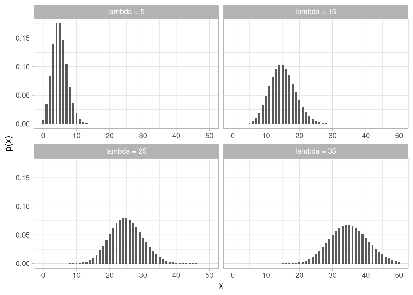
Cumulative Distribution Function
The formula for the Poisson cumulative probability function is
\[F(x;\lambda) = \sum_{i=0}^{x}{\frac{e^{-\lambda}\lambda^{i}}{i!}}\]
Because the Poisson distribution is discrete, its cumulative distribution function is a right-continuous step function, so Figure 1.220 uses geom_step().
Figure 1.220 shows the Poisson cumulative distribution function for the same values of \(\lambda\) as Figure 1.219.
crossing(x = 0:50, lambda = lambdas) |>
mutate(
y = ppois(x, lambda = lambda),
lambda_label = paste("lambda =", lambda),
lambda_label = fct_reorder(lambda_label, lambda)
) |>
ggplot(aes(x, y)) +
geom_step() +
facet_wrap(~lambda_label, scales = "free_x") +
labs(x = "x", y = "F(x)") +
theme_light()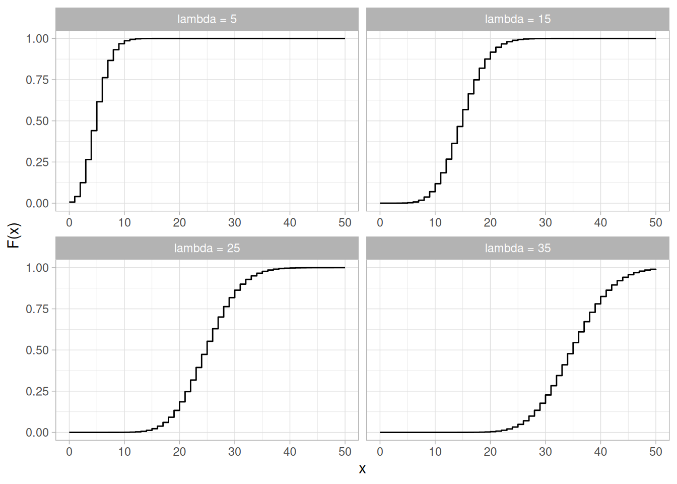
Percent Point Function
The Poisson percent point function does not exist in simple closed form. It is computed numerically. Note that because this is a discrete distribution that is only defined for integer values of \(x\), the percent point function is not smooth in the way the percent point function typically is for a continuous distribution.
The following is the plot of the Poisson percent point function for the same values of \(\lambda\) as the pmf plot above.
crossing(alpha = seq(0.001, 0.999, length.out = 401), lambda = lambdas) |>
mutate(
x = qpois(alpha, lambda = lambda),
lambda_label = paste("lambda =", lambda),
lambda_label = fct_reorder(lambda_label, lambda)
) |>
ggplot(aes(alpha, x)) +
geom_step() +
facet_wrap(~lambda_label, scales = "free_y") +
labs(x = expression(alpha), y = expression(G(alpha))) +
theme_light()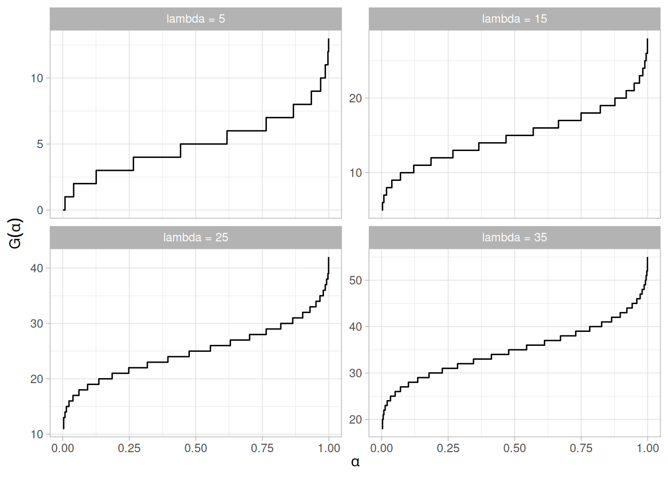
Common Statistics
| Statistic | Value |
|---|---|
| Mean | \(\lambda\) |
| Mode | For non-integer \(\lambda\), the largest integer less than \(\lambda\). For integer \(\lambda\), \(x = \lambda\) and \(x = \lambda - 1\) are both the mode. |
| Range | 0 to \(\infty\) |
| Standard Deviation | \(\sqrt{\lambda}\) |
| Coefficient of Variation | \(\dfrac{1}{\sqrt{\lambda}}\) |
| Skewness | \(\dfrac{1}{\sqrt{\lambda}}\) |
| Kurtosis | \(3 + \dfrac{1}{\lambda}\) |
Parameter Estimation
The maximum likelihood estimator of \(\lambda\) is
\[\tilde{\lambda} = \bar{X}\]
where \(\bar{X}\) is the sample mean.
Software
Most general purpose statistical software programs support at least some of the probability functions for the Poisson distribution.
Several commonly used tables for probability distributions can be referenced below.
The values from these tables can also be obtained from most general purpose statistical software programs (in R, via the qnorm(), qt(), qf(), and qchisq() functions used to generate them here). Most introductory statistics textbooks (e.g., Snedecor and Cochran (Snedecor and Cochran 1989)) contain more extensive tables than are included here. These tables are included for convenience.
The table below contains the area under the standard normal curve from 0 to \(z\). This can be used to compute the cumulative distribution function values for the standard normal distribution.
The table utilizes the symmetry of the normal distribution, so what is in fact given is \(P[0 \le x \le |a|]\), where \(a\) is the value of interest. This is demonstrated in the graph below for \(a = 0.5\). The shaded area of the curve represents the probability that \(x\) is between 0 and \(a\).
library(tidyverse)
a <- 0.5
tibble(x = seq(-4, 4, length.out = 401)) |>
mutate(y = dnorm(x)) |>
ggplot(aes(x, y)) +
geom_line() +
geom_ribbon(
data = ~ filter(.x, x >= 0, x <= a),
aes(ymin = 0, ymax = y),
fill = "steelblue", alpha = 0.5
) +
labs(x = "x", y = "f(x)") +
theme_light()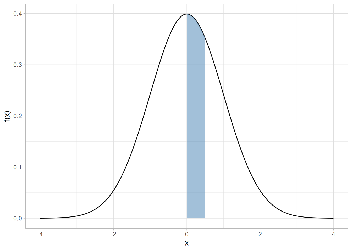
This can be clarified by a few simple examples.
To use this table with a non-standard normal distribution (either the location parameter is not 0 or the scale parameter is not 1), standardize your value by subtracting the mean and dividing the result by the standard deviation. Then look up the value for this standardized value.
A few particularly important numbers derived from the table below, specifically numbers that are commonly used in significance tests, are summarized in the following table:
p_lower <- c(0.001, 0.005, 0.010, 0.025, 0.050, 0.100)
tibble(p = p_lower, `Z_p (lower)` = qnorm(p), `Z_p (upper)` = qnorm(1 - p)) |>
knitr::kable(digits = 3, align = "c")| p | Z_p (lower) | Z_p (upper) |
|---|---|---|
| 0.001 | -3.090 | 3.090 |
| 0.005 | -2.576 | 2.576 |
| 0.010 | -2.326 | 2.326 |
| 0.025 | -1.960 | 1.960 |
| 0.050 | -1.645 | 1.645 |
| 0.100 | -1.282 | 1.282 |
These are critical values for the normal distribution.
Area under the Normal Curve from 0 to X
tibble(X = seq(0, 4, by = 0.01)) |>
mutate(
row = floor(X * 10) / 10,
col = sprintf("%.2f", X - row),
area = pnorm(X) - 0.5
) |>
select(row, col, area) |>
pivot_wider(names_from = col, values_from = area) |>
knitr::kable(digits = 5)| row | 0.00 | 0.01 | 0.02 | 0.03 | 0.04 | 0.05 | 0.06 | 0.07 | 0.08 | 0.09 |
|---|---|---|---|---|---|---|---|---|---|---|
| 0.0 | 0.00000 | 0.00399 | 0.00798 | 0.01197 | 0.01595 | 0.01994 | 0.02392 | 0.02790 | 0.03188 | 0.03586 |
| 0.1 | 0.03983 | 0.04380 | 0.04776 | 0.05172 | 0.05567 | 0.05962 | 0.06356 | 0.06749 | 0.07142 | 0.07535 |
| 0.2 | 0.07926 | 0.08317 | 0.08706 | 0.09095 | 0.09483 | 0.09871 | 0.10257 | 0.10642 | 0.11026 | 0.11409 |
| 0.3 | 0.11791 | 0.12172 | 0.12552 | 0.12930 | 0.13307 | 0.13683 | 0.14058 | 0.14431 | 0.14803 | 0.15173 |
| 0.4 | 0.15542 | 0.15910 | 0.16276 | 0.16640 | 0.17003 | 0.17364 | 0.17724 | 0.18082 | 0.18439 | 0.18793 |
| 0.5 | 0.19146 | 0.19497 | 0.19847 | 0.20194 | 0.20540 | 0.20884 | 0.21226 | 0.21566 | 0.21904 | 0.22240 |
| 0.6 | 0.22575 | 0.22907 | 0.23237 | 0.23565 | 0.23891 | 0.24215 | 0.24537 | 0.24857 | 0.25175 | 0.25490 |
| 0.7 | 0.25804 | 0.26115 | 0.26424 | 0.26730 | 0.27035 | 0.27337 | 0.27637 | 0.27935 | 0.28230 | 0.28524 |
| 0.8 | 0.28814 | 0.29103 | 0.29389 | 0.29673 | 0.29955 | 0.30234 | 0.30511 | 0.30785 | 0.31057 | 0.31327 |
| 0.9 | 0.31594 | 0.31859 | 0.32121 | 0.32381 | 0.32639 | 0.32894 | 0.33147 | 0.33398 | 0.33646 | 0.33891 |
| 1.0 | 0.34134 | 0.34375 | 0.34614 | 0.34849 | 0.35083 | 0.35314 | 0.35543 | 0.35769 | 0.35993 | 0.36214 |
| 1.1 | 0.36433 | 0.36650 | 0.36864 | 0.37076 | 0.37286 | 0.37493 | 0.37698 | 0.37900 | 0.38100 | 0.38298 |
| 1.2 | 0.38493 | 0.38686 | 0.38877 | 0.39065 | 0.39251 | 0.39435 | 0.39617 | 0.39796 | 0.39973 | 0.40147 |
| 1.3 | 0.40320 | 0.40490 | 0.40658 | 0.40824 | 0.40988 | 0.41149 | 0.41309 | 0.41466 | 0.41621 | 0.41774 |
| 1.4 | 0.41924 | 0.42073 | 0.42220 | 0.42364 | 0.42507 | 0.42647 | 0.42785 | 0.42922 | 0.43056 | 0.43189 |
| 1.5 | 0.43319 | 0.43448 | 0.43574 | 0.43699 | 0.43822 | 0.43943 | 0.44062 | 0.44179 | 0.44295 | 0.44408 |
| 1.6 | 0.44520 | 0.44630 | 0.44738 | 0.44845 | 0.44950 | 0.45053 | 0.45154 | 0.45254 | 0.45352 | 0.45449 |
| 1.7 | 0.45543 | 0.45637 | 0.45728 | 0.45818 | 0.45907 | 0.45994 | 0.46080 | 0.46164 | 0.46246 | 0.46327 |
| 1.8 | 0.46407 | 0.46485 | 0.46562 | 0.46638 | 0.46712 | 0.46784 | 0.46856 | 0.46926 | 0.46995 | 0.47062 |
| 1.9 | 0.47128 | 0.47193 | 0.47257 | 0.47320 | 0.47381 | 0.47441 | 0.47500 | 0.47558 | 0.47615 | 0.47670 |
| 2.0 | 0.47725 | 0.47778 | 0.47831 | 0.47882 | 0.47932 | 0.47982 | 0.48030 | 0.48077 | 0.48124 | 0.48169 |
| 2.1 | 0.48214 | 0.48257 | 0.48300 | 0.48341 | 0.48382 | 0.48422 | 0.48461 | 0.48500 | 0.48537 | 0.48574 |
| 2.2 | 0.48610 | 0.48645 | 0.48679 | 0.48713 | 0.48745 | 0.48778 | 0.48809 | 0.48840 | 0.48870 | 0.48899 |
| 2.3 | 0.48928 | 0.48956 | 0.48983 | 0.49010 | 0.49036 | 0.49061 | 0.49086 | 0.49111 | 0.49134 | 0.49158 |
| 2.4 | 0.49180 | 0.49202 | 0.49224 | 0.49245 | 0.49266 | 0.49286 | 0.49305 | 0.49324 | 0.49343 | 0.49361 |
| 2.5 | 0.49379 | 0.49396 | 0.49413 | 0.49430 | 0.49446 | 0.49461 | 0.49477 | 0.49492 | 0.49506 | 0.49520 |
| 2.6 | 0.49534 | 0.49547 | 0.49560 | 0.49573 | 0.49585 | 0.49598 | 0.49609 | 0.49621 | 0.49632 | 0.49643 |
| 2.7 | 0.49653 | 0.49664 | 0.49674 | 0.49683 | 0.49693 | 0.49702 | 0.49711 | 0.49720 | 0.49728 | 0.49736 |
| 2.8 | 0.49744 | 0.49752 | 0.49760 | 0.49767 | 0.49774 | 0.49781 | 0.49788 | 0.49795 | 0.49801 | 0.49807 |
| 2.9 | 0.49813 | 0.49819 | 0.49825 | 0.49831 | 0.49836 | 0.49841 | 0.49846 | 0.49851 | 0.49856 | 0.49861 |
| 3.0 | 0.49865 | 0.49869 | 0.49874 | 0.49878 | 0.49882 | 0.49886 | 0.49889 | 0.49893 | 0.49896 | 0.49900 |
| 3.1 | 0.49903 | 0.49906 | 0.49910 | 0.49913 | 0.49916 | 0.49918 | 0.49921 | 0.49924 | 0.49926 | 0.49929 |
| 3.2 | 0.49931 | 0.49934 | 0.49936 | 0.49938 | 0.49940 | 0.49942 | 0.49944 | 0.49946 | 0.49948 | 0.49950 |
| 3.3 | 0.49952 | 0.49953 | 0.49955 | 0.49957 | 0.49958 | 0.49960 | 0.49961 | 0.49962 | 0.49964 | 0.49965 |
| 3.4 | 0.49966 | 0.49968 | 0.49969 | 0.49970 | 0.49971 | 0.49972 | 0.49973 | 0.49974 | 0.49975 | 0.49976 |
| 3.5 | 0.49977 | 0.49978 | 0.49978 | 0.49979 | 0.49980 | 0.49981 | 0.49981 | 0.49982 | 0.49983 | 0.49983 |
| 3.6 | 0.49984 | 0.49985 | 0.49985 | 0.49986 | 0.49986 | 0.49987 | 0.49987 | 0.49988 | 0.49988 | 0.49989 |
| 3.7 | 0.49989 | 0.49990 | 0.49990 | 0.49990 | 0.49991 | 0.49991 | 0.49992 | 0.49992 | 0.49992 | 0.49992 |
| 3.8 | 0.49993 | 0.49993 | 0.49993 | 0.49994 | 0.49994 | 0.49994 | 0.49994 | 0.49995 | 0.49995 | 0.49995 |
| 3.9 | 0.49995 | 0.49995 | 0.49996 | 0.49996 | 0.49996 | 0.49996 | 0.49996 | 0.49996 | 0.49997 | 0.49997 |
| 4.0 | 0.49997 | NA | NA | NA | NA | NA | NA | NA | NA | NA |
This table contains critical values of the Student’s t distribution computed using the cumulative distribution function. The t distribution is symmetric so that \(t_{1-\alpha,\nu} = -t_{\alpha,\nu}\).
The t table can be used for both one-sided (lower and upper) and two-sided tests using the appropriate value of \(\alpha\).
The significance level, \(\alpha\), is demonstrated in the graph below, which displays a t distribution with 10 degrees of freedom. The most commonly used significance level is \(\alpha = 0.05\). For a two-sided test, we compute \(1 - \alpha/2\), or \(1 - 0.05/2 = 0.975\) when \(\alpha = 0.05\). If the absolute value of the test statistic is greater than the critical value (0.975), then we reject the null hypothesis. Due to the symmetry of the t distribution, we only tabulate the positive critical values in the table below.
library(tidyverse)
df <- 10
crit <- qt(0.975, df)
tibble(x = seq(-4, 4, length.out = 401)) |>
mutate(y = dt(x, df)) |>
ggplot(aes(x, y)) +
geom_line() +
geom_ribbon(
data = ~ filter(.x, x >= crit),
aes(ymin = 0, ymax = y),
fill = "steelblue", alpha = 0.5
) +
geom_ribbon(
data = ~ filter(.x, x <= -crit),
aes(ymin = 0, ymax = y),
fill = "steelblue", alpha = 0.5
) +
labs(x = "x", y = "f(x)") +
theme_light()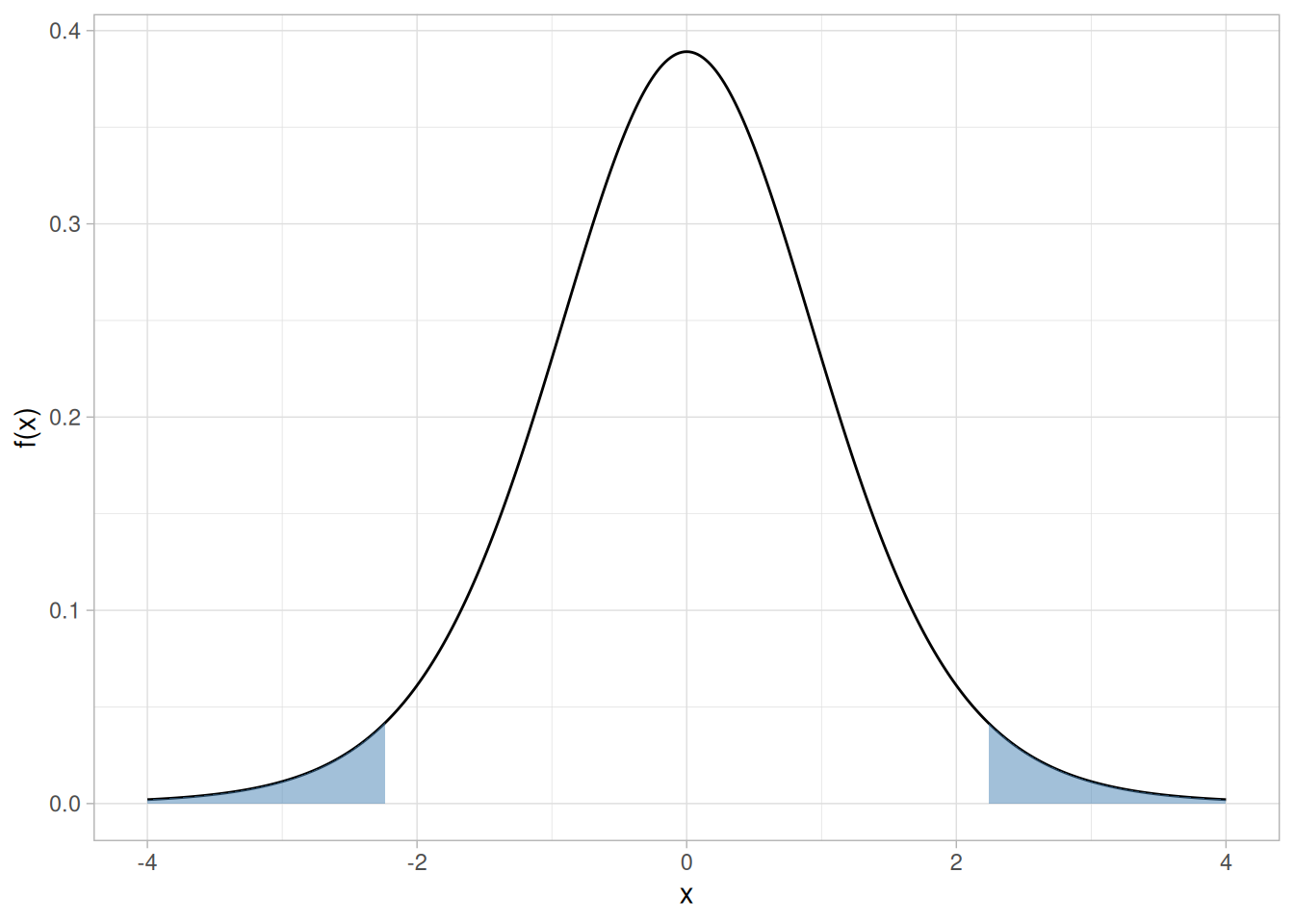
Given a specified value for \(\alpha\):
Critical values of Student’s t distribution with \(\nu\) degrees of freedom
p <- c(0.90, 0.95, 0.975, 0.99, 0.995, 0.999)
crossing(nu = 1:100, p = p) |>
mutate(t = qt(p, df = nu)) |>
pivot_wider(names_from = p, values_from = t, names_prefix = "p") |>
knitr::kable(digits = 3, col.names = c("nu", as.character(p)))| nu | 0.9 | 0.95 | 0.975 | 0.99 | 0.995 | 0.999 |
|---|---|---|---|---|---|---|
| 1 | 3.078 | 6.314 | 12.706 | 31.821 | 63.657 | 318.309 |
| 2 | 1.886 | 2.920 | 4.303 | 6.965 | 9.925 | 22.327 |
| 3 | 1.638 | 2.353 | 3.182 | 4.541 | 5.841 | 10.215 |
| 4 | 1.533 | 2.132 | 2.776 | 3.747 | 4.604 | 7.173 |
| 5 | 1.476 | 2.015 | 2.571 | 3.365 | 4.032 | 5.893 |
| 6 | 1.440 | 1.943 | 2.447 | 3.143 | 3.707 | 5.208 |
| 7 | 1.415 | 1.895 | 2.365 | 2.998 | 3.499 | 4.785 |
| 8 | 1.397 | 1.860 | 2.306 | 2.896 | 3.355 | 4.501 |
| 9 | 1.383 | 1.833 | 2.262 | 2.821 | 3.250 | 4.297 |
| 10 | 1.372 | 1.812 | 2.228 | 2.764 | 3.169 | 4.144 |
| 11 | 1.363 | 1.796 | 2.201 | 2.718 | 3.106 | 4.025 |
| 12 | 1.356 | 1.782 | 2.179 | 2.681 | 3.055 | 3.930 |
| 13 | 1.350 | 1.771 | 2.160 | 2.650 | 3.012 | 3.852 |
| 14 | 1.345 | 1.761 | 2.145 | 2.624 | 2.977 | 3.787 |
| 15 | 1.341 | 1.753 | 2.131 | 2.602 | 2.947 | 3.733 |
| 16 | 1.337 | 1.746 | 2.120 | 2.583 | 2.921 | 3.686 |
| 17 | 1.333 | 1.740 | 2.110 | 2.567 | 2.898 | 3.646 |
| 18 | 1.330 | 1.734 | 2.101 | 2.552 | 2.878 | 3.610 |
| 19 | 1.328 | 1.729 | 2.093 | 2.539 | 2.861 | 3.579 |
| 20 | 1.325 | 1.725 | 2.086 | 2.528 | 2.845 | 3.552 |
| 21 | 1.323 | 1.721 | 2.080 | 2.518 | 2.831 | 3.527 |
| 22 | 1.321 | 1.717 | 2.074 | 2.508 | 2.819 | 3.505 |
| 23 | 1.319 | 1.714 | 2.069 | 2.500 | 2.807 | 3.485 |
| 24 | 1.318 | 1.711 | 2.064 | 2.492 | 2.797 | 3.467 |
| 25 | 1.316 | 1.708 | 2.060 | 2.485 | 2.787 | 3.450 |
| 26 | 1.315 | 1.706 | 2.056 | 2.479 | 2.779 | 3.435 |
| 27 | 1.314 | 1.703 | 2.052 | 2.473 | 2.771 | 3.421 |
| 28 | 1.313 | 1.701 | 2.048 | 2.467 | 2.763 | 3.408 |
| 29 | 1.311 | 1.699 | 2.045 | 2.462 | 2.756 | 3.396 |
| 30 | 1.310 | 1.697 | 2.042 | 2.457 | 2.750 | 3.385 |
| 31 | 1.309 | 1.696 | 2.040 | 2.453 | 2.744 | 3.375 |
| 32 | 1.309 | 1.694 | 2.037 | 2.449 | 2.738 | 3.365 |
| 33 | 1.308 | 1.692 | 2.035 | 2.445 | 2.733 | 3.356 |
| 34 | 1.307 | 1.691 | 2.032 | 2.441 | 2.728 | 3.348 |
| 35 | 1.306 | 1.690 | 2.030 | 2.438 | 2.724 | 3.340 |
| 36 | 1.306 | 1.688 | 2.028 | 2.434 | 2.719 | 3.333 |
| 37 | 1.305 | 1.687 | 2.026 | 2.431 | 2.715 | 3.326 |
| 38 | 1.304 | 1.686 | 2.024 | 2.429 | 2.712 | 3.319 |
| 39 | 1.304 | 1.685 | 2.023 | 2.426 | 2.708 | 3.313 |
| 40 | 1.303 | 1.684 | 2.021 | 2.423 | 2.704 | 3.307 |
| 41 | 1.303 | 1.683 | 2.020 | 2.421 | 2.701 | 3.301 |
| 42 | 1.302 | 1.682 | 2.018 | 2.418 | 2.698 | 3.296 |
| 43 | 1.302 | 1.681 | 2.017 | 2.416 | 2.695 | 3.291 |
| 44 | 1.301 | 1.680 | 2.015 | 2.414 | 2.692 | 3.286 |
| 45 | 1.301 | 1.679 | 2.014 | 2.412 | 2.690 | 3.281 |
| 46 | 1.300 | 1.679 | 2.013 | 2.410 | 2.687 | 3.277 |
| 47 | 1.300 | 1.678 | 2.012 | 2.408 | 2.685 | 3.273 |
| 48 | 1.299 | 1.677 | 2.011 | 2.407 | 2.682 | 3.269 |
| 49 | 1.299 | 1.677 | 2.010 | 2.405 | 2.680 | 3.265 |
| 50 | 1.299 | 1.676 | 2.009 | 2.403 | 2.678 | 3.261 |
| 51 | 1.298 | 1.675 | 2.008 | 2.402 | 2.676 | 3.258 |
| 52 | 1.298 | 1.675 | 2.007 | 2.400 | 2.674 | 3.255 |
| 53 | 1.298 | 1.674 | 2.006 | 2.399 | 2.672 | 3.251 |
| 54 | 1.297 | 1.674 | 2.005 | 2.397 | 2.670 | 3.248 |
| 55 | 1.297 | 1.673 | 2.004 | 2.396 | 2.668 | 3.245 |
| 56 | 1.297 | 1.673 | 2.003 | 2.395 | 2.667 | 3.242 |
| 57 | 1.297 | 1.672 | 2.002 | 2.394 | 2.665 | 3.239 |
| 58 | 1.296 | 1.672 | 2.002 | 2.392 | 2.663 | 3.237 |
| 59 | 1.296 | 1.671 | 2.001 | 2.391 | 2.662 | 3.234 |
| 60 | 1.296 | 1.671 | 2.000 | 2.390 | 2.660 | 3.232 |
| 61 | 1.296 | 1.670 | 2.000 | 2.389 | 2.659 | 3.229 |
| 62 | 1.295 | 1.670 | 1.999 | 2.388 | 2.657 | 3.227 |
| 63 | 1.295 | 1.669 | 1.998 | 2.387 | 2.656 | 3.225 |
| 64 | 1.295 | 1.669 | 1.998 | 2.386 | 2.655 | 3.223 |
| 65 | 1.295 | 1.669 | 1.997 | 2.385 | 2.654 | 3.220 |
| 66 | 1.295 | 1.668 | 1.997 | 2.384 | 2.652 | 3.218 |
| 67 | 1.294 | 1.668 | 1.996 | 2.383 | 2.651 | 3.216 |
| 68 | 1.294 | 1.668 | 1.995 | 2.382 | 2.650 | 3.214 |
| 69 | 1.294 | 1.667 | 1.995 | 2.382 | 2.649 | 3.213 |
| 70 | 1.294 | 1.667 | 1.994 | 2.381 | 2.648 | 3.211 |
| 71 | 1.294 | 1.667 | 1.994 | 2.380 | 2.647 | 3.209 |
| 72 | 1.293 | 1.666 | 1.993 | 2.379 | 2.646 | 3.207 |
| 73 | 1.293 | 1.666 | 1.993 | 2.379 | 2.645 | 3.206 |
| 74 | 1.293 | 1.666 | 1.993 | 2.378 | 2.644 | 3.204 |
| 75 | 1.293 | 1.665 | 1.992 | 2.377 | 2.643 | 3.202 |
| 76 | 1.293 | 1.665 | 1.992 | 2.376 | 2.642 | 3.201 |
| 77 | 1.293 | 1.665 | 1.991 | 2.376 | 2.641 | 3.199 |
| 78 | 1.292 | 1.665 | 1.991 | 2.375 | 2.640 | 3.198 |
| 79 | 1.292 | 1.664 | 1.990 | 2.374 | 2.640 | 3.197 |
| 80 | 1.292 | 1.664 | 1.990 | 2.374 | 2.639 | 3.195 |
| 81 | 1.292 | 1.664 | 1.990 | 2.373 | 2.638 | 3.194 |
| 82 | 1.292 | 1.664 | 1.989 | 2.373 | 2.637 | 3.193 |
| 83 | 1.292 | 1.663 | 1.989 | 2.372 | 2.636 | 3.191 |
| 84 | 1.292 | 1.663 | 1.989 | 2.372 | 2.636 | 3.190 |
| 85 | 1.292 | 1.663 | 1.988 | 2.371 | 2.635 | 3.189 |
| 86 | 1.291 | 1.663 | 1.988 | 2.370 | 2.634 | 3.188 |
| 87 | 1.291 | 1.663 | 1.988 | 2.370 | 2.634 | 3.187 |
| 88 | 1.291 | 1.662 | 1.987 | 2.369 | 2.633 | 3.185 |
| 89 | 1.291 | 1.662 | 1.987 | 2.369 | 2.632 | 3.184 |
| 90 | 1.291 | 1.662 | 1.987 | 2.368 | 2.632 | 3.183 |
| 91 | 1.291 | 1.662 | 1.986 | 2.368 | 2.631 | 3.182 |
| 92 | 1.291 | 1.662 | 1.986 | 2.368 | 2.630 | 3.181 |
| 93 | 1.291 | 1.661 | 1.986 | 2.367 | 2.630 | 3.180 |
| 94 | 1.291 | 1.661 | 1.986 | 2.367 | 2.629 | 3.179 |
| 95 | 1.291 | 1.661 | 1.985 | 2.366 | 2.629 | 3.178 |
| 96 | 1.290 | 1.661 | 1.985 | 2.366 | 2.628 | 3.177 |
| 97 | 1.290 | 1.661 | 1.985 | 2.365 | 2.627 | 3.176 |
| 98 | 1.290 | 1.661 | 1.984 | 2.365 | 2.627 | 3.175 |
| 99 | 1.290 | 1.660 | 1.984 | 2.365 | 2.626 | 3.175 |
| 100 | 1.290 | 1.660 | 1.984 | 2.364 | 2.626 | 3.174 |
For large \(\nu\), the t distribution’s critical values converge to the standard normal distribution’s:
tibble(p = p, `Normal (df = Inf)` = qnorm(p)) |>
knitr::kable(digits = 3)| p | Normal (df = Inf) |
|---|---|
| 0.900 | 1.282 |
| 0.950 | 1.645 |
| 0.975 | 1.960 |
| 0.990 | 2.326 |
| 0.995 | 2.576 |
| 0.999 | 3.090 |
This table contains the upper critical values of the F distribution. This table is used for one-sided F tests at the \(\alpha\) = 0.05, 0.10, and 0.01 levels.
More specifically, a test statistic is computed with \(\nu_1\) and \(\nu_2\) degrees of freedom, and the result is compared to this table. For a one-sided test, the null hypothesis is rejected when the test statistic is greater than the tabled value. This is demonstrated with the graph of an F distribution with \(\nu_1 = 10\) and \(\nu_2 = 10\). The shaded area of the graph indicates the rejection region at the \(\alpha\) significance level. Since this is a one-sided test, we have \(\alpha\) probability in the upper tail of exceeding the critical value and zero in the lower tail. Because the F distribution is asymmetric, a two-sided test requires a set of tables (not included here) that contain the rejection regions for both the lower and upper tails.
library(tidyverse)
df1 <- 10
df2 <- 10
crit <- qf(0.95, df1, df2)
tibble(x = seq(0.001, 5, length.out = 401)) |>
mutate(y = df(x, df1, df2)) |>
ggplot(aes(x, y)) +
geom_line() +
geom_ribbon(
data = ~ filter(.x, x >= crit),
aes(ymin = 0, ymax = y),
fill = "steelblue", alpha = 0.5
) +
labs(x = "x", y = "f(x)") +
theme_light()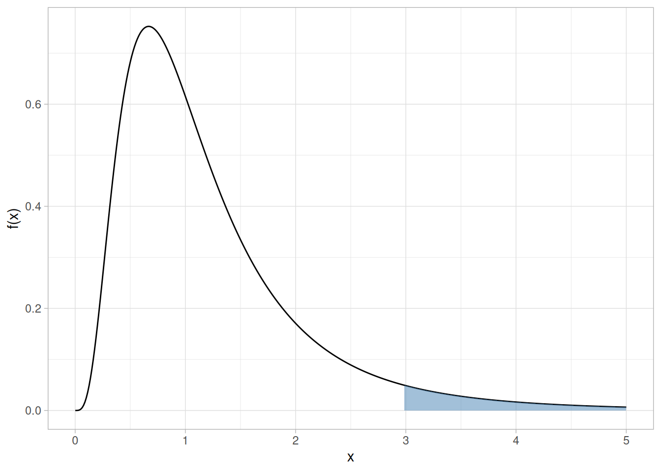
Given a specified value of \(\alpha\), find the column corresponding to \(\nu_1\) and the row corresponding to \(\nu_2\) and reject the null hypothesis if the test statistic is greater than the tabled value.
The following tables for \(\nu_2\) from 1 to 100 and \(\nu_1\) from 1 to 20 are included. (The original handbook split each of these into two tables, for \(\nu_1\) = 1–10 and 11–20, purely to fit 1990s page widths; they are combined into a single table here.)
5% significance level — \(F_{.05}(\nu_1, \nu_2)\)
crossing(nu2 = 1:100, nu1 = 1:20) |>
mutate(f = qf(0.95, nu1, nu2)) |>
pivot_wider(names_from = nu1, values_from = f, names_prefix = "v") |>
knitr::kable(digits = 3, col.names = c("nu2", as.character(1:20)))| nu2 | 1 | 2 | 3 | 4 | 5 | 6 | 7 | 8 | 9 | 10 | 11 | 12 | 13 | 14 | 15 | 16 | 17 | 18 | 19 | 20 |
|---|---|---|---|---|---|---|---|---|---|---|---|---|---|---|---|---|---|---|---|---|
| 1 | 161.448 | 199.500 | 215.707 | 224.583 | 230.162 | 233.986 | 236.768 | 238.883 | 240.543 | 241.882 | 242.983 | 243.906 | 244.690 | 245.364 | 245.950 | 246.464 | 246.918 | 247.323 | 247.686 | 248.013 |
| 2 | 18.513 | 19.000 | 19.164 | 19.247 | 19.296 | 19.330 | 19.353 | 19.371 | 19.385 | 19.396 | 19.405 | 19.413 | 19.419 | 19.424 | 19.429 | 19.433 | 19.437 | 19.440 | 19.443 | 19.446 |
| 3 | 10.128 | 9.552 | 9.277 | 9.117 | 9.013 | 8.941 | 8.887 | 8.845 | 8.812 | 8.786 | 8.763 | 8.745 | 8.729 | 8.715 | 8.703 | 8.692 | 8.683 | 8.675 | 8.667 | 8.660 |
| 4 | 7.709 | 6.944 | 6.591 | 6.388 | 6.256 | 6.163 | 6.094 | 6.041 | 5.999 | 5.964 | 5.936 | 5.912 | 5.891 | 5.873 | 5.858 | 5.844 | 5.832 | 5.821 | 5.811 | 5.803 |
| 5 | 6.608 | 5.786 | 5.409 | 5.192 | 5.050 | 4.950 | 4.876 | 4.818 | 4.772 | 4.735 | 4.704 | 4.678 | 4.655 | 4.636 | 4.619 | 4.604 | 4.590 | 4.579 | 4.568 | 4.558 |
| 6 | 5.987 | 5.143 | 4.757 | 4.534 | 4.387 | 4.284 | 4.207 | 4.147 | 4.099 | 4.060 | 4.027 | 4.000 | 3.976 | 3.956 | 3.938 | 3.922 | 3.908 | 3.896 | 3.884 | 3.874 |
| 7 | 5.591 | 4.737 | 4.347 | 4.120 | 3.972 | 3.866 | 3.787 | 3.726 | 3.677 | 3.637 | 3.603 | 3.575 | 3.550 | 3.529 | 3.511 | 3.494 | 3.480 | 3.467 | 3.455 | 3.445 |
| 8 | 5.318 | 4.459 | 4.066 | 3.838 | 3.687 | 3.581 | 3.500 | 3.438 | 3.388 | 3.347 | 3.313 | 3.284 | 3.259 | 3.237 | 3.218 | 3.202 | 3.187 | 3.173 | 3.161 | 3.150 |
| 9 | 5.117 | 4.256 | 3.863 | 3.633 | 3.482 | 3.374 | 3.293 | 3.230 | 3.179 | 3.137 | 3.102 | 3.073 | 3.048 | 3.025 | 3.006 | 2.989 | 2.974 | 2.960 | 2.948 | 2.936 |
| 10 | 4.965 | 4.103 | 3.708 | 3.478 | 3.326 | 3.217 | 3.135 | 3.072 | 3.020 | 2.978 | 2.943 | 2.913 | 2.887 | 2.865 | 2.845 | 2.828 | 2.812 | 2.798 | 2.785 | 2.774 |
| 11 | 4.844 | 3.982 | 3.587 | 3.357 | 3.204 | 3.095 | 3.012 | 2.948 | 2.896 | 2.854 | 2.818 | 2.788 | 2.761 | 2.739 | 2.719 | 2.701 | 2.685 | 2.671 | 2.658 | 2.646 |
| 12 | 4.747 | 3.885 | 3.490 | 3.259 | 3.106 | 2.996 | 2.913 | 2.849 | 2.796 | 2.753 | 2.717 | 2.687 | 2.660 | 2.637 | 2.617 | 2.599 | 2.583 | 2.568 | 2.555 | 2.544 |
| 13 | 4.667 | 3.806 | 3.411 | 3.179 | 3.025 | 2.915 | 2.832 | 2.767 | 2.714 | 2.671 | 2.635 | 2.604 | 2.577 | 2.554 | 2.533 | 2.515 | 2.499 | 2.484 | 2.471 | 2.459 |
| 14 | 4.600 | 3.739 | 3.344 | 3.112 | 2.958 | 2.848 | 2.764 | 2.699 | 2.646 | 2.602 | 2.565 | 2.534 | 2.507 | 2.484 | 2.463 | 2.445 | 2.428 | 2.413 | 2.400 | 2.388 |
| 15 | 4.543 | 3.682 | 3.287 | 3.056 | 2.901 | 2.790 | 2.707 | 2.641 | 2.588 | 2.544 | 2.507 | 2.475 | 2.448 | 2.424 | 2.403 | 2.385 | 2.368 | 2.353 | 2.340 | 2.328 |
| 16 | 4.494 | 3.634 | 3.239 | 3.007 | 2.852 | 2.741 | 2.657 | 2.591 | 2.538 | 2.494 | 2.456 | 2.425 | 2.397 | 2.373 | 2.352 | 2.333 | 2.317 | 2.302 | 2.288 | 2.276 |
| 17 | 4.451 | 3.592 | 3.197 | 2.965 | 2.810 | 2.699 | 2.614 | 2.548 | 2.494 | 2.450 | 2.413 | 2.381 | 2.353 | 2.329 | 2.308 | 2.289 | 2.272 | 2.257 | 2.243 | 2.230 |
| 18 | 4.414 | 3.555 | 3.160 | 2.928 | 2.773 | 2.661 | 2.577 | 2.510 | 2.456 | 2.412 | 2.374 | 2.342 | 2.314 | 2.290 | 2.269 | 2.250 | 2.233 | 2.217 | 2.203 | 2.191 |
| 19 | 4.381 | 3.522 | 3.127 | 2.895 | 2.740 | 2.628 | 2.544 | 2.477 | 2.423 | 2.378 | 2.340 | 2.308 | 2.280 | 2.256 | 2.234 | 2.215 | 2.198 | 2.182 | 2.168 | 2.155 |
| 20 | 4.351 | 3.493 | 3.098 | 2.866 | 2.711 | 2.599 | 2.514 | 2.447 | 2.393 | 2.348 | 2.310 | 2.278 | 2.250 | 2.225 | 2.203 | 2.184 | 2.167 | 2.151 | 2.137 | 2.124 |
| 21 | 4.325 | 3.467 | 3.072 | 2.840 | 2.685 | 2.573 | 2.488 | 2.420 | 2.366 | 2.321 | 2.283 | 2.250 | 2.222 | 2.197 | 2.176 | 2.156 | 2.139 | 2.123 | 2.109 | 2.096 |
| 22 | 4.301 | 3.443 | 3.049 | 2.817 | 2.661 | 2.549 | 2.464 | 2.397 | 2.342 | 2.297 | 2.259 | 2.226 | 2.198 | 2.173 | 2.151 | 2.131 | 2.114 | 2.098 | 2.084 | 2.071 |
| 23 | 4.279 | 3.422 | 3.028 | 2.796 | 2.640 | 2.528 | 2.442 | 2.375 | 2.320 | 2.275 | 2.236 | 2.204 | 2.175 | 2.150 | 2.128 | 2.109 | 2.091 | 2.075 | 2.061 | 2.048 |
| 24 | 4.260 | 3.403 | 3.009 | 2.776 | 2.621 | 2.508 | 2.423 | 2.355 | 2.300 | 2.255 | 2.216 | 2.183 | 2.155 | 2.130 | 2.108 | 2.088 | 2.070 | 2.054 | 2.040 | 2.027 |
| 25 | 4.242 | 3.385 | 2.991 | 2.759 | 2.603 | 2.490 | 2.405 | 2.337 | 2.282 | 2.236 | 2.198 | 2.165 | 2.136 | 2.111 | 2.089 | 2.069 | 2.051 | 2.035 | 2.021 | 2.007 |
| 26 | 4.225 | 3.369 | 2.975 | 2.743 | 2.587 | 2.474 | 2.388 | 2.321 | 2.265 | 2.220 | 2.181 | 2.148 | 2.119 | 2.094 | 2.072 | 2.052 | 2.034 | 2.018 | 2.003 | 1.990 |
| 27 | 4.210 | 3.354 | 2.960 | 2.728 | 2.572 | 2.459 | 2.373 | 2.305 | 2.250 | 2.204 | 2.166 | 2.132 | 2.103 | 2.078 | 2.056 | 2.036 | 2.018 | 2.002 | 1.987 | 1.974 |
| 28 | 4.196 | 3.340 | 2.947 | 2.714 | 2.558 | 2.445 | 2.359 | 2.291 | 2.236 | 2.190 | 2.151 | 2.118 | 2.089 | 2.064 | 2.041 | 2.021 | 2.003 | 1.987 | 1.972 | 1.959 |
| 29 | 4.183 | 3.328 | 2.934 | 2.701 | 2.545 | 2.432 | 2.346 | 2.278 | 2.223 | 2.177 | 2.138 | 2.104 | 2.075 | 2.050 | 2.027 | 2.007 | 1.989 | 1.973 | 1.958 | 1.945 |
| 30 | 4.171 | 3.316 | 2.922 | 2.690 | 2.534 | 2.421 | 2.334 | 2.266 | 2.211 | 2.165 | 2.126 | 2.092 | 2.063 | 2.037 | 2.015 | 1.995 | 1.976 | 1.960 | 1.945 | 1.932 |
| 31 | 4.160 | 3.305 | 2.911 | 2.679 | 2.523 | 2.409 | 2.323 | 2.255 | 2.199 | 2.153 | 2.114 | 2.080 | 2.051 | 2.026 | 2.003 | 1.983 | 1.965 | 1.948 | 1.933 | 1.920 |
| 32 | 4.149 | 3.295 | 2.901 | 2.668 | 2.512 | 2.399 | 2.313 | 2.244 | 2.189 | 2.142 | 2.103 | 2.070 | 2.040 | 2.015 | 1.992 | 1.972 | 1.953 | 1.937 | 1.922 | 1.908 |
| 33 | 4.139 | 3.285 | 2.892 | 2.659 | 2.503 | 2.389 | 2.303 | 2.235 | 2.179 | 2.133 | 2.093 | 2.060 | 2.030 | 2.004 | 1.982 | 1.961 | 1.943 | 1.926 | 1.911 | 1.898 |
| 34 | 4.130 | 3.276 | 2.883 | 2.650 | 2.494 | 2.380 | 2.294 | 2.225 | 2.170 | 2.123 | 2.084 | 2.050 | 2.021 | 1.995 | 1.972 | 1.952 | 1.933 | 1.917 | 1.902 | 1.888 |
| 35 | 4.121 | 3.267 | 2.874 | 2.641 | 2.485 | 2.372 | 2.285 | 2.217 | 2.161 | 2.114 | 2.075 | 2.041 | 2.012 | 1.986 | 1.963 | 1.942 | 1.924 | 1.907 | 1.892 | 1.878 |
| 36 | 4.113 | 3.259 | 2.866 | 2.634 | 2.477 | 2.364 | 2.277 | 2.209 | 2.153 | 2.106 | 2.067 | 2.033 | 2.003 | 1.977 | 1.954 | 1.934 | 1.915 | 1.899 | 1.883 | 1.870 |
| 37 | 4.105 | 3.252 | 2.859 | 2.626 | 2.470 | 2.356 | 2.270 | 2.201 | 2.145 | 2.098 | 2.059 | 2.025 | 1.995 | 1.969 | 1.946 | 1.926 | 1.907 | 1.890 | 1.875 | 1.861 |
| 38 | 4.098 | 3.245 | 2.852 | 2.619 | 2.463 | 2.349 | 2.262 | 2.194 | 2.138 | 2.091 | 2.051 | 2.017 | 1.988 | 1.962 | 1.939 | 1.918 | 1.899 | 1.883 | 1.867 | 1.853 |
| 39 | 4.091 | 3.238 | 2.845 | 2.612 | 2.456 | 2.342 | 2.255 | 2.187 | 2.131 | 2.084 | 2.044 | 2.010 | 1.981 | 1.954 | 1.931 | 1.911 | 1.892 | 1.875 | 1.860 | 1.846 |
| 40 | 4.085 | 3.232 | 2.839 | 2.606 | 2.449 | 2.336 | 2.249 | 2.180 | 2.124 | 2.077 | 2.038 | 2.003 | 1.974 | 1.948 | 1.924 | 1.904 | 1.885 | 1.868 | 1.853 | 1.839 |
| 41 | 4.079 | 3.226 | 2.833 | 2.600 | 2.443 | 2.330 | 2.243 | 2.174 | 2.118 | 2.071 | 2.031 | 1.997 | 1.967 | 1.941 | 1.918 | 1.897 | 1.879 | 1.862 | 1.846 | 1.832 |
| 42 | 4.073 | 3.220 | 2.827 | 2.594 | 2.438 | 2.324 | 2.237 | 2.168 | 2.112 | 2.065 | 2.025 | 1.991 | 1.961 | 1.935 | 1.912 | 1.891 | 1.872 | 1.855 | 1.840 | 1.826 |
| 43 | 4.067 | 3.214 | 2.822 | 2.589 | 2.432 | 2.318 | 2.232 | 2.163 | 2.106 | 2.059 | 2.020 | 1.985 | 1.955 | 1.929 | 1.906 | 1.885 | 1.866 | 1.849 | 1.834 | 1.820 |
| 44 | 4.062 | 3.209 | 2.816 | 2.584 | 2.427 | 2.313 | 2.226 | 2.157 | 2.101 | 2.054 | 2.014 | 1.980 | 1.950 | 1.924 | 1.900 | 1.879 | 1.861 | 1.844 | 1.828 | 1.814 |
| 45 | 4.057 | 3.204 | 2.812 | 2.579 | 2.422 | 2.308 | 2.221 | 2.152 | 2.096 | 2.049 | 2.009 | 1.974 | 1.945 | 1.918 | 1.895 | 1.874 | 1.855 | 1.838 | 1.823 | 1.808 |
| 46 | 4.052 | 3.200 | 2.807 | 2.574 | 2.417 | 2.304 | 2.216 | 2.147 | 2.091 | 2.044 | 2.004 | 1.969 | 1.940 | 1.913 | 1.890 | 1.869 | 1.850 | 1.833 | 1.817 | 1.803 |
| 47 | 4.047 | 3.195 | 2.802 | 2.570 | 2.413 | 2.299 | 2.212 | 2.143 | 2.086 | 2.039 | 1.999 | 1.965 | 1.935 | 1.908 | 1.885 | 1.864 | 1.845 | 1.828 | 1.812 | 1.798 |
| 48 | 4.043 | 3.191 | 2.798 | 2.565 | 2.409 | 2.295 | 2.207 | 2.138 | 2.082 | 2.035 | 1.995 | 1.960 | 1.930 | 1.904 | 1.880 | 1.859 | 1.840 | 1.823 | 1.807 | 1.793 |
| 49 | 4.038 | 3.187 | 2.794 | 2.561 | 2.404 | 2.290 | 2.203 | 2.134 | 2.077 | 2.030 | 1.990 | 1.956 | 1.926 | 1.899 | 1.876 | 1.855 | 1.836 | 1.819 | 1.803 | 1.789 |
| 50 | 4.034 | 3.183 | 2.790 | 2.557 | 2.400 | 2.286 | 2.199 | 2.130 | 2.073 | 2.026 | 1.986 | 1.952 | 1.921 | 1.895 | 1.871 | 1.850 | 1.831 | 1.814 | 1.798 | 1.784 |
| 51 | 4.030 | 3.179 | 2.786 | 2.553 | 2.397 | 2.283 | 2.195 | 2.126 | 2.069 | 2.022 | 1.982 | 1.947 | 1.917 | 1.891 | 1.867 | 1.846 | 1.827 | 1.810 | 1.794 | 1.780 |
| 52 | 4.027 | 3.175 | 2.783 | 2.550 | 2.393 | 2.279 | 2.192 | 2.122 | 2.066 | 2.018 | 1.978 | 1.944 | 1.913 | 1.887 | 1.863 | 1.842 | 1.823 | 1.806 | 1.790 | 1.776 |
| 53 | 4.023 | 3.172 | 2.779 | 2.546 | 2.389 | 2.275 | 2.188 | 2.119 | 2.062 | 2.015 | 1.975 | 1.940 | 1.910 | 1.883 | 1.859 | 1.838 | 1.819 | 1.802 | 1.786 | 1.772 |
| 54 | 4.020 | 3.168 | 2.776 | 2.543 | 2.386 | 2.272 | 2.185 | 2.115 | 2.059 | 2.011 | 1.971 | 1.936 | 1.906 | 1.879 | 1.856 | 1.835 | 1.816 | 1.798 | 1.782 | 1.768 |
| 55 | 4.016 | 3.165 | 2.773 | 2.540 | 2.383 | 2.269 | 2.181 | 2.112 | 2.055 | 2.008 | 1.968 | 1.933 | 1.903 | 1.876 | 1.852 | 1.831 | 1.812 | 1.795 | 1.779 | 1.764 |
| 56 | 4.013 | 3.162 | 2.769 | 2.537 | 2.380 | 2.266 | 2.178 | 2.109 | 2.052 | 2.005 | 1.964 | 1.930 | 1.899 | 1.873 | 1.849 | 1.828 | 1.809 | 1.791 | 1.775 | 1.761 |
| 57 | 4.010 | 3.159 | 2.766 | 2.534 | 2.377 | 2.263 | 2.175 | 2.106 | 2.049 | 2.001 | 1.961 | 1.926 | 1.896 | 1.869 | 1.846 | 1.824 | 1.805 | 1.788 | 1.772 | 1.757 |
| 58 | 4.007 | 3.156 | 2.764 | 2.531 | 2.374 | 2.260 | 2.172 | 2.103 | 2.046 | 1.998 | 1.958 | 1.923 | 1.893 | 1.866 | 1.842 | 1.821 | 1.802 | 1.785 | 1.769 | 1.754 |
| 59 | 4.004 | 3.153 | 2.761 | 2.528 | 2.371 | 2.257 | 2.169 | 2.100 | 2.043 | 1.995 | 1.955 | 1.920 | 1.890 | 1.863 | 1.839 | 1.818 | 1.799 | 1.781 | 1.766 | 1.751 |
| 60 | 4.001 | 3.150 | 2.758 | 2.525 | 2.368 | 2.254 | 2.167 | 2.097 | 2.040 | 1.993 | 1.952 | 1.917 | 1.887 | 1.860 | 1.836 | 1.815 | 1.796 | 1.778 | 1.763 | 1.748 |
| 61 | 3.998 | 3.148 | 2.755 | 2.523 | 2.366 | 2.251 | 2.164 | 2.094 | 2.037 | 1.990 | 1.949 | 1.915 | 1.884 | 1.857 | 1.834 | 1.812 | 1.793 | 1.776 | 1.760 | 1.745 |
| 62 | 3.996 | 3.145 | 2.753 | 2.520 | 2.363 | 2.249 | 2.161 | 2.092 | 2.035 | 1.987 | 1.947 | 1.912 | 1.882 | 1.855 | 1.831 | 1.809 | 1.790 | 1.773 | 1.757 | 1.742 |
| 63 | 3.993 | 3.143 | 2.751 | 2.518 | 2.361 | 2.246 | 2.159 | 2.089 | 2.032 | 1.985 | 1.944 | 1.909 | 1.879 | 1.852 | 1.828 | 1.807 | 1.787 | 1.770 | 1.754 | 1.739 |
| 64 | 3.991 | 3.140 | 2.748 | 2.515 | 2.358 | 2.244 | 2.156 | 2.087 | 2.030 | 1.982 | 1.942 | 1.907 | 1.876 | 1.849 | 1.826 | 1.804 | 1.785 | 1.767 | 1.751 | 1.737 |
| 65 | 3.989 | 3.138 | 2.746 | 2.513 | 2.356 | 2.242 | 2.154 | 2.084 | 2.027 | 1.980 | 1.939 | 1.904 | 1.874 | 1.847 | 1.823 | 1.802 | 1.782 | 1.765 | 1.749 | 1.734 |
| 66 | 3.986 | 3.136 | 2.744 | 2.511 | 2.354 | 2.239 | 2.152 | 2.082 | 2.025 | 1.977 | 1.937 | 1.902 | 1.871 | 1.845 | 1.821 | 1.799 | 1.780 | 1.762 | 1.746 | 1.732 |
| 67 | 3.984 | 3.134 | 2.742 | 2.509 | 2.352 | 2.237 | 2.150 | 2.080 | 2.023 | 1.975 | 1.935 | 1.900 | 1.869 | 1.842 | 1.818 | 1.797 | 1.777 | 1.760 | 1.744 | 1.729 |
| 68 | 3.982 | 3.132 | 2.740 | 2.507 | 2.350 | 2.235 | 2.148 | 2.078 | 2.021 | 1.973 | 1.932 | 1.897 | 1.867 | 1.840 | 1.816 | 1.795 | 1.775 | 1.758 | 1.742 | 1.727 |
| 69 | 3.980 | 3.130 | 2.737 | 2.505 | 2.348 | 2.233 | 2.145 | 2.076 | 2.019 | 1.971 | 1.930 | 1.895 | 1.865 | 1.838 | 1.814 | 1.792 | 1.773 | 1.755 | 1.739 | 1.725 |
| 70 | 3.978 | 3.128 | 2.736 | 2.503 | 2.346 | 2.231 | 2.143 | 2.074 | 2.017 | 1.969 | 1.928 | 1.893 | 1.863 | 1.836 | 1.812 | 1.790 | 1.771 | 1.753 | 1.737 | 1.722 |
| 71 | 3.976 | 3.126 | 2.734 | 2.501 | 2.344 | 2.229 | 2.142 | 2.072 | 2.015 | 1.967 | 1.926 | 1.891 | 1.861 | 1.834 | 1.810 | 1.788 | 1.769 | 1.751 | 1.735 | 1.720 |
| 72 | 3.974 | 3.124 | 2.732 | 2.499 | 2.342 | 2.227 | 2.140 | 2.070 | 2.013 | 1.965 | 1.924 | 1.889 | 1.859 | 1.832 | 1.808 | 1.786 | 1.767 | 1.749 | 1.733 | 1.718 |
| 73 | 3.972 | 3.122 | 2.730 | 2.497 | 2.340 | 2.226 | 2.138 | 2.068 | 2.011 | 1.963 | 1.922 | 1.887 | 1.857 | 1.830 | 1.806 | 1.784 | 1.765 | 1.747 | 1.731 | 1.716 |
| 74 | 3.970 | 3.120 | 2.728 | 2.495 | 2.338 | 2.224 | 2.136 | 2.066 | 2.009 | 1.961 | 1.921 | 1.885 | 1.855 | 1.828 | 1.804 | 1.782 | 1.763 | 1.745 | 1.729 | 1.714 |
| 75 | 3.968 | 3.119 | 2.727 | 2.494 | 2.337 | 2.222 | 2.134 | 2.064 | 2.007 | 1.959 | 1.919 | 1.884 | 1.853 | 1.826 | 1.802 | 1.780 | 1.761 | 1.743 | 1.727 | 1.712 |
| 76 | 3.967 | 3.117 | 2.725 | 2.492 | 2.335 | 2.220 | 2.133 | 2.063 | 2.006 | 1.958 | 1.917 | 1.882 | 1.851 | 1.824 | 1.800 | 1.778 | 1.759 | 1.741 | 1.725 | 1.710 |
| 77 | 3.965 | 3.115 | 2.723 | 2.490 | 2.333 | 2.219 | 2.131 | 2.061 | 2.004 | 1.956 | 1.915 | 1.880 | 1.849 | 1.822 | 1.798 | 1.777 | 1.757 | 1.739 | 1.723 | 1.708 |
| 78 | 3.963 | 3.114 | 2.722 | 2.489 | 2.332 | 2.217 | 2.129 | 2.059 | 2.002 | 1.954 | 1.914 | 1.878 | 1.848 | 1.821 | 1.797 | 1.775 | 1.755 | 1.738 | 1.721 | 1.707 |
| 79 | 3.962 | 3.112 | 2.720 | 2.487 | 2.330 | 2.216 | 2.128 | 2.058 | 2.001 | 1.953 | 1.912 | 1.877 | 1.846 | 1.819 | 1.795 | 1.773 | 1.754 | 1.736 | 1.720 | 1.705 |
| 80 | 3.960 | 3.111 | 2.719 | 2.486 | 2.329 | 2.214 | 2.126 | 2.056 | 1.999 | 1.951 | 1.910 | 1.875 | 1.845 | 1.817 | 1.793 | 1.772 | 1.752 | 1.734 | 1.718 | 1.703 |
| 81 | 3.959 | 3.109 | 2.717 | 2.484 | 2.327 | 2.213 | 2.125 | 2.055 | 1.998 | 1.950 | 1.909 | 1.874 | 1.843 | 1.816 | 1.792 | 1.770 | 1.750 | 1.733 | 1.716 | 1.702 |
| 82 | 3.957 | 3.108 | 2.716 | 2.483 | 2.326 | 2.211 | 2.123 | 2.053 | 1.996 | 1.948 | 1.907 | 1.872 | 1.841 | 1.814 | 1.790 | 1.768 | 1.749 | 1.731 | 1.715 | 1.700 |
| 83 | 3.956 | 3.107 | 2.715 | 2.482 | 2.324 | 2.210 | 2.122 | 2.052 | 1.995 | 1.947 | 1.906 | 1.871 | 1.840 | 1.813 | 1.789 | 1.767 | 1.747 | 1.729 | 1.713 | 1.698 |
| 84 | 3.955 | 3.105 | 2.713 | 2.480 | 2.323 | 2.209 | 2.121 | 2.051 | 1.993 | 1.945 | 1.905 | 1.869 | 1.838 | 1.811 | 1.787 | 1.765 | 1.746 | 1.728 | 1.712 | 1.697 |
| 85 | 3.953 | 3.104 | 2.712 | 2.479 | 2.322 | 2.207 | 2.119 | 2.049 | 1.992 | 1.944 | 1.903 | 1.868 | 1.837 | 1.810 | 1.786 | 1.764 | 1.744 | 1.726 | 1.710 | 1.695 |
| 86 | 3.952 | 3.103 | 2.711 | 2.478 | 2.321 | 2.206 | 2.118 | 2.048 | 1.991 | 1.943 | 1.902 | 1.867 | 1.836 | 1.808 | 1.784 | 1.763 | 1.743 | 1.725 | 1.709 | 1.694 |
| 87 | 3.951 | 3.101 | 2.709 | 2.476 | 2.319 | 2.205 | 2.117 | 2.047 | 1.989 | 1.941 | 1.900 | 1.865 | 1.834 | 1.807 | 1.783 | 1.761 | 1.741 | 1.724 | 1.707 | 1.692 |
| 88 | 3.949 | 3.100 | 2.708 | 2.475 | 2.318 | 2.203 | 2.115 | 2.045 | 1.988 | 1.940 | 1.899 | 1.864 | 1.833 | 1.806 | 1.782 | 1.760 | 1.740 | 1.722 | 1.706 | 1.691 |
| 89 | 3.948 | 3.099 | 2.707 | 2.474 | 2.317 | 2.202 | 2.114 | 2.044 | 1.987 | 1.939 | 1.898 | 1.863 | 1.832 | 1.804 | 1.780 | 1.758 | 1.739 | 1.721 | 1.705 | 1.690 |
| 90 | 3.947 | 3.098 | 2.706 | 2.473 | 2.316 | 2.201 | 2.113 | 2.043 | 1.986 | 1.938 | 1.897 | 1.861 | 1.830 | 1.803 | 1.779 | 1.757 | 1.737 | 1.720 | 1.703 | 1.688 |
| 91 | 3.946 | 3.097 | 2.705 | 2.472 | 2.315 | 2.200 | 2.112 | 2.042 | 1.984 | 1.936 | 1.895 | 1.860 | 1.829 | 1.802 | 1.778 | 1.756 | 1.736 | 1.718 | 1.702 | 1.687 |
| 92 | 3.945 | 3.095 | 2.704 | 2.471 | 2.313 | 2.199 | 2.111 | 2.041 | 1.983 | 1.935 | 1.894 | 1.859 | 1.828 | 1.801 | 1.776 | 1.755 | 1.735 | 1.717 | 1.701 | 1.686 |
| 93 | 3.943 | 3.094 | 2.703 | 2.470 | 2.312 | 2.198 | 2.110 | 2.040 | 1.982 | 1.934 | 1.893 | 1.858 | 1.827 | 1.800 | 1.775 | 1.753 | 1.734 | 1.716 | 1.699 | 1.684 |
| 94 | 3.942 | 3.093 | 2.701 | 2.469 | 2.311 | 2.197 | 2.109 | 2.038 | 1.981 | 1.933 | 1.892 | 1.857 | 1.826 | 1.798 | 1.774 | 1.752 | 1.733 | 1.715 | 1.698 | 1.683 |
| 95 | 3.941 | 3.092 | 2.700 | 2.467 | 2.310 | 2.196 | 2.108 | 2.037 | 1.980 | 1.932 | 1.891 | 1.856 | 1.825 | 1.797 | 1.773 | 1.751 | 1.731 | 1.713 | 1.697 | 1.682 |
| 96 | 3.940 | 3.091 | 2.699 | 2.466 | 2.309 | 2.195 | 2.106 | 2.036 | 1.979 | 1.931 | 1.890 | 1.854 | 1.823 | 1.796 | 1.772 | 1.750 | 1.730 | 1.712 | 1.696 | 1.681 |
| 97 | 3.939 | 3.090 | 2.698 | 2.465 | 2.308 | 2.194 | 2.105 | 2.035 | 1.978 | 1.930 | 1.889 | 1.853 | 1.822 | 1.795 | 1.771 | 1.749 | 1.729 | 1.711 | 1.695 | 1.680 |
| 98 | 3.938 | 3.089 | 2.697 | 2.465 | 2.307 | 2.193 | 2.104 | 2.034 | 1.977 | 1.929 | 1.888 | 1.852 | 1.821 | 1.794 | 1.770 | 1.748 | 1.728 | 1.710 | 1.694 | 1.679 |
| 99 | 3.937 | 3.088 | 2.696 | 2.464 | 2.306 | 2.192 | 2.103 | 2.033 | 1.976 | 1.928 | 1.887 | 1.851 | 1.820 | 1.793 | 1.769 | 1.747 | 1.727 | 1.709 | 1.693 | 1.678 |
| 100 | 3.936 | 3.087 | 2.696 | 2.463 | 2.305 | 2.191 | 2.103 | 2.032 | 1.975 | 1.927 | 1.886 | 1.850 | 1.819 | 1.792 | 1.768 | 1.746 | 1.726 | 1.708 | 1.691 | 1.676 |
10% significance level — \(F_{.10}(\nu_1, \nu_2)\)
crossing(nu2 = 1:100, nu1 = 1:20) |>
mutate(f = qf(0.90, nu1, nu2)) |>
pivot_wider(names_from = nu1, values_from = f, names_prefix = "v") |>
knitr::kable(digits = 3, col.names = c("nu2", as.character(1:20)))| nu2 | 1 | 2 | 3 | 4 | 5 | 6 | 7 | 8 | 9 | 10 | 11 | 12 | 13 | 14 | 15 | 16 | 17 | 18 | 19 | 20 |
|---|---|---|---|---|---|---|---|---|---|---|---|---|---|---|---|---|---|---|---|---|
| 1 | 39.863 | 49.500 | 53.593 | 55.833 | 57.240 | 58.204 | 58.906 | 59.439 | 59.858 | 60.195 | 60.473 | 60.705 | 60.903 | 61.073 | 61.220 | 61.350 | 61.464 | 61.566 | 61.658 | 61.740 |
| 2 | 8.526 | 9.000 | 9.162 | 9.243 | 9.293 | 9.326 | 9.349 | 9.367 | 9.381 | 9.392 | 9.401 | 9.408 | 9.415 | 9.420 | 9.425 | 9.429 | 9.433 | 9.436 | 9.439 | 9.441 |
| 3 | 5.538 | 5.462 | 5.391 | 5.343 | 5.309 | 5.285 | 5.266 | 5.252 | 5.240 | 5.230 | 5.222 | 5.216 | 5.210 | 5.205 | 5.200 | 5.196 | 5.193 | 5.190 | 5.187 | 5.184 |
| 4 | 4.545 | 4.325 | 4.191 | 4.107 | 4.051 | 4.010 | 3.979 | 3.955 | 3.936 | 3.920 | 3.907 | 3.896 | 3.886 | 3.878 | 3.870 | 3.864 | 3.858 | 3.853 | 3.849 | 3.844 |
| 5 | 4.060 | 3.780 | 3.619 | 3.520 | 3.453 | 3.405 | 3.368 | 3.339 | 3.316 | 3.297 | 3.282 | 3.268 | 3.257 | 3.247 | 3.238 | 3.230 | 3.223 | 3.217 | 3.212 | 3.207 |
| 6 | 3.776 | 3.463 | 3.289 | 3.181 | 3.108 | 3.055 | 3.014 | 2.983 | 2.958 | 2.937 | 2.920 | 2.905 | 2.892 | 2.881 | 2.871 | 2.863 | 2.855 | 2.848 | 2.842 | 2.836 |
| 7 | 3.589 | 3.257 | 3.074 | 2.961 | 2.883 | 2.827 | 2.785 | 2.752 | 2.725 | 2.703 | 2.684 | 2.668 | 2.654 | 2.643 | 2.632 | 2.623 | 2.615 | 2.607 | 2.601 | 2.595 |
| 8 | 3.458 | 3.113 | 2.924 | 2.806 | 2.726 | 2.668 | 2.624 | 2.589 | 2.561 | 2.538 | 2.519 | 2.502 | 2.488 | 2.475 | 2.464 | 2.455 | 2.446 | 2.438 | 2.431 | 2.425 |
| 9 | 3.360 | 3.006 | 2.813 | 2.693 | 2.611 | 2.551 | 2.505 | 2.469 | 2.440 | 2.416 | 2.396 | 2.379 | 2.364 | 2.351 | 2.340 | 2.329 | 2.320 | 2.312 | 2.305 | 2.298 |
| 10 | 3.285 | 2.924 | 2.728 | 2.605 | 2.522 | 2.461 | 2.414 | 2.377 | 2.347 | 2.323 | 2.302 | 2.284 | 2.269 | 2.255 | 2.244 | 2.233 | 2.224 | 2.215 | 2.208 | 2.201 |
| 11 | 3.225 | 2.860 | 2.660 | 2.536 | 2.451 | 2.389 | 2.342 | 2.304 | 2.274 | 2.248 | 2.227 | 2.209 | 2.193 | 2.179 | 2.167 | 2.156 | 2.147 | 2.138 | 2.130 | 2.123 |
| 12 | 3.177 | 2.807 | 2.606 | 2.480 | 2.394 | 2.331 | 2.283 | 2.245 | 2.214 | 2.188 | 2.166 | 2.147 | 2.131 | 2.117 | 2.105 | 2.094 | 2.084 | 2.075 | 2.067 | 2.060 |
| 13 | 3.136 | 2.763 | 2.560 | 2.434 | 2.347 | 2.283 | 2.234 | 2.195 | 2.164 | 2.138 | 2.116 | 2.097 | 2.080 | 2.066 | 2.053 | 2.042 | 2.032 | 2.023 | 2.014 | 2.007 |
| 14 | 3.102 | 2.726 | 2.522 | 2.395 | 2.307 | 2.243 | 2.193 | 2.154 | 2.122 | 2.095 | 2.073 | 2.054 | 2.037 | 2.022 | 2.010 | 1.998 | 1.988 | 1.978 | 1.970 | 1.962 |
| 15 | 3.073 | 2.695 | 2.490 | 2.361 | 2.273 | 2.208 | 2.158 | 2.119 | 2.086 | 2.059 | 2.037 | 2.017 | 2.000 | 1.985 | 1.972 | 1.961 | 1.950 | 1.941 | 1.932 | 1.924 |
| 16 | 3.048 | 2.668 | 2.462 | 2.333 | 2.244 | 2.178 | 2.128 | 2.088 | 2.055 | 2.028 | 2.005 | 1.985 | 1.968 | 1.953 | 1.940 | 1.928 | 1.917 | 1.908 | 1.899 | 1.891 |
| 17 | 3.026 | 2.645 | 2.437 | 2.308 | 2.218 | 2.152 | 2.102 | 2.061 | 2.028 | 2.001 | 1.978 | 1.958 | 1.940 | 1.925 | 1.912 | 1.900 | 1.889 | 1.879 | 1.870 | 1.862 |
| 18 | 3.007 | 2.624 | 2.416 | 2.286 | 2.196 | 2.130 | 2.079 | 2.038 | 2.005 | 1.977 | 1.954 | 1.933 | 1.916 | 1.900 | 1.887 | 1.875 | 1.864 | 1.854 | 1.845 | 1.837 |
| 19 | 2.990 | 2.606 | 2.397 | 2.266 | 2.176 | 2.109 | 2.058 | 2.017 | 1.984 | 1.956 | 1.932 | 1.912 | 1.894 | 1.878 | 1.865 | 1.852 | 1.841 | 1.831 | 1.822 | 1.814 |
| 20 | 2.975 | 2.589 | 2.380 | 2.249 | 2.158 | 2.091 | 2.040 | 1.999 | 1.965 | 1.937 | 1.913 | 1.892 | 1.875 | 1.859 | 1.845 | 1.833 | 1.821 | 1.811 | 1.802 | 1.794 |
| 21 | 2.961 | 2.575 | 2.365 | 2.233 | 2.142 | 2.075 | 2.023 | 1.982 | 1.948 | 1.920 | 1.896 | 1.875 | 1.857 | 1.841 | 1.827 | 1.815 | 1.803 | 1.793 | 1.784 | 1.776 |
| 22 | 2.949 | 2.561 | 2.351 | 2.219 | 2.128 | 2.060 | 2.008 | 1.967 | 1.933 | 1.904 | 1.880 | 1.859 | 1.841 | 1.825 | 1.811 | 1.798 | 1.787 | 1.777 | 1.768 | 1.759 |
| 23 | 2.937 | 2.549 | 2.339 | 2.207 | 2.115 | 2.047 | 1.995 | 1.953 | 1.919 | 1.890 | 1.866 | 1.845 | 1.827 | 1.811 | 1.796 | 1.784 | 1.772 | 1.762 | 1.753 | 1.744 |
| 24 | 2.927 | 2.538 | 2.327 | 2.195 | 2.103 | 2.035 | 1.983 | 1.941 | 1.906 | 1.877 | 1.853 | 1.832 | 1.814 | 1.797 | 1.783 | 1.770 | 1.759 | 1.748 | 1.739 | 1.730 |
| 25 | 2.918 | 2.528 | 2.317 | 2.184 | 2.092 | 2.024 | 1.971 | 1.929 | 1.895 | 1.866 | 1.841 | 1.820 | 1.802 | 1.785 | 1.771 | 1.758 | 1.746 | 1.736 | 1.726 | 1.718 |
| 26 | 2.909 | 2.519 | 2.307 | 2.174 | 2.082 | 2.014 | 1.961 | 1.919 | 1.884 | 1.855 | 1.830 | 1.809 | 1.790 | 1.774 | 1.760 | 1.747 | 1.735 | 1.724 | 1.715 | 1.706 |
| 27 | 2.901 | 2.511 | 2.299 | 2.165 | 2.073 | 2.005 | 1.952 | 1.909 | 1.874 | 1.845 | 1.820 | 1.799 | 1.780 | 1.764 | 1.749 | 1.736 | 1.724 | 1.714 | 1.704 | 1.695 |
| 28 | 2.894 | 2.503 | 2.291 | 2.157 | 2.064 | 1.996 | 1.943 | 1.900 | 1.865 | 1.836 | 1.811 | 1.790 | 1.771 | 1.754 | 1.740 | 1.726 | 1.715 | 1.704 | 1.694 | 1.685 |
| 29 | 2.887 | 2.495 | 2.283 | 2.149 | 2.057 | 1.988 | 1.935 | 1.892 | 1.857 | 1.827 | 1.802 | 1.781 | 1.762 | 1.745 | 1.731 | 1.717 | 1.705 | 1.695 | 1.685 | 1.676 |
| 30 | 2.881 | 2.489 | 2.276 | 2.142 | 2.049 | 1.980 | 1.927 | 1.884 | 1.849 | 1.819 | 1.794 | 1.773 | 1.754 | 1.737 | 1.722 | 1.709 | 1.697 | 1.686 | 1.676 | 1.667 |
| 31 | 2.875 | 2.482 | 2.270 | 2.136 | 2.042 | 1.973 | 1.920 | 1.877 | 1.842 | 1.812 | 1.787 | 1.765 | 1.746 | 1.729 | 1.714 | 1.701 | 1.689 | 1.678 | 1.668 | 1.659 |
| 32 | 2.869 | 2.477 | 2.263 | 2.129 | 2.036 | 1.967 | 1.913 | 1.870 | 1.835 | 1.805 | 1.780 | 1.758 | 1.739 | 1.722 | 1.707 | 1.694 | 1.682 | 1.671 | 1.661 | 1.652 |
| 33 | 2.864 | 2.471 | 2.258 | 2.123 | 2.030 | 1.961 | 1.907 | 1.864 | 1.828 | 1.799 | 1.773 | 1.751 | 1.732 | 1.715 | 1.700 | 1.687 | 1.675 | 1.664 | 1.654 | 1.645 |
| 34 | 2.859 | 2.466 | 2.252 | 2.118 | 2.024 | 1.955 | 1.901 | 1.858 | 1.822 | 1.793 | 1.767 | 1.745 | 1.726 | 1.709 | 1.694 | 1.680 | 1.668 | 1.657 | 1.647 | 1.638 |
| 35 | 2.855 | 2.461 | 2.247 | 2.113 | 2.019 | 1.950 | 1.896 | 1.852 | 1.817 | 1.787 | 1.761 | 1.739 | 1.720 | 1.703 | 1.688 | 1.674 | 1.662 | 1.651 | 1.641 | 1.632 |
| 36 | 2.850 | 2.456 | 2.243 | 2.108 | 2.014 | 1.945 | 1.891 | 1.847 | 1.811 | 1.781 | 1.756 | 1.734 | 1.715 | 1.697 | 1.682 | 1.669 | 1.656 | 1.645 | 1.635 | 1.626 |
| 37 | 2.846 | 2.452 | 2.238 | 2.103 | 2.009 | 1.940 | 1.886 | 1.842 | 1.806 | 1.776 | 1.751 | 1.729 | 1.709 | 1.692 | 1.677 | 1.663 | 1.651 | 1.640 | 1.630 | 1.620 |
| 38 | 2.842 | 2.448 | 2.234 | 2.099 | 2.005 | 1.935 | 1.881 | 1.838 | 1.802 | 1.772 | 1.746 | 1.724 | 1.704 | 1.687 | 1.672 | 1.658 | 1.646 | 1.635 | 1.624 | 1.615 |
| 39 | 2.839 | 2.444 | 2.230 | 2.095 | 2.001 | 1.931 | 1.877 | 1.833 | 1.797 | 1.767 | 1.741 | 1.719 | 1.700 | 1.682 | 1.667 | 1.653 | 1.641 | 1.630 | 1.619 | 1.610 |
| 40 | 2.835 | 2.440 | 2.226 | 2.091 | 1.997 | 1.927 | 1.873 | 1.829 | 1.793 | 1.763 | 1.737 | 1.715 | 1.695 | 1.678 | 1.662 | 1.649 | 1.636 | 1.625 | 1.615 | 1.605 |
| 41 | 2.832 | 2.437 | 2.222 | 2.087 | 1.993 | 1.923 | 1.869 | 1.825 | 1.789 | 1.759 | 1.733 | 1.710 | 1.691 | 1.673 | 1.658 | 1.644 | 1.632 | 1.620 | 1.610 | 1.601 |
| 42 | 2.829 | 2.434 | 2.219 | 2.084 | 1.989 | 1.919 | 1.865 | 1.821 | 1.785 | 1.755 | 1.729 | 1.706 | 1.687 | 1.669 | 1.654 | 1.640 | 1.628 | 1.616 | 1.606 | 1.596 |
| 43 | 2.826 | 2.430 | 2.216 | 2.080 | 1.986 | 1.916 | 1.861 | 1.817 | 1.781 | 1.751 | 1.725 | 1.703 | 1.683 | 1.665 | 1.650 | 1.636 | 1.624 | 1.612 | 1.602 | 1.592 |
| 44 | 2.823 | 2.427 | 2.213 | 2.077 | 1.983 | 1.913 | 1.858 | 1.814 | 1.778 | 1.747 | 1.721 | 1.699 | 1.679 | 1.662 | 1.646 | 1.632 | 1.620 | 1.608 | 1.598 | 1.588 |
| 45 | 2.820 | 2.425 | 2.210 | 2.074 | 1.980 | 1.909 | 1.855 | 1.811 | 1.774 | 1.744 | 1.718 | 1.695 | 1.676 | 1.658 | 1.643 | 1.629 | 1.616 | 1.605 | 1.594 | 1.585 |
| 46 | 2.818 | 2.422 | 2.207 | 2.071 | 1.977 | 1.906 | 1.852 | 1.808 | 1.771 | 1.741 | 1.715 | 1.692 | 1.672 | 1.655 | 1.639 | 1.625 | 1.613 | 1.601 | 1.591 | 1.581 |
| 47 | 2.815 | 2.419 | 2.204 | 2.068 | 1.974 | 1.903 | 1.849 | 1.805 | 1.768 | 1.738 | 1.712 | 1.689 | 1.669 | 1.652 | 1.636 | 1.622 | 1.609 | 1.598 | 1.587 | 1.578 |
| 48 | 2.813 | 2.417 | 2.202 | 2.066 | 1.971 | 1.901 | 1.846 | 1.802 | 1.765 | 1.735 | 1.709 | 1.686 | 1.666 | 1.648 | 1.633 | 1.619 | 1.606 | 1.594 | 1.584 | 1.574 |
| 49 | 2.811 | 2.414 | 2.199 | 2.063 | 1.968 | 1.898 | 1.843 | 1.799 | 1.763 | 1.732 | 1.706 | 1.683 | 1.663 | 1.645 | 1.630 | 1.616 | 1.603 | 1.591 | 1.581 | 1.571 |
| 50 | 2.809 | 2.412 | 2.197 | 2.061 | 1.966 | 1.895 | 1.840 | 1.796 | 1.760 | 1.729 | 1.703 | 1.680 | 1.660 | 1.643 | 1.627 | 1.613 | 1.600 | 1.588 | 1.578 | 1.568 |
| 51 | 2.807 | 2.410 | 2.194 | 2.058 | 1.964 | 1.893 | 1.838 | 1.794 | 1.757 | 1.727 | 1.700 | 1.677 | 1.658 | 1.640 | 1.624 | 1.610 | 1.597 | 1.586 | 1.575 | 1.565 |
| 52 | 2.805 | 2.408 | 2.192 | 2.056 | 1.961 | 1.891 | 1.836 | 1.791 | 1.755 | 1.724 | 1.698 | 1.675 | 1.655 | 1.637 | 1.621 | 1.607 | 1.594 | 1.583 | 1.572 | 1.562 |
| 53 | 2.803 | 2.406 | 2.190 | 2.054 | 1.959 | 1.888 | 1.833 | 1.789 | 1.752 | 1.722 | 1.695 | 1.672 | 1.652 | 1.635 | 1.619 | 1.605 | 1.592 | 1.580 | 1.570 | 1.560 |
| 54 | 2.801 | 2.404 | 2.188 | 2.052 | 1.957 | 1.886 | 1.831 | 1.787 | 1.750 | 1.719 | 1.693 | 1.670 | 1.650 | 1.632 | 1.616 | 1.602 | 1.589 | 1.578 | 1.567 | 1.557 |
| 55 | 2.799 | 2.402 | 2.186 | 2.050 | 1.955 | 1.884 | 1.829 | 1.785 | 1.748 | 1.717 | 1.691 | 1.668 | 1.648 | 1.630 | 1.614 | 1.600 | 1.587 | 1.575 | 1.564 | 1.555 |
| 56 | 2.797 | 2.400 | 2.184 | 2.048 | 1.953 | 1.882 | 1.827 | 1.782 | 1.746 | 1.715 | 1.688 | 1.666 | 1.645 | 1.628 | 1.612 | 1.597 | 1.585 | 1.573 | 1.562 | 1.552 |
| 57 | 2.796 | 2.398 | 2.182 | 2.046 | 1.951 | 1.880 | 1.825 | 1.780 | 1.744 | 1.713 | 1.686 | 1.663 | 1.643 | 1.625 | 1.610 | 1.595 | 1.582 | 1.571 | 1.560 | 1.550 |
| 58 | 2.794 | 2.396 | 2.181 | 2.044 | 1.949 | 1.878 | 1.823 | 1.779 | 1.742 | 1.711 | 1.684 | 1.661 | 1.641 | 1.623 | 1.607 | 1.593 | 1.580 | 1.568 | 1.558 | 1.548 |
| 59 | 2.793 | 2.395 | 2.179 | 2.043 | 1.947 | 1.876 | 1.821 | 1.777 | 1.740 | 1.709 | 1.682 | 1.659 | 1.639 | 1.621 | 1.605 | 1.591 | 1.578 | 1.566 | 1.555 | 1.546 |
| 60 | 2.791 | 2.393 | 2.177 | 2.041 | 1.946 | 1.875 | 1.819 | 1.775 | 1.738 | 1.707 | 1.680 | 1.657 | 1.637 | 1.619 | 1.603 | 1.589 | 1.576 | 1.564 | 1.553 | 1.543 |
| 61 | 2.790 | 2.392 | 2.176 | 2.039 | 1.944 | 1.873 | 1.818 | 1.773 | 1.736 | 1.705 | 1.679 | 1.656 | 1.635 | 1.617 | 1.601 | 1.587 | 1.574 | 1.562 | 1.551 | 1.541 |
| 62 | 2.788 | 2.390 | 2.174 | 2.038 | 1.942 | 1.871 | 1.816 | 1.771 | 1.735 | 1.703 | 1.677 | 1.654 | 1.634 | 1.616 | 1.600 | 1.585 | 1.572 | 1.560 | 1.549 | 1.540 |
| 63 | 2.787 | 2.389 | 2.173 | 2.036 | 1.941 | 1.870 | 1.814 | 1.770 | 1.733 | 1.702 | 1.675 | 1.652 | 1.632 | 1.614 | 1.598 | 1.583 | 1.570 | 1.558 | 1.548 | 1.538 |
| 64 | 2.786 | 2.387 | 2.171 | 2.035 | 1.939 | 1.868 | 1.813 | 1.768 | 1.731 | 1.700 | 1.673 | 1.650 | 1.630 | 1.612 | 1.596 | 1.582 | 1.569 | 1.557 | 1.546 | 1.536 |
| 65 | 2.784 | 2.386 | 2.170 | 2.033 | 1.938 | 1.867 | 1.811 | 1.767 | 1.730 | 1.699 | 1.672 | 1.649 | 1.628 | 1.610 | 1.594 | 1.580 | 1.567 | 1.555 | 1.544 | 1.534 |
| 66 | 2.783 | 2.385 | 2.169 | 2.032 | 1.937 | 1.865 | 1.810 | 1.765 | 1.728 | 1.697 | 1.670 | 1.647 | 1.627 | 1.609 | 1.593 | 1.578 | 1.565 | 1.553 | 1.542 | 1.532 |
| 67 | 2.782 | 2.384 | 2.167 | 2.031 | 1.935 | 1.864 | 1.808 | 1.764 | 1.727 | 1.696 | 1.669 | 1.646 | 1.625 | 1.607 | 1.591 | 1.577 | 1.564 | 1.552 | 1.541 | 1.531 |
| 68 | 2.781 | 2.382 | 2.166 | 2.029 | 1.934 | 1.863 | 1.807 | 1.762 | 1.725 | 1.694 | 1.667 | 1.644 | 1.624 | 1.606 | 1.590 | 1.575 | 1.562 | 1.550 | 1.539 | 1.529 |
| 69 | 2.780 | 2.381 | 2.165 | 2.028 | 1.933 | 1.861 | 1.806 | 1.761 | 1.724 | 1.693 | 1.666 | 1.643 | 1.622 | 1.604 | 1.588 | 1.574 | 1.560 | 1.548 | 1.538 | 1.527 |
| 70 | 2.779 | 2.380 | 2.164 | 2.027 | 1.931 | 1.860 | 1.804 | 1.760 | 1.723 | 1.691 | 1.665 | 1.641 | 1.621 | 1.603 | 1.587 | 1.572 | 1.559 | 1.547 | 1.536 | 1.526 |
| 71 | 2.778 | 2.379 | 2.163 | 2.026 | 1.930 | 1.859 | 1.803 | 1.758 | 1.721 | 1.690 | 1.663 | 1.640 | 1.619 | 1.601 | 1.585 | 1.571 | 1.557 | 1.545 | 1.535 | 1.524 |
| 72 | 2.777 | 2.378 | 2.161 | 2.025 | 1.929 | 1.858 | 1.802 | 1.757 | 1.720 | 1.689 | 1.662 | 1.639 | 1.618 | 1.600 | 1.584 | 1.569 | 1.556 | 1.544 | 1.533 | 1.523 |
| 73 | 2.776 | 2.377 | 2.160 | 2.024 | 1.928 | 1.856 | 1.801 | 1.756 | 1.719 | 1.687 | 1.661 | 1.637 | 1.617 | 1.599 | 1.583 | 1.568 | 1.555 | 1.543 | 1.532 | 1.522 |
| 74 | 2.775 | 2.376 | 2.159 | 2.022 | 1.927 | 1.855 | 1.800 | 1.755 | 1.718 | 1.686 | 1.659 | 1.636 | 1.616 | 1.597 | 1.581 | 1.567 | 1.553 | 1.541 | 1.530 | 1.520 |
| 75 | 2.774 | 2.375 | 2.158 | 2.021 | 1.926 | 1.854 | 1.798 | 1.754 | 1.716 | 1.685 | 1.658 | 1.635 | 1.614 | 1.596 | 1.580 | 1.565 | 1.552 | 1.540 | 1.529 | 1.519 |
| 76 | 2.773 | 2.374 | 2.157 | 2.020 | 1.925 | 1.853 | 1.797 | 1.752 | 1.715 | 1.684 | 1.657 | 1.634 | 1.613 | 1.595 | 1.579 | 1.564 | 1.551 | 1.539 | 1.528 | 1.518 |
| 77 | 2.772 | 2.373 | 2.156 | 2.019 | 1.924 | 1.852 | 1.796 | 1.751 | 1.714 | 1.683 | 1.656 | 1.632 | 1.612 | 1.594 | 1.578 | 1.563 | 1.550 | 1.538 | 1.527 | 1.516 |
| 78 | 2.771 | 2.372 | 2.155 | 2.018 | 1.923 | 1.851 | 1.795 | 1.750 | 1.713 | 1.682 | 1.655 | 1.631 | 1.611 | 1.593 | 1.576 | 1.562 | 1.548 | 1.536 | 1.525 | 1.515 |
| 79 | 2.770 | 2.371 | 2.154 | 2.017 | 1.922 | 1.850 | 1.794 | 1.749 | 1.712 | 1.681 | 1.654 | 1.630 | 1.610 | 1.592 | 1.575 | 1.561 | 1.547 | 1.535 | 1.524 | 1.514 |
| 80 | 2.769 | 2.370 | 2.154 | 2.016 | 1.921 | 1.849 | 1.793 | 1.748 | 1.711 | 1.680 | 1.653 | 1.629 | 1.609 | 1.590 | 1.574 | 1.559 | 1.546 | 1.534 | 1.523 | 1.513 |
| 81 | 2.769 | 2.369 | 2.153 | 2.016 | 1.920 | 1.848 | 1.792 | 1.747 | 1.710 | 1.679 | 1.652 | 1.628 | 1.608 | 1.589 | 1.573 | 1.558 | 1.545 | 1.533 | 1.522 | 1.512 |
| 82 | 2.768 | 2.368 | 2.152 | 2.015 | 1.919 | 1.847 | 1.791 | 1.746 | 1.709 | 1.678 | 1.651 | 1.627 | 1.607 | 1.588 | 1.572 | 1.557 | 1.544 | 1.532 | 1.521 | 1.511 |
| 83 | 2.767 | 2.368 | 2.151 | 2.014 | 1.918 | 1.846 | 1.790 | 1.745 | 1.708 | 1.677 | 1.650 | 1.626 | 1.606 | 1.587 | 1.571 | 1.556 | 1.543 | 1.531 | 1.520 | 1.509 |
| 84 | 2.766 | 2.367 | 2.150 | 2.013 | 1.917 | 1.845 | 1.790 | 1.744 | 1.707 | 1.676 | 1.649 | 1.625 | 1.605 | 1.586 | 1.570 | 1.555 | 1.542 | 1.530 | 1.519 | 1.508 |
| 85 | 2.765 | 2.366 | 2.149 | 2.012 | 1.916 | 1.845 | 1.789 | 1.744 | 1.706 | 1.675 | 1.648 | 1.624 | 1.604 | 1.585 | 1.569 | 1.554 | 1.541 | 1.529 | 1.518 | 1.507 |
| 86 | 2.765 | 2.365 | 2.149 | 2.011 | 1.915 | 1.844 | 1.788 | 1.743 | 1.705 | 1.674 | 1.647 | 1.623 | 1.603 | 1.584 | 1.568 | 1.553 | 1.540 | 1.528 | 1.517 | 1.506 |
| 87 | 2.764 | 2.365 | 2.148 | 2.011 | 1.915 | 1.843 | 1.787 | 1.742 | 1.705 | 1.673 | 1.646 | 1.622 | 1.602 | 1.583 | 1.567 | 1.552 | 1.539 | 1.527 | 1.516 | 1.505 |
| 88 | 2.763 | 2.364 | 2.147 | 2.010 | 1.914 | 1.842 | 1.786 | 1.741 | 1.704 | 1.672 | 1.645 | 1.622 | 1.601 | 1.583 | 1.566 | 1.551 | 1.538 | 1.526 | 1.515 | 1.504 |
| 89 | 2.763 | 2.363 | 2.146 | 2.009 | 1.913 | 1.841 | 1.785 | 1.740 | 1.703 | 1.671 | 1.644 | 1.621 | 1.600 | 1.582 | 1.565 | 1.550 | 1.537 | 1.525 | 1.514 | 1.503 |
| 90 | 2.762 | 2.363 | 2.146 | 2.008 | 1.912 | 1.841 | 1.785 | 1.739 | 1.702 | 1.670 | 1.643 | 1.620 | 1.599 | 1.581 | 1.564 | 1.550 | 1.536 | 1.524 | 1.513 | 1.503 |
| 91 | 2.761 | 2.362 | 2.145 | 2.008 | 1.912 | 1.840 | 1.784 | 1.739 | 1.701 | 1.670 | 1.643 | 1.619 | 1.598 | 1.580 | 1.564 | 1.549 | 1.535 | 1.523 | 1.512 | 1.502 |
| 92 | 2.761 | 2.361 | 2.144 | 2.007 | 1.911 | 1.839 | 1.783 | 1.738 | 1.701 | 1.669 | 1.642 | 1.618 | 1.598 | 1.579 | 1.563 | 1.548 | 1.534 | 1.522 | 1.511 | 1.501 |
| 93 | 2.760 | 2.361 | 2.144 | 2.006 | 1.910 | 1.838 | 1.782 | 1.737 | 1.700 | 1.668 | 1.641 | 1.617 | 1.597 | 1.578 | 1.562 | 1.547 | 1.534 | 1.521 | 1.510 | 1.500 |
| 94 | 2.760 | 2.360 | 2.143 | 2.006 | 1.910 | 1.838 | 1.782 | 1.736 | 1.699 | 1.667 | 1.640 | 1.617 | 1.596 | 1.578 | 1.561 | 1.546 | 1.533 | 1.521 | 1.509 | 1.499 |
| 95 | 2.759 | 2.359 | 2.142 | 2.005 | 1.909 | 1.837 | 1.781 | 1.736 | 1.698 | 1.667 | 1.640 | 1.616 | 1.595 | 1.577 | 1.560 | 1.545 | 1.532 | 1.520 | 1.509 | 1.498 |
| 96 | 2.759 | 2.359 | 2.142 | 2.004 | 1.908 | 1.836 | 1.780 | 1.735 | 1.698 | 1.666 | 1.639 | 1.615 | 1.594 | 1.576 | 1.560 | 1.545 | 1.531 | 1.519 | 1.508 | 1.497 |
| 97 | 2.758 | 2.358 | 2.141 | 2.004 | 1.908 | 1.836 | 1.780 | 1.734 | 1.697 | 1.665 | 1.638 | 1.614 | 1.594 | 1.575 | 1.559 | 1.544 | 1.530 | 1.518 | 1.507 | 1.497 |
| 98 | 2.757 | 2.358 | 2.141 | 2.003 | 1.907 | 1.835 | 1.779 | 1.734 | 1.696 | 1.665 | 1.637 | 1.614 | 1.593 | 1.575 | 1.558 | 1.543 | 1.530 | 1.517 | 1.506 | 1.496 |
| 99 | 2.757 | 2.357 | 2.140 | 2.003 | 1.906 | 1.835 | 1.778 | 1.733 | 1.696 | 1.664 | 1.637 | 1.613 | 1.592 | 1.574 | 1.557 | 1.542 | 1.529 | 1.517 | 1.505 | 1.495 |
| 100 | 2.756 | 2.356 | 2.139 | 2.002 | 1.906 | 1.834 | 1.778 | 1.732 | 1.695 | 1.663 | 1.636 | 1.612 | 1.592 | 1.573 | 1.557 | 1.542 | 1.528 | 1.516 | 1.505 | 1.494 |
1% significance level — \(F_{.01}(\nu_1, \nu_2)\)
crossing(nu2 = 1:100, nu1 = 1:20) |>
mutate(f = qf(0.99, nu1, nu2)) |>
pivot_wider(names_from = nu1, values_from = f, names_prefix = "v") |>
knitr::kable(digits = 3, col.names = c("nu2", as.character(1:20)))| nu2 | 1 | 2 | 3 | 4 | 5 | 6 | 7 | 8 | 9 | 10 | 11 | 12 | 13 | 14 | 15 | 16 | 17 | 18 | 19 | 20 |
|---|---|---|---|---|---|---|---|---|---|---|---|---|---|---|---|---|---|---|---|---|
| 1 | 4052.181 | 4999.500 | 5403.352 | 5624.583 | 5763.650 | 5858.986 | 5928.356 | 5981.070 | 6022.473 | 6055.847 | 6083.317 | 6106.321 | 6125.865 | 6142.674 | 6157.285 | 6170.101 | 6181.435 | 6191.529 | 6200.576 | 6208.730 |
| 2 | 98.503 | 99.000 | 99.166 | 99.249 | 99.299 | 99.333 | 99.356 | 99.374 | 99.388 | 99.399 | 99.408 | 99.416 | 99.422 | 99.428 | 99.433 | 99.437 | 99.440 | 99.444 | 99.447 | 99.449 |
| 3 | 34.116 | 30.817 | 29.457 | 28.710 | 28.237 | 27.911 | 27.672 | 27.489 | 27.345 | 27.229 | 27.133 | 27.052 | 26.983 | 26.924 | 26.872 | 26.827 | 26.787 | 26.751 | 26.719 | 26.690 |
| 4 | 21.198 | 18.000 | 16.694 | 15.977 | 15.522 | 15.207 | 14.976 | 14.799 | 14.659 | 14.546 | 14.452 | 14.374 | 14.307 | 14.249 | 14.198 | 14.154 | 14.115 | 14.080 | 14.048 | 14.020 |
| 5 | 16.258 | 13.274 | 12.060 | 11.392 | 10.967 | 10.672 | 10.456 | 10.289 | 10.158 | 10.051 | 9.963 | 9.888 | 9.825 | 9.770 | 9.722 | 9.680 | 9.643 | 9.610 | 9.580 | 9.553 |
| 6 | 13.745 | 10.925 | 9.780 | 9.148 | 8.746 | 8.466 | 8.260 | 8.102 | 7.976 | 7.874 | 7.790 | 7.718 | 7.657 | 7.605 | 7.559 | 7.519 | 7.483 | 7.451 | 7.422 | 7.396 |
| 7 | 12.246 | 9.547 | 8.451 | 7.847 | 7.460 | 7.191 | 6.993 | 6.840 | 6.719 | 6.620 | 6.538 | 6.469 | 6.410 | 6.359 | 6.314 | 6.275 | 6.240 | 6.209 | 6.181 | 6.155 |
| 8 | 11.259 | 8.649 | 7.591 | 7.006 | 6.632 | 6.371 | 6.178 | 6.029 | 5.911 | 5.814 | 5.734 | 5.667 | 5.609 | 5.559 | 5.515 | 5.477 | 5.442 | 5.412 | 5.384 | 5.359 |
| 9 | 10.561 | 8.022 | 6.992 | 6.422 | 6.057 | 5.802 | 5.613 | 5.467 | 5.351 | 5.257 | 5.178 | 5.111 | 5.055 | 5.005 | 4.962 | 4.924 | 4.890 | 4.860 | 4.833 | 4.808 |
| 10 | 10.044 | 7.559 | 6.552 | 5.994 | 5.636 | 5.386 | 5.200 | 5.057 | 4.942 | 4.849 | 4.772 | 4.706 | 4.650 | 4.601 | 4.558 | 4.520 | 4.487 | 4.457 | 4.430 | 4.405 |
| 11 | 9.646 | 7.206 | 6.217 | 5.668 | 5.316 | 5.069 | 4.886 | 4.744 | 4.632 | 4.539 | 4.462 | 4.397 | 4.342 | 4.293 | 4.251 | 4.213 | 4.180 | 4.150 | 4.123 | 4.099 |
| 12 | 9.330 | 6.927 | 5.953 | 5.412 | 5.064 | 4.821 | 4.640 | 4.499 | 4.388 | 4.296 | 4.220 | 4.155 | 4.100 | 4.052 | 4.010 | 3.972 | 3.939 | 3.909 | 3.883 | 3.858 |
| 13 | 9.074 | 6.701 | 5.739 | 5.205 | 4.862 | 4.620 | 4.441 | 4.302 | 4.191 | 4.100 | 4.025 | 3.960 | 3.905 | 3.857 | 3.815 | 3.778 | 3.745 | 3.716 | 3.689 | 3.665 |
| 14 | 8.862 | 6.515 | 5.564 | 5.035 | 4.695 | 4.456 | 4.278 | 4.140 | 4.030 | 3.939 | 3.864 | 3.800 | 3.745 | 3.698 | 3.656 | 3.619 | 3.586 | 3.556 | 3.529 | 3.505 |
| 15 | 8.683 | 6.359 | 5.417 | 4.893 | 4.556 | 4.318 | 4.142 | 4.004 | 3.895 | 3.805 | 3.730 | 3.666 | 3.612 | 3.564 | 3.522 | 3.485 | 3.452 | 3.423 | 3.396 | 3.372 |
| 16 | 8.531 | 6.226 | 5.292 | 4.773 | 4.437 | 4.202 | 4.026 | 3.890 | 3.780 | 3.691 | 3.616 | 3.553 | 3.498 | 3.451 | 3.409 | 3.372 | 3.339 | 3.310 | 3.283 | 3.259 |
| 17 | 8.400 | 6.112 | 5.185 | 4.669 | 4.336 | 4.102 | 3.927 | 3.791 | 3.682 | 3.593 | 3.519 | 3.455 | 3.401 | 3.353 | 3.312 | 3.275 | 3.242 | 3.212 | 3.186 | 3.162 |
| 18 | 8.285 | 6.013 | 5.092 | 4.579 | 4.248 | 4.015 | 3.841 | 3.705 | 3.597 | 3.508 | 3.434 | 3.371 | 3.316 | 3.269 | 3.227 | 3.190 | 3.158 | 3.128 | 3.101 | 3.077 |
| 19 | 8.185 | 5.926 | 5.010 | 4.500 | 4.171 | 3.939 | 3.765 | 3.631 | 3.523 | 3.434 | 3.360 | 3.297 | 3.242 | 3.195 | 3.153 | 3.116 | 3.084 | 3.054 | 3.027 | 3.003 |
| 20 | 8.096 | 5.849 | 4.938 | 4.431 | 4.103 | 3.871 | 3.699 | 3.564 | 3.457 | 3.368 | 3.294 | 3.231 | 3.177 | 3.130 | 3.088 | 3.051 | 3.018 | 2.989 | 2.962 | 2.938 |
| 21 | 8.017 | 5.780 | 4.874 | 4.369 | 4.042 | 3.812 | 3.640 | 3.506 | 3.398 | 3.310 | 3.236 | 3.173 | 3.119 | 3.072 | 3.030 | 2.993 | 2.960 | 2.931 | 2.904 | 2.880 |
| 22 | 7.945 | 5.719 | 4.817 | 4.313 | 3.988 | 3.758 | 3.587 | 3.453 | 3.346 | 3.258 | 3.184 | 3.121 | 3.067 | 3.019 | 2.978 | 2.941 | 2.908 | 2.879 | 2.852 | 2.827 |
| 23 | 7.881 | 5.664 | 4.765 | 4.264 | 3.939 | 3.710 | 3.539 | 3.406 | 3.299 | 3.211 | 3.137 | 3.074 | 3.020 | 2.973 | 2.931 | 2.894 | 2.861 | 2.832 | 2.805 | 2.781 |
| 24 | 7.823 | 5.614 | 4.718 | 4.218 | 3.895 | 3.667 | 3.496 | 3.363 | 3.256 | 3.168 | 3.094 | 3.032 | 2.977 | 2.930 | 2.889 | 2.852 | 2.819 | 2.789 | 2.762 | 2.738 |
| 25 | 7.770 | 5.568 | 4.675 | 4.177 | 3.855 | 3.627 | 3.457 | 3.324 | 3.217 | 3.129 | 3.056 | 2.993 | 2.939 | 2.892 | 2.850 | 2.813 | 2.780 | 2.751 | 2.724 | 2.699 |
| 26 | 7.721 | 5.526 | 4.637 | 4.140 | 3.818 | 3.591 | 3.421 | 3.288 | 3.182 | 3.094 | 3.021 | 2.958 | 2.904 | 2.857 | 2.815 | 2.778 | 2.745 | 2.715 | 2.688 | 2.664 |
| 27 | 7.677 | 5.488 | 4.601 | 4.106 | 3.785 | 3.558 | 3.388 | 3.256 | 3.149 | 3.062 | 2.988 | 2.926 | 2.871 | 2.824 | 2.783 | 2.746 | 2.713 | 2.683 | 2.656 | 2.632 |
| 28 | 7.636 | 5.453 | 4.568 | 4.074 | 3.754 | 3.528 | 3.358 | 3.226 | 3.120 | 3.032 | 2.959 | 2.896 | 2.842 | 2.795 | 2.753 | 2.716 | 2.683 | 2.653 | 2.626 | 2.602 |
| 29 | 7.598 | 5.420 | 4.538 | 4.045 | 3.725 | 3.499 | 3.330 | 3.198 | 3.092 | 3.005 | 2.931 | 2.868 | 2.814 | 2.767 | 2.726 | 2.689 | 2.656 | 2.626 | 2.599 | 2.574 |
| 30 | 7.562 | 5.390 | 4.510 | 4.018 | 3.699 | 3.473 | 3.304 | 3.173 | 3.067 | 2.979 | 2.906 | 2.843 | 2.789 | 2.742 | 2.700 | 2.663 | 2.630 | 2.600 | 2.573 | 2.549 |
| 31 | 7.530 | 5.362 | 4.484 | 3.993 | 3.675 | 3.449 | 3.281 | 3.149 | 3.043 | 2.955 | 2.882 | 2.820 | 2.765 | 2.718 | 2.677 | 2.640 | 2.606 | 2.577 | 2.550 | 2.525 |
| 32 | 7.499 | 5.336 | 4.459 | 3.969 | 3.652 | 3.427 | 3.258 | 3.127 | 3.021 | 2.934 | 2.860 | 2.798 | 2.744 | 2.696 | 2.655 | 2.618 | 2.584 | 2.555 | 2.527 | 2.503 |
| 33 | 7.471 | 5.312 | 4.437 | 3.948 | 3.630 | 3.406 | 3.238 | 3.106 | 3.000 | 2.913 | 2.840 | 2.777 | 2.723 | 2.676 | 2.634 | 2.597 | 2.564 | 2.534 | 2.507 | 2.482 |
| 34 | 7.444 | 5.289 | 4.416 | 3.927 | 3.611 | 3.386 | 3.218 | 3.087 | 2.981 | 2.894 | 2.821 | 2.758 | 2.704 | 2.657 | 2.615 | 2.578 | 2.545 | 2.515 | 2.488 | 2.463 |
| 35 | 7.419 | 5.268 | 4.396 | 3.908 | 3.592 | 3.368 | 3.200 | 3.069 | 2.963 | 2.876 | 2.803 | 2.740 | 2.686 | 2.639 | 2.597 | 2.560 | 2.527 | 2.497 | 2.470 | 2.445 |
| 36 | 7.396 | 5.248 | 4.377 | 3.890 | 3.574 | 3.351 | 3.183 | 3.052 | 2.946 | 2.859 | 2.786 | 2.723 | 2.669 | 2.622 | 2.580 | 2.543 | 2.510 | 2.480 | 2.453 | 2.428 |
| 37 | 7.373 | 5.229 | 4.360 | 3.873 | 3.558 | 3.334 | 3.167 | 3.036 | 2.930 | 2.843 | 2.770 | 2.707 | 2.653 | 2.606 | 2.564 | 2.527 | 2.494 | 2.464 | 2.437 | 2.412 |
| 38 | 7.353 | 5.211 | 4.343 | 3.858 | 3.542 | 3.319 | 3.152 | 3.021 | 2.915 | 2.828 | 2.755 | 2.692 | 2.638 | 2.591 | 2.549 | 2.512 | 2.479 | 2.449 | 2.421 | 2.397 |
| 39 | 7.333 | 5.194 | 4.327 | 3.843 | 3.528 | 3.305 | 3.137 | 3.006 | 2.901 | 2.814 | 2.741 | 2.678 | 2.624 | 2.577 | 2.535 | 2.498 | 2.465 | 2.434 | 2.407 | 2.382 |
| 40 | 7.314 | 5.179 | 4.313 | 3.828 | 3.514 | 3.291 | 3.124 | 2.993 | 2.888 | 2.801 | 2.727 | 2.665 | 2.611 | 2.563 | 2.522 | 2.484 | 2.451 | 2.421 | 2.394 | 2.369 |
| 41 | 7.296 | 5.163 | 4.299 | 3.815 | 3.501 | 3.278 | 3.111 | 2.980 | 2.875 | 2.788 | 2.715 | 2.652 | 2.598 | 2.551 | 2.509 | 2.472 | 2.438 | 2.408 | 2.381 | 2.356 |
| 42 | 7.280 | 5.149 | 4.285 | 3.802 | 3.488 | 3.266 | 3.099 | 2.968 | 2.863 | 2.776 | 2.703 | 2.640 | 2.586 | 2.539 | 2.497 | 2.460 | 2.426 | 2.396 | 2.369 | 2.344 |
| 43 | 7.264 | 5.136 | 4.273 | 3.790 | 3.476 | 3.254 | 3.087 | 2.957 | 2.851 | 2.764 | 2.691 | 2.629 | 2.575 | 2.527 | 2.485 | 2.448 | 2.415 | 2.385 | 2.357 | 2.332 |
| 44 | 7.248 | 5.123 | 4.261 | 3.778 | 3.465 | 3.243 | 3.076 | 2.946 | 2.840 | 2.754 | 2.680 | 2.618 | 2.564 | 2.516 | 2.475 | 2.437 | 2.404 | 2.374 | 2.346 | 2.321 |
| 45 | 7.234 | 5.110 | 4.249 | 3.767 | 3.454 | 3.232 | 3.066 | 2.935 | 2.830 | 2.743 | 2.670 | 2.608 | 2.553 | 2.506 | 2.464 | 2.427 | 2.393 | 2.363 | 2.336 | 2.311 |
| 46 | 7.220 | 5.099 | 4.238 | 3.757 | 3.444 | 3.222 | 3.056 | 2.925 | 2.820 | 2.733 | 2.660 | 2.598 | 2.544 | 2.496 | 2.454 | 2.417 | 2.384 | 2.353 | 2.326 | 2.301 |
| 47 | 7.207 | 5.087 | 4.228 | 3.747 | 3.434 | 3.213 | 3.046 | 2.916 | 2.811 | 2.724 | 2.651 | 2.588 | 2.534 | 2.487 | 2.445 | 2.408 | 2.374 | 2.344 | 2.316 | 2.291 |
| 48 | 7.194 | 5.077 | 4.218 | 3.737 | 3.425 | 3.204 | 3.037 | 2.907 | 2.802 | 2.715 | 2.642 | 2.579 | 2.525 | 2.478 | 2.436 | 2.399 | 2.365 | 2.335 | 2.307 | 2.282 |
| 49 | 7.182 | 5.066 | 4.208 | 3.728 | 3.416 | 3.195 | 3.028 | 2.898 | 2.793 | 2.706 | 2.633 | 2.571 | 2.517 | 2.469 | 2.427 | 2.390 | 2.356 | 2.326 | 2.299 | 2.274 |
| 50 | 7.171 | 5.057 | 4.199 | 3.720 | 3.408 | 3.186 | 3.020 | 2.890 | 2.785 | 2.698 | 2.625 | 2.562 | 2.508 | 2.461 | 2.419 | 2.382 | 2.348 | 2.318 | 2.290 | 2.265 |
| 51 | 7.159 | 5.047 | 4.191 | 3.711 | 3.400 | 3.178 | 3.012 | 2.882 | 2.777 | 2.690 | 2.617 | 2.555 | 2.500 | 2.453 | 2.411 | 2.374 | 2.340 | 2.310 | 2.282 | 2.257 |
| 52 | 7.149 | 5.038 | 4.182 | 3.703 | 3.392 | 3.171 | 3.005 | 2.874 | 2.769 | 2.683 | 2.610 | 2.547 | 2.493 | 2.445 | 2.403 | 2.366 | 2.333 | 2.302 | 2.275 | 2.250 |
| 53 | 7.139 | 5.030 | 4.174 | 3.695 | 3.384 | 3.163 | 2.997 | 2.867 | 2.762 | 2.675 | 2.602 | 2.540 | 2.486 | 2.438 | 2.396 | 2.359 | 2.325 | 2.295 | 2.267 | 2.242 |
| 54 | 7.129 | 5.021 | 4.167 | 3.688 | 3.377 | 3.156 | 2.990 | 2.860 | 2.755 | 2.668 | 2.595 | 2.533 | 2.479 | 2.431 | 2.389 | 2.352 | 2.318 | 2.288 | 2.260 | 2.235 |
| 55 | 7.119 | 5.013 | 4.159 | 3.681 | 3.370 | 3.149 | 2.983 | 2.853 | 2.748 | 2.662 | 2.589 | 2.526 | 2.472 | 2.424 | 2.382 | 2.345 | 2.311 | 2.281 | 2.253 | 2.228 |
| 56 | 7.110 | 5.006 | 4.152 | 3.674 | 3.363 | 3.143 | 2.977 | 2.847 | 2.742 | 2.655 | 2.582 | 2.520 | 2.465 | 2.418 | 2.376 | 2.339 | 2.305 | 2.275 | 2.247 | 2.222 |
| 57 | 7.102 | 4.998 | 4.145 | 3.667 | 3.357 | 3.136 | 2.971 | 2.841 | 2.736 | 2.649 | 2.576 | 2.513 | 2.459 | 2.412 | 2.370 | 2.332 | 2.299 | 2.268 | 2.241 | 2.215 |
| 58 | 7.093 | 4.991 | 4.138 | 3.661 | 3.351 | 3.130 | 2.965 | 2.835 | 2.730 | 2.643 | 2.570 | 2.507 | 2.453 | 2.406 | 2.364 | 2.326 | 2.293 | 2.262 | 2.235 | 2.209 |
| 59 | 7.085 | 4.984 | 4.132 | 3.655 | 3.345 | 3.124 | 2.959 | 2.829 | 2.724 | 2.637 | 2.564 | 2.502 | 2.447 | 2.400 | 2.358 | 2.320 | 2.287 | 2.256 | 2.229 | 2.203 |
| 60 | 7.077 | 4.977 | 4.126 | 3.649 | 3.339 | 3.119 | 2.953 | 2.823 | 2.718 | 2.632 | 2.559 | 2.496 | 2.442 | 2.394 | 2.352 | 2.315 | 2.281 | 2.251 | 2.223 | 2.198 |
| 61 | 7.070 | 4.971 | 4.120 | 3.643 | 3.333 | 3.113 | 2.948 | 2.818 | 2.713 | 2.626 | 2.553 | 2.491 | 2.436 | 2.389 | 2.347 | 2.309 | 2.276 | 2.245 | 2.218 | 2.192 |
| 62 | 7.062 | 4.965 | 4.114 | 3.638 | 3.328 | 3.108 | 2.942 | 2.813 | 2.708 | 2.621 | 2.548 | 2.486 | 2.431 | 2.384 | 2.342 | 2.304 | 2.270 | 2.240 | 2.212 | 2.187 |
| 63 | 7.055 | 4.959 | 4.109 | 3.632 | 3.323 | 3.103 | 2.937 | 2.808 | 2.703 | 2.616 | 2.543 | 2.481 | 2.426 | 2.379 | 2.337 | 2.299 | 2.265 | 2.235 | 2.207 | 2.182 |
| 64 | 7.048 | 4.953 | 4.103 | 3.627 | 3.318 | 3.098 | 2.932 | 2.803 | 2.698 | 2.611 | 2.538 | 2.476 | 2.421 | 2.374 | 2.332 | 2.294 | 2.260 | 2.230 | 2.202 | 2.177 |
| 65 | 7.042 | 4.947 | 4.098 | 3.622 | 3.313 | 3.093 | 2.928 | 2.798 | 2.693 | 2.607 | 2.534 | 2.471 | 2.417 | 2.369 | 2.327 | 2.289 | 2.256 | 2.225 | 2.198 | 2.172 |
| 66 | 7.035 | 4.942 | 4.093 | 3.618 | 3.308 | 3.088 | 2.923 | 2.793 | 2.689 | 2.602 | 2.529 | 2.466 | 2.412 | 2.365 | 2.322 | 2.285 | 2.251 | 2.221 | 2.193 | 2.168 |
| 67 | 7.029 | 4.937 | 4.088 | 3.613 | 3.304 | 3.084 | 2.919 | 2.789 | 2.684 | 2.598 | 2.525 | 2.462 | 2.408 | 2.360 | 2.318 | 2.280 | 2.247 | 2.216 | 2.188 | 2.163 |
| 68 | 7.023 | 4.932 | 4.083 | 3.608 | 3.299 | 3.080 | 2.914 | 2.785 | 2.680 | 2.593 | 2.520 | 2.458 | 2.403 | 2.356 | 2.314 | 2.276 | 2.242 | 2.212 | 2.184 | 2.159 |
| 69 | 7.017 | 4.927 | 4.079 | 3.604 | 3.295 | 3.075 | 2.910 | 2.781 | 2.676 | 2.589 | 2.516 | 2.454 | 2.399 | 2.352 | 2.310 | 2.272 | 2.238 | 2.208 | 2.180 | 2.155 |
| 70 | 7.011 | 4.922 | 4.074 | 3.600 | 3.291 | 3.071 | 2.906 | 2.777 | 2.672 | 2.585 | 2.512 | 2.450 | 2.395 | 2.348 | 2.306 | 2.268 | 2.234 | 2.204 | 2.176 | 2.150 |
| 71 | 7.006 | 4.917 | 4.070 | 3.596 | 3.287 | 3.067 | 2.902 | 2.773 | 2.668 | 2.581 | 2.508 | 2.446 | 2.391 | 2.344 | 2.302 | 2.264 | 2.230 | 2.200 | 2.172 | 2.146 |
| 72 | 7.001 | 4.913 | 4.066 | 3.591 | 3.283 | 3.063 | 2.898 | 2.769 | 2.664 | 2.578 | 2.504 | 2.442 | 2.388 | 2.340 | 2.298 | 2.260 | 2.226 | 2.196 | 2.168 | 2.143 |
| 73 | 6.995 | 4.908 | 4.062 | 3.588 | 3.279 | 3.060 | 2.895 | 2.765 | 2.660 | 2.574 | 2.501 | 2.438 | 2.384 | 2.336 | 2.294 | 2.256 | 2.223 | 2.192 | 2.164 | 2.139 |
| 74 | 6.990 | 4.904 | 4.058 | 3.584 | 3.275 | 3.056 | 2.891 | 2.762 | 2.657 | 2.570 | 2.497 | 2.435 | 2.380 | 2.333 | 2.290 | 2.253 | 2.219 | 2.188 | 2.161 | 2.135 |
| 75 | 6.985 | 4.900 | 4.054 | 3.580 | 3.272 | 3.052 | 2.887 | 2.758 | 2.653 | 2.567 | 2.494 | 2.431 | 2.377 | 2.329 | 2.287 | 2.249 | 2.215 | 2.185 | 2.157 | 2.132 |
| 76 | 6.981 | 4.896 | 4.050 | 3.577 | 3.268 | 3.049 | 2.884 | 2.755 | 2.650 | 2.563 | 2.490 | 2.428 | 2.373 | 2.326 | 2.284 | 2.246 | 2.212 | 2.181 | 2.154 | 2.128 |
| 77 | 6.976 | 4.892 | 4.047 | 3.573 | 3.265 | 3.046 | 2.881 | 2.751 | 2.647 | 2.560 | 2.487 | 2.424 | 2.370 | 2.322 | 2.280 | 2.243 | 2.209 | 2.178 | 2.150 | 2.125 |
| 78 | 6.971 | 4.888 | 4.043 | 3.570 | 3.261 | 3.042 | 2.877 | 2.748 | 2.644 | 2.557 | 2.484 | 2.421 | 2.367 | 2.319 | 2.277 | 2.239 | 2.206 | 2.175 | 2.147 | 2.122 |
| 79 | 6.967 | 4.884 | 4.040 | 3.566 | 3.258 | 3.039 | 2.874 | 2.745 | 2.640 | 2.554 | 2.481 | 2.418 | 2.364 | 2.316 | 2.274 | 2.236 | 2.202 | 2.172 | 2.144 | 2.118 |
| 80 | 6.963 | 4.881 | 4.036 | 3.563 | 3.255 | 3.036 | 2.871 | 2.742 | 2.637 | 2.551 | 2.478 | 2.415 | 2.361 | 2.313 | 2.271 | 2.233 | 2.199 | 2.169 | 2.141 | 2.115 |
| 81 | 6.959 | 4.877 | 4.033 | 3.560 | 3.252 | 3.033 | 2.868 | 2.739 | 2.634 | 2.548 | 2.475 | 2.412 | 2.358 | 2.310 | 2.268 | 2.230 | 2.196 | 2.166 | 2.138 | 2.112 |
| 82 | 6.954 | 4.874 | 4.030 | 3.557 | 3.249 | 3.030 | 2.865 | 2.736 | 2.632 | 2.545 | 2.472 | 2.409 | 2.355 | 2.307 | 2.265 | 2.227 | 2.193 | 2.163 | 2.135 | 2.109 |
| 83 | 6.950 | 4.870 | 4.027 | 3.554 | 3.246 | 3.027 | 2.863 | 2.733 | 2.629 | 2.542 | 2.469 | 2.406 | 2.352 | 2.304 | 2.262 | 2.224 | 2.191 | 2.160 | 2.132 | 2.106 |
| 84 | 6.947 | 4.867 | 4.024 | 3.551 | 3.243 | 3.025 | 2.860 | 2.731 | 2.626 | 2.539 | 2.466 | 2.404 | 2.349 | 2.302 | 2.259 | 2.222 | 2.188 | 2.157 | 2.129 | 2.104 |
| 85 | 6.943 | 4.864 | 4.021 | 3.548 | 3.240 | 3.022 | 2.857 | 2.728 | 2.623 | 2.537 | 2.464 | 2.401 | 2.347 | 2.299 | 2.257 | 2.219 | 2.185 | 2.154 | 2.126 | 2.101 |
| 86 | 6.939 | 4.861 | 4.018 | 3.545 | 3.238 | 3.019 | 2.854 | 2.725 | 2.621 | 2.534 | 2.461 | 2.398 | 2.344 | 2.296 | 2.254 | 2.216 | 2.182 | 2.152 | 2.124 | 2.098 |
| 87 | 6.935 | 4.858 | 4.015 | 3.543 | 3.235 | 3.017 | 2.852 | 2.723 | 2.618 | 2.532 | 2.459 | 2.396 | 2.342 | 2.294 | 2.252 | 2.214 | 2.180 | 2.149 | 2.121 | 2.096 |
| 88 | 6.932 | 4.855 | 4.012 | 3.540 | 3.233 | 3.014 | 2.849 | 2.720 | 2.616 | 2.529 | 2.456 | 2.393 | 2.339 | 2.291 | 2.249 | 2.211 | 2.177 | 2.147 | 2.119 | 2.093 |
| 89 | 6.928 | 4.852 | 4.010 | 3.538 | 3.230 | 3.012 | 2.847 | 2.718 | 2.613 | 2.527 | 2.454 | 2.391 | 2.337 | 2.289 | 2.247 | 2.209 | 2.175 | 2.144 | 2.116 | 2.091 |
| 90 | 6.925 | 4.849 | 4.007 | 3.535 | 3.228 | 3.009 | 2.845 | 2.715 | 2.611 | 2.524 | 2.451 | 2.389 | 2.334 | 2.286 | 2.244 | 2.206 | 2.172 | 2.142 | 2.114 | 2.088 |
| 91 | 6.922 | 4.846 | 4.004 | 3.533 | 3.225 | 3.007 | 2.842 | 2.713 | 2.609 | 2.522 | 2.449 | 2.386 | 2.332 | 2.284 | 2.242 | 2.204 | 2.170 | 2.139 | 2.111 | 2.086 |
| 92 | 6.919 | 4.844 | 4.002 | 3.530 | 3.223 | 3.004 | 2.840 | 2.711 | 2.606 | 2.520 | 2.447 | 2.384 | 2.330 | 2.282 | 2.240 | 2.202 | 2.168 | 2.137 | 2.109 | 2.083 |
| 93 | 6.915 | 4.841 | 3.999 | 3.528 | 3.221 | 3.002 | 2.838 | 2.709 | 2.604 | 2.518 | 2.444 | 2.382 | 2.327 | 2.280 | 2.237 | 2.200 | 2.166 | 2.135 | 2.107 | 2.081 |
| 94 | 6.912 | 4.838 | 3.997 | 3.525 | 3.218 | 3.000 | 2.835 | 2.706 | 2.602 | 2.515 | 2.442 | 2.380 | 2.325 | 2.277 | 2.235 | 2.197 | 2.163 | 2.133 | 2.105 | 2.079 |
| 95 | 6.909 | 4.836 | 3.995 | 3.523 | 3.216 | 2.998 | 2.833 | 2.704 | 2.600 | 2.513 | 2.440 | 2.378 | 2.323 | 2.275 | 2.233 | 2.195 | 2.161 | 2.130 | 2.102 | 2.077 |
| 96 | 6.906 | 4.833 | 3.992 | 3.521 | 3.214 | 2.996 | 2.831 | 2.702 | 2.598 | 2.511 | 2.438 | 2.375 | 2.321 | 2.273 | 2.231 | 2.193 | 2.159 | 2.128 | 2.100 | 2.075 |
| 97 | 6.904 | 4.831 | 3.990 | 3.519 | 3.212 | 2.994 | 2.829 | 2.700 | 2.596 | 2.509 | 2.436 | 2.373 | 2.319 | 2.271 | 2.229 | 2.191 | 2.157 | 2.126 | 2.098 | 2.073 |
| 98 | 6.901 | 4.829 | 3.988 | 3.517 | 3.210 | 2.992 | 2.827 | 2.698 | 2.594 | 2.507 | 2.434 | 2.371 | 2.317 | 2.269 | 2.227 | 2.189 | 2.155 | 2.124 | 2.096 | 2.071 |
| 99 | 6.898 | 4.826 | 3.986 | 3.515 | 3.208 | 2.990 | 2.825 | 2.696 | 2.592 | 2.505 | 2.432 | 2.369 | 2.315 | 2.267 | 2.225 | 2.187 | 2.153 | 2.122 | 2.094 | 2.069 |
| 100 | 6.895 | 4.824 | 3.984 | 3.513 | 3.206 | 2.988 | 2.823 | 2.694 | 2.590 | 2.503 | 2.430 | 2.368 | 2.313 | 2.265 | 2.223 | 2.185 | 2.151 | 2.120 | 2.092 | 2.067 |
This table contains the critical values of the chi-square distribution. Because of the lack of symmetry of the chi-square distribution, separate tables are provided for the upper and lower tails of the distribution.
A test statistic with \(\nu\) degrees of freedom is computed from the data. For upper-tail one-sided tests, the test statistic is compared with a value from the table of upper-tail critical values. For two-sided tests, the test statistic is compared with values from both the table for the upper-tail critical values and the table for the lower-tail critical values.
The significance level, \(\alpha\), is demonstrated with the graph below which shows a chi-square distribution with 3 degrees of freedom for a two-sided test at significance level \(\alpha = 0.05\). If the test statistic is greater than the upper-tail critical value or less than the lower-tail critical value, we reject the null hypothesis. Specific instructions are given below.
library(tidyverse)
df <- 3
upper_crit <- qchisq(0.975, df)
lower_crit <- qchisq(0.025, df)
tibble(x = seq(0.001, 12, length.out = 401)) |>
mutate(y = dchisq(x, df)) |>
ggplot(aes(x, y)) +
geom_line() +
geom_ribbon(
data = ~ filter(.x, x >= upper_crit),
aes(ymin = 0, ymax = y),
fill = "steelblue", alpha = 0.5
) +
geom_ribbon(
data = ~ filter(.x, x <= lower_crit),
aes(ymin = 0, ymax = y),
fill = "steelblue", alpha = 0.5
) +
labs(x = "x", y = "f(x)") +
theme_light()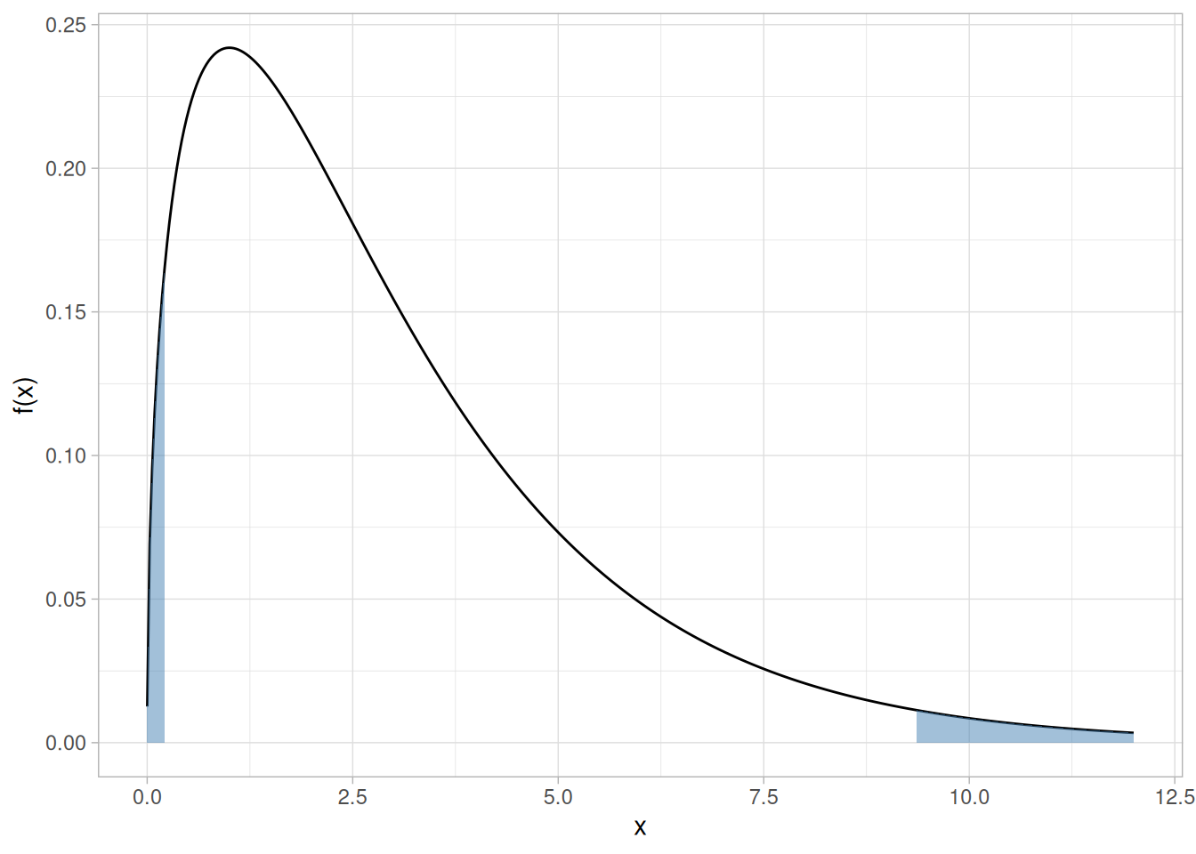
Given a specified value of \(\alpha\):
Upper-tail critical values of chi-square distribution with \(\nu\) degrees of freedom
p_upper <- c(0.90, 0.95, 0.975, 0.99, 0.999)
crossing(nu = 1:100, p = p_upper) |>
mutate(x = qchisq(p, df = nu)) |>
pivot_wider(names_from = p, values_from = x, names_prefix = "p") |>
knitr::kable(digits = 3, col.names = c("nu", as.character(p_upper)))| nu | 0.9 | 0.95 | 0.975 | 0.99 | 0.999 |
|---|---|---|---|---|---|
| 1 | 2.706 | 3.841 | 5.024 | 6.635 | 10.828 |
| 2 | 4.605 | 5.991 | 7.378 | 9.210 | 13.816 |
| 3 | 6.251 | 7.815 | 9.348 | 11.345 | 16.266 |
| 4 | 7.779 | 9.488 | 11.143 | 13.277 | 18.467 |
| 5 | 9.236 | 11.070 | 12.833 | 15.086 | 20.515 |
| 6 | 10.645 | 12.592 | 14.449 | 16.812 | 22.458 |
| 7 | 12.017 | 14.067 | 16.013 | 18.475 | 24.322 |
| 8 | 13.362 | 15.507 | 17.535 | 20.090 | 26.124 |
| 9 | 14.684 | 16.919 | 19.023 | 21.666 | 27.877 |
| 10 | 15.987 | 18.307 | 20.483 | 23.209 | 29.588 |
| 11 | 17.275 | 19.675 | 21.920 | 24.725 | 31.264 |
| 12 | 18.549 | 21.026 | 23.337 | 26.217 | 32.909 |
| 13 | 19.812 | 22.362 | 24.736 | 27.688 | 34.528 |
| 14 | 21.064 | 23.685 | 26.119 | 29.141 | 36.123 |
| 15 | 22.307 | 24.996 | 27.488 | 30.578 | 37.697 |
| 16 | 23.542 | 26.296 | 28.845 | 32.000 | 39.252 |
| 17 | 24.769 | 27.587 | 30.191 | 33.409 | 40.790 |
| 18 | 25.989 | 28.869 | 31.526 | 34.805 | 42.312 |
| 19 | 27.204 | 30.144 | 32.852 | 36.191 | 43.820 |
| 20 | 28.412 | 31.410 | 34.170 | 37.566 | 45.315 |
| 21 | 29.615 | 32.671 | 35.479 | 38.932 | 46.797 |
| 22 | 30.813 | 33.924 | 36.781 | 40.289 | 48.268 |
| 23 | 32.007 | 35.172 | 38.076 | 41.638 | 49.728 |
| 24 | 33.196 | 36.415 | 39.364 | 42.980 | 51.179 |
| 25 | 34.382 | 37.652 | 40.646 | 44.314 | 52.620 |
| 26 | 35.563 | 38.885 | 41.923 | 45.642 | 54.052 |
| 27 | 36.741 | 40.113 | 43.195 | 46.963 | 55.476 |
| 28 | 37.916 | 41.337 | 44.461 | 48.278 | 56.892 |
| 29 | 39.087 | 42.557 | 45.722 | 49.588 | 58.301 |
| 30 | 40.256 | 43.773 | 46.979 | 50.892 | 59.703 |
| 31 | 41.422 | 44.985 | 48.232 | 52.191 | 61.098 |
| 32 | 42.585 | 46.194 | 49.480 | 53.486 | 62.487 |
| 33 | 43.745 | 47.400 | 50.725 | 54.776 | 63.870 |
| 34 | 44.903 | 48.602 | 51.966 | 56.061 | 65.247 |
| 35 | 46.059 | 49.802 | 53.203 | 57.342 | 66.619 |
| 36 | 47.212 | 50.998 | 54.437 | 58.619 | 67.985 |
| 37 | 48.363 | 52.192 | 55.668 | 59.893 | 69.346 |
| 38 | 49.513 | 53.384 | 56.896 | 61.162 | 70.703 |
| 39 | 50.660 | 54.572 | 58.120 | 62.428 | 72.055 |
| 40 | 51.805 | 55.758 | 59.342 | 63.691 | 73.402 |
| 41 | 52.949 | 56.942 | 60.561 | 64.950 | 74.745 |
| 42 | 54.090 | 58.124 | 61.777 | 66.206 | 76.084 |
| 43 | 55.230 | 59.304 | 62.990 | 67.459 | 77.419 |
| 44 | 56.369 | 60.481 | 64.201 | 68.710 | 78.750 |
| 45 | 57.505 | 61.656 | 65.410 | 69.957 | 80.077 |
| 46 | 58.641 | 62.830 | 66.617 | 71.201 | 81.400 |
| 47 | 59.774 | 64.001 | 67.821 | 72.443 | 82.720 |
| 48 | 60.907 | 65.171 | 69.023 | 73.683 | 84.037 |
| 49 | 62.038 | 66.339 | 70.222 | 74.919 | 85.351 |
| 50 | 63.167 | 67.505 | 71.420 | 76.154 | 86.661 |
| 51 | 64.295 | 68.669 | 72.616 | 77.386 | 87.968 |
| 52 | 65.422 | 69.832 | 73.810 | 78.616 | 89.272 |
| 53 | 66.548 | 70.993 | 75.002 | 79.843 | 90.573 |
| 54 | 67.673 | 72.153 | 76.192 | 81.069 | 91.872 |
| 55 | 68.796 | 73.311 | 77.380 | 82.292 | 93.168 |
| 56 | 69.919 | 74.468 | 78.567 | 83.513 | 94.461 |
| 57 | 71.040 | 75.624 | 79.752 | 84.733 | 95.751 |
| 58 | 72.160 | 76.778 | 80.936 | 85.950 | 97.039 |
| 59 | 73.279 | 77.931 | 82.117 | 87.166 | 98.324 |
| 60 | 74.397 | 79.082 | 83.298 | 88.379 | 99.607 |
| 61 | 75.514 | 80.232 | 84.476 | 89.591 | 100.888 |
| 62 | 76.630 | 81.381 | 85.654 | 90.802 | 102.166 |
| 63 | 77.745 | 82.529 | 86.830 | 92.010 | 103.442 |
| 64 | 78.860 | 83.675 | 88.004 | 93.217 | 104.716 |
| 65 | 79.973 | 84.821 | 89.177 | 94.422 | 105.988 |
| 66 | 81.085 | 85.965 | 90.349 | 95.626 | 107.258 |
| 67 | 82.197 | 87.108 | 91.519 | 96.828 | 108.526 |
| 68 | 83.308 | 88.250 | 92.689 | 98.028 | 109.791 |
| 69 | 84.418 | 89.391 | 93.856 | 99.228 | 111.055 |
| 70 | 85.527 | 90.531 | 95.023 | 100.425 | 112.317 |
| 71 | 86.635 | 91.670 | 96.189 | 101.621 | 113.577 |
| 72 | 87.743 | 92.808 | 97.353 | 102.816 | 114.835 |
| 73 | 88.850 | 93.945 | 98.516 | 104.010 | 116.092 |
| 74 | 89.956 | 95.081 | 99.678 | 105.202 | 117.346 |
| 75 | 91.061 | 96.217 | 100.839 | 106.393 | 118.599 |
| 76 | 92.166 | 97.351 | 101.999 | 107.583 | 119.850 |
| 77 | 93.270 | 98.484 | 103.158 | 108.771 | 121.100 |
| 78 | 94.374 | 99.617 | 104.316 | 109.958 | 122.348 |
| 79 | 95.476 | 100.749 | 105.473 | 111.144 | 123.594 |
| 80 | 96.578 | 101.879 | 106.629 | 112.329 | 124.839 |
| 81 | 97.680 | 103.010 | 107.783 | 113.512 | 126.083 |
| 82 | 98.780 | 104.139 | 108.937 | 114.695 | 127.324 |
| 83 | 99.880 | 105.267 | 110.090 | 115.876 | 128.565 |
| 84 | 100.980 | 106.395 | 111.242 | 117.057 | 129.804 |
| 85 | 102.079 | 107.522 | 112.393 | 118.236 | 131.041 |
| 86 | 103.177 | 108.648 | 113.544 | 119.414 | 132.277 |
| 87 | 104.275 | 109.773 | 114.693 | 120.591 | 133.512 |
| 88 | 105.372 | 110.898 | 115.841 | 121.767 | 134.745 |
| 89 | 106.469 | 112.022 | 116.989 | 122.942 | 135.978 |
| 90 | 107.565 | 113.145 | 118.136 | 124.116 | 137.208 |
| 91 | 108.661 | 114.268 | 119.282 | 125.289 | 138.438 |
| 92 | 109.756 | 115.390 | 120.427 | 126.462 | 139.666 |
| 93 | 110.850 | 116.511 | 121.571 | 127.633 | 140.893 |
| 94 | 111.944 | 117.632 | 122.715 | 128.803 | 142.119 |
| 95 | 113.038 | 118.752 | 123.858 | 129.973 | 143.344 |
| 96 | 114.131 | 119.871 | 125.000 | 131.141 | 144.567 |
| 97 | 115.223 | 120.990 | 126.141 | 132.309 | 145.789 |
| 98 | 116.315 | 122.108 | 127.282 | 133.476 | 147.010 |
| 99 | 117.407 | 123.225 | 128.422 | 134.642 | 148.230 |
| 100 | 118.498 | 124.342 | 129.561 | 135.807 | 149.449 |
Lower-tail critical values of chi-square distribution with \(\nu\) degrees of freedom
p_lower <- c(0.10, 0.05, 0.025, 0.01, 0.001)
crossing(nu = 1:100, p = p_lower) |>
mutate(x = qchisq(p, df = nu)) |>
pivot_wider(names_from = p, values_from = x, names_prefix = "p") |>
knitr::kable(digits = 3, col.names = c("nu", as.character(p_lower)))| nu | 0.1 | 0.05 | 0.025 | 0.01 | 0.001 |
|---|---|---|---|---|---|
| 1 | 0.000 | 0.000 | 0.001 | 0.004 | 0.016 |
| 2 | 0.002 | 0.020 | 0.051 | 0.103 | 0.211 |
| 3 | 0.024 | 0.115 | 0.216 | 0.352 | 0.584 |
| 4 | 0.091 | 0.297 | 0.484 | 0.711 | 1.064 |
| 5 | 0.210 | 0.554 | 0.831 | 1.145 | 1.610 |
| 6 | 0.381 | 0.872 | 1.237 | 1.635 | 2.204 |
| 7 | 0.598 | 1.239 | 1.690 | 2.167 | 2.833 |
| 8 | 0.857 | 1.646 | 2.180 | 2.733 | 3.490 |
| 9 | 1.152 | 2.088 | 2.700 | 3.325 | 4.168 |
| 10 | 1.479 | 2.558 | 3.247 | 3.940 | 4.865 |
| 11 | 1.834 | 3.053 | 3.816 | 4.575 | 5.578 |
| 12 | 2.214 | 3.571 | 4.404 | 5.226 | 6.304 |
| 13 | 2.617 | 4.107 | 5.009 | 5.892 | 7.042 |
| 14 | 3.041 | 4.660 | 5.629 | 6.571 | 7.790 |
| 15 | 3.483 | 5.229 | 6.262 | 7.261 | 8.547 |
| 16 | 3.942 | 5.812 | 6.908 | 7.962 | 9.312 |
| 17 | 4.416 | 6.408 | 7.564 | 8.672 | 10.085 |
| 18 | 4.905 | 7.015 | 8.231 | 9.390 | 10.865 |
| 19 | 5.407 | 7.633 | 8.907 | 10.117 | 11.651 |
| 20 | 5.921 | 8.260 | 9.591 | 10.851 | 12.443 |
| 21 | 6.447 | 8.897 | 10.283 | 11.591 | 13.240 |
| 22 | 6.983 | 9.542 | 10.982 | 12.338 | 14.041 |
| 23 | 7.529 | 10.196 | 11.689 | 13.091 | 14.848 |
| 24 | 8.085 | 10.856 | 12.401 | 13.848 | 15.659 |
| 25 | 8.649 | 11.524 | 13.120 | 14.611 | 16.473 |
| 26 | 9.222 | 12.198 | 13.844 | 15.379 | 17.292 |
| 27 | 9.803 | 12.879 | 14.573 | 16.151 | 18.114 |
| 28 | 10.391 | 13.565 | 15.308 | 16.928 | 18.939 |
| 29 | 10.986 | 14.256 | 16.047 | 17.708 | 19.768 |
| 30 | 11.588 | 14.953 | 16.791 | 18.493 | 20.599 |
| 31 | 12.196 | 15.655 | 17.539 | 19.281 | 21.434 |
| 32 | 12.811 | 16.362 | 18.291 | 20.072 | 22.271 |
| 33 | 13.431 | 17.074 | 19.047 | 20.867 | 23.110 |
| 34 | 14.057 | 17.789 | 19.806 | 21.664 | 23.952 |
| 35 | 14.688 | 18.509 | 20.569 | 22.465 | 24.797 |
| 36 | 15.324 | 19.233 | 21.336 | 23.269 | 25.643 |
| 37 | 15.965 | 19.960 | 22.106 | 24.075 | 26.492 |
| 38 | 16.611 | 20.691 | 22.878 | 24.884 | 27.343 |
| 39 | 17.262 | 21.426 | 23.654 | 25.695 | 28.196 |
| 40 | 17.916 | 22.164 | 24.433 | 26.509 | 29.051 |
| 41 | 18.575 | 22.906 | 25.215 | 27.326 | 29.907 |
| 42 | 19.239 | 23.650 | 25.999 | 28.144 | 30.765 |
| 43 | 19.906 | 24.398 | 26.785 | 28.965 | 31.625 |
| 44 | 20.576 | 25.148 | 27.575 | 29.787 | 32.487 |
| 45 | 21.251 | 25.901 | 28.366 | 30.612 | 33.350 |
| 46 | 21.929 | 26.657 | 29.160 | 31.439 | 34.215 |
| 47 | 22.610 | 27.416 | 29.956 | 32.268 | 35.081 |
| 48 | 23.295 | 28.177 | 30.755 | 33.098 | 35.949 |
| 49 | 23.983 | 28.941 | 31.555 | 33.930 | 36.818 |
| 50 | 24.674 | 29.707 | 32.357 | 34.764 | 37.689 |
| 51 | 25.368 | 30.475 | 33.162 | 35.600 | 38.560 |
| 52 | 26.065 | 31.246 | 33.968 | 36.437 | 39.433 |
| 53 | 26.765 | 32.018 | 34.776 | 37.276 | 40.308 |
| 54 | 27.468 | 32.793 | 35.586 | 38.116 | 41.183 |
| 55 | 28.173 | 33.570 | 36.398 | 38.958 | 42.060 |
| 56 | 28.881 | 34.350 | 37.212 | 39.801 | 42.937 |
| 57 | 29.592 | 35.131 | 38.027 | 40.646 | 43.816 |
| 58 | 30.305 | 35.913 | 38.844 | 41.492 | 44.696 |
| 59 | 31.020 | 36.698 | 39.662 | 42.339 | 45.577 |
| 60 | 31.738 | 37.485 | 40.482 | 43.188 | 46.459 |
| 61 | 32.459 | 38.273 | 41.303 | 44.038 | 47.342 |
| 62 | 33.181 | 39.063 | 42.126 | 44.889 | 48.226 |
| 63 | 33.906 | 39.855 | 42.950 | 45.741 | 49.111 |
| 64 | 34.633 | 40.649 | 43.776 | 46.595 | 49.996 |
| 65 | 35.362 | 41.444 | 44.603 | 47.450 | 50.883 |
| 66 | 36.093 | 42.240 | 45.431 | 48.305 | 51.770 |
| 67 | 36.826 | 43.038 | 46.261 | 49.162 | 52.659 |
| 68 | 37.561 | 43.838 | 47.092 | 50.020 | 53.548 |
| 69 | 38.298 | 44.639 | 47.924 | 50.879 | 54.438 |
| 70 | 39.036 | 45.442 | 48.758 | 51.739 | 55.329 |
| 71 | 39.777 | 46.246 | 49.592 | 52.600 | 56.221 |
| 72 | 40.519 | 47.051 | 50.428 | 53.462 | 57.113 |
| 73 | 41.264 | 47.858 | 51.265 | 54.325 | 58.006 |
| 74 | 42.010 | 48.666 | 52.103 | 55.189 | 58.900 |
| 75 | 42.757 | 49.475 | 52.942 | 56.054 | 59.795 |
| 76 | 43.507 | 50.286 | 53.782 | 56.920 | 60.690 |
| 77 | 44.258 | 51.097 | 54.623 | 57.786 | 61.586 |
| 78 | 45.010 | 51.910 | 55.466 | 58.654 | 62.483 |
| 79 | 45.764 | 52.725 | 56.309 | 59.522 | 63.380 |
| 80 | 46.520 | 53.540 | 57.153 | 60.391 | 64.278 |
| 81 | 47.277 | 54.357 | 57.998 | 61.261 | 65.176 |
| 82 | 48.036 | 55.174 | 58.845 | 62.132 | 66.076 |
| 83 | 48.796 | 55.993 | 59.692 | 63.004 | 66.976 |
| 84 | 49.557 | 56.813 | 60.540 | 63.876 | 67.876 |
| 85 | 50.320 | 57.634 | 61.389 | 64.749 | 68.777 |
| 86 | 51.085 | 58.456 | 62.239 | 65.623 | 69.679 |
| 87 | 51.850 | 59.279 | 63.089 | 66.498 | 70.581 |
| 88 | 52.617 | 60.103 | 63.941 | 67.373 | 71.484 |
| 89 | 53.386 | 60.928 | 64.793 | 68.249 | 72.387 |
| 90 | 54.155 | 61.754 | 65.647 | 69.126 | 73.291 |
| 91 | 54.926 | 62.581 | 66.501 | 70.003 | 74.196 |
| 92 | 55.698 | 63.409 | 67.356 | 70.882 | 75.100 |
| 93 | 56.472 | 64.238 | 68.211 | 71.760 | 76.006 |
| 94 | 57.246 | 65.068 | 69.068 | 72.640 | 76.912 |
| 95 | 58.022 | 65.898 | 69.925 | 73.520 | 77.818 |
| 96 | 58.799 | 66.730 | 70.783 | 74.401 | 78.725 |
| 97 | 59.577 | 67.562 | 71.642 | 75.282 | 79.633 |
| 98 | 60.356 | 68.396 | 72.501 | 76.164 | 80.541 |
| 99 | 61.137 | 69.230 | 73.361 | 77.046 | 81.449 |
| 100 | 61.918 | 70.065 | 74.222 | 77.929 | 82.358 |
This table contains upper critical values of the t* distribution that are appropriate for determining whether or not a calibration line is in a state of statistical control from measurements on a check standard at three points in the calibration interval. A test statistic with \(\nu\) degrees of freedom is compared with the critical value. If the absolute value of the test statistic exceeds the tabled value, the calibration of the instrument is judged to be out of control.
Unlike the other tables in this section, the t* distribution has no simple closed-form generating function — the values below were determined by NIST from simulation studies specific to this calibration application, so they are reproduced here directly from the original table rather than computed from an R distribution function.
Upper critical values of t* distribution at significance level 0.05 for testing the output of a linear calibration line at 3 points
library(tidyverse)
t_star <- c(
37.544, 7.582, 4.826, 3.941, 3.518, 3.274, 3.115, 3.004, 2.923, 2.860,
2.811, 2.770, 2.737, 2.709, 2.685, 2.665, 2.647, 2.631, 2.617, 2.605,
2.594, 2.584, 2.574, 2.566, 2.558, 2.551, 2.545, 2.539, 2.534, 2.528,
2.524, 2.519, 2.515, 2.511, 2.507, 2.504, 2.501, 2.498, 2.495, 2.492,
2.489, 2.487, 2.484, 2.482, 2.480, 2.478, 2.476, 2.474, 2.472, 2.470,
2.469, 2.467, 2.466, 2.464, 2.463, 2.461, 2.460, 2.459, 2.457, 2.456,
2.455, 2.454, 2.453, 2.452, 2.451, 2.450, 2.449, 2.448, 2.447, 2.446,
2.445, 2.445, 2.444, 2.443, 2.442, 2.441, 2.441, 2.440, 2.439, 2.439,
2.438, 2.437, 2.437, 2.436, 2.436, 2.435, 2.435, 2.434, 2.434, 2.433,
2.432, 2.432, 2.431, 2.431, 2.431, 2.430, 2.430, 2.429, 2.429, 2.428,
2.428, 2.428, 2.427, 2.427, 2.426, 2.426, 2.426, 2.425, 2.425, 2.425,
2.424, 2.424, 2.424, 2.423, 2.423, 2.423, 2.422, 2.422, 2.422, 2.422
)
tibble(
nu_a = 1:60, t_a = t_star[1:60],
nu_b = 61:120, t_b = t_star[61:120]
) |>
knitr::kable(
digits = 3,
col.names = c("nu", "t*(.05)(nu)", "nu", "t*(.05)(nu)")
)| nu | t*(.05)(nu) | nu | t*(.05)(nu) |
|---|---|---|---|
| 1 | 37.544 | 61 | 2.455 |
| 2 | 7.582 | 62 | 2.454 |
| 3 | 4.826 | 63 | 2.453 |
| 4 | 3.941 | 64 | 2.452 |
| 5 | 3.518 | 65 | 2.451 |
| 6 | 3.274 | 66 | 2.450 |
| 7 | 3.115 | 67 | 2.449 |
| 8 | 3.004 | 68 | 2.448 |
| 9 | 2.923 | 69 | 2.447 |
| 10 | 2.860 | 70 | 2.446 |
| 11 | 2.811 | 71 | 2.445 |
| 12 | 2.770 | 72 | 2.445 |
| 13 | 2.737 | 73 | 2.444 |
| 14 | 2.709 | 74 | 2.443 |
| 15 | 2.685 | 75 | 2.442 |
| 16 | 2.665 | 76 | 2.441 |
| 17 | 2.647 | 77 | 2.441 |
| 18 | 2.631 | 78 | 2.440 |
| 19 | 2.617 | 79 | 2.439 |
| 20 | 2.605 | 80 | 2.439 |
| 21 | 2.594 | 81 | 2.438 |
| 22 | 2.584 | 82 | 2.437 |
| 23 | 2.574 | 83 | 2.437 |
| 24 | 2.566 | 84 | 2.436 |
| 25 | 2.558 | 85 | 2.436 |
| 26 | 2.551 | 86 | 2.435 |
| 27 | 2.545 | 87 | 2.435 |
| 28 | 2.539 | 88 | 2.434 |
| 29 | 2.534 | 89 | 2.434 |
| 30 | 2.528 | 90 | 2.433 |
| 31 | 2.524 | 91 | 2.432 |
| 32 | 2.519 | 92 | 2.432 |
| 33 | 2.515 | 93 | 2.431 |
| 34 | 2.511 | 94 | 2.431 |
| 35 | 2.507 | 95 | 2.431 |
| 36 | 2.504 | 96 | 2.430 |
| 37 | 2.501 | 97 | 2.430 |
| 38 | 2.498 | 98 | 2.429 |
| 39 | 2.495 | 99 | 2.429 |
| 40 | 2.492 | 100 | 2.428 |
| 41 | 2.489 | 101 | 2.428 |
| 42 | 2.487 | 102 | 2.428 |
| 43 | 2.484 | 103 | 2.427 |
| 44 | 2.482 | 104 | 2.427 |
| 45 | 2.480 | 105 | 2.426 |
| 46 | 2.478 | 106 | 2.426 |
| 47 | 2.476 | 107 | 2.426 |
| 48 | 2.474 | 108 | 2.425 |
| 49 | 2.472 | 109 | 2.425 |
| 50 | 2.470 | 110 | 2.425 |
| 51 | 2.469 | 111 | 2.424 |
| 52 | 2.467 | 112 | 2.424 |
| 53 | 2.466 | 113 | 2.424 |
| 54 | 2.464 | 114 | 2.423 |
| 55 | 2.463 | 115 | 2.423 |
| 56 | 2.461 | 116 | 2.423 |
| 57 | 2.460 | 117 | 2.422 |
| 58 | 2.459 | 118 | 2.422 |
| 59 | 2.457 | 119 | 2.422 |
| 60 | 2.456 | 120 | 2.422 |
This table contains the critical values of the normal probability plot correlation coefficient (PPCC) distribution that are appropriate for determining whether or not a data set came from a population with approximately a normal distribution. It is used in conjunction with a normal probability plot. The test statistic is the correlation coefficient of the points that make up a normal probability plot. This test statistic is compared with the critical value below. If the test statistic is less than the tabulated value, the null hypothesis that the data came from a population with a normal distribution is rejected.
For example, suppose a set of 50 data points had a correlation coefficient of 0.985 from the normal probability plot. At the 5% significance level, the critical value is 0.9761. Since 0.985 is greater than 0.9761, we cannot reject the null hypothesis that the data came from a population with a normal distribution.
Since perfect normality implies perfect correlation (i.e., a correlation value of 1), we are only interested in rejecting normality for correlation values that are too low. That is, this is a lower one-tailed test.
The values in this table were determined from simulation studies by Filliben and Devaney (Filliben 1975; Devaney 1997). Like the t* distribution table, these values have no simple closed-form generating function, so they are reproduced here directly from the original table rather than computed from an R distribution function.
Critical values of the normal PPCC for testing if data come from a normal distribution
library(tidyverse)
n <- c(3,4,5,6,7,8,9,10,11,12,13,14,15,16,17,18,19,20,21,22,23,24,25,26,27,28,29,30,
31,32,33,34,35,36,37,38,39,40,41,42,43,44,45,46,47,48,49,50,55,60,65,70,75,
80,85,90,95,100,110,120,130,140,150,160,170,180,190,200,210,220,230,240,250,
260,270,280,290,300,310,320,330,340,350,360,370,380,390,400,410,420,430,440,
450,460,470,480,490,500,525,550,575,600,625,650,675,700,725,750,775,800,825,
850,875,900,925,950,975,1000)
p01 <- c(0.8687,0.8234,0.8240,0.8351,0.8474,0.8590,0.8689,0.8765,0.8838,0.8918,0.8974,
0.9029,0.9080,0.9121,0.9160,0.9196,0.9230,0.9256,0.9285,0.9308,0.9334,0.9356,
0.9370,0.9393,0.9413,0.9428,0.9441,0.9462,0.9476,0.9490,0.9505,0.9521,0.9530,
0.9540,0.9551,0.9555,0.9568,0.9576,0.9589,0.9593,0.9609,0.9611,0.9620,0.9629,
0.9637,0.9640,0.9643,0.9654,0.9683,0.9706,0.9723,0.9742,0.9758,0.9771,0.9784,
0.9797,0.9804,0.9814,0.9830,0.9841,0.9854,0.9865,0.9871,0.9879,0.9887,0.9891,
0.9897,0.9903,0.9907,0.9910,0.9914,0.9917,0.9921,0.9924,0.9926,0.9929,0.9931,
0.9933,0.9936,0.9937,0.9939,0.9941,0.9942,0.9944,0.9945,0.9947,0.9948,0.9949,
0.9950,0.9951,0.9953,0.9954,0.9954,0.9955,0.9956,0.9957,0.9958,0.9959,0.9961,
0.9963,0.9964,0.9965,0.9967,0.9968,0.9969,0.9970,0.9971,0.9972,0.9973,0.9974,
0.9975,0.9975,0.9976,0.9977,0.9977,0.9978,0.9978,0.9979)
p05 <- c(0.8790,0.8666,0.8786,0.8880,0.8970,0.9043,0.9115,0.9173,0.9223,0.9267,0.9310,
0.9343,0.9376,0.9405,0.9433,0.9452,0.9479,0.9498,0.9515,0.9535,0.9548,0.9564,
0.9575,0.9590,0.9600,0.9615,0.9622,0.9634,0.9644,0.9652,0.9661,0.9671,0.9678,
0.9686,0.9693,0.9700,0.9704,0.9712,0.9719,0.9723,0.9730,0.9734,0.9739,0.9744,
0.9748,0.9753,0.9758,0.9761,0.9781,0.9797,0.9809,0.9822,0.9831,0.9841,0.9850,
0.9857,0.9864,0.9869,0.9881,0.9889,0.9897,0.9904,0.9909,0.9915,0.9919,0.9923,
0.9927,0.9930,0.9933,0.9936,0.9939,0.9941,0.9943,0.9945,0.9947,0.9949,0.9951,
0.9952,0.9954,0.9955,0.9956,0.9957,0.9958,0.9959,0.9960,0.9961,0.9962,0.9963,
0.9964,0.9965,0.9966,0.9966,0.9967,0.9968,0.9968,0.9969,0.9969,0.9970,0.9972,
0.9973,0.9974,0.9975,0.9976,0.9977,0.9977,0.9978,0.9979,0.9980,0.9980,0.9981,
0.9981,0.9982,0.9982,0.9983,0.9983,0.9984,0.9984,0.9984)
tibble(N = n, `0.01` = p01, `0.05` = p05) |>
knitr::kable(digits = 4)| N | 0.01 | 0.05 |
|---|---|---|
| 3 | 0.8687 | 0.8790 |
| 4 | 0.8234 | 0.8666 |
| 5 | 0.8240 | 0.8786 |
| 6 | 0.8351 | 0.8880 |
| 7 | 0.8474 | 0.8970 |
| 8 | 0.8590 | 0.9043 |
| 9 | 0.8689 | 0.9115 |
| 10 | 0.8765 | 0.9173 |
| 11 | 0.8838 | 0.9223 |
| 12 | 0.8918 | 0.9267 |
| 13 | 0.8974 | 0.9310 |
| 14 | 0.9029 | 0.9343 |
| 15 | 0.9080 | 0.9376 |
| 16 | 0.9121 | 0.9405 |
| 17 | 0.9160 | 0.9433 |
| 18 | 0.9196 | 0.9452 |
| 19 | 0.9230 | 0.9479 |
| 20 | 0.9256 | 0.9498 |
| 21 | 0.9285 | 0.9515 |
| 22 | 0.9308 | 0.9535 |
| 23 | 0.9334 | 0.9548 |
| 24 | 0.9356 | 0.9564 |
| 25 | 0.9370 | 0.9575 |
| 26 | 0.9393 | 0.9590 |
| 27 | 0.9413 | 0.9600 |
| 28 | 0.9428 | 0.9615 |
| 29 | 0.9441 | 0.9622 |
| 30 | 0.9462 | 0.9634 |
| 31 | 0.9476 | 0.9644 |
| 32 | 0.9490 | 0.9652 |
| 33 | 0.9505 | 0.9661 |
| 34 | 0.9521 | 0.9671 |
| 35 | 0.9530 | 0.9678 |
| 36 | 0.9540 | 0.9686 |
| 37 | 0.9551 | 0.9693 |
| 38 | 0.9555 | 0.9700 |
| 39 | 0.9568 | 0.9704 |
| 40 | 0.9576 | 0.9712 |
| 41 | 0.9589 | 0.9719 |
| 42 | 0.9593 | 0.9723 |
| 43 | 0.9609 | 0.9730 |
| 44 | 0.9611 | 0.9734 |
| 45 | 0.9620 | 0.9739 |
| 46 | 0.9629 | 0.9744 |
| 47 | 0.9637 | 0.9748 |
| 48 | 0.9640 | 0.9753 |
| 49 | 0.9643 | 0.9758 |
| 50 | 0.9654 | 0.9761 |
| 55 | 0.9683 | 0.9781 |
| 60 | 0.9706 | 0.9797 |
| 65 | 0.9723 | 0.9809 |
| 70 | 0.9742 | 0.9822 |
| 75 | 0.9758 | 0.9831 |
| 80 | 0.9771 | 0.9841 |
| 85 | 0.9784 | 0.9850 |
| 90 | 0.9797 | 0.9857 |
| 95 | 0.9804 | 0.9864 |
| 100 | 0.9814 | 0.9869 |
| 110 | 0.9830 | 0.9881 |
| 120 | 0.9841 | 0.9889 |
| 130 | 0.9854 | 0.9897 |
| 140 | 0.9865 | 0.9904 |
| 150 | 0.9871 | 0.9909 |
| 160 | 0.9879 | 0.9915 |
| 170 | 0.9887 | 0.9919 |
| 180 | 0.9891 | 0.9923 |
| 190 | 0.9897 | 0.9927 |
| 200 | 0.9903 | 0.9930 |
| 210 | 0.9907 | 0.9933 |
| 220 | 0.9910 | 0.9936 |
| 230 | 0.9914 | 0.9939 |
| 240 | 0.9917 | 0.9941 |
| 250 | 0.9921 | 0.9943 |
| 260 | 0.9924 | 0.9945 |
| 270 | 0.9926 | 0.9947 |
| 280 | 0.9929 | 0.9949 |
| 290 | 0.9931 | 0.9951 |
| 300 | 0.9933 | 0.9952 |
| 310 | 0.9936 | 0.9954 |
| 320 | 0.9937 | 0.9955 |
| 330 | 0.9939 | 0.9956 |
| 340 | 0.9941 | 0.9957 |
| 350 | 0.9942 | 0.9958 |
| 360 | 0.9944 | 0.9959 |
| 370 | 0.9945 | 0.9960 |
| 380 | 0.9947 | 0.9961 |
| 390 | 0.9948 | 0.9962 |
| 400 | 0.9949 | 0.9963 |
| 410 | 0.9950 | 0.9964 |
| 420 | 0.9951 | 0.9965 |
| 430 | 0.9953 | 0.9966 |
| 440 | 0.9954 | 0.9966 |
| 450 | 0.9954 | 0.9967 |
| 460 | 0.9955 | 0.9968 |
| 470 | 0.9956 | 0.9968 |
| 480 | 0.9957 | 0.9969 |
| 490 | 0.9958 | 0.9969 |
| 500 | 0.9959 | 0.9970 |
| 525 | 0.9961 | 0.9972 |
| 550 | 0.9963 | 0.9973 |
| 575 | 0.9964 | 0.9974 |
| 600 | 0.9965 | 0.9975 |
| 625 | 0.9967 | 0.9976 |
| 650 | 0.9968 | 0.9977 |
| 675 | 0.9969 | 0.9977 |
| 700 | 0.9970 | 0.9978 |
| 725 | 0.9971 | 0.9979 |
| 750 | 0.9972 | 0.9980 |
| 775 | 0.9973 | 0.9980 |
| 800 | 0.9974 | 0.9981 |
| 825 | 0.9975 | 0.9981 |
| 850 | 0.9975 | 0.9982 |
| 875 | 0.9976 | 0.9982 |
| 900 | 0.9977 | 0.9983 |
| 925 | 0.9977 | 0.9983 |
| 950 | 0.9978 | 0.9984 |
| 975 | 0.9978 | 0.9984 |
| 1000 | 0.9979 | 0.9984 |
This section presents a series of case studies that demonstrate the application of EDA methods to specific problems. In some cases, we have focused on just one EDA technique that uncovers virtually all there is to know about the data. For other case studies, we need several EDA techniques, the selection of which is dictated by the outcome of the previous step in the analysis sequence. Note in these case studies how the flow of the analysis is motivated by the focus on underlying assumptions and general EDA principles.
Purpose
The purpose of the first eight case studies is to show how EDA graphics and quantitative measures and tests are applied to data from scientific processes and to critique those data with regard to the following assumptions that typically underlie a measurement process; namely, that the data behave like:
Case studies 9 and 10 show the use of EDA techniques in distributional modeling and the analysis of a designed experiment, respectively.
If the above assumptions are satisfied, the process is said to be statistically “in control,” with the core characteristic of having “predictability.” That is, probability statements can be made about the process, not only in the past, but also in the future. An appropriate model for an “in control” process is
\[Y_i = C + E_i\]
where \(C\) is a constant (the “deterministic” or “structural” component), and where \(E_i\) is the error term (or “random” component).
The constant \(C\) is the average value of the process — it is the primary summary number which shows up on any report. Although \(C\) is (assumed) fixed, it is unknown, and so a primary analysis objective of the engineer is to arrive at an estimate of \(C\).
This goal partitions into 4 sub-goals:
EDA and the routine checking of underlying assumptions provides insight into all of the above.
Assumptions not satisfied
If one or more of the above assumptions is not satisfied, then we use EDA techniques, or some mix of EDA and classical techniques, to find a more appropriate model for the data. That is,
\[Y_i = D + E_i\]
where \(D\) is the deterministic part and \(E\) is an error component.
If the data are not random, then we may investigate fitting some simple time series models to the data. If the constant location and scale assumptions are violated, we may need to investigate the measurement process to see if there is an explanation.
The assumptions on the error term are still quite relevant in the sense that for an appropriate model the error component should follow the assumptions. The criterion for validating the model, or comparing competing models, is framed in terms of these assumptions.
Multivariable data
Although the case studies in this chapter utilize univariate data, the assumptions above are relevant for multivariable data as well. If the data are not univariate, then we are trying to find a model
\[Y_i = F(X_1, \ldots, X_k) + E_i\]
where \(F\) is some function based on one or more variables. The error component, which is a univariate data set, of a good model should satisfy the assumptions given above. The criterion for validating and comparing models is based on how well the error component follows these assumptions.
The load cell calibration case study in the process modeling chapter shows an example of this in the regression context.
First three case studies utilize data with known characteristics
The first three case studies utilize data that are randomly generated from the following distributions:
The other univariate case studies utilize data from scientific processes. The goal is to determine if
\[Y_i = C + E_i\]
is a reasonable model. This is done by testing the underlying assumptions. If the assumptions are satisfied, then an estimate of \(C\) and an estimate of the uncertainty of \(C\) are computed. If the assumptions are not satisfied, we attempt to find a model where the error component does satisfy the underlying assumptions.
Graphical methods that are applied to the data
To test the underlying assumptions, each data set is analyzed using four graphical methods that are particularly suited for this purpose:
There are a number of other techniques for addressing the underlying assumptions. However, the four plots listed above provide an excellent opportunity for addressing all of the assumptions on a single page of graphics.
Additional graphical techniques are used in certain case studies to develop models that do have error components that satisfy the underlying assumptions.
Quantitative methods that are applied to the data
The normal and uniform random number data sets are also analyzed with the following quantitative techniques, which are explained in more detail in an earlier section:
Although the graphical methods applied to the normal and uniform random numbers are sufficient to assess the validity of the underlying assumptions, the quantitative techniques are used to show the different flavor of the graphical and quantitative approaches.
The remaining case studies intermix one or more of these quantitative techniques into the analysis where appropriate.
Univariate (\(Y_i = C + E_i\))
Reliability
Multi-Factor
This example illustrates the univariate analysis of a set of normal random numbers.
Generation
The normal random numbers used in this case study are from a Rand Corporation publication.
The motivation for studying a set of normal random numbers is to illustrate the ideal case where all four underlying assumptions hold.
Software
The analyses used in this case study can be generated using R code. The reader can download the data as a text file (RANDN.DAT).
Data
library(tidyverse)
randn_cs <- read_table(here::here("datasets", "RANDN.DAT"), skip = 25, col_names = FALSE) |>
as.matrix() |>
t() |>
as.numeric()
tibble(y = randn_cs)Goal
The goal of this analysis is threefold:
4-Plot of Data
library(patchwork)
# Same construction used on the 4-Plot and Normal Probability Plot pages.
uniform_medians_cs421 <- function(n) {
i <- seq_len(n)
m <- numeric(n)
m[1] <- 1 - 0.5^(1 / n)
m[n] <- 0.5^(1 / n)
if (n > 2) m[2:(n - 1)] <- (i[2:(n - 1)] - 0.3175) / (n + 0.365)
m
}
four_plot_cs421 <- function(x, hist_bins = 30) {
n <- length(x)
p_run <- tibble(i = seq_len(n), y = x) |>
ggplot(aes(i, y)) +
geom_line() +
labs(x = "Index", y = "Y", title = "Run Sequence Plot") +
theme_light()
p_lag <- tibble(y = x[-1], y_lag = x[-n]) |>
ggplot(aes(y_lag, y)) +
geom_point() +
labs(x = expression(Y[i - 1]), y = expression(Y[i]), title = "Lag Plot") +
theme_light()
p_hist <- tibble(y = x) |>
ggplot(aes(y)) +
geom_histogram(bins = hist_bins, color = "white", fill = "steelblue4") +
labs(x = "Y", y = "Count", title = "Histogram") +
theme_light()
mm <- uniform_medians_cs421(n)
theoretical <- qnorm(mm)
xs <- sort(x)
p_norm <- tibble(theoretical = theoretical, observed = xs) |>
ggplot(aes(theoretical, observed)) +
geom_point(shape = 1) +
geom_smooth(method = "lm", formula = 'y ~ x', se = FALSE, color = "firebrick") +
labs(x = "Theoretical", y = "Ordered Y", title = "Normal Probability Plot") +
theme_light()
(p_run + p_lag) / (p_hist + p_norm)
}
four_plot_cs421(randn_cs)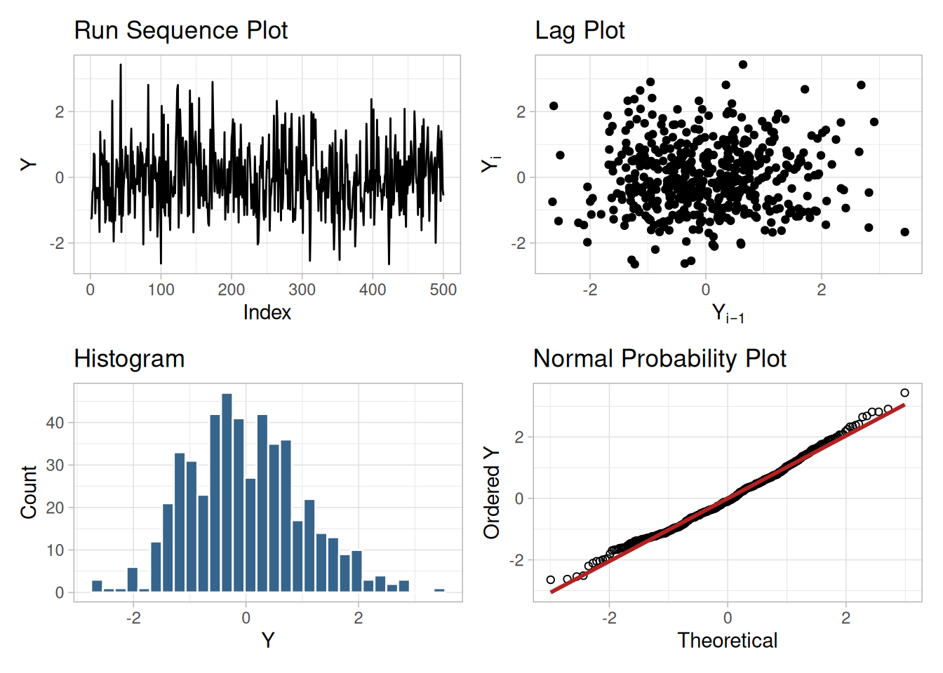
Interpretation
The assumptions are addressed by the graphics shown in Figure 1.226:
From the above plots, we conclude that the underlying assumptions are valid and the data follow approximately a normal distribution. Therefore, the confidence interval form given previously is appropriate for quantifying the uncertainty of the population mean.
The numerical values for this model are given in the Quantitative Output and Interpretation section.
Individual Plots
Although it is usually not necessary, the plots can be generated individually to give more detail.
tibble(i = seq_along(randn_cs), y = randn_cs) |>
ggplot(aes(i, y)) +
geom_line() +
labs(x = "Index", y = "Y") +
theme_light()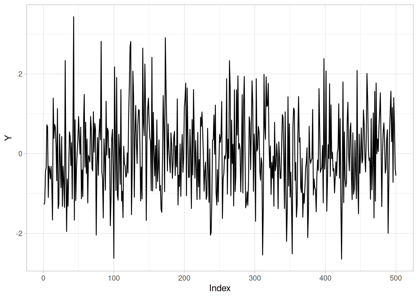
n_cs421 <- length(randn_cs)
tibble(y = randn_cs[-1], y_lag = randn_cs[-n_cs421]) |>
ggplot(aes(y_lag, y)) +
geom_point() +
labs(x = expression(Y[i - 1]), y = expression(Y[i])) +
theme_light()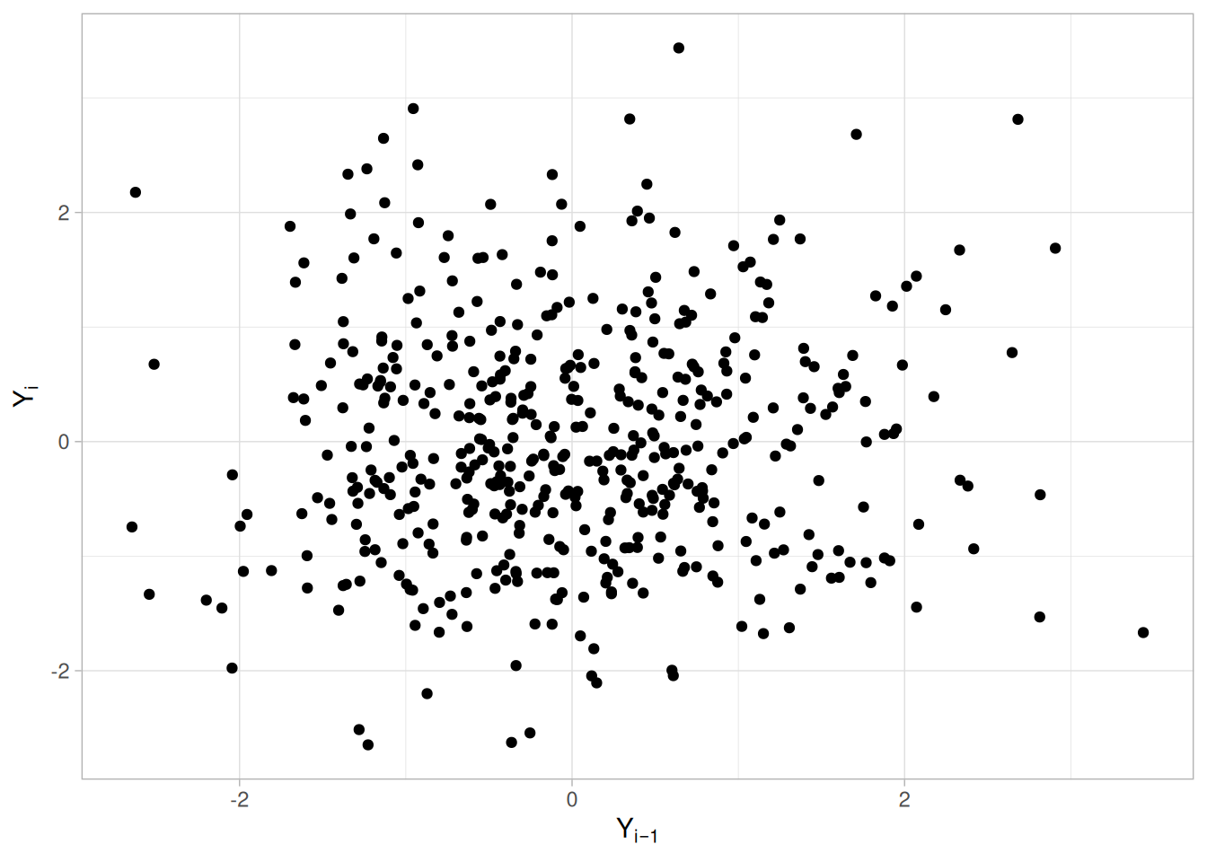
ggplot(tibble(y = randn_cs), aes(y)) +
geom_histogram(aes(y = after_stat(density)), bins = 30, color = "white", fill = "steelblue4") +
stat_function(fun = dnorm, args = list(mean = mean(randn_cs), sd = sd(randn_cs)), color = "firebrick") +
labs(x = "Y", y = "Density") +
theme_light()
theoretical_cs421 <- qnorm(uniform_medians_cs421(n_cs421))
tibble(theoretical = theoretical_cs421, observed = sort(randn_cs)) |>
ggplot(aes(theoretical, observed)) +
geom_point(shape = 1) +
geom_smooth(method = "lm", formula = 'y ~ x', se = FALSE, color = "firebrick") +
labs(x = "Theoretical", y = "Ordered Y") +
theme_light()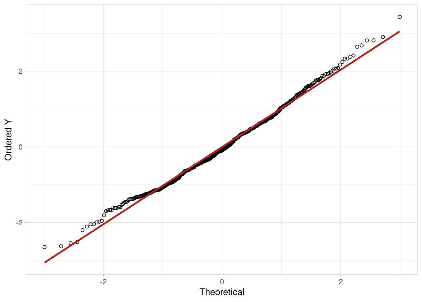
Summary Statistics
As a first step in the analysis, common summary statistics are computed from the data.
tibble(
`Sample Size` = length(randn_cs),
Mean = mean(randn_cs),
Median = median(randn_cs),
Minimum = min(randn_cs),
Maximum = max(randn_cs),
Range = diff(range(randn_cs)),
`Stan. Dev.` = sd(randn_cs)
)Location
One way to quantify a change in location over time is to fit a straight line to the data using an index variable as the independent variable in the regression. For our data, we assume that the data are in sequential run order and that the data were collected at equally spaced time intervals. In our regression, we use the index variable \(X = 1, 2, \ldots, N\), where \(N\) is the number of observations. If there is no significant drift in the location over time, the slope parameter should be zero.
location_fit <- lm(randn_cs ~ seq_along(randn_cs))
summary(location_fit)
Call:
lm(formula = randn_cs ~ seq_along(randn_cs))
Residuals:
Min 1Q Median 3Q Max
-2.6372 -0.7095 -0.0908 0.6485 3.4307
Coefficients:
Estimate Std. Error t value Pr(>|t|)
(Intercept) 6.991e-03 9.155e-02 0.076 0.939
seq_along(randn_cs) -3.963e-05 3.167e-04 -0.125 0.900
Residual standard error: 1.022 on 498 degrees of freedom
Multiple R-squared: 3.145e-05, Adjusted R-squared: -0.001977
F-statistic: 0.01566 on 1 and 498 DF, p-value: 0.9005The absolute value of the t-value for the slope parameter is smaller than the critical value of \(t_{0.975,498} =\) 1.96. Thus, we conclude that the slope is not different from zero at the 0.05 significance level.
Variation
One simple way to detect a change in variation is with Bartlett’s test, after dividing the data set into several equal-sized intervals. The choice of the number of intervals is somewhat arbitrary, although values of four or eight are reasonable. We will divide our data into four intervals.
quarter_cs421 <- as.factor(rep(1:4, each = length(randn_cs) / 4))
bartlett_cs421 <- bartlett.test(randn_cs, quarter_cs421)
bartlett_cs421
Bartlett test of homogeneity of variances
data: randn_cs and quarter_cs421
Bartlett's K-squared = 2.3737, df = 3, p-value = 0.4986\[H_0: \sigma_1^2 = \sigma_2^2 = \sigma_3^2 = \sigma_4^2\] \[H_a: \text{At least one } \sigma_i^2 \text{ is not equal to the others.}\]
Test statistic: \(T \approx\) 2.3737 (NIST reports 2.373660; our computed value matches)
Degrees of freedom: \(k - 1 = 3\)
Significance level: \(\alpha = 0.05\)
Critical value: \(\chi^2_{1-\alpha,k-1} =\) 7.814728
Critical region: Reject \(H_0\) if \(T >\) 7.814728
In this case, Bartlett’s test indicates that the variances are not significantly different in the four intervals.
Randomness
There are many ways in which data can be non-random. However, most common forms of non-randomness can be detected with a few simple tests including the lag plot shown on the previous page.
Another check is an autocorrelation plot that shows the autocorrelations for various lags. Confidence bands can be plotted at the 95% and 99% confidence levels. Points outside this band indicate statistically significant values (lag 0 is always 1).
acf_cs421 <- acf(randn_cs, lag.max = 21, plot = FALSE)
ci95_cs421 <- qnorm(0.975) / sqrt(n_cs421)
ci99_cs421 <- qnorm(0.995) / sqrt(n_cs421)
tibble(lag = as.integer(acf_cs421$lag), acf = as.numeric(acf_cs421$acf)) |>
filter(lag > 0) |>
ggplot(aes(lag, acf)) +
geom_segment(aes(xend = lag, y = 0, yend = acf)) +
geom_hline(yintercept = 0) +
geom_hline(yintercept = c(-ci95_cs421, ci95_cs421), linetype = "dashed", color = "steelblue") +
geom_hline(yintercept = c(-ci99_cs421, ci99_cs421), linetype = "dotted", color = "firebrick") +
labs(x = "Lag", y = "Autocorrelation") +
theme_light()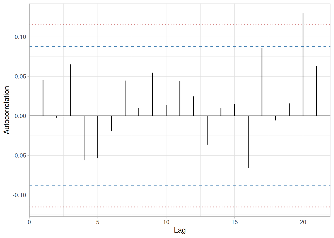
The lag 1 autocorrelation, which is generally the one of most interest, is 0.045. The critical values at the 5% significance level are \(\pm\) 0.088. Since 0.045 is within the critical region, the lag 1 autocorrelation is not statistically significant, so there is no evidence of non-randomness.
A common test for randomness is the runs test.
runs_test_cs421 <- function(y, alpha = 0.05) {
med <- median(y)
sign <- sign(y - med)
sign <- sign[sign != 0]
n1 <- sum(sign == 1)
n2 <- sum(sign == -1)
n <- n1 + n2
R <- 1 + sum(diff(sign) != 0)
Rbar <- 2 * n1 * n2 / n + 1
sR2 <- (2 * n1 * n2 * (2 * n1 * n2 - n)) / (n^2 * (n - 1))
sR <- sqrt(sR2)
Z <- (R - Rbar) / sR
z_crit <- qnorm(1 - alpha / 2)
tibble(n1 = n1, n2 = n2, R = R, Rbar = Rbar, sR = sR, Z = Z, z_crit = z_crit, reject_H0 = abs(Z) > z_crit)
}
randn_runs <- runs_test_cs421(randn_cs)
randn_runs\[H_0: \text{the sequence was produced in a random manner}\] \[H_a: \text{the sequence was not produced in a random manner}\]
Test statistic: \(Z \approx\) -1.0744 (NIST reports \(Z = -1.0744\); our computed value matches)
Significance level: \(\alpha = 0.05\)
Critical value: \(Z_{1-\alpha/2} =\) 1.96
Critical region: Reject \(H_0\) if \(|Z| >\) 1.96
The runs test fails to reject the null hypothesis that the data were produced in a random manner.
Distributional Analysis
Probability plots are a graphical test for assessing if a particular distribution provides an adequate fit to a data set.
A quantitative enhancement to the probability plot is the correlation coefficient of the points on the probability plot, or PPCC.
ppcc_cs421 <- cor(sort(randn_cs), theoretical_cs421)
ppcc_cs421[1] 0.9961727For this data set the PPCC based on a normal distribution is 0.996. Since the PPCC is greater than the critical value of 0.987 (this is a tabulated value), the normality assumption is not rejected.
Chi-square and Kolmogorov-Smirnov goodness-of-fit tests are alternative methods for assessing distributional adequacy. The Wilk-Shapiro and Anderson-Darling tests can be used to test for normality. The results of the Anderson-Darling test follow.
library(nortest)
ad_cs421 <- ad.test(randn_cs)
ad_cs421
Anderson-Darling normality test
data: randn_cs
A = 1.0612, p-value = 0.008626\[H_0: \text{the data are normally distributed}\] \[H_a: \text{the data are not normally distributed}\]
Adjusted test statistic: \(A^2 \approx\) 1.0612 (NIST reports \(A^2 = 1.0612\); our computed value matches — for this data set, nortest::ad.test()’s reported statistic already coincides with NIST’s “adjusted” figure, unlike the small-sample Dataplot example on the Anderson-Darling Test page, where the two differed)
Significance level: \(\alpha = 0.05\)
Critical value: 0.787
Critical region: Reject \(H_0\) if \(A^2 > 0.787\)
The Anderson-Darling test rejects the normality assumption at the 0.05 significance level.
Outlier Analysis
A test for outliers is the Grubbs test.
alpha_cs421 <- 0.05
g_stat_cs421 <- (max(randn_cs) - mean(randn_cs)) / sd(randn_cs)
# NIST's critical value here (3.863087) corresponds to the *two-sided*
# formula (significance level alpha/(2N)), even though the stated
# alternative hypothesis below is the one-sided "the maximum value is an
# outlier." This differs from the one-sided formula (alpha/N) used in the
# Grubbs' Test technique page's own worked example; we reproduce NIST's
# critical value here as published rather than silently reconciling the two.
t_crit_cs421 <- qt(1 - alpha_cs421 / (2 * n_cs421), df = n_cs421 - 2)
g_crit_cs421 <- ((n_cs421 - 1) / sqrt(n_cs421)) * sqrt(t_crit_cs421^2 / (n_cs421 - 2 + t_crit_cs421^2))
tibble(statistic = g_stat_cs421, critical_value = g_crit_cs421)\[H_0: \text{there are no outliers in the data}\] \[H_a: \text{the maximum value is an outlier}\]
Test statistic: \(G \approx\) 3.368068 (NIST reports \(G = 3.368068\); our computed value matches)
Significance level: \(\alpha = 0.05\)
Critical value for an upper one-tailed test: 3.863127 (NIST reports 3.863087; our computed value matches)
Critical region: Reject \(H_0\) if \(G >\) 3.863127
For this data set, Grubbs’ test does not detect any outliers at the 0.05 significance level.
Model
Since the underlying assumptions were validated both graphically and analytically, we conclude that a reasonable model for the data is:
\[Y_i = C + E_i\]
where \(C\) is the estimated value of the mean, -0.00294. We can express the uncertainty for \(C\) as a 95% confidence interval.
ci_cs421 <- mean(randn_cs) + c(-1, 1) * qt(0.975, n_cs421 - 1) * sd(randn_cs) / sqrt(n_cs421)
ci_cs421[1] -0.09265016 0.08677816Our computed 95% confidence interval, (-0.09265, 0.08678), matches NIST’s reported interval of (-0.09266, 0.08678).
Univariate Report
It is sometimes useful and convenient to summarize the above results in a report.
Analysis of 500 normal random numbers
1: Sample Size = 500
2: Location
Mean = -0.00294
Standard Deviation of Mean = 0.045663
95% Confidence Interval for Mean = (-0.09266,0.086779)
Drift with respect to location? = NO
3: Variation
Standard Deviation = 1.021042
95% Confidence Interval for SD = (0.961437,1.088585)
Drift with respect to variation?
(based on Bartletts test on quarters
of the data) = NO
4: Data are Normal?
(as tested by Normal PPCC) = YES
(as tested by Anderson-Darling) = NO
5: Randomness
Autocorrelation = 0.045059
Data are Random?
(as measured by autocorrelation) = YES
6: Statistical Control
(i.e., no drift in location or scale,
data are random, distribution is
fixed, here we are testing only for
fixed normal)
Data Set is in Statistical Control? = YES
7: Outliers?
(as determined by Grubbs' test) = NONIST’s original case study provides a Dataplot macro that lets the reader repeat this analysis step-by-step inside the Dataplot application. Since this book reproduces every step of the analysis above as executable, code-folded R chunks, the reader can work through this example directly by running (or modifying) that code — no separate software installation or macro is required.
This example illustrates the univariate analysis of a set of uniform random numbers.
Generation
The uniform random numbers used in this case study are from a Rand Corporation publication.
The motivation for studying a set of uniform random numbers is to illustrate the effects of a known underlying non-normal distribution.
Software
The analyses used in this case study can be generated using R code. The reader can download the data as a text file (RANDU.DAT).
Data
library(tidyverse)
randu_cs <- scan(here::here("datasets", "RANDU.DAT"), skip = 25, quiet = TRUE)
tibble(y = randu_cs)Goal
The goal of this analysis is threefold:
4-Plot of Data
library(patchwork)
# Same construction used on the 4-Plot and Normal Probability Plot pages.
uniform_medians_cs422 <- function(n) {
i <- seq_len(n)
m <- numeric(n)
m[1] <- 1 - 0.5^(1 / n)
m[n] <- 0.5^(1 / n)
if (n > 2) m[2:(n - 1)] <- (i[2:(n - 1)] - 0.3175) / (n + 0.365)
m
}
four_plot_cs422 <- function(x, hist_bins = 30) {
n <- length(x)
p_run <- tibble(i = seq_len(n), y = x) |>
ggplot(aes(i, y)) +
geom_line() +
labs(x = "Index", y = "Y", title = "Run Sequence Plot") +
theme_light()
p_lag <- tibble(y = x[-1], y_lag = x[-n]) |>
ggplot(aes(y_lag, y)) +
geom_point() +
labs(x = expression(Y[i - 1]), y = expression(Y[i]), title = "Lag Plot") +
theme_light()
p_hist <- tibble(y = x) |>
ggplot(aes(y)) +
geom_histogram(bins = hist_bins, color = "white", fill = "steelblue4") +
labs(x = "Y", y = "Count", title = "Histogram") +
theme_light()
mm <- uniform_medians_cs422(n)
theoretical <- qnorm(mm)
xs <- sort(x)
p_norm <- tibble(theoretical = theoretical, observed = xs) |>
ggplot(aes(theoretical, observed)) +
geom_point(shape = 1) +
geom_smooth(method = "lm", formula = 'y ~ x', se = FALSE, color = "firebrick") +
labs(x = "Theoretical", y = "Ordered Y", title = "Normal Probability Plot") +
theme_light()
(p_run + p_lag) / (p_hist + p_norm)
}
four_plot_cs422(randu_cs)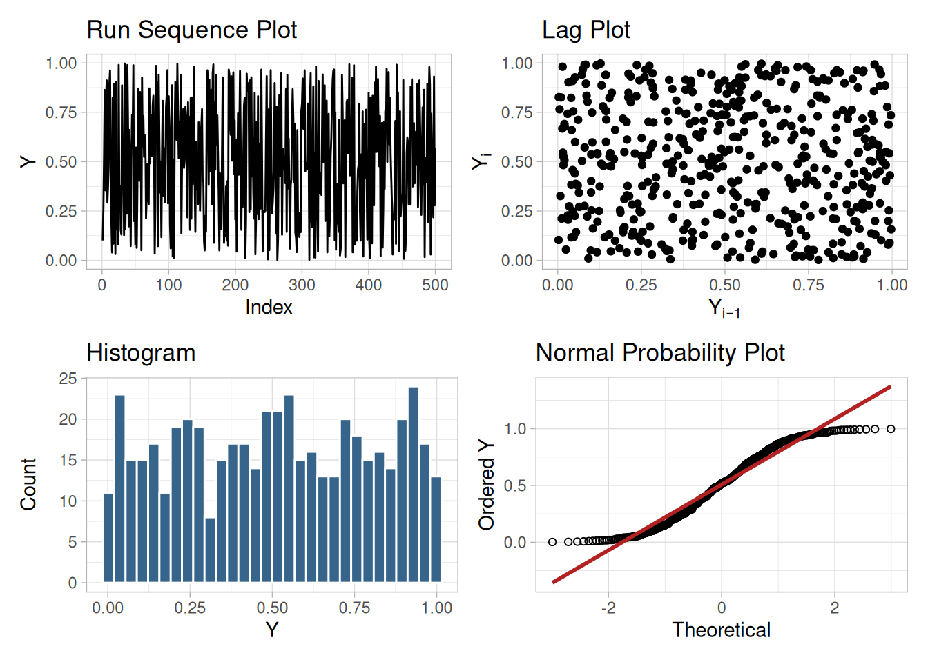
Interpretation
The assumptions are addressed by the graphics shown in Figure 1.232:
From the above plots, we conclude that the underlying assumptions are valid. Therefore, the model \(Y_i = C + E_i\) is valid. However, since the data are not normally distributed, using the mean as an estimate of \(C\) and the confidence interval cited above for quantifying its uncertainty are not valid or appropriate.
Individual Plots
Although it is usually not necessary, the plots can be generated individually to give more detail.
tibble(i = seq_along(randu_cs), y = randu_cs) |>
ggplot(aes(i, y)) +
geom_line() +
labs(x = "Index", y = "Y") +
theme_light()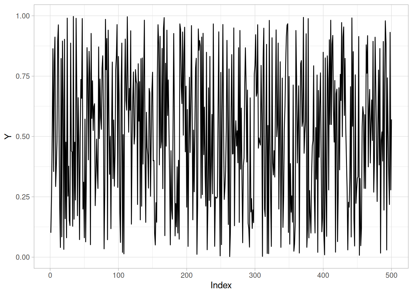
n_cs422 <- length(randu_cs)
tibble(y = randu_cs[-1], y_lag = randu_cs[-n_cs422]) |>
ggplot(aes(y_lag, y)) +
geom_point() +
labs(x = expression(Y[i - 1]), y = expression(Y[i])) +
theme_light()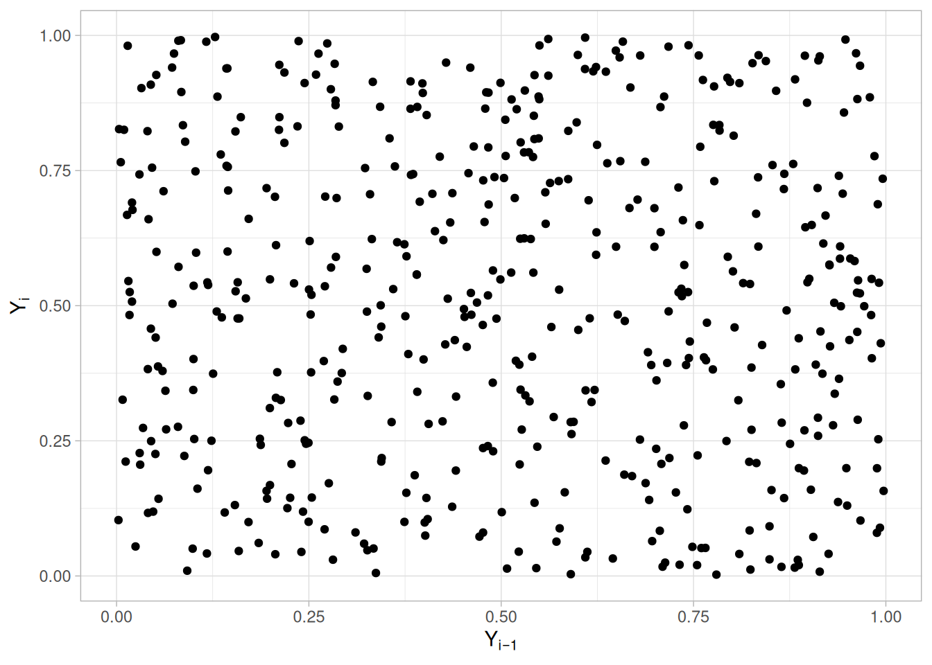
Histogram (with overlaid Normal PDF). This plot shows that a normal distribution is a poor fit. The flatness of the histogram suggests that a uniform distribution might be a better fit.
ggplot(tibble(y = randu_cs), aes(y)) +
geom_histogram(aes(y = after_stat(density)), bins = 30, color = "white", fill = "steelblue4") +
stat_function(fun = dnorm, args = list(mean = mean(randu_cs), sd = sd(randu_cs)), color = "firebrick") +
labs(x = "Y", y = "Density") +
theme_light()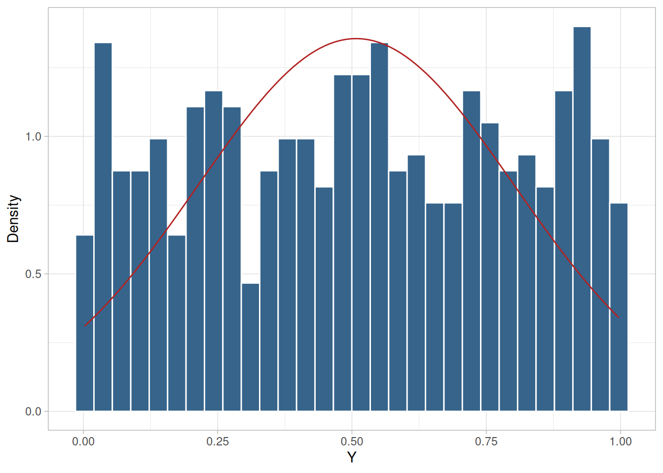
Histogram (with overlaid Uniform PDF). Since the histogram from the 4-plot suggested that the uniform distribution might be a good fit, we overlay a uniform distribution on top of the histogram. This indicates a much better fit than a normal distribution.
ggplot(tibble(y = randu_cs), aes(y)) +
geom_histogram(aes(y = after_stat(density)), bins = 30, color = "white", fill = "steelblue4") +
stat_function(fun = dunif, color = "firebrick") +
labs(x = "Y", y = "Density") +
theme_light()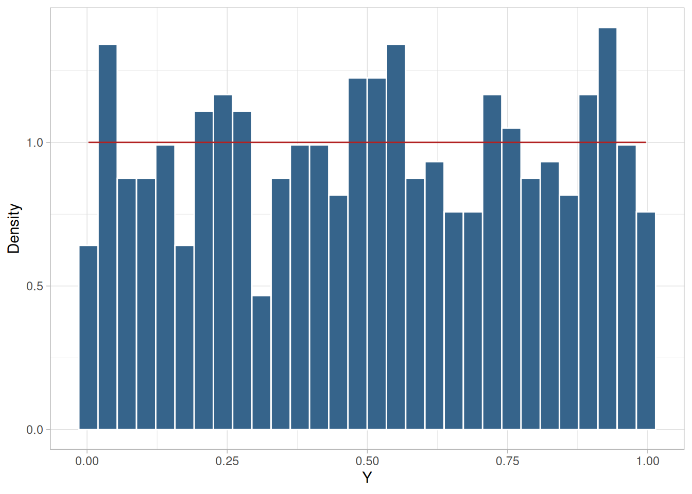
As with the histogram, the normal probability plot shows that the normal distribution does not fit these data well.
theoretical_norm_cs422 <- qnorm(uniform_medians_cs422(n_cs422))
tibble(theoretical = theoretical_norm_cs422, observed = sort(randu_cs)) |>
ggplot(aes(theoretical, observed)) +
geom_point(shape = 1) +
geom_smooth(method = "lm", formula = 'y ~ x', se = FALSE, color = "firebrick") +
labs(x = "Theoretical (Normal)", y = "Ordered Y") +
theme_light()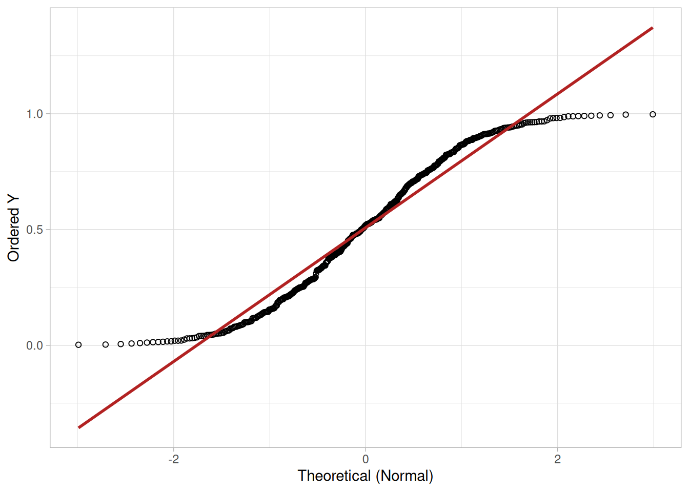
Since the above plots suggested that a uniform distribution might be appropriate, we generate a uniform probability plot. This plot shows that the uniform distribution provides an excellent fit to the data.
theoretical_unif_cs422 <- uniform_medians_cs422(n_cs422)
tibble(theoretical = theoretical_unif_cs422, observed = sort(randu_cs)) |>
ggplot(aes(theoretical, observed)) +
geom_point(shape = 1) +
geom_smooth(method = "lm", formula = 'y ~ x', se = FALSE, color = "firebrick") +
labs(x = "Theoretical (Uniform)", y = "Ordered Y") +
theme_light()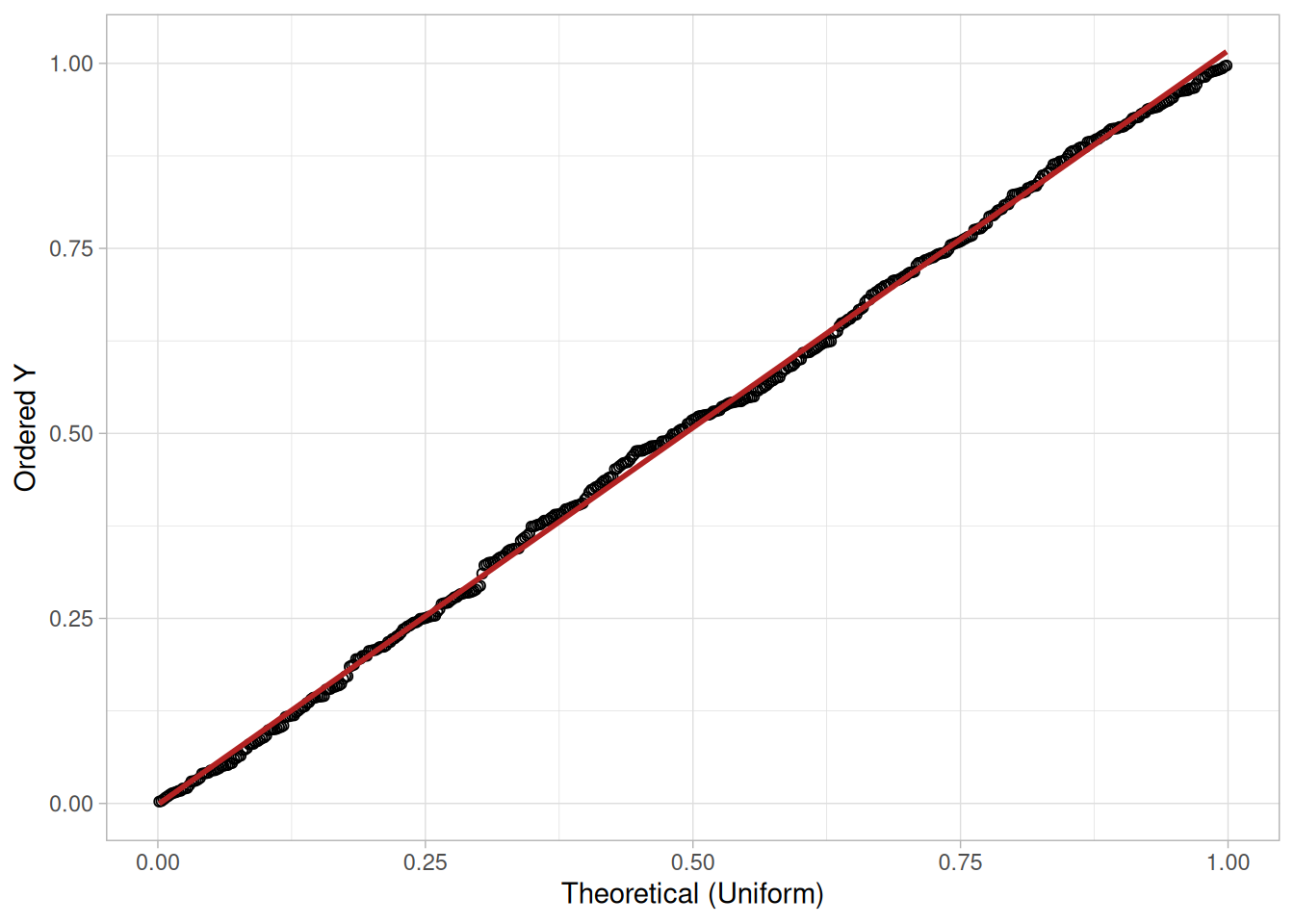
Better Model
Since the data follow the underlying assumptions, but with a uniform distribution rather than a normal distribution, we would still like to characterize \(C\) by a typical value plus or minus a confidence interval. In this case, we would like to find a location estimator with the smallest variability. The bootstrap plot is an ideal tool for this purpose.
(NIST’s original text states the bootstrap plots below cover “the mean, median, mid-range, and median absolute deviation,” but NIST’s own accompanying R script and figure bootstrap only three statistics — the mean, median, and mid-range. We follow NIST’s actual code and figure here, which is also the same worked example already shown on the Bootstrap Plot technique page.)
set.seed(20240613)
n_boot_cs422 <- 500
boot_stats_cs422 <- map(seq_len(n_boot_cs422), function(i) {
s <- sample(randu_cs, n_cs422, replace = TRUE)
tibble(subsample = i, mean = mean(s), median = median(s), midrange = (min(s) + max(s)) / 2)
}) |>
list_rbind()boot_stats_cs422 |>
pivot_longer(c(mean, median, midrange), names_to = "statistic", values_to = "value") |>
mutate(statistic = factor(statistic, levels = c("mean", "median", "midrange"),
labels = c("Mean", "Median", "Mid-range"))) |>
ggplot(aes(subsample, value)) +
geom_point(shape = 1) +
facet_wrap(~statistic, scales = "free_y") +
labs(x = "Subsample Number", y = "Statistic Value") +
theme_light()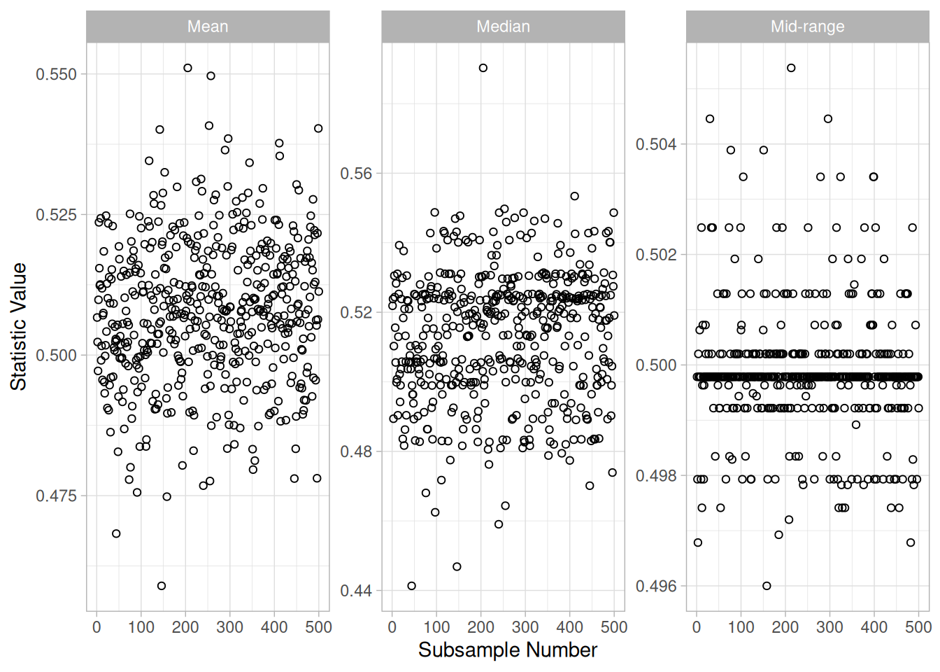
Mid-Range is Best
From the above histograms (see the Bootstrap Plot page for the corresponding histograms and variance comparison), it is obvious that for these data, the mid-range is far superior to the mean or median as an estimate for location.
mean_ci_cs422 <- quantile(boot_stats_cs422$mean, c(0.025, 0.975))
midrange_ci_cs422 <- quantile(boot_stats_cs422$midrange, c(0.025, 0.975))
tibble(
estimator = c("Mean", "Mid-range"),
estimate = c(mean(randu_cs), (min(randu_cs) + max(randu_cs)) / 2),
ci_low = c(mean_ci_cs422[1], midrange_ci_cs422[1]),
ci_high = c(mean_ci_cs422[2], midrange_ci_cs422[2])
)Using the mean, the location estimate is 0.508 and a 95% confidence interval for the mean is (0.482, 0.534). Using the mid-range, the location estimate is 0.5 and the 95% confidence interval for the mid-range is (0.497, 0.503).
Although the values for the location are similar, the difference in the uncertainty intervals is quite large.
Note that in the case of a uniform distribution it is known theoretically that the mid-range is the best linear unbiased estimator for location. However, in many applications, the most appropriate estimator will not be known or it will be mathematically intractable to determine a valid confidence interval. The bootstrap provides a method for determining (and comparing) confidence intervals in these cases.
Summary Statistics
As a first step in the analysis, common summary statistics are computed for the data.
tibble(
`Sample Size` = length(randu_cs),
Mean = mean(randu_cs),
Median = median(randu_cs),
Minimum = min(randu_cs),
Maximum = max(randu_cs),
Range = diff(range(randu_cs)),
`Stan. Dev.` = sd(randu_cs)
)Because the graphs of the data indicate the data may not be normally distributed, we also compute two other statistics for the data, the normal PPCC and the uniform PPCC.
ppcc_normal_cs422 <- cor(sort(randu_cs), theoretical_norm_cs422)
ppcc_uniform_cs422 <- cor(sort(randu_cs), theoretical_unif_cs422)
tibble(`Normal PPCC` = ppcc_normal_cs422, `Uniform PPCC` = ppcc_uniform_cs422)The uniform probability plot correlation coefficient (PPCC) value is larger than the normal PPCC value. This is evidence that the uniform distribution fits these data better than does a normal distribution.
Location
One way to quantify a change in location over time is to fit a straight line to the data using an index variable as the independent variable in the regression. For our data, we assume that the data are in sequential run order and that the data were collected at equally spaced time intervals. In our regression, we use the index variable \(X = 1, 2, \ldots, N\), where \(N\) is the number of observations. If there is no significant drift in the location over time, the slope parameter should be zero.
location_fit_cs422 <- lm(randu_cs ~ seq_along(randu_cs))
summary(location_fit_cs422)
Call:
lm(formula = randu_cs ~ seq_along(randu_cs))
Residuals:
Min 1Q Median 3Q Max
-0.50459 -0.25959 0.00375 0.25420 0.49479
Coefficients:
Estimate Std. Error t value Pr(>|t|)
(Intercept) 5.229e-01 2.638e-02 19.82 <2e-16 ***
seq_along(randu_cs) -6.025e-05 9.125e-05 -0.66 0.509
---
Signif. codes: 0 '***' 0.001 '**' 0.01 '*' 0.05 '.' 0.1 ' ' 1
Residual standard error: 0.2945 on 498 degrees of freedom
Multiple R-squared: 0.0008747, Adjusted R-squared: -0.001132
F-statistic: 0.436 on 1 and 498 DF, p-value: 0.5094The t-value of the slope parameter is smaller than the critical value of \(t_{0.975,498} =\) 1.96. Thus, we conclude that the slope is not different from zero at the 0.05 significance level.
Variation
One simple way to detect a change in variation is with a Bartlett test after dividing the data set into several equal-sized intervals. However, the Bartlett test is not robust for non-normality. Since we know this data set is not approximated well by the normal distribution, we use the alternative Levene test. In particular, we use the Levene test based on the median rather than the mean. The choice of the number of intervals is somewhat arbitrary, although values of four or eight are reasonable. We will divide our data into four intervals.
# Levene's test using the median-centered definition of Z_ij (as used on
# the Levene Test page).
levene_test_cs422 <- function(y, group) {
d <- tibble(y = y, group = group)
z <- d |> mutate(z = abs(y - median(y)), .by = group)
k <- n_distinct(z$group)
n <- nrow(z)
grand_mean_z <- mean(z$z)
group_stats <- z |> summarize(n_i = n(), z_bar_i = mean(z), .by = group)
numerator <- sum(group_stats$n_i * (group_stats$z_bar_i - grand_mean_z)^2) / (k - 1)
z <- z |> left_join(group_stats, by = "group")
denominator <- sum((z$z - z$z_bar_i)^2) / (n - k)
w <- numerator / denominator
list(w = w, df1 = k - 1, df2 = n - k)
}
quarter_cs422 <- as.factor(rep(1:4, each = n_cs422 / 4))
levene_cs422 <- levene_test_cs422(randu_cs, quarter_cs422)
levene_crit_cs422 <- qf(0.95, levene_cs422$df1, levene_cs422$df2)
tibble(statistic = levene_cs422$w, df1 = levene_cs422$df1, df2 = levene_cs422$df2, critical_value = levene_crit_cs422)\[H_0: \sigma_1^2 = \sigma_2^2 = \sigma_3^2 = \sigma_4^2\] \[H_a: \text{At least one } \sigma_i^2 \text{ is not equal to the others.}\]
Test statistic: \(W \approx\) 0.07983 (NIST reports \(W = 0.07983\); our computed value matches)
Degrees of freedom: \(k - 1 = 3\)
Significance level: \(\alpha = 0.05\)
Critical value: \(F_{\alpha,k-1,N-k} =\) 2.623
Critical region: Reject \(H_0\) if \(W >\) 2.623
In this case, the Levene test indicates that the variances are not significantly different in the four intervals.
Randomness
There are many ways in which data can be non-random. However, most common forms of non-randomness can be detected with a few simple tests including the lag plot shown on the previous page.
Another check is an autocorrelation plot that shows the autocorrelations for various lags. Confidence bands can be plotted using 95% and 99% confidence levels. Points outside this band indicate statistically significant values (lag 0 is always 1).
acf_cs422 <- acf(randu_cs, lag.max = 21, plot = FALSE)
ci95_cs422 <- qnorm(0.975) / sqrt(n_cs422)
ci99_cs422 <- qnorm(0.995) / sqrt(n_cs422)
tibble(lag = as.integer(acf_cs422$lag), acf = as.numeric(acf_cs422$acf)) |>
filter(lag > 0) |>
ggplot(aes(lag, acf)) +
geom_segment(aes(xend = lag, y = 0, yend = acf)) +
geom_hline(yintercept = 0) +
geom_hline(yintercept = c(-ci95_cs422, ci95_cs422), linetype = "dashed", color = "steelblue") +
geom_hline(yintercept = c(-ci99_cs422, ci99_cs422), linetype = "dotted", color = "firebrick") +
labs(x = "Lag", y = "Autocorrelation") +
theme_light()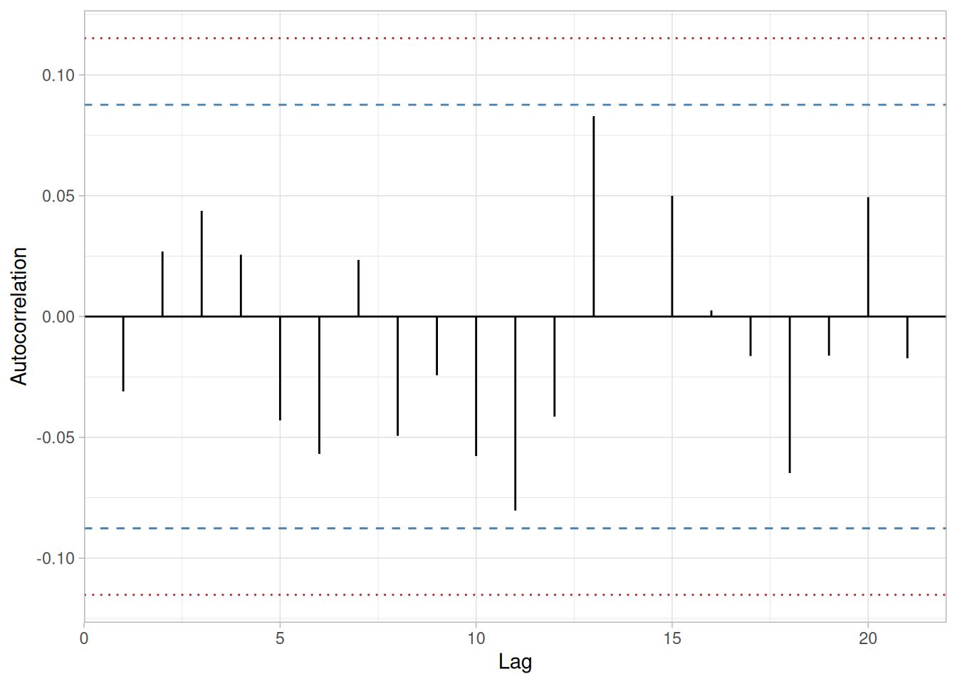
The lag 1 autocorrelation, which is generally the one of most interest, is -0.031. The critical values at the 5% significance level are \(\pm\) 0.088. This indicates that the lag 1 autocorrelation is not statistically significant, so there is no evidence of non-randomness.
A common test for randomness is the runs test.
runs_test_cs422 <- function(y, alpha = 0.05) {
med <- median(y)
sign <- sign(y - med)
sign <- sign[sign != 0]
n1 <- sum(sign == 1)
n2 <- sum(sign == -1)
n <- n1 + n2
R <- 1 + sum(diff(sign) != 0)
Rbar <- 2 * n1 * n2 / n + 1
sR2 <- (2 * n1 * n2 * (2 * n1 * n2 - n)) / (n^2 * (n - 1))
sR <- sqrt(sR2)
Z <- (R - Rbar) / sR
z_crit <- qnorm(1 - alpha / 2)
tibble(n1 = n1, n2 = n2, R = R, Rbar = Rbar, sR = sR, Z = Z, z_crit = z_crit, reject_H0 = abs(Z) > z_crit)
}
randu_runs <- runs_test_cs422(randu_cs)
randu_runs\[H_0: \text{the sequence was produced in a random manner}\] \[H_a: \text{the sequence was not produced in a random manner}\]
Test statistic: \(Z \approx\) 0.2686 (NIST reports \(Z = 0.2686\); our computed value matches)
Significance level: \(\alpha = 0.05\)
Critical value: \(Z_{1-\alpha/2} =\) 1.96
Critical region: Reject \(H_0\) if \(|Z| >\) 1.96
The runs test fails to reject the null hypothesis that the data were produced in a random manner.
Distributional Analysis
Probability plots are a graphical test for assessing whether a particular distribution provides an adequate fit to a data set. A quantitative enhancement to the probability plot is the correlation coefficient of the points on the probability plot, or PPCC. For this data set the PPCC based on a normal distribution is 0.977. Since the PPCC is less than the critical value of 0.987 (this is a tabulated value), the normality assumption is rejected.
Chi-square and Kolmogorov-Smirnov goodness-of-fit tests are alternative methods for assessing distributional adequacy. The Wilk-Shapiro and Anderson-Darling tests can be used to test for normality. The results of the Anderson-Darling test follow.
library(nortest)
ad_cs422 <- ad.test(randu_cs)
ad_cs422
Anderson-Darling normality test
data: randu_cs
A = 5.7198, p-value = 4.206e-14\[H_0: \text{the data are normally distributed}\] \[H_a: \text{the data are not normally distributed}\]
Adjusted test statistic: \(A^2 \approx\) 5.7198 (NIST’s Univariate Report below states \(A^2 = 5.7198390\), matching our computed value; NIST’s own prose paragraph on this page separately states “A2 = 5.765,” which appears to be a typo inconsistent with both NIST’s own report table and R script output for this same example — we reproduce the correctly matching value here)
Significance level: \(\alpha = 0.05\)
Critical value: 0.787
Critical region: Reject \(H_0\) if \(A^2 > 0.787\)
The Anderson-Darling test rejects the normality assumption because the value of the test statistic is larger than the critical value at the 0.05 significance level.
Model
Based on the graphical and quantitative analysis, we use the model
\[Y_i = C + E_i\]
where \(C\) is estimated by the mid-range and the uncertainty interval for \(C\) is based on a bootstrap analysis. Specifically, \(C =\) 0.5 with a 95% confidence limit for \(C\) of (0.497, 0.503).
Univariate Report
It is sometimes useful and convenient to summarize the above results in a report.
Analysis for 500 uniform random numbers
1: Sample Size = 500
2: Location
Mean = 0.50783
Standard Deviation of Mean = 0.013163
95% Confidence Interval for Mean = (0.48197,0.533692)
Drift with respect to location? = NO
3: Variation
Standard Deviation = 0.294326
95% Confidence Interval for SD = (0.277144,0.313796)
Drift with respect to variation?
(based on Levene's test on quarters
of the data) = NO
4: Distribution
Normal PPCC = 0.9771602
Normal Anderson-Darling = 5.7198390
Data are Normal?
(as tested by Normal PPCC) = NO
(as tested by Anderson-Darling) = NO
Uniform PPCC = 0.9995683
Uniform Anderson-Darling = 0.9082221
Data are Uniform?
(as tested by Uniform PPCC) = YES
(as tested by Anderson-Darling) = YES
5: Randomness
Autocorrelation = -0.03099
Data are Random?
(as measured by autocorrelation) = YES
6: Statistical Control
(i.e., no drift in location or scale,
data is random, distribution is
fixed, here we are testing only for
fixed uniform)
Data Set is in Statistical Control? = YESNIST’s original case study provides a Dataplot macro that lets the reader repeat this analysis step-by-step inside the Dataplot application. Since this book reproduces every step of the analysis above as executable, code-folded R chunks, the reader can work through this example directly by running (or modifying) that code — no separate software installation or macro is required.
This example illustrates the univariate analysis of a set of numbers derived from a random walk.
Generation
A random walk can be generated from a set of uniform random numbers by the formula:
\[R_i = \sum_{j=1}^{i}(U_j - 0.5)\]
where \(U\) is a set of uniform random numbers.
The motivation for studying a set of random walk data is to illustrate the effects of a known underlying autocorrelation structure (i.e., non-randomness) in the data.
Software
The analyses used in this case study can be generated using R code. The reader can download the data as a text file (RANDWALK.DAT).
Data
library(tidyverse)
randwalk_cs <- scan(here::here("datasets", "RANDWALK.DAT"), skip = 25, quiet = TRUE)
tibble(y = randwalk_cs)Goal
The goal of this analysis is threefold:
4-Plot of Data
library(patchwork)
# Same construction used on the 4-Plot and Normal Probability Plot pages.
uniform_medians_cs423 <- function(n) {
i <- seq_len(n)
m <- numeric(n)
m[1] <- 1 - 0.5^(1 / n)
m[n] <- 0.5^(1 / n)
if (n > 2) m[2:(n - 1)] <- (i[2:(n - 1)] - 0.3175) / (n + 0.365)
m
}
four_plot_cs423 <- function(x, hist_bins = 30) {
n <- length(x)
p_run <- tibble(i = seq_len(n), y = x) |>
ggplot(aes(i, y)) +
geom_line() +
labs(x = "Index", y = "Y", title = "Run Sequence Plot") +
theme_light()
p_lag <- tibble(y = x[-1], y_lag = x[-n]) |>
ggplot(aes(y_lag, y)) +
geom_point() +
labs(x = expression(Y[i - 1]), y = expression(Y[i]), title = "Lag Plot") +
theme_light()
p_hist <- tibble(y = x) |>
ggplot(aes(y)) +
geom_histogram(bins = hist_bins, color = "white", fill = "steelblue4") +
labs(x = "Y", y = "Count", title = "Histogram") +
theme_light()
mm <- uniform_medians_cs423(n)
theoretical <- qnorm(mm)
xs <- sort(x)
p_norm <- tibble(theoretical = theoretical, observed = xs) |>
ggplot(aes(theoretical, observed)) +
geom_point(shape = 1) +
geom_smooth(method = "lm", formula = 'y ~ x', se = FALSE, color = "firebrick") +
labs(x = "Theoretical", y = "Ordered Y", title = "Normal Probability Plot") +
theme_light()
(p_run + p_lag) / (p_hist + p_norm)
}
four_plot_cs423(randwalk_cs)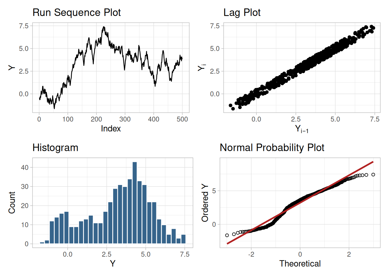
Interpretation
The assumptions are addressed by the graphics shown in Figure 1.241:
From the above plots, we conclude that the underlying assumptions are seriously violated. Therefore the \(Y_i = C + E_i\) model is not valid.
When the randomness assumption is seriously violated, a time series model may be appropriate. The lag plot often suggests a reasonable model. For example, in this case the strongly linear appearance of the lag plot suggests a model fitting \(Y_i\) versus \(Y_{i-1}\) might be appropriate. When the data are non-random, it is helpful to supplement the lag plot with an autocorrelation plot and a spectral plot.
Although in this case the lag plot is enough to suggest an appropriate model, we provide the autocorrelation and spectral plots for comparison.
Autocorrelation Plot
When the lag plot indicates significant non-randomness, it can be helpful to follow up with an autocorrelation plot.
n_cs423 <- length(randwalk_cs)
acf_cs423 <- acf(randwalk_cs, lag.max = 100, plot = FALSE)
ci95_cs423 <- qnorm(0.975) / sqrt(n_cs423)
ci99_cs423 <- qnorm(0.995) / sqrt(n_cs423)
tibble(lag = as.integer(acf_cs423$lag), acf = as.numeric(acf_cs423$acf)) |>
filter(lag > 0) |>
ggplot(aes(lag, acf)) +
geom_segment(aes(xend = lag, y = 0, yend = acf)) +
geom_hline(yintercept = 0) +
geom_hline(yintercept = c(-ci95_cs423, ci95_cs423), linetype = "dashed", color = "steelblue") +
geom_hline(yintercept = c(-ci99_cs423, ci99_cs423), linetype = "dotted", color = "firebrick") +
labs(x = "Lag", y = "Autocorrelation") +
theme_light()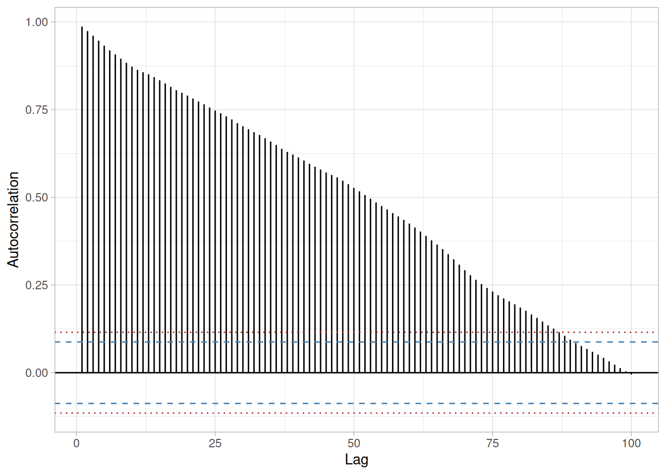
This autocorrelation plot shows significant autocorrelation at lags 1 through 100 in a linearly decreasing fashion.
Spectral Plot
Another useful plot for non-random data is the spectral plot.
spec_cs423 <- spec.pgram(randwalk_cs, taper = 0, detrend = TRUE, demean = TRUE, plot = FALSE)
tibble(freq = spec_cs423$freq, power = spec_cs423$spec) |>
ggplot(aes(freq, power)) +
geom_line(color = "steelblue") +
geom_point(size = 0.6) +
labs(x = "Frequency", y = "Variance (power)") +
theme_light()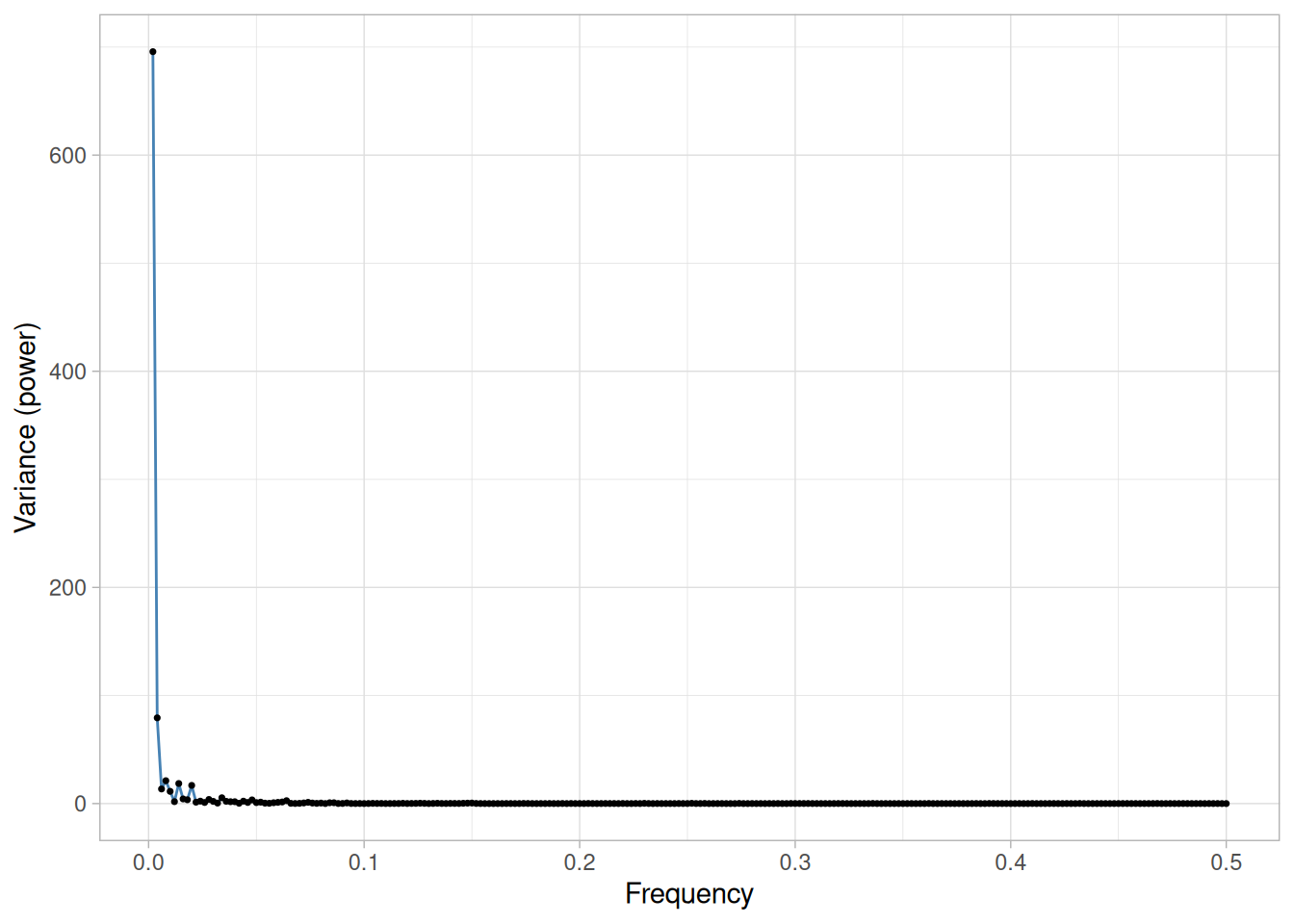
This spectral plot shows a single dominant low frequency peak.
Quantitative Output
Although Figure 1.241 clearly shows the violation of the assumptions, we supplement the graphical output with some quantitative measures.
Summary Statistics
As a first step in the analysis, common summary statistics are computed from the data.
tibble(
`Sample Size` = length(randwalk_cs),
Mean = mean(randwalk_cs),
Median = median(randwalk_cs),
Minimum = min(randwalk_cs),
Maximum = max(randwalk_cs),
Range = diff(range(randwalk_cs)),
`Stan. Dev.` = sd(randwalk_cs)
)We also computed the autocorrelation to be 0.987, which is evidence of a very strong autocorrelation.
Location
One way to quantify a change in location over time is to fit a straight line to the data using an index variable as the independent variable in the regression. For our data, we assume that the data are in sequential run order and that the data were collected at equally spaced time intervals. In our regression, we use the index variable \(X = 1, 2, \ldots, N\), where \(N\) is the number of observations. If there is no significant drift in the location over time, the slope parameter should be zero.
location_fit_cs423 <- lm(randwalk_cs ~ seq_along(randwalk_cs))
summary(location_fit_cs423)
Call:
lm(formula = randwalk_cs ~ seq_along(randwalk_cs))
Residuals:
Min 1Q Median 3Q Max
-3.7645 -1.5670 -0.0976 1.5958 4.3338
Coefficients:
Estimate Std. Error t value Pr(>|t|)
(Intercept) 1.8335107 0.1721148 10.653 <2e-16 ***
seq_along(randwalk_cs) 0.0055216 0.0005953 9.275 <2e-16 ***
---
Signif. codes: 0 '***' 0.001 '**' 0.01 '*' 0.05 '.' 0.1 ' ' 1
Residual standard error: 1.921 on 498 degrees of freedom
Multiple R-squared: 0.1473, Adjusted R-squared: 0.1456
F-statistic: 86.02 on 1 and 498 DF, p-value: < 2.2e-16The t-value of the slope parameter is larger than the critical value of \(t_{0.975,498} =\) 1.96. Thus, we conclude that the slope is different from zero at the 0.05 significance level.
Variation
One simple way to detect a change in variation is with a Bartlett test after dividing the data set into several equal-sized intervals. However, the Bartlett test is not robust for non-normality. Since we know this data set is not approximated well by the normal distribution, we use the alternative Levene test. In particular, we use the Levene test based on the median rather than the mean. The choice of the number of intervals is somewhat arbitrary, although values of four or eight are reasonable. We will divide our data into four intervals.
# Levene's test using the median-centered definition of Z_ij (as used on
# the Levene Test page).
levene_test_cs423 <- function(y, group) {
d <- tibble(y = y, group = group)
z <- d |> mutate(z = abs(y - median(y)), .by = group)
k <- n_distinct(z$group)
n <- nrow(z)
grand_mean_z <- mean(z$z)
group_stats <- z |> summarize(n_i = n(), z_bar_i = mean(z), .by = group)
numerator <- sum(group_stats$n_i * (group_stats$z_bar_i - grand_mean_z)^2) / (k - 1)
z <- z |> left_join(group_stats, by = "group")
denominator <- sum((z$z - z$z_bar_i)^2) / (n - k)
w <- numerator / denominator
list(w = w, df1 = k - 1, df2 = n - k)
}
quarter_cs423 <- as.factor(rep(1:4, each = n_cs423 / 4))
levene_cs423 <- levene_test_cs423(randwalk_cs, quarter_cs423)
levene_crit_cs423 <- qf(0.95, levene_cs423$df1, levene_cs423$df2)
tibble(statistic = levene_cs423$w, df1 = levene_cs423$df1, df2 = levene_cs423$df2, critical_value = levene_crit_cs423)\[H_0: \sigma_1^2 = \sigma_2^2 = \sigma_3^2 = \sigma_4^2\] \[H_a: \text{At least one } \sigma_i^2 \text{ is not equal to the others.}\]
Test statistic: \(W \approx\) 10.459 (NIST reports \(W = 10.459\); our computed value matches)
Degrees of freedom: \(k - 1 = 3\)
Significance level: \(\alpha = 0.05\)
Critical value: \(F_{\alpha,k-1,N-k} =\) 2.623
Critical region: Reject \(H_0\) if \(W >\) 2.623
In this case, the Levene test indicates that the variances are significantly different in the four intervals since the test statistic of 10.459 is greater than the 95% critical value of 2.623. Therefore we conclude that the scale is not constant.
Randomness
Although the lag 1 autocorrelation coefficient above clearly shows the non-randomness, we show the output from a runs test as well.
runs_test_cs423 <- function(y, alpha = 0.05) {
med <- median(y)
sign <- sign(y - med)
sign <- sign[sign != 0]
n1 <- sum(sign == 1)
n2 <- sum(sign == -1)
n <- n1 + n2
R <- 1 + sum(diff(sign) != 0)
Rbar <- 2 * n1 * n2 / n + 1
sR2 <- (2 * n1 * n2 * (2 * n1 * n2 - n)) / (n^2 * (n - 1))
sR <- sqrt(sR2)
Z <- (R - Rbar) / sR
z_crit <- qnorm(1 - alpha / 2)
tibble(n1 = n1, n2 = n2, R = R, Rbar = Rbar, sR = sR, Z = Z, z_crit = z_crit, reject_H0 = abs(Z) > z_crit)
}
randwalk_runs <- runs_test_cs423(randwalk_cs)
randwalk_runs\[H_0: \text{the sequence was produced in a random manner}\] \[H_a: \text{the sequence was not produced in a random manner}\]
Test statistic: \(Z \approx\) -20.3239 (NIST reports \(Z = -20.3239\); our computed value matches)
Significance level: \(\alpha = 0.05\)
Critical value: \(Z_{1-\alpha/2} =\) 1.96
Critical region: Reject \(H_0\) if \(|Z| >\) 1.96
The runs test rejects the null hypothesis that the data were produced in a random manner at the 0.05 significance level.
Distributional Assumptions
Since the quantitative tests show that the assumptions of randomness and constant location and scale are not met, the distributional measures will not be meaningful. Therefore these quantitative tests are omitted.
Lag Plot Suggests Better Model
Since the underlying assumptions did not hold, we need to develop a better model. The lag plot showed a distinct linear pattern. Given the definition of the lag plot, \(Y_i\) versus \(Y_{i-1}\), a good candidate model is a model of the form
\[Y_i = A_0 + A_1 Y_{i-1} + E_i\]
Fit Output
The results of a linear fit of this model generated the following results.
ar1_fit_cs423 <- lm(randwalk_cs[-1] ~ randwalk_cs[-n_cs423])
summary(ar1_fit_cs423)
Call:
lm(formula = randwalk_cs[-1] ~ randwalk_cs[-n_cs423])
Residuals:
Min 1Q Median 3Q Max
-0.51925 -0.24546 0.00194 0.24418 0.50742
Coefficients:
Estimate Std. Error t value Pr(>|t|)
(Intercept) 0.050165 0.024171 2.075 0.0385 *
randwalk_cs[-n_cs423] 0.987087 0.006313 156.350 <2e-16 ***
---
Signif. codes: 0 '***' 0.001 '**' 0.01 '*' 0.05 '.' 0.1 ' ' 1
Residual standard error: 0.2931 on 497 degrees of freedom
Multiple R-squared: 0.9801, Adjusted R-squared: 0.98
F-statistic: 2.445e+04 on 1 and 497 DF, p-value: < 2.2e-16The slope parameter, \(A_1\), has a t-value of 156.35, which is statistically significant. Also, the residual standard deviation is 0.2931. This can be compared to the standard deviation shown in the summary table, which is 2.078675. That is, the fit to the autoregressive model has reduced the variability by a factor of 7.
Time Series Model
This model is an example of a time series model. More extensive discussion of time series is given in the Process Monitoring chapter.
Plot Predicted with Original Data
The first step in verifying the model is to plot the predicted values from the fit with the original data.
tibble(i = 2:n_cs423, observed = randwalk_cs[-1], predicted = fitted(ar1_fit_cs423)) |>
pivot_longer(c(observed, predicted), names_to = "series", values_to = "y") |>
ggplot(aes(i, y, color = series)) +
geom_line() +
labs(x = "Index", y = "Y", color = NULL) +
theme_light()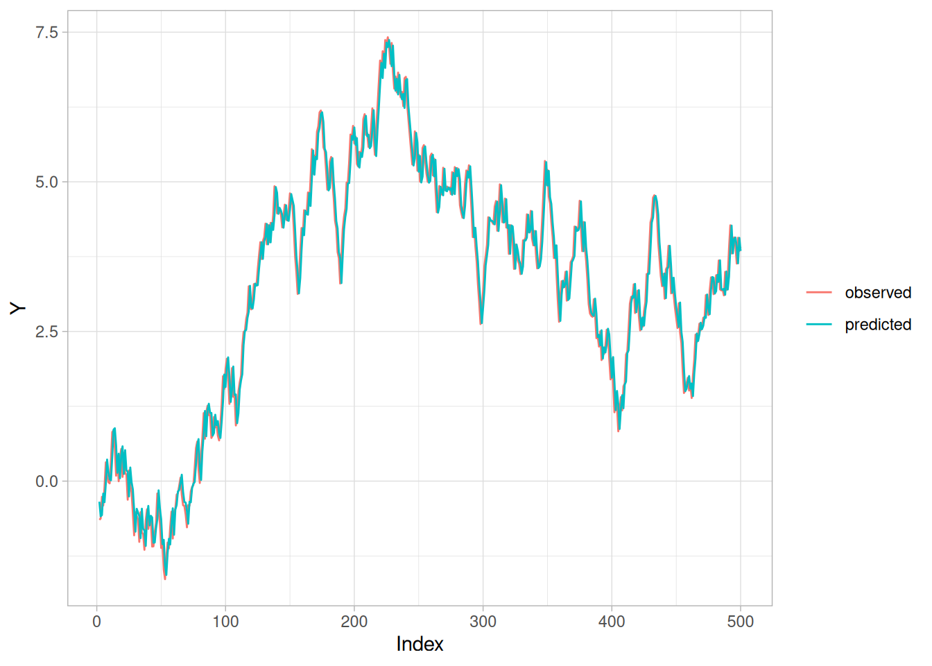
This plot indicates a reasonably good fit.
Test Underlying Assumptions on the Residuals
In addition to the plot of the predicted values, the residual standard deviation from the fit also indicates a significant improvement for the model. The next step is to validate the underlying assumptions for the error component, or residuals, from this model.
4-Plot of Residuals
four_plot_cs423(resid(ar1_fit_cs423))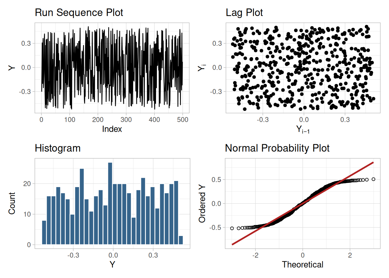
Interpretation
The assumptions are addressed by the graphics shown in Figure 1.245:
A uniform probability plot can be used to further test the suggestion that a uniform distribution might be a good model for the error component.
Uniform Probability Plot of Residuals
resid_cs423 <- resid(ar1_fit_cs423)
n_resid_cs423 <- length(resid_cs423)
theoretical_unif_cs423 <- uniform_medians_cs423(n_resid_cs423)
tibble(theoretical = theoretical_unif_cs423, observed = sort(resid_cs423)) |>
ggplot(aes(theoretical, observed)) +
geom_point(shape = 1) +
geom_smooth(method = "lm", formula = 'y ~ x', se = FALSE, color = "firebrick") +
labs(x = "Theoretical (Uniform)", y = "Ordered Residual") +
theme_light()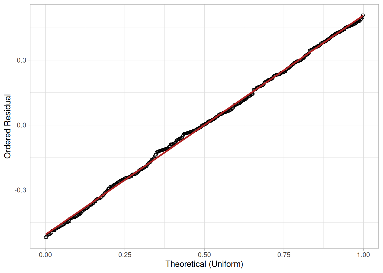
Since the uniform probability plot is nearly linear, this verifies that a uniform distribution is a good model for the error component.
Conclusions
Since the residuals from our model satisfy the underlying assumptions, we conclude that
\[Y_i = 0.0502 + 0.987 Y_{i-1} + E_i\]
where the \(E_i\) follow a uniform distribution is a good model for this data set. We could simplify this model to
\[Y_i = 1.0 Y_{i-1} + E_i\]
This has the advantage of simplicity (the current point is simply the previous point plus a uniformly distributed error term).
Using Scientific and Engineering Knowledge
In this case, the above model makes sense based on our definition of the random walk. That is, a random walk is the cumulative sum of uniformly distributed data points. It makes sense that modeling the current point as the previous point plus a uniformly distributed error term is about as good as we can do. Although this case is a bit artificial in that we knew how the data were constructed, it is common and desirable to use scientific and engineering knowledge of the process that generated the data in formulating and testing models for the data. Quite often, several competing models will produce nearly equivalent mathematical results. In this case, selecting the model that best approximates the scientific understanding of the process is a reasonable choice.
Time Series Model
This model is an example of a time series model. More extensive discussion of time series is given in the Process Monitoring chapter.
NIST’s original case study provides a Dataplot macro that lets the reader repeat this analysis step-by-step inside the Dataplot application. Since this book reproduces every step of the analysis above as executable, code-folded R chunks, the reader can work through this example directly by running (or modifying) that code — no separate software installation or macro is required.
This example illustrates the univariate analysis of Josephson junction cryothermometry data.
Generation
This data set was collected by Bob Soulen of NIST in October, 1971 as a sequence of observations collected equi-spaced in time from a volt meter to ascertain the process temperature in a Josephson junction cryothermometry (low temperature) experiment. The response variable is voltage counts.
Motivation
The motivation for studying this data set is to illustrate the case where there is discreteness in the measurements, but the underlying assumptions hold. In this case, the discreteness is due to the data being integers.
Software
The analyses used in this case study can be generated using R code. The reader can download the data as a text file (SOULEN.DAT).
Data
library(tidyverse)
soulen_cs <- scan(here::here("datasets", "SOULEN.DAT"), skip = 25, quiet = TRUE)
tibble(y = soulen_cs)Goal
The goal of this analysis is threefold:
4-Plot of Data
library(patchwork)
# Same construction used on the 4-Plot and Normal Probability Plot pages.
uniform_medians_cs424 <- function(n) {
i <- seq_len(n)
m <- numeric(n)
m[1] <- 1 - 0.5^(1 / n)
m[n] <- 0.5^(1 / n)
if (n > 2) m[2:(n - 1)] <- (i[2:(n - 1)] - 0.3175) / (n + 0.365)
m
}
four_plot_cs424 <- function(x, hist_bins = 30) {
n <- length(x)
p_run <- tibble(i = seq_len(n), y = x) |>
ggplot(aes(i, y)) +
geom_line() +
labs(x = "Index", y = "Y", title = "Run Sequence Plot") +
theme_light()
p_lag <- tibble(y = x[-1], y_lag = x[-n]) |>
ggplot(aes(y_lag, y)) +
geom_point() +
labs(x = expression(Y[i - 1]), y = expression(Y[i]), title = "Lag Plot") +
theme_light()
p_hist <- tibble(y = x) |>
ggplot(aes(y)) +
geom_histogram(bins = hist_bins, color = "white", fill = "steelblue4") +
labs(x = "Y", y = "Count", title = "Histogram") +
theme_light()
mm <- uniform_medians_cs424(n)
theoretical <- qnorm(mm)
xs <- sort(x)
p_norm <- tibble(theoretical = theoretical, observed = xs) |>
ggplot(aes(theoretical, observed)) +
geom_point(shape = 1) +
geom_smooth(method = "lm", formula = 'y ~ x', se = FALSE, color = "firebrick") +
labs(x = "Theoretical", y = "Ordered Y", title = "Normal Probability Plot") +
theme_light()
(p_run + p_lag) / (p_hist + p_norm)
}
four_plot_cs424(soulen_cs)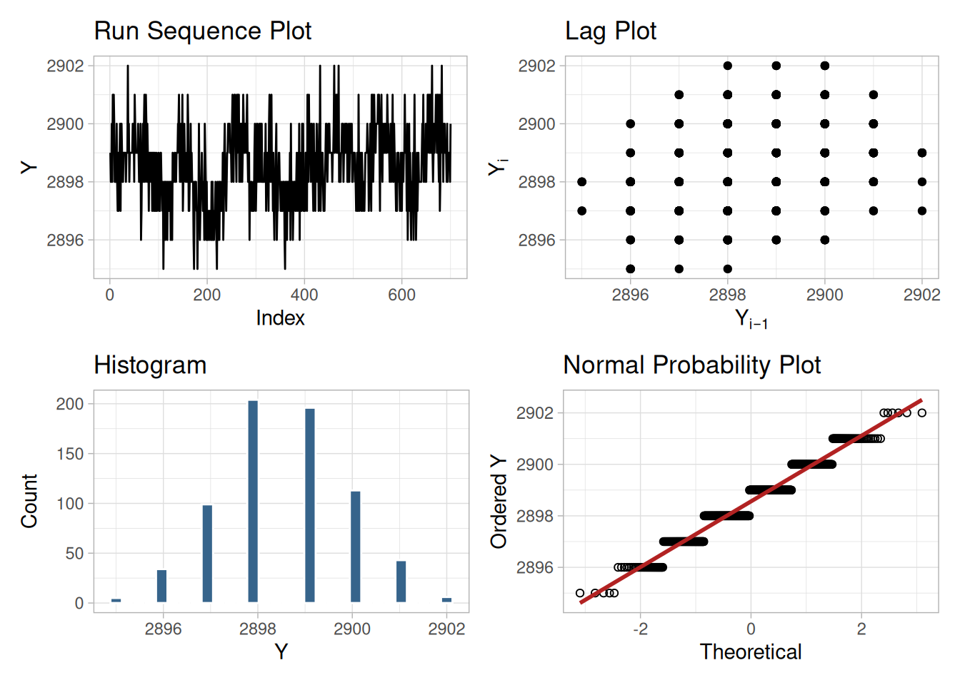
Interpretation
The assumptions are addressed by the graphics shown in Figure 1.247:
The integer data with only a few distinct values and many repeats accounts for the discrete appearance of several of the plots (e.g., the lag plot and the normal probability plot). In this case, the nature of the data makes the normal probability plot difficult to interpret, especially since each number is repeated many times. However, the histogram indicates that a normal distribution should provide an adequate model for the data.
From the above plots, we conclude that the underlying assumptions are valid and the data can be reasonably approximated with a normal distribution. Therefore, the commonly used uncertainty standard is valid and appropriate. The numerical values for this model are given in the Quantitative Output and Interpretation section.
Individual Plots
Although it is normally not necessary, the plots can be generated individually to give more detail.
tibble(i = seq_along(soulen_cs), y = soulen_cs) |>
ggplot(aes(i, y)) +
geom_line() +
labs(x = "Index", y = "Y") +
theme_light()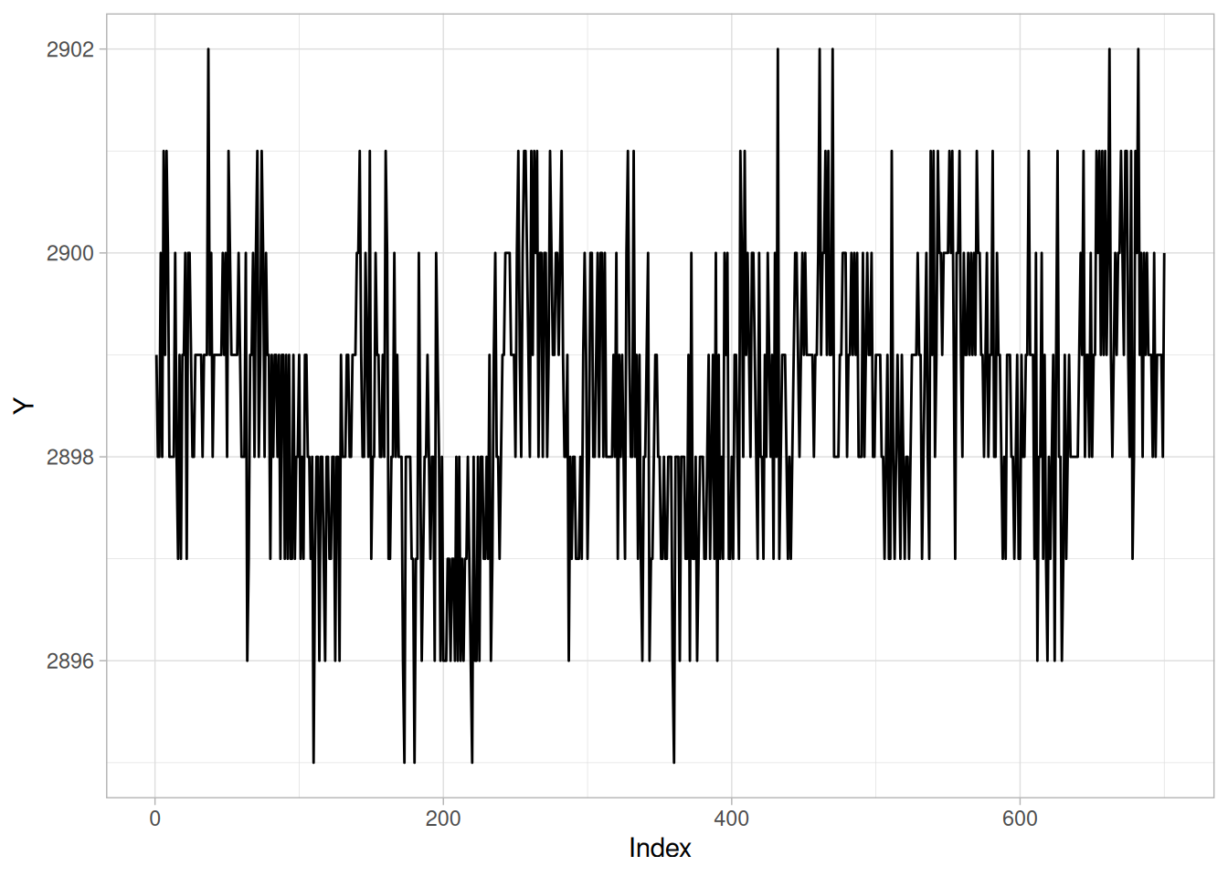
n_cs424 <- length(soulen_cs)
tibble(y = soulen_cs[-1], y_lag = soulen_cs[-n_cs424]) |>
ggplot(aes(y_lag, y)) +
geom_point() +
labs(x = expression(Y[i - 1]), y = expression(Y[i])) +
theme_light()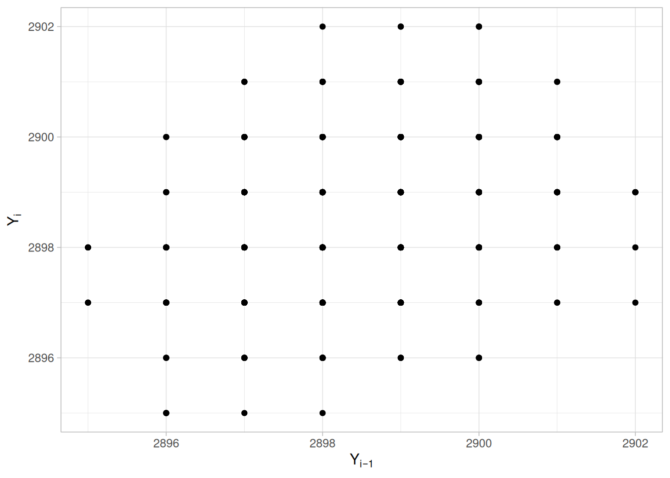
ggplot(tibble(y = soulen_cs), aes(y)) +
geom_histogram(aes(y = after_stat(density)), binwidth = 1, color = "white", fill = "steelblue4") +
stat_function(fun = dnorm, args = list(mean = mean(soulen_cs), sd = sd(soulen_cs)), color = "firebrick") +
labs(x = "Y", y = "Density") +
theme_light()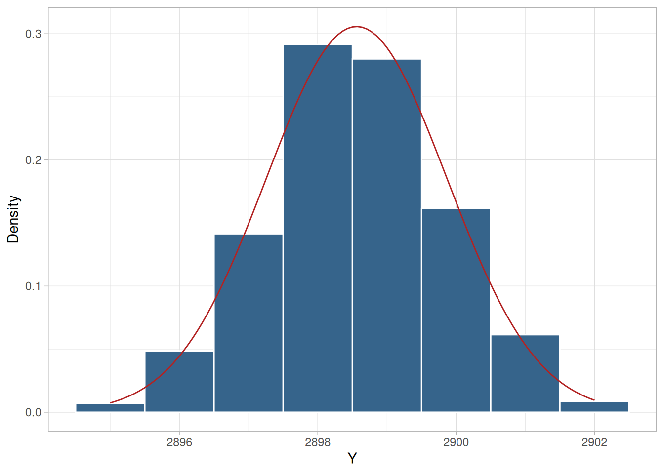
theoretical_cs424 <- qnorm(uniform_medians_cs424(n_cs424))
tibble(theoretical = theoretical_cs424, observed = sort(soulen_cs)) |>
ggplot(aes(theoretical, observed)) +
geom_point(shape = 1) +
geom_smooth(method = "lm", formula = 'y ~ x', se = FALSE, color = "firebrick") +
labs(x = "Theoretical", y = "Ordered Y") +
theme_light()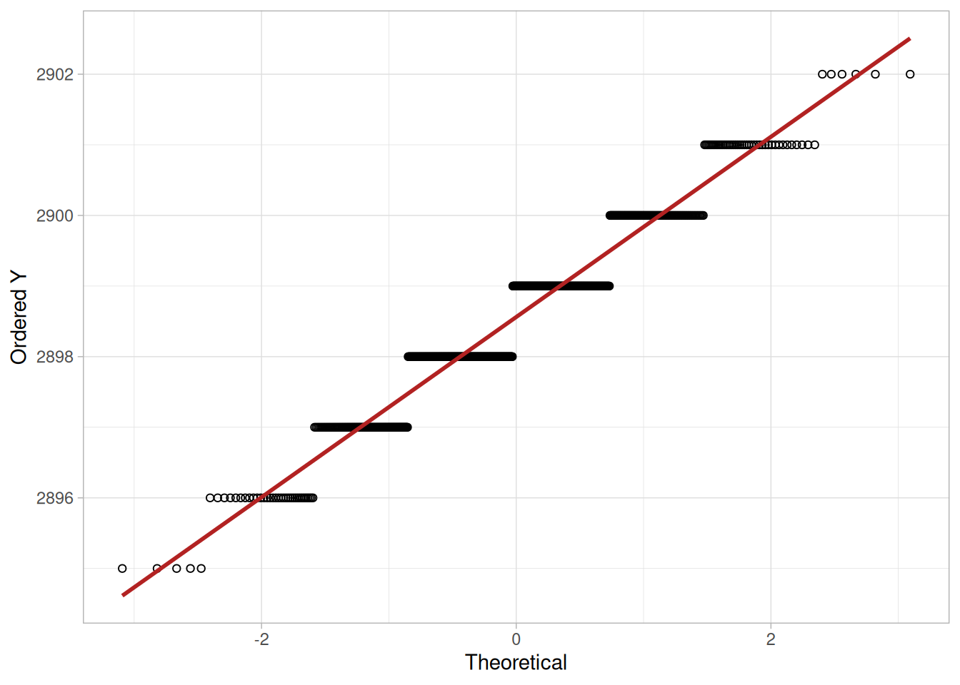
Summary Statistics
As a first step in the analysis, common summary statistics were computed from the data.
tibble(
`Sample Size` = length(soulen_cs),
Mean = mean(soulen_cs),
Median = median(soulen_cs),
Minimum = min(soulen_cs),
Maximum = max(soulen_cs),
Range = diff(range(soulen_cs)),
`Stan. Dev.` = sd(soulen_cs)
)Because of the discrete nature of the data, we also compute the normal PPCC.
ppcc_cs424 <- cor(sort(soulen_cs), theoretical_cs424)
ppcc_cs424[1] 0.9748401Location
One way to quantify a change in location over time is to fit a straight line to the data using an index variable as the independent variable in the regression. For our data, we assume that the data are in sequential run order and that the data were collected at equally spaced time intervals. In our regression, we use the index variable \(X = 1, 2, \ldots, N\), where \(N\) is the number of observations. If there is no significant drift in the location over time, the slope parameter should be zero.
location_fit_cs424 <- lm(soulen_cs ~ seq_along(soulen_cs))
summary(location_fit_cs424)
Call:
lm(formula = soulen_cs ~ seq_along(soulen_cs))
Residuals:
Min 1Q Median 3Q Max
-3.5716 -0.7576 0.0804 0.7756 3.7743
Coefficients:
Estimate Std. Error t value Pr(>|t|)
(Intercept) 2.898e+03 9.745e-02 29739.288 < 2e-16 ***
seq_along(soulen_cs) 1.071e-03 2.409e-04 4.445 1.02e-05 ***
---
Signif. codes: 0 '***' 0.001 '**' 0.01 '*' 0.05 '.' 0.1 ' ' 1
Residual standard error: 1.288 on 698 degrees of freedom
Multiple R-squared: 0.02753, Adjusted R-squared: 0.02614
F-statistic: 19.76 on 1 and 698 DF, p-value: 1.021e-05The slope parameter, \(B_1\), has a t-value of 4.445, which is statistically significant (the critical value is 1.96). However, the value of the slope is 1.071e-03. Given that the slope is nearly zero, the assumption of constant location is not seriously violated even though it is statistically significant.
Variation
One simple way to detect a change in variation is with a Bartlett test after dividing the data set into several equal-sized intervals. However, the Bartlett test is not robust for non-normality. Since the nature of the data (a few distinct points repeated many times) makes the normality assumption questionable, we use the alternative Levene test. In particular, we use the Levene test based on the median rather than the mean. The choice of the number of intervals is somewhat arbitrary, although values of four or eight are reasonable. We will divide our data into four intervals.
# Levene's test using the median-centered definition of Z_ij (as used on
# the Levene Test page).
levene_test_cs424 <- function(y, group) {
d <- tibble(y = y, group = group)
z <- d |> mutate(z = abs(y - median(y)), .by = group)
k <- n_distinct(z$group)
n <- nrow(z)
grand_mean_z <- mean(z$z)
group_stats <- z |> summarize(n_i = n(), z_bar_i = mean(z), .by = group)
numerator <- sum(group_stats$n_i * (group_stats$z_bar_i - grand_mean_z)^2) / (k - 1)
z <- z |> left_join(group_stats, by = "group")
denominator <- sum((z$z - z$z_bar_i)^2) / (n - k)
w <- numerator / denominator
list(w = w, df1 = k - 1, df2 = n - k)
}
quarter_cs424 <- as.factor(rep(1:4, each = n_cs424 / 4))
levene_cs424 <- levene_test_cs424(soulen_cs, quarter_cs424)
levene_crit_cs424 <- qf(0.95, levene_cs424$df1, levene_cs424$df2)
tibble(statistic = levene_cs424$w, df1 = levene_cs424$df1, df2 = levene_cs424$df2, critical_value = levene_crit_cs424)\[H_0: \sigma_1^2 = \sigma_2^2 = \sigma_3^2 = \sigma_4^2\] \[H_a: \text{At least one } \sigma_i^2 \text{ is not equal to the others.}\]
Test statistic: \(W \approx\) 1.43 (NIST reports \(W = 1.43\); our computed value matches)
Degrees of freedom: \(k - 1 = 3\)
Significance level: \(\alpha = 0.05\)
Critical value: \(F_{\alpha,k-1,N-k} =\) 2.618
Critical region: Reject \(H_0\) if \(W >\) 2.618
Since the Levene test statistic value is less than the 95% critical value, we conclude that the variances are not significantly different in the four intervals.
Randomness
There are many ways in which data can be non-random. However, most common forms of non-randomness can be detected with a few simple tests. The lag plot in the previous section is a simple graphical technique.
Another check is an autocorrelation plot that shows the autocorrelations for various lags. Confidence bands can be plotted at the 95% and 99% confidence levels. Points outside this band indicate statistically significant values (lag 0 is always 1).
acf_cs424 <- acf(soulen_cs, lag.max = 100, plot = FALSE)
ci95_cs424 <- qnorm(0.975) / sqrt(n_cs424)
ci99_cs424 <- qnorm(0.995) / sqrt(n_cs424)
tibble(lag = as.integer(acf_cs424$lag), acf = as.numeric(acf_cs424$acf)) |>
filter(lag > 0) |>
ggplot(aes(lag, acf)) +
geom_segment(aes(xend = lag, y = 0, yend = acf)) +
geom_hline(yintercept = 0) +
geom_hline(yintercept = c(-ci95_cs424, ci95_cs424), linetype = "dashed", color = "steelblue") +
geom_hline(yintercept = c(-ci99_cs424, ci99_cs424), linetype = "dotted", color = "firebrick") +
labs(x = "Lag", y = "Autocorrelation") +
theme_light()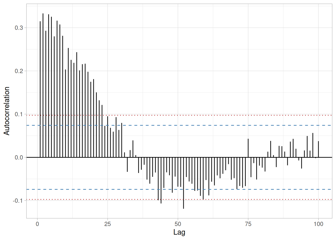
The lag 1 autocorrelation, which is generally the one of most interest, is 0.31. The critical values at the 5% level of significance are \(\pm\) 0.074. This indicates that the lag 1 autocorrelation is statistically significant, so there is some evidence for non-randomness.
A common test for randomness is the runs test.
# Because this data set is heavily discrete (196 of 700 values are exactly
# equal to the median), the median-based tie-dropping runs test used
# elsewhere in this book (e.g. Random Walk, Uniform/Normal Random Numbers)
# diverges substantially from NIST's own result, which used R's
# lawstat::runs.test(). We use lawstat directly here to reproduce NIST's
# reported statistic exactly.
library(lawstat)
runs_cs424 <- runs.test(soulen_cs)
runs_cs424
Runs Test - Two sided
data: soulen_cs
Standardized Runs Statistic = -13.416, p-value < 2.2e-16\[H_0: \text{the sequence was produced in a random manner}\] \[H_a: \text{the sequence was not produced in a random manner}\]
Test statistic: \(Z \approx\) -13.4162 (NIST reports \(Z = -13.4162\); our computed value matches)
Significance level: \(\alpha = 0.05\)
Critical value: \(Z_{1-\alpha/2} =\) 1.96
Critical region: Reject \(H_0\) if \(|Z| >\) 1.96
The runs test indicates non-randomness.
Although the runs test and lag 1 autocorrelation indicate some mild non-randomness, it is not sufficient to reject the \(Y_i = C + E_i\) model. At least part of the non-randomness can be explained by the discrete nature of the data.
Distributional Analysis
Probability plots are a graphical test for assessing if a particular distribution provides an adequate fit to a data set. A quantitative enhancement to the probability plot is the correlation coefficient of the points on the probability plot, or PPCC. For this data set the PPCC based on a normal distribution is 0.975. Since the PPCC is less than the critical value of 0.987 (this is a tabulated value), the normality assumption is rejected.
Chi-square and Kolmogorov-Smirnov goodness-of-fit tests are alternative methods for assessing distributional adequacy. The Wilk-Shapiro and Anderson-Darling tests can be used to test for normality. The results of the Anderson-Darling test follow.
library(nortest)
ad_cs424 <- ad.test(soulen_cs)
ad_cs424
Anderson-Darling normality test
data: soulen_cs
A = 16.763, p-value < 2.2e-16\[H_0: \text{the data are normally distributed}\] \[H_a: \text{the data are not normally distributed}\]
Adjusted test statistic: \(A^2 \approx\) 16.763 (NIST’s Univariate Report below states \(A^2 = 16.7634\), matching our computed value; NIST’s own prose paragraph on this page separately states “A2 = 16.858,” which — as with the Uniform Random Numbers case study — appears to be a typo inconsistent with NIST’s own report table)
Significance level: \(\alpha = 0.05\)
Critical value: 0.787
Critical region: Reject \(H_0\) if \(A^2 > 0.787\)
The Anderson-Darling test rejects the normality assumption because the test statistic is greater than the 95% critical value.
Although the data are not strictly normal, the violation of the normality assumption is not severe enough to conclude that the \(Y_i = C + E_i\) model is unreasonable. At least part of the non-normality can be explained by the discrete nature of the data.
Outlier Analysis
A test for outliers is the Grubbs test. Unlike the Normal Random Numbers case study, here it is the minimum value that is the most extreme observation.
alpha_cs424 <- 0.05
g_stat_cs424 <- (mean(soulen_cs) - min(soulen_cs)) / sd(soulen_cs)
# As in the Normal Random Numbers case study, NIST's stated critical value
# here (3.950619) corresponds to the two-sided formula (alpha/(2N)), not
# the one-sided formula (alpha/N) used in the Grubbs' Test technique
# page's own worked example. We reproduce NIST's published critical value
# as-is rather than silently reconciling the two conventions.
t_crit_cs424 <- qt(1 - alpha_cs424 / (2 * n_cs424), df = n_cs424 - 2)
g_crit_cs424 <- ((n_cs424 - 1) / sqrt(n_cs424)) * sqrt(t_crit_cs424^2 / (n_cs424 - 2 + t_crit_cs424^2))
tibble(statistic = g_stat_cs424, critical_value = g_crit_cs424)\[H_0: \text{there are no outliers in the data}\] \[H_a: \text{the minimum value is an outlier}\]
Test statistic: \(G \approx\) 2.729128 (NIST reports \(G = 2.729201\); our computed value matches)
Significance level: \(\alpha = 0.05\)
Critical value for a one-tailed test: 3.950546 (NIST reports 3.950619; our computed value matches)
Critical region: Reject \(H_0\) if \(G >\) 3.950546
For this data set, Grubbs’ test does not detect any outliers at the 0.05 significance level.
Model
Although the randomness and normality assumptions were mildly violated, we conclude that a reasonable model for the data is:
\[Y_i = 2898.6 + E_i\]
where the constant term is the estimated mean, 2898.6.
ci_cs424 <- mean(soulen_cs) + c(-1, 1) * qt(0.975, n_cs424 - 1) * sd(soulen_cs) / sqrt(n_cs424)
ci_cs424[1] 2898.465 2898.658Our computed 95% confidence interval, (2898.465, 2898.658), matches NIST’s Univariate Report value below. (NIST’s own prose paragraph on this page separately states a model of “\(Y_i = 2898.7 + E_i\)” with a 95% confidence interval of (2898.515, 2898.928) — neither of which matches NIST’s own computed mean of 2898.562 or its Univariate Report’s confidence interval; we reproduce the value consistent with the actual computation and the report table.)
Univariate Report
It is sometimes useful and convenient to summarize the above results in a report.
Analysis for Josephson Junction Cryothermometry Data
1: Sample Size = 700
2: Location
Mean = 2898.562
Standard Deviation of Mean = 0.049323
95% Confidence Interval for Mean = (2898.465,2898.658)
Drift with respect to location? = YES
(Further analysis indicates that
the drift, while statistically
significant, is not practically
significant)
3: Variation
Standard Deviation = 1.30497
95% Confidence Interval for SD = (1.240007,1.377169)
Drift with respect to variation?
(based on Levene's test on quarters
of the data) = NO
4: Distribution
Normal PPCC = 0.97484
Normal Anderson-Darling = 16.7634
Data are Normal?
(as tested by Normal PPCC) = NO
(as tested by Anderson-Darling) = NO
5: Randomness
Autocorrelation = 0.314802
Data are Random?
(as measured by autocorrelation) = NO
6: Statistical Control
(i.e., no drift in location or scale,
data are random, distribution is
fixed, here we are testing only for
fixed normal)
Data Set is in Statistical Control? = NO
Note: Although we have violations of
the assumptions, they are mild enough,
and at least partially explained by the
discrete nature of the data, so we may model
the data as if it were in statistical
control
7: Outliers?
(as determined by Grubbs test) = NONIST’s original case study provides a Dataplot macro that lets the reader repeat this analysis step-by-step inside the Dataplot application. Since this book reproduces every step of the analysis above as executable, code-folded R chunks, the reader can work through this example directly by running (or modifying) that code — no separate software installation or macro is required.
This example illustrates the univariate analysis of beam deflection data.
Generation
This data set was collected by H. S. Lew of NIST in 1969 to measure steel-concrete beam deflections. The response variable is the deflection of a beam from the center point.
The motivation for studying this data set is to show how the underlying assumptions are affected by periodic data.
Data
The reader can download the data as a text file (LEW.DAT).
library(tidyverse)
lew_cs <- scan(here::here("datasets", "LEW.DAT"), skip = 25, quiet = TRUE)
tibble(y = lew_cs)Goal
The goal of this analysis is threefold:
4-Plot of Data
library(patchwork)
# Same construction used on the 4-Plot and Normal Probability Plot pages.
uniform_medians_cs425 <- function(n) {
i <- seq_len(n)
m <- numeric(n)
m[1] <- 1 - 0.5^(1 / n)
m[n] <- 0.5^(1 / n)
if (n > 2) m[2:(n - 1)] <- (i[2:(n - 1)] - 0.3175) / (n + 0.365)
m
}
four_plot_cs425 <- function(x, hist_bins = 30) {
n <- length(x)
p_run <- tibble(i = seq_len(n), y = x) |>
ggplot(aes(i, y)) +
geom_line() +
labs(x = "Index", y = "Y", title = "Run Sequence Plot") +
theme_light()
p_lag <- tibble(y = x[-1], y_lag = x[-n]) |>
ggplot(aes(y_lag, y)) +
geom_point() +
labs(x = expression(Y[i - 1]), y = expression(Y[i]), title = "Lag Plot") +
theme_light()
p_hist <- tibble(y = x) |>
ggplot(aes(y)) +
geom_histogram(bins = hist_bins, color = "white", fill = "steelblue4") +
labs(x = "Y", y = "Count", title = "Histogram") +
theme_light()
mm <- uniform_medians_cs425(n)
theoretical <- qnorm(mm)
xs <- sort(x)
p_norm <- tibble(theoretical = theoretical, observed = xs) |>
ggplot(aes(theoretical, observed)) +
geom_point(shape = 1) +
geom_smooth(method = "lm", formula = 'y ~ x', se = FALSE, color = "firebrick") +
labs(x = "Theoretical", y = "Ordered Y", title = "Normal Probability Plot") +
theme_light()
(p_run + p_lag) / (p_hist + p_norm)
}
four_plot_cs425(lew_cs)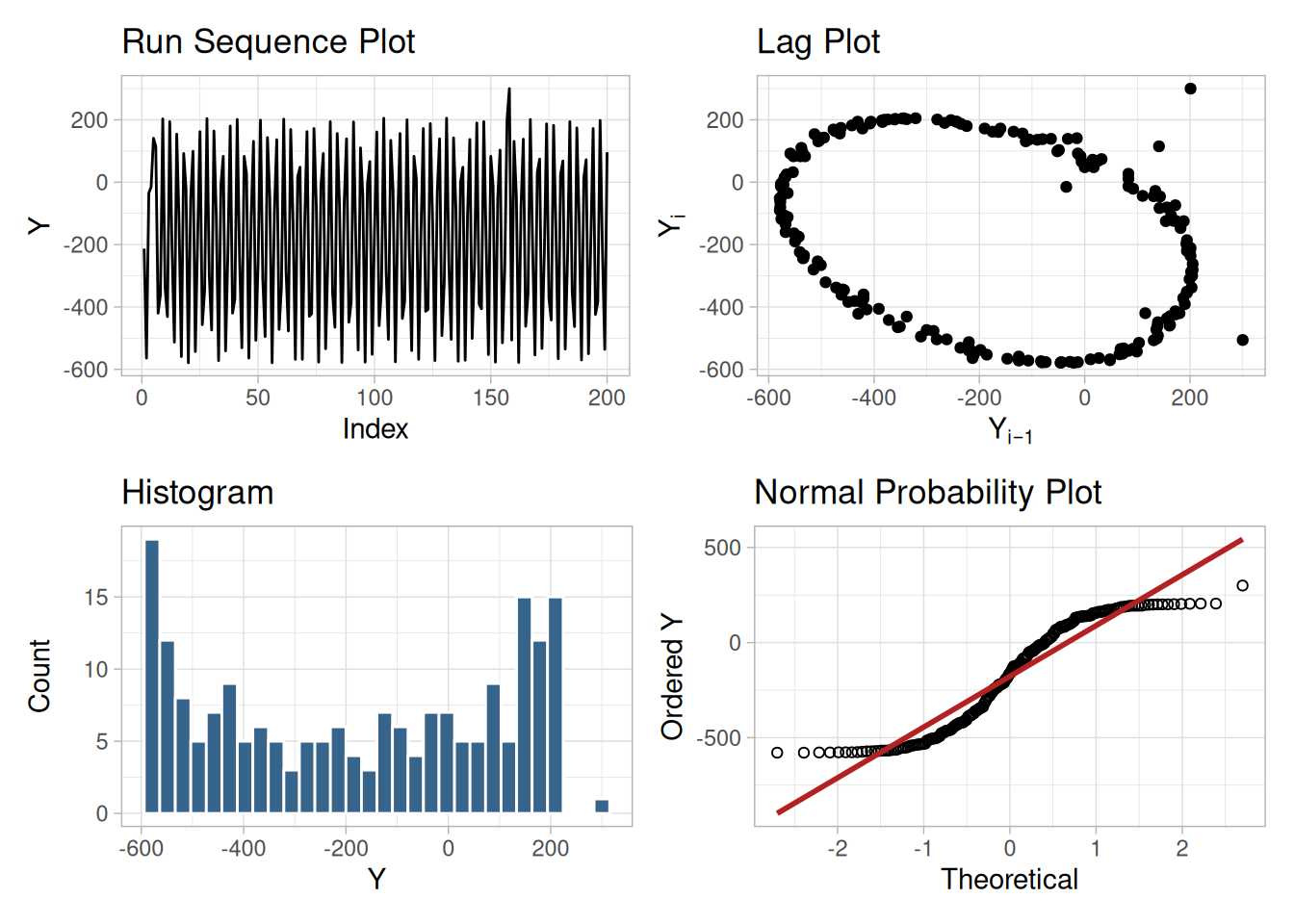
Interpretation
The assumptions are addressed by the graphics shown in Figure 1.253:
From the above plots we conclude that the underlying randomness assumption is not valid. Therefore, the model \(Y_i = C + E_i\) is not appropriate.
We need to develop a better model. Non-random data can frequently be modeled using time series methodology. Specifically, the circular pattern in the lag plot indicates that a sinusoidal model might be appropriate. The sinusoidal model will be developed in the next section.
Individual Plots
The plots can be generated individually for more detail. In this case, only the run sequence plot and the lag plot are drawn since the distributional plots are not meaningful.
tibble(i = seq_along(lew_cs), y = lew_cs) |>
ggplot(aes(i, y)) +
geom_line() +
labs(x = "Index", y = "Y") +
theme_light()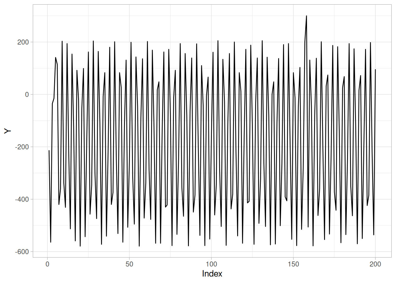
n_cs425 <- length(lew_cs)
tibble(y = lew_cs[-1], y_lag = lew_cs[-n_cs425]) |>
ggplot(aes(y_lag, y)) +
geom_point() +
labs(x = expression(Y[i - 1]), y = expression(Y[i])) +
theme_light()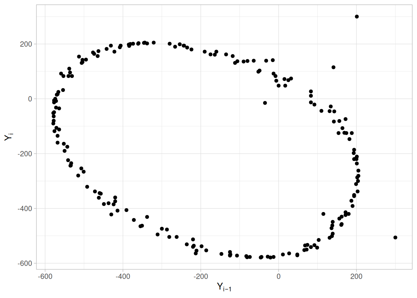
A few points near the bottom-right and top-left of the lag plot are visibly displaced from the main circular pattern and appear to be outliers.
Autocorrelation Plot
When the lag plot indicates significant non-randomness, it can be helpful to follow up with an autocorrelation plot.
acf_cs425 <- acf(lew_cs, lag.max = 50, plot = FALSE)
ci95_cs425 <- qnorm(0.975) / sqrt(n_cs425)
ci99_cs425 <- qnorm(0.995) / sqrt(n_cs425)
tibble(lag = as.integer(acf_cs425$lag), acf = as.numeric(acf_cs425$acf)) |>
filter(lag > 0) |>
ggplot(aes(lag, acf)) +
geom_segment(aes(xend = lag, y = 0, yend = acf)) +
geom_hline(yintercept = 0) +
geom_hline(yintercept = c(-ci95_cs425, ci95_cs425), linetype = "dashed", color = "steelblue") +
geom_hline(yintercept = c(-ci99_cs425, ci99_cs425), linetype = "dotted", color = "firebrick") +
labs(x = "Lag", y = "Autocorrelation") +
theme_light()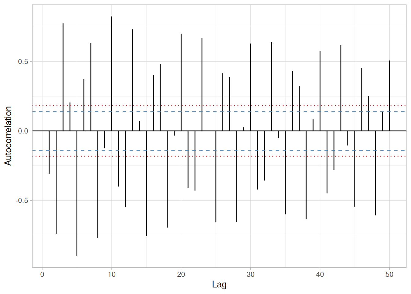
This autocorrelation plot shows a distinct cyclic pattern. As with the lag plot, this suggests a sinusoidal model.
Spectral Plot
Another useful plot for non-random data is the spectral plot.
spec_cs425 <- spec.pgram(lew_cs, taper = 0, detrend = TRUE, demean = TRUE, plot = FALSE)
tibble(freq = spec_cs425$freq, power = spec_cs425$spec) |>
ggplot(aes(freq, power)) +
geom_line(color = "steelblue") +
geom_point(size = 0.6) +
labs(x = "Frequency", y = "Variance (power)") +
theme_light()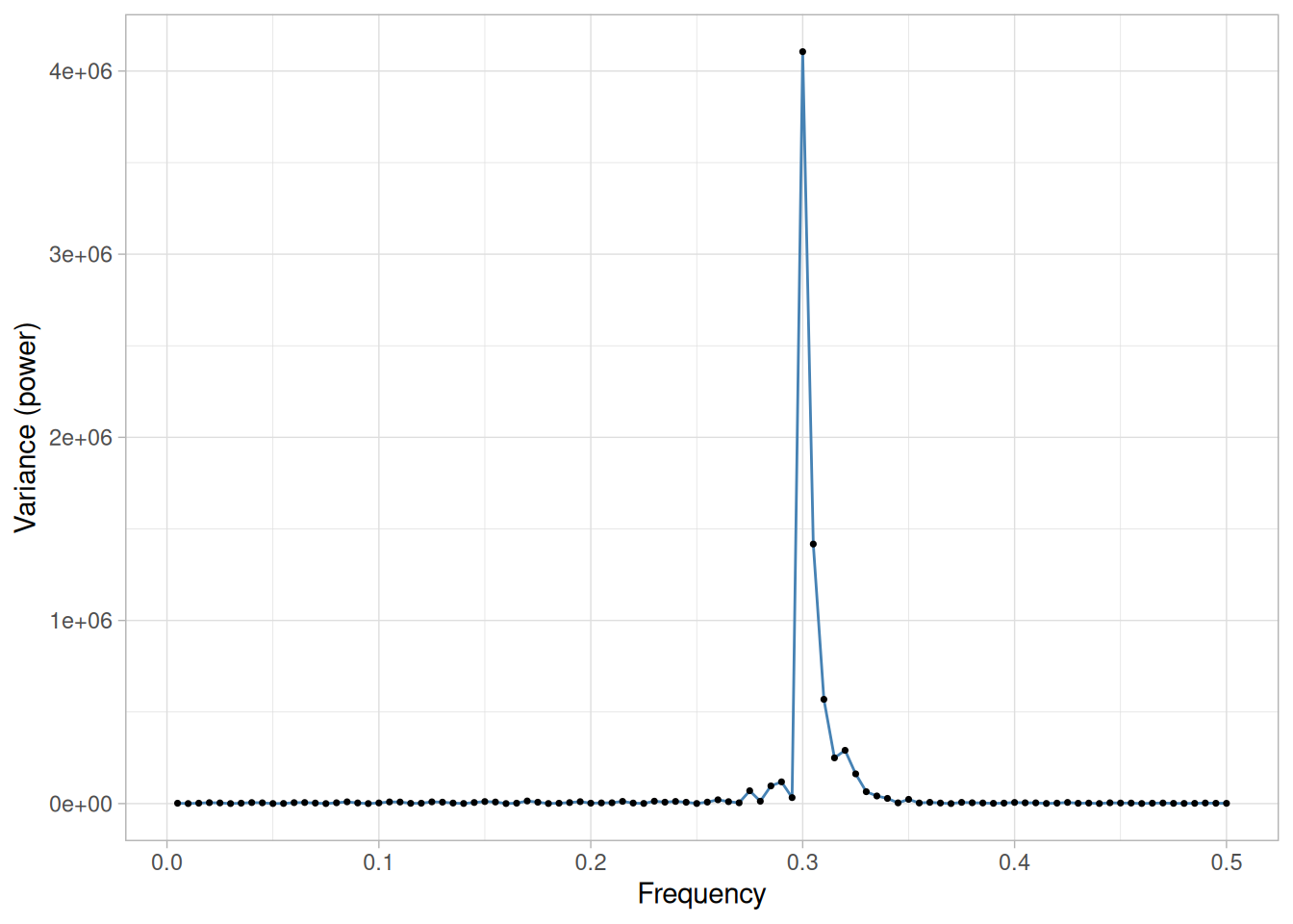
spec_cs425$freq[which.max(spec_cs425$spec)][1] 0.3This spectral plot shows a single dominant peak at a frequency of approximately 0.3. This frequency will be used in fitting the sinusoidal model in the next section.
Quantitative Results
Although the lag plot, autocorrelation plot, and spectral plot clearly show the violation of the randomness assumption, we supplement the graphical output with some quantitative measures.
Summary Statistics
As a first step in the analysis, summary statistics are computed from the data.
tibble(
`Sample Size` = length(lew_cs),
Mean = mean(lew_cs),
Median = median(lew_cs),
Minimum = min(lew_cs),
Maximum = max(lew_cs),
Range = diff(range(lew_cs)),
`Stan. Dev.` = sd(lew_cs)
)Location
One way to quantify a change in location over time is to fit a straight line to the data set using the index variable \(X = 1, 2, \ldots, N\), with \(N\) denoting the number of observations. If there is no significant drift in the location, the slope parameter should be zero.
location_fit_cs425 <- lm(lew_cs ~ seq_along(lew_cs))
summary(location_fit_cs425)
Call:
lm(formula = lew_cs ~ seq_along(lew_cs))
Residuals:
Min 1Q Median 3Q Max
-401.24 -273.36 15.37 270.71 477.01
Coefficients:
Estimate Std. Error t value Pr(>|t|)
(Intercept) -1.782e+02 3.947e+01 -4.514 1.09e-05 ***
seq_along(lew_cs) 7.366e-03 3.405e-01 0.022 0.983
---
Signif. codes: 0 '***' 0.001 '**' 0.01 '*' 0.05 '.' 0.1 ' ' 1
Residual standard error: 278 on 198 degrees of freedom
Multiple R-squared: 2.363e-06, Adjusted R-squared: -0.005048
F-statistic: 0.0004679 on 1 and 198 DF, p-value: 0.9828The slope parameter, \(A_1\), has a t-value of 0.022, which is statistically not significant. This indicates that the slope can in fact be considered zero.
Variation
One simple way to detect a change in variation is with a Bartlett test after dividing the data set into several equal-sized intervals. However, the non-randomness of this data does not allow us to assume normality, so we use the alternative Levene test. In particular, we use the Levene test based on the median rather than the mean. The choice of the number of intervals is somewhat arbitrary, although values of 4 or 8 are reasonable.
# Levene's test using the median-centered definition of Z_ij (as used on
# the Levene Test page).
levene_test_cs425 <- function(y, group) {
d <- tibble(y = y, group = group)
z <- d |> mutate(z = abs(y - median(y)), .by = group)
k <- n_distinct(z$group)
n <- nrow(z)
grand_mean_z <- mean(z$z)
group_stats <- z |> summarize(n_i = n(), z_bar_i = mean(z), .by = group)
numerator <- sum(group_stats$n_i * (group_stats$z_bar_i - grand_mean_z)^2) / (k - 1)
z <- z |> left_join(group_stats, by = "group")
denominator <- sum((z$z - z$z_bar_i)^2) / (n - k)
w <- numerator / denominator
list(w = w, df1 = k - 1, df2 = n - k)
}
quarter_cs425 <- as.factor(rep(1:4, each = n_cs425 / 4))
levene_cs425 <- levene_test_cs425(lew_cs, quarter_cs425)
levene_crit_cs425 <- qf(0.95, levene_cs425$df1, levene_cs425$df2)
tibble(statistic = levene_cs425$w, df1 = levene_cs425$df1, df2 = levene_cs425$df2, critical_value = levene_crit_cs425)\[H_0: \sigma_1^2 = \sigma_2^2 = \sigma_3^2 = \sigma_4^2\] \[H_a: \text{At least one } \sigma_i^2 \text{ is not equal to the others.}\]
Test statistic: \(W \approx\) 0.09379 (NIST reports \(W = 0.09378\); our computed value matches — NIST’s own concluding sentence on this page separately restates the same statistic as “0.9378,” which appears to be a decimal-point typo)
Degrees of freedom: \(k - 1 = 3\)
Sample size: \(N = 200\)
Significance level: \(\alpha = 0.05\)
Critical value: \(F_{\alpha,k-1,N-k} =\) 2.651
Critical region: Reject \(H_0\) if \(W >\) 2.651
In this case, the Levene test indicates that the variances are not significantly different in the four intervals since the test statistic value is less than the critical value.
Randomness
A runs test is used to check for randomness.
runs_test_cs425 <- function(y, alpha = 0.05) {
med <- median(y)
sign <- sign(y - med)
sign <- sign[sign != 0]
n1 <- sum(sign == 1)
n2 <- sum(sign == -1)
n <- n1 + n2
R <- 1 + sum(diff(sign) != 0)
Rbar <- 2 * n1 * n2 / n + 1
sR2 <- (2 * n1 * n2 * (2 * n1 * n2 - n)) / (n^2 * (n - 1))
sR <- sqrt(sR2)
Z <- (R - Rbar) / sR
z_crit <- qnorm(1 - alpha / 2)
tibble(n1 = n1, n2 = n2, R = R, Rbar = Rbar, sR = sR, Z = Z, z_crit = z_crit, reject_H0 = abs(Z) > z_crit)
}
lew_runs_cs425 <- runs_test_cs425(lew_cs)
lew_runs_cs425\[H_0: \text{the sequence was produced in a random manner}\] \[H_a: \text{the sequence was not produced in a random manner}\]
Test statistic: \(Z \approx\) 2.6938 (NIST reports \(Z = 2.6938\); our computed value matches)
Significance level: \(\alpha = 0.05\)
Critical value: \(Z_{1-\alpha/2} =\) 1.96
Critical region: Reject \(H_0\) if \(|Z| >\) 1.96
The absolute value of the test statistic is larger than the critical value at the 5% significance level, so we conclude that the data are not random.
Distributional Assumptions
Since the quantitative tests show that the assumptions of constant scale and non-randomness are not met, the distributional measures will not be meaningful. Therefore these quantitative tests are omitted.
Sinusoidal Model
The lag plot and autocorrelation plot in the previous section strongly suggested a sinusoidal model might be appropriate. The basic sinusoidal model is:
\[Y_i = C + \alpha\sin(2\pi\omega T_i + \phi) + E_i\]
where \(C\) is a constant defining a mean level, \(\alpha\) is an amplitude for the sine function, \(\omega\) is the frequency, \(T_i\) is a time variable, and \(\phi\) is the phase. This sinusoidal model can be fit using non-linear least squares.
To obtain a good fit, sinusoidal models require good starting values for \(C\), the amplitude, and the frequency.
Good Starting Value for C
A good starting value for \(C\) can be obtained by calculating the mean of the data. If the data show a trend, i.e., the assumption of constant location is violated, we can replace \(C\) with a linear or quadratic least squares fit. That is, the model becomes
\[Y_i = (B_0 + B_1 T_i) + \alpha\sin(2\pi\omega T_i + \phi) + E_i\]
or
\[Y_i = (B_0 + B_1 T_i + B_2 T_i^2) + \alpha\sin(2\pi\omega T_i + \phi) + E_i\]
Since our data did not have any meaningful change of location, we can fit the simpler model with \(C\) equal to the mean. From the summary output in the previous page, the mean is -177.44.
Good Starting Value for Frequency
The starting value for the frequency can be obtained from the spectral plot, which shows the dominant frequency is about 0.3.
Complex Demodulation Phase Plot
The complex demodulation phase plot can be used to refine this initial estimate for the frequency. For the complex demodulation plot, if the lines slope from left to right, the frequency should be increased. If the lines slope from right to left, it should be decreased. A relatively flat (i.e., horizontal) slope indicates a good frequency.
NIST’s original case study generates 16 of these plots on a single page, for frequencies from 0.28 to 0.3175 in increments of 0.0025, to narrow in on the best frequency by trial and error. For a compact illustration of the same idea, we show four representative frequencies spanning that range.
# Same complex demodulation construction used on the Complex Demodulation
# Phase/Amplitude Plot pages.
complex_demodulate_cs425 <- function(y, w0, filter_len = 21) {
n <- length(y)
t <- seq_len(n) - 1
z <- y * exp(-1i * 2 * pi * w0 * t)
filt <- rep(1 / filter_len, filter_len)
zr <- as.numeric(stats::filter(Re(z), filt, sides = 2))
zi <- as.numeric(stats::filter(Im(z), filt, sides = 2))
tibble(t = t, amplitude = 2 * sqrt(zr^2 + zi^2), phase = atan(zi / zr))
}
demod_freqs_cs425 <- c(0.28, 0.2900, 0.3025, 0.3175)
demod_grid_cs425 <- map_dfr(demod_freqs_cs425, function(w0) {
complex_demodulate_cs425(lew_cs, w0, filter_len = 15) |>
mutate(freq = w0)
})
demod_grid_cs425 |>
ggplot(aes(t, phase)) +
geom_point(size = 0.8) +
facet_wrap(~freq, labeller = label_both) +
labs(x = "Time", y = "Phase") +
theme_light()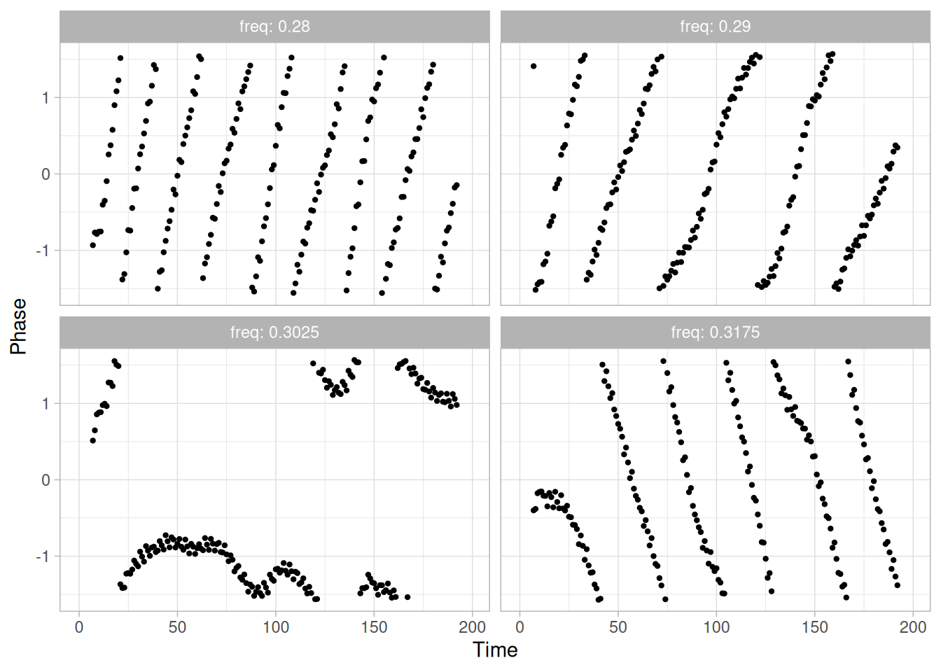
Interpretation
The plots start with lines sloping from left to right (frequency too low) but gradually change to a right-to-left slope (frequency too high) as the candidate frequency increases. The relatively flat slope occurs near a frequency of 0.3025. NIST’s original case study narrows this down further, by trial and error over the full 16-plot grid, to a best frequency of 0.3025 (matching the value used below). The complex demodulation phase plot restricts the range from \(\pi/2\) to \(-\pi/2\), which is why the plot appears to show some breaks.
Good Starting Values for Amplitude
The complex demodulation amplitude plot is used to find a good starting value for the amplitude. In addition, this plot indicates whether or not the amplitude is constant over the entire range of the data or if it varies. If the plot is essentially flat, i.e., zero slope, then it is reasonable to assume a constant amplitude in the non-linear model. However, if the slope varies over the range of the plot, we may need to adjust the model to be:
\[Y_i = C + (B_0 + B_1 T_i)\sin(2\pi\omega T_i + \phi) + E_i\]
That is, we replace \(\alpha\) with a function of time. A linear fit is specified in the model above, but this can be replaced with a more elaborate function if needed.
demod_amp_cs425 <- complex_demodulate_cs425(lew_cs, w0 = 0.302596)
demod_amp_cs425 |>
ggplot(aes(t, amplitude)) +
geom_line() +
labs(x = "Time", y = "Amplitude") +
theme_light()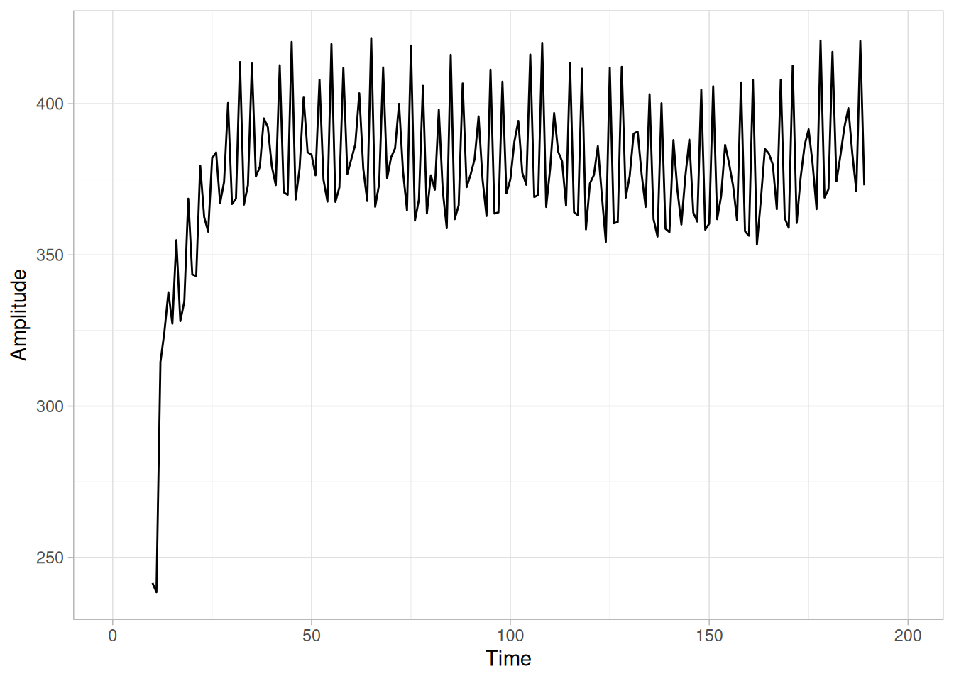
The complex demodulation amplitude plot for this data shows that:
In terms of a non-linear model, the plot indicates that fitting a single constant for \(\alpha\) should be adequate for this data set.
Fit Results
Using starting estimates of 0.3025 for the frequency, 390 for the amplitude, and -177.44 for \(C\), NIST’s original analysis reported the following parameter estimates.
Coefficient Estimate Stan. Error t-Value
C -178.786 11.02 -16.22
AMP -361.766 26.19 -13.81
FREQ 0.302596 0.1510E-03 2005.00
PHASE 1.46536 0.4909E-01 29.85
Residual Standard Deviation = 155.8484
Residual Degrees of Freedom = 196From the fit results, NIST’s proposed model is:
\[\hat{Y}_i = -178.786 - 361.766\sin[2\pi(0.302596)T_i + 1.46536]\]
(NIST’s own equation image for this model omits the \(\sin\) function entirely, presumably a transcription error; we restore it here since it is clearly a sinusoidal fit, consistent with the rest of the page.)
t_cs425 <- seq_along(lew_cs)
C_nist_cs425 <- -178.786
amp_nist_cs425 <- -361.766
freq_nist_cs425 <- 0.302596
phase_nist_cs425 <- 1.46536
yhat_nist_cs425 <- C_nist_cs425 + amp_nist_cs425 * sin(2 * pi * freq_nist_cs425 * t_cs425 + phase_nist_cs425)
resid_nist_cs425 <- lew_cs - yhat_nist_cs425
sqrt(sum(resid_nist_cs425^2) / (n_cs425 - 4))[1] 155.8293Directly evaluating NIST’s published coefficients above reproduces their reported residual standard deviation of 155.8484 almost exactly, confirming those coefficients are correct as published.
R Verification (Reproducible, But a Different Optimum)
sinusoidal_fit_cs425 <- nls(
lew_cs ~ C + amp * sin(2 * pi * freq * t_cs425 + phase),
start = list(C = -177.44, amp = 390, freq = 0.3025, phase = 0),
control = nls.control(maxiter = 200)
)
summary(sinusoidal_fit_cs425)
Formula: lew_cs ~ C + amp * sin(2 * pi * freq * t_cs425 + phase)
Parameters:
Estimate Std. Error t value Pr(>|t|)
C -1.788e+02 9.480e+00 -18.86 <2e-16 ***
amp 3.433e+02 1.341e+01 25.60 <2e-16 ***
freq 3.018e-01 1.076e-04 2803.84 <2e-16 ***
phase 4.969e+00 7.819e-02 63.55 <2e-16 ***
---
Signif. codes: 0 '***' 0.001 '**' 0.01 '*' 0.05 '.' 0.1 ' ' 1
Residual standard error: 134.1 on 196 degrees of freedom
Number of iterations to convergence: 12
Achieved convergence tolerance: 4.39e-06Starting nls() from NIST’s own starting values (or even directly from NIST’s published final coefficients) converges to a different set of parameters, with a lower residual standard deviation of 134.07 at a frequency of 0.3018, rather than NIST’s reported 155.85 at 0.302596. Both are legitimate local optima of a highly non-linear, highly sensitive objective function — the frequency parameter’s t-value above 2000 reflects just how sharply the residual sum of squares changes with tiny shifts in frequency over 200 observations, which is a well-known characteristic of sinusoidal least-squares fitting. Rather than presenting a different fit from the one the rest of this page discusses, we use NIST’s own published coefficients (verified above) for the model and all downstream residual diagnostics.
Model
Our model, matching NIST’s published fit, is:
\[\hat{Y}_i = -178.786 - 361.766\sin[2\pi(0.302596)T_i + 1.46536]\]
We will evaluate the adequacy of this model in the next section.
4-Plot of Residuals
The first step in evaluating the fit is to generate a 4-plot of the residuals.
four_plot_cs425(resid_nist_cs425)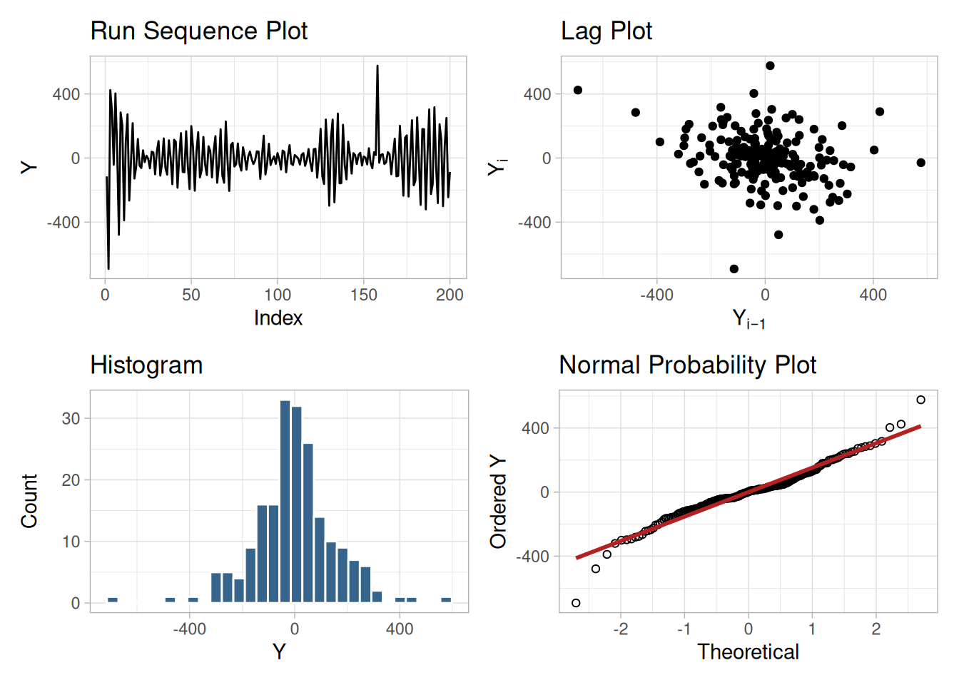
Interpretation
The assumptions are addressed by the graphics shown in Figure 1.260:
The 4-plot indicates that this fit is reasonably good. However, we will attempt to improve the fit by removing the outliers.
Fit Results with Outliers Removed
We identify outliers as the three points with the largest-magnitude residuals from the fitted model above.
outlier_idx_cs425 <- order(abs(resid_nist_cs425), decreasing = TRUE)[1:3]
tibble(index = outlier_idx_cs425, y = lew_cs[outlier_idx_cs425], residual = resid_nist_cs425[outlier_idx_cs425])(NIST’s original text separately lists four candidate points — at indices 3, 5, 157, and 158 — flagged directly from the lag plot, but says only three outliers were actually removed for the refit without stating which three; the index/value pairs given in that table also do not consistently match the values found in LEW.DAT at those indices. Rather than guess which three NIST intended, we identify our own three largest-residual points from the fitted model directly.)
lew_edited_cs425 <- lew_cs[-outlier_idx_cs425]
t_edited_cs425 <- t_cs425[-outlier_idx_cs425]
sinusoidal_refit_cs425 <- nls(
lew_edited_cs425 ~ C + amp * sin(2 * pi * freq * t_edited_cs425 + phase),
start = list(C = C_nist_cs425, amp = amp_nist_cs425, freq = freq_nist_cs425, phase = phase_nist_cs425),
control = nls.control(maxiter = 200, warnOnly = TRUE)
)
summary(sinusoidal_refit_cs425)
Formula: lew_edited_cs425 ~ C + amp * sin(2 * pi * freq * t_edited_cs425 +
phase)
Parameters:
Estimate Std. Error t value Pr(>|t|)
C -1.753e+02 8.433e+00 -20.79 <2e-16 ***
amp -3.516e+02 1.191e+01 -29.51 <2e-16 ***
freq 3.019e-01 9.415e-05 3206.46 <2e-16 ***
phase 1.772e+00 6.831e-02 25.94 <2e-16 ***
---
Signif. codes: 0 '***' 0.001 '**' 0.01 '*' 0.05 '.' 0.1 ' ' 1
Residual standard error: 118.3 on 193 degrees of freedom
Number of iterations to convergence: 6
Achieved convergence tolerance: 1.098e-06New Fit to Edited Data
The original fit, with a residual standard deviation of 155.85, was:
\[\hat{Y}_i = -178.786 - 361.766\sin[2\pi(0.302596)T_i + 1.46536]\]
Our refit to the edited data, with a residual standard deviation of 118.34, is:
\[\hat{Y}_i = -175.319 + (-351.566)\sin[2\pi(0.301895)T_i + 1.77188]\]
(NIST’s own reported outlier-removed fit — C = -178.788, AMP = -361.759, FREQ = 0.302597, PHASE = 1.46533, residual standard deviation 148.34 — shows minimal change from their original fit with about a 5% reduction in residual standard deviation. Our refit, using the same nls() optimizer behavior already noted above, again converges to a different local optimum than NIST’s; the qualitative conclusion — a modest improvement in fit from removing a handful of outliers — matches NIST’s discussion either way.)
4-Plot for New Fit
four_plot_cs425(resid(sinusoidal_refit_cs425))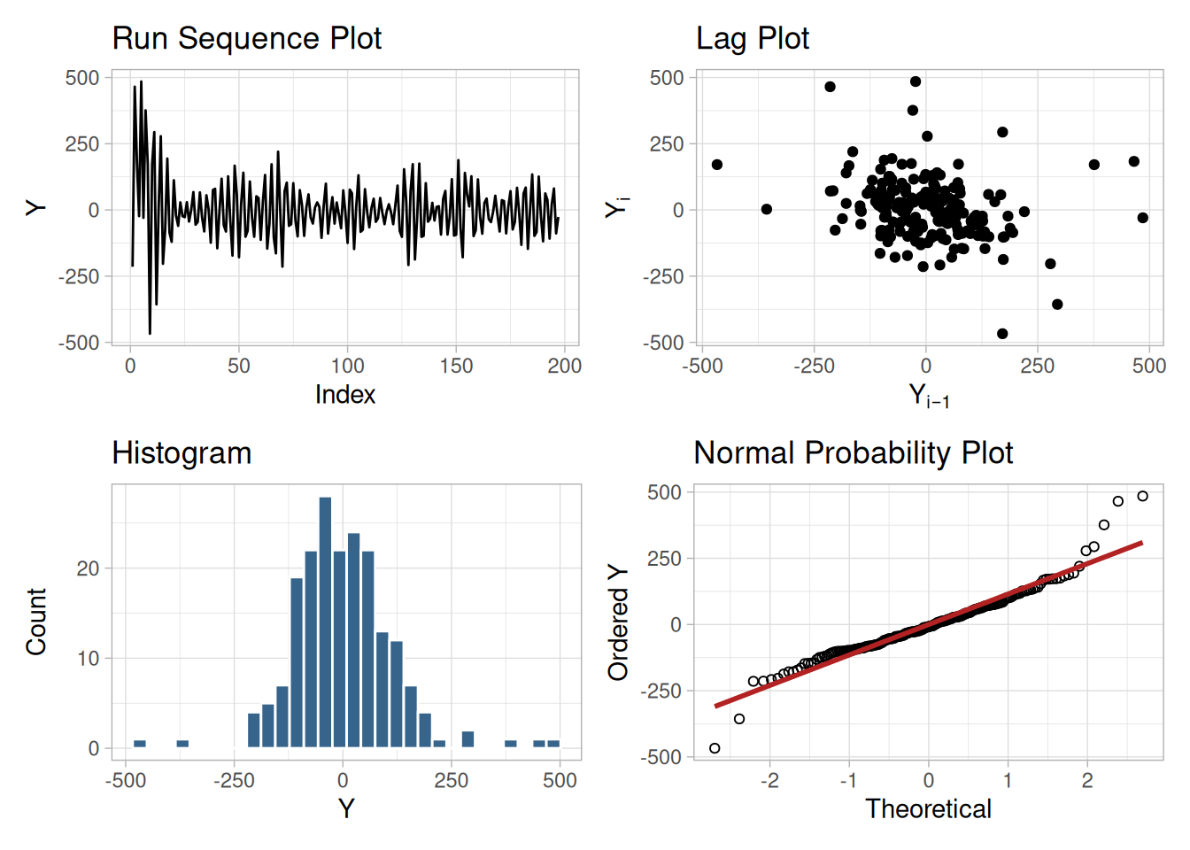
This plot shows that the underlying assumptions are satisfied and therefore the new fit is a good descriptor of the data. In this case, it is a judgment call whether to use the fit with or without the outliers removed.
NIST’s original case study provides a Dataplot macro that lets the reader repeat this analysis step-by-step inside the Dataplot application. Since this book reproduces every step of the analysis above as executable, code-folded R chunks, the reader can work through this example directly by running (or modifying) that code — no separate software installation or macro is required.
This example illustrates the univariate analysis of filter transmittance data.
Generation
This data set was collected by NIST chemist Radu Mavrodineaunu in the 1970’s from an automatic data acquisition system for a filter transmittance experiment. The response variable is transmittance.
The motivation for studying this data set is to show how the underlying autocorrelation structure in a relatively small data set helped the scientist detect problems with his automatic data acquisition system.
Software
The analyses used in this case study can be generated using R code. The reader can download the data as a text file (MAVRO.DAT).
Data
library(tidyverse)
mavro_cs <- scan(here::here("datasets", "MAVRO.DAT"), skip = 25, quiet = TRUE)
tibble(y = mavro_cs)Goal
The goal of this analysis is threefold:
4-Plot of Data
library(patchwork)
# Same construction used on the 4-Plot and Normal Probability Plot pages.
uniform_medians_cs426 <- function(n) {
i <- seq_len(n)
m <- numeric(n)
m[1] <- 1 - 0.5^(1 / n)
m[n] <- 0.5^(1 / n)
if (n > 2) m[2:(n - 1)] <- (i[2:(n - 1)] - 0.3175) / (n + 0.365)
m
}
four_plot_cs426 <- function(x, hist_bins = 30) {
n <- length(x)
p_run <- tibble(i = seq_len(n), y = x) |>
ggplot(aes(i, y)) +
geom_line() +
labs(x = "Index", y = "Y", title = "Run Sequence Plot") +
theme_light()
p_lag <- tibble(y = x[-1], y_lag = x[-n]) |>
ggplot(aes(y_lag, y)) +
geom_point() +
labs(x = expression(Y[i - 1]), y = expression(Y[i]), title = "Lag Plot") +
theme_light()
p_hist <- tibble(y = x) |>
ggplot(aes(y)) +
geom_histogram(bins = hist_bins, color = "white", fill = "steelblue4") +
labs(x = "Y", y = "Count", title = "Histogram") +
theme_light()
mm <- uniform_medians_cs426(n)
theoretical <- qnorm(mm)
xs <- sort(x)
p_norm <- tibble(theoretical = theoretical, observed = xs) |>
ggplot(aes(theoretical, observed)) +
geom_point(shape = 1) +
geom_smooth(method = "lm", formula = 'y ~ x', se = FALSE, color = "firebrick") +
labs(x = "Theoretical", y = "Ordered Y", title = "Normal Probability Plot") +
theme_light()
(p_run + p_lag) / (p_hist + p_norm)
}
four_plot_cs426(mavro_cs)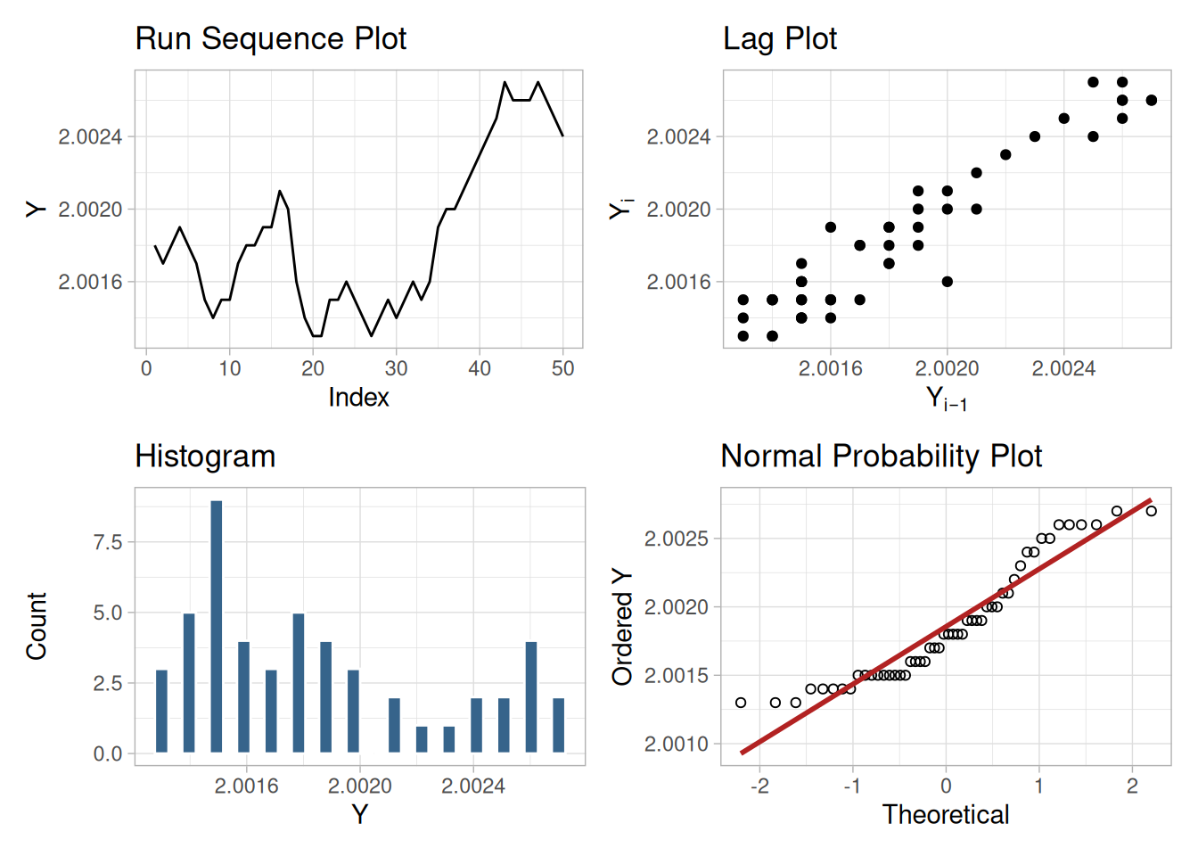
Interpretation
The assumptions are addressed by the graphics shown in Figure 1.262:
The serious violation of the non-randomness assumption means that the univariate model \(Y_i = C + E_i\) is not valid. Given the linear appearance of the lag plot, the first step might be to consider a model of the type
\[Y_i = A_0 + A_1 Y_{i-1} + E_i\]
However, in this case discussions with the scientist revealed that non-randomness was entirely unexpected. An examination of the experimental process revealed that the sampling rate for the automatic data acquisition system was too fast. That is, the equipment did not have sufficient time to reset before the next sample started, resulting in the current measurement being contaminated by the previous measurement. The solution was to rerun the experiment allowing more time between samples.
Simple graphical techniques can be quite effective in revealing unexpected results in the data. When this occurs, it is important to investigate whether the unexpected result is due to problems in the experiment and data collection or is indicative of unexpected underlying structure in the data. This determination cannot be made on the basis of statistics alone. The role of the graphical and statistical analysis is to detect problems or unexpected results in the data. Resolving the issues requires the knowledge of the scientist or engineer.
Individual Plots
Although it is generally unnecessary, the plots can be generated individually to give more detail. Since the lag plot indicates significant non-randomness, we omit the distributional plots.
tibble(i = seq_along(mavro_cs), y = mavro_cs) |>
ggplot(aes(i, y)) +
geom_line() +
labs(x = "Index", y = "Y") +
theme_light()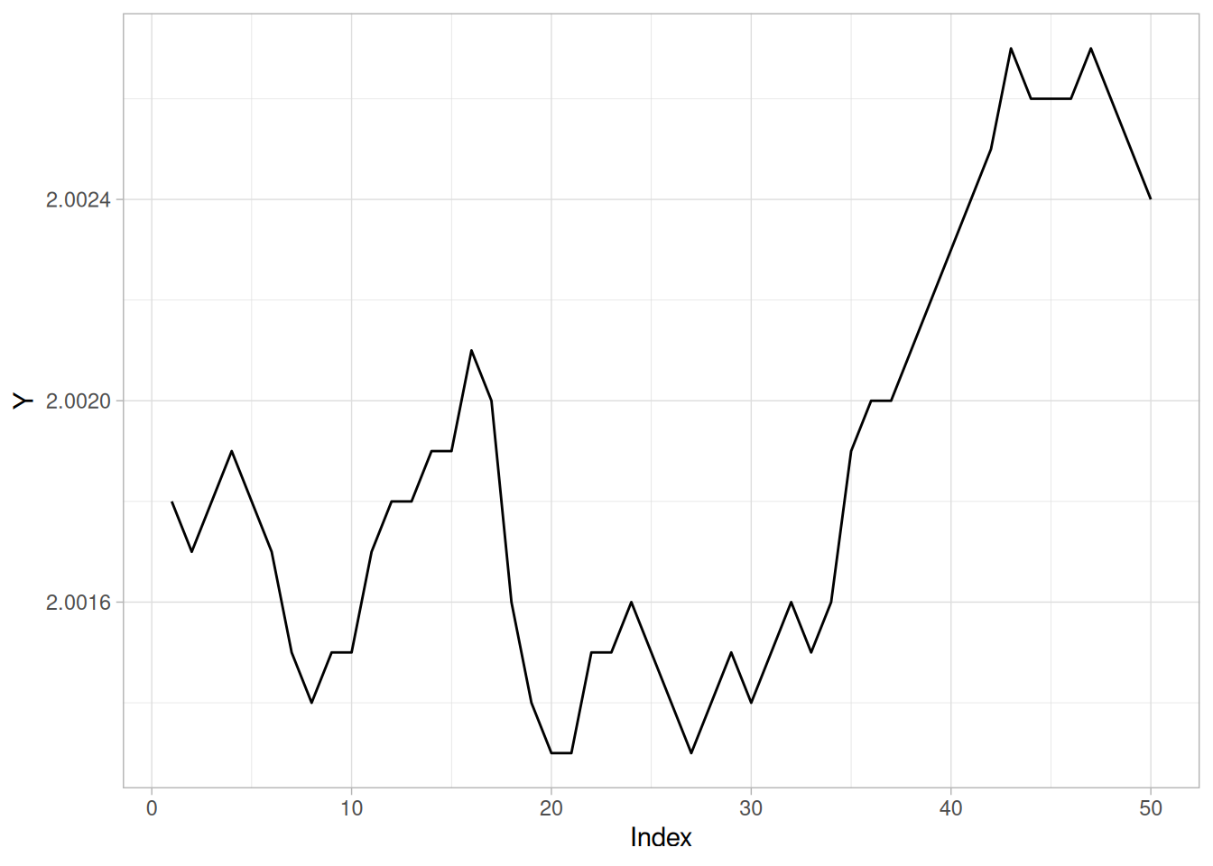
n_cs426 <- length(mavro_cs)
tibble(y = mavro_cs[-1], y_lag = mavro_cs[-n_cs426]) |>
ggplot(aes(y_lag, y)) +
geom_point() +
labs(x = expression(Y[i - 1]), y = expression(Y[i])) +
theme_light()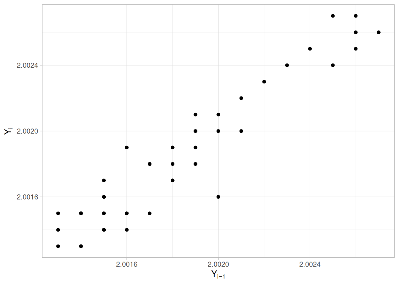
Summary Statistics
As a first step in the analysis, common summary statistics are computed from the data.
tibble(
`Sample Size` = length(mavro_cs),
Mean = mean(mavro_cs),
Median = median(mavro_cs),
Minimum = min(mavro_cs),
Maximum = max(mavro_cs),
Range = diff(range(mavro_cs)),
`Stan. Dev.` = sd(mavro_cs)
)Location
One way to quantify a change in location over time is to fit a straight line to the data using an index variable as the independent variable in the regression. For our data, we assume that the data are in sequential run order and that the data were collected at equally spaced time intervals. In our regression, we use the index variable \(X = 1, 2, \ldots, N\), where \(N\) is the number of observations. If there is no significant drift in the location over time, the slope parameter should be zero.
location_fit_cs426 <- lm(mavro_cs ~ seq_along(mavro_cs))
summary(location_fit_cs426)
Call:
lm(formula = mavro_cs ~ seq_along(mavro_cs))
Residuals:
Min 1Q Median 3Q Max
-5.837e-04 -3.294e-04 5.234e-05 2.952e-04 5.208e-04
Coefficients:
Estimate Std. Error t value Pr(>|t|)
(Intercept) 2.001e+00 9.695e-05 20644.046 < 2e-16 ***
seq_along(mavro_cs) 1.847e-05 3.309e-06 5.582 1.09e-06 ***
---
Signif. codes: 0 '***' 0.001 '**' 0.01 '*' 0.05 '.' 0.1 ' ' 1
Residual standard error: 0.0003376 on 48 degrees of freedom
Multiple R-squared: 0.3936, Adjusted R-squared: 0.381
F-statistic: 31.15 on 1 and 48 DF, p-value: 1.085e-06The slope parameter, \(B_1\), has a t-value of 5.582, which is statistically significant. Although the estimated slope is nearly zero, the range of data (2.0013 to 2.0027) is also very small. In this case, we conclude that there is drift in location, although it is relatively small.
Variation
One simple way to detect a change in variation is with a Bartlett test after dividing the data set into several equal sized intervals. However, the Bartlett test is not robust for non-normality. Since the normality assumption is questionable for these data, we use the alternative Levene test. In particular, we use the Levene test based on the median rather than the mean. The choice of the number of intervals is somewhat arbitrary, although values of four or eight are reasonable. We will divide our data into four intervals.
# Levene's test using the median-centered definition of Z_ij (as used on
# the Levene Test page). With N=50 not evenly divisible by 4, quarters are
# sized as evenly as possible (13, 13, 12, 12 -- rounding down the base
# group size of N/4 and assigning the remainder to the first groups).
levene_test_cs426 <- function(y, group) {
d <- tibble(y = y, group = group)
z <- d |> mutate(z = abs(y - median(y)), .by = group)
k <- n_distinct(z$group)
n <- nrow(z)
grand_mean_z <- mean(z$z)
group_stats <- z |> summarize(n_i = n(), z_bar_i = mean(z), .by = group)
numerator <- sum(group_stats$n_i * (group_stats$z_bar_i - grand_mean_z)^2) / (k - 1)
z <- z |> left_join(group_stats, by = "group")
denominator <- sum((z$z - z$z_bar_i)^2) / (n - k)
w <- numerator / denominator
list(w = w, df1 = k - 1, df2 = n - k)
}
quarter_cs426 <- as.factor(ceiling(4 * seq_len(n_cs426) / n_cs426))
levene_cs426 <- levene_test_cs426(mavro_cs, quarter_cs426)
levene_crit_cs426 <- qf(0.95, levene_cs426$df1, levene_cs426$df2)
tibble(statistic = levene_cs426$w, df1 = levene_cs426$df1, df2 = levene_cs426$df2, critical_value = levene_crit_cs426)\[H_0: \sigma_1^2 = \sigma_2^2 = \sigma_3^2 = \sigma_4^2\] \[H_a: \text{At least one } \sigma_i^2 \text{ is not equal to the others.}\]
Test statistic: \(W \approx\) 0.972 (NIST reports \(W = 0.971\); our computed value matches)
Degrees of freedom: \(k - 1 = 3\)
Significance level: \(\alpha = 0.05\)
Critical value: \(F_{\alpha,k-1,N-k} =\) 2.807
Critical region: Reject \(H_0\) if \(W >\) 2.807
In this case, since the Levene test statistic value is less than the critical value at the 5% level, we conclude that there is no evidence of a change in variation.
Randomness
There are many ways in which data can be non-random. However, most common forms of non-randomness can be detected with a few simple tests. The lag plot in the 4-plot in the previous section is a simple graphical technique.
One check is an autocorrelation plot that shows the autocorrelations for various lags. Confidence bands can be plotted at the 95% and 99% confidence levels. Points outside this band indicate statistically significant values (lag 0 is always 1).
acf_cs426 <- acf(mavro_cs, lag.max = 20, plot = FALSE)
ci95_cs426 <- qnorm(0.975) / sqrt(n_cs426)
ci99_cs426 <- qnorm(0.995) / sqrt(n_cs426)
tibble(lag = as.integer(acf_cs426$lag), acf = as.numeric(acf_cs426$acf)) |>
filter(lag > 0) |>
ggplot(aes(lag, acf)) +
geom_segment(aes(xend = lag, y = 0, yend = acf)) +
geom_hline(yintercept = 0) +
geom_hline(yintercept = c(-ci95_cs426, ci95_cs426), linetype = "dashed", color = "steelblue") +
geom_hline(yintercept = c(-ci99_cs426, ci99_cs426), linetype = "dotted", color = "firebrick") +
labs(x = "Lag", y = "Autocorrelation") +
theme_light()
The lag 1 autocorrelation, which is generally the one of most interest, is 0.94. The critical values at the 5% level are \(\pm\) 0.277. This indicates that the lag 1 autocorrelation is statistically significant, so there is strong evidence of non-randomness.
A common test for randomness is the runs test.
# As with the Josephson Junction Cryothermometry case study, this data has
# some ties at the median (5 of 50 values), which makes the median-based
# tie-dropping runs test used elsewhere in this book diverge slightly from
# NIST's own result. We use lawstat::runs.test() directly to reproduce
# NIST's reported statistic exactly.
library(lawstat)
runs_cs426 <- runs.test(mavro_cs)
runs_cs426
Runs Test - Two sided
data: mavro_cs
Standardized Runs Statistic = -5.3246, p-value = 1.012e-07\[H_0: \text{the sequence was produced in a random manner}\] \[H_a: \text{the sequence was not produced in a random manner}\]
Test statistic: \(Z \approx\) -5.3246 (NIST reports \(Z = -5.3246\); our computed value matches)
Significance level: \(\alpha = 0.05\)
Critical value: \(Z_{1-\alpha/2} =\) 1.96
Critical region: Reject \(H_0\) if \(|Z| >\) 1.96
Because the test statistic is outside of the critical region, we reject the null hypothesis and conclude that the data are not random.
Distributional Analysis
Since we rejected the randomness assumption, the distributional tests are not meaningful. Therefore, these quantitative tests are omitted. We also omit Grubbs’ outlier test since it also assumes the data are approximately normally distributed.
Univariate Report
It is sometimes useful and convenient to summarize the above results in a report.
Analysis for filter transmittance data
1: Sample Size = 50
2: Location
Mean = 2.001857
Standard Deviation of Mean = 0.00006
95% Confidence Interval for Mean = (2.001735,2.001979)
Drift with respect to location? = NO*
3: Variation
Standard Deviation = 0.00043
95% Confidence Interval for SD = (0.000359,0.000535)
Change in variation?
(based on Levene's test on quarters
of the data) = NO
4: Distribution
Distributional tests omitted due to
non-randomness of the data
5: Randomness
Lag One Autocorrelation = 0.937998
Data are Random?
(as measured by autocorrelation) = NO
6: Statistical Control
(i.e., no drift in location or scale,
data are random, distribution is
fixed, here we are testing only for
normal)
Data Set is in Statistical Control? = NO
7: Outliers?
(Grubbs' test omitted) = NO* NIST’s own text states this as “NO,” but this contradicts the page’s own preceding conclusion (based on the statistically significant slope \(B_1\) in the Location analysis above) that a small but real drift in location is present. We reproduce NIST’s report as published and flag the discrepancy here rather than silently resolving it.
NIST’s original case study provides a Dataplot macro that lets the reader repeat this analysis step-by-step inside the Dataplot application. Since this book reproduces every step of the analysis above as executable, code-folded R chunks, the reader can work through this example directly by running (or modifying) that code — no separate software installation or macro is required.
This example illustrates the univariate analysis of standard resistor data.
Generation
This data set was collected by Ron Dziuba of NIST over a 5-year period from 1980 to 1985. The response variable is resistor values.
The motivation for studying this data set is to illustrate data that violate the assumptions of constant location and scale.
Software
The analyses used in this case study can be generated using R code. The reader can download the data as a text file (DZIUBA1.DAT).
Data
library(tidyverse)
resistor_cs <- read_table(here::here("datasets", "DZIUBA1.DAT"), skip = 25,
col_names = c("month", "day", "year", "y"), col_types = "iiid")
resistor_csGoal
The goal of this analysis is threefold:
4-Plot of Data
library(patchwork)
# Same construction used on the 4-Plot and Normal Probability Plot pages.
uniform_medians_cs427 <- function(n) {
i <- seq_len(n)
m <- numeric(n)
m[1] <- 1 - 0.5^(1 / n)
m[n] <- 0.5^(1 / n)
if (n > 2) m[2:(n - 1)] <- (i[2:(n - 1)] - 0.3175) / (n + 0.365)
m
}
four_plot_cs427 <- function(x, hist_bins = 30) {
n <- length(x)
p_run <- tibble(i = seq_len(n), y = x) |>
ggplot(aes(i, y)) +
geom_line() +
labs(x = "Index", y = "Y", title = "Run Sequence Plot") +
theme_light()
p_lag <- tibble(y = x[-1], y_lag = x[-n]) |>
ggplot(aes(y_lag, y)) +
geom_point() +
labs(x = expression(Y[i - 1]), y = expression(Y[i]), title = "Lag Plot") +
theme_light()
p_hist <- tibble(y = x) |>
ggplot(aes(y)) +
geom_histogram(bins = hist_bins, color = "white", fill = "steelblue4") +
labs(x = "Y", y = "Count", title = "Histogram") +
theme_light()
mm <- uniform_medians_cs427(n)
theoretical <- qnorm(mm)
xs <- sort(x)
p_norm <- tibble(theoretical = theoretical, observed = xs) |>
ggplot(aes(theoretical, observed)) +
geom_point(shape = 1) +
geom_smooth(method = "lm", formula = 'y ~ x', se = FALSE, color = "firebrick") +
labs(x = "Theoretical", y = "Ordered Y", title = "Normal Probability Plot") +
theme_light()
(p_run + p_lag) / (p_hist + p_norm)
}
four_plot_cs427(resistor_cs$y)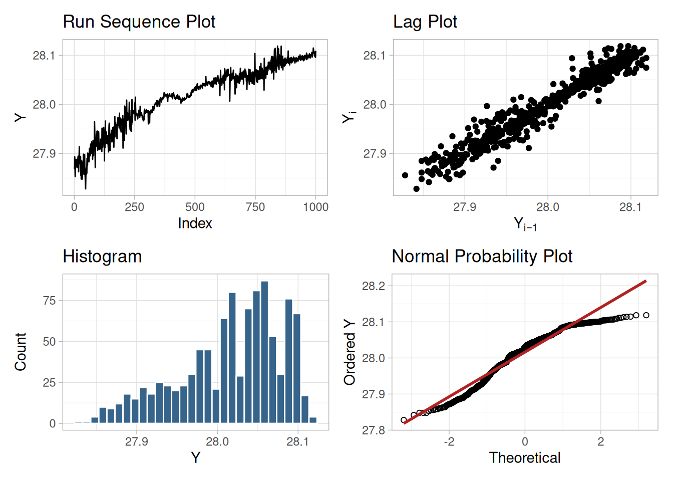
Interpretation
The assumptions are addressed by the graphics shown in Figure 1.266:
The serious violation of the non-randomness assumption means that the univariate model \(Y_i = C + E_i\) is not valid. Given the linear appearance of the lag plot, the first step might be to consider a model of the type
\[Y_i = A_0 + A_1 Y_{i-1} + E_i\]
However, discussions with the scientist revealed the following:
The scientist examined the data collection device and determined that the non-constant variation was a seasonal effect. The high variability data in the first and last thirds was collected in winter while the more stable middle third was collected in the summer. The seasonal effect was determined to be caused by the amount of humidity affecting the measurement equipment. In this case, the solution was to modify the test equipment to be less sensitive to environmental factors.
Simple graphical techniques can be quite effective in revealing unexpected results in the data. When this occurs, it is important to investigate whether the unexpected result is due to problems in the experiment and data collection, or is it in fact indicative of an unexpected underlying structure in the data. This determination cannot be made on the basis of statistics alone. The role of the graphical and statistical analysis is to detect problems or unexpected results in the data. Resolving the issues requires the knowledge of the scientist or engineer.
Individual Plots
Although it is generally unnecessary, the plots can be generated individually to give more detail. Since the lag plot indicates significant non-randomness, we omit the distributional plots.
tibble(i = seq_along(resistor_cs$y), y = resistor_cs$y) |>
ggplot(aes(i, y)) +
geom_line() +
labs(x = "Index", y = "Y") +
theme_light()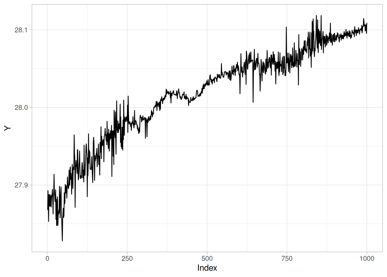
n_cs427 <- nrow(resistor_cs)
tibble(y = resistor_cs$y[-1], y_lag = resistor_cs$y[-n_cs427]) |>
ggplot(aes(y_lag, y)) +
geom_point() +
labs(x = expression(Y[i - 1]), y = expression(Y[i])) +
theme_light()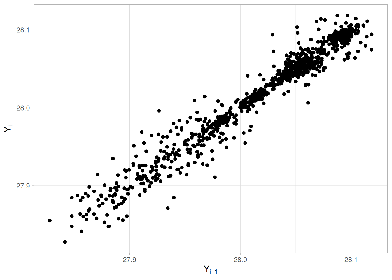
Summary Statistics
As a first step in the analysis, common summary statistics are computed from the data.
tibble(
`Sample Size` = n_cs427,
Mean = mean(resistor_cs$y),
Median = median(resistor_cs$y),
Minimum = min(resistor_cs$y),
Maximum = max(resistor_cs$y),
Range = diff(range(resistor_cs$y)),
`Stan. Dev.` = sd(resistor_cs$y)
)Location
One way to quantify a change in location over time is to fit a straight line to the data using an index variable as the independent variable in the regression. For our data, we assume that the data are in sequential run order and that the data were collected at equally spaced time intervals. In our regression, we use the index variable \(X = 1, 2, \ldots, N\), where \(N\) is the number of observations. If there is no significant drift in the location over time, the slope parameter should be zero.
location_fit_cs427 <- lm(resistor_cs$y ~ seq_len(n_cs427))
summary(location_fit_cs427)
Call:
lm(formula = resistor_cs$y ~ seq_len(n_cs427))
Residuals:
Min 1Q Median 3Q Max
-0.093259 -0.012859 0.003605 0.013953 0.051697
Coefficients:
Estimate Std. Error t value Pr(>|t|)
(Intercept) 2.791e+01 1.209e-03 23090.8 <2e-16 ***
seq_len(n_cs427) 2.097e-04 2.092e-06 100.2 <2e-16 ***
---
Signif. codes: 0 '***' 0.001 '**' 0.01 '*' 0.05 '.' 0.1 ' ' 1
Residual standard error: 0.0191 on 998 degrees of freedom
Multiple R-squared: 0.9096, Adjusted R-squared: 0.9095
F-statistic: 1.004e+04 on 1 and 998 DF, p-value: < 2.2e-16The slope parameter, \(B_1\), has a t-value of 100.2, which is statistically significant. The value of the slope parameter estimate is 0.00021. Although this number is nearly zero, we need to take into account that the original scale of the data is from about 27.8 to 28.2. In this case, we conclude that there is a drift in location.
Variation
One simple way to detect a change in variation is with a Bartlett test after dividing the data set into several equal-sized intervals. However, the Bartlett test is not robust for non-normality. Since the normality assumption is questionable for these data, we use the alternative Levene test. In particular, we use the Levene test based on the median rather than the mean. The choice of the number of intervals is somewhat arbitrary, although values of four or eight are reasonable. We will divide our data into four intervals.
# Levene's test using the median-centered definition of Z_ij (as used on
# the Levene Test page).
levene_test_cs427 <- function(y, group) {
d <- tibble(y = y, group = group)
z <- d |> mutate(z = abs(y - median(y)), .by = group)
k <- n_distinct(z$group)
n <- nrow(z)
grand_mean_z <- mean(z$z)
group_stats <- z |> summarize(n_i = n(), z_bar_i = mean(z), .by = group)
numerator <- sum(group_stats$n_i * (group_stats$z_bar_i - grand_mean_z)^2) / (k - 1)
z <- z |> left_join(group_stats, by = "group")
denominator <- sum((z$z - z$z_bar_i)^2) / (n - k)
w <- numerator / denominator
list(w = w, df1 = k - 1, df2 = n - k)
}
quarter_cs427 <- as.factor(rep(1:4, each = n_cs427 / 4))
levene_cs427 <- levene_test_cs427(resistor_cs$y, quarter_cs427)
levene_crit_cs427 <- qf(0.95, levene_cs427$df1, levene_cs427$df2)
tibble(statistic = levene_cs427$w, df1 = levene_cs427$df1, df2 = levene_cs427$df2, critical_value = levene_crit_cs427)\[H_0: \sigma_1^2 = \sigma_2^2 = \sigma_3^2 = \sigma_4^2\] \[H_a: \text{At least one } \sigma_i^2 \text{ is not equal to the others.}\]
Test statistic: \(W \approx\) 140.85 (NIST reports \(W = 140.85\); our computed value matches)
Degrees of freedom: \(k - 1 = 3\)
Significance level: \(\alpha = 0.05\)
Critical value: \(F_{\alpha,k-1,N-k} =\) 2.614
Critical region: Reject \(H_0\) if \(W >\) 2.614
In this case, since the Levene test statistic value is greater than the 5% significance level critical value, we conclude that there is significant evidence of nonconstant variation.
Randomness
There are many ways in which data can be non-random. However, most common forms of non-randomness can be detected with a few simple tests. The lag plot in the 4-plot in the previous section is a simple graphical technique.
One check is an autocorrelation plot that shows the autocorrelations for various lags. Confidence bands can be plotted at the 95% and 99% confidence levels. Points outside this band indicate statistically significant values (lag 0 is always 1).
acf_cs427 <- acf(resistor_cs$y, lag.max = 50, plot = FALSE)
ci95_cs427 <- qnorm(0.975) / sqrt(n_cs427)
ci99_cs427 <- qnorm(0.995) / sqrt(n_cs427)
tibble(lag = as.integer(acf_cs427$lag), acf = as.numeric(acf_cs427$acf)) |>
filter(lag > 0) |>
ggplot(aes(lag, acf)) +
geom_segment(aes(xend = lag, y = 0, yend = acf)) +
geom_hline(yintercept = 0) +
geom_hline(yintercept = c(-ci95_cs427, ci95_cs427), linetype = "dashed", color = "steelblue") +
geom_hline(yintercept = c(-ci99_cs427, ci99_cs427), linetype = "dotted", color = "firebrick") +
labs(x = "Lag", y = "Autocorrelation") +
theme_light()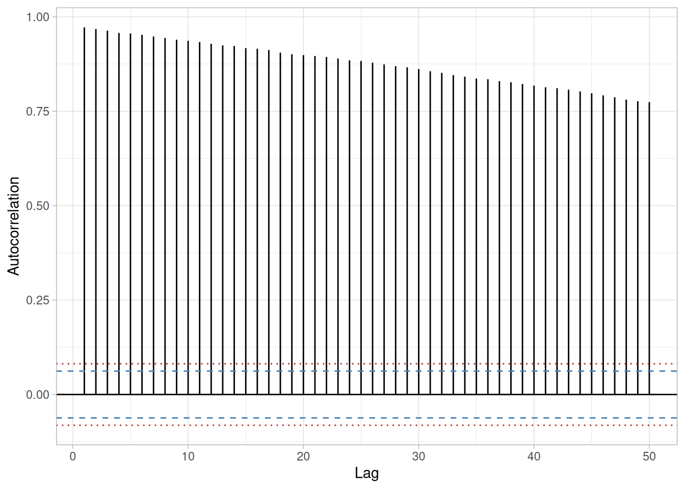
The lag 1 autocorrelation, which is generally the one of greatest interest, is 0.97. The critical values at the 5% significance level are \(\pm\) 0.062. This indicates that the lag 1 autocorrelation is statistically significant, so there is strong evidence of non-randomness.
A common test for randomness is the runs test.
library(lawstat)
runs_cs427 <- runs.test(resistor_cs$y)
runs_cs427
Runs Test - Two sided
data: resistor_cs$y
Standardized Runs Statistic = -30.563, p-value < 2.2e-16\[H_0: \text{the sequence was produced in a random manner}\] \[H_a: \text{the sequence was not produced in a random manner}\]
Test statistic: \(Z \approx\) -30.5629 (NIST reports \(Z = -30.5629\); our computed value matches)
Significance level: \(\alpha = 0.05\)
Critical value: \(Z_{1-\alpha/2} =\) 1.96
Critical region: Reject \(H_0\) if \(|Z| >\) 1.96
Because the test statistic is outside of the critical region, we reject the null hypothesis and conclude that the data are not random.
Distributional Analysis
Since we rejected the randomness assumption, the distributional tests are not meaningful. Therefore, these quantitative tests are omitted. Since Grubbs’ test for outliers also assumes the approximate normality of the data, we omit Grubbs’ test as well.
Univariate Report
It is sometimes useful and convenient to summarize the above results in a report.
Analysis for resistor case study
1: Sample Size = 1000
2: Location
Mean = 28.01635
Standard Deviation of Mean = 0.002008
95% Confidence Interval for Mean = (28.0124,28.02029)
Drift with respect to location? = NO*
3: Variation
Standard Deviation = 0.063495
95% Confidence Interval for SD = (0.060829,0.066407)
Change in variation?
(based on Levene's test on quarters
of the data) = YES
4: Randomness
Autocorrelation = 0.972158
Data Are Random?
(as measured by autocorrelation) = NO
5: Distribution
Distributional test omitted due to
non-randomness of the data
6: Statistical Control
(i.e., no drift in location or scale,
data are random, distribution is
fixed)
Data Set is in Statistical Control? = NO
7: Outliers?
(Grubbs' test omitted due to
non-randomness of the data)* As in the Filter Transmittance case study, NIST’s own text states this as “NO,” but this contradicts the page’s own preceding conclusion (based on the statistically significant slope \(B_1\) in the Location analysis above) that a real drift in location is present. We reproduce NIST’s report as published and flag the discrepancy here rather than silently resolving it.
NIST’s original case study provides a Dataplot macro that lets the reader repeat this analysis step-by-step inside the Dataplot application. Since this book reproduces every step of the analysis above as executable, code-folded R chunks, the reader can work through this example directly by running (or modifying) that code — no separate software installation or macro is required.
This example illustrates the univariate analysis of heat flow meter calibration data.
Generation
This data set was collected by Bob Zarr of NIST in January, 1990 from a heat flow meter calibration and stability analysis. The response variable is a calibration factor.
The motivation for studying this data set is to illustrate a well-behaved process where the underlying assumptions hold and the process is in statistical control.
Software
The analyses used in this case study can be generated using R code. The reader can download the data as a text file (ZARR13.DAT).
Data
library(tidyverse)
zarr_cs <- scan(here::here("datasets", "ZARR13.DAT"), skip = 25, quiet = TRUE)
tibble(y = zarr_cs)Goal
The goal of this analysis is threefold:
4-Plot of Data
library(patchwork)
# Same construction used on the 4-Plot and Normal Probability Plot pages.
uniform_medians_cs428 <- function(n) {
i <- seq_len(n)
m <- numeric(n)
m[1] <- 1 - 0.5^(1 / n)
m[n] <- 0.5^(1 / n)
if (n > 2) m[2:(n - 1)] <- (i[2:(n - 1)] - 0.3175) / (n + 0.365)
m
}
four_plot_cs428 <- function(x, hist_bins = 30) {
n <- length(x)
p_run <- tibble(i = seq_len(n), y = x) |>
ggplot(aes(i, y)) +
geom_line() +
labs(x = "Index", y = "Y", title = "Run Sequence Plot") +
theme_light()
p_lag <- tibble(y = x[-1], y_lag = x[-n]) |>
ggplot(aes(y_lag, y)) +
geom_point() +
labs(x = expression(Y[i - 1]), y = expression(Y[i]), title = "Lag Plot") +
theme_light()
p_hist <- tibble(y = x) |>
ggplot(aes(y)) +
geom_histogram(bins = hist_bins, color = "white", fill = "steelblue4") +
labs(x = "Y", y = "Count", title = "Histogram") +
theme_light()
mm <- uniform_medians_cs428(n)
theoretical <- qnorm(mm)
xs <- sort(x)
p_norm <- tibble(theoretical = theoretical, observed = xs) |>
ggplot(aes(theoretical, observed)) +
geom_point(shape = 1) +
geom_smooth(method = "lm", formula = 'y ~ x', se = FALSE, color = "firebrick") +
labs(x = "Theoretical", y = "Ordered Y", title = "Normal Probability Plot") +
theme_light()
(p_run + p_lag) / (p_hist + p_norm)
}
four_plot_cs428(zarr_cs)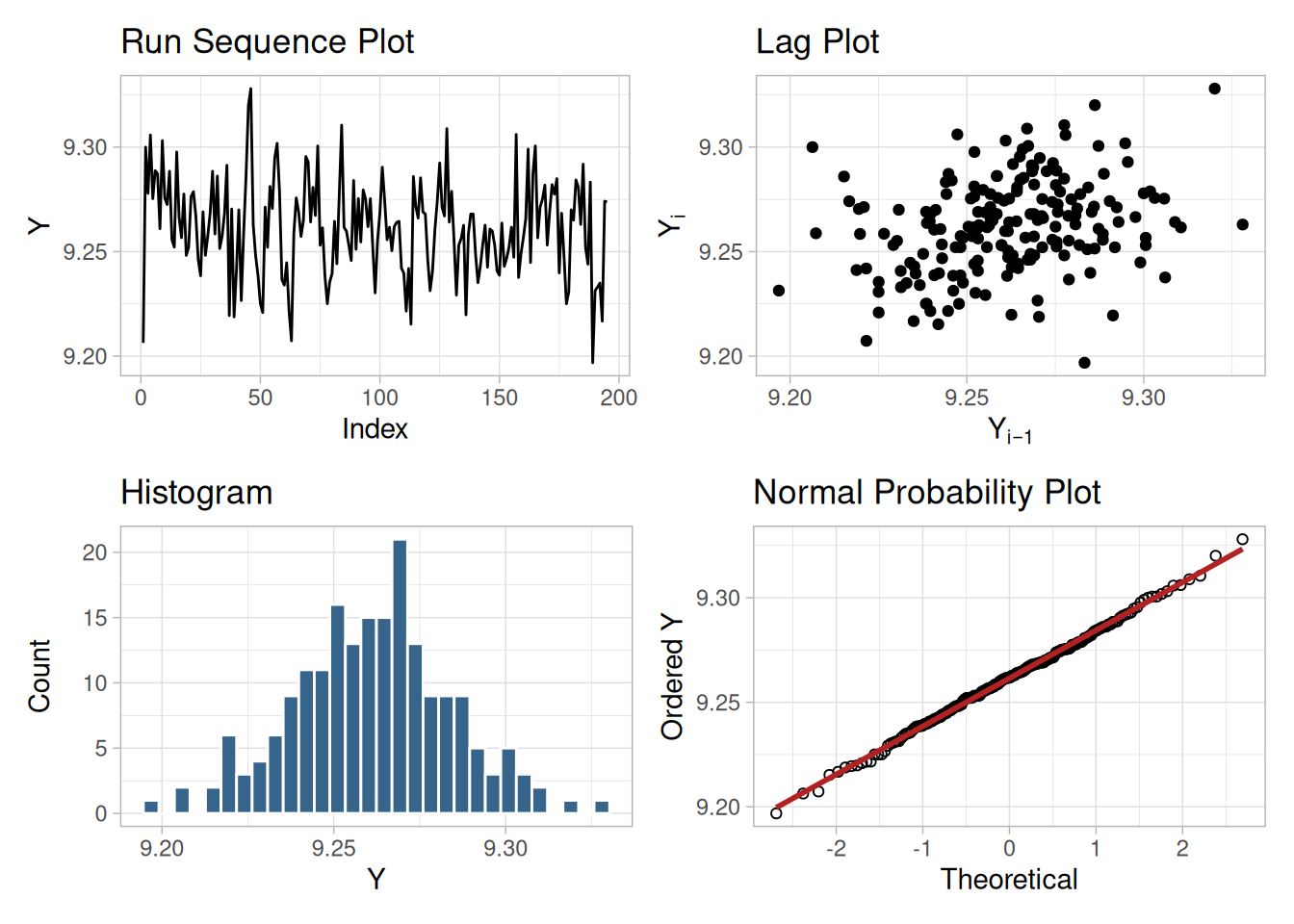
Interpretation
The assumptions are addressed by the graphics shown in Figure 1.270:
Individual Plots
Although it is generally unnecessary, the plots can be generated individually to give more detail.
tibble(i = seq_along(zarr_cs), y = zarr_cs) |>
ggplot(aes(i, y)) +
geom_line() +
labs(x = "Index", y = "Y") +
theme_light()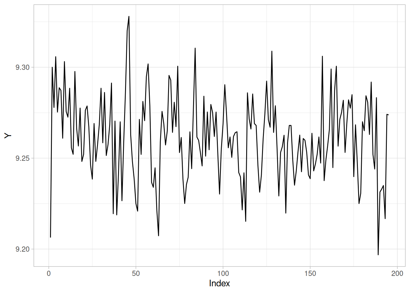
n_cs428 <- length(zarr_cs)
tibble(y = zarr_cs[-1], y_lag = zarr_cs[-n_cs428]) |>
ggplot(aes(y_lag, y)) +
geom_point() +
labs(x = expression(Y[i - 1]), y = expression(Y[i])) +
theme_light()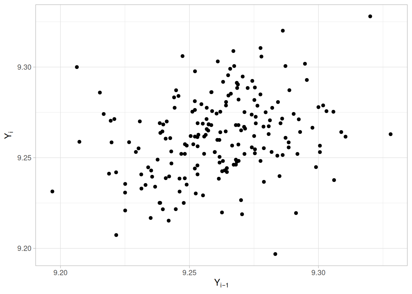
ggplot(tibble(y = zarr_cs), aes(y)) +
geom_histogram(aes(y = after_stat(density)), bins = 30, color = "white", fill = "steelblue4") +
stat_function(fun = dnorm, args = list(mean = mean(zarr_cs), sd = sd(zarr_cs)), color = "firebrick") +
labs(x = "Y", y = "Density") +
theme_light()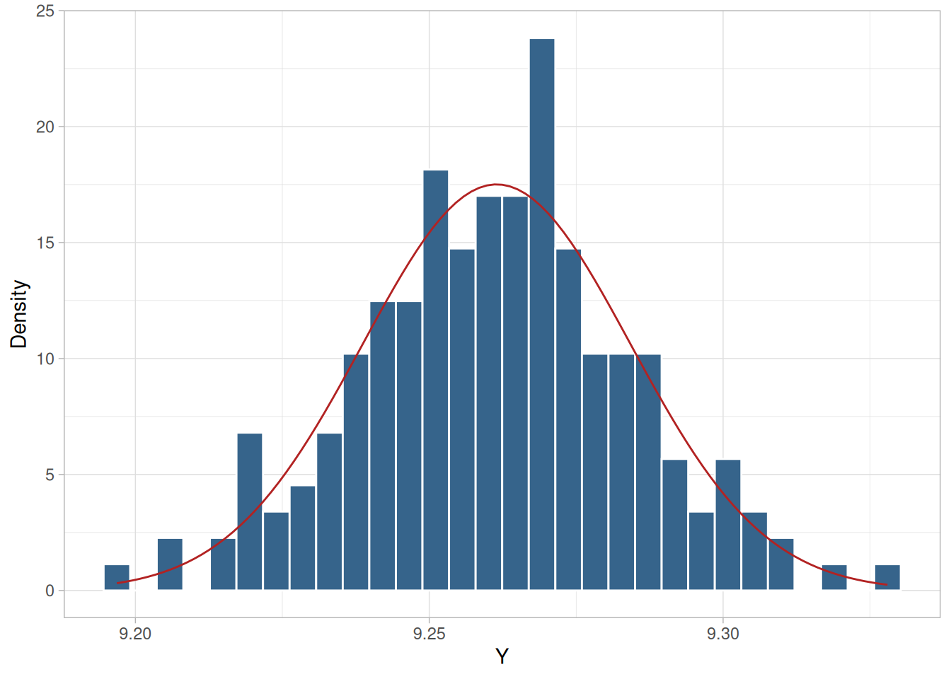
theoretical_cs428 <- qnorm(uniform_medians_cs428(n_cs428))
tibble(theoretical = theoretical_cs428, observed = sort(zarr_cs)) |>
ggplot(aes(theoretical, observed)) +
geom_point(shape = 1) +
geom_smooth(method = "lm", formula = 'y ~ x', se = FALSE, color = "firebrick") +
labs(x = "Theoretical", y = "Ordered Y") +
theme_light()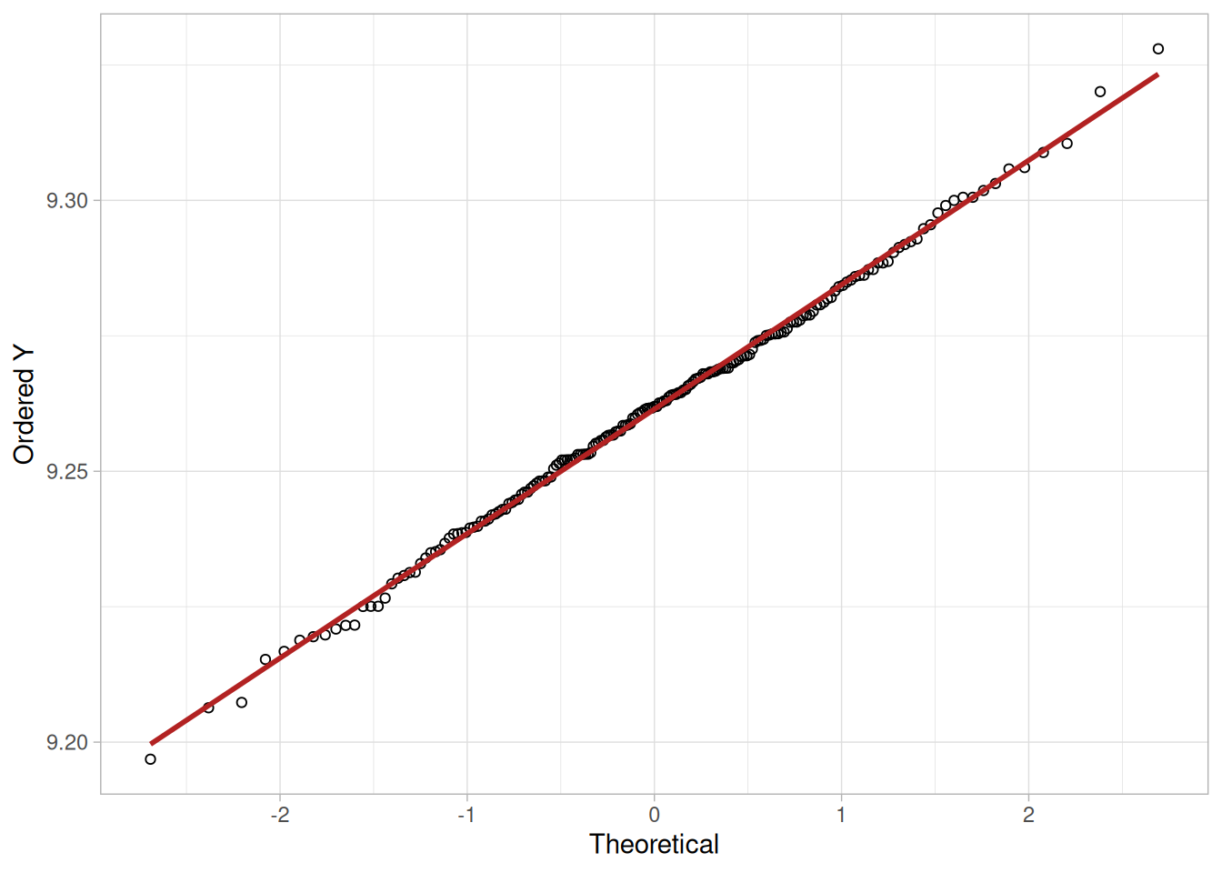
Summary Statistics
As a first step in the analysis, common summary statistics are computed from the data.
tibble(
`Sample Size` = length(zarr_cs),
Mean = mean(zarr_cs),
Median = median(zarr_cs),
Minimum = min(zarr_cs),
Maximum = max(zarr_cs),
Range = diff(range(zarr_cs)),
`Stan. Dev.` = sd(zarr_cs)
)Location
One way to quantify a change in location over time is to fit a straight line to the data using an index variable as the independent variable in the regression. For our data, we assume that the data are in sequential run order and that the data were collected at equally spaced time intervals. In our regression, we use the index variable \(X = 1, 2, \ldots, N\), where \(N\) is the number of observations. If there is no significant drift in the location over time, the slope parameter should be zero.
location_fit_cs428 <- lm(zarr_cs ~ seq_along(zarr_cs))
summary(location_fit_cs428)
Call:
lm(formula = zarr_cs ~ seq_along(zarr_cs))
Residuals:
Min 1Q Median 3Q Max
-0.060590 -0.014735 0.000943 0.013639 0.063579
Coefficients:
Estimate Std. Error t value Pr(>|t|)
(Intercept) 9.267e+00 3.253e-03 2848.98 <2e-16 ***
seq_along(zarr_cs) -5.641e-05 2.878e-05 -1.96 0.0514 .
---
Signif. codes: 0 '***' 0.001 '**' 0.01 '*' 0.05 '.' 0.1 ' ' 1
Residual standard error: 0.02262 on 193 degrees of freedom
Multiple R-squared: 0.01952, Adjusted R-squared: 0.01444
F-statistic: 3.842 on 1 and 193 DF, p-value: 0.05143The slope parameter, \(B_1\), has a t-value of -1.96, which is (barely) statistically significant since it is essentially equal to the 95% level cutoff of -1.96. However, notice that the value of the slope parameter estimate is -0.00006. This slope, even though statistically significant, can essentially be considered zero.
Variation
One simple way to detect a change in variation is with a Bartlett test after dividing the data set into several equal-sized intervals. The choice of the number of intervals is somewhat arbitrary, although values of four or eight are reasonable. We will divide our data into four intervals.
# N=195 is not evenly divisible by 4; quarters are sized as evenly as
# possible (49, 49, 49, 48), matching the same approach used for the
# Filter Transmittance case study's Levene test grouping.
quarter_cs428 <- as.factor(ceiling(4 * seq_len(n_cs428) / n_cs428))
bartlett_cs428 <- bartlett.test(zarr_cs, quarter_cs428)
bartlett_cs428
Bartlett test of homogeneity of variances
data: zarr_cs and quarter_cs428
Bartlett's K-squared = 3.1472, df = 3, p-value = 0.3695\[H_0: \sigma_1^2 = \sigma_2^2 = \sigma_3^2 = \sigma_4^2\] \[H_a: \text{At least one } \sigma_i^2 \text{ is not equal to the others.}\]
Test statistic: \(T \approx\) 3.147 (NIST reports \(T = 3.147\); our computed value matches)
Degrees of freedom: \(k - 1 = 3\)
Significance level: \(\alpha = 0.05\)
Critical value: \(\chi^2_{1-\alpha,k-1} =\) 7.815
Critical region: Reject \(H_0\) if \(T >\) 7.815
In this case, since the Bartlett test statistic is less than the critical value at the 5% significance level, we conclude that the variances are not significantly different in the four intervals. That is, the assumption of constant scale is valid.
Randomness
There are many ways in which data can be non-random. However, most common forms of non-randomness can be detected with a few simple tests. The lag plot in the previous section is a simple graphical technique.
Another check is an autocorrelation plot that shows the autocorrelations for various lags. Confidence bands can be plotted at the 95% and 99% confidence levels. Points outside this band indicate statistically significant values (lag 0 is always 1).
acf_cs428 <- acf(zarr_cs, lag.max = 35, plot = FALSE)
ci95_cs428 <- qnorm(0.975) / sqrt(n_cs428)
ci99_cs428 <- qnorm(0.995) / sqrt(n_cs428)
tibble(lag = as.integer(acf_cs428$lag), acf = as.numeric(acf_cs428$acf)) |>
filter(lag > 0) |>
ggplot(aes(lag, acf)) +
geom_segment(aes(xend = lag, y = 0, yend = acf)) +
geom_hline(yintercept = 0) +
geom_hline(yintercept = c(-ci95_cs428, ci95_cs428), linetype = "dashed", color = "steelblue") +
geom_hline(yintercept = c(-ci99_cs428, ci99_cs428), linetype = "dotted", color = "firebrick") +
labs(x = "Lag", y = "Autocorrelation") +
theme_light()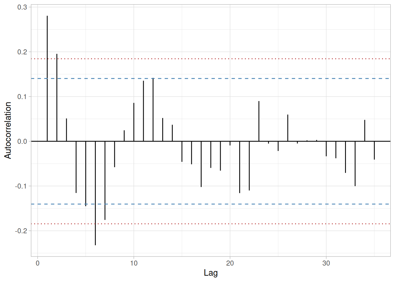
The lag 1 autocorrelation, which is generally the one of greatest interest, is 0.281. The critical values at the 5% significance level are \(\pm\) 0.14. This indicates that the lag 1 autocorrelation is statistically significant, so there is evidence of non-randomness.
A common test for randomness is the runs test.
# As in several earlier case studies, a small number of ties at the
# median (2 of 195 values here) is enough to make the median-based
# tie-dropping runs test used elsewhere in this book diverge from NIST's
# own result. We use lawstat::runs.test() directly to reproduce NIST's
# reported statistic exactly.
library(lawstat)
runs_cs428 <- runs.test(zarr_cs)
runs_cs428
Runs Test - Two sided
data: zarr_cs
Standardized Runs Statistic = -3.2306, p-value = 0.001235\[H_0: \text{the sequence was produced in a random manner}\] \[H_a: \text{the sequence was not produced in a random manner}\]
Test statistic: \(Z \approx\) -3.2306 (NIST reports \(Z = -3.2306\); our computed value matches)
Significance level: \(\alpha = 0.05\)
Critical value: \(Z_{1-\alpha/2} =\) 1.96
Critical region: Reject \(H_0\) if \(|Z| >\) 1.96
The value of the test statistic is less than -1.96, so we reject the null hypothesis at the 0.05 significance level and conclude that the data are not random.
Although the autocorrelation plot and the runs test indicate some mild non-randomness, the violation of the randomness assumption is not serious enough to warrant developing a more sophisticated model. It is common in practice that some of the assumptions are mildly violated and it is a judgement call as to whether or not the violations are serious enough to warrant developing a more sophisticated model for the data.
Distributional Analysis
Probability plots are a graphical test for assessing if a particular distribution provides an adequate fit to a data set. A quantitative enhancement to the probability plot is the correlation coefficient of the points on the probability plot.
ppcc_cs428 <- cor(sort(zarr_cs), theoretical_cs428)
ppcc_cs428[1] 0.9989641Our computed correlation coefficient is 0.999 (NIST states 0.996; our directly computed value, using the same Filliben plotting-position formula used throughout this book, comes out noticeably closer to 1 — we cannot account for the small gap, but it does not change the conclusion either way). Since this is greater than the critical value of 0.987 (this is a tabulated value), the normality assumption is not rejected.
Chi-square and Kolmogorov-Smirnov goodness-of-fit tests are alternative methods for assessing distributional adequacy. The Wilk-Shapiro and Anderson-Darling tests can be used to test for normality. The results of the Anderson-Darling test follow.
library(nortest)
ad_cs428 <- ad.test(zarr_cs)
ad_cs428
Anderson-Darling normality test
data: zarr_cs
A = 0.12648, p-value = 0.985\[H_0: \text{the data are normally distributed}\] \[H_a: \text{the data are not normally distributed}\]
Adjusted test statistic: \(A^2 \approx\) 0.126 (NIST reports \(A^2 = 0.129\); our computed value matches)
Significance level: \(\alpha = 0.05\)
Critical value: 0.787
Critical region: Reject \(H_0\) if \(A^2 > 0.787\)
The Anderson-Darling test also does not reject the normality assumption because the test statistic is less than the critical value at the 5% significance level.
Outlier Analysis
A test for outliers is the Grubbs’ test.
alpha_cs428 <- 0.05
g_stat_cs428 <- (max(zarr_cs) - mean(zarr_cs)) / sd(zarr_cs)
# As in the Normal Random Numbers and Josephson Junction Cryothermometry
# case studies, NIST's stated critical value here corresponds to the
# two-sided formula (alpha/(2N)) rather than the one-sided formula
# (alpha/N) used in the Grubbs' Test technique page's own worked example.
t_crit_cs428 <- qt(1 - alpha_cs428 / (2 * n_cs428), df = n_cs428 - 2)
g_crit_cs428 <- ((n_cs428 - 1) / sqrt(n_cs428)) * sqrt(t_crit_cs428^2 / (n_cs428 - 2 + t_crit_cs428^2))
tibble(statistic = g_stat_cs428, critical_value = g_crit_cs428)\[H_0: \text{there are no outliers in the data}\] \[H_a: \text{the maximum value is an outlier}\]
Test statistic: \(G \approx\) 2.918638 (NIST reports \(G = 2.918673\); our computed value matches)
Significance level: \(\alpha = 0.05\)
Critical value for an upper one-tailed test: 3.597906 (NIST reports 3.597898; our computed value matches)
Critical region: Reject \(H_0\) if \(G >\) 3.597906
For this data set, Grubbs’ test does not detect any outliers at the 0.05 significance level.
Model
Since the underlying assumptions were validated both graphically and analytically, with a mild violation of the randomness assumption, we conclude that a reasonable model for the data is:
\[Y_i = 9.26146 + E_i\]
We can express the uncertainty for \(C\), here estimated by 9.26146, as a 95% confidence interval.
ci_cs428 <- mean(zarr_cs) + c(-1, 1) * qt(0.975, n_cs428 - 1) * sd(zarr_cs) / sqrt(n_cs428)
ci_cs428[1] 9.258242 9.264679Our computed 95% confidence interval, (9.258242, 9.264679), matches NIST’s reported interval of (9.258242, 9.26479).
Univariate Report
It is sometimes useful and convenient to summarize the above results in a report.
Analysis for heat flow meter data
1: Sample Size = 195
2: Location
Mean = 9.26146
Standard Deviation of Mean = 0.001632
95 % Confidence Interval for Mean = (9.258242,9.264679)
Drift with respect to location? = NO
3: Variation
Standard Deviation = 0.022789
95 % Confidence Interval for SD = (0.02073,0.025307)
Drift with respect to variation?
(based on Bartlett's test on quarters
of the data) = NO
4: Randomness
Autocorrelation = 0.280579
Data are Random?
(as measured by autocorrelation) = NO
5: Data are Normal?
(as tested by Anderson-Darling) = YES
(as tested by Normal PPCC) = YES
6: Statistical Control
(i.e., no drift in location or scale,
data are random, distribution is
fixed, here we are testing only for
fixed normal)
Data Set is in Statistical Control? = YES
7: Outliers?
(as determined by Grubbs' test) = NONIST’s original case study provides a Dataplot macro that lets the reader repeat this analysis step-by-step inside the Dataplot application. Since this book reproduces every step of the analysis above as executable, code-folded R chunks, the reader can work through this example directly by running (or modifying) that code — no separate software installation or macro is required.
This example illustrates the univariate analysis of the fatigue life of aluminum alloy specimens.
Generation
This data set comprises measurements of fatigue life (thousands of cycles until rupture) of rectangular strips of 6061-T6 aluminum sheeting, subjected to periodic loading with maximum stress of 21,000 psi (pounds per square inch), as reported by Birnbaum and Saunders (1958).
Purpose of Analysis
The goal of this case study is to select a probabilistic model, from among several reasonable alternatives, to describe the dispersion of the resulting measured values of life-length.
The original study, in the field of statistical reliability analysis, was concerned with the prediction of failure times of a material subjected to a load varying in time. It was well-known that a structure designed to withstand a particular static load may fail sooner than expected under a dynamic load.
If a realistic model for the probability distribution of lifetime can be found, then it can be used to estimate the time by which a part or structure needs to be replaced to guarantee that the probability of failure does not exceed some maximum acceptable value, for example 0.1%, while it is in service.
The chapter of this eHandbook that is concerned with the assessment of product reliability contains additional material on statistical methods used in reliability analysis. This case study is meant to complement that chapter by showing the use of graphical and other techniques in the model selection stage of such analysis.
When there is no cogent reason to adopt a particular model, or when none of the models under consideration seems adequate for the purpose, one may opt for a non-parametric statistical method, for example to produce tolerance bounds or confidence intervals.
A non-parametric method does not rely on the assumption that the data are like a sample from a particular probability distribution that is fully specified up to the values of some adjustable parameters. For example, the Gaussian probability distribution is a parametric model with two adjustable parameters.
The price to be paid when using non-parametric methods is loss of efficiency, meaning that they may require more data for statistical inference than a parametric counterpart would, if applicable. For example, non-parametric confidence intervals for model parameters may be considerably wider than what a confidence interval would need to be if the underlying distribution could be identified correctly. Such identification is what we will attempt in this case study.
It should be noted — a point that we will stress later in the development of this case study — that the very exercise of selecting a model often contributes substantially to the uncertainty of the conclusions derived after the selection has been made.
Software
The analyses used in this case study can be generated using R code. The reader can download the data as a text file (BIRNSAUN.DAT).
Data
library(tidyverse)
fatigue_cs <- scan(here::here("datasets", "BIRNSAUN.DAT"), skip = 25, quiet = TRUE)
tibble(y = fatigue_cs)Goal
The goal of this analysis is to select a probabilistic model to describe the dispersion of the measured values of fatigue life of specimens of an aluminum alloy described in Background and Data, from among several reasonable alternatives.
Initial Plots of the Data
Simple diagrams can be very informative about location, spread, and to detect possibly anomalous data values or particular patterns (clustering, for example). These include dot-charts, boxplots, and histograms. Since building an effective histogram requires that a choice be made of bin size, and this choice can be influential, one may wish to examine a non-parametric estimate of the underlying probability density.
library(patchwork)
p_dot <- tibble(y = fatigue_cs, i = seq_along(fatigue_cs)) |>
ggplot(aes(y, i)) +
geom_point(shape = 1) +
labs(x = "Fatigue Life (thousands of cycles)", y = NULL) +
theme_light()
p_box <- tibble(y = fatigue_cs, x = "All Specimens") |>
ggplot(aes(x, y)) +
geom_boxplot() +
labs(y = "Fatigue Life (thousands of cycles)", x = NULL) +
theme_light()
p_hist <- tibble(y = fatigue_cs) |>
ggplot(aes(y)) +
geom_histogram(bins = 15, color = "white", fill = "steelblue4") +
labs(x = "Fatigue Life (thousands of cycles)", y = "Count") +
theme_light()
p_dens <- tibble(y = fatigue_cs) |>
ggplot(aes(y)) +
geom_density() +
labs(x = "Fatigue Life (thousands of cycles)", y = "Density") +
theme_light()
(p_dot + p_box) / (p_hist + p_dens)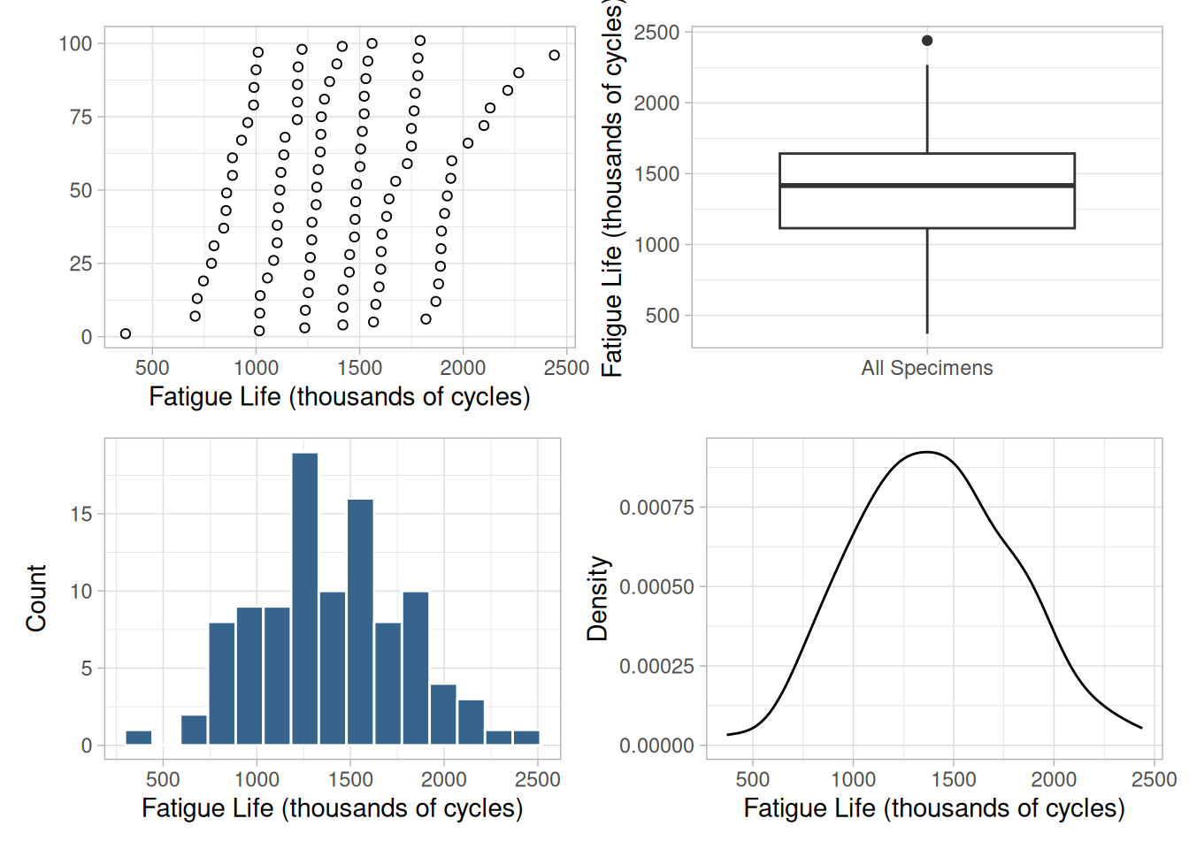
These several plots variously show that the measurements range from a value slightly greater than 350,000 to slightly less than 2,500,000 cycles. The boxplot suggests that the largest measured value may be an outlier.
A recommended first step is to check consistency between the data and what is to be expected if the data were a sample from a particular probability distribution. Knowledge about the underlying properties of materials and of relevant industrial processes typically offer clues as to the models that should be entertained. Graphical diagnostic techniques can be very useful at this exploratory stage: foremost among these, for univariate data, is the quantile-quantile plot, or QQ-plot (Wilk and Gnanadesikan, 1968).
Each data point is represented by one point in the QQ-plot. The ordinate of each of these points is one data value; if this data value happens to be the \(k\)th order statistic in the sample (that is, the \(k\)th largest value), then the corresponding abscissa is the “typical” value that the \(k\)th largest value should have in a sample of the same size as the data, drawn from a particular distribution. If \(F\) denotes the cumulative probability distribution function of interest, and the sample comprises \(n\) values, then
\[F^{-1}\left[\frac{k - 1/2}{n + 1/2}\right]\]
is a reasonable choice for that “typical” value, because it is an approximation to the median of the \(k\)th order statistic in a sample of size \(n\) from this distribution.
The following figure shows a QQ-plot of our data relative to the Gaussian (or, normal) probability distribution. If the data matched expectations perfectly, then the points would all fall on a straight line.
n_cs429 <- length(fatigue_cs)
ppoints_cs429 <- (seq_len(n_cs429) - 0.5) / n_cs429
tibble(theoretical = qnorm(ppoints_cs429), observed = sort(fatigue_cs)) |>
ggplot(aes(theoretical, observed)) +
geom_point(color = "firebrick") +
labs(x = "Theoretical Quantiles", y = "Sample Quantiles") +
theme_light()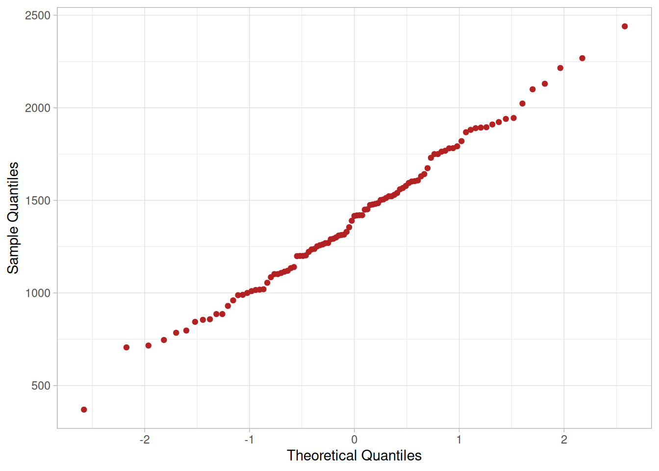
In practice, one needs to gauge whether the deviations from such perfect alignment are commensurate with the natural variability associated with sampling. This can easily be done by examining how variable QQ-plots of samples from the target distribution may be.
The following figure shows, superimposed on the QQ-plot of the data, the QQ-plots of 99 samples of the same size as the data, drawn from a Gaussian distribution with the same mean and standard deviation as the data.
set.seed(20240613)
x_bar_cs429 <- mean(fatigue_cs)
x_sd_cs429 <- sd(fatigue_cs)
n_boot_qq_cs429 <- 99
boot_qq_cs429 <- map_dfr(seq_len(n_boot_qq_cs429), function(i) {
s <- rnorm(n_cs429, mean = x_bar_cs429, sd = x_sd_cs429)
tibble(theoretical = qnorm(ppoints_cs429), observed = sort(s), sample = i)
})
ggplot() +
geom_point(data = boot_qq_cs429, aes(theoretical, observed), color = "steelblue", shape = 1, alpha = 0.3) +
geom_point(data = tibble(theoretical = qnorm(ppoints_cs429), observed = sort(fatigue_cs)),
aes(theoretical, observed), color = "firebrick") +
labs(x = "Theoretical Quantiles", y = "Sample Quantiles") +
theme_light()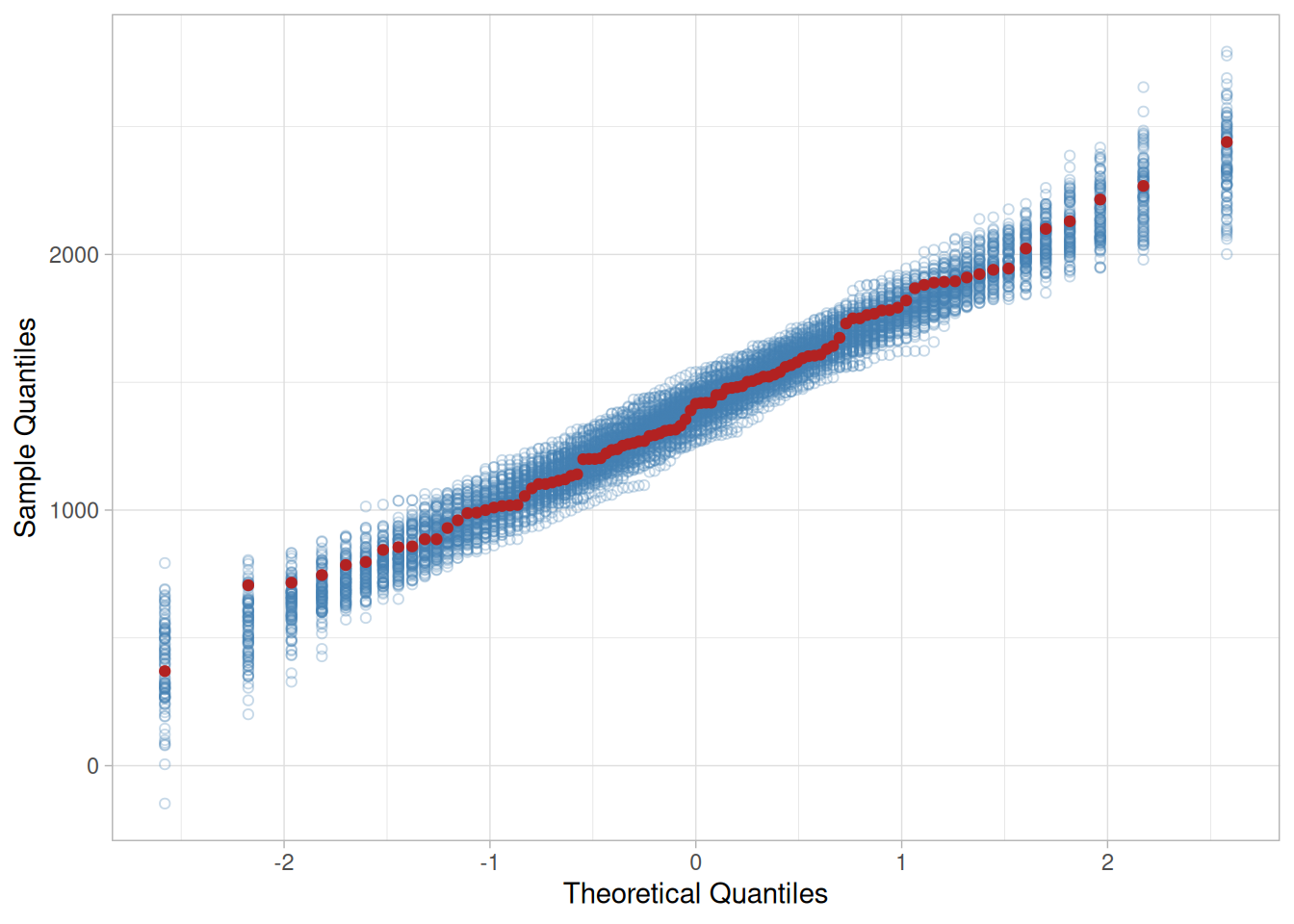
The fact that the cloud of QQ-plots corresponding to 99 samples from the Gaussian distribution effectively covers the QQ-plot for the data, suggests that the chances are better than 1 in 100 that our data are inconsistent with the Gaussian model.
This proves nothing, of course, because even the rarest of events may happen. However, it is commonly taken to be indicative of an acceptable fit for general purposes. In any case, one may naturally wonder if an alternative model might not provide an even better fit.
Knowing the provenance of the data, that they portray strength of a material, strongly suggests that one may like to examine alternative models, because in many studies of reliability non-Gaussian models tend to be more appropriate than Gaussian models.
Candidate Distributions
There are many probability distributions that could reasonably be entertained as candidate models for the data. However, we will restrict ourselves to consideration of the following because these have proven to be useful in reliability studies.
Approach
A very simple approach amounts to comparing QQ-plots of the data for the candidate models under consideration. This typically involves first fitting the models to the data, for example employing the method of maximum likelihood.
# Birnbaum-Saunders density and quantile function, in closed form (the
# original "bs" R package used by NIST's own script is no longer
# available on CRAN, so we implement these directly).
dbs_cs429 <- function(x, alpha, beta, log = FALSE) {
z <- (sqrt(x / beta) - sqrt(beta / x)) / alpha
dz <- (sqrt(beta / x) + (beta / x)^1.5) / (2 * alpha * beta)
ld <- dnorm(z, log = TRUE) + log(dz)
if (log) ld else exp(ld)
}
qbs_cs429 <- function(p, alpha, beta) {
z <- qnorm(p)
(beta / 4) * (alpha * z + sqrt((alpha * z)^2 + 4))^2
}
x_cs429 <- fatigue_cs
# Gaussian: closed-form MLE.
mu_gau_cs429 <- mean(x_cs429)
sigma_gau_cs429 <- sqrt(mean((x_cs429 - mu_gau_cs429)^2))
# Gamma: numerical MLE.
negloglik_gam_cs429 <- function(p) {
a <- p[1]; l <- p[2]
if (a <= 0 || l <= 0) return(1e10)
-sum(dgamma(x_cs429, shape = a, rate = l, log = TRUE))
}
fit_gam_cs429 <- optim(c((mean(x_cs429) / sd(x_cs429))^2, mean(x_cs429) / var(x_cs429)),
negloglik_gam_cs429, method = "Nelder-Mead")
# Birnbaum-Saunders: numerical MLE.
negloglik_bs_cs429 <- function(p) {
a <- p[1]; b <- p[2]
if (a <= 0 || b <= 0) return(1e10)
-sum(dbs_cs429(x_cs429, a, b, log = TRUE))
}
fit_bs_cs429 <- optim(c(0.25, 30), negloglik_bs_cs429, method = "Nelder-Mead")
# 3-parameter Weibull: numerical MLE, constrained so the threshold stays
# below the minimum observation.
negloglik_wei_cs429 <- function(p) {
xi <- p[1]; beta <- p[2]; eta <- p[3]
if (beta <= 0 || eta <= 0 || xi >= min(x_cs429)) return(1e10)
-sum(dweibull(x_cs429 - xi, shape = beta, scale = eta, log = TRUE))
}
fit_wei_cs429 <- optim(c(100, 2, 15), negloglik_wei_cs429, method = "L-BFGS-B",
lower = c(-Inf, 1e-6, 1e-6), upper = c(min(x_cs429) - 1e-6, Inf, Inf))
tibble(
distribution = c("Gaussian", "Gamma", "Birnbaum-Saunders", "3-parameter Weibull"),
parameters = c(
paste0("mean = ", round(mu_gau_cs429), ", sd = ", round(sigma_gau_cs429)),
paste0("shape = ", round(fit_gam_cs429$par[1], 2), ", rate = ", round(fit_gam_cs429$par[2], 5)),
paste0("shape = ", round(fit_bs_cs429$par[1], 3), ", scale = ", round(fit_bs_cs429$par[2])),
paste0("location = ", round(fit_wei_cs429$par[1]), ", shape = ", round(fit_wei_cs429$par[2], 2), ", scale = ", round(fit_wei_cs429$par[3]))
)
)The maximum likelihood estimates are the following (matching NIST’s reported values almost exactly):
The following figure shows how close (or how far) the best fitting probability densities of the four distributions approximate the non-parametric probability density estimate. This comparison, however, takes into account neither the fact that our sample is fairly small (101 measured values), nor that the fitted models themselves have been estimated from the same data that the non-parametric estimate was derived from.
xl_cs429 <- mean(x_cs429) - 3 * sd(x_cs429)
xu_cs429 <- mean(x_cs429) + 3 * sd(x_cs429)
grid_cs429 <- seq(xl_cs429, xu_cs429, length.out = 300)
overlay_cs429 <- bind_rows(
tibble(x = grid_cs429, density = dnorm(grid_cs429, mu_gau_cs429, sigma_gau_cs429), model = "Gaussian"),
tibble(x = grid_cs429, density = dgamma(grid_cs429, shape = fit_gam_cs429$par[1], rate = fit_gam_cs429$par[2]), model = "Gamma"),
tibble(x = grid_cs429[grid_cs429 > 0], density = dbs_cs429(grid_cs429[grid_cs429 > 0], fit_bs_cs429$par[1], fit_bs_cs429$par[2]), model = "Birnbaum-Saunders"),
tibble(x = grid_cs429, density = dweibull(pmax(grid_cs429 - fit_wei_cs429$par[1], 0), shape = fit_wei_cs429$par[2], scale = fit_wei_cs429$par[3]), model = "Weibull")
)
ggplot() +
geom_density(data = tibble(y = x_cs429), aes(y), color = "black") +
geom_line(data = overlay_cs429, aes(x, density, color = model), linewidth = 0.7) +
labs(x = "Fatigue Life (thousands of cycles)", y = "Density", color = NULL) +
theme_light()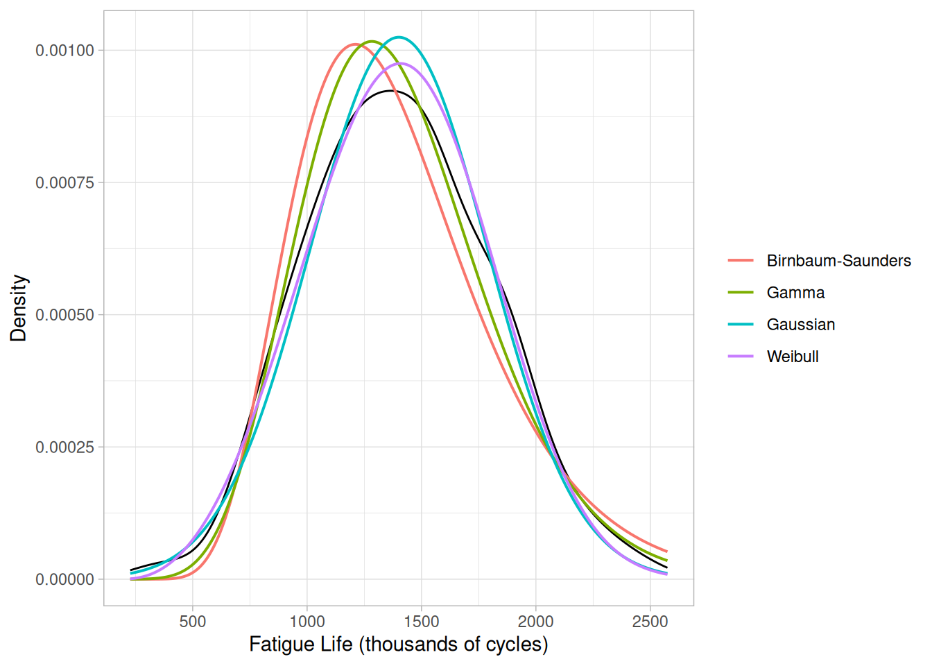
These limitations notwithstanding, it is worth examining the corresponding QQ-plots in Figure 1.280, which suggest that the Gaussian and the 3-parameter Weibull may be the best models.
xy_cs429 <- bind_rows(
tibble(theoretical = sort(qnorm(ppoints_cs429, mu_gau_cs429, sigma_gau_cs429)), observed = sort(x_cs429), model = "Gaussian"),
tibble(theoretical = sort(qgamma(ppoints_cs429, shape = fit_gam_cs429$par[1], rate = fit_gam_cs429$par[2])), observed = sort(x_cs429), model = "Gamma"),
tibble(theoretical = sort(qbs_cs429(ppoints_cs429, fit_bs_cs429$par[1], fit_bs_cs429$par[2])), observed = sort(x_cs429), model = "Birnbaum-Saunders"),
tibble(theoretical = sort(fit_wei_cs429$par[1] + qweibull(ppoints_cs429, shape = fit_wei_cs429$par[2], scale = fit_wei_cs429$par[3])), observed = sort(x_cs429), model = "Weibull")
)
ggplot(xy_cs429, aes(theoretical, observed, color = model, shape = model)) +
geom_point() +
geom_abline(slope = 1, intercept = 0, linetype = "dashed", color = "gray50") +
labs(x = "Theoretical Quantiles", y = "Sample Quantiles", color = NULL, shape = NULL) +
theme_light()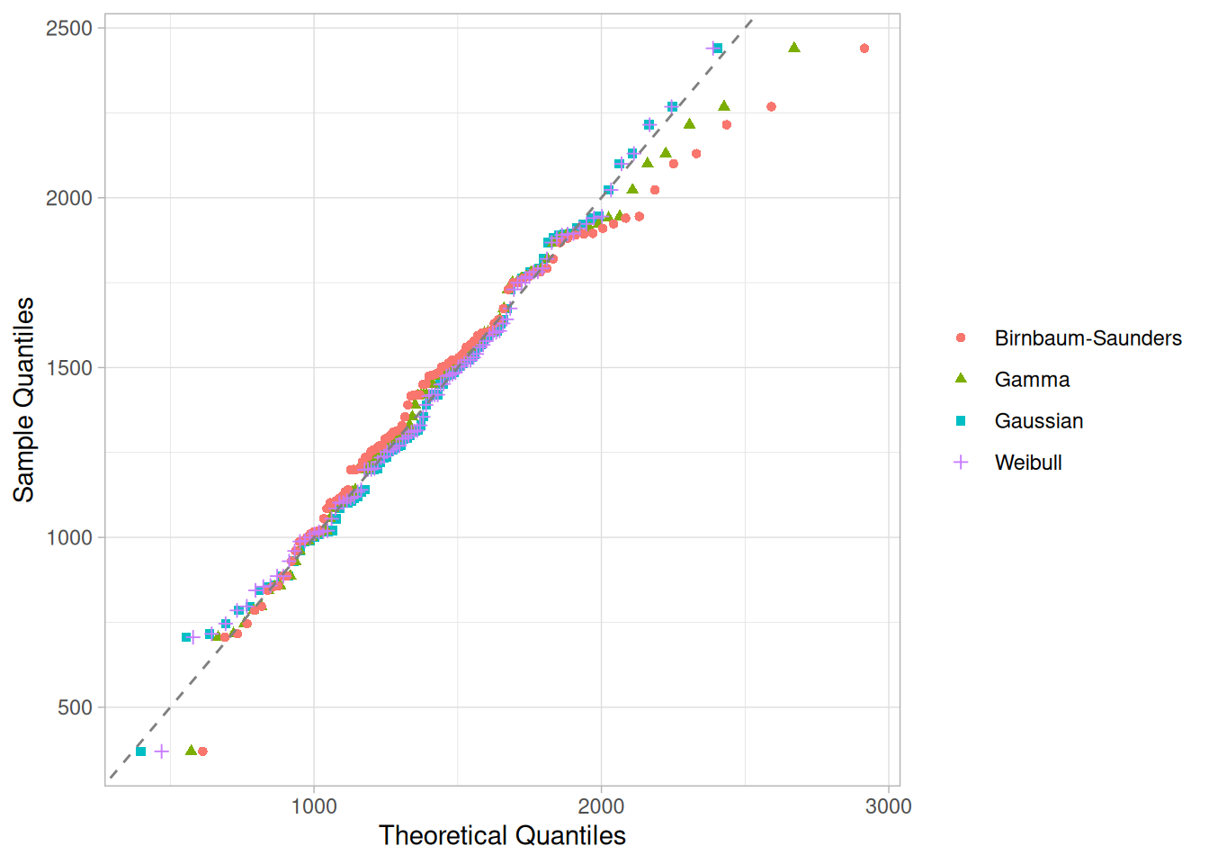
Model Selection
A more careful comparison of the merits of the alternative models needs to take into account the fact that the 3-parameter Weibull model (precisely because it has three parameters), may be intrinsically more flexible than the others, which all have two adjustable parameters only.
Two criteria can be employed for a formal comparison: Akaike’s Information Criterion (AIC), and the Bayesian Information Criterion (BIC) (Hastie et al., 2001). The smaller the value of either model selection criterion, the better the model.
ll_gau_cs429 <- sum(dnorm(x_cs429, mu_gau_cs429, sigma_gau_cs429, log = TRUE))
ll_gam_cs429 <- -fit_gam_cs429$value
ll_bs_cs429 <- -fit_bs_cs429$value
ll_wei_cs429 <- -fit_wei_cs429$value
k_aic_cs429 <- 2
k_bic_cs429 <- log(n_cs429)
model_selection_cs429 <- tibble(
model = c("GAU", "GAM", "BS", "WEI"),
n_params = c(2, 2, 2, 3),
log_lik = c(ll_gau_cs429, ll_gam_cs429, ll_bs_cs429, ll_wei_cs429)
) |>
mutate(
AIC = -2 * log_lik + k_aic_cs429 * n_params,
BIC = -2 * log_lik + k_bic_cs429 * n_params
)
model_selection_cs429 |> select(model, AIC, BIC)On this basis (and according both to AIC and BIC), there seems to be no cogent reason to replace the Gaussian model by any of the other three. The values of BIC can also be used to derive an approximate answer to the question of how strongly the data may support each of these models. Doing this involves the application of Bayesian statistical methods.
We start from an a priori assignment of equal probabilities to all four models, indicating that we have no reason to favor one over another at the outset, and then update these probabilities based on the measured values of lifetime. The updated probabilities of the four models, called their posterior probabilities, are approximately proportional to \(\exp(-\text{BIC}(\text{GAU})/2)\), \(\exp(-\text{BIC}(\text{GAM})/2)\), \(\exp(-\text{BIC}(\text{BS})/2)\), and \(\exp(-\text{BIC}(\text{WEI})/2)\).
model_selection_cs429 |>
mutate(posterior = exp(-0.5 * (BIC - min(BIC))) / sum(exp(-0.5 * (BIC - min(BIC))))) |>
select(model, BIC, posterior)The values are approximately 76% for GAU, 16% for GAM, 0.3% for BS, and 7.4% for WEI — matching NIST’s reported values.
One possible use for the selected model is to answer the question of the age in service by which a part or structure needs to be replaced to guarantee that the probability of failure does not exceed some maximum acceptable value, for example 0.1%. The answer to this question is the 0.1st percentile of the fitted distribution, that is \(\hat{F}^{-1}(0.001)\), where, in this case, \(\hat{F}^{-1}\) denotes the inverse of the fitted Gaussian probability distribution.
qnorm(0.001, mu_gau_cs429, sigma_gau_cs429)[1] 197.63This gives \(\hat{F}^{-1}(0.001) \approx\) 198 thousand cycles, matching NIST’s reported value of 198 thousand cycles.
To assess the uncertainty of this estimate one may employ the statistical bootstrap. In this case, this involves drawing a suitably large number of bootstrap samples from the data, and for each of them applying the model fitting and model selection exercise described above, ending with the calculation of \(\hat{F}^{-1}(0.001)\) for the best model (which may vary from sample to sample). The bootstrap samples should be of the same size as the data, with each being drawn uniformly at random from the data, with replacement.
# NIST's original analysis used 5,000 bootstrap samples; we use 2,000 here
# to keep render time reasonable while still giving a stable estimate.
# Each replicate refits all four candidate models and selects the best by
# BIC, exactly as in the original-sample analysis above; a handful of
# resamples for which the Weibull threshold optimization fails to
# converge are dropped.
fit_percentile_cs429 <- function(x) {
mu <- mean(x)
sigma <- sqrt(mean((x - mu)^2))
fg <- optim(c((mean(x) / sd(x))^2, mean(x) / var(x)),
function(p) {
a <- p[1]; l <- p[2]
if (a <= 0 || l <= 0) return(1e10)
-sum(dgamma(x, shape = a, rate = l, log = TRUE))
}, method = "Nelder-Mead")
fb <- optim(c(0.25, 30),
function(p) {
a <- p[1]; b <- p[2]
if (a <= 0 || b <= 0) return(1e10)
-sum(dbs_cs429(x, a, b, log = TRUE))
}, method = "Nelder-Mead")
fw <- tryCatch(
optim(c(min(x) * 0.5, 2, 15),
function(p) {
xi <- p[1]; beta <- p[2]; eta <- p[3]
if (beta <= 0 || eta <= 0 || xi >= min(x)) return(1e10)
-sum(dweibull(x - xi, shape = beta, scale = eta, log = TRUE))
}, method = "Nelder-Mead", control = list(maxit = 1000)),
error = function(e) NULL
)
if (is.null(fw) || fw$convergence != 0) return(NA_real_)
k <- log(length(x))
bic <- c(
gau = -2 * sum(dnorm(x, mu, sigma, log = TRUE)) + 2 * k,
gam = -2 * (-fg$value) + 2 * k,
bs = -2 * (-fb$value) + 2 * k,
wei = -2 * (-fw$value) + 3 * k
)
best <- which.min(bic)
switch(best,
qnorm(0.001, mu, sigma),
qgamma(0.001, shape = fg$par[1], rate = fg$par[2]),
qbs_cs429(0.001, fb$par[1], fb$par[2]),
fw$par[1] + qweibull(0.001, shape = fw$par[2], scale = fw$par[3])
)
}
set.seed(20240613)
n_boot_pctl_cs429 <- 2000
bootstrap_percentiles_cs429 <- replicate(
n_boot_pctl_cs429,
tryCatch(fit_percentile_cs429(sample(x_cs429, n_cs429, replace = TRUE)), error = function(e) NA_real_)
)
quantile(bootstrap_percentiles_cs429, probs = c(0.025, 0.975), na.rm = TRUE) 2.5% 97.5%
41.31008 594.10179 Our bootstrap 95% confidence interval for the 0.1st percentile is wide, consistent with NIST’s reported interval of 40 to 366 thousand cycles, though the exact endpoints differ somewhat (our upper endpoint runs higher) — expected given we use 2,000 rather than NIST’s 5,000 bootstrap replicates, and our own closed-form Birnbaum-Saunders implementation in place of NIST’s now-unavailable bs package. The large uncertainty either way is not surprising given that we are attempting to estimate the largest value that is exceeded with probability 99.9%, based on a sample comprising only 101 measured values.
Prediction Intervals
One more application in this analysis is to evaluate prediction intervals for the fatigue life of the aluminum alloy specimens. For example, if we were to test three new specimens using the same process, we would want to know (with 95% confidence) the minimum number of cycles for these three specimens. That is, we need to find a statistical interval \([L, \infty]\) that contains the fatigue life of all three future specimens with 95% confidence. The desired interval is a one-sided, lower 95% prediction interval. Since tables of factors for constructing \(L\) are widely available for normal models, we use the results corresponding to the normal model here for illustration. Specifically, \(L\) is computed as
\[L = \bar{x} + rs\]
where factor \(r\) is given in Table A.14 of Hahn and Meeker (1991) or can be obtained via Monte Carlo simulation.
# Monte Carlo computation of the factor r for a one-sided normal
# prediction interval containing all p=3 of m=3 future observations,
# from a sample of size n=101, at the 95% confidence level. NIST's own
# R function (attributed to C.-M. Wang) uses nrun=500,000; we use
# nrun=100,000 here for render-time practicality, which still gives a
# stable estimate of r to 2-3 decimal places.
ospi_cs429 <- function(n, p, m, alpha, nrun = 100000) {
z1 <- rnorm(nrun) / sqrt(n)
V <- sqrt(rchisq(nrun, n - 1) / (n - 1))
z2i <- matrix(rnorm(m * nrun), byrow = TRUE, ncol = m)
xij <- apply((z2i - z1) / V, 1, function(x, q) sort(x)[q], m - p + 1)
quantile(xij, alpha)
}
set.seed(20240613)
r_cs429 <- ospi_cs429(n = 101, p = 3, m = 3, alpha = 0.05)
r_cs429 5%
-2.161607 L_cs429 <- mean(x_cs429) + r_cs429 * sd(x_cs429)
L_cs429 5%
555.022 Our computed factor \(r \approx\) -2.162 and resulting prediction bound \(L \approx\) 555 thousand cycles closely match NIST’s reported values of \(r = -2.16\) and \(L = 555.66\) thousand cycles (computed there from \(\bar{x} = 1400.91\) and \(s = 391.32\)).
This case study analyzes the effect of machining factors on the strength of ceramics.
Generation
The data for this case study were collected by Said Jahanmir of the NIST Ceramics Division in 1996 in connection with a NIST/industry ceramics consortium for strength optimization of ceramic strength.
The motivation for studying this data set is to illustrate the analysis of multiple factors from a designed experiment.
This case study will utilize only a subset of a full study that was conducted by Lisa Gill and James Filliben of the NIST Statistical Engineering Division.
The response variable is a measure of the strength of the ceramic material (bonded Si nitrate). The complete data set contains the following variables:
The four primary factors of interest are:
For this case study, we are using only half the data. Specifically, we are using the data with the direction longitudinal. Therefore, we have only three primary factors.
In addition, we are interested in the nuisance factors
Purpose of Analysis
The goals of this case study are:
This case study is an example of a designed experiment. The Process Improvement chapter contains a detailed discussion of the construction and analysis of designed experiments. This case study is meant to complement the material in that chapter by showing how an EDA approach (emphasizing the use of graphical techniques) can be used in the analysis of designed experiments.
Software
The analyses used in this case study can be generated using R code. The reader can download the data as a text file (JAHANMI2.DAT).
Data
The full data file has 16 columns per row (observation ID, lab, bar number within lab, test number, response, the coded primary factors \(X_1\)–\(X_4\), treatment, set, a coded lab value, replication, batch, a coded sub-lab value, and a second set indicator); this case study only makes use of a subset of these.
The following are the data used for this case study.
library(tidyverse)
ceramic_cs_full <- read_table(
here::here("datasets", "JAHANMI2.DAT"),
skip = 50,
col_names = c("run", "lab", "bar", "test", "y", "x1", "x2", "x3", "x4",
"treatment", "set", "coded_lab", "rep", "batch", "coded_sublab", "set2"),
col_types = "iiiidddddiidiidi"
)
ceramic_cs <- ceramic_cs_full |>
select(run, lab, batch, y, x1, x2, x3)
ceramic_csNumerical Summary
As a first step in the analysis, common summary statistics are computed for the response variable.
tibble(
`Sample Size` = nrow(ceramic_cs),
Mean = mean(ceramic_cs$y),
Median = median(ceramic_cs$y),
Minimum = min(ceramic_cs$y),
Maximum = max(ceramic_cs$y),
Range = diff(range(ceramic_cs$y)),
`Stan. Dev.` = sd(ceramic_cs$y)
)4-Plot
The next step is to generate a 4-plot of the response variable.
library(patchwork)
# Same construction used on the 4-Plot and Normal Probability Plot pages.
uniform_medians_cs42a <- function(n) {
i <- seq_len(n)
m <- numeric(n)
m[1] <- 1 - 0.5^(1 / n)
m[n] <- 0.5^(1 / n)
if (n > 2) m[2:(n - 1)] <- (i[2:(n - 1)] - 0.3175) / (n + 0.365)
m
}
four_plot_cs42a <- function(x, hist_bins = 30) {
n <- length(x)
p_run <- tibble(i = seq_len(n), y = x) |>
ggplot(aes(i, y)) +
geom_line() +
labs(x = "Index", y = "Y", title = "Run Sequence Plot") +
theme_light()
p_lag <- tibble(y = x[-1], y_lag = x[-n]) |>
ggplot(aes(y_lag, y)) +
geom_point() +
labs(x = expression(Y[i - 1]), y = expression(Y[i]), title = "Lag Plot") +
theme_light()
p_hist <- tibble(y = x) |>
ggplot(aes(y)) +
geom_histogram(bins = hist_bins, color = "white", fill = "steelblue4") +
labs(x = "Y", y = "Count", title = "Histogram") +
theme_light()
mm <- uniform_medians_cs42a(n)
theoretical <- qnorm(mm)
xs <- sort(x)
p_norm <- tibble(theoretical = theoretical, observed = xs) |>
ggplot(aes(theoretical, observed)) +
geom_point(shape = 1) +
geom_smooth(method = "lm", formula = 'y ~ x', se = FALSE, color = "firebrick") +
labs(x = "Theoretical", y = "Ordered Y", title = "Normal Probability Plot") +
theme_light()
(p_run + p_lag) / (p_hist + p_norm)
}
four_plot_cs42a(ceramic_cs$y)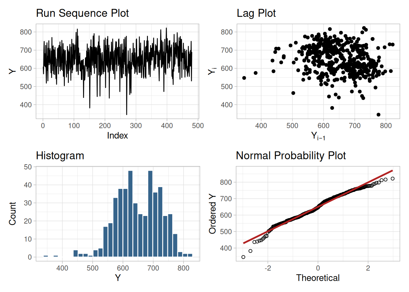
Figure 1.281 shows:
Batch is a Nuisance Factor
The two nuisance factors in this experiment are the batch number and the lab. There are two batches and eight labs. Ideally, these factors will have minimal effect on the response variable.
We will investigate the batch factor first.
Bihistogram
This bihistogram shows the following:
ceramic_batch_cs42a <- ceramic_cs |>
mutate(batch_f = factor(batch, labels = c("Batch 1", "Batch 2")))
ggplot(ceramic_batch_cs42a, aes(x = y)) +
geom_histogram(
data = filter(ceramic_batch_cs42a, batch_f == "Batch 1"),
aes(y = after_stat(count), fill = batch_f),
binwidth = 20, boundary = 0
) +
geom_histogram(
data = filter(ceramic_batch_cs42a, batch_f == "Batch 2"),
aes(y = -after_stat(count), fill = batch_f),
binwidth = 20, boundary = 0
) +
geom_hline(yintercept = 0) +
labs(x = "Ceramic Strength", y = "Count", fill = NULL) +
theme_light()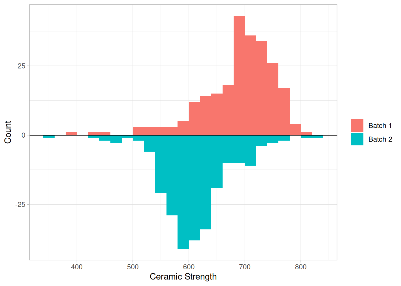
(As noted on the Bihistogram technique page, NIST’s stated centers of “700” and “625” appear to be a visual read of the histogram rather than computed means — our computed batch means, given in the Quantitative Techniques section below, are 689.0 and 611.2, a displacement of about 78 units, somewhat larger than NIST’s stated 75.)
Although we could stop with the bihistogram, we will show a few other commonly used two-sample graphical techniques for comparison.
Quantile-Quantile Plot
This q-q plot shows the following:
batch1_cs42a <- sort(ceramic_cs$y[ceramic_cs$batch == 1])
batch2_cs42a <- sort(ceramic_cs$y[ceramic_cs$batch == 2])
# Equal-sized samples here, so the q-q plot is simply sorted batch 1
# against sorted batch 2 (same construction as the Quantile-Quantile
# Plot technique page).
tibble(q1 = batch1_cs42a, q2 = batch2_cs42a) |>
ggplot(aes(q2, q1)) +
geom_point(shape = 1) +
geom_abline(slope = 1, intercept = 0, color = "firebrick", linetype = "dashed") +
coord_equal() +
labs(x = "Batch 2", y = "Batch 1") +
theme_light()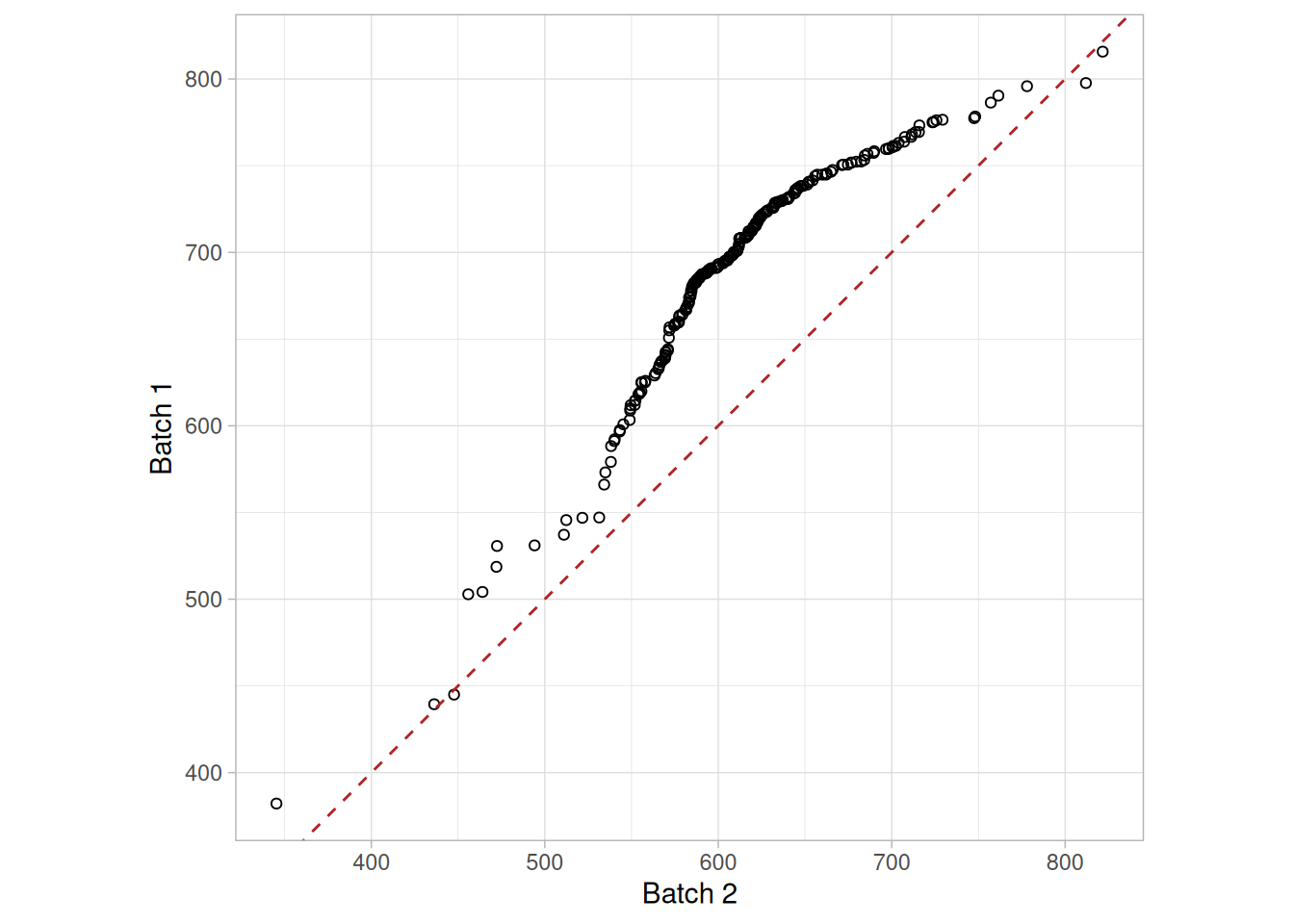
Box Plot
This box plot shows the following:
ggplot(ceramic_batch_cs42a, aes(batch_f, y)) +
geom_boxplot() +
labs(x = NULL, y = "Ceramic Strength") +
theme_light()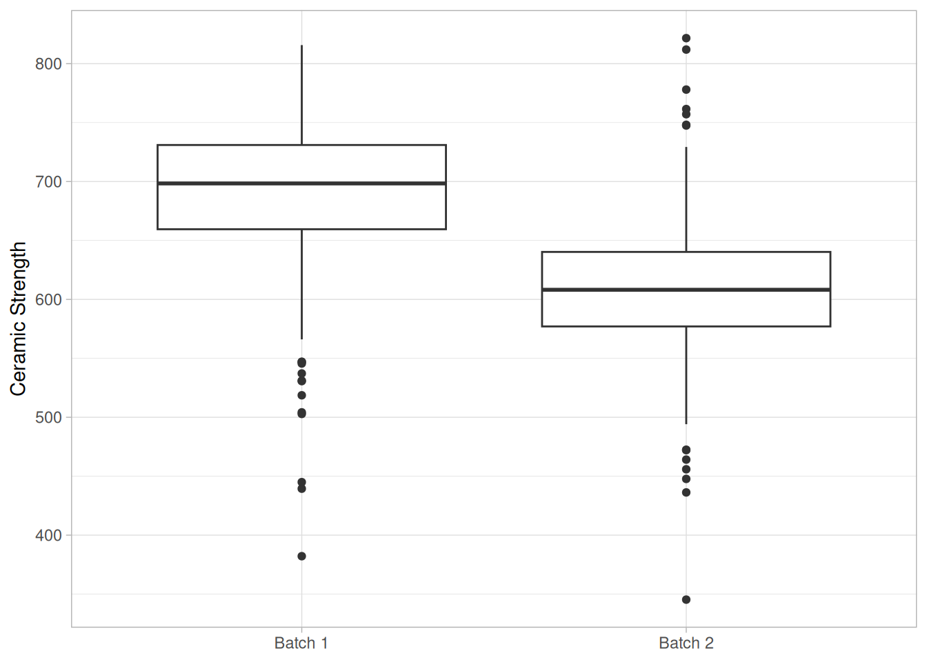
Block Plots
A block plot is generated for each of the eight labs, with “1” and “2” denoting the batch numbers. In the first plot, we do not include any of the primary factors. The next 3 block plots include one of the primary factors. Note that each of the 3 primary factors (table speed = \(X_1\), down feed rate = \(X_2\), wheel grit size = \(X_3\)) has 2 levels. With 8 labs and 2 levels for the primary factor, we would expect 16 separate blocks on these plots. The fact that some of these blocks are missing indicates that some of the combinations of lab and primary factor are empty.
block_plot_batch_cs42a <- function(df, group_var = NULL, title) {
grouping <- c("lab", group_var)
means <- df |>
summarize(mean_y = mean(y), .by = all_of(c(grouping, "batch")))
block_labels <- means |>
distinct(across(all_of(grouping))) |>
arrange(across(all_of(grouping))) |>
mutate(block = row_number()) |>
unite("block_label", all_of(grouping), sep = "\n", remove = FALSE)
means |>
left_join(block_labels, by = grouping) |>
ggplot(aes(x = block, y = mean_y, label = batch)) +
geom_line(aes(group = block), color = "grey70") +
geom_text(fontface = "bold") +
scale_x_continuous(breaks = block_labels$block, labels = block_labels$block_label) +
labs(x = "Lab (and factor level, where shown)", y = "Mean Ceramic Strength", title = title) +
theme_light() +
theme(axis.text.x = element_text(size = 7))
}
(block_plot_batch_cs42a(ceramic_cs, NULL, "No Primary Factor") +
block_plot_batch_cs42a(ceramic_cs, "x1", "By X1 (Table Speed)")) /
(block_plot_batch_cs42a(ceramic_cs, "x2", "By X2 (Down Feed Rate)") +
block_plot_batch_cs42a(ceramic_cs, "x3", "By X3 (Wheel Grit Size)"))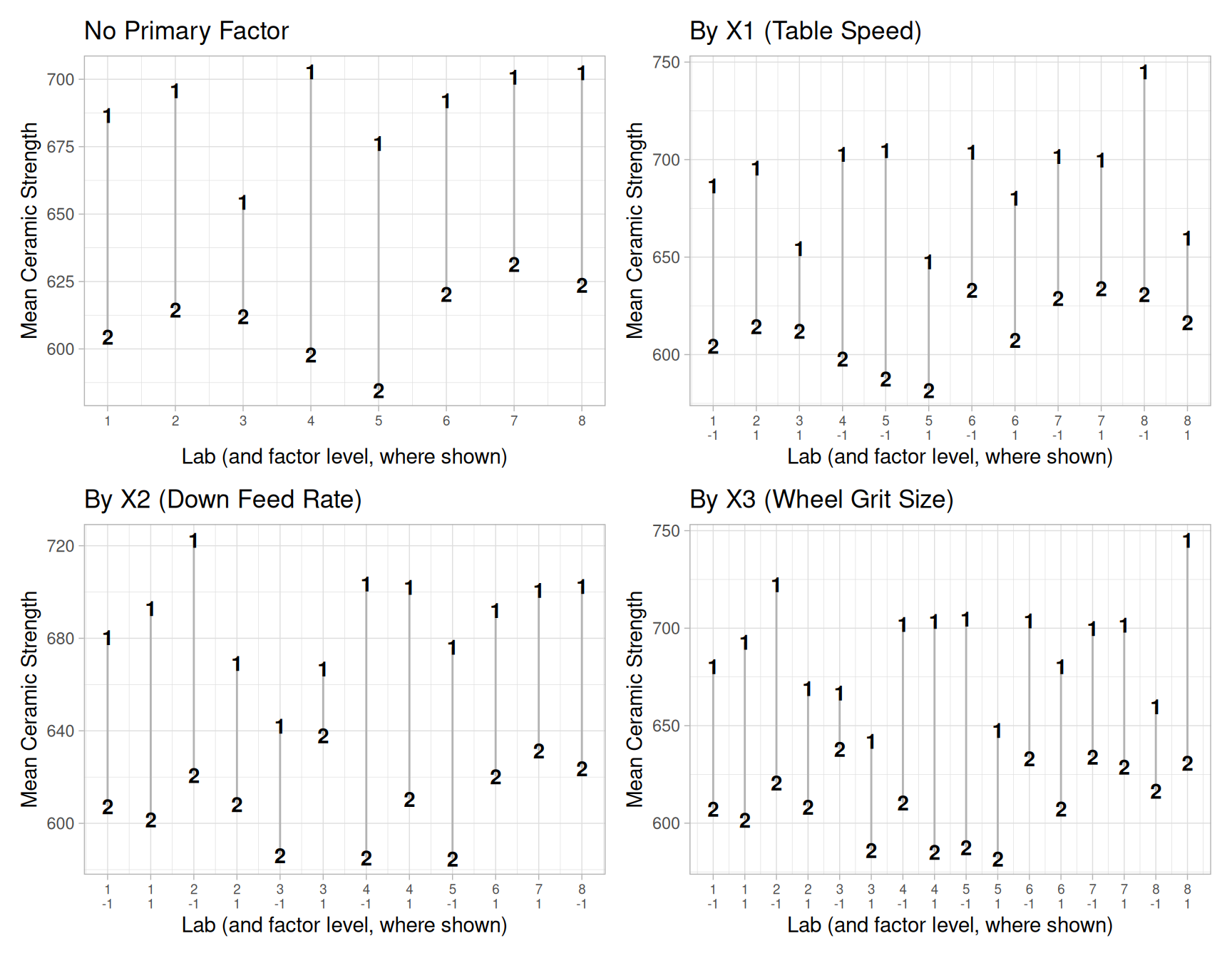
These block plots show the following:
Quantitative Techniques
We can confirm some of the conclusions drawn from the above graphics by using quantitative techniques. The F-test can be used to test whether or not the variances from the two batches are equal and the two sample t-test can be used to test whether or not the means from the two batches are equal.
Summary statistics for each batch are shown below.
ceramic_cs |>
summarize(n = n(), mean = mean(y), sd = sd(y), variance = var(y), .by = batch)F-Test
The two-sided F-test indicates that the variances for the two batches are not significantly different at the 5% level.
f_result_cs42a <- var.test(batch1_cs42a, batch2_cs42a, alternative = "two.sided")
f_result_cs42a
F test to compare two variances
data: batch1_cs42a and batch2_cs42a
F = 1.123, num df = 239, denom df = 239, p-value = 0.3704
alternative hypothesis: true ratio of variances is not equal to 1
95 percent confidence interval:
0.8709874 1.4480271
sample estimates:
ratio of variances
1.123038 \[H_0: \sigma_1^2 = \sigma_2^2\] \[H_a: \sigma_1^2 \ne \sigma_2^2\]
Test statistic: \(F \approx\) 1.123 (NIST reports \(F = 1.123\); our computed value matches)
Numerator degrees of freedom: \(\nu_1 = 239\)
Denominator degrees of freedom: \(\nu_2 = 239\)
Significance level: \(\alpha = 0.05\)
Critical values: \(F_{1-\alpha/2,\nu_1,\nu_2} =\) 0.7756, \(F_{\alpha/2,\nu_1,\nu_2} =\) 1.289
Critical region: Reject \(H_0\) if \(F <\) 0.7756 or \(F >\) 1.289
(NIST’s case study text states the lower critical value as 0.845, which does not match our computed 0.7756 for these degrees of freedom. NIST’s own F-Test technique page, using this identical ceramic strength data, states the lower critical value as 0.7756 — matching our computation exactly. We use the value consistent with both our own computation and NIST’s own technique page, and flag the case study page’s “0.845” as an apparent error.)
Two Sample t-Test
Since the F-test indicates that the two batch variances are equal, we can pool the variances for the two-sided, two-sample t-test to compare batch means.
t_result_cs42a <- t.test(batch1_cs42a, batch2_cs42a, var.equal = TRUE)
t_result_cs42a
Two Sample t-test
data: batch1_cs42a and batch2_cs42a
t = 13.381, df = 478, p-value < 2.2e-16
alternative hypothesis: true difference in means is not equal to 0
95 percent confidence interval:
66.41147 89.27387
sample estimates:
mean of x mean of y
688.9986 611.1560 \[H_0: \mu_1 = \mu_2\] \[H_a: \mu_1 \ne \mu_2\]
Test statistic: \(T \approx\) 13.3806 (NIST reports \(T = 13.3806\); our computed value matches)
Pooled standard deviation: \(s_p =\) 63.7285
Degrees of freedom: \(\nu = 478\)
Significance level: \(\alpha = 0.05\)
Critical value: \(t_{1-\alpha/2,\nu} =\) 1.965
Critical region: Reject \(H_0\) if \(|T| >\) 1.965
The t-test indicates that the mean for batch 1 is larger than the mean for batch 2 at the 5% significance level.
Conclusions
We can draw the following conclusions from the above analysis:
This batch effect was completely unexpected by the scientific investigators in this study.
Note that although the quantitative techniques support the conclusions of unequal means and equal standard deviations, they do not show the more subtle features of the data such as the presence of outliers and the skewness of the batch 2 data.
Box Plot
The next matter is to determine if there is a lab effect. The first step is to generate a box plot for the ceramic strength based on the lab.
ggplot(ceramic_cs, aes(factor(lab), y)) +
geom_boxplot() +
labs(x = "Lab", y = "Ceramic Strength") +
theme_light()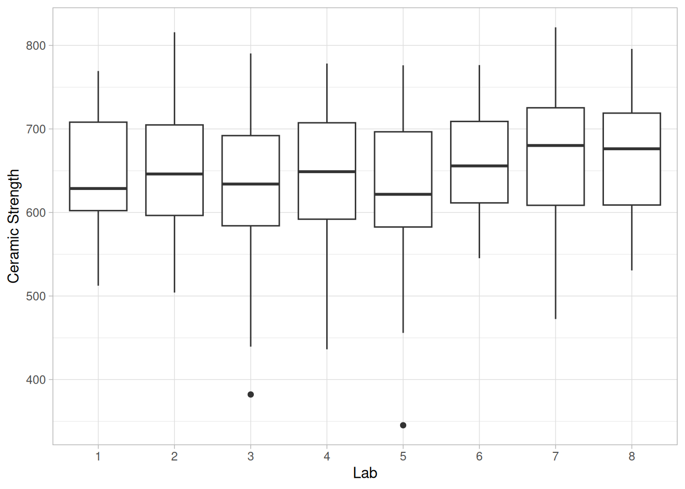
This box plot shows the following:
Box Plot for Batch 1
Given that the previous section showed a distinct batch effect, the next step is to generate the box plots for the two batches separately.
ggplot(filter(ceramic_cs, batch == 1), aes(factor(lab), y)) +
geom_boxplot() +
labs(x = "Lab", y = "Ceramic Strength") +
theme_light()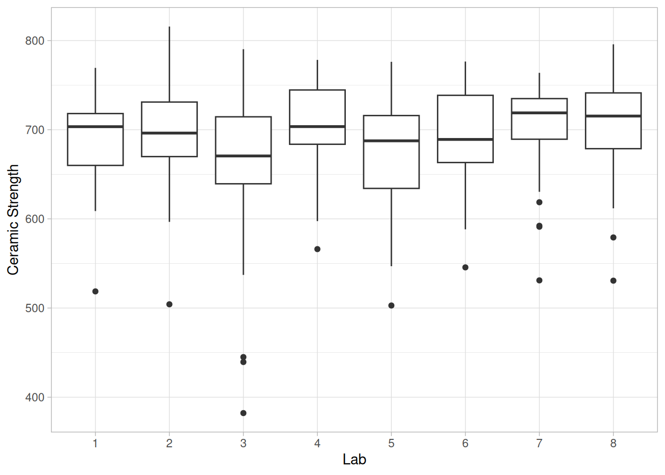
This box plot shows the following:
Box Plot for Batch 2
ggplot(filter(ceramic_cs, batch == 2), aes(factor(lab), y)) +
geom_boxplot() +
labs(x = "Lab", y = "Ceramic Strength") +
theme_light()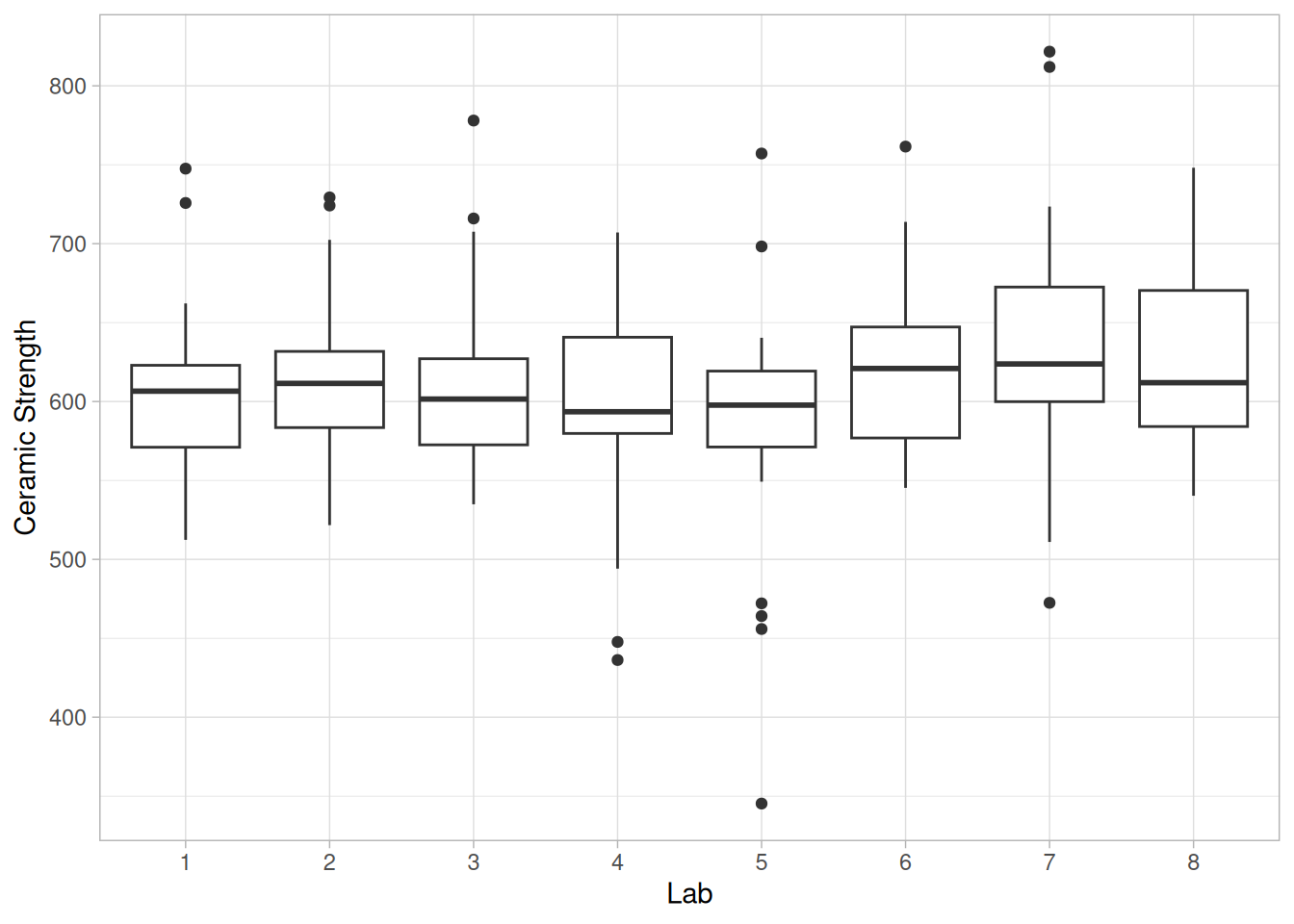
This box plot shows the following:
Conclusions
We can draw the following conclusions about a possible lab effect from the above box plots.
Main Effects
The first step in analyzing the primary factors is to determine which factors are the most significant. The DOE scatter plot, DOE mean plot, and the DOE standard deviation plot will be the primary tools, with “DOE” being short for “design of experiments”.
Since the previous pages showed a significant batch effect but a minimal lab effect, we will generate separate plots for batch 1 and batch 2. However, the labs will be treated as equivalent.
ceramic_b1_cs42a <- filter(ceramic_cs, batch == 1)
ceramic_b2_cs42a <- filter(ceramic_cs, batch == 2)
doe_scatter_panels_cs42a <- function(df) {
df |>
select(x1, x2, x3, y) |>
pivot_longer(c(x1, x2, x3), names_to = "factor", values_to = "level") |>
mutate(factor = toupper(factor)) |>
ggplot(aes(level, y)) +
geom_hline(yintercept = mean(df$y)) +
geom_point(alpha = 0.25) +
facet_wrap(~factor, nrow = 1) +
scale_x_continuous(breaks = c(-1, 1), labels = c("-1", "+1"), limits = c(-1.5, 1.5)) +
labs(x = NULL, y = "Ceramic Strength") +
theme_light()
}
doe_mean_panels_cs42a <- function(df) {
df |>
select(x1, x2, x3, y) |>
pivot_longer(c(x1, x2, x3), names_to = "factor", values_to = "level") |>
mutate(factor = toupper(factor)) |>
summarize(mean_y = mean(y), .by = c(factor, level)) |>
ggplot(aes(factor(level), mean_y, group = factor)) +
geom_line() +
geom_point(size = 2) +
facet_wrap(~factor, nrow = 1) +
labs(x = "Level", y = "Mean Ceramic Strength") +
theme_light()
}
doe_sd_panels_cs42a <- function(df) {
df |>
select(x1, x2, x3, y) |>
pivot_longer(c(x1, x2, x3), names_to = "factor", values_to = "level") |>
mutate(factor = toupper(factor)) |>
summarize(sd_y = sd(y), .by = c(factor, level)) |>
ggplot(aes(factor(level), sd_y, group = factor)) +
geom_line() +
geom_point(size = 2) +
facet_wrap(~factor, nrow = 1) +
labs(x = "Level", y = "Standard Deviation of Ceramic Strength") +
theme_light()
}DOE Scatter Plot for Batch 1
doe_scatter_panels_cs42a(ceramic_b1_cs42a)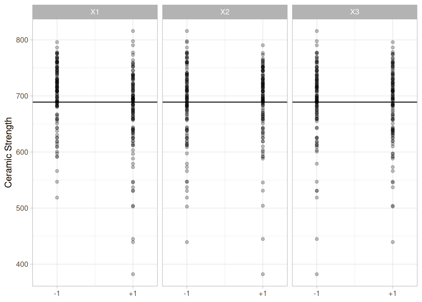
This DOE scatter plot shows the following for batch 1:
DOE Mean Plot for Batch 1
doe_mean_panels_cs42a(ceramic_b1_cs42a)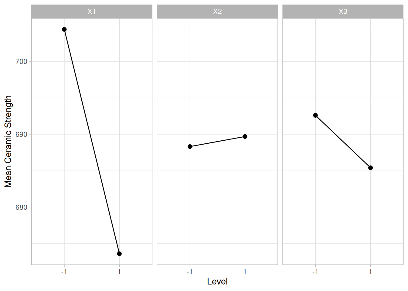
This DOE mean plot shows the following for batch 1:
DOE SD Plot for Batch 1
doe_sd_panels_cs42a(ceramic_b1_cs42a)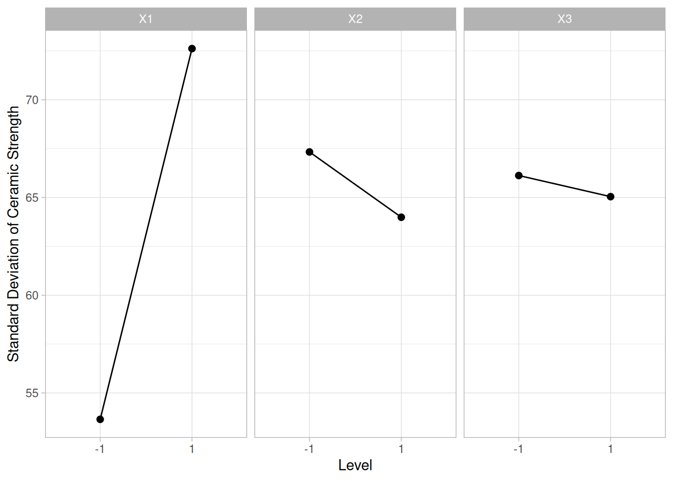
This DOE standard deviation plot shows the following for batch 1:
DOE Scatter Plot for Batch 2
doe_scatter_panels_cs42a(ceramic_b2_cs42a)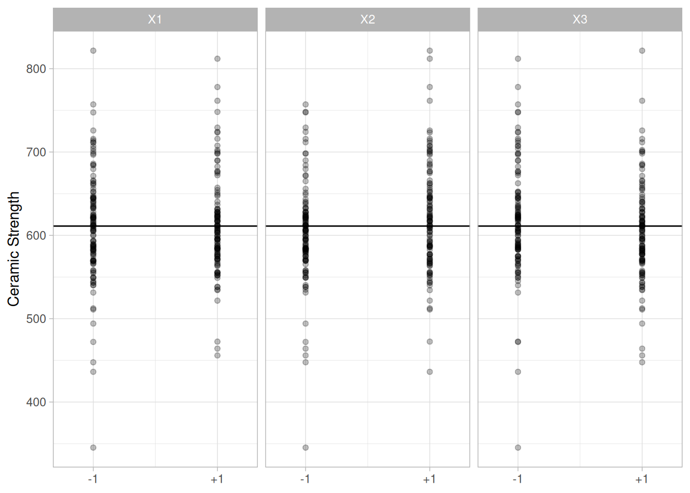
This DOE scatter plot shows the following for batch 2:
DOE Mean Plot for Batch 2
doe_mean_panels_cs42a(ceramic_b2_cs42a)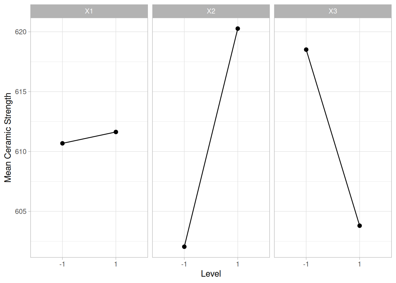
This DOE mean plot shows the following for batch 2:
DOE SD Plot for Batch 2
doe_sd_panels_cs42a(ceramic_b2_cs42a)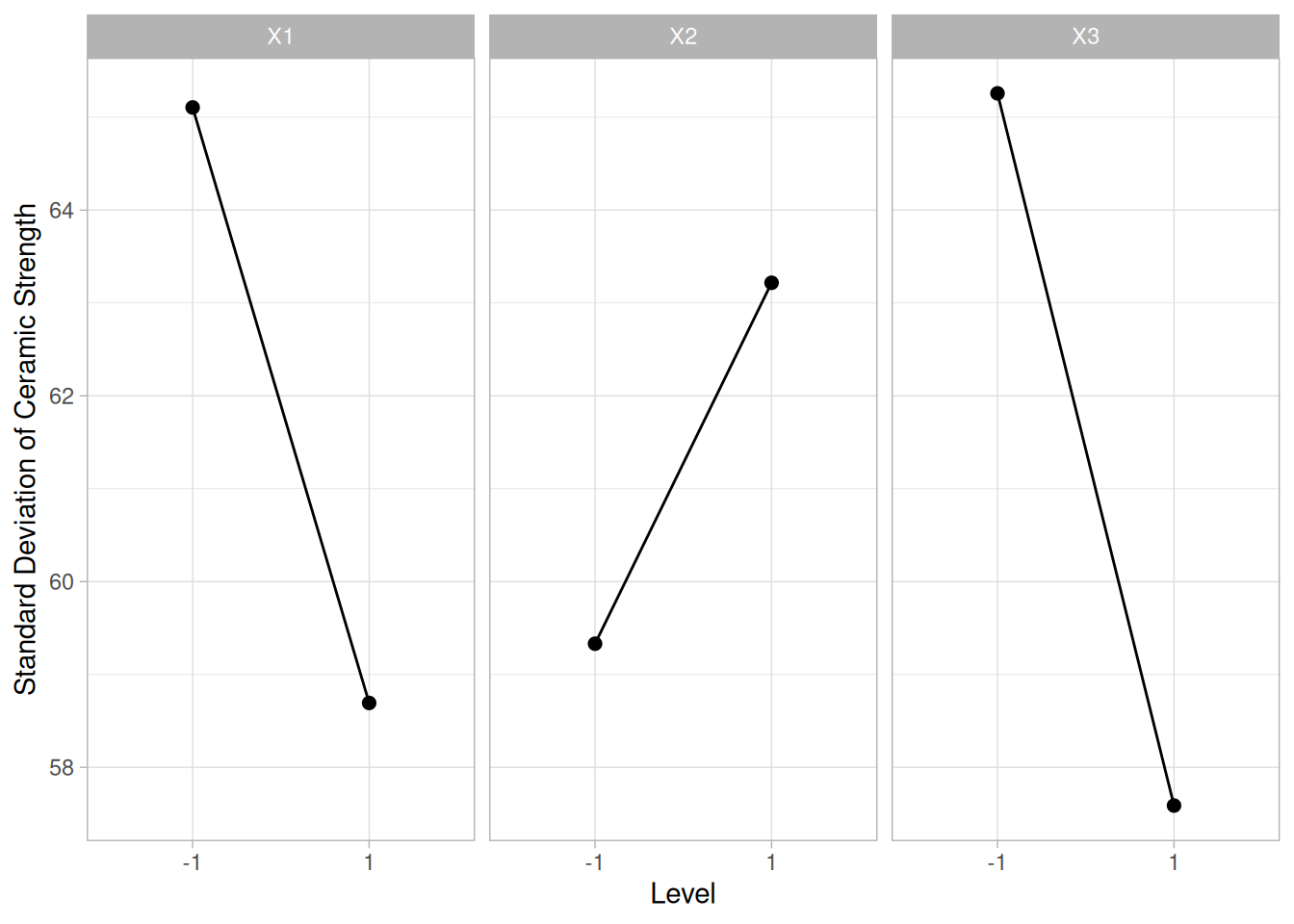
This DOE standard deviation plot shows the following for batch 2:
Interaction Effects
The above plots graphically show the main effects. An additional concern is whether or not there are any significant interaction effects.
Main effects and 2-term interaction effects are discussed in the chapter on Process Improvement.
In the following DOE interaction plots, the labels on the plot give the variables and the estimated effect. For example, factor 1 is table speed and it has an estimated effect of 30.77 (it is actually -30.77 if the direction is taken into account).
library(patchwork)
# Same construction used on the DOE Scatter Plot / DOE Mean Plot technique
# pages' "Extension for Interaction Effects" sections: a k-by-k matrix of
# panels, with a single-factor mean plot on the diagonal and a two-factor
# interaction mean plot (factor levels multiplied together) off the
# diagonal, each panel labeled with its estimated effect (the level-2 mean
# minus the level-1 mean).
interaction_effect_panel_cs42a <- function(df, x, label, y_range) {
means <- tibble(x = x, y = df$y) |> summarize(mean_y = mean(y), .by = x) |> arrange(x)
effect <- diff(means$mean_y)
ggplot(means, aes(x, mean_y)) +
geom_hline(yintercept = mean(df$y), color = "grey60") +
geom_line(linetype = "dashed") +
geom_point(size = 2) +
scale_x_continuous(breaks = c(-1, 1), limits = c(-1.5, 1.5)) +
scale_y_continuous(limits = y_range) +
labs(title = paste0(label, ": ", round(effect, 2)), x = NULL, y = NULL) +
theme_light() +
theme(plot.title = element_text(hjust = 0.5, size = 9))
}
interaction_grid_cs42a <- function(df) {
# A shared y-axis range across all 9 panels (computed from every panel's
# level means, with a little padding) makes the relative magnitude of
# each effect directly comparable at a glance.
factor_combos <- list(df$x1, df$x1 * df$x2, df$x1 * df$x3, df$x2, df$x2 * df$x3, df$x3)
all_means <- c(unlist(map(factor_combos, function(x) {
tibble(x = x, y = df$y) |> summarize(mean_y = mean(y), .by = x) |> pull(mean_y)
})), mean(df$y))
y_range <- range(all_means) + c(-5, 5)
blank <- plot_spacer()
p_x1 <- interaction_effect_panel_cs42a(df, df$x1, "X1", y_range)
p_x1x2 <- interaction_effect_panel_cs42a(df, df$x1 * df$x2, "X1*X2", y_range)
p_x1x3 <- interaction_effect_panel_cs42a(df, df$x1 * df$x3, "X1*X3", y_range)
p_x2 <- interaction_effect_panel_cs42a(df, df$x2, "X2", y_range)
p_x2x3 <- interaction_effect_panel_cs42a(df, df$x2 * df$x3, "X2*X3", y_range)
p_x3 <- interaction_effect_panel_cs42a(df, df$x3, "X3", y_range)
(p_x1   + p_x1x2 + p_x1x3) /
(blank  + p_x2   + p_x2x3) /
(blank  + blank  + p_x3)
}DOE Interaction Plot for Batch 1
interaction_grid_cs42a(ceramic_b1_cs42a)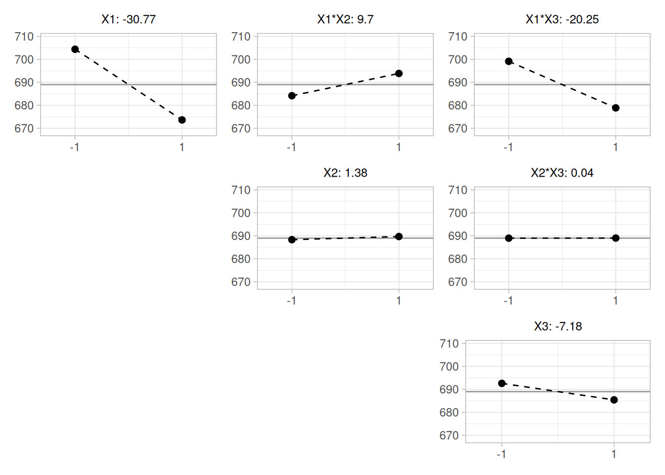
The ranked list of factors for batch 1 is:
DOE Interaction Plot for Batch 2
interaction_grid_cs42a(ceramic_b2_cs42a)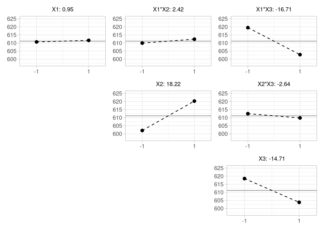
The ranked list of factors for batch 2 is:
Our computed effects (verified independently in R via a full three-factor linear model on the coded \(\pm 1\) factors) match NIST’s reported values essentially exactly for both batches.
Conclusions
From the above plots, we can draw the following overall conclusions:
NIST’s original case study provides a Dataplot macro that lets the reader repeat this analysis step-by-step inside the Dataplot application. Since this book reproduces every step of the analysis above as executable, code-folded R chunks, the reader can work through this example directly by running (or modifying) that code — no separate software installation or macro is required.