Quality Control has been with us for a long time. How long? It is safe to say that when manufacturing began and competition accompanied manufacturing, consumers would compare and choose the most attractive product (barring a monopoly of course). If manufacturer A discovered that manufacturer B’s profits soared, the former tried to improve his/her offerings, probably by improving the quality of the output, and/or lowering the price. Improvement of quality did not necessarily stop with the product - but also included the process used for making the product.
The process was held in high esteem, as manifested by the medieval guilds of the Middle Ages. These guilds mandated long periods of training for apprentices, and those who were aiming to become master craftsmen had to demonstrate evidence of their ability. Such procedures were, in general, aimed at the maintenance and improvement of the quality of the process.
In modern times we have professional societies, governmental regulatory bodies such as the Food and Drug Administration, factory inspection, etc., aimed at assuring the quality of products sold to consumers. Quality Control has thus had a long history.
Science of statistics is fairly recent
On the other hand, statistical quality control is comparatively new. The science of statistics itself goes back only two to three centuries. And its greatest developments have taken place during the 20th century. The earlier applications were made in astronomy and physics and in the biological and social sciences. It was not until the 1920s that statistical theory began to be applied effectively to quality control as a result of the development of sampling theory.
The concept of quality control in manufacturing was first advanced by Walter Shewhart
The first to apply the newly discovered statistical methods to the problem of quality control was Walter A. Shewhart of the Bell Telephone Laboratories. He issued a memorandum on May 16, 1924 that featured a sketch of a modern control chart.
Shewhart kept improving and working on this scheme, and in 1931 he published a book on statistical quality control, “Economic Control of Quality of Manufactured Product”, published by Van Nostrand in New York. This book set the tone for subsequent applications of statistical methods to process control.
Contributions of Dodge and Romig to sampling inspection
Two other Bell Labs statisticians, H.F. Dodge and H.G. Romig spearheaded efforts in applying statistical theory to sampling inspection. The work of these three pioneers constitutes much of what nowadays comprises the theory of statistical quality and control. There is much more to say about the history of statistical quality control and the interested reader is invited to peruse one or more of the references. A very good summary of the historical background of SQC is found in chapter 1 of “Quality Control and Industrial Statistics” (Duncan 1986). See also (Juran 1997).
6.1.2 What are Process Control Techniques?
Statistical Process Control (SPC)
Typical process control techniques
There are many ways to implement process control. Key monitoring and investigating tools include:
All these are described in Montgomery (2000). This chapter will focus (Section 3) on control chart methods, specifically:
Classical Shewhart Control charts,
Cumulative Sum (CUSUM) charts
Exponentially Weighted Moving Average (EWMA) charts
Multivariate control charts
Underlying concepts
The underlying concept of statistical process control is based on a comparison of what is happening today with what happened previously. We take a snapshot of how the process typically performs or build a model of how we think the process will perform and calculate control limits for the expected measurements of the output of the process. Then we collect data from the process and compare the data to the control limits. The majority of measurements should fall within the control limits. Measurements that fall outside the control limits are examined to see if they belong to the same population as our initial snapshot or model. Stated differently, we use historical data to compute the initial control limits. Then the data are compared against these initial limits. Points that fall outside of the limits are investigated and, perhaps, some will later be discarded. If so, the limits would be recomputed and the process repeated. This is referred to as Phase I. Real-time process monitoring, using the limits from the end of Phase I, is Phase II.
Statistical Quality Control (SQC)
Tools of statistical quality control
Several techniques can be used to investigate the product for defects or defective pieces after all processing is complete. Typical tools of SQC (described in Section 2) are:
Lot Acceptance sampling plans
Skip lot sampling plans
Military (MIL) Standard sampling plans
Underlying concepts of statistical quality control
The purpose of statistical quality control is to ensure, in a cost efficient manner, that the product shipped to customers meets their specifications. Inspecting every product is costly and inefficient, but the consequences of shipping non conforming product can be significant in terms of customer dissatisfaction. Statistical Quality Control is the process of inspecting enough product from given lots to probabilistically ensure a specified quality level.
6.1.3 What is Process Control?
Two types of intervention are possible – one is based on engineering judgment and the other is automated
Process Control is the active changing of the process based on the results of process monitoring. Once the process monitoring tools have detected an out-of-control situation, the person responsible for the process makes a change to bring the process back into control.
Out-of-control Action Plans (OCAPS) detail the action to be taken once an out-of-control situation is detected. A specific flowchart, that leads the process engineer through the corrective procedure, may be provided for each unique process.
Advanced Process Control Loops are automated changes to the process that are programmed to correct for the size of the out-of-control measurement.
6.1.4 What to do if the process is “Out of Control”?
Reactions to out-of-control conditions
If the process is out-of-control, the process engineer looks for an assignable cause by following the out-of-control action plan (OCAP) associated with the control chart. Out-of-control refers to rejecting the assumption that the current data are from the same population as the data used to create the initial control chart limits.
For classical Shewhart charts, a set of rules called the Western Electric Rules (WECO Rules) and a set of trend rules often are used to determine out-of-control.
6.1.5 What to do if “In Control” but Unacceptable?
In control means process is predictable
“In Control” only means that the process is predictable in a statistical sense. What do you do if the process is “in control” but the average level is too high or too low or the variability is unacceptable?
can be initiated to put the process on target or reduce the variability.
Process must be stable
Note that the process must be stable before it can be centered at a target value or its overall variation can be reduced.
6.1.6 What is Process Capability?
Process capability compares the output of an in-control process to the specification limits by using capability indices. The comparison is made by forming the ratio of the spread between the process specifications (the specification “width”) to the spread of the process values, as measured by 6 process standard deviation units (the process “width”).
Process Capability Indices
A process capability index uses both the process variability and the process specifications to determine whether the process is “capable”
We are often required to compare the output of a stable process with the process specifications and make a statement about how well the process meets specification. To do this we compare the natural variability of a stable process with the process specification limits.
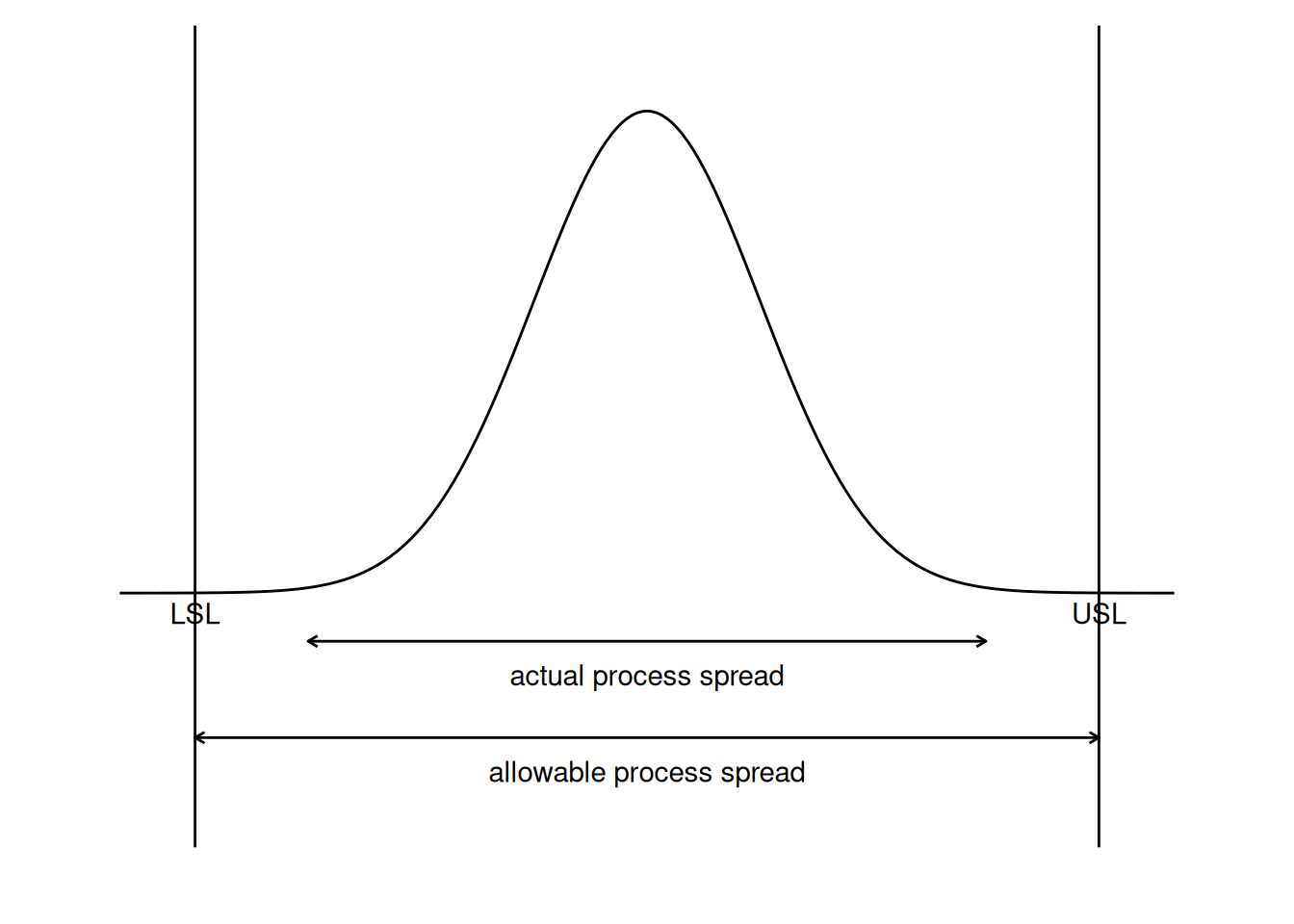
A process where almost all the measurements fall inside the specification limits is a capable process. This can be represented pictorially by the plot below:
Code
library(tidyverse)LSL <--6USL <-6sigma1 <-1.5curve_df <-tibble(x =seq(LSL -1, USL +1, length.out =400)) |>mutate(y =dnorm(x, mean =0, sd = sigma1))ymax <-max(curve_df$y)ggplot(curve_df, aes(x, y)) +geom_line() +geom_vline(xintercept =c(LSL, USL)) +annotate("text", x = LSL, y =-0.02* ymax, label ="LSL", vjust =1) +annotate("text", x = USL, y =-0.02* ymax, label ="USL", vjust =1) +annotate("segment",x =-3* sigma1, xend =3* sigma1, y =-0.1* ymax, yend =-0.1* ymax,arrow =arrow(ends ="both", length =unit(0.15, "cm")) ) +annotate("text", x =0, y =-0.17* ymax, label ="actual process spread") +annotate("segment",x = LSL, xend = USL, y =-0.3* ymax, yend =-0.3* ymax,arrow =arrow(ends ="both", length =unit(0.15, "cm")) ) +annotate("text", x =0, y =-0.37* ymax, label ="allowable process spread") +coord_cartesian(ylim =c(-0.45* ymax, ymax *1.1), xlim =c(LSL -1.5, USL +1.5), clip ="off") +theme_void() +theme(plot.margin =margin(10, 10, 30, 10))
Figure 6.1: Diagram demonstrating a capable process
There are several statistics that can be used to measure the capability of a process: \(C_p\), \(C_{pk}\), and \(C_{pm}\).
Most capability indices estimates are valid only if the sample size used is “large enough”. Large enough is generally thought to be about 50 independent data values.
The \(C_p\), \(C_{pk}\), and \(C_{pm}\) statistics assume that the population of data values is normally distributed. Assuming a two-sided specification, if \(\mu\) and \(\sigma\) are the mean and standard deviation, respectively, of the normal data and \(\text{USL}\), \(\text{LSL}\), and \(T\) are the upper and lower specification limits and the target value, respectively, then the population capability indices are defined as follows.
The estimator for \(C_{pk}\) can also be expressed as \(C_{pk} = C_p(1-k)\), where \(k\) is a scaled distance between the midpoint of the specification range, \(m\), and the process mean, \(\mu\).
Denote the midpoint of the specification range by \(m = (\text{USL} + \text{LSL})/2\). The distance between the process mean, \(\mu\), and the optimum, which is \(m\), is \(\mu - m\), where \(m \le \mu \le \text{LSL}\). The scaled distance is
(The absolute sign takes care of the case when \(\text{LSL} \le \mu \le m\)). To determine the estimated value, \(\hat{k}\), we estimate \(\mu\) by \(\bar{x}\). Note that \(\bar{x} \le \text{USL}\).
The estimator for the \(C_p\) index, adjusted by the \(k\) factor, is
\[\hat{C}_{pk} = \hat{C}_{p}(1 - \hat{k}) \, .\]
Since \(0 \le k \le 1\), it follows that \(\hat{C}_{pk} \le \hat{C}_{p}\).
Plot showing \(C_p\) for varying process widths
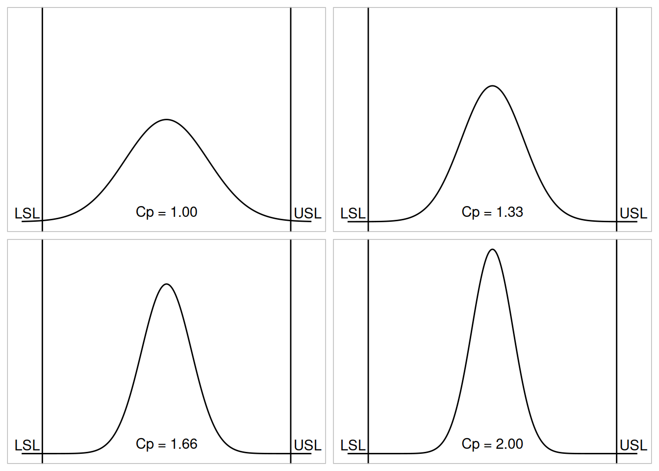
To get an idea of the value of the \(C_p\) statistic for varying process widths, consider the following plot.
Table 6.1: Translating Cp into rejects and percent of specification used
6 sigma
8 sigma
10 sigma
12 sigma
Cp
1.00
1.33
1.66
2.00
Rejects
0.27 %
64 ppm
0.6 ppm
2 ppb
% of spec used
100
75
60
50
USL - LSL spread, in multiples of sigma
where ppm = parts per million and ppb = parts per billion. Note that the reject figures are based on the assumption that the distribution is centered at \(\mu\).
We have discussed the situation with two spec. limits, the \(\text{USL}\) and \(\text{LSL}\). This is known as the bilateral or two-sided case. There are many cases where only the lower or upper specifications are used. Using one spec limit is called unilateral or one-sided. The corresponding capability indices are
One-sided specifications and the corresponding capability indices
where \(\mu\) and \(\sigma\) are the process mean and standard deviation, respectively.
Estimators of \(C_{pu}\) and \(C_{pl}\) are obtained by replacing \(\mu\) and \(\sigma\) by \(\bar{x}\) and \(s\), respectively. The following relationship holds
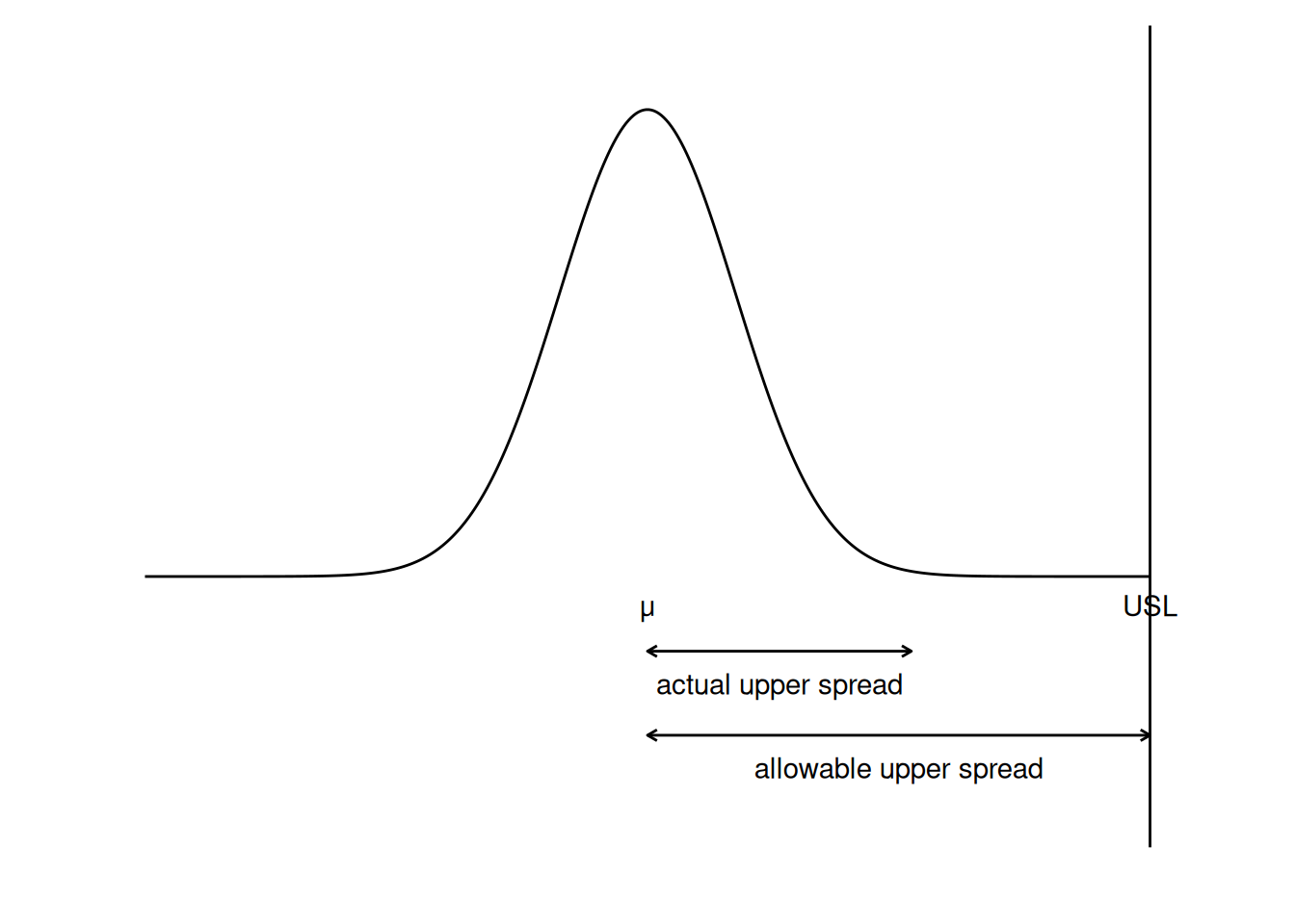
Figure 6.3: Graph demonstrating upper actual and allowable upper spread
Note that we also can write:
\[C_{pk} = \text{min}(C_{pl}, \, C_{pu}) \, .\]
Confidence Limits For Capability Indices
Confidence intervals for indices
Assuming normally distributed process data, the distribution of the sample \(\hat{C}_p\) follows from a Chi-square distribution and \(\hat{C}_{pu}\) and \(\hat{C}_{pl}\) have distributions related to the non-central \(t\) distribution. Fortunately, approximate confidence limits related to the normal distribution have been derived. Various approximations to the distribution of \(\hat{C}_{pk}\) have been proposed, including those given by Bissell (1990), and we will use a normal approximation.
The resulting formulas for \(100(1-\alpha) \%\) confidence limits are given below.
with \(z\) denoting the percent point function of the standard normal distribution. If \(\beta\) is not known, set it to \(\alpha\).
Limits for \(C_{pl}\) are obtained by replacing \(\hat{C}_{pu}\) by \(\hat{C}_{pl}\).
Confidence Interval for \(C_{pk}\)
Zhang et al. (1990) derived the exact variance for the estimator of \(C_{pk}\) as well as an approximation for large \(n\). The reference paper is Zhang, Stenback and Wardrop (1990), “Interval Estimation of the process capability index,” Communications in Statistics: Theory and Methods, 19(21), 4455-4470.
It is important to note that the sample size should be at least 25 before these approximations are valid. In general, however, we need \(n \ge 100\) for capability studies. Another point to observe is that variations are not negligible due to the randomness of capability indices.
Capability Index Example
An example
For a certain process the \(\text{USL} = 20\) and the \(\text{LSL} = 8\). The observed process average, \(\bar{x} = 16\), and the standard deviation, \(s = 2\). From this we obtain
We would like to have \(\hat{C}_{pk}\) at least 1.0, so this is not a good process. If possible, reduce the variability or/and center the process. We can compute the \(\hat{C}_{pu}\) and \(\hat{C}_{pl}\) using
From this we see that the \(\hat{C}_{pu}\), which is the smallest of the above indices, is 0.6667. Note that the formula \(\hat{C}_{pk} = \hat{C}_{p}(1 - \hat{k})\) is the algebraic equivalent of the \(\text{min}(\hat{C}_{pu}, \, \hat{C}_{pl})\) definition.
What happens if the process is not approximately normally distributed?
What you can do with non-normal data
The indices that we considered thus far are based on normality of the process distribution. This poses a problem when the process distribution is not normal. Without going into the specifics, we can list some remedies.
Transform the data so that they become approximately normal. A popular transformation is the Box-Cox transformation.
Use or develop another set of indices, that apply to nonnormal distributions. Non-parametric versions (Pearn, Tai, Hsiao, and Ao (2014) and Chen and Ding (2001)) of the \(C_{p}\), \(C_{pk}\), and \(C_{pm}\) capability indices are denoted by \(C_{np}\), \(C_{npk}\), and \(C_{npm}\). Estimators for these non-parametric capability indices are calculated by
where \(p(0.99855)\) is the 99.865th percentile of the data and \(p(0.00135)\) is the 0.135th percentile of the data. The use of these percentiles is justified to mimic the coverage of \(\pm 3\) standard deviations for the normal distribution. Note that some sources may use 99% coverage. For example, the \(C_{npk}\) statistic may be given as
where \(p(0.995)\) is the 99.5th percentile of the data and \(p(0.005)\) is the 0.5th percentile of the data.
For additional information on nonnormal distributions, see Kotz and Johnson (1992).
There is, of course, much more that can be said about the case of nonnormal data. However, if a Box-Cox transformation can be successfully performed, one is encouraged to use it.
6.2 Test Product for Acceptability: Lot Acceptance Sampling
Contents of section 2
This section describes how to make decisions on a lot-by-lot basis whether to accept a lot as likely to meet requirements or reject the lot as likely to have too many defective units.
Contributions of Dodge and Romig to acceptance sampling
Acceptance sampling is an important field of statistical quality control that was popularized by Dodge and Romig and originally applied by the U.S. military to the testing of bullets during World War II. If every bullet was tested in advance, no bullets would be left to ship. If, on the other hand, none were tested, malfunctions might occur in the field of battle, with potentially disastrous results.
Definintion of Lot Acceptance Sampling
Dodge reasoned that a sample should be picked at random from the lot, and on the basis of information that was yielded by the sample, a decision should be made regarding the disposition of the lot. In general, the decision is either to accept or reject the lot. This process is called Lot Acceptance Sampling or just Acceptance Sampling.
“Attributes” (i.e., defect counting) will be assumed
Acceptance sampling is “the middle of the road” approach between no inspection and 100% inspection. There are two major classifications of acceptance plans: by attributes (“go, no-go”) and by variables. The attribute case is the most common for acceptance sampling, and will be assumed for the rest of this section.
Important point
A point to remember is that the main purpose of acceptance sampling is to decide whether or not the lot is likely to be acceptable, not to estimate the quality of the lot.
Scenarios leading to acceptance sampling
Acceptance sampling is employed when one or several of the following hold:
Testing is destructive
The cost of 100% inspection is very high
100% inspection takes too long
Acceptance Quality Control and Acceptance Sampling
It was pointed out by Harold Dodge in 1969 that Acceptance Quality Control is not the same as Acceptance Sampling. The latter depends on specific sampling plans, which when implemented indicate the conditions for acceptance or rejection of the immediate lot that is being inspected. The former may be implemented in the form of an Acceptance Control Chart. The control limits for the Acceptance Control Chart are computed using the specification limits and the standard deviation of what is being monitored (see Ryan (2000) for details).
An observation by Harold Dodge
In 1942, Dodge stated:
“….basically the”acceptance quality control” system that was developed encompasses the concept of protecting the consumer from getting unacceptable defective product, and encouraging the producer in the use of process quality control by: varying the quantity and severity of acceptance inspections in direct relation to the importance of the characteristics inspected, and in the inverse relation to the goodness of the quality level as indication by those inspections.”
To reiterate the difference in these two approaches: acceptance sampling plans are one-shot deals, which essentially test short-run effects. Quality control is of the long-run variety, and is part of a well-designed system for lot acceptance.
“An individual sampling plan has much the effect of a lone sniper, while the sampling plan scheme can provide a fusillade in the battle for quality improvement.”
Control of product quality using acceptance control charts
According to the ISO standard on acceptance control charts (ISO 7966 1993), an acceptance control chart combines consideration of control implications with elements of acceptance sampling. It is an appropriate tool for helping to make decisions with respect to process acceptance. The difference between acceptance sampling approaches and acceptance control charts is the emphasis on process acceptability rather than on product disposition decisions.
6.2.2 What kinds of Lot Acceptance Sampling Plans (LASPs) are there?
LASP is a sampling scheme and a set of rules
A lot acceptance sampling plan (LASP) is a sampling scheme and a set of rules for making decisions. The decision, based on counting the number of defectives in a sample, can be to accept the lot, reject the lot, or even, for multiple or sequential sampling schemes, to take another sample and then repeat the decision process.
Types of acceptance plans to choose from
LASPs fall into the following categories:
Single sampling plans: One sample of items is selected at random from a lot and the disposition of the lot is determined from the resulting information. These plans are usually denoted as (\(n,c\)) plans for a sample size \(n\), where the lot is rejected if there are more than \(c\) defectives. These are the most common (and easiest) plans to use although not the most efficient in terms of average number of samples needed.
Double sampling plans: After the first sample is tested, there are three possibilities:
Accept the lot
Reject the lot
No decision
If the outcome is (3), and a second sample is taken, the procedure is to combine the results of both samples and make a final decision based on that information.
Multiple sampling plans: This is an extension of the double sampling plans where more than two samples are needed to reach a conclusion. The advantage of multiple sampling is smaller sample sizes.
Sequential sampling plans: This is the ultimate extension of multiple sampling where items are selected from a lot one at a time and after inspection of each item a decision is made to accept or reject the lot or select another unit.
Skip lot sampling plans: Skip lot sampling means that only a fraction of the submitted lots are inspected.
Definitions of basic Acceptance Sampling terms
Deriving a plan, within one of the categories listed above, is discussed in the pages that follow. All derivations depend on the properties you want the plan to have. These are described using the following terms:
Acceptable Quality Level (AQL): The AQL is a percent defective that is the base line requirement for the quality of the producer’s product. The producer would like to design a sampling plan such that there is a high probability of accepting a lot that has a defect level less than or equal to the AQL.
Lot Tolerance Percent Defective (LTPD): The LTPD is a designated high defect level that would be unacceptable to the consumer. The consumer would like the sampling plan to have a low probability of accepting a lot with a defect level as high as the LTPD.
Type I Error (Producer’s Risk): This is the probability, for a given (\(n,c\)) sampling plan, of rejecting a lot that has a defect level equal to the AQL. The producer suffers when this occurs, because a lot with acceptable quality was rejected. The symbol \(\alpha\) is commonly used for the Type I error and typical values for \(\alpha\) range from 0.2 to 0.01.
Type II Error (Consumer’s Risk): This is the probability, for a given (\(n,c\)) sampling plan, of accepting a lot with a defect level equal to the LTPD. The consumer suffers when this occurs, because a lot with unacceptable quality was accepted. The symbol \(\beta\) is commonly used for the Type II error and typical values range from 0.2 to 0.01.
Operating Characteristic (OC) Curve: This curve plots the probability of accepting the lot (Y-axis) versus the lot fraction or percent defectives (X-axis). The OC curve is the primary tool for displaying and investigating the properties of a LASP.
Average Outgoing Quality (AOQ): A common procedure, when sampling and testing is non-destructive, is to 100% inspect rejected lots and replace all defectives with good units. In this case, all rejected lots are made perfect and the only defects left are those in lots that were accepted. AOQs refer to the long term defect level for this combined LASP and 100% inspection of rejected lots process. If all lots come in with a defect level of exactly \(p\), and the OC curve for the chosen (\(n,c\)) LASP indicates a probability \(p_a\) of accepting such a lot, over the long run the AOQ can easily be shown to be:
\[ \text{AOQ} = \frac{p_a p (N - n)}{N} \, ,\]
where \(N\) is the lot size.
Average Outgoing Quality Level (AOQL): A plot of the AOQ (Y-axis) versus the incoming lot \(p\) (X-axis) will start at 0 for \(p=0\), and return to 0 for \(p = 1\) (where every lot is 100% inspected and rectified). In between, it will rise to a maximum. This maximum, which is the worst possible long term AOQ, is called the AOQL.
Average Total Inspection (ATI): When rejected lots are 100% inspected, it is easy to calculate the ATI if lots come consistently with a defect level of \(p\). For a LASP (\(n,c\)) with a probability \(p_a\) of accepting a lot with defect level \(p\), we have
\[ \text{ATI} = n + (1-p_a)(N-n) \, , \]
where \(N\) is the lot size.
Average Sample Number (ASN): For a single sampling LASP (\(n,c\)) we know each and every lot has a sample of size \(n\) taken and inspected or tested. For double, multiple and sequential LASPs, the amount of sampling varies depending on the number of defects observed. For any given double, multiple or sequential plan, a long term ASN can be calculated assuming all lots come in with a defect level of \(p\). A plot of the ASN, versus the incoming defect level \(p\), describes the sampling efficiency of a given LASP scheme.
The final choice is a tradeoff decision
Making a final choice between single or multiple sampling plans that have acceptable properties is a matter of deciding whether the average sampling savings gained by the various multiple sampling plans justifies the additional complexity of these plans and the uncertainty of not knowing how much sampling and inspection will be done on a day-by-day basis.
6.2.3 How do you Choose a Single Sampling Plan?
Two methods for choosing a single sample acceptance plan
A single sampling plan, as previously defined, is specified by the pair of numbers (\(n,c\)). The sample size is \(n\), and the lot is rejected if there are more than \(c\) defectives in the sample; otherwise the lot is accepted.
There are two widely used ways of picking (\(n,c\)):
Use tables (such as MIL STD 105D) that focus on either the AQL or the LTPD desired.
Specify 2 desired points on the OC curve and solve for the (\(n,c\)) that uniquely determines an OC curve going through these points.
The next two pages describe these methods in detail.
6.2.3.1 Choosing a Sampling Plan: MIL Standard 105D
The AQL or Acceptable Quality Level is the baseline requirement
Sampling plans are typically set up with reference to an acceptable quality level, or AQL. The AQL is the base line requirement for the quality of the producer’s product. The producer would like to design a sampling plan such that the OC curve yields a high probability of acceptance at the AQL. On the other side of the OC curve, the consumer wishes to be protected from accepting poor quality from the producer. So the consumer establishes a criterion, the lot tolerance percent defective or LTPD. Here the idea is to only accept poor quality product with a very low probability. Mil. Std. plans have been used for over 50 years to achieve these goals.
The U.S. Department of Defense Military Standard 105E
Military Standard 105E sampling plan
Standard military sampling procedures for inspection by attributes were developed during World War II. Army Ordnance tables and procedures were generated in the early 1940’s and these grew into the Army Service Forces tables. At the end of the war, the Navy also worked on a set of tables. In the meanwhile, the Statistical Research Group at Columbia University performed research and outputted many outstanding results on attribute sampling plans.
These three streams combined in 1950 into a standard called Mil. Std. 105A. It has since been modified from time to time and issued as 105B, 105C and 105D. Mil. Std. 105D was issued by the U.S. government in 1963. It was adopted in 1971 by the American National Standards Institute as ANSI Standard Z1.4 and in 1974 it was adopted (with minor changes) by the International Organization for Standardization as ISO Std. 2859. The latest revision is Mil. Std 105E and was issued in 1989.
These three similar standards are continuously being updated and revised, but the basic tables remain the same. Thus the discussion that follows of the germane aspects of Mil. Std. 105E also applies to the other two standards.
Description of Mil. Std. 105D
Military Standard 105D sampling plan
This document is essentially a set of individual plans, organized in a system of sampling schemes. A sampling scheme consists of a combination of a normal sampling plan, a tightened sampling plan, and a reduced sampling plan plus rules for switching from one to the other.
AQL is foundation of standard
The foundation of the Standard is the acceptable quality level or AQL. In the following scenario, a certain military agency, called the Consumer from here on, wants to purchase a particular product from a supplier, called the Producer from here on.
In applying the Mil. Std. 105D it is expected that there is perfect agreement between Producer and Consumer regarding what the AQL is for a given product characteristic. It is understood by both parties that the Producer will be submitting for inspection a number of lots whose quality level is typically as good as specified by the Consumer. Continued quality is assured by the acceptance or rejection of lots following a particular sampling plan and also by providing for a shift to another, tighter sampling plan, when there is evidence that the Producer’s product does not meet the agreed-upon AQL.
Standard offers 3 types of sampling plans
Mil. Std. 105E offers three types of sampling plans: single, double and multiple plans. The choice is, in general, up to the inspectors.
Because of the three possible selections, the standard does not give a sample size, but rather a sample code letter. This, together with the decision of the type of plan yields the specific sampling plan to be used.
Inspection level
In addition to an initial decision on an AQL it is also necessary to decide on an “inspection level”. This determines the relationship between the lot size and the sample size. The standard offers three general and four special levels.
Steps in the standard
The steps in the use of the standard can be summarized as follows:
Decide on the AQL.
Decide on the inspection level.
Determine the lot size.
Enter the table to find sample size code letter.
Decide on type of sampling to be used.
Enter proper table to find the plan to be used.
Begin with normal inspection, follow the switching rules and the rule for stopping the inspection (if needed).
Additional information
There is much more that can be said about Mil. Std. 105E, (and 105D). The interested reader is referred to references such as (Montgomery (2000), Schilling (1982), tables 11-2 to 11-17, and Duncan (1986), pages 214 - 248).
There is also (currently) a web site developed by Galit Shmueli that will develop sampling plans interactively with the user, according to Military Standard 105E (ANSI/ASQC Z1.4, ISO 2859) Tables.
6.2.3.2 Choosing a Sampling Plan with a given OC Curve
Sample OC curve
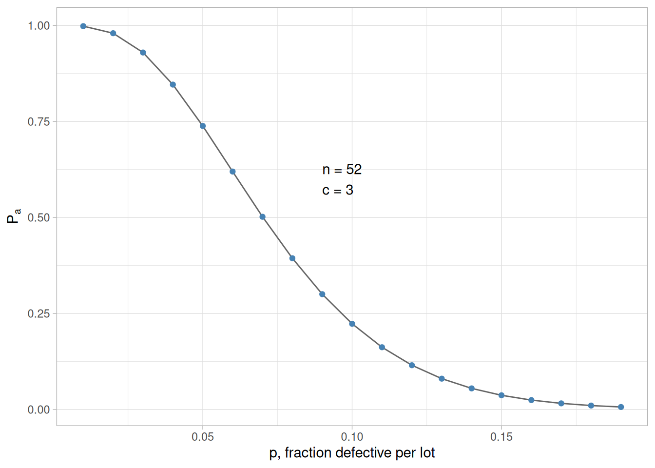
We start by looking at a typical OC curve. The OC curve for a (52, 3) sampling plan is shown below.
Code
library(tidyverse)n <-52c <-3oc_data <-tibble(p =seq(0.01, 0.19, 0.01)) |>mutate(Pa =pbinom(c, n, p))ggplot(oc_data, aes(p, Pa)) +geom_line(color ="grey40") +geom_point(color ="steelblue") +annotate("text", x =0.09, y =0.6, label ="n = 52\nc = 3", hjust =0) +labs(x ="p, fraction defective per lot", y =expression(P[a])) +theme_light()
Figure 6.4: Sample OC curve for (52,3) sampling plan
Number of defectives is approximately binomial
It is instructive to show how the points on this curve are obtained, once we have a sampling plan (\(n,c\)) - later we will demonstrate how a sampling plan (\(n,c\)) is obtained.
We assume that the lot size \(N\) is very large, as compared to the sample size \(n\), so that removing the sample doesn’t significantly change the remainder of the lot, no matter how many defects are in the sample. Then the distribution of the number of defectives, \(d\), in a random sample of \(n\) items is approximately binomial with parameters \(n\) and \(p\), where \(p\) is the fraction of defectives per lot.
The probability of observing exactly \(d\) defectives is given by
The probability of acceptance is the probability that \(d\), the number of defectives, is less than or equal to \(c\), the accept number. This means that
Table 6.2: Probability of acceptance and probability of d defectives for a (52,3) sampling plan
\(P_a\)
\(p\)
0.998
0.01
0.980
0.02
0.930
0.03
0.846
0.04
0.738
0.05
0.620
0.06
0.502
0.07
0.394
0.08
0.300
0.09
0.223
0.10
0.162
0.11
0.115
0.12
Solving for (\(n,c\))
Equations for calculating a sampling plan with a given OC curve
In order to design a sampling plan with a specified OC curve one needs two designated points. Let us design a sampling plan such that the probability of acceptance is \(1-\alpha\) for lots with fraction defective \(p_1\) and the probability of acceptance is \(\beta\) for lots with fraction defective \(p_2\). Typical choices for these points are: \(p_1\) is the AQL, \(p_2\) is the LTPD and \(\alpha, \, \beta\) are the Producer’s Risk (Type I error) and Consumer’s Risk (Type II error), respectively.
If we are willing to assume that binomial sampling is valid, then the sample size \(n\), and the acceptance number \(c\) are the solution to
These two simultaneous equations are nonlinear so there is no simple, direct solution. There are however a number of iterative techniques available that give approximate solutions so that composition of a computer program poses few problems.
Average Outgoing Quality (AOQ)
Calculating AOQs
We can also calculate the AOQ for a (\(n,c\)) sampling plan, provided rejected lots are 100% inspected and defectives are replaced with good parts.
Assume all lots come in with exactly a \(p_0\) proportion of defectives. After screening a rejected lot, the final fraction defectives will be zero for that lot. However, accepted lots have fraction defective \(p_0\). Therefore, the outgoing lots from the inspection stations are a mixture of lots with fractions defective \(p_0\) and 0. Assuming the lot size is \(N\), we have.
\[ \text{AOQ} = \frac{P_a p(N-n)}{N} \, . \]
For example, let \(N=10000\), \(n=52\), \(c=3\), and \(p\), the quality of incoming lots, equals 0.03. Now at \(p = 0.03\), we glean from the OC curve table that \(p_a = 0.930\) and
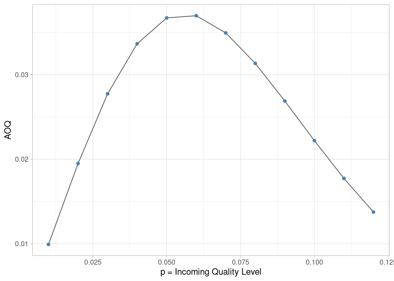
From examining this curve we observe that when the incoming quality is very good (very small fraction of defectives coming in), then the outgoing quality is also very good (very small fraction of defectives going out). When the incoming lot quality is very bad, most of the lots are rejected and then inspected. The “duds” are eliminated or replaced by good ones, so that the quality of the outgoing lots, the AOQ, becomes very good. In between these extremes, the AOQ rises, reaches a maximum, and then drops.
The maximum ordinate on the AOQ curve represents the worst possible quality that results from the rectifying inspection program. It is called the average outgoing quality limit, (AOQL).
From the table we see that the \(\text{AOQL} = 0.0372\) at \(p=0.06\) for the above example.
One final remark: if \(N \gg n\), then the \(\text{AOQ} \approx P_a p\).
The Average Total Inspection (ATI)
Calculating the Average Total Inspection
What is the total amount of inspection when rejected lots are screened?
If all lots contain zero defectives, no lot will be rejected.
If all items are defective, all lots will be inspected, and the amount to be inspected is \(N\).
Finally, if the lot quality is \(0 \lt p \lt 1\), the average amount of inspection per lot will vary between the sample size \(n\), and the lot size \(N\).
Let the quality of the lot be \(p\) and the probability of lot acceptance be \(P_a\), then the ATI per lot is
\[ \text{ATI} = n + (1 - P_a) (N - n) \, . \]
For example, let \(N=10000\), \(n=52\), \(c=3\), and \(p = 0.03\). We know from the OC table that \(P_a = 0.93\). Then \(\text{ATI} = 52 + (1-0.930)(10000 - 52) = 753\). (Note that while 0.930 was rounded to three decimal places, 753 was obtained using more decimal places.)
Sample table of ATI versus \(p\)
Setting \(p = 0.01, \, 0.02, \, \ldots, \, 0.14\) generates the following table.
Code
ati_data <-tibble(p =seq(0.01, 0.14, 0.01)) |>mutate(Pa =pbinom(c, n, p), ATI = n + (1- Pa) * (N - n))ati_data |>transmute(ATI =round(ATI), `$p$`= p) |> knitr::kable(align ="cc")
Table 6.4: ATI versus p for a (52,3) sampling plan, N = 10000
ATI
\(p\)
70
0.01
253
0.02
753
0.03
1584
0.04
2655
0.05
3836
0.06
5008
0.07
6083
0.08
7013
0.09
7780
0.10
8388
0.11
8854
0.12
9201
0.13
9453
0.14
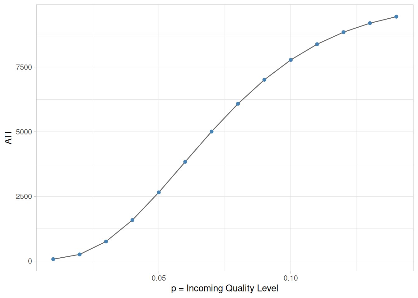
Plot of ATI versus \(p\)
A plot of ATI versus \(p\), the Incoming Lot Quality (ILQ) is given below.
Double and multiple sampling plans were invented to give a questionable lot another chance. For example, if in double sampling the results of the first sample are not conclusive with regard to accepting or rejecting, a second sample is taken. Application of double sampling requires that a first sample of size \(n_1\) is taken at random from the (large) lot. The number of defectives is then counted and compared to the first sample’s acceptance number \(a_1\) and rejection number \(r_1\). Denote the number of defectives in sample 1 by \(d_1\) and in sample 2 by \(d_2\), then:
If \(d_1 \le a_1\), the lot is accepted.
If \(d_1 \ge r_1\), the lot is rejected.
If \(a_1 < d_1 < r_1\), a second sample is taken.
If a second sample of size \(n_2\) is taken, the number of defectives, \(d_2\), is counted. The total number of defectives is \(D_2 = d_1 + d_2\). Now this is compared to the acceptance number \(a_2\) and the rejection number \(r_2\) of sample 2. In double sampling, \(r_2 = a_2 + 1\) to ensure a decision on the sample.
If \(D_2 \le a_2\), the lot is accepted.
If \(D_2 \ge r_2\), the lot is rejected.
Design of a Double Sampling Plan
Design of a double sampling plan
The parameters required to construct the OC curve are similar to the single sample case. The two points of interest are (\(p_1, \, 1-\alpha\)) and (\(p_2, \, \beta\)), where \(p_1\) is the lot fraction defective for plan 1 and \(p_2\) is the lot fraction defective for plan 2. As far as the respective sample sizes are concerned, the second sample size must be equal to, or an even multiple of, the first sample size.
There exist a variety of tables that assist the user in constructing double and multiple sampling plans. The index to these tables is the \(p_2 / p_1\) ratio, where \(p_2 > p_1\). One set of tables, taken from the Army Chemical Corps (1953) Engineering Agency for \(\alpha = 0.05\) and \(\beta = 0.10\), is given below:
Table 6.5: Tables for \(n_1 = n_2\)
\(R = p_2/p_1\)
accept \(c_1\)
numbers \(c_2\)
approximation of \(pn_1\) for \(P=0.95\)
values \(P=0.10\)
11.90
0
1
0.21
2.50
7.54
1
2
0.52
3.92
6.79
0
2
0.43
2.96
5.39
1
3
0.76
4.11
4.65
2
4
1.16
5.39
4.25
1
4
1.04
4.42
3.88
2
5
1.43
5.55
3.63
3
6
1.87
6.78
3.38
2
6
1.72
5.82
3.21
3
7
2.15
6.91
3.09
4
8
2.62
8.10
2.85
4
9
2.90
8.26
2.60
5
11
3.68
9.56
2.44
5
12
4.00
9.77
2.32
5
13
4.35
10.08
2.22
5
14
4.70
10.45
2.12
5
16
5.39
11.41
Table 6.6: Tables for \(n_2 = 2n_1\)
\(R = p_2/p_1\)
accept \(c_1\)
numbers \(c_2\)
approximation of \(pn_1\) for \(P=0.95\)
values \(P=0.10\)
14.50
0
1
0.16
2.32
8.07
0
2
0.30
2.42
6.48
1
3
0.60
3.89
5.39
0
3
0.49
2.64
5.09
0
4
0.77
3.92
4.31
1
4
0.68
2.93
4.19
0
5
0.96
4.02
3.60
1
6
1.16
4.17
3.26
1
8
1.68
5.47
2.96
2
10
2.27
6.72
2.77
3
11
2.46
6.82
2.62
4
13
3.07
8.05
2.46
4
14
3.29
8.11
2.21
3
15
3.41
7.55
1.97
4
20
4.75
9.35
1.74
6
30
7.45
12.96
Example
Example of a double sampling plan
We wish to construct a double sampling plan according to \(p_1 = 0.01\), \(\alpha = 0.05\), \(p_2 = 0.05\), \(\beta = 0.10\), \(n_1 = n_2\).
The plans in the corresponding table are indexed on the ratio
\[ R = p_2 / p_1 = 5 \, . \]
We find the row whose \(R\) is closet to 5. This is the 5th row (\(R = 4.65\)). This gives \(c_1 = 2\) and \(c_2=4\). The value of \(n_1\) is determined from either of the two columns labeled \(pn_1\).
The left holds \(\alpha\) constant at 0.05 (\(P = 0.95 = 1-\alpha\)) and the right holds \(\beta\) constant at 0.10 (\(P = 0.10\)). Then holding \(\alpha\) constant, we find \(pn_1 = 1.16\), so \(n_1 = 1.16 / p_1 = 116\). And, holding \(\beta\) constant, we find \(pn_1 = 5.39\), so \(n_1 = 5.39 / p_2 = 108\). Thus the desired sampling plan is \(n_1 = 108\), \(c_1 = 2\), \(n_2 = 108\), \(c_2 = 4\).
If we opt for \(n_2 = 2n_1\), and follow the same procedure using the appropriate table, the plan is: \(n_1 = 77\), \(c_1 = 1\), \(n_2 = 154\), \(c_2 = 4\).
The first plan needs less samples if the number of defectives in sample 1 is greater than 2, while the second plan needs less samples if the number of defectives in sample 1 is less than 2.
ASN Curve for a Double Sampling Plan
Construction of the ASN curve
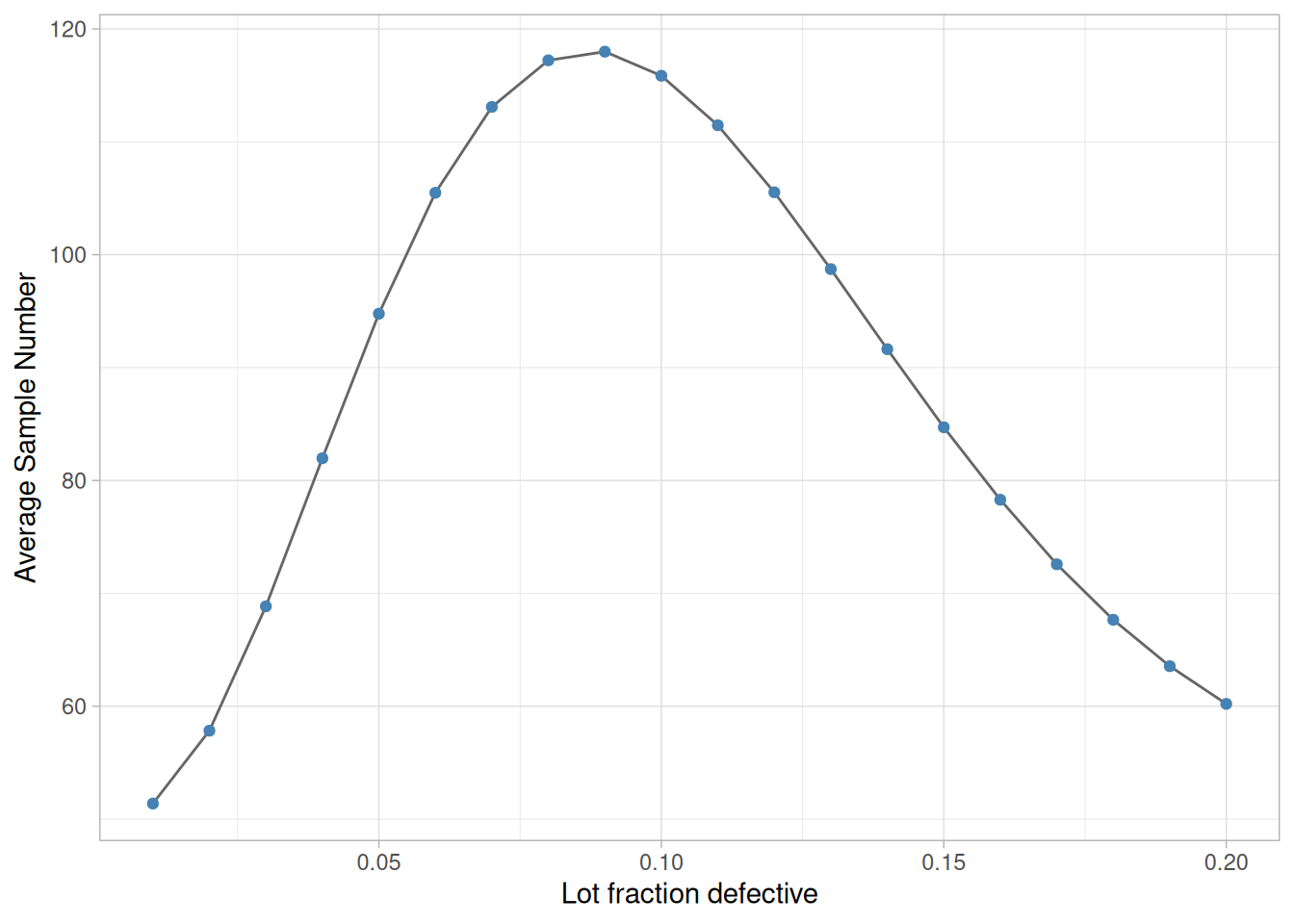
Since when using a double sampling plan the sample size depends on whether or not a second sample is required, an important consideration for this kind of sampling is the Average Sample Number (ASN) curve. This curve plots the ASN versus \(p'\), the true fraction defective in an incoming lot.
We will illustrate how to calculate the ASN curve with an example. Consider a double-sampling plan \(n_1 = 50\), \(c_1 = 2\), \(n_2 = 100\), \(c_2 = 6\), where \(n_1\) is the sample size for plan 1, with accept number \(c_1\), and \(n_2, \, c_2\), are the sample size and accept number, respectively, for plan 2.
Let \(p' = 0.06\). Then the probability of acceptance on the first sample, which is the chance of getting two or less defectives, is 0.416 (using binomial tables). The probability of rejection on the second sample, which is the chance of getting more than six defectives, is (1-0.971) = 0.029. The probability of making a decision on the first sample is 0.445, equal to the sum of 0.416 and 0.029. With complete inspection of the second sample, the average size sample is equal to the size of the first sample times the probability that there will be only one sample plus the size of the combined samples times the probability that a second sample will be necessary. For the sampling plan under consideration, the ASN with complete inspection of the second sample for a \(p' = 0.06\) is
\[ 50(0.445) + 150(0.555) = 106 \, . \]
The general formula for an average sample number curve of a double-sampling plan with complete inspection of the second sample is
Figure 6.7: Plot of Average Sample Number versus Lot Fraction Defective
6.2.5 What is Multiple Sampling?
Multiple Sampling is an extension of the double sampling concept
Multiple sampling is an extension of double sampling. It involves inspection of 1 to \(k\) successive samples as required to reach an ultimate decision.
Mil-Std 105D suggests \(k=7\) is a good number. Multiple sampling plans are usually presented in tabular form.
Procedure for multiple sampling
The procedure commences with taking a random sample of size \(n_1\) from a large lot of size \(N\) and counting the number of defectives, \(d_1\).
If \(d_1 \le a_1\) the lot is accepted.
If \(d_1 \ge r_1\) the lot is rejected.
If \(a_1 < d_1 < r_1\), another sample is taken.
If subsequent samples are required, the first sample procedure is repeated sample by sample. For each sample, the total number of defectives found at any stage, say stage \(i\), is
\[ D_i = \sum_{j=1}^i d_j \]
This is compared with the acceptance number \(a_i\) and the rejection number \(r_i\) for that stage until a decision is made. Sometimes acceptance is not allowed at the early stages of multiple sampling; however, rejection can occur at any stage.
Efficiency measured by the ASN
Efficiency for a multiple sampling scheme is measured by the average sample number (ASN) required for a given Type I and Type II set of errors. The number of samples needed when following a multiple sampling scheme may vary from trial to trial, and the ASN represents the average of what might happen over many trials with a fixed incoming defect level.
6.2.6 What is a Sequential Sampling Plan?
Sequential Sampling
Sequential sampling is different from single, double or multiple sampling. Here one takes a sequence of samples from a lot. How many total samples looked at is a function of the results of the sampling process.
Item-by-item and group sequential sampling
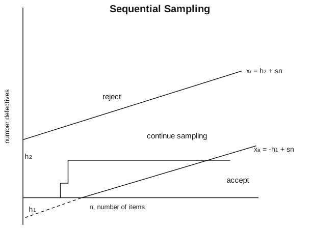
The sequence can be one sample at a time, and then the sampling process is usually called item-by-item sequential sampling. One can also select sample sizes greater than one, in which case the process is referred to as group sequential sampling. Item-by-item is more popular so we concentrate on it. The operation of such a plan is illustrated below:
Diagram of item-by-item sampling
Figure 6.8: Diagram demonstrating item-by-item sequential sampling plan
Description of sequentail sampling graph
The cumulative observed number of defectives is plotted on the graph. For each point, the x-axis is the total number of items thus far selected, and the y-axis is the total number of observed defectives. If the plotted point falls within the parallel lines the process continues by drawing another sample. As soon as a point falls on or above the upper line, the lot is rejected. And when a point falls on or below the lower line, the lot is accepted. The process can theoretically last until the lot is 100% inspected. However, as a rule of thumb, sequential-sampling plans are truncated after the number inspected reaches three times the number that would have been inspected using a corresponding single sampling plan.
Equations for the limit lines
The equations for the two limit lines are functions of the parameters \(p_1\), \(\alpha\), \(p_2\), and \(\beta\).
\[ \begin{aligned}
x_a & = -h_1 + s n \\
x_r & = h_2 + s n \, ,
\end{aligned} \]
Both acceptance numbers and rejection numbers must be integers. The acceptance number is the next integer less than or equal to \(x_a\) and the rejection number is the next integer greater than or equal to \(x_r\). Thus for \(n=1\), the acceptance number is -1, which is impossible, and the rejection number is 2, which is also impossible. For \(n = 24\), the acceptance number is 0 and the rejection number is 3.
The results for \(n = 1, \, 2, \, 3, \, \ldots, \, 26\) are tabulated below.
Table 6.7: Acceptance and rejection numbers for n = 1, …, 26
n inspect
n accept
n reject
n inspect
n accept
n reject
1
x
2
14
x
2
2
x
2
15
x
2
3
x
2
16
x
2
4
x
2
17
x
2
5
x
2
18
x
2
6
x
2
19
x
2
7
x
2
20
x
3
8
x
2
21
x
3
9
x
2
22
x
3
10
x
2
23
x
3
11
x
2
24
0
3
12
x
2
25
0
3
13
x
2
26
0
3
So, for \(n=24\) the acceptance number is 0 and the rejection number is 3. The “x” means that acceptance or rejection is not possible.
Other sequential plans are given below.
n inspect
n accept
n reject
49
1
3
58
1
4
74
2
4
83
2
5
100
3
5
109
3
6
The corresponding single sampling plan is (52,2) and double sampling plan is (21,0), (21,1).
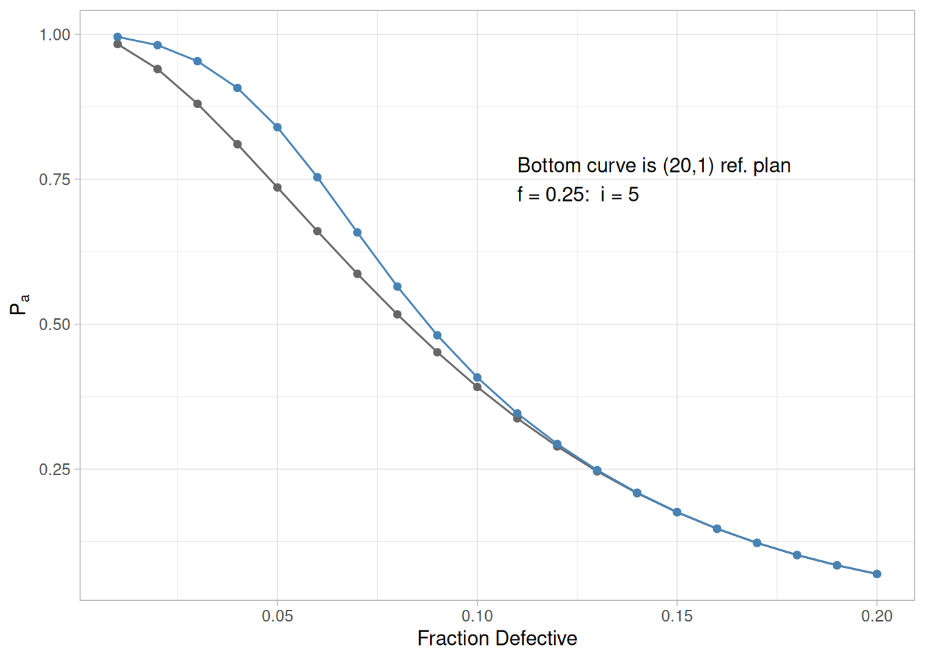
Efficiency measured by ASN
Efficiency for a sequential sampling scheme is measured by the average sample number (ASN) required for a given Type I and Type II set of errors. The number of samples needed when following a sequential sampling scheme may vary from trial to trial, and the ASN represents the average of what might happen over many trials with a fixed incoming defect level. Good software for designing sequential sampling schemes will calculate the ASN curve as a function of the incoming defect level.
6.2.7 What is Skip Lot Sampling?
Skip Lot Sampling
Skip Lot sampling means that only a fraction of the submitted lots are inspected. This mode of sampling is of the cost-saving variety in terms of time and effort. However skip-lot sampling should only be used when it has been demonstrated that the quality of the submitted product is very good.
Implementation of skip-lot sampling plan
A skip-lot sampling plan is implemented as follows:
Design a single sampling plan by specifying the alpha and beta risks and the consumer/producer’s risks. This plan is called “the reference sampling plan”.
Start with normal lot-by-lot inspection, using the reference plan.
When a pre-specified number, \(i\) of consecutive lots are accepted, switch to inspecting only a fraction \(f\) of the lots. The selection of the members of that fraction is done at random.
When a lot is rejected return to normal inspection.
The \(f\) and \(i\) parameters
The parameters \(f\) and \(i\) are essential to calculating the probability of acceptance for a skip-lot sampling plan. In this scheme, \(i\), called the clearance number, is a positive integer and the sampling fraction \(f\) is such that \(0 < f < 1\). Hence, when \(f=1\) there is no longer skip-lot sampling. The calculation of the acceptance probability for the skip-lot sampling plan is performed via the following formula
Comparison of univariate and multivariate control data
Control charts are used to routinely monitor quality. Depending on the number of process characteristics to be monitored, there are two basic types of control charts. The first, referred to as a univariate control chart, is a graphical display (chart) of one quality characteristic. The second, referred to as a multivariate control chart, is a graphical display of a statistic that summarizes or represents more than one quality characteristic.
Characteristics of control charts
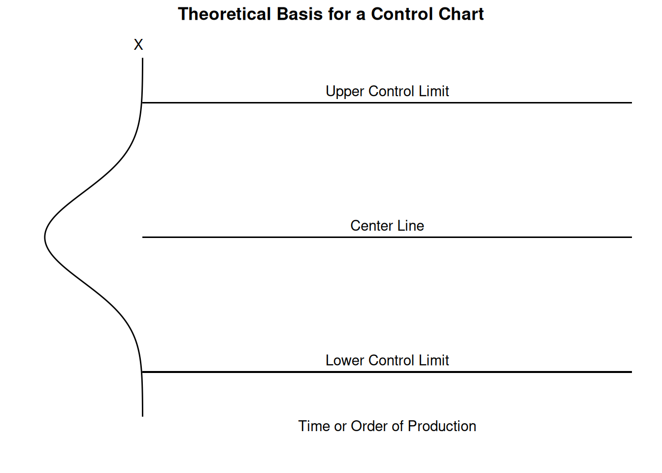
If a single quality characteristic has been measured or computed from a sample, the control chart shows the value of the quality characteristic versus the sample number or versus time. In general, the chart contains a center line that represents the mean value for the in-control process. Two other horizontal lines, called the upper control limit (UCL) and the lower control limit (LCL), are also shown on the chart. These control limits are chosen so that almost all of the data points will fall within these limits as long as the process remains in-control. The figure below illustrates this.
Chart demonstrating basis of control chart
Code
library(tidyverse)mu <-0sigma <-1ucl <- mu +3* sigmalcl <- mu -3* sigmaxmax <-6curve_width <-0.2* xmaxcurve_df <-tibble(y =seq(mu -4* sigma, mu +4* sigma, length.out =400)) |>mutate(x =-dnorm(y, mu, sigma) /dnorm(0, 0, sigma) * curve_width)ggplot(curve_df, aes(x, y)) +geom_path() +geom_segment(x =0, xend = xmax, y = ucl, yend = ucl) +geom_segment(x =0, xend = xmax, y = mu, yend = mu) +geom_segment(x =0, xend = xmax, y = lcl, yend = lcl) +annotate("text", x = xmax /2, y = ucl, label ="Upper Control Limit", vjust =-0.6) +annotate("text", x = xmax /2, y = mu, label ="Center Line", vjust =-0.6) +annotate("text", x = xmax /2, y = lcl, label ="Lower Control Limit", vjust =-0.6) +annotate("text", x = xmax /2, y = lcl -1.2, label ="Time or Order of Production") +annotate("text", x =-0.05, y = mu +4.3* sigma, label ="X") +labs(title ="Theoretical Basis for a Control Chart") +coord_cartesian(xlim =c(-curve_width *1.15, xmax), ylim =c(mu -4.8* sigma, mu +4.3* sigma), clip ="off") +theme_void() +theme(plot.title =element_text(hjust =0.5, face ="bold"))
Figure 6.10: Chart showing theoretical basis for a control chart
Why control charts “work”
The control limits as pictured in the graph might be 0.001 probability limits. If so, and if chance causes alone were present, the probability of a point falling above the upper limit would be one out of a thousand, and similarly, a point falling below the lower limit would be one out of a thousand. We would be searching for an assignable cause if a point would fall outside these limits. Where we put these limits will determine the risk of undertaking such a search when in reality there is no assignable cause for variation.
Since two out of a thousand is a very small risk, the 0.001 limits may be said to give practical assurances that, if a point falls outside these limits, the variation was caused be an assignable cause. It must be noted that two out of one thousand is a purely arbitrary number. There is no reason why it could not have been set to one out a hundred or even larger. The decision would depend on the amount of risk the management of the quality control program is willing to take. In general (in the world of quality control) it is customary to use limits that approximate the 0.002 standard.
Letting \(X\) denote the value of a process characteristic, if the system of chance causes generates a variation in \(X\) that follows the normal distribution, the 0.001 probability limits will be very close to the \(3\sigma\) limits. From normal tables we glean that the \(3\sigma\) in one direction is 0.00135, or in both directions 0.0027. For normal distributions, therefore, the \(3\sigma\) limits are the practical equivalent of 0.001 probability limits.
Plus or minus “3 sigma” limits are typical
In the U.S., whether \(X\) is normally distributed or not, it is an acceptable practice to base the control limits upon a multiple of the standard deviation. Usually this multiple is 3 and thus the limits are called 3-sigma limits. This term is used whether the standard deviation is the universe or population parameter, or some estimate thereof, or simply a “standard value” for control chart purposes. It should be inferred from the context what standard deviation is involved. (Note that in the U.K., statisticians generally prefer to adhere to probability limits.)
If the underlying distribution is skewed, say in the positive direction, the 3-sigma limit will fall short of the upper 0.001 limit, while the lower 3-sigma limit will fall below the 0.001 limit. This situation means that the risk of looking for assignable causes of positive variation when none exists will be greater than one out of a thousand. But the risk of searching for an assignable cause of negative variation, when none exists, will be reduced. The net result, however, will be an increase in the risk of a chance variation beyond the control limits. How much this risk will be increased will depend on the degree of skewness.
If variation in quality follows a Poisson distribution, for example, for which \(np = 0.8\), the risk of exceeding the upper limit by chance would be raised by the use of 3-sigma limits from 0.001 to 0.009 and the lower limit reduces from 0.001 to 0. For a Poisson distribution the mean and variance both equal \(np\). Hence the upper 3-sigma limit is \(0.8 + 3\sqrt{0.8} = 3.48\) and the lower limit is 0. For \(np = 0.8\) the probability of getting more than 3 successes is 0.009.
Strategies for dealing with out-of-control findings
If a data point falls outside the control limits, we assume that the process is probably out of control and that an investigation is warranted to find and eliminate the cause or causes.
Does this mean that when all points fall within the limits, the process is in control? Not necessarily. If the plot looks non-random, that is, if the points exhibit some form of systematic behavior, there is still something wrong. For example, if the first 25 of 30 points fall above the center line and the last 5 fall below the center line, we would wish to know why this is so. Statistical methods to detect sequences or nonrandom patterns can be applied to the interpretation of control charts. To be sure, “in control” implies that all points are between the control limits and they form a random pattern.
6.3.2 What are Variables Control Charts?
During the 1920’s, Dr. Walter A. Shewhart proposed a general model for control charts as follows:
Shewhart Control Charts for variables
Let \(w\) be a sample statistic that measures some continuously varying quality characteristic of interest (e.g., thickness), and suppose that the mean of \(w\) is \(\mu_w\), with a standard deviation of \(\sigma_w\). Then the center line, the \(UCL\), and the \(LCL\) are
\(UCL = \mu_w + k \sigma_w\)
Center Line = \(\mu_w\)
\(LCL = \mu_w - k \sigma_w\)
where \(k\) is the distance of the control limits from the center line, expressed in terms of standard deviation units. When \(k\) is set to 3, we speak of 3-sigma control charts.
Historically, \(k = 3\) has become an accepted standard in industry.
The centerline is the process mean, which in general is unknown. We replace it with a target or the average of all the data. The quantity that we plot is the sample average, \(\overline{X}\). The chart is called the \(\overline{X}\) chart.
We also have to deal with the fact that \(\sigma\) is, in general, unknown. Here we replace \(\sigma_w\) with a given standard value, or we estimate it by a function of the average standard deviation. This is obtained by averaging the individual standard deviations that we calculated from each of \(m\) preliminary (or present) samples, each of size \(n\). This function will be discussed shortly.
It is equally important to examine the standard deviations in ascertaining whether the process is in control. There is, unfortunately, a slight problem involved when we work with the usual estimator of \(\sigma\). The following discussion will illustrate this.
Sample Variance
If \(\sigma^2\) is the unknown variance of a probability distribution, then an unbiased estimator of \(\sigma^2\) is the sample variance,
However, \(s\), the sample standard deviation, is not an unbiased estimator of \(\sigma\). If the underlying distribution is normal, then \(s\) actually estimates \(c_4 \cdot \sigma\), where \(c_4\) is a constant that depends on the sample size \(n\). This constant is tabulated in most text books on statistical quality control and may be calculated using
Note that in some sources the formula is given in terms of \(\sigma = c_4 \cdot s\), in which case \(c_4\) will be the reciprocal of the formula given above.
Fractional Factorials
To compute this we need a non-integer factorial, which is defined for \(n/2\) as follows:
With this definition the reader should have no problem verifying that the \(c_4\) factor for \(n=10\) is 0.9727.
Mean and standard deviation of the estimators
So the mean or expected value of the sample standard deviation is \(c_4 \cdot \sigma\).
The standard deviation of the sample standard deviation is
\[ \sigma_s = \sigma \sqrt{1 - c_4^2} \, . \]
What are the differences between control limits and specification limits?
Control limits vs. specifications
Control Limits are used to determine if the process is in a state of statistical control (i.e., is producing consistent output).
Specification Limits are used to determine if the product will function in the intended fashion.
How many data points are needed to set up a control chart?
How many samples are needed?
Shewhart gave the following rule of thumb:
“It has also been observed that a person would seldom if ever be justified in concluding that a state of statistical control of a given repetitive operation or production process has been reached until he had obtained, under presumably the same essential conditions, a sequence of not less than twenty five samples of size four that are in control.”
It is important to note that control chart properties, such as false alarm probabilities, are generally given under the assumption that the parameters, such as \(\mu\) and \(\sigma\), are known. When the control limits are not computed from a large amount of data, the actual properties might be quite different from what is assumed (see, e.g., Quesenberry (1993)).
When do we recalculate control limits?
When do we recalculate control limits?
Since a control chart “compares” the current performance of the process characteristic to the past performance of this characteristic, changing the control limits frequently would negate any usefulness.
So, only change your control limits if you have a valid, compelling reason for doing so. Some examples of reasons:
When you have at least 30 more data points to add to the chart and there have been no known changes to the process
you get a better estimate of the variability
If a major process change occurs and affects the way your process runs.
If a known, preventable act changes the way the tool or process would behave (power goes out, consumable is corrupted or bad quality, etc.)
What are the WECO rules for signaling “Out of Control”?
General rules for detecting out of control or non-random situations
WECO stands for Western Electric Company Rules.
Table 6.8: Western Electric Company (WECO) rules for signaling “out of control”
Zone
Rule
Above \(+3\sigma\)
Any point above
\(+2\sigma\) to \(+3\sigma\)
2 out of the last 3 points
\(+1\sigma\) to \(+2\sigma\)
4 out of the last 5 points
Center line to \(+1\sigma\)
8 consecutive points on this side of the center line
Center line to \(-1\sigma\)
8 consecutive points on this side of the center line
\(-1\sigma\) to \(-2\sigma\)
4 out of the last 5 points
\(-2\sigma\) to \(-3\sigma\)
2 out of the last 3 points
Below \(-3\sigma\)
Any point below
Trend Rules: 6 in a row trending up or down. 14 in a row alternating up and down.
WECO rules based on probabilities
The WECO rules are based on probability. We know that, for a normal distribution, the probability of encountering a point outside \(\pm 3 \sigma\) is 0.3%. This is a rare event. Therefore, if we observe a point outside the control limits, we conclude the process has shifted and is unstable. Similarly, we can identify other events that are equally rare and use them as flags for instability. The probability of observing two points out of three in a row between \(2 \sigma\) and \(3 \sigma\) and the probability of observing four points out of five in a row between \(1 \sigma\) and \(2 \sigma\) are also about 0.3%.
WECO rules increase false alarms
Note: While the WECO rules increase a Shewhart chart’s sensitivity to trends or drifts in the mean, there is a severe downside to adding the WECO rules to an ordinary Shewhart control chart that the user should understand. When following the standard Shewhart “out of control” rule (i.e., signal if and only if you see a point beyond the plus or minus 3 sigma control limits) you will have “false alarms” every 371 points on the average (see the description of Average Run Length or ARL on the next page). Adding the WECO rules increases the frequency of false alarms to about once in every 91.75 points, on the average (see Champ and Woodall (1987)). The user has to decide whether this price is worth paying (some users add the WECO rules, but take them “less seriously” in terms of the effort put into troubleshooting activities when out of control signals occur).
With this background, the next page will describe how to construct Shewhart variables control charts.
6.3.2.1 Shewhart X-bar and R and S Control Charts
\(\bar{X}\) and \(s\) Charts
\(\bar{X}\) and \(s\) Shewhart Control Charts
We begin with \(\bar{X}\) and \(s\) charts. We should use the \(s\) chart first to determine if the distribution for the process characteristic is stable.
Let us consider the case where we have to estimate \(\sigma\) by analyzing past data. Suppose we have \(m\) preliminary samples at our disposition, each of size \(n\), and let \(s_i\) be the standard deviation of the ith sample. Then the average of the \(m\) standard deviations is
\[ \bar{s} = \frac{1}{m} \sum_{i=1}^m s_i \, . \]
Control Limits for \(\bar{X}\) and \(s\) Control Charts
We make use of the factor \(c_4\) described on the previous page.
The statistic \(\bar{s}/c_4\) is an unbiased estimator of \(\sigma\). Therefore, the parameters of the \(s\) chart would be
\(\bar{\bar{x}}\), the “grand” mean, is the average of all the observations.
It is often convenient to plot the \(\bar{X}\) and \(s\) charts on one page.
\(\bar{X}\) and \(R\) Control Charts
\(\bar{X}\) and \(R\) control charts
If the sample size is relatively small (say equal to or less than 10), we can use the range instead of the standard deviation of a sample to construct control charts on \(\bar{X}\) and the range, \(R\). The range of a sample is simply the difference between the largest and smallest observation.
There is a statistical relationship (Patnaik, 1946) between the mean range for data from a normal distribution and \(\sigma\), the standard deviation of that distribution. This relationship depends only on the sample size, \(n\). The mean of \(R\) is \(d_2 \sigma\), where the value of \(d_2\) is also a function of \(n\). An estimator of\(\sigma\) is therefore \(R / d_2\).
Armed with this background we can now develop the \(\bar{X}\) and \(R\) control chart.
Let \(R_1, \, R_2, \, \ldots, R_k\), be the ranges of \(k\) samples. The average range is
So, if we use \(\bar{\bar{x}}\) (or a given target) as an estimator of \(\mu\) and \(\bar{R} / d_2\) as an estimator of \(\sigma\), then the parameters of the \(\bar{X}\) chart are
The factor \(A_2\) depends only on \(n\), and is tabled below.
The \(R\) chart
\(R\) control charts
This chart controls the process variability since the sample range is related to the process standard deviation. The center line of the \(R\) chart is the average range.
To compute the control limits we need an estimate of the true, but unknown standard deviation \(W = R/\sigma\). This can be found from the distribution of \(W = R/\sigma\) (assuming that the items that we measure follow a normal distribution). The standard deviation of \(W\) is \(d_3\), and is a known function of the sample size, \(n\). It is tabulated in many textbooks on statistical quality control.
Therefore since \(R = W \sigma\), the standard deviation of \(R\) is \(\sigma_R = d_3 \sigma\). But since the true \(\sigma\) is unknown, we may estimate \(\sigma_R\) by
The factors \(D_3\) and \(D_4\) depend only on \(n\), and are tabled below.
Table 6.9: Factors for Calculating Limits for \(\bar{X}\) and \(R\) Charts
\(n\)
\(A_2\)
\(D_3\)
\(D_4\)
2
1.880
0
3.267
3
1.023
0
2.575
4
0.729
0
2.282
5
0.577
0
2.115
6
0.483
0
2.004
7
0.419
0.076
1.924
8
0.373
0.136
1.864
9
0.337
0.184
1.816
10
0.308
0.223
1.777
In general, the range approach is quite satisfactory for sample sizes up to around 10. For larger sample sizes, using subgroup standard deviations is preferable. For small sample sizes, the relative efficiency of using the range approach as opposed to using standard deviations is shown in the following table.
Efficiency of \(R\) versus \(s/c_4\)
\(n\)
Relative Efficiency
2
1.000
3
0.992
4
0.975
5
0.955
6
0.930
10
0.850
A typical sample size is 4 or 5, so not much is lost by using the range for such sample sizes.
Time To Detection or Average Run Length (ARL)
Waiting time to signal “out of control”
Two important questions when dealing with control charts are:
How often will there be false alarms where we look for an assignable cause but nothing has changed?
How quickly will we detect certain kinds of systematic changes, such as mean shifts?
The ARL tells us, for a given situation, how long on the average we will plot successive control charts points before we detect a point beyond the control limits.
For an \(\bar{X}\) chart, with no change in the process, we wait on the average \(1/p\) points before a false alarm takes place, with \(p\) denoting the probability of an observation plotting outside the control limits. For a normal distribution, \(p = 0.0027\) and the ARL is approximately 371.
A table comparing Shewhart \(\bar{X}\) chart ARLs to Cumulative Sum (CUSUM) ARLs for various mean shifts is given later in this section.
There is also (currently) a web site developed by Galit Shmueli that will do ARL calculations interactively with the user, for Shewhart charts with or without additional (Western Electric) rules added.
6.3.2.2 Individuals Control Charts
Samples are Individual Measurements
Moving range used to derive upper and lower limits
Control charts for individual measurements, e.g., the sample size = 1, use the moving range of two successive observations to measure the process variability.
The moving range is defined as
\[ MR_i = |x_i - x_{i-1}| \, , \]
which is the absolute value of the first difference (e.g., the difference between two consecutive data points) of the data. Analogous to the Shewhart control chart, one can plot both the data (which are the individuals) and the moving range.
Individuals control limits for an observation
For the control chart for individual measurements, the lines plotted are:
where \(\bar{x}\) is the average of all the individuals and \(\overline{MR}\) is the average of all the moving ranges of two observations. Keep in mind that either or both averages may be replaced by a standard or target, if available. (Note that 1.128 is the value of \(d_2\) for \(n = 2\).)
Example of moving range
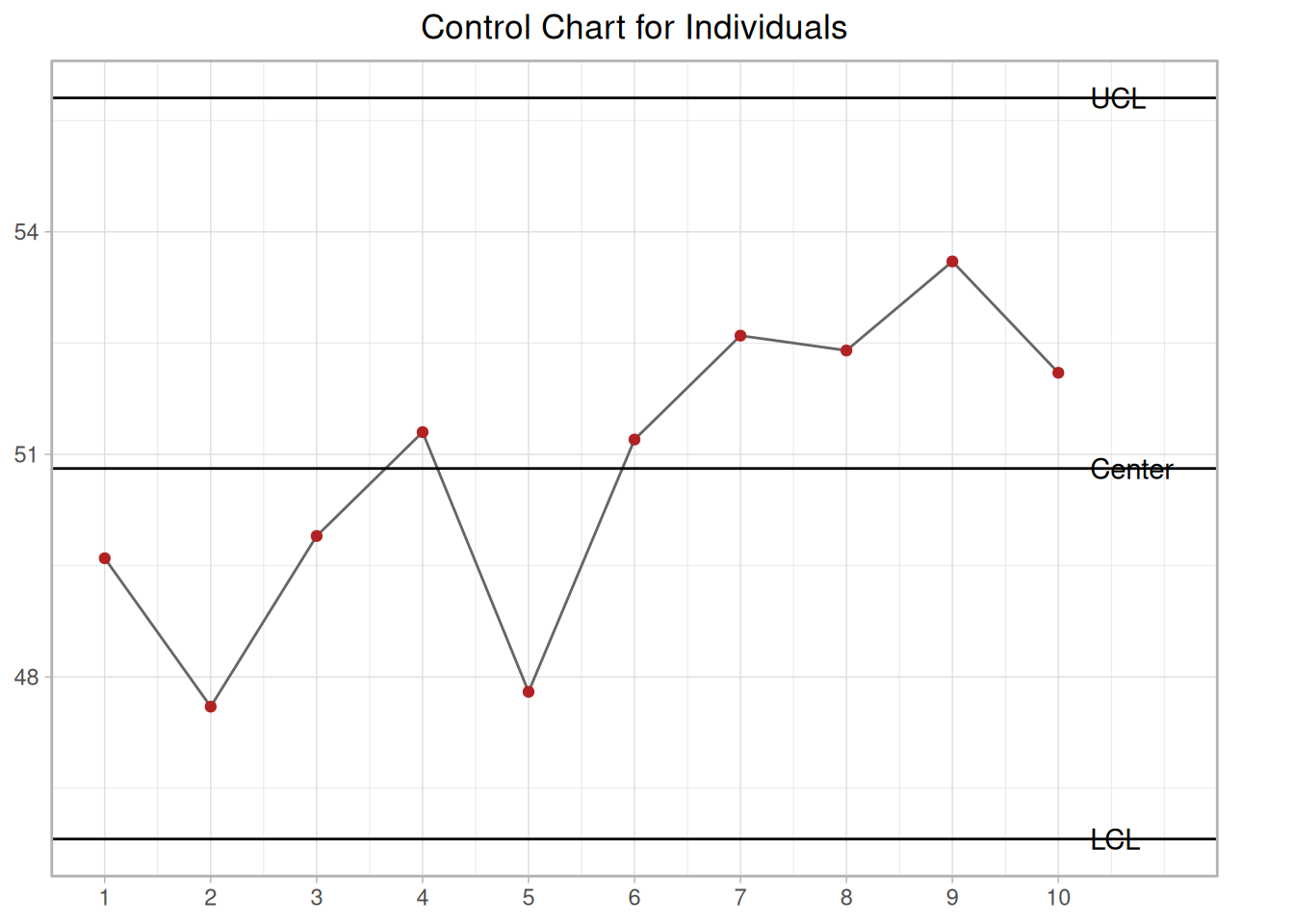
The following example illustrates the control chart for individual observations. A new process was studied in order to monitor flow rate. The first 10 batches resulted in
ucl <- xbar +3* mrbar /1.128lcl <- xbar -3* mrbar /1.128ggplot(flowrate, aes(batch, x)) +geom_line(color ="grey40") +geom_point(color ="firebrick") +geom_hline(yintercept =c(ucl, xbar, lcl)) +annotate("text", x =10.3, y = ucl, label ="UCL", hjust =0) +annotate("text", x =10.3, y = xbar, label ="Center", hjust =0) +annotate("text", x =10.3, y = lcl, label ="LCL", hjust =0) +scale_x_continuous(breaks =1:10) +coord_cartesian(xlim =c(1, 11), clip ="off") +labs(title ="Control Chart for Individuals", x =NULL, y =NULL) +theme_light() +theme(plot.title =element_text(hjust =0.5), plot.margin =margin(5.5, 30, 5.5, 5.5))
Figure 6.11: Control chart for individuals from above table
The process is in control, since none of the plotted points fall outside either the \(UCL\) or \(LCL\).
Alternative for constructing individuals control chart
Note: Another way to construct the individuals chart is by using the standard deviation. Then we can obtain the chart from
\[ \bar{x} \pm 3s/c_4 \, .\]
It is preferable to have the limits computed this way for the start of Phase 2.
6.3.2.3 Cusum Control Charts
CUSUM is an efficient alternative to Shewhart procedures
CUSUM charts, while not as intuitive and simple to operate as Shewhart charts, have been shown to be more efficient in detecting small shifts in the mean of a process. In particular, analyzing ARL’s for CUSUM control charts shows that they are better than Shewhart control charts when it is desired to detect shifts in the mean that are 2 sigma or less.
CUSUM works as follows: Let us collect \(m\) samples, each of size \(n\), and compute the mean of each sample. Then the cumulative sum (CUSUM) control chart is formed by plotting one of the following quantities:
against the sample number \(m\), where \(\hat{\mu}_0\) is the estimate of the in-control mean and \(\sigma_{\bar{x}}\) is the known (or estimated) standard deviation of the sample means. The choice of which of these two quantities is plotted is usually determined by the statistical software package. In either case, as long as the process remains in control centered at \(\hat{\mu}_0\), the CUSUM plot will show variation in a random pattern centered about zero. If the process mean shifts upward, the charted CUSUM points will eventually drift upwards, and vice versa if the process mean decreases.
V-Mask used to determine if process is out of control
A visual procedure proposed by Barnard in 1959, known as the V-Mask, is sometimes used to determine whether a process is out of control. More often, the tabular form of the V-Mask is preferred. The tabular form is illustrated later in this section.
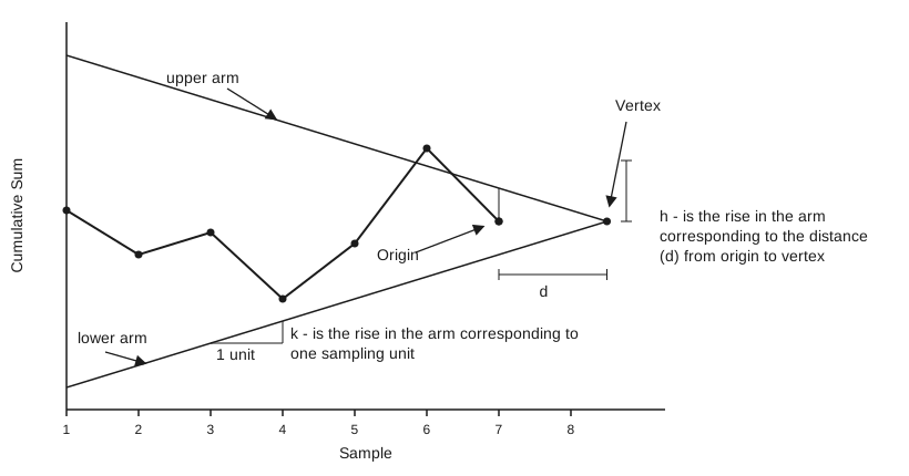
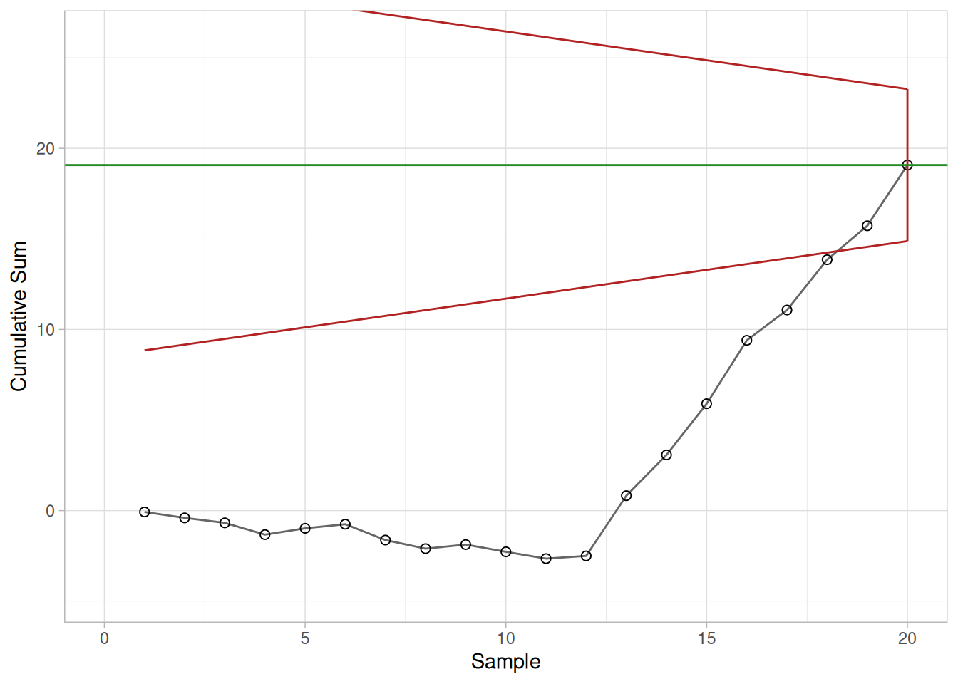
A V-Mask is an overlay shape in the form of a V on its side that is superimposed on the graph of the cumulative sums. The origin point of the V-Mask (see diagram below) is placed on top of the latest cumulative sum point and past points are examined to see if any fall above or below the sides of the V. As long as all the previous points lie between the sides of the V, the process is in control. Otherwise (even if one point lies outside) the process is suspected of being out of control.
Code
library(tidyverse)flow_data <-tibble(Sample =1:20,Means =c(324.925, 324.675, 324.725, 324.350, 325.350, 325.225, 324.125, 324.525,325.225, 324.600, 324.625, 325.150, 328.325, 327.250, 327.825, 328.500,326.675, 327.775, 326.875, 328.350 ))mu0 <-325k <-0.3175h <-4.1959d <- h / kcusum_tbl <-tibble(group = flow_data$Sample, x = flow_data$Means) |>mutate(x_minus_mu = x - mu0,hi_term = x - mu0 - k,lo_term = mu0 - k - x )Shi <- Slo <-numeric(nrow(cusum_tbl))for (i inseq_len(nrow(cusum_tbl))) { prev_hi <-if (i ==1) 0else Shi[i -1] prev_lo <-if (i ==1) 0else Slo[i -1] Shi[i] <-max(0, prev_hi + cusum_tbl$hi_term[i]) Slo[i] <-max(0, prev_lo + cusum_tbl$lo_term[i])}cusum_tbl <- cusum_tbl |>mutate(Shi = Shi, Slo = Slo, S =cumsum(x_minus_mu))v_mask_plot <-function(origin_i) { S0 <- cusum_tbl$S[origin_i] vertex_x <- origin_i + d xmax <-max(cusum_tbl$group)# Arms are only meaningful for past samples, so they are drawn from the# left edge up to the origin and capped there with a vertical segment --# this is how the origin is marked in the original figures, with no text label. upper <-tibble(group =c(1, origin_i)) |>mutate(S = S0 + k * (vertex_x - group)) lower <-tibble(group =c(1, origin_i)) |>mutate(S = S0 - k * (vertex_x - group)) cap <-tibble(group = origin_i, S = S0 - k * d, Send = S0 + k * d)ggplot(cusum_tbl, aes(group, S)) +geom_line(color ="grey40") +geom_point(shape =1, size =2) +geom_line(data = upper, aes(group, S), color ="firebrick") +geom_line(data = lower, aes(group, S), color ="firebrick") +geom_segment(data = cap, aes(x = group, xend = group, y = S, yend = Send), color ="firebrick") +geom_hline(yintercept = S0, color ="forestgreen") +coord_cartesian(xlim =c(0, xmax), ylim =range(cusum_tbl$S) +c(-2, 7)) +labs(x ="Sample", y ="Cumulative Sum") +theme_light()}
Sample V-Mask demonstrating an out of control process
Figure 6.12: Cusum chart with V-Mask showing out of control point
Interpretation of the V-Mask on the plot
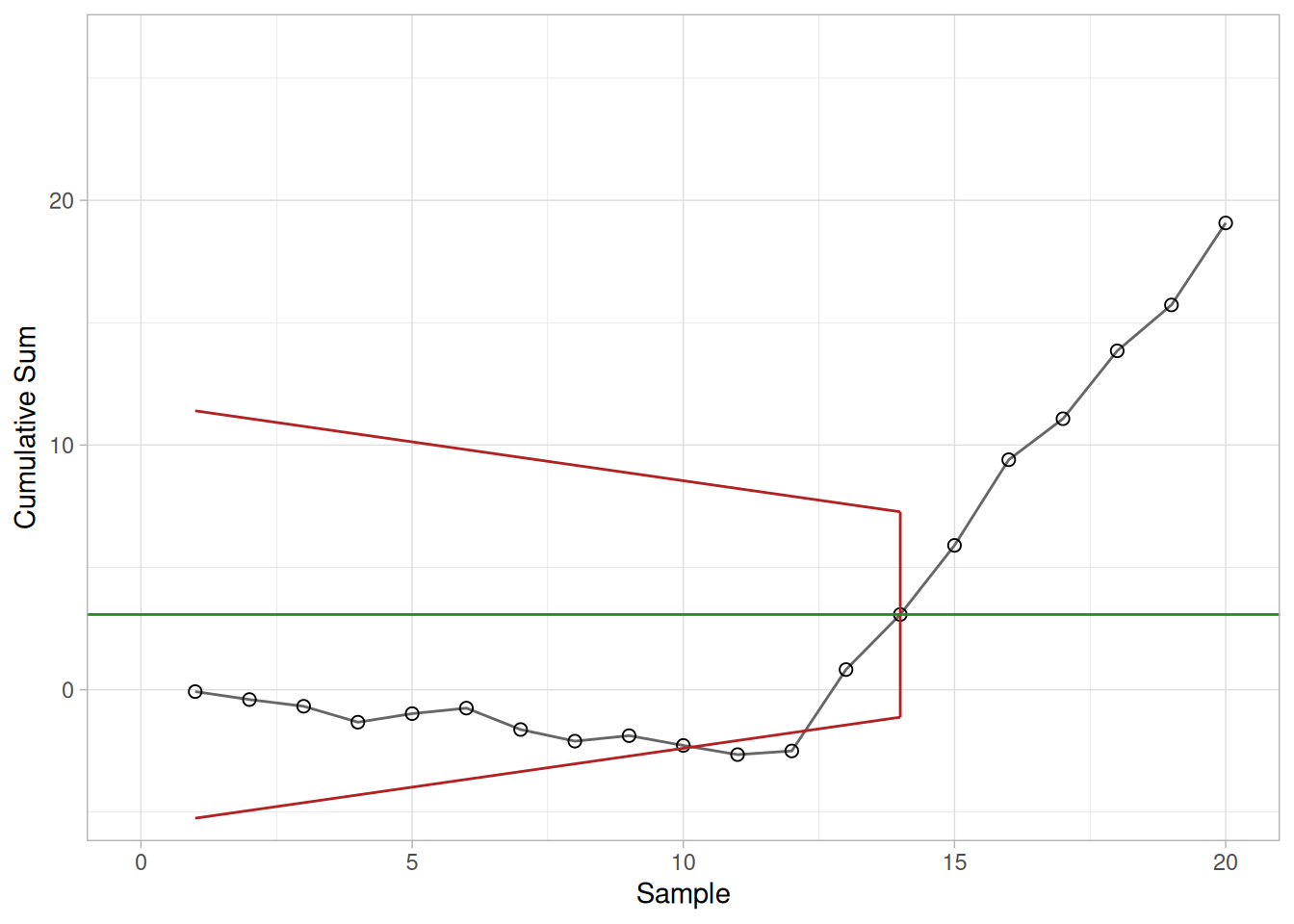
In the diagram above, the V-Mask shows an out of control situation because of the point that lies above the upper arm. By sliding the V-Mask backwards so that the origin point covers other cumulative sum data points, we can determine the first point that signaled an out-of-control situation. This is useful for diagnosing what might have caused the process to go out of control.
From the diagram it is clear that the behavior of the V-Mask is determined by the distance \(k\) (which is the slope of the lower arm) and the rise distance \(h\). These are the design parameters of the V-Mask. Note that we could also specify \(d\) and the vertex angle (or, as is more common in the literature, \(\theta = 1/2\) of the vertex angle) as the design parameters, and we would end up with the same V-Mask.
In practice, designing and manually constructing a V-Mask is a complicated procedure. A CUSUM spreadsheet style procedure shown below is more practical, unless you have statistical software that automates the V-Mask methodology. Before describing the spreadsheet approach, we will look briefly at an example of a V-Mask in graph form.
V-Mask Example
An example will be used to illustrate the construction and application of a V-Mask. The 20 data points
Table 6.11: 20 sample means used in the V-Mask example
Sample
Means
1
324.925
2
324.675
3
324.725
4
324.350
5
325.350
6
325.225
7
324.125
8
324.525
9
325.225
10
324.600
11
324.625
12
325.150
13
328.325
14
327.250
15
327.825
16
328.500
17
326.675
18
327.775
19
326.875
20
328.350
are each the average of samples of size 4 taken from a process that has an estimated mean of 325. Based on process data, the process standard deviation is 1.27 and therefore the sample means have a standard deviation of \(1.27 / (4^{1/2}) = 0.635\).
We can design a V-Mask using \(h\) and \(k\) or we can use an \(\alpha\) and \(\beta\) design approach. For the latter approach we must specify
\(\alpha\): the probability of a false alarm, i.e., concluding that a shift in the process has occurred, while in fact it did not,
\(\beta\): the probability of not detecting that a shift in the process mean has, in fact, occurred, and
\(\delta\) (delta): the amount of shift in the process mean that we wish to detect, expressed as a multiple of the standard deviation of the data points (which are the sample means).
Note: Technically, \(\alpha\) and \(\beta\) are calculated in terms of one sequential trial where we monitor \(S_m\) until we have either an out-of-control signal or \(S_m\) returns to the starting point (and the monitoring begins, in effect, all over again).
The values of \(h\) and \(k\) are related to \(\alpha\), \(\beta\), and \(\delta\) based on the following equations (adapted from Montgomery (2000)).
\[ \begin{aligned}
k & = \frac{\delta \sigma_{x}}{2} \\
d & = \frac{2}{\delta^2}\text{ln} \left( \frac{1-\beta}{\alpha} \right) \\
h & = d k
\end{aligned} \]
In our example we choose \(\alpha = 0.0027\) (equivalent to the plus or minus 3 sigma criteria used in a standard Shewhart chart), and \(\beta = 0.01\). Finally, we decide we want to quickly detect a shift as large as 1 sigma, which sets \(\delta = 1\). The values obtained by applying the above equations are \(h = 4.1959\) and \(k = 0.3175\).
CUSUM Chart with V-Mask
When the V-Mask is placed over the last data point, the mask clearly indicates an out of control situation.
Code
v_mask_plot(20)
Figure 6.13: CUSUM chart with V-Mask
CUSUM chart after moving V-Mask to first out of control point
We next move the V-Mask and back to the first point that indicated the process was out of control. This is point number 14, as shown below.
Code
v_mask_plot(14)
Figure 6.14: CUSUM chart after moving V-Mask to first out of control point
Rule of thumb for choosing \(h\) and \(k\)
Note: A general rule of thumb (Montgomery (2000)) if one chooses to design with the \(h\) and \(k\) approach, instead of the \(\alpha\) and \(\beta\) method illustrated above, is to choose \(k\) to be half the \(\delta\) shift (0.5 in our example) and \(h\) to be around 4 or 5.
For more information on CUSUM chart design, see Woodall and Adams (1993).
Tabular or Spreadsheet Form of the V-Mask
A spreadsheet approach to CUSUM monitoring
Most users of CUSUM procedures prefer tabular charts over the V-Mask. The V-Mask is actually a carry-over of the pre-computer era. The tabular method can be quickly implemented by standard spreadsheet software.
To generate the tabular form we use the \(h\) and \(k\) parameters expressed in the original data units. It is also possible to use sigma units.
where \(S_{hi}(0)\) and \(S_{lo}(0)\) are 0. When either \(S_{hi}(i)\) and \(S_{lo}(i)\) exceeds \(h\), the process is out of control.
Example of spreadsheet calculations
We will construct a CUSUM tabular chart for the example described above. For this example, the parameter are \(h = 4.1959\) and \(k = 0.3175\). Using these design values, the tabular form of the example is
Table 6.12: Tabular CUSUM for the V-Mask example; * marks an out-of-control signal
Group
x
x - 325
x - 325 - k
S_hi
325 - k - x
S_lo
CUSUM
1
324.93
-0.07
-0.39
0.00
-0.24
0.00
-0.07
2
324.68
-0.32
-0.64
0.00
0.01
0.01
-0.40
3
324.73
-0.27
-0.59
0.00
-0.04
0.00
-0.67
4
324.35
-0.65
-0.97
0.00
0.33
0.33
-1.32
5
325.35
0.35
0.03
0.03
-0.67
0.00
-0.97
6
325.23
0.23
-0.09
0.00
-0.54
0.00
-0.75
7
324.12
-0.88
-1.19
0.00
0.56
0.56
-1.62
8
324.52
-0.48
-0.79
0.00
0.16
0.72
-2.10
9
325.23
0.23
-0.09
0.00
-0.54
0.17
-1.87
10
324.60
-0.40
-0.72
0.00
0.08
0.25
-2.27
11
324.62
-0.38
-0.69
0.00
0.06
0.31
-2.65
12
325.15
0.15
-0.17
0.00
-0.47
0.00
-2.50
13
328.32
3.32
3.01
3.01
-3.64
0.00
0.83
14
327.25
2.25
1.93
4.94*
-2.57
0.00
3.08
15
327.82
2.82
2.51
7.45*
-3.14
0.00
5.90
16
328.50
3.50
3.18
10.63*
-3.82
0.00
9.40
17
326.68
1.68
1.36
11.99*
-1.99
0.00
11.08
18
327.77
2.77
2.46
14.44*
-3.09
0.00
13.85
19
326.88
1.88
1.56
16.00*
-2.19
0.00
15.73
20
328.35
3.35
3.03
19.03*
-3.67
0.00
19.08
6.3.2.3.1 Cusum Average Run Length
The Average Run Length of Cumulative Sum Control Charts
The ARL of CUSUM
The operation of obtaining samples to use with a cumulative sum (CUSUM) control chart consists of taking samples of size \(n\) and plotting the cumulative sums
versus the sample number \(r\), where \(\bar{x}_i\) is the sample mean and \(k\) is a reference value.
In practice, \(k\) might be set equal to \((\hat{\mu}_0 + \mu_1)/2\), where \(\hat{\mu}_0\) is the estimated in-control mean, which is sometimes known as the acceptable quality level, and \(\mu_1\) is referred to as the rejectable quality level.
If the distance between a plotted point and the lowest previous point is equal to or greater than \(h\), one concludes that the process mean has shifted (increased).
\(h\) is decision limit
Hence, \(h\) is referred to as the decision limit. Thus the sample size \(n\), reference value \(k\), and decision limit \(h\) are the parameters required for operating a one-sided CUSUM chart. If one has to control both positive and negative deviations, as is usually the case, two one-sided charts are used, with respective values \(k_1, \, k_2, \, (k_1 > k_2)\) and respective decision limits \(h\) and \(-h\).
Standardizing shift in mean and decision limit
The shift in the mean can be expressed as \(\mu -k\). If we are dealing with normally distributed measurements, we can standardize this shift by
The average run length (ARL) at a given quality level is the average number of samples (subgroups) taken before an action signal is given. The standardized parameters \(k_s\) and \(h_s\) together with the sample size \(n\) are usually selected to yield approximate ARLs \(L_0\) and \(L_1\) at acceptable and rejectable quality levels \(\mu_0\) and \(\mu_1\) respectively. We would like to see a high ARL, \(L_0\), when the process is on target, (i.e. in control), and a low ARL, \(L_1\), when the process mean shifts to an unsatisfactory level.
In order to determine the parameters of a CUSUM chart, the acceptable and rejectable quality levels along with the desired respective ARLs are usually specified. The design parameters can then be obtained by a number of ways. Unfortunately, the calculations of the ARL for CUSUM charts are quite involved.
There are several nomographs available from different sources that can be utilized to find the ARLs when the standardized \(h\) and \(k\) are given. Some of the nomographs solve the unpleasant integral equations that form the basis of the exact solutions, using an approximation of Systems of Linear Algebraic Equations (SLAE). This Handbook used a computer program that furnished the required ARLs given the standardized \(h\) and \(k\). An example is given below.
Example of finding ARLs given the standardized \(h\) and \(k\)
Table 6.13: Average Run Lengths for CUSUM (\(k=0.5\)) versus a Shewhart \(\bar{X}\) chart, at selected mean shifts
mean shift (\(k = 0.5\))
\((h\sqrt{n})/\sigma = 4\)
\((h\sqrt{n})/\sigma = 5\)
Shewhart \(\bar{X}\)
0.00
336
930
371.00
0.25
74.2
140
281.14
0.50
26.6
30.0
155.22
0.75
13.3
17.0
81.22
1.00
8.38
10.4
44.0
1.50
4.75
5.75
14.97
2.00
3.34
4.01
6.30
2.50
2.62
3.11
3.24
3.00
2.19
2.57
2.00
4.00
1.71
2.01
1.19
Using the table
If \(k = 0.5\), then the shift of the mean (in multiples of the standard deviation of the mean) is obtained by adding 0.5 to the first column. For example to detect a mean shift of \(1 \sigma\) at \(h = 4\), the ARL = 8.38 (at first column entry of 0.5).
The last column of the table contains the ARLs for a Shewhart control chart at selected mean shifts. The ARL for Shewhart is \(1/p\), where \(p\) is the probability for a point to fall outside established control limits. Thus, for 3-sigma control limits and assuming normality, the probability to exceed the upper control limit is 0.00135 and to fall below the lower control limit is also 0.00135 and their sum is 0.0027. (These numbers come from standard normal distribution tables or computer programs, setting \(z = 3\).) Then the ARL = 1/0.0027 = 370.37. This says that when a process is in control one expects an out-of-control signal (false alarm) each 371 runs.
ARL if a 1 sigma shift has occurred
When the means shifts up by \(1 \sigma\), then the distance between the upper control limit and the shifted mean is \(2 \sigma\) (instead of \(3 \sigma\)). Entering normal distribution tables with \(z = 2\) yields a probability of \(p = 0.02275\) to exceed this value. The distance between the shifted mean and the lower limit is now \(4 \sigma\) and the probability of \(\bar{X} < -4\) is only 0.000032 and can be ignored. The ARL is 1/0.02275 = 43.96.
Shewhart is better for detecting large shifts, CUSUM is faster for small shifts
The conclusion can be drawn that the Shewhart chart is superior for detecting large shifts and the CUSUM scheme is faster for small shifts. The break-even point is a function of \(h\), as the table shows.
6.3.2.4 EWMA Control Charts
EWMA statistic
The Exponentially Weighted Moving Average (EWMA) is a statistic for monitoring the process that averages the data in a way that gives less and less weight to data as they are further removed in time.
Comparison of Shewhart control chart and EWMA control chart techniques
For the Shewhart chart control technique, the decision regarding the state of control of the process at any time, \(t\), depends solely on the most recent measurement from the process and, of course, the degree of “trueness” of the estimates of the control limits from historical data. For the EWMA control technique, the decision depends on the EWMA statistic, which is an exponentially weighted average of all prior data, including the most recent measurement.
By the choice of weighting factor, \(\lambda\), the EWMA control procedure can be made sensitive to a small or gradual drift in the process, whereas the Shewhart control procedure can only react when the last data point is outside a control limit.
\(\text{EWMA}_0\) is the mean of historical data (target)
\(Y_t\) is the observation at time \(t\)
\(n\) is the number of observations to be monitored including \(\text{EWMA}_0\)
\(0 < \lambda \le 1\) is a constant that determines the depth of memory of the \(\text{EWMA}\).
The equation is due to Roberts (1959).
Choice of weighting factor
The parameter \(\lambda\) determines the rate at which “older” data enter into the calculation of the EWMA statistic. A value of \(\lambda = 1\) implies that only the most recent measurement influences the EWMA (degrades to Shewhart chart). Thus, a large value of \(\lambda\) (closer to 1) gives more weight to recent data and less weight to older data; a small value of \(\lambda\) (closer to 0) gives more weight to older data. The value of \(\lambda\) is usually set between 0.2 and 0.3 (Hunter 1986) although this choice is somewhat arbitrary. Lucas and Saccucci (1990) give tables that help the user select \(\lambda\).
Variance of EWMA statistic
The estimated variance of the EWMA statistic is approximately
where the factor \(k\) is either set equal 3 or chosen using the Lucas and Saccucci (1990) tables. The data are assumed to be independent and these tables also assume a normal population.
As with all control procedures, the EWMA procedure depends on a database of measurements that are truly representative of the process. Once the mean value and standard deviation have been calculated from this database, the process can enter the monitoring stage, provided the process was in control when the data were collected. If not, then the usual Phase 1 work would have to be completed first.
Example of calculation of parameters for an EWMA control chart
To illustrate the construction of an EWMA control chart, consider a process with the following parameters calculated from historical data:
\[ \text{EWMA}_0 = 50 \]
\[ s = 2.0539 \]
with \(\lambda\) chosen to be 0.3 so that \(\lambda / (2-\lambda) = 0.3/1.7 = 0.1765\) and the square root = 0.4201. The control limits are given by
These data represent control measurements from the process which is to be monitored using the EWMA control chart technique. The table above includes the corresponding EWMA statistics computed from this data set.
Sample EWMA plot
The control chart is given below.
Code
s_ewma <-sqrt(lambda / (2- lambda)) * sucl <- ewma0 +3* s_ewmalcl <- ewma0 -3* s_ewmaggplot(ewma_data, aes(Observation)) +geom_hline(yintercept =c(ucl, lcl)) +geom_line(aes(y = EWMA), color ="forestgreen") +geom_point(aes(y = EWMA), shape =0, color ="forestgreen") +geom_point(aes(y = Y), shape =4, color ="firebrick") +annotate("text", x =0, y = ucl, label ="Upper EWMA Limit", color ="steelblue", hjust =0, vjust =-0.6, fontface ="bold") +annotate("text", x =0, y = lcl, label ="Lower EWMA Limit", color ="navy", hjust =0, vjust =1.4) +scale_x_continuous(breaks =seq(0, 20, 5)) +coord_cartesian(xlim =c(0, 20), ylim =c(min(ewma_data$Y), max(ewma_data$Y))) +labs(title ="EWMA Plot", x ="Observation Number", y ="Value") +theme_light()
Figure 6.15: EWMA plot of above data
Interpretation of EWMA control chart
The red dots are the raw data; the jagged line is the EWMA statistic over time. The chart tells us that the process is in control because all \(\text{EWMA}_t\) lie between the control limits. However, there seems to be a trend upwards for the last 5 periods.
6.3.3 What are Attributes Control Charts?
Attributes data arise when classifying or counting observations
The Shewhart control chart plots quality characteristics that can be measured and expressed numerically. We measure weight, height, position, thickness, etc. If we cannot represent a particular quality characteristic numerically, or if it is impractical to do so, we then often resort to using a quality characteristic to sort or classify an item that is inspected into one of two “buckets”.
An example of a common quality characteristic classification would be designating units as “conforming units” or “nonconforming units”. Another quality characteristic criteria would be sorting units into “non defective” and “defective” categories. Quality characteristics of that type are called attributes.
Note that there is a difference between “nonconforming to an engineering specification” and “defective” – a nonconforming unit may function just fine and be, in fact, not defective at all, while a part can be “in spec” and not function as desired (i.e., be defective).
Examples of quality characteristics that are attributes are the number of failures in a production run, the proportion of malfunctioning wafers in a lot, the number of people eating in the cafeteria on a given day, etc.
Types of attribute control charts
Control charts dealing with the number of defects or nonconformities are called \(c\) charts (for count).
Control charts dealing with the proportion or fraction of defective product are called \(p\) charts (for proportion).
There is another chart which handles defects per unit, called the u chart (for unit). This applies when we wish to work with the average number of nonconformities per unit of product.
For additional references, see Woodall (1997) which reviews papers showing examples of attribute control charting, including examples from semiconductor manufacturing such as those examining the spatial dependence of defects.
6.3.3.1 Counts Control Charts
Defective items vs individual defects
The literature differentiates between defect and defective, which is the same as differentiating between nonconformity and nonconforming units. This may sound like splitting hairs, but in the interest of clarity let’s try to unravel this man-made mystery.
Consider a wafer with a number of chips on it. The wafer is referred to as an “item of a product”. The chip may be referred to as “a specific point”. There exist certain specifications for the wafers. When a particular wafer (e.g., the item of the product) does not meet at least one of the specifications, it is classified as a nonconforming item. Furthermore, each chip, (e.g., the specific point) at which a specification is not met becomes a defect or nonconformity.
So, a nonconforming or defective item contains at least one defect or nonconformity. It should be pointed out that a wafer can contain several defects but still be classified as conforming. For example, the defects may be located at noncritical positions on the wafer. If, on the other hand, the number of the so-called “unimportant” defects becomes alarmingly large, an investigation of the production of these wafers is warranted.
Control charts involving counts can be either for the total number of nonconformities (defects) for the sample of inspected units, or for the average number of defects per inspection unit.
Poisson approximation for numbers or counts of defects
Let us consider an assembled product such as a microcomputer. The opportunity for the occurrence of any given defect may be quite large. However, the probability of occurrence of a defect in any one arbitrarily chosen spot is likely to be very small. In such a case, the incidence of defects might be modeled by a Poisson distribution. Actually, the Poisson distribution is an approximation of the binomial distribution and applies well in this capacity according to the following rule of thumb:
The sample size \(n\) should be equal to or larger than 20 and the probability of a single success, \(p\), should be smaller than or equal to 0.05. If \(n \ge 100\), the approximation is excellent if \(np\) is also \(\le 10\).
Illustrate Poisson approximation to binomial
To illustrate the use of the Poisson distribution as an approximation of a binomial distribution, consider the following comparison: Let \(p\), the probability of a single success in \(n = 200\) trials, be 0.025.
Find the probability of exactly 3 successes. If we assume that \(p\) remains constant then the solution follows the binomial distribution rules, that is:
Before the control chart parameters are defined there is one more definition: the inspection unit. We shall count the number of defects that occur in a so-called inspection unit. More often than not, an inspection unit is a single unit or item of product; for example, a wafer. However, sometimes the inspection unit could consist of five wafers, or ten wafers and so on. The size of the inspection units may depend on the recording facility, measuring equipment, operators, etc.
Suppose that defects occur in a given inspection unit according to the Poisson distribution, with parameter \(c\) (often denoted by \(np\) or the Greek letter \(\lambda\)). In other words
Control charts for counts, using the Poisson distribution
\[ p(x) = \frac{e^{-c}c^{x}}{x!} \, ,\]
where \(x\) is the number of defects and \(c > 0\) is the parameter of the Poisson distribution. It is known that both the mean and the variance of this distribution are equal to \(c\). Then the \(k\)-sigma control chart is
\[ \begin{aligned}
UCL & = c + k\sqrt{c} \\
\text{Center Line} & = c \\
LCL & = c - k\sqrt{c} \, .
\end{aligned} \]
If the \(LCL\) comes out negative, then there is no lower control limit. This control scheme assumes that a standard value for \(c\) is available. If this is not the case then \(c\) may be estimated as the average of the number of defects in a preliminary sample of inspection units, call it \(\bar{c}\). Usually \(k\) is set to 3 by many practioners.
Control chart example using counts
An example may help to illustrate the construction of control limits for counts data. We are inspecting 25 successive wafers, each containing 100 chips; the wafer is the inspection unit. The observed number of defects are
ggplot(wafer_data, aes(Wafer, Defects)) +geom_line(color ="grey40") +geom_point(color ="steelblue") +geom_hline(yintercept = cbar, color ="black", linetype ="dashed") +geom_hline(yintercept =c(ucl_wafer, lcl_wafer), color ="firebrick", linetype ="dashed") +scale_x_continuous(breaks =seq(1, 25, 2)) +labs(title ="Control Chart for Counts", x ="Wafer", y ="Defects") +theme_light() +theme(plot.title =element_text(hjust =0.5))
Figure 6.16: Sample counts control chart
Transforming Poisson Data
Normal approximation to Poisson is adequate when the mean of the Poisson is at least 5
We have seen that the 3-sigma limits for a \(c\) chart, where \(c\) represents the number of nonconformities, are given by
\[ \bar{c} \pm 3 \sqrt{\bar{c}} \, , \]
where it is assumed that the normal approximation to the Poisson distribution holds, hence the symmetry of the control limits. It is shown in the literature that the normal approximation to the Poisson is adequate when the mean of the Poisson is at least 5. When applied to the \(c\) chart this implies that the mean of the defects should be at least 5. This requirement will often be met in practice, but still, when the mean is smaller than 9 (solving the above equation) there will be no lower control limit.
Let the mean be 10. Then the lower control limit is 0.513. However, \(P(c=0) = 0.000045\), using the Poisson formula. This is only 1/30 of the assumed area of 0.00135. So one has to raise the lower limit so as to get as close as possible to 0.00135. From Poisson tables or computer software we find that \(P(1) = 0.0005\) and \(P(2) = 0.0027\), so the lower limit should actually be 2 or 3.
Transforming count data into approximately normal data
To avoid this type of problem, we may resort to a transformation that makes the transformed data match the normal distribution better. One such transformation described by Ryan (2000) is
\[ Y = 2 \sqrt{c} \, , \]
which is, for a large sample, approximately normally distributed with mean = 2\(\sqrt{\lambda}\) and variance = 1, where \(\lambda\) is the mean of the Poisson distribution.
Similar transformations have been proposed by Anscombe (1948) and Freeman and Tukey (1950). When applied to a \(c\) chart these are
While using transformations may result in meaningful control limits, one has to bear in mind that the user is now working with data on a different scale than the original measurements. There is another way to remedy the problem of symmetric limits applied to non symmetric cases, and that is to use probability limits. These can be obtained from tables given by Molina (1973). This allows the user to work with data on the original scale, but they require special tables to obtain the limits. Of course, software might be used instead.
Warning for highly skewed distributions
Note: In general, it is not a good idea to use 3-sigma limits for distributions that are highly skewed (see Ryan and Schwertman (1997) for more about the possibly extreme consequences of doing this).
6.3.3.2 Proportions Control Charts
\(p\) is the fraction defective in a lot or population
The proportion or fraction nonconforming (defective) in a population is defined as the ratio of the number of nonconforming items in the population to the total number of items in that population. The item under consideration may have one or more quality characteristics that are inspected simultaneously. If at least one of the characteristics does not conform to standard, the item is classified as nonconforming.
The fraction or proportion can be expressed as a decimal, or, when multiplied by 100, as a percent. The underlying statistical principles for a control chart for proportion nonconforming are based on the binomial distribution.
Let us suppose that the production process operates in a stable manner, such that the probability that a given unit will not conform to specifications is \(p\). Furthermore, we assume that successive units produced are independent. Under these conditions, each unit that is produced is a realization of a Bernoulli random variable with parameter \(p\). If a random sample of \(n\) units of product is selected and if \(D\) is the number of units that are nonconforming, then \(D\) follows a binomial distribution with parameters \(n\) and \(p\) so that
The binomial distribution model for number of defectives in a sample
\[ P(D=x) = \left( \begin{array}{c} n \\ x \end{array} \right)
p^x (1-p)^{n-x} \, , \,\,\,\,\,\, x = 0, \, 1, \, \ldots, \, n \, , \]
where
\[ \left( \begin{array}{c} n \\ x \end{array} \right) \]
denotes a “combination”, referring to \(n\) things taken \(x\) at a time.
The mean of \(D\) is \(np\) and the variance is \(np(1-p)\). The sample proportion nonconforming is the ratio of the number of nonconforming units in the sample, \(D\), to the sample size \(n\),
\[ \hat{p} = \frac{D}{n} \, .\]
The mean and variance of this estimator are
\[ \mu = p \]
and
\[ \sigma_{\hat{p}}^2 = \frac{p(1-p)}{n} \, . \]
This background is sufficient to develop the control chart for proportion or fraction nonconforming. The chart is called the \(p\)-chart.
\(p\) control charts for lot proportion defective
If the true fraction conforming \(p\) is known (or a standard value is given), then the center line and control limits of the fraction nonconforming control chart is
\[ \begin{aligned}
UCL & = p + 3\sqrt{\frac{p(1-p)}{n}} \\
\text{Center Line} & = p \\
LCL & = p - 3\sqrt{\frac{p(1-p)}{n}} \, .
\end{aligned} \]
When the process fraction (proportion) \(p\) is not known, it must be estimated from the available data. This is accomplished by selecting \(m\) preliminary samples, each of size \(n\). If there are \(D_i\) defectives in sample \(i\), the fraction nonconforming in sample \(i\) is
\[ \hat{p}_i = \frac{D_i}{n} \, , \,\,\,\,\, i = 1, \, 2, \, \ldots, \, m \, , \]
and the average of these individuals sample fractions is
The \(\bar{p}\) is used instead of \(p\) in the control chart setup.
Example of a \(p\)-chart
A numerical example will now be given to illustrate the above mentioned principles. The location of chips on a wafer is measured on 30 wafers.
On each wafer 50 chips are measured and a defective is defined whenever a misregistration, in terms of horizontal and/or vertical distances from the center, is recorded. The results are
n <-50pbar <-mean(proportions_data$FractionDefective)ucl_p <- pbar +3*sqrt(pbar * (1- pbar) / n)lcl_p <- pbar -3*sqrt(pbar * (1- pbar) / n)ggplot(proportions_data, aes(Wafer, FractionDefective)) +geom_line(color ="grey40") +geom_point(color ="steelblue") +annotate("segment", x =1, xend =30, y = pbar, yend = pbar, color ="black", linetype ="dashed") +annotate("segment", x =1, xend =30, y =c(ucl_p, lcl_p), yend =c(ucl_p, lcl_p), color ="firebrick", linetype ="dashed") +annotate("text", x =30.5, y = ucl_p, label =sprintf("UCL = %.4f", ucl_p), hjust =0) +annotate("text", x =30.5, y = pbar, label =sprintf("Center = %.4f", pbar), hjust =0) +annotate("text", x =30.5, y = lcl_p, label =sprintf("LCL = %.4f", lcl_p), hjust =0) +scale_x_continuous(breaks =seq(1, 30, 2)) +coord_cartesian(xlim =c(1, 38), clip ="off") +labs(title ="Control Chart for Proportions", x ="Wafer", y ="Fraction Defective") +theme_light() +theme(plot.title =element_text(hjust =0.5))
Figure 6.17: Sample proportions control chart
6.3.4 What are Multivariate Control Charts?
Multivariate control charts and Hotelling’s \(T^2\) statistic
It is a fact of life that most data are naturally multivariate. Hotelling in 1947 introduced a statistic which uniquely lends itself to plotting multivariate observations (Hotelling 1947). This statistic, appropriately named Hotelling’s \(T^2\), is a scalar that combines information from the dispersion and mean of several variables. Due to the fact that computations are laborious and fairly complex and require some knowledge of matrix algebra, acceptance of multivariate control charts by industry was slow and hesitant.
Multivariate control charts now more accessible
Nowadays, modern computers in general and the PC in particular have made complex calculations accessible and during the last decade, multivariate control charts were given more attention. In fact, the multivariate charts which display the Hotelling \(T^2\) statistic became so popular that they sometimes are called Shewhart charts as well (e.g., Crosier, 1988), although Shewhart had nothing to do with them.
Hotelling charts for both means and dispersion
As in the univariate case, when data are grouped, the \(T^2\) chart can be paired with a chart that displays a measure of variability within the subgroups for all the analyzed characteristics. The combined \(T^2\) and \(T_d^2\) (dispersion) charts are thus a multivariate counterpart of the univariate \(\bar{X}\) and \(S\) (or \(\bar{X}\) and \(R\)) charts.
Hotelling mean and dispersion control charts
An example of a Hotelling \(T^2\) and \(T_d^2\) pair of charts is given below:
Figure 6.18: Plots of Hotelling mean and dispersion control charts
Interpretation of sample Hotelling control charts
Each chart represents 14 consecutive measurements on the means of four variables. The \(T^2\) chart for means indicates an out-of-control state for groups 1,2 and 9-11. The \(T_d^2\) chart for dispersions indicate that groups 10, 13 and 14 are also out of control. The interpretation is that the multivariate system is suspect. To find an assignable cause, one has to resort to the individual univariate control charts or some other univariate procedure that should accompany this multivariate chart.
Additional discussion
For more details and examples see the next section and also Tutorials, section 5, subsections 4.3, 4.3.1 and 4.3.2. An introduction to Elements of multivariate analysis is also given in the Tutorials.
6.3.4.1 Hotelling Control Charts
Definition of Hotelling’s \(T^2\) “distance” statistic
The Hotelling \(T^2\) distance is a measure that accounts for the covariance structure of a multivariate normal distribution. It was proposed by Harold Hotelling in 1947 (Hotelling 1947) and is called Hotelling \(T^2\). It may be thought of as the multivariate counterpart of the Student’s-t statistic.
The \(T^2\) distance is a constant multiplied by a quadratic form. This quadratic form is obtained by multiplying the following three quantities.
The vector of deviations between the observations and the mean, \(\mathbf{m}\), which is expressed by \((\mathbf{X-m})^{T}\),
the inverse of the covariance matrix, \(\mathbf{S}^{-1}\),
and the vector of deviations, \((\mathbf{X-m})\).
It should be mentioned that for independent variables, the covariance matrix is a diagonal matrix and \(T^2\) becomes proportional to the sum of squared standardized variables.
In general, the higher the \(T^2\) value, the more distant is the observation from the mean. The formula for computing the \(T^2\) is:
The constant \(c\) is the sample size from which the covariance matrix was estimated.
\(T^2\) readily graphable
The \(T^2\) distances lend themselves readily to graphical displays and as a result the \(T^2\) chart is the most popular among the multivariate control charts.
Estimation of the Mean and Covariance Matrix
Mean and Covariance matrices
Let \(\mathbf{X}_1, \, \mathbf{X}_2, \, \ldots, \, \mathbf{X}_n\) be \(n\)\(p\)-dimensional vectors of observations that are sampled independently from \(N_p(\mathbf{m}, \mathbf{\Sigma})\), where \(p < n-1\), and \(\mathbf{\Sigma}\) is the covariance matrix of \(\mathbf{X}\). The observed mean vector \(\mathbf{\bar{X}}\) and the sample dispersion matrix
are the unbiased estimators of \(\mathbf{m}\) and \(\mathbf{\Sigma}\), respectively.
Additional discussion
See Tutorials (section 5), subsections 4.3, 4.3.1 and 4.3.2 for more details and examples. An introduction to Elements of multivariate analysis is also given in the Tutorials.
6.3.4.2 Principal Components Control Charts
Problems with \(T^2\) charts
Although the \(T^2\) chart is the most popular, easiest to use and interpret method for handling multivariate process data, and is beginning to be widely accepted by quality engineers and operators, it is not a panacea. First, unlike the univariate case, the scale of the values displayed on the chart is not related to the scales of any of the monitored variables. Secondly, when the \(T^2\) statistic exceeds the upper control limit (\(UCL\)), the user does not know which particular variable(s) caused the out-of-control signal.
Run univariate charts along with the multivariate ones
With respect to scaling, we strongly advise to run individual univariate charts in tandem with the multivariate chart. This will also help in honing in on the culprit(s) that might have caused the signal. However, individual univariate charts cannot explain situations that are a result of some problems in the covariance or correlation between the variables. This is why a dispersion chart must also be used.
Another way to monitor multivariate data: Principal Components control charts
Another way to analyze the data is to use principal components. For each multivariate measurement (or observation), the principal components are linear combinations of the standardized \(p\) variables (to standardize subtract their respective targets and divide by their standard deviations). The principal components have two important advantages:
the new variables are uncorrelated (or almost), and
very often, a few (sometimes 1 or 2) principal components may capture most of the variability in the data so that we do not have to use all of the \(p\) principal components for control.
Eigenvalues
Unfortunately, there is one big disadvantage: the identity of the original variables is lost! However, in some cases the specific linear combinations corresponding to the principal components with the largest eigenvalues may yield meaningful measurement units. What is being used in control charts are the principal factors.
A principal factor is the principal component divided by the square root of its eigenvalue.
Additional discussion
More details and examples are given in the Tutorials (section 5).
6.3.4.3 Multivariate EWMA Charts
Multivariate EWMA Control Chart
Univariate EWMA model
The model for a univariate EWMA chart is given by:
\[ Z_i = \lambda X_i + (1-\lambda)Z_{i-1}, \,\,\,\,\, i = 1, \, 2, \, \ldots, \, n \, , \]
where \(Z_i\) is the \(i\)th EWMA, \(X_i\) is the the \(i\)th observation, \(Z_0\) is the average from the historical data, and \(0 < \lambda \le 1\).
Multivariate EWMA model
In the multivariate case, one can extend this formula to
\[ Z_i = \Lambda X_i + (1-\Lambda)Z_{i-1} \, , \]
where \(Z_i\) is the \(i\)th EWMA vector, \(X_i\) is the the \(i\)th observation vector \(i = 1, \, 2, \, \ldots, \, n\), \(Z_0\) is the vector of variable values from the historical data, \(\Lambda\) is the \(\text{diag}(\lambda_1, \, \lambda_2, \, \ldots, \, \lambda_p)\) which is a diagonal matrix with \(\lambda_1, \, \lambda_2, \, \ldots, \, \lambda_p\) on the main diagonal, and \(p\) is the number of variables; that is the number of elements in each vector.
Illustration of multivariate EWMA
The following illustration may clarify this. There are \(p\) variables and each variable contains \(n\) observations. The input data matrix looks like the following.
The question is “What is large?”. When we examine the formula with the \(2i\) in it, we observe that when \(2i\) becomes sufficiently large such that \((1-\lambda)^{2i}\) becomes almost zero, then we can use the simplified formula.
Table for selected values of \(\lambda\) and \(i\)
The following table gives the values of \((1-\lambda)^{2i}\) for selected values of \(\lambda\) and \(i\).
Table 6.16: Values of \((1-\lambda)^{2i}\) for selected \(1-\lambda\) and \(2i\)
1 − λ
2i
4
6
8
10
12
20
30
40
50
0.9
0.656
0.531
0.430
0.349
0.282
0.122
0.042
0.015
0.005
0.8
0.410
0.262
0.168
0.107
0.069
0.012
0.001
0.000
0.000
0.7
0.240
0.118
0.058
0.028
0.014
0.001
0.000
0.000
0.000
0.6
0.130
0.047
0.017
0.006
0.002
0.000
0.000
0.000
0.000
0.5
0.062
0.016
0.004
0.001
0.000
0.000
0.000
0.000
0.000
0.4
0.026
0.004
0.001
0.000
0.000
0.000
0.000
0.000
0.000
0.3
0.008
0.001
0.000
0.000
0.000
0.000
0.000
0.000
0.000
0.2
0.002
0.000
0.000
0.000
0.000
0.000
0.000
0.000
0.000
0.1
0.000
0.000
0.000
0.000
0.000
0.000
0.000
0.000
0.000
Simplified formula not required
It should be pointed out that a well-meaning computer program does not have to adhere to the simplified formula, and potential inaccuracies for low values for \(\lambda\) and \(i\) can thus be avoided.
MEWMA computer output for the Lowry data
Here is an example of the application of an MEWMA control chart. To facilitate comparison with existing literature, we used data from Lowry et al. The data were simulated from a bivariate normal distribution with unit variances and a correlation coefficient of 0.5. The value for \(\lambda = 0.10\) and the values for \(T_i^2\) were obtained by the equation given above. The covariance of the MEWMA vectors was obtained by using the non-simplified equation. That means that for each MEWMA control statistic, the computer computed a covariance matrix, where \(i = 1, \, 2, \, \ldots, \, 10\). The results of the computer routine are:
The UCL = 5.938 for \(\alpha = 0.05\). Smaller choices of \(\alpha\) are also used.
Sample MEWMA plot
The following is the plot of the above MEWMA.
Code
ucl_mewma <-5.938ggplot(mewma_data, aes(seq_along(T2), T2)) +geom_line(color ="grey40") +geom_point(color ="steelblue") +geom_hline(yintercept = ucl_mewma, color ="firebrick", linetype ="dashed") +scale_x_continuous(breaks =1:10) +labs(title ="Plot of MEWMA's", x =NULL, y =NULL) +theme_light() +theme(plot.title =element_text(hjust =0.5))
Figure 6.19: Sample MEWMA plot of the above data
6.4 Introduction to Time Series Analysis
Time series methods take into account possible internal structure in the data
Time series data often arise when monitoring industrial processes or tracking corporate business metrics. The essential difference between modeling data via time series methods or using the process monitoring methods discussed earlier in this chapter is the following:
Time series analysis accounts for the fact that data points taken over time may have an internal structure (such as autocorrelation, trend or seasonal variation) that should be accounted for.
This section will give a brief overview of some of the more widely used techniques in the rich and rapidly growing field of time series modeling and analysis.
The user’s application and preference will decide the selection of the appropriate technique. It is beyond the realm and intention of the authors of this handbook to cover all these methods. The overview presented here will start by looking at some basic smoothing techniques:
Averaging Methods
Exponential Smoothing Techniques.
Later in this section we will discuss the Box-Jenkins modeling methods and Multivariate Time Series.
6.4.2 What are Moving Average or Smoothing Techniques?
Smoothing data removes random variation and shows trends and cyclic components
Inherent in the collection of data taken over time is some form of random variation. There exist methods for reducing of canceling the effect due to random variation. An often-used technique in industry is “smoothing”. This technique, when properly applied, reveals more clearly the underlying trend, seasonal and cyclic components.
There are two distinct groups of smoothing methods
Averaging Methods
Exponential Smoothing Methods
Taking averages is the simplest way to smooth data
We will first investigate some averaging methods, such as the “simple” average of all past data.
A manager of a warehouse wants to know how much a typical supplier delivers in 1000 dollar units. He/she takes a sample of 12 suppliers, at random, obtaining the following results:
Table 6.18: Error and squared error for the estimate 10
Supplier
Amount
Error
Error Squared
1
9
-1
1
2
8
-2
4
3
9
-1
1
4
12
2
4
5
9
-1
1
6
12
2
4
7
11
1
1
8
7
-3
9
9
13
3
9
10
9
-1
1
11
11
1
1
12
10
0
0
The SSE = 36 and the MSE = 36/12 = 3.
Table of MSE results for example using different estimates
So how good was the estimator for the amount spent for each supplier? Let us compare the estimate (10) with the following estimates: 7, 9, and 12. That is, we estimate that each supplier will spend $7, or $9 or $12.
Table 6.19: SSE and MSE for four candidate estimators
7
9
10
12
SSE
144
48
36
84
MSE
12
4
3
7
The estimator with the smallest MSE is the best. It can be shown mathematically that the estimator that minimizes the MSE for a set of random data is the mean.
Table showing squared error for the mean for sample data
Next we will examine the mean to see how well it predicts net income over time.
The next table gives the income before taxes of a PC manufacturer between 1985 and 1994.
Table 6.20: Income before taxes of a PC manufacturer, 1985-1994
Year
Income
Mean
Error
Squared Error
1985
46.163
48.676
-2.513
6.315
1986
46.998
48.676
-1.678
2.816
1987
47.816
48.676
-0.860
0.740
1988
48.311
48.676
-0.365
0.133
1989
48.758
48.676
0.082
0.007
1990
49.164
48.676
0.488
0.238
1991
49.548
48.676
0.872
0.760
1992
48.915
48.676
0.239
0.057
1993
50.315
48.676
1.639
2.686
1994
50.768
48.676
2.092
4.376
The MSE = 1.8129.
The mean is not a good estimator when there are trends
The question arises: can we use the mean to forecast income if we suspect a trend? A look at the graph below shows clearly that we should not do this.
Code
ggplot(income, aes(Year)) +geom_line(aes(y = Income, color ="Income")) +geom_point(aes(y = Income, color ="Income"), shape =18, size =2) +geom_line(aes(y = income_mean, color ="Mean")) +geom_point(aes(y = income_mean, color ="Mean"), shape =0) +scale_color_manual(values =c(Income ="firebrick", Mean ="steelblue"), name =NULL) +scale_x_continuous(breaks =seq(1985, 1994, 2)) +labs(x =NULL, y =NULL) +theme_light()
Figure 6.20: Plot demonstrating the mean is not a good estimator in the presence of trend
Average weighs all past observations equally
In summary, we state that
The “simple” average or mean of all past observations is only a useful estimate for forecasting when there are no trends. If there are trends, use different estimates that take the trend into account.
The average “weighs” all past observations equally. For example, the average of the values 3, 4, 5 is 4. We know, of course, that an average is computed by adding all the values and dividing the sum by the number of values. Another way of computing the average is by adding each value divided by the number of values, or
\[ 3/3 + 4/3 + 5/3 = 1 + 1.3333 + 1.6667 = 4. \]
The multiplier 1/3 is called the weight. In general:
The \(\left ( \frac{1} {n} \right )\) are the weights and, of course, they sum to 1.
6.4.2.1 Single Moving Average
Taking a moving average is a smoothing process
An alternative way to summarize the past data is to compute the mean of successive smaller sets of numbers of past data as follows.
Recall the set of numbers 9, 8, 9, 12, 9, 12, 11, 7, 13, 9, 11, 10 which were the dollar amount of 12 suppliers selected at random. Let us set \(M\), the size of the “smaller set” equal to 3. Then the average of the first 3 numbers is: (9 + 8 + 9) / 3 = 8.667.
This is called “smoothing” (i.e., some form of averaging). This smoothing process is continued by advancing one period and calculating the next average of three numbers, dropping the first number.
Moving average example
The next table summarizes the process, which is referred to as Moving Averaging. The general expression for the moving average is
Table 6.21: Three-period single moving average of the supplier data
Supplier
Amount
MA
Error
Error squared
1
9
2
8
3
9
8.667
0.333
0.111
4
12
9.667
2.333
5.444
5
9
10.000
-1.000
1.000
6
12
11.000
1.000
1.000
7
11
10.667
0.333
0.111
8
7
10.000
-3.000
9.000
9
13
10.333
2.667
7.111
10
9
9.667
-0.667
0.444
11
11
11.000
0.000
0.000
12
10
10.000
0.000
0.000
The MSE = 2.42 as compared to 3 in the previous case.
6.4.2.2 Centered Moving Average
When computing a running moving average, placing the average in the middle time period makes sense
In the previous example we computed the average of the first 3 time periods and placed it next to period 3. We could have placed the average in the middle of the time interval of three periods, that is, next to period 2. This works well with odd time periods, but not so good for even time periods. So where would we place the first moving average when \(M\) = 4?
Technically, the Moving Average would fall at \(t\) = 2.5, 3.5, …
To avoid this problem we smooth the MA’s using \(M\) = 2. Thus we smooth the smoothed values!
If we average an even number of terms, we need to smooth the smoothed values
The following table shows the results using \(M\) = 4.
Code
library(tidyverse)N <-4x <-c(9, 8, 9, 12, 9, 12, 11, 7, 13, 9, 11, 10)[1:7]# A trailing M=4 average naturally falls at half-integer periods (t-1.5);# averaging each adjacent pair of these then centers the result back on an# integer period, which is the "smooth the smoothed values" step described above.trail_ma <-as.numeric(stats::filter(x, rep(1/ N, N), sides =1))periods <-seq(1, 7, by =0.5)interim <-tibble(Period = periods) |>mutate(is_integer = Period ==round(Period),Value =ifelse(is_integer, x[Period], NA),MA =ifelse(!is_integer, trail_ma[Period +1.5], NA),Centered =ifelse(is_integer, (lag(MA, 1) +lead(MA, 1)) /2, NA) ) |>select(Period, Value, MA, Centered)interim |>mutate(across(c(Value, MA, Centered), ~ifelse(is.na(.x), "", sprintf("%.3f", .x)))) |> knitr::kable(align ="rrrr")
Table 6.22: Interim Steps: M = 4 moving average, then centered by averaging adjacent pairs
Table 6.23: Centered moving average (M = 4) of the supplier data
Period
Value
Centered MA
1
9
2
8
3
9
9.50
4
12
10.00
5
9
10.75
6
12
7
11
Double Moving Averages for a Linear Trend Process
Moving averages are still not able to handle significant trends when forecasting
Unfortunately, neither the mean of all data nor the moving average of the most recent \(M\) values, when used as forecasts for the next period, are able to cope with a significant trend.
There exists a variation on the MA procedure that often does a better job of handling trend. It is called Double Moving Averages for a Linear Trend Process. It calculates a second moving average from the original moving average, using the same value for \(M\). As soon as both single and double moving averages are available, a computer routine uses these averages to compute a slope and intercept, and then forecasts one or more periods ahead.
6.4.3 What is Exponential Smoothing?
Exponential smoothing schemes weight past observations using exponentially decreasing weights
This is a very popular scheme to produce a smoothed Time Series. Whereas in Single Moving Averages the past observations are weighted equally, Exponential Smoothing assigns exponentially decreasing weights as the observation get older.
In other words, recent observations are given relatively more weight in forecasting than the older observations.
In the case of moving averages, the weights assigned to the observations are the same and are equal to 1/\(N\). In exponential smoothing, however, there are one or more smoothing parameters to be determined (or estimated) and these choices determine the weights assigned to the observations.
Single, double and triple Exponential Smoothing will be described in this section.
6.4.3.1 Single Exponential Smoothing
Exponential smoothing weights past observations with exponentially decreasing weights to forecast future values
This smoothing scheme begins by setting \(S_2\) to \(y_1\), where \(S_i\) stands for smoothed observation or EWMA, and \(y\) stands for the original observation. The subscripts refer to the time periods, \(1, \, 2, \, \ldots, \, n\). For the third period, \(S_3 = \alpha y_2 + (1-\alpha) S_2\); and so on. There is no \(S_1\); the smoothed series starts with the smoothed version of the second observation.
For any time period \(t\), the smoothed value \(S_t\) is found by computing
This is the basic equation of exponential smoothing and the constant or parameter \(\alpha\) is called the smoothing constant.
Note: There is an alternative approach to exponential smoothing that replaces \(y_{t-1}\) in the basic equation with \(y_t\), the current observation. That formulation, due to Roberts (1959), is described in the section on EWMA control charts. The formulation here follows Hunter (1986).
Setting the first EWMA
The first forecast is very important
The initial EWMA plays an important role in computing all the subsequent EWMAs. Setting \(S_2\) to \(y_1\) is one method of initialization. Another way is to set it to the target of the process.
Still another possibility would be to average the first four or five observations.
It can also be shown that the smaller the value of \(\alpha\), the more important is the selection of the initial EWMA. The user would be wise to try a few methods, (assuming that the software has them available) before finalizing the settings.
Why is it called “Exponential”?
Expand basic equation
Let us expand the basic equation by first substituting for \(S_{t-1}\) in the basic equation to obtain
By substituting for \(S_{t-2}\), then for \(S_{t-3}\), and so forth, until we reach \(S_2\) (which is just \(y_1\)), it can be shown that the expanding equation can be written as:
This illustrates the exponential behavior. The weights, \(\alpha(1-\alpha)^t\) decrease geometrically, and their sum is unity as shown below, using a property of geometric series:
From the last formula we can see that the summation term shows that the contribution to the smoothed value \(S_t\) becomes less at each consecutive time period.
Example for \(\alpha = 0.3\)
Let \(\alpha = 0.3\). Observe that the weights \(\alpha(1-\alpha)^t\) decrease exponentially (geometrically) with time.
Table 6.24: Weights \(\alpha(1-\alpha)^t\) for \(\alpha = 0.3\)
Value
weight
last
\(y_1\)
0.2100
\(y_2\)
0.1470
\(y_3\)
0.1029
\(y_4\)
0.0720
What is the “best” value for \(\alpha\)?
How do you choose the weight parameter?
The speed at which the older responses are dampened (smoothed) is a function of the value of \(\alpha\). When \(\alpha\) is close to 1, dampening is quick and when \(\alpha\) is close to 0, dampening is slow. This is illustrated in the table below.
Table 6.26: Single exponential smoothing, \(\alpha = 0.1\)
Time
\(y_t\)
\(S(\alpha=0.1)\)
Error
Error squared
1
71
2
70
71
-1
1
3
69
70.9
-1.9
3.61
4
68
70.71
-2.71
7.34
5
64
70.44
-6.44
41.47
6
65
69.8
-4.8
23.04
7
72
69.32
2.68
7.18
8
78
69.58
8.42
70.9
9
75
70.43
4.57
20.88
10
75
70.88
4.12
16.97
11
75
71.29
3.71
13.76
12
70
71.67
-1.67
2.79
The sum of the squared errors (SSE) = 208.94. The mean of the squared errors (MSE) is the SSE /11 = 19.
Calculate for different values of \(\alpha\)
The MSE was again calculated for \(\alpha = 0.5\) and turned out to be 16.29, so in this case we would prefer an \(\alpha\) of 0.5. Can we do better? We could apply the proven trial-and-error method. This is an iterative procedure beginning with a range of \(\alpha\) between 0.1 and 0.9. We determine the best initial choice for \(\alpha\) and then search between \(\alpha - \Delta\) and \(\alpha + \Delta\). We could repeat this perhaps one more time to find the best \(\alpha\) to 3 decimal places.
Note
Reproducing NIST’s methodology for \(\alpha = 0.5\) (full-precision recursion, SSE computed from the values rounded to 2 decimal places for display, exactly as it reproduces the \(\alpha = 0.1\) SSE of 208.94 above) gives SSE = 181.44 and MSE = 16.49, not the 16.29 stated on the original page. We were unable to reproduce 16.29 by any variation of the method described on this page or the next (including the alternate Roberts/EWMA formulation), and the smoothed curve in the plot below is consistent with our calculation. We preserve NIST’s stated value here and flag the discrepancy.
Nonlinear optimizers can be used
But there are better search methods, such as the Marquardt procedure. This is a nonlinear optimizer that minimizes the sum of squares of residuals. In general, most well designed statistical software programs should be able to find the value of \(\alpha\) that minimizes the MSE.
Sample plot showing smoothed data for 2 values of \(\alpha\)
New forecast is previous forecast plus an error adjustment
This can be written as:
\[ S_{t+1} = S_t + \alpha \epsilon_t \, , \]
where \(\epsilon_t\) is the forecast error (actual - forecast) for period \(t\).
In other words, the new forecast is the old one plus an adjustment for the error that occurred in the last forecast.
Bootstrapping of Forecasts
Bootstrapping forecasts
What happens if you wish to forecast from some origin, usually the last data point, and no actual observations are available? In this situation we have to modify the formula to become:
where \(y_{origin}\) remains constant. This technique is known as bootstrapping.
Example of Bootstrapping
Example
The last data point in the previous example was 70 and its forecast (smoothed value \(S\)) was 71.7. Since we do have the data point and the forecast available, we can calculate the next forecast using the regular formula with \(\alpha = 0.1\) as
Table 6.28: Single exponential smoothing (alpha = 0.3) applied to trending data
Data
Fit
6.4
5.6
6.4
7.8
6.2
8.8
6.7
11.0
7.3
11.6
8.4
16.7
9.4
15.3
11.6
21.6
12.7
22.4
15.4
Plot demonstrating inadequacy of single exponential smoothing when there is trend
The resulting graph looks like (periods 11-15 extend the fitted series with the bootstrap forecast described above, holding the last data value as the origin):
Code
fitted_trend <-single_exp_smooth(trend_data, 0.3)y_origin <- trend_data[length(trend_data)]s_last <- fitted_trend[length(fitted_trend)]fitted_bootstrap <-accumulate(1:5, \(acc, i) 0.3* y_origin +0.7* acc, .init = s_last)[-1]trend_plot_data <-bind_rows(tibble(Period =seq_along(trend_data), series ="data", value = trend_data),tibble(Period =seq_along(trend_data), series ="fitted", value = fitted_trend),tibble(Period =length(trend_data) +1:5, series ="fitted", value = fitted_bootstrap))ggplot(trend_plot_data, aes(Period, value, color = series, linetype = series)) +geom_line() +geom_point(size =1.5) +scale_color_manual(values =c(data ="#4B0082", fitted ="darkorange")) +scale_linetype_manual(values =c(data ="solid", fitted ="22")) +scale_x_continuous(breaks =seq(1, 15, 2)) +labs(x =NULL, y =NULL, color =NULL, linetype =NULL) +theme_light() +theme(legend.position ="top")
Figure 6.22: Plot showing raw data with single exponential smoothed values
6.4.3.3 Double Exponential Smoothing
Double exponential smoothing uses two constants and is better at handling trends
As was previously observed, Single Smoothing does not excel in following the data when there is a trend. This situation can be improved by the introduction of a second equation with a second constant, \(\gamma\), which must be chosen in conjunction with \(\alpha\).
Here are the two equations associated with Double Exponential Smoothing.
The first smoothing equation adjusts \(S_t\) directly for the trend of the previous period, \(b_{t-1}\), by adding it to the last smoothed value, \(S_{t-1}\). This helps to eliminate the lag and brings \(S_t\) to the appropriate base of the current value.
The second smoothing equation then updates the trend, which is expressed as the difference between the last two values. The equation is similar to the basic form of single smoothing, but here applied to the updating of the trend.
Non-linear optimization techniques can be used
The values for \(\alpha\) and \(\gamma\) can be obtained via non-linear optimization techniques, such as the Marquardt Algorithm.
6.4.3.4 Forecasting with Double Exponential Smoothing(LASP)
Now we will fit a double smoothing model with \(\alpha = 0.3623\) and \(\gamma = 1.0\). These are the estimates that result in the lowest possible MSE when comparing the original series to one-step-ahead-at-a-time forecasts (since this version of double exponential smoothing uses the current series value to calculate a smoothed value, the smoothed series cannot be used to determine an \(\alpha\) with minimum MSE). The chosen starting values are \(S_1 = y_1 = 6.4\) and \(b_1 = \left[(y_2-y_1)+(y_3-y_2)+(y_4-y_3)\right]/3 = 0.8\).
For comparison’s sake we also fit a single smoothing model with \(\alpha = 0.977\) (this results in the lowest MSE for single exponential smoothing).
The MSE for double smoothing is 3.7024. The MSE for single smoothing is 8.8867.
Note
Recomputing from the stated \(S_1\), \(b_1\), \(\alpha\), and \(\gamma\) in full floating-point precision reproduces every value in the Double and Single columns of the table below exactly, and gives MSE \(\approx 3.67\) (double) and MSE \(\approx 8.88\) (single) — close to, but not identical to, NIST’s stated 3.7024 and 8.8867. This is consistent with NIST’s \(\alpha\) and \(\gamma\) values themselves being rounded outputs of a non-linear optimizer rather than exact minimizers, so the small MSE differences are not flagged as errors.
Table 6.30: Five-period-ahead forecast comparison, single vs. double exponential smoothing
Period
Single
Double
11
22.4
25.8
12
22.4
28.7
13
22.4
31.7
14
22.4
34.6
15
22.4
37.6
Plot comparing single and double exponential smoothing forecasts
A plot of these results (using the forecasted double smoothing values) is very enlightening.
Code
forecast_plot_data <-bind_rows(tibble(Period =1:n, series ="Data", value = y),tibble(Period =1:n, series ="Double", value =c(S[1], forecast_double)),tibble(Period =1:n, series ="Single", value =ifelse(is.na(single), S[1], single)),tibble(Period =11:15, series ="Double", value = double_forecast),tibble(Period =11:15, series ="Single", value = single_forecast))ggplot(forecast_plot_data, aes(Period, value, color = series, shape = series)) +geom_line(data = \(d) filter(d, series =="Data")) +geom_line(data = \(d) filter(d, series =="Double"), linetype ="solid") +geom_line(data = \(d) filter(d, series =="Single"), linetype ="dashed") +geom_point(size =1.5) +scale_color_manual(values =c(Data ="black", Double ="firebrick", Single ="steelblue")) +scale_shape_manual(values =c(Data =16, Double =15, Single =17)) +scale_x_continuous(breaks =seq(1, 15, 2)) +labs(x ="Index", y ="Forecast", color =NULL, shape =NULL) +theme_light() +theme(legend.position ="top")
Figure 6.23: Plot showing single and double exponential smoothing forecasts
This graph indicates that double smoothing follows the data much closer than single smoothing. Furthermore, for forecasting single smoothing cannot do better than projecting a straight horizontal line, which is not very likely to occur in reality. So in this case double smoothing is preferred.
Plot comparing double exponential smoothing and regression forecasts
Finally, let us compare double smoothing with linear regression:
Code
fit <-lm(y ~ t, data =tibble(y = y, t =1:n))regression_forecast <-predict(fit, newdata =tibble(t =11:15))regression_plot_data <-bind_rows(tibble(Period =1:n, series ="Data", value = y),tibble(Period =1:n, series ="Double", value =c(S[1], forecast_double)),tibble(Period =1:n, series ="Regression", value =fitted(fit)),tibble(Period =11:15, series ="Double", value = double_forecast),tibble(Period =11:15, series ="Regression", value = regression_forecast))ggplot(regression_plot_data, aes(Period, value, color = series, shape = series)) +geom_line(data = \(d) filter(d, series =="Data")) +geom_line(data = \(d) filter(d, series =="Double"), linetype ="solid") +geom_line(data = \(d) filter(d, series =="Regression"), linetype ="dashed") +geom_point(size =1.5) +scale_color_manual(values =c(Data ="black", Double ="firebrick", Regression ="steelblue")) +scale_shape_manual(values =c(Data =16, Double =15, Regression =17)) +scale_x_continuous(breaks =seq(1, 15, 2)) +labs(x ="Index", y ="Forecast", color =NULL, shape =NULL) +theme_light() +theme(legend.position ="top")
Figure 6.24: Plot showing raw data with double exponential smoothing and regression forecasts
This is an interesting picture. Both techniques follow the data in similar fashion, but the regression line is more conservative. That is, there is a slower increase with the regression line than with double smoothing.
Selection of technique depends on the forecaster
The selection of the technique depends on the forecaster. If it is desired to portray the growth process in a more aggressive manner, then one selects double smoothing. Otherwise, regression may be preferable. It should be noted that in linear regression “time” functions as the independent variable. Chapter 4 discusses the basics of linear regression, and the details of regression estimation.
6.4.3.5 Triple Exponential Smoothing
What happens if the data show trend and seasonality?
To handle seasonality, we have to add a third parameter
In this case double smoothing will not work. We now introduce a third equation to take care of seasonality (sometimes called periodicity). The resulting set of equations is called the “Holt-Winters” (HW) method after the names of the inventors.
The basic equations for their method are given by:
and \(\alpha\), \(\beta\), and \(\gamma\) are constants that must be estimated in such a way that the MSE of the error is minimized. This is best left to a good software package.
Complete season needed
To initialize the HW method we need at least one complete season’s data to determine initial estimates of the seasonal indices \(I_{t-L}\).
\(L\) periods in a season
A complete season’s data consists of \(L\) periods. And we need to estimate the trend factor from one period to the next. To accomplish this, it is advisable to use two complete seasons; that is, \(2L\) periods.
Initial values for the trend factor
How to get initial estimates for trend and seasonality parameters
The general formula to estimate the initial trend is given by
NIST’s original page gives \(I_3 = (y_3/A_1 + y_6/A_2 + y_{11}/A_3 + \ldots)/6\) and \(I_4 = (y_4/A_1 + y_6/A_2 + y_{12}/A_3 + \ldots)/6\) — both reuse the \(y_6/A_2\) term from the \(I_2\) line. This contradicts NIST’s own Step 2 table directly above, which places \(y_7/A_2\) in row 3 and \(y_8/A_2\) in row 4, and is also inconsistent with the worked seasonal-index table in the next section, where row 3 and row 4 of the example data clearly follow the \(y_7\)/\(y_8\) pattern. We correct the typo here, following the Step 2 table and the worked example.
We now know the algebra behind the computation of the initial estimates. The next page contains an example of triple exponential smoothing.
The case of the Zero Coefficients
Zero coefficients for trend and seasonality parameters
Sometimes it happens that a computer program for triple exponential smoothing outputs a final coefficient for trend (\(\gamma\)) or for seasonality (\(\beta\)) of zero. Or worse, both are outputted as zero!
Does this indicate that there is no trend and/or no seasonality?
Of course not! It only means that the initial values for trend and/or seasonality were right on the money. No updating was necessary in order to arrive at the lowest possible MSE. We should inspect the updating formulas to verify this.
6.4.3.6 Example of Triple Exponential Smoothing
Example comparing single, double, triple exponential smoothing
This example shows comparison of single, double and triple exponential smoothing for a data set.
The following data set represents 24 observations. These are six years of quarterly data (each year has four quarters).
Plot of raw data with single, double, and triple exponential forecasts
Code
# Single exponential smoothing, alpha = 0.4694alpha_s <-0.4694S1 <-rep(NA_real_, n)S1[2] <- y[1]for (t in3:n) S1[t] <- alpha_s * y[t -1] + (1- alpha_s) * S1[t -1]single_future <-accumulate(1:12, \(acc, i) alpha_s * y[n] + (1- alpha_s) * acc, .init = S1[n])[-1]# Double exponential smoothing (Holt), alpha = 0.1086, gamma = 1.0alpha_d <-0.1086gamma_d <-1.0S2 <-numeric(n)b2 <-numeric(n)S2[1] <- y[1]b2[1] <- y[2] - y[1]for (t in2:n) { S2[t] <- alpha_d * y[t] + (1- alpha_d) * (S2[t -1] + b2[t -1]) b2[t] <- gamma_d * (S2[t] - S2[t -1]) + (1- gamma_d) * b2[t -1]}double_hist <-c(NA, (S2 + b2)[1:(n -1)])double_future <- S2[n] + (1:12) * b2[n]# Triple exponential smoothing (Holt-Winters), alpha = 0.7556, gamma = 0, beta = 0.9837I_tail <- fit3$I[(n - L +1):n]triple_future <-sapply(1:12, \(m) (fit3$S[n] + m * fit3$b[n]) * I_tail[((m -1) %% L) +1])plot_data <-bind_rows(tibble(Period =1:n, series ="Actual", value = y),tibble(Period =1:n, series ="single", value = S1),tibble(Period = n +1:12, series ="single", value = single_future),tibble(Period =1:n, series ="double", value = double_hist),tibble(Period = n +1:12, series ="double", value = double_future),tibble(Period =1:n, series ="triple", value = fit3$fc),tibble(Period = n +1:12, series ="triple", value = triple_future))ggplot(plot_data, aes(Period, value, color = series, shape = series)) +geom_line(data = \(d) filter(d, series =="Actual"), linewidth =0.6) +geom_line(data = \(d) filter(d, series =="single"), linetype ="dashed") +geom_line(data = \(d) filter(d, series =="double"), linetype ="dashed") +geom_line(data = \(d) filter(d, series =="triple"), linetype ="dashed") +geom_point(size =1.2) +scale_color_manual(values =c(Actual ="black", single ="steelblue", double ="forestgreen", triple ="firebrick")) +scale_shape_manual(values =c(Actual =16, single =15, double =17, triple =18)) +scale_x_continuous(breaks =seq(1, 36, 3)) +labs(x ="Period", y ="Sales", color =NULL, shape =NULL) +theme_light() +theme(legend.position ="top")
Figure 6.25: Plot of raw data with single, double, and triple exponential forecasts
Plot of raw data with triple exponential forecasts
Actual Time Series with forecasts
Code
plot_data_triple <-bind_rows(tibble(Period =1:n, series ="Actual", value = y),tibble(Period =1:n, series ="Triple", value = fit3$fc),tibble(Period = n +1:12, series ="Triple", value = triple_future))ggplot(plot_data_triple, aes(Period, value, color = series, shape = series)) +geom_line(linetype ="dashed") +geom_point(size =1.5) +scale_color_manual(values =c(Actual ="firebrick", Triple ="black")) +scale_shape_manual(values =c(Actual =16, Triple =15)) +scale_x_continuous(breaks =seq(1, 36, 3)) +labs(x ="Period", y ="Sales", color =NULL, shape =NULL) +theme_light() +theme(legend.position ="top")
Figure 6.26: Plot of raw data with triple exponential forecasts
Comparison of MSEs
Comparison of MSEs
MSE
\(\alpha\) demand
\(\gamma\) trend
\(\beta\) seasonality
6906
0.4694
5054
0.1086
1.0000
936
1.0000
1.0000
520
0.7556
0.0000
0.9837
The updating coefficients were chosen by a computer program such that the MSE for each of the methods was minimized.
Note
Reproducing the single and double exponential smoothing rows with the stated \(\alpha\) (and \(\gamma\)) reproduces NIST’s MSE closely: our recursion gives MSE = 6906.8 for single smoothing (stated 6906) and MSE = 5543.0 for double smoothing (stated 5054, within the same precision tolerance seen for the double-smoothing examples earlier in this section). For the triple (Holt-Winters) row, running our implementation of the equations above at NIST’s stated \(\alpha=0.7556\), \(\gamma=0\), \(\beta=0.9837\) gives MSE \(\approx\) 995, and the best fit we can find by direct search of the three parameters gives MSE \(\approx\) 816 — neither reproduces the stated 520. This is likely due to implementation details of the original fitting software (e.g., the exact handling of the startup period) that are not specified on this page. We use NIST’s stated parameters directly, since they illustrate the “zero coefficient” case discussed on the previous page, and reproduce the overall shape of the original forecast plots above.
Example of the computation of the Initial Trend
Computation of initial trend
The data set consists of quarterly sales data. The season is 1 year and since there are 4 quarters per year, \(L=4\). Using the formula we obtain:
Table 6.32: Quarterly sales by year, with yearly averages
1
2
3
4
5
6
1
362
382
473.0
544
628
627.00
2
385
409
513.0
582
707
725.00
3
432
498
582.0
681
773
854.00
4
341
387
474.0
557
592
661.00
\(\bar{X}\)
380
419
510.5
591
675
716.75
In this example we used the full 6 years of data. Other schemes may use only 3, or some other number of years. There are also a number of ways to compute initial estimates.
Note
Our recomputation of the yearly averages (\(A_1, \ldots, A_6 = 380, 419, 510.5, 591, 675, 716.75\)) matches NIST’s stated table exactly, and the resulting initial seasonal indices are \(I_1, \ldots, I_4 = 0.9194, 1.0063, 1.1591, 0.9152\) (not shown numerically on NIST’s original page, but consistent with the corrected formulas above).
6.4.3.7 Exponential Smoothing Summary
Summary
Exponential smoothing has proven to be a useful technique
Exponential smoothing has proven through the years to be very useful in many forecasting situations. It was first suggested by C.C. Holt in 1957 and was meant to be used for non-seasonal time series showing no trend. He later offered a procedure (1958) that does handle trends. Winters (1965) generalized the method to include seasonality, hence the name “Holt-Winters Method”.
Holt-Winters has 3 updating equations
The Holt-Winters Method has 3 updating equations, each with a constant that ranges from 0 to 1. The equations are intended to give more weight to recent observations and less weight to observations further in the past.
These weights are geometrically decreasing by a constant ratio.
The HW procedure can be made fully automatic by user-friendly software.
Although a univariate time series data set is usually given as a single column of numbers, time is in fact an implicit variable in the time series. If the data are equi-spaced, the time variable, or index, does not need to be explicitly given. The time variable may sometimes be explicitly used for plotting the series. However, it is not used in the time series model itself.
The analysis of time series where the data are not collected in equal time increments is beyond the scope of this handbook.
This data set contains selected monthly mean CO₂ concentrations at the Mauna Loa Observatory from 1974 to 1987. The CO₂ concentrations were measured by the continuous infrared analyser of the Geophysical Monitoring for Climatic Change division of NOAA’s Air Resources Laboratory. The selection has been for an approximation of ‘background conditions’. See Thoning et al., “Atmospheric Carbon Dioxide at Mauna Loa Observatory: II Analysis of the NOAA/GMCC Data 1974-1985”, Journal of Geophysical Research (submitted) for details.
This dataset was received from Jim Elkins of NOAA in 1988.
Data
Each line contains the CO₂ concentration (mixing ratio in dry air, expressed in the WMO X85 mole fraction scale, maintained by the Scripps Institution of Oceanography). In addition, it contains the year, month, and a numeric value for the combined month and year. This combined date is useful for plotting purposes. The reader can download the data as a text file.
The southern oscillation is defined as the barametric pressure difference between Tahiti and the Darwin Islands at sea level. The southern oscillation is a predictor of el nino which in turn is thought to be a driver of world-wide weather. Specifically, repeated southern oscillation values less than -1 typically defines an el nino. Note: the decimal values in the second column of the data given below are obtained as (month number - 0.5)/12. The reader can download the data as a text file.
A common assumption in many time series techniques is that the data are stationary.
A stationary process has the property that the mean, variance and autocorrelation structure do not change over time. Stationarity can be defined in precise mathematical terms, but for our purpose we mean a flat looking series, without trend, constant variance over time, a constant autocorrelation structure over time and no periodic fluctuations (seasonality).
For practical purposes, stationarity can usually be determined from a run sequence plot.
Transformations to Achieve Stationarity
If the time series is not stationary, we can often transform it to stationarity with one of the following techniques.
We can difference the data. That is, given the series \(Z_t\), we create the new series
\[ Y_i = Z_i - Z_{i-1} \, . \]
The differenced data will contain one less point than the original data. Although you can difference the data more than once, one difference is usually sufficient.
If the data contain a trend, we can fit some type of curve to the data and then model the residuals from that fit. Since the purpose of the fit is to simply remove long term trend, a simple fit, such as a straight line, is typically used.
For non-constant variance, taking the logarithm or square root of the series may stabilize the variance. For negative data, you can add a suitable constant to make all the data positive before applying the transformation. This constant can then be subtracted from the model to obtain predicted (i.e., the fitted) values and forecasts for future points.
The above techniques are intended to generate series with constant location and scale. Although seasonality also violates stationarity, this is usually explicitly incorporated into the time series model.
library(tidyverse)co2_data <-read_table( here::here("datasets", "MLCO2MON.DAT"),skip =25,col_names =c("CO2", "YearMonth", "Year", "Month")) |>drop_na()ggplot(co2_data, aes(YearMonth, CO2)) +geom_line() +labs(title ="CO2 Concentrations for Mauna Loa Observatory", x ="Time", y ="CO2 Concentrations") +theme_light()
Figure 6.27: Run sequence plot of CO2 data set indicates a simple linear fit should be sufficient to remove trend
The initial run sequence plot of the data indicates a rising trend. A visual inspection of this plot indicates that a simple linear fit should be sufficient to remove this upward trend.
This plot also shows periodical behavior. This is discussed in the next section.
Linear Trend Removed
Code
co2_fit <-lm(CO2 ~ YearMonth, data = co2_data)co2_data <- co2_data |>mutate(Residual =residuals(co2_fit))ggplot(co2_data, aes(YearMonth, Residual)) +geom_line() +labs(title ="CO2 Concentrations with Linear Trend Removed", x ="Date", y ="Residuals") +theme_light()
Figure 6.28: Run sequence plot of CO2 data with linear trend removed
This plot contains the residuals from a linear fit to the original data. After removing the linear trend, the run sequence plot indicates that the data have a constant location and variance, although the pattern of the residuals shows that the data depart from the model in a systematic way.
6.4.4.3 Seasonality
Seasonality
Many time series display seasonality. By seasonality, we mean periodic fluctuations. For example, retail sales tend to peak for the Christmas season and then decline after the holidays. So time series of retail sales will typically show increasing sales from September through December and declining sales in January and February.
Seasonality is quite common in economic time series. It is less common in engineering and scientific data.
If seasonality is present, it must be incorporated into the time series model. In this section, we discuss techniques for detecting seasonality. We defer modeling of seasonality until later sections.
Detecting Seasonality
The following graphical techniques can be used to detect seasonality.
Multiple box plots can be used as an alternative to the seasonal subseries plot to detect seasonality.
The autocorrelation plot can help identify seasonality.
Examples of each of these plots will be shown below.
The run sequence plot is a recommended first step for analyzing any time series. Although seasonality can sometimes be indicated with this plot, seasonality is shown more clearly by the seasonal subseries plot or the box plot. The seasonal subseries plot does an excellent job of showing both the seasonal differences (between group patterns) and also the within-group patterns. The box plot shows the seasonal difference (between group patterns) quite well, but it does not show within group patterns. However, for large data sets, the box plot is usually easier to read than the seasonal subseries plot.
Both the seasonal subseries plot and the box plot assume that the seasonal periods are known. In most cases, the analyst will in fact know this. For example, for monthly data, the period is 12 since there are 12 months in a year. However, if the period is not known, the autocorrelation plot can help. If there is significant seasonality, the autocorrelation plot should show spikes at lags equal to the period. For example, for monthly data, if there is a seasonality effect, we would expect to see significant peaks at lag 12, 24, 36, and so on (although the intensity may decrease the further out we go).
co2_data <-read_table( here::here("datasets", "MLCO2MON.DAT"),skip =25,col_names =c("CO2", "YearMonth", "Year", "Month")) |>drop_na()co2_fit <-lm(CO2 ~ YearMonth, data = co2_data)co2_data <- co2_data |>mutate(Residual =residuals(co2_fit))ggplot(co2_data, aes(YearMonth, Residual)) +geom_line() +labs(title ="CO2 Concentrations with Linear Trend Removed", x ="Date", y ="Residuals") +theme_light()
Figure 6.32: Run sequence plot of CO2 data
This plot shows periodic behavior. However, it is difficult to determine the nature of the seasonality from this plot.
Seasonal Subseries Plot
Code
co2_subseries <- co2_data |>group_by(Month) |>mutate(x = Month + scales::rescale(rank(Year, ties.method ="first"), to =c(-0.4, 0.4)),group_mean =mean(Residual) ) |>ungroup()ggplot(co2_subseries, aes(x, Residual, group = Month)) +geom_line() +geom_segment(aes(x = Month -0.4, xend = Month +0.4, y = group_mean, yend = group_mean), color ="firebrick") +scale_x_continuous(breaks =1:12, labels = month.abb) +labs(title ="Seasonal Subseries Plot of CO2 Concentrations", x ="Month", y ="CO2 Concentrations") +theme_light()
Figure 6.33: Seasonal subseries plot of CO2 data shows distinct seasonal pattern
The seasonal subseries plot shows the seasonal pattern more clearly. In this case, the CO₂ concentrations are at a minimum in September and October. From there, steadily the concentrations increase until June and then begin declining until September.
Box Plot
Code
ggplot(co2_data, aes(factor(Month, labels = month.abb), Residual)) +geom_boxplot() +labs(title ="Box Plot of CO2 Concentrations", x ="Month", y ="CO2 Concentrations") +theme_light()
Figure 6.34: Box plot of CO2 data also shows distinct seasonal pattern
As with the seasonal subseries plot, the seasonal pattern is quite evident in the box plot.
6.4.4.3.1 Seasonal Subseries Plot
Purpose
Seasonal subseries plots (Cleveland 1993) are a tool for detecting seasonality in a time series.
This plot is only useful if the period of the seasonality is already known. In many cases, this will in fact be known. For example, monthly data typically has a period of 12.
If the period is not known, an autocorrelation plot or spectral plot can be used to determine it.
This seasonal subseries plot containing monthly data of CO₂ concentrations reveals a strong seasonality pattern. The CO₂ concentrations peak in May, steadily decrease through September, and then begin rising again until the May peak.
This plot allows you to detect both between group and within group patterns.
If there is a large number of observations, then a box plot may be preferable.
Definition
Seasonal subseries plots are formed by
Vertical axis:
Response variable
Horizontal axis:
Time ordered by season. For example, with monthly data, all the January values are plotted (in chronological order), then all the February values, and so on.
In addition, a reference line is drawn at the group means.
The user must specify the length of the seasonal pattern before generating this plot. In most cases, the analyst will know this from the context of the problem and data collection. Sometimes the series will need to be detrended before generating the plot, as was the case for the CO₂ data.
Questions
The seasonal subseries plot can provide answers to the following questions:
Do the data exhibit a seasonal pattern?
What is the nature of the seasonality?
Is there a within-group pattern (e.g., do January and July exhibit similar patterns)?
Are there any outliers once seasonality has been accounted for?
Importance
It is important to know when analyzing a time series if there is a significant seasonality effect. The seasonal subseries plot is an excellent tool for determining if there is a seasonal pattern.
Related Techniques
Box Plot
Run Sequence Plot
Autocorrelation Plot
Software
Seasonal subseries plots are available in a few general purpose statistical software programs. It may be possible to write macros to generate this plot in most statistical software programs that do not provide it directly. The reader can download the data as a text file.
6.4.4.4 Common Approaches to Univariate Time Series
There are a number of approaches to modeling time series. We outline a few of the most common approaches below.
Trend, Seasonal, Residual Decompositions
One approach is to decompose the time series into a trend, seasonal, and residual component.
Triple exponential smoothing is an example of this approach. Another example, called seasonal loess, is based on locally weighted least squares and is discussed by Cleveland (1993). We do not discuss seasonal loess in this handbook.
Frequency Based Methods
Another approach, commonly used in scientific and engineering applications, is to analyze the series in the frequency domain. An example of this approach in modeling a sinusoidal type data set is shown in the beam deflection case study. The spectral plot is the primary tool for the frequency analysis of time series.
Detailed discussions of frequency-based methods are included in Bloomfield (1976), Jenkins and Watts (1968), and Chatfield (1996).
Autoregressive (AR) Models
A common approach for modeling univariate time series is the autoregressive (AR) model:
An autoregressive model is simply a linear regression of the current value of the series against one or more prior values of the series. The value of \(p\) is called the order of the AR model.
AR models can be analyzed with one of various methods, including standard linear least squares techniques. They also have a straightforward interpretation.
Moving Average (MA) Models
Another common approach for modeling univariate time series models is the moving average (MA) model:
where \(X_t\) is the time series, \(\mu\) is the mean of the series, \(A_{t-i}\) are white noise terms, and \(\theta_1, \, \ldots, \, \theta_q\) are the parameters of the model. The value of \(q\) is called the order of the MA model.
That is, a moving average model is conceptually a linear regression of the current value of the series against the white noise or random shocks of one or more prior values of the series. The random shocks at each point are assumed to come from the same distribution, typically a normal distribution, with location at zero and constant scale. The distinction in this model is that these random shocks are propogated to future values of the time series. Fitting the MA estimates is more complicated than with AR models because the error terms are not observable. This means that iterative non-linear fitting procedures need to be used in place of linear least squares. MA models also have a less obvious interpretation than AR models.
Sometimes the ACF and PACF will suggest that a MA model would be a better model choice and sometimes both AR and MA terms should be used in the same model (see Section 6.4.4.5).
Note, however, that the error terms after the model is fit should be independent and follow the standard assumptions for a univariate process.
Box-Jenkins Approach
Box and Jenkins popularized an approach that combines the moving average and the autoregressive approaches in the book Time Series Analysis: Forecasting and Control(Box et al. 1994).
Although both autoregressive and moving average approaches were already known (and were originally investigated by Yule), the contribution of Box and Jenkins was in developing a systematic methodology for identifying and estimating models that could incorporate both approaches. This makes Box-Jenkins models a powerful class of models. The next several sections will discuss these models in detail.
6.4.4.5 Box-Jenkins Models
Box-Jenkins Approach
The Box-Jenkins ARMA model is a combination of the AR and MA models (described on the previous page):
where the terms in the equation have the same meaning as given for the AR and MA model.
Comments on Box-Jenkins Model
A couple of notes on this model.
The Box-Jenkins model assumes that the time series is stationary. Box and Jenkins recommend differencing non-stationary series one or more times to achieve stationarity. Doing so produces an ARIMA model, with the “I” standing for “Integrated”.
Some formulations transform the series by subtracting the mean of the series from each data point. This yields a series with a mean of zero. Whether you need to do this or not is dependent on the software you use to estimate the model.
Box-Jenkins models can be extended to include seasonal autoregressive and seasonal moving average terms. Although this complicates the notation and mathematics of the model, the underlying concepts for seasonal autoregressive and seasonal moving average terms are similar to the non-seasonal autoregressive and moving average terms.
The most general Box-Jenkins model includes difference operators, autoregressive terms, moving average terms, seasonal difference operators, seasonal autoregressive terms, and seasonal moving average terms. As with modeling in general, however, only necessary terms should be included in the model. Those interested in the mathematical details can consult Box, Jenkins and Reinsel (1994), Chatfield (1996), or Brockwell and Davis (2002).
Stages in Box-Jenkins Modeling
There are three primary stages in building a Box-Jenkins time series model.
The following remarks regarding Box-Jenkins models should be noted.
Box-Jenkins models are quite flexible due to the inclusion of both autoregressive and moving average terms.
Based on the Wold decomposition theorem (not discussed in the Handbook), a stationary process can be approximated by an ARMA model. In practice, finding that approximation may not be easy.
Chatfield (1996) recommends decomposition methods for series in which the trend and seasonal components are dominant.
Building good ARIMA models generally requires more experience than commonly used statistical methods such as regression.
Sufficiently Long Series Required
Typically, effective fitting of Box-Jenkins models requires at least a moderately long series. Chatfield (1996) recommends at least 50 observations. Many others would recommend at least 100 observations.
6.4.4.6 Box-Jenkins Model Identification
Stationarity and Seasonality
The first step in developing a Box-Jenkins model is to determine if the series is stationary and if there is any significant seasonality that needs to be modeled.
Detecting stationarity
Stationarity can be assessed from a run sequence plot. The run sequence plot should show constant location and scale. It can also be detected from an autocorrelation plot. Specifically, non-stationarity is often indicated by an autocorrelation plot with very slow decay.
Detecting seasonality
Seasonality (or periodicity) can usually be assessed from an autocorrelation plot, a seasonal subseries plot, or a spectral plot.
Differencing to achieve stationarity
Box and Jenkins recommend the differencing approach to achieve stationarity. However, fitting a curve and subtracting the fitted values from the original data can also be used in the context of Box-Jenkins models.
Seasonal differencing
At the model identification stage, our goal is to detect seasonality, if it exists, and to identify the order for the seasonal autoregressive and seasonal moving average terms. For many series, the period is known and a single seasonality term is sufficient. For example, for monthly data we would typically include either a seasonal AR 12 term or a seasonal MA 12 term. For Box-Jenkins models, we do not explicitly remove seasonality before fitting the model. Instead, we include the order of the seasonal terms in the model specification to the ARIMA estimation software. However, it may be helpful to apply a seasonal difference to the data and regenerate the autocorrelation and partial autocorrelation plots. This may help in the model identification of the non-seasonal component of the model. In some cases, the seasonal differencing may remove most or all of the seasonality effect.
Identify p and q
Once stationarity and seasonality have been addressed, the next step is to identify the order (i.e., the \(p\) and \(q\)) of the autoregressive and moving average terms.
Autocorrelation and Partial Autocorrelation Plots
The primary tools for doing this are the autocorrelation plot and the partial autocorrelation plot. The sample autocorrelation plot and the sample partial autocorrelation plot are compared to the theoretical behavior of these plots when the order is known.
Order of Autoregressive Process (\(p\))
Specifically, for an AR(1) process, the sample autocorrelation function should have an exponentially decreasing appearance. However, higher-order AR processes are often a mixture of exponentially decreasing and damped sinusoidal components.
For higher-order autoregressive processes, the sample autocorrelation needs to be supplemented with a partial autocorrelation plot. The partial autocorrelation of an AR(\(p\)) process becomes zero at lag \(p + 1\) and greater, so we examine the sample partial autocorrelation function to see if there is evidence of a departure from zero. This is usually determined by placing a 95% confidence interval on the sample partial autocorrelation plot (most software programs that generate sample autocorrelation plots will also plot this confidence interval). If the software program does not generate the confidence band, it is approximately \(\pm 2/\sqrt{N}\), with \(N\) denoting the sample size.
Order of Moving Average Process (\(q\))
The autocorrelation function of a MA(\(q\)) process becomes zero at lag \(q + 1\) and greater, so we examine the sample autocorrelation function to see where it essentially becomes zero. We do this by placing the 95% confidence interval for the sample autocorrelation function on the sample autocorrelation plot. Most software that can generate the autocorrelation plot can also generate this confidence interval.
The sample partial autocorrelation function is generally not helpful for identifying the order of the moving average process.
Shape of Autocorrelation Function
The following table summarizes how we use the sample autocorrelation function for model identification.
SHAPE
INDICATED MODEL
Exponential, decaying to zero
Autoregressive model. Use the partial autocorrelation plot to identify the order of the autoregressive model.
Alternating positive and negative, decaying to zero
Autoregressive model. Use the partial autocorrelation plot to help identify the order.
One or more spikes, rest are essentially zero
Moving average model, order identified by where plot becomes zero.
Decay, starting after a few lags
Mixed autoregressive and moving average model.
All zero or close to zero
Data is essentially random.
High values at fixed intervals
Include seasonal autoregressive term.
No decay to zero
Series is not stationary.
Mixed Models Difficult to Identify
In practice, the sample autocorrelation and partial autocorrelation functions are random variables and will not give the same picture as the theoretical functions. This makes the model identification more difficult. In particular, mixed models can be particularly difficult to identify.
Although experience is helpful, developing good models using these sample plots can involve much trial and error. For this reason, in recent years information-based criteria such as FPE (Final Prediction Error) and AIC (Akaike Information Criterion) and others have been preferred and used. These techniques can help automate the model identification process. These techniques require computer software to use. Fortunately, these techniques are available in many commercial statistical software programs that provide ARIMA modeling capabilities.
For additional information on these techniques, see Brockwell and Davis (1987, 2002).
Examples
We show a typical series of plots for performing the initial model identification for
6.4.4.6.1 Model Identification for Southern Oscillations Data
Example for Southern Oscillations
We show typical series of plots for the initial model identification stages of Box-Jenkins modeling for two different examples.
The first example is for the southern oscillations data set. We start with the run sequence plot and seasonal subseries plot to determine if we need to address stationarity and seasonality.
Code
library(tidyverse)elnino_data <-read_table( here::here("datasets", "ELNINO.DAT"),skip =25,col_names =c("SouthernOscillation", "YearMonth", "Year", "Month")) |>drop_na()# ACF plot with widening (Bartlett) 95%/99% confidence bands, matching# the Box-Jenkins model-identification convention described in Section 6.4.4.6.acf_plot_bj <-function(x, lag_max, title =NULL, xlab ="Lag") { n <-length(x) a <-acf(x, lag.max = lag_max, plot =FALSE, demean =TRUE) r <-as.numeric(a$acf)[-1] lag <-as.integer(a$lag)[-1] se <-sqrt((1+2*cumsum(c(0, r[-length(r)])^2)) / n) bands <-bind_rows(tibble(lag = lag, value =qnorm(0.975) * se, series ="95% Confidence Band"),tibble(lag = lag, value =-qnorm(0.975) * se, series ="95% Confidence Band"),tibble(lag = lag, value =qnorm(0.995) * se, series ="99% Confidence Band"),tibble(lag = lag, value =-qnorm(0.995) * se, series ="99% Confidence Band") )ggplot() +geom_segment(data =tibble(lag = lag, acf = r), aes(lag, y =0, xend = lag, yend = acf)) +geom_hline(yintercept =0) +geom_line(data = bands, aes(lag, value, color = series, group =interaction(series, value >0))) +scale_color_manual(values =c("95% Confidence Band"="steelblue", "99% Confidence Band"="firebrick")) +labs(title = title, x = xlab, y ="Autocorrelation", color =NULL) +theme_light() +theme(legend.position ="top")}# PACF plot with flat +/- 2/sqrt(N) confidence bands.pacf_plot_bj <-function(x, lag_max, title =NULL, xlab ="Lag") { n <-length(x) p <-pacf(x, lag.max = lag_max, plot =FALSE) lag <-as.integer(p$lag) r <-as.numeric(p$acf) ci95 <-qnorm(0.975) /sqrt(n) ci99 <-qnorm(0.995) /sqrt(n) bands <-tibble(lag =rep(range(lag), 4),value =rep(c(ci95, -ci95, ci99, -ci99), each =2),series =rep(c("95% Confidence Band", "95% Confidence Band", "99% Confidence Band", "99% Confidence Band"), each =2) )ggplot() +geom_segment(data =tibble(lag = lag, pacf = r), aes(lag, y =0, xend = lag, yend = pacf)) +geom_hline(yintercept =0) +geom_line(data = bands, aes(lag, value, color = series, group =interaction(series, value >0))) +scale_color_manual(values =c("95% Confidence Band"="steelblue", "99% Confidence Band"="firebrick")) +labs(title = title, x = xlab, y ="Partial Autocorrelation", color =NULL) +theme_light() +theme(legend.position ="top")}
Run Sequence Plot
Code
ggplot(elnino_data, aes(YearMonth, SouthernOscillation)) +geom_line() +labs(title ="Southern Oscillations", x =NULL, y ="OSC Concentrations") +theme_light()
Figure 6.36: Run sequence plot of southern oscillations data
The run sequence plot indicates stationarity.
Seasonal Subseries Plot
Code
osc_subseries <- elnino_data |>group_by(Month) |>mutate(x = Month + scales::rescale(rank(Year, ties.method ="first"), to =c(-0.4, 0.4)),group_mean =mean(SouthernOscillation) ) |>ungroup()ggplot(osc_subseries, aes(x, SouthernOscillation, group = Month)) +geom_line() +geom_segment(aes(x = Month -0.4, xend = Month +0.4, y = group_mean, yend = group_mean), color ="firebrick") +scale_x_continuous(breaks =1:12, labels = month.abb) +labs(title ="Seasonal Subseries Plot of Southern Oscillations", x ="Month", y ="OSC Concentrations") +theme_light()
Figure 6.37: Seasonal subseries plot of southern oscillations data
The seasonal subseries plot indicates that there is no significant seasonality.
Since the above plots show that this series does not exhibit any significant non-stationarity or seasonality, we generate the autocorrelation and partial autocorrelation plots of the raw data.
Autocorrelation Plot
Code
acf_plot_bj(elnino_data$SouthernOscillation, lag_max =114, title ="Southern Oscillations")
Figure 6.38: Autocorrelation plot of southern oscillations data
The autocorrelation plot shows a mixture of exponentially decaying and damped sinusoidal components. This indicates that an autoregressive model, with order greater than one, may be appropriate for these data. The partial autocorrelation plot should be examined to determine the order.
Partial Autocorrelation Plot
Code
pacf_plot_bj(elnino_data$SouthernOscillation, lag_max =114, title ="Southern Oscillations")
Figure 6.39: Partial autocorrelation plot of southern oscillations data
The partial autocorrelation plot suggests that an AR(2) model might be appropriate.
In summary, our initial attempt would be to fit an AR(2) model with no seasonal terms and no differencing or trend removal. Model validation should be performed before accepting this as a final model.
6.4.4.6.2 Model Identification for the CO₂ Concentrations Data
Example for Monthly CO₂ Concentrations
The second example is for the monthly CO₂ concentrations data set. As before, we start with the run sequence plot to check for stationarity.
ggplot(co2_data, aes(YearMonth, CO2)) +geom_line() +labs(title ="CO2 Concentrations for Mauna Loa Observatory", x ="Time", y ="CO2 Concentrations") +theme_light()
Figure 6.40: Run sequence plot of CO2 data
The initial run sequence plot of the data indicates a rising trend. A visual inspection of this plot indicates that a simple linear fit should be sufficient to remove this upward trend.
Linear Trend Removed
Code
ggplot(co2_data, aes(YearMonth, Residual)) +geom_line() +labs(title ="CO2 Concentrations with Linear Trend Removed", x ="Date", y ="Residuals") +theme_light()
Figure 6.41: Run sequence plot after linear trend removed
This plot contains the residuals from a linear fit to the original data. After removing the linear trend, the run sequence plot indicates that the data have a constant location and variance, which implies stationarity.
However, the plot does show seasonality. We generate an autocorrelation plot to help determine the period followed by a seasonal subseries plot.
Autocorrelation Plot
Code
acf_plot_bj(co2_data$Residual, lag_max =39, title ="CO2 Concentrations for Mauna Loa Observatory")
Figure 6.42: Autocorrelation plot of CO2 data
The autocorrelation plot shows an alternating pattern of positive and negative spikes. It also shows a repeating pattern every 12 lags, which indicates a seasonality effect.
The two connected lines on the autocorrelation plot are 95% and 99% confidence intervals for statistical significance of the autocorrelations.
Seasonal Subseries Plot
Code
co2_subseries <- co2_data |>group_by(Month) |>mutate(x = Month + scales::rescale(rank(Year, ties.method ="first"), to =c(-0.4, 0.4)),group_mean =mean(Residual) ) |>ungroup()ggplot(co2_subseries, aes(x, Residual, group = Month)) +geom_line() +geom_segment(aes(x = Month -0.4, xend = Month +0.4, y = group_mean, yend = group_mean), color ="firebrick") +scale_x_continuous(breaks =1:12, labels = month.abb) +labs(title ="Seasonal Subseries Plot of CO2 Concentrations", x ="Month", y ="CO2 Concentrations") +theme_light()
Figure 6.43: Seasonal subseries plot of CO2 data
A significant seasonal pattern is obvious in this plot, so we need to include seasonal terms in fitting a Box-Jenkins model. Since this is monthly data, we would typically include either a lag 12 seasonal autoregressive and/or moving average term.
To help identify the non-seasonal components, we will take a seasonal difference of 12 and generate the autocorrelation plot on the seasonally differenced data.
Autocorrelation Plot for Seasonally Differenced Data
Code
co2_sdiff <-diff(co2_data$Residual, lag =12)acf_plot_bj(co2_sdiff, lag_max =36, title ="CO2 Concentrations for Mauna Loa Observatory", xlab ="Lag\n(Seasonally Differenced)")
Figure 6.44: Autocorrelation plot of seasonally differenced data
This autocorrelation plot shows a mixture of exponential decay and a damped sinusoidal pattern. This indicates that an AR model, with order greater than one, may be appropriate. We generate a partial autocorrelation plot to help identify the order.
Partial Autocorrelation Plot of Seasonally Differenced Data
Code
pacf_plot_bj(co2_sdiff, lag_max =36, title ="CO2 Concentrations for Mauna Loa Observatory", xlab ="Lag\n(Seasonally Differenced)")
Figure 6.45: Partial autocorrelation plot of seasonally differenced data
The partial autocorrelation plot suggests that an AR(2) model might be appropriate since the partial autocorrelation becomes zero after the second lag. The lag 12 is also significant, indicating some remaining seasonality.
In summary, our initial attempt would be to fit an AR(2) model with a seasonal AR(12) term on the data with a linear trend line removed. We could try the model both with and without seasonal differencing applied. Model validation should be performed before accepting this as a final model.
6.4.4.6.3 Partial Autocorrelation Plot
Purpose: Model Identification for Box-Jenkins Models
Partial autocorrelation plots (Box and Jenkins, pp. 64-65 (1994)) are a commonly used tool for model identification in Box-Jenkins models.
The partial autocorrelation at lag \(k\) is the autocorrelation between \(X_t\) and \(X_{t-k}\) that is not accounted for by lags 1 through \(k-1\).
There are algorithms, not discussed here, for computing the partial autocorrelation based on the sample autocorrelations. See (Box et al. 1994) or (Brockwell and Davis 1987) for the mathematical details.
Note
NIST’s original page cites this material as “Box, Jenkins, and Reinsel 1970” and “Brockwell, 1991”, but links both citations to the same reference-list entries used throughout this chapter: Box, Jenkins, and Reinsel’s 3rd edition (1994) and Brockwell and Davis’s Time Series: Theory and Methods (1987) — Chapter 6’s reference list has no 1970 or 1991 editions. We cite the 1994 and 1987 editions here to match the linked entries.
Specifically, partial autocorrelations are useful in identifying the order of an autoregressive model. The partial autocorrelation of an AR(\(p\)) process is zero at lag \(p+1\) and greater. If the sample autocorrelation plot indicates that an AR model may be appropriate, then the sample partial autocorrelation plot is examined to help identify the order. We look for the point on the plot where the partial autocorrelations essentially become zero. Placing a 95% confidence interval for statistical significance is helpful for this purpose.
The approximate 95% confidence interval for the partial autocorrelations are at \(\pm 2/\sqrt{N}\).
Figure 6.46: Partial autocorrelation plot of southern oscillations data
This partial autocorrelation plot, for the southern oscillations data set, shows clear statistical significance for lags 1 and 2 (lag 0 is always 1). The next few lags are at the borderline of statistical significance. If the autocorrelation plot indicates that an AR model is appropriate, we could start our modeling with an AR(2) model. We might compare this with an AR(3) model.
Definition
Partial autocorrelation plots are formed by
Vertical axis:
Partial autocorrelation coefficient at lag \(h\).
Horizontal axis:
Time lag \(h \, (h=0, \, 1, \, 2, \, 3, \, \ldots)\).
In addition, 95% confidence interval bands are typically included on the plot.
Questions
The partial autocorrelation plot can help provide answers to the following questions:
Is an AR model appropriate for the data?
If an AR model is appropriate, what order should we use?
Related Techniques
Autocorrelation Plot
Run Sequence Plot
Spectral Plot
Case Study
The partial autocorrelation plot is demonstrated in the Negiz data case study.
Software
Partial autocorrelation plots are available in many general purpose statistical software programs.
6.4.4.7 Box-Jenkins Model Estimation
Use Software
Estimating the parameters for the Box-Jenkins models is a quite complicated non-linear estimation problem. For this reason, the parameter estimation should be left to a high quality software program that fits Box-Jenkins models. Fortunately, many commercial statistical software programs now fit Box-Jenkins models.
Approaches
The main approaches to fitting Box-Jenkins models are non-linear least squares and maximum likelihood estimation.
Maximum likelihood estimation is generally the preferred technique. The likelihood equations for the full Box-Jenkins model are complicated and are not included here. See Brockwell and Davis (1987) for the mathematical details.
Model Estimation Example
The Negiz case study shows an example of the Box-Jenkins model-fitting.
6.4.4.8 Box-Jenkins Model Diagnostics
Assumptions for a Stable Univariate Process
Model diagnostics for Box-Jenkins models is similar to model validation for non-linear least squares fitting.
That is, the error term \(A_t\) is assumed to follow the assumptions for a stationary univariate process. The residuals should be white noise (or independent when their distributions are normal) drawings from a fixed distribution with a constant mean and variance. If the Box-Jenkins model is a good model for the data, the residuals should satisfy these assumptions.
If these assumptions are not satisfied, we need to fit a more appropriate model. That is, we go back to the model identification step and try to develop a better model. Hopefully the analysis of the residuals can provide some clues as to a more appropriate model.
4-Plot of Residuals
As discussed in the EDA chapter, one way to assess if the residuals from the Box-Jenkins model follow the assumptions is to generate a 4-plot of the residuals and an autocorrelation plot of the residuals. One could also look at the value of the Box-Ljung (1978) statistic.
An example of analyzing the residuals from a Box-Jenkins model is given in the Negiz data case study.
6.4.4.8.1 Box-Ljung Test
Test for Lack of Fit
The Box-Ljung test (1978) is a diagnostic tool used to test the lack of fit of a time series model.
The test is applied to the residuals of a time series after fitting an ARMA(\(p,q\)) model to the data. The test examines \(m\) autocorrelations of the residuals. If the autocorrelations are very small, we conclude that the model does not exhibit significant lack of fit.
Section 6.4.4.9 contains an example in which the Box-Ljung test is implemented using a residual time series.
Definition
In general, the Box-Ljung test is defined as:
\(H_0\):
The model does not exhibit lack of fit.
\(H_a\):
The model exhibits lack of fit.
Test Statistic:
Given a time series \(Y\) of length \(n\), the test statistic is defined as: \[ Q = n(n+2)\sum_{k=1}^{m} \, \frac{\hat{r}^2_k}{n-k} \] where \(\hat{r}_k\) is the estimated autocorrelation of the series at lag \(k\), and \(m\) is the number of lags being tested.
Significance Level:
\(\alpha\)
Critical Region:
The Box-Ljung test rejects the null hypothesis (indicating that the model has significant lack of fit) if \[ Q > \chi_{1-\alpha, \, h}^2 \] where \(\chi_{1-\alpha, \, h}^2\) is the chi-square distribution table value with \(h\) degrees of freedom and significance level \(\alpha\). Because the test is applied to residuals, the degrees of freedom must account for the estimated model parameters so that \(h = m-p-q\), where \(p\) and \(q\) indicate the number of parameters from the ARMA(\(p,q\)) model fit to the data.
6.4.4.9 Example of Univariate Box-Jenkins Analysis
Series F
We analyze the series F data set in Box, Jenkins, and Reinsel (1994). A plot of the 70 raw data points is shown below.
The data do not appear to have a seasonal component or a noticeable trend. (The stationarity of the series was verified by fitting a straight line to the data versus time period. The slope was not found to be significantly different from zero (\(p\)-value = 0.2).)
Our own fit confirms this: the slope \(p\)-value is 0.21.
Model Identification
We compute the autocorrelation function (ACF) of the data for the first 35 lags to determine the type of model to fit to the data. We list the numeric results and plot the ACF (along with 95% confidence limits) versus the lag number.
NIST’s original table reports \(\delta = 51.1286\) (matching the series mean computed here), standard errors of 0.1202 for both \(\phi_1\) and \(\phi_2\), a residual standard deviation of 10.9599, and a runs-test \(Z = 0.4887\) (\(p = 0.625\)). Fitting an AR(2) model by the method of moments (Yule-Walker equations) reproduces \(\phi_1 = -0.3198\) and \(\phi_2 = 0.1797\) exactly, and the runs test (splitting residuals at their median) reproduces \(Z\) and the \(p\)-value to the stated precision. The standard errors and residual standard deviation computed here are close to NIST’s stated values (within the usual precision-of-estimation-method tolerance seen elsewhere in this chapter) but not bit-for-bit identical, consistent with NIST using a slightly different but equivalent asymptotic formula or software package. The quantity NIST labels \(\delta\) in this table is the series mean \(\mu\), not the intercept constant \(\delta = (1-\phi_1-\phi_2)\mu\) defined in Section 6.4.4.4 — using \(\mu\) directly in the mean-adjusted form of the AR(2) recursion reproduces NIST’s forecasts exactly, as shown below.
Forecasting
Using our AR(2) model, we forecast values six time periods into the future.
Table 6.38: Six-period-ahead forecasts for Series F
Period
Prediction
Standard Error
71
60.6405
10.9290
72
43.0317
11.4744
73
55.4274
11.8810
74
48.2987
11.9901
75
52.8061
12.0378
76
50.0835
12.0543
The “historical” data and forecasted values (with 90% confidence limits) are shown in the graph below.
Code
z90 <-qnorm(0.95)forecast_data <-tibble(Observation = (n +1):(n +6),Yield = f[3:8],lower = f[3:8] - z90 * se_fc,upper = f[3:8] + z90 * se_fc)ggplot() +geom_line(data = series_f, aes(Observation, Yield)) +geom_line(data = forecast_data, aes(Observation, Yield), color ="steelblue") +geom_point(data = forecast_data, aes(Observation, Yield), color ="steelblue") +geom_line(data = forecast_data, aes(Observation, lower), color ="firebrick") +geom_line(data = forecast_data, aes(Observation, upper), color ="firebrick") +labs(title ="Series F with Forecasts and 90% Confidence Limits", x ="Observation", y ="Series F") +theme_light()
Figure 6.49: Plot of forecasted values
6.4.4.10 Box-Jenkins Analysis on Seasonal Data
Series G
This example illustrates a Box-Jenkins time series analysis for seasonal data using the series G data set in Box, Jenkins, and Reinsel (1994). A plot of the 144 observations is shown below.
Figure 6.52: Plot of first differences of the natural log of series G
Analyzing Autocorrelation Plot for Seasonality
To identify an appropriate model, we plot the ACF of the time series.
Code
# ACF plot with widening (Bartlett) 95% confidence bands, as used throughout# the Box-Jenkins model-identification examples in Section 6.4.4.6.acf_plot_bj <-function(x, lag_max, title =NULL) { n <-length(x) a <-acf(x, lag.max = lag_max, plot =FALSE, demean =TRUE) r <-as.numeric(a$acf)[-1] lag <-as.integer(a$lag)[-1] se <-sqrt((1+2*cumsum(c(0, r[-length(r)])^2)) / n) ci95 <-qnorm(0.975) * se bands <-bind_rows(tibble(lag = lag, value = ci95),tibble(lag = lag, value =-ci95) )ggplot() +geom_segment(data =tibble(lag = lag, acf = r), aes(lag, y =0, xend = lag, yend = acf)) +geom_hline(yintercept =0) +geom_line(data = bands, aes(lag, value, group = value >0), color ="steelblue", linetype ="dashed") +labs(title = title, x ="Lag", y ="ACF") +theme_light()}acf_plot_bj(fd, lag_max =36, title ="ACF with 95% Confidence Limits")
Figure 6.53: ACF plot of first differenced natural log series G
If very large autocorrelations are observed at lags spaced \(n\) periods apart, for example at lags 12 and 24, then there is evidence of periodicity. That effect should be removed, since the objective of the identification stage is to reduce the autocorrelation throughout. So if simple differencing is not enough, try seasonal differencing at a selected period, such as 4, 6, or 12. In our example, the seasonal period is 12.
A plot of Series G after taking the natural log, first differencing, and seasonal differencing is shown below.
Code
sfd <-diff(fd, lag =12)tibble(Observation =14:144, SeasonalDiffLogSeriesG = sfd) |>ggplot(aes(Observation, SeasonalDiffLogSeriesG)) +geom_line() +geom_point() +labs(x ="Observation", y ="Seasonal and First Differenced ln(Series G)") +theme_light()
Figure 6.54: Seasonal and first differenced natural log of series G
The number of seasonal terms is rarely more than one. If you know the shape of your forecast function, or you wish to assign a particular shape to the forecast function, you can select the appropriate number of terms for seasonal AR or seasonal MA models.
The book by Box and Jenkins, Time Series Analysis Forecasting and Control (the later edition is Box, Jenkins and Reinsel (1994)) has a discussion on these forecast functions on pages 326-328. Again, if you have only a faint notion, but you do know that there was a trend upwards before differencing, pick a seasonal MA term and see what comes out in the diagnostics.
An ACF plot of the seasonal and first differenced natural log of series G is shown below.
Code
acf_plot_bj(sfd, lag_max =36, title ="ACF with 95% Confidence Limits")
Figure 6.55: Autocorrelation plot after taking seasonal difference
The plot has a few spikes, but most autocorrelations are near zero, indicating that a seasonal MA(1) model is appropriate.
Test the randomness of the residuals up to 30 lags using the Box-Ljung test. Recall that the degrees of freedom for the critical region must be adjusted to account for two estimated parameters.
\(H_0\): The residuals are random. \(H_a\): The residuals are not random.
Table 6.40: 12-period-ahead forecasts for Series G, with 90% confidence limits
Period
Lower Limit
Forecast
Upper Limit
145
424.0234
450.7261
478.4649
146
396.7861
426.0042
456.7577
147
442.5731
479.3298
518.4399
148
451.3902
492.7365
537.1454
149
463.3034
509.3982
559.3245
150
527.3754
583.7383
645.2544
151
601.9371
670.4625
745.7830
152
595.7602
667.5274
746.9323
153
495.7137
558.5657
628.5389
154
439.1900
497.5430
562.8899
155
377.7599
430.1618
489.1730
156
417.3149
477.5643
545.7760
Code
forecast_data <-tibble(Observation =145:156, SeriesG = forecast_g, lower = L90, upper = U90)ggplot() +geom_line(data =filter(series_g, Observation >=108), aes(Observation, SeriesG)) +geom_point(data =filter(series_g, Observation >=108), aes(Observation, SeriesG)) +geom_point(data = forecast_data, aes(Observation, SeriesG), color ="steelblue", size =2) +geom_line(data = forecast_data, aes(Observation, lower), color ="firebrick") +geom_line(data = forecast_data, aes(Observation, upper), color ="firebrick") +labs(title ="12 Forecasts and 90% Confidence Intervals", x ="Observation", y ="Series G") +theme_light()
Figure 6.56: Plot of forecasted values with 90% confidence limits
6.4.5 Multivariate Time Series Models
If each time series observation is a vector of numbers, you can model them using a multivariate form of the Box-Jenkins model
The multivariate form of the Box-Jenkins univariate models is sometimes called the ARMAV model, for AutoRegressive Moving Average Vector or simply vector ARMA process.
The ARMAV model for a stationary multivariate time series, with a zero mean vector, represented by
NIST’s original equation reuses the \(\phi_1\) (autoregressive) matrix for the moving-average term shown here, instead of a \(\theta_1\) matrix. This contradicts the general ARMAV definition above, which explicitly defines separate \(\phi_k\) and \(\theta_k\) matrices for the autoregressive and moving-average parameters respectively. We use \(\theta_1\) here, consistent with the general model and with standard ARMA notation.
Estimation of parameters and covariance matrix difficult
The estimation of the matrix parameters and covariance matrix is complicated and very difficult without computer software. The estimation of the Moving Average matrices is especially an ordeal. If we opt to ignore the MA component(s) we are left with the ARV model given by:
\(x_t\) is a vector of observations, \(x_{1t}, \, x_{2t}, \, \ldots, \, x_{nt}\) at time \(t\),
\(a_t\) is a vector of white noise, \(a_{1t}, \, a_{2t}, \, \ldots, \, a_{nt}\) at time \(t\),
\(\phi_k = \{\phi_{k.jj}\}, \,\,\, k = 1, \, 2, \, \ldots, \, p\) is a \(n \times n\) matrix of autoregressive parameters,
\(E[a_t] = 0\)
\(E[a_t a_{t-k}'] = 0, \,\,\,\,\, k \ne 0\)
\(E[a_t a_{t-k}'] = \Sigma_a, \,\,\,\,\, k = 0\)
where \(\Sigma_a\) is the dispersion or covariance matrix.
A model with \(p\) autoregressive matrix parameters is an ARV(\(p\)) model or a vector AR model.
The parameter matrices may be estimated by multivariate least squares, but there are other methods such as maximum likelihood estimation.
Interesting properties of parameter matrices
There are a few interesting properties associated with the phi or AR parameter matrices. Consider the following example for a bivariate series with \(n=2\), \(p=2\), and \(q = 0\). The ARMAV(2,0) model is:
Without loss of generality, assume that the \(X\) series is input and the \(Y\) series are output and that the mean vector is \((0,0)\).
Therefore, transform the observation by subtracting their respective averages.
Diagonal terms of Phi matrix
The diagonal terms of each Phi matrix are the scalar estimates for each series, in this case:
\(\phi_{1.11}, \, \phi_{2.11}\) for the input series \(X\),
\(\phi_{1.22}, \, \phi_{2.22}\) for the output series \(Y\).
Transfer mechanism
The lower off-diagonal elements represent the influence of the input on the output.
This is called the “transfer” mechanism or transfer-function model as discussed by Box and Jenkins in Chapter 11. The \(\phi\) terms here correspond to their \(\delta\) terms.
The upper off-diagonal terms represent the influence of the output on the input.
Feedback
This is called “feedback”. The presence of feedback can also be seen as a high value for a coefficient in the correlation matrix of the residuals. A “true” transfer model exists when there is no feedback.
This can be seen by expressing the matrix form into scalar form:
Finally, delay or “dead” time can be measured by studying the lower off-diagonal elements again.
If, for example, \(\phi_{1.21}\) is non-significant, the delay is 1 time period.
6.4.5.1 Example of Multivariate Time Series Analysis
Bivariate Gas Furnace Example
The gas furnace data from Box, Jenkins, and Reinsel (1994) is used to illustrate the analysis of a bivariate time series. Inside the gas furnace, air and methane were combined in order to obtain a mixture of gases containing CO₂ (carbon dioxide). The input series \(x_t\) is the methane gas feedrate and the CO₂ concentration is the output series \(y_t\).
In this experiment 296 successive pairs of observations \((x_t, \, y_t)\) were collected from continuous records at 9-second intervals. For the analysis described here, only the first 60 pairs were used. We fit an ARV(2) model as described in 6.4.5. This data set is available as a text file.
Plots of input and output series
The plots of the input and output series are displayed below.
The equation for \(x_t\) corresponds to gas rate while the equation for \(y_t\) corresponds to CO₂ concentration.
Each series is first centered on its own mean (consistent with the zero-mean-vector assumption in Section 6.4.5), and each equation is then fit by ordinary least squares on the centered series.
The parameter estimates for the equation associated with gas rate are the following.
Table 6.41: ARV(2) parameter estimates for the gas rate equation
Source
Estimate
Std. Err.
t value
Pr(>|t|)
\(a_{1t}\)
0.003063
0.035769
0.085625
0.932087
\(\phi_{1.11}\)
1.683225
0.123128
13.670547
0.000000
\(\phi_{2.11}\)
-0.860205
0.165886
-5.185510
0.000003
\(\phi_{1.12}\)
-0.076224
0.096947
-0.786245
0.435225
\(\phi_{2.12}\)
0.044774
0.082285
0.544128
0.588635
Residual standard error: 0.2654 based on 53 degrees of freedom Multiple R-Squared: 0.9387 Adjusted R-squared: 0.9341 F-statistic: 203.1 based on 4 and 53 degrees of freedom
The parameter estimates for the equation associated with CO₂ concentration are the following.
Table 6.42: ARV(2) parameter estimates for the CO2 concentration equation
Source
Estimate
Std. Err.
t value
Pr(>|t|)
\(a_{2t}\)
-0.033721
0.016152
-2.087767
0.041641
\(\phi_{1.22}\)
1.226297
0.043776
28.012888
0.000000
\(\phi_{2.22}\)
-0.409269
0.037156
-11.015026
0.000000
\(\phi_{1.21}\)
0.228976
0.055598
4.118425
0.000134
\(\phi_{2.21}\)
-0.805322
0.074905
-10.751170
0.000000
Residual standard error: 0.1198 based on 53 degrees of freedom Multiple R-Squared: 0.9985 Adjusted R-squared: 0.9984 F-statistic: 8977.9 based on 4 and 53 degrees of freedom
Box-Ljung tests performed for each series to test the randomness of the first 24 residuals were not significant. The \(p\)-values for the tests using CO₂ concentration residuals and gas rate residuals were 0.4 and 0.6, respectively.
Note
Our own Box-Ljung tests (24 lags, 4 fitted parameters) give \(p \approx\) 0.47 for the CO₂ concentration residuals and \(p \approx\) 0.7 for the gas rate residuals — close to NIST’s stated 0.4 and 0.6, and leading to the same conclusion (neither series shows significant residual autocorrelation), but not identical. NIST does not specify its exact test configuration here, so small differences are expected.
Forecasting
The forecasting method is an extension of the model and follows the theory outlined in the previous section. The forecasted values of the next six observations (61-66) and the associated 90% confidence limits are shown below for each series.
Table 6.43: Six-period-ahead forecasts for Series G, with 90% confidence limits
Observation
90% Lower Limit (Concentration)
Concentration Forecast
90% Upper Limit (Concentration)
61
51.0
51.2
51.4
62
51.0
51.3
51.6
63
50.6
51.0
51.4
64
49.8
50.5
51.1
65
48.7
50.0
51.3
66
47.6
49.7
51.8
Observation
90% Lower Limit (Rate)
Rate Forecast
90% Upper Limit (Rate)
61
0.795
1.231
1.668
62
0.439
1.295
2.150
63
0.032
1.242
2.452
64
-0.332
1.128
2.588
65
-0.605
1.005
2.614
66
-0.776
0.908
2.593
6.5 Tutorials
Tutorial contents
Note
The archived handbook’s own table of contents for this section is out of date: it lists only three sub-pages under Hotelling’s \(T^2\) (two worked-example pages and a continuation), plus a separate “Hotelling’s \(T^2\) Chart” page. The live page sequence, however, contains six sub-pages of general Phase I/II control-chart theory with no worked example, and the “Hotelling’s \(T^2\) Chart” page is an orphan: it is not reachable from that sequence, and it opens by continuing a worked example that no longer exists anywhere in the archived site (its own figure is identical to the one already presented in Section 6.3.4). We list the contents below as they actually appear in the live sequence rather than as the stale page-level table of contents states them, and omit the orphaned chart page.
“Normal” data are data that are drawn (come from) a population that has a normal distribution. This distribution is inarguably the most important and the most frequently used distribution in both the theory and application of statistics. If \(X\) is a normal random variable, then the probability distribution of \(X\) is
The parameters of the normal distribution are the mean \(\mu\) and the standard deviation \(\sigma\) (or the variance \(\sigma^2\)). A special notation is employed to indicate that \(X\) is normally distributed with these parameters, namely
\[ X \sim N(\mu, \, \sigma) \,\,\,\,\,\, \text{or} \,\,\,\,\,\, X \sim N(\mu, \, \sigma^2) \, . \]
Shape is symmetric and unimodal
The shape of the normal distribution is symmetric and unimodal. It is called the bell-shaped or Gaussian distribution after its inventor, Gauss (although De Moivre also deserves credit).
The visual appearance is given below.
Code
library(tidyverse)ggplot(tibble(x =seq(-4, 4, length.out =400)), aes(x, dnorm(x))) +geom_line(linewidth =0.8) +geom_vline(xintercept =0) +scale_x_continuous(breaks =0, labels =expression(mu)) +scale_y_continuous(breaks =NULL) +labs(title ="The Normal Distribution", x ="X", y ="f(x)") +theme_light() +theme(plot.title =element_text(hjust =0.5))
Figure 6.59: Sample plot of the normal distribution
Property of probability distributions is that area under curve equals one
A property of a special class of non-negative functions, called probability distributions, is that the area under the curve equals unity. One finds the area under any portion of the curve by integrating the distribution between the specified limits. The area under the bell-shaped curve of the normal distribution can be shown to be equal to 1, and therefore the normal distribution is a probability distribution.
Interpretation of \(\sigma\)
There is a simple interpretation of \(\sigma\).
68.27 % of the population fall between \(\mu \pm 1 \sigma\) 95.45 % of the population fall between \(\mu \pm 2 \sigma\) 99.73 % of the population fall between \(\mu \pm 3 \sigma\)
Our own computation confirms these: \(P(\mu - \sigma < X < \mu + \sigma) = 68.27\%\), \(P(\mu - 2\sigma < X < \mu + 2\sigma) = 95.45\%\), \(P(\mu - 3\sigma < X < \mu + 3\sigma) = 99.73\%\).
The cumulative normal distribution
The cumulative normal distribution is defined as the probability that the normal variate is less than or equal to some value \(v\), or
Unfortunately this integral cannot be evaluated in closed form and one has to resort to numerical methods. But even so, tables for all possible values of \(\mu\) and \(\sigma\) would be required. A change of variables rescues the situation. We let
\[ z = \frac{x - \mu}{\sigma} \, . \]
Now the evaluation can be made independently of \(\mu\) and \(\sigma\); that is,
Tables for the cumulative standard normal distribution
Tables of the cumulative standard normal distribution are given in every statistics textbook and in the handbook. A rich variety of approximations can be found in the literature on numerical methods.
For example, if \(\mu = 0\) and \(\sigma=1\) then the area under the curve from \(\mu -1\sigma\) to \(\mu + 1 \sigma\) is the area from 0 - 1 to 0 + 1, which is 0.6827. Since most standard normal tables give area to the left of the lookup value, they will have for \(z = 1\) an area of 0.8413 and for \(z = -1\) an area of 0.1587. By subtraction we obtain the area between -1 and +1 to be 0.8413 - 0.1587 = 0.6826.
6.5.2 What do we do when data are “Non-normal”?
Often it is possible to transform non-normal data into approximately normal data
Non-normality is a way of life, since no characteristic (height, weight, etc.) will have exactly a normal distribution. One strategy to make non-normal data resemble normal data is by using a transformation. There is no dearth of transformations in statistics; the issue is which one to select for the situation at hand. Unfortunately, the choice of the “best” transformation is generally not obvious.
This was recognized in 1964 by G.E.P. Box and D.R. Cox (1964). They wrote a paper in which a useful family of power transformations was suggested. These transformations are defined only for positive data values. This should not pose any problem because a constant can always be added if the set of observations contains one or more negative values.
Given the vector of data observations \(x = x_1, \, x_2, \, \ldots, \, x_n\), one way to select the power \(\lambda\) is to use the \(\lambda\) that maximizes the logarithm of the likelihood function
In addition, a confidence bound (based on the likelihood ratio statistic) can be constructed for \(\lambda\) as follows: a set of \(\lambda\) values that represent an approximate \(100(1-\alpha)\)% confidence bound for \(\lambda\) is formed from those \(\lambda\) that satisfy
where \(\hat{\lambda}\) denotes the maximum likelihood estimator for \(\lambda\) and \(\chi_{1-\alpha, \, 1}^2\) is the \(100(1-\alpha)\) percentile of the chi-square distribution with 1 degree of freedom.
Table 6.45: Box-Cox log-likelihood function values
\(\lambda\)
LLF
\(\lambda\)
LLF
\(\lambda\)
LLF
-2.0
7.1147
-0.6
89.0587
0.8
101.3254
-1.9
14.1877
-0.5
92.7855
0.9
99.3404
-1.8
21.1357
-0.4
96.0975
1.0
97.1031
-1.7
27.9468
-0.3
98.9723
1.1
94.6373
-1.6
34.6082
-0.2
101.3923
1.2
91.9644
-1.5
41.1055
-0.1
103.3457
1.3
89.1034
-1.4
47.4230
0.0
104.8276
1.4
86.0714
-1.3
53.5433
0.1
105.8406
1.5
82.8833
-1.2
59.4474
0.2
106.3948
1.6
79.5521
-1.1
65.1147
0.3
106.5070
1.7
76.0897
-1.0
70.5227
0.4
106.1995
1.8
72.5062
-0.9
75.6472
0.5
105.4986
1.9
68.8107
-0.8
80.4626
0.6
104.4330
-0.7
84.9421
0.7
103.0322
This table shows that \(\lambda = 0.3\) maximizes the log-likelihood function (LLF). This becomes 0.28 if a second digit of accuracy is calculated.
Our own computation confirms this exactly: maximizing the log-likelihood over the continuous range gives \(\hat{\lambda} = 0.28\).
The Box-Cox transform is also discussed in Chapter 1 under the Box Cox Linearity Plot and the Box Cox Normality Plot. The Box-Cox normality plot discussion provides a graphical method for choosing \(\lambda\) to transform a data set to normality. The criterion used to choose \(\lambda\) for the Box-Cox linearity plot is the value of \(\lambda\) that maximizes the correlation between the transformed \(x\)-values and the \(y\)-values when making a normal probability plot of the (transformed) data.
6.5.3 Elements of Matrix Algebra
Elementary Matrix Algebra
Basic definitions and operations of matrix algebra - needed for multivariate analysis
Vectors and matrices are arrays of numbers. The algebra for symbolic operations on them is different from the algebra for operations on scalars, or single numbers. For example there is no division in matrix algebra, although there is an operation called “multiplying by an inverse”. It is possible to express the exact equivalent of matrix algebra equations in terms of scalar algebra expressions, but the results look rather messy.
It can be said that the matrix algebra notation is shorthand for the corresponding scalar longhand.
NIST’s original page denotes the transpose with a prime (\({\bf a}'\)). We use the superscript-\(T\) notation (\({\bf a}^T\)) throughout this book, consistent with its use elsewhere.
Sum of two vectors
The sum of two vectors (say, \({\bf a}\) and \({\bf b}\)) is the vector of sums of corresponding elements.
The product of a scalar (\(k\)), times a vector (\({\bf a}\)) is \(k\) times each element of \({\bf a}\).
\[ k{\bf a} = {\bf a}k = \left[ \begin{array}{c} k a_1 \\ k a_2 \\ \vdots \\ k a_p \end{array} \right] \]
A matrix is a rectangular table of numbers
A matrix is a rectangular table of numbers, with \(p\) rows and \(n\) columns. It is also referred to as an array of \(n\) column vectors of length \(p\). Thus
Matrix multiplication involves the computation of the sum of the products of elements from a row of the first matrix (the premultiplier on the left) and a column of the second matrix (the postmultiplier on the right). This sum of products is computed for every combination of rows and columns. For example, if \({\bf A}\) is a \(2 \times 3\) matrix and \({\bf B}\) is a \(3 \times 2\) matrix, the product \({\bf AB}\) is
Thus, the product is a \(2 \times 2\) matrix. This came about as follows: The number of columns of \({\bf A}\) must be equal to the number of rows of \({\bf B}\). In this case this is 3. If they are not equal, multiplication is impossible. If they are equal, then the number of rows of the product \({\bf AB}\) is equal to the number of rows of \({\bf A}\) and the number of columns is equal to the number of columns of \({\bf B}\).
Example of \(3 \times 2\) matrix multiplied by a \(2 \times 3\)
It follows that the result of the product \({\bf BA}\) is a \(3 \times 3\) matrix.
In general, if \({\bf A}\) is a \(k \times p\) matrix and \({\bf B}\) is a \(p \times n\) matrix, the product \({\bf AB}\) is a \(k \times n\) matrix. If \(k = n\), then the product \({\bf BA}\) can also be formed. We say that matrices conform for the operations of addition, subtraction or multiplication when their respective orders (numbers of row and columns) are such as to permit the operations. Matrices that do not conform for addition or subtraction cannot be added or subtracted. Matrices that do not conform for multiplication cannot be multiplied.
6.5.3.1 Numerical Examples
Numerical examples of matrix operations
Numerical examples of the matrix operations described on the previous page are given here to clarify these operations.
It is not possible to pre-multiply a matrix by a column vector, nor to post-multiply a matrix by a row vector. The matrix product \({\bf a}^T{\bf Ba}\) yields a scalar and is called a quadratic form. Note that \({\bf B}\) must be a square matrix if \({\bf a}^T{\bf Ba}\) is to conform to multiplication. Here is an example of a quadratic form
The matrix analog of division involves an operation called inverting a matrix. Only square matrices can be inverted. Inversion is a tedious numerical procedure and it is best performed by computers. There are many ways to invert a matrix, but ultimately whichever method is selected by a program is immaterial. If you wish to try one method by hand, a very popular numerical method is the Gauss-Jordan method.
Identity matrix
To augment the notion of the inverse of a matrix, \({\bf A}^{-1}\) (\({\bf A}\) inverse) we notice the following relation.
\({\bf I}\) is called the identity matrix and is a special case of a diagonal matrix. Any matrix that has zeros in all of the off-diagonal positions is a diagonal matrix.
6.5.3.2 Determinant and Eigenstructure
A matrix determinant is difficult to define but a very useful number
Unfortunately, not every square matrix has an inverse (although most do). Associated with any square matrix is a single number that represents a unique function of the numbers in the matrix. This scalar function of a square matrix is called the determinant. The determinant of a matrix \({\bf A}\) is denoted by \(|{\bf A}|\). A formal definition for the determinant of a square matrix \({\bf A} = (a_{ij})\) is somewhat beyond the scope of this Handbook. Consult any good linear algebra textbook if you are interested in the mathematical details.
Singular matrix
As is the case of inversion of a square matrix, calculation of the determinant is tedious and computer assistance is needed for practical calculations. If the determinant of the (square) matrix is exactly zero, the matrix is said to be singular and it has no inverse.
Determinant of variance-covariance matrix
Of great interest in statistics is the determinant of a square symmetric matrix \({\bf D}\) whose diagonal elements are sample variances and whose off-diagonal elements are sample covariances. Symmetry means that the matrix and its transpose are identical (i.e., \({\bf A} = {\bf A}^T\)). An example is
where \(s_1\) and \(s_2\) are sample standard deviations and \(r_{ij}\) is the sample correlation.
\({\bf D}\) is the sample variance-covariance matrix for observations of a multivariate vector of \(p\) elements. The determinant of \({\bf D}\), in this case, is sometimes called the generalized variance.
Characteristic equation
In addition to a determinant and possibly an inverse, every square matrix has associated with it a characteristic equation. The characteristic equation of a matrix is formed by subtracting some particular value, usually denoted by the greek letter \(\lambda\), (lambda), from each diagonal element of the matrix, such that the determinant of the resulting matrix is equal to zero. For example, the characteristic equation of a second order (\(2 \times 2\)) matrix \({\bf A}\) may be written as
Definition of the characteristic equation for \(2 \times 2\) matrix
For a matrix of order \(p\), there may be as many as \(p\) different values for \(\lambda\) that will satisfy the equation. These different values are called the eigenvalues of the matrix.
Eigenvectors of a matrix
Associated with each eigenvalue is a vector, \({\bf v}\), called the eigenvector. The eigenvector satisfies the equation
\[ {\bf Av} = \lambda {\bf v} \, . \]
Eigenstructure of a matrix
If the complete set of eigenvectors is arranged as the columns of a matrix \({\bf V}\), and the corresponding eigenvalues are arranged in the diagonal positions of a diagonal matrix \({\bf L}\), the following relationship holds.
\[ {\bf AV} = {\bf VL} \]
Note
NIST’s original page states that the eigenvalues are arranged in the diagonal positions of matrix \({\bf V}\), then writes the relationship \({\bf AV} = {\bf VL}\) — but this equation only holds if \({\bf L}\) (not \({\bf V}\)) is the diagonal matrix of eigenvalues and \({\bf V}\) holds the eigenvectors as its columns (so that each column satisfies \({\bf A}{\bf v}_i = \lambda_i {\bf v}_i\), consistent with the eigenvector equation above). We state it the consistent way here.
This equation specifies the complete eigenstructure of \({\bf A}\). Eigenstructures and the associated theory figure heavily in multivariate procedures and the numerical evaluation of \({\bf L}\) and \({\bf V}\) is a central computing problem.
6.5.4 Elements of Multivariate Analysis
Multivariate analysis
Multivariate analysis is a branch of statistics concerned with the analysis of multiple measurements, made on one or several samples of individuals. For example, we may wish to measure length, width, and weight of a product.
Multiple measurement, or observation, as row or column vector
A multiple measurement or observation may be expressed as
referring to the physical properties of length, width, and weight, respectively. It is customary to denote multivariate quantities with bold letters. The collection of measurements on \({\bf x}\) is called a vector. In this case it is a row vector. We could have written \({\bf x}\) as a column vector.
Matrix to represent more than one multiple measurement
If we take several such measurements, we record them in a rectangular array of numbers. For example, the \({\bf X}\) matrix below represents five observations, on each of three variables.
By convention, rows typically represent observations and columns represent variables
In this case the number of rows, (\(n = 5\)), is the number of observations, and the number of columns, (\(p=3\)), is the number of variables that are measured. The rectangular array is an assembly of \(n\) row vectors of length \(p\). This array is called a matrix, or, more specifically, a \(n\) by \(p\) matrix. Its name is \({\bf X}\). The names of matrices are usually written in bold, uppercase letters, as in Section 6.5.3. We could just as well have written \({\bf X}\) as a \(p\) (variables) by \(n\) (measurements) matrix as follows:
The set of 5 observations, measuring 3 variables, can be described by its mean vector and variance-covariance matrix. The three variables, from left to right are length, width, and height of a certain object, for example. Each row vector \({\bf X}_i\) is another observation of the three variables (or components).
Definition of mean vector and variance-covariance matrix
The mean vector consists of the means of each variable and the variance-covariance matrix consists of the variances of the variables along the main diagonal and the covariances between each pair of variables in the other matrix positions.
The formula for computing the covariance of the variables \(X\) and \(Y\) is
where the mean vector contains the arithmetic averages of the three variables and the (unbiased) variance-covariance matrix \({\bf S}\) is calculated by
Thus, 0.025 is the variance of the length variable, 0.0075 is the covariance between the length and the width variables, 0.00175 is the covariance between the length and the height variables, 0.007 is the variance of the width variable, 0.00135 is the covariance between the width and height variables and 0.00043 is the variance of the height variable.
Centroid, dispersion matrix
The mean vector is often referred to as the centroid and the variance-covariance matrix as the dispersion or dispersion matrix. Also, the terms variance-covariance matrix and covariance matrix are used interchangeably.
6.5.4.2 The Multivariate Normal Distribution
Multivariate normal model
When multivariate data are analyzed, the multivariate normal model is the most commonly used model.
The multivariate normal distribution model extends the univariate normal distribution model to fit vector observations.
where \({\bf m} = (m_1, \, \ldots, \, m_p)\) is the vector of means and \({\bf \Sigma}\) is the variance-covariance matrix of the multivariate normal distribution. The shortcut notation for this density is
When \(p=2\), \({\bf X} = (X_1, \, X_2)\) has the bivariate normal distribution with a two-dimensional vector of means, \({\bf m} = (m_1, \, m_2)\) and covariance matrix
A multivariate method that is the multivariate counterpart of Student’s \(t\) and which also forms the basis for certain multivariate control charts is based on Hotelling’s \(T^2\) distribution, which was introduced by Hotelling (1947).
Univariate \(t\)-test for mean
Recall, from Section 1.3.5.2,
\[ t = \frac{\bar{x} - \mu}{s/\sqrt{n}} \]
has a \(t\) distribution provided that \(X\) is normally distributed, and can be used as long as \(X\) doesn’t differ greatly from a normal distribution. If we wanted to test the hypothesis that \(\mu = \mu_0\), we would then have
\({\bf S}^{-1}\) is the inverse of the sample variance-covariance matrix, \({\bf S}\), and \(n\) is the sample size upon which each \(\bar{x}_i, \, i=1, \, 2, \, \ldots, \, p\), is based. (The diagonal elements of \({\bf S}\) are the variances and the off-diagonal elements are the covariances for the \(p\) variables. This is discussed further in Section 6.5.4.3.1.)
Note
NIST’s original page omits the transpose on \((\bar{{\bf x}} - {\bf \mu}_0)\) in the \(T^2\) formula, writing it as a bare row-times-matrix-times-column product without indicating which factor is transposed. We write it with the leading transpose, consistent with the quadratic-form convention introduced in Section 6.5.3.1 and with the univariate-to-multivariate generalization immediately above it.
with \(F_{(p, \, n-p)}\) representing the \(F\) distribution with \(p\) degrees of freedom for the numerator and \(n-p\) for the denominator. Thus, if \(\mu\) were specified to be \(\mu_0\), this could be tested by taking a single \(p\)-variate sample of size \(n\), then computing \(T^2\) and comparing it with
Result does not apply directly to multivariate Shewhart-type charts
Although this result applies to hypothesis testing, it does not apply directly to multivariate Shewhart-type charts (for which there is no \(\mu_0\)), although the result might be used as an approximation when a large sample is used and data are in subgroups, with the upper control limit (UCL) of a chart based on the approximation.
Three-sigma limits from univariate control chart
When a univariate control chart is used for Phase I (analysis of historical data), and subsequently for Phase II (real-time process monitoring), the general form of the control limits is the same for each phase, although this need not be the case. Specifically, three-sigma limits are used in the univariate case, which skirts the relevant distribution theory for each Phase.
Selection of different control limit forms for each Phase
Three-sigma units are generally not used with multivariate charts, however, which makes the selection of different control limit forms for each Phase (based on the relevant distribution theory), a natural choice.
6.5.4.3.1\(T^2\) Chart for Subgroup Averages – Phase I
Estimate \(\mu\) with \(\bar{\bar{x}}\)
Since \(\mu\) is generally unknown, it is necessary to estimate \(\mu\) analogous to the way that \(\mu\) is estimated when an \(\bar{X}\) chart is used. Specifically, when there are rational subgroups, \(\mu\) is estimated by \(\bar{\bar{x}}\), with
Each \(\bar{\bar{x}}_i, \, i=1, \, 2, \, \ldots, \, p\), is obtained the same way as with an \(\bar{X}\) chart, namely, by taking \(k\) subgroups of size \(n\) and computing
with \(x_{ilr}\) denoting the \(r\)th observation (out of \(n\)) for the \(i\)th variable in the \(l\)th subgroup.
Estimating the variances and covariances
The variances and covariances are similarly averaged over the subgroups. Specifically, the \(s_{ij}\) elements of the variance-covariance matrix \({\bf S}\) are obtained as
with \(s_{ijl}\) for \(i \ne j\) denoting the sample covariance between variables \(X_i\) and \(X_j\) for the \(l\)th subgroup, and \(s_{ij}\) for \(i = j\) denotes the sample variance of \(X_i\). The variances \(s_{ijl}^2 (=s_{iil})\) for subgroup \(l\) and for variables \(i = 1, \, 2, \, \ldots, \, p\) are computed as
As with an \(\bar{X}\) chart (or any other chart), the \(k\) subgroups would be tested for control by computing \(k\) values of \(T^2\) and comparing each against the UCL. If any value falls above the UCL (there is no lower control limit), the corresponding subgroup would be investigated.
for the \(j\)th subgroup (\(j = 1, \, 2, \, \ldots, \, k\)), with \(\bar{{\bf x}}\) denoting a vector with \(p\) elements that contains the subgroup averages for each of the \(p\) characteristics for the \(j\)th subgroup. (\({\bf S}_p^{-1}\) is the inverse matrix of the “pooled” variance-covariance matrix, \({\bf S}_p\), which is obtained by averaging the subgroup variance-covariance matrices over the \(k\) subgroups.)
Formula for the upper control limit
Each of the \(k\) values of \(T_j^2\) given in the equation above would be compared with
A lower control limit is generally not used in multivariate control chart applications, although some control chart methods do utilize a LCL. Although a small value for \(T_j^2\) might seem desirable, a value that is very small would likely indicate a problem of some type as we would not expect every element of \(\bar{{\bf x}}^{(j)}\) to be virtually equal to every element in \(\bar{\bar{x}}\).
Delete out-of-control points once cause discovered and corrected
As with any Phase I control chart procedure, if there are any points that plot above the UCL and can be identified as corresponding to out-of-control conditions that have been corrected, the point(s) should be deleted and the UCL recomputed. The remaining points would then be compared with the new UCL and the process continued as long as necessary, remembering that points should be deleted only if their correspondence with out-of-control conditions can be identified and the cause(s) of the condition(s) were removed.
6.5.4.3.2\(T^2\) Chart for Subgroup Averages – Phase II
Phase II requires recomputing \({\bf S}_p\) and \(\bar{\bar{\bf x}}\) and different control limits
Determining the UCL that is to be subsequently applied to future subgroups entails recomputing, if necessary, \({\bf S}_p\) and \(\bar{\bar{\bf x}}\), and using a constant and an \(F\) value that are different from the form given for the Phase I control limits. The form is different because different distribution theory is involved since future subgroups are assumed to be independent of the “current” set of subgroups that is used in calculating \({\bf S}_p\) and \(\bar{\bar{\bf x}}\). (The same thing happens with \(\bar{X}\) charts; the problem is simply ignored through the use of 3-sigma limits, although a different approach should be used when there is a small number of subgroups – and the necessary theory has been worked out.)
Illustration
To illustrate, assume that \(a\) subgroups had been discarded (with possibly \(a = 0\)) so that \(k - a\) subgroups are used in obtaining \({\bf S}_p\) and \(\bar{\bar{\bf x}}\). We shall let these two values be represented by \({\bf S}_p^\bullet\) and \(\bar{\bar{\bf x}}^\bullet\) to distinguish them from the original values, \({\bf S}_p\) and \(\bar{\bar{\bf x}}\), before any subgroups are deleted. Future values to be plotted on the multivariate chart would then be obtained from
with \(\bar{{\bf x}}^{(future)}\) denoting an arbitrary vector containing the averages for the \(p\) characteristics for a single subgroup obtained in the future. Each of these future values would be plotted on the multivariate chart and compared with
Phase II control limits
\[ UCL = \left( \frac{p(k-a+1)(n-1)}{(k-a)n - k + a - p + 1} \right) F_{\alpha, \, (p, \, (k-a)n-k+a-p+1)} \, , \]
with \(a\) denoting the number of the original subgroups that are deleted before computing \({\bf S}_p^\bullet\) and \(\bar{\bar{\bf x}}^\bullet\). Notice that the equation for the control limits for Phase II given here does not reduce to the equation for the control limits for Phase I when \(a=0\), nor should we expect it to since the Phase I UCL is used when testing for control of the entire set of subgroups that is used in computing \({\bf S}_p\) and \(\bar{\bar{\bf x}}\).
6.5.4.3.3 Chart for Individual Observations – Phase I
Multivariate individual control charts
Control charts for multivariate individual observations can be constructed, just as charts can be constructed for univariate individual observations.
Constructing the control chart
Assume there are \(m\) historical multivariate observations to be tested for control, so that \(Q_j, \, j = 1, \, 2, \, \ldots, \, m\) are computed, with
with \(B(\cdot)\) denoting the beta distribution with parameters \(p/2\) and \((m-p-1)/2\). These limits are due to Tracy, Young and Mason (1992). Note that a LCL is stated, unlike the other multivariate control chart procedures given in this section. Although interest will generally be centered at the UCL, a value of \(Q\) below the LCL should also be investigated, as this could signal problems in data recording.
Delete points if special cause(s) are identified and corrected
As in the case when subgroups are used, if any points plot outside these control limits and special cause(s) that were subsequently removed can be identified, the point(s) would be deleted and the control limits recomputed, making the appropriate adjustments on the degrees of freedom, and re-testing the remaining points against the new limits.
6.5.4.3.4 Chart for Individual Observations – Phase II
Control limits
In Phase II, each value of \(Q_j\) would be plotted against the UCL of
with, as before, \(p\) denoting the number of characteristics.
Further Information
The control limit expressions given in this section and the immediately preceding sections are given in Ryan (2000, chap. 9).
6.5.4.3.5 Charts for Controlling Multivariate Variability
No satisfactory charts for multivariate variability
Unfortunately, there are no charts for controlling multivariate variability, with either subgroups or individual observations, that are simple, easy-to-understand and implement, and statistically defensible. Methods based on the generalized variance have been proposed for subgroup data, but such methods have been criticized by Ryan (2000, sec. 9.4) and some references cited therein. For individual observations, the multivariate analogue of a univariate moving range chart might be considered as an estimator of the variance-covariance matrix for Phase I, although the distribution of the estimator is unknown.
6.5.4.3.6 Constructing Multivariate Charts
Multivariate control charts not commonly available in statistical software
Although control charts were originally constructed and maintained by hand, it would be extremely impractical to try to do that with the chart procedures that were presented in Sections 6.5.4.3.1-6.5.4.3.4. Unfortunately, the well-known statistical software packages do not have capability for the four procedures just outlined. However, Dataplot, which is used for case studies and tutorials throughout this e-Handbook, does have that capability.
6.5.5 Principal Components
Dimension reduction tool
A Multivariate Analysis problem could start out with a substantial number of correlated variables. Principal Component Analysis is a dimension-reduction tool that can be used advantageously in such situations. Principal component analysis aims at reducing a large set of variables to a small set that still contains most of the information in the large set.
Principal factors
The technique of principal component analysis enables us to create and use a reduced set of variables, which are called principal factors. A reduced set is much easier to analyze and interpret. To study a data set that results in the estimation of roughly 500 parameters may be difficult, but if we could reduce these to 5 it would certainly make our day. We will show in what follows how to achieve substantial dimension reduction.
Inverse transformation not possible
While these principal factors represent or replace one or more of the original variables, it should be noted that they are not just a one-to-one transformation, so inverse transformations are not possible.
Original data matrix
To shed a light on the structure of principal components analysis, let us consider a multivariate data matrix \({\bf X}\), with \(n\) rows and \(p\) columns. The \(p\) elements of each row are scores or measurements on a subject such as height, weight and age.
Linear function that maximizes variance
Next, standardize the \({\bf X}\) matrix so that each column mean is 0 and each column variance is 1. Call this matrix \({\bf Z}\). Each column is a vector variable, \({\bf z}_i, \, i = 1, \, \ldots, \, p\). The main idea behind principal component analysis is to derive a linear function \({\bf y}\) for each of the vector variables \({\bf z}_i\). This linear function possesses an extremely important property; namely, its variance is maximized.
Linear function is component of \({\bf z}\)
This linear function is referred to as a component of \({\bf z}\). To illustrate the computation of a single element for the \(j\)th \({\bf y}\) vector, consider the product \({\bf y} = {\bf z} {\bf v}^T\) where \({\bf v}^T\) is a column vector of \({\bf V}\), and \({\bf V}\) is a \(p \times p\) coefficient matrix that carries the \(p\)-element variable \({\bf z}\) into the derived \(n\)-element variable \({\bf y}\). \({\bf V}\) is known as the eigen vector matrix. The dimension of \({\bf z}\) is \(1 \times p\), the dimension of \({\bf v}^T\) is \(p \times 1\). The scalar algebra for the component score for the \(i\)th individual of \({\bf y}_j, \, j = 1, \, \ldots, \, p\) is:
Now, it can be shown that the dispersion matrix \({\bf D}_z\) of a standardized variable is a correlation matrix. Thus \({\bf R}\) is the correlation matrix for \({\bf z}\).
Number of parameters to estimate increases rapidly as \(p\) increases
At this juncture you may be tempted to say: “so what?”. To answer this let us look at the intercorrelations among the elements of a vector variable. The number of parameters to be estimated for a \(p\)-element variable is
\(p\) means
\(p\) variances
\((p^2 - p)/2\) covariances
for a total of \(2p + (p^2 - p)/2\) parameters.
So
If \(p = 2\), there are 5 parameters
If \(p = 10\), there are 65 parameters
If \(p \ge 30\), there are 495 parameters
Uncorrelated variables require no covariance estimation
All these parameters must be estimated and interpreted. That is a herculean task, to say the least. Now, if we could transform the data so that we obtain a vector of uncorrelated variables, life becomes much more bearable, since there are no covariances.
6.5.5.1 Properties of Principal Components
Orthogonalizing Transformations
Transformation from \({\bf z}\) to \({\bf y}\)
The equation \({\bf y} = {\bf V}^T{\bf z}\) represents a transformation, where \({\bf y}\) is the transformed variable, \({\bf z}\) is the original standardized variable, and \({\bf V}\) is the premultiplier to go from \({\bf z}\) to \({\bf y}\).
Orthogonal transformations simplify things
To produce a transformation vector for \({\bf y}\) for which the elements are uncorrelated is the same as saying that we want \({\bf V}\) such that \({\bf D}_{\bf y}\) is a diagonal matrix. That is, all the off-diagonal elements of \({\bf D}_{\bf y}\) must be zero. This is called an orthogonalizing transformation.
Infinite number of values for \({\bf V}\)
There are an infinite number of values for \({\bf V}\) that will produce a diagonal \({\bf D}_{\bf y}\) for any correlation matrix \({\bf R}\). Thus the mathematical problem “find a unique \({\bf V}\) such that \({\bf D}_{\bf y}\) is diagonal” cannot be solved as it stands. A number of famous statisticians such as Karl Pearson and Harold Hotelling pondered this problem and suggested a “variance maximizing” solution.
Principal components maximize variance of the transformed elements, one by one
Hotelling (1933) derived the “principal components” solution. It proceeds as follows: for the first principal component, which will be the first element of \({\bf y}\) and be defined by the coefficients in the first column of \({\bf V}\), (denoted by \({\bf v}_1\)), we want a solution such that the variance of \({\bf y}_1\) will be maximized.
Constrain \({\bf v}\) to generate a unique solution
The constraint on the numbers in \({\bf v}_1\) is that the sum of the squares of the coefficients equals 1. Expressed mathematically, we wish to maximize
\[ \frac{1}{N} \sum_{i=1}^N Y_{1i}^2 \, , \]
where
\[ y_{1i} = {\bf v}_1^T {\bf z}_i \, , \]
and \({\bf v}_1^T{\bf v}_1 = 1\) (this is called “normalizing” \({\bf v}_1\)).
Computation of first principal component from \({\bf R}\) and \({\bf v}_1\)
Substituting the middle equation in the first yields
where \({\bf R}\) is the correlation matrix of \({\bf Z}\), which, in turn, is the standardized matrix of \({\bf X}\), the original data matrix. Therefore, we want to maximize \({\bf v}_1^T {\bf R} {\bf v}_1\) subject to \({\bf v}_1^T{\bf v}_1 = 1\).
introduce the restriction on \({\bf v}_1\) via the Lagrange multiplier approach. It can be shown (T.W. Anderson (1958), page 347, theorem 8) that the vector of partial derivatives is
and solving for the roots \(\lambda_j, \, j = 1, \, 2, \, \ldots, \, p\).
Largest eigenvalue
Specifically, the largest eigenvalue, \(\lambda_1\), and its associated vector, \({\bf v}_1\), are required. Solving for this eigenvalue and vector is another mammoth numerical task that can realistically only be performed by a computer. In general, software is involved and the algorithms are complex.
Remaining \(p\) eigenvalues
After obtaining the first eigenvalue, the process is repeated until all \(p\) eigenvalues are computed.
Full eigenstructure of \({\bf R}\)
To succinctly define the full eigenstructure of \({\bf R}\), we introduce another matrix \({\bf L}\), which is a diagonal matrix with \(\lambda_j\) in the \(j\)th position on the diagonal. Then the full eigenstructure of \({\bf R}\) is given as
\({\bf RV} = {\bf VL}\),
where
\({\bf V}^T{\bf V} = {\bf VV}^T = {\bf I}\)
and
\({\bf V}^T{\bf RV} = {\bf L} = {\bf D_y}\).
Principal Factors
Scale to zero means and unit variances
It was mentioned before that it is helpful to scale any transformation \({\bf y}\) of a vector variable \({\bf z}\) so that its elements have zero means and unit variances. Such a standardized transformation is called a factoring of \({\bf z}\), or of \({\bf R}\), and each linear component of the transformation is called a factor.
Deriving unit variances for principal components
Now, the principal components already have zero means, but their variances are not 1; in fact, they are the eigenvalues, comprising the diagonal elements of \({\bf L}\). It is possible to derive the principal factor with unit variance from the principal component as follows:
\[f_i = \frac{y_i}{\sqrt{\lambda}} \, , \]
or for all factors,
\[ f = {\bf L}^{-1/2}{\bf y} \, . \]
Substituting \({\bf V}^T{\bf z}\) for \({\bf y}\) we have
The matrix \({\bf B}\) is then the matrix of factor score coefficients for principal factors.
How many Eigenvalues?
Dimensionality of the set of factor scores
The number of eigenvalues, \(N\), used in the final set determines the dimensionality of the set of factor scores. For example, if the original test consisted of 8 measurements on 100 subjects, and we extract 2 eigenvalues, the set of factor scores is a matrix of 100 rows by 2 columns.
Eigenvalues greater than unity
Each column or principal factor should represent a number of original variables. Kaiser (1960) suggested a rule-of-thumb that takes as a value for \(N\), the number of eigenvalues larger than unity.
Note
NIST’s original page cites this rule-of-thumb as “Kaiser (1966)”. The eigenvalue-greater-than-unity criterion is widely attributed to Kaiser’s 1960 paper “The Application of Electronic Computers to Factor Analysis” (Educational and Psychological Measurement, 20, 141-151); we were unable to find a distinct 1966 Kaiser publication proposing this same rule, so we cite the 1960 paper here.
Factor Structure
Factor structure matrix \({\bf S}\)
The primary interpretative device in principal components is the factor structure, computed as
\[ {\bf S} = {\bf VL}^{1/2} \, . \]
\({\bf S}\) is a matrix whose elements are the correlations between the principal components and the variables. If we retain, for example, two eigenvalues, meaning that there are two principal components, then the \({\bf S}\) matrix consists of two columns and \(p\) (number of variables) rows.
Table showing relation between variables and principal components
Principal Component 1
Principal Component 2
Variable 1
\(r_{11}\)
\(r_{12}\)
Variable 2
\(r_{21}\)
\(r_{22}\)
Variable 3
\(r_{31}\)
\(r_{32}\)
Variable 4
\(r_{41}\)
\(r_{42}\)
The \(r_{ij}\) are the correlation coefficients between variable \(i\) and principal component \(j\), where \(i\) ranges from 1 to 4 and \(j\) from 1 to 2.
The communality
\({\bf SS}^T\) is the source of the “explained” correlations among the variables. Its diagonal is called “the communality”.
Rotation
Factor analysis
If this correlation matrix, i.e., the factor structure matrix, does not help much in the interpretation, it is possible to rotate the axis of the principal components. This may result in the polarization of the correlation coefficients. Some practitioners refer to rotation after generating the factor structure as factor analysis.
Varimax rotation
A popular scheme for rotation was suggested by Henry Kaiser (1958). He produced a method for orthogonal rotation of factors, called the varimax rotation, which cleans up the factors as follows:
For each factor, high loadings (correlations) will result for a few variables; the rest will be near zero.
Example
The following computer output from a principal component analysis on a four-variable data set, followed by varimax rotation of the factor structure, will illustrate his point.
Before Rotation (Factor 1)
Before Rotation (Factor 2)
After Rotation (Factor 1)
After Rotation (Factor 2)
1
0.853
-0.989
0.997
0.058
2
0.634
0.762
0.089
0.987
3
0.858
-0.498
0.989
0.076
4
0.633
0.736
0.103
0.965
Communality
Formula for communality statistic
A measure of how well the selected factors (principal components) “explain” the variance of each of the variables is given by a statistic called communality. This is defined by
\[ h_k^2 = \sum_{i=1}^k S_{ki}^2 \, . \]
Explanation of communality statistic
That is: the square of the correlation of variable \(k\) with factor \(i\) gives the part of the variance accounted for by that factor. The sum of these squares for \(n\) factors is the communality, or explained variable for that variable (row).
Roadmap to solve the V matrix
Main steps to obtaining eigenstructure for a correlation matrix
In summary, here are the main steps to obtain the eigenstructure for a correlation matrix.
Compute \({\bf R}\), the correlation matrix of the original data. \({\bf R}\) is also the correlation matrix of the standardized data.
Obtain the characteristic equation of \({\bf R}\) which is a polynomial of degree \(p\) (the number of variables), obtained from expanding the determinant of \(|{\bf R} - \lambda{\bf I}|=0\) and solving for the roots \(\lambda_p\), that is: \(\lambda_1, \, \lambda_2, \, \ldots, \, \lambda_p\).
Then solve for the columns of the \({\bf V}\) matrix, (\({\bf v}_1, \, {\bf v}_2\, \, \ldots, \, {\bf v}_p\)). The roots, \(\lambda_i\), are called the eigenvalues (or latent values). The columns of \({\bf V}\) are called the eigenvectors.
6.5.5.2 Numerical Example
Calculation of principal components example
A numerical example may clarify the mechanics of principal component analysis.
Sample data set
Let us analyze the following 3-variate dataset with 10 observations. Each observation consists of 3 measurements on a wafer: thickness, horizontal displacement, and vertical displacement.
This is the matrix expression for three homogeneous equations with three unknowns and yields the first column of \({\bf V}\): 0.64 0.69 -0.34 (again, a computerized solution is indispensable).
Compute the remaining columns of the \({\bf V}\) matrix
Repeating this procedure for the other two eigenvalues yields the matrix \({\bf V}\).
# eigen() returns eigenvectors unique only up to sign; we flip columns 1# and 3 to match the sign convention used on the original page.V <- eig$vectorsV[, c(1, 3)] <--V[, c(1, 3)]round(V, 2)
Notice that if you multiply \({\bf V}\) by its transpose, the result is an identity matrix, \({\bf V}^T{\bf V} = {\bf I}\).
Code
round(t(V) %*% V, 4)
     [,1] [,2] [,3]
[1,]    1    0    0
[2,]    0    1    0
[3,]    0    0    1
Compute the \({\bf L}^{1/2}\) matrix
Now form the matrix \({\bf L}^{1/2}\), which is a diagonal matrix whose elements are the square roots of the eigenvalues of \({\bf R}\). Then obtain \({\bf S}\), the factor structure, using \({\bf S} = {\bf VL}^{1/2}\).
Finally, we can compute the factor scores from \({\bf ZB}\), where \({\bf Z}\) is \({\bf X}\) converted to standard score form. These columns are the principal factors.
# Standardizing by the population (n-divisor) standard deviation, rather# than R's default sample (n-1-divisor) standard deviation, is needed to# reproduce the factor scores exactly.n <-nrow(X)means <-colMeans(X)pop_sd <-sqrt(colSums((t(t(X) - means))^2) / n)Z <-scale(X, center = means, scale = pop_sd)Fmat <- Z %*% Bround(Fmat, 2)
NIST’s page does not state explicitly how \({\bf X}\) is standardized to form \({\bf Z}\). Reproducing the factor scores table exactly requires standardizing with the population (divide-by-\(n\)) standard deviation rather than the sample (divide-by-\((n-1)\)) standard deviation ordinarily used for a correlation matrix (the correlation matrix \({\bf R}\) itself is unaffected by this choice, since both standard deviations cancel in the correlation formula). We’ve noted this detail in the code above for anyone reproducing the calculation.
Principal factors control chart
These factors can be plotted against the indices, which could be times. If time is used, the resulting plot is an example of a principal factors control chart.
6.6 Case Studies in Process Monitoring
Detailed Examples
The general points of the first five sections are illustrated in this section using data from physical science and engineering applications. Each example is presented step-by-step in the text, and is often cross-linked with the relevant sections of the chapter describing the analysis in general.
Case Study for SPC in Batch Processing Environment
Semiconductor processing creates multiple sources of variability to monitor
One of the assumptions in using classical Shewhart SPC charts is that the only source of variation is from part to part (or within subgroup variation). This is the case for most continuous processing situations. However, many of today’s processing situations have different sources of variation. The semiconductor industry is one of the areas where the processing creates multiple sources of variation.
In semiconductor processing, the basic experimental unit is a silicon wafer. Operations are performed on the wafer, but individual wafers can be grouped multiple ways. In the diffusion area, up to 150 wafers are processed in one time in a diffusion tube. In the etch area, single wafers are processed individually. In the lithography area, the light exposure is done on sub-areas of the wafer. There are many times during the production of a computer chip where the experimental unit varies and thus there are different sources of variation in this batch processing environment.
The following is a case study of a lithography process. Five sites are measured on each wafer, three wafers are measured in a cassette (typically a grouping of 24 - 25 wafers) and thirty cassettes of wafers are used in the study. The width of a line is the measurement under study. There are two line width variables. The first is the original data and the second has been cleaned up somewhat. This case study uses the raw data. The entire data table is 450 rows long with six columns.
four_plot <-function(y) { d <-tibble(y = y) |>mutate(order =row_number(), lag_y =lag(y)) p1 <-ggplot(d, aes(order, y)) +geom_line() +labs(x =NULL, y =NULL, title ="Run Sequence Plot") +theme_light() p2 <-ggplot(d, aes(lag_y, y)) +geom_point() +labs(x =NULL, y =NULL, title ="Lag Plot") +theme_light() p3 <-ggplot(d, aes(y)) +geom_histogram(bins =15, fill ="white", color ="black") +labs(x =NULL, y =NULL, title ="Histogram") +theme_light() p4 <-ggplot(d, aes(sample = y)) +stat_qq() +stat_qq_line() +labs(x =NULL, y =NULL, title ="Normal Probability Plot") +theme_light() (p1 + p2) / (p3 + p4)}four_plot(lithography$LineWidth)
Figure 6.60: 4-plot of the response variable
Interpretation
This 4-plot shows the following.
The run sequence plot (upper left) indicates that the location and scale are not constant over time. This indicates that the three factors do in fact have an effect of some kind.
The lag plot (upper right) indicates that there is some mild autocorrelation in the data. This is not unexpected as the data are grouped in a logical order of the three factors (i.e., not randomly) and the run sequence plot indicates that there are factor effects.
The histogram (lower left) shows that most of the data fall between 1 and 5, with the center of the data at about 2.2.
Due to the non-constant location and scale and autocorrelation in the data, distributional inferences from the normal probability plot (lower right) are not meaningful.
The run sequence plot is shown at full size to show greater detail. In addition, a numerical summary of the data is generated.
Run Sequence Plot of Data
Code
ggplot(lithography, aes(Sequence, LineWidth)) +geom_line() +labs(x ="Sequence", y ="Width") +theme_light()
Figure 6.61: Run sequence plot of the response variable
We are primarily interested in the mean and standard deviation. From the summary, we see that the mean is 2.53 and the standard deviation is 0.69.
Plot response against individual factors
The next step is to plot the response against each individual factor. For comparison, we generate both a scatter plot and a box plot of the data. The scatter plot shows more detail. However, comparisons are usually easier to see with the box plot, particularly as the number of data points and groups become larger.
Figure 6.69: DOE SD plot of response variable against 3 factor variables
Summary
The above graphs show that there are differences between the lots and the sites.
There are various ways we can create subgroups of this dataset: each lot could be a subgroup, each wafer could be a subgroup, or each site measured could be a subgroup (with only one data value in each subgroup).
Recall that for a classical Shewhart means chart, the average within subgroup standard deviation is used to calculate the control limits for the means chart. However, with a means chart you are monitoring the subgroup mean-to-mean variation. There is no problem if you are in a continuous processing situation - this becomes an issue if you are operating in a batch processing environment.
We will look at various control charts based on different subgroupings in 6.6.1.3.
6.6.1.3 Subgroup Analysis
Control charts for subgroups
The resulting classical Shewhart control charts for each possible subgroup are shown below.
The first pair of control charts use the site as the subgroup. However, since site has a subgroup size of one we use the control charts for individual measurements. A moving average and a moving range chart are shown.
Moving average control chart
Code
y <- lithography$LineWidthxbar <-mean(y)mr <-abs(diff(y))mrbar <-mean(mr)ucl_i <- xbar +3* mrbar /1.128lcl_i <- xbar -3* mrbar /1.128ggplot(tibble(Sequence =seq_along(y), y = y), aes(Sequence, y)) +geom_line(color ="grey40") +geom_point(color ="firebrick", size =0.8) +geom_hline(yintercept =c(ucl_i, xbar, lcl_i)) +annotate("text", x =460, y = ucl_i, label ="UCL", hjust =0) +annotate("text", x =460, y = xbar, label ="TARGET", hjust =0) +annotate("text", x =460, y = lcl_i, label ="LCL", hjust =0) +coord_cartesian(xlim =c(0, 450), clip ="off") +labs(x =NULL, y ="Mean of Line Width") +theme_light() +theme(plot.margin =margin(5.5, 40, 5.5, 5.5))
Figure 6.70: Moving average control chart with site as the subgroup
Moving range control chart
Code
ucl_mr <-3.267* mrbarggplot(tibble(Sequence =2:450, MR = mr), aes(Sequence, MR)) +geom_line(color ="grey40") +geom_point(color ="firebrick", size =0.8) +geom_hline(yintercept =c(ucl_mr, mrbar, 0)) +annotate("text", x =460, y = ucl_mr, label ="UCL", hjust =0) +annotate("text", x =460, y = mrbar, label ="TARGET", hjust =0) +annotate("text", x =460, y =0, label ="LCL", hjust =0) +coord_cartesian(xlim =c(0, 450), clip ="off") +labs(x =NULL, y ="Range of Line Width") +theme_light() +theme(plot.margin =margin(5.5, 40, 5.5, 5.5))
Figure 6.71: Moving range control chart with site as the subgroup
Wafer as subgroup
The next pair of control charts use the wafer as the subgroup. In this case, the subgroup size is five. A mean and a standard deviation control chart are shown.
ggplot(wafer_groups, aes(WaferIndex, mean)) +geom_line(color ="grey40") +geom_point(color ="firebrick", size =0.8) +geom_hline(yintercept =c(ucl_x5, xbarbar5, lcl_x5)) +annotate("text", x =93, y = ucl_x5, label ="UCL", hjust =0) +annotate("text", x =93, y = xbarbar5, label ="TARGET", hjust =0) +annotate("text", x =93, y = lcl_x5, label ="LCL", hjust =0) +coord_cartesian(xlim =c(0, 90), clip ="off") +labs(x ="Wafer", y ="Mean of Line Width") +theme_light() +theme(plot.margin =margin(5.5, 40, 5.5, 5.5))
Figure 6.72: Mean control chart with wafer as subgroup
SD control chart
Code
ggplot(wafer_groups, aes(WaferIndex, sd)) +geom_line(color ="grey40") +geom_point(color ="firebrick", size =0.8) +geom_hline(yintercept =c(ucl_s5, sbar5)) +annotate("text", x =93, y = ucl_s5, label ="UCL", hjust =0) +annotate("text", x =93, y = sbar5, label ="TARGET", hjust =0) +coord_cartesian(xlim =c(0, 90), clip ="off") +labs(x ="Wafer", y ="SD of Line Width") +theme_light() +theme(plot.margin =margin(5.5, 40, 5.5, 5.5))
Figure 6.73: Standard deviation control chart with wafer as subgroup
There is no LCL for the standard deviation chart because of the small subgroup size.
Cassette as subgroup
The next pair of control charts use the cassette as the subgroup. In this case, the subgroup size is 15. A mean and a standard deviation control chart are shown.
ggplot(cassette_groups, aes(Cassette, mean)) +geom_line(color ="grey40") +geom_point(color ="firebrick", size =0.8) +geom_hline(yintercept =c(ucl_x15, xbarbar15, lcl_x15)) +annotate("text", x =31.5, y = ucl_x15, label ="UCL", hjust =0) +annotate("text", x =31.5, y = xbarbar15, label ="TARGET", hjust =0) +annotate("text", x =31.5, y = lcl_x15, label ="LCL", hjust =0) +coord_cartesian(xlim =c(1, 30), clip ="off") +labs(x ="Cassette", y ="Mean of Line Width") +theme_light() +theme(plot.margin =margin(5.5, 40, 5.5, 5.5))
Figure 6.74: Mean control chart with cassette as subgroup
SD control chart
Code
ggplot(cassette_groups, aes(Cassette, sd)) +geom_line(color ="grey40") +geom_point(color ="firebrick", size =0.8) +geom_hline(yintercept =c(ucl_s15, sbar15, lcl_s15)) +annotate("text", x =31.5, y = ucl_s15, label ="UCL", hjust =0) +annotate("text", x =31.5, y = sbar15, label ="TARGET", hjust =0) +annotate("text", x =31.5, y = lcl_s15, label ="LCL", hjust =0) +coord_cartesian(xlim =c(1, 30), clip ="off") +labs(x ="Cassette", y ="SD of Line Width") +theme_light() +theme(plot.margin =margin(5.5, 40, 5.5, 5.5))
Figure 6.75: Standard deviation control chart with cassette as subgroup
Interpretation
Which of these subgroupings of the data is correct? As you can see, each subgrouping produces a different chart. Part of the answer lies in the manufacturing requirements for this process. Another aspect that can be statistically determined is the magnitude of each of the sources of variation. In order to understand our data structure and how much variation each of our sources contribute, we need to perform a variance component analysis. The variance component analysis for this data set is shown below.
If your software does not generate the variance components directly, they can be computed from a standard analysis of variance output by equating mean squares (MS) to expected mean squares (EMS).
The sum of squares and mean squares for a nested, random effects model are shown below.
Source
Degrees of Freedom
Sum of Squares
Mean Squares
Cassette
29
127.40293
4.3932
Wafer(Cassette)
60
25.52089
0.4253
Site(Cassette, Wafer)
360
63.17865
0.1755
The expected mean squares for cassette, wafer within cassette, and site within cassette and wafer, along with their associated mean squares, are the following.
Expressed as a percentage of the total variance, cassette-to-cassette variation accounts for 54% of the total, site-to-site variation accounts for 36%, and wafer-to-wafer variation accounts for the remaining 10%.
All of the analyses in this section can be completed using R code. The reader can download the data as a text file.
6.6.1.4 Shewhart Control Chart
Choosing the right control charts to monitor the process
The largest source of variation in this data is the lot-to-lot variation. So, using classical Shewhart methods, if we specify our subgroup to be anything other than lot, we will be ignoring the known lot-to-lot variation and could get out-of-control points that already have a known, assignable cause - the data comes from different lots. However, in the lithography processing area the measurements of most interest are the site level measurements, not the lot means. How can we get around this seeming contradiction?
Chart sources of variation separately
One solution is to chart the important sources of variation separately. We would then be able to monitor the variation of our process and truly understand where the variation is coming from and if it changes. For this dataset, this approach would require having two sets of control charts, one for the individual site measurements and the other for the lot means. This would double the number of charts necessary for this process (we would have 4 charts for line width instead of 2).
Chart only most important source of variation
Another solution would be to have one chart on the largest source of variation. This would mean we would have one set of charts that monitor the lot-to-lot variation. From a manufacturing standpoint, this would be unacceptable.
Use boxplot type chart
We could create a non-standard chart that would plot all the individual data values and group them together in a boxplot type format by lot. The control limits could be generated to monitor the individual data values while the lot-to-lot variation would be monitored by the patterns of the groupings. This would take special programming and management intervention to implement non-standard charts in most floor shop control systems.
Alternate form for mean control chart
A commonly applied solution is the first option; have multiple charts on this process. When creating the control limits for the lot means, care must be taken to use the lot-to-lot variation instead of the within lot variation. The resulting control charts are: the standard individuals/moving range charts (as seen previously), and a control chart on the lot means that is different from the previous lot means chart. This new chart uses the lot-to-lot variation to calculate control limits instead of the average within-lot standard deviation. The accompanying standard deviation chart is the same as seen previously.
Mean control chart using lot-to-lot variation
Code
library(tidyverse)lithography <-read_table( here::here("datasets", "LITHOGRA.DAT"),skip =25,col_names =c("Cassette", "Wafer", "Site", "LineWidth", "Sequence", "CleanedLineWidth"))c4 <-function(n) sqrt(2/ (n -1)) *gamma(n /2) /gamma((n -1) /2)cassette_groups <- lithography |>group_by(Cassette) |>summarise(mean =mean(LineWidth), sd =sd(LineWidth), .groups ="drop")n15 <-15c4_15 <-c4(n15)xbarbar15 <-mean(cassette_groups$mean)sbar15 <-mean(cassette_groups$sd)ucl_x15 <- xbarbar15 +3* sbar15 / (c4_15 *sqrt(n15))lcl_x15 <- xbarbar15 -3* sbar15 / (c4_15 *sqrt(n15))# Lot-to-lot ("LL") limits use the standard deviation of the lot (cassette)# means directly, rather than the average within-lot standard deviation.sd_lot_means <-sd(cassette_groups$mean)ucl_ll <- xbarbar15 +3* sd_lot_meanslcl_ll <- xbarbar15 -3* sd_lot_meansggplot(cassette_groups, aes(Cassette, mean)) +geom_line(color ="grey40") +geom_point(color ="firebrick", size =0.8) +geom_hline(yintercept =c(ucl_ll, ucl_x15, xbarbar15, lcl_x15, lcl_ll)) +annotate("text", x =31.5, y = ucl_ll, label ="UCL: LL", hjust =0) +annotate("text", x =31.5, y = ucl_x15, label ="UCL", hjust =0) +annotate("text", x =31.5, y = xbarbar15, label ="TARGET", hjust =0) +annotate("text", x =31.5, y = lcl_x15, label ="LCL", hjust =0) +annotate("text", x =31.5, y = lcl_ll, label ="LCL: LL", hjust =0) +coord_cartesian(xlim =c(1, 30), clip ="off") +labs(x ="Cassette", y ="Mean of Line Width") +theme_light() +theme(plot.margin =margin(5.5, 45, 5.5, 5.5))
Figure 6.76: Mean control chart using lot-to-lot variation
The control limits labeled with “UCL” and “LCL” are the standard control limits. The control limits labeled with “UCL: LL” and “LCL: LL” are based on the lot-to-lot variation.
6.6.1.5 Work This Example Yourself
NIST’s original handbook provides a Dataplot macro that lets the reader step through this case study interactively, one Dataplot command at a time. This book takes a different approach: every plot, table, and computed value in the preceding sections is produced by a live, visible R code chunk reading directly from LITHOGRA.DAT. To work through this example yourself, expand the code blocks in those sections (via the “Code” toggles) and run them in your own R session – the sequence of steps is the same one NIST’s macro walks through:
The source of the data for this case study is Antuan Negiz who analyzed these data while he was a post-doc in the NIST Statistical Engineering Division from the Illinois Institute of Technology.
Data Collection
These data were collected from an aerosol mini-spray dryer device. The purpose of this device is to convert a slurry stream into deposited particles in a drying chamber. The device injects the slurry at high speed. The slurry is pulverized as it enters the drying chamber when it comes into contact with a hot gas stream at low humidity. The liquid contained in the pulverized slurry particles is vaporized, then transferred to the hot gas stream leaving behind dried small-sized particles.
The response variable is particle size, which is collected equidistant in time. There are a variety of associated variables that may affect the injection process itself and hence the size and quality of the deposited particles. For this case study, we restrict our analysis to the response variable.
Applications
Such deposition process operations have many applications from powdered laundry detergents at one extreme to ceramic molding at an important other extreme. In ceramic molding, the distribution and homogeneity of the particle sizes are particularly important because after the molds are baked and cured, the properties of the final molded ceramic product is strongly affected by the intermediate uniformity of the base ceramic particles, which in turn is directly reflective of the quality of the initial atomization process in the aerosol injection device.
Aerosol Particle Size Dynamic Modeling and Control
The data set consists of particle sizes collected over time. The basic distributional properties of this process are of interest in terms of distributional shape, constancy of size, and variation in size. In addition, this time series may be examined for autocorrelation structure to determine a prediction model of particle size as a function of time–such a model is frequently autoregressive in nature. Such a high-quality prediction equation would be essential as a first step in developing a predictor-corrective recursive feedback mechanism which would serve as the core in developing and implementing real-time dynamic corrective algorithms. The net effect of such algorithms is, of course, a particle size distribution that is much less variable, much more stable in nature, and of much higher quality. All of this results in final ceramic mold products that are more uniform and predictable across a wide range of important performance characteristics.
For the purposes of this case study, we restrict the analysis to determining an appropriate Box-Jenkins model of the particle size.
The first step in the analysis is to generate a run sequence plot of the response variable. A run sequence plot can indicate stationarity (i.e., constant location and scale), the presence of outliers, and seasonal patterns.
Non-stationarity can often be removed by differencing the data or fitting some type of trend curve. We would then attempt to fit a Box-Jenkins model to the differenced data or to the residuals after fitting a trend curve.
Although Box-Jenkins models can estimate seasonal components, the analyst needs to specify the seasonal period (for example, 12 for monthly data). Seasonal components are common for economic time series. They are less common for engineering and scientific data.
Code
library(tidyverse)aerosol <-read_table( here::here("datasets", "NEGIZ4.DAT"),skip =50,col_names =c("Junk1", "Junk2", "ParticleSize", "Junk3", "Junk4")) |>select(ParticleSize) |>mutate(Sequence =row_number(), .before = ParticleSize)# ACF plot with a single widening (Bartlett) 95% confidence band, matching# the style of the original figures for this case study.acf_plot_single <-function(x, lag_max, title =NULL, xlab ="Lag") { n <-length(x) a <-acf(x, lag.max = lag_max, plot =FALSE, demean =TRUE) r <-as.numeric(a$acf)[-1] lag <-as.integer(a$lag)[-1] se <-sqrt((1+2*cumsum(c(0, r[-length(r)])^2)) / n) band <-qnorm(0.975) * seggplot() +geom_segment(data =tibble(lag = lag, acf = r), aes(lag, y =0, xend = lag, yend = acf)) +geom_hline(yintercept =0) +geom_line(data =tibble(lag = lag, value = band), aes(lag, value, color ="95% Confidence Band")) +geom_line(data =tibble(lag = lag, value =-band), aes(lag, value, color ="95% Confidence Band")) +scale_color_manual(values =c("95% Confidence Band"="steelblue")) +labs(title = title, x = xlab, y ="Autocorrelation", color =NULL) +theme_light() +theme(legend.position ="top")}# PACF plot with flat +/- 2/sqrt(N) confidence bands.pacf_plot_single <-function(x, lag_max, title =NULL, xlab ="Lag") { n <-length(x) p <-pacf(x, lag.max = lag_max, plot =FALSE) lag <-as.integer(p$lag) r <-as.numeric(p$acf) ci95 <-qnorm(0.975) /sqrt(n)ggplot() +geom_segment(data =tibble(lag = lag, pacf = r), aes(lag, y =0, xend = lag, yend = pacf)) +geom_hline(yintercept =0) +geom_hline(yintercept =c(ci95, -ci95), color ="steelblue") +labs(title = title, x = xlab, y ="Partial Autocorrelation") +theme_light()}
Run Sequence Plot
Code
ggplot(aerosol, aes(Sequence, ParticleSize)) +geom_line() +labs(x ="Sequence", y ="Width") +theme_light()
Figure 6.77: Run sequence plot of particle size
Interpretation of the Run Sequence Plot
We can make the following conclusions from the run sequence plot.
The data show strong and positive autocorrelation.
There does not seem to be a significant trend or any obvious seasonal pattern in the data.
The next step is to examine the sample autocorrelations using the autocorrelation plot.
Autocorrelation Plot
Code
acf_plot_single(aerosol$ParticleSize, lag_max =50, title ="Autocorrelation Plot of the Original Data")
Figure 6.78: Autocorrelation plot of the original data
Interpretation of the Autocorrelation Plot
The autocorrelation plot has a 95% confidence band, which is constructed based on the assumption that the process is a moving average process. The autocorrelation plot shows that the sample autocorrelations are very strong and positive and decay very slowly.
The autocorrelation plot indicates that the process is non-stationary and suggests an ARIMA model. The next step is to difference the data.
Run Sequence Plot of Differenced Data
Code
diff_aerosol <-tibble(Sequence =2:nrow(aerosol),DiffParticleSize =diff(aerosol$ParticleSize))ggplot(diff_aerosol, aes(Sequence, DiffParticleSize)) +geom_line() +labs(x ="Sequence", y ="Width", title ="Run Sequence Plot of the Differenced Data") +theme_light()
Figure 6.79: Run sequence plot of the differenced data
Interpretation of the Run Sequence Plot
The run sequence plot of the differenced data shows that the mean of the differenced data is around zero, with the differenced data less autocorrelated than the original data.
The next step is to examine the sample autocorrelations of the differenced data.
Autocorrelation Plot of the Differenced Data
Code
acf_plot_single(diff_aerosol$DiffParticleSize, lag_max =50, title ="Autocorrelation Plot of the Differenced Data")
Figure 6.80: Autocorrelation plot of the differenced data
Interpretation of the Autocorrelation Plot of the Differenced Data
The autocorrelation plot of the differenced data with a 95% confidence band shows that only the autocorrelation at lag 1 is significant. The autocorrelation plot together with run sequence of the differenced data suggest that the differenced data are stationary. Based on the autocorrelation plot, an MA(1) model is suggested for the differenced data.
To examine other possible models, we produce the partial autocorrelation plot of the differenced data.
Partial Autocorrelation Plot of the Differenced Data
Code
pacf_plot_single(diff_aerosol$DiffParticleSize, lag_max =50, title ="Partial Autocorrelation Plot of the Differenced Data")
Figure 6.81: Partial autocorrelation plot of the differenced data
Interpretation of the Partial Autocorrelation Plot of the Differenced Data
The partial autocorrelation plot of the differenced data with 95% confidence bands shows that only the partial autocorrelations of the first and second lag are significant. This suggests an AR(2) model for the differenced data.
Akaike Information Criterion (AIC and AICC)
Information-based criteria, such as the AIC or AICC (see Brockwell and Davis (2002), pp. 171-174), can be used to automate the choice of an appropriate model. Many software programs for time series analysis will generate the AIC or AICC for a broad range of models.
Whatever method is used for model identification, model diagnostics should be performed on the selected model. Based on the plots in this section, we will examine the ARIMA(2,1,0) and ARIMA(0,1,1) models in detail.
6.6.2.3 Model Estimation
AR(2) Model Parameter Estimates
The following parameter estimates were computed for the AR(2) model based on the differenced data.
It is often more convenient to express the model in terms of the original data, \(X_t\), rather than the differenced data. From the definition of the difference, \(Y_t = X_t - X_{t-1}\), we can make the appropriate substitutions into the above equation,
It is often more convenient to express the model in terms of the original data, \(X_t\), rather than the differenced data. Making the appropriate substitutions into the above equation,
library(tidyverse)library(patchwork)aerosol <-read_table( here::here("datasets", "NEGIZ4.DAT"),skip =50,col_names =c("Junk1", "Junk2", "ParticleSize", "Junk3", "Junk4")) |>select(ParticleSize)diff_y <-diff(aerosol$ParticleSize)fit_ar2 <-arima(diff_y, order =c(2, 0, 0), method ="ML")fit_ma1 <-arima(diff_y, order =c(0, 0, 1), method ="ML")resid_ar2 <-as.numeric(residuals(fit_ar2))resid_ma1 <-as.numeric(residuals(fit_ma1))four_plot <-function(y) { d <-tibble(y = y) |>mutate(order =row_number(), lag_y =lag(y)) p1 <-ggplot(d, aes(order, y)) +geom_line() +labs(x =NULL, y =NULL, title ="Run Sequence Plot") +theme_light() p2 <-ggplot(d, aes(lag_y, y)) +geom_point(shape =4) +labs(x =NULL, y =NULL, title ="Lag Plot") +theme_light() p3 <-ggplot(d, aes(y)) +geom_histogram(bins =15, fill ="white", color ="black") +labs(x =NULL, y =NULL, title ="Histogram") +theme_light() p4 <-ggplot(d, aes(sample = y)) +stat_qq() +stat_qq_line() +labs(x =NULL, y =NULL, title ="Normal Probability Plot") +theme_light() (p1 + p2) / (p3 + p4)}acf_plot_single <-function(x, lag_max, title =NULL, xlab ="Lag") { n <-length(x) a <-acf(x, lag.max = lag_max, plot =FALSE, demean =TRUE) r <-as.numeric(a$acf)[-1] lag <-as.integer(a$lag)[-1] ci95 <-qnorm(0.975) /sqrt(n)ggplot() +geom_segment(data =tibble(lag = lag, acf = r), aes(lag, y =0, xend = lag, yend = acf)) +geom_hline(yintercept =0) +geom_hline(yintercept =c(ci95, -ci95), color ="steelblue") +labs(title = title, x = xlab, y ="Autocorrelation") +theme_light()}
4-Plot of Residuals from ARIMA(2,1,0) Model
The 4-plot is a convenient graphical technique for model validation in that it tests the assumptions for the residuals on a single graph.
Code
four_plot(resid_ar2)
Figure 6.82: 4-plot of residuals from the ARIMA(2,1,0) model
Interpretation of the 4-Plot
We can make the following conclusions based on the above 4-plot.
The run sequence plot shows that the residuals do not violate the assumption of constant location and scale. It also shows that most of the residuals are in the range (-1, 1).
The lag plot indicates that the residuals are not autocorrelated at lag 1.
Autocorrelation Plot of Residuals from ARIMA(2,1,0) Model
In addition, the autocorrelation plot of the residuals from the ARIMA(2,1,0) model was generated.
Code
acf_plot_single(resid_ar2, lag_max =50, title ="Autocorrelation Plot of the Residuals from ARIMA(2,1,0)")
Figure 6.83: Autocorrelation plot of residuals from the ARIMA(2,1,0) model
Interpretation of the Autocorrelation Plot
The autocorrelation plot shows that for the first 25 lags, all sample autocorrelations except those at lags 7 and 18 fall inside the 95% confidence bounds indicating the residuals appear to be random.
Test the Randomness of Residuals From the ARIMA(2,1,0) Model Fit
We apply the Box-Ljung test to the residuals from the ARIMA(2,1,0) model fit to determine whether residuals are random.
Code
ljung_ar2 <-Box.test(resid_ar2, lag =24, type ="Ljung-Box", fitdf =2)ljung_ar2
In this example, the Box-Ljung test shows that the first 24 lag autocorrelations among the residuals are zero (\(p\)-value = 0.080), indicating that the residuals are random and that the model provides an adequate fit to the data.
4-Plot of Residuals from ARIMA(0,1,1) Model
The 4-plot is a convenient graphical technique for model validation in that it tests the assumptions for the residuals on a single graph.
Code
four_plot(resid_ma1)
Figure 6.84: 4-plot of residuals from the ARIMA(0,1,1) model
Interpretation of the 4-Plot from the ARIMA(0,1,1) Model
We can make the following conclusions based on the above 4-plot.
The run sequence plot shows that the residuals do not violate the assumption of constant location and scale. It also shows that most of the residuals are in the range (-1, 1).
The lag plot indicates that the residuals are not autocorrelated at lag 1.
The histogram and normal probability plot indicate that the normal distribution provides an adequate fit for this model.
This 4-plot of the residuals indicates that the fitted model is adequate for the data.
Autocorrelation Plot of Residuals from ARIMA(0,1,1) Model
The autocorrelation plot of the residuals from ARIMA(0,1,1) was generated.
Code
acf_plot_single(resid_ma1, lag_max =50, title ="Autocorrelation Plot of the Residuals from ARIMA(0,1,1)")
Figure 6.85: Autocorrelation plot of residuals from the ARIMA(0,1,1) model
Interpretation of the Autocorrelation Plot
Similar to the result for the ARIMA(2,1,0) model, it shows that for the first 25 lags, all sample autocorrelations except those at lags 7 and 18 fall inside the 95% confidence bounds indicating the residuals appear to be random.
Test the Randomness of Residuals From the ARIMA(0,1,1) Model Fit
The Box-Ljung test is also applied to the residuals from the ARIMA(0,1,1) model.
Code
ljung_ma1 <-Box.test(resid_ma1, lag =24, type ="Ljung-Box", fitdf =1)ljung_ma1
The test indicates that there is at least one non-zero autocorrelation among the first 24 lags. We conclude that there is not enough evidence to claim that the residuals are random (\(p\)-value = 0.026).
Summary
Overall, the ARIMA(0,1,1) is an adequate model. However, the ARIMA(2,1,0) is a little better than the ARIMA(0,1,1).
6.6.2.5 Work This Example Yourself
NIST’s original handbook provides a Dataplot macro that lets the reader step through this case study interactively, one Dataplot command at a time. This book takes a different approach: every plot, table, and computed value in the preceding sections is produced by a live, visible R code chunk reading directly from NEGIZ4.DAT. To work through this example yourself, expand the code blocks in those sections (via the “Code” toggles) and run them in your own R session – the sequence of steps is the same one NIST’s macro walks through:
Validate the models: generate a 4-plot and autocorrelation plot of the residuals from the ARIMA(2,1,0) model, and perform a Box-Ljung test of randomness on those residuals; then generate a 4-plot and autocorrelation plot of the residuals from the ARIMA(0,1,1) model, and perform a Box-Ljung test of randomness on those residuals.
Anderson, T. W. 1958. Introduction to Multivariate Statistical Analysis. Wiley.
Army Chemical Corps. 1953. Master Sampling Plans for Single, Duplicate, Double and Multiple Sampling. Manual No. 2.
Bissell, A. F. 1990. “How Reliable Is Your Capability Index?”Applied Statistics 39: 331–40.
Bloomfield, Peter. 1976. Fourier Analysis of Time Series. John Wiley; Sons.
Box, G. E. P., and D. R. Cox. 1964. “An Analysis of Transformations.”Journal of the Royal Statistical Society, 211–52.
Box, G. E. P., G. M. Jenkins, and G. C. Reinsel. 1994. Time Series Analysis, Forecasting and Control. 3rd ed. Prentice Hall.
Brockwell, Peter J., and Richard A. Davis. 1987. Time Series: Theory and Methods. Springer-Verlag.
Brockwell, Peter J., and Richard A. Davis. 2002. Introduction to Time Series and Forecasting. 2nd ed. Springer-Verlag.
Champ, C. W., and W. H. Woodall. 1987. “Exact Results for Shewhart Control Charts with Supplementary Runs Rules.”Technometrics 29: 393–99.
Chatfield, C. 1996. The Analysis of Time Series. 5th ed. Chapman; Hall.
Chen, Jann-Pygn, and Cherng G. Ding. 2001. “A New Process Capability Index for Non-Normal Distributions.”International Journal of Quality & Reliability Management 18 (7): 762–70.
Duncan, A. J. 1986. Quality Control and Industrial Statistics. 5th ed. Irwin.
Hotelling, H. 1933. “Analysis of a Complex of Statistical Variables into Principal Components.”Journal of Educational Psychology 24: 417–41, 498–520.
Hotelling, H. 1947. “Multivariate Quality Control.” In Techniques of Statistical Analysis, edited by C. Eisenhart, M. W. Hastay, and W. A. Wallis. McGraw-Hill.
ISO 7966: 1993. Acceptance Control Charts. 1993. ISO.
Jenkins, Gwilym, and Donald Watts. 1968. Spectral Analysis and Its Applications. Holden-Day.
Johnson, R. A., and D. W. Wichern. 1998. Applied Multivariate Statistical Analysis. 4th ed. Prentice Hall.
Juran, J. M. 1997. “Early SQC: A Historical Supplement.”Quality Progress 30 (9): 73–81.
Kaiser, Henry F. 1958. “The Varimax Criterion for Analytic Rotation in Factor Analysis.”Psychometrika 23 (3): 187–200.
Kaiser, Henry F. 1960. “The Application of Electronic Computers to Factor Analysis.”Educational and Psychological Measurement 20: 141–51.
Kotz, S., and N. L. Johnson. 1992. Process Capability Indices. Chapman & Hall.
Ljung, G., and G. Box. 1978. “On a Measure of Lack of Fit in Time Series Models.”Biometrika 65: 297–303.
Lowry, C. A., W. H. Woodall, C. W. Champ, and S. E. Rigdon. 1992. “A Multivariate Exponentially Weighted Moving Average Chart.”Technometrics 34: 46–53.
Lucas, J. M., and M. S. Saccucci. 1990. “Exponentially Weighted Moving Average Control Schemes: Properties and Enhancements.”Technometrics 32: 1–29.
Montgomery, D. C. 2000. Introduction to Statistical Quality Control. 4th ed. Wiley.
Pearn, W. L., Y. T. Tai, F. Hsiao, and Y. P. Ao. 2014. “Approximately Unbiased Estimator for Non-Normal Process Capability Index \(C_{Npk}\).”Journal of Testing and Evaluation 42 (6): 1–10.
Quesenberry, C. P. 1993. “The Effect of Sample Size on Estimated Limits for X̄ and X Control Charts.”Journal of Quality Technology 25 (4): 237–47.
Ryan, T. P., and N. C. Schwertman. 1997. “Optimal Limits for Attributes Control Charts.”Journal of Quality Technology 29 (1): 86–98.
Ryan, Thomas P. 2000. Statistical Methods for Quality Improvement. 2nd ed. Wiley.
Schilling, Edward G. 1982. Acceptance Sampling in Quality Control. Marcel Dekker.
Tracy, N. D., J. C. Young, and R. L. Mason. 1992. “Multivariate Control Charts for Individual Observations.”Journal of Quality Technology 24 (2): 88–95.
Woodall, W. H. 1997. “Control Charting Based on Attribute Data: Bibliography and Review.”Journal of Quality Technology 29: 172–83.
Woodall, W. H., and B. M. Adams. 1993. “The Statistical Design of CUSUM Charts.”Quality Engineering 5 (4): 559–70.
Zhang, N. F., G. A. Stenback, and D. M. Wardrop. 1990. “Interval Estimation of the Process Capability Index.”Communications in Statistics: Theory and Methods 19 (21): 4455–70.
Source Code
# Process or Product Monitoring and Control {#sec-pmc}This chapter presents techniques for monitoring and controlling processes and signaling when corrective actions are necessary.1. [Introduction](#sec-pmc-1)2. [Test Product for Acceptability](#sec-pmc-2)3. [Univariate and Multivariate Control Charts](#sec-pmc-3)4. [Introduction to Time Series Analysis](#sec-pmc-4)5. [Tutorials](#sec-pmc-5)6. [Case Studies in Process Monitoring](#sec-pmc-6){{< include introduction/index.qmd >}}{{< include test-acceptability/index.qmd >}}{{< include control-charts/index.qmd >}}{{< include time-series/index.qmd >}}{{< include time-series/definitions.qmd >}}{{< include time-series/moving-average/index.qmd >}}{{< include time-series/moving-average/single.qmd >}}{{< include time-series/moving-average/centered.qmd >}}{{< include time-series/exponential-smoothing/index.qmd >}}{{< include time-series/exponential-smoothing/single.qmd >}}{{< include time-series/exponential-smoothing/forecasting-single.qmd >}}{{< include time-series/exponential-smoothing/double.qmd >}}{{< include time-series/exponential-smoothing/forecasting-double.qmd >}}{{< include time-series/exponential-smoothing/triple.qmd >}}{{< include time-series/exponential-smoothing/triple-example.qmd >}}{{< include time-series/exponential-smoothing/summary.qmd >}}{{< include time-series/univariate/index.qmd >}}{{< include time-series/univariate/sample-data/index.qmd >}}{{< include time-series/univariate/sample-data/co2.qmd >}}{{< include time-series/univariate/sample-data/southern-oscillation.qmd >}}{{< include time-series/univariate/stationarity.qmd >}}{{< include time-series/univariate/seasonality/index.qmd >}}{{< include time-series/univariate/seasonality/seasonal-subseries-plot.qmd >}}{{< include time-series/univariate/common-approaches.qmd >}}{{< include time-series/univariate/box-jenkins-approach.qmd >}}{{< include time-series/univariate/model-identification/index.qmd >}}{{< include time-series/univariate/model-identification/southern-oscillations.qmd >}}{{< include time-series/univariate/model-identification/co2-concentrations.qmd >}}{{< include time-series/univariate/model-identification/partial-autocorrelation-plot.qmd >}}{{< include time-series/univariate/model-estimation.qmd >}}{{< include time-series/univariate/model-diagnostics/index.qmd >}}{{< include time-series/univariate/model-diagnostics/box-ljung-test.qmd >}}{{< include time-series/univariate/example-box-jenkins.qmd >}}{{< include time-series/univariate/seasonal-box-jenkins.qmd >}}{{< include time-series/multivariate/index.qmd >}}{{< include time-series/multivariate/example.qmd >}}{{< include tutorials/index.qmd >}}{{< include tutorials/normal-data.qmd >}}{{< include tutorials/non-normal-data.qmd >}}{{< include tutorials/matrix-algebra/index.qmd >}}{{< include tutorials/matrix-algebra/numerical-examples.qmd >}}{{< include tutorials/matrix-algebra/determinant-eigenstructure.qmd >}}{{< include tutorials/multivariate-analysis/index.qmd >}}{{< include tutorials/multivariate-analysis/mean-vector-covariance.qmd >}}{{< include tutorials/multivariate-analysis/multivariate-normal.qmd >}}{{< include tutorials/multivariate-analysis/hotelling-t2.qmd >}}{{< include tutorials/multivariate-analysis/t2-subgroup-phase1.qmd >}}{{< include tutorials/multivariate-analysis/t2-subgroup-phase2.qmd >}}{{< include tutorials/multivariate-analysis/t2-individual-phase1.qmd >}}{{< include tutorials/multivariate-analysis/t2-individual-phase2.qmd >}}{{< include tutorials/multivariate-analysis/variability-charts.qmd >}}{{< include tutorials/multivariate-analysis/constructing-charts.qmd >}}{{< include tutorials/principal-components/index.qmd >}}{{< include tutorials/principal-components/properties.qmd >}}{{< include tutorials/principal-components/numerical-example.qmd >}}{{< include case-studies/index.qmd >}}{{< include case-studies/lithography/index.qmd >}}{{< include case-studies/lithography/background-data.qmd >}}{{< include case-studies/lithography/graphical-representation.qmd >}}{{< include case-studies/lithography/subgroup-analysis.qmd >}}{{< include case-studies/lithography/shewhart-control-chart.qmd >}}{{< include case-studies/lithography/work-yourself.qmd >}}{{< include case-studies/aerosol-particle-size/index.qmd >}}{{< include case-studies/aerosol-particle-size/background-data.qmd >}}{{< include case-studies/aerosol-particle-size/model-identification.qmd >}}{{< include case-studies/aerosol-particle-size/model-estimation.qmd >}}{{< include case-studies/aerosol-particle-size/model-validation.qmd >}}{{< include case-studies/aerosol-particle-size/work-yourself.qmd >}}