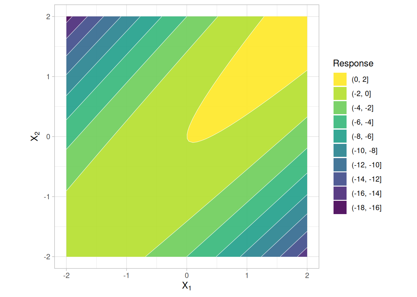
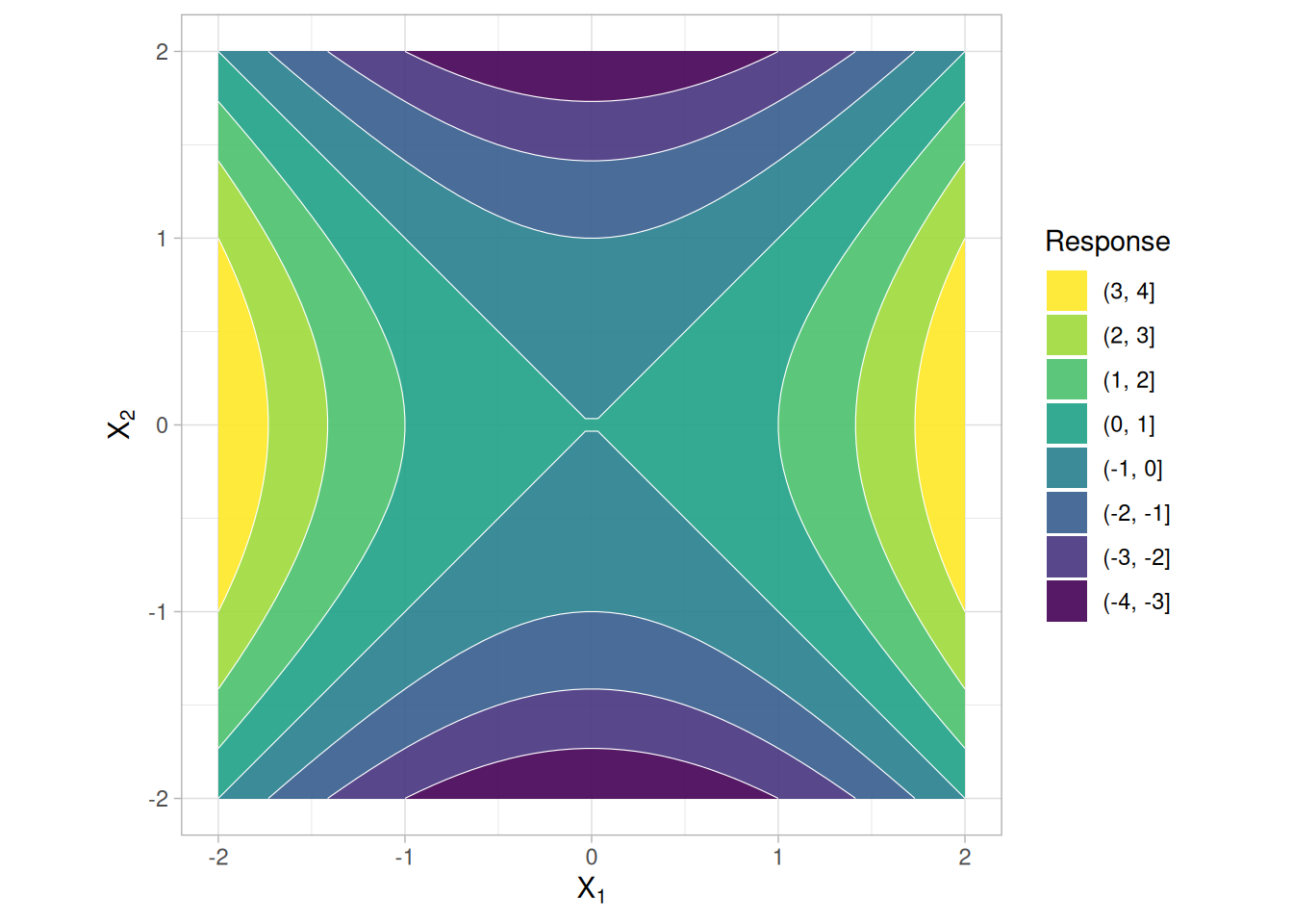
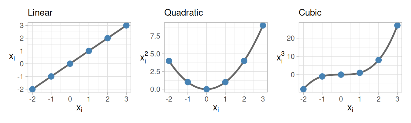
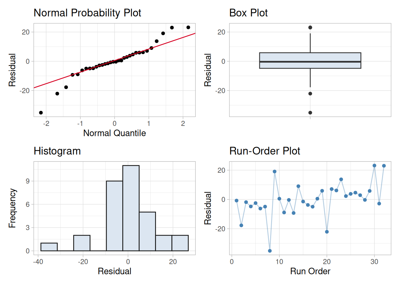
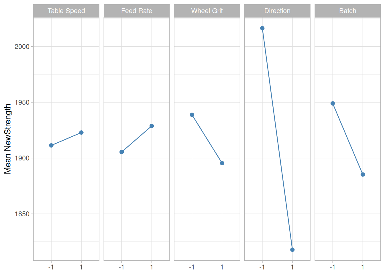
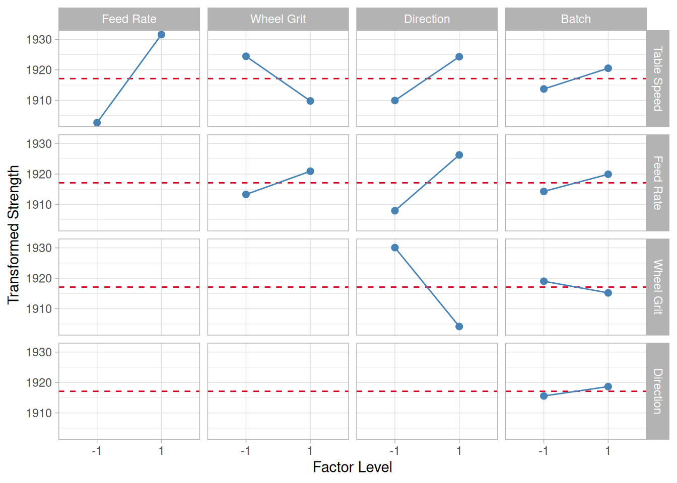
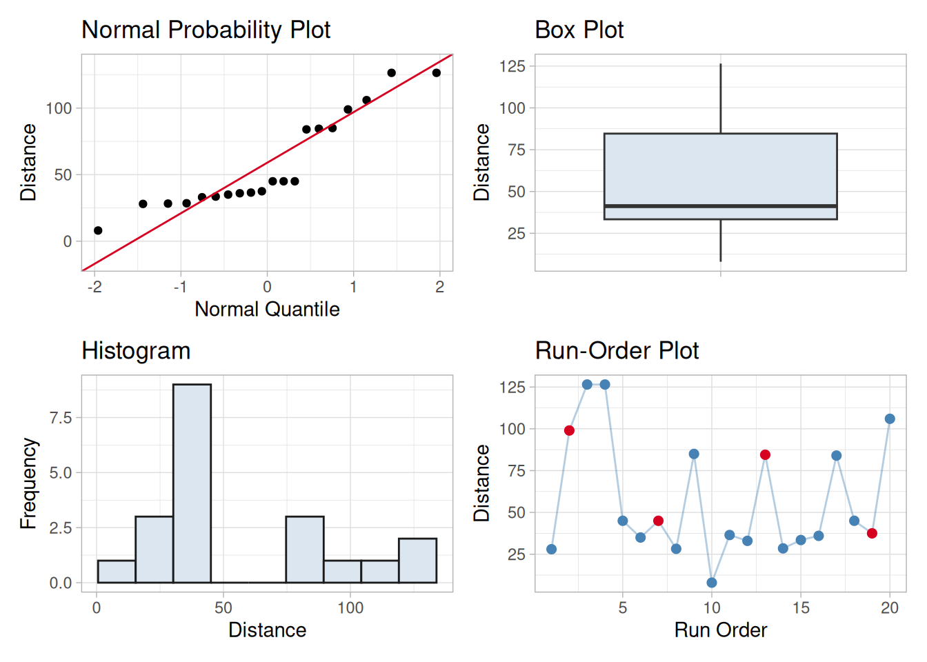
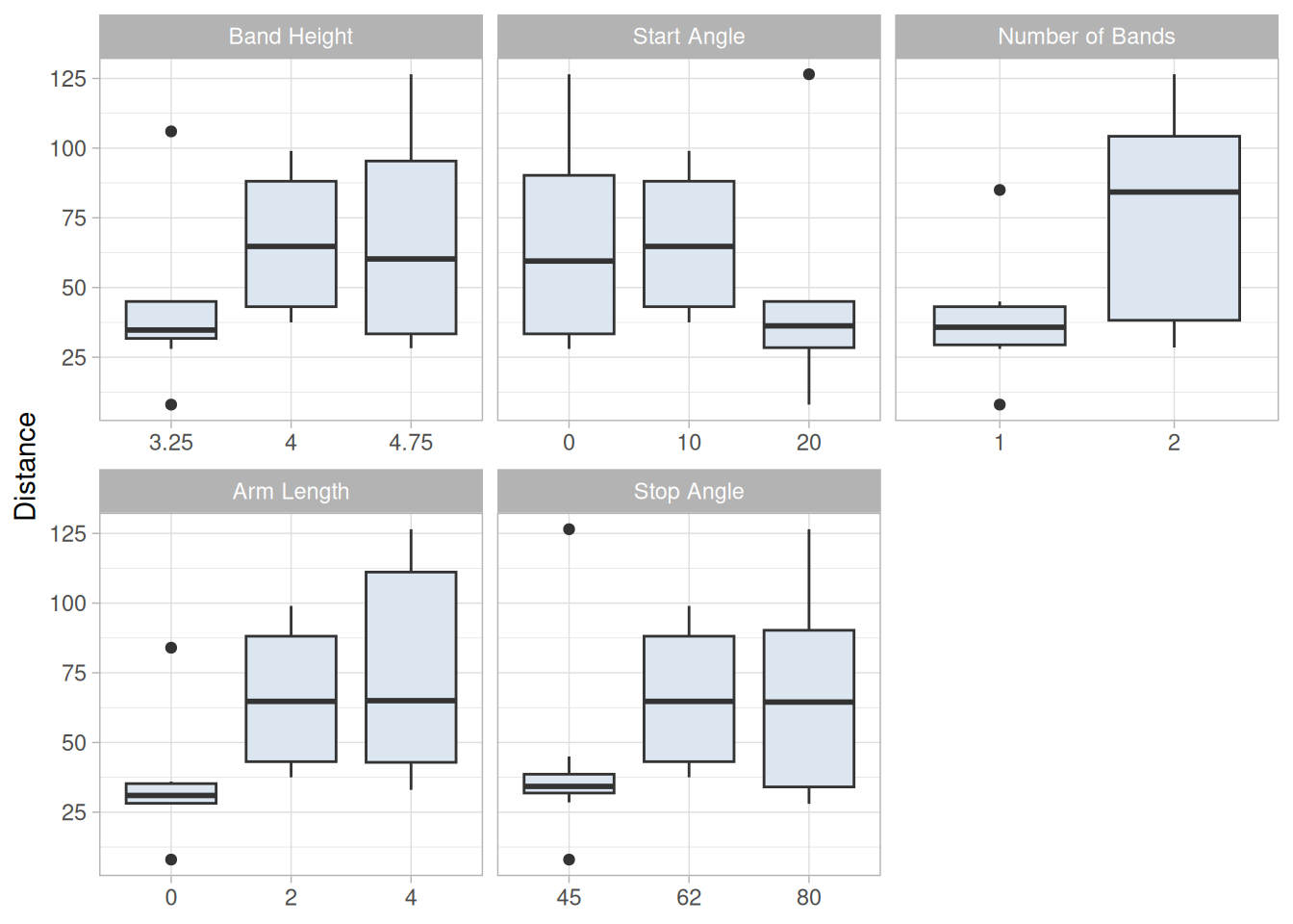
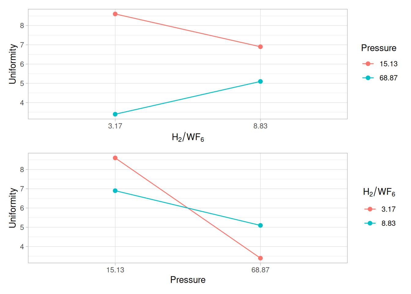
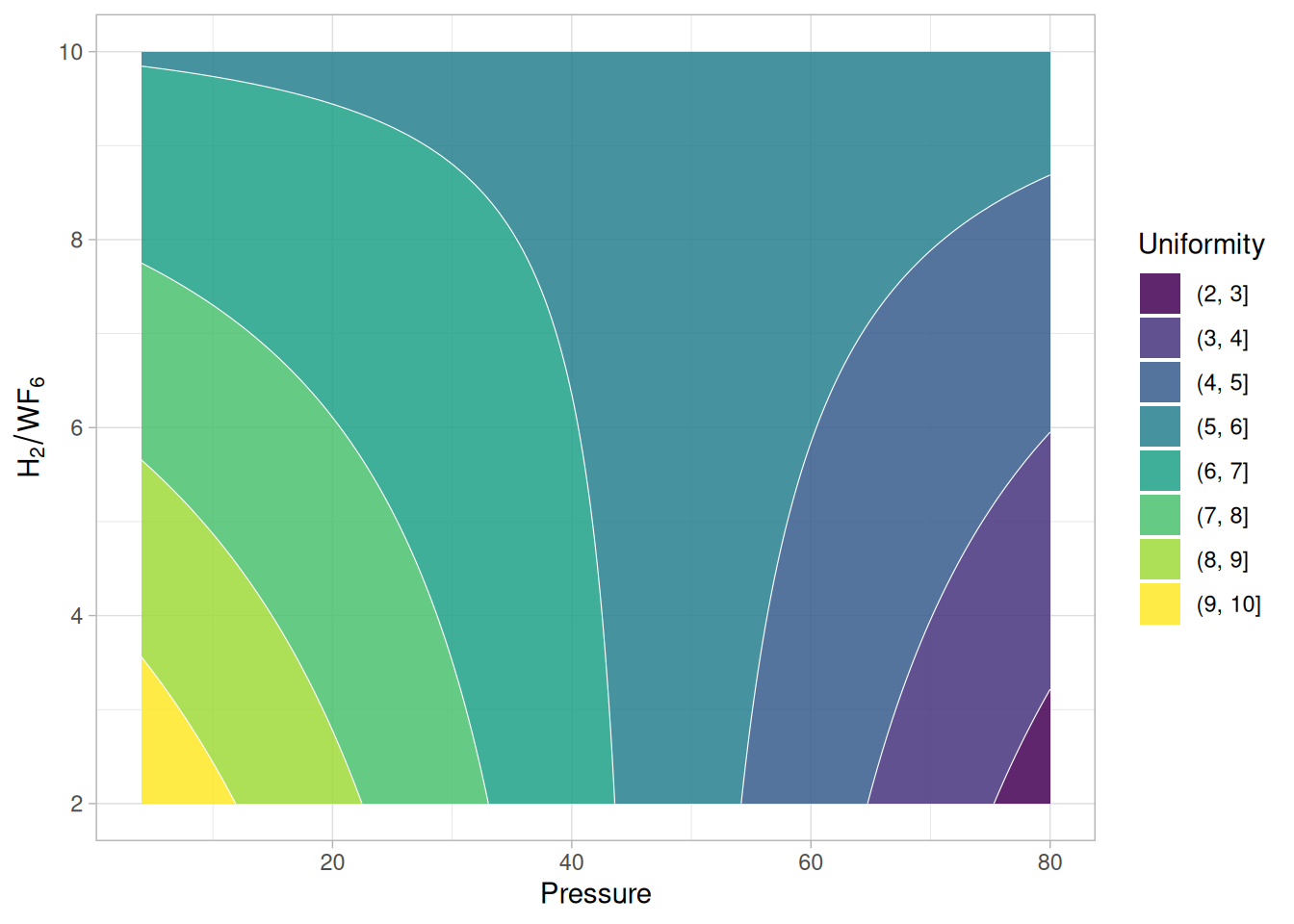
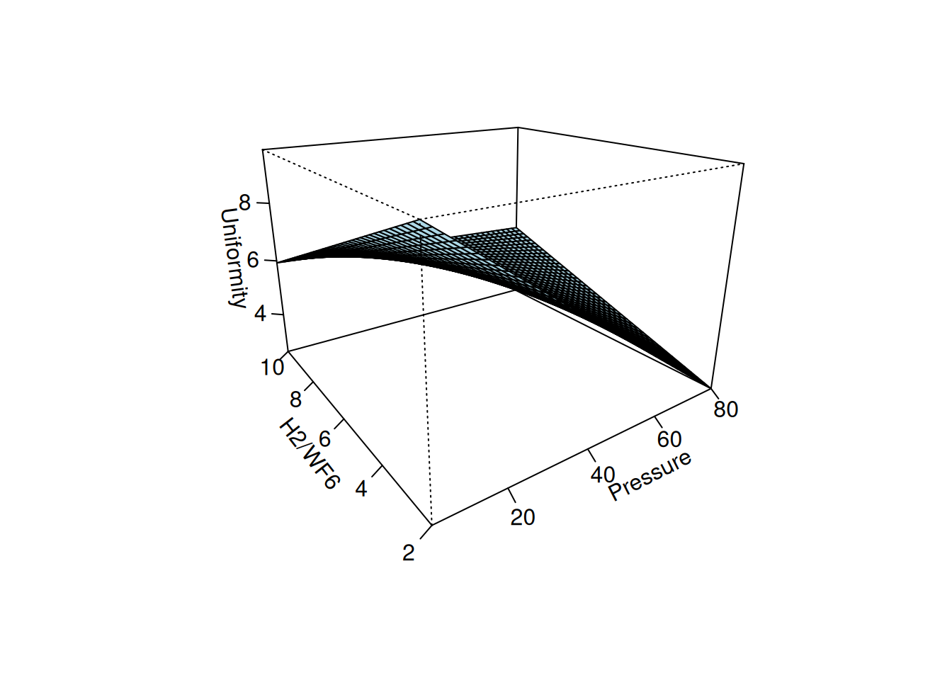
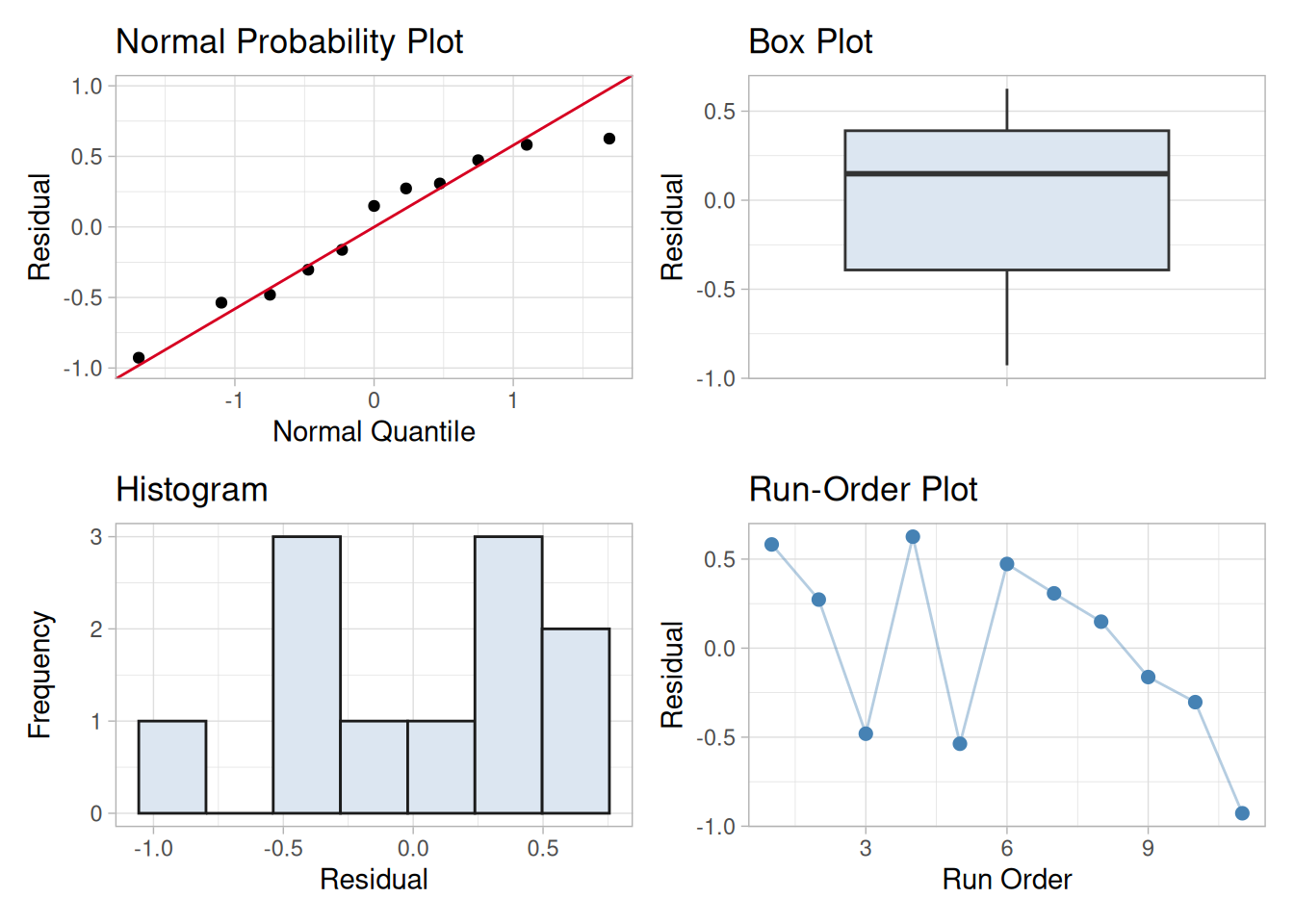
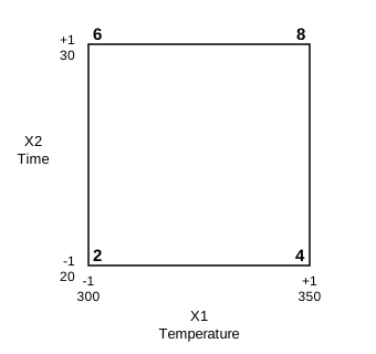
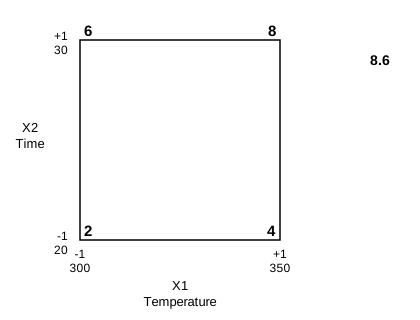
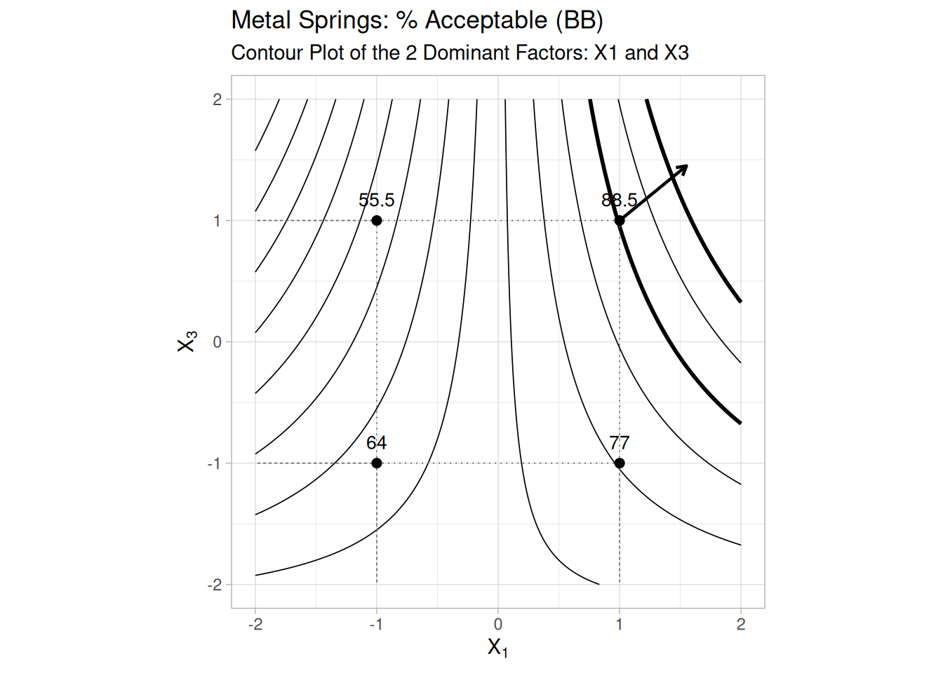
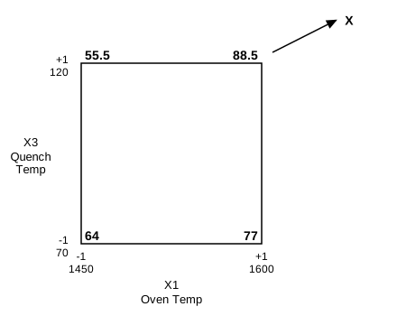
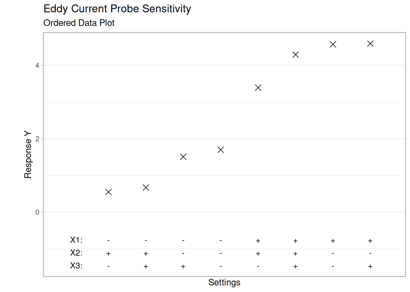
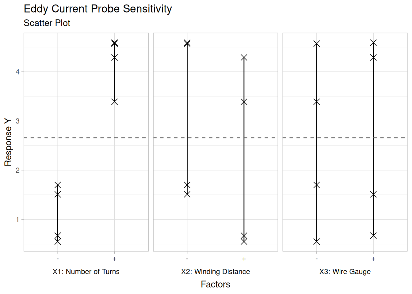
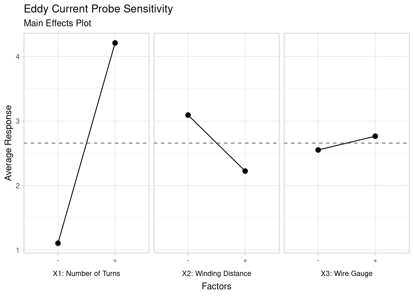
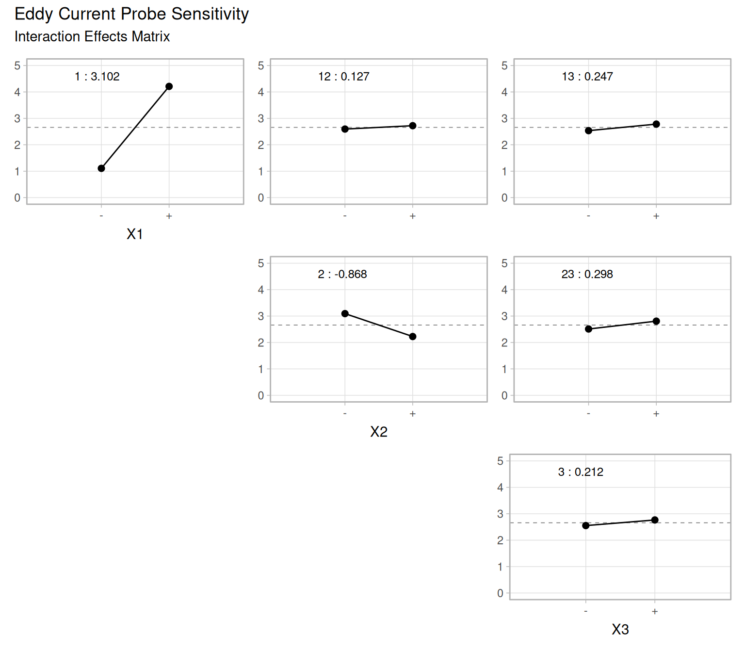
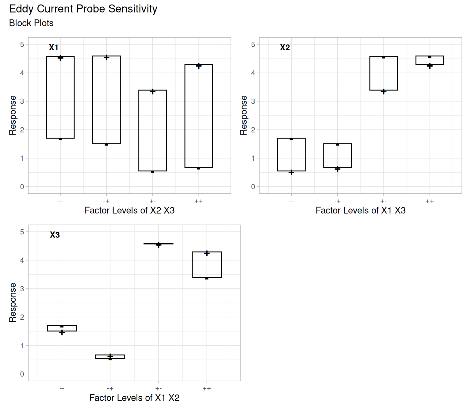
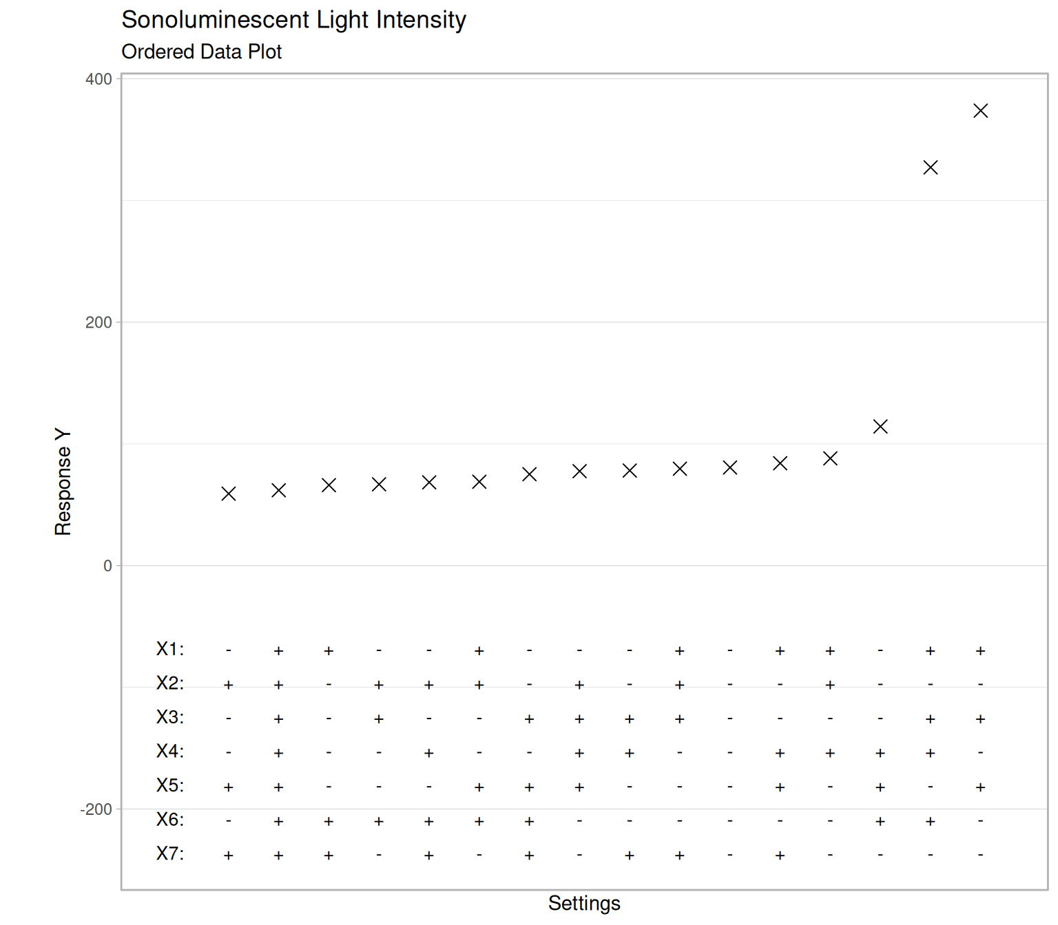
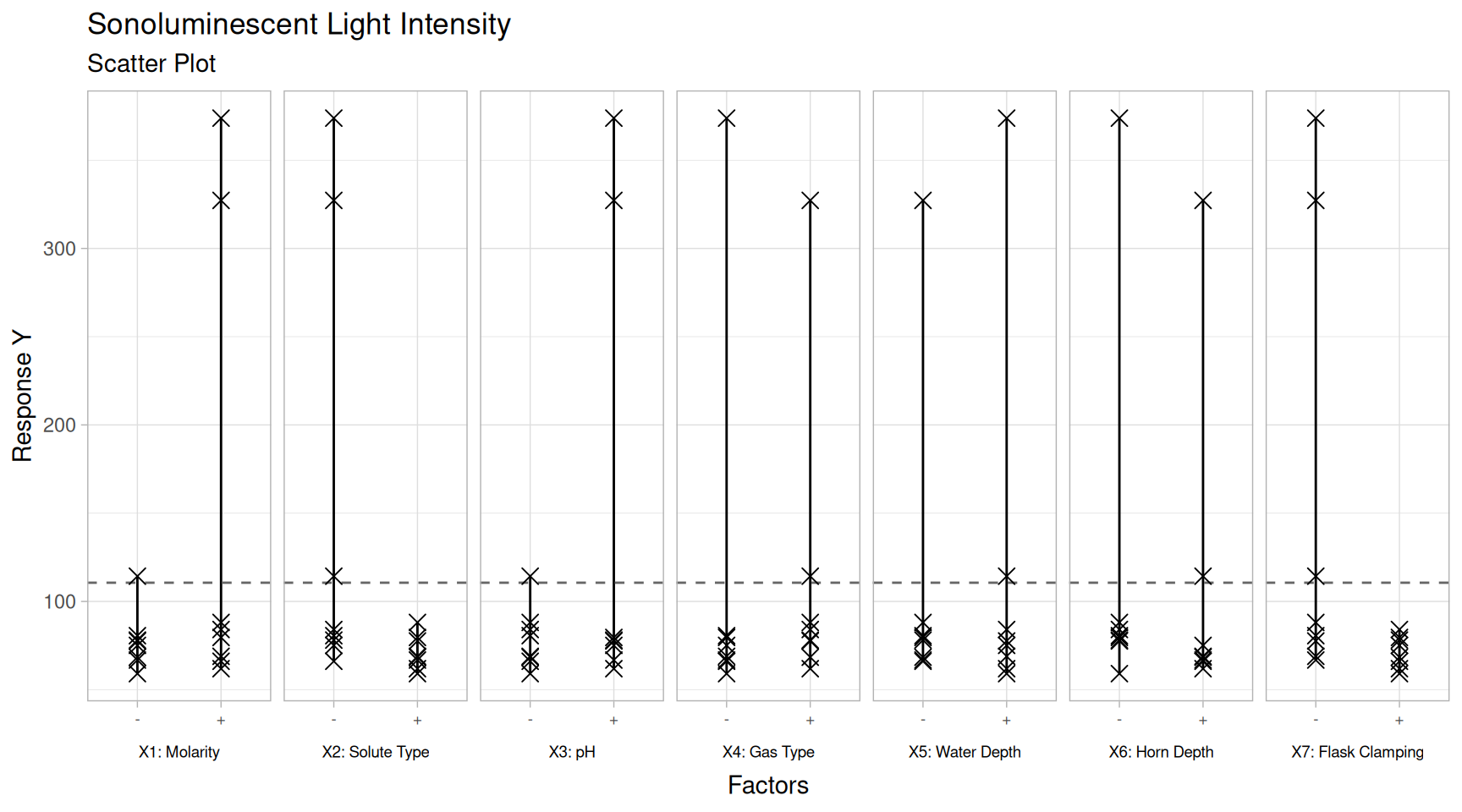
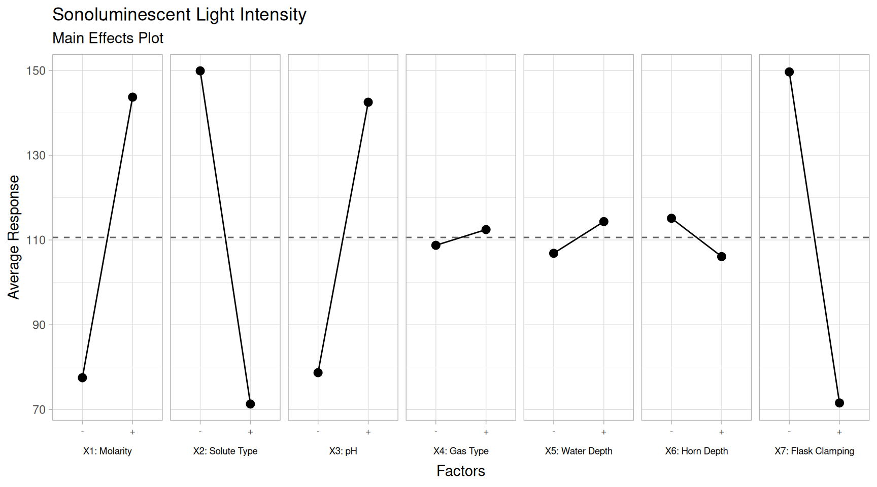
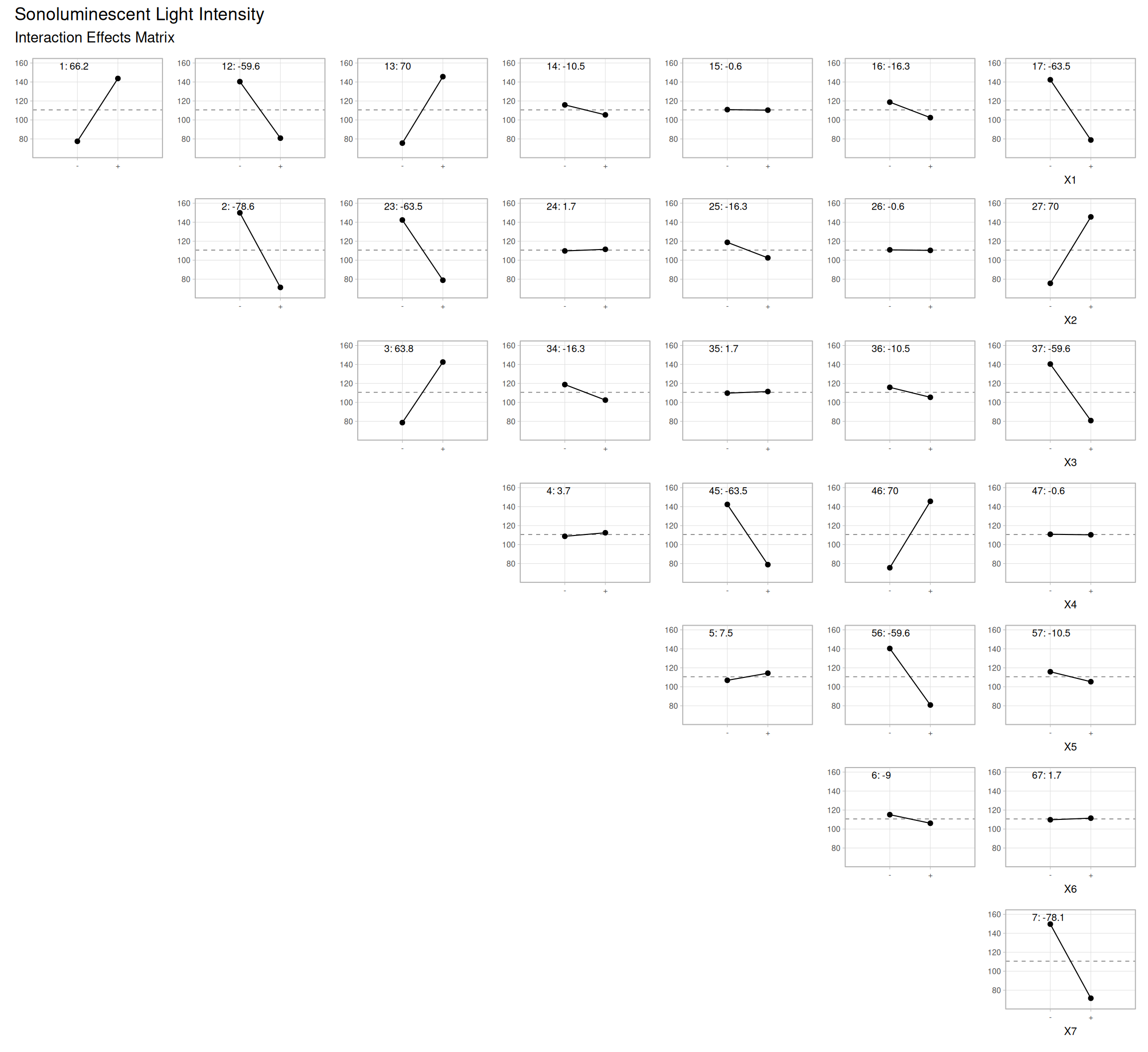
This section describes the basic concepts of the Design of Experiments (DOE).
This section introduces the basic concepts, terminology, goals and procedures underlying the proper statistical design of experiments. Design of experiments is abbreviated as DOE throughout this chapter.
Experimental Design (or DOE) economically maximizes information
In an experiment, we deliberately change one or more process variables (or factors) in order to observe the effect the changes have on one or more response variables. The (statistical) design of experiments (DOE) is an efficient procedure for planning experiments so that the data obtained can be analyzed to yield valid and objective conclusions.
DOE begins with determining the objectives of an experiment and selecting the process factors for the study. An Experimental Design is the laying out of a detailed experimental plan in advance of doing the experiment. Well chosen experimental designs maximize the amount of “information” that can be obtained for a given amount of experimental effort.
The statistical theory underlying DOE generally begins with the concept of process models.
Process Models for DOE
Black box process model
It is common to begin with a process model of the ‘black box’ type, with several discrete or continuous input factors that can be controlled – that is, varied at will by the experimenter – and one or more measured output responses. The output responses are assumed continuous. Experimental data are used to derive an empirical (approximation) model linking the outputs and inputs. These empirical models generally contain first and second-order terms.
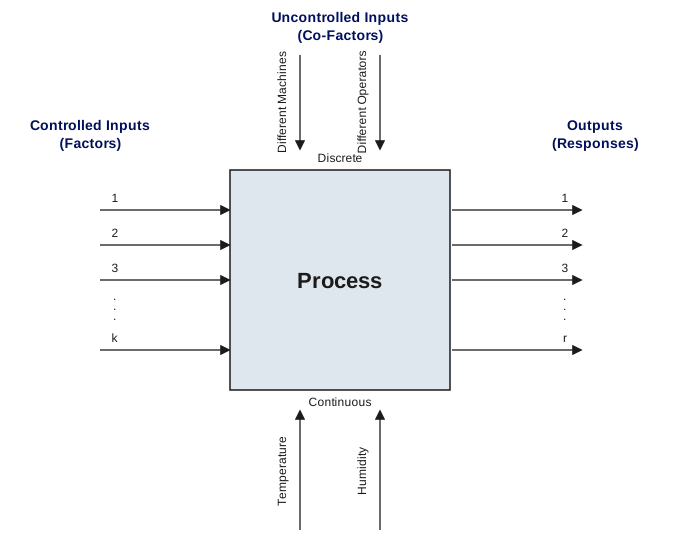
Often the experiment has to account for a number of uncontrolled factors that may be discrete, such as different machines or operators, and/or continuous such as ambient temperature or humidity. Figure 1.1 illustrates this situation.
Figure 5.1: A ‘Black Box’ Process Model Schematic: numbered controlled inputs (factors) enter from the left and produce numbered outputs (responses) on the right, while uncontrolled inputs enter from the top (discrete co-factors, such as different machines or operators) and bottom (continuous co-factors, such as temperature or humidity)
Models for DOE’s
The most common empirical models fit to the experimental data take either a linear form or quadratic form.
Linear model
A linear model with two factors, \(X_1\) and \(X_2\), can be written as
Here, \(Y\) is the response for given levels of the main effects \(X_1\) and \(X_2\) and the \(X_1 X_2\) term is included to account for a possible interaction effect between \(X_1\) and \(X_2\). The constant \(\beta_0\) is the response of \(Y\) when both main effects are 0.
For a more complicated example, a linear model with three factors \(X_1\), \(X_2\), \(X_3\) and one response, \(Y\), would look like (if all possible terms were included in the model)
The three terms with single “X’s” are the main effects terms. There are \(k(k-1)/2 = 3 \cdot 2 / 2 = 3\) two-way interaction terms and 1 three-way interaction term (which is often omitted, for simplicity). When the experimental data are analyzed, all the unknown “\(\beta\)” parameters are estimated and the coefficients of the “X” terms are tested to see which ones are significantly different from 0.
Quadratic model
A second-order (quadratic) model (typically used in response surface DOE’s with suspected curvature) does not include the three-way interaction term but adds three more terms to the linear model, namely
Clearly, a full model could include many cross-product (or interaction) terms involving squared X’s. However, in general these terms are not needed and most DOE software defaults to leaving them out of the model.
5.1.2 What are the uses of DOE?
DOE is a multipurpose tool that can help in many situations
Below are seven examples illustrating situations in which experimental design can be used effectively:
Choosing Between Alternatives
Selecting the Key Factors Affecting a Response
Response Surface Modeling to:
Hit a Target
Reduce Variability
Maximize or Minimize a Response
Make a Process Robust (i.e., the process gets the “right” results even though there are uncontrollable “noise” factors)
Seek Multiple Goals
Regression Modeling
Choosing Between Alternatives (Comparative Experiment)
A common use is planning an experiment to gather data to make a decision between two or more alternatives. Supplier A vs. supplier B? Which new additive is the most effective? Is catalyst ‘x’ an improvement over the existing catalyst? These and countless other choices between alternatives can be presented to us in a never-ending parade. Often we have the choice made for us by outside factors over which we have no control. But in many cases we are also asked to make the choice. It helps if one has valid data to back up one’s decision.
The preferred solution is to agree on a measurement by which competing choices can be compared, generate a sample of data from each alternative, and compare average results. The ‘best’ average outcome will be our preference. We have performed a comparative experiment!
Types of comparative studies
Sometimes this comparison is performed under one common set of conditions. This is a comparative study with a narrow scope – which is suitable for some initial comparisons of possible alternatives.
Other comparison studies, intended to validate that one alternative is preferred over a wide range of conditions, will purposely and systematically vary the background conditions under which the primary comparison is made in order to reach a conclusion that will be proven valid over a broad scope. We discuss experimental designs for each of these types of comparisons in Sections 5.3.3.1 and 5.3.3.2.
Selecting the Key Factors Affecting a Response (Screening Experiments)
Selecting the few that matter from the many possible factors. Often there are many possible factors, some of which may be critical and others which may have little or no effect on a response. It may be desirable, as a goal by itself, to reduce the number of factors to a relatively small set (2-5) so that attention can be focussed on controlling those factors with appropriate specifications, control charts, etc.
Screening experiments are an efficient way, with a minimal number of runs, of determining the important factors. They may also be used as a first step when the ultimate goal is to model a response with a response surface. We will discuss experimental designs for screening a large number of factors in Sections 5.3.3.3, 5.3.3.4 and 5.3.3.5.
Response Surface Modeling a Process
Some reasons to model a process
Once one knows the primary variables (factors) that affect the responses of interest, a number of additional objectives may be pursued. These include:
Hitting a Target
Maximizing or Minimizing a Response
Reducing Variation
Making a Process Robust
Seeking Multiple Goals
What each of these purposes have in common is that experimentation is used to fit a model that may permit a rough, local approximation to the actual surface. Given that the particular objective can be met with such an approximate model, the experimental effort is kept to a minimum while still achieving the immediate goal.
These response surface modeling objectives will now be briefly expanded upon.
Hitting a Target
Often we want to “fine tune” a process to consistently hit a target. This is a frequently encountered goal for an experiment. One might try out different settings until the desired target is ‘hit’ consistently. For example, a machine tool that has been recently overhauled may require some setup ‘tweaking’ before it runs on target. Such action is a small and common form of experimentation. However, rather than experimenting in an ad hoc manner until we happen to find a setup that hits the target, one can fit a model estimated from a small experiment and use this model to determine the necessary adjustments to hit the target.
More complex forms of experimentation, such as the determination of the correct chemical mix of a coating that will yield a desired refractive index for the dried coat (and simultaneously achieve specifications for other attributes), may involve many ingredients and be very sensitive to small changes in the percentages in the mix. Fitting suitable models, based on sequentially planned experiments, may be the only way to efficiently achieve this goal of hitting targets for multiple responses simultaneously.
Maximizing or Minimizing a Response
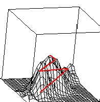
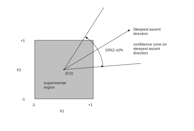
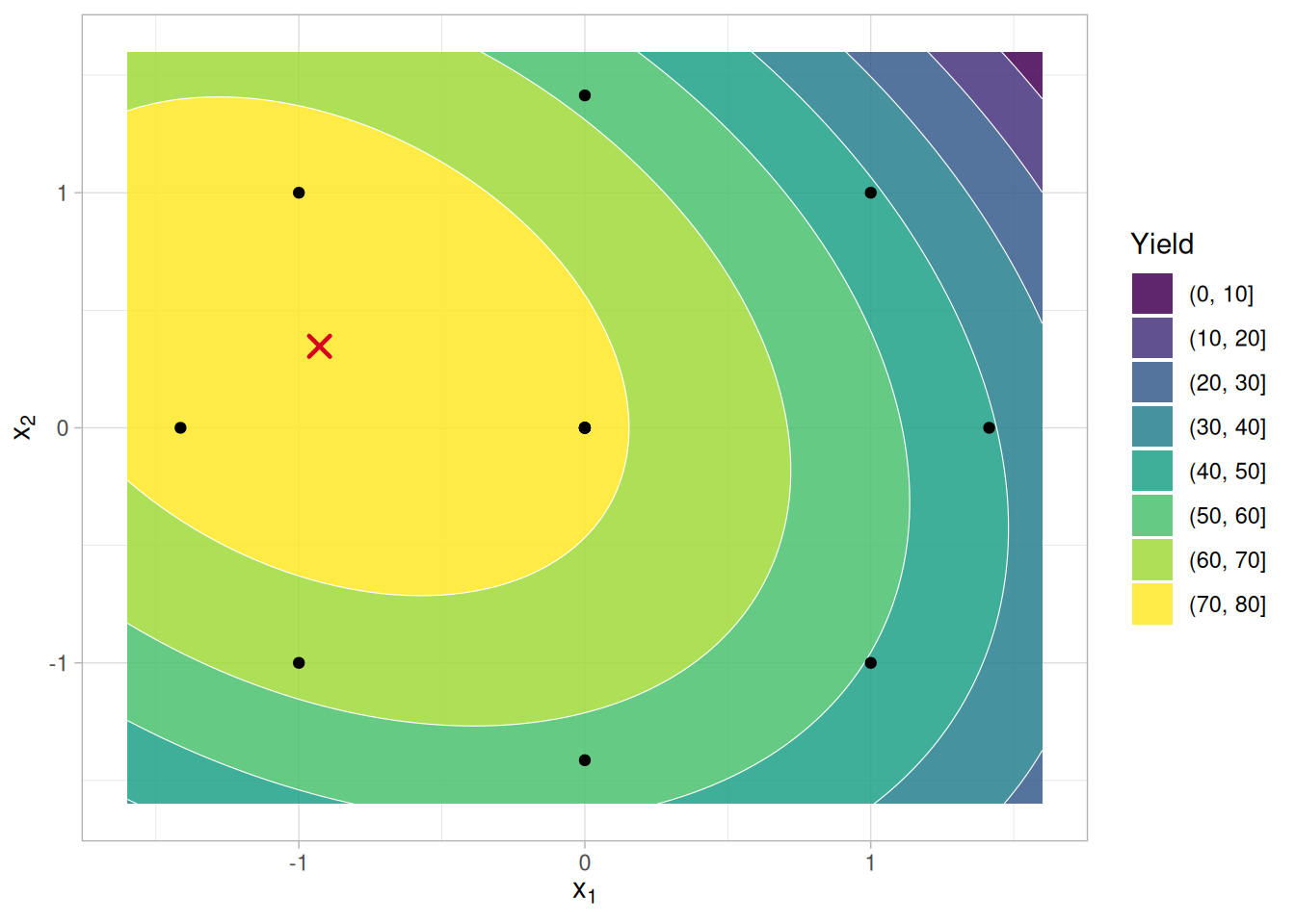
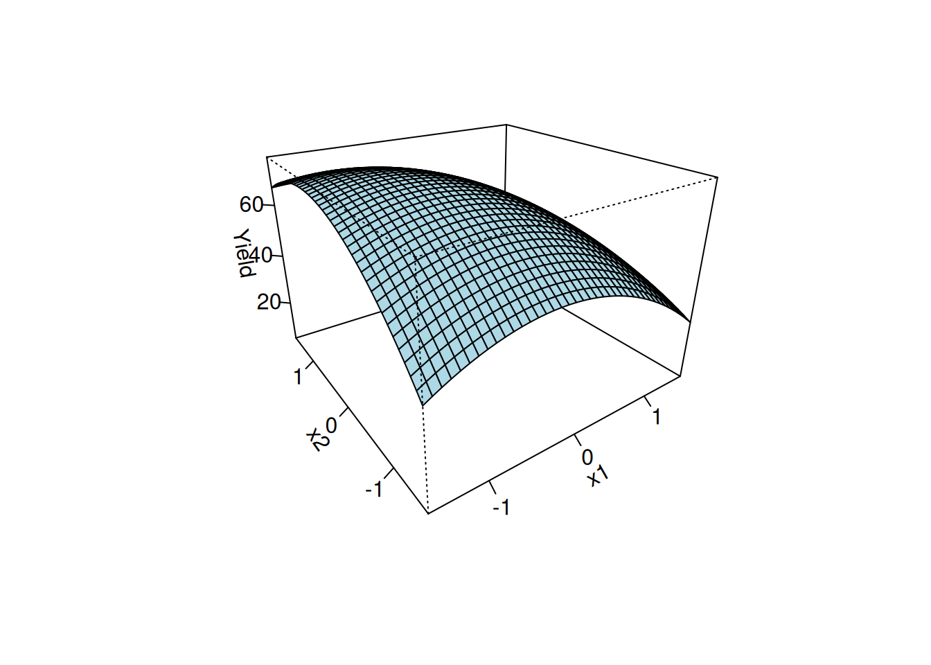
Optimizing a process output is a common goal. Many processes are being run at sub-optimal settings, some of them for years, even though each factor has been optimized individually over time. Finding settings that increase yield or decrease the amount of scrap and rework represent opportunities for substantial financial gain. Often, however, one must experiment with multiple inputs to achieve a better output. Section 5.3.3.6 on second-order designs plus material in Section 5.5.3 will be useful for these applications.
Figure 5.2: Pathway up the process response surface to an ‘optimum’
Reducing Variation
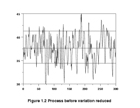
Processes that are on target, on the average, may still have too much variability. A process may be performing with unacceptable consistency, meaning its internal variation is too high.
Excessive variation can result from many causes. Sometimes it is due to the lack of having or following standard operating procedures. At other times, excessive variation is due to certain hard-to-control inputs that affect the critical output characteristics of the process. When this latter situation is the case, one may experiment with these hard-to-control factors, looking for a region where the surface is flatter and the process is easier to manage. To take advantage of such flatness in the surface, one must use designs – such as the second-order designs of Section 5.3.3.6 – that permit identification of these features. Contour or surface plots are useful for elucidating the key features of these fitted models. See also 5.5.3.1.4.
Figure 5.3: Process before variation reduced
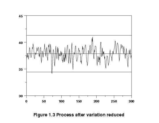
It might be possible to reduce the variation by altering the setpoints (recipe) of the process, so that it runs in a more ‘stable’ region.
Figure 5.4: Process after variation reduced
Finding this new recipe could be the subject of an experiment, especially if there are many input factors that could conceivably affect the output.
Making a Process Robust
The less a process or product is affected by external conditions, the better it is – this is called “Robustness”. An item designed and made under controlled conditions will be later ‘field tested’ in the hands of the customer and may prove susceptible to failure modes not seen in the lab or thought of by design. An example would be the starter motor of an automobile that is required to operate under extremes of external temperature. A starter that performs under such a wide range is termed ‘robust’ to temperature.
Designing an item so that it is robust calls for a special experimental effort. It is possible to stress the item in the design lab and so determine the critical components affecting its performance. A different gauge of armature wire might be a solution to the starter motor, but so might be many other alternatives. The correct combination of factors can be found only by experimentation.
Seeking Multiple Goals
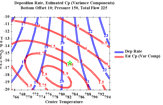
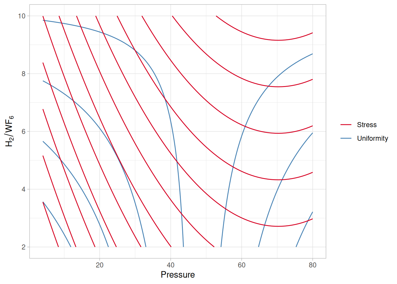
Sometimes we have multiple outputs and we have to compromise to achieve desirable outcomes – DOE can help here. A product or process seldom has just one desirable output characteristic. There are usually several, and they are often interrelated so that improving one will cause a deterioration of another. For example: rate vs. consistency; strength vs. expense; etc. Any product is a trade-off between these various desirable final characteristics. Understanding the boundaries of the trade-off allows one to make the correct choices. This is done by either constructing some weighted objective function (‘desirability function’) and optimizing it, or examining contour plots of responses generated by a computer program, as given below.
Figure 5.5: Overlaid contour plot of Deposition Rate and Capability (Cp)
Regression Modeling
Regression models (Chapter 4) are used to fit more precise models. Sometimes we require more than a rough approximating model over a local region. In such cases, the standard designs presented in this chapter for estimating first- or second-order polynomial models may not suffice. Chapter 4 covers the topic of experimental design and analysis for fitting general models for a single explanatory factor. If one has multiple factors, and either a nonlinear model or some other special model, the computer-aided designs of Section 5.5.2 may be useful.
5.1.3 What are the steps of DOE?
Key steps for DOE
Obtaining good results from a DOE involves these seven steps:
Set objectives
Select process variables
Select an experimental design
Execute the design
Check that the data are consistent with the experimental assumptions
Analyze and interpret the results
Use/present the results (may lead to further runs or DOE’s).
A checklist of practical considerations
Important practical considerations in planning and running experiments are
Check performance of gauges/measurement devices first.
Keep the experiment as simple as possible.
Check that all planned runs are feasible.
Watch out for process drifts and shifts during the run.
Avoid unplanned changes (e.g., swap operators at halfway point).
Allow some time (and back-up material) for unexpected events.
Obtain buy-in from all parties involved.
Maintain effective ownership of each step in the experimental plan.
Preserve all the raw data – do not keep only summary averages!
Record everything that happens.
Reset equipment to its original state after the experiment.
The Sequential or Iterative Approach to DOE
Planning to do a sequence of small experiments is often better than relying on one big experiment to give you all the answers. It is often a mistake to believe that ‘one big experiment will give the answer.’
A more useful approach to experimental design is to recognize that while one experiment might provide a useful result, it is more common to perform two or three, or maybe more, experiments before a complete answer is attained. In other words, an iterative approach is best and, in the end, most economical. Putting all one’s eggs in one basket is not advisable.
Each stage provides insight for next stage
The reason an iterative approach frequently works best is because it is logical to move through stages of experimentation, each stage providing insight as to how the next experiment should be run.
5.2 Assumptions
We should check the engineering and model-building assumptions that are made in most DOE’s
In all model building we make assumptions, and we also require certain conditions to be approximately met for purposes of estimation. This section looks at some of the engineering and mathematical assumptions we typically make. These are:
Metrology capabilities are a key factor in most experiments
It is unhelpful to find, after you have finished all the experimental runs, that the measurement devices you have at your disposal cannot measure the changes you were hoping to see. Plan to check this out before embarking on the experiment itself. Measurement process characterization is covered in Chapter 2.
SPC check of measurement devices
In addition, it is advisable, especially if the experimental material is planned to arrive for measurement over a protracted period, that an SPC (i.e., quality control) check is kept on all measurement devices from the start to the conclusion of the whole experimental project. Strange experimental outcomes can often be traced to ‘hiccups’ in the metrology system.
5.2.2 Is the process stable?
Plan to examine process stability as part of your experiment
Experimental runs should have control runs that are made at the ‘standard’ process setpoints, or at least at some standard operating recipe. The experiment should start and end with such runs. A plot of the outcomes of these control runs will indicate if the underlying process itself has drifted or shifted during the experiment.
It is desirable to experiment on a stable process. However, if this cannot be achieved, then the process instability must be accounted for in the analysis of the experiment. For example, if the mean is shifting with time (or experimental trial run), then it will be necessary to include a trend term in the experimental model (i.e., include a time variable or a run number variable).
5.2.3 Is there a simple model?
Polynomial approximation models only work for smoothly varying outputs
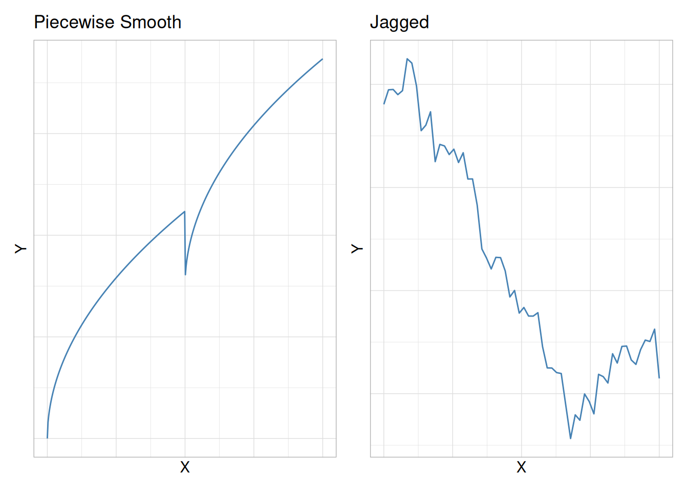
In this chapter we restrict ourselves to the case for which the response variable(s) are continuous outputs denoted as \(Y\). Over the experimental range, the outputs must not only be continuous, but also reasonably smooth. A sharp falloff in \(Y\) values is likely to be missed by the approximating polynomials that we use because these polynomials assume a smoothly curving underlying response surface.
Piecewise smoothness requires separate experiments
If the surface under investigation is known to be only piecewise smooth, then the experiments will have to be broken up into separate experiments, each investigating the shape of the separate sections. A surface that is known to be very jagged (i.e., non-smooth) will not be successfully approximated by a smooth polynomial.
Figure 5.6: Examples of piecewise smooth and jagged responses
5.2.4 Are the model residuals well-behaved?
Residuals are the differences between the observed and predicted responses
Residuals are estimates of experimental error obtained by subtracting the observed responses from the predicted responses.
The predicted response is calculated from the chosen model, after all the unknown model parameters have been estimated from the experimental data.
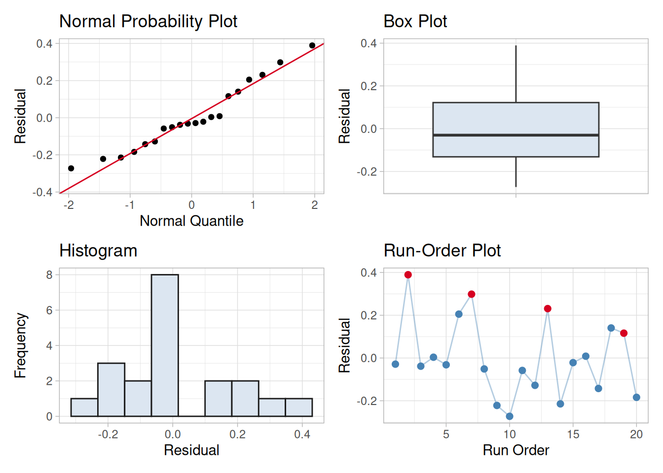
Examining residuals is a key part of all statistical modeling, including DOE’s. Carefully looking at residuals can tell us whether our assumptions are reasonable and our choice of model is appropriate.
Residuals are elements of variation unexplained by fitted model
Residuals can be thought of as elements of variation unexplained by the fitted model. Since this is a form of error, the same general assumptions apply to the group of residuals that we typically use for errors in general: one expects them to be (roughly) normal and (approximately) independently distributed with a mean of 0 and some constant variance.
Assumptions for residuals
These are the assumptions behind ANOVA and classical regression analysis. This means that an analyst should expect a regression model to err in predicting a response in a random fashion; the model should predict values higher than actual and lower than actual with equal probability. In addition, the level of the error should be independent of when the observation occurred in the study, or the size of the observation being predicted, or even the factor settings involved in making the prediction. The overall pattern of the residuals should be similar to the bell-shaped pattern observed when plotting a histogram of normally distributed data.
We emphasize the use of graphical methods to examine residuals.
Departures indicate inadequate model
Departures from these assumptions usually mean that the residuals contain structure that is not accounted for in the model. Identifying that structure and adding term(s) representing it to the original model leads to a better model.
Tests for Residual Normality
Plots for examining residuals
Any graph suitable for displaying the distribution of a set of data is suitable for judging the normality of the distribution of a group of residuals. The three most common types are:
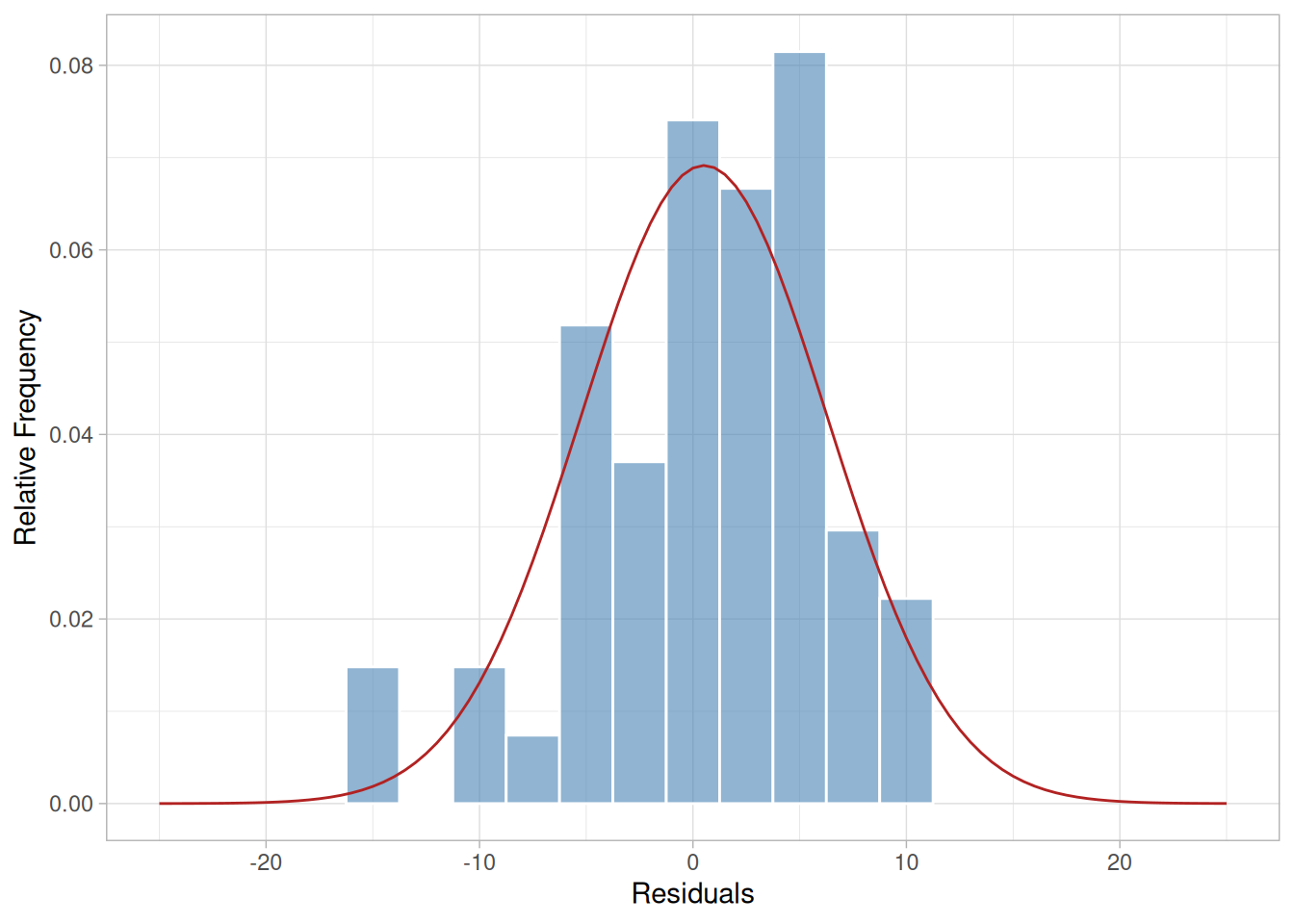
ggplot(sample_residuals, aes(residual)) +geom_histogram(aes(y =after_stat(density)), binwidth =2.5, fill ="steelblue", alpha =0.6, color ="white") +stat_function(fun = dnorm, args =list(mean =mean(sample_residuals$residual), sd =sd(sample_residuals$residual)), color ="firebrick", xlim =c(-25, 25)) +coord_cartesian(xlim =c(-25, 25)) +labs(x ="Residuals", y ="Relative Frequency") +theme_light()
Figure 5.7: Sample histogram of residuals from a semiconductor process
The histogram is a frequency plot obtained by placing the data in regularly spaced cells and plotting each cell frequency versus the center of the cell. The figure above illustrates an approximately normal distribution of residuals produced by a model for a calibration process. We have superimposed a normal density function on the histogram.
Small sample sizes
Sample sizes of residuals are generally small (<50) because experiments have limited treatment combinations, so a histogram is not be the best choice for judging the distribution of residuals. A more sensitive graph is the normal probability plot.
Normal probability plot
The steps in forming a normal probability plot are:
Sort the residuals into ascending order.
Calculate the cumulative probability of each residual using the formula:
\[P(\text{i-th residual}) = \frac{i}{N+1}\]
with \(P\) denoting the cumulative probability of a point, \(i\) is the order of the value in the list and \(N\) is the number of entries in the list.
Plot the calculated p-values versus the residual value on normal probability paper.
The normal probability plot should produce an approximately straight line if the points come from a normal distribution.
Sample normal probability plot with overlaid dot plot
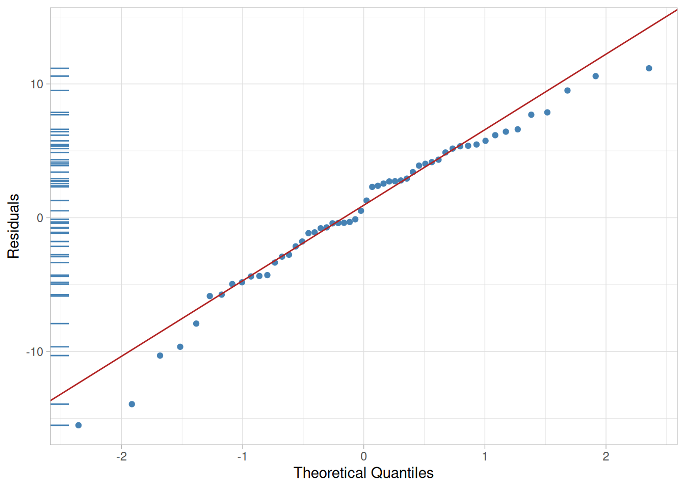
The plot below illustrates the normal probability graph created from the same group of residuals used for the histogram above.
Figure 5.8: Sample normal probability plot, with an overlaid dot plot along the left edge
This graph includes the addition of a dot plot. The dot plot is the collection of points along the left y-axis. These are the values of the residuals. The purpose of the dot plot is to provide an indication the distribution of the residuals.
“S” shaped curves indicate bimodal distribution
Small departures from the straight line in the normal probability plot are common, but a clearly “S” shaped curve on this graph suggests a bimodal distribution of residuals. Breaks near the middle of this graph are also indications of abnormalities in the residual distribution.
Note
Studentized residuals are residuals converted to a scale approximately representing the standard deviation of an individual residual from the center of the residual distribution. The technique used to convert residuals to this form produces a Student’s t distribution of values.
Independence of Residuals Over Time
Run sequence plot
If the order of the observations in a data table represents the order of execution of each treatment combination, then a plot of the residuals of those observations versus the case order or time order of the observations will test for any time dependency. These are referred to as run sequence plots.
Code
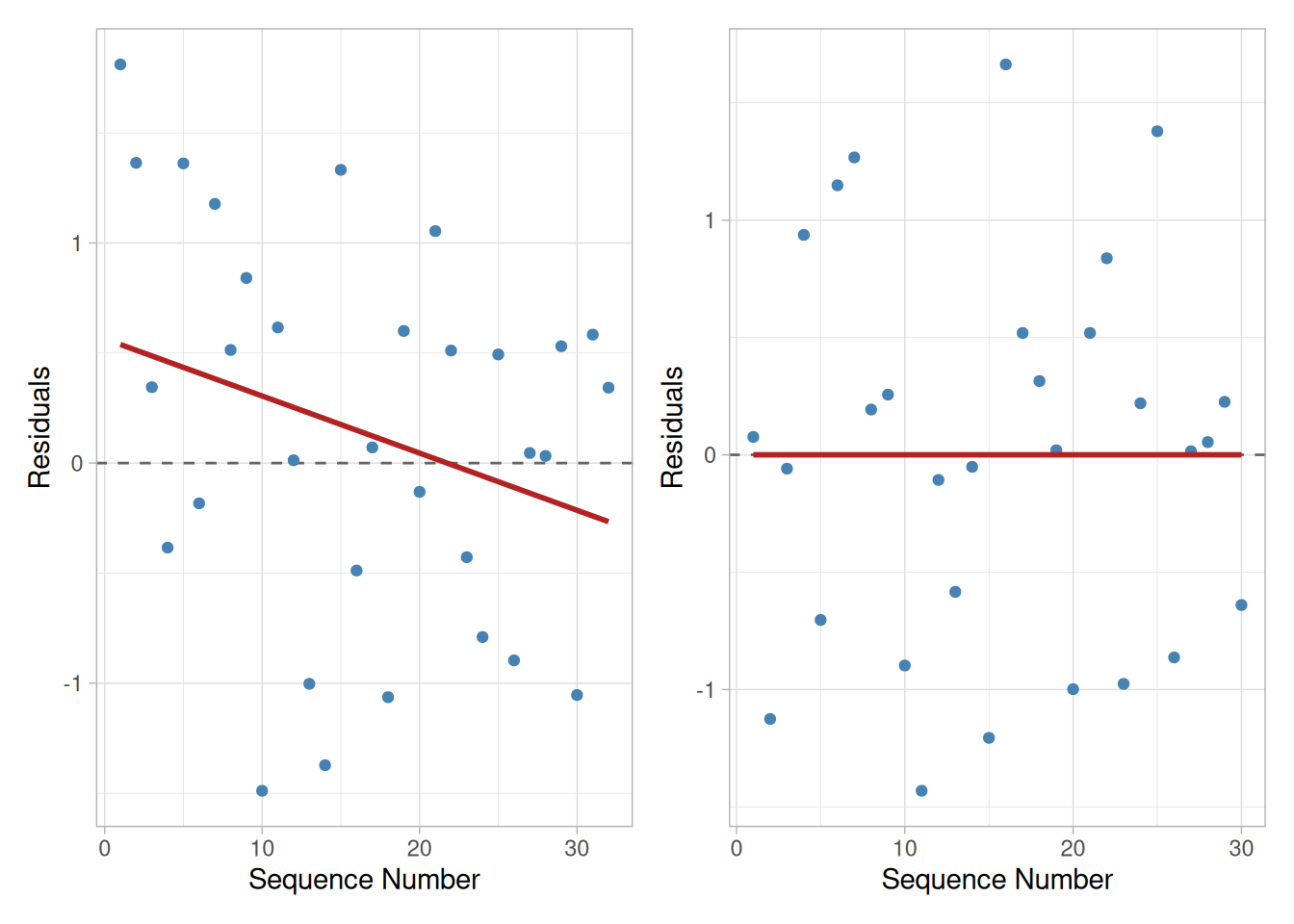
library(tidyverse)library(patchwork)set.seed(524)trend_data <-tibble(sequence =1:32,residual =0.75-0.045* sequence +rnorm(32, 0, 0.9))p_trend <-ggplot(trend_data, aes(sequence, residual)) +geom_hline(yintercept =0, linetype ="dashed", color ="grey40") +geom_point(color ="steelblue") +geom_smooth(method ="lm", formula ="y ~ x", se =FALSE, color ="firebrick") +labs(x ="Sequence Number", y ="Residuals") +theme_light()no_trend_data <-tibble(sequence =1:30,residual =resid(lm(rnorm(30, 0, 1.2) ~ sequence)))p_no_trend <-ggplot(no_trend_data, aes(sequence, residual)) +geom_hline(yintercept =0, linetype ="dashed", color ="grey40") +geom_point(color ="steelblue") +geom_smooth(method ="lm", formula ="y ~ x", se =FALSE, color ="firebrick") +labs(x ="Sequence Number", y ="Residuals") +theme_light()p_trend + p_no_trend
Figure 5.9: Sample run sequence plots: with a time trend (left) and without a time trend (right)
Interpretation of the sample run sequence plots
The residuals in the left-hand plot suggest a time trend, while those in the right-hand plot do not. The left-hand plot suggests that the system was drifting slowly to lower values as the investigation continued. In extreme cases a drift of the equipment will produce models with very poor ability to account for the variability in the data (low \(R^2\)).
If the investigation includes centerpoints, then plotting them in time order may produce a more clear indication of a time trend if one exists. Plotting the raw responses in time sequence can also sometimes detect trend changes in a process that residual plots might not detect.
Plot of Residuals Versus Corresponding Predicted Values
Check for increasing residuals as size of fitted value increases
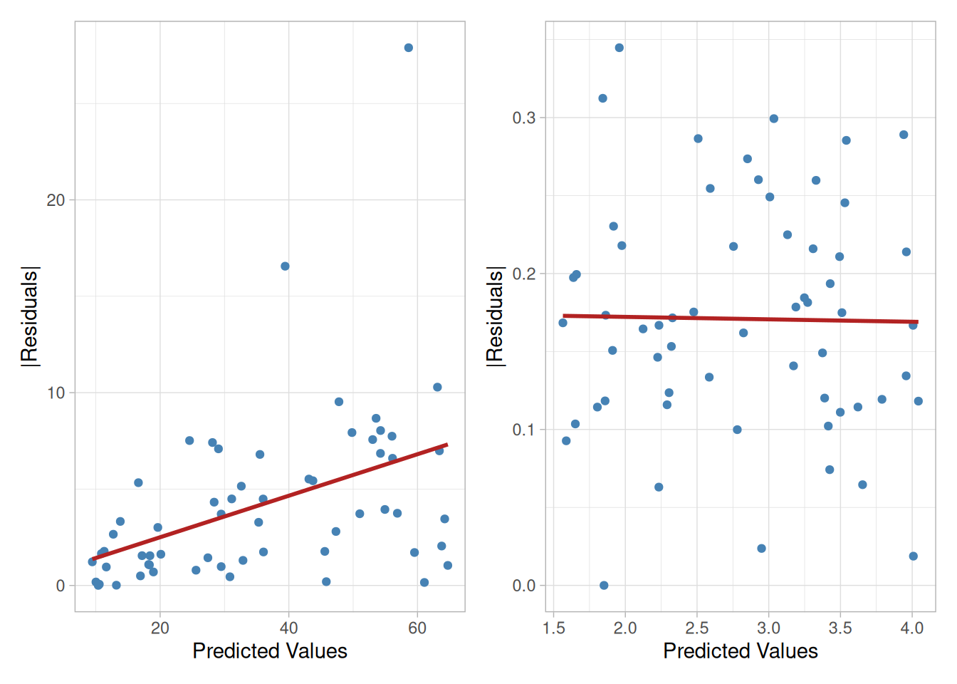
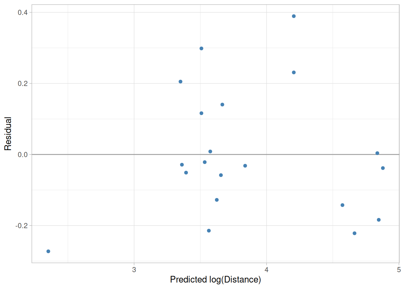
Plotting residuals versus the value of a fitted response should produce a distribution of points scattered randomly about 0, regardless of the size of the fitted value. Quite commonly, however, residual values may increase as the size of the fitted value increases. When this happens, the residual cloud becomes “funnel shaped” with the larger end toward larger fitted values; that is, the residuals have larger and larger scatter as the value of the response increases. Plotting the absolute values of the residuals instead of the signed values will produce a “wedge-shaped” distribution; a smoothing function is added to each graph which helps to show the trend.
Code
set.seed(627)funnel_data <-tibble(predicted =runif(60, 8, 65),abs_residual =abs(rnorm(60, 0, 0.15* predicted)))p_funnel <-ggplot(funnel_data, aes(predicted, abs_residual)) +geom_point(color ="steelblue") +geom_smooth(method ="lm", formula ="y ~ x", se =FALSE, color ="firebrick") +labs(x ="Predicted Values", y ="|Residuals|") +theme_light()no_funnel_data <-tibble(predicted =runif(60, 1.5, 4.2),abs_residual =pmax(0.17+resid(lm(rnorm(60, 0, 0.08) ~ predicted)), 0))p_no_funnel <-ggplot(no_funnel_data, aes(predicted, abs_residual)) +geom_point(color ="steelblue") +geom_smooth(method ="lm", formula ="y ~ x", se =FALSE, color ="firebrick") +labs(x ="Predicted Values", y ="|Residuals|") +theme_light()p_funnel + p_no_funnel
Figure 5.10: Sample |residuals| versus predicted values: showing increasing residuals (left) and not showing increasing residuals, after a transformation of the response (right)
Interpretation of the residuals versus fitted values plots
A residual distribution such as that in the left-hand plot showing a trend to higher absolute residuals as the value of the response increases suggests that one should transform the response, perhaps by modeling its logarithm or square root, etc., (contractive transformations). Transforming a response in this fashion often simplifies its relationship with a predictor variable and leads to simpler models. Later sections discuss transformation in more detail. The right-hand plot shows the residuals after a transformation on the response variable was used to reduce the scatter. Notice the difference in scales on the vertical axes.
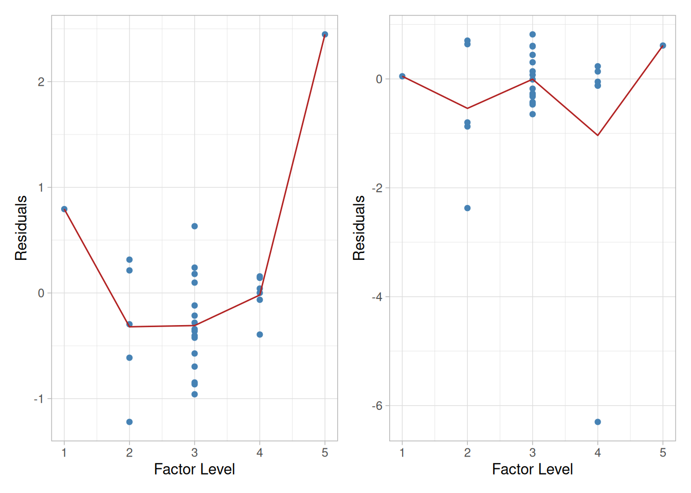
Figure 5.11: Sample residuals versus factor setting: before (left) and after (right) adding a quadratic term
Interpretation of residuals versus factor setting plots
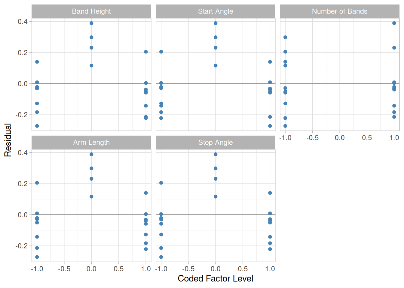
The left-hand plot shows that the size of the residuals changed as a function of a predictor’s settings. A graph like this suggests that the model needs a higher-order term in that predictor or that one should transform the predictor using a logarithm or square root, for example. The right-hand plot shows the residuals for the same response after adding a quadratic term. Notice the single point widely separated from the other residuals. This point is an “outlier.” That is, its position is well within the range of values used for this predictor in the investigation, but its result was somewhat lower than the model predicted. A signal that curvature is present is a trace resembling a “frown” or a “smile” in these graphs.
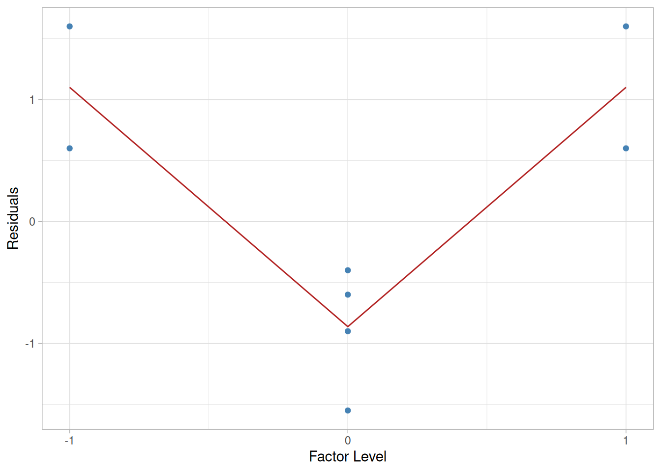
For the simple factorial design that includes center points, if the response model being considered lacked one or more higher-order terms, the plot of residuals versus factor settings might appear as below.
Figure 5.12: Sample residuals versus factor setting for a simple factorial design with centerpoints, lacking a higher-order term
Interpretation of plot
The example given above obviously involves five levels of the predictor. The experiment utilized a response surface design.
Graph indicates presence of curvature
While the graph gives a definite signal that curvature is present, identifying the source of that curvature is not possible due to the structure of the design. Graphs generated using the other predictors in that situation would have very similar appearances.
Additional discussion of residual analysis
Note
Note: Residuals are an important subject discussed repeatedly in this Handbook. For example, graphical residual plots are discussed in the 6-plot technique in Chapter 1, and the general examination of residuals as a part of model building is discussed in Chapter 4.
5.3 Choosing an Experimental Design
Contents of Section 3
This section describes in detail the process of choosing an experimental design to obtain the results you need. The basic designs an engineer needs to know about are described in detail.
Note that this section describes the basic designs used for most engineering and scientific applications
Planning an experiment begins with carefully considering what the objectives (or goals) are
The objectives for an experiment are best determined by a team discussion. All of the objectives should be written down, even the “unspoken” ones.
The group should discuss which objectives are the key ones, and which ones are “nice but not really necessary”. Prioritization of the objectives helps you decide which direction to go with regard to the selection of the factors, responses and the particular design. Sometimes prioritization will force you to start over from scratch when you realize that the experiment you decided to run does not meet one or more critical objectives.
Types of designs
Examples of goals were given earlier in Section 5.1.2, in which we described four broad categories of experimental designs, with various objectives for each. These were:
Comparative designs to:
choose between alternatives, with narrow scope, suitable for an initial comparison (see Section 5.3.3.1)
choose between alternatives, with broad scope, suitable for a confirmatory comparison (see Section 5.3.3.2)
Screening designs to identify which factors/effects are important
when you have 2 - 4 factors and can perform a full factorial (Section 5.3.3.3)
when you have more than 3 factors and want to begin with as small a design as possible (Section 5.3.3.4 and 5.3.3.5)
when you have some qualitative factors, or you have some quantitative factors that are known to have a non-monotonic effect (Section 5.3.3.10)
Note that some authors prefer to restrict the term screening design to the case where you are trying to extract the most important factors from a large (say > 5) list of initial factors (usually a fractional factorial design). We include the case with a smaller number of factors, usually a full factorial design, since the basic purpose and analysis is similar.
Response Surface modeling to achieve one or more of the following objectives:
hit a target
maximize or minimize a response
reduce variation by locating a region where the process is easier to manage
make a process robust (note: this objective may often be accomplished with screening designs rather than with response surface designs – see Section 5.5.6)
Regression modeling
to estimate a precise model, quantifying the dependence of response variable(s) on process inputs.
Based on objective, where to go next
After identifying the objective listed above that corresponds most closely to your specific goal, you can
select the appropriate design named in section 5.3.3 that suits your objective (and follow the related links).
5.3.2 How do you select and scale the process variables?
Guidelines to assist the engineering judgment process of selecting process variables for a DOE
Process variables include both inputs and outputs – i.e., factors and responses. The selection of these variables is best done as a team effort. The team should
Include all important factors (based on engineering judgment).
Be bold, but not foolish, in choosing the low and high factor levels.
Check the factor settings for impractical or impossible combinations – i.e., very low pressure and very high gas flows.
Include all relevant responses.
Avoid using only responses that combine two or more measurements of the process. For example, if interested in selectivity (the ratio of two etch rates), measure both rates, not just the ratio.
Be careful when choosing the allowable range for each factor
We have to choose the range of the settings for input factors, and it is wise to give this some thought beforehand rather than just try extreme values. In some cases, extreme values will give runs that are not feasible; in other cases, extreme ranges might move one out of a smooth area of the response surface into some jagged region, or close to an asymptote.
Two-level designs have just a “high” and a “low” setting for each factor
The most popular experimental designs are two-level designs. Why only two levels? There are a number of good reasons why two is the most common choice amongst engineers: one reason is that it is ideal for screening designs, simple and economical; it also gives most of the information required to go to a multilevel response surface experiment if one is needed.
Consider adding some center points to your two-level design
The term “two-level design” is something of a misnomer, however, as it is recommended to include some center points during the experiment (center points are located in the middle of the design ‘box’).
Notation for 2-Level Designs
Matrix notation for describing an experiment
The standard layout for a 2-level design uses +1 and -1 notation to denote the “high level” and the “low level” respectively, for each factor. For example, the matrix below
Factor 1 (\(X_1\))
Factor 2 (\(X_2\))
Trial 1
-1
-1
Trial 2
+1
-1
Trial 3
-1
+1
Trial 4
+1
+1
describes an experiment in which 4 trials (or runs) were conducted with each factor set to high or low during a run according to whether the matrix had a +1 or -1 set for the factor during that trial. If the experiment had more than 2 factors, there would be an additional column in the matrix for each additional factor.
Note
Note: Some authors shorten the matrix notation for a two-level design by just recording the plus and minus signs, leaving out the “1’s”.
Coding the data
The use of +1 and -1 for the factor settings is called coding the data. This aids in the interpretation of the coefficients fit to any experimental model. After factor settings are coded, center points have the value “0”. Coding is described in more detail in the DOE glossary.
The Model or Analysis Matrix
Design matrices
If we add an “I” column and an “\(X_1 \cdot X_2\)” column to the matrix of 4 trials for a two-factor experiment described earlier, we obtain what is known as the model or analysis matrix for this simple experiment, which is shown below. The model matrix for a three-factor experiment is shown later in this section.
and the “I” column of the design matrix has all 1’s to provide for the \(\beta_0\) term. The \(X_1 \cdot X_2\) column is formed by multiplying the “\(X_1\)” and “\(X_2\)” columns together, row element by row element. This column gives interaction term for each trial.
Model in matrix notation
In matrix notation, we can summarize this experiment by
\[Y = X\beta + \text{experimental error}\]
for which \(X\) is the 4 by 4 design matrix of 1’s and -1’s shown above, \(\beta\) is the vector of unknown model coefficients \((\beta_0, \beta_1, \beta_2, \beta_{12})\) and \(Y\) is a vector consisting of the four trial response observations.
Orthogonal Property of Scaling in a 2-Factor Experiment
Coding produces orthogonal columns
Coding is sometime called “orthogonal coding” since all the columns of a coded 2-factor design matrix (except the “I” column) are typically orthogonal. That is, the dot product for any pair of columns is zero. For example, for \(X_1\) and \(X_2\):
A design is selected based on the experimental objective and the number of factors
The choice of an experimental design depends on the objectives of the experiment and the number of factors to be investigated.
Experimental Design Objectives
Types of designs are listed here according to the experimental objective they meet.
Comparative objective: If you have one or several factors under investigation, but the primary goal of your experiment is to make a conclusion about one a-priori important factor, (in the presence of, and/or in spite of the existence of the other factors), and the question of interest is whether or not that factor is “significant”, (i.e., whether or not there is a significant change in the response for different levels of that factor), then you have a comparative problem and you need a comparative design solution.
Screening objective: The primary purpose of the experiment is to select or screen out the few important main effects from the many less important ones. These screening designs are also termed main effects designs.
Response Surface (method) objective: The experiment is designed to allow us to estimate interaction and even quadratic effects, and therefore give us an idea of the (local) shape of the response surface we are investigating. For this reason, they are termed response surface method (RSM) designs. RSM designs are used to:
Find improved or optimal process settings
Troubleshoot process problems and weak points
Make a product or process more robust against external and non-controllable influences. “Robust” means relatively insensitive to these influences.
Optimizing responses when factors are proportions of a mixture objective: If you have factors that are proportions of a mixture and you want to know what the “best” proportions of the factors are so as to maximize (or minimize) a response, then you need a mixture design.
Optimal fitting of a regression model objective: If you want to model a response as a mathematical function (either known or empirical) of a few continuous factors and you desire “good” model parameter estimates (i.e., unbiased and minimum variance), then you need a regression design.
Mixture and regression designs
Mixture designs are discussed briefly in section 5 (Advanced Topics) and regression designs for a single factor are discussed in chapter 4. Selection of designs for the remaining 3 objectives is summarized in the following table.
Summary table for choosing an experimental design for comparative, screening, and response surface designs
Table 5.1: Design Selection Guideline
Number of Factors
Comparative Objective
Screening Objective
Response Surface Objective
1
1-factor completely randomized design
–
–
2 - 4
Randomized block design
Full or fractional factorial
Central composite or Box-Behnken
5 or more
Randomized block design
Fractional factorial or Plackett-Burman
Screen first to reduce number of factors
Resources and degree of control over wrong decisions
Choice of a design from within these various types depends on the amount of resources available and the degree of control over making wrong decisions (Type I and Type II errors for testing hypotheses) that the experimenter desires.
Save some runs for center points and “redos” that might be needed
It is a good idea to choose a design that requires somewhat fewer runs than the budget permits, so that center point runs can be added to check for curvature in a 2-level screening design and backup resources are available to redo runs that have processing mishaps.
5.3.3.1 Completely randomized designs
These designs are for studying the effects of one primary factor without the need to take other nuisance factors into account
Here we consider completely randomized designs that have one primary factor. The experiment compares the values of a response variable based on the different levels of that primary factor.
For completely randomized designs, the levels of the primary factor are randomly assigned to the experimental units. By randomization, we mean that the run sequence of the experimental units is determined randomly. For example, if there are 3 levels of the primary factor with each level to be run 2 times, then there are 6 factorial possible run sequences (or 6! ways to order the experimental trials). Because of the replication, the number of unique orderings is 90 (since 90 = 6!/(2!*2!*2!)). An example of an unrandomized design would be to always run 2 replications for the first level, then 2 for the second level, and finally 2 for the third level. To randomize the runs, one way would be to put 6 slips of paper in a box with 2 having level 1, 2 having level 2, and 2 having level 3. Before each run, one of the slips would be drawn blindly from the box and the level selected would be used for the next run of the experiment.
Randomization typically performed by computer software
In practice, the randomization is typically performed by a computer program. However, the randomization can also be generated from random number tables or by some physical mechanism (e.g., drawing the slips of paper).
Three key numbers
All completely randomized designs with one primary factor are defined by 3 numbers:
\(k\) = number of factors (= 1 for these designs)
\(L\) = number of levels
\(n\) = number of replications
and the total sample size (number of runs) is \(N = k \times L \times n\).
Balance
Balance dictates that the number of replications be the same at each level of the factor (this will maximize the sensitivity of subsequent statistical \(t\) (or \(F\)) tests).
Typical example of a completely randomized design
A typical example of a completely randomized design is the following:
\(k\) = 1 factor (\(X_1\))
\(L\) = 4 levels of that single factor (called “1”, “2”, “3”, and “4”)
The randomized sequence of trials might look like:
Run
\(X_1\)
1
3
2
1
3
4
4
2
5
2
6
1
7
3
8
4
9
1
10
2
11
4
12
3
Note that in this example there are \(12! / (3! \cdot 3! \cdot 3! \cdot 3!) = 369{,}600\) ways to run the experiment, all equally likely to be picked by a randomization procedure.
Model for a completely randomized design
The model for the response is
\[Y_{ij} = \mu + T_i + \text{random error}\]
with
\(Y_{ij}\) being any observation for which \(X_1 = i\) (\(i\) and \(j\) denote the level of the factor and the replication within the level of the factor, respectively)
\(\mu\) (or mu) is the general location parameter
\(T_i\) is the effect of having treatment level \(i\)
Estimates and Statistical Tests
Estimating and testing model factor levels
Estimate for \(\mu\): \(\bar{Y}\) = the average of all the data
Estimate for \(T_i\): \(\bar{Y}_i - \bar{Y}\) with \(\bar{Y}_i\) = average of all \(Y\) for which \(X_1 = i\).
Statistical tests for levels of \(X_1\) are shown in the section on one-way ANOVA in Chapter 7.
5.3.3.2 Randomized block designs
Blocking to “remove” the effect of nuisance factors
For randomized block designs, there is one factor or variable that is of primary interest. However, there are also several other nuisance factors.
Nuisance factors are those that may affect the measured result, but are not of primary interest. For example, in applying a treatment, nuisance factors might be the specific operator who prepared the treatment, the time of day the experiment was run, and the room temperature. All experiments have nuisance factors. The experimenter will typically need to spend some time deciding which nuisance factors are important enough to keep track of or control, if possible, during the experiment.
Blocking used for nuisance factors that can be controlled
When we can control nuisance factors, an important technique known as blocking can be used to reduce or eliminate the contribution to experimental error contributed by nuisance factors. The basic concept is to create homogeneous blocks in which the nuisance factors are held constant and the factor of interest is allowed to vary. Within blocks, it is possible to assess the effect of different levels of the factor of interest without having to worry about variations due to changes of the block factors, which are accounted for in the analysis.
Definition of blocking factors
A nuisance factor is used as a blocking factor if every level of the primary factor occurs the same number of times with each level of the nuisance factor. The analysis of the experiment will focus on the effect of varying levels of the primary factor within each block of the experiment.
Block for a few of the most important nuisance factors
The general rule is:
“Block what you can, randomize what you cannot.”
Blocking is used to remove the effects of a few of the most important nuisance variables. Randomization is then used to reduce the contaminating effects of the remaining nuisance variables.
Table of randomized block designs
One useful way to look at a randomized block experiment is to consider it as a collection of completely randomized experiments, each run within one of the blocks of the total experiment.
Table 5.2: Randomized Block Designs (RBD)
Name of Design
Number of Factors \(k\)
Number of Runs \(n\)
2-factor RBD
2
\(L_1 \times L_2\)
3-factor RBD
3
\(L_1 \times L_2 \times L_3\)
4-factor RBD
4
\(L_1 \times L_2 \times L_3 \times L_4\)
\(\vdots\)
\(\vdots\)
\(\vdots\)
\(k\)-factor RBD
\(k\)
\(L_1 \times L_2 \times \cdots \times L_k\)
with
\(L_1\) = number of levels (settings) of factor 1
\(L_2\) = number of levels (settings) of factor 2
\(L_3\) = number of levels (settings) of factor 3
\(L_4\) = number of levels (settings) of factor 4
\(\ldots\)
\(L_k\) = number of levels (settings) of factor \(k\)
Example of a Randomized Block Design
Example of a randomized block design
Suppose engineers at a semiconductor manufacturing facility want to test whether different wafer implant material dosages have a significant effect on resistivity measurements after a diffusion process taking place in a furnace. They have four different dosages they want to try and enough experimental wafers from the same lot to run three wafers at each of the dosages.
Furnace run is a nuisance factor
The nuisance factor they are concerned with is “furnace run” since it is known that each furnace run differs from the last and impacts many process parameters.
Ideal would be to eliminate nuisance furnace factor
An ideal way to run this experiment would be to run all the 4x3=12 wafers in the same furnace run. That would eliminate the nuisance furnace factor completely. However, regular production wafers have furnace priority, and only a few experimental wafers are allowed into any furnace run at the same time.
Non-Blocked method
A non-blocked way to run this experiment would be to run each of the twelve experimental wafers, in random order, one per furnace run. That would increase the experimental error of each resistivity measurement by the run-to-run furnace variability and make it more difficult to study the effects of the different dosages. The blocked way to run this experiment, assuming you can convince manufacturing to let you put four experimental wafers in a furnace run, would be to put four wafers with different dosages in each of three furnace runs. The only randomization would be choosing which of the three wafers with dosage 1 would go into furnace run 1, and similarly for the wafers with dosages 2, 3 and 4.
Description of the experiment
Let \(X_1\) be dosage “level” and \(X_2\) be the blocking factor furnace run. Then the experiment can be described as follows:
Before randomization, the design trials look like:
Table 5.3: Design trials for a 4-by-3 randomized block design
\(X_1\)
\(X_2\)
1
1
1
2
1
3
2
1
2
2
2
3
3
1
3
2
3
3
4
1
4
2
4
3
Matrix representation
An alternate way of summarizing the design trials would be to use a 4 by 3 matrix whose 4 rows are the levels of the treatment \(X_1\) and whose columns are the 3 levels of the blocking variable \(X_2\). The cells in the matrix have indices that match the \(X_1\), \(X_2\) combinations above.
By extension, note that the trials for any \(K\)-factor randomized block design are simply the cell indices of a \(K\) dimensional matrix.
Model for a Randomized Block Design
Model for a randomized block design
The model for a randomized block design with one nuisance variable is
\(Y_{i,j}\) is any observation for which \(X_1 = i\) and \(X_2 = j\)
\(X_1\) is the primary factor
\(X_2\) is the blocking factor
\(\mu\) is the general location parameter (i.e., the mean)
\(T_i\) is the effect for being in treatment \(i\) (of factor \(X_1\))
\(B_j\) is the effect for being in block \(j\) (of factor \(X_2\))
Estimates for a Randomized Block Design
Estimating factor effects for a randomized block design
Estimate for \(\mu\): \(\bar{Y}\) = the average of all the data
Estimate for \(T_i\): \(\bar{Y}_i - \bar{Y}\) with \(\bar{Y}_i\) = average of all \(Y\) for which \(X_1 = i\).
Estimate for \(B_j\): \(\bar{Y}_j - \bar{Y}\) with \(\bar{Y}_j\) = average of all \(Y\) for which \(X_2 = j\).
5.3.3.2.1 Latin square and related designs
Latin square (and related) designs are efficient designs to block from 2 to 4 nuisance factors
Latin square designs, and the related Graeco-Latin square and Hyper-Graeco-Latin square designs, are a special type of comparative design.
There is a single factor of primary interest, typically called the treatment factor, and several nuisance factors. For Latin square designs there are 2 nuisance factors, for Graeco-Latin square designs there are 3 nuisance factors, and for Hyper-Graeco-Latin square designs there are 4 nuisance factors.
Nuisance factors used as blocking variables
The nuisance factors are used as blocking variables.
For Latin square designs, the 2 nuisance factors are divided into a tabular grid with the property that each row and each column receive each treatment exactly once.
As with the Latin square design, a Graeco-Latin square design is a \(k \times k\) tabular grid in which \(k\) is the number of levels of the treatment factor. However, it uses 3 blocking variables instead of the 2 used by the standard Latin square design.
A Hyper-Graeco-Latin square design is also a \(k \times k\) tabular grid with \(k\) denoting the number of levels of the treatment factor. However, it uses 4 blocking variables instead of the 2 used by the standard Latin square design.
Advantages and disadvantages of Latin square designs
The advantages of Latin square designs are:
They handle the case when we have several nuisance factors and we either cannot combine them into a single factor or we wish to keep them separate.
They allow experiments with a relatively small number of runs.
The disadvantages are:
The number of levels of each blocking variable must equal the number of levels of the treatment factor.
The Latin square model assumes that there are no interactions between the blocking variables or between the treatment variable and the blocking variable.
The randomization is more complex.
Note that Latin square designs are equivalent to specific fractional factorial designs (e.g., the 4x4 Latin square design is equivalent to a \(4^{3-1}\) fractional factorial design).
Summary of designs
Several useful designs are described in the table below.
Table 5.4: Some Useful Latin Square, Graeco-Latin Square and Hyper-Graeco-Latin Square Designs
Name of Design
Number of Factors \(k\)
Number of Runs \(N\)
3-by-3 Latin Square
3
9
4-by-4 Latin Square
3
16
5-by-5 Latin Square
3
25
3-by-3 Graeco-Latin Square
4
9
4-by-4 Graeco-Latin Square
4
16
5-by-5 Graeco-Latin Square
4
25
4-by-4 Hyper-Graeco-Latin Square
5
16
5-by-5 Hyper-Graeco-Latin Square
5
25
Model for Latin Square and Related Designs
Latin square design model and estimates for effect levels
The model for a response for a latin square design is
\(Y_{ijk}\) denoting any observation for which \(X_1 = i\), \(X_2 = j\), \(X_3 = k\)
\(X_1\) and \(X_2\) are blocking factors
\(X_3\) is the primary factor
\(\mu\) denoting the general location parameter
\(R_i\) denoting the effect for block \(i\)
\(C_j\) denoting the effect for block \(j\)
\(T_k\) denoting the effect for treatment \(k\)
Models for Graeco-Latin and Hyper-Graeco-Latin squares are the obvious extensions of the Latin square model, with additional blocking variables added.
Estimates for Latin Square Designs
Estimates
Estimate for \(\mu\): \(\bar{Y}\) = the average of all the data
Estimate for \(R_i\): \(\bar{Y}_i - \bar{Y}\) with \(\bar{Y}_i\) = average of all \(Y\) for which \(X_1 = i\)
Estimate for \(C_j\): \(\bar{Y}_j - \bar{Y}\) with \(\bar{Y}_j\) = average of all \(Y\) for which \(X_2 = j\)
Estimate for \(T_k\): \(\bar{Y}_k - \bar{Y}\) with \(\bar{Y}_k\) = average of all \(Y\) for which \(X_3 = k\)
Randomize as much as design allows
Designs for Latin squares with 3-, 4-, and 5-level factors are given next. These designs show what the treatment combinations should be for each run. When using any of these designs, be sure to randomize the treatment units and trial order, as much as the design allows.
For example, one recommendation is that a Latin square design be randomly selected from those available, then randomize the run order.
Latin Square Designs for 3-, 4-, and 5-Level Factors
Designs for 3-level factors (and 2 nuisance or blocking factors)
More details on Latin square designs can be found in Box et al. (1978).
5.3.3.2.2 Graeco-Latin square designs
These designs handle 3 nuisance factors
Graeco-Latin squares, as described on the previous page, are efficient designs to study the effect of one treatment factor in the presence of 3 nuisance factors. They are restricted, however, to the case in which all the factors have the same number of levels.
Randomize as much as design allows
Designs for 3-, 4-, and 5-level factors are given on this page. These designs show what the treatment combinations would be for each run. When using any of these designs, be sure to randomize the treatment units and trial order, as much as the design allows.
For example, one recommendation is that a Graeco-Latin square design be randomly selected from those available, then randomize the run order.
Graeco-Latin Square Designs for 3-, 4-, and 5-Level Factors
Hyper-Graeco-Latin squares, as described earlier, are efficient designs to study the effect of one treatment factor in the presence of 4 nuisance factors. They are restricted, however, to the case in which all the factors have the same number of levels.
Randomize as much as design allows
Designs for 4- and 5-level factors are given on this page. These designs show what the treatment combinations should be for each run. When using any of these designs, be sure to randomize the treatment units and trial order, as much as the design allows.
For example, one recommendation is that a hyper-Graeco-Latin square design be randomly selected from those available, then randomize the run order.
Hyper-Graeco-Latin Square Designs for 4- and 5-Level Factors
Designs for 4-level factors (there are no 3-level factor Hyper-Graeco Latin square designs)
A design in which every setting of every factor appears with every setting of every other factor is a full factorial design.
A common experimental design is one with all input factors set at two levels each. These levels are called ‘high’ and ‘low’ or ‘+1’ and ‘-1’, respectively. A design with all possible high/low combinations of all the input factors is called a full factorial design in two levels.
If there are \(k\) factors, each at 2 levels, a full factorial design has \(2^k\) runs.
Table 5.13: Number of Runs for a \(2^k\) Full Factorial
Number of Factors
Number of Runs
2
4
3
8
4
16
5
32
6
64
7
128
Full factorial designs not recommended for 5 or more factors
As shown by the above table, when the number of factors is 5 or greater, a full factorial design requires a large number of runs and is not very efficient. As recommended in the Design Guideline Table, a fractional factorial design or a Plackett-Burman design is a better choice for 5 or more factors.
5.3.3.3.1 Two-level full factorial designs
Description
Graphical representation of a two-level design with 3 factors
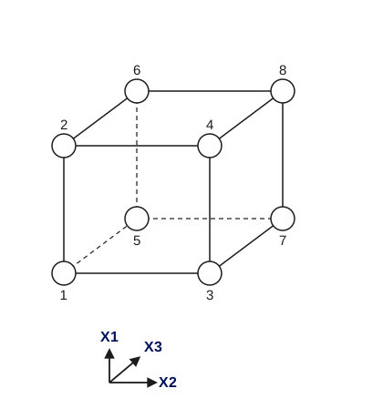
Consider the two-level, full factorial design for three factors, namely the \(2^3\) design. This implies eight runs (not counting replications or center point runs). Graphically, we can represent the \(2^3\) design by the cube shown in Figure 5.13. The arrows show the direction of increase of the factors. The numbers ‘1’ through ‘8’ at the corners of the design box reference the ‘Standard Order’ of runs (see Figure 5.13).
Figure 5.13: A \(2^3\) two-level, full factorial design; factors \(X_1\), \(X_2\), \(X_3\)
The design matrix
In tabular form, this design is given by:
Table 5.14: A \(2^3\) two-level, full factorial design table showing runs in ‘Standard Order’
run
\(X_1\)
\(X_2\)
\(X_3\)
1
-1
-1
-1
2
1
-1
-1
3
-1
1
-1
4
1
1
-1
5
-1
-1
1
6
1
-1
1
7
-1
1
1
8
1
1
1
The left-most column of Table 5.14, numbers 1 through 8, specifies a (non-randomized) run order called the ‘Standard Order.’ These numbers are also shown in Figure 5.13. For example, run 1 is made at the ‘low’ setting of all three factors.
Standard Order for a \(2^k\) Level Factorial Design
Rule for writing a \(2^k\) full factorial in “standard order”
We can readily generalize the \(2^3\) standard order matrix to a 2-level full factorial with \(k\) factors. The first (\(X_1\)) column starts with -1 and alternates in sign for all \(2^k\) runs. The second (\(X_2\)) column starts with -1 repeated twice, then alternates with 2 in a row of the opposite sign until all \(2^k\) places are filled. The third (\(X_3\)) column starts with -1 repeated 4 times, then 4 repeats of +1’s and so on. In general, the \(i\)-th column (\(X_i\)) starts with \(2^{i-1}\) repeats of -1 followed by \(2^{i-1}\) repeats of +1.
Example of a \(2^3\) Experiment
Analysis matrix for the 3-factor complete factorial
An engineering experiment called for running three factors; namely, Pressure (factor \(X_1\)), Table speed (factor \(X_2\)) and Down force (factor \(X_3\)), each at a ‘high’ and ‘low’ setting, on a production tool to determine which had the greatest effect on product uniformity. Two replications were run at each setting. A (full factorial) \(2^3\) design with 2 replications calls for 8*2=16 runs.
Table 5.15: Model or Analysis Matrix for a \(2^3\) Experiment
\(I\)
\(X_1\)
\(X_2\)
\(X_1{\cdot}X_2\)
\(X_3\)
\(X_1{\cdot}X_3\)
\(X_2{\cdot}X_3\)
\(X_1{\cdot}X_2{\cdot}X_3\)
Rep 1
Rep 2
+1
-1
-1
+1
-1
+1
+1
-1
-3
-1
+1
+1
-1
-1
-1
-1
+1
+1
0
-1
+1
-1
+1
-1
-1
+1
-1
+1
-1
0
+1
+1
+1
+1
-1
-1
-1
-1
+2
+3
+1
-1
-1
+1
+1
-1
-1
+1
-1
0
+1
+1
-1
-1
+1
+1
-1
-1
+2
+1
+1
-1
+1
-1
+1
-1
+1
-1
+1
+1
+1
+1
+1
+1
+1
+1
+1
+1
+6
+5
The block with the 1’s and -1’s is called the Model Matrix or the Analysis Matrix. The table formed by the columns \(X_1\), \(X_2\) and \(X_3\) is called the Design Table or Design Matrix.
Orthogonality Properties of Analysis Matrices for 2-Factor Experiments
Eliminate correlation between estimates of main effects and interactions
When all factors have been coded so that the high value is “1” and the low value is “-1”, the design matrix for any full (or suitably chosen fractional) factorial experiment has columns that are all pairwise orthogonal and all the columns (except the “I” column) sum to 0.
The orthogonality property is important because it eliminates correlation between the estimates of the main effects and interactions.
5.3.3.3.2 Full factorial example
A Full Factorial Design Example
An example of a full factorial design with 3 factors
Suppose that we wish to improve the yield of a polishing operation. The three inputs (factors) that are considered important to the operation are Speed (\(X_1\)), Feed (\(X_2\)), and Depth (\(X_3\)). We want to ascertain the relative importance of each of these factors on Yield (\(Y\)).
Speed, Feed and Depth can all be varied continuously along their respective scales, from a low to a high setting. Yield is observed to vary smoothly when progressive changes are made to the inputs. This leads us to believe that the ultimate response surface for \(Y\) will be smooth.
Table of factor level settings
Table 5.16: High (+1), Low (-1), and Standard (0) Settings for a Polishing Operation
Low (-1)
Standard (0)
High (+1)
Units
Speed
16
20
24
rpm
Feed
0.001
0.003
0.005
cm/sec
Depth
0.01
0.015
0.02
cm/sec
Factor Combinations
Graphical representation of the factor level settings
We want to try various combinations of these settings so as to establish the best way to run the polisher. There are eight different ways of combining high and low settings of Speed, Feed, and Depth. These eight are shown at the corners of Figure 5.14.
Figure 5.14: A \(2^3\) Two-level, Full Factorial Design; Factors \(X_1\), \(X_2\), \(X_3\). (The arrows show the direction of increase of the factors.)
\(2^3\) implies 8 runs
Note that if we have \(k\) factors, each run at two levels, there will be \(2^k\) different combinations of the levels. In the present case, \(k\) = 3 and \(2^3\) = 8.
Full Model
Running the full complement of all possible factor combinations means that we can estimate all the main and interaction effects. There are three main effects, three two-factor interactions, and a three-factor interaction, all of which appear in the full model as follows:
A full factorial design allows us to estimate all eight ‘beta’ coefficients \(\{\beta_0, \ldots, \beta_{123}\}\).
Standard order
Coded variables in standard order
The numbering of the corners of the box in Figure 5.14 refers to a standard way of writing down the settings of an experiment called ‘standard order’. We see standard order displayed in the following tabular representation of the eight-cornered box.
Note that the factor settings have been coded, replacing the low setting by -1 and the high setting by 1.
Factor settings in tabular form
Table 5.17: A \(2^3\) Two-level, Full Factorial Design Table Showing Runs in ‘Standard Order’
\(X_1\)
\(X_2\)
\(X_3\)
1
-1
-1
-1
2
+1
-1
-1
3
-1
+1
-1
4
+1
+1
-1
5
-1
-1
+1
6
+1
-1
+1
7
-1
+1
+1
8
+1
+1
+1
Replication
Replication provides information on variability
Running the entire design more than once makes for easier data analysis because, for each run (i.e., ‘corner of the design box’) we obtain an average value of the response as well as some idea about the dispersion (variability, consistency) of the response at that setting.
Homogeneity of variance
One of the usual analysis assumptions is that the response dispersion is uniform across the experimental space. The technical term is ‘homogeneity of variance’. Replication allows us to check this assumption and possibly find the setting combinations that give inconsistent yields, allowing us to avoid that area of the factor space.
Factor settings in standard order with replication
We now have constructed a design table for a two-level full factorial in three factors, replicated twice.
Table 5.18: The \(2^3\) Full Factorial Replicated Twice and Presented in Standard Order
Speed, \(X_1\)
Feed, \(X_2\)
Depth, \(X_3\)
1
16, -1
.001, -1
.01, -1
2
24, +1
.001, -1
.01, -1
3
16, -1
.005, +1
.01, -1
4
24, +1
.005, +1
.01, -1
5
16, -1
.001, -1
.02, +1
6
24, +1
.001, -1
.02, +1
7
16, -1
.005, +1
.02, +1
8
24, +1
.005, +1
.02, +1
9
16, -1
.001, -1
.01, -1
10
24, +1
.001, -1
.01, -1
11
16, -1
.005, +1
.01, -1
12
24, +1
.005, +1
.01, -1
13
16, -1
.001, -1
.02, +1
14
24, +1
.001, -1
.02, +1
15
16, -1
.005, +1
.02, +1
16
24, +1
.005, +1
.02, +1
Randomization
No randomization and no center points
If we now ran the design as is, in the order shown, we would have two deficiencies, namely:
no randomization, and
no center points.
Randomization provides protection against extraneous factors affecting the results
The more freely one can randomize experimental runs, the more insurance one has against extraneous factors possibly affecting the results, and hence perhaps wasting our experimental time and effort. For example, consider the ‘Depth’ column: the settings of Depth, in standard order, follow a ‘four low, four high, four low, four high’ pattern.
Suppose now that four settings are run in the day and four at night, and that (unknown to the experimenter) ambient temperature in the polishing shop affects Yield. We would run the experiment over two days and two nights and conclude that Depth influenced Yield, when in fact ambient temperature was the significant influence. So the moral is: Randomize experimental runs as much as possible.
Table of factor settings in randomized order
Here’s the design matrix again with the rows randomized. The old standard order column is also shown for comparison and for re-sorting, if desired, after the runs are in.
Table 5.19: The \(2^3\) Full Factorial Replicated Twice with Random Run Order Indicated
Random Order
Standard Order
\(X_1\)
\(X_2\)
\(X_3\)
1
5
-1
-1
+1
2
15
-1
+1
+1
3
9
-1
-1
-1
4
7
-1
+1
+1
5
3
-1
+1
-1
6
12
+1
+1
-1
7
6
+1
-1
+1
8
4
+1
+1
-1
9
2
+1
-1
-1
10
13
-1
-1
+1
11
8
+1
+1
+1
12
16
+1
+1
+1
13
1
-1
-1
-1
14
14
+1
-1
+1
15
11
-1
+1
-1
16
10
+1
-1
-1
Table showing design matrix with randomization and center points
This design would be improved by adding at least 3 centerpoint runs placed at the beginning, middle and end of the experiment. The final design matrix is shown below:
Table 5.20: The \(2^3\) Full Factorial Replicated Twice with Random Run Order Indicated and Center Point Runs Added
Random Order
Standard Order
\(X_1\)
\(X_2\)
\(X_3\)
1
–
0
0
0
2
5
-1
-1
+1
3
15
-1
+1
+1
4
9
-1
-1
-1
5
7
-1
+1
+1
6
3
-1
+1
-1
7
12
+1
+1
-1
8
6
+1
-1
+1
9
–
0
0
0
10
4
+1
+1
-1
11
2
+1
-1
-1
12
13
-1
-1
+1
13
8
+1
+1
+1
14
16
+1
+1
+1
15
1
-1
-1
-1
16
14
+1
-1
+1
17
11
-1
+1
-1
18
10
+1
-1
-1
19
–
0
0
0
5.3.3.3.3 Blocking of full factorial designs
Eliminate the influence of extraneous factors by “blocking”
We often need to eliminate the influence of extraneous factors when running an experiment. We do this by “blocking.” Previously, blocking was introduced when randomized block designs were discussed. There we were concerned with one factor in the presence of one of more nuisance factors. In this section we look at a general approach that enables us to divide 2-level factorial experiments into blocks.
For example, assume we anticipate predictable shifts will occur while an experiment is being run. This might happen when one has to change to a new batch of raw materials halfway through the experiment. The effect of the change in raw materials is well known, and we want to eliminate its influence on the subsequent data analysis.
Blocking in a \(2^3\) factorial design
In this case, we need to divide our experiment into two halves (2 blocks), one with the first raw material batch and the other with the new batch. The division has to balance out the effect of the materials change in such a way as to eliminate its influence on the analysis, and we do this by blocking.
Example
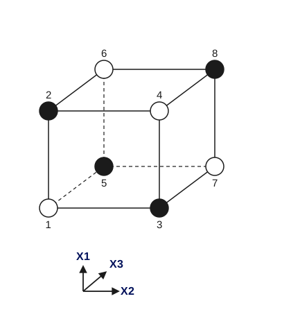
Example: An eight-run \(2^3\) full factorial has to be blocked into two groups of four runs each. Consider the design ‘box’ for the \(2^3\) full factorial. Blocking can be achieved by assigning the first block to the dark-shaded corners and the second block to the open circle corners.
Graphical representation of blocking scheme
Figure 5.15: Blocking Scheme for a \(2^3\) Using Alternate Corners
Three-factor interaction confounded with the block effect
This works because we are in fact assigning the ‘estimation’ of the (unwanted) blocking effect to the three-factor interaction, and because of the special property of two-level designs called orthogonality.
That is, the three-factor interaction is “confounded” with the block effect as will be seen shortly.
Orthogonality
Orthogonality guarantees that we can always estimate the effect of one factor or interaction clear of any influence due to any other factor or interaction. Orthogonality is a very desirable property in DOE and this is a major reason why two-level factorials are so popular and successful.
Table showing blocking scheme
Formally, consider the \(2^3\) design table with the three-factor interaction column added.
Table 5.21: Two Blocks for a \(2^3\) Design
SPEED \(X_1\)
FEED \(X_2\)
DEPTH \(X_3\)
\(X_1{\cdot}X_2{\cdot}X_3\)
BLOCK
-1
-1
-1
-1
I
+1
-1
-1
+1
II
-1
+1
-1
+1
II
+1
+1
-1
-1
I
-1
-1
+1
+1
II
+1
-1
+1
-1
I
-1
+1
+1
-1
I
+1
+1
+1
+1
II
Block by assigning the “Block effect” to a high-order interaction
Rows that have a ‘-1’ in the three-factor interaction column are assigned to ‘Block I’ (rows 1, 4, 6, 7), while the other rows are assigned to ‘Block II’ (rows 2, 3, 5, 8). Note that the Block I rows are the open circle corners of the design ‘box’ above; Block II are dark-shaded corners.
Most DOE software will do blocking for you
The general rule for blocking is: use one or a combination of high-order interaction columns to construct blocks. This gives us a formal way of blocking complex designs. Apart from simple cases in which you can design your own blocks, your statistical/DOE software will do the blocking if asked, but you do need to understand the principle behind it.
Block effects are confounded with higher-order interactions
The price you pay for blocking by using high-order interaction columns is that you can no longer distinguish the high-order interaction(s) from the blocking effect – they have been ‘confounded,’ or ‘aliased.’ In fact, the blocking effect is now the sum of the blocking effect and the high-order interaction effect. This is fine as long as our assumption about negligible high-order interactions holds true, which it usually does.
Center points within a block
Within a block, center point runs are assigned as if the block were a separate experiment – which in a sense it is.
Randomization takes place within a block as it would for any non-blocked DOE.
5.3.3.4 Fractional factorial designs
Full factorial experiments can require many runs
The American Society for Quality Control (1983)Glossary & Tables for Statistical Quality Control defines fractional factorial design in the following way: “A factorial experiment in which only an adequately chosen fraction of the treatment combinations required for the complete factorial experiment is selected to be run.”
A carefully chosen fraction of the runs may be all that is necessary
Even if the number of factors, \(k\), in a design is small, the \(2^k\) runs specified for a full factorial can quickly become very large. For example, \(2^6\) = 64 runs is for a two-level, full factorial design with six factors. To this design we need to add a good number of centerpoint runs and we can thus quickly run up a very large resource requirement for runs with only a modest number of factors.
Later sections will show how to choose the “right” fraction for 2-level designs – these are both balanced and orthogonal
The solution to this problem is to use only a fraction of the runs specified by the full factorial design. Which runs to make and which to leave out is the subject of interest here. In general, we pick a fraction such as \(\frac{1}{2}\), \(\frac{1}{4}\), etc. of the runs called for by the full factorial. We use various strategies that ensure an appropriate choice of runs. The following sections will show you how to choose an appropriate fraction of a full factorial design to suit your purpose at hand. Properly chosen fractional factorial designs for 2-level experiments have the desirable properties of being both balanced and orthogonal.
2-Level fractional factorial designs emphasized
Note: We will be emphasizing fractions of two-level designs only. This is because two-level fractional designs are, in engineering at least, by far the most popular fractional designs. Fractional factorials where some factors have three levels will be covered briefly in Section 5.3.3.10.
5.3.3.4.1 A \(2^{3-1}\) design (half of a \(2^3\))
We can run a fraction of a full factorial experiment and still be able to estimate main effects
Consider the two-level, full factorial design for three factors, namely the \(2^3\) design. This implies eight runs (not counting replications or center points). Graphically, as shown earlier, we can represent the \(2^3\) design by the following cube:
Figure 5.16: A \(2^3\) Full Factorial Design; Factors \(X_1\), \(X_2\), \(X_3\). (The arrows show the direction of increase of the factors. Numbers ‘1’ through ‘8’ at the corners of the design cube reference the ‘Standard Order’ of runs)
Tabular representation of the design
In tabular form, this design (also showing eight observations \(y_j\) (\(j\) = 1,…,8)) is given by
Table 5.22: A \(2^3\) Two-level, Full Factorial Design Table Showing Runs in ‘Standard Order,’ Plus Observations (\(y_j\))
\(X_1\)
\(X_2\)
\(X_3\)
\(Y\)
1
-1
-1
-1
\(y_1\) = 33
2
+1
-1
-1
\(y_2\) = 63
3
-1
+1
-1
\(y_3\) = 41
4
+1
+1
-1
\(Y_4\) = 57
5
-1
-1
+1
\(y_5\) = 57
6
+1
-1
+1
\(y_6\) = 51
7
-1
+1
+1
\(y_7\) = 59
8
+1
+1
+1
\(y_8\) = 53
Responses in standard order
The right-most column of the table lists ‘\(y_1\)’ through ‘\(y_8\)’ to indicate the responses measured for the experimental runs when listed in standard order. For example, ‘\(y_1\)’ is the response (i.e., output) observed when the three factors were all run at their ‘low’ setting. The numbers entered in the ‘y’ column will be used to illustrate calculations of effects.
Computing \(X_1\) main effect
From the entries in the table we are able to compute all ‘effects’ such as main effects, first-order ‘interaction’ effects, etc. For example, to compute the main effect estimate ‘\(c_1\)’ of factor \(X_1\), we compute the average response at all runs with \(X_1\) at the ‘high’ setting, namely \((1/4)(y_2 + y_4 + y_6 + y_8)\), minus the average response of all runs with \(X_1\) set at ‘low,’ namely \((1/4)(y_1 + y_3 + y_5 + y_7)\). That is,
Can we estimate \(X_1\) main effect with four runs?
Suppose, however, that we only have enough resources to do four runs. Is it still possible to estimate the main effect for \(X_1\)? Or any other main effect? The answer is yes, and there are even different choices of the four runs that will accomplish this.
Example of computing the main effects using only four runs
For example, suppose we select only the four light (unshaded) corners of the design cube. Using these four runs (1, 4, 6 and 7), we can still compute \(c_1\) as follows:
We could also have used the four dark (shaded) corners of the design cube for our runs and obtained similar, but slightly different, estimates for the main effects. In either case, we would have used half the number of runs that the full factorial requires. The half fraction we used is a new design written as \(2^{3-1}\). Note that \(2^{3-1} = 2^3/2 = 2^2 = 4\), which is the number of runs in this half-fraction design. In the next section, a general method for choosing fractions that “work” will be discussed.
Example of how fractional factorial experiments often arise in industry
Example: An engineering experiment calls for running three factors, namely Pressure, Table speed, and Down force, each at a ‘high’ and a ‘low’ setting, on a production tool to determine which has the greatest effect on product uniformity. Interaction effects are considered negligible, but uniformity measurement error requires that at least two separate runs (replications) be made at each process setting. In addition, several ‘standard setting’ runs (centerpoint runs) need to be made at regular intervals during the experiment to monitor for process drift. As experimental time and material are limited, no more than 15 runs can be planned.
A full factorial \(2^3\) design, replicated twice, calls for 8x2 = 16 runs, even without centerpoint runs, so this is not an option. However a \(2^{3-1}\) design replicated twice requires only 4x2 = 8 runs, and then we would have 15-8 = 7 spare runs: 3 to 5 of these spare runs can be used for centerpoint runs and the rest saved for backup in case something goes wrong with any run. As long as we are confident that the interactions are negligibly small (compared to the main effects), and as long as complete replication is required, then the above replicated \(2^{3-1}\) fractional factorial design (with center points) is a very reasonable choice.
On the other hand, if interactions are potentially large (and if the replication required could be set aside), then the usual \(2^3\) full factorial design (with center points) would serve as a good design.
5.3.3.4.2 Constructing the \(2^{3-1}\) half-fraction design
Construction of a \(2^{3-1}\) half fraction design by starting with a \(2^2\) full factorial design
First note that, mathematically, \(2^{3-1} = 2^2\). This gives us the first step, which is to start with a regular \(2^2\) full factorial design. That is, we start with the following design table.
Table 5.23: A Standard Order \(2^2\) Full Factorial Design Table
\(X_1\)
\(X_2\)
1
-1
-1
2
+1
-1
3
-1
+1
4
+1
+1
Assign the third factor to the interaction column of a \(2^2\) design
This design has four runs, the right number for a half-fraction of a \(2^3\), but there is no column for factor \(X_3\). We need to add a third column to take care of this, and we do it by adding the \(X_1{\cdot}X_2\) interaction column. This column is, as you will recall from full factorial designs, constructed by multiplying the row entry for \(X_1\) with that of \(X_2\) to obtain the row entry for \(X_1{\cdot}X_2\).
Table 5.24: A \(2^2\) Design Table Augmented with the \(X_1{\cdot}X_2\) Interaction Column
\(X_1\)
\(X_2\)
\(X_1{\cdot}X_2\)
1
-1
-1
+1
2
+1
-1
-1
3
-1
+1
-1
4
+1
+1
+1
Design table with \(X_3\) set to \(X_1{\cdot}X_2\)
We may now substitute ‘\(X_3\)’ in place of ‘\(X_1{\cdot}X_2\)’ in this table.
Table 5.25: A \(2^{3-1}\) Design Table with Column \(X_3\) set to \(X_1{\cdot}X_2\)
\(X_1\)
\(X_2\)
\(X_3\)
1
-1
-1
+1
2
+1
-1
-1
3
-1
+1
-1
4
+1
+1
+1
Design table with \(X_3\) set to \(-X_1{\cdot}X_2\)
Note that the rows of the table above give the dark-shaded corners of the design in Figure 5.16. If we had set \(X_3 = -X_1{\cdot}X_2\) as the rule for generating the third column of our \(2^{3-1}\) design, we would have obtained:
Table 5.26: A \(2^{3-1}\) Design Table with Column \(X_3\) set to \(-X_1{\cdot}X_2\)
\(X_1\)
\(X_2\)
\(X_3\)
1
-1
-1
-1
2
+1
-1
+1
3
-1
+1
+1
4
+1
+1
-1
Main effect estimates from fractional factorial not as good as full factorial
This design gives the light-shaded corners of the box of Figure 5.16. Both \(2^{3-1}\) designs that we have generated are equally good, and both save half the number of runs over the original \(2^3\) full factorial design. If \(c_1\), \(c_2\), and \(c_3\) are our estimates of the main effects for the factors \(X_1\), \(X_2\), \(X_3\) (i.e., the difference in the response due to going from “low” to “high” for an effect), then the precision of the estimates \(c_1\), \(c_2\), and \(c_3\) are not quite as good as for the full 8-run factorial because we only have four observations to construct the averages instead of eight; this is one price we have to pay for using fewer runs.
Example
Example: For the ‘Pressure (P), Table speed (T), and Down force (D)’ design situation of the previous example, here’s a replicated \(2^{3-1}\) in randomized run order, with five centerpoint runs (‘000’) interspersed among the runs. This design table was constructed using the technique discussed above, with D = P*T.
Design table for the example
Table 5.27: A \(2^{3-1}\) Design Replicated Twice, with Five Centerpoint Runs Added
Pattern
P
T
D
Center Point
1
000
0
0
0
1
2
+–
+1
-1
-1
0
3
-+-
-1
+1
-1
0
4
000
0
0
0
1
5
+++
+1
+1
+1
0
6
–+
-1
-1
+1
0
7
000
0
0
0
1
8
+–
+1
-1
-1
0
9
–+
-1
-1
+1
0
10
000
0
0
0
1
11
+++
+1
+1
+1
0
12
-+-
-1
+1
-1
0
13
000
0
0
0
1
5.3.3.4.3 Confounding (also called aliasing)
Confounding means we have lost the ability to estimate some effects and/or interactions
One price we pay for using the design table column \(X_1{\cdot}X_2\) to obtain column \(X_3\) in Table 5.25 is, clearly, our inability to obtain an estimate of the interaction effect for \(X_1{\cdot}X_2\) (i.e., \(c_{12}\)) that is separate from an estimate of the main effect for \(X_3\). In other words, we have confounded the main effect estimate for factor \(X_3\) (i.e., \(c_3\)) with the estimate of the interaction effect for \(X_1\) and \(X_2\) (i.e., with \(c_{12}\)). The whole issue of confounding is fundamental to the construction of fractional factorial designs, and we will spend time discussing it below.
Sparsity of effects assumption
In using the \(2^{3-1}\) design, we also assume that \(c_{12}\) is small compared to \(c_3\); this is called a ‘sparsity of effects’ assumption. Our computation of \(c_3\) is in fact a computation of \(c_3 + c_{12}\). If the desired effects are only confounded with non-significant interactions, then we are OK.
A Notation and Method for Generating Confounding or Aliasing
A short way of writing factor column multiplication
A short way of writing ‘\(X_3 = X_1{\cdot}X_2\)’ (understanding that we are talking about multiplying columns of the design table together) is: ‘3 = 12’ (similarly 3 = -12 refers to \(X_3 = -X_1{\cdot}X_2\)). Note that ‘12’ refers to column multiplication of the kind we are using to construct the fractional design and any column multiplied by itself gives the identity column of all 1’s.
Next we multiply both sides of 3=12 by 3 and obtain 33=123, or I=123 since 33=I (or a column of all 1’s). Playing around with this “algebra”, we see that 2I=2123, or 2=2123, or 2=1223, or 2=13 (since 2I=2, 22=I, and 1I3=13). Similarly, 1=23.
Definition of “design generator” or “generating relation” and “defining relation”
I=123 is called a design generator or a generating relation for this \(2^{3-1}\) design (the dark-shaded corners of Figure 5.16). Since there is only one design generator for this design, it is also the defining relation for the design. Equally, I=-123 is the design generator (and defining relation) for the light-shaded corners of Figure 5.16. We call I=123 the defining relation for the \(2^{3-1}\) design because with it we can generate (by “multiplication”) the complete confounding pattern for the design. That is, given I=123, we can generate the set of {1=23, 2=13, 3=12, I=123}, which is the complete set of aliases, as they are called, for this \(2^{3-1}\) fractional factorial design. With I=123, we can easily generate all the columns of the half-fraction design \(2^{3-1}\).
Principal fraction
Note: We can replace any design generator by its negative counterpart and have an equivalent, but different fractional design. The fraction generated by positive design generators is sometimes called the principal fraction.
All main effects of \(2^{3-1}\) design confounded with two-factor interactions
The confounding pattern described by 1=23, 2=13, and 3=12 tells us that all the main effects of the \(2^{3-1}\) design are confounded with two-factor interactions. That is the price we pay for using this fractional design. Other fractional designs have different confounding patterns; for example, in the typical quarter-fraction of a \(2^6\) design, i.e., in a \(2^{6-2}\) design, main effects are confounded with three-factor interactions (e.g., 5=123) and so on. In the case of 5=123, we can also readily see that 15=23 (etc.), which alerts us to the fact that certain two-factor interactions of a \(2^{6-2}\) are confounded with other two-factor interactions.
A useful summary diagram for a fractional factorial design
Summary: A convenient summary diagram of the discussion so far about the \(2^{3-1}\) design is as follows:
Figure 5.17: Essential Elements of a \(2^{3-1}\) Design
The next section will add one more item to the above box, and then we will be able to select the right two-level fractional factorial design for a wide range of experimental tasks.
5.3.3.4.4 Fractional factorial design specifications and design resolution
Generating relation and diagram for the \(2^{8-3}\) fractional factorial design
We considered the \(2^{3-1}\) design in the previous section and saw that its generator written in “I = …” form is {I = +123}. Next we look at a one-eighth fraction of a \(2^8\) design, namely the \(2^{8-3}\) fractional factorial design. Using a diagram similar to Figure 5.17, we have the following:
Figure 5.18: Specifications for a \(2^{8-3}\) Design
\(2^{8-3}\) design has 32 runs
Figure 5.18 tells us that a \(2^{8-3}\) design has 32 runs, not including centerpoint runs, and eight factors. There are three generators since this is a 1/8 = \(2^{-3}\) fraction (in general, a \(2^{k-p}\) fractional factorial needs \(p\) generators which define the settings for \(p\) additional factor columns to be added to the \(2^{k-p}\) full factorial design columns – see the following detailed description for the \(2^{8-3}\) design).
How to Construct a Fractional Factorial Design From the Specification
Rule for constructing a fractional factorial design
In order to construct the design, we do the following:
Write down a full factorial design in standard order for \(k-p\) factors (8-3 = 5 factors for the example above). In the specification above we start with a \(2^5\) full factorial design. Such a design has \(2^5\) = 32 rows.
Add a sixth column to the design table for factor 6, using 6 = 345 (or 6 = -345) to manufacture it (i.e., create the new column by multiplying the indicated old columns together).
Do likewise for factor 7 and for factor 8, using the appropriate design generators given in Figure 5.18.
The resultant design matrix gives the 32 trial runs for an 8-factor fractional factorial design. (When actually running the experiment, we would of course randomize the run order.)
Design generators
We note further that the design generators, written in ‘I = …’ form, for the principal \(2^{8-3}\) fractional factorial design are:
{ I = + 3456; I = + 12457; I = +12358 }.
These design generators result from multiplying the “6 = 345” generator by “6” to obtain “I = 3456” and so on for the other two generators.
“Defining relation” for a fractional factorial design
The total collection of design generators for a factorial design, including all new generators that can be formed as products of these generators, is called a defining relation. There are seven “words”, or strings of numbers, in the defining relation for the \(2^{8-3}\) design, starting with the original three generators and adding all the new “words” that can be formed by multiplying together any two or three of these original three words. These seven turn out to be I = 3456 = 12457 = 12358 = 12367 = 12468 = 3478 = 5678. In general, there will be \((2^p - 1)\) words in the defining relation for a \(2^{k-p}\) fractional factorial.
Definition of “Resolution”
The length of the shortest word in the defining relation is called the resolution of the design. Resolution describes the degree to which estimated main effects are aliased (or confounded) with estimated 2-level interactions, 3-level interactions, etc.
Notation for resolution (Roman numerals)
The length of the shortest word in the defining relation for the \(2^{8-3}\) design is four. This is written in Roman numeral script, and subscripted as \(2_{IV}^{8-3}\).
Note that the \(2^{3-1}\) design has only one word, “I = 123” (or “I = -123”), in its defining relation since there is only one design generator, and so this fractional factorial design has resolution three; that is, we may write \(2_{III}^{3-1}\).
Diagram for a \(2^{8-3}\) design showing resolution
Now Figure 5.18 may be completed by writing it as:
Figure 5.19: Specifications for a \(2^{8-3}\), Showing Resolution IV
Resolution and confounding
The design resolution tells us how badly the design is confounded. Previously, in the \(2^{3-1}\) design, we saw that the main effects were confounded with two-factor interactions. However, main effects were not confounded with other main effects. So, at worst, we have 3=12, or 2=13, etc., but we do not have 1=2, etc. In fact, a resolution II design would be pretty useless for any purpose whatsoever! Similarly, in a resolution IV design, main effects are confounded with at worst three-factor interactions. We can see, in Figure 5.19, that 6=345. We also see that 36=45, 34=56, etc. (i.e., some two-factor interactions are confounded with certain other two-factor interactions) etc.; but we never see anything like 2=13, or 5=34, (i.e., main effects confounded with two-factor interactions).
The complete first-order interaction confounding for the given \(2^{8-3}\) design
The complete confounding pattern, for confounding of up to two-factor interactions, arising from the design given in Figure 5.19 is
All of these relations can be easily verified by multiplying the indicated two-factor interactions by the generators. For example, to verify that 38 = 47, multiply both sides of 8=1235 by 3 to get 38=125. Then, multiply 7=1245 by 4 to get 47=125. From that it follows that 38=47.
One or two factors suspected of possibly having significant first-order interactions can be assigned in such a way as to avoid having them aliased
For this \(2_{IV}^{8-3}\) fractional factorial design, 15 two-factor interactions are aliased (confounded) in pairs or in a group of three. The remaining 28 - 15 = 13 two-factor interactions are only aliased with higher-order interactions (which are generally assumed to be negligible). This is verified by noting that factors “1” and “2” never appear in a length-4 word in the defining relation. So, all 13 interactions involving “1” and “2” are clear of aliasing with any other two factor interaction.
If one or two factors are suspected of possibly having significant first-order interactions, they can be assigned in such a way as to avoid having them aliased.
Higher resolution designs have less severe confounding, but require more runs
A resolution IV design is “better” than a resolution III design because we have less-severe confounding pattern in the ‘IV’ than in the ‘III’ situation; higher-order interactions are less likely to be significant than low-order interactions.
A higher-resolution design for the same number of factors will, however, require more runs and so it is ‘worse’ than a lower order design in that sense.
Resolution V designs for 8 factors
Similarly, with a resolution V design, main effects would be confounded with four-factor (and possibly higher-order) interactions, and two-factor interactions would be confounded with certain three-factor interactions. To obtain a resolution V design for 8 factors requires more runs than the \(2^{8-3}\) design. One option, if estimating all main effects and two-factor interactions is a requirement, is a \(2_V^{8-3}\) design. However, a 48-run alternative (John’s 3/4 fractional factorial) is also available.
There are many choices of fractional factorial designs – some may have the same number of runs and resolution, but different aliasing patterns.
Note: There are other \(2_V^{8-3}\) fractional designs that can be derived starting with different choices of design generators for the “6”, “7” and “8” factor columns. However, they are either equivalent (in terms of the number of words of length of four) to the fraction with generators 6 = 345, 7 = 1245, 8 = 1235 (obtained by relabeling the factors), or they are inferior to the fraction given because their defining relation contains more words of length four (and therefore more confounded two-factor interactions). For example, the \(2_V^{8-3}\) design with generators 6 = 12345, 7 = 135, and 8 = 245 has five length-four words in the defining relation (the defining relation is I = 123456 = 1357 = 2458 = 2467 = 1368 = 123478 = 5678). As a result, this design would confound more two factor-interactions (23 out of 28 possible two-factor interactions are confounded, leaving only “12”, “14”, “23”, “27” and “34” as estimable two-factor interactions).
Diagram of an alternative way for generating the \(2^{8-3}\) design
As an example of an equivalent “best” \(2_V^{8-3}\) fractional factorial design, obtained by “relabeling”, consider the design specified below.
Figure 5.20: Another Way of Generating the \(2^{8-3}\) Design
This design is equivalent to the design specified in Figure 5.19 after relabeling the factors as follows: 1 becomes 5, 2 becomes 8, 3 becomes 1, 4 becomes 2, 5 becomes 3, 6 remains 6, 7 becomes 4 and 8 becomes 7.
Minimum aberration
A table given later in this chapter gives a collection of useful fractional factorial designs that, for a given \(k\) and \(p\), maximize the possible resolution and minimize the number of short words in the defining relation (which minimizes two-factor aliasing). The term for this is “minimum aberration”.
Design Resolution Summary
Commonly used design Resolutions
The meaning of the most prevalent resolution levels is as follows:
Resolution III Designs
Main effects are confounded (aliased) with two-factor interactions.
Resolution IV Designs
No main effects are aliased with two-factor interactions, but two-factor interactions are aliased with each other.
Resolution V Designs
No main effect or two-factor interaction is aliased with any other main effect or two-factor interaction, but two-factor interactions are aliased with three-factor interactions.
5.3.3.4.5 Use of fractional factorial designs
Use low-resolution designs for screening among main effects and use higher-resolution designs when interaction effects and response surfaces need to be investigated
The basic purpose of a fractional factorial design is to economically investigate cause-and-effect relationships of significance in a given experimental setting. This does not differ in essence from the purpose of any experimental design. However, because we are able to choose fractions of a full design, and hence be more economical, we also have to be aware that different factorial designs serve different purposes.
Broadly speaking, with designs of resolution three, and sometimes four, we seek to screen out the few important main effects from the many less important others. For this reason, these designs are often termed main effects designs, or screening designs.
On the other hand, designs of resolution five, and higher, are used for focusing on more than just main effects in an experimental situation. These designs allow us to estimate interaction effects and such designs are easily augmented to complete a second-order design – a design that permits estimation of a full second-order (quadratic) model.
Different purposes for screening/RSM designs
Within the screening/RSM strategy of design, there are a number of functional purposes for which designs are used. For example, an experiment might be designed to determine how to make a product better or a process more robust against the influence of external and non-controllable influences such as the weather. Experiments might be designed to troubleshoot a process, to determine bottlenecks, or to specify which component(s) of a product are most in need of improvement. Experiments might also be designed to optimize yield, or to minimize defect levels, or to move a process away from an unstable operating zone. All these aims and purposes can be achieved using fractional factorial designs and their appropriate design enhancements.
5.3.3.4.6 Screening designs
Screening designs are an efficient way to identify significant main effects
The term ‘Screening Design’ refers to an experimental plan that is intended to find the few significant factors from a list of many potential ones. Alternatively, we refer to a design as a screening design if its primary purpose is to identify significant main effects, rather than interaction effects, the latter being assumed an order of magnitude less important.
Use screening designs when you have many factors to consider
Even when the experimental goal is to eventually fit a response surface model (an RSM analysis), the first experiment should be a screening design when there are many factors to consider.
Screening designs are usually resolution III or IV
Screening designs are typically of resolution III. The reason is that resolution III designs permit one to explore the effects of many factors with an efficient number of runs. Sometimes designs of resolution IV are also used for screening designs. In these designs, main effects are confounded with, at worst, three-factor interactions. This is better from the confounding viewpoint, but the designs require more runs than a resolution III design.
Plackett-Burman designs
Another common family of screening designs is the Plackett-Burman set of designs, so named after its inventors. These designs are of resolution III and will be described later.
Economical plans for determining significant main effects
In short, screening designs are economical experimental plans that focus on determining the relative significance of many main effects.
5.3.3.4.7 Summary tables of useful fractional factorial designs
Useful fractional factorial designs for up to 10 factors are summarized here
There are very useful summaries of two-level fractional factorial designs for up to 11 factors, originally published in the book Statistics for Experimenters by G.E.P. Box, W.G. Hunter, and J.S. Hunter (New York, John Wiley & Sons, 1978) and also given in the book Design and Analysis of Experiments, 5th edition by Douglas C. Montgomery (New York, John Wiley & Sons, 2000).
Generator column notation can use either numbers or letters for the factor columns
They differ in the notation for the design generators. Box, Hunter, and Hunter use numbers (as we did in our earlier discussion) and Montgomery uses capital letters according to the following scheme:
1
2
3
4
5
6
7
8
9
10
11
A
B
C
D
E
F
G
H
J
K
L
Notice the absence of the letter I. This is usually reserved for the intercept column that is identically 1. As an example of the letter notation, note that the design generator “6 = 12345” is equivalent to “F = ABCDE”.
Details of the design generators, the defining relation, the confounding structure, and the design matrix
Table 5.28 catalogs these useful fractional factorial designs using the generator notation previously described in Figure 5.19. Clicking on the \(2_R^{k-p}\) specification for a given design provides details (courtesy of Dataplot files) of the design generators, the defining relation, the confounding structure (as far as main effects and two-level interactions are concerned), and the design matrix. The notation used follows our previous labeling of factors with numbers, not letters.
Click on the design specification in the table below and a text file with details about the design can be viewed or saved
Table 5.28: Summary of Useful Fractional Factorial Designs
In 1946, R.L. Plackett and J.P. Burman published their now famous paper “The Design of Optimal Multifactorial Experiments” in Biometrika (vol. 33). This paper described the construction of very economical designs with the run number a multiple of four (rather than a power of 2). Plackett-Burman designs are very efficient screening designs when only main effects are of interest.
These designs have run numbers that are a multiple of 4
Plackett-Burman (PB) designs are used for screening experiments because, in a PB design, main effects are, in general, heavily confounded with two-factor interactions. The PB design in 12 runs, for example, may be used for an experiment containing up to 11 factors.
12-Run Plackett-Burman design
Table 5.29: Plackett-Burman Design in 12 Runs for up to 11 Factors
Pattern
\(X_1\)
\(X_2\)
\(X_3\)
\(X_4\)
\(X_5\)
\(X_6\)
\(X_7\)
\(X_8\)
\(X_9\)
\(X_{10}\)
\(X_{11}\)
1
+++++++++++
+1
+1
+1
+1
+1
+1
+1
+1
+1
+1
+1
2
-+-+++—+-
-1
+1
-1
+1
+1
+1
-1
-1
-1
+1
-1
3
–+-+++—+
-1
-1
+1
-1
+1
+1
+1
-1
-1
-1
+1
4
+–+-+++—
+1
-1
-1
+1
-1
+1
+1
+1
-1
-1
-1
5
-+–+-+++–
-1
+1
-1
-1
+1
-1
+1
+1
+1
-1
-1
6
–+–+-+++-
-1
-1
+1
-1
-1
+1
-1
+1
+1
+1
-1
7
—+–+-+++
-1
-1
-1
+1
-1
-1
+1
-1
+1
+1
+1
8
+—+–+-++
+1
-1
-1
-1
+1
-1
-1
+1
-1
+1
+1
9
++—+–+-+
+1
+1
-1
-1
-1
+1
-1
-1
+1
-1
+1
10
+++—+–+-
+1
+1
+1
-1
-1
-1
+1
-1
-1
+1
-1
11
-+++—+–+
-1
+1
+1
+1
-1
-1
-1
+1
-1
-1
+1
12
+-+++—+–
+1
-1
+1
+1
+1
-1
-1
-1
+1
-1
-1
Saturated Main Effect designs
PB designs also exist for 20-run, 24-run, and 28-run (and higher) designs. With a 20-run design you can run a screening experiment for up to 19 factors, up to 23 factors in a 24-run design, and up to 27 factors in a 28-run design. These Resolution III designs are known as Saturated Main Effect designs because all degrees of freedom are utilized to estimate main effects. The designs for 20 and 24 runs are shown below.
20-Run Plackett-Burman design
Table 5.30: A 20-Run Plackett-Burman Design
\(X_1\)
\(X_2\)
\(X_3\)
\(X_4\)
\(X_5\)
\(X_6\)
\(X_7\)
\(X_8\)
\(X_9\)
\(X_{10}\)
\(X_{11}\)
\(X_{12}\)
\(X_{13}\)
\(X_{14}\)
\(X_{15}\)
\(X_{16}\)
\(X_{17}\)
\(X_{18}\)
\(X_{19}\)
1
+1
+1
+1
+1
+1
+1
+1
+1
+1
+1
+1
+1
+1
+1
+1
+1
+1
+1
+1
2
-1
+1
-1
-1
+1
+1
+1
+1
-1
+1
-1
+1
-1
-1
-1
-1
+1
+1
-1
3
-1
-1
+1
-1
-1
+1
+1
+1
+1
-1
+1
-1
+1
-1
-1
-1
-1
+1
+1
4
+1
-1
-1
+1
-1
-1
+1
+1
+1
+1
-1
+1
-1
+1
-1
-1
-1
-1
+1
5
+1
+1
-1
-1
+1
-1
-1
+1
+1
+1
+1
-1
+1
-1
+1
-1
-1
-1
-1
6
-1
+1
+1
-1
-1
+1
-1
-1
+1
+1
+1
+1
-1
+1
-1
+1
-1
-1
-1
7
-1
-1
+1
+1
-1
-1
+1
-1
-1
+1
+1
+1
+1
-1
+1
-1
+1
-1
-1
8
-1
-1
-1
+1
+1
-1
-1
+1
-1
-1
+1
+1
+1
+1
-1
+1
-1
+1
-1
9
-1
-1
-1
-1
+1
+1
-1
-1
+1
-1
-1
+1
+1
+1
+1
-1
+1
-1
+1
10
+1
-1
-1
-1
-1
+1
+1
-1
-1
+1
-1
-1
+1
+1
+1
+1
-1
+1
-1
11
-1
+1
-1
-1
-1
-1
+1
+1
-1
-1
+1
-1
-1
+1
+1
+1
+1
-1
+1
12
+1
-1
+1
-1
-1
-1
-1
+1
+1
-1
-1
+1
-1
-1
+1
+1
+1
+1
-1
13
-1
+1
-1
+1
-1
-1
-1
-1
+1
+1
-1
-1
+1
-1
-1
+1
+1
+1
+1
14
+1
-1
+1
-1
+1
-1
-1
-1
-1
+1
+1
-1
-1
+1
-1
-1
+1
+1
+1
15
+1
+1
-1
+1
-1
+1
-1
-1
-1
-1
+1
+1
-1
-1
+1
-1
-1
+1
+1
16
+1
+1
+1
-1
+1
-1
+1
-1
-1
-1
-1
+1
+1
-1
-1
+1
-1
-1
+1
17
+1
+1
+1
+1
-1
+1
-1
+1
-1
-1
-1
-1
+1
+1
-1
-1
+1
-1
-1
18
-1
+1
+1
+1
+1
-1
+1
-1
+1
-1
-1
-1
-1
+1
+1
-1
-1
+1
-1
19
-1
-1
+1
+1
+1
+1
-1
+1
-1
+1
-1
-1
-1
-1
+1
+1
-1
-1
+1
20
+1
-1
-1
+1
+1
+1
+1
-1
+1
-1
+1
-1
-1
-1
-1
+1
+1
-1
-1
24-Run Plackett-Burman design
Table 5.31: A 24-Run Plackett-Burman Design
\(X_1\)
\(X_2\)
\(X_3\)
\(X_4\)
\(X_5\)
\(X_6\)
\(X_7\)
\(X_8\)
\(X_9\)
\(X_{10}\)
\(X_{11}\)
\(X_{12}\)
\(X_{13}\)
\(X_{14}\)
\(X_{15}\)
\(X_{16}\)
\(X_{17}\)
\(X_{18}\)
\(X_{19}\)
\(X_{20}\)
\(X_{21}\)
\(X_{22}\)
\(X_{23}\)
1
1
1
1
1
1
1
1
1
1
1
1
1
1
1
1
1
1
1
1
1
1
1
1
2
-1
1
1
1
1
-1
1
-1
1
1
-1
-1
1
1
-1
-1
1
-1
1
-1
-1
-1
-1
3
-1
-1
1
1
1
1
-1
1
-1
1
1
-1
-1
1
1
-1
-1
1
-1
1
-1
-1
-1
4
-1
-1
-1
1
1
1
1
-1
1
-1
1
1
-1
-1
1
1
-1
-1
1
-1
1
-1
-1
5
-1
-1
-1
-1
1
1
1
1
-1
1
-1
1
1
-1
-1
1
1
-1
-1
1
-1
1
-1
6
-1
-1
-1
-1
-1
1
1
1
1
-1
1
-1
1
1
-1
-1
1
1
-1
-1
1
-1
1
7
1
-1
-1
-1
-1
-1
1
1
1
1
-1
1
-1
1
1
-1
-1
1
1
-1
-1
1
-1
8
-1
1
-1
-1
-1
-1
-1
1
1
1
1
-1
1
-1
1
1
-1
-1
1
1
-1
-1
1
9
1
-1
1
-1
-1
-1
-1
-1
1
1
1
1
-1
1
-1
1
1
-1
-1
1
1
-1
-1
10
-1
1
-1
1
-1
-1
-1
-1
-1
1
1
1
1
-1
1
-1
1
1
-1
-1
1
1
-1
11
-1
-1
1
-1
1
-1
-1
-1
-1
-1
1
1
1
1
-1
1
-1
1
1
-1
-1
1
1
12
1
-1
-1
1
-1
1
-1
-1
-1
-1
-1
1
1
1
1
-1
1
-1
1
1
-1
-1
1
13
1
1
-1
-1
1
-1
1
-1
-1
-1
-1
-1
1
1
1
1
-1
1
-1
1
1
-1
-1
14
-1
1
1
-1
-1
1
-1
1
-1
-1
-1
-1
-1
1
1
1
1
-1
1
-1
1
1
-1
15
-1
-1
1
1
-1
-1
1
-1
1
-1
-1
-1
-1
-1
1
1
1
1
-1
1
-1
1
1
16
1
-1
-1
1
1
-1
-1
1
-1
1
-1
-1
-1
-1
-1
1
1
1
1
-1
1
-1
1
17
1
1
-1
-1
1
1
-1
-1
1
-1
1
-1
-1
-1
-1
-1
1
1
1
1
-1
1
-1
18
-1
1
1
-1
-1
1
1
-1
-1
1
-1
1
-1
-1
-1
-1
-1
1
1
1
1
-1
1
19
1
-1
1
1
-1
-1
1
1
-1
-1
1
-1
1
-1
-1
-1
-1
-1
1
1
1
1
-1
20
-1
1
-1
1
1
-1
-1
1
1
-1
-1
1
-1
1
-1
-1
-1
-1
-1
1
1
1
1
21
1
-1
1
-1
1
1
-1
-1
1
1
-1
-1
1
-1
1
-1
-1
-1
-1
-1
1
1
1
22
1
1
-1
1
-1
1
1
-1
-1
1
1
-1
-1
1
-1
1
-1
-1
-1
-1
-1
1
1
23
1
1
1
-1
1
-1
1
1
-1
-1
1
1
-1
-1
1
-1
1
-1
-1
-1
-1
-1
1
24
1
1
1
1
-1
1
-1
1
1
-1
-1
1
1
-1
-1
1
-1
1
-1
-1
-1
-1
-1
No defining relation
These designs do not have a defining relation since interactions are not identically equal to main effects. With the \(2_{III}^{k-p}\) designs, a main effect column \(X_i\) is either orthogonal to \(X_iX_j\) or identical to plus or minus \(X_iX_j\). For Plackett-Burman designs, the two-factor interaction column \(X_iX_j\) is correlated with every \(X_k\) (for \(k\) not equal to \(i\) or \(j\)).
Economical for detecting large main effects
However, these designs are very useful for economically detecting large main effects, assuming all interactions are negligible when compared with the few important main effects.
5.3.3.6 Response surface designs
Response surface models may involve just main effects and interactions or they may also have quadratic and possibly cubic terms to account for curvature
Earlier, we described the response surface method (RSM) objective. Under some circumstances, a model involving only main effects and interactions may be appropriate to describe a response surface when
Analysis of the results revealed no evidence of “pure quadratic” curvature in the response of interest (i.e., the response at the center approximately equals the average of the responses at the factorial runs).
The design matrix originally used included the limits of the factor settings available to run the process.
Equations for quadratic and cubic models
In other circumstances, a complete description of the process behavior might require a quadratic or cubic model:
These are the full models, with all possible terms, rarely would all of the terms be needed in an application.
Quadratic models almost always sufficient for industrial applications
If the experimenter has defined factor limits appropriately and/or taken advantage of all the tools available in multiple regression analysis (transformations of responses and factors, for example), then finding an industrial process that requires a third-order model is highly unusual. Therefore, we will only focus on designs that are useful for fitting quadratic models. As we will see, these designs often provide lack of fit detection that will help determine when a higher-order model is needed.
General quadratic surface types
Figure 5.21 through Figure 5.24 identify the general quadratic surface types that an investigator might encounter.
Possible behaviors of responses as functions of factor settings
Figure 5.25 illustrates possible behaviors of responses as functions of factor settings.
Code
library(patchwork)quick_plots_df <-tibble(x =-2:3,x_linear = x,x_quadratic = x^2,x_cubic = x^3)point_size <-3point_color <-"steelblue"fit_line_color <-"grey40"linear_plot <- quick_plots_df |>ggplot(aes(x, x_linear)) +geom_smooth(method ="lm", formula ="y ~ x", se =FALSE, color = fit_line_color) +geom_point(size = point_size, color = point_color) +labs(x =quote(x[i]), y =quote(x[i]), subtitle ="Linear") +theme_light() +theme(axis.title.y =element_text(angle =0, vjust =0.5))quadratic_plot <- quick_plots_df |>ggplot(aes(x, x_quadratic)) +geom_smooth(method ="lm", formula ="y ~ poly(x, 2)", se =FALSE, color = fit_line_color) +geom_point(size = point_size, color = point_color) +labs(x =quote(x[i]), y =quote(x[i]^2), subtitle ="Quadratic") +theme_light() +theme(axis.title.y =element_text(angle =0, vjust =0.5))cubic_plot <- quick_plots_df |>ggplot(aes(x, x_cubic)) +geom_smooth(method ="lm", formula ="y ~ poly(x, 3)", se =FALSE, color = fit_line_color) +geom_point(size = point_size, color = point_color) +labs(x =quote(x[i]), y =quote(x[i]^3), subtitle ="Cubic") +theme_light() +theme(axis.title.y =element_text(angle =0, vjust =0.5))linear_plot + quadratic_plot + cubic_plot
Figure 5.25: Possible Behaviors of Responses as Functions of Factor Settings
A two-level experiment with center points can detect, but not fit, quadratic effects
If a response behaves as in the linear panel of Figure 5.25, the design matrix to quantify that behavior need only contain factors with two levels – low and high. This model is a basic assumption of simple two-level factorial and fractional factorial designs. If a response behaves as in the quadratic panel, the minimum number of levels required for a factor to quantify that behavior is three. One might logically assume that adding center points to a two-level design would satisfy that requirement, but the arrangement of the treatments in such a matrix confounds all quadratic effects with each other. While a two-level design with center points cannot estimate individual pure quadratic effects, it can detect them effectively.
Three-level factorial design
A solution to creating a design matrix that permits the estimation of simple curvature as shown in the quadratic panel of Figure 5.25 would be to use a three-level factorial design. Table 5.32 explores that possibility.
Four-level factorial design
Finally, in more complex cases such as illustrated in the cubic panel of Figure 5.25, the design matrix must contain at least four levels of each factor to characterize the behavior of the response adequately.
3-level factorial designs can fit quadratic models but they require many runs when there are more than 4 factors
Table 5.32: Three-level Factorial Designs
Number of Factors
Treatment Combinations \(3^k\) Factorial
Number of Coefficients Quadratic Empirical Model
2
9
6
3
27
10
4
81
15
5
243
21
6
729
28
Fractional factorial designs created to avoid such a large number of runs
Two-level factorial designs quickly become too large for practical application as the number of factors investigated increases. This problem was the motivation for creating ‘fractional factorial’ designs. Table 5.32 shows that the number of runs required for a \(3^k\) factorial becomes unacceptable even more quickly than for \(2^k\) designs. The last column in Table 5.32 shows the number of terms present in a quadratic model for each case.
Number of runs large even for modest number of factors
With only a modest number of factors, the number of runs is very large, even an order of magnitude greater than the number of parameters to be estimated when \(k\) isn’t small. For example, the absolute minimum number of runs required to estimate all the terms present in a four-factor quadratic model is 15: the intercept term, 4 main effects, 6 two-factor interactions, and 4 quadratic terms.
The corresponding \(3^k\) design for \(k\) = 4 requires 81 runs.
Complex alias structure and lack of rotatability for 3-level fractional factorial designs
Considering a fractional factorial at three levels is a logical step, given the success of fractional designs when applied to two-level designs. Unfortunately, the alias structure for the three-level fractional factorial designs is considerably more complex and harder to define than in the two-level case.
Additionally, the three-level factorial designs suffer a major flaw in their lack of ‘rotatability.’
Rotatability of Designs
“Rotatability” is a desirable property not present in 3-level factorial designs
In a rotatable design, the variance of the predicted values of \(y\) is a function of the distance of a point from the center of the design and is not a function of the direction the point lies from the center (rotatability). Before a study begins, little or no knowledge may exist about the region that contains the optimum response. Therefore, the experimental design matrix should not bias an investigation in any direction.
Contours of variance of predicted values are concentric circles
In a rotatable design, the contours associated with the variance of the predicted values are concentric circles. Figure 5.26 and Figure 5.27 (adapted from Box and Draper, ‘Empirical Model Building and Response Surfaces,’ page 485) illustrate a three-dimensional plot and contour plot, respectively, of the ‘information function’ associated with a \(3^2\) design.
Information function
The information function is:
\[\frac{1}{V(\hat{y})}\]
with \(V\) denoting the variance (of the predicted value \(\hat{y}\)).
Each figure clearly shows that the information content of the design is not only a function of the distance from the center of the design space, but also a function of direction.
Figure 5.26: Three-Dimensional Illustration for the Information Function of a \(3^2\) Design (Box and Draper 1987)
Figure 5.27: Contour Map of the Information Function for a \(3^2\) Design (Box and Draper 1987)
Graphs of the information function for a rotatable quadratic design
Figure 5.28 and Figure 5.29 are the corresponding graphs of the information function for a rotatable quadratic design. In each of these figures, the value of the information function depends only on the distance of a point from the center of the space.
Figure 5.28: Three-Dimensional Illustration of the Information Function for a Rotatable Quadratic Design for Two Factors (Box and Draper 1987)
Figure 5.29: Contour Map of the Information Function for a Rotatable Quadratic Design for Two Factors (Box and Draper 1987)
Classical Quadratic Designs
Central composite and Box-Behnken designs
Introduced during the 1950’s, classical quadratic designs fall into two broad categories: Box-Wilson central composite designs and Box-Behnken designs. The next sections describe these design classes and their properties.
5.3.3.6.1 Central Composite Designs (CCD)
Box-Wilson Central Composite Designs
CCD designs start with a factorial or fractional factorial design (with center points) and add “star” points to estimate curvature
A Box-Wilson Central Composite Design, commonly called ‘a central composite design,’ contains an imbedded factorial or fractional factorial design with center points that is augmented with a group of ‘star points’ that allow estimation of curvature. If the distance from the center of the design space to a factorial point is \(\pm 1\) unit for each factor, the distance from the center of the design space to a star point is \(\pm \alpha\) with \(|\alpha| > 1\). The precise value of \(\alpha\) depends on certain properties desired for the design and on the number of factors involved.
Similarly, the number of centerpoint runs the design is to contain also depends on certain properties required for the design.
Diagram of central composite design generation for two factors
Figure 5.30: Generation of a Central Composite Design for Two Factors
A CCD design with \(k\) factors has \(2k\) star points
A central composite design always contains twice as many star points as there are factors in the design. The star points represent new extreme values (low and high) for each factor in the design. Table 5.33 summarizes the properties of the three varieties of central composite designs. Figure 5.31 illustrates the relationships among these varieties.
Description of 3 types of CCD designs, which depend on where the star points are placed
Table 5.33: Central Composite Designs
Central Composite Design Type
Terminology
Comments
Circumscribed
CCC
CCC designs are the original form of the central composite design. The star points are at some distance from the center based on the properties desired for the design and the number of factors in the design. The star points establish new extremes for the low and high settings for all factors. Figure 5.30 illustrates a CCC design. These designs have circular, spherical, or hyperspherical symmetry and require 5 levels for each factor. Augmenting an existing factorial or resolution V fractional factorial design with star points can produce this design.
Inscribed
CCI
For those situations in which the limits specified for factor settings are truly limits, the CCI design uses the factor settings as the star points and creates a factorial or fractional factorial design within those limits (in other words, a CCI design is a scaled down CCC design with each factor level of the CCC design divided by \(\alpha\) to generate the CCI design). This design also requires 5 levels of each factor.
Face Centered
CCF
In this design the star points are at the center of each face of the factorial space, so \(\alpha = \pm 1\). This variety requires 3 levels of each factor. Augmenting an existing factorial or resolution V design with appropriate star points can also produce this design.
Pictorial representation of where the star points are placed for the 3 types of CCD designs
Figure 5.31: Comparison of the Three Types of Central Composite Designs
Comparison of the 3 central composite designs
The diagrams in Figure 5.31 illustrate the three types of central composite designs for two factors. Note that the CCC explores the largest process space and the CCI explores the smallest process space. Both the CCC and CCI are rotatable designs, but the CCF is not. In the CCC design, the design points describe a circle circumscribed about the factorial square. For three factors, the CCC design points describe a sphere around the factorial cube.
Determining \(\alpha\) in Central Composite Designs
The value of \(\alpha\) is chosen to maintain rotatability
To maintain rotatability, the value of \(\alpha\) depends on the number of experimental runs in the factorial portion of the central composite design:
\[\alpha = [\text{number of factorial runs}]^{1/4}\]
If the factorial is a full factorial, then
\[\alpha = \left[2^k\right]^{1/4}\]
However, the factorial portion can also be a fractional factorial design of resolution V.
Table 5.34 illustrates some typical values of \(\alpha\) as a function of the number of factors.
Values of \(\alpha\) depending on the number of factors in the factorial part of the design
Table 5.34: Determining \(\alpha\) for Rotatability
Number of Factors
Factorial Portion
Scaled Value for \(\alpha\) Relative to \(\pm 1\)
2
\(2^2\)
\(2^{2/4}\) = 1.414
3
\(2^3\)
\(2^{3/4}\) = 1.682
4
\(2^4\)
\(2^{4/4}\) = 2.000
5
\(2^{5-1}\)
\(2^{4/4}\) = 2.000
5
\(2^5\)
\(2^{5/4}\) = 2.378
6
\(2^{6-1}\)
\(2^{5/4}\) = 2.378
6
\(2^6\)
\(2^{6/4}\) = 2.828
Orthogonal blocking
The value of \(\alpha\) also depends on whether or not the design is orthogonally blocked. That is, the question is whether or not the design is divided into blocks such that the block effects do not affect the estimates of the coefficients in the second order model.
Example of both rotatability and orthogonal blocking for two factors
Under some circumstances, the value of \(\alpha\) allows simultaneous rotatability and orthogonality. One such example for \(k\) = 2 is shown below:
BLOCK
\(X_1\)
\(X_2\)
1
-1
-1
1
1
-1
1
-1
1
1
1
1
1
0
0
1
0
0
2
-1.414
0
2
1.414
0
2
0
-1.414
2
0
1.414
2
0
0
2
0
0
Additional central composite designs
Examples of other central composite designs will be given after Box-Behnken designs are described.
5.3.3.6.2 Box-Behnken designs
An alternate choice for fitting quadratic models that requires 3 levels of each factor and is rotatable (or “nearly” rotatable)
The Box-Behnken design is an independent quadratic design in that it does not contain an embedded factorial or fractional factorial design. In this design the treatment combinations are at the midpoints of edges of the process space and at the center. These designs are rotatable (or near rotatable) and require 3 levels of each factor. The designs have limited capability for orthogonal blocking compared to the central composite designs.
Figure 5.32 illustrates a Box-Behnken design for three factors.
Box-Behnken design for 3 factors
Figure 5.32: A Box-Behnken Design for Three Factors
Geometry of the design
The geometry of this design suggests a sphere within the process space such that the surface of the sphere protrudes through each face with the surface of the sphere tangential to the midpoint of each edge of the space.
Examples of Box-Behnken designs are given on the next page.
5.3.3.6.3 Comparisons of response surface designs
Choosing a Response Surface Design
Various CCD designs and Box-Behnken designs are compared and their properties discussed
Table 5.35 contrasts the structures of four common quadratic designs one might use when investigating three factors. The table combines CCC and CCI designs because they are structurally identical.
For three factors, the Box-Behnken design offers some advantage in requiring a fewer number of runs. For 4 or more factors, this advantage disappears.
Structural comparisons of CCC (CCI), CCF, and Box-Behnken designs for three factors
Factor settings for CCC and CCI three factor designs
Table 5.36 illustrates the factor settings required for a central composite circumscribed (CCC) design and for a central composite inscribed (CCI) design (standard order), assuming three factors, each with low and high settings of 10 and 20, respectively. Because the CCC design generates new extremes for all factors, the investigator must inspect any worksheet generated for such a design to make certain that the factor settings called for are reasonable.
In Table 5.36, treatments 1 to 8 in each case are the factorial points in the design; treatments 9 to 14 are the star points; and 15 to 20 are the system-recommended center points. Notice in the CCC design how the low and high values of each factor have been extended to create the star points. In the CCI design, the specified low and high values become the star points, and the system computes appropriate settings for the factorial part of the design inside those boundaries.
Table 5.36: Factor Settings for CCC and CCI Designs for Three Factors (* are star points)
Central Composite Circumscribed CCC
Central Composite Inscribed CCI
Sequence Number
X1
X2
X3
Sequence Number
X1
X2
X3
1
10
10
10
1
12
12
12
2
20
10
10
2
18
12
12
3
10
20
10
3
12
18
12
4
20
20
10
4
18
18
12
5
10
10
20
5
12
12
18
6
20
10
20
6
18
12
18
7
10
20
20
7
12
12
18
8
20
20
20
8
18
18
18
9
6.6
15
15 *
9
10
15
15
10
23.4
15
15 *
10
20
15
15
11
15
6.6
15 *
11
15
10
15
12
15
23.4
15 *
12
15
20
15
13
15
15
6.6 *
13
15
15
10
14
15
15
23.4 *
14
15
15
20
15
15
15
15
15
15
15
15
16
15
15
15
16
15
15
15
17
15
15
15
17
15
15
15
18
15
15
15
18
15
15
15
19
15
15
15
19
15
15
15
20
15
15
15
20
15
15
15
Factor settings for CCF and Box-Behnken three factor designs
Table 5.37 illustrates the factor settings for the corresponding central composite face-centered (CCF) and Box-Behnken designs. Note that each of these designs provides three levels for each factor and that the Box-Behnken design requires fewer runs in the three-factor case.
Table 5.37: Factor Settings for CCF and Box-Behnken Designs for Three Factors (* are star points for the CCC)
Central Composite Face-Centered CCC
Box-Behnken
Sequence Number
X1
X2
X3
Sequence Number
X1
X2
X3
1
10
10
10
1
10
10
15
2
20
10
10
2
20
10
15
3
10
20
10
3
10
20
15
4
20
20
10
4
20
20
15
5
10
10
20
5
10
15
10
6
20
10
20
6
20
15
10
7
10
20
20
7
10
15
20
8
20
20
20
8
20
15
20
9
10
15
15 *
9
15
10
10
10
20
15
15 *
10
15
20
10
11
15
10
15 *
11
15
10
20
12
15
20
15 *
12
15
20
20
13
15
15
10 *
13
15
15
15
14
15
15
20 *
14
15
15
15
15
15
15
15
15
15
15
15
16
15
15
15
17
15
15
15
18
15
15
15
19
15
15
15
20
15
15
15
Properties of classical response surface designs
Table 5.38 summarizes properties of the classical quadratic designs. Use this table for broad guidelines when attempting to choose from among available designs.
Table 5.38: Summary of Properties of Classical Response Surface Designs
Design Type
Comment
CCC
CCC designs provide high quality predictions over the entire design space, but require factor settings outside the range of the factors in the factorial part. Note: When the possibility of running a CCC design is recognized before starting a factorial experiment, factor spacings can be reduced to ensure that \(\pm \alpha\) for each coded factor corresponds to feasible (reasonable) levels. Requires 5 levels for each factor.
CCI
CCI designs use only points within the factor ranges originally specified, but do not provide the same high quality prediction over the entire space compared to the CCC. Requires 5 levels of each factor.
CCF
CCF designs provide relatively high quality predictions over the entire design space and do not require using points outside the original factor range. However, they give poor precision for estimating pure quadratic coefficients. Requires 3 levels for each factor.
Box-Behnken
These designs require fewer treatment combinations than a central composite design in cases involving 3 or 4 factors. The Box-Behnken design is rotatable (or nearly so) but it contains regions of poor prediction quality like the CCI. Its “missing corners” may be useful when the experimenter should avoid combined factor extremes. This property prevents a potential loss of data in those cases. Requires 3 levels for each factor.
Number of runs required by central composite and Box-Behnken designs
Table 5.39 compares the number of runs required for a given number of factors for various Central Composite and Box-Behnken designs.
Table 5.39: Number of Runs Required by Central Composite and Box-Behnken Designs
Number of Factors
Central Composite
Box-Behnken
2
13 (5 center points)
–
3
20 (6 centerpoint runs)
15
4
30 (6 centerpoint runs)
27
5
33 (fractional factorial) or 52 (full factorial)
46
6
54 (fractional factorial) or 91 (full factorial)
54
Desirable Features for Response Surface Designs
A summary of desirable properties for response surface designs
G. E. P. Box and N. R. Draper in “Empirical Model Building and Response Surfaces,” John Wiley and Sons, New York, 1987, page 477, identify desirable properties for a response surface design (1987):
Satisfactory distribution of information across the experimental region.
Fitted values are as close as possible to observed values.
minimize residuals or error of prediction
Good lack of fit detection.
Internal estimate of error.
Constant variance check.
Transformations can be estimated.
Suitability for blocking.
Sequential construction of higher order designs from simpler designs
Minimum number of treatment combinations.
Good graphical analysis through simple data patterns.
Good behavior when errors in settings of input variables occur.
5.3.3.6.4 Blocking a response surface design
How can we block a response surface design?
When augmenting a resolution V design to a CCC design by adding star points, it may be desirable to block the design
If an investigator has run either a \(2^k\) full factorial or a \(2^{k-p}\) fractional factorial design of at least resolution V, augmentation of that design to a central composite design (either CCC of CCF) is easily accomplished by adding an additional set (block) of star and centerpoint runs. If the factorial experiment indicated (via the \(t\) test) curvature, this composite augmentation is the best follow-up option (follow-up options for other situations will be discussed later).
An orthogonal blocked response surface design has advantages
An important point to take into account when choosing a response surface design is the possibility of running the design in blocks. Blocked designs are better designs if the design allows the estimation of individual and interaction factor effects independently of the block effects. This condition is called orthogonal blocking. Blocks are assumed to have no impact on the nature and shape of the response surface.
CCF designs cannot be orthogonally blocked
The CCF design does not allow orthogonal blocking and the Box-Behnken designs offer blocking only in limited circumstances, whereas the CCC does permit orthogonal blocking.
Axial and factorial blocks
In general, when two blocks are required there should be an axial block and a factorial block. For three blocks, the factorial block is divided into two blocks and the axial block is not split. The blocking of the factorial design points should result in orthogonality between blocks and individual factors and between blocks and the two factor interactions.
The following Central Composite design in two factors is broken into two blocks.
Table of CCD design with 2 factors and 2 blocks
Table 5.40: CCD: 2 Factors, 2 Blocks
Pattern
Block
\(X_1\)
\(X_2\)
Comment
–
1
-1
-1
Full Factorial
-+
1
-1
+1
Full Factorial
+-
1
+1
-1
Full Factorial
++
1
+1
+1
Full Factorial
00
1
0
0
Center-Full Factorial
00
1
0
0
Center-Full Factorial
00
1
0
0
Center-Full Factorial
-0
2
-1.414214
0
Axial
+0
2
+1.414214
0
Axial
0-
2
0
-1.414214
Axial
0+
2
0
+1.414214
Axial
00
2
0
0
Center-Axial
00
2
0
0
Center-Axial
00
2
0
0
Center-Axial
Note that the first block includes the full factorial points and three centerpoint replicates. The second block includes the axial points and another three centerpoint replicates. Naturally these two blocks should be run as two separate random sequences.
Table of CCD design with 3 factors and 3 blocks
The following three examples show blocking structure for various designs.
Table 5.41: CCD: 3 Factors 3 Blocks, Sorted by Block
Pattern
Block
\(X_1\)
\(X_2\)
\(X_3\)
Comment
—
1
-1
-1
-1
Full Factorial
-++
1
-1
+1
+1
Full Factorial
+-+
1
+1
-1
+1
Full Factorial
++-
1
+1
+1
-1
Full Factorial
000
1
0
0
0
Center-Full Factorial
000
1
0
0
0
Center-Full Factorial
–+
2
-1
-1
+1
Full Factorial
-+-
2
-1
+1
-1
Full Factorial
+–
2
+1
-1
-1
Full Factorial
+++
2
+1
+1
+1
Full Factorial
000
2
0
0
0
Center-Full Factorial
000
2
0
0
0
Center-Full Factorial
-00
3
-1.63299
0
0
Axial
+00
3
+1.63299
0
0
Axial
0-0
3
0
-1.63299
0
Axial
0+0
3
0
+1.63299
0
Axial
00-
3
0
0
-1.63299
Axial
00+
3
0
0
+1.63299
Axial
000
3
0
0
0
Axial
000
3
0
0
0
Axial
Table of CCD design with 4 factors and 3 blocks
Table 5.42: CCD: 4 Factors, 3 Blocks
Pattern
Block
\(X_1\)
\(X_2\)
\(X_3\)
\(X_4\)
Comment
—+
1
-1
-1
-1
+1
Full Factorial
–+-
1
-1
-1
+1
-1
Full Factorial
-+–
1
-1
+1
-1
-1
Full Factorial
-+++
1
-1
+1
+1
+1
Full Factorial
+—
1
+1
-1
-1
-1
Full Factorial
+-++
1
+1
-1
+1
+1
Full Factorial
++-+
1
+1
+1
-1
+1
Full Factorial
+++-
1
+1
+1
+1
-1
Full Factorial
0000
1
0
0
0
0
Center-Full Factorial
0000
1
0
0
0
0
Center-Full Factorial
—-
2
-1
-1
-1
-1
Full Factorial
–++
2
-1
-1
+1
+1
Full Factorial
-+-+
2
-1
+1
-1
+1
Full Factorial
-++-
2
-1
+1
+1
-1
Full Factorial
+–+
2
+1
-1
-1
+1
Full Factorial
+-+-
2
+1
-1
+1
-1
Full Factorial
++–
2
+1
+1
-1
-1
Full Factorial
++++
2
+1
+1
+1
+1
Full Factorial
0000
2
0
0
0
0
Center-Full Factorial
0000
2
0
0
0
0
Center-Full Factorial
-000
3
-2
0
0
0
Axial
+000
3
+2
0
0
0
Axial
0-00
3
0
-2
0
0
Axial
0+00
3
0
+2
0
0
Axial
00-0
3
0
0
-2
0
Axial
00+0
3
0
0
+2
0
Axial
000-
3
0
0
0
-2
Axial
000+
3
0
0
0
+2
Axial
0000
3
0
0
0
0
Center-Axial
0000
3
0
0
0
0
Center-Axial
Table of CCD design with 5 factors and 2 blocks
Table 5.43: CCD: 5 Factors, 2 Blocks
Pattern
Block
\(X_1\)
\(X_2\)
\(X_3\)
\(X_4\)
\(X_5\)
Comment
—-+
1
-1
-1
-1
-1
+1
Fractional Factorial
—+-
1
-1
-1
-1
+1
-1
Fractional Factorial
–+–
1
-1
-1
+1
-1
-1
Fractional Factorial
–+++
1
-1
-1
+1
+1
+1
Fractional Factorial
-+—
1
-1
+1
-1
-1
-1
Fractional Factorial
-+-++
1
-1
+1
-1
+1
+1
Fractional Factorial
-++-+
1
-1
+1
+1
-1
+1
Fractional Factorial
-+++-
1
-1
+1
+1
+1
-1
Fractional Factorial
+—-
1
+1
-1
-1
-1
-1
Fractional Factorial
+–++
1
+1
-1
-1
+1
+1
Fractional Factorial
+-+-+
1
+1
-1
+1
-1
+1
Fractional Factorial
+-++-
1
+1
-1
+1
+1
-1
Fractional Factorial
++–+
1
+1
+1
-1
-1
+1
Fractional Factorial
++-+-
1
+1
+1
-1
+1
-1
Fractional Factorial
+++–
1
+1
+1
+1
-1
-1
Fractional Factorial
+++++
1
+1
+1
+1
+1
+1
Fractional Factorial
00000
1
0
0
0
0
0
Center-Fractional Factorial
00000
1
0
0
0
0
0
Center-Fractional Factorial
00000
1
0
0
0
0
0
Center-Fractional Factorial
00000
1
0
0
0
0
0
Center-Fractional Factorial
00000
1
0
0
0
0
0
Center-Fractional Factorial
00000
1
0
0
0
0
0
Center-Fractional Factorial
-0000
2
-2
0
0
0
0
Axial
+0000
2
+2
0
0
0
0
Axial
0-000
2
0
-2
0
0
0
Axial
0+000
2
0
+2
0
0
0
Axial
00-00
2
0
0
-2
0
0
Axial
00+00
2
0
0
+2
0
0
Axial
000-0
2
0
0
0
-2
0
Axial
000+0
2
0
0
0
+2
0
Axial
0000-
2
0
0
0
0
-2
Axial
0000+
2
0
0
0
0
+2
Axial
00000
2
0
0
0
0
0
Center-Axial
5.3.3.7 Adding centerpoints
Center point, or ‘Control’ Runs
Centerpoint runs provide a check for both process stability and possible curvature
As mentioned earlier in this section, we add centerpoint runs interspersed among the experimental setting runs for two purposes:
To provide a measure of process stability and inherent variability
To check for curvature.
Centerpoint runs are not randomized
Centerpoint runs should begin and end the experiment, and should be dispersed as evenly as possible throughout the design matrix. The centerpoint runs are not randomized! There would be no reason to randomize them as they are there as guardians against process instability and the best way to find instability is to sample the process on a regular basis.
Rough rule of thumb is to add 3 to 5 center point runs to your design
With this in mind, we have to decide on how many centerpoint runs to do. This is a tradeoff between the resources we have, the need for enough runs to see if there is process instability, and the desire to get the experiment over with as quickly as possible. As a rough guide, you should generally add approximately 3 to 5 centerpoint runs to a full or fractional factorial design.
Table of randomized, replicated \(2^3\) full factorial design with centerpoints
In the following table we have added three centerpoint runs to the otherwise randomized design matrix, making a total of nineteen runs.
Table 5.44: Randomized, Replicated \(2^3\) Full Factorial Design Matrix with Centerpoint Control Runs Added
Random Order
Standard Order
SPEED
FEED
DEPTH
1
not applicable
not applicable
0
0
0
2
1
5
-1
-1
1
3
2
15
-1
1
1
4
3
9
-1
-1
-1
5
4
7
-1
1
1
6
5
3
-1
1
-1
7
6
12
1
1
-1
8
7
6
1
-1
1
9
8
4
1
1
-1
10
not applicable
not applicable
0
0
0
11
9
2
1
-1
-1
12
10
13
-1
-1
1
13
11
8
1
1
1
14
12
16
1
1
1
15
13
1
-1
-1
-1
16
14
14
1
-1
1
17
15
11
-1
1
-1
18
16
10
1
-1
-1
19
not applicable
not applicable
0
0
0
Preparing a worksheet for operator of experiment
To prepare a worksheet for an operator to use when running the experiment, delete the columns ‘RandOrd’ and ‘Standard Order.’ Add an additional column for the output (Yield) on the right, and change all ‘-1’, ‘0’, and ‘1’ to original factor levels as follows.
Operator worksheet
Table 5.45: DOE Worksheet Ready to Run
Sequence Number
Speed
Feed
Depth
Yield
1
20
0.003
0.015
2
16
0.001
0.02
3
16
0.005
0.02
4
16
0.001
0.01
5
16
0.005
0.02
6
16
0.005
0.01
7
24
0.005
0.01
8
24
0.001
0.02
9
24
0.005
0.01
10
20
0.003
0.015
11
24
0.001
0.01
12
16
0.001
0.02
13
24
0.005
0.02
14
24
0.005
0.02
15
16
0.001
0.01
16
24
0.001
0.02
17
16
0.005
0.01
18
24
0.001
0.01
19
20
0.003
0.015
Note that the control (centerpoint) runs appear at rows 1, 10, and 19. This worksheet can be given to the person who is going to do the runs/measurements and asked to proceed through it from first row to last in that order, filling in the Yield values as they are obtained.
Pseudo Center points
Center points for discrete factors
One often runs experiments in which some factors are nominal. For example, Catalyst “A” might be the (-1) setting, catalyst “B” might be coded (+1). The choice of which is “high” and which is “low” is arbitrary, but one must have some way of deciding which catalyst setting is the “standard” one.
These standard settings for the discrete input factors together with center points for the continuous input factors, will be regarded as the “center points” for purposes of design.
Center Points in Response Surface Designs
Uniform precision
In an unblocked response surface design, the number of center points controls other properties of the design matrix. The number of center points can make the design orthogonal or have “uniform precision.” We will only focus on uniform precision here as classical quadratic designs were set up to have this property.
Variance of prediction
Uniform precision ensures that the variance of prediction is the same at the center of the experimental space as it is at a unit distance away from the center.
Protection against bias
In a response surface context, to contrast the virtue of uniform precision designs over replicated center-point orthogonal designs one should also consider the following guidance from Montgomery (1991, 547), “A uniform precision design offers more protection against bias in the regression coefficients than does an orthogonal design because of the presence of third-order and higher terms in the true surface.”
Controlling \(\alpha\) and the number of center points
Myers, Vining, et al. (1992) have explored the options regarding the number of center points and the value of \(\alpha\) somewhat further: An investigator may control two parameters, \(\alpha\) and the number of center points (\(n_c\)), given \(k\) factors. Either set \(\alpha = 2^{(k/4)}\) (for rotatability) or \(\sqrt{k}\) – an axial point on perimeter of design region. Designs are similar in performance with \(\sqrt{k}\) preferable as \(k\) increases. Findings indicate that the best overall design performance occurs with \(\alpha \approx \sqrt{k}\) and \(2 \le n_c \le 5\).
Earlier we saw how fractional factorial designs resulted in an alias structure that confounded main effects with certain interactions. Often it is useful to know how to run a few additional treatment combinations to remove alias structures that might be masking significant effects or interactions.
Partial foldover designs break up specific alias patterns
Two methods will be described for selecting these additional treatment combinations:
A foldover design is obtained from a fractional factorial design by reversing the signs of all the columns
A mirror-image fold-over (or foldover, without the hyphen) design is used to augment fractional factorial designs to increase the resolution of \(2_{III}^{3-1}\) and Plackett-Burman designs. It is obtained by reversing the signs of all the columns of the original design matrix. The original design runs are combined with the mirror-image fold-over design runs, and this combination can then be used to estimate all main effects clear of any two-factor interaction. This is referred to as: breaking the alias link between main effects and two-factor interactions.
Before we illustrate this concept with an example, we briefly review the basic concepts involved.
Review of Fractional \(2^{k-p}\) Designs
A resolution III design, combined with its mirror-image foldover, becomes resolution IV
In general, a design type that uses a specified fraction of the runs from a full factorial and is balanced and orthogonal is called a fractional factorial.
A 2-level fractional factorial is constructed as follows: Let the number of runs be \(2^{k-p}\). Start by constructing the full factorial for the \(k-p\) variables. Next associate the extra factors with higher-order interaction columns. The Table shown previously details how to do this to achieve a minimal amount of confounding.
For example, consider the \(2^{5-2}\) design (a resolution III design). The full factorial for \(k\) = 5 requires \(2^5\) = 32 runs. The fractional factorial can be achieved in \(2^{5-2}\) = 8 runs, called a quarter (1/4) fractional design, by setting \(X_4 = X_1X_2\) and \(X_5 = X_1X_3\).
Design matrix for a \(2^{5-2}\) fractional factorial
The design matrix for a \(2^{5-2}\) fractional factorial looks like:
Table 5.46: Design Matrix for a \(2^{5-2}\) Fractional Factorial
run
\(X_1\)
\(X_2\)
\(X_3\)
\(X_4 = X_1X_2\)
\(X_5 = X_1X_3\)
1
-1
-1
-1
+1
+1
2
+1
-1
-1
-1
-1
3
-1
+1
-1
-1
+1
4
+1
+1
-1
+1
-1
5
-1
-1
+1
+1
-1
6
+1
-1
+1
-1
+1
7
-1
+1
+1
-1
-1
8
+1
+1
+1
+1
+1
Full generator/confounding/design-matrix details for this design are also available as a downloadable file, courtesy of the original archived Dataplot files.
Design Generators, Defining Relation and the Mirror-Image Foldover
Increase to resolution IV design by augmenting design matrix
In this design the \(X_1X_2\) column was used to generate the \(X_4\) main effect and the \(X_1X_3\) column was used to generate the \(X_5\) main effect. The design generators are: 4 = 12 and 5 = 13 and the defining relation is I = 124 = 135 = 2345. Every main effect is confounded (aliased) with at least one first-order interaction (see the confounding structure for this design).
We can increase the resolution of this design to IV if we augment the 8 original runs, adding on the 8 runs from the mirror-image fold-over design. These runs make up another 1/4 fraction design with design generators 4 = -12 and 5 = -13 and defining relation I = -124 = -135 = 2345. The augmented runs are:
Augmented runs for the design matrix
Table 5.47: Augmented Runs for the Design Matrix
run
\(X_1\)
\(X_2\)
\(X_3\)
\(X_4 = -X_1X_2\)
\(X_5 = -X_1X_3\)
9
+1
+1
+1
-1
-1
10
-1
+1
+1
+1
+1
11
+1
-1
+1
+1
-1
12
-1
-1
+1
-1
+1
13
+1
+1
-1
-1
+1
14
-1
+1
-1
+1
-1
15
+1
-1
-1
+1
+1
16
-1
-1
-1
-1
-1
Mirror-image foldover design reverses all signs in original design matrix
A mirror-image foldover design is the original design with all signs reversed. It breaks the alias chains between every main factor and two-factor interaction of a resolution III design. That is, we can estimate all the main effects clear of any two-factor interaction.
A 1/16 Design Generator Example
\(2^{7-3}\) example
Now we consider a more complex example. We would like to study the effects of 7 variables. A full 2-level factorial, \(2^7\), would require 128 runs.
Assume economic reasons restrict us to 8 runs. We will build a \(2^{7-4} = 2^3\) full factorial and assign certain products of columns to the \(X_4\), \(X_5\), \(X_6\) and \(X_7\) variables. This will generate a resolution III design in which all of the main effects are aliased with first-order and higher interaction terms. The design matrix (see the previous Table for a complete description of this fractional factorial design) is:
Design matrix for \(2^{7-3}\) fractional factorial
Table 5.48: Design Matrix for a \(2^{7-3}\) Fractional Factorial
run
\(X_1\)
\(X_2\)
\(X_3\)
\(X_4 = X_1X_2\)
\(X_5 = X_1X_3\)
\(X_6 = X_2X_3\)
\(X_7 = X_1X_2X_3\)
1
-1
-1
-1
+1
+1
+1
-1
2
+1
-1
-1
-1
-1
+1
+1
3
-1
+1
-1
-1
+1
-1
+1
4
+1
+1
-1
+1
-1
-1
-1
5
-1
-1
+1
+1
-1
-1
+1
6
+1
-1
+1
-1
+1
-1
-1
7
-1
+1
+1
-1
-1
+1
-1
8
+1
+1
+1
+1
+1
+1
+1
Full generator/confounding/design-matrix details for this design are also available as a downloadable file, courtesy of the original archived Dataplot files.
Design generators and defining relation for this example
The design generators for this 1/16 fractional factorial design are:
4 = 12, 5 = 13, 6 = 23 and 7 = 123
From these we obtain, by multiplication, the defining relation:
Using this defining relation, we can easily compute the alias structure for the complete design, as shown previously in the link to the fractional design Table given earlier. For example, to figure out which effects are aliased (confounded) with factor \(X_1\) we multiply the defining relation by 1 to obtain:
In order to simplify matters, let us ignore all interactions with 3 or more factors; we then have the following 2-factor alias pattern for \(X_1\): 1 = 24 = 35 = 67 or, using the full notation, \(X_1 = X_2{\cdot}X_4 = X_3{\cdot}X_5 = X_6{\cdot}X_7\).
The same procedure can be used to obtain all the other aliases for each of the main effects, generating the following list:
Signs in every column of original design matrix reversed for mirror-image foldover design
The chosen design used a set of generators with all positive signs. The mirror-image foldover design uses generators with negative signs for terms with an even number of factors or, 4 = -12, 5 = -13, 6 = -23 and 7 = 123. This generates a design matrix that is equal to the original design matrix with every sign in every column reversed.
If we augment the initial 8 runs with the 8 mirror-image foldover design runs (with all column signs reversed), we can de-alias all the main effect estimates from the 2-way interactions. The additional runs are:
Design matrix for mirror-image foldover runs
Table 5.49: Design Matrix for the Mirror-Image Foldover Runs of the \(2^{7-3}\) Fractional Factorial
run
\(X_1\)
\(X_2\)
\(X_3\)
\(X_4 = X_1X_2\)
\(X_5 = X_1X_3\)
\(X_6 = X_2X_3\)
\(X_7 = X_1X_2X_3\)
1
+1
+1
+1
-1
-1
-1
+1
2
-1
+1
+1
+1
+1
-1
-1
3
+1
-1
+1
+1
-1
+1
-1
4
-1
-1
+1
-1
+1
+1
+1
5
+1
+1
-1
-1
+1
+1
-1
6
-1
+1
-1
+1
-1
+1
+1
7
+1
-1
-1
+1
+1
-1
+1
8
-1
-1
-1
-1
-1
-1
-1
Alias structure for augmented runs
Following the same steps as before and making the same assumptions about the omission of higher-order interactions in the alias structure, we arrive at:
With both sets of runs, we can now estimate all the main effects free from two factor interactions.
Build a resolution IV design from a resolution III design
Note: In general, a mirror-image foldover design is a method to build a resolution IV design from a resolution III design. It is never used to follow-up a resolution IV design.
5.3.3.8.2 Alternative foldover designs
Alternative foldover designs can be an economical way to break up a selected alias pattern
The mirror-image foldover (in which signs in all columns are reversed) is only one of the possible follow-up fractions that can be run to augment a fractional factorial design. It is the most common choice when the original fraction is resolution III. However, alternative foldover designs with fewer runs can often be utilized to break up selected alias patterns. We illustrate this by looking at what happens when the signs of a single factor column are reversed.
Example of de-aliasing a single factor
Previously, we described how we de-alias all the factors of a \(2^{7-4}\) experiment. Suppose that we only want to de-alias the \(X_4\) factor. This can be accomplished by only changing the sign of \(X_4 = X_1X_2\) to \(X_4 = -X_1X_2\). The resulting design is:
Table showing design matrix of a reverse \(X_4\) foldover design
Table 5.50: A “Reverse \(X_4\)” Foldover Design
run
\(X_1\)
\(X_2\)
\(X_3\)
\(X_4 = -X_1X_2\)
\(X_5 = -X_1X_3\)
\(X_6 = X_2X_3\)
\(X_7 = X_1X_2X_3\)
1
-1
-1
-1
-1
+1
+1
-1
2
+1
-1
-1
+1
-1
+1
+1
3
-1
+1
-1
+1
+1
-1
+1
4
+1
+1
-1
-1
-1
-1
-1
5
-1
-1
+1
-1
-1
-1
+1
6
+1
-1
+1
+1
+1
-1
-1
7
-1
+1
+1
+1
-1
+1
-1
8
+1
+1
+1
-1
+1
+1
+1
Alias patterns and effects that can be estimated in the example design
The two-factor alias patterns for \(X_4\) are:
Original experiment: \(X_4 = X_1X_2 = X_3X_7 = X_5X_6\);
The following effects can be estimated by combining the original \(2_{III}^{7-4}\) with the “Reverse \(X_4\)” foldover fraction:
\(X_1 + X_3X_5 + X_6X_7\)
\(X_2 + X_3X_6 + X_5X_7\)
\(X_3 + X_1X_5 + X_2X_6\)
\(X_4\)
\(X_5 + X_1X_3 + X_2X_7\)
\(X_6 + X_2X_3 + X_1X_7\)
\(X_7 + X_2X_5 + X_1X_6\)
\(X_1X_4\)
\(X_2X_4\)
\(X_3X_4\)
\(X_4X_5\)
\(X_4X_6\)
\(X_4X_7\)
\(X_1X_2 + X_3X_7 + X_5X_6\)
Note: The 16 runs allow estimating the above 14 effects, with one degree of freedom left over for a possible block effect.
Advantage and disadvantage of this example design
The advantage of this follow-up design is that it permits estimation of the \(X_4\) effect and each of the six two-factor interaction terms involving \(X_4\).
The disadvantage is that the combined fractions still yield a resolution III design, with all main effects other than \(X_4\) aliased with two-factor interactions.
Case when purpose is simply to estimate all two-factor interactions of a single factor
Reversing a single factor column to obtain de-aliased two-factor interactions for that one factor works for any resolution III or IV design. When used to follow-up a resolution IV design, there are relatively few new effects to be estimated (as compared to \(2_{III}^{k-p}\) designs). When the original resolution IV fraction provides sufficient precision, and the purpose of the follow-up runs is simply to estimate all two-factor interactions for one factor, the semifolding option should be considered.
Semifolding
Number of runs can be reduced for resolution IV designs
For resolution IV fractions, it is possible to economize on the number of runs that are needed to break the alias chains for all two-factor interactions of a single factor. In the above case we needed 8 additional runs, which is the same number of runs that were used in the original experiment. This can be improved upon.
Additional information on John’s 3/4 designs
We can repeat only the points that were set at the high levels of the factor of choice and then run them at their low settings in the next experiment. For the given example, this means an additional 4 runs instead 8. We mention this technique only in passing, more details may be found in the references (or see John’s 3/4 designs).
5.3.3.9 Three-level full factorial designs
Three-level designs are useful for investigating quadratic effects
The three-level design is written as a \(3^k\) factorial design. It means that \(k\) factors are considered, each at 3 levels. These are (usually) referred to as low, intermediate and high levels. These levels are numerically expressed as 0, 1, and 2. One could have considered the digits -1, 0, and +1, but this may be confusing with respect to the 2-level designs since 0 is reserved for center points. Therefore, we will use the 0, 1, 2 scheme. The reason that the three-level designs were proposed is to model possible curvature in the response function and to handle the case of nominal factors at 3 levels. A third level for a continuous factor facilitates investigation of a quadratic relationship between the response and each of the factors.
Three-level design may require prohibitive number of runs
Unfortunately, the three-level design is prohibitive in terms of the number of runs, and thus in terms of cost and effort. For example a two-level design with center points is much less expensive while it still is a very good (and simple) way to establish the presence or absence of curvature.
The \(3^2\) design
The simplest 3-level design - with only 2 factors
This is the simplest three-level design. It has two factors, each at three levels. The 9 treatment combinations for this type of design can be shown pictorially as follows:
A notation such as “20” means that factor A is at its high level (2) and factor B is at its low level (0).
The \(3^3\) design
The model and treatment runs for a 3 factor, 3-level design
This is a design that consists of three factors, each at three levels. It can be expressed as a 3 x 3 x 3 = \(3^3\) design. The model for such an experiment is
where each factor is included as a nominal factor rather than as a continuous variable. In such cases, main effects have 2 degrees of freedom, two-factor interactions have \(2^2\) = 4 degrees of freedom and \(k\)-factor interactions have \(2^k\) degrees of freedom. The model contains 2 + 2 + 2 + 4 + 4 + 4 + 8 = 26 degrees of freedom. Note that if there is no replication, the fit is exact and there is no error term (the epsilon term) in the model. In this no replication case, if one assumes that there are no three-factor interactions, then one can use these 8 degrees of freedom for error estimation.
In this model we see that \(i\) = 1, 2, 3, and similarly for \(j\) and \(k\), making 27 treatments.
Two types of fractions of \(3^k\) designs are employed:
Box-Behnken designs whose purpose is to estimate a second-order model for quantitative factors (discussed earlier in section 5.3.3.6.2)
\(3^{k-p}\) orthogonal arrays.
5.3.3.10 Three-level, mixed-level and fractional factorial designs
Mixed level designs have some factors with, say, 2 levels, and some with 3 levels or 4 levels
The \(2^k\) and \(3^k\) experiments are special cases of factorial designs. In a factorial design, one obtains data at every combination of the levels. The importance of factorial designs, especially 2-level factorial designs, was stated by Montgomery (1991): “It is our belief that the two-level factorial and fractional factorial designs should be the cornerstone of industrial experimentation for product and process development and improvement.” He went on to say: “There are, however, some situations in which it is necessary to include a factor (or a few factors) that have more than two levels.”
This section will look at how to add three-level factors starting with two-level designs, obtaining what is called a mixed-level design. We will also look at how to add a four-level factor to a two-level design. The section will conclude with a listing of some useful orthogonal three-level and mixed-level designs (a few of the so-called Taguchi “L” orthogonal array designs), and a brief discussion of their benefits and disadvantages.
Generating a Mixed Three-Level and Two-Level Design
Montgomery scheme for generating a mixed design
Montgomery (1991) suggests how to derive a variable at three levels from a \(2^3\) design, using a rather ingenious scheme. The objective is to generate a design for one variable, \(A\), at 2 levels and another, \(X\), at three levels. This will be formed by combining the -1 and 1 patterns for the \(B\) and \(C\) factors to form the levels of the three-level factor \(X\):
Table 5.52: Generating a Mixed Design
Two-Level \(B\)
Two-Level \(C\)
Three-Level \(X\)
-1
-1
\(x_1\)
+1
-1
\(x_2\)
-1
+1
\(x_2\)
+1
+1
\(x_3\)
Similar to the \(3^k\) case, we observe that \(X\) has 2 degrees of freedom, which can be broken out into a linear and a quadratic component. To illustrate how the \(2^3\) design leads to the design with one factor at two levels and one factor at three levels, consider the following table, with particular attention focused on the column labels.
Table illustrating the generation of a design with one factor at 2 levels and another at 3 levels from a \(2^3\) design
Table 5.53: Generating One 2-Level and One 3-Level Factor from a \(2^3\) Design
\(A\)
\(X_L\)
\(X_L\)
\(AX_L\)
\(AX_L\)
\(X_Q\)
\(AX_Q\)
TRT
MNT
Run
\(A\)
\(B\)
\(C\)
\(AB\)
\(AC\)
\(BC\)
\(ABC\)
\(A\)
\(X\)
1
-1
-1
-1
+1
+1
+1
-1
Low
Low
2
+1
-1
-1
-1
-1
+1
+1
High
Low
3
-1
+1
-1
-1
+1
-1
+1
Low
Medium
4
+1
+1
-1
+1
-1
-1
-1
High
Medium
5
-1
-1
+1
+1
-1
-1
+1
Low
Medium
6
+1
-1
+1
-1
+1
-1
-1
High
Medium
7
-1
+1
+1
-1
-1
+1
-1
Low
High
8
+1
+1
+1
+1
+1
+1
+1
High
High
If quadratic effect negligible, we may include a second two-level factor
If we believe that the quadratic effect is negligible, we may include a second two-level factor, \(D\), with \(D = ABC\). In fact, we can convert the design to exclusively a main effect (resolution III) situation consisting of four two-level factors and one three-level factor. This is accomplished by equating the second two-level factor to \(AB\), the third to \(AC\) and the fourth to \(ABC\). Column \(BC\) cannot be used in this manner because it contains the quadratic effect of the three-level factor \(X\).
More than one three-level factor
3-Level factors from \(2^4\) and \(2^5\) designs
We have seen that in order to create one three-level factor, the starting design can be a \(2^3\) factorial. Without proof we state that a \(2^4\) can split off 1, 2 or 3 three-level factors; a \(2^5\) is able to generate 3 three-level factors and still maintain a full factorial structure. For more on this, see Montgomery (1991).
Generating a Two- and Four-Level Mixed Design
Constructing a design with one 4-level factor and two 2-level factors
We may use the same principles as for the three-level factor example in creating a four-level factor. We will assume that the goal is to construct a design with one four-level and two two-level factors. Initially we wish to estimate all main effects and interactions. It has been shown (see Montgomery 1991) that this can be accomplished via a \(2^4\) (16 runs) design, with columns \(A\) and \(B\) used to create the four level factor \(X\).
Table showing design with 4-level, two 2-level factors in 16 runs
Table 5.54: A Single Four-level Factor and Two Two-level Factors in 16 runs
Run
\(A\)
\(B\)
\(X\)
\(C\)
\(D\)
1
-1
-1
\(x_1\)
-1
-1
2
+1
-1
\(x_2\)
-1
-1
3
-1
+1
\(x_3\)
-1
-1
4
+1
+1
\(x_4\)
-1
-1
5
-1
-1
\(x_1\)
+1
-1
6
+1
-1
\(x_2\)
+1
-1
7
-1
+1
\(x_3\)
+1
-1
8
+1
+1
\(x_4\)
+1
-1
9
-1
-1
\(x_1\)
-1
+1
10
+1
-1
\(x_2\)
-1
+1
11
-1
+1
\(x_3\)
-1
+1
12
+1
+1
\(x_4\)
-1
+1
13
-1
-1
\(x_1\)
+1
+1
14
+1
-1
\(x_2\)
+1
+1
15
-1
+1
\(x_3\)
+1
+1
16
+1
+1
\(x_4\)
+1
+1
The “+” and “-” are substituted for +1 and -1, to conserve space on the page.
Some Useful (Taguchi) Orthogonal “L” Array Designs
L9 design
Table 5.55: \(L_9\) - A \(3^{4-2}\) Fractional Factorial Design, 4 Factors at Three Levels (9 runs)
Run
\(X_1\)
\(X_2\)
\(X_3\)
\(X_4\)
1
1
1
1
1
2
1
2
2
2
3
1
3
3
3
4
2
1
2
3
5
2
2
3
1
6
2
3
1
2
7
3
1
3
2
8
3
2
1
3
9
3
3
2
1
L18 design
Table 5.56: \(L_{18}\) - A \(2 \times 3^{7-5}\) Fractional Factorial (Mixed-Level) Design, 1 Factor at Two Levels and Seven Factors at 3 Levels (18 Runs)
Run
\(X_1\)
\(X_2\)
\(X_3\)
\(X_4\)
\(X_5\)
\(X_6\)
\(X_7\)
\(X_8\)
1
1
1
1
1
1
1
1
1
2
1
1
2
2
2
2
2
2
3
1
1
3
3
3
3
3
3
4
1
2
1
1
2
2
3
3
5
1
2
2
2
3
3
1
1
6
1
2
3
3
1
1
2
2
7
1
3
1
2
1
3
2
3
8
1
3
2
3
2
1
3
1
9
1
3
3
1
3
2
1
2
10
2
1
1
3
3
2
2
1
11
2
1
2
1
1
3
3
2
12
2
1
3
2
2
1
1
3
13
2
2
1
2
3
1
3
2
14
2
2
2
3
1
2
1
3
15
2
2
3
1
2
3
2
1
16
2
3
1
3
2
3
1
2
17
2
3
2
1
3
1
2
3
18
2
3
3
2
1
2
3
1
L27 design
Table 5.57: \(L_{27}\) - A \(3^{13-10}\) Fractional Factorial Design, Thirteen Factors at Three Levels (27 Runs)
Run
\(X_1\)
\(X_2\)
\(X_3\)
\(X_4\)
\(X_5\)
\(X_6\)
\(X_7\)
\(X_8\)
\(X_9\)
\(X_{10}\)
\(X_{11}\)
\(X_{12}\)
\(X_{13}\)
1
1
1
1
1
1
1
1
1
1
1
1
1
1
2
1
1
1
1
2
2
2
2
2
2
2
2
2
3
1
1
1
1
3
3
3
3
3
3
3
3
3
4
1
2
2
2
1
1
1
2
2
2
3
3
3
5
1
2
2
2
2
2
2
3
3
3
1
1
1
6
1
2
2
2
3
3
3
1
1
1
2
2
2
7
1
3
3
3
1
1
1
3
3
3
2
2
2
8
1
3
3
3
2
2
2
1
1
1
3
3
3
9
1
3
3
3
3
3
3
2
2
2
1
1
1
10
2
1
2
3
1
2
3
1
2
3
1
2
3
11
2
1
2
3
2
3
1
2
3
1
2
3
1
12
2
1
2
3
3
1
2
3
1
2
3
1
2
13
2
2
3
1
1
2
3
2
3
1
3
1
2
14
2
2
3
1
2
3
1
3
1
2
1
2
3
15
2
2
3
1
3
1
2
1
2
3
2
3
1
16
2
3
1
2
1
2
3
3
1
2
2
3
1
17
2
3
1
2
2
3
1
1
2
3
3
1
2
18
2
3
1
2
3
1
2
2
3
1
1
2
3
19
3
1
3
2
1
3
2
1
3
2
1
3
2
20
3
1
3
2
2
1
3
2
1
3
2
1
3
21
3
1
3
2
3
2
1
3
2
1
3
2
1
22
3
2
1
3
1
3
2
2
1
3
3
2
1
23
3
2
1
3
2
1
3
3
2
1
1
3
2
24
3
2
1
3
3
2
1
1
3
2
2
1
3
25
3
3
2
1
1
3
2
3
2
1
2
1
3
26
3
3
2
1
2
1
3
1
3
2
3
2
1
27
3
3
2
1
3
2
1
2
1
3
1
3
2
L36 design
Table 5.58: \(L_{36}\) - A Fractional Factorial (Mixed-Level) Design, Eleven Factors at Two Levels and Twelve Factors at 3 Levels (36 Runs)
Run
\(X_1\)
\(X_2\)
\(X_3\)
\(X_4\)
\(X_5\)
\(X_6\)
\(X_7\)
\(X_8\)
\(X_9\)
\(X_{10}\)
\(X_{11}\)
\(X_{12}\)
\(X_{13}\)
\(X_{14}\)
\(X_{15}\)
\(X_{16}\)
\(X_{17}\)
\(X_{18}\)
\(X_{19}\)
\(X_{20}\)
\(X_{21}\)
\(X_{22}\)
\(X_{23}\)
1
1
1
1
1
1
1
1
1
1
1
1
1
1
1
1
1
1
1
1
1
1
1
1
2
1
1
1
1
1
1
1
1
1
1
1
2
2
2
2
2
2
2
2
2
2
2
2
3
1
1
1
1
1
1
1
1
1
1
1
3
3
3
3
3
3
3
3
3
3
3
3
4
1
1
1
1
1
2
2
2
2
2
2
1
1
1
1
2
2
2
2
3
3
3
3
5
1
1
1
1
1
2
2
2
2
2
2
2
2
2
2
3
3
3
3
1
1
1
1
6
1
1
1
1
1
2
2
2
2
2
2
3
3
3
3
1
1
1
1
2
2
2
2
7
1
1
2
2
2
1
1
1
2
2
2
1
1
2
3
1
2
3
3
1
2
2
3
8
1
1
2
2
2
1
1
1
2
2
2
2
2
3
1
2
3
1
1
2
3
3
1
9
1
1
2
2
2
1
1
1
2
2
2
3
3
1
2
3
1
2
2
3
1
1
2
10
1
2
1
2
2
1
2
2
1
1
2
1
2
3
1
1
2
2
3
2
1
3
3
11
1
2
1
2
2
1
2
2
1
1
2
2
3
1
2
2
3
3
1
3
2
1
1
12
1
2
1
2
2
1
2
2
1
1
2
3
1
2
3
3
1
1
2
1
3
2
2
13
1
2
2
1
2
2
1
2
1
2
1
1
2
3
2
1
3
2
1
3
3
2
1
14
1
2
2
1
2
2
1
2
1
2
1
2
3
1
3
2
1
3
2
1
1
3
2
15
1
2
2
1
2
2
1
2
1
2
1
3
1
2
1
3
2
1
3
2
2
1
3
16
1
2
2
2
1
2
2
1
2
1
1
1
3
2
1
2
1
3
2
3
3
1
2
17
1
2
2
2
1
2
2
1
2
1
1
2
1
3
2
3
2
1
3
1
1
2
3
18
1
2
2
2
1
2
2
1
2
1
1
3
2
1
3
1
3
2
1
2
2
3
1
19
2
1
2
1
2
2
2
1
1
2
1
1
3
2
2
1
1
3
2
2
3
1
3
20
2
1
2
1
2
2
2
1
1
2
1
2
1
3
3
2
2
1
3
3
1
2
1
21
2
1
2
1
2
2
2
1
1
2
1
3
2
1
1
3
3
2
1
1
2
3
2
22
2
1
2
2
1
2
1
2
2
1
1
1
3
2
3
3
2
1
1
1
2
1
2
23
2
1
2
2
1
2
1
2
2
1
1
2
1
3
1
1
3
2
2
2
3
2
3
24
2
1
2
2
1
2
1
2
2
1
1
3
2
1
2
2
1
3
3
3
1
3
1
25
2
2
1
1
2
1
2
1
2
2
1
1
2
1
3
3
1
2
3
1
3
2
2
26
2
2
1
1
2
1
2
1
2
2
1
2
3
2
1
1
2
3
1
2
1
3
3
27
2
2
1
1
2
1
2
1
2
2
1
3
1
3
2
2
3
1
2
3
2
1
1
28
2
2
1
2
1
1
1
2
2
1
2
1
2
1
3
2
3
1
2
1
2
3
3
29
2
2
1
2
1
1
1
2
2
1
2
2
3
2
1
3
1
2
3
2
3
1
1
30
2
2
1
2
1
1
1
2
2
1
2
3
1
3
2
1
2
3
1
3
1
2
2
31
2
2
2
1
1
1
2
2
1
2
2
1
3
3
1
3
2
2
1
2
1
2
3
32
2
2
2
1
1
1
2
2
1
2
2
2
1
1
2
1
3
3
2
3
2
3
1
33
2
2
2
1
1
1
2
2
1
2
2
3
2
2
3
2
1
1
3
1
3
1
2
34
2
2
1
1
2
1
2
1
2
2
1
1
3
1
2
3
2
3
1
2
2
3
1
35
2
2
1
1
2
1
2
1
2
2
1
2
1
2
3
1
3
1
2
3
3
1
2
36
2
2
1
1
2
1
2
1
2
2
1
3
2
3
1
2
1
2
3
1
1
2
3
Advantages and Disadvantages of Three-Level and Mixed-Level “L” Designs
Advantages and disadvantages of three-level mixed-level designs
The good features of these designs are:
They are orthogonal arrays. Some analysts believe this simplifies the analysis and interpretation of results while other analysts believe it does not.
They obtain a lot of information about the main effects in a relatively few number of runs.
You can test whether non-linear terms are needed in the model, at least as far as the three-level factors are concerned.
On the other hand, there are several undesirable features of these designs to consider:
They provide limited information about interactions.
They require more runs than a comparable \(2^{k-p}\) design, and a two-level design will often suffice when the factors are continuous and monotonic (many three-level designs are used when two-level designs would have been adequate).
5.4 Analysis of DOE data
Contents of this section
Assuming you have a starting model that you want to fit to your experimental data and the experiment was designed correctly for your objective, most DOE software packages will analyze your DOE data. This section will illustrate how to analyze DOE’s by first going over the generic basic steps and then showing software examples. The contents of the section are:
flowchart TD
    A["Look at the data."] --> B{"Answers to questions obvious?"}
    B -- Yes --> H(["Use the results to answer the questions in your experimental objectives."])
    B -- No --> C["Create the theoretical model."]
    C --> D["Estimate the actual model from the data (simplify if possible)."]
    D --> E{"Are the residuals randomly and Normally distributed around 0?"}
    E -- No --> F["Try transforming the response data."]
    F --> D
    E -- Yes --> G{"Is there any Lack of Fit?"}
    G -- Yes --> I["Use graphs to identify the source of the LoF. If feasible, edit the model to correct. If not, redesign or augment this design."]
    I --> D
    G -- No --> J["Examine the ANOVA table."]
    J --> K{"Further simplify the model if appropriate?"}
    K -- Yes --> D
    K -- No --> H
Figure 5.35: Flowchart of DOE analysis steps
DOE Analysis Steps
Analysis steps: graphics, theoretical model, actual model, validate model, use model
The following are the basic steps in a DOE analysis.
Look at the data. Examine it for outliers, typos and obvious problems. Construct as many graphs as you can to get the big picture.
Sometimes the right graphs and plots of the data lead to obvious answers for your experimental objective questions and you can skip to step 5. In most cases, however, you will want to continue by fitting and validating a model that can be used to answer your questions.
Create the theoretical model (the experiment should have been designed with this model in mind!).
Create a model from the data. Simplify the model, if possible, using stepwise regression methods and/or parameter p-value significance information.
Test the model assumptions using residual graphs.
If none of the model assumptions were violated, examine the ANOVA.
Simplify the model further, if appropriate. If reduction is appropriate, then return to step 3 with a new model.
If model assumptions were violated, try to find a cause.
Are necessary terms missing from the model?
Will a transformation of the response help? If a transformation is used, return to step 3 with a new model.
Use the results to answer the questions in your experimental objectives – finding important factors, finding optimum settings, etc.
Flowchart is a guideline, not a hard-and-fast rule
Note: The above flowchart and sequence of steps should not be regarded as a “hard-and-fast rule” for analyzing all DOE’s. Different analysts may prefer a different sequence of steps and not all types of experiments can be analyzed with one set procedure. There still remains some art in both the design and the analysis of experiments, which can only be learned from experience. In addition, the role of engineering judgment should not be underestimated.
5.4.2 How to “look” at DOE data
The importance of looking at the data with a wide array of plots or visual displays cannot be over-stressed
The right graphs, plots or visual displays of a dataset can uncover anomalies or provide insights that go beyond what most quantitative techniques are capable of discovering. Indeed, in many cases quantitative techniques and models are tools used to confirm and extend the conclusions an analyst has already formulated after carefully “looking” at the data.
Most software packages have a selection of different kinds of plots for displaying DOE data. Some of these useful ways of looking at data are mentioned below, with links to detailed explanations in Chapter 1 (Exploratory Data Analysis or EDA) or to other places where they are illustrated and explained. In addition, examples and detailed explanations of visual (EDA) DOE techniques can be found in section 5.5.9.
Normal or half-normal probability plots for effects. Note: these links show how to generate plots to test for normal (or half-normal) data with points lining up along a straight line, approximately, if the plotted points were from the assumed normal (or half-normal) distribution. For two-level full factorial and fractional factorial experiments, the points plotted are the estimates of all the model effects, including possible interactions. Those effects that are really negligible should have estimates that resemble normally distributed noise, with mean zero and a constant variance. Significant effects can be picked out as the ones that do not line up along the straight line. Normal effect plots use the effect estimates directly, while half-normal plots use the absolute values of the effect estimates.
DOE models should be consistent with the goal of the experiment
In general, the trial model that will be fit to DOE data should be consistent with the goal of the experiment and has been predetermined by the goal of the experiment and the experimental design and data collection methodology.
For full factorial designs with \(k\) factors (\(2^k\) runs, not counting any center points or replication runs), the full model contains all the main effects and all orders of interaction terms. Usually, higher-order (three or more factors) interaction terms are included initially to construct the normal (or half-normal) plot of effects, but later dropped when a simpler, adequate model is fit. Depending on the software available or the analyst’s preferences, various techniques such as normal or half-normal plots, Youden plots, p-value comparisons and stepwise regression routines are used to reduce the model to the minimum number of needed terms. An example of model selection is shown later in this section and an example of Yates algorithm is given as a case study.
Fractional factorial designs
For fractional factorial screening designs, it is necessary to know the alias structure in order to write an appropriate starting model containing only the interaction terms the experiment was designed to estimate (assuming all terms confounded with these selected terms are insignificant). This is illustrated by the fractional factorial example later in this section. The starting model is then possibly reduced by the same techniques described above for full factorial models.
Response surface designs
Response surface initial models include quadratic terms and may occasionally also include cubic terms. These models were described in section 3.
All the tools and procedures for testing, revising and selecting final DOE models are covered in various sections of the Handbook. The outline below gives many of the most common and useful techniques and has links to detailed explanations.
Outline of Model Testing and Revising: Tools and Procedures
Graphical Indicators for testing models (using residuals)
Final model used to make conclusions and decisions
Assume that you have a final model that has passed all the relevant tests (visual and quantitative) and you are ready to make conclusions and decisions. These should be responses to the questions or outputs dictated by the original experimental goals.
Checklist relating DOE conclusions or outputs to experimental goals or experimental purpose:
Do the responses differ significantly over the factor levels? (comparative experiment goal)
Which are the significant effects or terms in the final model? (screening experiment goal)
What is the model for estimating responses?
Full factorial case (main effects plus significant interactions)
Fractional factorial case (main effects plus significant interactions that are not confounded with other possibly real effects)
RSM case (allowing for quadratic or possibly cubic models, if needed)
What responses are predicted and how can responses be optimized? (RSM goal)
Contour plots
Settings for confirmation runs and prediction intervals for results
5.4.6 How to confirm DOE results (confirmatory runs)
Definition of confirmation runs
When the analysis of the experiment is complete, one must verify that the predictions are good. These are called confirmation runs.
The interpretation and conclusions from an experiment may include a “best” setting to use to meet the goals of the experiment. Even if this “best” setting were included in the design, you should run it again as part of the confirmation runs to make sure nothing has changed and that the response values are close to their predicted values.
At least 3 confirmation runs should be planned
In an industrial setting, it is very desirable to have a stable process. Therefore, one should run more than one test at the “best” settings. A minimum of 3 runs should be conducted (allowing an estimate of variability at that setting).
If the time between actually running the experiment and conducting the confirmation runs is more than a few hours, the experimenter must be careful to ensure that nothing else has changed since the original data collection.
Carefully duplicate the original environment
The confirmation runs should be conducted in an environment as similar as possible to the original experiment. For example, if the experiment were conducted in the afternoon and the equipment has a warm-up effect, the confirmation runs should be conducted in the afternoon after the equipment has warmed up. Other extraneous factors that may change or affect the results of the confirmation runs are: person/operator on the equipment, temperature, humidity, machine parameters, raw materials, etc.
Checks for when confirmation runs give surprises
What do you do if you don’t obtain the results you expected? If the confirmation runs don’t produce the results you expected:
check to see that nothing has changed since the original data collection
verify that you have the correct settings for the confirmation runs
revisit the model to verify the “best” settings from the analysis
verify that you had the correct predicted value for the confirmation runs.
If you don’t find the answer after checking the above 4 items, the model may not predict very well in the region you decided was “best”. You still learned from the experiment and you should use the information gained from this experiment to design another follow-up experiment.
Even when the experimental goals are not met, something was learned that can be used in a follow-up experiment
Every well-designed experiment is a success in that you learn something from it. However, every experiment will not necessarily meet the goals established before experimentation. That is why it makes sense to plan to experiment sequentially in order to meet the goals.
5.4.7 Examples of DOE’s
Three detailed examples
Perhaps one of the best ways to illustrate how to analyze data from a designed experiment is to work through a detailed example, explaining each step in the analysis.
Detailed analyses are presented for three basic types of designed experiments:
Most analyses of designed experiments are performed by statistical software packages. Good statistical software enables the analyst to view graphical displays, build models, and test assumptions. Occasionally, the goals of the experiment can be achieved by simply examining appropriate graphical displays of the experimental responses. In other cases, a satisfactory model has to be fit in order to determine the most significant factors or the optimal contours of the response surface. In any case, the software will perform the appropriate calculations as long as the analyst knows what to request and how to interpret the program outputs.
5.4.7.1 Full factorial example
Data Source
This example uses data from a NIST high performance ceramics experiment
This data set was taken from an experiment that was performed a few years ago at NIST by Said Jahanmir of the Ceramics Division in the Material Science and Engineering Laboratory. The original analysis was performed primarily by Lisa Gill of the Statistical Engineering Division. The example shown here is an independent analysis of a modified portion of the original data set.
The original data set was part of a high performance ceramics experiment with the goal of characterizing the effect of grinding parameters on sintered reaction-bonded silicon nitride, reaction bonded silicone nitride, and sintered silicon nitride.
Only modified data from the first of the three ceramic types (sintered reaction-bonded silicon nitride) will be discussed in this illustrative example of a full factorial data analysis.
Purpose: To determine the effect of machining factors on ceramic strength
Response variable = mean (over 15 repetitions) of the ceramic strength
Number of observations = 32 (a complete \(2^5\) factorial design)
Response Variable Y = Mean (over 15 reps) of Ceramic Strength
Factor 1 = Table Speed (2 levels: slow (.025 m/s) and fast (.125 m/s))
Factor 2 = Down Feed Rate (2 levels: slow (.05 mm) and fast (.125 mm))
Factor 3 = Wheel Grit (2 levels: 140/170 and 80/100)
Factor 4 = Direction (2 levels: longitudinal and transverse)
Factor 5 = Batch (2 levels: 1 and 2)
Since two factors were qualitative (direction and batch) and it was reasonable to expect monotone effects from the quantitative factors, no centerpoint runs were included.
The data
The design matrix, with measured ceramic strength responses, appears below. The actual randomized run order is given in the last column.
The experimental data will be analyzed following the previously described five basic steps.
Step 1: Look at the data
Plot the response variable
We start by plotting the response data several ways to see if any trends or anomalies appear that would not be accounted for by the standard linear response models.
First, we look at the distribution of the response variable regardless of factor levels by generating the following four plots: a normal probability plot, a box plot, and a histogram of the response variable, and the response versus the run order.
Code
p1 <-ggplot(ceramic, aes(sample = strength)) +stat_qq(distribution = qnorm) +stat_qq_line(distribution = qnorm, color ="#D60021") +labs(title ="Normal Probability Plot", x ="Normal Quantile", y ="Strength")p2 <-ggplot(ceramic, aes(x ="", y = strength)) +geom_boxplot(fill ="#DCE6F1") +labs(title ="Box Plot", x =NULL, y ="Strength")p3 <-ggplot(ceramic, aes(x = strength)) +geom_histogram(bins =9, fill ="#DCE6F1", color ="#1B1B1B") +labs(title ="Histogram", x ="Strength", y ="Frequency")p4 <-ggplot(ceramic, aes(x = order, y = strength)) +geom_point(color ="steelblue") +geom_line(color ="steelblue", alpha =0.4) +labs(title ="Run-Order Plot", x ="Run Order", y ="Strength")(p1 + p2) / (p3 + p4)
Figure 5.36: 4-plot of the ceramic strength response
Clearly there is “structure” that we hope to account for when we fit a response model. For example, the response variable is separated into two roughly equal-sized clumps in the histogram. The first clump is centered approximately around the value 450 while the second clump is centered approximately around the value 650. As hoped for, the run-order plot does not indicate a significant time effect.
Box plots of response by factor variables
Next, we look at box plots of the response for each factor.
Several factors, most notably “Direction” followed by “Batch” and possibly “Wheel Grit”, appear to change the average response level.
Step 2: Create the theoretical model
Theoretical model: assume all four-factor and higher interaction terms are not significant
For a \(2^5\) full factorial experiment we can fit a model containing a mean term, five main effect terms, ten two-factor interaction terms, ten three-factor interaction terms, five four-factor interaction terms, and a five-factor interaction term (32 parameters). However, we start by assuming all four-factor and higher interaction terms are non-existent. It’s very rare for such high-order interactions to be significant, and they are very difficult to interpret from an engineering viewpoint. The assumption allows us to accumulate the sums of squares for these terms and use them to estimate an error term. We start with a theoretical model with 26 unknown constants, hoping the data will clarify which of these are the significant main effects and interactions we need for a final model.
Step 3: Fit model to the data
Results from fitting up to and including third-order interaction terms
The ANOVA table for the 26-parameter model (intercept not shown) follows. The terms are listed in the same hierarchical order NIST used: main effects, then each factor’s interactions with the previously listed factors, added one factor at a time.
This fit has a large \(R^2\) and adjusted \(R^2\) (0.9951 and 0.9748, matching NIST’s reported 0.995127 and 0.974821), but the high number of large (\(>0.10\)) \(p\)-values makes it clear that the model has many unnecessary terms.
Stepwise regression
Starting with the 26 terms, we use stepwise regression to eliminate unnecessary terms. By a combination of stepwise regression and the removal of remaining terms with a \(p\)-value larger than 0.05, we quickly arrive at a model with an intercept and 12 significant effect terms.
This 12-term model reproduces NIST’s reported summary of fit exactly: \(R^2 = 0.9891\), adjusted \(R^2 = 0.9822\), and root mean square error \(= 14.96\).
Normal plot of the effects
Non-significant effects should effectively follow an approximately normal distribution with the same location and scale. Significant effects will vary from this normal distribution. Therefore, another method of determining significant effects is to generate a normal probability plot of all 31 effects (the full set of main effects and interactions estimable from a saturated, unreplicated \(2^5\) design). The effects that deviate substantially from the straight line fit to the data are considered significant. Although this is a somewhat subjective criteria, it tends to work well in practice. It is helpful to use both the numerical output from the fit and graphical techniques such as the normal probability plot in deciding which terms to keep in the model.
A normal probability plot of the effects is shown below. (To reduce the scale of the y-axis, the largest two effects, X4: Direction and X5: Batch, are not shown on the plot. In addition, these two effects were not used to compute the normal reference line.) The effects we consider to be significant are labeled. In this case, we have arrived at the exact same 12 terms by looking at the normal probability plot as we did from the stepwise regression.
Figure 5.38: Normal probability plot of the effects
Most of the effects cluster close to the center (zero) line and follow the fitted normal model straight line. The effects that appear to be above or below the line by more than a small amount are the same effects identified using the stepwise routine. Some analysts prefer to include a main effect term when it has several significant interactions even if the main effect term itself does not appear to be significant.
At this stage, the model appears to account for most of the variability in the response, achieving an adjusted \(R^2\) of 0.982. All the main effects are significant, as are six 2-factor interactions and one 3-factor interaction. The only interaction that makes little physical sense is the “X4: Direction * X5: Batch” interaction – why would the response using one batch of material react differently when the batch is cut in a different direction as compared to another batch of the same formulation?
However, before accepting any model, residuals need to be examined.
Step 4: Test the model assumptions using residual graphs (adjust and simplify as needed)
Plot of residuals versus predicted responses
First we look at the residuals plotted versus the predicted responses.
Code
ceramic <- ceramic |>mutate(resid12 =residuals(fit12), fitted12 =fitted(fit12))ggplot(ceramic, aes(fitted12, resid12)) +geom_hline(yintercept =0, color ="gray60") +geom_point(color ="steelblue") +labs(x ="Predicted Strength", y ="Residual")
Figure 5.39: Residuals versus predicted response, 12-term model
The residuals appear to spread out more with larger values of predicted strength, which should not happen when there is a common variance.
Next we examine the distribution of the residuals with a normal quantile plot, a box plot, a histogram, and a run-order plot.
Code
resid_4plot <-function(df, resid_col, order_col ="order") { p1 <-ggplot(df, aes(sample = .data[[resid_col]])) +stat_qq(distribution = qnorm) +stat_qq_line(distribution = qnorm, color ="#D60021") +labs(title ="Normal Probability Plot", x ="Normal Quantile", y ="Residual") p2 <-ggplot(df, aes(x ="", y = .data[[resid_col]])) +geom_boxplot(fill ="#DCE6F1") +labs(title ="Box Plot", x =NULL, y ="Residual") p3 <-ggplot(df, aes(x = .data[[resid_col]])) +geom_histogram(bins =9, fill ="#DCE6F1", color ="#1B1B1B") +labs(title ="Histogram", x ="Residual", y ="Frequency") p4 <-ggplot(df, aes(x = .data[[order_col]], y = .data[[resid_col]])) +geom_point(color ="steelblue") +geom_line(color ="steelblue", alpha =0.4) +labs(title ="Run-Order Plot", x ="Run Order", y ="Residual") (p1 + p2) / (p3 + p4)}resid_4plot(ceramic, "resid12")
Figure 5.40: 4-plot of the residuals, 12-term model
None of these plots appear to show typical normal residuals and the boxplot indicates that there may be outliers.
Step 4 continued: Transform the data and fit the model again
Box-Cox Transformation
We next look at whether we can model a transformation of the response variable and obtain residuals with the assumed properties. We calculate an optimum Box-Cox transformation by finding the value of \(\lambda\) that maximizes the (profile) log-likelihood.
Code
bc <- MASS::boxcox(fit12, lambda =seq(-1, 2, by =0.02), plotit =FALSE)bc_df <-tibble(lambda = bc$x, loglik = bc$y)best_lambda <- bc_df$lambda[which.max(bc_df$loglik)]ci_cut <-max(bc_df$loglik) -qchisq(0.95, 1) /2ggplot(bc_df, aes(lambda, loglik)) +geom_line(color ="steelblue") +geom_vline(xintercept = best_lambda, color ="#D60021", linetype ="dashed") +geom_hline(yintercept = ci_cut, color ="gray50", linetype ="dotted") +labs(x =expression(lambda), y ="Log-Likelihood")
Figure 5.41: Box-Cox transformation graph
Code
best_lambda
[1] 0.26
Note
Our computed profile log-likelihood peaks near \(\lambda \approx\) 0.26, while NIST’s page reports an optimum of exactly \(\lambda = 0.2\). The dotted horizontal line marks the 95% confidence cutoff for \(\lambda\), and 0.2 sits comfortably inside that interval, so NIST’s choice of the round value 0.2 is a defensible simplification of the actual (slightly higher) numerical optimum, not an error. We use \(\lambda = 0.2\) below so our transformed response matches NIST’s Y:NewStrength variable exactly.
The optimum is found at \(\lambda = 0.2\). A new Y: Strength variable is calculated using:
When the 12-effect model is fit to the transformed data, the “X4: Direction * X5: Batch” interaction term is no longer significant. The 11-effect model fit is shown below, with parameter estimates and \(p\)-values.
This model has a very large \(R^2\) and adjusted \(R^2\) (\(0.9904\) and \(0.9851\), matching NIST’s reported \(0.99041\) and \(0.985135\)). The magnitude of every coefficient also matches NIST’s published table exactly.
Note
NIST’s originally published table for this 11-effect model lists the sign of every two-way interaction coefficient (X1*X2, X1*X3, X1*X4, X2*X4, X3*X4) as the opposite of what our independently fit model produces here, even though the magnitudes agree exactly and every main-effect and the three-way (X1*X2*X4) coefficient match in both sign and magnitude. We verified this is not a coding error on our part: our 26-term and 12-term ANOVA tables above reproduce NIST’s sum-of-squares and \(F\)-statistics to the decimal, which would not happen if our factor coding were reversed. We show our own (verified) coefficients here rather than silently flipping their signs to match NIST’s page.
The residual plots (shown below) are quite a bit better behaved than before.
Residual plots from model with transformed response
The plot of the residuals versus the predicted values indicates that the transformation has resolved the problem of increasing variance with increasing strength.
Code
ceramic <- ceramic |>mutate(resid11 =residuals(fit11), fitted11 =fitted(fit11))ggplot(ceramic, aes(fitted11, resid11)) +geom_hline(yintercept =0, color ="gray60") +geom_point(color ="steelblue") +labs(x ="Predicted NewStrength", y ="Residual")
Figure 5.42: Residuals versus predicted response, 11-term model on transformed data
The normal probability plot, box plot, and the histogram of the residuals do not indicate any serious violations of the model assumptions. The run sequence plot of the residuals does not indicate any time dependent patterns.
Code
resid_4plot(ceramic, "resid11")
Figure 5.43: 4-plot of the residuals, 11-term model on transformed data
Step 5. Answer the questions in your experimental objectives
Important main effects and interaction effects
The magnitudes of the effect estimates show that “Direction” is by far the most important factor. “Batch” plays the next most critical role, followed by “Wheel Grit”. Then, there are several important interactions followed by “Feed Rate”. “Table Speed” plays a role in almost every significant interaction term, but is the least important main effect on its own. Note that large interactions can obscure main effects.
Plots of the main effects and significant 2-way interactions
Plots of the main effects and the significant 2-way interactions are shown below.
Next, we plot all ten two-way interactions at once, in the same triangular arrangement NIST used: each panel plots the mean transformed strength at the low (\(-1\)) and high (\(+1\)) level of that pair’s product term (e.g., panel “s*r” plots the mean at Speed\(\times\)Rate \(= -1\) against the mean at Speed\(\times\)Rate \(= +1\)). The dashed red line marks the overall mean, so a panel with a steep slope crossing the line indicates a strong interaction between that pair of factors.
The steepest panels – Grit*Direction, Speed*Rate, and Rate*Direction – are exactly the two-way interactions already identified as significant in the 11-effect model. The blank cells complete the triangular layout: each pair of factors appears exactly once, ordered Speed, Rate, Grit, Direction, Batch along both the rows and the columns.
Optimal Settings
Based on the analyses, we can select factor settings that maximize ceramic strength. Translating from “-1” and “+1” back to the actual factor settings, we have: Table speed at “1” or .125 m/s; Down Feed Rate at “1” or .125 mm; Wheel Grit at “-1” or 140/170; and Direction at “-1” or longitudinal.
Unfortunately, “Batch” is also a very significant factor, with the first batch giving higher strengths than the second. Unless it is possible to learn what worked well with this batch, and how to repeat it, not much can be done about this factor.
Comments
Analyses with value of Direction fixed indicates complex model is needed only for transverse cut
One might ask what an analysis of just the \(2^4\) factorial with “Direction” kept at -1 (i.e., longitudinal) would yield. This analysis turns out to have a very simple model; only “Wheel Grit” and “Batch” are significant main effects and no interactions are significant.
Code
long_df <-filter(ceramic, direction ==-1)simple_fit <-lm(strength ~ grit + batch, data = long_df)full2_fit <-lm(strength ~ (speed + rate + grit + batch)^2, data = long_df)summary(simple_fit)
Call:
lm(formula = strength ~ grit + batch, data = long_df)

Residuals:
    Min      1Q  Median      3Q     Max
-32.907 -11.375  -1.102  12.741  28.622

Coefficients:
            Estimate Std. Error t value Pr(>|t|)
(Intercept)  646.132      4.933 130.980  < 2e-16 ***
grit          -9.959      4.933  -2.019   0.0646 .
batch        -38.874      4.933  -7.880 2.64e-06 ***
---
Signif. codes:  0 '***' 0.001 '**' 0.01 '*' 0.05 '.' 0.1 ' ' 1

Residual standard error: 19.73 on 13 degrees of freedom
Multiple R-squared:  0.8358, Adjusted R-squared:  0.8105
F-statistic: 33.09 on 2 and 13 DF,  p-value: 7.941e-06
Code
anova(simple_fit, full2_fit)
The nested \(F\)-test confirms that adding table speed, feed rate, or any two-way interaction to this simple model does not significantly improve the fit (\(p = 0.61\)).
If, on the other hand, we do an analysis of the \(2^4\) factorial with “Direction” kept at +1 (i.e., transverse), then we obtain a 7-parameter model with all the main effects and interactions we saw in the \(2^5\) analysis, except, of course, any terms involving “Direction”.
Code
trans_df <-filter(ceramic, direction ==1)trans_fit <-lm(strength ~ speed + rate + speed:rate + grit + speed:grit + batch, data = trans_df)summary(trans_fit)
So it appears that the complex model of the full analysis came from the physical properties of a transverse cut, and these complexities are not present for longitudinal cuts.
Half fraction design
If we had assumed that three-factor and higher interactions were negligible before experimenting, a \(2_{V}^{5-1}\) half fraction design might have been chosen. In hindsight, we would have obtained valid estimates for all main effects and two-factor interactions except for \(X_3\) and \(X_5\), which would have been aliased with \(X_1 * X_2 * X_4\) in that half fraction.
Natural log transformation
Finally, we note that many analysts might prefer to adopt a natural logarithm transformation (i.e., use \(\ln Y\)) as the response instead of using a Box-Cox transformation with an exponent of 0.2. The natural logarithm transformation corresponds to an exponent of \(\lambda = 0\) in the Box-Cox graph.
5.4.7.2 Fractional factorial example
A “Catapult” Fractional Factorial Experiment
A step-by-step analysis of a fractional factorial “catapult” experiment
This experiment was conducted by a team of students on a catapult, a table-top wooden device used to teach design of experiments and statistical process control. The catapult has several controllable factors and a response easily measured in a classroom setting. It has been used for over 10 years in hundreds of classes.
Description of Experiment: Response and Factors
The experiment has five factors that might affect the distance the golf ball travels
Purpose: To determine the significant factors that affect the distance the ball is thrown by the catapult, and to determine the settings required to reach three different distances (30, 60 and 90 inches).
Response Variable: The distance in inches from the front of the catapult to the spot where the ball lands. The ball is a plastic golf ball.
Number of observations: 20 (a \(2^{5-1}\) resolution V design with 4 center points).
Variables:
Response Variable \(Y\) = distance
Factor 1 = band height (height of the pivot point for the rubber bands, levels were 2.25 and 4.75 inches with a centerpoint level of 3.5)
Factor 2 = start angle (location of the arm when the operator releases, starts the forward motion of the arm, levels were 0 and 20 degrees with a centerpoint level of 10 degrees)
Factor 3 = rubber bands (number of rubber bands used on the catapult, levels were 1 and 2 bands)
Factor 4 = arm length (distance the arm is extended, levels were 0 and 4 inches with a centerpoint level of 2 inches)
Factor 5 = stop angle (location of the arm where the forward motion of the arm is stopped and the ball starts flying, levels were 45 and 80 degrees with a centerpoint level of 62 degrees)
Note
NIST’s page states the band height levels as 2.25 and 4.75 inches with a centerpoint of 3.5. The archived data file (CATAPULT.DAT) that NIST’s own page links to instead records 3.25, 4.00, and 4.75 inches for the low, center, and high band-height settings. We reproduce NIST’s stated levels here (per our verbatim-fidelity convention for descriptive prose), but use the actual recorded values from CATAPULT.DAT throughout the analysis below, since those are what the response was actually measured against.
Design matrix and responses (in run order)
The design matrix appears below in (randomized) run order. The reader can download the data as a text file.
Note that four of the factors are continuous, and one, number of rubber bands, is discrete. Due to the presence of this discrete factor, we actually have two different centerpoints, each with two runs. Runs 7 and 19 are with one rubber band, and the center of the other factors, while runs 2 and 13 are with two rubber bands and the center of the other factors.
Five confirmatory runs
After analyzing the 20 runs and determining factor settings needed to achieve predicted distances of 30, 60 and 90 inches, the team was asked to conduct five confirmatory runs at each of the derived settings.
Analysis of the Experiment
Step 1: Look at the data
We start by plotting the data several ways to see if any trends or anomalies appear that would not be accounted for by the models.
Code
p1 <-ggplot(catapult, aes(sample = distance)) +stat_qq(distribution = qnorm) +stat_qq_line(distribution = qnorm, color ="#D60021") +labs(title ="Normal Probability Plot", x ="Normal Quantile", y ="Distance")p2 <-ggplot(catapult, aes(x ="", y = distance)) +geom_boxplot(fill ="#DCE6F1") +labs(title ="Box Plot", x =NULL, y ="Distance")p3 <-ggplot(catapult, aes(x = distance)) +geom_histogram(bins =9, fill ="#DCE6F1", color ="#1B1B1B") +labs(title ="Histogram", x ="Distance", y ="Frequency")p4 <-ggplot(catapult, aes(x = order, y = distance)) +geom_line(color ="steelblue", alpha =0.4) +geom_point(aes(color = cent >0), size =2) +scale_color_manual(values =c(`TRUE`="#D60021", `FALSE`="steelblue"), guide ="none") +labs(title ="Run-Order Plot", x ="Run Order", y ="Distance")(p1 + p2) / (p3 + p4)
Figure 5.46: 4-plot of the catapult distance response (center points highlighted)
We can see the large spread of the data and a pattern to the data that should be explained by the analysis. The run order plot does not indicate an obvious time sequence. The four highlighted points in the run order plot are the center points in the design. Recall that runs 2 and 13 had two rubber bands and runs 7 and 19 had one rubber band. There may be a slight aging of the rubber bands in that the second center point resulted in a distance that was a little shorter than the first for each pair.
Plots of responses versus factor columns
Next look at the plots of responses sorted by factor columns.
Several factors appear to change the average response level and most have large spread at each of the levels.
Step 2: Create the theoretical model
With a resolution V design we are able to estimate all the main effects and all two-factor interactions without worrying about confounding. Therefore, the initial model will have 16 terms: the intercept term, the 5 main effects, and the 10 two-factor interactions.
Step 3: Create the actual model from the data
Variable coding
Note we have used the orthogonally coded columns for the analysis, and have abbreviated the factor names as follows: Height (h) = band height, Start (s) = start angle, Bands (b) = number of rubber bands, Stop (e) = stop angle, Length (l) = arm length.
Trial model with all main factors and two-factor interactions
The results of fitting the trial model that includes all main factors and two-factor interactions follow.
Code
full_fit <-lm( distance ~ h + s + b + l + e + h:s + h:b + h:l + h:e + s:b + s:l + s:e + b:l + b:e + l:e,data = catapult)summary(full_fit)
This reproduces NIST’s reported summary of fit exactly: \(R^2 = 0.9709\), adjusted \(R^2 = 0.8619\), and residual standard error \(= 13.28\) on 4 degrees of freedom.
Use p-values and a normal probability plot to help select significant effects
The model has a good \(R^2\) value, but the fact that \(R^2\) adjusted is considerably smaller indicates that we undoubtedly have some terms in our model that are not significant. Scanning the column of \(p\)-values (labeled Pr(>|t|)) for small values shows five significant effects at the 0.05 level and another one at the 0.10 level.
A normal probability plot of effects is a useful graphical tool to determine significant effects. The graph below shows that there are nine terms in the model that can be assumed to be noise. That would leave six terms to be included in the model. Whereas the output above shows a \(p\)-value of 0.0836 for the interaction of Bands (b) and Length (l), the normal plot suggests we treat this interaction as significant.
The pure-error sum of squares comes from the two replicated centerpoint pairs (runs 7/19 with one rubber band, and runs 2/13 with two rubber bands). This reproduces NIST’s reported lack-of-fit table exactly: lack-of-fit sum of squares \(= 1973.74\) on 11 degrees of freedom, pure error \(= 133.25\) on 2 degrees of freedom, \(F = 2.69\), \(p = 0.3018\).
\(R^2\) is OK and there is no significant model “lack of fit”
The \(R^2\) and \(R^2\) adjusted values are acceptable. The ANOVA table shows us that the model is significant, and the lack-of-fit test is not significant. Parameter estimates are below.
Code
summary(fit6)
Call:
lm(formula = distance ~ h + s + b + l + e + b:l, data = catapult)

Residuals:
    Min      1Q  Median      3Q     Max
-23.091  -5.195  -1.528   6.993  22.050

Coefficients:
            Estimate Std. Error t value Pr(>|t|)
(Intercept)   57.537      2.847  20.212 3.33e-11 ***
h             13.484      3.183   4.237 0.000971 ***
s            -11.078      3.183  -3.481 0.004062 **
b             19.413      2.847   6.819 1.23e-05 ***
l             20.141      3.183   6.328 2.62e-05 ***
e             12.047      3.183   3.785 0.002271 **
b:l            7.609      3.183   2.391 0.032640 *
---
Signif. codes:  0 '***' 0.001 '**' 0.01 '*' 0.05 '.' 0.1 ' ' 1

Residual standard error: 12.73 on 13 degrees of freedom
Multiple R-squared:  0.9131,    Adjusted R-squared:  0.873
F-statistic: 22.78 on 6 and 13 DF,  p-value: 3.452e-06
This reproduces NIST’s reported summary exactly: \(R^2 = 0.9131\), adjusted \(R^2 = 0.873\), residual standard error \(= 12.73\) on 13 degrees of freedom.
Step 4: Test the model assumptions using residual graphs (adjust and simplify as needed)
Diagnostic residual plots
To examine the assumption that the residuals are approximately normally distributed, are independent, and have equal variances, we generate four plots of the residuals: a normal probability plot, box plot, histogram, and a run-order plot of the residuals. In the run-order plot, the highlighted points are the centerpoint values.
Code
resid_4plot <-function(df, resid_col, order_col ="order", cent_col ="cent") { p1 <-ggplot(df, aes(sample = .data[[resid_col]])) +stat_qq(distribution = qnorm) +stat_qq_line(distribution = qnorm, color ="#D60021") +labs(title ="Normal Probability Plot", x ="Normal Quantile", y ="Residual") p2 <-ggplot(df, aes(x ="", y = .data[[resid_col]])) +geom_boxplot(fill ="#DCE6F1") +labs(title ="Box Plot", x =NULL, y ="Residual") p3 <-ggplot(df, aes(x = .data[[resid_col]])) +geom_histogram(bins =9, fill ="#DCE6F1", color ="#1B1B1B") +labs(title ="Histogram", x ="Residual", y ="Frequency") p4 <-ggplot(df, aes(x = .data[[order_col]], y = .data[[resid_col]])) +geom_line(color ="steelblue", alpha =0.4) +geom_point(aes(color = .data[[cent_col]] >0), size =2) +scale_color_manual(values =c(`TRUE`="#D60021", `FALSE`="steelblue"), guide ="none") +labs(title ="Run-Order Plot", x ="Run Order", y ="Residual") (p1 + p2) / (p3 + p4)}catapult <- catapult |>mutate(resid6 = resid6, fitted6 =fitted(fit6))resid_4plot(catapult, "resid6")
Figure 5.49: 4-plot of the residuals, 6-term model
The residuals do appear to have, at least approximately, a normal distribution.
Plot of residuals versus predicted values
Next we plot the residuals versus the predicted values.
Code
ggplot(catapult, aes(fitted6, resid6)) +geom_hline(yintercept =0, color ="gray60") +geom_point(color ="steelblue") +labs(x ="Predicted Distance", y ="Residual")
Figure 5.50: Residuals versus predicted distance, 6-term model
There does not appear to be a pattern to the residuals. One observation about the graph, from a single point, is that the model performs poorly in predicting a short distance. In fact, run number 10 had a measured distance of 8 inches, but the model predicts a negative distance, giving a large residual. The fact that the model predicts an impossible negative distance is an obvious shortcoming of the model. We may not be successful at predicting the catapult settings required to hit a distance less than 25 inches. This is not surprising since there is only one data value less than 28 inches. Recall that the objective is to achieve distances of 30, 60, and 90 inches.
Plots of residuals versus the factor variables
Next we look at the residual values versus each of the factors.
Code
factor_labels_coded <-c(h ="Band Height", s ="Start Angle", b ="Number of Bands",l ="Arm Length", e ="Stop Angle")catapult |>pivot_longer(c(h, s, b, l, e), names_to ="factor", values_to ="level") |>mutate(factor =factor(factor_labels_coded[factor], levels = factor_labels_coded)) |>ggplot(aes(level, resid6)) +geom_hline(yintercept =0, color ="gray60") +geom_point(color ="steelblue") +facet_wrap(~factor, nrow =2) +labs(x ="Coded Factor Level", y ="Residual")
Figure 5.51: Residuals by factor, 6-term model
Most of the residual graphs versus the factors appear to have a slight “frown” on the graph (higher residuals in the center). This may indicate a lack of fit, or sign of curvature at the centerpoint values. The lack-of-fit test, however, indicates that the lack of fit is not significant.
Consider a transformation of the response variable to see if we can obtain a better model
At this point, since there are several unsatisfactory features of the model we have fit and the resultant residuals, we should consider whether a simple transformation of the response variable (\(Y\) = “Distance”) might improve the situation.
There are at least two good reasons to suspect that using the logarithm of distance as the response might lead to a better model.
A linear model fit to \(\ln(Y)\) will always predict a positive distance when converted back to the original scale for any possible combination of \(X\) factor values.
Physical considerations suggest that a realistic model for distance might require quadratic terms since gravity plays a key role – taking logarithms often reduces the impact of non-linear terms.
To see whether using \(\ln(Y)\) as the response leads to a more satisfactory model, we return to step 3.
Step 3a: Fit the full model using ln(Y) as the response
First a main effects and two-factor interaction model is fit to the log distance responses
Proceeding as before, using the coded values of the factor levels and the natural logarithm of distance as the response, we obtain the following parameter estimates.
Code
catapult <- catapult |>mutate(log_distance =log(distance))full_log_fit <-lm( log_distance ~ h + s + b + l + e + h:s + h:b + h:l + h:e + s:b + s:l + s:e + b:l + b:e + l:e,data = catapult)summary(full_log_fit)
This reproduces NIST’s reported summary exactly: \(R^2 = 0.9564\), adjusted \(R^2 = 0.7927\), residual standard error \(= 0.307\) on 4 degrees of freedom.
A simpler model with just main effects has a satisfactory fit
Examining the \(p\)-values of the 16 model coefficients, only the intercept and the 5 main effect terms appear significant. Refitting the model with just these terms yields the following results.
Code
main_log_fit <-lm(log_distance ~ h + s + b + l + e, data = catapult)anova(main_log_fit)
Code
summary(main_log_fit)
Call:
lm(formula = log_distance ~ h + s + b + l + e, data = catapult)

Residuals:
     Min       1Q   Median       3Q      Max
-0.27259 -0.13143 -0.03024  0.12220  0.38930

Coefficients:
            Estimate Std. Error t value Pr(>|t|)
(Intercept)  3.85702    0.04702  82.035  < 2e-16 ***
h            0.25735    0.05257   4.896 0.000236 ***
s           -0.24174    0.05257  -4.599 0.000413 ***
b            0.34880    0.04702   7.419 3.26e-06 ***
l            0.39437    0.05257   7.502 2.87e-06 ***
e            0.26273    0.05257   4.998 0.000195 ***
---
Signif. codes:  0 '***' 0.001 '**' 0.01 '*' 0.05 '.' 0.1 ' ' 1

Residual standard error: 0.2103 on 14 degrees of freedom
Multiple R-squared:  0.9284,    Adjusted R-squared:  0.9028
F-statistic: 36.28 on 5 and 14 DF,  p-value: 1.565e-07
This is a simpler model than previously obtained in Step 3 (no interaction term). All the terms are highly significant and there is no indication of a significant lack of fit: our lack-of-fit sum of squares (\(0.590\) on 12 degrees of freedom) and pure error (\(0.029\) on 2 degrees of freedom) reproduce NIST’s reported \(F = 3.371\), \(p = 0.2514\) exactly.
We next look at the residuals for this new model fit.
Step 4a: Test the (new) model assumptions using residual graphs (adjust and simplify as needed)
Normal probability plot, box plot, histogram, and run-order plot of the residuals
The following normal plot, box plot, histogram and run-order plot of the residuals shows no problems.
Figure 5.52: 4-plot of the residuals, main-effects model on log distance
Residuals plotted versus run order again show a possible slight decreasing trend (rubber band fatigue?).
Plot of residuals versus predicted ln(Y) values
A plot of the residuals versus the predicted \(\ln(Y)\) values looks reasonable, although there might be a tendency for the model to overestimate slightly for high predicted values.
Code
ggplot(catapult, aes(fitted_log, resid_log)) +geom_hline(yintercept =0, color ="gray60") +geom_point(color ="steelblue") +labs(x ="Predicted log(Distance)", y ="Residual")
Figure 5.53: Residuals versus predicted log distance
Plot of residuals versus the factor variables
Next we look at the residual values versus each of the factors.
Figure 5.54: Residuals by factor, main-effects model on log distance
These plots still appear to have a slight “frown” on the graph (higher residuals in the center). However, the model is generally an improvement over the previous model and will be accepted as possibly the best that can be done without conducting a new experiment designed to fit a quadratic model.
Step 5: Use the results to answer the questions in your experimental objectives
Final step: Predict the settings that should be used to obtain desired distances
Based on the analyses and plots, we can select factor settings that maximize the log-transformed distance. Translating from “-1”, “0”, and “+1” back to the actual factor settings, we have: band height at “0” or 3.5 inches; start angle at “0” or 10 degrees; number of rubber bands at “1” or 2 bands; arm length at “1” or 4 inches; and stop angle at “0” or 80 degrees.
Note
NIST’s own factor descriptions above (and our verified CATAPULT.DAT data) put the coded “0” (centerpoint) level at 4.00 inches for band height and 62 degrees for stop angle, not 3.5 inches or 80 degrees. The value 80 is actually the high (“+1”) level for stop angle. Reading the main effects plot below using the actual recorded levels, the optimal settings are: band height near 4.0 inches (level “0”), start angle at 10 degrees (level “0”), 2 rubber bands (level “+1”), arm length at 4 inches (level “+1”), and stop angle at 62 degrees (level “0”) – all five factors set to whichever level maximizes mean log(distance) in the plot below.
In the confirmatory runs that followed the experiment, the team was successful at hitting all three targets, but did not hit them all five times. The model discovery and fitting process, as illustrated in this analysis, is often an iterative process.
5.4.7.3 Response surface model example
Data Source
A CCD with two responses
This example uses experimental data published in Czitrom and Spagon (1997), Statistical Case Studies for Industrial Process Improvement. The material is copyrighted by the American Statistical Association and the Society for Industrial and Applied Mathematics, and is used with their permission. Specifically, Chapter 15, titled “Elimination of TiN Peeling During Exposure to CVD Tungsten Deposition Process Using Designed Experiments”, describes a semiconductor wafer processing experiment (labeled Experiment 2).
Goal, response variables, and factor variables
The goal of this experiment was to fit response surface models to the two responses, deposition layer Uniformity and deposition layer Stress, as a function of two particular controllable factors of the chemical vapor deposition (CVD) reactor process. These factors were Pressure (measured in torr) and the ratio of the gaseous reactants H\(_2\) and WF\(_6\) (called H\(_2\)/WF\(_6\)). The experiment also included an important third (categorical) response – the presence or absence of titanium nitride (TiN) peeling. The third response has been omitted in this example in order to focus on the response surface aspects of the experiment.
To summarize, the goal is to obtain a response surface model for two responses, Uniformity and Stress. The factors are: Pressure and H\(_2\)/WF\(_6\).
Experiment Description
The design is a 13-run CCI design with 3 centerpoints
The minimum and maximum values chosen for Pressure were 4 torr and 80 torr (0.5333 kPa and 10.6658 kPa). Although the international system of units indicates that the standard unit for pressure is Pascal, or 1 N/m\(^2\), we use torr to be consistent with the analysis appearing in the paper by Czitrom and Spagon (1997).
The minimum and maximum H\(_2\)/WF\(_6\) ratios were chosen to be 2 and 10. Since response curvature, especially for Uniformity, was a distinct possibility, an experimental design that allowed estimating a second order (quadratic) model was needed. The experimenters decided to use a central composite inscribed (CCI) design. For two factors, this design is typically recommended to have 13 runs with 5 centerpoint runs. However, the experimenters, perhaps to conserve a limited supply of wafer resources, chose to include only 3 centerpoint runs. The design is still rotatable, but the uniform precision property has been sacrificed.
Table containing the CCI design points and experimental responses
The table below shows the CCI design and experimental responses, in the order in which they were run (presumably randomized). The last two columns show coded values of the factors. The reader can download the data as a text file.
Uniformity is calculated from four-point probe sheet resistance measurements made at 49 different locations across a wafer. The value in the table is the standard deviation of the 49 measurements divided by their mean, expressed as a percentage. So a smaller value of Uniformity indicates a more uniform layer – hence, lower values are desirable. The Stress calculation is based on an optical measurement of wafer bow, and again lower values are more desirable.
Analysis of DOE Data
Steps for fitting a response surface model
The steps for fitting a response surface (second-order or quadratic) model are as follows:
Fit the full model to the first response.
Use stepwise regression, forward selection, or backward elimination to identify important variables.
When selecting variables for inclusion in the model, follow the hierarchy principle and keep all main effects that are part of significant higher-order terms or interactions, even if the main effect \(p\)-value is larger than you would like (note that not all analysts agree with this principle).
Generate diagnostic residual plots (histograms, box plots, normal plots, etc.) for the model selected.
Examine the fitted model plot, interaction plots, and ANOVA statistics (\(R^2\), adjusted \(R^2\), lack-of-fit test, etc.). Use all these plots and statistics to determine whether the model fit is satisfactory.
Use contour plots of the response surface to explore the effect of changing factor levels on the response.
Repeat all the above steps for the second response variable.
After satisfactory models have been fit to both responses, you can overlay the surface contours for both responses.
Find optimal factor settings.
Fitting a Model to the Uniformity Response, Simplifying the Model and Checking Residuals
This reproduces NIST’s reported full quadratic model exactly: \(R^2 = 0.8716\), adjusted \(R^2 = 0.7431\), residual standard error \(= 0.7235\) on 5 degrees of freedom.
Stepwise regression for Uniformity
Code
step_unif <-step(full_unif, direction ="backward", trace =1)
The stepwise routine selects a model containing the intercept, Pressure, and the interaction term. However, many statisticians do not think an interaction term should be included in a model unless both main effects are also included. Thus, we will use the model that included Pressure, H\(_2\)/WF\(_6\), and the interaction term. Interaction plots confirm the need for an interaction term in the model.
Code
corner_runs <- response_surface |>filter(abs(coded_press) >0.5, abs(coded_h2wf6) >0.5)p1 <-ggplot(corner_runs, aes(factor(h2wf6), uniformity, color =factor(pressure), group =factor(pressure))) +geom_line() +geom_point(size =2) +labs(x =expression(H[2]/WF[6]), y ="Uniformity", color ="Pressure")p2 <-ggplot(corner_runs, aes(factor(pressure), uniformity, color =factor(h2wf6), group =factor(h2wf6))) +geom_line() +geom_point(size =2) +labs(x ="Pressure", y ="Uniformity", color =expression(H[2]/WF[6]))p1 / p2
Figure 5.56: Interaction plots for the Uniformity response
Analysis of model selected by stepwise regression for Uniformity
This reproduces NIST’s reported model exactly: \(R^2 = 0.8703\), adjusted \(R^2 = 0.8148\), residual standard error \(= 0.6145\) on 7 degrees of freedom, and a lack-of-fit test of \(F = 0.52\), \(p = 0.7588\) (built from the three replicated centerpoints, runs 2, 6, and 11).
A contour plot and perspective plot of Uniformity provide a visual display of the response surface.
We perform a residuals analysis to validate the model assumptions. We generate a normal plot, a box plot, a histogram and a run-order plot of the residuals.
Code
resid_4plot <-function(df, resid_col, order_col ="run") { p1 <-ggplot(df, aes(sample = .data[[resid_col]])) +stat_qq(distribution = qnorm) +stat_qq_line(distribution = qnorm, color ="#D60021") +labs(title ="Normal Probability Plot", x ="Normal Quantile", y ="Residual") p2 <-ggplot(df, aes(x ="", y = .data[[resid_col]])) +geom_boxplot(fill ="#DCE6F1") +labs(title ="Box Plot", x =NULL, y ="Residual") p3 <-ggplot(df, aes(x = .data[[resid_col]])) +geom_histogram(bins =7, fill ="#DCE6F1", color ="#1B1B1B") +labs(title ="Histogram", x ="Residual", y ="Frequency") p4 <-ggplot(df, aes(x = .data[[order_col]], y = .data[[resid_col]])) +geom_line(color ="steelblue", alpha =0.4) +geom_point(color ="steelblue", size =2) +labs(title ="Run-Order Plot", x ="Run Order", y ="Residual") (p1 + p2) / (p3 + p4)}response_surface <- response_surface |>mutate(resid_unif = resid_unif)resid_4plot(response_surface, "resid_unif")
Figure 5.59: Normal plot, box plot, histogram, and run-order plot of the Uniformity residuals
The residual plots do not indicate problems with the underlying assumptions.
Conclusions from the analysis
From the above output, we make the following conclusions.
The \(R^2\) is reasonable for fitting Uniformity (well known to be a difficult response to model).
The lack-of-fit test is not significant (very small “Prob > F” would indicate a lack of fit).
The residual plots do not reveal any major violations of the underlying assumptions.
The interaction plot shows why an interaction term is needed (parallel lines would suggest no interaction).
Fitting a Model to the Stress Response, Simplifying the Model and Checking Residuals
Our reproduction matches NIST’s reported Pressure, Pressure\(^2\), and interaction coefficients exactly (0.73593, \(-0.52873\), and 0.06943), and the same overall fit statistics (\(R^2 = 0.9918\), adjusted \(R^2 = 0.9835\)).
Note
NIST’s page reports a different Intercept, H\(_2\)/WF\(_6\), and H\(_2\)/WF\(_6^2\) coefficient for this full quadratic Stress model (8.056791, 0.852099, and \(-0.007414\), with H\(_2\)/WF\(_6\)’s standard error roughly five times Pressure’s). Our independently fit model, using the same coded design columns NIST’s own page links to, gives an Intercept of 7.79004, an H\(_2\)/WF\(_6\) coefficient of 0.49686, and an H\(_2\)/WF\(_6^2\) coefficient of \(-0.11873\), with H\(_2\)/WF\(_6\)’s standard error equal to Pressure’s – as it should be for a design where both factors share the same coded \(\pm 1\) / \(\pm 0.71\) scale. We are confident in our own numbers here: the reduced model below (and every other model in this example) reproduces NIST’s published values exactly, which would not happen if our coding were off. We show our own (verified) coefficients rather than silently matching NIST’s page.
Stepwise regression for Stress
Code
step_stress <-step(full_stress, direction ="backward", trace =1)
The stepwise routine identifies a model containing the intercept, the main effects, and both squared terms. However, the fit of the full quadratic model indicates that neither the H\(_2\)/WF\(_6\) squared term nor the interaction term are significant. A comparison of the full model and the model containing just the main effects and squared pressure term indicates that there is no significant difference between the two models.
In addition, interaction plots do not indicate any significant interaction.
Code
p1 <-ggplot(corner_runs, aes(factor(h2wf6), stress, color =factor(pressure), group =factor(pressure))) +geom_line() +geom_point(size =2) +labs(x =expression(H[2]/WF[6]), y ="Stress", color ="Pressure")p2 <-ggplot(corner_runs, aes(factor(pressure), stress, color =factor(h2wf6), group =factor(h2wf6))) +geom_line() +geom_point(size =2) +labs(x ="Pressure", y ="Stress", color =expression(H[2]/WF[6]))p1 / p2
Figure 5.60: Interaction plots for the Stress response
Thus, we will proceed with the model containing main effects and the squared pressure term.
The fact that the stepwise procedure selected a model for Stress containing a term that was not significant indicates that all output generated by statistical software should be carefully examined. In this case, the stepwise procedure identified the model with the lowest AIC (Akaike information criterion), but did not take into account contributions by individual terms. Other software using a different criteria may identify a different model, so it is important to understand the algorithms being used.
Analysis of reduced model for Stress
Code
anova(model1)
Code
summary(model1)
Call:
lm(formula = stress ~ coded_press + coded_h2wf6 + I(coded_press^2),
    data = response_surface)

Residuals:
     Min       1Q   Median       3Q      Max
-0.07724 -0.04466 -0.03023  0.04812  0.16590

Coefficients:
                 Estimate Std. Error t value Pr(>|t|)
(Intercept)       7.73410    0.03715 208.185 1.56e-14 ***
coded_press       0.73593    0.04407  16.699 6.75e-07 ***
coded_h2wf6       0.49686    0.04407  11.274 9.65e-06 ***
I(coded_press^2) -0.49426    0.07094  -6.967 0.000218 ***
---
Signif. codes:  0 '***' 0.001 '**' 0.01 '*' 0.05 '.' 0.1 ' ' 1

Residual standard error: 0.08832 on 7 degrees of freedom
Multiple R-squared:  0.9848,    Adjusted R-squared:  0.9783
F-statistic: 151.5 on 3 and 7 DF,  p-value: 9.947e-07
This reproduces NIST’s reported reduced model exactly: \(R^2 = 0.9848\), adjusted \(R^2 = 0.9783\), residual standard error \(= 0.0883\) on 7 degrees of freedom, and a lack-of-fit test of \(F = 0.58\), \(p = 0.73\).
A contour plot and perspective plot of Stress provide a visual representation of the response surface.
Code
ggplot(rs_grid, aes(pressure, h2wf6, z = pred_stress)) +geom_contour_filled(alpha =0.85) +geom_contour(color ="white", linewidth =0.2) +scale_fill_viridis_d(name ="Stress") +labs(x ="Pressure", y =expression(H[2]/WF[6]))
We perform a residuals analysis to validate the model by generating a run-order plot, box plot, histogram, and normal probability plot of the residuals.
Figure 5.63: Normal plot, box plot, histogram, and run-order plot of the Stress residuals
The residual plots do not indicate any major violations of the underlying assumptions.
Conclusions
From the above output, we make the following conclusions.
The \(R^2\) is very good for fitting Stress.
The lack-of-fit test is not significant (very small “Prob > F” would indicate a lack of fit).
The residual plots do not reveal any major violations of the underlying assumptions.
The nearly parallel lines in the interaction plots show why an interaction term is not needed.
Response Surface Contours for Both Responses
Overlay contour plots
We overlay the contour plots for the two responses to visually compare the surfaces over the region of interest.
Code
ggplot(rs_grid) +geom_contour(aes(pressure, h2wf6, z = pred_unif, color ="Uniformity")) +geom_contour(aes(pressure, h2wf6, z = pred_stress, color ="Stress")) +scale_color_manual(values =c(Uniformity ="steelblue", Stress ="#D60021"), name =NULL) +labs(x ="Pressure", y =expression(H[2]/WF[6]))
Figure 5.64: Contour plot showing both response variables
Summary
Final response surface models
The response surface models fit to (coded) Uniformity and Stress were:
Trade-offs are often needed for multiple responses
The models and the corresponding contour plots show that trade-offs have to be made when trying to achieve low values for both Uniformity and Stress since a high value of Pressure is good for Uniformity while a low value of Pressure is good for Stress. While low values of H\(_2\)/WF\(_6\) are good for both responses, the situation is further complicated by the fact that the Peeling response (not considered in this analysis) was unacceptable for values of H\(_2\)/WF\(_6\) below approximately 5.
Uniformity was chosen as more important
In this case, the experimenters chose to focus on optimizing Uniformity while keeping H\(_2\)/WF\(_6\) at 5. That meant setting Pressure at 80 torr.
Confirmation runs validated the model projections
A set of 16 verification runs at the chosen conditions confirmed that all goals, except those for the Stress response, were met by this set of process settings.
5.5 Advanced topics
Contents of “Advanced Topics” section
This section builds on the basics of DOE described in the preceding sections by adding brief or survey descriptions of a selection of useful techniques. Subjects covered are:
Most experimental situations call for standard designs that can be constructed with many statistical software packages. Standard designs have assured degrees of precision, orthogonality, and other optimal properties that are important for the exploratory nature of most experiments. In some situations, however, standard designs are not appropriate or are impractical. These may include situations where
The required blocking structure or blocking size of the experimental situation does not fit into a standard blocked design
Not all combinations of the factor settings are feasible, or for some other reason the region of experimentation is constrained or irregularly shaped.
A classical design needs to be ‘repaired’. This can happen due to improper planning with the original design treatment combinations containing forbidden or unreachable combinations that were not considered before the design was generated.
A nonlinear model is appropriate.
A quadratic or response surface design is required in the presence of qualitative factors.
The factors in the experiment include both components of a mixture and other process variables.
There are multiple sources of variation leading to nested or hierarchical data structures and restrictions on what can be randomized.
A standard fractional factorial design requires too many treatment combinations for the given amount of time and/or resources.
Computer-aided designs
When situations such as the above exist, computer-aided designs are a useful option. In some situations, computer-aided designs are the only option an experimenter has.
5.5.2 What is a computer-aided design?
Computer-aided designs are generated by a computer algorithm and constructed to be optimal for certain models according to one of many types of optimality criteria
Designs generated from a computer algorithm are referred to as computer-aided designs. Computer-aided designs are experimental designs that are generated based on a particular optimality criterion and are generally ‘optimal’ only for a specified model. As a result, they are sometimes referred to as optimal designs and generally do not satisfy the desirable properties such as independence among the estimators that standard classical designs do. The design treatment runs that are generated by the algorithms are chosen from an overall candidate set of possible treatment combinations. The candidate set consists of all the possible treatment combinations that one wishes to consider in an experiment.
Optimality criteria
There are various forms of optimality criteria that are used to select the points for a design.
D-Optimality
One popular criterion is D-optimality, which seeks to maximize \(|X'X|\), the determinant of the information matrix\(X'X\) of the design. This criterion results in minimizing the generalized variance of the parameter estimates based on a pre-specified model.
A-Optimality
Another criterion is A-optimality, which seeks to minimize the trace of the inverse of the information matrix. This criterion results in minimizing the average variance of the parameter estimates based on a pre-specified model.
G-Optimality
A third criterion is G-optimality, which seeks to minimize the maximum prediction variance, i.e., minimize \(\max_x \left[ d = x'(X'X)^{-1}x \right]\), over a specified set of design points.
V-Optimality
A fourth criterion is V-optimality, which seeks to minimize the average prediction variance over a specified set of design points.
Optimality of a given design is model dependent
Since the optimality criterion of most computer-aided designs is based on some function of the information matrix, the ‘optimality’ of a given design is model dependent. That is, the experimenter must specify a model for the design and the final number of design points desired before the ‘optimal’ design can be generated. The design generated by the computer algorithm is ‘optimal’ only for that model.
5.5.2.1 D-Optimal designs
D-optimal designs are often used when classical designs do not apply
D-optimal designs are one form of design provided by a computer algorithm. These types of computer-aided designs are particularly useful when classical designs do not apply.
Unlike standard classical designs such as factorials and fractional factorials, D-optimal design matrices are usually not orthogonal and effect estimates are correlated.
These types of designs are always an option regardless of the type of model the experimenter wishes to fit (for example, first order, first order plus some interactions, full quadratic, cubic, etc.) or the objective specified for the experiment (for example, screening, response surface, etc.). D-optimal designs are straight optimizations based on a chosen optimality criterion and the model that will be fit. The optimality criterion used in generating D-optimal designs is one of maximizing \(|X'X|\), the determinant of the information matrix \(X'X\).
This optimality criterion results in minimizing the generalized variance of the parameter estimates for a pre-specified model. As a result, the ‘optimality’ of a given D-optimal design is model dependent. That is, the experimenter must specify a model for the design before a computer can generate the specific treatment combinations. Given the total number of treatment runs for an experiment and a specified model, the computer algorithm chooses the optimal set of design runs from a candidate set of possible design treatment runs. This candidate set of treatment runs usually consists of all possible combinations of various factor levels that one wishes to use in the experiment.
In other words, the candidate set is a collection of treatment combinations from which the D-optimal algorithm chooses the treatment combinations to include in the design. The computer algorithm generally uses a stepping and exchanging process to select the set of treatment runs.
Note: There is no guarantee that the design the computer generates is actually D-optimal.
D-optimal designs are useful when resources are limited or there are constraints on factor settings
The reasons for using D-optimal designs instead of standard classical designs generally fall into two categories:
standard factorial or fractional factorial designs require too many runs for the amount of resources or time allowed for the experiment
the design space is constrained (the process space contains factor settings that are not feasible or are impossible to run).
Example
Suppose an industrial process has three design variables (\(k\) = 3), and engineering judgment specifies the following model as an appropriate representation of the process.
The levels being considered by the researcher are (coded)
\(X_1\): 5 levels (-1, -0.5, 0, 0.5, 1)
\(X_2\): 2 levels (-1, 1)
\(X_3\): 2 levels (-1, 1)
Due to resource limitations, only \(n\) = 12 data points can be collected.
Create the candidate set
Given the experimental specifications, the first step in generating the design is to create a candidate set of points. The candidate set is a data table with a row for each point (run) to be considered for the design, often a full factorial. For our problem, the candidate set is a full factorial in all factors containing \(5 \times 2 \times 2 = 20\) possible design runs.
Table 5.59: Candidate Set for Variables X1, X2, X3
Generating a D-optimal design
D-optimal designs maximize the D-efficiency, which is a volume criterion on the generalized variance of the parameter estimates. The D-efficiency of the standard fractional factorial is 100%, but it is not possible to achieve 100% D-efficiency when pure quadratic terms such as \(X_1^2\) are included in the model.
The D-efficiency values are a function of the number of points in the design, the number of independent variables in the model, and the maximum standard error for prediction over the design points. The best design is the one with the highest D-efficiency. Other reported efficiencies (e.g. A, G, I) help choose an optimal design when various models produce similar D-efficiencies.
D-optimal design
We use the AlgDesign package’s optFederov() function (a modified Fedorov exchange algorithm) to search the candidate set for the 12-run D-optimal design for this model.
This also reproduces NIST’s reported standard error for prediction exactly: every design point has OptStdPred\(= 0.645497\), since this particular model and candidate set produce a design with equal prediction variance at every design point.
Software note
Software packages may have different procedures for generating D-optimal designs, so the final design may be different depending on the software package being used.
5.5.2.2 Repairing a design
Repair or augment classical designs
Computer-aided designs are helpful in either repairing or augmenting a current experimental design. They can be used to repair a ‘broken’ standard classical design.
Original design matrix may contain runs that were lost or impossible to achieve
There may be situations in which, due to improper planning or other issues, the original design matrix contains forbidden or unreachable combinations of the factor settings. A computer-aided design (for example a D-optimal design) can be used to ‘replace’ those runs from the original design that were unattainable. The runs from the original design that are attainable are labeled as ‘inclusion’ runs and will be included in the final computer-aided design.
Computer-aided design can generate additional attainable runs
Given a pre-specified model, the computer-aided design can generate the additional attainable runs that are necessary in order to estimate the model of interest. As a result, the computer-aided design is just replacing those runs in the original design that were unattainable with a new set of runs that are attainable, and which still allows the experimenter to obtain information regarding the factors from the experiment.
Properties of this final design may not compare with those of the original design
The properties of this final design will probably not compare with those of the original design and there may exist some correlation among the estimates. However, instead of not being able to use any of the data for analysis, generating the replacement runs from a computer-aided design, a D-optimal design for example, allows one to analyze the data. Furthermore, computer-aided designs can be used to augment a classical design with treatment combinations that will break alias chains among the terms in the model or permit the estimation of curvilinear effects.
5.5.3 How do you optimize a process?
How do you determine the optimal region to run a process?
Often the primary DOE goal is to find the operating conditions that maximize (or minimize) the system responses
The optimal region to run a process is usually determined after a sequence of experiments has been conducted and a series of empirical models obtained. In many engineering and science applications, experiments are conducted and empirical models are developed with the objective of improving the responses of interest. From a mathematical point of view, the objective is to find the operating conditions (or factor levels) \(X_1, X_2, \ldots, X_k\) that maximize or minimize the \(r\) system response variables \(Y_1, Y_2, \ldots, Y_r\). In experimental optimization, different optimization techniques are applied to the fitted response equations \(\hat{Y}_1, \hat{Y}_2, \ldots, \hat{Y}_r\). Provided that the fitted equations approximate adequately the true (unknown) system responses, the optimal operating conditions of the model will be “close” to the optimal operating conditions of the true system.
The DOE approach to optimization
The experimental optimization of response surface models differs from classical optimization techniques in at least three ways:
Find approximate (good) models and iteratively search for (near) optimal operating conditions
Experimental optimization is an iterative process; that is, experiments conducted in one set of experiments result in fitted models that indicate where to search for improved operating conditions in the next set of experiments. Thus, the coefficients in the fitted equations (or the form of the fitted equations) may change during the optimization process. This is in contrast to classical optimization in which the functions to optimize are supposed to be fixed and given.
Randomness (sampling variability) affects the final answers and should be taken into account
The response models are fit from experimental data that usually contain random variability due to uncontrollable or unknown causes. This implies that an experiment, if repeated, will result in a different fitted response surface model that might lead to different optimal operating conditions. Therefore, sampling variability should be considered in experimental optimization.
In contrast, in classical optimization techniques the functions are deterministic and given.
Optimization process requires input of the experimenter
The fitted responses are local approximations, implying that the optimization process requires the input of the experimenter (a person familiar with the process). This is in contrast with classical optimization which is always automated in the form of some computer algorithm.
5.5.3.1 Single response case
Optimizing of a single response usually starts with line searches in the direction of maximum improvement
The experimental optimization of a single response is usually conducted in two phases or steps, following the advice of Box and Wilson (1951). The first phase consists of a sequence of line searches in the direction of maximum improvement. Each search in the sequence is continued until there is evidence that the direction chosen does not result in further improvements. The sequence of line searches is performed as long as there is no evidence of lack of fit for a simple first-order model of the form
If there is lack of fit for linear models, quadratic models are tried next
The second phase is performed when there is lack of linear fit in Phase I, and instead, a second-order or quadratic polynomial regression model of the general form
is fit. Not all responses will require quadratic fit, and in such cases Phase I is stopped when the response of interest cannot be improved any further. Each phase is explained and illustrated in the next few sections.
“Flowchart” for two phases of experimental optimization
The following is a flow chart showing the two phases of experimental optimization.
flowchart LR
    A["'Phase I'<br>Line Searches<br>First-order model"] -- "lack of linear fit detected<br>or<br>Quadratic effects detected" --> B["'Phase II'<br>Non-linear optimization<br>Quadratic model"]
Figure 5.65: The Two Phases of Experimental Optimization
5.5.3.1.1 Single response: Path of steepest ascent
Starting at the current operating conditions, fit a linear model
If experimentation is initially performed in a new, poorly understood production process, chances are that the initial operating conditions \(X_1, X_2, \ldots, X_k\) are located far from the region where the factors achieve a maximum or minimum for the response of interest, \(Y\). A first-order model will serve as a good local approximation in a small region close to the initial operating conditions and far from where the process exhibits curvature. Therefore, it makes sense to fit a simple first-order (or linear polynomial) model of the form:
Experimental strategies for fitting this type of model were discussed earlier. Usually, a \(2^{k-p}\) fractional factorial experiment is conducted with repeated runs at the current operating conditions (which serve as the origin of coordinates in orthogonally coded factors).
Determine the directions of steepest ascent and continue experimenting until no further improvement occurs – then iterate the process
The idea behind “Phase I” is to keep experimenting along the direction of steepest ascent (or descent, as required) until there is no further improvement in the response. At that point, a new fractional factorial experiment with center runs is conducted to determine a new search direction. This process is repeated until at some point significant curvature in \(\hat{Y}\) is detected. This implies that the operating conditions \(X_1, X_2, \ldots, X_k\) are close to where the maximum (or minimum, as required) of \(Y\) occurs. When significant curvature, or lack of fit, is detected, the experimenter should proceed with “Phase II”. Figure 5.66 illustrates a sequence of line searches when seeking a region where curvature exists in a problem with 2 factors (i.e., \(k=2\)).
Figure 5.66: A Sequence of Line Searches for a 2-Factor Optimization Problem
Two main decisions: search direction and length of step
There are two main decisions an engineer must make in Phase I:
determine the search direction;
determine the length of the step to move from the current operating conditions.
Figure 5.67 shows a flow diagram of the different iterative tasks required in Phase I. This diagram is intended as a guideline and should not be automated in such a way that the experimenter has no input in the optimization process.
Flow chart of iterative search process
flowchart TD
    A["Perform a fractional factorial experiment around current operating conditions. Use center runs to test for lack of fit."] --> B["Estimate a first order polynomial model."]
    B --> C{"Main effects dominant?"}
    C -- No --> D(["Phase II"])
    C -- Yes --> E["Define search direction and step size. Move one step along steepest ascent (descent) direction."]
    E --> F["Perform experiment at new operating conditions."]
    F --> G{"Improvement observed?"}
    G -- Yes --> F
    G -- No --> A
Figure 5.67: Flow Chart for the First Phase of the Experimental Optimization Procedure
Procedure for Finding the Direction of Maximum Improvement
The direction of steepest ascent is determined by the gradient of the fitted model
Suppose a first-order model (like above) has been fit and provides a useful approximation. As long as lack of fit (due to pure quadratic curvature and interactions) is very small compared to the main effects, steepest ascent can be attempted. To determine the direction of maximum improvement we use
the estimated direction of steepest ascent, given by the gradient of \(\hat{Y}\), if the objective is to maximize\(Y\);
the estimated direction of steepest descent, given by the negative of the gradient of \(\hat{Y}\), if the objective is to minimize\(Y\).
The direction of steepest ascent depends on the scaling convention – equal variance scaling is recommended
The direction of the gradient, \(g\), is given by the values of the parameter estimates, that is, \(g' = (b_1, b_2, \ldots, b_k)\). Since the parameter estimates \(b_1, b_2, \ldots, b_k\) depend on the scaling convention for the factors, the steepest ascent (descent) direction is also scale dependent. That is, two experimenters using different scaling conventions will follow different paths for process improvement. This does not diminish the general validity of the method since the region of the search, as given by the signs of the parameter estimates, does not change with scale. An equal variance scaling convention, however, is recommended. The coded factors \(x_i\), in terms of the factors in the original units of measurement, \(X_i\), are obtained from the relation
This coding convention is recommended since it provides parameter estimates that are scale independent, generally leading to a more reliable search direction. The coordinates of the factor settings in the direction of steepest ascent, positioned a distance \(\rho\) from the origin, are given by:
This problem can be solved with the aid of an optimization solver (e.g., like the solver option of a spreadsheet). However, in this case this is not really needed, as the solution is a simple equation that yields the coordinates
Equation can be computed for increasing values of \(\rho\)
An engineer can compute this equation for different increasing values of \(\rho\) and obtain different factor settings, all on the steepest ascent direction.
It has been concluded (perhaps after a factor screening experiment) that the yield (\(Y\), in %) of a chemical process is mainly affected by the temperature (\(X_1\), in degrees C) and by the reaction time (\(X_2\), in minutes). Due to safety reasons, the region of operation is limited to
\[50 \le X_1 \le 250 \qquad 150 \le X_2 \le 500\]
Factor levels
The process is currently run at a temperature of 200 degrees C and a reaction time of 200 minutes. A process engineer decides to run a \(2^2\) full factorial experiment with factor levels at
Table 5.61: Factor Levels for the Chemical Process Experiment
factor
low
center
high
\(X_1\)
170
200
230
\(X_2\)
150
200
250
Orthogonally coded factors
Five repeated runs at the center levels are conducted to assess lack of fit. The orthogonally coded factors are
The corresponding ANOVA table for a first-order polynomial model, with the residual sum of squares further decomposed into curvature (the deviation of the center-point runs from the factorial-point fit), lack of fit (the \(x_1 x_2\) interaction), and pure error (the variation among the five center-point replicates) is:
This reproduces NIST’s reported ANOVA table exactly: curvature sum of squares \(8.2733\) (\(F = 0.1577\), \(p = 0.7077\)), lack of fit \(37.6382\) (\(F = 0.6702\), \(p = 0.4590\)), and pure error \(224.6511\) (mean square \(56.1628\)).
Resulting model
It can be seen from the ANOVA table that there is no significant lack of linear fit due to an interaction term and there is no evidence of curvature. Furthermore, there is evidence that the first-order model is significant.
Code
fit <-lm(yield ~ x1 + x2, data = chemical_process)summary(fit)
Call:
lm(formula = yield ~ x1 + x2, data = chemical_process)

Residuals:
    Min      1Q  Median      3Q     Max
-10.964  -4.139   1.996   3.506   7.646

Coefficients:
            Estimate Std. Error t value Pr(>|t|)
(Intercept)   40.644      2.238  18.158  1.8e-06 ***
x1            -1.292      3.358  -0.385    0.714
x2            11.142      3.358   3.319    0.016 *
---
Signif. codes:  0 '***' 0.001 '**' 0.01 '*' 0.05 '.' 0.1 ' ' 1

Residual standard error: 6.715 on 6 degrees of freedom
Multiple R-squared:  0.6504,    Adjusted R-squared:  0.5338
F-statistic: 5.581 on 2 and 6 DF,  p-value: 0.04274
The resulting model (in the coded variables) is
\[\hat{Y} = 40.644 - 1.2925 x_1 + 11.14 x_2\]
reproducing NIST’s reported coefficients and \(R^2 = 0.6504\) exactly.
Diagnostic checks
The usual diagnostic checks show conformance to the regression assumptions, although the \(R^2\) value is not very high: \(R^2 = 0.6504\).
Determine level of factors for next run using direction of steepest ascent
To maximize\(\hat{Y}\), we use the direction of steepest ascent. The engineer selects \(\rho = 1\) since a point on the steepest ascent direction one unit (in the coded units) from the origin is desired. Then from the equation above for the predicted \(Y\) response, the coordinates of the factor levels for the next run are given by:
This means that to improve the process, for every \((-0.1152)(30) = -3.456\) degrees C that temperature is varied (decreased), the reaction time should be varied by \((0.9933)(50) = 49.66\) minutes.
Technical Appendix 5A: finding the factor settings on the steepest ascent direction a specified distance from the origin
Details of how to determine the path of steepest ascent
The problem of finding the factor settings on the steepest ascent/descent direction that are located a distance \(\rho\) from the origin is given by the optimization problem,
To solve it, use a Lagrange multiplier approach. First, add a penalty \(\lambda\) for solutions not satisfying the constraint (since we want a direction of steepest ascent, we maximize, and therefore the penalty is negative). For steepest descent we minimize and the penalty term is added instead.
\[\text{maximize} \quad L = b'x - \lambda(x'x - \rho^2)\]
Compute the partials and equate them to zero
\[\frac{\partial L}{\partial x} = b - 2 \lambda x = 0\]\[\frac{\partial L}{\partial \lambda} = -(x'x - \rho^2) = 0\]
Solve two equations in two unknowns
These two equations have two unknowns (the vector \(x\) and the scalar \(\lambda\)) and thus can be solved yielding the desired solution:
From this equation we can see that any multiple \(\rho\) of the direction of the gradient (given by \(b / \lVert b \rVert\)) will lead to points on the steepest ascent direction. For steepest descent, use instead \(-b_i\) in the numerator of the equation above.
5.5.3.1.2 Single response: Confidence region for search path
“Randomness” means that the steepest ascent direction is just an estimate and it is possible to construct a confidence “cone” around this direction estimate
The direction given by the gradient \(g' = (b_1, b_2, \ldots, b_k)\) constitutes only a single (point) estimate based on a sample of \(N\) runs. If a different set of \(N\) runs were conducted, these would provide different parameter estimates, which in turn would give a different gradient. To account for this sampling variability, Box and Draper (1987) gave a formula for constructing a “cone” around the direction of steepest ascent that with certain probability contains the true (unknown) system gradient given by \((\beta_1, \beta_2, \ldots, \beta_k)\). The width of the confidence cone is useful to assess how reliable an estimated search direction is.
Figure 5.68 shows such a cone for the steepest ascent direction in an experiment with 2 factors. If the cone is so wide that almost every possible direction is inside the cone, an experimenter should be very careful in moving too far from the current operating conditions along the path of steepest ascent or descent. Usually this will happen when the linear fit is quite poor (i.e., when the \(R^2\) value is low). Thus, plotting the confidence cone is not so important as computing its width.
If you are interested in the details on how to compute such a cone (and its width), see Technical Appendix 5B.
Graph of a confidence cone for the steepest ascent direction
Figure 5.68: A Confidence Cone for the Steepest Ascent Direction in an Experiment with 2 Factors
Technical Appendix 5B: Computing a Confidence Cone on the Direction of Steepest Ascent
Details of how to construct a confidence cone for the direction of steepest ascent
Suppose the response of interest is adequately described by a first-order polynomial model. Consider the inequality
\(C_{jj}\) is the \(j\)-th diagonal element of the matrix \((X'X)^{-1}\) (for \(j = 1, \ldots, k\) these values are all equal if the experimental design is a \(2^{k-p}\) factorial of at least Resolution III), and \(X\) is the model matrix of the experiment (including columns for the intercept and second-order terms, if any). Any operating condition with coordinates \(x' = (x_1, x_2, \ldots, x_k)\) that satisfies this inequality generates a direction that lies within the \(100(1-\alpha)\%\) confidence cone of steepest ascent if
\[\sum_{i=1}^{k} b_i x_i > 0\]
or inside the \(100(1-\alpha)\%\) confidence cone of steepest descent if
\[\sum_{i=1}^{k} b_i x_i < 0\]
Inequality defines a cone
The inequality defines a cone with the apex at the origin and center line located along the gradient of \(\hat{Y}\).
A measure of goodness of fit: \(\theta_\alpha\)
A measure of “goodness” of a search direction is given by the fraction of directions excluded by the \(100(1-\alpha)\%\) confidence cone around the steepest ascent/descent direction (see Box and Draper (1987)) which is given by:
with \(T_{k-1}()\) denoting the complement of the Student’s \(t\) distribution function with \(k-1\) degrees of freedom (that is, \(T_{k-1}(x) = P(t_{k-1} \ge x)\)) and \(F_{\alpha,k-1,n-p}\) denotes an \(\alpha\) percentage point of the \(F\) distribution with \(k-1\) and \(n-p\) degrees of freedom, with \(n-p\) denoting the error degrees of freedom. The value of \(\phi_\alpha\) represents the fraction of directions included by the confidence cone. The smaller \(\phi_\alpha\) is, the wider the cone is, with \(0 \le \phi_\alpha \le 1\). Note that the inequality equation and the “goodness measure” equation are valid when operating conditions are given in coded units.
Example: Computing \(\theta_\alpha\)
Compute \(s_b^2\) from ANOVA table and \(C_{jj}\)
From the ANOVA table in the chemical experiment discussed earlier,
since \(C_{jj} = 1/4\) (\(j = 2, 3\)) for a \(2^2\) factorial. The fraction of directions excluded by a 95% confidence cone in the direction of steepest ascent is:
Compute \(\theta_\alpha\)
Code
k <-2F_alpha <-qf(0.95, k -1, 6)T_arg <- (b1^2+ b2^2) / (sb2 * F_alpha) - (k -1)phi_alpha <-pt(sqrt(T_arg), df = k -1, lower.tail =FALSE)theta_alpha <-1- phi_alphac(F_alpha =unname(F_alpha), phi_alpha =unname(phi_alpha), theta_alpha =unname(theta_alpha))
This reproduces NIST’s reported values exactly: \(s_b^2 = 13.1145\), \(\phi_{0.05} = 0.29\), and \(\theta_{0.05} = 0.71\).
Conclusions for this example
since \(F_{0.05,1,6} = 5.99\). Thus 71% of the possible directions from the current operating point are excluded with 95% confidence. This is useful information that can be used to select a step length. The smaller \(\phi_\alpha\) is, the shorter the step should be, as the steepest ascent direction is less reliable.
In this example, with high confidence, the true steepest ascent direction is within this cone of 29% of possible directions. For \(k=2\), 29% of \(360^\circ = 104.4^\circ\), so we are 95% confident that our estimated steepest ascent path is within plus or minus \(52.2^\circ\) of the true steepest path – reproducing NIST’s reported values exactly. In this case, we should not use a large step along the estimated steepest ascent path.
5.5.3.1.3 Single response: Choosing the step length
A procedure for choosing how far along the direction of steepest ascent to go for the next trial run
Once the search direction is determined, the second decision needed in Phase I relates to how far in that direction the process should be “moved”. The most common procedure for selecting a step length is based on choosing a step size in one factor and then computing step lengths in the other factors proportional to their parameter estimates. This provides a point on the direction of maximum improvement. The procedure is given below. A similar approach is obtained by choosing increasing values of \(\rho\) in
However, the procedure below considers the original units of measurement which are easier to deal with than the coded “distance” \(\rho\).
Procedure: selection of step length
Procedure for selecting the step length
The following is the procedure for selecting the step length.
Choose a step length \(\Delta X_j\) (in natural units of measurement) for some factor \(j\). Usually, factor \(j\) is chosen to be the one engineers feel more comfortable varying, or the one with the largest \(|b_j|\). The value of \(\Delta X_j\) can be based on the width of the confidence cone around the steepest ascent/descent direction. Very wide cones indicate that the estimated steepest ascent/descent direction is not reliable, and thus \(\Delta X_j\) should be small. This usually occurs when the \(R^2\) value is low. In such a case, additional experiments can be conducted in the current experimental region to obtain a better model fit and a better search direction.
Transform to coded units: \[\Delta x_j = \frac{\Delta X_j}{s_j}\] with \(s_j\) denoting the scale factor used for factor \(j\) (e.g., \(s_j = \text{range}_j / 2\)).
Set \(\Delta x_i = \frac{b_i}{b_j} \Delta x_j\) for all other factors \(i\).
Transform all the \(\Delta x_i\)’s to natural units: \(\Delta X_i = (\Delta x_i)(s_i)\).
Example: Step Length Selection
An example of step length selection
The following is an example of the step length selection procedure.
For the chemical process experiment described previously, the process engineer selected \(\Delta X_2 = 50\) minutes. This was based on process engineering considerations. It was also felt that \(\Delta X_2 = 50\) does not move the process too far away from the current region of experimentation. This was desired since the \(R^2\) value of 0.6504 for the fitted model is quite low, providing a not very reliable steepest ascent direction (and a wide confidence cone, see Technical Appendix 5B).
Thus the step size is \(\Delta X' = (-3.48^\circ C, 50 \text{ minutes})\).
Procedure: Conducting Experiments Along the Direction of Maximum Improvement
Procedure for conducting experiments along the direction of maximum improvement
The following is the procedure for conducting experiments along the direction of maximum improvement.
Given current operating conditions \(X_0' = (X_1, X_2, \ldots, X_k)\) and a step size \(\Delta X' = (\Delta X_1, \Delta X_2, \ldots, \Delta X_k)\), perform experiments at factor levels \(X_0 + \Delta X, X_0 + 2\Delta X, X_0 + 3\Delta X, \ldots\) as long as improvement in the response \(Y\) (decrease or increase, as desired) is observed.
Once a point has been reached where there is no further improvement, a new first-order experiment (e.g., a \(2^{k-p}\) fractional factorial) should be performed with repeated center runs to assess lack of fit. If there is no significant evidence of lack of fit, the new first-order model will provide a new search direction, and another iteration is performed as indicated in Figure 5.67. Otherwise (there is evidence of lack of fit), the experimental design is augmented and a second-order model should be fitted. That is, the experimenter should proceed to “Phase II”.
Example: Experimenting Along the Direction of Maximum Improvement
Step 1: increase factor levels by \(\Delta X\)
Step 1:
Given \(X_0\) = (200 degrees C, 200 minutes) and \(\Delta X\) = (-3.48 degrees C, 50 minutes), the next experiments were performed as follows (the step size in temperature was rounded to \(-3.5^\circ C\) for practical reasons):
Table 5.62: Steps Along the Path of Steepest Ascent
\(X_1\)
\(X_2\)
\(x_1\)
\(x_2\)
\(Y\) (= yield)
\(X_0\)
200
200
0
0
\(X_0 + \Delta X\)
196.5
250
-0.1160
1
56.2
\(X_0 + 2\Delta X\)
193.0
300
-0.2320
2
71.49
\(X_0 + 3\Delta X\)
189.5
350
-0.3480
3
75.63
\(X_0 + 4\Delta X\)
186.0
400
-0.4640
4
72.31
\(X_0 + 5\Delta X\)
182.5
450
-0.5800
5
72.10
Since the goal is to maximize \(Y\), the point of maximum observed response is \(X_1\) = 189.5 degrees C, \(X_2\) = 350 minutes. Notice that the search was stopped after 2 consecutive drops in response, to assure that we have passed by the “peak” of the “hill”.
Step 2: new factorial experiment
Step 2:
A new \(2^2\) factorial experiment is performed with \(X' = (189.5, 350)\) as the origin. Using the same scaling factors as before, the new scaled controllable factors are:
Five center runs (at \(X_1 = 189.5, X_2 = 350\)) were repeated to assess lack of fit. The experimental results were (the reader can download the data as a text file):
This reproduces NIST’s reported ANOVA table exactly: model sum of squares \(505.376\) (main effects, \(F = 4.731\), \(p = 0.0703\)), curvature \(336.364\) (\(F = 6.297\), \(p = 0.0539\)), lack of fit \(93.896\) (\(F = 2.168\), \(p = 0.2149\)), and pure error \(173.179\) (mean square \(43.295\)).
From the table, the linear effects (model) are significant and there is no evidence of lack of fit. However, there is a significant curvature effect (at the 5.4% significance level), which implies that the optimization should proceed with Phase II; that is, the fit and optimization of a second-order model.
5.5.3.1.4 Single response: Optimization when there is adequate quadratic fit
Regions where quadratic models or even cubic models are needed occur in many instances in industry
After a few steepest ascent (or descent) searches, a first-order model will eventually lead to no further improvement or it will exhibit lack of fit. The latter case typically occurs when operating conditions have been changed to a region where there are quadratic (second-order) effects present in the response. A second-order polynomial can be used as a local approximation of the response in a small region where, hopefully, optimal operating conditions exist. However, while a quadratic fit is appropriate in most of the cases in industry, there will be a few times when a quadratic fit will not be sufficiently flexible to explain a given response. In such cases, the analyst generally does one of the following:
Uses a transformation of \(Y\) or the \(X_i\)’s to improve the fit.
Limits use of the model to a smaller region in which the model does fit.
Adds other terms to the model.
Procedure: obtaining the estimated optimal operating conditions
Second-order polynomial model
Once a linear model exhibits lack of fit or when significant curvature is detected, the experimental design used in Phase I (recall that a \(2^{k-p}\) factorial experiment might be used) should be augmented with axial runs on each factor to form what is called a central composite design. This experimental design allows estimation of a second-order polynomial of the form
If the corresponding analysis of variance table indicates no lack of fit for this model, the engineer can proceed to determine the estimated optimal operating conditions.
Using some graphics software, obtain a contour plot of the fitted response. If the number of factors (\(k\)) is greater than 2, then plot contours in all planes corresponding to all the possible pairs of factors. For \(k\) greater than, say, 5, this could be too cumbersome (unless the graphic software plots all pairs automatically). In such a case, a “canonical analysis” of the surface is recommended (see Technical Appendix 5D).
Use an optimization solver to maximize or minimize (as desired) the estimated response \(\hat{Y}\).
Perform a confirmation experiment at the estimated optimal operating conditions given by the solver in step 2.
Chemical experiment example
We illustrate these steps using the chemical experiment discussed previously. For a technical description of a formula that provides the coordinates of the stationary point of the surface, see Technical Appendix 5C.
Example: Second Phase Optimization of Chemical Process
Experimental results for axial runs
Recall that in the chemical experiment, the ANOVA table, obtained from using an experiment run around the coordinates \(X_1 = 189.5, X_2 = 350\), indicated significant curvature effects. Augmenting the \(2^2\) factorial experiment with axial runs at \(\pm\alpha = \pm\sqrt{2}\) to achieve a rotatable central composite experimental design, the following experimental results were obtained (the reader can download the data as a text file):
Combining these 4 axial runs with the 9 runs (the \(2^2\) factorial plus 5 centerpoints) from the previous experiment gives a 13-run central composite design. The ANOVA table corresponding to a cubic model with an interaction term (contained in the quadratic sum-of-squares partition) is
Call:
lm(formula = yield ~ x1 + x2 + I(x1^2) + I(x2^2) + x1:x2, data = central_composite)

Residuals:
    Min      1Q  Median      3Q     Max
-9.9174 -2.5474  0.9424  2.7412  7.3626

Coefficients:
            Estimate Std. Error t value Pr(>|t|)
(Intercept)  71.9974     2.5804  27.902 1.95e-08 ***
x1          -11.7763     2.0401  -5.772 0.000683 ***
x2            0.7406     2.0401   0.363 0.727312
I(x1^2)      -7.2515     2.1881  -3.314 0.012869 *
I(x2^2)      -7.5490     2.1881  -3.450 0.010690 *
x1:x2        -4.8450     2.8849  -1.679 0.136962
---
Signif. codes:  0 '***' 0.001 '**' 0.01 '*' 0.05 '.' 0.1 ' ' 1

Residual standard error: 5.77 on 7 degrees of freedom
Multiple R-squared:  0.8898,    Adjusted R-squared:  0.8111
F-statistic:  11.3 on 5 and 7 DF,  p-value: 0.003014
This reproduces NIST’s reported model exactly: \(R^2 = 0.8898\), adjusted \(R^2 = 0.8111\), residual standard error \(= 5.77\) on 7 degrees of freedom.
Lack-of-fit tests and auxiliary diagnostic statistics
From the ANOVA table, the linear and quadratic effects are significant. The quadratic model has a larger \(p\)-value for the lack of fit test, higher adjusted \(R^2\), and a lower PRESS statistic than competing linear or cubic models; thus it should provide a reliable model. The fitted quadratic equation, in coded units, is
The results are \(X_1^* = 161.64^\circ C\), \(X_2^* = 367.32\) minutes. The estimated yield at the optimal point is \(\hat{Y}(X^*) = 77.59\%\) – reproducing NIST’s reported optimum exactly.
Step 3:
Confirmation experiment
A confirmation experiment was conducted by the process engineer at settings \(X_1 = 161.64\), \(X_2 = 367.32\). The observed response was \(\hat{Y}(X^*) = 76.5\%\), which is satisfactorily close to the estimated optimum.
Technical Appendix 5C: Finding the Factor Settings for the Stationary Point of a Quadratic Response
How to find the maximum or minimum point for a quadratic response
Rewrite the fitted equation using matrix notation as
\[\hat{Y}(x) = b_0 + b'x + x'Bx\]
where \(b' = (b_1, b_2, \ldots, b_k)\) denotes a vector of first-order parameter estimates,
is a matrix of second-order parameter estimates and \(x' = (x_1, x_2, \ldots, x_k)\) is the vector of controllable factors. Notice that the off-diagonal elements of \(B\) are equal to half the two-factor interaction coefficients.
Equating the partial derivatives of \(\hat{Y}\) with respect to \(x\) to zeroes and solving the resulting system of equations, the coordinates of the stationary point of the response are given by
\[x^* = -\frac{1}{2} B^{-1} b\]
Nature of the stationary point is determined by \(B\)
The nature of the stationary point (whether it is a point of maximum response, minimum response, or a saddle point) is determined by the matrix \(B\). The two-factor interactions do not, in general, let us “see” what type of point \(x^*\) is. One thing that can be said is that if the diagonal elements of \(B\) (\(b_{ii}\)) have mixed signs, \(x^*\) is a saddle point. Otherwise, it is necessary to look at the characteristic roots or eigenvalues of \(B\) to see whether \(B\) is “positive definite” (so \(x^*\) is a point of minimum response) or “negative definite” (the case in which \(x^*\) is a point of maximum response). This task is easier if the two-factor interactions are “eliminated” from the fitted equation as is described in Technical Appendix 5D.
Example: computing the stationary point, Chemical Process experiment
Example of computing the stationary point
The fitted quadratic equation in the chemical experiment discussed in Section 5.5.3.1.1 is, in coded units,
Transforming back to the original units of measurement, the coordinates of the stationary point are
\[X^* = \begin{pmatrix} 161.64^\circ C \\ 367.36 \text{ minutes} \end{pmatrix}\]
The predicted response at the stationary point is \(\hat{Y}(X^*) = 77.59\%\).
Technical Appendix 5D: “Canonical Analysis” of Quadratic Responses
Case for a single controllable response
Whether the stationary point \(X^*\) represents a point of maximum or minimum response, or is just a saddle point, is determined by the matrix of second-order coefficients, \(B\). In the simpler case of just a single controllable factor (\(k=1\)), \(B\) is a scalar proportional to the second derivative of \(\hat{Y}(x)\) with respect to \(x\). If \(d^2\hat{Y}/dx^2\) is positive, recall from calculus that the function \(\hat{Y}(x)\) is convex (“bowl shaped”) and \(x^*\) is a point of minimum response.
Case for multiple controllable responses not so easy
Unfortunately, the multiple factor case (\(k>1\)) is not so easy since the two-factor interactions (the off-diagonal elements of \(B\)) obscure the picture of what is going on. A recommended procedure for analyzing whether \(B\) is “positive definite” (we have a minimum) or “negative definite” (we have a maximum) is to rotate the axes \(x_1, x_2, \ldots, x_k\) so that the two-factor interactions disappear. It is also customary (Box and Draper (1987); Khuri and Cornell (1987); Myers and Montgomery (1995)) to translate the origin of coordinates to the stationary point so that the intercept term is eliminated from the equation of \(\hat{Y}(x)\). This procedure is called the canonical analysis of \(\hat{Y}(x)\).
Procedure: Canonical Analysis
Steps for performing the canonical analysis
Define a new axis \(z = x - x^*\) (translation step). The fitted equation becomes
\[\hat{Y}(z) = \hat{Y}(x^*) + z'Bz\]
Define a new axis \(w = E'z\), with \(E'BE = D\) and \(D\) a diagonal matrix to be defined (rotation step). The fitted equation becomes
\[\hat{Y}(w) = \hat{Y}(x^*) + w'Dw\]
This is the so-called canonical form of the model. The elements on the diagonal of \(D\), \(\lambda_i\) (\(i = 1, 2, \ldots, k\)) are the eigenvalues of \(B\). The columns of \(E'\), \(e_i\), are the orthonormal eigenvectors of \(B\), which means that the \(e_i\) satisfy \((B - \lambda_i)e_i = 0\), \(e_i'e_j = 0\) for \(i \ne j\), and \(e_i'e_i = 1.0\).
If all the \(\lambda_i\) are negative, \(x^*\) is a point of maximum response. If all the \(\lambda_i\) are positive, \(x^*\) is a point of minimum response. Finally, if the \(\lambda_i\) are of mixed signs, the response is a saddle function and \(x^*\) is the saddle point.
Eigenvalues that are approximately zero
If some \(\lambda_i \approx 0\), the fitted ellipsoid
is elongated (i.e., it is flat) along the direction of the \(w_i\) axis. Points along the \(w_i\) axis will have an estimated response close to optimal; thus the process engineer has flexibility in choosing “good” operating conditions. If two eigenvalues (say \(\lambda_i\) and \(\lambda_j\)) are close to zero, a plane in the \((w_i, w_j)\) coordinates will have close to optimal operating conditions, etc.
Canonical analysis typically performed by software
Software is available to compute the eigenvalues \(\lambda_i\) and the orthonormal eigenvectors \(e_i\); thus there is no need to do a canonical analysis by hand.
Example: Canonical Analysis of Yield Response in Chemical Experiment
\(B\) matrix for this example
Let us return to the chemical experiment example to illustrate the method. Keep in mind that when the number of factors is small (e.g., \(k=2\) as in this example) canonical analysis is not recommended in practice since simple contour plotting will provide sufficient information. The fitted equation of the model yields
Compute the eigenvalues and find the orthonormal eigenvectors
To compute the eigenvalues \(\lambda_i\), we have to find all roots of the expression that results from equating the determinant of \(B - \lambda_i I\) to zero. Since \(B\) is symmetric and has real coefficients, there will be \(k\) real roots \(\lambda_i, i = 1, 2, \ldots, k\). To find the orthonormal eigenvectors, solve the simultaneous equations \((B - \lambda_i I)e_i = 0\) and \(e_i'e_i = 1\).
As mentioned previously, the stationary point is \((x^*)' = (-0.9278, 0.3468)\), which corresponds to \(X^{*'} = (161.64, 367.36)\). Since both eigenvalues are negative, \(x^*\) is a point of maximum response. To obtain the directions of the axis of the fitted ellipsoid, compute
Since \(|\lambda_1| < |\lambda_2|\), there is somewhat more elongation in the \(w_1\) direction. However, since both eigenvalues are quite far from zero, there is not much flexibility in choosing operating conditions. It can be seen from Figure 5.69 that the fitted ellipses do not have a great elongation in the \(w_1\) direction, the direction of the major axis. It is important to emphasize that confirmation experiments at \(x^*\) should be performed to check the validity of the estimated optimal solution.
5.5.3.1.5 Single response: Effect of sampling error on optimal solution
Experimental error means all derived optimal operating conditions are just estimates – confidence regions that are likely to contain the optimal points can be derived
Process engineers should be aware that the estimated optimal operating conditions \(x^*\) represent a single estimate of the true (unknown) system optimal point. That is, due to sampling (experimental) error, if the experiment is repeated, a different quadratic function will be fitted which will yield a different stationary point \(x^*\). Some authors (Box and Hunter (1954); Myers and Montgomery (1995)) provide a procedure that allows one to compute a region in the factor space that, with a specified probability, contains the system stationary point. This region is useful information for a process engineer in that it provides a measure of how “good” the point estimate \(x^*\) is. In general, the larger this region is, the less reliable the point estimate \(x^*\) is. When the number of factors, \(k\), is greater than 3, these confidence regions are difficult to visualize.
Confirmation runs are very important
Awareness of experimental error should make a process engineer realize the importance of performing confirmation runs at \(x^*\), the estimated optimal operating conditions.
5.5.3.1.6 Single response: Optimization subject to experimental region constraints
Optimal operating conditions may fall outside region where experiment conducted
Sometimes the optimal operating conditions \(x^*\) simply fall outside the region where the experiment was conducted. In these cases, constrained optimization techniques can be used to find the solution \(x^*\) that optimizes \(\hat{Y}(x)\) without leaving the region in the factor space where the experiment took place.
Ridge analysis is a method for finding optimal factor settings that satisfy certain constraints
“Ridge Analysis”, as developed by Hoerl (1959), Hoerl (1964), and Draper (1963), is an optimization technique that finds factor settings \(x^*\) such that they
The solution \(x^*\) to this problem provides operating conditions that yield an estimated absolute maximum or minimum response on a sphere of radius \(\rho\). Different solutions can be obtained by trying different values of \(\rho\).
Solve with non-linear programming software
The original formulation of Ridge Analysis was based on the eigenvalues of a stationarity system. With the wide availability of non-linear programming codes, Ridge Analysis problems can be solved without recourse to eigenvalue analysis.
5.5.3.2 Multiple response case
When there are multiple responses, it is often impossible to simultaneously optimize each one – trade-offs must be made
In the multiple response case, finding process operating conditions that simultaneously maximize (or minimize, as desired) all the responses is quite difficult, and often impossible. Almost inevitably, the process engineer must make some trade-offs in order to find process operating conditions that are satisfactory for most (and hopefully all) the responses. In this subsection, we examine some effective ways to make these trade-offs.
5.5.3.2.1 Multiple responses: Path of steepest ascent
Objective: consider and balance the individual paths of maximum improvement
When the responses exhibit adequate linear fit (i.e., the response models are all linear), the objective is to find a direction or path that simultaneously considers the individual paths of maximum improvement and balances them in some way. This case is addressed next.
When there is a mix of linear and higher-order responses, or when all empirical response models are of higher-order, see sections 5.5.3.2.2 and 5.5.3.2.3. The desirability method (section 5.5.3.2.2) can also be used when all response models are linear.
Procedure: Path of Steepest Ascent, Multiple Responses
A weighted priority strategy is described using the path of steepest ascent for each response
The following is a weighted priority strategy using the path of steepest ascent for each response.
Compute the gradients \(g_i\) (\(i\) = 1, 2, …, \(k\)) of all responses as explained in section 5.5.3.1.1. If one of the responses is clearly of primary interest compared to the others, use only the gradient of this response and follow the procedure of section 5.5.3.1.1. Otherwise, continue with step 2.
Determine relative priorities \(\pi_i\) for each of the \(k\) responses. Then, the weighted gradient for the search direction is given by
The confidence cone for the direction of maximum improvement explained in section 5.5.3.1.2 can be used to weight down “poor” response models that provide very wide cones and unreliable directions. Since the width of the cone is proportional to \((1 - R^2)\), we can use
Given a weighted direction of maximum improvement, we can follow the single response steepest ascent procedure as in section 5.5.3.1.1 by selecting points with coordinates \(x^* = \rho d_i, i = 1, 2, \ldots, k\). These and related issues are explained more fully in Del Castillo (1996).
Example: Path of Steepest Ascent, Multiple Response Case
An example using the weighted priority method
Suppose the response model:
\[\hat{y}_1 = 711.0 + 50.9 x_1 + 154.8 x_2\]
with \(R_1^2 = 0.8968\) represents the average yield of a production process obtained from a replicated factorial experiment in the two controllable factors (in coded units). From the same experiment, a second response model for the process standard deviation of the yield is obtained and given by
\[\hat{y}_2 = 19.26 + 6.31 x_1 + 6.28 x_2\]
with \(R_2^2 = 0.5977\). We wish to maximize the mean yield while minimizing the standard deviation of the yield.
which, after scaling it (by dividing each coordinate by \(\sqrt{(-0.096)^2 + 0.2878^2}\)), gives the weighted direction \(d' = (-0.3164, 0.9486)\).
Therefore, if we want to move \(\rho = 1\) coded units along the path of maximum improvement, we will set \(x_1 = (1)(-0.3164) = -0.3164\), \(x_2 = (1)(0.9486) = 0.9486\) in the next run or experiment.
5.5.3.2.2 Multiple responses: The desirability approach
The desirability approach is a popular method that assigns a “score” to a set of responses and chooses factor settings that maximize that score
The desirability function approach is one of the most widely used methods in industry for the optimization of multiple response processes. It is based on the idea that the “quality” of a product or process that has multiple quality characteristics, with one of them outside of some “desired” limits, is completely unacceptable. The method finds operating conditions \(x\) that provide the “most desirable” response values.
For each response \(Y_i(x)\), a desirability function \(d_i(Y_i)\) assigns numbers between 0 and 1 to the possible values of \(Y_i\), with \(d_i(Y_i) = 0\) representing a completely undesirable value of \(Y_i\) and \(d_i(Y_i) = 1\) representing a completely desirable or ideal response value. The individual desirabilities are then combined using the geometric mean, which gives the overall desirability\(D\):
with \(k\) denoting the number of responses. Notice that if any response \(Y_i\) is completely undesirable (\(d_i(Y_i) = 0\)), then the overall desirability is zero. In practice, fitted response values \(\hat{Y}_i\) are used in place of the \(Y_i\).
Desirability functions of Derringer and Suich
Depending on whether a particular response \(Y_i\) is to be maximized, minimized, or assigned a target value, different desirability functions \(d_i(Y_i)\) can be used. A useful class of desirability functions was proposed by Derringer and Suich (1980). Let \(L_i\), \(U_i\), and \(T_i\) be the lower, upper, and target values, respectively, that are desired for response \(Y_i\), with \(L_i \le T_i \le U_i\).
Desirability function for “target is best”
If a response is of the “target is best” kind, then its individual desirability function is
with the exponents \(s\) and \(t\) determining how important it is to hit the target value. For \(s = t = 1\), the desirability function increases linearly towards \(T_i\); for \(s < 1, t < 1\), the function is convex, and for \(s > 1, t > 1\), the function is concave (see the example below for an illustration).
Desirability function for maximizing a response
If a response is to be maximized instead, the individual desirability is defined as
with \(T_i\) denoting a small enough value for the response.
Desirability approach steps
The desirability approach consists of the following steps:
Conduct experiments and fit response models for all \(k\) responses;
Define individual desirability functions for each response;
Maximize the overall desirability \(D\) with respect to the controllable factors.
Example:
An example using the desirability approach
Derringer and Suich (1980) present the following multiple response experiment arising in the development of a tire tread compound. The controllable factors are: \(x_1\), hydrated silica level, \(x_2\), silane coupling agent level, and \(x_3\), sulfur level. The four responses to be optimized and their desired ranges are:
Factor and response variables
Table 5.63: Responses and Desired Ranges for the Tire Tread Compound Example
Source
Desired range
PICO Abrasion index, \(Y_1\)
\(120 < Y_1\)
200% modulus, \(Y_2\)
\(1000 < Y_2\)
Elongation at break, \(Y_3\)
\(400 < Y_3 < 600\)
Hardness, \(Y_4\)
\(60 < Y_4 < 75\)
The first two responses are to be maximized, and the value \(s=1\) was chosen for their desirability functions. The last two responses are “target is best” with \(T_3 = 500\) and \(T_4 = 67.5\). The values \(s=t=1\) were chosen in both cases.
Note
NIST’s page gives only the lower bound (\(L_1 = 120\), \(L_2 = 1000\)) for the two “maximize” responses, without stating the upper reference value \(T_i\) at which each desirability function reaches 1.0. We use the values from the original Derringer and Suich (1980) paper, \(T_1 = 170\) and \(T_2 = 1300\), which we verified reproduce NIST’s reported optimum and overall desirability almost exactly (see below).
Experimental runs from a central composite design
The following experiments were conducted using a central composite design. The reader can download the data as a text file.
This reproduces NIST’s reported coefficients and \(R^2\) values almost exactly. Note that no interactions were significant for response 3 and that the fit for response 2 is quite poor.
Best Solution
We use the desirability package to define the four individual desirability functions and find the operating conditions that maximize the overall desirability \(D\).
This reproduces NIST’s reported solution almost exactly: \((x^*)' = (-0.10, 0.15, -1.0)\) and results in:
\(d_1(\hat{Y}_1) = 0.34\)
\((\hat{Y}_1(x^*) = 136.4)\)
\(d_2(\hat{Y}_2) = 1.0\)
\((\hat{Y}_2(x^*) = 1571.05)\)
\(d_3(\hat{Y}_3) = 0.49\)
\((\hat{Y}_3(x^*) = 450.56)\)
\(d_4(\hat{Y}_4) = 0.76\)
\((\hat{Y}_4(x^*) = 69.26)\)
The overall desirability for this solution is 0.596. All responses are predicted to be within the desired limits.
3D plot of the overall desirability function
Figure 5.71 shows a 3D plot of the overall desirability function \(D(x)\) for the \((x_2, x_3)\) plane when \(x_1\) is fixed at -0.10. The function \(D(x)\) is quite “flat” in the vicinity of the optimal solution, indicating that small variations around \(x^*\) are predicted to not change the overall desirability drastically. However, the importance of performing confirmatory runs at the estimated optimal operating conditions should be emphasized. This is particularly true in this example given the poor fit of the response models (e.g., \(\hat{Y}_2\)).
Figure 5.71: Overall Desirability Function for Example Problem
5.5.3.2.3 Multiple responses: The mathematical programming approach
The mathematical programming approach maximizes or minimizes a primary response, subject to appropriate constraints on all other responses
The analysis of multiple response systems usually involves some type of optimization problem. When one response can be chosen as the “primary”, or most important response, and bounds or targets can be defined on all other responses, a mathematical programming approach can be taken. If this is not possible, the desirability approach should be used instead.
In the mathematical programming approach, the primary response is maximized or minimized, as desired, subject to appropriate constraints on all other responses. The case of two responses (“dual” responses) has been studied in detail by some authors and is presented first. Then, the case of more than 2 responses is illustrated.
with \(T\) denoting the target value for the secondary response, \(p\) the number of primary responses (i.e., responses to be optimized), \(s\) the number of secondary responses (i.e., responses to be constrained), and \(\rho\) is the radius of a spherical constraint that limits the region in the controllable factor space where the search should be undertaken. The value of \(\rho\) should be chosen with the purpose of avoiding solutions that extrapolate too far outside the region where the experimental data were obtained. For example, if the experimental design is a central composite design, choosing \(\rho = \alpha\) (axial distance) is a logical choice. Bounds of the form \(L \le x_i \le U\) can be used instead if a cubical experimental region were used (e.g., when using a factorial experiment). Note that a Ridge Analysis problem is related to a DRS problem when the secondary constraint is absent. Thus, any algorithm or solver for DRS’s will also work for the Ridge Analysis of single response systems.
Nonlinear programming software required for DRS
In a DRS, the response models \(\hat{Y}_p\) and \(\hat{Y}_s\) can be linear, quadratic or even cubic polynomials. A nonlinear programming algorithm has to be used for the optimization of a DRS. For the particular case of quadratic responses, an equality constraint for the secondary response, and a spherical region of experimentation, specialized optimization algorithms exist that guarantee global optimal solutions.
More general case
In the more general case of inequality constraints or a cubical region of experimentation, a general purpose nonlinear solver must be used and several starting points should be tried to avoid local optima. This is illustrated in the next section.
More than 2 responses
Example for more than 2 responses
Example: problem setup
The values of three components \((x_1, x_2, x_3)\) of a propellant need to be selected to maximize a primary response, burning rate (\(Y_1\)), subject to satisfactory levels of two secondary responses; namely, the variance of the burning rate (\(Y_2\)) and the cost (\(Y_3\)). The three components must add to 100% of the mixture. The fitted models are:
The solution to the optimization problem can be obtained using the Rsolnp package, which implements Y. Ye’s augmented Lagrangian solver for nonlinearly constrained optimization problems.
This reproduces NIST’s reported solution exactly: \((x^*)' = (0.212, 0.343, 0.443)\) which provides \(\hat{Y}_1 = 106.62\), \(\hat{Y}_2 = 4.17\), and \(\hat{Y}_3 = 18.23\). Therefore, both secondary responses are below the specified upper bounds. The optimization should be implemented using a variety of starting points to avoid local optima. Once again, confirmatory experiments should be conducted at the estimated optimal operating conditions.
5.5.4 What is a mixture design?
When the factors are proportions of a blend, you need to use a mixture design
In a mixture experiment, the independent factors are proportions of different components of a blend. For example, if you want to optimize the tensile strength of stainless steel, the factors of interest might be the proportions of iron, copper, nickel, and chromium in the alloy. The fact that the proportions of the different factors must sum to 100% complicates the design as well as the analysis of mixture experiments.
Standard mixture designs and constrained mixture designs
When the mixture components are subject to the constraint that they must sum to one, there are standard mixture designs for fitting standard models, such as Simplex-Lattice designs and Simplex-Centroid designs. When mixture components are subject to additional constraints, such as a maximum and/or minimum value for each component, designs other than the standard mixture designs, referred to as constrained mixture designs or Extreme-Vertices designs, are appropriate.
Measured response assumed to depend only on relative proportions
In mixture experiments, the measured response is assumed to depend only on the relative proportions of the ingredients or components in the mixture and not on the amount of the mixture. The amount of the mixture could also be studied as an additional factor in the experiment; however, this would be an example of mixture and process variables being treated together.
Proportions of each variable must sum to 1
The main distinction between mixture experiments and independent variable experiments is that with the former, the input variables or components are non-negative proportionate amounts of the mixture, and if expressed as fractions of the mixture, they must sum to one. If for some reason, the sum of the component proportions is less than one, the variable proportions can be rewritten as scaled fractions so that the scaled fractions sum to one.
Purpose of a mixture design
In mixture problems, the purpose of the experiment is to model the blending surface with some form of mathematical equation so that:
Predictions of the response for any mixture or combination of the ingredients can be made empirically, or
Some measure of the influence on the response of each component singly and in combination with other components can be obtained.
Assumptions for mixture experiments
The usual assumptions made for factorial experiments are also made for mixture experiments. In particular, it is assumed that the errors are independent and identically distributed with zero mean and common variance. Another assumption that is made, as with factorial designs, is that the true underlying response surface is continuous over the region being studied.
Steps in planning a mixture experiment
Planning a mixture experiment typically involves the following steps (Cornell and Piepel, 1994):
Define the objectives of the experiment.
Select the mixture components and any other factors to be studied. Other factors may include process variables or the total amount of the mixture.
Identify any constraints on the mixture components or other factors in order to specify the experimental region.
Identify the response variable(s) to be measured.
Propose an appropriate model for modeling the response data as functions of the mixture components and other factors selected for the experiment.
Select an experimental design that is sufficient not only to fit the proposed model, but which allows a test of model adequacy as well.
5.5.4.1 Mixture screening designs
Screening experiments can be used to identify the important mixture factors
In some areas of mixture experiments, for example, certain chemical industries, there is often a large number, \(q\), of potentially important components that can be considered candidates in an experiment. The objective of these types of experiments is to screen the components to identify the ones that are most important. In this type of situation, the experimenter should consider a screening experiment to reduce the number of possible components.
A first order mixture model
The construction of screening designs and their corresponding models often begins with the first-order or first-degree mixture model
for which the beta coefficients are non-negative and sum to one.
Choices of types of screening designs depend on constraints
If the experimental region is a simplex, it is generally a good idea to make the ranges of the components as similar as possible. Then the relative effects of the components can be assessed by ranking the ratios of the parameter estimates (i.e., the estimates of the \(\beta_i\)), relative to their standard errors. Simplex screening designs are recommended when it is possible to experiment over the total simplex region. Constrained mixture designs are suggested when the proportions of some or all of the components are restricted by upper and lower bounds. If these designs are not feasible in this situation, then D-optimal designs for a linear model are always an option.
5.5.4.2 Simplex-lattice designs
Definition of simplex-lattice points
A \(\{q, m\}\) simplex-lattice design for \(q\) components consists of points defined by the following coordinate settings: the proportions assumed by each component take the \(m+1\) equally spaced values from 0 to 1,
and all possible combinations (mixtures) of the proportions from this equation are used.
Except for the center, all design points are on the simplex boundaries
Note that the standard Simplex-Lattice and the Simplex-Centroid designs (described later) are boundary-point designs; that is, with the exception of the overall centroid, all the design points are on the boundaries of the simplex. When one is interested in prediction in the interior, it is highly desirable to augment the simplex-type designs with interior design points.
Example of a three-component simplex lattice design
Consider a three-component mixture for which the number of equally spaced levels for each component is four (i.e., \(x_i\) = 0, 0.333, 0.667, 1). In this example \(q = 3\) and \(m = 3\). If one uses all possible blends of the three components with these proportions, the \(\{3, 3\}\) simplex-lattice then contains the 10 blending coordinates listed in Table 5.64. The experimental region and the distribution of design runs over the simplex region are shown in Figure 5.72. There are 10 design runs for the \(\{3, 3\}\) simplex-lattice design.
Design table
Table 5.64: Simplex Lattice Design
\(X_1\)
\(X_2\)
\(X_3\)
0
0
1
0
0.333
0.667
0
0.667
0.333
0
1
0
0.333
0
0.667
0.333
0.333
0.333
0.333
0.667
0
0.667
0
0.333
0.667
0.333
0
1
0
0
Figure 5.72: Configuration of Design Runs for a {3,3} Simplex-Lattice Design
Diagram showing configuration of design runs
The number of design points in the simplex-lattice is \((q+m-1)!/(m!(q-1)!)\).
Definition of canonical polynomial model used in mixture experiments
Now consider the form of the polynomial model that one might fit to the data from a mixture experiment. Due to the restriction \(x_1 + x_2 + \cdots + x_q = 1\), the form of the regression function that is fit to the data from a mixture experiment is somewhat different from the traditional polynomial fit and is often referred to as the canonical polynomial. Its form is derived using the general form of the regression function that can be fit to data collected at the points of a \(\{q, m\}\) simplex-lattice design and substituting into this function the dependence relationship among the \(x_i\) terms. The number of terms in the \(\{q, m\}\) polynomial is \((q+m-1)!/(m!(q-1)!)\), as stated previously. This is equal to the number of points that make up the associated \(\{q, m\}\) simplex-lattice design.
Example for a {q, m=1} simplex-lattice design
For example, the equation that can be fit to the points from a \(\{q, m=1\}\) simplex-lattice design is
with \(\beta_i^{\star} = \beta_0 + \beta_i\) for all \(i = 1, \ldots, q\).
First-order canonical form
This is called the canonical form of the first-order mixture model. In general, the canonical forms of the mixture models (with the asterisks removed from the parameters) are as follows:
The terms in the canonical mixture polynomials have simple interpretations. Geometrically, the parameter \(\beta_i\) in the above equations represents the expected response to the pure mixture \(x_i = 1\), \(x_j = 0\), \(i \ne j\), and is the height of the mixture surface at the vertex \(x_i = 1\). The portion of each of the above polynomials given by
\[\sum_{i=1}^{q} \beta_i x_i\]
is called the linear blending portion. When blending is strictly additive, then the linear model form above is an appropriate model.
Example: Simplex-Lattice Design for a Yarn Elongation Problem
Three-component mixture example
The following example is from Cornell (1990) and consists of a three-component mixture problem. The three components are Polyethylene (\(X_1\)), polystyrene (\(X_2\)), and polypropylene (\(X_3\)), which are blended together to form fiber that will be spun into yarn. The product developers are only interested in the pure and binary blends of these three materials. The response variable of interest is yarn elongation in kilograms of force applied. A \(\{3,2\}\) simplex-lattice design is used to study the blending process. The simplex region and the six design runs are shown in Figure 5.73. The design and the observed responses are listed in Table 5.65. There were two replicate observations run at each of the pure blends. There were three replicate observations run at the binary blends. There are 15 observations with six unique design runs.
Diagram showing the designs runs for this example
Figure 5.73: Design Runs for the {3,2} Simplex-Lattice Yarn Elongation Problem
Table showing the simplex-lattice design and observed responses
Table 5.65: Simplex-Lattice Design for Yarn Elongation Problem
\(X_1\)
\(X_2\)
\(X_3\)
Observed Elongation Values
0.0
0.0
1.0
16.8, 16.0
0.0
0.5
0.5
10.0, 9.7, 11.8
0.0
1.0
0.0
8.8, 10.0
0.5
0.0
0.5
17.7, 16.4, 16.6
0.5
0.5
0.0
15.0, 14.8, 16.1
1.0
0.0
0.0
11.0, 12.4
Fit a quadratic mixture model
The design runs listed in Table 5.65 are in standard order. The actual order of the 15 treatment runs was completely randomized. Since there are three levels of each of the three mixture components, a quadratic mixture model can be fit to the data. Note that there is no intercept in the model.
Call:
lm(formula = y ~ -1 + x1 + x2 + x3 + x1 * x2 + x1 * x3 + x2 *
    x3, data = yarn)

Residuals:
   Min     1Q Median     3Q    Max
 -0.80  -0.50  -0.30   0.65   1.30

Coefficients:
      Estimate Std. Error t value Pr(>|t|)
x1     11.7000     0.6037  19.381 1.20e-08 ***
x2      9.4000     0.6037  15.571 8.15e-08 ***
x3     16.4000     0.6037  27.166 6.01e-10 ***
x1:x2  19.0000     2.6082   7.285 4.64e-05 ***
x1:x3  11.4000     2.6082   4.371  0.00180 **
x2:x3  -9.6000     2.6082  -3.681  0.00507 **
---
Signif. codes:  0 '***' 0.001 '**' 0.01 '*' 0.05 '.' 0.1 ' ' 1

Residual standard error: 0.8537 on 9 degrees of freedom
Multiple R-squared:  0.9977,    Adjusted R-squared:  0.9962
F-statistic: 658.1 on 6 and 9 DF,  p-value: 2.271e-11
Note
NIST’s page reports RSquare 0.951356 with a Model line of DF = 5 in the accompanying ANOVA table, while summary() of the no-intercept lm() fit above reports Multiple R-squared: 0.9977 with 6 model parameters (x1, x2, x3, x1:x2, x1:x3, x2:x3). NIST’s page does not state which software produced its output, but the labeling (RSquare, Prob > F, Observations (or Sum Wgts), t Ratio) matches the standard output of JMP’s regression platform, so the discussion below refers to it as such for concreteness; the underlying reasoning holds regardless of which package was actually used. Both figures are correct — they reflect different conventions for reporting \(R^2\) for a no-intercept model: one that reports \(R^2\) and the “Model” row of the ANOVA table relative to the mean-corrected total sum of squares, subtracting the sum of squares attributable to the mean (and one degree of freedom for it) out of the model sum of squares:
which reproduces NIST’s reported DF = 5 and RSquare 0.951356 exactly. R’s summary.lm(), by contrast, reports the uncorrected\(R^2\) (relative to \(\sum y_i^2\)) for a no-intercept model, which is the appropriate quantity here since the mixture constraint makes the fitted model inherently one without a free intercept. Both the sums of squares and F-statistic in the ANOVA table (2878.27, 479.71, 658.14) agree exactly with NIST’s reported values; only the \(R^2\)/DF convention for the no-intercept case differs.
Interpretation of results
Under the parameter estimates section of the output are the individual t-tests for each of the parameters in the model. The three cross product terms are significant (\(X_1 * X_2\), \(X_3 * X_1\), \(X_3 * X_2\)), indicating a significant quadratic fit.
Since \(b_3 > b_1 > b_2\), one can conclude that component 3 (polypropylene) produces yarn with the highest elongation. Additionally, since \(b_{12}\) and \(b_{13}\) are positive, blending components 1 and 2 or components 1 and 3 produces higher elongation values than would be expected just by averaging the elongations of the pure blends. This is an example of “synergistic” blending effects. Components 2 and 3 have antagonistic blending effects because \(b_{23}\) is negative.
Contour plot of the predicted elongation values
Figure 5.74 is the contour plot of the elongation values, reproduced using the same ternary contouring approach as NIST’s own published R code (pri542.r), adapted here with ggplot2. From the plot it can be seen that if maximum elongation is desired, a blend of components 1 and 3 should be chosen consisting of about 75%-80% component 3 and 20%-25% component 1.
Warning: Raster pixels are placed at uneven horizontal intervals and will be shifted
ℹ Consider using `geom_tile()` instead.
Figure 5.74: Contour Plot of Predicted Elongation Values from {3,2} Simplex-Lattice Design
The analyses in this page can be obtained using the R code (pri542.r) published by NIST.
5.5.4.3 Simplex-centroid designs
Definition of simplex-centroid designs
A second type of mixture design is the simplex-centroid design. In the \(q\)-component simplex-centroid design, the number of distinct points is \(2^q - 1\). These points correspond to \(q\) permutations of \((1, 0, 0, \ldots, 0)\) or \(q\) single component blends, the \(\binom{q}{2}\) permutations of \((.5, .5, 0, \ldots, 0)\) or all binary mixtures, the \(\binom{q}{3}\) permutations of \((1/3, 1/3, 1/3, 0, \ldots, 0)\), …, and so on, with finally the overall centroid point \((1/q, 1/q, \ldots, 1/q)\) or \(q\)-nary mixture.
Model supported by simplex-centroid designs
The design points in the Simplex-Centroid design will support the polynomial
However, in order to fit a first-order model with \(q = 4\), only the five runs with a “1” and all “1/4’s” would be needed. To fit a second-order model, add the six runs with a “.5” (this also fits a saturated third-order model, with no degrees of freedom left for error).
5.5.4.4 Constrained mixture designs
Upper and/or lower bound constraints may be present
In mixture designs when there are constraints on the component proportions, these are often upper and/or lower bound constraints of the form \(L_i \le x_i \le U_i\), \(i = 1, 2, \ldots, q\), where \(L_i\) is the lower bound for the \(i\)-th component and \(U_i\) the upper bound for the \(i\)-th component. The general form of the constrained mixture problem is
The feasible mixture space is shown in Figure 5.75. Note that the existence of lower bounds does not affect the shape of the mixture region, it is still a simplex region. In general, this will always be the case if only lower bounds are imposed on any of the component proportions.
Diagram showing the feasible mixture space
Figure 5.75: The Feasible Mixture Space (Shaded Region) for Three Components with Lower Bounds
A simple transformation helps in design construction and analysis
Since the new region of the experiment is still a simplex, it is possible to define a new set of components that take on the values from 0 to 1 over the feasible region. This will make the design construction and the model fitting easier over the constrained region of interest. These new components (\(x_i^{\star}\)) are called pseudo components and are defined using the following formula
Formula for pseudo components
\[x_i^{\star} = \frac{x_i - L_i}{1 - L}\]
with
\[L = \sum_{i=1}^{q} L_i < 1\]
denoting the sum of all the lower bounds.
Computation of the pseudo components for the example
In the three component example above, the pseudo components are
Constructing a design in the pseudo components is accomplished by specifying the design points in terms of the \(x_i^{\star}\) and then converting them to the original component settings using
\[x_i = L_i + (1 - L) x_i^{\star}\]
Select appropriate design
In terms of the pseudo components, the experimenter has the choice of selecting a Simplex-Lattice or a Simplex-Centroid design, depending on the objectives of the experiment.
Simplex-centroid design example (after transformation)
Suppose, we decided to use a Simplex-centroid design for the three-component experiment. Table 5.66 shows the design points in the pseudo components, along with the corresponding setting for the original components.
Table showing the design points in both the pseudo components and the original components
NIST labels the design points \((X_1, X_2, X_3)\) as the “Pseudo Components” and the resulting proportions \((x_1^{\star}, x_2^{\star}, x_3^{\star})\) as the “Original Components” (this table-heading convention is the reverse of the \(x_i^{\star}\) notation introduced above for the pseudo-component formula itself, but is reproduced here as published).
Table 5.66: Pseudo Component Settings and Original Component Settings, Three-Component Simplex-Centroid Design
Pseudo Components
Original Components
X1
X2
X3
x1*
x2*
x3*
1
0
0
0.5
0.4
0.1
0
1
0
0.3
0.6
0.1
0
0
1
0.3
0.4
0.3
0.5
0.5
0
0.4
0.5
0.1
0.5
0
0.5
0.4
0.4
0.2
0
0.5
0.5
0.3
0.5
0.2
0.3333
0.3333
0.3333
0.3667
0.4667
0.1667
The computed values confirm NIST’s published table exactly.
Use of pseudo components (after transformation) is recommended
It is recommended that the pseudo components be used to fit the mixture model. This is due to the fact that the constrained design space will usually have relatively high levels of multicollinearity among the predictors. Once the final predictive model for the pseudo components has been determined, the equation in terms of the original components can be determined by substituting the relationship between \(x_i\) and \(x_i^{\star}\).
D-optimal designs can also be used
Computer-aided designs (D-optimal, for example) can be used to select points for a mixture design in a constrained region. See Myers and Montgomery (1995) for more details on using D-optimal designs in mixture experiments.
Extreme vertice designs are another option
Note: There are other mixture designs that cover only a sub-portion or smaller space within the simplex. These types of mixture designs (not covered here) are referred to as extreme vertices designs. (See chapter 11 of Myers and Montgomery (1995) or Cornell (1990).)
5.5.4.5 Treating mixture and process variables together
Options for setting up experiments for processes that have both standard process variables and mixture variables
Consider a mixture experiment consisting of \(q\) mixture components and \(k\) process variables. First consider the case in which each of the process variables to be studied has only two levels. Orthogonally scaled factor settings for the process variables will be used (i.e., -1 is the low level, 1 is the high level, and 0 is the center point). Also assume that each of the components \(x_i\) can range from 0 to 1. The region of interest then for the process variables is a \(k\)-dimensional hypercube.
The region of interest for the mixture components is the \((q-1)\)-dimensional simplex. The combined region of interest for both the process variables and the mixture components is of dimensionality \(q - 1 + k\).
Example of three mixture components and three process variables
For example, consider three mixture components \((x_1, x_2, x_3)\) with three process variables \((z_1, z_2, z_3)\). The dimensionality of the region is 5. The combined region of interest for the three mixture components and three process variables is shown in Figure 5.76 and Figure 5.77. The complete space of the design can be viewed in either of two ways. The first diagram shows the idea of a full factorial at each vertex of the three-component simplex region. The second diagram shows the idea of a three-component simplex region at each point in the full factorial. In either case, the same overall process space is being investigated.
Diagram showing simplex region of a 3-component mixture with a \(2^3\) full factorial at each pure mixture run
Figure 5.76: Simplex Region of a Three Component Mixture with a 2^3 Full Factorial at Each Pure Mixture Run
Diagram showing process space of a \(2^3\) full factorial with the 3-component simplex region at each point of the full factorial
Figure 5.77: Process Space of a 2^3 Full Factorial with the Three Component Simplex Region at Each Point of the Full Factorial
Additional options available
As can be seen from the above diagrams, setting up the design configurations in the process variables and mixture components involves setting up either a mixture design at each point of a configuration in the process variables, or similarly, creating a factorial arrangement in the process variables at each point of composition in the mixture components. For the example depicted in the above two diagrams, this is not the only design available for this number of mixture components with the specified number of process variables. Another option might be to run a fractional factorial design at each vertex or point of the mixture design, with the same fraction run at each mixture design point. Still another option might be to run a fractional factorial design at each vertex or point of the mixture design, with a different fraction run at each mixture design point.
5.5.5 How can I account for nested variation (restricted randomization)?
Nested data structures are common and lead to many sources of variability
Many processes have more than one source of variation in them. In order to reduce variation in processes, these multiple sources must be understood, and that often leads to the concept of nested or hierarchical data structures. For example, in the semiconductor industry, a batch process may operate on several wafers at a time (wafers are said to be nested within batch). Understanding the input variables that control variation among those wafers, as well as understanding the variation across each wafer in a run, is an important part of the strategy for minimizing the total variation in the system.
Example of nested data
Figure 5.78 below represents a batch process that uses 7 monitor wafers in each run. The plan further calls for measuring response on each wafer at each of 9 sites. The organization of the sampling plan has a hierarchical or nested structure: the batch run is the topmost level, the second level is an individual wafer, and the third level is the site on the wafer.
The total amount of data generated per batch run will be 7*9 = 63 data points. One approach to analyzing these data would be to compute the mean of all these points as well as their standard deviation and use those results as responses for each run.
Diagram illustrating the example
Figure 5.78: Hierarchical Data Structure Example
Sites nested within wafers and wafers are nested within runs
Analyzing the data as suggested above is not absolutely incorrect, but doing so loses information that one might otherwise obtain. For example, site 1 on wafer 1 is physically different from site 1 on wafer 2 or on any other wafer. The same is true for any of the sites on any of the wafers. Similarly, wafer 1 in run 1 is physically different from wafer 1 in run 2, and so on. To describe this situation one says that sites are nested within wafers while wafers are nested within runs.
Nesting places restrictions on the randomization
As a consequence of this nesting, there are restrictions on the randomization that can occur in the experiment. This kind of restricted randomization always produces nested sources of variation. Examples of nested variation or restricted randomization discussed on this page are split-plot and strip-plot designs.
Wafer-to-wafer and site-to-site variations are often “noise factors” in an experiment
The objective of an experiment with the type of sampling plan described in Figure 5.78 is generally to reduce the variability due to sites on the wafers and wafers within runs (or batches) in the process. The sites on the wafers and the wafers within a batch become sources of unwanted variation and an investigator seeks to make the system robust to those sources – in other words, one could treat wafers and sites as noise factors in such an experiment.
Treating wafers and sites as random effects allows calculation of variance estimates
Because the wafers and the sites represent unwanted sources of variation and because one of the objectives is to reduce the process sensitivity to these sources of variation, treating wafers and sites as random effects in the analysis of the data is a reasonable approach. In other words, nested variation is often another way of saying nested random effects or nested sources of noise. If the factors “wafers” and “sites”, are treated as random effects, then it is possible to estimate a variance component due to each source of variation through analysis of variance techniques. Once estimates of the variance components have been obtained, an investigator is then able to determine the largest source of variation in the process under experimentation, and also determine the magnitudes of the other sources of variation in relation to the largest source.
Nested random effects same as nested variation
If an experiment or process has nested variation, the experiment or process has multiple sources of random error that affect its output. Having nested random effects in a model is the same thing as having nested variation in a model.
Split-Plot Designs
Split-plot designs often arise when some factors are “hard to vary” or when batch processes are run
Split-plot designs result when a particular type of restricted randomization has occurred during the experiment. A simple factorial experiment can result in a split-plot type of design because of the way the experiment was actually executed.
In many industrial experiments, three situations often occur:
some of the factors of interest may be ‘hard to vary’ while the remaining factors are easy to vary. As a result, the order in which the treatment combinations for the experiment are run is determined by the ordering of these ‘hard-to-vary’ factors
experimental units are processed together as a batch for one or more of the factors in a particular treatment combination
experimental units are processed individually, one right after the other, for the same treatment combination without resetting the factor settings for that treatment combination.
A split-plot experiment example
An experiment run under one of the above three situations usually results in a split-plot type of design. Consider an experiment to examine electroplating of aluminum (non-aqueous) on copper strips. The three factors of interest are: current (A); solution temperature (T); and the solution concentration of the plating agent (S). Plating rate is the measured response. There are a total of 16 copper strips available for the experiment. The treatment combinations to be run (orthogonally scaled) are listed below in standard order (i.e., they have not been randomized):
Table showing the design matrix
Table 5.67: Orthogonally Scaled Treatment Combinations from a 23 Full Factorial
Current
Temperature
Concentration
-1
-1
-1
-1
-1
+1
-1
+1
-1
-1
+1
+1
+1
-1
-1
+1
-1
+1
+1
+1
-1
+1
+1
+1
Concentration is hard to vary, so minimize the number of times it is changed
Consider running the experiment under the first condition listed above, with the factor solution concentration of the plating agent (S) being hard to vary. Since this factor is hard to vary, the experimenter would like to randomize the treatment combinations so that the solution concentration factor has a minimal number of changes. In other words, the randomization of the treatment runs is restricted somewhat by the level of the solution concentration factor.
Randomize so that all runs for one level of concentration are run first
As a result, the treatment combinations might be randomized such that those treatment runs corresponding to one level of the concentration (-1) are run first. Each copper strip is individually plated, meaning only one strip at a time is placed in the solution for a given treatment combination. Once the four runs at the low level of solution concentration have been completed, the solution is changed to the high level of concentration (1), and the remaining four runs of the experiment are performed (where again, each strip is individually plated).
Performing replications
Once one complete replicate of the experiment has been completed, a second replicate is performed with a set of four copper strips processed for a given level of solution concentration before changing the concentration and processing the remaining four strips. Note that the levels for the remaining two factors can still be randomized. In addition, the level of concentration that is run first in the replication runs can also be randomized.
Whole plot and subplot factors
Running the experiment in this way results in a split-plot design. Solution concentration is known as the whole plot factor and the subplot factors are the current and the solution temperature.
Definition of experimental units and whole plot and subplot factors for this experiment
A split-plot design has more than one size experimental unit (see Section 7 for a discussion of experimental units). In this experiment, one size experimental unit is an individual copper strip. The treatments or factors that were applied to the individual strips are solution temperature and current (these factors were changed each time a new strip was placed in the solution). The other or larger size experimental unit is a set of four copper strips. The treatment or factor that was applied to a set of four strips is solution concentration (this factor was changed after four strips were processed). The smaller size experimental unit is referred to as the subplot experimental unit, while the larger experimental unit is referred to as the whole plot unit.
Each size of experimental unit leads to an error term in the model for the experiment
There are 16 subplot experimental units for this experiment. Solution temperature and current are the subplot factors in this experiment. There are four whole-plot experimental units in this experiment. Solution concentration is the whole-plot factor in this experiment. Since there are two sizes of experimental units, there are two error terms in the model, one that corresponds to the whole-plot error or whole-plot experimental unit and one that corresponds to the subplot error or subplot experimental unit.
Partial ANOVA table
The ANOVA table for this experiment would look, in part, as follows:
Source
DF
Replication
1
Concentration
1
Error (Whole plot) = Rep*Conc
1
Temperature
1
Rep*Temp
1
Current
1
Rep*Current
1
Temp*Conc
1
Rep*Temp*Conc
1
Temp*Current
1
Rep*Temp*Current
1
Current*Conc
1
Rep*Current*Conc
1
Temp*Current*Conc
1
Error (Subplot) = Rep*Temp*Current*Conc
1
The first three sources are from the whole-plot level, while the next 12 are from the subplot portion. A normal probability plot of the 12 subplot term estimates could be used to look for significant terms.
A batch process leads to a different experiment - also a strip-plot
Consider running the experiment under the second condition listed above (i.e., a batch process) for which four copper strips are placed in the solution at one time. A specified level of current can be applied to an individual strip within the solution. The same 16 treatment combinations (a replicated 23 factorial) are run as were run under the first scenario. However, the way in which the experiment is performed would be different. There are four treatment combinations of solution temperature and solution concentration: (-1, -1), (-1, 1), (1, -1), (1, 1). The experimenter randomly chooses one of these four treatments to set up first. Four copper strips are placed in the solution. Two of the four strips are randomly assigned to the low current level. The remaining two strips are assigned to the high current level. The plating is performed and the response is measured. A second treatment combination of temperature and concentration is chosen and the same procedure is followed. This is done for all four temperature / concentration combinations.
This also a split-plot design
Running the experiment in this way also results in a split-plot design in which the whole-plot factors are now solution concentration and solution temperature, and the subplot factor is current.
Defining experimental units
In this experiment, one size experimental unit is again an individual copper strip. The treatment or factor that was applied to the individual strips is current (this factor was changed each time for a different strip within the solution). The other or larger size experimental unit is again a set of four copper strips. The treatments or factors that were applied to a set of four strips are solution concentration and solution temperature (these factors were changed after four strips were processed).
Subplot experimental unit
The smaller size experimental unit is again referred to as the subplot experimental unit. There are 16 subplot experimental units for this experiment. Current is the subplot factor in this experiment.
Whole-plot experimental unit
The larger-size experimental unit is the whole-plot experimental unit. There are four whole plot experimental units in this experiment and solution concentration and solution temperature are the whole plot factors in this experiment.
Two error terms in the model
There are two sizes of experimental units and there are two error terms in the model: one that corresponds to the whole-plot error or whole-plot experimental unit, and one that corresponds to the subplot error or subplot experimental unit.
Partial ANOVA table
The ANOVA for this experiment looks, in part, as follows:
Source
DF
Concentration
1
Temperature
1
Error (Whole plot) = Conc*Temp
1
Current
1
Conc*Current
1
Temp*Current
1
Conc*Temp*Current
1
Error (Subplot)
8
The first three sources come from the whole-plot level and the next 5 come from the subplot level. Since there are 8 degrees of freedom for the subplot error term, this MSE can be used to test each effect that involves current.
Running the experiment under the third scenario
Consider running the experiment under the third scenario listed above. There is only one copper strip in the solution at one time. However, two strips, one at the low current and one at the high current, are processed one right after the other under the same temperature and concentration setting. Once two strips have been processed, the concentration is changed and the temperature is reset to another combination. Two strips are again processed, one after the other, under this temperature and concentration setting. This process is continued until all 16 copper strips have been processed.
This also a split-plot design
Running the experiment in this way also results in a split-plot design in which the whole-plot factors are again solution concentration and solution temperature and the subplot factor is current. In this experiment, one size experimental unit is an individual copper strip. The treatment or factor that was applied to the individual strips is current (this factor was changed each time for a different strip within the solution). The other or larger-size experimental unit is a set of two copper strips. The treatments or factors that were applied to a pair of two strips are solution concentration and solution temperature (these factors were changed after two strips were processed). The smaller size experimental unit is referred to as the subplot experimental unit.
Current is the subplot factor and temperature and concentration are the whole plot factors
There are 16 subplot experimental units for this experiment. Current is the subplot factor in the experiment. There are eight whole-plot experimental units in this experiment. Solution concentration and solution temperature are the whole plot factors. There are two error terms in the model, one that corresponds to the whole-plot error or whole-plot experimental unit, and one that corresponds to the subplot error or subplot experimental unit.
Partial ANOVA table
The ANOVA for this (third) approach is, in part, as follows:
Source
DF
Concentration
1
Temperature
1
Conc*Temp
1
Error (Whole plot)
4
Current
1
Conc*Current
1
Temp*Current
1
Conc*Temp*Current
1
Error (Subplot)
4
The first four terms come from the whole-plot analysis and the next 5 terms come from the subplot analysis. Note that we have separate error terms for both the whole plot and the subplot effects, each based on 4 degrees of freedom.
Primary distinction of split-plot designs is that they have more than one experimental unit size (and therefore more than one error term)
As can be seen from these three scenarios, one of the major differences in split-plot designs versus simple factorial designs is the number of different sizes of experimental units in the experiment. Split-plot designs have more than one size experimental unit, i.e., more than one error term. Since these designs involve different sizes of experimental units and different variances, the standard errors of the various mean comparisons involve one or more of the variances. Specifying the appropriate model for a split-plot design involves being able to identify each size of experimental unit. The way an experimental unit is defined relative to the design structure (for example, a completely randomized design versus a randomized complete block design) and the treatment structure (for example, a full 23 factorial, a resolution V half fraction, a two-way treatment structure with a control group, etc.). As a result of having greater than one size experimental unit, the appropriate model used to analyze split-plot designs is a mixed model.
Using wrong model can lead to invalid conclusions
If the data from an experiment are analyzed with only one error term used in the model, misleading and invalid conclusions can be drawn from the results. For a more detailed discussion of these designs and the appropriate analysis procedures, see Milliken and Johnson (1984), Analysis of Messy Data, Vol. 1.
Strip-Plot Designs
Strip-plot designs often result from experiments that are conducted over two or more process steps
Similar to a split-plot design, a strip-plot design can result when some type of restricted randomization has occurred during the experiment. A simple factorial design can result in a strip-plot design depending on how the experiment was conducted. Strip-plot designs often result from experiments that are conducted over two or more process steps in which each process step is a batch process, i.e., completing each treatment combination of the experiment requires more than one processing step with experimental units processed together at each process step. As in the split-plot design, strip-plot designs result when the randomization in the experiment has been restricted in some way. As a result of the restricted randomization that occurs in strip-plot designs, there are multiple sizes of experimental units. Therefore, there are different error terms or different error variances that are used to test the factors of interest in the design. A traditional strip-plot design has three sizes of experimental units.
Example with two steps and three factor variables
Consider the following example from the semiconductor industry. An experiment requires an implant step and an anneal step. At both the anneal and the implant steps there are three factors to test. The implant process accommodates 12 wafers in a batch, and implanting a single wafer under a specified set of conditions is not practical nor does doing so represent economical use of the implanter. The anneal furnace can handle up to 100 wafers.
Explanation of the diagram that illustrates the design structure of the example
Figure 5.79 shows the design structure for how the experiment was run. The rectangles at the top of the diagram represent the settings for a two-level factorial design for the three factors in the implant step (A, B, C). Similarly, the rectangles at the lower left of the diagram represent a two-level factorial design for the three factors in the anneal step (D, E, F).
The arrows connecting each set of rectangles to the grid in the center of the diagram represent a randomization of trials in the experiment. The horizontal elements in the grid represent the experimental units for the anneal factors. The vertical elements in the grid represent the experimental units for the implant factors. The intersection of the vertical and horizontal elements represents the experimental units for the interaction effects between the implant factors and the anneal factors. Therefore, this experiment contains three sizes of experimental units, each of which has a unique error term for estimating the significance of effects.
Diagram of the split-plot design
Figure 5.79: Diagram of a strip-plot design involving two process steps with three factors in each step
Note
The arrows above illustrate that each implant treatment combination and each anneal treatment combination is randomly assigned to a position in the grid; the specific crossing pattern shown is illustrative of this randomization and is not reproduced pixel-for-pixel from NIST’s original figure.
Physical meaning of the experimental units
To put actual physical meaning to each of the experimental units in the above example, consider each cell in the grid as an individual wafer. A batch of eight wafers goes through the implant step first. According to the figure, treatment combination #3 in factors A, B, and C is the first implant treatment run. This implant treatment is applied to all eight wafers at once. Once the first implant treatment is finished, another set of eight wafers is implanted with treatment combination #5 of factors A, B, and C. This continues until the last batch of eight wafers is implanted with treatment combination #6 of factors A, B, and C. Once all of the eight treatment combinations of the implant factors have been run, the anneal step starts. The first anneal treatment combination to be run is treatment combination #5 of factors D, E, and F. This anneal treatment combination is applied to a set of eight wafers, with each of these eight wafers coming from one of the eight implant treatment combinations. After this first batch of wafers has been annealed, the second anneal treatment is applied to a second batch of eight wafers, with these eight wafers coming from one each of the eight implant treatment combinations. This is continued until the last batch of eight wafers has been implanted with a particular combination of factors D, E, and F.
Three sizes of experimental units
Running the experiment in this way results in a strip-plot design with three sizes of experimental units. A set of eight wafers that are implanted together is the experimental unit for the implant factors A, B, and C and for all of their interactions. There are eight experimental units for the implant factors. A different set of eight wafers are annealed together. This different set of eight wafers is the second size experimental unit and is the experimental unit for the anneal factors D, E, and F and for all of their interactions. The third size experimental unit is a single wafer. This is the experimental unit for all of the interaction effects between the implant factors and the anneal factors.
Replication
Actually, the above figure of the strip-plot design represents one block or one replicate of this experiment. If the experiment contains no replication and the model for the implant contains only the main effects and two-factor interactions, the three-factor interaction term A*B*C (1 degree of freedom) provides the error term for the estimation of effects within the implant experimental unit. Invoking a similar model for the anneal experimental unit produces the three-factor interaction term D*E*F for the error term (1 degree of freedom) for effects within the anneal experimental unit.
Further information
For more details about strip-plot designs, see Milliken and Johnson (1984) or Miller (1997).
5.5.6 What are Taguchi designs?
Taguchi designs are related to fractional factorial designs - many of which are large screening designs
Genichi Taguchi, a Japanese engineer, proposed several approaches to experimental designs that are sometimes called “Taguchi Methods.” These methods utilize two-, three-, and mixed-level fractional factorial designs. Large screening designs seem to be particularly favored by Taguchi adherents.
Taguchi refers to experimental design as “off-line quality control” because it is a method of ensuring good performance in the design stage of products or processes. Some experimental designs, however, such as when used in evolutionary operation, can be used on-line while the process is running. He has also published a booklet of design nomograms (“Orthogonal Arrays and Linear Graphs,” Taguchi and Konishi (1987), American Supplier Institute) which may be used as a design guide, similar to the table of fractional factorial designs given previously in Section 5.3. Some of the well-known Taguchi orthogonal arrays (L9, L18, L27 and L36) were given earlier when three-level, mixed-level and fractional factorial designs were discussed.
If these were the only aspects of “Taguchi Designs,” there would be little additional reason to consider them over and above our previous discussion on factorials. “Taguchi” designs are similar to our familiar fractional factorial designs. However, Taguchi has introduced several noteworthy new ways of conceptualizing an experiment that are very valuable, especially in product development and industrial engineering, and we will look at two of his main ideas, namely Parameter Design and Tolerance Design.
Parameter Design
Taguchi advocated using inner and outer array designs to take into account noise factors (outer) and design factors (inner)
The aim here is to make a product or process less variable (more robust) in the face of variation over which we have little or no control. A simple fictitious example might be that of the starter motor of an automobile that has to perform reliably in the face of variation in ambient temperature and varying states of battery weakness. The engineer has control over, say, number of armature turns, gauge of armature wire, and ferric content of magnet alloy.
Conventionally, one can view this as an experiment in five factors. Taguchi has pointed out the usefulness of viewing it as a set-up of three inner array factors (turns, gauge, ferric %) over which we have design control, plus an outer array of factors over which we have control only in the laboratory (temperature, battery voltage).
Pictorial representation of Taguchi designs
Pictorially, we can view this design as being a conventional design in the inner array factors (compare Figure 5.13) with the addition of a “small” outer array factorial design at each corner of the “inner array” box.
Let I1 = “turns,” I2 = “gauge,” I3 = “ferric %,” E1 = “temperature,” and E2 = “voltage.” Then we construct a 23 design “box” for the I’s, and at each of the eight corners so constructed, we place a 22 design “box” for the E’s, as is shown in Figure 5.80.
Figure 5.80: Inner 23 and outer 22 arrays for robust design, with ‘I’ the inner array, ‘E’ the outer array
An example of an inner and outer array designed experiment
We now have a total of 8x4 = 32 experimental settings, or runs. These are set out in Table 5.68, in which the 23 design in the I’s is given in standard order on the left of the table and the 22 design in the E’s is written out sideways along the top. Note that the experiment would not be run in the standard order but should, as always, have its runs randomized. The output measured is the percent of (theoretical) maximum torque.
Table showing the Taguchi design and the responses from the experiment
Table 5.68: Design table, in standard order(s) for the parameter design of Figure 5.17
Run Number
I1
I2
I3
E1 / E2
Output Mean
Output Std. Dev
-1 / -1
+1 / -1
-1 / +1
+1 / +1
1
-1
-1
-1
75
86
67
98
81.5
13.5
2
1
-1
-1
87
78
56
91
78.0
15.6
3
-1
1
-1
77
89
78
8
63.0
37.1
4
1
1
-1
95
65
77
95
83.0
14.7
5
-1
-1
1
78
78
59
94
77.2
14.3
6
1
-1
1
56
79
67
94
74.0
16.3
7
-1
1
1
79
80
66
85
77.5
8.1
8
1
1
1
71
80
73
95
79.8
10.9
This reproduces NIST’s published table exactly (the row-5 mean of 77.25 rounds to NIST’s reported 77.3 under conventional round-half-up, versus 77.2 shown above under R’s round-half-to-even; both are consistent with the same underlying value).
Interpretation of the table
Note that there are four outputs measured on each row. These correspond to the four ‘outer array’ design points at each corner of the ‘outer array’ box. As there are eight corners of the outer array box, there are eight rows in all.
Each row yields a mean and standard deviation % of maximum torque. Ideally there would be one row that had both the highest average torque and the lowest standard deviation (variability). Row 4 has the highest torque and row 7 has the lowest variability, so we are forced to compromise. We can’t simply ‘pick the winner.’
Use contour plots to see inside the box
One might also observe that all the outcomes occur at the corners of the design ‘box’, which means that we cannot see ‘inside’ the box. An optimum point might occur within the box, and we can search for such a point using contour plots. Contour plots were illustrated in the example of response surface design analysis given in Section 4.
Fractional factorials
Note that we could have used fractional factorials for either the inner or outer array designs, or for both.
Tolerance Design
Taguchi also advocated tolerance studies to determine, based on a loss or cost function, which variables have critical tolerances that need to be tightened
This section deals with the problem of how, and when, to specify tightened tolerances for a product or a process so that quality and performance/productivity are enhanced. Every product or process has a number, perhaps a large number, of components. We explain here how to identify the critical components to target when tolerances have to be tightened.
It is a natural impulse to believe that the quality and performance of any item can easily be improved by merely tightening up on some or all of its tolerance requirements. By this we mean that if the old version of the item specified, say, machining to ± 1 micron, we naturally believe that we can obtain better performance by specifying machining to ± ½ micron.
This can become expensive, however, and is often not a guarantee of much better performance. One has merely to witness the high initial and maintenance costs of such tight-tolerance-level items as space vehicles, expensive automobiles, etc. to realize that tolerance design, the selection of critical tolerances and the re-specification of those critical tolerances, is not a task to be undertaken without careful thought. In fact, it is recommended that only after extensive parameter design studies have been completed should tolerance design be performed as a last resort to improve quality and productivity.
Example
Example: measurement of electronic component made up of two components
Customers for an electronic component complained to their supplier that the measurement reported by the supplier on the as-delivered items appeared to be imprecise. The supplier undertook to investigate the matter.
The supplier’s engineers reported that the measurement in question was made up of two components, which we label \(x\) and \(y\), and the final measurement \(M\) was reported according to the standard formula
\[M = K x / y\]
with \(K\) a known physical constant. Components \(x\) and \(y\) were measured separately in the laboratory using two different techniques, and the results combined by software to produce \(M\). Buying new measurement devices for both components would be prohibitively expensive, and it was not even known by how much the \(x\) or \(y\) component tolerances should be improved to produce the desired improvement in the precision of \(M\).
Taylor series expansion
Assume that in a measurement of a standard item the ‘true’ value of \(x\) is \(x_o\) and for \(y\) it is \(y_o\). Let \(f(x, y) = M\); then the Taylor Series expansion for \(f(x,y)\) is
NIST’s page states the coefficient of the \((y-y_o)^2\) term as \(-2 K / y_o^3\) (negative, missing the factor \(x_o\)). Differentiating \(f(x,y) = Kx/y\) directly gives \(\partial^2 f/\partial y^2 = 2Kx/y^3\), which evaluated at \((x_o, y_o)\) is \(+2Kx_o/y_o^3\); the standard second-order Taylor term is then \(\tfrac{1}{2}(y-y_o)^2 \cdot 2Kx_o/y_o^3 = (y-y_o)^2 Kx_o/y_o^3\), as shown above. This sign/coefficient correction has no effect on the final result below, since this quadratic term (along with the \((x-x_o)(y-y_o)\) term) is dropped in the next step as negligible.
Assume distribution of x is normal
It is assumed known from experience that the measurements of \(x\) show a distribution with an average value \(x_o\), and with a standard deviation \(\sigma_x = 0.003\)\(x\)-units. In addition, we assume that the distribution of \(x\) is normal. Since 99.74% of a normal distribution’s range is covered by \(6\sigma\), we take \(3\sigma_x = 0.009\)\(x\)-units to be the existing tolerance \(T_x\) for measurements on \(x\). That is, \(T_x = \pm 0.009\)\(x\)-units is the ‘play’ around \(x_o\) that we expect from the existing measurement system.
Assume distribution of y is normal
It is also assumed known that the \(y\) measurements show a normal distribution around \(y_o\), with standard deviation \(\sigma_y = 0.004\)\(y\)-units. Thus \(T_y = \pm 3\sigma_y = \pm 0.012\).
Worst case values
Now \(\pm T_x\) and \(\pm T_y\) may be thought of as ‘worst case’ values for \((x-x_o)\) and \((y-y_o)\). Substituting \(T_x\) for \((x-x_o)\) and \(T_y\) for \((y-y_o)\) in the expanded formula for \(M(x,y)\), we have
The \(T_y^2\) and \(T_x T_y\) terms, and all terms of higher order, are going to be at least an order of magnitude smaller than terms in \(T_x\) and in \(T_y\), and for this reason we drop them, so that
This shows the relative contributions of the components to the variation in the measurement.
Economic decision
As \(y_o\) is a known quantity and reduction in \(T_x\) and in \(T_y\) each carries its own price tag, it becomes an economic decision whether one should spend resources to reduce \(T_x\) or \(T_y\), or both.
Simulation an alternative to Taylor series approximation
In this example, we have used a Taylor series approximation to obtain a simple expression that highlights the benefit of \(T_x\) and \(T_y\). Alternatively, one might simulate values of \(M = K \cdot x/y\), given a specified \((T_x, T_y)\) and \((x_0, y_0)\), and then summarize the results with a model for the variability of \(M\) as a function of \((T_x, T_y)\).
Functional form may not be available
In other applications, no functional form is available and one must use experimentation to empirically determine the optimal tolerance design. See Bisgaard and Steinberg (1997).
5.5.7 What are John’s 3/4 fractional factorial designs?
John’s designs require only 3/4 of the number of runs a full 2n factorial would require
Three-quarter (¾) designs are two-level factorial designs that require only three-quarters of the number of runs of the ‘original’ design. For example, instead of making all of the sixteen runs required for a 24 fractional factorial design, we need only run 12 of them. Such designs were invented by Professor Peter John of the University of Texas, and are sometimes called ‘John’s ¾ designs.’
Three-quarter fractional factorial designs can be used to save on resources in two different contexts. In one scenario, we may wish to perform additional runs after having completed a fractional factorial, so as to de-alias certain specific interaction patterns. Second, we may wish to use a ¾ design to begin with and thus save on 25% of the run requirement of a regular design.
Semifolding Example
Four experimental factors
We have four experimental factors to investigate, namely \(X_1\), \(X_2\), \(X_3\), and \(X_4\), and we have designed and run a \(2^{4-1}\) fractional factorial design. Such a design has eight runs, or rows, if we don’t count center point runs (or replications).
Resolution IV design
The \(2^{4-1}\) design is of resolution IV, which means that main effects are confounded with, at worst, three-factor interactions, and two-factor interactions are confounded with other two-factor interactions.
Design matrix
The design matrix, in standard order, is shown in Table 5.69 along with all the two-factor interaction columns. Note that the column for \(X_4\) is constructed by multiplying columns for \(X_1\), \(X_2\), and \(X_3\) together (i.e., 4=123).
Table 5.69: The 24-1 design plus 2-factor interaction columns shown in standard order. Note that 4=123.
Run Number
X1
X2
X3
X4
Two-Factor Interaction Columns
X1*X2
X1*X3
X1*X4
X2*X3
X2*X4
X3*X4
1
-1
-1
-1
-1
1
1
1
1
1
1
2
1
-1
-1
1
-1
-1
1
1
-1
-1
3
-1
1
-1
1
-1
1
-1
-1
1
-1
4
1
1
-1
-1
1
-1
-1
-1
-1
1
5
-1
-1
1
1
1
-1
-1
-1
-1
1
6
1
-1
1
-1
-1
1
-1
-1
1
-1
7
-1
1
1
-1
-1
-1
1
1
-1
-1
8
1
1
1
1
1
1
1
1
1
1
Confounding of two-factor interactions
Note also that 12=34, 13=24, and 14=23. These follow from the generating relationship 4=123 and tells us that we cannot estimate any two-factor interaction that is free of some other two-factor alias.
Estimating two-factor interactions free of confounding
Suppose that we became interested in estimating some or all of the two-factor interactions that involved factor \(X_1\); that is, we want to estimate one or more of the interactions 12, 13, and 14 free of two-factor confounding.
One way of doing this is to run the ‘other half’ of the design: an additional eight rows formed from the relationship 4 = -123. Putting these two ‘halves’ together, the original one and the new one, we’d obtain a \(2^4\) design in sixteen runs. Eight of these runs would already have been run, so all we’d need to do is run the remaining half.
Alternative method requiring fewer runs
There is a way, however, to obtain what we want while adding only four more runs. These runs are selected in the following manner: take the four rows of Table 5.69 that have ‘-1’ in the ‘\(X_1\)’ column and switch the ‘-’ sign under \(X_1\) to ‘+’ to obtain the four-row table of Table 5.70. This is called a foldover on \(X_1\), choosing the subset of runs with \(X_1 = -1\). Note that this choice of 4 runs is not unique, and that if the initial design suggested that \(X_1 = -1\) were a desirable level, we would have chosen to experiment at the other four treatment combinations that were omitted from the initial design.
Table of the additional design points
Code
foldover <- design_8 |>select(run, X1, X2, X3, X4) |>filter(X1 ==-1) |>mutate(X1 =1, run = run +8)foldover |>gt() |>cols_label(run ="Run Number")
Table 5.70: Foldover on ‘X1’ of the 24-1 design of Table 5.8
Run Number
X1
X2
X3
X4
9
1
-1
-1
-1
11
1
1
-1
1
13
1
-1
1
1
15
1
1
1
-1
Table with new design points added to the original design points
Add this new block of rows to the bottom of Table 5.69 to obtain a design in twelve rows. We show this in Table 5.71 and also add in the two-factor interactions as well for illustration (not needed when we do the runs).
Table 5.71: A twelve-run design based on the 24-1, also showing all two-factor interaction columns
Run Number
X1
X2
X3
X4
Two-Factor Interaction Columns
X1*X2
X1*X3
X1*X4
X2*X3
X2*X4
X3*X4
1
-1
-1
-1
-1
1
1
1
1
1
1
2
1
-1
-1
1
-1
-1
1
1
-1
-1
3
-1
1
-1
1
-1
1
-1
-1
1
-1
4
1
1
-1
-1
1
-1
-1
-1
-1
1
5
-1
-1
1
1
1
-1
-1
-1
-1
1
6
1
-1
1
-1
-1
1
-1
-1
1
-1
7
-1
1
1
-1
-1
-1
1
1
-1
-1
8
1
1
1
1
1
1
1
1
1
1
9
1
-1
-1
-1
-1
-1
-1
1
1
1
11
1
1
-1
1
1
-1
1
-1
1
-1
13
1
-1
1
1
-1
1
1
-1
-1
1
15
1
1
1
-1
1
1
-1
1
-1
-1
Note
NIST’s published table shows the run number for the first foldover row as “1” rather than “9”; this is an evident transcription typo in NIST’s own HTML (the X1,X2,X3,X4 values of that row, (1,-1,-1,-1), match run 9 of Table 5.9 exactly, and the run numbers for the remaining three foldover rows are correctly shown as 10, 11, and 12). The table above shows the correct run number.
Design is resolution V
Examine the two-factor interaction columns and convince yourself that no two are alike. This means that no two-factor interaction involving \(X_1\) is aliased with any other two-factor interaction. Thus, the design is resolution V, which is not always the case when constructing these types of ¾ foldover designs.
What we now have is a design with 12 runs, with which we can estimate all the two-factor interactions involving \(X_1\) free of aliasing with any other two-factor interaction. It is called a ¾ design because it has ¾ the number of rows of the next regular factorial design (a \(2^4\)).
Standard errors of effect estimates
If one fits a model with an intercept, a block effect, the four main effects and the six two-factor interactions, then each coefficient has a standard error of \(\sigma/8^{1/2}\), instead of \(\sigma/12^{1/2}\), because the design is not orthogonal and each estimate is correlated with two other estimates. Note that no degrees of freedom exists for estimating \(\sigma\). Instead, one should plot the 10 effect estimates using a normal (or half-normal) effects plot to judge which effects to declare significant.
This confirms that every one of the 12 fitted coefficients (intercept, block effect, 4 main effects, 6 two-factor interactions) has variance factor exactly \(1/8\), i.e., standard error \(\sigma/\sqrt{8}\), and that with 12 runs and 12 parameters the model is saturated (0 degrees of freedom for error), exactly as stated.
Further information
For more details on ¾ fractions obtained by adding a follow-up design that is half the size of the original design, see Mee and Peralta (2000).
Next we consider an example in which a ¾ fraction arises when the (¾) \(2^{k-p}\) design is planned from the start because it is an efficient design that allows estimation of a sufficient number of effects.
A 48-Run 3/4 Design Example
Estimate all main effects and two-factor interactions for 8 factors
Suppose we wish to run an experiment for \(k\)=8 factors, with which we want to estimate all main effects and two-factor interactions. We could use the \(2_V^{8-2}\) design described in the summary table of fractional factorial designs, but this would require a 64-run experiment to estimate the 1 + 8 + 28 = 37 desired coefficients. In this context, and especially for larger resolution V designs, ¾ of the design points will generally suffice.
Construction of the 48-run design
The 48 run-design is constructed as follows: start by creating the full \(2_V^{8-2}\) design using the generators 7 = 1234 and 8 = 1256. The defining relation is I = 12347 = 12568 = 345678 (see the summary table details for this design).
Next, arrange these 64 treatment combinations into four blocks of size 16, blocking on the interactions 135 and 246 (i.e., block 1 has 135 = 246 = -1 runs, block 2 has 135 = -1, 246 = +1, block 3 has 135 = +1, 246 = -1 and block 4 has 135 = 246 = +1). If we exclude the first block in which 135 = 246 = -1, we have the desired ¾ design reproduced below (the reader can verify that these are the runs described in the summary table, excluding the runs numbered 1, 6, 11, 16, 18, 21, 28, 31, 35, 40, 41, 46, 52, 55, 58 and 61).
Table 5.72: The 48-run 3/4 fraction of the 2(V)8-2 design, constructed by excluding the (135=246=-1) block
Run Number
X1
X2
X3
X4
X5
X6
X7
X8
2
1
-1
-1
-1
-1
-1
-1
-1
3
-1
1
-1
-1
-1
-1
-1
-1
4
1
1
-1
-1
-1
-1
1
1
5
-1
-1
1
-1
-1
-1
-1
1
7
-1
1
1
-1
-1
-1
1
-1
8
1
1
1
-1
-1
-1
-1
1
9
-1
-1
-1
1
-1
-1
-1
1
10
1
-1
-1
1
-1
-1
1
-1
12
1
1
-1
1
-1
-1
-1
1
13
-1
-1
1
1
-1
-1
1
1
14
1
-1
1
1
-1
-1
-1
-1
15
-1
1
1
1
-1
-1
-1
-1
17
-1
-1
-1
-1
1
-1
1
-1
19
-1
1
-1
-1
1
-1
-1
1
20
1
1
-1
-1
1
-1
1
-1
22
1
-1
1
-1
1
-1
1
1
23
-1
1
1
-1
1
-1
1
1
24
1
1
1
-1
1
-1
-1
-1
25
-1
-1
-1
1
1
-1
-1
-1
26
1
-1
-1
1
1
-1
1
1
27
-1
1
-1
1
1
-1
1
1
29
-1
-1
1
1
1
-1
1
-1
30
1
-1
1
1
1
-1
-1
1
32
1
1
1
1
1
-1
1
-1
33
-1
-1
-1
-1
-1
1
1
-1
34
1
-1
-1
-1
-1
1
-1
1
36
1
1
-1
-1
-1
1
1
-1
37
-1
-1
1
-1
-1
1
-1
-1
38
1
-1
1
-1
-1
1
1
1
39
-1
1
1
-1
-1
1
1
1
42
1
-1
-1
1
-1
1
1
1
43
-1
1
-1
1
-1
1
1
1
44
1
1
-1
1
-1
1
-1
-1
45
-1
-1
1
1
-1
1
1
-1
47
-1
1
1
1
-1
1
-1
1
48
1
1
1
1
-1
1
1
-1
49
-1
-1
-1
-1
1
1
1
1
50
1
-1
-1
-1
1
1
-1
-1
51
-1
1
-1
-1
1
1
-1
-1
53
-1
-1
1
-1
1
1
-1
1
54
1
-1
1
-1
1
1
1
-1
56
1
1
1
-1
1
1
-1
1
57
-1
-1
-1
1
1
1
-1
1
59
-1
1
-1
1
1
1
1
-1
60
1
1
-1
1
1
1
-1
1
62
1
-1
1
1
1
1
-1
-1
63
-1
1
1
1
1
1
-1
-1
64
1
1
1
1
1
1
1
1
This reproduces NIST’s published 48-run table exactly, and the 16 excluded standard-order run numbers (1, 6, 11, 16, 18, 21, 28, 31, 35, 40, 41, 46, 52, 55, 58, 61) match NIST’s stated list exactly.
Good precision for coefficient estimates
This design provides 11 degrees of freedom for error and also provides good precision for coefficient estimates (some of the coefficients have a standard error of \(\sigma/\sqrt{32}\) and some have a standard error of \(\sigma/\sqrt{42.55}\)).
The 11 error degrees of freedom and the \(\sigma/\sqrt{32}\) standard error are confirmed exactly (18 of the 36 non-intercept coefficients have variance factor exactly \(1/32\)). For the remaining 18 coefficients, however, our independently computed variance factor is exactly \(128/3 \approx 42.67\), not NIST’s stated \(42.55\). We are confident in this value: it is a clean rational number (\(128/3\)) shared identically by all 18 affected coefficients, strongly suggesting NIST’s “42.55” is itself a numeric transcription error rather than a different (and also exact) computation.
Further information
More about John’s ¾ designs can be found in John (1971) or Diamond (1989).
5.5.8 What are small composite designs?
Small composite designs save runs, compared to Resolution V response surface designs, by adding star points to a Resolution III design
Response surface designs (RSD) were described earlier. A typical RSD requires about 13 runs for 2 factors, 20 runs for 3 factors, 31 runs for 4 factors, and 32 runs for 5 factors. It is obvious that, once you have four or more factors you wish to include in a RSD, you will need more than one lot (i.e., batch) of experimental units for your basic design. This is what most statistical software today will give you. However, there is a way to cut down on the number of runs, as suggested by H.O. Hartley in his paper “Smallest Composite Designs for Quadratic Response Surfaces,” published in Biometrics, December 1959 (Hartley 1959).
This method addresses the theory that using a Resolution V design as the smallest fractional design to create a RSD is unnecessary. The method adds star points to designs of Resolution III and uses the star points to clear the main effects of aliasing with the two-factor interactions. The resulting design allows estimation of the higher-order interactions. It also provides poor interaction coefficient estimates and should not be used unless the error variability is negligible compared to the systematic effects of the factors.
Useful for 4 or 5 factors
This could be particularly useful when you have a design containing four or five factors and you wish to only use the experimental units from one lot (i.e., batch).
Table containing design matrix for four factors
The following is a design for four factors. You would want to randomize these runs before implementing them; -1 and +1 represent the low and high settings, respectively, of each factor.
Table 5.73: Four factors: Factorial design section is based on a generator of I = X1X2X3, Resolution III; -alpha and +alpha are the star points, calculated beyond the factorial range; 0 represents the midpoint of the factor range
Row
X1
X2
X3
X4
1
1.000
−1.000
−1.000
−1.000
2
−1.000
1.000
−1.000
−1.000
3
−1.000
−1.000
1.000
−1.000
4
1.000
1.000
1.000
−1.000
5
1.000
−1.000
−1.000
1.000
6
−1.000
1.000
−1.000
1.000
7
−1.000
−1.000
1.000
1.000
8
1.000
1.000
1.000
1.000
9
−1.682
0.000
0.000
0.000
10
1.682
0.000
0.000
0.000
11
0.000
−1.682
0.000
0.000
12
0.000
1.682
0.000
0.000
13
0.000
0.000
−1.682
0.000
14
0.000
0.000
1.682
0.000
15
0.000
0.000
0.000
−1.682
16
0.000
0.000
0.000
1.682
17
0.000
0.000
0.000
0.000
18
0.000
0.000
0.000
0.000
19
0.000
0.000
0.000
0.000
20
0.000
0.000
0.000
0.000
This reproduces NIST’s published 20-row design exactly: 8 factorial runs (the Resolution III \(\{X_1,X_2,X_3\}\) fraction defined by \(I = X_1 X_2 X_3\), fully crossed with \(X_4 = \pm 1\)), 8 axial (star) runs at \(\pm\alpha\) on each factor in turn, and 4 center-point runs.
Determining α in Small Composite Designs
α based on number of treatment combinations in the factorial portion
To maintain rotatability for usual CCD’s, the value of \(\alpha\) is determined by the number of treatment combinations in the factorial portion of the central composite design:
\[\alpha = \left[ \text{number of factorial runs} \right]^{1/4}\]
With 8 factorial runs, \(\alpha = 8^{1/4} \approx 1.682\).
Small composite designs not rotatable
However, small composite designs are not rotatable, regardless of the choice of \(\alpha\). For small composite designs, \(\alpha\) should not be smaller than [number of factorial runs]\(^{1/4}\) nor larger than \(k^{1/2}\).
5.5.9 An EDA approach to experimental design
Introduction
This section presents an exploratory data analysis (EDA) approach to analyzing the data from a designed experiment. This material is meant to complement, not replace, the more model-based approach for analyzing experiment designs given in section 4 of this chapter.
An EDA approach is particularly applicable to screening designs because we are in the preliminary stages of understanding our process.
EDA philosophy
EDA is not a single technique. It is an approach to analyzing data.
EDA is data-driven. That is, we do not assume an initial model. Rather, we attempt to let the data speak for themselves.
EDA is question-based. That is, we select a technique to answer one or more questions.
EDA utilizes multiple techniques rather than depending on a single technique. Different plots have a different basis, focus, and sensitivities, and therefore may bring out different aspects of the data. When multiple techniques give us a redundancy of conclusions, this increases our confidence that our conclusions are valid. When they give conflicting conclusions, this may be giving us a clue as to the nature of our data.
EDA tools are often graphical. The primary objective is to provide insight into the data, which graphical techniques often provide more readily than quantitative techniques.
10-Step process
The following is a 10-step EDA process for analyzing the data from \(2^k\) full factorial and \(2^{k-p}\) fractional factorial designs.
Each of these plots will be presented with the following format:
Purpose of the plot
Output of the plot
Definition of the plot
Motivation for the plot
An example of the plot using the defective springs data
A discussion of how to interpret the plot
Conclusions we can draw from the plot for the defective springs data
Data set
Defective springs data
The plots presented in this section are demonstrated with a data set from Box and Bisgaard (1987). (The “(BB)” that appears in each plot’s title throughout this section is a reference back to these two authors’ initials.)
These data are from a \(2^3\) full factorial data set that contains the following variables:
Response variable \(Y\) = percentage of springs without cracks
Factor 1 = oven temperature (2 levels: 1450 and 1600 F)
Factor 2 = carbon concentration (2 levels: 0.5% and 0.7%)
Factor 3 = quench temperature (2 levels: 70 and 120 F)
The ordered data plot answers the following two questions:
What is the best setting (based on the data) for each of the \(k\) factors?
What is the most important factor?
In the above two questions, the terms “best” and “important” need more precise definitions.
Settings may be declared as “best” in three different ways:
“best” with respect to the data;
“best” on average;
“best” with respect to predicted values from an adequate model.
In the worst case, each of the above three criteria may yield different “best settings”. If that occurs, then the three answers must be consolidated at the end of the 10-step process.
The ordered data plot will yield best settings based on the first criteria (data). That is, this technique yields those settings that correspond to the best response value, with the best value dependent upon the project goals:
maximization of the response;
minimization of the response;
hitting a target for the response.
This, in turn, trivially yields the best response value:
maximization: the observed maximum data point;
minimization: the observed minimum data point;
target: the observed data value closest to the specified target.
With respect to the most “important” factor, this by default refers to the single factor which causes the greatest change in the value of the response variable as we proceed from the “-” setting to the “+” setting of the factor. In practice, if a factor has one setting for the best and near-best response values and the opposite setting for the worst and near-worst response values, then that factor is usually the most important factor.
Output
The output from the ordered data plot is:
Primary: Best setting for each of the \(k\) factors.
Secondary: The name of the most important factor.
Definition
An ordered data plot is formed by:
Vertical Axis: The ordered (smallest to largest) raw response value for each of the \(n\) runs in the experiment.
Horizontal Axis: The corresponding dummy run index (1 to \(n\)) with (at each run) a designation of the corresponding settings (- or +) for each of the \(k\) factors.
In essence, the ordered data plot may be viewed as a scatter plot of the ordered data versus a single \(n\)-treatment consolidation factor.
Motivation
To determine the best setting, an obvious place to start is the best response value. What constitutes “best”? Are we trying to maximize the response, minimize the response, or hit a specific target value? This non-statistical question must be addressed and answered by the analyst. For example, if the project goal is ultimately to achieve a large response, then the desired experimental goal is maximization. In such a case, the analyst would note from the plot the largest response value and the corresponding combination of the \(k\)-factor settings that yielded that best response.
Plot for defective springs data
Applying the ordered response plot for the defective springs data set yields the following plot.
Figure 5.81: Ordered response plot for the defective springs data
How to interpret
From the ordered data plot, we look for the following:
best settings;
most important factor.
Best Settings (Based on the Data):
At the best (highest or lowest or target) response value, what are the corresponding settings for each of the \(k\) factors? This defines the best setting based on the raw data.
Most Important Factor:
For the best response point and for the nearby neighborhood of near-best response points, which (if any) of the \(k\) factors has consistent settings? That is, for the subset of response values that is best or near-best, do all of these values emanate from an identical level of some factor?
Alternatively, for the best half of the data, does this half happen to result from some factor with a common setting? If yes, then the factor that displays such consistency is an excellent candidate for being declared the “most important factor”. For a balanced experimental design, when all of the best/near-best response values come from one setting, it follows that all of the worst/near-worst response values will come from the other setting of that factor. Hence that factor becomes “most important”.
At the bottom of the plot, step though each of the \(k\) factors and determine which factor, if any, exhibits such behavior. This defines the “most important” factor.
Conclusions for the defective springs data
The application of the ordered data plot to the defective springs data set results in the following conclusions:
Best Settings (Based on the Data):
\((X_1, X_2, X_3) = (+,-,+) = (+1,-1,+1)\) is the best setting since
the project goal is maximization of the percent acceptable springs;
\(Y = 90\) is the largest observed response value; and
\((X_1, X_2, X_3) = (+,-,+)\) at \(Y = 90\).
Most important factor:
\(X_1\) is the most important factor since the four largest response values (90, 87, 79, and 75) have factor \(X_1\) at +1, and the four smallest response values (52, 59, 61, and 67) have factor \(X_1\) at -1.
Code
list(best_setting = ordered_data |>slice_max(y, n =1) |>select(x1, x2, x3, y),top_4_x1 = ordered_data |>slice_max(y, n =4) |>pull(x1),bottom_4_x1 = ordered_data |>slice_min(y, n =4) |>pull(x1))
The DOE (design of experiments) scatter plot answers the following three questions:
What are the most important factors?
What is the best setting for each of these important factors?
What data points are outliers?
In the above questions, the terms “important”, “best”, and “outliers” need clarification and specificity:
Important
A factor can be “important” if it leads to a significant shift in either the location or the variation of the response variable as we go from the “-” setting to the “+” setting of the factor. Both definitions are relevant and acceptable. The default definition of “important” in engineering/scientific applications is a shift in location. Unless specified otherwise, when a factor is claimed to be important, the implication is that the factor caused a large location shift in the response.
Best
A factor setting is “best” if it results in a typical response that is closest, in location, to the desired project goal (maximization, minimization, target). This desired project goal is an engineering, not a statistical, question, and so the desired optimization goal must be specified by the engineer.
Outlier
A data point is an “outlier” if it comes from a different probability distribution or from a different deterministic model than the remainder of the data. A single outlier in a data set can affect all effect estimates and so in turn can potentially invalidate the factor rankings in terms of importance.
Given the above definitions, the DOE scatter plot is a useful early-step tool for determining the important factors, best settings, and outliers. An alternate name for the DOE scatter plot is “main effects plot”.
Output
The output for the DOE scatter plot is:
Primary: Identification of the important factors.
Secondary: Best setting for these factors and identification of outliers.
Definition
The DOE scatter plot is formed by
Vertical Axis: The response (= the raw data) for a given setting (- or +) of a factor for each of the \(k\) factors.
Horizontal Axis: The \(k\) factors, and the two settings (- and +) within each factor.
Motivation
The scatter plot is the primary data analysis tool for determining if and how a response relates to another factor. Determining if such a relationship exists is a necessary first step in converting statistical association to possible engineering cause-and-effect. Looking at how the raw data change as a function of the different levels of a factor is a fundamental step which, it may be argued, should never be skipped in any data analysis.
From such a foundational plot, the analyst invariably extracts information dealing with location shifts, variation shifts, and outliers. Such information may easily be washed out by other “more advanced” quantitative or graphical procedures (even computing and plotting means!). Hence there is motivation for the DOE scatter plot.
If we were interested in assessing the importance of a single factor, and since “important” by default means shift in location, then the simple scatter plot is an ideal tool. A large shift (with little data overlap) in the body of the data from the “-” setting to the “+” setting of a given factor would imply that the factor is important. A small shift (with much overlap) would imply the factor is not important.
The DOE scatter plot is actually a sequence of \(k\) such scatter plots with one scatter plot for each factor.
Plot for defective springs data
The DOE scatter plot for the defective springs data set is as follows.
Figure 5.82: DOE scatter plot for the defective springs data
How to interpret
As discussed previously, the DOE scatter plot is used to look for the following:
Most Important Factors;
Best Settings of the Most Important Factors;
Outliers.
Each of these will be discussed in turn.
Most Important Factors:
For each of the \(k\) factors, as we go from the “-” setting to the “+” setting within the factor, is there a location shift in the body of the data? If yes, then
Which factor has the biggest such data location shift (that is, has least data overlap)? This defines the “most important factor”.
Which factor has the next biggest shift (that is, has next least data overlap)? This defines the “second most important factor”.
Continue for the remaining factors.
In practice, the DOE scatter plot will typically only be able to discriminate the most important factor (largest shift) and perhaps the second most important factor (next largest shift). The degree of overlap in remaining factors is frequently too large to ascertain with certainty the ranking for other factors.
Best Settings for the Most Important Factors:
For each of the most important factors, which setting (“-” or “+”) yields the “best” response?
In order to answer this question, the engineer must first define “best”. This is done with respect to the overall project goal in conjunction with the specific response variable under study. For some experiments (e.g., maximizing the speed of a chip), “best” means we are trying to maximize the response (speed). For other experiments (e.g., semiconductor chip scrap), “best” means we are trying to minimize the response (scrap). For yet other experiments (e.g., designing a resistor) “best” means we are trying to hit a specific target (the specified resistance). Thus the definition of “best” is an engineering precursor to the determination of best settings.
Suppose the analyst is attempting to maximize the response. In such a case, the analyst would proceed as follows:
For factor 1, for what setting (- or +) is the body of the data higher?
For factor 2, for what setting (- or +) is the body of the data higher?
is thus theoretically obtained by looking at each factor individually in the DOE scatter plot and choosing the setting (- or +) that has the body of data closest to the desired optimal (maximal, minimal, target) response.
As indicated earlier, the DOE scatter plot will typically be able to estimate best settings for only the first few important factors. Again, the degree of data overlap precludes ascertaining best settings for the remaining factors. Other tools, such as the DOE mean plot, will do a better job of determining such settings.
Outliers:
Do any data points stand apart from the bulk of the data? If so, then such values are candidates for further investigation as outliers. For multiple outliers, it is of interest to note if all such anomalous data cluster at the same setting for any of the various factors. If so, then such settings become candidates for avoidance or inclusion, depending on the nature (bad or good), of the outliers.
Conclusions for the defective springs data
The application of the DOE scatter plot to the defective springs data set results in the following conclusions:
Most Important Factors:
\(X_1\) (most important);
\(X_2\) (of lesser importance);
\(X_3\) (of least importance).
that is,
factor 1 definitely looks important;
factor 2 is a distant second;
factor 3 has too much overlap to be important with respect to location, but is flagged for further investigation due to potential differences in variation.
Best Settings:
\((X_1, X_2, X_3) = (+,-,-) = (+1,-1,-1)\)
Outliers: None detected.
5.5.9.3 DOE mean plot
Purpose
The DOE (design of experiments) mean plot answers the following two questions:
What is the ranked list of factors (not including the interactions)? The ranking is from the most important factor to least important factor.
What is the best setting for each of the \(k\) factors?
In the above two questions, the terms “important” and “best” need clarification and specificity.
A factor can be important if it leads to a significant shift in the location of the response variable as we go from the “-” setting of the factor to the “+” setting of the factor. Alternatively, a factor can be important if it leads to a significant change in variation (spread) as we go from the “-” to the “+” settings. Both definitions are relevant and acceptable. The default definition of “important” in engineering/scientific applications is the former (shift in location). Unless specified to the contrary, when a factor is claimed to be important, the implication is that the factor caused a large location shift in the response.
In this context, a factor setting is best if it results in a typical response that is closest (in location) to the desired project goal (that is, a maximization, minimization, or hitting a target). This desired project goal is an engineering, not a statistical, question, and so the desired optimization goal must be overtly specified by the engineer.
Given the above two definitions of important and best, the DOE mean plot is a useful tool for determining the important factors and for determining the best settings.
An alternate name for the DOE mean plot is the “main effects plot”.
Output
The output from the DOE mean plot is:
Primary: A ranked list of the factors (not including interactions) from most important to least important.
Secondary: The best setting for each of the \(k\) factors.
Definition
The DOE mean plot is formed by:
Vertical Axis: The mean response for a given setting (“-” or “+”) of a factor, for each of the \(k\) factors.
Horizontal Axis: The \(k\) factors and the two settings (“-” and “+”) within each factor.
Motivation
If we were interested in assessing the importance of a single factor, and since important, by default, means shift in location, and the average is the simplest location estimator, a reasonable graphics tool to assess a single factor’s importance would be a simple mean plot. The vertical axis of such a plot would be the mean response for each setting of the factor and the horizontal axis is the two settings of the factor: “-” and “+” (-1 and +1). A large difference in the two means would imply the factor is important while a small difference would imply the factor is not important.
The DOE mean plot is actually a sequence of \(k\) such plots, with one mean plot for each factor. To assist in comparability and relative importance, all of the mean plots are on the same scale.
Plot for defective springs data
Applying the DOE mean plot to the defective springs data yields the following plot.
Figure 5.83: DOE mean plot for the defective springs data
How to interpret
From the DOE mean plot, we look for the following:
A ranked list of factors from most important to least important.
The best settings for each factor (on average).
Ranked List of Factors–Most Important to Least Important:
For each of the \(k\) factors, as we go from the “-” setting to the “+” setting for the factor, is there a shift in location of the average response?
If yes, we would like to identify the factor with the biggest shift (the “most important factor”), the next biggest shift (the “second most important factor”), and so on until all factors are accounted for.
Since we are only plotting the means and each factor has identical (-,+) = (-1,+1) coded factor settings, the above simplifies to
What factor has the steepest line? This is the most important factor.
The next steepest line? This is the second most important factor.
Continue for the remaining factors.
This ranking of factors based on local means is the most important step in building the definitive ranked list of factors as required in screening experiments.
Best Settings (on Average):
For each of the \(k\) factors, which setting (- or +) yields the “best” response?
In order to answer this, the engineer must first define “best”. This is done with respect to the overall project goal in conjunction with the specific response variable under study. For some experiments, “best” means we are trying to maximize the response (e.g., maximizing the speed of a chip). For other experiments, “best” means we are trying to minimize the response (e.g., semiconductor chip scrap). For yet other experiments, “best” means we are trying to hit a specific target (e.g., designing a resistor to match a specified resistance). Thus the definition of “best” is a precursor to the determination of best settings.
For example, suppose the analyst is attempting to maximize the response. In that case, the analyst would proceed as follows:
For factor 1, what setting (- or +) has the largest average response?
For factor 2, what setting (- or +) has the largest average response?
is in general obtained by looking at each factor individually in the DOE mean plot and choosing that setting (- or +) that has an average response closest to the desired optimal (maximal, minimal, target) response.
This candidate for best settings is based on the averages. This \(k\)-vector of best settings should be similar to that obtained from the DOE scatter plot, though the DOE mean plot is easier to interpret.
Conclusions for the defective springs data
The application of the DOE mean plot to the defective springs data set results in the following conclusions:
Ranked list of factors (excluding interactions):
\(X_1\) (most important). Qualitatively, this factor looks definitely important.
\(X_2\) (of lesser importance). Qualitatively, this factor is a distant second to \(X_1\).
\(X_3\) (unimportant). Qualitatively, this factor appears to be unimportant.
The interaction effects matrix plot is an extension of the DOE mean plot to include both main effects and 2-factor interactions (the DOE mean plot focuses on main effects only). The interaction effects matrix plot answers the following two questions:
What is the ranked list of factors (including 2-factor interactions), ranked from most important to least important; and
What is the best setting for each of the \(k\) factors?
For a \(k\)-factor experiment, the effect on the response could be due to main effects and various interactions all the way up to \(k\)-term interactions. As the number of factors, \(k\), increases, the total number of interactions increases exponentially. The total number of possible interactions of all orders = \(2^k - 1 - k\). Thus for \(k = 3\), the total number of possible interactions = 4, but for \(k = 7\) the total number of possible interactions = 120.
In practice, the most important interactions are likely to be 2-factor interactions. The total number of possible 2-factor interactions is
Thus for \(k = 3\), the number of 2-factor interactions = 3, while for \(k = 7\), the number of 2-factor interactions = 21.
It is important to distinguish between the number of interactions that are active in a given experiment versus the number of interactions that the analyst is capable of making definitive conclusions about. The former depends only on the physics and engineering of the problem. The latter depends on the number of factors, \(k\), the choice of the \(k\) factors, the constraints on the number of runs, \(n\), and ultimately on the experimental design that the analyst chooses to use. In short, the number of possible interactions is not necessarily identical to the number of interactions that we can detect.
Note that
with full factorial designs, we can uniquely estimate interactions of all orders;
with fractional factorial designs, we can uniquely estimate only some (or at times no) interactions; the more fractionated the design, the fewer interactions that we can estimate.
Output
The output for the interaction effects matrix plot is
Primary: Ranked list of the factors (including 2-factor interactions) with the factors are ranked from important to unimportant.
Secondary: Best setting for each of the \(k\) factors.
Definition
The interaction effects matrix plot is an upper right-triangular matrix of mean plots consisting of \(k\) main effects plots on the diagonal and \(k(k-1)/2\) 2-factor interaction effects plots on the off-diagonal.
In general, interactions are not the same as the usual (multiplicative) cross-products. However, for the special case of 2-level designs coded as (-, +) = (-1, +1), the interactions are identical to cross-products. By way of contrast, if the 2-level designs are coded otherwise (e.g., the (1, 2) notation espoused by Taguchi and others), then this equivalence is not true. Mathematically,
Thus, coding does make a difference. We recommend the use of the (-, +) coding.
It is remarkable that with the - and + coding, the 2-factor interactions are dealt with, interpreted, and compared in the same way that the \(k\) main effects are handled. It is thus natural to include both 2-factor interactions and main effects within the same matrix plot for ease of comparison.
For the off-diagonal terms, the first construction step is to form the horizontal axis values, which will be the derived values (also - and +) of the cross-product. For example, the settings for the \(X_1 X_2\) interaction are derived by simple multiplication from the data as shown below.
\(X_1\)
\(X_2\)
\(X_1 X_2\)
-
-
+
+
-
-
-
+
-
+
+
+
Thus \(X_1\), \(X_2\), and \(X_1 X_2\) all form a closed (-, +) system. The advantage of the closed system is that graphically interactions can be interpreted in the exact same fashion as the \(k\) main effects.
After the entire \(X_1 X_2\) vector of settings has been formed in this way, the vertical axis of the \(X_1 X_2\) interaction plot is formed:
the plot point above \(X_1 X_2 = -\) is simply the mean of all response values for which \(X_1 X_2 = -\)
the plot point above \(X_1 X_2 = +\) is simply the mean of all response values for which \(X_1 X_2 = +\).
We form the plots for the remaining 2-factor interactions in a similar fashion.
All the mean plots, for both main effects and 2-factor interactions, have a common scale to facilitate comparisons. Each mean plot has
Vertical Axis: The mean response for a given setting (- or +) of a given factor or a given 2-factor interaction.
Horizontal Axis: The 2 settings (- and +) within each factor, or within each 2-factor interaction.
Legend:
A tag (1, 2, …, \(k\), 12, 13, etc.), with \(1 = X_1\), \(2 = X_2\), …, \(k = X_k\), \(12 = X_1 X_2\), \(13 = X_1 X_3\), \(35 = X_3 X_5\), \(123 = X_1 X_2 X_3\), etc.) which identifies the particular mean plot; and
The least squares estimate of the factor (or 2-factor interaction) effect. These effect estimates are large in magnitude for important factors and near-zero in magnitude for unimportant factors.
In a later section, we discuss in detail the models associated with full and fractional factorial 2-level designs. One such model representation is
For factor variables coded with + and - settings, the \(\beta_i\) coefficient is one half of the effect estimate due to factor \(X_i\). Thus, if we multiply the least-squares coefficients by two, due to orthogonality, we obtain the simple difference of means at the + setting and the - setting. This is true for the \(k\) main factors. It is also true for all two-factor and multi-factor interactions.
Thus, visually, the difference in the mean values on the plot is identically the least squares estimate for the effect. Large differences (steep lines) imply important factors while small differences (flat lines) imply unimportant factors.
Motivation
As discussed in detail above, the next logical step beyond main effects is displaying 2-factor interactions, and this plot matrix provides a convenient graphical tool for examining the relative importance of main effects and 2-factor interactions in concert. To do so, we make use of the striking aspect that in the context of 2-level designs, the 2-factor interactions are identical to cross-products and the 2-factor interaction effects can be interpreted and compared the same way as main effects.
Plot for defective springs data
Constructing the interaction effects matrix plot for the defective springs data set yields the following plot.
Important factors (including 2-factor interactions):
Jointly compare the \(k\) main factors and the \(k(k-1)/2\) 2-factor interactions. For each of these subplots, as we go from the “-” setting to the “+” setting within a subplot, is there a shift in location of the average data (yes/no)? Since all subplots have a common (-1, +1) horizontal axis, questions involving shifts in location translate into questions involving steepness of the mean lines (large shifts imply steep mean lines while no shifts imply flat mean lines).
Identify the factor or 2-factor interaction that has the largest shift (based on averages). This defines the “most important factor”. The largest shift is determined by the steepest line.
Identify the factor or 2-factor interaction that has the next largest shift (based on averages). This defines the “second most important factor”. This shift is determined by the next steepest line.
Continue for the remaining factors.
This ranking of factors and 2-factor interactions based on local means is a major step in building the definitive list of ranked factors as required for screening experiments.
Best settings:
For each factor (of the \(k\) main factors along the diagonal), which setting (- or +) yields the “best” (highest/lowest) average response?
Note that the experimenter has the ability to change settings for only the \(k\) main factors, not for any 2-factor interactions. Although a setting of some 2-factor interaction may yield a better average response than the alternative setting for that same 2-factor interaction, the experimenter is unable to set a 2-factor interaction setting in practice. That is to say, there is no “knob” on the machine that controls 2-factor interactions; the “knobs” only control the settings of the \(k\) main factors.
How then does this matrix of subplots serve as an improvement over the \(k\) best settings that one would obtain from the DOE mean plot? There are two common possibilities:
Steep Line:
For those main factors along the diagonal that have steep lines (that is, are important), choose the best setting directly from the subplot. This will be the same as the best setting derived from the DOE mean plot.
Flat line:
For those main factors along the diagonal that have flat lines (that is, are unimportant), the naive conclusion to use either setting, perhaps giving preference to the cheaper setting or the easier-to-implement setting, may be unwittingly incorrect. In such a case, the use of the off-diagonal 2-factor interaction information from the interaction effects matrix is critical for deducing the better setting for this nominally “unimportant” factor.
To illustrate this, consider the following example:
Suppose the factor \(X_1\) subplot is steep (important) with the best setting for \(X_1\) at “+”.
Suppose the factor \(X_2\) subplot is flat (unimportant) with both settings yielding about the same mean response.
Then what setting should be used for \(X_2\)? To answer this, consider the following two cases:
Case 1. If the \(X_1 X_2\) interaction plot happens also to be flat (unimportant), then choose either setting for \(X_2\) based on cost or ease.
Case 2. On the other hand, if the \(X_1 X_2\) interaction plot is steep (important), then this dictates a preferred setting for \(X_2\)not based on cost or ease.
To be specific for case 2, if \(X_1 X_2\) is important, with \(X_1 X_2 = +\) being the better setting, and if \(X_1\) is important, with \(X_1 = +\) being the better setting, then this implies that the best setting for \(X_2\) must be “+” (to assure that \(X_1 X_2\) (= \(+ \times +\)) will also be “+”). The reason for this is that since we are already locked into \(X_1 = +\), and since \(X_1 X_2 = +\) is better, then the only way we can obtain \(X_1 X_2 = +\) with \(X_1 = +\) is for \(X_2\) to be “+” (if \(X_2\) were “-”, then \(X_1 X_2\) with \(X_1 = +\) would yield \(X_1 X_2 = -\)).
In general, if \(X_1\) is important, \(X_1 X_2\) is important, and \(X_2\) is not important, then there are four distinct cases for deciding what the best setting is for \(X_2\):
\(X_1\)
\(X_1 X_2\)
\(\Rightarrow X_2\)
+
+
+
+
-
-
-
+
-
-
-
+
By similar reasoning, examining each factor and pair of factors, we thus arrive at a resulting vector of the \(k\) best settings:
This average-based \(k\)-vector should be compared with best settings \(k\)-vectors obtained from previous steps (in particular, from step 1 in which the best settings were drawn from the best data value).
When the average-based best settings and the data-based best settings agree, we benefit from the increased confidence given our conclusions.
When the average-based best settings and the data-based best settings disagree, then what settings should the analyst finally choose? Note that in general the average-based settings and the data-based settings will invariably be identical for all “important” factors. Factors that do differ are virtually always “unimportant”. Given such disagreement, the analyst has three options:
Use the average-based settings for minor factors. This has the advantage of a broader (average) base of support.
Use the data-based settings for minor factors. This has the advantage of demonstrated local optimality.
Use the cheaper or more convenient settings for the local factor. This has the advantage of practicality.
Thus the interaction effects matrix yields important information not only about the ranked list of factors, but also about the best settings for each of the \(k\) main factors. This matrix of subplots is one of the most important tools for the experimenter in the analysis of 2-level screening designs.
When the interaction effects matrix is used to analyze 2-level fractional (as opposed to full) factorial designs, important additional information can be extracted from the matrix regarding confounding structure.
It is well-known that all fractional factorial designs have confounding, a property whereby every estimated main effect is confounded/contaminated/biased by some high-order interactions. The practical effect of this is that the analyst is unsure of how much of the estimated main effect is due to the main factor itself and how much is due to some confounding interaction. Such contamination is the price that is paid by examining \(k\) factors with a sample size \(n\) that is less than a full factorial \(n = 2^k\) runs.
It is a “fundamental theorem” of the discipline of experimental design that for a given number of factors \(k\) and a given number of runs \(n\), some fractional factorial designs are better than others. “Better” in this case means that the intrinsic confounding that must exist in all fractional factorial designs has been minimized by the choice of design. This minimization is done by constructing the design so that the main effect confounding is pushed to as high an order interaction as possible.
The rationale behind this is that in physical science and engineering systems it has been found that the “likelihood” of high-order interactions being significant is small (compared to the likelihood of main effects and 2-factor interactions being significant). Given this, we would prefer that such inescapable main effect confounding be with the highest order interaction possible, and hence the bias to the estimated main effect be as small as possible.
The worst designs are those in which the main effect confounding is with 2-factor interactions. This may be dangerous because in physical/engineering systems, it is quite common for Nature to have some real (and large) 2-factor interactions. In such a case, the 2-factor interaction effect will be inseparably entangled with some estimated main effect, and so the experiment will be flawed in that
ambiguous estimated main effects and
an ambiguous list of ranked factors
will result.
If the number of factors, \(k\), is large and the number of runs, \(n\), is constrained to be small, then confounding of main effects with 2-factor interactions is unavoidable. For example, if we have \(k = 7\) factors and can afford only \(n = 8\) runs, then the corresponding 2-level fractional factorial design is a \(2^{7-4}\) which necessarily will have main effects confounded with (3) 2-factor interactions. This cannot be avoided.
On the other hand, situations arise in which 2-factor interaction confounding with main effects results not from constraints on \(k\) or \(n\), but on poor design construction. For example, if we have \(k = 7\) factors and can afford \(n = 16\) runs, a poorly constructed design might have main effects confounded with 2-factor interactions, but a well-constructed design with the same \(k = 7\), \(n = 16\) would have main effects confounded with 3-factor interactions but no 2-factor interactions. Clearly, this latter design is preferable in terms of minimizing main effect confounding/contamination/bias.
For those cases in which we do have main effects confounded with 2-factor interactions, an important question arises:
For a particular main effect of interest, how do we know which 2-factor interaction(s) confound/contaminate that main effect?
The usual answer to this question is by means of generator theory, confounding tables, or alias charts. An alternate complementary approach is given by the interaction effects matrix. In particular, if we are examining a 2-level fractional factorial design and
if we are not sure that the design has main effects confounded with 2-factor interactions, or
if we are sure that we have such 2-factor interaction confounding but are not sure what effects are confounded,
then how can the interaction effects matrix be of assistance? The answer to this question is that the confounding structure can be read directly from the interaction effects matrix.
For example, for a 7-factor experiment, if, say, the factor \(X_3\) is confounded with the 2-factor interaction \(X_2 X_5\), then
the appearance of the factor \(X_3\) subplot and the appearance of the 2-factor interaction \(X_2 X_5\) subplot will necessarily be identical, and
the value of the estimated main effect for \(X_3\) (as given in the legend of the main effect subplot) and the value of the estimated 2-factor interaction effect for \(X_2 X_5\) (as given in the legend of the 2-factor interaction subplot) will also necessarily be identical.
The above conditions are necessary, but not sufficient for the effects to be confounded.
Hence, in the absence of tabular descriptions (from your statistical software program) of the confounding structure, the interaction effect matrix offers the following graphical alternative for deducing confounding structure in fractional factorial designs:
scan the main factors along the diagonal subplots and choose the subset of factors that are “important”.
For each of the “important” factors, scan all of the 2-factor interactions and compare the main factor subplot and estimated effect with each 2-factor interaction subplot and estimated effect.
If there is no match, this implies that the main effect is not confounded with any 2-factor interaction.
If there is a match, this implies that the main effect may be confounded with that 2-factor interaction.
If none of the main effects are confounded with any 2-factor interactions, we can have high confidence in the integrity (non-contamination) of our estimated main effects.
In practice, for highly-fractionated designs, each main effect may be confounded with several 2-factor interactions. For example, for a \(2^{7-4}\) fractional factorial design, each main effect will be confounded with three 2-factor interactions. These 1 + 3 = 4 identical subplots will be blatantly obvious in the interaction effects matrix.
Finally, what happens in the case in which the design the main effects are not confounded with 2-factor interactions (no diagonal subplot matches any off-diagonal subplot). In such a case, does the interaction effects matrix offer any useful further insight and information?
The answer to this question is yes because even though such designs have main effects unconfounded with 2-factor interactions, it is fairly common for such designs to have 2-factor interactions confounded with one another, and on occasion it may be of interest to the analyst to understand that confounding. A specific example of such a design is a \(2^{4-1}\) design formed with \(X_4\) settings \(= X_1 X_2 X_3\). In this case, the 2-factor-interaction confounding structure may be deduced by comparing all of the 2-factor interaction subplots (and effect estimates) with one another. Identical subplots and effect estimates hint strongly that the two 2-factor interactions are confounded. As before, such comparisons provide necessary (but not sufficient) conditions for confounding. Most statistical software for analyzing fractional factorial experiments will explicitly list the confounding structure.
Conclusions for the defective springs data
The application of the interaction effects matrix plot to the defective springs data set results in the following conclusions:
Ranked list of factors (including 2-factor interactions):
\(X_1\) (estimated effect = 23.0)
\(X_1 X_3\) (estimated effect = 10.0)
\(X_2\) (estimated effect = -5.0)
\(X_3\) (estimated effect = 1.5)
\(X_1 X_2\) (estimated effect = 1.5)
\(X_2 X_3\) (estimated effect = 0.0)
Factor 1 definitely looks important. The \(X_1 X_3\) interaction looks important. Factor 2 is of lesser importance. All other factors and 2-factor interactions appear to be unimportant.
The block plot answers the following two general questions:
What are the important factors (including interactions)?
What are the best settings for these important factors?
The basic (single) block plot is a multifactor EDA technique to determine if a factor is important and to ascertain if that importance is unconditional (robust) over all settings of all other factors in the system. In an experimental design context, the block plot is actually a sequence of block plots with one plot for each of the \(k\) factors.
Due to the ability of the block plot to determine whether a factor is important over all settings of all other factors, the block plot is also referred to as a DOE robustness plot.
Output
The block plot provides specific information on
Important factors (of the \(k\) factors and the \(\binom{k}{2}\) 2-factor interactions); and
Best settings of the important factors.
Definition
The block plot is a series of \(k\) basic block plots with each basic block plot for a main effect. Each basic block plot asks the question as to whether that particular factor is important:
The first block plot asks the question: “Is factor \(X_1\) important?
The second block plot asks the question: “Is factor \(X_2\) important?
Continue for the remaining factors.
The \(i\)-th basic block plot, which targets factor \(i\) and asks whether factor \(X_i\) is important, is formed by:
Vertical Axis: Response
Horizontal Axis: All \(2^{k-1}\) possible combinations of the (\(k\)-1) non-target factors (that is, “robustness” factors). For example, for the block plot focusing on factor \(X_1\) from a \(2^3\) full factorial experiment, the horizontal axis will consist of all \(2^{3-1} = 4\) distinct combinations of factors \(X_2\) and \(X_3\). We create this robustness factors axis because we are interested in determining if \(X_1\) is important robustly. That is, we are interested in whether \(X_1\) is important not only in a general/summary kind of way, but also whether the importance of \(X\) is universally and consistently valid over each of the \(2^{3-1} = 4\) combinations of factors \(X_2\) and \(X_3\). These four combinations are \((X_2, X_3) = (+,+), (+,-), (-,+)\), and \((-,-)\). The robustness factors on the horizontal axis change from one block plot to the next. For example, for the \(k = 3\) factor case:
the block plot targeting \(X_1\) will have robustness factors \(X_2\) and \(X_3\);
the block plot targeting \(X_2\) will have robustness factors \(X_1\) and \(X_3\);
the block plot targeting \(X_3\) will have robustness factors \(X_1\) and \(X_2\).
Plot Character: The setting (- or +) for the target factor \(X_i\). Each point in a block plot has an associated setting for the target factor \(X_i\). If \(X_i = -\), the corresponding plot point will be “-”; if \(X_i = +\), the corresponding plot point will be “+”.
For a particular combination of robustness factor settings (horizontally), there will be two points plotted above it (vertically):
one plot point for \(X_i = -\); and
the other plot point for \(X_i = +\).
In a block plot, these two plot points are surrounded by a box (a block) to focus the eye on the internal within-block differences as opposed to the distraction of the external block-to-block differences. Internal block differences reflect on the importance of the target factor (as desired). External block-to-block differences reflect on the importance of various robustness factors, which is not of primary interest.
Large within-block differences (that is, tall blocks) indicate a large local effect on the response which, since all robustness factors are fixed for a given block, can only be attributed to the target factor. This identifies an “important” target factor. Small within-block differences (small blocks) indicate that the target factor \(X_i\) is unimportant.
For a given block plot, the specific question of interest is thus
Is the target factor \(X_i\) important? That is, as we move within a block from the target factor setting of “-” to the target factor setting of “+”, does the response variable value change by a large amount?
The height of the block reflects the “local” (that is, for that particular combination of robustness factor settings) effect on the response due to a change in the target factor settings. The “localized” estimate for the target factor effect for \(X_i\) is in fact identical to the difference in the response between the target factor \(X_i\) at the “+” setting and at the “-” setting. Each block height of a robustness plot is thus a localized estimate of the target factor effect.
In summary, important factors will have both
consistently large block heights; and
consistent +/- sign arrangements
where the “consistency” is over all settings of robustness factors. Less important factors will have only one of these two properties. Unimportant factors will have neither property.
Plot for defective springs data
Applying the ordered response plot to the defective springs data set yields the following plot.
Figure 5.85: Block plots for the defective springs data
How to interpret
From the block plot, we are looking for the following:
Important factors (including 2-factor interactions);
Best settings for these factors.
We will discuss each of these in turn.
Important factors (including 2-factor interactions):
Look at each of the \(k\) block plots. Within a given block plot,
Are the corresponding block heights consistently large as we scan across the within-plot robustness factor settings–yes/no; and are the within-block sign patterns (+ above -, or - above +) consistent across all robustness factors settings–yes/no?
To facilitate intercomparisons, all block plots have the same vertical axis scale. Across such block plots,
Which plot has the consistently largest block heights, along with consistent arrangement of within-block +’s and -’s? This defines the “most important factor”.
Which plot has the consistently next-largest block heights, along with consistent arrangement of within-block +’s and -’s? This defines the “second most important factor”.
Continue for the remaining factors.
This scanning and comparing of the \(k\) block plots easily leads to the identification of the most important factors. This identification has the additional virtue over previous steps in that it is robust. For a given important factor, the consistency of block heights and sign arrangement across robustness factors gives additional credence to the robust importance of that factor. The factor is important (the change in the response will be large) irrespective of what settings the robustness factors have. Having such information is both important and comforting.
Important Special Case; Large but Inconsistent:
What happens if the block heights are large but not consistent? Suppose, for example, a \(2^3\) factorial experiment is being analyzed and the block plot focusing on factor \(X_1\) is being examined and interpreted so as to address the usual question of whether factor \(X_1\) is important.
Let us consider in some detail how such a block plot might appear. This \(X_1\) block plot will have \(2^{3-1} = 4\) combinations of the robustness factors \(X_2\) and \(X_3\) along the horizontal axis in the following order:
If the block heights are consistently large (with “+” above “-” in each block) over the four combinations of settings for \(X_2\) and \(X_3\), as in
\((X_2, X_3)\)
block height (= local \(X_1\) effect)
(+, +)
30
(+, -)
29
(-, +)
29
(-, -)
31
then from binomial considerations there is one chance in \(2^{4-1} = 1/8 \approx 12.5\%\) of the four local \(X_1\) effects having the same sign (i.e., all positive or all negative). The usual statistical cutoff of 5% has not been achieved here, but the 12.5% is suggestive. Further, the consistency of the four \(X_1\) effects (all near 30) is evidence of a robustness of the \(X\) effect over the settings of the other two factors. In summary, the above suggests:
Factor 1 is probably important (the issue of how large the effect has to be in order to be considered important will be discussed in more detail in a later section); and
The estimated factor 1 effect is about 30 units.
On the other hand, suppose the 4 block heights for factor 1 vary in the following cyclic way:
\((X_2, X_3)\)
block height (= local \(X_1\) effect)
(+, +)
30
(+, -)
20
(-, +)
30
(-, -)
20
then how is this to be interpreted?
The key here to such interpretation is that the block plot is telling us that the estimated \(X_1\) effect is in fact at least 20 units, but not consistent. The effect is changing, but it is changing in a structured way. The “trick” is to scan the \(X_2\) and \(X_3\) settings and deduce what that substructure is. Doing so from the above table, we see that the estimated \(X_1\) effect is 30
for point 1 \((X_2, X_3) = (+,+)\) and
for point 3 \((X_2, X_3) = (-,+)\)
and then the estimated \(X_1\) effect drops 10 units to 20
for point 2 \((X_2, X_3) = (+,-)\) and
for point 4 \((X_2, X_3) = (-,-)\)
We thus deduce that the estimated \(X_1\) effect is
30 whenever \(X_3 = +\)
20 whenever \(X_3 = -\)
When the factor \(X_1\) effect is not consistent, but in fact changes depending on the setting of factor \(X_3\), then definitionally that is said to be an “\(X_1 X_3\) interaction”. That is precisely the case here, and so our conclusions would be:
the estimated factor \(X_1\) effect is 25 (the average of 30, 20, 30, and 20);
the \(X_1 X_3\) interaction is probably important;
the estimated \(X_1 X_3\) interaction is about 10 (the change in the factor \(X_1\) effect as \(X_3\) changes = 30 - 20 = 10);
hence the \(X_1 X_3\) interaction is less important than the \(X_1\) effect.
Note that we are using the term important in a qualitative sense here. More precise determinations of importance in terms of statistical or engineering significance are discussed in later sections.
The block plot gives us the structure and the detail to allow such conclusions to be drawn and to be understood. It is a valuable adjunct to the previous analysis steps.
Best settings:
After identifying important factors, it is also of use to determine the best settings for these factors. As usual, best settings are determined for main effects only (since main effects are all that the engineer can control). Best settings for interactions are not done because the engineer has no direct way of controlling them.
In the block plot context, this determination of best factor settings is done simply by noting which factor setting (+ or -) within each block is closest to that which the engineer is ultimately trying to achieve. In the defective springs case, since the response variable is percent acceptable springs, we are clearly trying to maximize (as opposed to minimize, or hit a target) the response and the ideal optimum point is 100%. Given this, we would look at the block plot of a given important factor and note within each block which factor setting (+ or -) yields a data value closest to 100% and then select that setting as the best for that factor.
From the defective springs block plots, we would thus conclude that
the best setting for factor 1 is +;
the best setting for factor 2 is -;
the best setting for factor 3 cannot be easily determined.
Conclusions for the defective springs data
In summary, applying the block plot to the defective springs data set results in the following conclusions:
Unranked list of important factors (including interactions):
This confirms the block plot’s visual pattern: the \(X_1\) local effects (12, 31, 14, 35) are all positive and consistently large; the \(X_2\) local effects (-6, -7, -4, -3) are all negative and moderately large; and the \(X_3\) local effects (-8, -9, 11, 12) are large in magnitude but switch sign depending on the setting of \(X_1\) – the signature of an \(X_1 X_3\) interaction rather than a robust \(X_3\) main effect.
5.5.9.6 DOE Youden plot
Purpose
The DOE (design of experiments) Youden plot answers the following question:
What are the important factors (including interactions)?
In its original interlab rendition, the Youden plot was a graphical technique developed in the 1960’s by Jack Youden of NIST for assessing between-lab biases and within-lab variation problems in the context of interlab experimentation. In particular, it was appropriate for the analysis of round-robin data when exactly two materials, batches, etc. were used in the design.
In a design of experiments context, we borrow this duality emphasis and apply it to 2-level designs. The 2-component emphasis of the Youden plot makes it a natural to be applied to such designs.
Output
The DOE Youden plot provides specific information on
Ranked list of factors (including interactions); and
Separation of factors into two categories: important and unimportant.
The primary output from a DOE Youden plot is the ranked list of factors (out of the \(k\) factors and interactions). For full factorial designs, interactions include the full complement of interactions at all orders; for fractional factorial designs, interactions include only some, and occasionally none, of the actual interactions. Further, the DOE Youden plot yields information identifying which factors/interactions are important and which are unimportant.
Definition
The DOE Youden plot consists of the following:
Vertical Axis: Mean response at the “+” setting for each factor and each interaction. For a given factor or interaction, \(n/2\) response values will go into computing the “+” mean.
Horizontal Axis: Mean response at the “-” setting for each factor and each interaction. For a given factor or interaction, \(n/2\) response values will go into computing the “-” mean.
Plot Character: Factor/interaction identification for which
1 indicates factor \(X_1\);
2 indicates factor \(X_2\);
…
12 indicates the 2-factor \(X_1 X_2\) interaction
123 indicates the 3-factor \(X_1 X_2 X_3\) interaction
etc.
In essence, the DOE Youden plot is a scatter plot of the “+” average responses versus the “-” average responses. The plot will consist of \(n - 1\) points with one point for each factor and one point for each (available) interaction. Each point on the plot is annotated to identify which factor or interaction is being represented.
Motivation
Definitionally, if a factor is unimportant, the “+” average will be approximately the same as the “-” average, and if a factor is important, the “+” average will be considerably different from the “-” average. Hence a plot that compares the “+” averages with the “-” averages directly seems potentially informative.
From the definition above, the DOE Youden plot is a scatter plot with the “+” averages on the vertical axis and the “-” averages on the horizontal axis. Thus, unimportant factors will tend to cluster in the middle of the plot and important factors will tend to be far removed from the middle.
Because of an arithmetic identity which requires that the average of any corresponding “+” and “-” means must equal the grand mean, all points on a DOE Youden plot will lie on a -45 degree diagonal line. Or to put it another way, for each factor
Therefore, the slope of the line is -1 and all points lie on the line. Important factors will plot well-removed from the center because average(+) = average(-) at the center.
Plot for defective springs data
Applying the DOE Youden plot for the defective springs data set yields the following plot.
Figure 5.86: DOE Youden plot for the defective springs data
How to interpret
In the DOE Youden plot, we look for the following:
A ranked list of factors (including interactions). The intersecting dotted lines at the center of the plot are the value of the grand mean on both the vertical and horizontal axes. Scan the points along the negative-slope diagonal line and note as to whether such points are clustered around the grand mean or are displaced up or down the diagonal line.
Which point is farthest away from the center? This defines the “most important” factor.
Which point is next farthest away from the center? This defines the “second most important” factor.
Continue in a similar manner for the remaining points. The points closest to the center define the “least important” factors.
Separation of factors into important/unimportant categories. Interpretationally, if a factor is unimportant, the “+” average will be about the same as the “-” average, so the plot of “+” vertically and “-” horizontally will be near the grand mean of all \(n - 1\) data points.
Conversely, if a factor is important, the “+” average will differ greatly from the “-” average, and so the plot of “+” vertically and “-” horizontally will be considerably displaced up into the top left quadrant or down into the bottom right quadrant.
The separation of factors into important/unimportant categories is thus done by answering the question:
Which points visually form a cluster around the center? (these define the “unimportant factors”–all remaining factors are “important”).
This ranked list of important factors derived from the DOE Youden plot is to be compared with the ranked lists obtained from previous steps. Invariably, there will be a large degree of consistency exhibited across all/most of the techniques.
Conclusions for the defective springs data
The application of the DOE Youden plot to the defective springs data set results in the following conclusions:
Ranked list of factors (including interactions):
\(X_1\) (most important)
\(X_1 X_3\) (next most important)
\(X_2\)
other factors are of lesser importance
Separation of factors into important/unimportant categories:
What are the important factors (including interactions)?
Quantitatively, the question as to what is the estimated effect of a given factor or interaction and what is its rank relative to other factors and interactions is answered via the least squares estimation criterion (that is, forming effect estimates that minimize the sum of the squared differences between the raw data and the fitted values from such estimates). Based on such an estimation criterion, one could then construct a tabular list of the factors and interactions ordered by the effect magnitude.
The |effects| plot provides a graphical representation of these ordered estimates, Pareto-style from largest to smallest.
The |effects| plot, as presented here, yields both of the above: the plot itself, and the ranked list table. Further, the plot also presents auxiliary confounding information, which is necessary in forming valid conclusions for fractional factorial designs.
Output
The output of the |effects| plot is:
Primary: A ranked list of important effects (and interactions). For full factorial designs, interactions include the full complement of interactions at all orders; for fractional factorial designs, interactions include only some, and occasionally none, of the actual interactions.
Secondary: Grouping of factors (and interactions) into two categories: important and unimportant.
Definition
The |effects| plot is formed by:
Vertical Axis: Ordered (largest to smallest) absolute value of the estimated effects for the main factors and for (available) interactions. For \(n\) data points (no replication), typically (\(n\)-1) effects will be estimated and the (\(n\)-1) |effects| will be plotted.
123 indicates the 3-factor \(X_1 X_2 X_3\) interaction,
etc.
If the design is a fractional factorial, the confounding structure for each main factor and 2-factor interaction is also of interest alongside the ranked list of estimates.
The estimated effects that form the basis for the vertical axis are optimal in the least squares sense. No other estimators exist that will yield a smaller sum of squared deviations between the raw data and the fitted values based on these estimates.
For both the \(2^k\) full factorial designs and \(2^{k-p}\) fractional factorial designs, the form for the least squares estimate of the factor \(i\) effect, the 2-factor interaction effect, and the multi-factor interaction effect has the following simple form:
with \(\bar{Y}(+)\) denoting the average of all response values for which factor \(i\) (or the 2-factor or multi-factor interaction) takes on a “+” value, and \(\bar{Y}(-)\) denoting the average of all response values for which factor \(i\) (or the 2-factor or multi-factor interaction) takes on a “-” value.
The essence of the above simplification is that the 2-level full and fractional factorial designs are all orthogonal in nature, and so all off-diagonal terms in the least squares \(X'X\) matrix vanish.
Motivation
Because of the difference-of-means definition of the least squares estimates, and because of the fact that all factors (and interactions) are standardized by taking on values of -1 and +1 (simplified to - and +), the resulting estimates are all on the same scale. Therefore, comparing and ranking the estimates based on magnitude makes eminently good sense.
Moreover, since the sign of each estimate is completely arbitrary and will reverse depending on how the initial assignments were made (e.g., we could assign “-” to treatment A and “+” to treatment B or just as easily assign “+” to treatment A and “-” to treatment B), forming a ranking based on magnitudes (as opposed to signed effects) is preferred.
Given that, the ultimate and definitive ranking of factor and interaction effects will be made based on the ranked (magnitude) list of such least squares estimates. Such rankings are given graphically, Pareto-style, within the plot. For the case when we have fractional (versus full) factorial designs, the confounding structure for whatever design was used is also of interest alongside the ranking.
If a factor is important, the “+” average will be considerably different from the “-” average, and so the absolute value of the difference will be large. Conversely, unimportant factors have small differences in the averages, and so the absolute value will be small.
We choose to form a Pareto chart of such |effects|. In the Pareto chart, the largest effects (most important factors) will be presented first (to the left) and then progress down to the smallest effects (least important) factors to the right.
Plot for defective springs data
Applying the |effects| plot to the defective springs data yields the following plot.
Figure 5.87: |Effects| plot for the defective springs data
How to interpret
From the |effects| plot, we look for the following:
The ranked list of factors (including interactions) is given by the left-to-right order of the spikes. These spikes should be of decreasing height as we move from left to right. Note the factor identifier associated with each of these bars.
Identify the important factors. Forming the ranked list of factors is important, but is only half of the analysis. The second part of the analysis is to take the ranking and “draw the (horizontal) line” in the list and on the graph so that factors above the line are deemed “important” while factors below the line are deemed unimportant.
Since factor effects are frequently a continuum ranging from the very large through the moderate and down to the very small, the separation of all such factors into two groups (important and unimportant) may seem arbitrary and severe. However, in practice, from both a research funding and a modeling point of view, such a bifurcation is both common and necessary.
From an engineering research-funding point of view, one must frequently focus on a subset of factors for future research, attention, and money, and thereby necessarily set aside other factors from any further consideration. From a model-building point of view, a final model either has a term in it or it does not–there is no middle ground. Parsimonious models require in-or-out decisions. It goes without saying that as soon as we have identified the important factors, these are the factors that will comprise our (parsimonious) good model, and those that are declared as unimportant will not be in the model.
Given that, where does such a bifurcation line go?
There are four ways, each discussed in turn, to draw such a line:
The ranked list and segregation of factors derived from the |effects| plot are to be compared with the ranked list of factors obtained in previous steps. Invariably, there will be a considerable degree of consistency exhibited across all of the techniques.
Conclusions for the defective springs data
The application of the |effects| plot to the defective springs data set results in the following conclusions:
Ranked list of factors (including interactions):
\(X_1\) (most important)
\(X_1 X_3\) (next most important)
\(X_2\)
other factors are of lesser importance
Separation of factors into important/unimportant categories:
Important: \(X_1\), \(X_1 X_3\), and \(X_2\)
Unimportant: the remainder
5.5.9.7.1 Statistical significance
Formal statistical methods
Formal statistical methods to answer the question of statistical significance commonly involve the use of
ANOVA (analysis of variance); and
\(t\)-based confidence intervals for the effects.
ANOVA
The virtue of ANOVA is that it is a powerful, flexible tool with many applications. The drawback of ANOVA is that
it is heavily quantitative and non-intuitive;
it must have an assumed underlying model; and
its validity depends on assumptions of a constant error variance and normality of the errors.
t confidence intervals
\(T\) confidence intervals for the effects, using the \(t\)-distribution, are also heavily used for determining factor significance. As part of the \(t\) approach, one first needs to determine \(\textrm{sd}(\textrm{effect})\), the standard deviation of an effect. For 2-level full and fractional factorial designs, such a standard deviation is related to \(\sigma\), the standard deviation of an observation under fixed conditions, via the formula:
which in turn leads to forming 95% confidence intervals for an effect via
\[c \cdot \textrm{sd}(\textrm{effect})\]
for an appropriate multiple \(c\) (from the \(t\) distribution). Thus in the context of the |effects| plot, “drawing the line” at \(c \cdot \textrm{sd}(\textrm{effect})\) would serve to separate, as desired, the list of effects into 2 domains:
significant (that is, important); and
not significant (that is, unimportant).
Estimating sd(effect)
The key in the above approach is to determine an estimate for \(\textrm{sd}(\textrm{effect})\). Three statistical approaches are common:
Prior knowledge about \(\sigma\):
If \(\sigma\) is known, we can compute \(\textrm{sd}(\textrm{effect})\) from the above expression and make use of a conservative (normal-based) 95% confidence interval by drawing the line at
This method is rarely used in practice because \(\sigma\) is rarely known.
Replication in the experimental design:
Replication will allow \(\sigma\) to be estimated from the data without depending on the correctness of a deterministic model. This is a real benefit. On the other hand, the downside of such replication is that it increases the number of runs, time, and expense of the experiment. If replication can be afforded, this method should be used. In such a case, the analyst separates important from unimportant terms by drawing the line at
\[t \cdot \textrm{sd}(\textrm{effect}) = t \cdot \left( \frac{2\hat{\sigma}}{\sqrt{n}} \right)\]
This approach “assumes away” all 3-factor interactions and higher and uses the data pertaining to these interactions to estimate \(\sigma\). Specifically,
\[\hat{\sigma} = \sqrt{\frac{\text{SSQ}}{h}}\]
with \(h\) denoting the number of 3-factor interactions and higher, and SSQ is the sum of squares for these higher-order effects. The analyst separates important from unimportant effects by drawing the line at
\[t \cdot \textrm{sd}(\textrm{effect}) = t \cdot \left( \frac{2\hat{\sigma}}{\sqrt{n}} \right)\]
with \(t\) denoting the 97.5 percent point from the appropriate (with \(h\) degrees of freedom) Student’s-\(t\) distribution.
This method warrants caution:
it involves an untestable assumption (that such interactions = 0);
it can result in an estimate for \(\textrm{sd}(\textrm{effect})\) based on few terms (even a single term); and
it is virtually unusable for highly-fractionated designs (since high-order interactions are not directly estimable).
Non-statistical considerations
The above statistical methods can and should be used. Additionally, the non-statistical considerations discussed in the next few sections are frequently insightful in practice and have their place in the EDA approach as advocated here.
5.5.9.7.2 Engineering significance
Engineering cutoff
Draw the horizontal line on the chart at that value which you as an engineer have declared beforehand as the engineering cutoff. Any effect larger than this cutoff will be considered as significant from an engineering point of view.
Specifying a cutoff value requires non-statistical thinking, but is frequently useful
This approach requires preliminary, data-free thinking on the part of the analyst as to how big (= what number?) an effect (any effect) must be before the analyst would “care” as an engineer/scientist? In other words, in the units of the response variable, how much would the response variable have to change consistently before the analyst would say “that’s a big enough change for me from an engineering point of view”? An engineering number, a cutoff value, is needed here. This value is non-statistical; this value must emanate from the engineer’s head.
If upon reflection the analyst does not have such a value in mind, this “engineering significance” approach would be set aside. From experience, it has been found that the engineering soul-searching that goes into evoking such a cutoff value is frequently useful and should be part of the decision process, independent of statistical considerations, of separating the effects into important/unimportant categories.
A rough engineering cutoff
In the absence of a known engineering cutoff, a rough cutoff value is commonly 5% or 10% of the average (or current) production response for the system. Thus, if a chemical reaction production process is yielding a reaction rate of about 70, then 5% of 70 = 3. The engineer may declare any future effect that causes an average change of 3 or more units in the response (that is, any estimated effect whose magnitude exceeds 3) to be “engineering significant”. In the context of the |effects| plot, the engineer would draw the line at a height of 3 on the plot, and all effects that are above the line are declared as significant and all below the line are declared not significant.
5.5.9.7.3 Numerical significance
10% of the largest effect
Note the height of the largest bar (= the magnitude of the largest effect). Declare as “significant” any effect that exceeds 10% of the largest effect. The 10% is arbitrary and has no statistical (or engineering) basis, but it does have a “numeric” basis in that it results in keeping the largest effect and any effects that are within 90% of the largest effect.
Apply with caution
As with any rule-of-thumb, some caution should be used in applying this criterion. Specifically, if the largest effect is in fact not very large, this rule-of-thumb may not be useful.
5.5.9.7.4 Pattern significance
Look for L-shaped pattern
The |effects| plot has a characteristic horizontally-elongated \(L\)-shaped pattern. The vertical arm of the \(L\) consists of important factors. The horizontal arm is comprised of unimportant factors. If a factor is important, the bar height will be large and succeeding bar heights may drop off considerably (perhaps by 50%)–such factors make up the left arm of the \(L\). On the other hand, if a factor is not important, its bar height will tend to be small and near-zero–such factors make up the bottom arm of the \(L\). It is of interest to note where the kink is in the \(L\). Factors to the left of that kink are arguably declared important while factors at the kink point and to the right of it are declared unimportant.
Factor labels
As a consequence of this “kinking”, note the labels on the far right margin of the plot. Factors to the left and above the kink point tend to have far-right labels distinct and isolated. Factors at, to the right, and below the kink point tend to have far right labels that are overstruck and hard to read. A (rough) rule-of-thumb would then be to declare as important those factors/interactions whose far-right labels are easy to distinguish, and to declare as unimportant those factors/interactions whose far-right labels are overwritten and hard to distinguish.
Note
NIST’s original |effects| plot repeats the factor/interaction tags a second time along the far-right margin, directly across from each bar’s height; this redundancy is what makes the overstruck labels at small, clustered effect magnitudes a usable diagnostic. The simplified Figure 5.87 used in this book omits that redundant margin (along with the signed-effects table and confounding annotations in NIST’s original), so this particular visual cue – distinguishing overstruck from isolated far-right labels – is not directly reproducible from it. The \(L\)-shaped pattern itself, however, is fully visible in Figure 5.87: \(X_1\) and \(X_1 X_3\) form the steep left arm, and the remaining five terms flatten out into the horizontal arm.
5.5.9.8 Half-normal probability plot
Purpose
The half-normal probability plot answers the question:
What are the important factors (including interactions)?
Quantitatively, the estimated effect of a given main effect or interaction and its rank relative to other main effects and interactions is given via least squares estimation (that is, forming effect estimates that minimize the sum of the squared differences between raw data and the fitted values from such estimates). Having such estimates in hand, one could then construct a list of the main effects and interactions ordered by the effect magnitude.
The half-normal probability plot is a graphical tool that uses these ordered estimated effects to help assess which factors are important and which are unimportant.
A half-normal distribution is the distribution of the |\(X\)| with \(X\) having a normal distribution.
Output
The outputs from the half-normal probability plot are
Primary: Grouping of factors and interactions into two categories: important and unimportant. For full factorial designs, interactions include the full complement of interactions of all orders; for fractional factorial designs, interactions include only some, and occasionally none, of the actual interactions (when they aren’t estimable).
Secondary: Ranked list of factors and interactions from most important down to least important.
Definition
A half-normal probability plot is formed by
Vertical Axis: Ordered (largest to smallest) absolute value of the estimated effects for the main factors and available interactions. If \(n\) data points (no replication) have been collected, then typically (\(n\)-1) effects will be estimated and the (\(n\)-1) |effects| will be plotted.
Horizontal Axis: (\(n\)-1) theoretical order statistic medians from a half-normal distribution. These (\(n\)-1) values are not data-dependent. They depend only on the half-normal distribution and the number of items plotted (= \(n\)-1). The theoretical medians represent an “ideal” typical ordered data set that would have been obtained from a random drawing of (\(n\)-1) samples from a half-normal distribution.
Point identification: Factor/interaction identification:
1 indicates factor \(X_1\);
2 indicates factor \(X_2\);
…
12 indicates the 2-factor \(X_1 X_2\) interaction
123 indicates the 3-factor \(X_1 X_2 X_3\) interaction,
etc.
If the design is a fractional factorial, the confounding structure is also of interest for main effects and 2-factor interactions.
Motivation
To provide a rationale for the half-normal probability plot, we first discuss the motivation for the normal probability plot (which also finds frequent use in these 2-level designs).
The basis for the normal probability plot is the mathematical form for each (and all) of the estimated effects. As discussed for the |effects| plot, the estimated effects are the optimal least squares estimates. Because of the orthogonality of the \(2^k\) full factorial and the \(2^{k-p}\) fractional factorial designs, all least squares estimators for main effects and interactions simplify to the form:
with \(\bar{Y}(+)\) the average of all response values for which the factor or interaction takes on a “+” value, and where \(\bar{Y}(-)\) is the average of all response values for which the factor or interaction takes on a “-” value.
Under rather general conditions, the Central Limit Theorem allows that the difference-of-sums form for the estimated effects tends to follow a normal distribution (for a large enough sample size \(n\)).
The question arises as to what normal distribution; that is, a normal distribution with what mean and what standard deviation? Since all estimators have an identical form (a difference of averages), the standard deviations, though unknown, will in fact be the same under the assumption of constant \(\sigma\). This is good in that it simplifies the normality analysis.
As for the means, however, there will be differences from one effect to the next, and these differences depend on whether a factor is unimportant or important. Unimportant factors are those that have near-zero effects and important factors are those whose effects are considerably removed from zero. Thus, unimportant effects tend to have a normal distribution centered near zero while important effects tend to have a normal distribution centered at their respective true large (but unknown) effect values.
In the simplest experimental case, if the experiment were such that no factors were important (that is, all effects were near zero), the (\(n\)-1) estimated effects would behave like random drawings from a normal distribution centered at zero. We can test for such normality (and hence test for a null-effect experiment) by using the normal probability plot. Normal probability plots are easy to interpret. In simplest terms:
if linear, then normal
If the normal probability plot of the (\(n\)-1) estimated effects is linear, this implies that all of the true (unknown) effects are zero or near-zero. That is, no factor is important.
On the other hand, if the truth behind the experiment is that there is exactly one factor that was important (that is, significantly non-zero), and all remaining factors are unimportant (that is, near-zero), then the normal probability plot of all (\(n\)-1) effects is near-linear for the (\(n\)-2) unimportant factors and the remaining single important factor would stand well off the line.
Similarly, if the experiment were such that some subset of factors were important and all remaining factors were unimportant, then the normal probability plot of all (\(n\)-1) effects would be near-linear for all unimportant factors with the remaining important factors all well off the line.
In real life, with the number of important factors unknown, this suggests that one could form a normal probability plot of the (\(n\)-1) estimated effects and draw a line through those (unimportant) effects in the vicinity of zero. This identifies and extracts all remaining effects off the line and declares them as important.
The above rationale and methodology works well in practice, with the net effect that the normal probability plot of the effects is an important, commonly used and successfully employed tool for identifying important factors in 2-level full and factorial experiments. Following the lead of Cuthbert Daniel (1976), we augment the methodology and arrive at a further improvement. Specifically, the sign of each estimate is completely arbitrary and will reverse depending on how the initial assignments were made (e.g., we could assign “-” to treatment A and “+” to treatment B or just as easily assign “+” to treatment A and “-” to treatment B).
This arbitrariness is addressed by dealing with the effect magnitudes rather than the signed effects. If the signed effects follow a normal distribution, the absolute values of the effects follow a half-normal distribution.
In this new context, one tests for important versus unimportant factors by generating a half-normal probability plot of the absolute value of the effects. As before, linearity implies half-normality, which in turn implies all factors are unimportant. More typically, however, the half-normal probability plot will be only partially linear. Unimportant (that is, near-zero) effects manifest themselves as being near zero and on a line while important (that is, large) effects manifest themselves by being off the line and well-displaced from zero.
Plot for defective springs data
The half-normal probability plot of the effects for the defective springs data set is as follows.
Figure 5.88: Half-normal probability plot for the defective springs data
How to interpret
From the half-normal probability plot, we look for the following:
Identifying Important Factors:
Determining the subset of important factors is the most important task of the half-normal probability plot of |effects|. As discussed above, the estimated |effect| of an unimportant factor will typically be on or close to a near-zero line, while the estimated |effect| of an important factor will typically be displaced well off the line.
The separation of factors into important/unimportant categories is thus done by answering the question:
Which points on the half-normal probability plot of |effects| are large and well-off the linear collection of points drawn in the vicinity of the origin?
This line of unimportant factors typically encompasses the majority of the points on the plot. The procedure consists, therefore, of the following:
identifying this line of near-zero (unimportant) factors; then
declaring the remaining off-line factors as important.
Note that the half-normal probability plot of |effects| and the |effects| plot have the same vertical axis; namely, the ordered |effects|, so the following discussion about right-margin factor identifiers is relevant to both plots. As a consequence of the natural on-line/off-line segregation of the |effects| in half-normal probability plots, factors off-line tend to have far-right labels that are distinct and isolated while factors near the line tend to have far-right labels that are overstruck and hard to read. The rough rule-of-thumb would then be to declare as important those factors/interactions whose far-right labels are easy to distinguish and to declare as unimportant those factors/interactions whose far-right labels are overwritten and hard to distinguish.
Ranked List of Factors (including interactions):
This is a minor objective of the half-normal probability plot (it is better done via the |effects| plot). To determine the ranked list of factors from a half-normal probability plot, simply scan the vertical axis |effects|
Which |effect| is largest? Note the factor identifier associated with this largest |effect| (this is the “most important factor”).
Which |effect| is next in size? Note the factor identifier associated with this next largest |effect| (this is the “second most important factor”).
Continue for the remaining factors. In practice, the bottom end of the ranked list (the unimportant factors) will be hard to extract because of overstriking, but the top end of the ranked list (the important factors) will be easy to determine.
Note
NIST’s original half-normal probability plot leaves the plotted points themselves unlabeled and instead repeats the factor/interaction tags a second time along the far-right margin, directly across from each point’s height – which is what the “overstriking” discussed above refers to. Figure 5.88 instead labels each point directly (via ggrepel), which is easier to read but does not reproduce that specific far-right-margin overstriking effect; the underlying on-line/off-line clustering it is meant to reveal is still fully visible in the figure.
In summary, it should be noted that since the signs of the estimated effects are arbitrary, we recommend the use of the half-normal probability plot of |effects| technique over the normal probability plot of the |effects|. These probability plots are among the most commonly-employed EDA procedure for identification of important factors in 2-level full and factorial designs. The half-normal probability plot enjoys widespread usage across both “classical” and Taguchi camps. It deservedly plays an important role in our recommended 10-step graphical procedure for the analysis of 2-level designed experiments.
Conclusions for the defective springs data
The application of the half-normal probability plot to the defective springs data set results in the following conclusions:
Ranked list of factors (including interactions):
\(X_1\) (most important)
\(X_1 X_3\) (next most important)
\(X_2\)
other factors are of lesser importance
Separation of factors into important/unimportant categories:
Important: \(X_1\), \(X_1 X_3\), and \(X_2\)
Unimportant: the remainder
5.5.9.9 Cumulative residual standard deviation plot
Purpose
The cumulative residual sd (standard deviation) plot answers the question:
What is a good model for the data?
The prior 8 steps in this analysis sequence addressed the two important goals:
Factors: determining the most important factors that affect the response, and
Settings: determining the best settings for these factors.
In addition to the above, a third goal is of interest:
Model: determining a model (that is, a prediction equation) that functionally relates the observed response \(Y\) with the various main effects and interactions.
Such a function makes particular sense when all of the individual factors are continuous and ordinal (such as temperature, pressure, humidity, concentration, etc.) as opposed to any of the factors being discrete and non-ordinal (such as plant, operator, catalyst, supplier).
In the continuous-factor case, the analyst could use such a function for the following purposes.
Reproduction/Smoothing: predict the response at the observed design points.
Interpolation: predict what the response would be at (unobserved) regions between the design points.
Extrapolation: predict what the response would be at (unobserved) regions beyond the design points.
For the discrete-factor case, the methods developed below to arrive at such a function still apply, and so the resulting model may be used for reproduction. However, the interpolation and extrapolation aspects do not apply.
In modeling, we seek a function \(f\) in the \(k\) factors \(X_1, X_2, \ldots, X_k\) such that the predicted values
\[\hat{Y} = f(X_1, X_2, \ldots, X_k)\]
are “close” to the observed raw data values \(Y\). To this end, two tasks exist:
Determine a good functional form \(f\);
Determine good estimates for the coefficients in that function \(f\).
For example, if we had two factors \(X_1\) and \(X_2\), our goal would be to
determine some function \(f(X_1, X_2)\); and
estimate the parameters in \(f\)
such that the resulting model would yield predicted values \(\hat{Y}\) that are as close as possible to the observed response values \(Y\). If the form \(f\) has been wisely chosen, a good model will result and that model will have the characteristic that the differences (“residuals” = \(Y - \hat{Y}\)) will be uniformly near zero. On the other hand, a poor model (from a poor choice of the form \(f\)) will have the characteristic that some or all of the residuals will be “large”.
For a given model, a statistic that summarizes the quality of the fit via the typical size of the \(n\) residuals is the residual standard deviation:
with \(p\) denoting the number of terms in the model (including the constant term) and \(r\) denoting the \(i\)th residual. We are also assuming that the mean of the residuals is zero, which will be the case for models with a constant term that are fit using least squares.
If we have a good-fitting model, \(s_{res}\) will be small. If we have a poor-fitting model, \(s_{res}\) will be large.
For a given data set, each proposed model has its own quality of fit, and hence its own residual standard deviation. Clearly, the residual standard deviation is more of a model-descriptor than a data-descriptor. Whereas “nature” creates the data, the analyst creates the models. Theoretically, for the same data set, it is possible for the analyst to propose an indefinitely large number of models.
In practice, however, an analyst usually forwards only a small, finite number of plausible models for consideration. Each model will have its own residual standard deviation. The cumulative residual standard deviation plot is simply a graphical representation of this collection of residual standard deviations for various models. The plot is beneficial in that
good models are distinguished from bad models;
simple good models are distinguished from complicated good models.
In summary, then, the cumulative residual standard deviation plot is a graphical tool to help assess
which models are poor (least desirable); and
which models are good but complex (more desirable); and
which models are good and simple (most desirable).
Output
The outputs from the cumulative residual standard deviation plot are
Primary: A good-fitting prediction equation consisting of an additive constant plus the most important main effects and interactions.
Secondary: The residual standard deviation for this good-fitting model.
Definition
A cumulative residual sd plot is formed by
Vertical Axis: Ordered (largest to smallest) residual standard deviations of a sequence of progressively more complicated fitted models.
Horizontal Axis: Factor/interaction identification of the last term included into the linear model:
1 indicates factor \(X_1\);
2 indicates factor \(X_2\);
…
12 indicates the 2-factor \(X_1 X_2\) interaction
123 indicates the 3-factor \(X_1 X_2 X_3\) interaction
etc.
If the design is a fractional factorial, the confounding structure is also of interest for main effects and 2-factor interactions.
The cumulative residual standard deviations plot is thus a Pareto-style, largest to smallest, graphical summary of residual standard deviations for a selected series of progressively more complicated linear models.
The plot shows, from left to right, a model with only a constant and the model then augmented by including, one at a time, remaining factors and interactions. Each factor and interaction is incorporated into the model in an additive (rather than in a multiplicative or logarithmic or power, etc. fashion). At any stage, the ordering of the next term to be added to the model is such that it will result in the maximal decrease in the resulting residual standard deviation.
Figure 5.89: Cumulative residual standard deviation plot for the defective springs data
How to interpret
As discussed in detail under question 4 in the Motivation section, the cumulative residual standard deviation “curve” will characteristically decrease left to right as we add more terms to the model. The incremental improvement (decrease) tends to be large at the beginning when important factors are being added, but then the decrease tends to be marginal at the end as unimportant factors are being added.
Including all terms would yield a perfect fit (residual standard deviation = 0) but would also result in an unwieldy model. Including only the first term (the average) would yield a simple model (only one term!) but typically will fit poorly. Although a formal quantitative stopping rule can be developed based on statistical theory, a less-rigorous (but good) alternative stopping rule that is graphical, easy to use, and highly effective in practice is as follows:
Keep adding terms to the model until the curve’s “elbow” is encountered. The “elbow point” is that value in which there is a consistent, noticeably shallower slope (decrease) in the curve. Include all terms up to (and including) the elbow point (after all, each of these included terms decreased the residual standard deviation by a large amount). Exclude any terms after the elbow point since all such successive terms decreased the residual standard deviation so slowly that the terms were “not worth the complication of keeping”.
From the residual standard deviation plot for the defective springs data, we note the following:
The residual standard deviation (rsd) for the “baseline” model
\[\hat{Y} = \bar{Y} = 71.25\]
is \(s_{res}\) = 13.7.
As we add the next term, \(X_1\), the rsd drops nearly 7 units (from 13.7 to 6.6).
If we add the term \(X_1 X_3\), the rsd drops another 3 units (from 6.6 to 3.4).
If we add the term \(X_2\), the rsd drops another 2 units (from 3.4 to 1.5).
When the term \(X_3\) is added, the reduction in the rsd (from about 1.5 to 1.3) is negligible.
Thereafter to the end, the total reduction in the rsd is from only 1.3 to 0.
In step 5, note that when we have effects of equal magnitude (the \(X_3\) effect is equal to the \(X_1 X_2\) interaction effect), we prefer including a main effect before an interaction effect and a lower-order interaction effect before a higher-order interaction effect.
In this case, the “kink” in the residual standard deviation curve is at the \(X_2\) term. Prior to that, all added terms (including \(X_2\)) reduced the rsd by a large amount (7, then 3, then 2). After the addition of \(X_2\), the reduction in the rsd was small (all less than 1): 0.2, then 0.8, then 0.5, then 0.
The final recommended model in this case thus involves \(p\) = 4 terms:
The \(B_1\) = 11.5, \(B_{13}\) = 5, and \(B_2\) = -2.5 least-squares values are, of course, one half of the estimated effects \(E_1\) = 23, \(E_{13}\) = 10, and \(E_2\) = -5. Effects, calculated as \(\hat{Y}(+1) - \hat{Y}(-1)\), were previously derived in step 7 of the recommended 10-step DOE analysis procedure.
Applying this prediction equation to the 8 design points yields: predicted values \(\hat{Y}\) that are close to the data \(Y\), and residuals (\(Res = Y - \hat{Y}\)) that are close to zero:
with \(n\) = 8 data points, and \(p\) = 4 estimated coefficients (including the average) yields
Code
round(summary(model_4term)$sigma, 2)
[1] 1.54
\[s_{res} = 1.54 \text{ (or 1.5 if rounded to 1 decimal place)}\]
The detailed \(s_{res}\) = 1.54 calculation brings us full circle, for 1.54 is the value given above the \(X_3\) term on the cumulative residual standard deviation plot.
Conclusions for the defective springs data
The application of the Cumulative Residual Standard Deviation Plot to the defective springs data set results in the following conclusions:
Residual Standard Deviation for this Model (as a measure of the goodness-of-fit for the model):
\[s_{res} = 1.54\]
5.5.9.9.1 Motivation: what is a model?
Mathematical models: functional form and coefficients
A model is a mathematical function that relates the response \(Y\) to the factors \(X_1\) to \(X_k\). A model has a
functional form; and
coefficients.
An excellent and easy-to-use functional form that we find particularly useful is a linear combination of the main effects and the interactions (the selected model is a subset of the full model and almost always a proper subset). The coefficients in this linear model are easy to obtain via application of the least squares estimation criterion (regression). A given functional form with estimated coefficients is referred to as a “fitted model” or a “prediction equation”.
Predicted values and residuals
For given settings of the factors \(X_1\) to \(X_k\), a fitted model will yield predicted values. For each (and every) setting of the \(X_i\)’s, a “perfect-fit” model is one in which the predicted values are identical to the observed responses \(Y\) at these \(X_i\)’s. In other words, a perfect-fit model would yield a vector of predicted values identical to the observed vector of response values. For these same \(X_i\)’s, a “good-fitting” model is one that yields predicted values “acceptably near”, but not necessarily identical to, the observed responses \(Y\).
The residuals (= deviations = error) of a model are the vector of differences (\(Y - \hat{Y}\)) between the responses and the predicted values from the model. For a perfect-fit model, the vector of residuals would be all zeros. For a good-fitting model, the vector of residuals will be acceptably (from an engineering point of view) close to zero.
5.5.9.9.2 Motivation: how do we construct a goodness-of-fit metric for a model?
Motivation
This question deals with the issue of how to construct a metric, a statistic, that may be used to ascertain the quality of the fitted model. The statistic should be such that for one range of values, the implication is that the model is good, whereas for another range of values, the implication is that the model gives a poor fit.
Sum of absolute residuals
Since a model’s adequacy is inversely related to the size of its residuals, one obvious statistic is the sum of the absolute residuals.
\[\text{AR} = \sum_{i=1}^{n}{|r_{i}|}\]
Clearly, for a fixed \(n\), the smaller this sum is, the smaller are the residuals, which implies the closer the predicted values are to the raw data \(Y\), and hence the better the fitted model. The primary disadvantage of this statistic is that it may grow larger simply as the sample size \(n\) grows larger.
Average absolute residual
A better metric that does not change (much) with increasing sample size is the average absolute residual:
with \(p\) denoting the number of fitted coefficients in the model. This statistic is the standard deviation of the residuals from a given model. The smaller is this residual standard deviation, the better fitting is the model. We shall use the residual standard deviation as our metric of choice for evaluating and comparing various proposed models.
5.5.9.9.3 Motivation: how do we construct a good model?
Models for \(2^k\) and \(2^{k-p}\) designs
Given that we have a statistic to measure the quality of a model, any model, we move to the question of how to construct reasonable models for fitting data from \(2^k\) and \(2^{k-p}\) designs.
Initial simple model
The simplest such proposed model is
\[Y = c + \epsilon\]
that is, the response \(Y\) = a constant + random error. This trivial model says that all of the factors (and interactions) are in fact worthless for prediction and so the best-fit model is one that consists of a simple horizontal straight line through the body of the data. The least squares estimate for this constant \(c\) in the above model is the sample mean \(\bar{Y}\). The prediction equation for this model is thus
\[\hat{Y} = \bar{Y}\]
The predicted values \(\hat{Y}\) for this fitted trivial model are thus given by a vector consisting of the same value (namely \(\bar{Y}\)) throughout. The residual vector for this model will thus simplify to simple deviations from the mean:
\[Y - \bar{Y}\]
Since the number of fitted coefficients in this model is 1 (namely the constant \(c\)), the residual standard deviation is the following:
which is of course the familiar, commonly employed sample standard deviation. If the residual standard deviation for this trivial model were “small enough”, then we could terminate the model-building process right there with no further inclusion of terms. In practice, however, this trivial model does not yield a residual standard deviation that is small enough (because the common value \(\bar{Y}\) will not be close enough to some of the raw responses \(Y\)) and so the model must be augmented – but how?
Next-step model
The logical next-step proposed model will consist of the above additive constant plus some term that will improve the predicted values the most. This will equivalently reduce the residuals the most and thus reduce the residual standard deviation the most.
Using the most important effects
As it turns out, it is a mathematical fact that the factor or interaction that has the largest estimated effect
\[\hat{E} = \bar{Y}(+) - \bar{Y}(-)\]
will necessarily, after being included in the model, yield the “biggest bang for the buck” in terms of improving the predicted values toward the response values \(Y\). Hence at this point the model-building process and the effect estimation process merge.
In the previous steps in our analysis, we developed a ranked list of factors and interactions. We thus have a ready-made ordering of the terms that could be added, one at a time, to the model. This ranked list of effects is precisely what we need to cumulatively build more complicated, but better fitting, models.
Step through the ranked list of factors
Our procedure will thus be to step through, one by one, the ranked list of effects, cumulatively augmenting our current model by the next term in the list, and then compute (for all \(n\) design points) the predicted values, residuals, and residual standard deviation. We continue this one-term-at-a-time augmentation until the predicted values are acceptably close to the observed responses \(Y\) (and hence the residuals and residual standard deviation become acceptably close to zero).
Starting with the simple average, each cumulative model in this iteration process will have its own associated residual standard deviation. In practice, the iteration continues until the residual standard deviations become sufficiently small.
Cumulative residual standard deviation plot
The cumulative residual standard deviation plot is a graphical summary of the above model-building process. On the horizontal axis is a series of terms (starting with the average, and continuing on with various main effects and interactions). After the average, the ordering of terms on the horizontal axis is identical to the ordering of terms based on the half-normal probability plot ranking based on effect magnitude.
On the vertical axis is the corresponding residual standard deviation that results when the cumulative model has its coefficients fitted via least squares, and then has its predicted values, residuals, and residual standard deviations computed. The first residual standard deviation (on the far left of the cumulative residual standard deviation plot) is that which results from the model consisting of
the average.
The second residual standard deviation plotted is from the model consisting of
the average, plus
the term with the largest |effect|.
The third residual standard deviation plotted is from the model consisting of
the average, plus
the term with the largest |effect|, plus
the term with the second largest |effect|.
and so forth.
5.5.9.9.4 Motivation: how do we know when to stop adding terms?
Cumulative residual standard deviation plot typically has a hockey stick appearance
Proceeding left to right, as we add more terms to the model, the cumulative residual standard deviation “curve” will typically decrease. At the beginning (on the left), as we add large-effect terms, the decrease from one residual standard deviation to the next residual standard deviation will be large. The incremental improvement (decrease) then tends to drop off slightly. At some point the incremental improvement will typically slacken off considerably. Appearance-wise, it is thus very typical for such a curve to have a “hockey stick” appearance:
starting with a series of large decrements between successive residual standard deviations; then
hitting an elbow; then
having a series of gradual decrements thereafter.
Stopping rule
The cumulative residual standard deviation plot provides a visual answer to the question:
What is a good model?
by answering the related question:
When do we stop adding terms to the cumulative model?
Graphically, the most common stopping rule for adding terms is to cease immediately upon encountering the “elbow”. We include all terms up to and including the elbow point since each of these terms decreased the residual standard deviation by a large amount. However, we exclude any terms afterward since these terms do not decrease the residual standard deviation fast enough to warrant inclusion in the model.
5.5.9.9.5 Motivation: what is the form of the model?
Models for various values of k
From the above discussion, we thus note and recommend a form of the model that consists of an additive constant plus a linear combination of main effects and interactions. What then is the specific form for the linear combination?
The following are the full models for various values of \(k\). The selected final model will be a subset of the full model.
\[\begin{array}{lcl}
Y & = & f(X_{1},X_{2}, \ldots , X_{k}) + \epsilon \\
& = & c + \text{linear combination of all main} \\
& & \text{effects and all interactions} + \epsilon
\end{array}\]
Note that the model equations shown above include coefficients that represent the change in \(Y\) for a one-unit change in \(X_i\). To obtain an effect estimate, which represents a two-unit change in \(X_i\) if the levels of \(X_i\) are +1 and -1, simply multiply the coefficient by two.
Ordered linear combination
The listing above has the terms ordered with the main effects, then the 2-factor interactions, then the 3-factor interactions, etc. In practice, it is recommended that the terms be ordered by importance (whether they be main effects or interactions). Aside from providing a functional representation of the response, models should help reinforce what is driving the response, which such a re-ordering does. Thus for \(k\) = 2, if factor 2 is most important, the 2-factor interaction is next in importance, and factor 1 is least important, then it is recommended that the above ordering of
5.5.9.9.6 Motivation: what are the advantages of the linear combinatoric model?
Advantages: perfect fit and comparable coefficients
The linear model consisting of main effects and all interactions has two advantages:
Perfect Fit: If we choose to include in the model all of the main effects and all interactions (of all orders), then the resulting least squares fitted model will have the property that the predicted values will be identical to the raw response values \(Y\). We will illustrate this in the next section.
Comparable Coefficients: Since the model fit has been carried out in the coded factor (-1, +1) units rather than the units of the original factor (temperature, time, pressure, catalyst concentration, etc.), the factor coefficients immediately become comparable to one another, which serves as an immediate mechanism for the scale-free ranking of the relative importance of the factors.
Example
To illustrate in detail the above latter point, suppose the (-1, +1) factor \(X_1\) is really a coding of temperature \(T\) with the original temperature ranging from 300 to 350 degrees and the (-1, +1) factor \(X_2\) is really a coding of time \(t\) with the original time ranging from 20 to 30 minutes. Given that, a linear model in the original temperature \(T\) and time \(t\) would yield coefficients whose magnitude depends on the magnitude of \(T\) (300 to 350) and \(t\) (20 to 30), and whose value would change if we decided to change the units of \(T\) (e.g., from Fahrenheit degrees to Celsius degrees) and \(t\) (e.g., from minutes to seconds). All of this is avoided by carrying out the fit not in the original units for \(T\) (300,350) and \(t\) (20, 30), but in the coded units of \(X_1\) (-1, +1) and \(X_2\) (-1, +1). The resulting coefficients are unit-invariant, and thus the coefficient magnitudes reflect the true contribution of the factors and interactions without regard to the unit of measurement.
Coding does not lead to loss of generality
Such coding leads to no loss of generality since the coded factor may be expressed as a simple linear relation of the original factor (\(X_1\) to \(T\), \(X_2\) to \(t\)). The unit-invariant coded coefficients may be easily transformed to unit-sensitive original coefficients if so desired.
5.5.9.9.7 Motivation: how do we use the model to generate predicted values?
Design matrix with response for two factors
To illustrate the details as to how a model may be used for prediction, let us consider a simple case and generalize from it. Consider the simple Yates-order \(2^2\) full factorial design in \(X_1\) and \(X_2\), augmented with a response vector \(Y\):
\(X_1\)
\(X_2\)
\(Y\)
-
-
2
+
-
4
-
+
6
+
+
8
Geometric representation
This can be represented geometrically.
Figure 5.90: Diagram of the \(2^2\) design with corner responses in coded units
From the above diagram, we may deduce that the estimated factor effects are:
\(c\)
=
the average response = \(\bar{Y}\) (2 + 4 + 6 + 8) / 4 = 5
\(E_1\)
=
average change in \(Y\) as \(X_1\) goes from -1 to +1 ((4-2) + (8-6)) / 2 = (2 + 2) / 2 = 2 Note: the (4-2) is the change in \(Y\) (due to \(X_1\)) on the lower axis; the (8-6) is the change in \(Y\) (due to \(X_1\)) on the upper axis.
\(E_2\)
=
average change in \(Y\) as \(X_2\) goes from -1 to +1 ((6-2) + (8-4)) / 2 = (4 + 4) / 2 = 4
\(E_{12}\)
=
interaction = (the less obvious) average change in \(Y\) as \(X_1 X_2\) goes from -1 to +1 ((2-4) + (8-6)) / 2 = (-2 + 2) / 2 = 0
For factors coded using +1 and -1, the least-squares estimate of a coefficient is one half of the effect estimate (\(B_i\) = \(E_i\) / 2), so the fitted model (that is, the prediction equation) is
This is a perfect-fit model. Such perfect-fit models will result anytime (in this orthogonal 2-level design family) we include all main effects and all interactions. Remarkably, this is true not only for \(k\) = 2 factors, but for general \(k\).
Residuals
For a given model (any model), the difference between the response value \(Y\) and the predicted value \(\hat{Y}\) is referred to as the “residual”:
\[\text{residual} = Y - \hat{Y}\]
The perfect-fit full-blown (all main factors and all interactions of all orders) models will have all residuals identically zero.
The perfect fit is a mathematical property that comes if we choose to use the linear model with all possible terms.
Price for perfect fit
What price is paid for this perfect fit? One price is that the variance of \(\hat{Y}\) is increased unnecessarily. In addition, we have a non-parsimonious model. We must compute and carry the average and the coefficients of all main effects and all interactions. Including the average, there will in general be \(2^k\) coefficients to fully describe the fitting of the \(n = 2^k\) points. This is very much akin to the \(Y = f(X)\) polynomial fitting of \(n\) distinct points. It is well known that this may be done “perfectly” by fitting a polynomial of degree \(n-1\). It is comforting to know that such perfection is mathematically attainable, but in practice do we want to do this all the time or even anytime? The answer is generally “no” for two reasons:
Noise: It is very common that the response data \(Y\) has noise (= error) in it. Do we want to go out of our way to fit such noise? Or do we want our model to filter out the noise and just fit the “signal”? For the latter, fewer coefficients may be in order, in the same spirit that we may forego a perfect-fitting (but jagged) 11th degree polynomial to 12 data points, and opt out instead for an imperfect (but smoother) 3rd degree polynomial fit to the 12 points.
Parsimony: For full factorial designs, to fit the \(n = 2^k\) points we would need to compute \(2^k\) coefficients. We gain information by noting the magnitude and sign of such coefficients, but numerically we have \(n\) data values \(Y\) as input and \(n\) coefficients \(B\) as output, and so no numerical reduction has been achieved. We have simply used one set of \(n\) numbers (the data) to obtain another set of \(n\) numbers (the coefficients). Not all of these coefficients will be equally important. At times that importance becomes clouded by the sheer volume of the \(n = 2^k\) coefficients. Parsimony suggests that our result should be simpler and more focused than our \(n\) starting points. Hence fewer retained coefficients are called for.
The net result is that in practice we almost always give up the perfect, but unwieldy, model for an imperfect, but parsimonious, model.
Imperfect fit
The above calculations illustrated the computation of predicted values for the full model. On the other hand, as discussed above, it will generally be convenient for signal or parsimony purposes to deliberately omit some unimportant factors. When the analyst chooses such a model, we note that the methodology for computing predicted values \(\hat{Y}\) is precisely the same. In such a case, however, the resulting predicted values will in general not be identical to the original response values \(Y\); that is, we no longer obtain a perfect fit. Thus, linear models that omit some terms will have virtually all non-zero residuals.
5.5.9.9.8 Motivation: how do we use the model beyond the data domain?
Interpolation and extrapolation
The previous section illustrated how to compute predicted values at the points included in the design. One of the virtues of modeling is that the resulting prediction equation is not restricted to the design data points. From the prediction equation, predicted values can be computed elsewhere and anywhere:
within the domain of the data (interpolation);
outside of the domain of the data (extrapolation).
In the hands of an expert scientist/engineer/analyst, the ability to predict elsewhere is extremely valuable. Based on the fitted model, we have the ability to compute predicted values for the response at a large number of internal and external points. Thus the analyst can go beyond the handful of factor combinations at hand and can get a feel (typically via subsequent contour plotting) as to what the nature of the entire response surface is.
This added insight into the nature of the response is “free” and is an incredibly important benefit of the entire model-building exercise.
Predict with caution
Can we be fooled and misled by such a mathematical and computational exercise? After all, is not the only thing that is “real” the data, and everything else artificial? The answer is “yes”, and so such interpolation/extrapolation is a double-edged sword that must be wielded with care. The best attitude, and especially for extrapolation, is that the derived conclusions must be viewed with extra caution.
By construction, the recommended fitted models should be good at the design points. If the full-blown model were used, the fit will be perfect. If the full-blown model is reduced just a bit, then the fit will still typically be quite good. By continuity, one would expect perfection/goodness at the design points would lead to goodness in the immediate vicinity of the design points. However, such local goodness does not guarantee that the derived model will be good at some distance from the design points.
Do confirmation runs
Modeling and prediction allow us to go beyond the data to gain additional insights, but they must be done with great caution. Interpolation is generally safer than extrapolation, but mis-prediction, error, and misinterpretation are liable to occur in either case.
The analyst should definitely perform the model-building process and enjoy the ability to predict elsewhere, but the analyst must always be prepared to validate the interpolated and extrapolated predictions by collection of additional real, confirmatory data. The general empirical model that we recommend knows “nothing” about the engineering, physics, or chemistry surrounding your particular measurement problem, and although the model is the best generic model available, it must nonetheless be confirmed by additional data. Such additional data can be obtained pre-experimentally or post-experimentally. If done pre-experimentally, a recommended procedure for checking the validity of the fitted model is to augment the usual \(2^k\) or \(2^{k-p}\) designs with additional points at the center of the design. This is discussed in the next section.
Applies only for continuous factors
Of course, all such discussion of interpolation and extrapolation makes sense only in the context of continuous ordinal factors such as temperature, time, pressure, size, etc. Interpolation and extrapolation make no sense for discrete non-ordinal factors such as supplier, operators, design types, etc.
5.5.9.9.9 Motivation: what is the best confirmation point for interpolation?
Augment via center point
For the usual continuous factor case, the best (most efficient and highest leverage) additional model-validation point that may be added to a \(2^k\) or \(2^{k-p}\) design is at the center point. This center point augmentation “costs” the experimentalist only one additional run.
Example
For example, for the \(k\) = 2 factor (Temperature (300 to 350), and time (20 to 30)) experiment discussed in the previous sections, the usual 4-run \(2^2\) full factorial design may be replaced by the following 5-run \(2^2\) full factorial design with a center point.
\(X_1\)
\(X_2\)
\(Y\)
-
-
2
+
-
4
-
+
6
+
+
8
0
0
Predicted value for the center point
Since “-” stands for -1 and “+” stands for +1, it is natural to code the center point as (0,0). Using the recommended model
\[\hat{Y} = 5 + 2 X_{2} + X_{1}\]
we can substitute 0 for \(X_1\) and \(X_2\) to generate the predicted value of 5 for the confirmatory run.
The importance of the confirmatory run cannot be overstated. If the confirmatory run at the center point yields a data value of, say, \(Y\) = 5.1, since the predicted value at the center is 5 and we know the model is perfect at the corner points, that would give the analyst a greater confidence that the quality of the fitted model may extend over the entire interior (interpolation) domain. On the other hand, if the confirmatory run yielded a center point data value quite different (e.g., \(Y\) = 7.5) from the center point predicted value of 5, then that would prompt the analyst to not trust the fitted model even for interpolation purposes. Hence when our factors are continuous, a single confirmatory run at the center point helps immensely in assessing the range of trust for our model.
Replicated center points
In practice, this center point value frequently has two, or even three or more, replications. This not only provides a reference point for assessing the interpolative power of the model at the center, but it also allows us to compute model-free estimates of the natural error in the data. This in turn allows us a more rigorous method for computing the uncertainty for individual coefficients in the model and for rigorously carrying out a lack-of-fit test for assessing general model adequacy.
5.5.9.9.10 Motivation: how do we use the model for interpolation?
Design table in original data units
As for the mechanics of interpolation itself, consider a continuation of the prior \(k\) = 2 factor experiment. Suppose temperature \(T\) ranges from 300 to 350 and time \(t\) ranges from 20 to 30, and the analyst can afford \(n\) = 4 runs. A \(2^2\) full factorial design is run. Forming the coded temperature as \(X_1\) and the coded time as \(X_2\), we have the usual:
Temperature
Time
\(X_1\)
\(X_2\)
\(Y\)
300
20
-
-
2
350
20
+
-
4
300
30
-
+
6
350
30
+
+
8
Graphical representation
Graphically the design and data are as follows:
Figure 5.91: Design and response data in original data units
Typical interpolation question
As before, from the data, the prediction equation is
\[\hat{Y} = 5 + 2 X_{2} + X_{1}\]
We now pose the following typical interpolation question:
From the model, what is the predicted response at, say, temperature = 310 and time = 26?
In short:
\[\hat{Y}(T = 310, t = 26) = \text{?}\]
To solve this problem, we first view the \(k\) = 2 design and data graphically, and note (via an “X”) as to where the desired (\(T\) = 310, \(t\) = 26) interpolation point is:
Figure 5.92: Interpolation point marked on the design
Predicting the response for the interpolated point
The important next step is to convert the raw (in units of the original factors \(T\) and \(t\)) interpolation point into a coded (in units of \(X_1\) and \(X_2\)) interpolation point. From the graph or otherwise, we note that a linear translation between \(T\) and \(X_1\), and between \(t\) and \(X_2\) yields
Graphical representation of response value for interpolated data point
Thus:
Figure 5.93: Predicted value for the interpolated point
5.5.9.9.11 Motivation: how do we use the model for extrapolation?
Graphical representation of extrapolation
Extrapolation is performed similarly to interpolation. For example, the predicted value at temperature \(T\) = 375 and time \(t\) = 28 is indicated by the “X”:
Figure 5.94: Extrapolation point marked outside the design
and is computed by substituting the values \(X_1\) = +2.0 (\(T\)=375) and \(X_2\) = +0.8 (\(t\)=28) into the prediction equation
\[\hat{Y} = 5 + 2 X_{2} + X_{1}\]
yielding a predicted value of 8.6.
Note
Independently recomputing \(X_2\) using the same coding formula established on the interpolation page (\(X_2 = (t - 25) / 5\), since \(t = 25\) is the design center and 5 minutes corresponds to one coded unit) gives \(X_2 = (28-25)/5 = 0.6\), not the \(X_2 = 0.8\) stated above – and substituting \(X_2 = 0.6\) yields \(\hat{Y} = 8.2\), not 8.6. NIST’s own stated \(X_2 = 0.8\) is the value actually needed to reach their stated \(\hat{Y} = 8.6\), but it is internally inconsistent with \(t = 28\) under their own coding scheme (\(X_2 = 0.8\) corresponds to \(t = 29\)). We report both NIST’s stated values and our independently recomputed ones below rather than silently reconciling them.
Figure 5.95: Predicted value for the extrapolated point
Pseudo-data
The predicted value from the modeling effort may be viewed as pseudo-data, data obtained without the experimental effort. Such “free” data can add tremendously to the insight via the application of graphical techniques (in particular, the contour plots) and can add significant insight and understanding as to the nature of the response surface relating \(Y\) to the \(X\)’s.
But, again, a final word of caution: the “pseudo data” that results from the modeling process is exactly that, pseudo-data. It is not real data, and so the model and the model’s predicted values must be validated by additional confirmatory (real) data points. A more balanced approach is that:
Models may be trusted as “real” [that is, to generate predicted values and contour curves], but must always be verified [that is, by the addition of confirmatory data points].
The rule of thumb is thus to take advantage of the available and recommended model-building mechanics for these 2-level designs, but do treat the resulting derived model with an equal dose of both optimism and caution.
Summary
In summary, the motivation for model building is that it gives us insight into the nature of the response surface along with the ability to do interpolation and extrapolation; further, the motivation for the use of the cumulative residual standard deviation plot is that it serves as an easy-to-interpret tool for determining a good and parsimonious model.
5.5.9.10 DOE contour plot
Purpose
The DOE contour plot answers the question:
Where else could we have run the experiment to optimize the response?
Prior steps in this analysis have suggested the best setting for each of the \(k\) factors. These best settings may have been derived from
Data: which of the \(n\) design points yielded the best response, and what were the settings of that design point, or from
Averages: what setting of each factor yielded the best response “on the average”.
This 10th (and last) step in the analysis sequence goes beyond the limitations of the \(n\) data points already chosen in the design and replaces the data-limited question
“From among the \(n\) data points, what was the best setting?”
to a region-related question:
“In general, what should the settings have been to optimize the response?”
Output
The outputs from the DOE contour plot are
Primary: Best setting (\(X_{10}\), \(X_{20}\), …, \(X_{k0}\)) for each of the \(k\) factors. This derived setting should yield an optimal response.
Secondary: Insight into the nature of the response surface and the importance/unimportance of interactions.
Definition
A DOE contour plot is formed by
Vertical Axis: The second most important factor in the experiment.
Horizontal Axis: The most important factor in the experiment.
More specifically, the DOE contour plot is constructed and utilized via the following 7 steps:
Axes
Contour Curves
Optimal Response Value
Best Corner
Steepest Ascent/Descent
Optimal Curve
Optimal Setting
with
Axes: Choose the two most important factors in the experiment as the two axes on the plot.
Contour Curves: Based on the fitted model and the best data settings for all of the remaining factors, draw contour curves involving the two dominant factors. This yields a graphical representation of the response surface. The details for constructing linear contour curves are given in a later section.
Optimal Value: Identify the theoretical value of the response that constitutes “best.” In particular, what value would we like to have seen for the response?
Best “Corner”: The contour plot will have four “corners” for the two most important factors \(X_i\) and \(X_j\): (\(X_i\), \(X_j\)) = (-, -), (-, +), (+, -), and (+, +). From the data, identify which of these four corners yields the highest average response \(\bar{Y}\).
Steepest Ascent/Descent: From this optimum corner point, and based on the nature of the contour lines near that corner, step out in the direction of steepest ascent (if maximizing) or steepest descent (if minimizing).
Optimal Curve: Identify the curve on the contour plot that corresponds to the ideal optimal value.
Optimal Setting: Determine where the steepest ascent/descent line intersects the optimum contour curve. This point represents our “best guess” as to where we could have run our experiment so as to obtain the desired optimal response.
Motivation
In addition to increasing insight, most experiments have a goal of optimizing the response. That is, of determining a setting (\(X_{10}\), \(X_{20}\), …, \(X_{k0}\)) for which the response is optimized.
The tool of choice to address this goal is the DOE contour plot. For a pair of factors \(X_i\) and \(X_j\), the DOE contour plot is a 2-dimensional representation of the 3-dimensional \(Y = f(X_i, X_j)\) response surface. The position and spacing of the isocurves on the DOE contour plot are an easily interpreted reflection of the nature of the surface.
In terms of the construction of the DOE contour plot, there are three aspects of note:
Pairs of Factors: A DOE contour plot necessarily has two axes (only); hence only two out of the \(k\) factors can be represented on this plot. All other factors must be set at a fixed value (their optimum settings as determined by the ordered data plot, the DOE mean plot, and the interaction effects matrix plot).
Most Important Factor Pair: Many DOE contour plots are possible. For an experiment with \(k\) factors, there are
possible contour plots. For example, for \(k\) = 4 factors there are 6 possible contour plots: \(X_1\) and \(X_2\), \(X_1\) and \(X_3\), \(X_1\) and \(X_4\), \(X_2\) and \(X_3\), \(X_2\) and \(X_4\), and \(X_3\) and \(X_4\). In practice, we usually generate only one contour plot involving the two most important factors.
Main Effects Only: The contour plot axes involve main effects only, not interactions. The rationale for this is that the “deliverable” for this step is \(k\) settings, a best setting for each of the \(k\) factors. These \(k\) factors are real and can be controlled, and so optimal settings can be used in production. Interactions are of a different nature as there is no “knob on the machine” by which an interaction may be set to -, or to +. Hence the candidates for the axes on contour plots are main effects only – no interactions.
In summary, the motivation for the DOE contour plot is that it is an easy-to-use graphic that provides insight as to the nature of the response surface, and provides a specific answer to the question “Where (else) should we have collected the data so to have optimized the response?”.
Plot for defective springs data
Applying the DOE contour plot for the defective springs data set yields the following plot.
Code
library(tidyverse)contour_grid <-expand_grid(x1 =seq(-2, 2, 0.02), x3 =seq(-2, 2, 0.02)) |>mutate(y =73.75+11.5* x1 +5* x1 * x3)corners <-tibble(x1 =c(-1, 1, -1, 1), x3 =c(-1, -1, 1, 1), avg =c(64, 77, 55.5, 88.5))ggplot(contour_grid, aes(x1, x3, z = y)) +geom_contour(breaks =seq(0, 100, 5), color ="black", linewidth =0.3) +geom_contour(breaks =c(90, 100), color ="black", linewidth =1) +geom_segment(data = corners, aes(x = x1, xend = x1, y = x3, yend =-2, z =NULL),linetype ="dotted", color ="grey40", linewidth =0.3 ) +geom_segment(data = corners, aes(x = x1, xend =-2, y = x3, yend = x3, z =NULL),linetype ="dotted", color ="grey40", linewidth =0.3 ) +geom_point(data = corners, aes(x1, x3, z =NULL), size =2) +geom_text(data = corners, aes(x1, x3, label = avg, z =NULL), vjust =-1, size =3.5) +annotate("segment",x =1, y =1, xend =1.55, yend =1.45,arrow =arrow(length =unit(0.2, "cm")), linewidth =0.8 ) +coord_equal(xlim =c(-2, 2), ylim =c(-2, 2)) +labs(title ="Metal Springs: % Acceptable (BB)",subtitle ="Contour Plot of the 2 Dominant Factors: X1 and X3",x =expression(X[1]), y =expression(X[3]) ) +theme_light()
Figure 5.96: DOE contour plot for the defective springs data
Note
NIST’s original contour plot image prints its axis titles as “X3” on the horizontal axis and “X1” on the vertical axis – but the placement of the four corner averages in that same image (55.5, 64, 77, 88.5), and every description of these axes in the text that follows (starting with the Axes page), is consistently written in terms of horizontal = \(X_1\), vertical = \(X_3\). Figure 5.96 above follows that textual convention (horizontal = \(X_1\), vertical = \(X_3\)), under which the corner averages line up correctly with the best-corner averages table: we treat NIST’s printed axis titles on the original image as the likely swap, not the surrounding text.
How to interpret
From the DOE contour plot for the defective springs data, we note the following regarding the 7 framework issues:
NIST’s original text states these as \(X_2\) = +1.0 coded / CC = 0.7% uncoded. As discussed in detail on the Optimal Setting page, \(X_2 = -1\) (CC = 0.5%) is the setting established throughout this section as the better-performing one for carbon concentration – it is the value substituted into the fitted model on the Contour Curves page – so we corrected both figures here.
Nature of the response surface:
The \(X_1 X_3\) interaction is important, hence the effect of factor \(X_1\) will change depending on the setting of factor \(X_3\).
5.5.9.10.1 How to interpret: axes
What factors go on the two axes?
For this first item, we choose the two most important factors in the experiment as the plot axes.
These are determined from the ranked list of important factors as discussed in the previous steps. In particular, the |effects| plot includes a ranked factor table. For the defective springs data, that ranked list consists of
Factor/Interaction
Effect Estimate
\(X_1\)
23
\(X_1 X_3\)
10
\(X_2\)
-5
\(X_3\)
1.5
\(X_1 X_2\)
1.5
\(X_1 X_2 X_3\)
0.5
\(X_2 X_3\)
0
Possible choices
In general, the two axes of the contour plot could consist of
\(X_1\) and \(X_2\),
\(X_1\) and \(X_3\), or
\(X_2\) and \(X_3\).
In this case, since \(X_1\) is the top item in the ranked list, with an estimated effect of 23, \(X_1\) is the most important factor and so will occupy the horizontal axis of the contour plot. The admissible list thus reduces to
\(X_1\) and \(X_2\), or
\(X_1\) and \(X_3\).
To decide between these two pairs, we look to the second item in the ranked list. This is the interaction term \(X_1 X_3\), with an estimated effect of 10. Since interactions are not allowed as contour plot axes, \(X_1 X_3\) must be set aside. On the other hand, the components of this interaction (\(X_1\) and \(X_3\)) are not to be set aside. Since \(X_1\) has already been identified as one axis in the contour plot, this suggests that the other component (\(X_3\)) be used as the second axis. We do so. Note that \(X_3\) itself does not need to be important (in fact, it is noted that \(X_3\) is ranked fourth in the listed table with a value of 1.5).
In summary then, for this example the contour plot axes are:
Horizontal Axis: \(X_1\) Vertical Axis: \(X_3\)
Four cases for recommended choice of axes
Other cases can be more complicated. In general, the recommended rule for selecting the two plot axes is that they be drawn from the first two items in the ranked list of factors. The following four cases cover most situations in practice:
Case 1:
Item 1 is a main effect (e.g., \(X_3\))
Item 2 is another main effect (e.g., \(X_5\))
Recommended choice:
Horizontal axis: item 1 (e.g., \(X_3\));
Vertical axis: item 2 (e.g., \(X_5\)).
Case 2:
Item 1 is a main effect (e.g., \(X_3\))
Item 2 is a (common-element) interaction (e.g., \(X_3 X_4\))
Recommended choice:
Horizontal axis: item 1 (e.g., \(X_3\));
Vertical axis: the remaining component in item 2 (e.g., \(X_4\)).
Case 3:
Item 1 is a main effect (e.g., \(X_3\))
Item 2 is a (non-common-element) interaction (e.g., \(X_2 X_4\))
Recommended choice:
Horizontal axis: item 1 (e.g., \(X_3\));
Vertical axis: either component in item 2 (e.g., \(X_2\), or \(X_4\)), but preferably the one with the largest individual effect (thus scan the rest of the ranked factors and if the \(X_2\) |effect| > \(X_4\) |effect|, choose \(X_2\); otherwise choose \(X_4\)).
Case 4:
Item 1 is a (2-factor) interaction (e.g., \(X_2 X_4\))
Item 2 is anything
Recommended choice:
Horizontal axis: component 1 from the item 1 interaction (e.g., \(X_2\));
Vertical axis: component 2 from the item 1 interaction (e.g., \(X_4\)).
5.5.9.10.2 How to interpret: contour curves
Non-linear appearance of contour curves implies strong interaction
Based on the fitted model (cumulative residual standard deviation plot) and the best data settings for all of the remaining factors, we draw contour curves involving the two dominant factors. This yields a graphical representation of the response surface.
Before delving into the details as to how the contour lines were generated, let us first note as to what insight can be gained regarding the general nature of the response surface. For the defective springs data, the dominant characteristic of the contour plot is the non-linear (fan-shaped, in this case) appearance. Such non-linearity implies a strong \(X_1 X_3\) interaction effect. If the \(X_1 X_3\) interaction were small, the contour plot would consist of a series of near-parallel lines. Such is decidedly not the case here.
Constructing the contour curves
As for the details of the construction of the contour plot, we draw on the model-fitting results that were achieved in the cumulative residual standard deviation plot. In that step, we derived the following good-fitting prediction equation:
The contour plot has axes of \(X_1\) and \(X_3\). \(X_2\) is not included and so a fixed value of \(X_2\) must be assigned. The response variable is the percentage of acceptable springs, so we are attempting to maximize the response. From the ordered data plot, the main effects plot, and the interaction effects matrix plot of the general analysis sequence, we saw that the best setting for factor \(X_2\) was “-”. The best observed response data value (\(Y\) = 90) was achieved with the run (\(X_1\), \(X_2\), \(X_3\)) = (+, -, +), which has \(X_2\) = “-”. Also, the average response for \(X_2\) = “-” was 73 while the average response for \(X_2\) = “+” was 68. We thus set \(X_2\) = -1 in the prediction equation to obtain
This equation involves only \(X_1\) and \(X_3\) and is immediately usable for the \(X_1\) and \(X_3\) contour plot. The raw response values in the data ranged from 52 to 90. The response implies that the theoretical worst is \(Y\) = 0 and the theoretical best is \(Y\) = 100.
To generate the contour curve for, say, \(Y\) = 70, we solve
\[70 = 73.75 + 11.5 X_{1} + 5 X_{1} X_{3}\]
by rearranging the equation in \(X_3\) (the vertical axis) as a function of \(X_1\) (the horizontal axis). By substituting various values of \(X_1\) into the rearranged equation, the above equation generates the desired response curve for \(Y\) = 70. We do so similarly for contour curves for any desired response value \(Y\).
For these \(X_3 = g(X_1)\) equations, what values should be used for \(X_1\)? Since \(X_1\) is coded in the range -1 to +1, we recommend expanding the horizontal axis to -2 to +2 to allow extrapolation. In practice, for the DOE contour plot generated previously, we chose to generate \(X_1\) values from -2, at increments of 0.05, up to +2. For most data sets, this gives a smooth enough curve for proper interpretation.
Values for Y
What values should be used for \(Y\)? Since the total theoretical range for the response \(Y\) (= percent acceptable springs) is 0% to 100%, we chose to generate contour curves starting with 0, at increments of 5, and ending with 100. We thus generated 21 contour curves. Many of these curves did not appear since they were beyond the -2 to +2 plot range for the \(X_1\) and \(X_3\) factors.
Summary
In summary, the contour plot curves are generated by making use of the (rearranged) previously derived prediction equation. For the defective springs data, the appearance of the contour plot implied a strong \(X_1 X_3\) interaction.
5.5.9.10.3 How to interpret: optimal response value
Need to define “best”
We need to identify the theoretical value of the response that would constitute “best”. What value would we like to have seen for the response?
For example, if the response variable in a chemical experiment is percent reacted, then the ideal theoretical optimum would be 100%. If the response variable in a manufacturing experiment is amount of waste, then the ideal theoretical optimum would be zero. If the response variable in a flow experiment is the fuel flow rate in an engine, then the ideal theoretical optimum (as dictated by engine specifications) may be a specific value (e.g., 175 cc/sec). In any event, for the experiment at hand, select a number that represents the ideal response value.
Optimal value for this example
For the defective springs data, the response (percentage of acceptable springs) ranged from \(Y\) = 52 to 90. The theoretically worst value would be 0 (= no springs are acceptable), and the theoretically best value would be 100 (100% of the springs are acceptable). Since we are trying to maximize the response, the selected optimal value is 100.
5.5.9.10.4 How to interpret: best corner
Four corners representing 2 levels for 2 factors
The contour plot will have four “corners” (two factors times two settings per factor) for the two most important factors \(X_i\) and \(X_j\): (\(X_i\), \(X_j\)) = (-, -), (-, +), (+, -), or (+, +). Which of these four corners yields the highest average response \(\bar{Y}\)? That is, what is the “best corner”?
Use the raw data
This is done by using the raw data, extracting out the two “axes factors”, computing the average response at each of the four corners, then choosing the corner with the best average.
Table 5.77: Average response at each of the four X1, X3 corners
X1
X3
Ȳ
n
-
-
64.0
2
-
+
55.5
2
+
-
77.0
2
+
+
88.5
2
These four average values for the corners are annotated on the plot (Figure 5.96). The best (highest) of these values is 88.5. This comes from the (+, +) upper right corner. We conclude that for the defective springs data the best corner is (+, +).
5.5.9.10.5 How to interpret: steepest ascent/descent
Start at optimum corner point
From the optimum corner point, based on the nature of the contour surface at that corner, step out in the direction of steepest ascent (if maximizing) or steepest descent (if minimizing).
Defective springs example
Since our goal for the defective springs problem is to maximize the response, we seek the path of steepest ascent. Our starting point is the best corner (the upper right corner (+, +)), which has an average response value of 88.5. The contour lines for this plot have increments of 5 units. As we move from left to right across the contour plot, the contour lines go from low to high response values. In the plot, we have drawn the maximum contour level, 100, as a thick line. For easier identification, we have also drawn the contour level of 90 as a thick line. This contour level of 90 is immediately to the right of the best corner.
Note
NIST’s original text here states the maximum contour level drawn as a thick line is “105” – but the preceding Contour Curves page states that contour curves were generated for \(Y\) from 0 to 100 in increments of 5 (“21 contour curves” in total, i.e. \(0, 5, \ldots, 100\)), and the Optimal Curve page explicitly identifies \(Y = 100\) – not 105 – as the outermost, optimal response curve. We treat “105” as a likely typo for “100” and use 100 as the outer thick contour level in Figure 5.96, consistent with the rest of the section.
Conclusions on steepest ascent for defective springs example
The nature of the contour curves in the vicinity of (+, +) suggests a path of steepest ascent
in the “northeast” direction
about 30 degrees above the horizontal.
5.5.9.10.6 How to interpret: optimal curve
Corresponds to ideal optimum value
The optimal curve is the curve on the contour plot that corresponds to the ideal optimum value.
Defective springs example
For the defective springs data, we search for the \(Y\) = 100 contour curve. As determined in the steepest ascent/descent section, the \(Y\) = 90 curve is immediately outside the (+, +) point. The next curve to the right is the \(Y\) = 95 curve, and the next curve beyond that is the \(Y\) = 100 curve. This is the optimal response curve.
Theoretically, any (\(X_1\), \(X_3\)) setting along the optimal curve would generate the desired response of \(Y\) = 100. In practice, however, this is true only if our estimated contour surface is identical to “nature’s” response surface. In reality, the plotted contour curves are truth estimates based on the available (and “noisy”) \(n\) = 8 data values. We are confident of the contour curves in the vicinity of the data points (the four corner points on the chart), but as we move away from the corner points, our confidence in the contour curves decreases. Thus the point on the \(Y\) = 100 optimal response curve that is “most likely” to be valid is the one that is closest to a corner point. Our objective then is to locate that “near-point”.
Defective springs example
In terms of the defective springs contour plot, we draw a line from the best corner, (+, +), outward and perpendicular to the \(Y\) = 90, \(Y\) = 95, and \(Y\) = 100 contour curves. The \(Y\) = 100 intersection yields the “nearest point” on the optimal response curve.
Having done so, it is of interest to note the coordinates of that optimal setting. In this case, from the graph, that setting is (in coded units) approximately at
\[(X_1 = 1.5, X_3 = 1.3)\]
Table of coded and uncoded factors
With the determination of this setting, we have thus, in theory, formally completed our original task. In practice, however, more needs to be done. We need to know “What is this optimal setting, not just in the coded units, but also in the original (uncoded) units”? That is, what does (\(X_1\)=1.5, \(X_3\)=1.3) correspond to in the units of the original data?
To deduce this, we need to refer back to the original (uncoded) factors in this problem. They were:
Coded Factor
Uncoded Factor
\(X_1\)
OT: Oven Temperature
\(X_2\)
CC: Carbon Concentration
\(X_3\)
QT: Quench Temperature
Uncoded and coded factor settings
These factors had settings – what were the settings of the coded and uncoded factors? From the original description of the problem, the uncoded factor settings were:
Oven Temperature (1450 and 1600 degrees)
Carbon Concentration (0.5% and 0.7%)
Quench Temperature (70 and 120 degrees)
with the usual settings for the corresponding coded factors:
\(X_1\) (-1, +1)
\(X_2\) (-1, +1)
\(X_3\) (-1, +1)
Diagram
To determine the corresponding setting for (\(X_1\)=1.5, \(X_3\)=1.3), we thus refer to the following diagram, which mimics a scatter plot of response averages – oven temperature (OT) on the horizontal axis and quench temperature (QT) on the vertical axis:
Figure 5.97: Response averages with the near-point optimal setting marked
The “X” on the chart represents the “near point” setting on the optimal curve.
Optimal setting for X1 (oven temperature)
To determine what “X” is in uncoded units, we note (from the graph) that a linear transformation between OT and \(X_1\) as defined by
and finally, including the best setting of the fixed \(X_2\) factor (carbon concentration CC) of \(X_2\) = -1 (CC = 0.5%), we thus have the final, complete recommended optimal settings for all three factors:
NIST’s text states two paragraphs above this summary that \(X_2 = -1\) corresponds to CC = 0.5%, yet NIST’s own final summary line pairs coded \(X_2 = -1.0\) with uncoded CC = 0.7% – the opposite of CC’s own stated low level. Since \(X_2 = -1\) was explicitly identified earlier (and in the Contour Curves page) as the better-performing, “-” setting for carbon concentration, we corrected CC to 0.5% above (NIST’s original reads 0.7%, a transcription error carried through both this page and the chapter overview’s conclusions).
If we were to run another experiment, this is the point (based on the data) that we would set oven temperature, carbon concentration, and quench temperature with the hope/goal of achieving 100% acceptable springs.
Options for next step
In practice, we could either
collect a single data point (if money and time are an issue) at this recommended setting and see how close to 100% we achieve, or
collect two, or preferably three, (if money and time are less of an issue) replicates at the center point (recommended setting).
if money and time are not an issue, run a \(2^2\) full factorial design with center point. The design is centered on the optimal setting (\(X_1\) = +1.5, \(X_3\) = +1.3)1 with one overlapping new corner point at (\(X_1\) = +1, \(X_3\) = +1) and with new corner points at (\(X_1\), \(X_3\)) = (+1, +1), (+2, +1), (+1, +1.6), (+2, +1.6). Of these four new corner points, the point (+1, +1) has the advantage that it overlaps with a corner point of the original design.
5.6 Case studies
Contents
The purpose of this section is to illustrate the analysis of designed experiments with data collected from experiments run at the National Institute of Standards and Technology and SEMATECH.
The data for this case study is a subset of a study performed by Capobianco, Splett, and Iyer (Capobianco et al. 1990). Capobianco was a member of the NIST Electromagnetics Division and Splett and Iyer were members of the NIST Statistical Engineering Division at the time of this study.
The goal of this project is to develop a nondestructive portable device for detecting cracks and fractures in metals. A primary application would be the detection of defects in airplane wings. The internal mechanism of the detector would be for sensing crack-induced changes in the detector’s electromagnetic field, which would in turn result in changes in the impedance level of the detector. This change of impedance is termed “sensitivity” and it is a sub-goal of this experiment to maximize such sensitivity as the detector is moved from an unflawed region to a flawed region on the metal.
Statistical Goals
The case study illustrates the analysis of a \(2^3\) full factorial experimental design. The specific statistical goals of the experiment are:
Determine the important factors that affect sensitivity.
Determine the settings that maximize sensitivity.
Determine a prediction equation that functionally relates sensitivity to various factors.
Data Used in the Analysis
There were three detector wiring component factors under consideration:
\(X_1\) = Number of wire turns
\(X_2\) = Wire winding distance
\(X_3\) = Wire gauge
Since the maximum number of runs that could be afforded timewise and costwise in this experiment was \(n\) = 10, a \(2^3\) full factorial experiment (involving \(n\) = 8 runs) was chosen. With an eye to the usual monotonicity assumption for two-level factorial designs, the selected settings for the three factors were as follows:
Note that the independent variables are coded as +1 and -1. These represent the low and high settings for the levels of each variable. Factorial designs often have two levels for each factor (independent variable) with the levels being coded as -1 and +1. This is a scaling of the data that can simplify the analysis. If desired, these scaled values can be converted back to the original units of the data for presentation.
Figure 5.98: Ordered data plot for the eddy current probe sensitivity data
Conclusions from the Ordered Data Plot
We can make the following conclusions based on the ordered data plot.
Important Factors: The four highest response values have \(X_1\) = + while the four lowest response values have \(X_1\) = -. This implies \(X_1\) is the most important factor. When \(X_1\) = -, the - values of \(X_2\) are higher than the + values of \(X_2\). Similarly, when \(X_1\) = +, the - values of \(X_2\) are higher than the + values of \(X_2\). This implies \(X_2\) is important, but less so than \(X_1\). There is no clear pattern for \(X_3\).
Best Settings: In this experiment, we are using the device as a detector, and so high sensitivities are desirable. Given this, our first pass at best settings yields (\(X_1\) = +1, \(X_2\) = -1, \(X_3\) = either).
Plot the Data: DOE Scatter Plot
The next step in the analysis is to generate a DOE scatter plot.
Figure 5.99: DOE scatter plot for the eddy current probe sensitivity data
Conclusions from the DOE Scatter Plot
We can make the following conclusions based on the DOE scatter plot.
Important Factors: \(X_1\) (Number of Turns) is clearly important. When \(X_1\) = -1, all four sensitivities are low, and when \(X_1\) = +1, all four sensitivities are high. \(X_2\) (Winding Distance) is less important. The four sensitivities for \(X_2\) = -1 are slightly higher, as a group, than the four sensitivities for \(X_2\) = +1. \(X_3\) (Wire Gauge) does not appear to be important at all. The sensitivity is about the same (on the average) regardless of the settings for \(X_3\).
Best Settings: In this experiment, we are using the device as a detector, so high sensitivities are desirable. Given this, our first pass at best settings yields (\(X_1\) = +1, \(X_2\) = -1, \(X_3\) = either).
There does not appear to be any significant outliers.
Check for Main Effects: DOE Mean Plot
One of the primary questions is: what are the most important factors? The ordered data plot and the DOE scatter plot provide useful summary plots of the data. Both of these plots indicated that \(X_1\) is clearly important, \(X_2\) is somewhat important, and \(X_3\) is probably not important.
The DOE mean plot shows the main effects. This provides probably the easiest to interpret indication of the important factors.
Figure 5.100: DOE mean plot for the eddy current probe sensitivity data
Conclusions from the DOE Mean Plot
The DOE mean plot (or main effects plot) reaffirms the ordering of the DOE scatter plot, but additional information is gleaned because the eyeball distance between the mean values gives an approximation to the least-squares estimate of the factor effects.
We can make the following conclusions from the DOE mean plot.
Important Factors:
\(X_1\) (effect = large: about 3 ohms)
\(X_2\) (effect = moderate: about -1 ohm)
\(X_3\) (effect = small: about 1/4 ohm)
Best Settings: As before, choose the factor settings that (on the average) maximize the sensitivity:
All of these plots are used primarily to detect the most important factors. Because it plots a summary statistic rather than the raw data, the DOE mean plot shows the main effects most clearly. However, it is still recommended to generate either the ordered data plot or the DOE scatter plot (or both). Since these plot the raw data, they can sometimes reveal features of the data that might be masked by the DOE mean plot.
5.6.1.3 Interaction effects
Check for Interaction Effects: DOE Interaction Plot
In addition to the main effects, it is also important to check for interaction effects, especially two-factor interaction effects. The DOE interaction effects plot is an effective tool for this. The effects on the plot represent the change in sensitivity from low to high levels of the factors.
Figure 5.101: Interaction effects matrix plot for the eddy current probe sensitivity data
Conclusions from the DOE Interaction Effects Plot
We can make the following conclusions from the DOE interaction effects plot.
Important Factors: Looking for the plots that have the steepest lines (that is, largest effects), we note that:
\(X_1\) (number of turns) is the most important effect: estimated effect = 3.1025;
\(X_2\) (winding distance) is next most important: estimated effect = -0.8675;
\(X_3\) (wire gauge) is relatively unimportant;
All three two-factor interactions are relatively unimportant.
Note
NIST’s original text (and the legend in the corresponding Dataplot-generated figure) state the \(X_1\) effect as -3.1025, with a negative sign. This contradicts the regression coefficient for \(X_1\) established on the Estimate Main and Interaction Effects page (+1.55125, so effect = 2 \(\times\) 1.55125 = +3.1025), the upward-sloping \(X_1\) line in the interaction plot itself (both in Figure 5.101 above and in NIST’s own source figure), and the best-settings conclusion reached consistently throughout this case study (\(X_1\) = +1 gives higher sensitivity). We give the effect with its correct, positive sign above.
Best Settings: As with the main effects plot, the best settings to maximize the sensitivity are
\((X_1,X_2,X_3) = (+1,-1,+1)\)
but with the \(X_3\) setting of +1 mattering little.
Block plots are a useful adjunct to the DOE mean plot and the DOE interaction effects plot to confirm the importance of factors, to establish the robustness of main effect conclusions, and to determine the existence of interactions. Specifically,
The first plot below answers the question: Is \(X_1\) important? If \(X_1\) is important, is this importance robust over all four settings of \(X_2\) and \(X_3\)?
The second plot below answers the question: Is \(X_2\) important? If \(X_2\) is important, is this importance robust over all four settings of \(X_1\) and \(X_3\)?
The third plot below answers the question: Is \(X_3\) important? If \(X_3\) is important, is this importance robust over all four settings of \(X_1\) and \(X_2\)?
For block plots, it is the height of the bars that is important, not the relative positioning of each bar. Hence we focus on the size and internals of the blocks, not “where” the blocks are one relative to another.
Figure 5.102: Block plots for the eddy current probe sensitivity data
Conclusions from the Block Plots
Recall that the block plot will assess factor importance by the degree of consistency (robustness) of the factor effect over a variety of conditions. In this light, we can make the following conclusions from the block plots.
Relative Importance of Factors: All of the bar heights in plot 1 (turns) are greater than the bar heights in plots 2 and 3. Hence, \(X_1\) is more important than \(X_2\) and \(X_3\).
Statistical Significance: In plot 1, looking at the levels within each bar, we note that the response for level 2 is higher than level 1 in each of the four bars. By chance, this happens with probability \(1/(2^4) = 1/16 = 6.25\%\). Hence, \(X_1\) is near-statistically significant at the 5% level. Similarly, for plot 2, level 1 is greater than level 2 for all four bars. Hence, \(X_2\) is near-statistically significant. For \(X_3\), there is no consistent ordering within all four bars, and hence \(X_3\) is not statistically significant. Rigorously speaking then, \(X_1\) and \(X_2\) are not statistically significant (since 6.25% is not < 5%); on the other hand such near-significance is suggestive to the analyst that such factors may in fact be important, and hence warrant further attention.
Note that the usual method for determining statistical significance is to perform an analysis of variance (ANOVA). ANOVA is based on normality assumptions. If these normality assumptions are valid, then ANOVA methods are the most powerful method for determining statistical significance. The advantage of the block-plot method is that it is based on less rigorous assumptions than ANOVA. At an exploratory stage, it is useful to know that our conclusions regarding important factors are valid under a wide range of assumptions.
Interactions: For \(X_1\), the four bars do not change height in any systematic way and hence there is no evidence of \(X_1\) interacting with either \(X_2\) or \(X_3\). Similarly, there is no evidence of interactions for \(X_2\).
This confirms the block plot’s visual pattern: the \(X_1\) local effects (2.87, 3.08, 2.84, 3.62) are all positive and consistently large; the \(X_2\) local effects (-1.15, -0.84, -1.18, -0.30) are all negative and moderately large; and the \(X_3\) local effects (-0.19, 0.12, 0.02, 0.90) are small and inconsistent in sign, with no evidence of a robust main effect or an interaction with \(X_1\) or \(X_2\).
5.6.1.5 Estimate main and interaction effects
Effects Estimation
Although the effect estimates were given on the DOE interaction plot on a previous page, we also display them in tabular form.
The full model for the \(2^3\) factorial design is
Data from factorial designs with two levels can be analyzed using least-squares regression. The regression coefficients represent the change per one unit of the factor variable, the effects shown on the interaction plot represent changes between high and low factor levels so they are twice as large as the regression coefficients.
Effect Estimates
The parameter estimates from a least-squares regression analysis for the full model are shown below.
Table 5.79: Effect estimates for the eddy current probe sensitivity data
effect
estimate
Mean
2.65875
X1
1.55125
X2
−0.43375
X3
0.10625
X1*X2
0.06375
X1*X3
0.12375
X2*X3
0.14875
X1*X2*X3
0.07125
Because we fit the full model to the data, there are no degrees of freedom for error and no significance tests are available.
If we sort the effects from largest to smallest (excluding the mean), the four most important factors are: X1 (number of turns), X2 (winding distance), X2*X3 (winding distance by wire gauge interaction), and X1*X3 (number of turns by wire gauge interaction).
Parameter Estimates Don’t Change as Additional Terms Added
In most cases of least-squares fitting, the model coefficient estimates for previously added terms change depending on what was successively added. For example, the estimate for the \(X_1\) coefficient might change depending on whether or not an \(X_2\) term was included in the model. This is not the case when the design is orthogonal, as is this \(2^3\) full factorial design. In such a case, the estimates for the previously included terms do not change as additional terms are added. This means the list of effect estimates in the Estimate main and interaction effects section serves as the least-squares coefficient estimates for progressively more complicated models.
Default Model: Grand Mean
If none of the factors are important, the prediction equation defaults to the mean of all the response values (the overall or grand mean). That is,
\[\hat{Y} = 2.65875\]
For our example, the default model has a grand mean of 2.65875 with a residual standard deviation (a measure of goodness of fit) of 1.74106 ohms.
Possible Prediction Equations
We add effects to the default model in decreasing order of absolute magnitude and compute the residual standard deviation after adding each effect. The prediction equations and their residual standard deviations are shown below.
Note that the full model is a perfect fit to the data.
5.6.1.7 Intermediate conclusions
Important Factors
Taking stock from all of the graphical and quantitative analyses of the previous sections, we conclude that \(X_1\) (number of turns) is the most important engineering factor affecting sensitivity, followed by \(X_2\) (wire distance) as next in importance, followed then by some less important interactions and \(X_3\) (wire gauge).
Best Settings
Also, from the various analyses, we conclude that the best design settings (on the average) for a high-sensitivity detector are
\[(X_1,X_2,X_3) = (+,-,+)\]
that is
number of turns = 180,
winding distance = 0.38, and
wire gauge = 48.
Can We Extract More From the Data?
Thus, in a very real sense, the analysis is complete. We have achieved the two most important stated goals of the experiment:
gaining insight into the most important factors, and
ascertaining the optimal production settings.
On the other hand, more information can be squeezed from the data, and that is what this section and the remaining sections address.
First of all, we focus on the problem of taking the ranked list of factors and objectively ascertaining which factors are “important” versus “unimportant”.
In a parallel fashion, we use the subset of important factors derived above to form a “final” prediction equation that is good (that is, having a sufficiently small residual standard deviation) while being parsimonious (having a small number of terms), compared to the full model, which is perfect (having a residual standard deviation = 0, that is, the predicted values = the raw data), but is unduly complicated (consisting of a constant + 7 terms).
5.6.1.8 Important factors and parsimonious prediction
Identify Important Factors
The two problems discussed in the previous section (important factors and a parsimonious model) will be handled in parallel since determination of one yields the other. In regard to the “important factors”, our immediate goal is to take the full subset of seven main effects and interactions and extract a subset that we will declare as “important”, with the complementary subset being “unimportant”. Seven criteria are discussed in detail in a section in Chapter 1, which uses this same eddy current data set as its running example. The relevant criteria will be applied here. These criteria are not all equally important, nor will they yield identical subsets, in which case a consensus subset or a weighted consensus subset must be extracted.
Criteria for Including Terms in the Model
The criteria that we can use in determining whether to keep a factor in the model can be summarized as follows.
The first four criteria focus on effect estimates with three numerical criteria and one graphical criterion. The fifth criterion focuses on averages. We discuss each of these criteria in detail in the following sections.
The last section summarizes the conclusions based on all of the criteria.
where \(|\hat{\beta_{i}}|\) is the absolute value of the parameter estimate (i.e., the effect) and \(\Delta\) is the minimum engineering significant difference. That is, declare a factor as “important” if the effect is greater than some a priori declared engineering difference. We use a rough rule-of-thumb of keeping only those factors whose effect is greater than 10% of the current production average. In this case, let’s say that the average detector has a sensitivity of 1.25 ohms. This suggests that we would declare all factors whose effect is greater than 10% of 1.25 ohms = 0.125 ohms to be significant from an engineering point of view.
Based on this minimum engineering-significant-difference criterion, we conclude to keep two terms: \(X_1\) (1.55125) and \(X_2\) (-0.43375).
That is, declare a factor as important if it exceeds 10% of the largest effect. For the current case study, the largest effect is from \(X_1\) (1.55125 ohms), and so 10% of that is 0.155 ohms. This suggests keeping all factors whose effects exceed 0.155 ohms.
Based on the 90% numerical criterion, we would keep two terms: \(X_1\) (1.55125) and \(X_2\) (-0.43375). The \(X_2 X_3\) term, (0.14875), is just under the cutoff.
That is, declare a factor as “important” if its effect is more than 2 standard deviations away from 0 (0, by definition, meaning “no effect”). The difficulty with this is that in order to invoke this rule we need the \(\sigma\) (the standard deviation of an observation).
For the eddy current case study, ignoring three-factor and higher interactions leads to an estimate of \(\sigma\) based on omitting only a single term: the \(X_1 X_2 X_3\) interaction.
Thus for our example, if one assumes that the three-factor interaction is nil and hence represents a single drawing from a population centered at zero, an estimate of the standard deviation of an effect is simply the estimate of the interaction effect (0.07125). Two such effect standard deviations is 0.1425. This rule becomes to keep all \(|\hat{\beta_{i}}|\) > 0.1425. This results in keeping three terms: \(X_1\) (1.55125), \(X_2\) (-0.43375), and \(X_2 X_3\) (0.14875).
Note
NIST’s original text names the third retained term here as “\(X_1 X_2\) (0.14875)”. This is inconsistent with the effects table, where \(X_1 X_2 = 0.06375\) and \(X_2 X_3 = 0.14875\) – and with the summary table two sections below, which correctly lists \(X_2 X_3\) (not \(X_1 X_2\)) as the third term selected by this criterion. We give the correct term name, \(X_2 X_3\), above.
The normal probability plot can be used to identify important factors. The following graph shows the normal probability plot of the effects.
Code
library(ggrepel)effects_tbl <-tibble(term =names(betas), effect = betas) |>mutate(term =str_replace_all(term, ":", ""),term =str_remove_all(term, "x") ) |>arrange(effect) |>mutate(rank =row_number(), n =n(), theoretical =qnorm(ppoints(n)))ggplot(effects_tbl, aes(theoretical, effect, label = term)) +geom_point(size =2) +geom_text_repel(size =4, seed =1, box.padding =0.6, point.padding =0.3, force =10, max.overlaps =Inf, min.segment.length =0) +labs(title ="Eddy Current Probe Sensitivity", subtitle ="Normal Probability Plot of Effects",x ="Normal Order Statistic Medians", y ="Effect" ) +theme_light()
Figure 5.103: Normal probability plot of the effects for the eddy current probe sensitivity data
The normal probability plot clearly shows two factors displaced off the line, and we see that those two factors are \(X_1\) and \(X_2\). Thus, we would keep \(X_1\) (1.55125) and \(X_2\) (-0.43375).
Effects: Youden Plot
A DOE Youden plot can be used in the following way. A factor is “important” if it is displaced away from the central-tendency bunch in a Youden plot of high and low averages.
Figure 5.104: Youden plot for the eddy current probe sensitivity data
For our example, the Youden plot clearly shows a cluster of points near the grand average (2.65875) with two displaced points above (\(X_1\)) and below (\(X_2\)). Based on the Youden plot, we keep two factors: \(X_1\) (1.55125) and \(X_2\) (-0.43375).
Conclusions
In summary, the criterion for specifying “important” factors yielded the following:
Criterion
Factors kept
1. Effects, Engineering Significant
\(X_1\)\(X_2\)
2. Effects, Numerically Significant
\(X_1\)\(X_2\) (\(X_2 X_3\) is borderline)
3. Effects, Statistically Significant
\(X_1\)\(X_2\)\(X_2 X_3\)
4. Effects, Normal Probability Plot
\(X_1\)\(X_2\)
5. Averages, Youden Plot
\(X_1\)\(X_2\)
All the criteria select \(X_1\) and \(X_2\). One also includes the \(X_2 X_3\) interaction term (and it is borderline for another criteria).
The residual standard deviation for this model is 0.30429.
The next step is to validate the model. The primary method of model validation is graphical residual analysis; that is, through an assortment of plots of the differences between the observed data \(Y\) and the predicted value \(\hat{Y}\) from the model. For example, the design point (-1, -1, -1) has an observed data point (from the Background and data section) of \(Y\) = 1.70, while the predicted value from the above fitted model for this design point is
\[\hat{Y} = 2.65875 + 1.55125(-1) - 0.43375(-1)\]
which leads to the residual 0.15875.
Table of Residuals
If the model fits well, \(\hat{Y}\) should be near \(Y\) for all eight design points. Hence the eight residuals should all be near zero. The eight predicted values and residuals for the model with these data are:
Table 5.81: Predicted values and residuals for the eddy current probe sensitivity data
X1
X2
X3
Observed
Predicted
Residual
-1
-1
-1
1.70
1.54125
0.15875
+1
-1
-1
4.57
4.64375
-0.07375
-1
+1
-1
0.55
0.67375
-0.12375
+1
+1
-1
3.39
3.77625
-0.38625
-1
-1
+1
1.51
1.54125
-0.03125
+1
-1
+1
4.59
4.64375
-0.05375
-1
+1
+1
0.67
0.67375
-0.00375
+1
+1
+1
4.29
3.77625
0.51375
Residual Standard Deviation
What is the magnitude of the typical residual? There are several ways to compute this, but the statistically optimal measure is the residual standard deviation:
with \(r_i\) denoting the \(i\)th residual, \(N\) = 8 is the number of observations, and \(P\) = 3 is the number of fitted parameters. From the table of prediction equations, the residual standard deviation is 0.30429.
Code
round(summary(model_parsimonious)$sigma, 5)
[1] 0.30429
How Should Residuals Behave?
If the prediction equation is adequate, the residuals from that equation should behave like random drawings (typically from an approximately normal distribution), and should, since presumably random, have no structural relationship with any factor. This includes any and all potential terms (\(X_1\), \(X_2\), \(X_3\), \(X_1 X_2\), \(X_1 X_3\), \(X_2 X_3\), \(X_1 X_2 X_3\)).
Further, if the model is adequate and complete, the residuals should have no structural relationship with any other variables that may have been recorded. In particular, this includes the run sequence (time), which is really serving as a surrogate for any physical or environmental variable correlated with time. Ideally, all such residual scatter plots should appear structureless. Any scatter plot that exhibits structure suggests that the factor should have been formally included as part of the prediction equation.
Validating the prediction equation thus means that we do a final check as to whether any other variables may have been inadvertently left out of the prediction equation, including variables drifting with time.
The graphical residual analysis thus consists of scatter plots of the residuals versus all three factors and four interactions (all such plots should be structureless), a scatter plot of the residuals versus run sequence (which also should be structureless), and a normal probability plot of the residuals (which should be near linear). We present such plots below.
Figure 5.105: Residual diagnostic plots for the eddy current probe sensitivity data
The first plot is a normal probability plot of the residuals. The second plot is a run sequence plot of the residuals. The remaining plots show the residuals plotted against each of the factors and each of the interaction terms.
Conclusions
We make the following conclusions based on the above plots.
Main Effects and Interactions: The \(X_1\) and \(X_2\) scatter plots are “flat” (as they must be since \(X_1\) and \(X_2\) were explicitly included in the model). The \(X_3\) plot shows some structure as does the \(X_1 X_3\), the \(X_2 X_3\), and the \(X_1 X_2 X_3\) plots. The \(X_1 X_2\) plot shows little structure. The net effect is that the relative ordering of these scatter plots is very much in agreement (again, as it must be) with the relative ordering of the “unimportant” factors. From the table of effects and the \(X_2 X_3\) residual plot, the third most influential term to be added to the model would be \(X_2 X_3\). In effect, these plots offer a higher-resolution confirmation of the ordering of effects. On the other hand, none of these other factors “passed” the criteria given in the previous section, and so these factors, suggestively influential as they might be, are still not influential enough to be added to the model.
Time Drift: The run sequence scatter plot is random. Hence there does not appear to be a drift either from time, or from any factor (e.g., temperature, humidity, pressure, etc.) possibly correlated with time.
Normality: The normal probability plot of the eight residuals has some trend, which suggests that additional terms might be added. On the other hand, the correlation coefficient of the 8 ordered residuals and the eight theoretical normal N(0,1) order statistic medians (which define the two axes of the plot) has the value
as a parsimonious, but good, representation of the sensitivity phenomenon under study.
5.6.1.10 Using the fitted model
Model Provides Additional Insight
Although deriving the fitted model was not the primary purpose of the study, it does have two benefits in terms of additional insight:
Global prediction
Global determination of best settings
Global Prediction
How does one predict the response at points other than those used in the experiment? The prediction equation yields good results at the eight combinations of coded -1 and +1 values for the three factors:
\(X_1\) = Number of turns = 90 and 180
\(X_2\) = Winding distance = 0.38 and 1.14
\(X_3\) = Wire gauge = 40 and 48
What, however, would one expect the detector to yield at target settings of, say,
Number of turns = 150
Winding distance = 0.50
Wire gauge = 46
Based on the fitted equation, we first translate the target values into coded target values as follows:
The above procedure can be carried out for any values of turns, distance, and gauge. This is subject to the usual cautions that equations that are good near the data point vertices may not necessarily be good everywhere in the factor space. Interpolation is a bit safer than extrapolation, but it is not guaranteed to provide good results, of course. One would feel more comfortable about interpolation (as in our example) if additional data had been collected at the center point and the center point data turned out to be in good agreement with predicted values at the center point based on the fitted model. In our case, we had no such data and so the sobering truth is that the user of the equation is assuming something in which the data set as given is not capable of suggesting one way or the other. Given that assumption, we have demonstrated how one may cautiously but insightfully generate predicted values that go well beyond our limited original data set of eight points.
Global Determination of Best Settings
In order to determine the best settings for the factors, we can use a DOE contour plot. The DOE contour plot is generated for the two most significant factors and shows the value of the response variable at the vertices (i.e, the -1 and +1 settings for the factor variables) and indicates the direction that maximizes (or minimizes) the response variable. If you have more than two significant factors, you can generate a series of DOE contour plots with each one using two of the important factors.
DOE Contour Plot
The following is the DOE contour plot of the number of turns and the winding distance.
Figure 5.106: DOE contour plot of number of turns (X1) and winding distance (X2) for the eddy current probe sensitivity data
The maximum value of the response variable (eddy current) corresponds to \(X_1\) (number of turns) equal to +1 and \(X_2\) (winding distance) equal to -1. The lower right corner of the contour plot corresponds to the direction that maximizes the response variable. This information can be used in planning the next phase of the experiment.
Note
NIST’s original text and source figure for this page state the maximizing settings as \(X_1 = -1\) and \(X_2 = +1\), located at the upper left corner of the contour plot. This contradicts the regression coefficients established on the Estimate main and interaction effects page (\(X_1\) has a positive coefficient of 1.55125, so larger \(X_1\) increases sensitivity; \(X_2\) has a negative coefficient of -0.43375, so smaller \(X_2\) increases sensitivity), the four corner averages computed directly from the raw data (the largest, 4.58, occurs at \(X_1=+1, X_2=-1\)), and the best-settings conclusion reached consistently everywhere else in this case study (\((X_1,X_2,X_3) = (+,-,+)\)). We traced this to an axis-labeling error in NIST’s original Dataplot-generated contour figure: that figure’s horizontal axis is titled “Winding Distance” (\(X_2\)) and vertical axis “Number of Turns” (\(X_1\)), but the four corner values it plots are actually arranged as if the axes were the other way around – so the point NIST’s source figure calls \((X_1=-1, X_2=+1)\) is, under its own plotted corner values, really \((X_1=+1, X_2=-1)\). We give the corrected settings and corner orientation above, consistent with the rest of the case study.
5.6.1.11 Conclusions and next step
Conclusions
The goals of this case study were:
Determine the most important factors.
Determine the best settings for the factors.
Determine a good prediction equation for the data.
The various plots and analysis showed that the number of turns (\(X_1\)) and the winding distance (\(X_2\)) were the most important factors and a good prediction equation for the data is:
The DOE contour plot gave us the best settings for the factors (\(X_1\) = +1 and \(X_2\) = -1).
Note
NIST’s original text states these as (\(X_1\) = -1 and \(X_2\) = +1). As discussed in detail on the Using the Fitted Model page, this is inconsistent with the positive \(X_1\) coefficient and negative \(X_2\) coefficient in the prediction equation above, and with the best-settings conclusion reached throughout the rest of this case study; we give the corrected settings here.
Next Step
Full and fractional designs are typically used to identify the most important factors. In some applications, this is sufficient and no further experimentation is performed. In other applications, it is desired to maximize (or minimize) the response variable. This typically involves the use of response surface designs. The DOE contour plot can provide guidance on the settings to use for the factor variables in this next phase of the experiment.
This is a common sequence for designed experiments in engineering and scientific applications. Note the iterative nature of this approach. That is, you typically do not design one large experiment to answer all your questions. Rather, you run a series of smaller experiments. The initial experiment or experiments are used to identify the important factors. Once these factors are identified, follow-up experiments can be run to fine tune the optimal settings (in terms of maximizing/minimizing the response variable) for these most important factors.
For this particular case study, a response surface design was not used.
5.6.1.12 Work this example yourself
NIST’s original handbook provides a Dataplot macro that lets the reader step through this case study interactively, one Dataplot command at a time. This book takes a different approach: every plot, table, and computed value in the preceding sections is produced by a live, visible R code chunk reading directly from SPLETT3.DAT. To work through this example yourself, expand the code blocks in those sections (via the “Code” toggles) and run them in your own R session – the sequence of steps is the same one NIST’s macro walks through:
This case study demonstrates the analysis of a \(2^{7-3}\) fractional factorial design. The purpose of the study is to optimize sonoluminescent light intensity.
Sonoluminescence is the process of turning sound energy into light. An ultrasonic horn is used to resonate a bubble of air in a medium, usually water. The bubble is ultrasonically compressed and then collapses to light-emitting plasma.
In the general physics community, sonoluminescence studies are being carried out to characterize it, to understand it, and to uncover its practical uses. An unanswered question in the community is whether sonoluminescence may be used for cold fusion.
NIST’s motive for sonoluminescent investigations is to assess its suitability for the dissolution of physical samples, which is needed in the production of homogeneous Standard Reference Materials (SRMs). It is believed that maximal dissolution coincides with maximal energy and maximal light intensity. The ultimate motivation for striving for maximal dissolution is that this allows improved determination of alpha- and beta-emitting radionuclides in such samples.
The objectives of the NIST experiment were to determine the important factors that affect sonoluminescent light intensity and to ascertain optimal settings of such factors that will predictably achieve high intensities. An original list of 49 factors was reduced, based on physics reasons, to the following seven factors: molarity (amount of solute), solute type, pH, gas type in the water, water depth, horn depth, and flask clamping.
Time restrictions caused the experiment to be about one month, which in turn translated into an upper limit of roughly 20 runs. A 7-factor, 2-level fractional factorial design (Resolution IV) was constructed and run. The factor level settings are given below.
Eva Wilcox and Ken Inn of the NIST Physics Laboratory conducted this experiment during 1999. Jim Filliben of the NIST Statistical Engineering Division performed the analysis of the experimental data.
Response Variable, Factor Variables, and Factor-Level Settings
This experiment utilizes the following response and factor variables.
Response Variable (\(Y\)) = The sonoluminescent light intensity.
Factor 1 (\(X_1\)) = Molarity (amount of Solute). The coding is -1 for 0.10 mol and +1 for 0.33 mol.
Factor 2 (\(X_2\)) = Solute type. The coding is -1 for sugar and +1 for glycerol.
Factor 3 (\(X_3\)) = pH. The coding is -1 for 3 and +1 for 11.
Factor 4 (\(X_4\)) = Gas type in water. The coding is -1 for helium and +1 for air.
Factor 5 (\(X_5\)) = Water depth. The coding is -1 for half and +1 for full.
Factor 6 (\(X_6\)) = Horn depth. The coding is -1 for 5 mm and +1 for 10 mm.
Factor 7 (\(X_7\)) = Flask clamping. The coding is -1 for unclamped and +1 for clamped.
This data set has 16 observations. It is a \(2^{7-3}\) design with no center points.
Goal of the Experiment
This case study demonstrates the analysis of a \(2^{7-3}\) fractional factorial experimental design. The goals of this case study are:
Determine the important factors that affect the sonoluminescent light intensity. Specifically, we are trying to maximize this intensity.
Determine the best settings of the seven factors so as to maximize the sonoluminescent light intensity.
Data Used in the Analysis
The following are the data used for this analysis. This data set is given in Yates order.
NIST’s page text does not state the design generators for this fractional factorial. They are given, however, in the header comments of the underlying INN.DAT file: \(X_5 = X_2 X_3 X_4\), \(X_6 = X_1 X_3 X_4\), and \(X_7 = X_1 X_2 X_3\). We verify them directly against the data below; this supplementary information (not shown on the original page) is used throughout the remaining sections of this case study – for example, in identifying which 2-factor interactions are confounded with one another.
Figure 5.107: Ordered data plot for the sonoluminescent light intensity data
Conclusions from the Ordered Data Plot
We can make the following conclusions based on the ordered data plot.
Two points clearly stand out. The first 13 points lie in the 50 to 100 range, the next point is greater than 100, and the last two points are greater than 300.
Important Factors: For these two highest points, factors \(X_1\), \(X_2\), \(X_3\), and \(X_7\) have the same value (namely, +, -, +, -, respectively) while \(X_4\), \(X_5\), and \(X_6\) have differing values. We conclude that \(X_1\), \(X_2\), \(X_3\), and \(X_7\) are potentially important factors, while \(X_4\), \(X_5\), and \(X_6\) are not.
Best Settings: Our first pass makes use of the settings at the observed maximum (\(Y\) = 373.8). The settings for this maximum are (+, -, +, -, +, -, -).
Plot the Data: DOE Scatter Plot
The next step in the analysis is to generate a DOE scatter plot.
Figure 5.108: DOE scatter plot for the sonoluminescent light intensity data
Conclusions from the DOE Scatter Plot
We can make the following conclusions based on the DOE scatter plot.
Important Factors: Again, two points dominate the plot. For \(X_1\), \(X_2\), \(X_3\), and \(X_7\), these two points emanate from the same setting, (+, -, +, -), while for \(X_4\), \(X_5\), and \(X_6\) they emanate from different settings. We conclude that \(X_1\), \(X_2\), \(X_3\), and \(X_7\) are potentially important, while \(X_4\), \(X_5\), and \(X_6\) are probably not important.
Best Settings: Our first pass at best settings yields (\(X_1\) = +, \(X_2\) = -, \(X_3\) = +, \(X_4\) = either, \(X_5\) = either, \(X_6\) = either, \(X_7\) = -).
Check for Main Effects: DOE Mean Plot
The DOE mean plot is generated to more clearly show the main effects:
Figure 5.109: DOE mean plot for the sonoluminescent light intensity data
Conclusions from the DOE Mean Plot
We can make the following conclusions from the DOE mean plot.
Important Factors:
\(X_2\) (effect = large: about -80)
\(X_7\) (effect = large: about -80)
\(X_1\) (effect = large: about 70)
\(X_3\) (effect = large: about 65)
\(X_6\) (effect = small: about -10)
\(X_5\) (effect = small: between 5 and 10)
\(X_4\) (effect = small: less than 5)
Best Settings: Here we step through each factor, one by one, and choose the setting that yields the highest average for the sonoluminescent light intensity:
All of the above three plots are used primarily to determine the most important factors. Because it plots a summary statistic rather than the raw data, the DOE mean plot shows the ordering of the main effects most clearly. However, it is still recommended to generate either the ordered data plot or the DOE scatter plot (or both). Since these plot the raw data, they can sometimes reveal features of the data that might be masked by the DOE mean plot.
In this case, the ordered data plot and the DOE scatter plot clearly show two dominant points. This feature would not be obvious if we had generated only the DOE mean plot.
Interpretation-wise, the most important factor \(X_2\) (solute) will, on the average, change the light intensity by about 80 units regardless of the settings of the other factors. The other factors are interpreted similarly.
In terms of the best settings, note that the ordered data plot, based on the maximum response value, yielded
\[+, -, +, -, +, -, -\]
Note that a consensus best value, with “.” indicating a setting for which the three plots disagree, would be
\[+, -, +, ., +, -, -\]
Note that the factor for which the settings disagree, \(X_4\), invariably defines itself as an “unimportant” factor.
5.6.2.3 Interaction effects
Check for Interaction Effects: DOE Interaction Plot
In addition to the main effects, it is also important to check for interaction effects, especially 2-factor interaction effects. The DOE interaction effects plot is an effective tool for this.
Figure 5.110: Interaction effects matrix plot for the sonoluminescent light intensity data
Conclusions from the DOE Interaction Effects Plot
We make the following conclusions from the DOE interaction effects plot.
Important Factors: Looking for the plots that have the steepest lines (that is, the largest effects), and noting that the legends on each subplot give the estimated effect, we have that
The diagonal plots are the main effects. The important factors are: \(X_2\), \(X_7\), \(X_1\), and \(X_3\). These four factors have |effect| > 60. The remaining three factors have |effect| < 10.
The off-diagonal plots are the 2-factor interaction effects. Of the 21 2-factor interactions, 9 are nominally important, but they fall into three groups of three:
All remaining 2-factor interactions are small having an |effect| < 20. A virtue of the interaction effects matrix plot is that the confounding structure of this Resolution IV design can be read off the plot. In this case, the fact that \(X_1 X_3\), \(X_4 X_6\), and \(X_2 X_7\) all have effect estimates identical to 70 is not a mathematical coincidence. It is a reflection of the fact that for this design, the three 2-factor interactions are confounded. This is also true for the other two sets of three (\(X_2 X_3\), \(X_4 X_5\), \(X_1 X_7\), and \(X_1 X_2\), \(X_5 X_6\), \(X_3 X_7\)).
Best Settings: Reading down the diagonal plots, we select, as before, the best settings “on the average”:
For the more important factors (\(X_1\), \(X_2\), \(X_3\), \(X_7\)), we note that the best settings (+, -, +, -) are consistent with the best settings for the 2-factor interactions (cross-products):
\(X_1\): +, \(X_2\): - with \(X_1 X_2\): -
\(X_1\): +, \(X_3\): + with \(X_1 X_3\): +
\(X_1\): +, \(X_7\): - with \(X_1 X_7\): -
\(X_2\): -, \(X_3\): + with \(X_2 X_3\): -
\(X_2\): -, \(X_7\): - with \(X_2 X_7\): +
\(X_3\): +, \(X_7\): - with \(X_3 X_7\): -
5.6.2.4 Main and interaction effects: block plots
Block Plots
Block plots are a useful adjunct to the DOE mean plot and the DOE interaction effects plot to confirm the importance of factors, to establish the robustness of main effect conclusions, and to determine the existence of interactions.
For block plots, it is the height of the bars that is important, not the relative positioning of each bar. Hence we focus on the size and internal signs of the blocks, not “where” the blocks are relative to each other.
We note in passing that for a fractional factorial design, we cannot display all combinations of the six remaining factors. We have arbitrarily chosen two robustness factors, which yields four blocks for comparison. For \(X_1\), \(X_2\), and \(X_3\) we rotate through the other two of these three factors as the robustness pair; for \(X_4\) through \(X_7\) we use the two most important factors, \(X_1\) and \(X_2\), as the (arbitrarily chosen) robustness pair.
Figure 5.111: Block plots for the sonoluminescent light intensity data
Conclusions from the Block Plots
Relative Importance of Factors: Because of the expanded vertical axis, due to the two “outliers”, the block plot is not particularly revealing. Block plots based on alternatively scaled data (e.g., LOG(Y)) would be more informative.
5.6.2.5 Important factors: Youden plot
Purpose
The DOE Youden plot is used to distinguish between important and unimportant factors.
Sample Youden Plot
For this fractional factorial design, each of the 7 main effects and each of the 7 confounded 2-factor-interaction groups (one representative label per group) is plotted; the full confounding membership of each labeled interaction is given in the table beneath the plot.
Table 5.83: Confounding structure for the labeled 2-factor interactions
Plotted term
Confounded with
13
13 + 27 + 46
23
23 + 45 + 17
12
12 + 56 + 37
34
34 + 16 + 25
14
14 + 36 + 57
24
24 + 35 + 67
15
15 + 26 + 47
Conclusions from the Youden plot
We can make the following conclusions from the Youden plot.
In the upper left corner are the interaction term \(X_1 X_3\) and the main effects \(X_1\) and \(X_3\).
In the lower right corner are the main effects \(X_2\) and \(X_7\) and the interaction terms \(X_2 X_3\) and \(X_1 X_2\).
The remaining terms are clustered in the center, which indicates that such effects have averages that are similar (and hence the effects are near zero), and so such effects are relatively unimportant.
From the confounding table above, the information on \(X_1 X_3\) must be tempered with the fact that \(X_1 X_3\) is confounded with \(X_2 X_7\) and \(X_4 X_6\).
5.6.2.6 Important factors: |effects| plot
Purpose
The |effects| plot displays the results of a Yates analysis in both a tabular and a graphical format. It is used to distinguish between important and unimportant effects.
Figure 5.113: |Effects| plot for the sonoluminescent light intensity data
Conclusions from the |effects| plot
We can make the following conclusions from the |effects| plot.
A ranked list of main effects and interaction terms is:
\(X_2\)
\(X_7\)
\(X_1 X_3\) (confounded with \(X_2 X_7\) and \(X_4 X_6\))
\(X_1\)
\(X_3\)
\(X_2 X_3\) (confounded with \(X_4 X_5\) and \(X_1 X_7\))
\(X_1 X_2\) (confounded with \(X_3 X_7\) and \(X_5 X_6\))
\(X_3 X_4\) (confounded with \(X_1 X_6\) and \(X_2 X_5\))
\(X_1 X_4\) (confounded with \(X_3 X_6\) and \(X_5 X_7\))
\(X_6\)
\(X_5\)
\(X_1 X_2 X_4\) (confounded with other 3-factor interactions)
\(X_4\)
\(X_2 X_4\) (confounded with \(X_3 X_5\) and \(X_6 X_7\))
\(X_1 X_5\) (confounded with \(X_2 X_6\) and \(X_4 X_7\))
From the graph, there is a clear dividing line between the first seven effects (all |effect| > 50) and the last eight effects (all |effect| < 20). This suggests we retain the first seven terms as “important” and discard the remaining as “unimportant”.
Again, the confounding structure reminds us that, for example, the nominal effect size of 70.0125 for \(X_1 X_3\) (molarity*pH) can come from an \(X_1 X_3\) interaction, an \(X_2 X_7\) (solute*clamping) interaction, an \(X_4 X_6\) (gas*horn depth) interaction, or any mixture of the three interactions.
5.6.2.7 Important factors: half-normal probability plot
Figure 5.114: Half-normal probability plot for the sonoluminescent light intensity data
Conclusions from the Half-Normal Probability Plot
We can make the following conclusions from the half-normal probability plot.
The points in the plot divide into two clear clusters:
An upper cluster (|effect| > 60).
A lower cluster (|effect| < 20).
The upper cluster contains the effects: \(X_2\), \(X_7\), \(X_1 X_3\) (and confounding), \(X_1\), \(X_3\), \(X_2 X_3\) (and confounding), \(X_1 X_2\) (and confounding). These effects should definitely be considered important.
The remaining effects lie on a line and form a lower cluster. These effects are declared relatively unimportant.
Figure 5.115: Cumulative residual standard deviation plot for the sonoluminescent light intensity data
The plot shows the full cumulative sequence of all 15 terms, continuing past \(X_1 X_2\) down to the saturated (perfect-fit, residual SD = 0) model; the discussion below, however, only concerns the first 7 terms (through \(X_1 X_2\)), since that is where NIST’s own stopping rule applies.
Conclusions from the Cumulative Residual SD Plot
We can make the following conclusions from the cumulative residual standard deviation plot.
The baseline model consisting only of the average (\(\hat{Y}\) = 110.6063) has a high residual standard deviation (95).
Code
round(rsd_vals[1], 2)
[1] 94.91
The cumulative residual standard deviation shows a significant and steady decrease as the following terms are added to the average: \(X_2\), \(X_7\), \(X_1 X_3\), \(X_1\), \(X_3\), \(X_2 X_3\), and \(X_1 X_2\). Including these terms reduces the cumulative residual standard deviation from approximately 95 to approximately 17.
Code
round(rsd_vals[8], 2)
[1] 16.82
Exclude from the model any term after \(X_1 X_2\) as the decrease in the residual standard deviation becomes relatively small.
From the |effects| plot, we see that the average is 110.6063, the estimated \(X_2\) effect is -78.6126, and so on. (The model coefficients are one half of the effect estimates.) We use this to form the following prediction equation:
NIST’s original text and equation state the sixth term here as “\(X_1 X_5\)” with coefficient -31.7313. This is inconsistent with the cumulative model-building order given one sentence earlier in this same section (\(X_2\), \(X_7\), \(X_1 X_3\), \(X_1\), \(X_3\), \(X_2 X_3\), \(X_1 X_2\) – which has no \(X_1 X_5\) term at all), and the coefficient -31.7313 is exactly half of the \(X_2 X_3\) effect (-63.4625) established on the |effects| plot page – not the \(X_1 X_5\) effect, which is only -0.5625. We give the term as \(X_2 X_3\) above, consistent with the rest of this section.
Note that \(X_1 X_3\) is confounded with \(X_2 X_7\) and \(X_4 X_6\), \(X_2 X_3\) is confounded with \(X_4 X_5\) and \(X_1 X_7\), and \(X_1 X_2\) is confounded with \(X_3 X_7\) and \(X_5 X_6\).
From the above graph, we see that the residual standard deviation for this model is approximately 17.
5.6.2.9 Next step: DOE contour plot
Purpose
The DOE contour plot is used to determine the best factor settings for the two most important factors in the next iteration of the experiment.
From the previous plots, we identified \(X_2\) (solute) and \(X_7\) (clamping) as the two most important factors.
Figure 5.116: DOE contour plot of solute (X2) and flask clamping (X7) for the sonoluminescent light intensity data
Conclusions from the DOE Contour Plot
We can make the following conclusions from the DOE contour plot.
The best (high light intensity) setting for \(X_2\) is “-” and the best setting for \(X_7\) is “-”. This combination yields an average response of approximately 224. The next highest average response from any other combination of these factors is only 76.
The non-linear nature of the contour lines implies that the \(X_2 X_7\) interaction is important.
On the left side of the plot from top to bottom, the contour lines start at 0, increment by 50 and stop at 400. On the bottom of the plot from right to left, the contour lines start at 0, increment by 50 and stop at 400.
To achieve a light intensity of, say 400, this suggests an extrapolated best setting of (\(X_2\), \(X_7\)) = (-2,-2).
Such extrapolation only makes sense if \(X_2\) and \(X_7\) are continuous factors. Such is not the case here. In this example, \(X_2\) is solute (-1 = sugar and +1 = glycerol) and \(X_7\) is flask clamping (-1 is unclamped and +1 is clamped). Both factors are discrete, and so extrapolated settings are not possible.
5.6.2.10 Summary of conclusions
Most Important Factors
The primary goal of this experiment was to identify the most important factors in maximizing the sonoluminescent light intensity.
Based on the preceding graphical analysis, we make the following conclusions.
Four factors and three groups of 2-factor interactions are important. A rank-order listing of factors is:
\(X_2\): Solute (effect = -78.6)
\(X_7\): Clamping (effect = -78.1)
\(X_1 X_3\) (Molarity*pH) or \(X_2 X_7\) (Solute*Clamping) (effect = 70.0)
\(X_1\): Molarity (effect = 66.2)
\(X_3\): pH (effect = 63.5)
\(X_2 X_3\) (Solute*pH) or \(X_4 X_5\) (Gas*Water Depth) or \(X_1 X_7\) (Molarity*Clamping) (effect = -63.5)
\(X_1 X_2\) (Molarity*Solute) or \(X_3 X_7\) (pH*Clamping) (effect = -59.6)
Thus, of the seven factors and 21 2-factor interactions, it was found that four factors and at most seven 2-factor interactions seem important, with the remaining three factors and 14 interactions apparently being unimportant.
Best Settings
The best settings to maximize sonoluminescent light intensity are
\(X_1\) (Molarity) + (0.33 mol)
\(X_2\) (Solute) - (sugar)
\(X_3\) (pH) + (11)
\(X_4\) (Gas) . (either)
\(X_5\) (Water Depth) + (full)
\(X_6\) (Horn Depth) - (5 mm)
\(X_7\) (Clamping) - (unclamped)
with the \(X_1\), \(X_2\), \(X_3\), and \(X_7\) settings especially important.
5.6.2.11 Work this example yourself
NIST’s original handbook provides a Dataplot macro that lets the reader step through this case study interactively, one Dataplot command at a time. This book takes a different approach: every plot, table, and computed value in the preceding sections is produced by a live, visible R code chunk reading directly from INN.DAT. To work through this example yourself, expand the code blocks in those sections (via the “Code” toggles) and run them in your own R session – the sequence of steps is the same one NIST’s macro walks through:
This page gives definitions and information for many of the basic terms used in DOE.
Alias
When the estimate of an effect also includes the influence of one or more other effects (usually high order interactions) the effects are said to be aliased (see confounding). For example, if the estimate of effect D in a four factor experiment actually estimates (D + ABC), then the main effect D is aliased with the 3-way interaction ABC. Note: This causes no difficulty when the higher order interaction is either non-existent or insignificant.
Analysis of Variance (ANOVA)
A mathematical process for separating the variability of a group of observations into assignable causes and setting up various significance tests.
Balanced Design
An experimental design where all cells (i.e. treatment combinations) have the same number of observations.
Blocking
A schedule for conducting treatment combinations in an experimental study such that any effects on the experimental results due to a known change in raw materials, operators, machines, etc., become concentrated in the levels of the blocking variable. Note: the reason for blocking is to isolate a systematic effect and prevent it from obscuring the main effects. Blocking is achieved by restricting randomization.
Center Points
Points at the center value of all factor ranges.
Coding Factor Levels
Transforming the scale of measurement for a factor so that the high value becomes +1 and the low value becomes -1 (see Scaling Factor Levels). After coding all factors in a 2-level full factorial experiment, the design matrix has all orthogonal columns.
Coding is a simple linear transformation of the original measurement scale. If the “high” value is \(X_h\) and the “low” value is \(X_L\) (in the original scale), then the scaling transformation takes any original \(X\) value and converts it to \((X - a)/b\), where
\(a = (X_h + X_L)/2\) and \(b = (X_h - X_L)/2\).
To go back to the original measurement scale, just take the coded value and multiply it by “b” and add “a” or, \(X = b(\text{coded value}) + a\).
As an example, if the factor is temperature and the high setting is 65\(^\circ\)C and the low setting is 55\(^\circ\)C, then \(a = (65 + 55)/2 = 60\) and \(b = (65 - 55)/2 = 5\). The center point (where the coded value is 0) has a temperature of \(5(0) + 60 = 60^\circ\)C.
Comparative Designs
A design aimed at making conclusions about one a priori important factor, possibly in the presence of one or more other “nuisance” factors.
Confounding
A confounding design is one where some treatment effects (main or interactions) are estimated by the same linear combination of the experimental observations as some blocking effects. In this case, the treatment effect and the blocking effect are said to be confounded. Confounding is also used as a general term to indicate that the value of a main effect estimate comes from both the main effect itself and also contamination or bias from higher order interactions. Note: Confounding designs naturally arise when full factorial designs have to be run in blocks and the block size is smaller than the number of different treatment combinations. They also occur whenever a fractional factorial design is chosen instead of a full factorial design.
Note
NIST’s original glossary links “full factorial designs” to pri331.htm and “fractional factorial design” to pri332.htm. Those pages are actually titled “Completely randomized designs” and “Randomized block designs” respectively – the correct pages, titled “Full factorial designs” and “Fractional factorial designs,” are pri333.htm and pri334.htm. We link to the correct pages above.
A set of experimental runs which allows you to fit a particular model and estimate your desired effects.
Design Matrix
A matrix description of an experiment that is useful for constructing and analyzing experiments.
Effect
How changing the settings of a factor changes the response. The effect of a single factor is also called a main effect. Note: For a factor A with two levels, scaled so that low = -1 and high = +1, the effect of A is estimated by subtracting the average response when A is -1 from the average response when A = +1 and dividing the result by 2 (division by 2 is needed because the -1 level is 2 scaled units away from the +1 level).
Error
Unexplained variation in a collection of observations. Note: DOE’s typically require understanding of both random error and lack of fit error.
Experimental Unit
The entity to which a specific treatment combination is applied. Note: an experimental unit can be a
PC board
silicon wafer
tray of components simultaneously treated
individual agricultural plants
plot of land
automotive transmissions
etc.
Factors
Process inputs an investigator manipulates to cause a change in the output. Some factors cannot be controlled by the experimenter but may effect the responses. If their effect is significant, these uncontrolled factors should be measured and used in the data analysis. Note: The inputs can be discrete or continuous.
Crossed Factors
Two factors are crossed if every level of one occurs with every level of the other in the experiment.
Nested Factors
A factor “A” is nested within another factor “B” if the levels or values of “A” are different for every level or value of “B”. Note: Nested factors or effects have a hierarchical relationship.
Fixed Effect
An effect associated with an input variable that has a limited number of levels or in which only a limited number of levels are of interest to the experimenter.
Interactions
Occurs when the effect of one factor on a response depends on the level of another factor(s).
Lack of Fit Error
Error that occurs when the analysis omits one or more important terms or factors from the process model. Note: Including replication in a DOE allows separation of experimental error into its components: lack of fit and random (pure) error.
Model
Mathematical relationship which relates changes in a given response to changes in one or more factors.
Two vectors of the same length are orthogonal if the sum of the products of their corresponding elements is 0. Note: An experimental design is orthogonal if the effects of any factor balance out (sum to zero) across the effects of the other factors.
Random Effect
An effect associated with input variables chosen at random from a population having a large or infinite number of possible values.
Random error
Error that occurs due to natural variation in the process. Note: Random error is typically assumed to be normally distributed with zero mean and a constant variance. Note: Random error is also called experimental error.
Randomization
A schedule for allocating treatment material and for conducting treatment combinations in a DOE such that the conditions in one run neither depend on the conditions of the previous run nor predict the conditions in the subsequent runs. Note: The importance of randomization cannot be over stressed. Randomization is necessary for conclusions drawn from the experiment to be correct, unambiguous and defensible.
Replication
Performing the same treatment combination more than once. Note: Including replication allows an estimate of the random error independent of any lack of fit error.
Resolution
A term which describes the degree to which estimated main effects are aliased (or confounded) with estimated 2-level interactions, 3-level interactions, etc. In general, the resolution of a design is one more than the smallest order interaction that some main effect is confounded (aliased) with. If some main effects are confounded with some 2-level interactions, the resolution is 3. Note: Full factorial designs have no confounding and are said to have resolution “infinity”. For most practical purposes, a resolution 5 design is excellent and a resolution 4 design may be adequate. Resolution 3 designs are useful as economical screening designs.
Responses
The output(s) of a process. Sometimes called dependent variable(s).
Response Surface Designs
A DOE that fully explores the process window and models the responses. Note: These designs are most effective when there are less than 5 factors. Quadratic models are used for response surface designs and at least three levels of every factor are needed in the design.
Rotatability
A design is rotatable if the variance of the predicted response at any point x depends only on the distance of x from the design center point. A design with this property can be rotated around its center point without changing the prediction variance at x. Note: Rotatability is a desirable property for response surface designs (i.e. quadratic model designs).
Scaling Factor Levels
Transforming factor levels so that the high value becomes +1 and the low value becomes -1.
Screening Designs
A DOE that identifies which of many factors have a significant effect on the response. Note: Typically screening designs have more than 5 factors.
Treatment
A treatment is a specific combination of factor levels whose effect is to be compared with other treatments.
Treatment Combination
The combination of the settings of several factors in a given experimental trial. Also known as a run.
Variance Components
Partitioning of the overall variation into assignable components.
American Society for Quality Control. 1983. Glossary and Tables for Statistical Quality Control. American Society for Quality Control.
Bisgaard, S., and D. M. Steinberg. 1997. “The Design and Analysis of 2k-p Prototype Experiments.”Technometrics 39 (1): 52–62.
Box, G. E. P., and J. S. Hunter. 1954. “A Confidence Region for the Solution of a Set of Simultaneous Equations with an Application to Experimental Design.”Biometrika 41: 190–99.
Box, G. E. P., W. G. Hunter, and J. S. Hunter. 1978. Statistics for Experimenters: An Introduction to Design, Data Analysis, and Model Building. John Wiley; Sons.
Box, G. E. P., and K. B. Wilson. 1951. “On the Experimental Attainment of Optimum Conditions.”Journal of the Royal Statistical Society, Series B 13: 1–45.
Box, George E. P., and Soren Bisgaard. 1987. “The Scientific Context of Quality Improvement.”Quality Progress, 56.
Box, George E. P., and Norman R. Draper. 1987. Empirical Model Building and Response Surfaces. John Wiley & Sons.
Capobianco, T. E., J. D. Splett, and H. K. Iyer. 1990. “Eddy Current Probe Sensitivity as a Function of Coil Construction Parameters.”Research in Nondestructive Evaluation 2: 169–86.
Cornell, John A. 1990. Experiments with Mixtures: Designs, Models, and the Analysis of Mixture Data. John Wiley & Sons.
Czitrom, Veronica, and Patrick D. Spagon. 1997. Statistical Case Studies for Industrial Process Improvement. ASA-SIAM Series on Statistics; Applied Probability.
Daniel, Cuthbert. 1976. Applications of Statistics to Industrial Experimentation. John Wiley & Sons.
Del Castillo, E. 1996. “Multiresponse Optimization Confidence Regions.”Journal of Quality Technology 28 (1): 61–70.
Derringer, G., and R. Suich. 1980. “Simultaneous Optimization of Several Response Variables.”Journal of Quality Technology 12 (4): 214–19.
Diamond, W. J. 1989. Practical Experimental Designs. Second. Van Nostrand Reinhold.
Draper, N. R. 1963. “Ridge Analysis of Response Surfaces.”Technometrics 5: 469–79.
Hartley, H. O. 1959. “Smallest Composite Designs for Quadratic Response Surfaces.”Biometrics.
Hoerl, A. E. 1959. “Optimum Solution of Many Variables Equations.”Chemical Engineering Progress 55: 67–78.
Hoerl, A. E. 1964. “Ridge Analysis.”Chemical Engineering Symposium Series 60: 67–77.
John, P. W. M. 1971. Statistical Design and Analysis of Experiments. SIAM Classics in Applied Mathematics.
Khuri, A. I., and J. A. Cornell. 1987. Response Surfaces. Marcel Dekker.
Mee, R. W., and M. Peralta. 2000. “Semifolding 2k-p Designs.”Technometrics 42 (2): 122.
Miller, A. 1997. “Strip-Plot Configuration of Fractional Factorials.”Technometrics 39 (2): 153.
Milliken, George A., and Dallas E. Johnson. 1984. Analysis of Messy Data, Vol. 1. Van Nostrand Reinhold.
Montgomery, Douglas C. 1991. Design and Analysis of Experiments. John Wiley & Sons.
Myers, R. H., and D. C. Montgomery. 1995. Response Surface Methodology: Process and Product Optimization Using Designed Experiments. John Wiley & Sons.
Myers, R. H., G. G. Vining, et al. 1992. “Variance Dispersion of Response Surface Designs.”Journal of Quality Technology 24: 1–11.
Taguchi, Genichi, and Shin Konishi. 1987. Orthogonal Arrays and Linear Graphs. American Supplier Institute.
NIST’s text literally reads “\(X_1\) = +1, 5” here; we read the comma as a typo for a decimal point and corrected it to \(X_1\) = +1.5, matching the optimal setting established earlier on this page.↩︎
Source Code
# Process Improvement {#sec-pri}1. [Introduction](#sec-pri-1)2. [Assumptions](#sec-pri-2)3. [Choosing an Experimental Design](#sec-pri-3)4. [Analysis of DOE Data](#sec-pri-4)5. [Advanced Topics](#sec-pri-5)6. [Case Studies](#sec-pri-6)7. [A Glossary of DOE Terminology](#sec-pri-7){{< include introduction/index.qmd >}}{{< include assumptions/index.qmd >}}{{< include choosing-design/index.qmd >}}{{< include analysis-doe/index.qmd >}}{{< include advanced-topics/index.qmd >}}{{< include case-studies/index.qmd >}}{{< include case-studies/eddy-current-probe.qmd >}}{{< include case-studies/eddy-current-probe/background-and-data.qmd >}}{{< include case-studies/eddy-current-probe/initial-plots-main-effects.qmd >}}{{< include case-studies/eddy-current-probe/interaction-effects.qmd >}}{{< include case-studies/eddy-current-probe/block-plots.qmd >}}{{< include case-studies/eddy-current-probe/estimate-effects.qmd >}}{{< include case-studies/eddy-current-probe/modeling-and-prediction.qmd >}}{{< include case-studies/eddy-current-probe/intermediate-conclusions.qmd >}}{{< include case-studies/eddy-current-probe/important-factors.qmd >}}{{< include case-studies/eddy-current-probe/validate-model.qmd >}}{{< include case-studies/eddy-current-probe/using-the-model.qmd >}}{{< include case-studies/eddy-current-probe/conclusions-and-next-step.qmd >}}{{< include case-studies/eddy-current-probe/work-this-example-yourself.qmd >}}{{< include case-studies/sonoluminescent-light.qmd >}}{{< include case-studies/sonoluminescent-light/background-and-data.qmd >}}{{< include case-studies/sonoluminescent-light/initial-plots-main-effects.qmd >}}{{< include case-studies/sonoluminescent-light/interaction-effects.qmd >}}{{< include case-studies/sonoluminescent-light/block-plots.qmd >}}{{< include case-studies/sonoluminescent-light/youden-plot.qmd >}}{{< include case-studies/sonoluminescent-light/effects-plot.qmd >}}{{< include case-studies/sonoluminescent-light/half-normal-probability-plot.qmd >}}{{< include case-studies/sonoluminescent-light/cumulative-residual-sd-plot.qmd >}}{{< include case-studies/sonoluminescent-light/contour-plot.qmd >}}{{< include case-studies/sonoluminescent-light/summary-of-conclusions.qmd >}}{{< include case-studies/sonoluminescent-light/work-this-example-yourself.qmd >}}{{< include glossary.qmd >}}