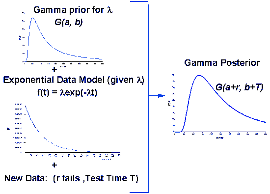
This section introduces the terminology and models that will be used to describe and quantify product reliability. The terminology, probability distributions and models used for reliability analysis differ in many cases from those used in other statistical applications.
8.1.1 Why is the assessment and control of product reliability important?
We depend on, demand, and expect reliable products
In today’s technological world nearly everyone depends upon the continued functioning of a wide array of complex machinery and equipment for their everyday health, safety, mobility and economic welfare. We expect our cars, computers, electrical appliances, lights, televisions, etc. to function whenever we need them - day after day, year after year. When they fail the results can be catastrophic: injury, loss of life and/or costly lawsuits can occur. More often, repeated failure leads to annoyance, inconvenience and a lasting customer dissatisfaction that can play havoc with the responsible company’s marketplace position.
Shipping unreliable products can destroy a company’s reputation
It takes a long time for a company to build up a reputation for reliability, and only a short time to be branded as “unreliable” after shipping a flawed product. Continual assessment of new product reliability and ongoing control of the reliability of everything shipped are critical necessities in today’s competitive business arena.
8.1.1.1 Quality versus reliability
Reliability is “quality changing over time”
The everyday usage term “quality of a product” is loosely taken to mean its inherent degree of excellence. In industry, this is made more precise by defining quality to be “conformance to requirements at the start of use”. Assuming the product specifications adequately capture customer requirements, the quality level can now be precisely measured by the fraction of units shipped that meet specifications.
A motion picture instead of a snapshot
But how many of these units still meet specifications after a week of operation? Or after a month, or at the end of a one year warranty period? That is where “reliability” comes in. Quality is a snapshot at the start of life and reliability is a motion picture of the day-by-day operation. Time zero defects are manufacturing mistakes that escaped final test. The additional defects that appear over time are “reliability defects” or reliability fallout.
Life distributions model fraction fallout over time
The quality level might be described by a single fraction defective. To describe reliability fallout a probability model that describes the fraction fallout over time is needed. This is known as the life distribution model.
8.1.1.2 Competitive driving factors
Reliability is a major economic factor in determining a product’s success
Accurate prediction and control of reliability plays an important role in the profitability of a product. Service costs for products within the warranty period or under a service contract are a major expense and a significant pricing factor. Proper spare part stocking and support personnel hiring and training also depend upon good reliability fallout predictions. On the other hand, missing reliability targets may invoke contractual penalties and cost future business.
Companies that can economically design and market products that meet their customers’ reliability expectations have a strong competitive advantage in today’s marketplace.
8.1.1.3 Safety and health considerations
Some failures have serious social consequences and this should be taken into account when planning reliability studies
Sometimes equipment failure can have a major impact on human safety and/or health. Automobiles, planes, life support equipment, and power generating plants are a few examples.
From the point of view of “assessing product reliability”, we treat these kinds of catastrophic failures no differently from the failure that occurs when a key parameter measured on a manufacturing tool drifts slightly out of specification, calling for an unscheduled maintenance action.
It is up to the reliability engineer (and the relevant customer) to define what constitutes a failure in any reliability study. More resource (test time and test units) should be planned for when an incorrect reliability assessment could negatively impact safety and/or health.
8.1.2 What are the basic terms and models used for reliability evaluation?
Reliability methods and terminology began with 19th century insurance companies
Reliability theory developed apart from the mainstream of probability and statistics, and was used primarily as a tool to help nineteenth century maritime and life insurance companies compute profitable rates to charge their customers. Even today, the terms “failure rate” and “hazard rate” are often used interchangeably.
The following sections will define some of the concepts, terms, and models we need to describe, estimate and predict reliability.
8.1.2.1 Repairable systems, non-repairable populations and lifetime distribution models
Life distribution models describe how non-repairable populations fail over time
A repairable system is one which can be restored to satisfactory operation by any action, including parts replacements or changes to adjustable settings. When discussing the rate at which failures occur during system operation time (and are then repaired) we will define a Rate of Occurrence of Failure (ROCF) or “repair rate”. It would be incorrect to talk about failure rates or hazard rates for repairable systems, as these terms apply only to the first failure times for a population of non repairable components.
A non-repairable population is one for which individual items that fail are removed permanently from the population. While the system may be repaired by replacing failed units from either a similar or a different population, the members of the original population dwindle over time until all have eventually failed.
We begin with models and definitions for non-repairable populations. Repair rates for repairable populations will be defined in a later section.
The theoretical population models used to describe unit lifetimes are known as Lifetime Distribution Models. The population is generally considered to be all of the possible unit lifetimes for all of the units that could be manufactured based on a particular design and choice of materials and manufacturing process. A random sample of size \(n\) from this population is the collection of failure times observed for a randomly selected group of \(n\) units.
Any continuous PDF defined only for non-negative values can be a lifetime distribution model
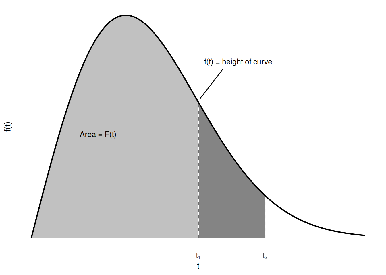
A lifetime distribution model can be any probability density function (or PDF) \(f(t)\) defined over the range of time from \(t = 0, \, \ldots, \, \infty\). The corresponding cumulative distribution function (or CDF) \(F(t)\) is a very useful function, as it gives the probability that a randomly selected unit will fail by time \(t\). The figure below shows the relationship between \(f(t)\) and \(F(t)\) and gives three descriptions of \(F(t)\).
Code
library(tidyverse)t_seq <-seq(0, 10, length.out =400)pdf_vals <-dweibull(t_seq, shape =2, scale =4)t1 <-5t2 <-7df <-tibble(t = t_seq, f = pdf_vals)ggplot(df, aes(t, f)) +geom_area(data = df |>filter(t <= t1), aes(t, f), fill ="grey40", alpha =0.4) +geom_area(data = df |>filter(t >= t1, t <= t2), aes(t, f), fill ="grey20", alpha =0.6) +geom_line(linewidth =0.8) +annotate("text", x =2, y =0.1, label ="Area = F(t)", size =3.5) +annotate("text", x =6.2, y =0.17, label ="f(t) = height of curve", size =3.5) +annotate("segment", x =5.75, xend = t1 +0.05, y =0.163, yend =dweibull(t1, 2, 4) +0.003) +annotate("segment", x = t1, xend = t1, y =0, yend =dweibull(t1, 2, 4), linetype ="dashed") +annotate("segment", x = t2, xend = t2, y =0, yend =dweibull(t2, 2, 4), linetype ="dashed") +scale_x_continuous(breaks =c(t1, t2), labels =c(expression(t[1]), expression(t[2]))) +labs(x ="t", y ="f(t)") +theme_minimal() +theme(axis.text.y =element_blank(), panel.grid =element_blank())
Figure 8.1: The relationship between the PDF f(t) and the CDF F(t)
\(F(t)\) = the area under the PDF \(f(t)\) to the left of \(t\).
\(F(t)\) = the probability that a single randomly chosen new unit will fail by time \(t\).
\(F(t)\) = the proportion of the entire population that fails by time \(t\).
The figure above also shows a shaded area under \(f(t)\) between the two times \(t_1\) and \(t_2\). This area is \([F(t_2) - F(t_1)]\) and represents the proportion of the population that fails between times \(t_1\) and \(t_2\) (or the probability that a brand new randomly chosen unit will survive to time \(t_1\) but fail before time \(t_2\)).
Note that the PDF \(f(t)\) has only non-negative values and eventually either becomes 0 as \(t\) increases, or decreases towards 0. The CDF \(F(t)\) is monotonically increasing and goes from 0 to 1 as \(t\) approaches infinity. In other words, the total area under the curve is always 1.
The Weibull model is a good example of a life distribution
The 2-parameter Weibull distribution is an example of a popular \(F(t)\). It has the CDF and PDF equations given by:
where \(\gamma\) is the “shape” parameter and \(\alpha\) is a “scale” parameter called the characteristic life.
Example: A company produces automotive fuel pumps that fail according to a Weibull life distribution model with shape parameter \(\gamma\) = 1.5 and scale parameter 8,000 (time measured in use hours). If a typical pump is used 800 hours a year, what proportion are likely to fail within 5 years?
Solution: The probability associated with the 800*5 quantile of a Weibull distribution with \(\gamma\) = 1.5 and \(\alpha\) = 8000 is 0.298. Thus about 30% of the pumps will fail in the first 5 years.
Code
pweibull(800*5, shape =1.5, scale =8000)
[1] 0.2978115
Functions for computing PDF values and CDF values are available in R via dweibull() and pweibull().
8.1.2.2 Reliability or survival function
Survival is the complementary event to failure
The Reliability Function\(R(t)\), also known as the Survival Function\(S(t)\), is defined by
\[ R(t) = S(t) = \mbox{the probability a unit survives beyond time } t \, . \]
Since a unit either fails, or survives, and one of these two mutually exclusive alternatives must occur, we have
Calculations using \(R(t)\) often occur when building up from single components to subsystems with many components. For example, if one microprocessor comes from a population with reliability function \(R_m(t)\) and two of them are used for the CPU in a system, then the system CPU has a reliability function given by
\[ R_{cpu}(t) = R_m^2(t) \, , \]
The reliability of the system is the product of the reliability functions of the components
since both must survive in order for the system to survive. This building up to the system from the individual components will be discussed in detail when we look at the “Bottom-Up” method. The general rule is: to calculate the reliability of a system of independent components, multiply the reliability functions of all the components together.
8.1.2.3 Failure (or hazard) rate
The failure rate is the rate at which the population survivors at any given instant are “falling over the cliff”
The failure rate is defined for non repairable populations as the (instantaneous) rate of failure for the survivors to time \(t\) during the next instant of time. It is a rate per unit of time similar in meaning to reading a car speedometer at a particular instant and seeing 45 mph. The next instant the failure rate may change and the units that have already failed play no further role since only the survivors count.
The failure rate (or hazard rate) is denoted by \(h(t)\) and is calculated from
The failure rate is sometimes called a “conditional failure rate” since the denominator \(1 - F(t)\) (i.e., the population survivors) converts the expression into a conditional rate, given survival past time \(t\).
Since \(h(t)\) is also equal to the negative of the derivative of \(\mbox{ln}[R(t)]\), we have the useful identity:
be the Cumulative Hazard Function, we then have \(F(t) = 1 - e^{-H(t)}\). Two other useful identities that follow from these formulas are:
\[ h(t) = - \frac{d \mbox{ln} R(t)}{dt} \]
\[ H(t) = - \mbox{ln} R(t) \,\, . \]
It is also sometimes useful to define an average failure rate over any interval \((T_1, T_2)\) that “averages” the failure rate over that interval. This rate, denoted by \(AFR(T_1, T_2)\), is a single number that can be used as a specification or target for the population failure rate over that interval. If \(T_1\) is 0, it is dropped from the expression. Thus, for example, \(AFR(40,000)\) would be the average failure rate for the population over the first 40,000 hours of operation.
A plot of the failure rate over time for most products yields a curve that looks like a drawing of a bathtub
If enough units from a given population are observed operating and failing over time, it is relatively easy to compute week-by-week (or month-by-month) estimates of the failure rate \(h(t)\). For example, if \(N_{12}\) units survive to start the 13th month of life and \(r_{13}\) of them fail during the next month (or 720 hours) of life, then a simple empirical estimate of \(h(t)\) averaged across the 13th month of life (or between 8640 hours and 9360 hours of age), is given by \((r_{13} / N_{12} \cdot 720)\). Similar estimates are discussed in detail in the section on Empirical Model Fitting.
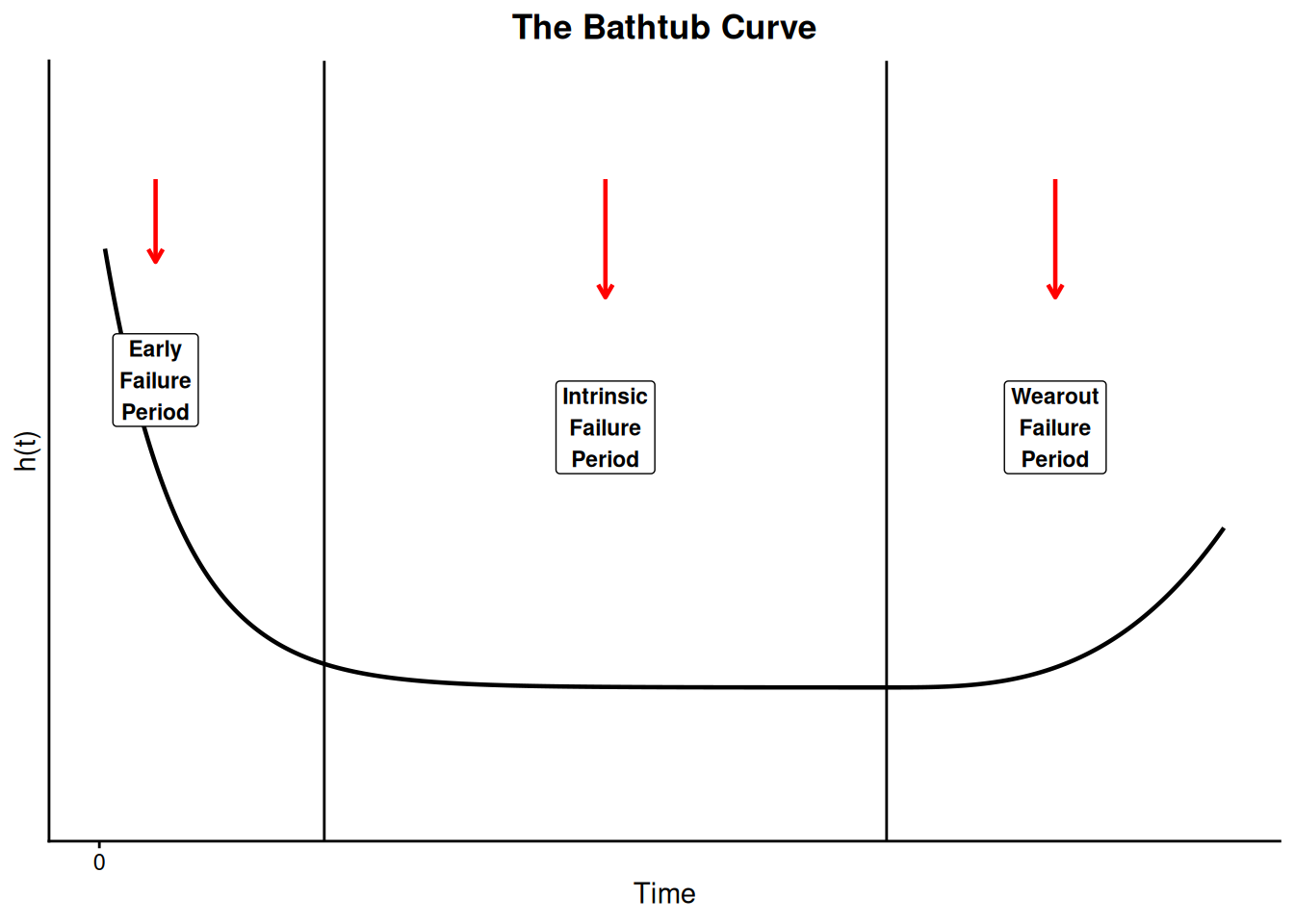
Over many years, and across a wide variety of mechanical and electronic components and systems, people have calculated empirical population failure rates as units age over time and repeatedly obtained a graph such as shown below. Because of the shape of this failure rate curve, it has become widely known as the “Bathtub” curve.
The initial region that begins at time zero when a customer first begins to use the product is characterized by a high but rapidly decreasing failure rate. This region is known as the Early Failure Period (also referred to as Infant Mortality Period, from the actuarial origins of the first bathtub curve plots). This decreasing failure rate typically lasts several weeks to a few months.
Next, the failure rate levels off and remains roughly constant for (hopefully) the majority of the useful life of the product. This long period of a level failure rate is known as the Intrinsic Failure Period (also called the Stable Failure Period) and the constant failure rate level is called the Intrinsic Failure Rate. Note that most systems spend most of their lifetimes operating in this flat portion of the bathtub curve.
Finally, if units from the population remain in use long enough, the failure rate begins to increase as materials wear out and degradation failures occur at an ever increasing rate. This is the Wearout Failure Period.
Repair Rate models are based on counting the cumulative number of failures over time
A different approach is used for modeling the rate of occurrence of failure incidences for a repairable system. In this chapter, these rates are called repair rates (not to be confused with the length of time for a repair, which is not discussed in this chapter). Time is measured by system power-on-hours from initial turn-on at time zero, to the end of system life. Failures occur as given system ages and the system is repaired to a state that may be the same as new, or better, or worse. The frequency of repairs may be increasing, decreasing, or staying at a roughly constant rate.
Let \(N(t)\) be a counting function that keeps track of the cumulative number of failures a given system has had from time zero to time \(t\). \(N(t)\) is a step function that jumps up one every time a failure occurs and stays at the new level until the next failure.
Every system will have its own observed \(N(t)\) function over time. If we observed the \(N(t)\) curves for a large number of similar systems and “averaged” these curves, we would have an estimate of \(M(t)\) = the expected number (average number) of cumulative failures by time \(t\) for these systems.
The Repair Rate (or ROCOF) is the mean rate of failures per unit time
The derivative of \(M(t)\), denoted \(m(t)\), is defined to be the Repair Rate or the Rate Of Occurrence Of Failures at Time \(t\), or ROCOF.
Models for \(N(t)\), \(M(t)\), and \(m(t)\) will be described in the section on Repair Rate Models.
8.1.3 What are some common difficulties with reliability data and how are they overcome?
The Paradox of Reliability Analysis: The more reliable a product is, the harder it is to get the failure data needed to “prove” it is reliable!
There are two closely related problems that are typical with reliability data and not common with most other forms of statistical data. These are:
Censoring (when the observation period ends, not all units have failed - some are survivors)
Lack of Failures (if there is too much censoring, even though a large number of units may be under observation, the information in the data is limited due to the lack of actual failures)
These problems cause considerable practical difficulty when planning reliability assessment tests and analyzing failure data. Some solutions are discussed in the next two sections. Typically, the solutions involve making additional assumptions and using complicated models.
8.1.3.1 Censoring
When not all units on test fail we have censored data
Consider a situation in which we are reliability testing \(n\) (non-repairable) units taken randomly from a population. We are investigating the population to determine if its failure rate is acceptable. In the typical test scenario, we have a fixed time \(T\) to run the units to see if they survive or fail. The data obtained are called Censored Type I data.
Censored Type I Data
During the \(T\) hours of test we observe \(r\) failures (where \(r\) can be any number from 0 to \(n\)). The (exact) failure times are \(t_1, \, t_2, \, \ldots, \, t_r\), and there are \((n - r)\) units that survived the entire \(T\)-hour test without failing. Note that \(T\) is fixed in advance and \(r\) is random, since we don’t know how many failures will occur until the test is run. Note also that we assume the exact times of failure are recorded when there are failures.
This type of censoring is also called “right censored” data since the times of failure to the right (i.e., larger than \(T\)) are missing.
Another (much less common) way to test is to decide in advance that you want to see exactly \(r\) failure times and then test until they occur. For example, you might put 100 units on test and decide you want to see at least half of them fail. Then \(r = 50\), but \(T\) is unknown until the 50th failure occurs. This is called Censored Type II data.
Censored Type II Data
We observe \(t_1, \, t_2, \, \ldots, \, t_r\), where \(r\) is specified in advance. The test ends at time \(T = t_r\), and \((n - r)\) units have survived. Again we assume it is possible to observe the exact time of failure for failed units.
Type II censoring has the significant advantage that you know in advance how many failure times your test will yield - this helps enormously when planning adequate tests. However, an open-ended random test time is generally impractical from a management point of view and this type of testing is rarely seen.
Sometimes we don’t even know the exact time of failure
Readout or Interval Data
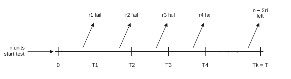
Sometimes exact times of failure are not known; only an interval of time in which the failure occurred is recorded. This kind of data is called Readout or Interval data and the situation is shown in the figure below:
Figure 8.3: Reliability testing timeline with interval (readout) data: n units start test at time 0, with r1, r2, r3, r4, … failures observed at readout times T1, T2, T3, T4, …, and the remaining n - sum(ri) units left at the final readout time Tk = T
Multicensored Data
In the most general case, every unit observed yields exactly one of the following three types of information:
a run-time if the unit did not fail while under observation
an exact failure time
an interval of time during which the unit failed.
The units may all have different run-times and/or readout intervals.
Many special methods have been developed to handle censored data
Note that when a data set consists of failure times that can be sorted into several different failure modes, it is possible (and often necessary) to analyze and model each mode separately. Consider all failures due to modes other than the one being analyzed as censoring times, with the censored run-time equal to the time it failed due to the different (independent) failure mode. This is discussed further in the competing risk section and later analysis sections.
8.1.3.2 Lack of failures
Failure data is needed to accurately assess and improve reliability - this poses problems when testing highly reliable parts
When fitting models and estimating failure rates from reliability data, the precision of the estimates (as measured by the width of the confidence intervals) tends to vary inversely with the square root of the number of failures observed - not the number of units on test or the length of the test. In other words, a test where 5 fail out of a total of 10 on test gives more information than a test with 1000 units but only 2 failures.
Since the number of failures \(r\) is critical, and not the sample size \(n\) on test, it becomes increasingly difficult to assess the failure rates of highly reliable components. Parts like memory chips, that in typical use have failure rates measured in parts per million per thousand hours, will have few or no failures when tested for reasonable time periods with affordable sample sizes. This gives little or no information for accomplishing the two primary purposes of reliability testing, namely:
accurately assessing population failure rates
obtaining failure mode information to feedback for product improvement.
Testing at much higher than typical stresses can yield failures but models are then needed to relate these back to use stress
How can tests be designed to overcome an expected lack of failures?
The answer is to make failures occur by testing at much higher stresses than the units would normally see in their intended application. This creates a new problem: how can these failures at higher-than-normal stresses be related to what would be expected to happen over the course of many years at normal use stresses? The models that relate high stress reliability to normal use reliability are called acceleration models.
8.1.4 What is “physical acceleration” and how do we model it?
When changing stress is equivalent to multiplying time to fail by a constant, we have true (physical) acceleration
Physical Acceleration (sometimes called True Acceleration or just Acceleration) means that operating a unit at high stress (i.e., higher temperature or voltage or humidity or duty cycle, etc.) produces the same failures that would occur at typical-use stresses, except that they happen much quicker.
Failure may be due to mechanical fatigue, corrosion, chemical reaction, diffusion, migration, etc. These are the same causes of failure under normal stress; the time scale is simply different.
An Acceleration Factor is the constant multiplier between the two stress levels
When there is true acceleration, changing stress is equivalent to transforming the time scale used to record when failures occur. The transformations commonly used are linear, which means that time-to-fail at high stress just has to be multiplied by a constant (the acceleration factor) to obtain the equivalent time-to-fail at use stress.
We use the following notation:
At stress
At use
\(t_s\) = time-to-fail at stress
\(t_u\) = corresponding time-to-fail at use
\(F_s(t)\) = CDF at stress
\(F_u(t)\) = CDF at use
\(f_s(t)\) = PDF at stress
\(f_u(t)\) = PDF at use
\(h_s(t)\) = failure rate at stress
\(h_u(t)\) = failure rate at use
Then, an acceleration factor \(AF\) between stress and use means the following relationships hold:
Table 8.1: Linear Acceleration Relationships
Time-to-Fail
\(t_u = AF \times t_s\)
Failure Probability
\(F_u(t) = F_s(t/AF)\)
Reliability
\(R_u(t) = R_s(t/AF)\)
PDF or Density Function
\(f_u(t) = (1/AF) f_s(t/AF)\)
Failure Rate
\(h_u(t) = (1/AF) h_s(t/AF)\)
Each failure mode has its own acceleration factor
Failure data should be separated by failure mode when analyzed, if acceleration is relevant
Probability plots of data from different stress cells have the same slope (if there is acceleration)
Note: Acceleration requires that there be a stress dependent physical process causing change or degradation that leads to failure. In general, different failure modes will be affected differently by stress and have different acceleration factors. Therefore, it is unlikely that a single acceleration factor will apply to more than one failure mechanism. Separate out different types of failure when analyzing failure data.
Also, a consequence of the linear acceleration relationships shown above (which follows directly from “true acceleration”) is the following:
The Shape Parameter for the key life distribution models (Weibull, Lognormal) does not change for units operating under different stresses. Probability plots of data from different stress cells will line up roughly parallel.
Acceleration models predict time to fail as a function of stress
Acceleration factors show how time-to-fail at a particular operating stress level (for one failure mode or mechanism) can be used to predict the equivalent time to fail at a different operating stress level.
A model that predicts time-to-fail as a function of stress would be even better than a collection of acceleration factors. If we write \(t_f = G(S)\), with \(G(S)\) denoting the model equation for an arbitrary stress level \(S\), then the acceleration factor between two stress levels \(S_1\) and \(S_2\) can be evaluated simply by \(AF = G(S_1) / G(S_2)\). Now we can test at the higher stress \(S_2\), obtain a sufficient number of failures to fit life distribution models and evaluate failure rates, and use the Linear Acceleration Relationships Table to predict what will occur at the lower use stress \(S_1\).
A model that predicts time-to-fail as a function of operating stresses is known as an acceleration model.
Acceleration models are often derived from physics or kinetics models related to the failure mechanism
Acceleration models are usually based on the physics or chemistry underlying a particular failure mechanism. Successful empirical models often turn out to be approximations of complicated physics or kinetics models, when the theory of the failure mechanism is better understood. The following sections will consider a variety of powerful and useful models:
The Arrhenius model predicts failure acceleration due to temperature increase
One of the earliest and most successful acceleration models predicts how time-to-fail varies with temperature. This empirically based model is known as the Arrhenius equation. It takes the form
with \(T\) denoting temperature measured in degrees Kelvin (273.16 + degrees Celsius) at the point when the failure process takes place and \(k\) is Boltzmann’s constant (8.617e-5 in ev/K). The constant \(A\) is a scaling factor that drops out when calculating acceleration factors, with \(\Delta H\) (pronounced “Delta H”) denoting the activation energy, which is the critical parameter in the model.
The Arrhenius activation energy, \(\Delta H\), is all you need to know to calculate temperature acceleration
The value of \(\Delta H\) depends on the failure mechanism and the materials involved, and typically ranges from 0.3 or 0.4 up to 1.5, or even higher. Acceleration factors between two temperatures increase exponentially as \(\Delta H\) increases.
The acceleration factor between a higher temperature \(T_2\) and a lower temperature \(T_1\) is given by
The Arrhenius model has been used successfully for failure mechanisms that depend on chemical reactions, diffusion processes or migration processes. This covers many of the non-mechanical (or non-material fatigue) failure modes that cause electronic equipment failure.
8.1.5.2 Eyring
The Eyring model has a theoretical basis in chemistry and quantum mechanics and can be used to model acceleration when many stresses are involved
Henry Eyring’s contributions to chemical reaction rate theory have led to a very general and powerful model for acceleration known as the Eyring Model. This model has several key features:
It has a theoretical basis from chemistry and quantum mechanics.
If a chemical process (chemical reaction, diffusion, corrosion, migration, etc.) is causing degradation leading to failure, the Eyring model describes how the rate of degradation varies with stress or, equivalently, how time to failure varies with stress.
The model includes temperature and can be expanded to include other relevant stresses.
The temperature term by itself is very similar to the Arrhenius empirical model, explaining why that model has been so successful in establishing the connection between the \(\Delta H\) parameter and the quantum theory concept of “activation energy needed to cross an energy barrier and initiate a reaction”.
The model for temperature and one additional stress takes the general form:
for which \(S_1\) could be some function of voltage or current or any other relevant stress and the parameters \(\alpha, \Delta H, B,\) and \(C\) determine acceleration between stress combinations. As with the Arrhenius Model, \(k\) is Boltzmann’s constant and temperature is in degrees Kelvin.
If we want to add an additional non-thermal stress term, the model becomes
and as many stresses as are relevant can be included by adding similar terms.
Models with multiple stresses generally have no interaction terms - which means you can multiply acceleration factors due to different stresses
Note that the general Eyring model includes terms that have stress and temperature interactions (in other words, the effect of changing temperature varies, depending on the levels of other stresses). Most models in actual use do not include any interaction terms, so that the relative change in acceleration factors when only one stress changes does not depend on the level of the other stresses.
In models with no interaction, you can compute acceleration factors for each stress and multiply them together. This would not be true if the physical mechanism required interaction terms - but, at least to first approximations, it seems to work for most examples in the literature.
The Eyring model can also be used to model rate of degradation leading to failure as a function of stress
Advantages of the Eyring Model
Can handle many stresses.
Can be used to model degradation data as well as failure data.
The \(\Delta H\) parameter has a physical meaning and has been studied and estimated for many well known failure mechanisms and materials.
In practice, the Eyring Model is usually too complicated to use in its most general form and must be “customized” or simplified for any particular failure mechanism
Disadvantages of the Eyring Model
Even with just two stresses, there are 5 parameters to estimate. Each additional stress adds 2 more unknown parameters.
Many of the parameters may have only a second-order effect. For example, setting \(\alpha\) = 0 works quite well since the temperature term then becomes the same as in the Arrhenius model. Also, the constants \(C\) and \(E\) are only needed if there is a significant temperature interaction effect with respect to the other stresses.
The form in which the other stresses appear is not specified by the general model and may vary according to the particular failure mechanism. In other words, \(S_1\) may be voltage or ln (voltage) or some other function of voltage.
Many well-known models are simplified versions of the Eyring model with appropriate functions of relevant stresses chosen for \(S_1\) and \(S_2\). Some of these will be shown in the Other Models section. The trick is to find the right simplification to use for a particular failure mechanism.
8.1.5.3 Other models
Many useful 1, 2 and 3 stress models are simple Eyring models. Six are described
This section will discuss several acceleration models whose successful use has been described in the literature.
Again, these are just simplified two stress Eyring models with the appropriate choice of constants and functions of voltage.
The Electromigration Model
Electromigration is a semiconductor failure mechanism where open failures occur in metal thin film conductors due to the movement of ions toward the anode. This ionic movement is accelerated high temperatures and high current density. The (modified Eyring) model takes the form
with \(J\) denoting the current density. \(\Delta H\) is typically between 0.5 and 1.2 electron volts, while an \(n\) around 2 is common.
Three-Stress Models (Temperature, Voltage and Humidity)
Humidity plays an important role in many failure mechanisms that depend on corrosion or ionic movement. A common 3-stress model takes the form
\[ t_f = A \cdot \mbox{exp} \left( \frac{\Delta H}{kT} \right) \cdot V^{-\beta} \cdot R H^{-\gamma} \,\, . \]
Here \(RH\) is percent relative humidity. Other obvious variations on this model would be to use an exponential voltage term and/or an exponential \(RH\) term.
Even this simplified Eyring 3-stress model has 4 unknown parameters and an extensive experimental setup would be required to fit the model and calculate acceleration factors.
The Coffin-Manson Model is a useful non-Eyring model for crack growth or material fatigue
The Coffin-Manson Mechanical Crack Growth Model
Models for mechanical failure, material fatigue or material deformation are not forms of the Eyring model. These models typically have terms relating to cycles of stress or frequency of use or change in temperatures. A model of this type known as the (modified) Coffin-Manson model has been used successfully to model crack growth in solder and other metals due to repeated temperature cycling as equipment is turned on and off. This model takes the form
\(\Delta T\) = the temperature range during a cycle
and \(G(T_{\mbox{max}})\) is an Arrhenius term evaluated at the maximum temperature reached in each cycle.
Typical values for the cycling frequency exponent \(\alpha\) and the temperature range exponent \(\beta\) are around -1/3 and 2, respectively (note that reducing the cycling frequency reduces the number of cycles to failure). The \(\Delta H\) activation energy term in \(G(T_{\mbox{max}})\) is around 1.25.
8.1.6 What are the basic lifetime distribution models used for non-repairable populations?
A handful of lifetime distribution models have enjoyed great practical success
There are a handful of parametric models that have successfully served as population models for failure times arising from a wide range of products and failure mechanisms. Sometimes there are probabilistic arguments based on the physics of the failure mode that tend to justify the choice of model. Other times the model is used solely because of its empirical success in fitting actual failure data.
All the key formulas for using the exponential model
Formulas and Plots
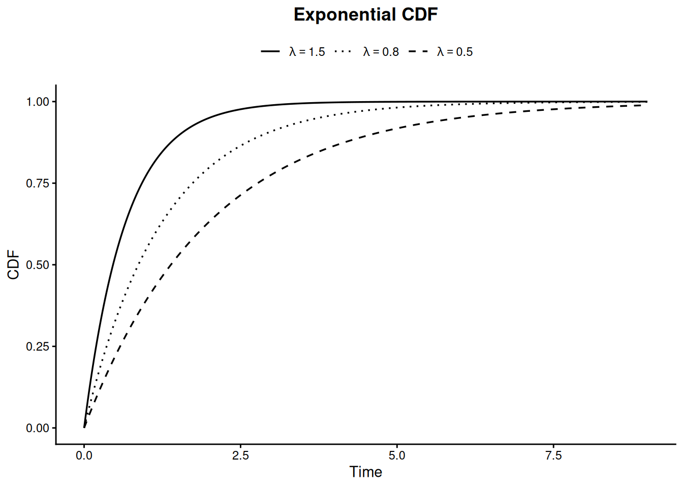
The exponential model, with only one unknown parameter, is the simplest of all life distribution models. The key equations for the exponential are shown below:
Note that the failure rate reduces to the constant \(\lambda\) for any time. The exponential distribution is the only distribution to have a constant failure rate. Also, another name for the exponential mean is the Mean Time To Fail or MTTF and we have MTTF = \(1/\lambda\).
The cumulative hazard function for the exponential is just the integral of the failure rate or \(H(t) = \lambda t\).
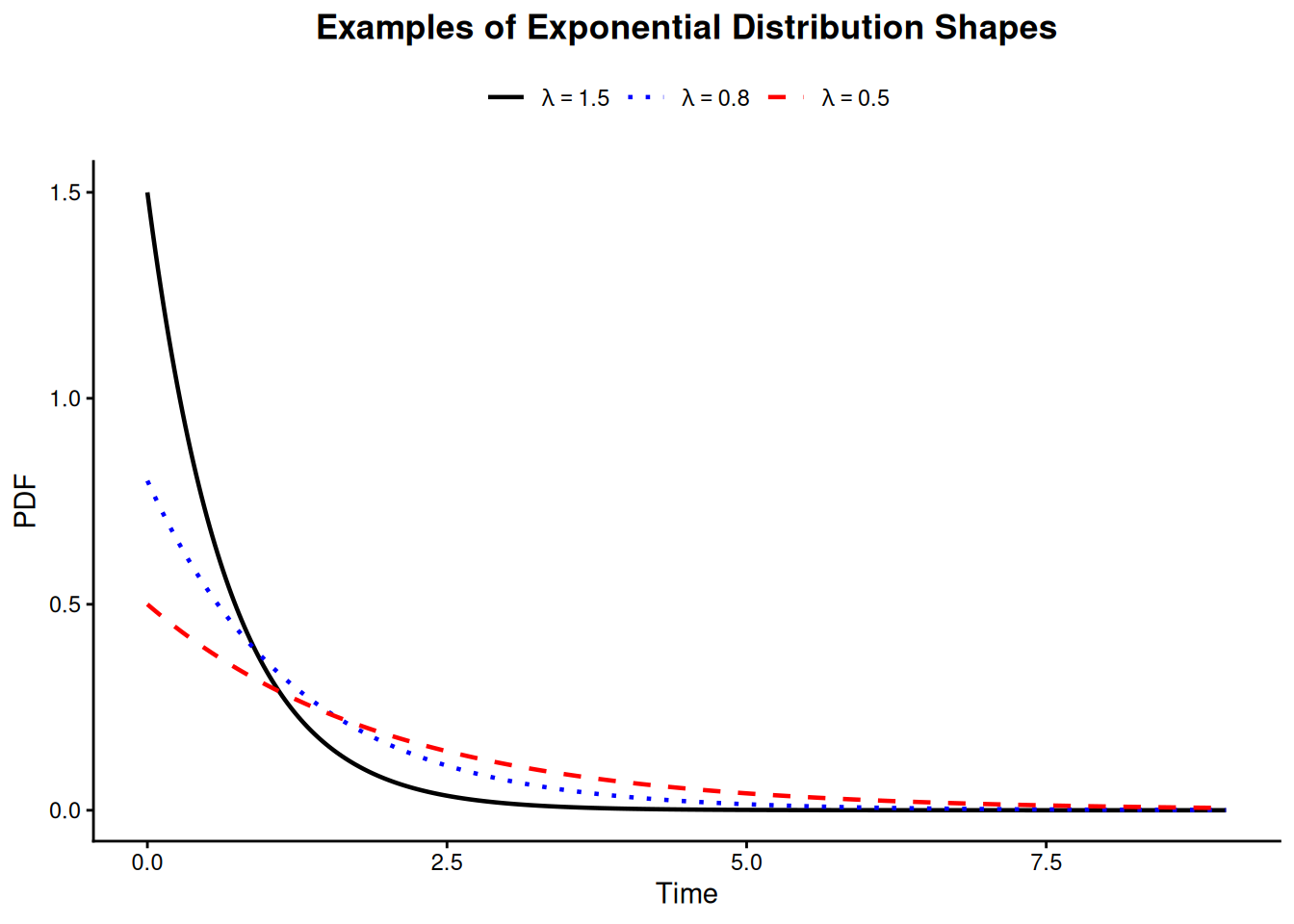
The PDF for the exponential has the familiar shape shown below.
The Exponential distribution “shape”
Code
library(tidyverse)t_seq <-seq(0, 9, length.out =400)lambda_levels <-c("lambda == 1.5", "lambda == 0.8", "lambda == 0.5")pdf_df <-bind_rows(tibble(t = t_seq, pdf =dexp(t_seq, 1.5), lambda ="lambda == 1.5"),tibble(t = t_seq, pdf =dexp(t_seq, 0.8), lambda ="lambda == 0.8"),tibble(t = t_seq, pdf =dexp(t_seq, 0.5), lambda ="lambda == 0.5")) |>mutate(lambda =factor(lambda, levels = lambda_levels))ggplot(pdf_df, aes(t, pdf, color = lambda, linetype = lambda)) +geom_line(linewidth =0.8) +scale_color_manual(values =c("black", "blue", "red"), labels = scales::label_parse()) +scale_linetype_manual(values =c("solid", "dotted", "dashed"), labels = scales::label_parse()) +labs(title ="Examples of Exponential Distribution Shapes", x ="Time", y ="PDF", color =NULL, linetype =NULL) +theme_classic() +theme(plot.title =element_text(hjust =0.5, face ="bold"), legend.position ="top")
Figure 8.4: Examples of exponential distribution shapes
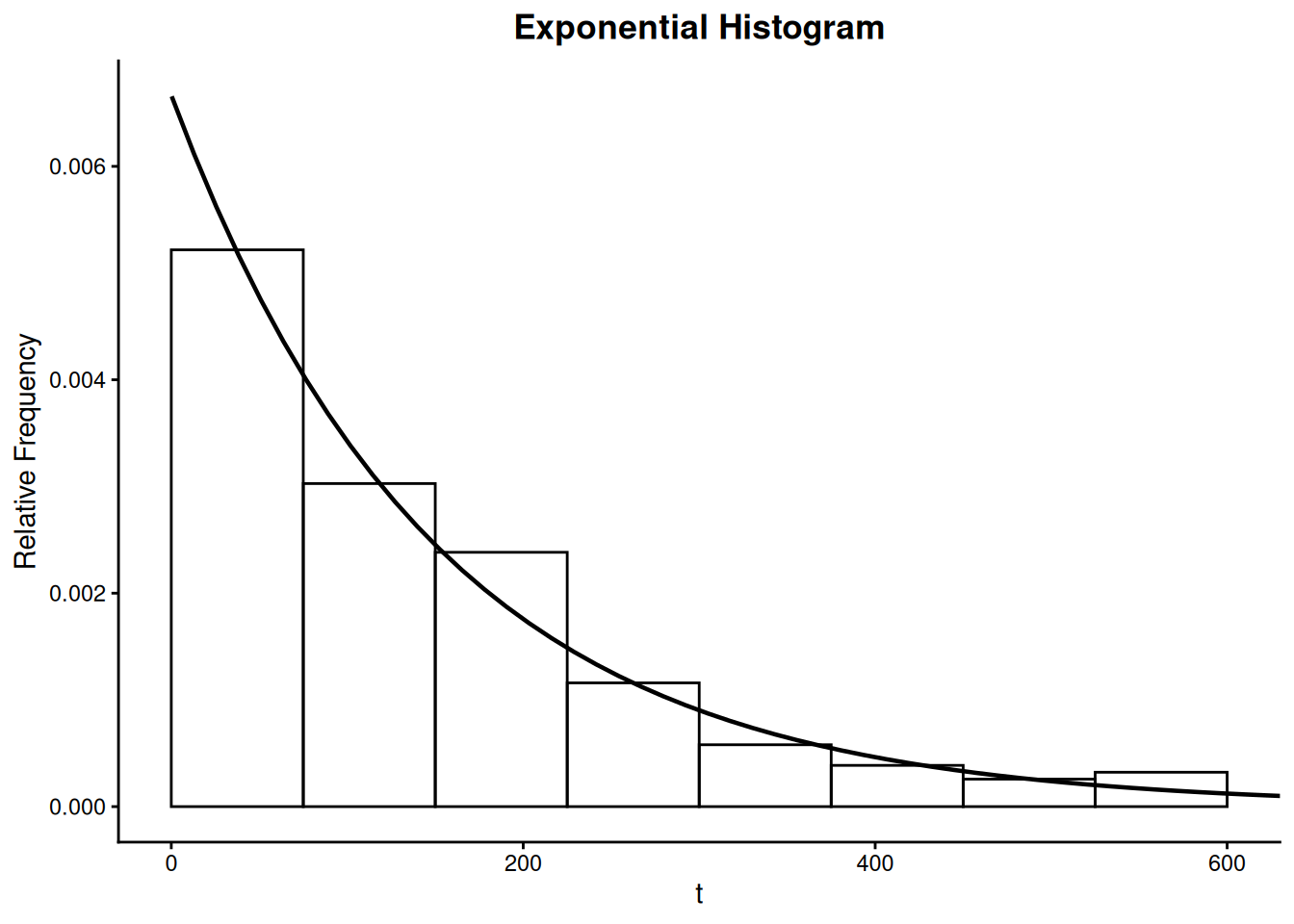
Below is an example of typical exponential lifetime data displayed in Histogram form with corresponding exponential PDF drawn through the histogram.
Histogram of Exponential Data
Code
set.seed(42)hist_data <-tibble(x =rexp(214, 1/150))ggplot(hist_data, aes(x)) +geom_histogram(aes(y =after_stat(density)), breaks =seq(0, 600, by =75), fill =NA, color ="black") +stat_function(fun = dexp, args =list(rate =1/150), linewidth =0.8) +coord_cartesian(xlim =c(0, 600)) +labs(title ="Exponential Histogram", x =expression(t), y ="Relative Frequency") +theme_classic() +theme(plot.title =element_text(hjust =0.5, face ="bold"))
Figure 8.6: Exponential histogram with overlaid PDF
Uses of the Exponential Distribution Model
Because of its constant failure rate property, the exponential distribution is an excellent model for the long flat “intrinsic failure” portion of the Bathtub Curve. Since most components and systems spend most of their lifetimes in this portion of the Bathtub Curve, this justifies frequent use of the exponential distribution (when early failures or wear out is not a concern).
Just as it is often useful to approximate a curve by piecewise straight line segments, we can approximate any failure rate curve by week-by-week or month-by-month constant rates that are the average of the actual changing rate during the respective time durations. That way we can approximate any model by piecewise exponential distribution segments patched together.
Some natural phenomena have a constant failure rate (or occurrence rate) property; for example, the arrival rate of cosmic ray alpha particles or Geiger counter tics. The exponential model works well for inter arrival times (while the Poisson distribution describes the total number of events in a given period). When these events trigger failures, the exponential life distribution model will naturally apply.
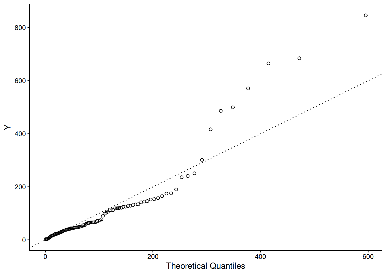
Exponential probability plot
We can generate a probability plot of normalized exponential data, so that a perfect exponential fit is a diagonal line with slope 1. The probability plot for 100 normalized random exponential observations (\(\lambda\) = 0.01) is shown below.
with \(\alpha\) the scale parameter (the Characteristic Life), \(\gamma\) (gamma) the Shape Parameter, and \(\Gamma\) is the Gamma function with \(\Gamma(N) = (N-1)!\) for integer \(N\).
The cumulative hazard function for the Weibull is the integral of the failure rate or
A more general three-parameter form of the Weibull includes an additional waiting time parameter \(\mu\) (sometimes called a shift or location parameter). The formulas for the 3-parameter Weibull are easily obtained from the above formulas by replacing \(t\) by \((t-\mu)\) wherever \(t\) appears. No failure can occur before \(\mu\) hours, so the time scale starts at \(\mu\), and not 0. If a shift parameter \(\mu\) is known (based, perhaps, on the physics of the failure mode), then all you have to do is subtract \(\mu\) from all the observed failure times and/or readout times and analyze the resulting shifted data with a two-parameter Weibull.
NOTE: Various texts and articles in the literature use a variety of different symbols for the same Weibull parameters. For example, the characteristic life is sometimes called \(c\) (\(\nu\) = nu or \(\eta\) = eta) and the shape parameter is also called \(m\) (or \(\beta\) = beta). To add to the confusion, some software uses \(\beta\) as the characteristic life parameter and \(\alpha\) as the shape parameter. Some authors even parameterize the density function differently, using a scale parameter \(\theta = \alpha^\gamma\).
Special Case: When \(\gamma\) = 1, the Weibull reduces to the Exponential Model, with \(\alpha = 1/\lambda\) = the mean time to fail (MTTF).
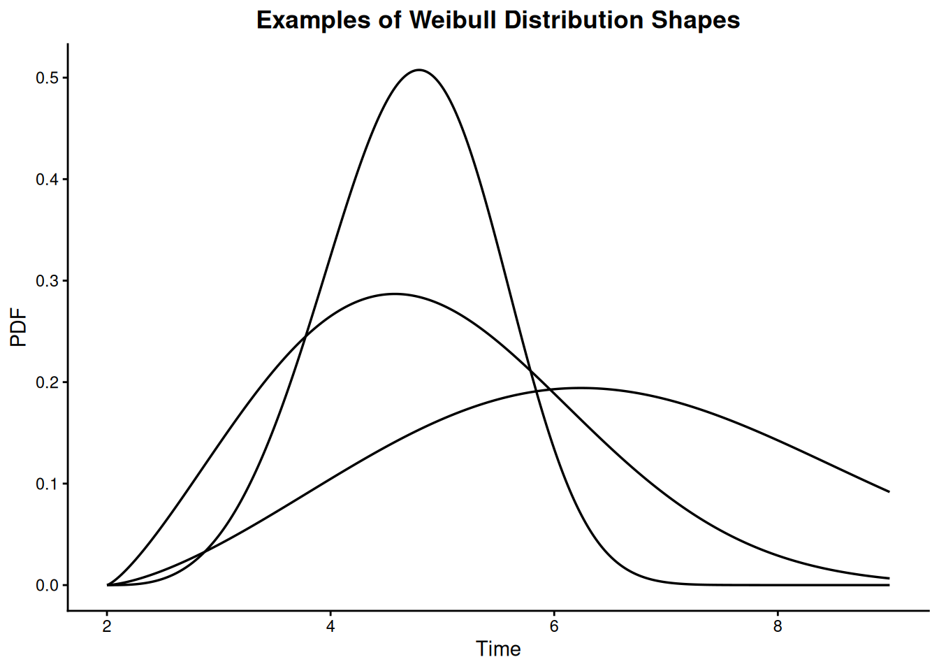
Depending on the value of the shape parameter \(\gamma\), the Weibull model can empirically fit a wide range of data histogram shapes. This is shown by the PDF example curves below.
Weibull data “shapes”
Code
library(tidyverse)mu <-2t_seq <-seq(mu, 9, length.out =400)shape_levels <-c("gamma == 4", "gamma == 2.3", "gamma == 2.5")pdf_df <-bind_rows(tibble(t = t_seq, pdf =dweibull(t_seq - mu, 4, 3), shape ="gamma == 4"),tibble(t = t_seq, pdf =dweibull(t_seq - mu, 2.3, 3.3), shape ="gamma == 2.3"),tibble(t = t_seq, pdf =dweibull(t_seq - mu, 2.5, 5.2), shape ="gamma == 2.5")) |>mutate(shape =factor(shape, levels = shape_levels))ggplot(pdf_df, aes(t, pdf, linetype = shape)) +geom_line(linewidth =0.6, color ="black") +scale_linetype_manual(values =c("solid", "solid", "solid"), guide ="none") +labs(title ="Examples of Weibull Distribution Shapes", x ="Time", y ="PDF") +theme_classic() +theme(plot.title =element_text(hjust =0.5, face ="bold"))
Figure 8.8: Examples of Weibull distribution shapes
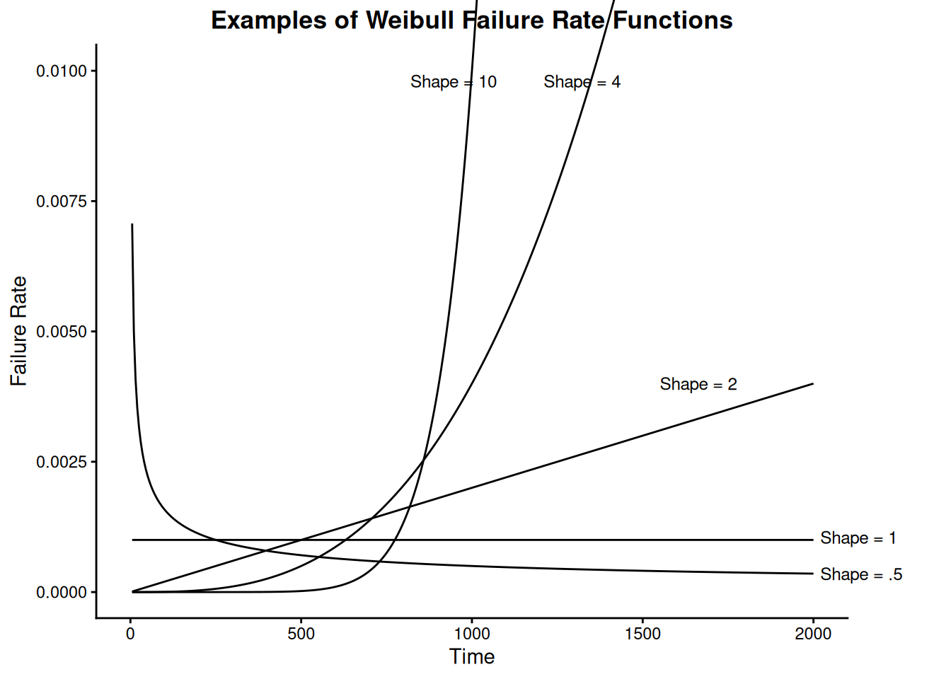
From a failure rate model viewpoint, the Weibull is a natural extension of the constant failure rate exponential model since the Weibull has a polynomial failure rate with exponent \(\{\gamma - 1\}\). This makes all the failure rate curves shown in the following plot possible.
Figure 8.9: Examples of Weibull failure rate functions
Uses of the Weibull Distribution Model
Because of its flexible shape and ability to model a wide range of failure rates, the Weibull has been used successfully in many applications as a purely empirical model.
The Weibull model can be derived theoretically as a form of Extreme Value Distribution, governing the time to occurrence of the “weakest link” of many competing failure processes. This may explain why it has been so successful in applications such as capacitor, ball bearing, relay and material strength failures.
Another special case of the Weibull occurs when the shape parameter is 2. The distribution is called the Rayleigh Distribution and it turns out to be the theoretical probability model for the magnitude of radial error when the \(x\) and \(y\) coordinate errors are independent normals with 0 mean and the same standard deviation.
Weibull probability plot
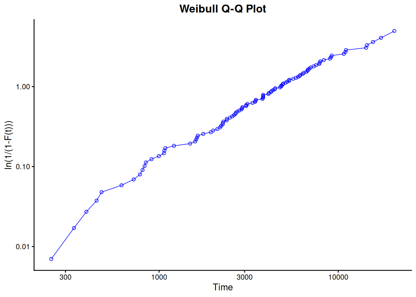
We generated 100 Weibull random variables using \(T\) = 1000, \(\gamma\) = 1.5 and \(\alpha\) = 5000. To see how well these random Weibull data points are actually fit by a Weibull distribution, we generated the probability plot shown below. Note the log scale used is base 10.
Code
set.seed(42)weibull_sample <-sort(rweibull(100, 1.5, 5000))p <-ppoints(length(weibull_sample), a =0.3)ggplot(tibble(time = weibull_sample, y =-log(1- p)), aes(time, y)) +geom_point(shape =1, color ="blue") +geom_line(color ="blue", linewidth =0.3) +scale_x_log10() +scale_y_log10() +labs(title ="Weibull Q-Q Plot", x ="Time", y ="ln(1/(1-F(t)))") +theme_classic() +theme(plot.title =element_text(hjust =0.5, face ="bold"))
Figure 8.10: Weibull Q-Q plot for 100 simulated Weibull random variables
If the data follow a Weibull distribution, the points should follow a straight line.
We can compute the PDF and CDF values for failure time \(T\) = 1000, using the example Weibull distribution with \(\gamma\) = 1.5 and \(\alpha\) = 5000. The PDF value is 0.000123 and the CDF value is 0.08556.
Functions for computing Weibull PDF values, CDF values, and for producing probability plots, are available in R via dweibull(), pweibull(), and rweibull().
8.1.6.3 Extreme value distributions
The Extreme Value Distribution usually refers to the distribution of the minimum of a large number of unbounded random observations
Description, Formulas, and Plots
We have already referred to Extreme Value Distributions when describing the uses of the Weibull distribution. Extreme value distributions are the limiting distributions for the minimum or the maximum of a very large collection of random observations from the same arbitrary distribution. Gumbel (1958) showed that for any well-behaved initial distribution (i.e., \(F(x)\) is continuous and has an inverse), only a few models are needed, depending on whether you are interested in the maximum or the minimum, and also if the observations are bounded above or below.
In the context of reliability modeling, extreme value distributions for the minimum are frequently encountered. For example, if a system consists of \(n\) identical components in series, and the system fails when the first of these components fails, then system failure times are the minimum of \(n\) random component failure times. Extreme value theory says that, independent of the choice of component model, the system model will approach a Weibull as \(n\) becomes large. The same reasoning can also be applied at a component level, if the component failure occurs when the first of many similar competing failure processes reaches a critical level.
The distribution often referred to as the Extreme Value Distribution (Type I) is the limiting distribution of the minimum of a large number of unbounded identically distributed random variables. The PDF and CDF are given by:
Extreme Value Distribution formulas and PDF shapes
If the \(x\) values are bounded below (as is the case with times of failure) then the limiting distribution is the Weibull. Formulas and uses of the Weibull have already been discussed.
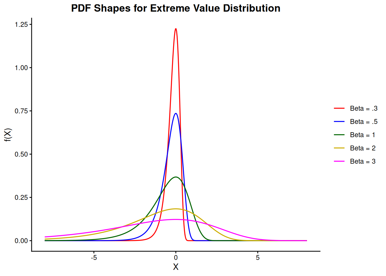
PDF Shapes for the (minimum) Extreme Value Distribution (Type I) are shown in the following figure.
Figure 8.11: PDF shapes for the extreme value distribution
The natural log of Weibull data is extreme value data
Uses of the Extreme Value Distribution Model
In any modeling application for which the variable of interest is the minimum of many random factors, all of which can take positive or negative values, try the extreme value distribution as a likely candidate model. For lifetime distribution modeling, since failure times are bounded below by zero, the Weibull distribution is a better choice.
The Weibull distribution and the extreme value distribution have a useful mathematical relationship. If \(t_1, \, t_2, \, \ldots, \, t_n\) are a sample of random times of fail from a Weibull distribution, then ln(\(t_1\)), ln(\(t_2\)), …, ln(\(t_n\)) are random observations from the extreme value distribution. In other words, the natural log of a Weibull random time is an extreme value random observation.
If the Weibull has the shape parameter \(\gamma\) and the characteristic life \(\alpha\), then the extreme value distribution (after taking natural logarithms) has \(\mu\) = ln(\(\alpha\)), \(\beta = \frac{1}{\gamma}\).
Because of this relationship, computer programs designed for the extreme value distribution can be used to analyze Weibull data. The situation exactly parallels using normal distribution programs to analyze lognormal data, after first taking natural logarithms of the data points.
Probability plot for the extreme value distribution
Assume \(\mu\) = ln (200,000) = 12.206 and \(\beta\) = 1/2 = 0.5. The extreme value distribution associated with these parameters could be obtained by taking natural logarithms of data from a Weibull population with characteristic life \(\alpha\) = 200,000 and shape \(\gamma\) = 2.
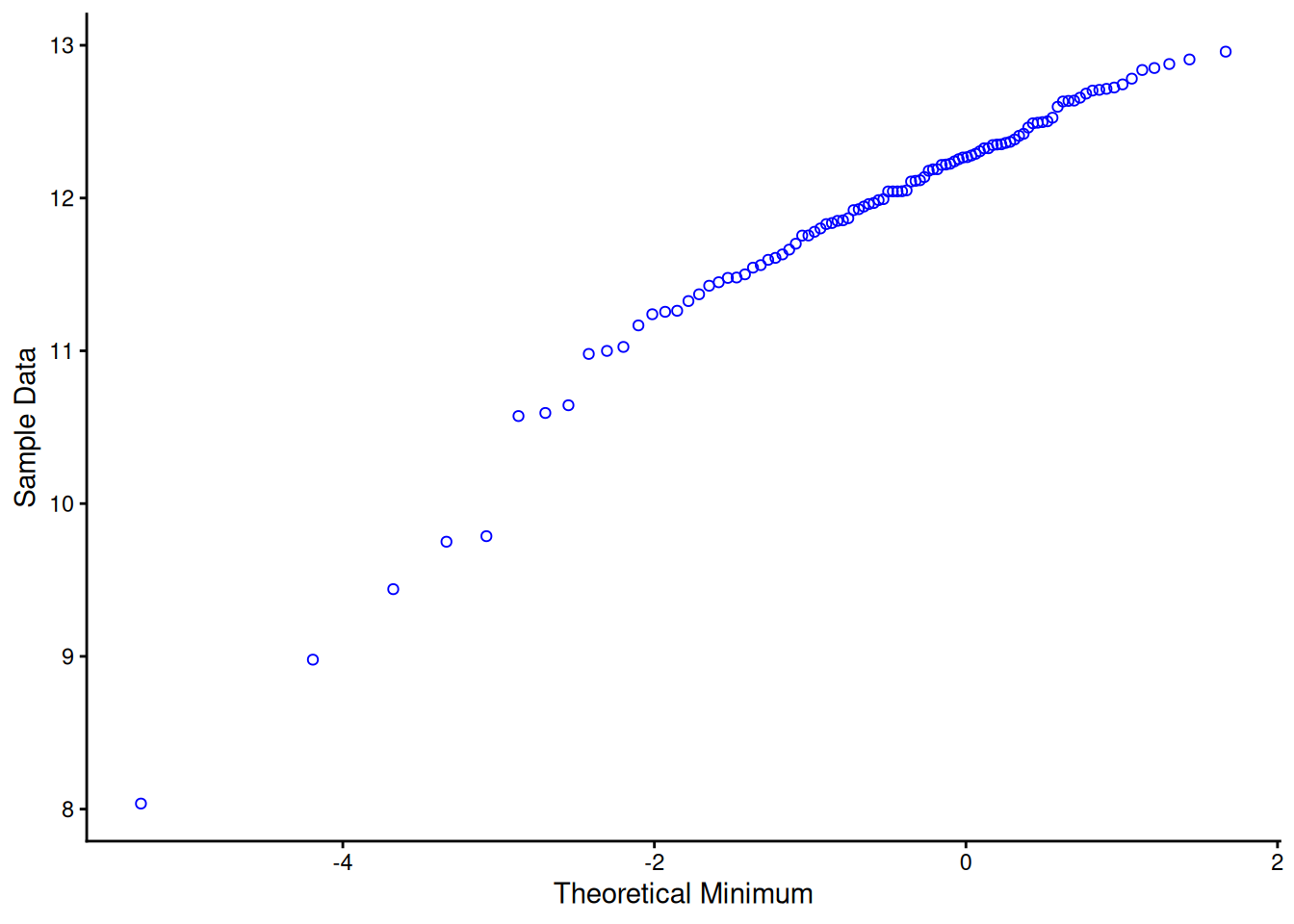
We generate 100 random numbers from this extreme value distribution and construct the following probability plot.
Figure 8.12: Extreme value type I probability plot for 100 simulated random numbers
Data from an extreme value distribution will line up approximately along a straight line when this kind of plot is constructed. The slope of the line is an estimate of \(\beta\), the “\(y\)-axis” value on the line corresponding to the “\(x\)-axis” 0 point is an estimate of \(\mu\). For the graph above, these turn out to be very close to the actual values of \(\beta\) and \(\mu\).
For the example extreme value distribution with \(\mu\) = ln(200,000) = 12.206 and \(\beta\) = 1/2 = 0.5, the PDF values corresponding to the points 5, 8, 10, 12, 12.8 are 0.110E-5, 0.444E-3, 0.024, 0.683 and 0.247, and the CDF values corresponding to the same points are 0.551E-6, 0.222E-3, 0.012, 0.484 and 0.962.
Functions for computing extreme value distribution PDF values, CDF values, and for producing probability plots, are available in R via the devgumbel(), pevgumbel(), qevgumbel(), and revgumbel() helper functions defined above (equivalent to dGU()/pGU()/qGU()/rGU() in the gamlss.dist package used by NIST’s own companion script).
8.1.6.4 Lognormal
Lognormal Formulas and relationship to the normal distribution
Formulas and Plots
The lognormal life distribution, like the Weibull, is a very flexible model that can empirically fit many types of failure data. The two-parameter form has parameters \(\sigma\) is the shape parameter and \(T_{50}\) is the median (a scale parameter).
Note: If time to failure, \(t_f\), has a lognormal distribution, then the (natural) logarithm of time to failure has a normal distribution with mean \(\mu\) = ln \(T_{50}\) and standard deviation \(\sigma\). This makes lognormal data convenient to work with; just take natural logarithms of all the failure times and censoring times and analyze the resulting normal data. Later on, convert back to real time and lognormal parameters using \(\sigma\) as the lognormal shape and \(T_{50} = e^\mu\) as the (median) scale parameter.
Below is a summary of the key formulas for the lognormal.
Note: A more general three-parameter form of the lognormal includes an additional waiting time parameter \(\theta\) (sometimes called a shift or location parameter). The formulas for the three-parameter lognormal are easily obtained from the above formulas by replacing \(t\) by \((t - \theta)\) wherever \(t\) appears. No failure can occur before \(\theta\) hours, so the time scale starts at \(\theta\) and not 0. If a shift parameter \(\theta\) is known (based, perhaps, on the physics of the failure mode), then all you have to do is subtract \(\theta\) from all the observed failure times and/or readout times and analyze the resulting shifted data with a two-parameter lognormal.
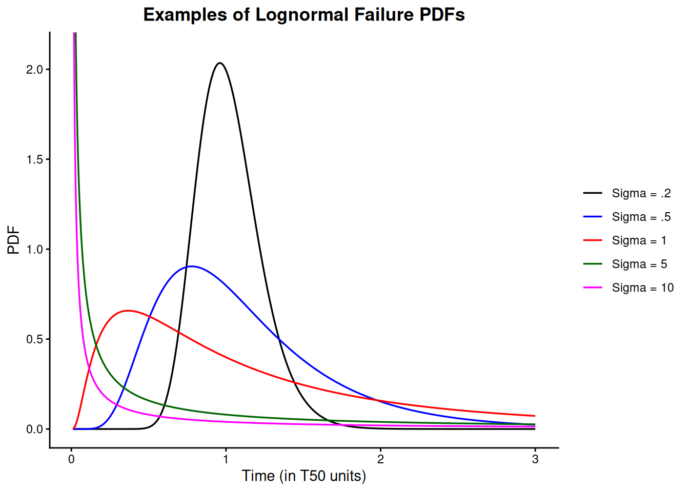
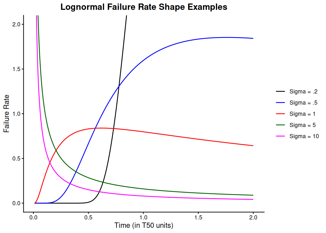
Examples of lognormal PDF and failure rate plots are shown below. Note that lognormal shapes for small sigmas are very similar to Weibull shapes when the shape parameter \(\gamma\) is large and large sigmas give plots similar to small Weibull \(\gamma\)’s. Both distributions are very flexible and it is often difficult to choose which to use based on empirical fits to small samples of (possibly censored) data.
A very flexible model that also can apply (theoretically) to many degradation process failure modes
Uses of the Lognormal Distribution Model
As shown in the preceding plots, the lognormal PDF and failure rate shapes are flexible enough to make the lognormal a very useful empirical model. In addition, the relationship to the normal (just take natural logarithms of all the data and time points and you have “normal” data) makes it easy to work with mathematically, with many good software analysis programs available to treat normal data.
The lognormal model can be theoretically derived under assumptions matching many failure degradation processes common to electronic (semiconductor) failure mechanisms. Some of these are: corrosion, diffusion, migration, crack growth, electromigration, and, in general, failures resulting from chemical reactions or processes. That does not mean that the lognormal is always the correct model for these mechanisms, but it does perhaps explain why it has been empirically successful in so many of these cases.
A brief sketch of the theoretical arguments leading to a lognormal model follows.
Applying the Central Limit Theorem to small additive errors in the log domain and justifying a normal model is equivalent to justifying the lognormal model in real time when a process moves towards failure based on the cumulative effect of many small “multiplicative” shocks. More precisely, if at any instant in time a degradation process undergoes a small increase in the total amount of degradation that is proportional to the current total amount of degradation, then it is reasonable to expect the time to failure (i.e., reaching a critical amount of degradation) to follow a lognormal distribution (Kolmogorov, 1941).
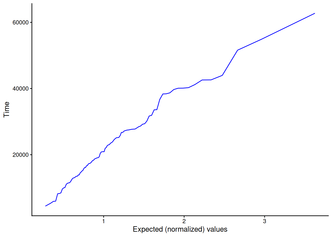
We generated 100 random numbers from a lognormal distribution with shape 0.5 and median life 20,000. To see how well these random lognormal data points are fit by a lognormal distribution, we generate the lognormal probability plot shown below. Points that line up approximately on a straight line indicates a good fit to a lognormal (with shape 0.5). The time that corresponds to the (normalized) \(x\)-axis \(T_{50}\) of 1 is the estimated \(T_{50}\) according to the data. In this case it is close to 20,000, as expected.
Figure 8.15: Lognormal probability plot of 100 simulated lognormal random numbers
For a lognormal distribution at time \(T\) = 5000 with \(\sigma\) = 0.5 and \(T_{50}\) = 20,000, the PDF value is 0.34175E-5, the CDF value is 0.002781, and the failure rate is 0.3427E-5.
Functions for computing lognormal distribution PDF values, CDF values, failure rates, and for producing probability plots, are available in R via dlnorm(), plnorm(), and qlnorm().
8.1.6.5 Gamma
Formulas for the gamma model
Formulas and Plots
There are two ways of writing (parameterizing) the gamma distribution that are common in the literature. In addition, different authors use different symbols for the shape and scale parameters. Below we show two ways of writing the gamma, with “shape” parameter \(a = \alpha\), and “scale” parameter \(b = 1/\beta\).
Another well-known statistical distribution, the Chi-Square, is also a special case of the gamma. A Chi-Square distribution with \(n\) degrees of freedom is the same as a gamma with \(a = n\)/2 and \(b\) = 0.5 (or \(\beta\) = 2).
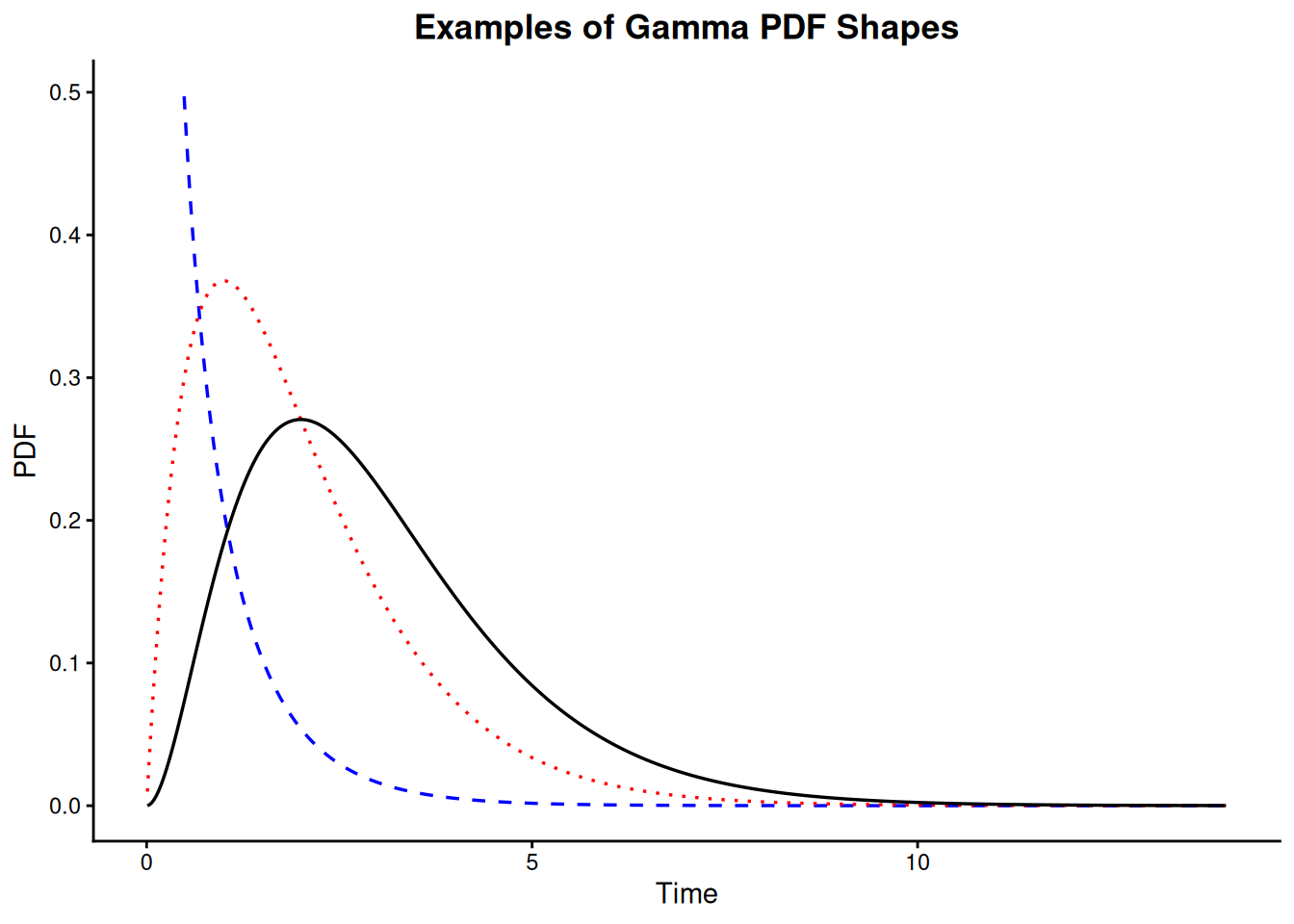
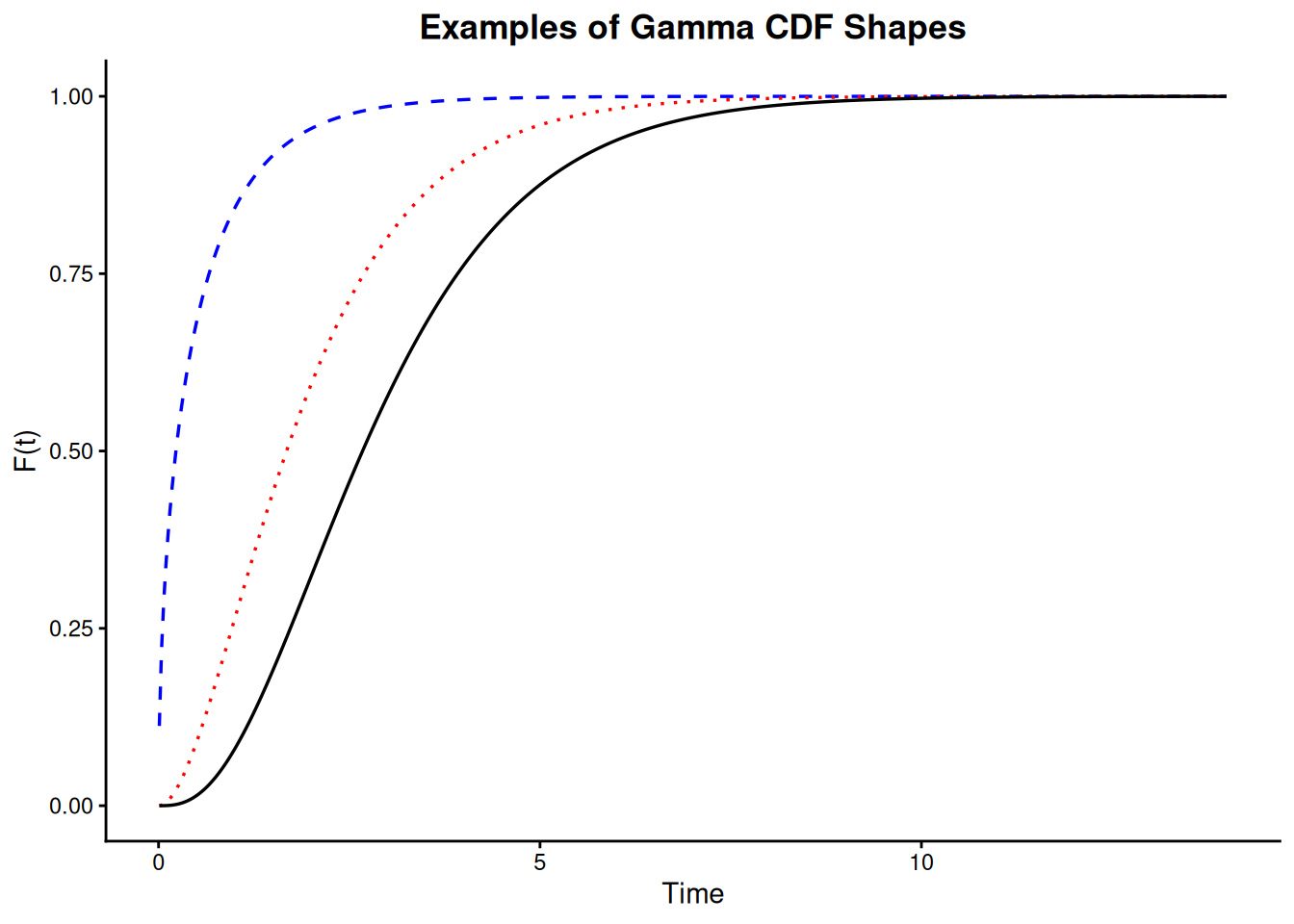
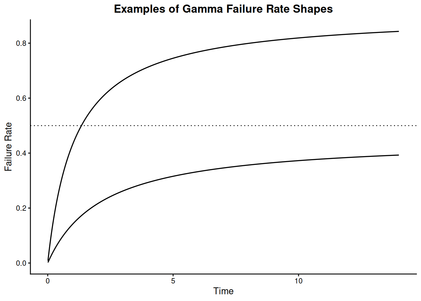
The following plots give examples of gamma PDF, CDF and failure rate shapes.
Shapes for gamma data
Code
library(tidyverse)t_seq <-seq(0.01, 14, length.out =500)shape_levels <-c("a = .5", "a = 2", "a = 3")shape_vals <-c(0.5, 2, 3)pdf_df <-map2_dfr(shape_vals, shape_levels, \(a, lbl) tibble(t = t_seq, fx =dgamma(t_seq, shape = a, scale =1), shape = lbl)) |>mutate(shape =factor(shape, levels = shape_levels)) |>filter(fx <=0.52)ggplot(pdf_df, aes(t, fx, color = shape, linetype = shape)) +geom_line(linewidth =0.6) +scale_color_manual(values =c("blue", "red", "black"), guide ="none") +scale_linetype_manual(values =c("dashed", "dotted", "solid"), guide ="none") +labs(title ="Examples of Gamma PDF Shapes", x ="Time", y ="PDF") +theme_classic() +theme(plot.title =element_text(hjust =0.5, face ="bold"))
Figure 8.18: Examples of gamma failure rate shapes
The gamma is used in “Standby” system models and also for Bayesian reliability analysis
Uses of the Gamma Distribution Model
The gamma is a flexible life distribution model that may offer a good fit to some sets of failure data. It is not, however, widely used as a life distribution model for common failure mechanisms.
The gamma does arise naturally as the time-to-first fail distribution for a system with standby exponentially distributed backups. If there are \(n\)-1 standby backup units and the system and all backups have exponential lifetimes with parameter \(\lambda\), then the total lifetime has a gamma distribution with \(a = n\) and \(b = \lambda\). Note: when \(a\) is a positive integer, the gamma is sometimes called an Erlang distribution. The Erlang distribution is used frequently in queuing theory applications.
A common use of the gamma model occurs in Bayesian reliability applications. When a system follows an HPP (exponential) model with a constant repair rate \(\lambda\), and it is desired to make use of prior information about possible values of \(\lambda\), a gamma Bayesian prior for \(\lambda\) is a convenient and popular choice.
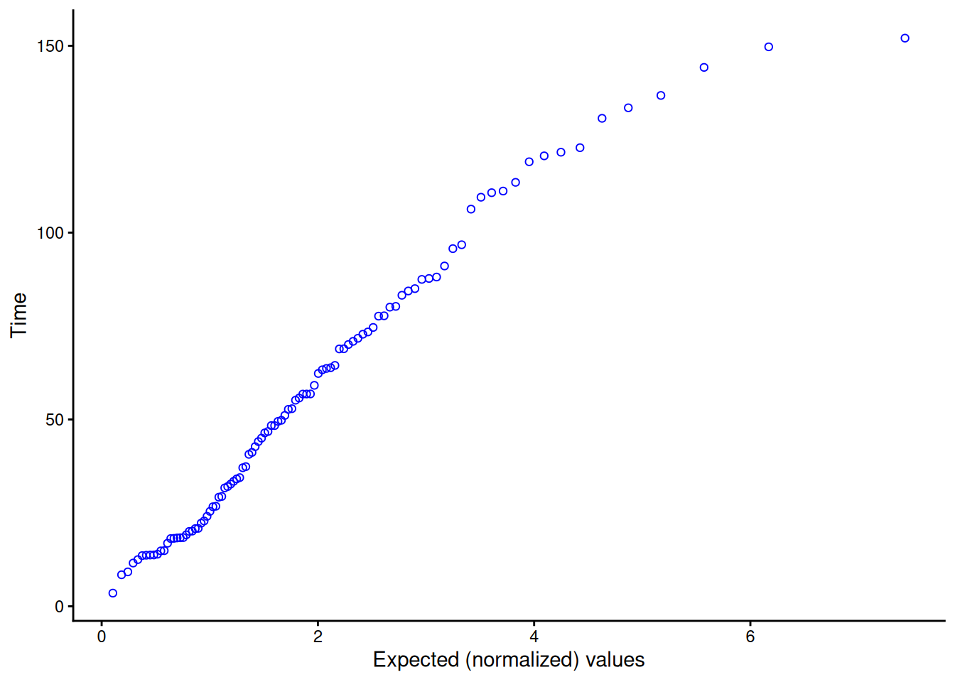
Gamma probability plot
We generated 100 random gamma data points using shape parameter \(\alpha\) = 2 and scale parameter \(\beta\) = 30. A gamma probability plot of the 100 data points is shown below.
Code
set.seed(42)gamma_sample <-rgamma(100, shape =2, scale =30)expected_gamma <-qgamma(ppoints(length(gamma_sample)), shape =2)ggplot(tibble(expected = expected_gamma, time =sort(gamma_sample)), aes(expected, time)) +geom_point(shape =1, color ="blue") +labs(x ="Expected (normalized) values", y ="Time") +theme_classic()
Figure 8.19: Gamma probability plot of 100 simulated gamma random numbers
The value of the shape parameter \(\alpha\) can be estimated from data using
the squared ratio of mean failure time to the standard deviation of the failure times.
Using an example solved in the section on standby models, where \(\alpha\) = 2, \(\beta\) = 30, and \(t\) = 24 months, the PDF, CDF, reliability, and failure rate are the following.
Functions for computing gamma distribution PDF values, CDF values, reliability values, failure rates, and for producing probability plots, are available in R via dgamma(), pgamma(), and qgamma().
8.1.6.6 Fatigue life (Birnbaum-Saunders)
A model based on cycles of stress causing degradation or crack growth
In 1969, Birnbaum and Saunders described a life distribution model that could be derived from a physical fatigue process where crack growth causes failure (Birnbaum and Saunders 1969). Since one of the best ways to choose a life distribution model is to derive it from a physical/statistical argument that is consistent with the failure mechanism, the Birnbaum-Saunders fatigue life distribution is worth considering.
Formulas and shapes for the fatigue life model
Formulas and Plots for the Birnbaum-Saunders Model
The PDF, CDF, mean, and variance for the Birnbaum-Saunders distribution are shown below. The parameters are: \(\gamma\), a shape parameter; and \(\mu\), a scale parameter. These are the parameters we will use in our discussion, but there are other choices also common in the literature (see the parameters used for the derivation of the model).
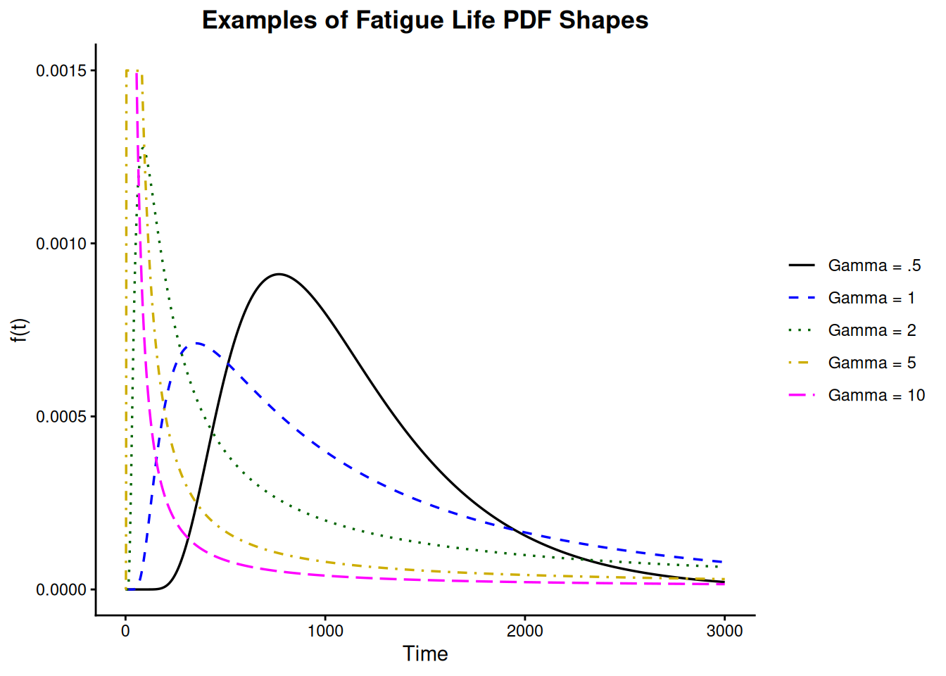
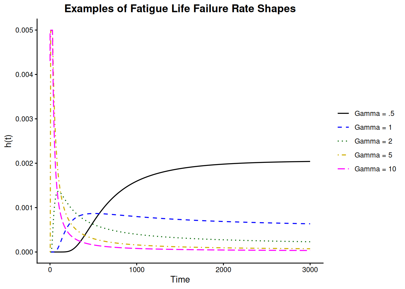
PDF shapes for the model vary from highly skewed and long tailed (small gamma values) to nearly symmetric and short tailed as gamma increases. This is shown in the figure below.
Note
NIST’s variance formula above, \(\mu^2 \gamma^2 (1 + 5\gamma^2/4)\), is strictly increasing in \(\gamma\) for any fixed \(\mu\) — the distribution’s overall spread actually increases as \(\gamma\) increases, not decreases as the prose above states. For larger \(\gamma\), essentially all of this extra spread shows up as an extreme, narrow spike immediately after \(t = 0\) (values well off the scale of the figure below) together with a long, low tail; for smaller \(\gamma\), the same total probability is instead spread into a single broad, visibly long-tailed hump. The figure below, computed directly from the stated PDF and CDF formulas with \(\mu\) held fixed and cropped to a readable vertical scale, shows this latter, visible part of the story clearly, but the handbook’s framing of large \(\gamma\) as “short tailed” only holds if the (much larger, off-scale) spike near the origin is ignored.
Figure 8.21: Examples of fatigue life (Birnbaum-Saunders) failure rate shapes
If crack growth in each stress cycle is a random amount independent of past cycles of growth, the Fatigue Life mode model may apply.
Derivation and Use of the Birnbaum-Saunders Model:
Consider a material that continually undergoes cycles of stress loads. During each cycle, a dominant crack grows towards a critical length that will cause failure. Under repeated application of \(n\) cycles of loads, the total extension of the dominant crack can be written as
\[ W_n = \sum_{j=1}^n Y_j \, , \]
and we assume the \(Y_j\) are independent and identically distributed non-negative random variables with mean \(\mu\) and variance \(\sigma^2\). Suppose failure occurs at the \(N\)-th cycle, when \(W_n\) first exceeds a constant critical value \(w\). If \(n\) is large, we can use a central limit theorem argument to conclude that
Since there are many cycles, each lasting a very short time, we can replace the discrete number of cycles \(N\) needed to reach failure by the continuous time \(t_f\) needed to reach failure. The CDF \(F(t)\) of \(t_f\) is given by
Here \(\Phi\) denotes the standard normal CDF. Writing the model with parameters \(\alpha\) and \(\beta\) is an alternative way of writing the Birnbaum-Saunders distribution that is often used (\(\alpha = \gamma\) and \(\beta = \mu\), as compared to the way the formulas were parameterized earlier in this section).
Note: The critical assumption in the derivation, from a physical point of view, is that the crack growth during any one cycle is independent of the growth during any other cycle. Also, the growth has approximately the same random distribution, from cycle to cycle. This is a very different situation from the proportional degradation argument used to derive a log normal distribution model, with the rate of degradation at any point in time depending on the total amount of degradation that has occurred up to that time.
This kind of physical degradation is consistent with Miner’s Rule.
The Birnbaum-Saunders assumption, while physically restrictive, is consistent with a deterministic model from materials physics known as Miner’s Rule (Miner’s Rule implies that the damage that occurs after \(n\) cycles, at a stress level that produces a fatigue life of \(N\) cycles, is proportional to \(n/N\)). So, when the physics of failure suggests Miner’s Rule applies, the Birnbaum-Saunders model is a reasonable choice for a life distribution model.
Birnbaum-Saunders probability plot
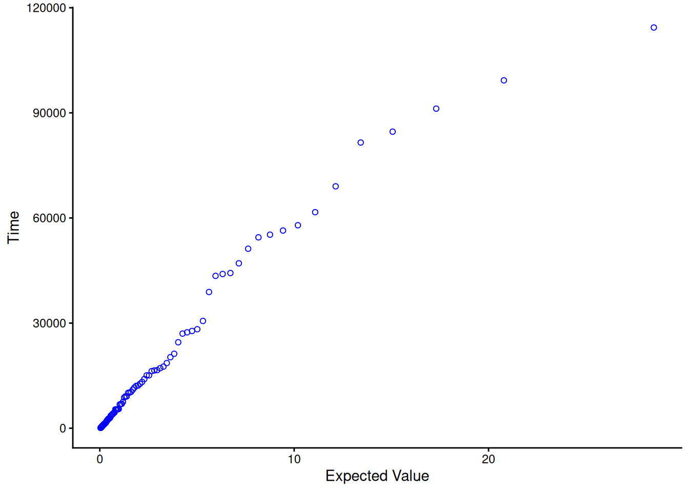
We generated 100 random numbers from a Birnbaum-Saunders distribution where \(\mu\) = 5000 and \(\gamma\) = 2, and created a fatigue life probability plot of the 100 data points.
Code
qbs <-function(p, gamma, mu) { z <-qnorm(p) r <- gamma * z mu * (r /2+sqrt((r /2)^2+1))^2}rbs <-function(n, gamma, mu) qbs(runif(n), gamma, mu)set.seed(42)bs_sample <-sort(rbs(100, 2, 5000))expected_bs <-qbs(ppoints(length(bs_sample)), 2, 1)ggplot(tibble(expected = expected_bs, time = bs_sample), aes(expected, time)) +geom_point(shape =1, color ="blue") +labs(x ="Expected Value", y ="Time") +theme_classic()
Figure 8.22: Fatigue life probability plot of 100 simulated Birnbaum-Saunders random numbers
If the points on the probability plot line up roughly on a straight line, as expected for data we generated, then the data are correctly modeled by the Birnbaum-Saunders distribution.
The PDF value at time \(t\) = 4000 for a Birnbaum-Saunders (fatigue life) distribution with parameters \(\mu\) = 5000 and \(\gamma\) = 2 is 4.987e-05 and the CDF value is 0.455.
Functions for computing Birnbaum-Saunders distribution PDF values, CDF values, and for producing probability plots, are available in R via the VGAM package’s dbisa()/pbisa()/qbisa()/rbisa() functions, equivalent to the dbs()/pbs()/qbs()/rbs() helper functions defined above.
8.1.6.7 Proportional hazards model
The proportional hazards model is often used in survival analysis (medical testing) studies. It is not used much with engineering data
The proportional hazards model, proposed by Cox (1972) (Cox 1972), has been used primarily in medical testing analysis, to model the effect of secondary variables on survival. It is more like an acceleration model than a specific life distribution model, and its strength lies in its ability to model and test many inferences about survival without making any specific assumptions about the form of the life distribution model.
This section will give only a brief description of the proportional hazards model, since it has limited engineering applications.
Proportional Hazards Model Assumption
Let \(z = \{x, \, y, \, \ldots\}\) be a vector of one or more explanatory variables believed to affect lifetime. These variables may be continuous (like temperature in engineering studies, or dosage level of a particular drug in medical studies) or they may be indicator variables with the value 1 if a given factor or condition is present, and 0 otherwise.
Let the hazard rate for a nominal (or baseline) set \(z_0 = \{x_0, \, y_0, \, \ldots\}\) of these variables be given by \(h_0(t)\), with \(h_0(t)\) denoting a legitimate hazard function (failure rate) for some unspecified life distribution model.
The proportional hazard model assumes changing a stress variable (or explanatory variable) has the effect of multiplying the hazard rate by a constant.
The proportional hazards model assumes we can write the changed hazard function for a new value of \(z\) as
\[ h_z(t) = g(z) h_0(t) \,\, .\]
In other words, changing \(z\), the explanatory variable vector, results in a new hazard function that is proportional to the nominal hazard function, and the proportionality constant is a function of \(z, \, g(z)\), independent of the time variable \(t\).
A common and useful form for \(g(z)\) is the Log Linear Model which has the equation: \(g(x) = e^{\alpha x}\) for one variable, \(g(x,y) = e^{ax + by}\) for two variables, etc.
Properties and Applications of the Proportional Hazards Model
The proportional hazards model is equivalent to the acceleration factor concept if and only if the life distribution model is a Weibull (which includes the exponential model, as a special case). For a Weibull with shape parameter \(\gamma\), and an acceleration factor \(AF\) between nominal use fail time \(t_0\) and high stress fail time \(t_s\) (with \(t_0 = AF t_s\)) we have \(g(s) = AF^\gamma\). In other words, \(h_s(0) = AF^\gamma h_0(t)\).
Under a log-linear model assumption for \(g(z)\), without any further assumptions about the life distribution model, it is possible to analyze experimental data and compute maximum likelihood estimates and use likelihood ratio tests to determine which explanatory variables are highly significant. In order to do this kind of analysis, however, special software is needed.
More details on the theory and applications of the proportional hazards model may be found in Cox and Oakes (1984) (Cox and Oakes 1984).
8.1.7 What are some basic repair rate models used for repairable systems?
Models for repair rates of repairable systems
\(N(t)\), \(M(t)\), and \(m(t)\) were defined in the section on Repair Rates. Repair rate models are defined by first picking a functional form for \(M(t)\), the expected number of cumulative failures by time \(t\). Taking the derivative of this gives the repair rate model \(m(t)\).
The simplest useful model for \(M(t)\) is \(M(t) = \lambda t\) and the repair rate (or ROCOF) is the constant \(m(t) = \lambda\). This model comes about when the interarrival times between failures are independent and identically distributed according to the exponential distribution, with parameter \(\lambda\). This basic model is also known as a Homogeneous Poisson Process (HPP). The following formulas apply.
\[ \begin{array}{rcl}
F(t) = 1 - e^{-\lambda t} & = & \mbox{CDF of the waiting time to the next failure} \\
& & \mbox{(or interarrival time between failures)} \\
& & \\
N(T) & = & \mbox{cumulative number of failures from time } 0 \mbox{ to time } T \\
& & \\
P\{N(t)=k\} & = & \frac{(\lambda T)^k e^{-\lambda T}}{k!} \\
& & \\
M(t) = \lambda T & = & \mbox{expected number of failures by time } T \\
& & \\
M'(t) = m(t) & = & \lambda = \mbox{repair rate or ROCOF} \\
& & \\
\frac{1}{\lambda} & = & \mbox{Mean Time Between Failures (MTBF)}
\end{array} \]
HPP model fits flat portion of “bathtub” curve
Despite the simplicity of this model, it is widely used for repairable equipment and systems throughout industry. Justification for this comes, in part, from the shape of the empirical Bathtub Curve. Most systems (or complex tools or equipment) spend most of their “lifetimes” operating in the long flat constant repair rate portion of the Bathtub Curve. The HPP is the only model that applies to that portion of the curve, so it is the most popular model for system reliability evaluation and reliability test planning.
In the HPP model, the probability of having exactly \(k\) failures by time \(T\) is given by the Poisson distribution with mean \(\lambda T\) (see formula for \(P\{N(t) = k\}\) above).
8.1.7.2 Non-Homogeneous Poisson Process (NHPP) - power law
The repair rate for a NHPP following the Power law
A flexible model (that has been very successful in many applications) for the expected number of failures in the first \(t\) hours, \(M(t)\), is given by the polynomial
\[ M(t) = at^b, \,\, \mbox{ for } \,\, a, \, b > 0 \,\, . \]
The Power law model is very flexible and contains the HPP (exponential) model as a special case
The HPP model has a the constant repair rate \(m(t) = \lambda\). If we substitute an arbitrary function \(\lambda(t)\) for \(\lambda\), we have a Non-Homogeneous Poisson Process (NHPP) with Intensity Function \(\lambda\). If
then we have an NHPP with a Power Law intensity function (the “intensity function” is another name for the repair rate \(m(t)\)).
Because of the polynomial nature of the ROCOF, this model is very flexible and can model both increasing (\(b>1\) or \(\beta < 0\)) and decreasing (\(0 < b < 1\) or \(0 < \beta < 1\)) failure rates. When \(b\) = 1 or \(\beta\) = 0, the model reduces to the HPP constant repair rate model.
Probabilities of failure for all NHPP processes can easily be calculated based on the Poisson formula
Probabilities of a given number of failures for the NHPP model are calculated by a straightforward generalization of the formulas for the HPP. Thus, for any NHPP
The Power Law model is also called the Duane Model and the AMSAA model
Other names for the Power Law model are: the Duane Model and the AMSAA model. AMSAA stands for the United States Army Materials System Analysis Activity, where much theoretical work describing the Power Law model was performed in the 1970’s.
It is also called a Weibull Process - but this name is misleading and should be avoided
The time to the first fail for a Power Law process has a Weibull distribution with shape parameter \(b\) and characteristic life \(a\). For this reason, the Power Law model is sometimes called a Weibull Process. This name is confusing and should be avoided, however, since it mixes a life distribution model applicable to the lifetimes of a non-repairable population with a model for the inter-arrival times of failures of a repairable population.
For any NHPP process with intensity function \(m(t)\), the distribution function (CDF) for the inter-arrival time \(\tau\) to the next failure, given a failure just occurred at time \(T\), is given by
Once a failure occurs, the waiting time to the next failure for an NHPP has a simple CDF formula
is said to follow an Exponential Law. This is also called the log-linear model or the Cox-Lewis model.
A system whose repair rate follows this flexible model is improving if \(\beta\) < 0 and deteriorating if \(\beta\) > 0. When \(\beta\) = 0, the Exponential Law reduces to the HPP constant repair rate model.
8.1.8 How can you evaluate reliability from the “bottom-up” (component failure mode to system failure rate)?
Several simple models can be used to calculate system failure rates, starting with failure rates for failure modes within individual system components
This section deals with models and methods that apply to non-repairable components and systems. Models for failure rates (and not repair rates) are described. The next section covers models for (repairable) system reliability growth.
We use the Competing Risk Model to go from component failure modes to component failure rates. Next we use the Series Model to go from components to assemblies and systems. These models assume independence and “first failure mode to reach failure causes both the component and the system to fail”.
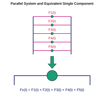
If some components are “in parallel”, so that the system can survive one (or possibly more) component failures, we have the parallel or redundant model. If an assembly has \(n\) identical components, at least \(r\) of which must be working for the system to work, we have what is known as the \(r\) out of \(n\) model.
The standby model uses redundancy like the parallel model, except that the redundant unit is in an off-state (not exercised) until called upon to replace a failed unit.
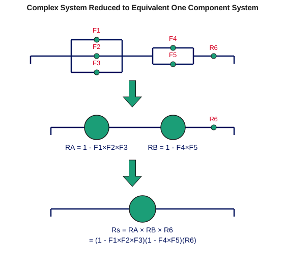
This section describes these various models. The last subsection shows how complex systems can be evaluated using the various models as building blocks.
8.1.8.1 Competing risk model
Use the competing risk model when the failure mechanisms are independent and the first mechanism failure causes the component to fail
Assume a (replaceable) component or unit has \(k\) different ways it can fail. These are called failure modes and underlying each failure mode is a failure mechanism.
The Competing Risk Model evaluates component reliability by “building up” from the reliability models for each failure mode.
The following three assumptions are needed.
Each failure mechanism leading to a particular type of failure (i.e., failure mode) proceeds independently of every other one, at least until a failure occurs.
The component fails when the first of all the competing failure mechanisms reaches a failure state.
Each of the \(k\) failure modes has a known life distribution model \(F_i(t)\).
The competing risk model can be used when all three assumptions hold. If \(R_c(t)\), \(F_c(t)\), and \(h_c(t)\) denote the reliability, CDF and failure rate for the component, respectively, and \(R_i(t)\), \(F_i(t)\), and \(h_i(t)\) are the reliability, CDF and failure rate for the \(i\)-th failure mode, respectively, then the competing risk model formulas are:
Think of the competing risk model in the following way:
All the failure mechanisms are having a race to see which can reach failure first. They are not allowed to “look over their shoulder or sideways” at the progress the other ones are making. They just go their own way as fast as they can and the first to reach “failure” causes the component to fail.
Under these conditions the component reliability is the product of the failure mode reliabilities and the component failure rate is just the sum of the failure mode failure rates.
Note that the above holds for any arbitrary life distribution model, as long as “independence” and “first mechanism failure causes the component to fail” holds.
When we learn how to plot and analyze reliability data in later sections, the methods will be applied separately to each failure mode within the data set (considering failures due to all other modes as “censored run times”). With this approach, the competing risk model provides the glue to put the pieces back together again.
8.1.8.2 Series model
The series model is used to go from individual components to the entire system, assuming the system fails when the first component fails and all components fail or survive independently of one another
The Series Model is used to build up from components to sub-assemblies and systems. It only applies to non replaceable populations (or first failures of populations of systems). The assumptions and formulas for the Series Model are identical to those for the Competing Risk Model, with the \(k\) failure modes within a component replaced by the \(n\) components within a system.
The following three assumptions are needed.
Each component operates or fails independently of every other one, at least until the first component failure occurs.
The system fails when the first component failure occurs.
Each of the \(n\) (possibly different) components in the system has a known life distribution model \(F_i(t)\).
Add failure rates and multiply reliabilities in the Series Model
with the subscript \(S\) referring to the entire system and the subscript \(i\) referring to the \(i\)-th component.
Note that the above holds for any arbitrary component life distribution models, as long as “independence” and “first component failure causes the system to fail” both hold.
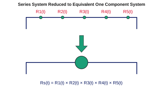
The analogy to a series circuit is useful. The entire system has \(n\) components in series. The system fails when current no longer flows and each component operates or fails independently of all the others. The schematic below shows a system with 5 components in series “replaced” by an “equivalent” (as far as reliability is concerned) system with only one component.
Figure 8.23: Diagram of a series system with five components, R1(t) through R5(t), reduced to an equivalent one-component system with reliability Rs(t) equal to the product of the five component reliabilities
8.1.8.3 Parallel or redundant model
The parallel model assumes all n components that make up a system operate independently and the system works as long as at least one component still works
The opposite of a series model, for which the first component failure causes the system to fail, is a parallel model for which all the components have to fail before the system fails. If there are \(n\) components, any (\(n - 1\)) of them may be considered redundant to the remaining one (even if the components are all different). When the system is turned on, all the components operate until they fail. The system reaches failure at the time of the last component failure.
The assumptions for a parallel model are:
All components operate independently of one another, as far as reliability is concerned.
The system operates as long as at least one component is still operating. System failure occurs at the time of the last component failure.
The CDF for each component is known.
Multiply component CDF’s to get the system CDF for a parallel model
For a parallel model, the CDF \(F_S(t)\) for the system is just the product of the CDFs \(F_i(t)\) for the components, or
\[ F_S(t) = \prod_{i=1}^n F_i(t) \,\, . \]
\(R_S(t)\) and \(h_S(t)\) can be evaluated using basic definitions, once we have \(F_S(t)\).
The schematic below represents a parallel system with 5 components and the (reliability) equivalent 1 component system with a CDF \(F_S(t)\) equal to the product of the 5 component CDFs.
Figure 8.24: Diagram of a parallel system with five components, F1(t) through F5(t), reduced to an equivalent single-component system with CDF Fs(t) equal to the product of the five component CDFs
8.1.8.4 R out of N model
An \(r\) out of \(n\) model is a system that survives when at least \(r\) of its components are working (any \(r\))
An “\(r\) out of \(n\)” system contains both the series system model and the parallel system model as special cases. The system has \(n\) components that operate or fail independently of one another and as long as at least \(r\) of these components (any \(r\)) survive, the system survives. System failure occurs when the ($n - r + $ 1)-th component failure occurs.
When \(r = n\), the \(r\) out of \(n\) model reduces to the series model. When \(r\) = 1, the \(r\) out of \(n\) model becomes the parallel model.
We treat here the simple case where all the components are identical.
Formulas and assumptions for the \(r\) out of \(n\) model (identical components):
All components have the identical reliability function \(R(t)\).
All components operate independently of one another (as far as failure is concerned).
The system can survive any (\(n - r\)) of the components failing. The system fails at the instant of the ($n - r + $ 1)-th component failure.
Formula for an \(r\) out of \(n\) system where the components are identical
System reliability is given by adding the probability of exactly \(r\) components surviving to time \(t\) to the probability of exactly (\(r\) + 1) components surviving, and so on up to the probability of all components surviving to time \(t\). These are binomial probabilities (with \(p = R(t)\)), so the system reliability is given by:
Note: If we relax the assumption that all the components are identical, then \(R_S(t)\) would be the sum of probabilities evaluated for all possible terms that could be formed by picking at least \(r\) survivors and the corresponding failures. The probability for each term is evaluated as a product of \(R(t)\)’s and \(F(t)\)’s. For example, for \(n\) = 4 and \(r\) = 2, the system reliability would be (abbreviating the notation for \(R(t)\) and \(F(t)\) by using only \(R\) and \(F\))
The Standby Model evaluates improved reliability when backup replacements are switched on when failures occur
A Standby Model refers to the case in which a key component (or assembly) has an identical backup component in an “off” state until needed. When the original component fails, a switch turns on the “standby” backup component and the system continues to operate.
In the simple case, assume the non-standby part of the system has CDF \(F(t)\) and there are (\(n - 1\)) identical backup units that will operate in sequence until the last one fails. At that point, the system finally fails.
The total system lifetime is the sum of \(n\) identically distributed random lifetimes, each having CDF \(F(t)\).
Identical backup Standby model leads to convolution formulas
In other words, \(T_n = t_1 + t_2 + \cdots + t_n\), where each \(t_i\) has CDF \(F(t)\) and \(T_n\) has a CDF we denote by \(F_n(t)\). This can be evaluated using convolution formulas:
\[ \begin{aligned}
F_2(t) & = \int_0^t F(u) f(t-u) du \\
F_n(t) & = \int_0^t F_{n-1}(u) f(t-u) du
\end{aligned} \]
where \(f(t)\) is the PDF \(F'(t)\).
In general, convolutions are solved numerically. However, for the special case when \(F(t)\) is the exponential model, the above integrations can be solved in closed form.
Exponential standby systems lead to a gamma lifetime model
Special Case: The Exponential (or Gamma) Standby Model
If \(F(t)\) has the exponential CDF (i.e., \(F(t) = 1 - e^{-\lambda t}\)), then
and the PDF \(f_n(t)\) is the well-known gamma distribution.
Example: An unmanned space probe sent out to explore the solar system has an onboard computer with reliability characterized by the exponential distribution with a Mean Time To Failure (MTTF) of \(1/\lambda\) = 30 months (a constant failure rate of 1/30 = 0.033 fails per month). The probability of surviving a two year mission is only \(\mbox{exp}(-24/30)\) = 0.45. If, however, a second computer is included in the probe in a standby mode, the reliability at 24 months (using the above formula for \(F_2\)) becomes 0.8 \(\times\) 0.449 + 0.449 = 0.81. The failure rate at 24 months (\(f_2/(1-F_2)\)) reduces to [(24/900) \(\times\) 0.449]/0.81 = 0.015 fails per month. At 12 months the failure rate is only 0.0095 fails per month, which is less than 1/3 of the failure rate calculated for the non-standby case.
Standby units (as the example shows) are an effective way of increasing reliability and reducing failure rates, especially during the early stages of product life. Their improvement effect is similar to, but greater than, that of parallel redundancy. The drawback, from a practical standpoint, is the expense of extra components that are not needed for functionality.
8.1.8.6 Complex systems
Often the reliability of complex systems can be evaluated by successive applications of Series and/or Parallel model formulas
Many complex systems can be diagrammed as combinations of Series components, Parallel components, \(R\) out of \(N\) components and Standby components. By using the formulas for these models, subsystems or sections of the original system can be replaced by an “equivalent” single component with a known CDF or Reliability function. Proceeding like this, it may be possible to eventually reduce the entire system to one component with a known CDF.
Below is an example of a complex system composed of both components in parallel and components in series is reduced first to a series system and finally to a one-component system.
Figure 8.25: Diagram of a complex system — three components (F1, F2, F3) in parallel, in series with two components (F4, F5) in parallel, in series with a single component R6 — reduced first to three equivalent components in series (RA, RB, R6), then to one equivalent component Rs
Note: The reduction methods described above will work for many, but not all, systems. Some systems with a complicated operational logic structure will need a more formal structural analysis methodology. This methodology deals with subjects such as event trees, Boolean representations, coherent structures, cut sets and decompositions, and is beyond the present scope of this Handbook.
8.1.9 How can you model reliability growth?
A reliability improvement test is a formal procedure aimed at discovering and fixing system reliability flaws
During the early stages of developing and prototyping complex systems, reliability often does not meet customer requirements. A formal test procedure aimed at discovering and fixing causes of unreliability is known as a Reliability Improvement Test. This test focuses on system design, system assembly and component selection weaknesses that cause failures.
A typical reliability improvement test procedure would be to run a prototype system, as the customer might for a period of several weeks, while a multidisciplined team of engineers and technicians (design, quality, reliability, manufacturing, etc.) analyze every failure that occurs. This team comes up with root causes for the failures and develops design and/or assembly improvements to hopefully eliminate or reduce the future occurrence of that type of failure. As the testing continues, the improvements the team comes up with are incorporated into the prototype, so it is expected that reliability will improve during the course of the test.
Repair rates should show an improvement trend during the course of a reliability improvement test and this can be modeled using a NHPP model
Another name for reliability improvement testing is TAAF testing, standing for Test, Analyze And Fix.
While only one model applies when a repairable system has no improvement or degradation trends (the constant repair rate HPP model), there are infinitely many models that could be used to describe a system with a decreasing repair rate (reliability growth models).
Fortunately, one or two relatively simple models have been very successful in a wide range of industrial applications. Two models that have previously been described will be used in this section. These models are the NHPP Power Law Model and the NHPP Exponential Law Model. The Power Law Model underlies the frequently used graphical technique known as Duane Plotting.
8.1.9.1 NHPP power law
If the Power Law applies, Repair Rates improve over time according to the formula \(\alpha t^{-\beta}\). The exponent \(\beta\) lies between 0 and 1 and is called the reliability growth slope
This repairable system model was described in Section 8.1.7.2. The expected number of failures by time \(t\) has the form \(M(t) = a t^b\) and the repair rate has the form \(m(t) = a b t^{b-1}\). This will model improvement when 0 $ < b < $ 1, with larger improvements coming when \(b\) is smaller. As we will see in the next section on Duane Plotting, it is convenient to define \(\beta = 1 - b\) and \(\alpha = ab\), and write the repair rate as
\[ m(t) = \alpha t ^{-\beta} \,\, . \]
Again we have improvement when 0 \(< \beta <\) 1, with larger improvement coming from larger values of \(\beta\). \(\beta\) is known as the Duane Plot slope or the reliability improvement Growth Slope.
In terms of the original parameters for \(M(t)\), we have
\[ a = \frac{\alpha}{1-\beta}\,\,\, \mbox{ and } \,\,\, b = 1-\beta \,\, . \]
Use of the Power Law model for reliability growth test data generally assumes the following:
While the test is ongoing, system improvements are introduced that produce continual improvements in the rate of system repair.
Over a long enough period of time the effect of these improvements can be modeled adequately by the continuous polynomial repair rate improvement model \(\alpha t^{-\beta}\).
When an improvement test ends, the MTBF stays constant at its last achieved value
When the improvement test ends at test time \(T\) and no further improvement actions are ongoing, the repair rate has been reduced to \(\alpha T^{-\beta}\). The repair rate remains constant from then on at this new (improved) level.
Assumption three means that when the test ends, the HPP constant repair rate model takes over and the MTBF for the system from then on is the reciprocal of the final repair rate or \((T^{\beta})/\alpha\). If we estimate the expected number of failures up to time T by the actual number observed, the estimated MTBF at the end of a reliability test (following the Power Law) is:
\[ \mbox{ESTIMATED MTBF AT END OF TEST } = \frac{T}{r(1-\beta)} \,\, , \]
with \(T\) denoting the test time, \(r\) is the total number of test failures and \(\beta\) is the reliability growth slope. A formula for estimating \(\beta\) from system failure times is given in the Analysis Section for the Power Law model.
Simulated Data Example
Simulating NHPP Power Law Data
Step 1: User inputs the positive constants \(a\) and \(b\).
Step 2: Simulate a vector of \(n\) uniform (0,1) random numbers. Call these \(U_1, \, U_2, \, U_3, \, \ldots, \, U_n\).
The \(n\) numbers \(Y_1, \, Y_2, \, \ldots, \, Y_n\) are the desired repair times simulated from an NHPP Power Law process with parameters \(a, \, b\) (or \(\beta = 1-b\) and \(\alpha = ab\)).
Example
We generated \(n\) = 13 random repair times using the NHPP Power Law process with \(a\) = 0.2 and \(b\) = 0.4. The resulting data and a plot of failure number versus repair times are shown below.
Code
library(tidyverse)powersim <-function(N, a, b) { U <-runif(N) Y <-rep(NA, N) Y[1] <- ((-1/ a) *log(U[1]))^(1/ b)for (i in2:N) { Y[i] <- ((Y[i -1])^b - (1/ a) *log(U[i]))^(1/ b) } Y}set.seed(42)Y <-powersim(13, 0.2, 0.4)tibble(`Failure Number`=1:13, `Failure Time`=round(Y, 1)) |> knitr::kable(align ="lr")
Table 8.2: Simulated NHPP power law repair times (a = 0.2, b = 0.4, n = 13)
Failure Number
Failure Time
1
0.1
2
0.5
3
130.9
4
178.5
5
330.1
6
663.7
7
868.6
8
3126.6
9
3825.1
10
4471.7
11
6142.7
12
6945.0
13
7116.7
Code
ggplot(tibble(time = Y, number =1:13), aes(time, number)) +geom_point(shape =1) +geom_line(linewidth =0.3) +labs(x ="Failure Times", y ="Failure Number") +theme_classic()
Figure 8.26: Plot of failure number versus simulated repair times
The NHPP power law process can be implemented using the powersim() function defined above (equivalent to NIST’s own companion R script).
8.1.9.2 Duane plots
A plot on log-log paper of successive MTBF estimates versus system time of fail for reliability improvement test data is called a Duane Plot
The standard estimate of the MTBF for a system with a constant repair rate (an HPP system) is \(T/r\), with \(T\) denoting the total time the system was observed and \(r\) is the total number of failures that occurred.
If we calculate successive MTBF estimates (called Cum MTBF Estimates), every time a failure occurs for a system undergoing reliability improvement testing, we typically see a sequence of mostly increasing numbers.
In 1964, J. T. Duane observed that when he plotted these cum MTBF estimates versus the times of failure on log-log paper, the points tended to line up following a straight line. This was true for many different sets of reliability improvement data and many other engineers have seen similar results over the last three decades. This type of plot is called a Duane Plot and the slope \(\beta\) of the best line through the points is called the reliability growth slope or Duane plot slope.
Points on a Duane plot line up approximately on a straight line if the Power Law model applies
Plotting a Duane Plot is simple. If the \(i\)th failure occurs at time \(t_i\), then plot \(t_i\) divided by \(i\) (the “\(y\)”-axis value) versus the time \(t_i\) (the “\(x\)”-axis value) on log-log graph paper. Do this for all the test failures and draw the best straight line you can following all these points.
Why does this “work”? Following the notation for repairable system models, we are plotting estimates of {\(t/M(t)\)} versus the time of failure \(t\). If \(M(t)\) follows the Power Law (also described in the last section), then we are plotting estimates of \(t/at^b\) versus the time of failure \(t\). This is the same as plotting \((1/\alpha)t^\beta\) versus \(t\), with \(\beta = 1-b\). For a log-log scale plot, this will be a straight line with slope \(\beta\) and intercept (when \(t\) = 1) of \(-\mbox{log}_{10} a\).
In other words, a straight line on a Duane plot is equivalent to the NHPP Power Law Model with a reliability growth slope of \(\beta = 1-b\) and an “\(a\)” parameter equal to \(10^{-\mbox{intercept}}\).
Note: A useful empirical rule of thumb based on Duane plots made from many reliability improvement tests across many industries is the following:
Duane plot reliability growth slopes should lie between 0.3 and 0.6
The reliability improvement slope for virtually all reliability improvement tests will be between 0.3 and 0.6. The lower end (0.3) describes a minimally effective test - perhaps the cross-functional team is inexperienced or the system has many failure mechanisms that are not well understood. The higher end (0.6) approaches the empirical state of the art for reliability improvement activities.
Examples of Duane Plots
Duane Plot Example 1:
A reliability growth test lasted 1500 hours (approximately 10 weeks) and recorded 8 failures at the following system hours: 33, 76, 145, 347, 555, 811, 1212, 1499. After calculating successive cum MTBF estimates, a Duane plot shows these estimates versus system age on log vs log paper. The “best” straight line through the data points corresponds to a NHPP Power Law model with reliability growth slope \(\beta\) equal to the slope of the line. This line is an estimate of the theoretical model line (assuming the Power Law holds during the course of the test) and the achieved MTBF at the end of the test is given by
\[ \frac{T}{r(1-\beta)} \, , \]
with \(T\) denoting the total test time and \(r\) the number of failures. Results for this particular reliability growth test follow.
Code
library(tidyverse)age <-c(33, 76, 145, 347, 555, 811, 1212, 1499)r <-length(age)cum_mtbf <- age / (1:r)tibble(`Failure #`=1:r, `System Age of Failure`= age, `Cum MTBF`=round(cum_mtbf, 1)) |> knitr::kable(align ="lrr")
Table 8.3: Reliability growth test data and cumulative MTBF estimates
The Duane plot indicates a reasonable fit to a Power Law NHPP model. The reliability improvement slope (slope of line on Duane plot) is \(\beta\) = 0.437 (using the formula given in the section on reliability data analysis for the Power Law model) and the estimated MTBF achieved by the end of the 1500 hour test is 1500/(8 \(\times\) [1-0.437]) or 333 hours.
Code
T_test <-1500beta_hat <-1- (r -1) /sum(log(T_test / age))mtbf_end <- T_test / (r * (1- beta_hat))tibble(Statistic =c("Beta (growth slope)", "MTBF at end of test"), Value =c(beta_hat, mtbf_end)) |> knitr::kable(digits =3, align ="lr")
Statistic
Value
Beta (growth slope)
0.437
MTBF at end of test
332.749
Duane Plot Example 2:
A Duane plot for the simulated Power Law data used in the Example in the preceding section is shown below.
Code
powersim <-function(N, a, b) { U <-runif(N) Y <-rep(NA, N) Y[1] <- ((-1/ a) *log(U[1]))^(1/ b)for (i in2:N) { Y[i] <- ((Y[i -1])^b - (1/ a) *log(U[i]))^(1/ b) } Y}set.seed(42)fail_time <-powersim(13, 0.2, 0.4)fail_num <-1:13mcum <- fail_time / fail_numggplot(tibble(logt =log10(fail_time), logm =log10(mcum)), aes(logt, logm)) +geom_point(shape =19, color ="blue", size =2) +labs(x ="log10(Failure Time)", y ="log10 (Cum MTBF)") +theme_classic()
Figure 8.28: Example 2 Duane plot
Duane plots can be produced using the R code shown above (equivalent to NIST’s own companion script).
8.1.9.3 NHPP exponential law
The Exponential Law is another useful reliability growth model to try when the Power law is not fitting well
For this model, if \(\beta\) < 0, the repair rate improves over time according to
\[ m(t) = e^{\alpha + \beta t} \, . \]
The corresponding cumulative expected failures model is
\[ M(t) = A \left( 1-e^{\beta t} \right) \, . \]
This approaches the maximum value of \(A\) expected failures as \(t\) goes to infinity, so the cumulative failures plot should clearly be bending over and asymptotically approaching a value
\[A = \frac{-e^\alpha}{\beta} \, . \]
Rule of thumb: First try a Duane plot and the Power law model. If that shows obvious lack of fit, try the Exponential Law model, estimating parameters using the formulas in the Analysis Section for the Exponential law. A plot of cum fails versus time, along with the estimated \(M(t)\) curve, can be used to judge goodness of fit.
8.1.10 How can Bayesian methodology be used for reliability evaluation?
Several Bayesian Methods overview topics are covered in this section
This section gives an overview of the application of Bayesian techniques in reliability investigations. The following topics are covered:
Bayesian analysis considers population parameters to be random, not fixed
Old information, or subjective judgment, is used to determine a prior distribution for these population parameters
It makes a great deal of practical sense to use all the information available, old and/or new, objective or subjective, when making decisions under uncertainty. This is especially true when the consequences of the decisions can have a significant impact, financial or otherwise. Most of us make everyday personal decisions this way, using an intuitive process based on our experience and subjective judgments.
Mainstream statistical analysis, however, seeks objectivity by generally restricting the information used in an analysis to that obtained from a current set of clearly relevant data. Prior knowledge is not used except to suggest the choice of a particular population model to “fit” to the data, and this choice is later checked against the data for reasonableness.
Lifetime or repair models, as we saw earlier when we looked at repairable and non repairable reliability population models, have one or more unknown parameters. The classical statistical approach considers these parameters as fixed but unknown constants to be estimated (i.e., “guessed at”) using sample data taken randomly from the population of interest. A confidence interval for an unknown parameter is really a frequency statement about the likelihood that numbers calculated from a sample capture the true parameter. Strictly speaking, one cannot make probability statements about the true parameter since it is fixed, not random.
The Bayesian approach, on the other hand, treats these population model parameters as random, not fixed, quantities. Before looking at the current data, we use old information, or even subjective judgments, to construct a prior distribution model for these parameters. This model expresses our starting assessment about how likely various values of the unknown parameters are. We then make use of the current data (via Baye’s formula) to revise this starting assessment, deriving what is called the posterior distribution model for the population model parameters. Parameter estimates, along with confidence intervals (known as credibility intervals), are calculated directly from the posterior distribution. Credibility intervals are legitimate probability statements about the unknown parameters, since these parameters now are considered random, not fixed.
It is unlikely in most applications that data will ever exist to validate a chosen prior distribution model. Parametric Bayesian prior models are chosen because of their flexibility and mathematical convenience. In particular, conjugate priors (defined below) are a natural and popular choice of Bayesian prior distribution models.
Bayes Formula, Prior and Posterior Distribution Models, and Conjugate Priors
Bayes formula provides the mathematical tool that combines prior knowledge with current data to produce a posterior distribution
Bayes formula is a useful equation from probability theory that expresses the conditional probability of an event A occurring, given that the event \(B\) has occurred (written P\((A|B)\)), in terms of unconditional probabilities and the probability the event \(B\) has occurred, given that \(A\) has occurred. In other words, Bayes formula inverts which of the events is the conditioning event. The formula is
where \(f(x | \lambda)\) is the probability model, or likelihood function, for the observed data \(x\) given the unknown parameter (or parameters) \(\lambda\), \(g(\lambda)\) is the prior distribution model for \(\lambda\), and \(g(\lambda | x)\) is the posterior distribution model for \(\lambda\) given that the data \(x\) have been observed.
When \(g(\lambda | x)\) and \(g(\lambda)\) both belong to the same distribution family, \(g(\lambda)\) and \(f(x | \lambda)\) are called conjugate distributions and \(g(\lambda)\) is the conjugate prior for \(f(x | \lambda)\). For example, the Beta distribution model is a conjugate prior for the proportion of successes \(p\) when samples have a binomial distribution. And the Gamma model is a conjugate prior for the failure rate \(\lambda\) when sampling failure times or repair times from an exponentially distributed population. This latter conjugate pair (gamma, exponential) is used extensively in Bayesian system reliability applications.
How Bayes Methodology is used in System Reliability Evaluation
Bayesian system reliability evaluation assumes the system MTBF is a random quantity “chosen” according to a prior distribution model
Models and assumptions for using Bayes methodology will be described in a later section. Here we compare the classical paradigm versus the Bayesian paradigm when system reliability follows the HPP or exponential model (i.e., the flat portion of the Bathtub Curve).
Classical Paradigm For System Reliability Evaluation:
The MTBF is one fixed unknown value - there is no “probability” associated with it
Failure data from a test or observation period allows you to make inferences about the value of the true unknown MTBF
No other data are used and no “judgment” - the procedure is objective and based solely on the test data and the assumed HPP model
Bayesian Paradigm For System Reliability Evaluation:
The MTBF is a random quantity with a probability distribution
The particular piece of equipment or system you are testing “chooses” an MTBF from this distribution and you observe failure data that follow an HPP model with that MTBF
Prior to running the test, you already have some idea of what the MTBF probability distribution looks like based on prior test data or an consensus engineering judgment
Advantages and Disadvantages of using Bayes Methodology
Pro’s and con’s for using Bayesian methods
While the primary motivation to use Bayesian reliability methods is typically a desire to save on test time and materials cost, there are other factors that should also be taken into account. The table below summarizes some of these “good news” and “bad news” considerations.
Code
library(gt)tibble::tibble(`Pro's`=c("Uses prior information - this \"makes sense\"","If the prior information is encouraging, less new testing may be needed to confirm a desired MTBF at a given confidence","Confidence intervals are really intervals for the (random) MTBF - sometimes called \"credibility intervals\"","", "" ),`Con's`=c("Prior information may not be accurate - generating misleading conclusions","Way of inputting prior information (choice of prior) may not be correct","Customers may not accept validity of prior data or engineering judgements","There is no one \"correct way\" of inputting prior information and different approaches can give different results","Results aren't objective and don't stand by themselves" )) |>gt() |>sub_missing(columns =everything(), missing_text ="") |>cols_align(align ="left", columns =everything())
Table 8.4: Bayesian Paradigm: Advantages and Disadvantages
Pro's
Con's
Uses prior information - this "makes sense"
Prior information may not be accurate - generating misleading conclusions
If the prior information is encouraging, less new testing may be needed to confirm a desired MTBF at a given confidence
Way of inputting prior information (choice of prior) may not be correct
Confidence intervals are really intervals for the (random) MTBF - sometimes called "credibility intervals"
Customers may not accept validity of prior data or engineering judgements
There is no one "correct way" of inputting prior information and different approaches can give different results
Results aren't objective and don't stand by themselves
8.2 Assumptions/Prerequisites
Goals of this section
This section describes how life distribution models and acceleration models are typically chosen. Several graphical and analytical methods for evaluating model fit are also discussed.
8.2.1 How do you choose an appropriate life distribution model?
Choose models that make sense, fit the data and, hopefully, have a plausible theoretical justification
Life distribution models are chosen for one or more of the following three reasons:
There is a physical/statistical argument that theoretically matches a failure mechanism to a life distribution model
A particular model has previously been used successfully for the same or a similar failure mechanism
A convenient model provides a good empirical fit to all the failure data
Whatever method is used to choose a model, the model should
“make sense” - for example, don’t use an exponential model with a constant failure rate to model a “wear out” failure mechanism
Models like the lognormal and the Weibull are so flexible that it is not uncommon for both to fit a small set of failure data equally well. Yet, especially when projecting via acceleration models to a use condition far removed from the test data, these two models may predict failure rates that differ by orders of magnitude. That is why it is more than an academic exercise to try to find a theoretical justification for using a particular distribution.
There are several useful theoretical arguments to help guide the choice of a model
We will consider three well-known arguments of this type:
Note that physical/statistical arguments for choosing a life distribution model are typically based on individual failure modes.
For some questions, an “empirical” distribution-free approach can be used
The Kaplan-Meier technique can be used when it is appropriate to just “let the data points speak for themselves” without making any model assumptions. However, you generally need a considerable amount of data for this approach to be useful, and acceleration modeling is much more difficult.
8.2.1.1 Based on failure mode
Life distribution models and physical acceleration models typically only apply at the individual failure mode level
Failure mode data are failure data sorted by types of failures. Root cause analysis must be done on each failure incident in order to characterize them by failure mode. While this may be difficult and costly, it is a key part of any serious effort to understand, model, project and improve component or system reliability.
The natural place to apply both life distribution models and physical acceleration models is at the failure mode level. Each component failure mode will typically have its own life distribution model. The same is true for acceleration models. For the most part, these models only make sense at the failure mode level, and not at the component or system level. Once each mode (or mechanism) is modeled, the bottom-up approach can be used to build up to the entire component or system.
If component or system failure occurs when the first of many competing failure processes reaches a critical point, then Extreme Value Theory suggests that the Weibull Distribution will be a good model
It is well known that the Central Limit Theorem suggests that normal distributions will successfully model most engineering data when the observed measurements arise from the sum of many small random sources (such as measurement errors). Practical experience validates this theory - the normal distribution “works” for many engineering data sets.
Less known is the fact that Extreme Value Theory suggests that the Weibull distribution will successfully model failure times for mechanisms for which many competing similar failure processes are “racing” to failure and the first to reach it (i.e., the minimum of a large collection of roughly comparable random failure times) produces the observed failure time. Analogously, when a large number of roughly equivalent runners are competing and the winning time is recorded for many similar races, these times are likely to follow a Weibull distribution.
Note that this does not mean that anytime there are several failure mechanisms competing to cause a component or system to fail, the Weibull model applies. One or a few of these mechanisms may dominate the others and cause almost all of the failures. Then the “minimum of a large number of roughly comparable” random failure times does not apply and the proper model should be derived from the distribution models for the few dominating mechanisms using the competing risk model.
On the other hand, there are many cases in which failure occurs at the weakest link of a large number of similar degradation processes or defect flaws. One example of this occurs when modeling catastrophic failures of capacitors caused by dielectric material breakdown. Typical dielectric material has many “flaws” or microscopic sites where a breakdown will eventually take place. These sites may be thought of as competing with each other to reach failure first. The Weibull model, as extreme value theory would suggest, has been very successful as a life distribution model for this failure mechanism.
8.2.1.3 Multiplicative degradation argument
The lognormal model can be applied when degradation is caused by random shocks that increase degradation at a rate proportional to the total amount already present
A brief verbal description of the multiplicative degradation argument (leading to a derivation of the lognormal model) was given under Uses of the Lognormal Distribution Model. Here a formal derivation will be outlined because it gives insight into why the lognormal has been a successful model for many failure mechanisms based on degradation processes.
Let \(y_1, \, y_2, \, \ldots, \, y_n\) be measurements of the amount of degradation for a particular failure process taken at successive discrete instants of time as the process moves towards failure. Assume the following relationships exist between the \(y\)’s:
\[ y_i = (1 + \epsilon_i)y_{i-1} \, , \]
where the \(\epsilon_i\) are small, independent random perturbations or “shocks” to the system that move the failure process along. In other words, the increase in the amount of degradation from one instant to the next is a small random multiple of the total amount of degradation already present. This is what is meant by multiplicative degradation. The situation is analogous to a snowball rolling down a snow covered hill; the larger it becomes, the faster it grows because it is able to pick up even more snow.
We can express the total amount of degradation at the \(n\)-th instant of time by
Using a Central Limit Theorem argument we can conclude that ln \(x_n\) has approximately a normal distribution. But by the properties of the lognormal distribution, this means that \(x_n\) (or the amount of degradation) will follow approximately a lognormal model for any \(n\) (or at any time \(t\)). Since failure occurs when the amount of degradation reaches a critical point, time of failure will be modeled successfully by a lognormal for this type of process.
Failure mechanisms that might be successfully modeled by the lognormal distribution based on the multiplicative degradation model
What kinds of failure mechanisms might be expected to follow a multiplicative degradation model? The processes listed below are likely candidates:
Chemical reactions leading to the formation of new compounds
Diffusion or migration of ions
Crack growth or propagation
Many semiconductor failure modes are caused by one of these three degradation processes. Therefore, it is no surprise that the lognormal model has been very successful for the following semiconductor wear out failure mechanisms:
Corrosion
Metal migration
Electromigration
Diffusion
Crack growth
8.2.1.4 Fatigue life (Birnbaum-Saunders) model
A model derived from random crack growth occurring during many independent cycles of stress
The derivation of the Fatigue Life model is based on repeated cycles of stress causing degradation leading to eventual failure. The typical example is crack growth. One key assumption is that the amount of degradation during any cycle is independent of the degradation in any other cycle, with the same random distribution.
When this assumption matches well with a hypothesized physical model describing the degradation process, one would expect the Birnbaum-Saunders model to be a reasonable distribution model candidate. (See the note in the derivation for comments about the difference between the lognormal model derivation and the Fatigue Life model assumptions. Also see the comment on Miner’s Rule).
8.2.1.5 Empirical model fitting - distribution free (Kaplan-Meier) approach
The Kaplan-Meier procedure gives CDF estimates for complete or censored sample data without assuming a particular distribution model
The Kaplan-Meier (K-M) Product Limit procedure provides quick, simple estimates of the Reliability function or the CDF based on failure data that may even be multicensored. No underlying model (such as Weibull or lognormal) is assumed; K-M estimation is an empirical (non-parametric) procedure. Exact times of failure are required, however.
Calculating Kaplan-Meier Estimates
The steps for calculating K-M estimates are the following:
Order the actual failure times from \(t_1\) through \(t_r\), where there are \(r\) failures
Corresponding to each \(t_i\), associate the number \(n_i\), with \(n_i\) = the number of operating units just before the the \(i\)-th failure occurred at time \(t_i\)
Estimate \(R(t_1)\) by \((n_1 - 1)/n_1\)
Estimate \(R(t_i)\) by \(R(t_{i-1}) \times (n_i - 1)/n_i\)
Estimate the CDF \(F(t_i)\) by 1 - \(R(t_i)\)
Note that unfailed units taken off test (i.e., censored) only count up to the last actual failure time before they were removed. They are included in the \(n_i\) counts up to and including that failure time, but not after.
Example of K-M estimate calculations
A simple example will illustrate the K-M procedure. Assume 20 units are on life test and 6 failures occur at the following times: 10, 32, 56, 98, 122, and 181 hours. There were 4 unfailed units removed from the test for other experiments at the following times: 50, 100, 125 and 150 hours. The remaining 10 unfailed units were removed from the test at 200 hours. The K-M estimates for this life test are:
The R computation above matches NIST’s hand-worked values exactly.
A General Expression for K-M Estimates
A general expression for the K-M estimates can be written. Assume we have \(n\) units on test and order the observed times for these \(n\) units from \(t_1\) to \(t_n\). Some of these are actual failure times and some are running times for units taken off test before they fail. Keep track of all the indices corresponding to actual failure times. Then the K-M estimates are given by:
with the “hat” over \(R\) indicating it is an estimate and \(S\) is the set of all subscripts \(j\) such that \(t_j\) is an actual failure time. The notation \(j \in S\) and \(t_j\) less than or equal to \(t_i\) means we only form products for indices \(j\) that are in \(S\) and also correspond to times of failure less than or equal to \(t_i\).
Once values for \(R(t_i)\) are calculated, the CDF estimates are \(F(t_i) = 1 - R(t_i)\).
A small modification of K-M estimates produces better results for probability plotting
Modified K-M Estimates
The K-M estimate at the time of the last failure is \(R(t_r)\) = 0 and \(F(t_r)\) = 1. This estimate has a pessimistic bias and cannot be plotted (without modification) on a probability plot since the CDF for standard reliability models asymptotically approaches 1 as time approaches infinity. Better estimates for graphical plotting can be obtained by modifying the K-M estimates so that they reduce to the median rank estimates for plotting Type I Censored life test data (described in the next section). Modified K-M estimates are given by the formula
Once values for \(R(t_i)\) are calculated, the CDF estimates are \(F(t_i) = 1 - R(t_i)\).
8.2.2 How do you plot reliability data?
Create a probability plot and if the points line up approximately on a straight line, the assumed model is a reasonable fit
Graphical plots of reliability data are quick, useful visual tests of whether a particular model is consistent with the observed data. The basic idea behind virtually all graphical plotting techniques is the following:
Points calculated from the data are plotted on a log-log scale and, as long as they line up approximately on a straight line, the analyst can conclude that the data are consistent with the assumed model.
Later on (Section 8.4.2.1) we will also look at plots that can be used to check acceleration model assumptions.
Note: Many of the plots discussed in this section can also be used to obtain quick estimates of model parameters. This will be covered in later sections. While there may be other, more accurate ways of estimating parameters, simple graphical estimates can be very handy, especially when other techniques require software programs that are not readily available.
8.2.2.1 Probability plotting
Use probability plots to see your data and visually check model assumptions
Probability plots are simple visual ways of summarizing reliability data by plotting CDF estimates versus time using a log-log scale.
The \(x\) axis is labeled “Time” and the \(y\) axis is labeled “cumulative percent” or “percentile”. There are rules, independent of the model, for calculating plotting positions (points) from the reliability data. These only depend on the type of censoring in the data and whether exact times of failure are recorded or only readout times.
Plot each failure mode separately
Remember that different failure modes can and should be separated out and individually analyzed. When analyzing failure mode A, for example, treat failure times from failure modes B, C, etc., as censored run times. Then repeat for failure mode B, and so on.
Data points line up roughly on a straight line when the model chosen is reasonable
When the points are plotted, the analyst fits a straight line to the data (either by eye, or with the aid of a least squares fitting program). Every straight line on, say, a Weibull probability plot uniquely corresponds to a particular Weibull life distribution model and the same is true for lognormal or exponential plots. If the points follow the line reasonably well, then the model is consistent with the data. If it was your previously chosen model, there is no reason to question the choice. In addition, there is a simple way to find the parameter estimates that correspond to the fitted straight line.
Plotting positions on the \(x\) axis depend on the type of data censoring
Plotting Positions: Censored Data (Type I or Type II)
At the time \(t_i\) of the \(i\)-th failure, we need an estimate of the CDF (or the cumulative population percent failure). The simplest and most obvious estimate is just \(100(i/n)\) (with a total of \(n\) units on test). This, however, is generally an overestimate (i.e. biased). Various texts recommend corrections such as \(100(i-0.5)/n\) or \(100i/(n+1)\). Here, we recommend what are known as (approximate) median rank estimates.
For each time \(t_i\) of the \(i\)-th failure, calculate the CDF or percentile estimate using \(100(i-0.3)/(n+0.4)\).
Plotting Positions: Readout Data
Let the readout times be \(T_1, \, T_2, \, \ldots, \, T_k\) and let the corresponding new failures recorded at each readout be \(r_1, \, r_2, \, \ldots, \, r_k\). Again, there are \(n\) units on test.
For each readout time \(T_j\), calculate the CDF or percentile estimate using
\[ \frac{100 \sum_{i=1}^j r_i}{n} \, . \]
Plotting Positions: Multicensored Data
The calculations are more complicated for multicensored data. K-M estimates (described in a preceding section) can be used to obtain plotting positions at every failure time. The more precise Modified K-M Estimates are recommended. They reduce to the Censored Type I or the Censored Type II median rank estimates when the data consist of only failures, without any removals except possibly at the end of the test.
Reliability Models
Plotting positions on the \(y\) axis depend on the reliability model
The general idea is to take the model CDF equation and write it in such a way that a function of \(F(t)\) is a linear equation of a function of \(t\). This will be clear after a few examples. In the formulas that follow, “ln” always means “natural logarithm”, while “log” always means “base 10 logarithm”.
If we let \(y = 1/[1-F(t)]\) and \(x = t\), then \(\mbox{log } y\) is linear in \(x\) with slope \(\lambda / \mbox{ln } 10\). Thus, we can make an exponential probability plot by using a logarithmic \(y\) axis. Use the plotting position estimates for \(F(t_i)\) described above (without the 100 \(\times\) multiplier) to calculate pairs of \((x_i,\, y_i)\) points.
If the data are consistent with an exponential model, the resulting plot will have points that line up almost as a straight line going through the origin with slope \(\lambda / \mbox{ln } 10\).
If we let \(y = \mbox{ln}(1/[1-F(t)])\) and \(x = t\), then \(\mbox{log } y\) is linear in \(\mbox{log } x\) with slope \(\gamma\). Thus, we can make a Weibull probability plot using a log-log scale. Use the plotting position estimates for \(F(t_i)\) (without the 100 \(\times\) multiplier) to calculate pairs of \((x_i, \, y_i)\) points.
If the data are consistent with a Weibull model, the resulting plot will have points that line up roughly on a straight line with slope \(\gamma\). This line will cross the \(\mbox{log } x\) axis at time \(t = \alpha\) and the \(\mbox{log } y\) axis (i.e., the intercept) at \(-\gamma \mbox{ log } \alpha\).
with \(\Phi^{-1}\) denoting the inverse function for the standard normal distribution (taking a probability as an argument and returning the corresponding “\(z\)” value).
If we let \(y = t\) and \(x = \Phi^{-1}[F(t)]\), then \(\mbox{log } y\) is linear in \(x\) with slope \(\sigma / \mbox{ln } 10\) and intercept (when \(F(t)\) = 0.5) of \(\mbox{log } T_{50}\). We generate a lognormal probability plot using a logarithmic \(y\) axis. Use the plotting position estimates for \(F(t_i)\) (without the 100 \(\times\) multiplier) to calculate pairs of \((x_i, \, y_i)\) points.
If the data are consistent with a lognormal model, the resulting plot will have points that line up roughly on a straight line with slope \(\sigma / \mbox{ln } 10\) and intercept \(T_{50}\) on the \(\mbox{log } y\) axis.
If we let \(y = -\mbox{ln}[1 - F(x)]\), then \(\mbox{ln } y\) is linear in \(x\) with slope 1/\(\beta\) and intercept \(-\mu / \beta\). We plot \(y\) versus \(x\) where the \(y\) axis is base 10 logarithmic. The points should follow a straight line with a slope of \((1/\beta) \cdot \mbox{ln } 10\) and an intercept of \((-\mu/\beta) \cdot \mbox{ln } 10\). The \(\mbox{ln } 10\) factors in the slope and intercept are needed because the plot uses a base 10 logarithmic axis.
A Weibull example of probability plotting
Example
We generated 20 random Weibull failure times with a shape parameter of \(\gamma\) = 1.5 and \(\alpha\) = 500. Assuming a test time of \(T\) = 500 hours, only 10 of these failure times would have been observed. They are, to the nearest hour: 54, 187, 216, 240, 244, 335, 361, 373, 375, and 386. We will compute plotting position CDF estimates based on these failure times, and then generate a probability plot.
Table 8.5: Weibull probability plot example data and CDF estimates
Failure (i)
Time of Failure (x)
F(t_i) estimate
ln(1/[1-F(t_i)]) (y)
1
54
0.034
0.035
2
187
0.083
0.087
3
216
0.132
0.142
4
240
0.181
0.200
5
244
0.230
0.262
6
335
0.279
0.328
7
361
0.328
0.398
8
373
0.377
0.474
9
375
0.426
0.556
10
386
0.475
0.645
We generate a probability plot using column (4) versus column (2) and log-log scale axes.
Code
ggplot(tibble(x = x_fail, y = y), aes(x, y)) +geom_point(shape =19, color ="blue", size =2) +scale_x_log10() +scale_y_log10() +labs(x ="Time of Failure", y =expression(ln(1/ (1-F(t))))) +theme_classic()
Figure 8.29: Weibull probability plot of the example failure times
Note that the configuration of points appears to have some curvature. This is mostly due to the very first point on the plot (the earliest time of failure). The first few points on a probability plot have more variability than points in the central range and less attention should be paid to them when visually testing for “straightness”.
Use of least squares (regression) to fit a line through the points on a probability plot
Since our data are plotted on a log-log scale, we fit a straight line using \(\mbox{log } x\) as the independent variable and \(\mbox{log } y\) as the dependent variable.
The regression produces a slope estimate of 1.46, which is close to the 1.5 value used in the simulation. The intercept is -4.114 and setting this equal to \(-\gamma \mbox{ log } \alpha\) we estimate \(\alpha\) = 657 (the “true” value used in the simulation was 500).
The R computation above matches NIST’s reported slope (1.46), intercept (-4.114), and alpha estimate (657) exactly.
The analyses in this section can be implemented using both Dataplot code and R code. Both packages have special functions to automatically generate probability plots for a wide variety of distributions.
8.2.2.2 Hazard and cumulative hazard plotting
Cumulative Hazard Plotting has the same purpose as probability plotting
Similar to probability plots, cumulative hazard plots are used for visually examining distributional model assumptions for reliability data and have a similar interpretation as probability plots. The cumulative hazard plot consists of a plot of the cumulative hazard \(H(t_i)\) versus the time \(t_i\) of the \(i\)-th failure. As with probability plots, the plotting positions are calculated independently of the model and a reasonable straight-line fit to the points confirms that the chosen model and the data are consistent.
Advantages of Cumulative Hazard Plotting
It is much easier to calculate plotting positions for multicensored data using cumulative hazard plotting techniques.
The most common reliability distributions, the exponential and the Weibull, are easily plotted.
Disadvantages of Cumulative Hazard Plotting
It is less intuitively clear just what is being plotted. In a probability plot, the cumulative percent failed is meaningful and the resulting straight-line fit can be used to identify times when desired percentages of the population will have failed. The percent cumulative hazard can increase beyond 100% and is harder to interpret.
Normal cumulative hazard plotting techniques require exact times of failure and running times.
Since computers are able to calculate K-M estimates for probability plotting, the main advantage of cumulative hazard plotting goes away.
Since probability plots are generally more useful, we will only give a brief description of hazard plotting.
How to Make Cumulative Hazard Plots
Order the failure times and running times for each of the \(n\) units on test in ascending order from 1 to \(n\). The order is called the rank of the unit. Calculate the reverse rank for each unit (reverse rank = \(n - \mbox{rank} + 1\)).
Calculate a hazard “value” for every failed unit (do this only for the failed units). The hazard value for the failed unit with reverse rank \(k\) is just \(1/k\).
Calculate the cumulative hazard values for each failed unit. The cumulative hazard value corresponding to a particular failed unit is the sum of all the hazard values for failed units with ranks up to and including that failed unit.
Plot the time of failure versus the cumulative hazard value. Linear \(x\) and \(y\) scales are appropriate for an exponential distribution, while a log-log scale is appropriate for a Weibull distribution.
A life test cumulative hazard plotting example
Example: Ten units were tested at high stress test for up to 250 hours. Six failures occurred at 37, 73, 132, 195, 222 and 248 hours. Four units were taken off test without failing at the following run times: 50, 100, 200 and 250 hours. Cumulative hazard values were computed in the following table.
Next ignore the rows with no cumulative hazard value and plot column (1) vs column (6).
Exponential and Weibull Cumulative Hazard Plots
The cumulative hazard for the exponential distribution is just \(H(t) = \alpha t\), which is linear in \(t\) with an intercept of zero. So a simple linear graph of \(y\) = column (6) versus \(x\) = column (1) should line up as approximately a straight line going through the origin with slope \(\lambda\) if the exponential model is appropriate.
Code
failures <-tibble(event_time, is_failure, cum_haz) |>filter(is_failure ==1)ggplot(failures, aes(event_time, cum_haz)) +geom_point(shape =19, color ="blue", size =2) +labs(x ="Time", y ="Cumulative Hazard") +theme_classic()
Figure 8.30: Exponential cumulative hazard plot
The cumulative hazard for the Weibull distribution is \(H(t) = (t/\alpha)^\gamma\), so a plot of \(y\) versus \(x\) on a log-log scale should resemble a straight line with slope \(\gamma\) if the Weibull model is appropriate.
Code
ggplot(failures, aes(event_time, cum_haz)) +geom_point(shape =19, color ="blue", size =2) +scale_x_log10() +scale_y_log10() +labs(x ="Time", y ="Cumulative Hazard") +theme_classic()
Figure 8.31: Weibull cumulative hazard plot
A least-squares regression fit of the data (using base 10 logarithms to transform columns (1) and (6)) indicates that the estimated slope for the Weibull distribution is 1.27, which is fairly similar to the exponential model slope of 1. The Weibull fit looks somewhat better than the exponential fit; however, with a sample of just 10, and only 6 failures, it is difficult to pick a model from the data alone.
Code
fit <-lm(log10(cum_haz) ~log10(event_time), data = failures)tibble(Statistic ="Weibull cum hazard slope", Value =round(unname(coef(fit)[2]), 2)) |> knitr::kable(align ="lr")
Statistic
Value
Weibull cum hazard slope
1.27
The R computation above matches NIST’s reported Weibull slope of 1.27 exactly.
The analyses in this section can be implemented using both Dataplot code and R code.
8.2.2.3 Trend and growth plotting (Duane plots)
Repair rates are typically either nearly constant over time or else consistently follow a good or a bad trend
Models for repairable systems were described earlier. These models are for the cumulative number of failures (or the repair rate) over time. The two models used with most success throughout industry are the HPP (constant repair rate or “exponential” system model) and the NHPP Power Law process (the repair rate is the polynomial \(m(t) = \alpha t^{-\beta}\)).
Before constructing a Duane Plot, there are a few simple trend plots that often convey strong evidence of the presence or absence of a trend in the repair rate over time. If there is no trend, an HPP model is reasonable. If there is an apparent improvement or degradation trend, a Duane Plot will provide a visual check for whether the NHPP Power law model is consistent with the data.
A few simple plots can help us decide whether trends are present
These simple visual graphical tests for trends are
Plot cumulative failures versus system age (a step function that goes up every time there is a new failure). If this plot looks linear, there is no obvious improvement (or degradation) trend. A bending downward indicates improvement; bending upward indicates degradation.
Plot the inter arrival times between new failures (in other words, the waiting times between failures, with the time to the first failure used as the first “inter-arrival” time). If these trend up, there is improvement; if they trend down, there is degradation.
Plot the reciprocals of the inter-arrival times. Each reciprocal is a new failure rate estimate based only on the waiting time since the last failure. If these trend down, there is improvement; an upward trend indicates degradation.
Trend plots and a Duane Plot for actual Reliability Improvement Test data
Case Study 1: Use of Trend Plots and Duane Plots with Reliability Improvement Test Data
A prototype of a new, complex piece of equipment went through a 1500 operational hours Reliability Improvement Test. During the test there were 10 failures. As part of the improvement process, a cross functional Failure Review Board made sure every failure was analyzed down to the root cause and design and parts selection fixes were implemented on the prototype. The observed failure times were: 5, 40, 43, 175, 389, 712, 747, 795, 1299 and 1478 hours, with the test ending at 1500 hours. The reliability engineer on the Failure Review Board first made trend plots as described above, then made a Duane plot. These plots follow.
The R computation of the cumulative MTBF table above matches NIST’s reported values exactly.
Comments: The three trend plots all show an improvement trend. The reason it might be useful to try all three trend plots is that a trend might show up more clearly on one plot than the others. Formal statistical tests on the significance of this visual evidence of a trend will be shown in the section on Trend Tests.
The points on the Duane Plot line up roughly as a straight line, indicating the NHPP Power Law model is consistent with the data.
The analyses in this section can be implemented using R code.
8.2.3 How can you test reliability model assumptions?
Models are frequently necessary - but should always be checked
Since reliability models are often used to project (extrapolate) failure rates or MTBF’s that are well beyond the range of the reliability data used to fit these models, it is very important to “test” whether the models chosen are consistent with whatever data are available. This section describes several ways of deciding whether a model under examination is acceptable. These are:
A visual test of a model is a simple plot that tells us at a glance whether the model is consistent with the data
We have already seen many examples of visual tests of models. These were: Probability Plots, Cum hazard Plots, Duane Plots and Trend Plots. In all but the Trend Plots, the model was “tested” by how well the data points followed a straight line. In the case of the Trend Plots, we looked for curvature away from a straight line (cum repair plots) or increasing or decreasing size trends (inter arrival times and reciprocal inter-arrival times).
These simple plots are a powerful diagnostic tool since the human eye can often detect patterns or anomalies in the data by studying graphs. That kind of invaluable information would be lost if the analyst only used quantitative statistical tests to check model fit. Every analysis should include as many visual tests as are applicable.
Advantages of Visual Tests
Easy to understand and explain.
Can occasionally reveal patterns or anomalies in the data.
When a model “passes” a visual test, it is somewhat unlikely any quantitative statistical test will “reject” it (the human eye is less forgiving and more likely to detect spurious trends)
Combine visual tests with formal quantitative tests for the “best of both worlds” approach
Disadvantages of Visual Tests
Visual tests are subjective.
They do not quantify how well or how poorly a model fits the data.
They are of little help in choosing between two or more competing models that both appear to fit the data.
Simulation studies have shown that correct models may often appear to not fit well by sheer chance - it is hard to know when visual evidence is strong enough to reject what was previously believed to be a correct model.
You can retain the advantages of visual tests and remove their disadvantages by combining data plots with formal statistical tests of goodness of fit or trend.
8.2.3.2 Goodness of fit tests
A Goodness of Fit test checks on whether your data are reasonable or highly unlikely, given an assumed distribution model
General tests for checking the hypothesis that your data are consistent with a particular model are discussed in Chapter 7. Details and examples of the Chi-Square Goodness of Fit test and the Kolmogorov-Smirnov (K-S) test are given in Chapter 1. The Chi-Square test can be used with Type I or Type II censored data and readout data if there are enough failures and readout times. The K-S test generally requires complete samples, which limits its usefulness in reliability analysis.
These tests control the probability of rejecting a valid model as follows:
the analyst chooses a confidence level designated by \(100(1-\alpha)\).
a test statistic is calculated from the data and compared to likely values for this statistic, assuming the model is correct.
if the test statistic has a very unlikely value, or less than or equal to an \(\alpha\) probability of occurring, where \(\alpha\) is a small value like 0.1 or 0.05 or even 0.01, then the model is rejected.
So the risk of rejecting the right model is kept to \(\alpha\) or less, and the choice of \(\alpha\) usually takes into account the potential loss or difficulties incurred if the model is rejected.
8.2.3.3 Likelihood ratio tests
Likelihood Ratio Tests are a powerful, very general method of testing model assumptions. However, they require special software, not always readily available
Likelihood functions for reliability data are described in Section 8.4.1.2. Two ways we use likelihood functions to choose models or verify/validate assumptions are:
Calculate the maximum likelihood of the sample data based on an assumed distribution model (the maximum occurs when unknown parameters are replaced by their maximum likelihood estimates). Repeat this calculation for other candidate distribution models that also appear to fit the data (based on probability plots). If all the models have the same number of unknown parameters, and there is no convincing reason to choose one particular model over another based on the failure mechanism or previous successful analyses, then pick the model with the largest likelihood value.
Many model assumptions can be viewed as putting restrictions on the parameters in a likelihood expression that effectively reduce the total number of unknown parameters. Some common examples are:
Examples where assumptions can be tested by the Likelihood Ratio Test
It is suspected that a type of data, typically modeled by a Weibull distribution, can be fit adequately by an exponential model. The exponential distribution is a special case of the Weibull, with the shape parameter \(\gamma\) set to 1. If we write the Weibull likelihood function for the data, the exponential model likelihood function is obtained by setting \(\gamma\) to 1, and the number of unknown parameters has been reduced from two to one.
Assume we have \(n\) cells of data from an acceleration test, with each cell having a different operating temperature. We assume a lognormal population model applies in every cell. Without an acceleration model assumption, the likelihood of the experimental data would be the product of the likelihoods from each cell and there would be \(2n\) unknown parameters (a different \(T_{50}\) and \(\sigma\) for each cell). If we assume an Arrhenius model applies, the total number of parameters drops from \(2n\) to just 3, the single common \(\sigma\) and the Arrhenius \(A\) and \(\Delta H\) parameters. This acceleration assumption “saves” \((2n-3)\) parameters.
We life test samples of product from two vendors. The product is known to have a failure mechanism modeled by the Weibull distribution, and we want to know whether there is a difference in reliability between the vendors. The unrestricted likelihood of the data is the product of the two likelihoods, with 4 unknown parameters (the shape and characteristic life for each vendor population). If, however, we assume no difference between vendors, the likelihood reduces to having only two unknown parameters (the common shape and the common characteristic life). Two parameters are “lost” by the assumption of “no difference”.
Clearly, we could come up with many more examples like these three, for which an important assumption can be restated as a reduction or restriction on the number of parameters used to formulate the likelihood function of the data. In all these cases, there is a simple and very useful way to test whether the assumption is consistent with the data.
The Likelihood Ratio Test Procedure
Details of the Likelihood Ratio Test procedure. In general, calculations are difficult and need to be built into the software you use
Let \(L_1\) be the maximum value of the likelihood of the data without the additional assumption. In other words, \(L_1\) is the likelihood of the data with all the parameters unrestricted and maximum likelihood estimates substituted for these parameters.
Let \(L_0\) be the maximum value of the likelihood when the parameters are restricted (and reduced in number) based on the assumption. Assume \(k\) parameters were lost (i.e., \(L_0\) has \(k\) less parameters than \(L_1\)).
Form the ratio \(\lambda = L_0 / L_1\). This ratio is always between 0 and 1 and the less likely the assumption is, the smaller \(\lambda\) will be. This can be quantified at a given confidence level as follows:
Calculate \(\chi^2 = -2 \mbox{ ln } \lambda\). The smaller \(\lambda\) is, the larger \(\chi^2\) will be.
We can tell when \(\chi^2\) is significantly large by comparing it to the \(100(1-\alpha)\) percentile point of a Chi-Square distribution with \(k\) degrees of freedom. \(\chi^2\) has an approximate Chi-Square distribution with \(k\) degrees of freedom and the approximation is usually good, even for small sample sizes.
The likelihood ratio test computes \(\chi^2\) and rejects the assumption if \(\chi^2\) is larger than a Chi-Square percentile with \(k\) degrees of freedom, where the percentile corresponds to the confidence level chosen by the analyst.
Note: While Likelihood Ratio test procedures are very useful and widely applicable, the computations are difficult to perform by hand, especially for censored data, and appropriate software is necessary.
8.2.3.4 Trend tests
Formal Trend Tests should accompany Trend Plots and Duane Plots. Three are given in this section
In this section we look at formal statistical tests that can allow us to quantitatively determine whether or not the repair times of a system show a significant trend (which may be an improvement or a degradation trend). The section on trend and growth plotting contained a discussion of visual tests for trends - this section complements those visual tests as several numerical tests are presented.
Three statistical test procedures will be described:
The Reverse Arrangement Test (a simple and useful test that has the advantage of making no assumptions about a model for the possible trend)
The Military Handbook Test (optimal for distinguishing between “no trend” and a trend following the NHPP Power Law or Duane model)
The Laplace Test (optimal for distinguishing between “no trend” and a trend following the NHPP Exponential Law model)
The Reverse Arrangement Test (RAT test) is simple and makes no assumptions about what model a trend might follow
The Reverse Arrangement Test
Assume there are \(r\) repairs during the observation period and they occurred at system ages \(T_1, \, T_2, \, T_3, \, \ldots, \, T_r\). (We set the start of the observation period to \(T = 0\)). Let \(I_1 = T_1, \, I_2 = T_2 - T_1, \, I_3 = T_3 - T_2, \, \ldots, \, I_r = T_r - T_{r-1}\) be the inter-arrival times for repairs (i.e., the sequence of waiting times between failures). Assume the observation period ends at time \(T_{end} > T_r\).
Previously, we plotted this sequence of inter-arrival times to look for evidence of trends. Now, we calculate how many instances we have of a later inter-arrival time being strictly greater than an earlier inter-arrival time. Each time that happens, we call it a reversal. If there are a lot of reversals (more than are likely from pure chance with no trend), we have significant evidence of an improvement trend. If there are too few reversals we have significant evidence of degradation.
A formal definition of the reversal count and some properties of this count are:
count a reversal every time \(I_j < I_k\) for some \(j\) and \(k\) with \(j < k\)
this reversal count is the total number of reversals \(R\)
for \(r\) repair times, the maximum possible number of reversals is \(r(r-1)/2\)
if there are no trends, on the average one would expect to have \(r(r-1)/4\) reversals.
As a simple example, assume we have 5 repair times at system ages 22, 58, 71, 156 and 225, and the observation period ended at system age 300. First calculate the inter arrival times and obtain: 22, 36, 13, 85, 69. Next, count reversals by “putting your finger” on the first inter-arrival time, 22, and counting how many later inter arrival times are greater than that. In this case, there are 3. Continue by “moving your finger” to the second time, 36, and counting how many later times are greater. There are exactly 2. Repeating this for the third and fourth inter-arrival times (with many repairs, your finger gets very tired!) we obtain 2 and 0 reversals, respectively. Adding 3 + 2 + 2 + 0 = 7, we see that \(R\) = 7. The total possible number of reversals is 5x4/2 = 10 and an “average” number is half this, or 5.
Code
reversal_count <-function(I) { r <-length(I) R <-0for (j in1:(r -1)) for (k in (j +1):r) if (I[j] < I[k]) R <- R +1 R}T_rep <-c(22, 58, 71, 156, 225)I <-diff(c(0, T_rep))R <-reversal_count(I)tibble::tibble(Statistic =c("Inter-arrival times", "Reversal count (R)"), Value =c(paste(I, collapse =", "), R)) |> knitr::kable(align ="lr")
Statistic
Value
Inter-arrival times
22, 36, 13, 85, 69
Reversal count (R)
7
The R computation above matches NIST’s inter-arrival times and reversal count (\(R\) = 7) exactly.
In the example, we saw 7 reversals (2 more than average). Is this strong evidence for an improvement trend? The following table allows us to answer that at a 90% or 95% or 99% confidence level - the higher the confidence, the stronger the evidence of improvement (or the less likely that pure chance alone produced the result).
A useful table to check whether a reliability test has demonstrated significant improvement
Code
tibble::tibble(`Number of Repairs`=4:12,`Min R for 90% Evidence`=c(6, 9, 12, 16, 20, 25, 31, 37, 43),`Min R for 95% Evidence`=c(6, 9, 13, 17, 22, 27, 33, 39, 46),`Min R for 99% Evidence`=c(NA, 10, 14, 19, 24, 30, 36, 43, 50)) |> knitr::kable(align ="rrrr")
Table 8.8: Value of R indicating significant improvement (one-sided test)
Number of Repairs
Min R for 90% Evidence
Min R for 95% Evidence
Min R for 99% Evidence
4
6
6
NA
5
9
9
10
6
12
13
14
7
16
17
19
8
20
22
24
9
25
27
30
10
31
33
36
11
37
39
43
12
43
46
50
One-sided test means before looking at the data we expected improvement trends, or, at worst, a constant repair rate. This would be the case if we know of actions taken to improve reliability (such as occur during reliability improvement tests).
For the \(r\) = 5 repair times example above where we had \(R\) = 7, the table shows we do not (yet) have enough evidence to demonstrate a significant improvement trend. That does not mean that an improvement model is incorrect - it just means it is not yet “proved” statistically. With small numbers of repairs, it is not easy to obtain significant results.
For numbers of repairs beyond 12, there is a good approximation formula that can be used to determine whether \(R\) is large enough to be significant. Calculate
Use this formula when there are more than 12 repairs in the data set
and if \(z\) > 1.282, we have at least 90% significance. If \(z\) > 1.645, we have 95% significance, and a \(z\) > 2.33 indicates 99% significance since \(z\) has an approximate standard normal distribution.
That covers the (one-sided) test for significant improvement trends. If, on the other hand, we believe there may be a degradation trend (the system is wearing out or being over stressed, for example) and we want to know if the data confirms this, then we expect a low value for \(R\) and we need a table to determine when the value is low enough to be significant. The table below gives these critical values for \(R\).
Code
tibble::tibble(`Number of Repairs`=4:12,`Max R for 90% Evidence`=c(0, 1, 3, 5, 8, 11, 14, 18, 23),`Max R for 95% Evidence`=c(0, 1, 2, 4, 6, 9, 12, 16, 20),`Max R for 99% Evidence`=c(NA, 0, 1, 2, 4, 6, 9, 12, 16)) |> knitr::kable(align ="rrrr")
Table 8.9: Value of R indicating significant degradation trend (one-sided test)
Number of Repairs
Max R for 90% Evidence
Max R for 95% Evidence
Max R for 99% Evidence
4
0
0
NA
5
1
1
0
6
3
2
1
7
5
4
2
8
8
6
4
9
11
9
6
10
14
12
9
11
18
16
12
12
23
20
16
For numbers of repairs \(r\) > 12, use the approximation formula above, with \(R\) replaced by \([r(r-1)/2 - R]\).
Because of the success of the Duane model with industrial improvement test data, this Trend Test is recommended
The Military Handbook Test
This test is better at finding significance when the choice is between no trend and a NHPP Power Law (Duane) model. In other words, if the data come from a system following the Power Law, this test will generally do better than any other test in terms of finding significance.
As before, we have \(r\) times of repair \(T_1, \, T_2, \, \ldots, \, T_r\) with the observation period ending at time \(T_{end} > T_r\). Calculate
and compare this to percentiles of the Chi-Square distribution with \(2r\) degrees of freedom. For a one-sided improvement test, reject no trend (or HPP) in favor of an improvement trend if the chi square value is beyond the 90 (or 95, or 99) percentile. For a one-sided degradation test, reject no trend if the chi-square value is less than the 10 (or 5, or 1) percentile.
Applying this test to the 5 repair times example, the test statistic has value 13.28 with 10 degrees of freedom, and the chi-square percentile is 79%.
The R computation above matches NIST’s reported chi-square statistic (13.28), degrees of freedom (10), and percentile (79%) exactly.
The Laplace Test
This test is better at finding significance when the choice is between no trend and a NHPP Exponential model. In other words, if the data come from a system following the Exponential Law, this test will generally do better than any test in terms of finding significance.
As before, we have \(r\) times of repair \(T_1, \, T_2, \, \ldots, \, T_r\) with the observation period ending at time \(T_{end} > T_r\). Calculate
and compare this to high (for improvement) or low (for degradation) percentiles of the standard normal distribution.
Formal tests generally confirm the subjective information conveyed by trend plots
Case Study 1: Reliability Test Improvement Data (Continued from earlier work)
The failure data and Trend plots and Duane plot were shown earlier. The observed failure times were: 5, 40, 43, 175, 389, 712, 747, 795, 1299 and 1478 hours, with the test ending at 1500 hours.
Reverse Arrangement Test: The inter-arrival times are: 5, 35, 3, 132, 214, 323, 35, 48, 504 and 179. The number of reversals is 33, which, according to the table above, is just significant at the 95% level.
The Military Handbook Test: The Chi-Square test statistic, using the formula given above, is 37.23 with 20 degrees of freedom and has significance level 98.9%. Since the Duane Plot looked very reasonable, this test probably gives the most precise significance assessment of how unlikely it is that sheer chance produced such an apparent improvement trend (only about 1.1% probability).
The R computation above matches NIST’s reported reversal count (33), Chi-Square statistic (37.23), degrees of freedom (20), and significance level (98.9%) exactly.
8.2.4 How do you choose an appropriate physical acceleration model?
Choosing a good acceleration model is part science and part art - but start with a good literature search
Choosing a physical acceleration model is a lot like choosing a life distribution model. First identify the failure mode and what stresses are relevant (i.e., will accelerate the failure mechanism). Then check to see if the literature contains examples of successful applications of a particular model for this mechanism.
If the literature offers little help, try the models described in earlier sections:
All but the last model (the Coffin-Manson) apply to chemical or electronic failure mechanisms, and since temperature is almost always a relevant stress for these mechanisms, the Arrhenius model is nearly always a part of any more general model. The Coffin-Manson model works well for many mechanical fatigue-related mechanisms.
Sometimes models have to be adjusted to include a threshold level for some stresses. In other words, failure might never occur due to a particular mechanism unless a particular stress (temperature, for example) is beyond a threshold value. A model for a temperature-dependent mechanism with a threshold at \(T = T_0\) might look like
for which \(f(T)\) could be Arrhenius. As the temperature decreases towards \(T_0\), time to fail increases toward infinity in this (deterministic) acceleration model.
Models derived theoretically have been very successful and are convincing
In some cases, a mathematical/physical description of the failure mechanism can lead to an acceleration model. Some of the models above were originally derived that way.
Simple models are often the best
In general, use the simplest model (fewest parameters) you can. When you have chosen a model, use visual tests and formal statistical fit tests to confirm the model is consistent with your data. Continue to use the model as long as it gives results that “work,” but be quick to look for a new model when it is clear the old one is no longer adequate.
There are some good quotes that apply here:
Quotes from experts on models
“All models are wrong, but some are useful.” - George Box, and the principle of Occam’s Razor (attributed to the 14th century logician William of Occam who said “Entities should not be multiplied unnecessarily” - or something equivalent to that in Latin).
A modern version of Occam’s Razor is: If you have two theories that both explain the observed facts then you should use the simplest one until more evidence comes along - also called the Law of Parsimony.
Finally, for those who feel the above quotes place too much emphasis on simplicity, there are several appropriate quotes from Albert Einstein:
“Make your theory as simple as possible, but no simpler.”
“For every complex question there is a simple and wrong solution.”
8.2.5 What models and assumptions are typically made when Bayesian methods are used for reliability evaluation?
The basics of Bayesian methodology were explained earlier, along with some of the advantages and disadvantages of using this approach. Here we only consider the models and assumptions that are commonplace when applying Bayesian methodology to evaluate system reliability.
Bayesian assumptions for the gamma exponential system model
Assumptions:
Failure times for the system under investigation can be adequately modeled by the exponential distribution. For repairable systems, this means the HPP model applies and the system is operating in the flat portion of the bathtub curve. While Bayesian methodology can also be applied to non-repairable component populations, we will restrict ourselves to the system application in this Handbook.
The MTBF for the system can be regarded as chosen from a prior distribution model that is an analytic representation of our previous information or judgments about the system’s reliability. The form of this prior model is the gamma distribution (the conjugate prior for the exponential model). The prior model is actually defined for \(\lambda\) = 1/MTBF since it is easier to do the calculations this way.
Our prior knowledge is used to choose the gamma parameters \(a\) and \(b\) for the prior distribution model for \(\lambda\). There are many possible ways to convert “knowledge” to gamma parameters, depending on the form of the “knowledge” - we will describe three approaches.
Several ways to choose the prior gamma parameter values
If you have actual data from previous testing done on the system (or a system believed to have the same reliability as the one under investigation), this is the most credible prior knowledge, and the easiest to use. Simply set the gamma parameter \(a\) equal to the total number of failures from all the previous data, and set the parameter \(b\) equal to the total of all the previous test hours.
A consensus method for determining \(a\) and \(b\) that works well is the following: Assemble a group of engineers who know the system and its sub-components well from a reliability viewpoint.
Have the group reach agreement on a reasonable MTBF they expect the system to have. They could each pick a number they would be willing to bet even money that the system would either meet or miss, and the average or median of these numbers would be their 50% best guess for the MTBF. Or they could just discuss even-money MTBF candidates until a consensus is reached.
Repeat the process again, this time reaching agreement on a low MTBF they expect the system to exceed. A “5%” value that they are “95% confident” the system will exceed (i.e., they would give 19 to 1 odds) is a good choice. Or a “10%” value might be chosen (i.e., they would give 9 to 1 odds the actual MTBF exceeds the low MTBF). Use whichever percentile choice the group prefers.
Call the reasonable MTBF \(\mbox{MTBF}_{50}\) and the low MTBF you are 95% confident the system will exceed \(\mbox{MTBF}_{05}\). These two numbers uniquely determine gamma parameters \(a\) and \(b\) that have \(\lambda\) percentile values at the right locations
We call this method of specifying gamma prior parameters the 50/95 method (or the 50/90 method if we use \(\mbox{MTBF}_{10}\), etc.). A simple way to calculate \(a\) and \(b\) for this method is described below.
A third way of choosing prior parameters starts the same way as the second method. Consensus is reached on an reasonable MTBF, \(\mbox{MTBF}_{50}\). Next, however, the group decides they want a somewhat weak prior that will change rapidly, based on new test information. If the prior parameter “\(a\)” is set to 1, the gamma has a standard deviation equal to its mean, which makes it spread out, or “weak”. To insure the 50th percentile is set at \(\lambda_{50} = 1/\mbox{MTBF}_{50}\), we have to choose \(b = \mbox{ln } 2 \times \mbox{MTBF}_{50}\), which is approximately \(0.6931 \times \mbox{MTBF}_{50}\).
Note: As we will see when we plan Bayesian tests, this weak prior is actually a very friendly prior in terms of saving test time.
Many variations are possible, based on the above three methods. For example, you might have prior data from sources that you don’t completely trust. Or you might question whether the data really apply to the system under investigation. You might decide to “weight” the prior data by 0.5, to “weaken” it. This can be implemented by setting \(a\) = 0.5 \(\times\) the number of fails in the prior data and \(b\) = 0.5 \(\times\) the number of test hours. That spreads out the prior distribution more, and lets it react quicker to new test data.
Consequences
After a new test is run, the posterior gamma parameters are easily obtained from the prior parameters by adding the new number of fails to “\(a\)” and the new test time to “\(b\)”
No matter how you arrive at values for the gamma prior parameters \(a\) and \(b\), the method for incorporating new test information is the same. The new information is combined with the prior model to produce an updated or posterior distribution model for \(\lambda\).
Under assumptions 1 and 2, when a new test is run with \(T\) system operating hours and \(r\) failures, the posterior distribution for \(\lambda\) is still a gamma, with new parameters:
\[ a' = a + r, \,\,\, b' = b + T \, . \]
In other words, add to \(a\) the number of new failures and add to \(b\) the number of new test hours to obtain the new parameters for the posterior distribution.
A group of engineers, discussing the reliability of a new piece of equipment, decide to use the 50/95 method to convert their knowledge into a Bayesian gamma prior. Consensus is reached on a likely \(\mbox{MTBF}_{50}\) value of 600 hours and a low \(\mbox{MTBF}_{05}\) value of 250. \(RT\) is 600/250 = 2.4. (Note: if the group felt that 250 was a \(\mbox{MTBF}_{10}\) value, instead of a \(\mbox{MTBF}_{05}\) value, then the only change needed would be to replace 0.95 in the B1 equation by 0.90. This would be the “50/90” method.)
Using software to find the root of a univariate function, the gamma prior parameters were found to be \(a\) = 2.863 and \(b\) = 1522.46. The parameters will have (approximately) a probability of 50% of \(\lambda\) being below 1/600 = 0.001667 and a probability of 95% of \(\lambda\) being below 1/250 = 0.004. (The probabilities are based on the 0.001667 and 0.004 quantiles of a gamma distribution with shape parameter \(a\) = 2.863 and rate parameter \(b\) = 1522.46).
Code
MTBF50 <-600MTBF05 <-250RT <- MTBF50 / MTBF05# The shape parameter a is found by matching the ratio of the 95th and 50th# gamma percentiles to RT; this ratio is independent of the rate parameter.f <-function(a) qgamma(0.95, shape = a, rate =1) /qgamma(0.5, shape = a, rate =1) - RTa_hat <-uniroot(f, c(0.1, 20))$root# b (rate parameter) is then set so the 50th percentile of lambda equals 1/MTBF50b_hat <-qgamma(0.5, shape = a_hat, rate =1) * MTBF50lambda50 <-qgamma(0.5, shape = a_hat, rate = b_hat)lambda95 <-qgamma(0.95, shape = a_hat, rate = b_hat)tibble::tibble(Statistic =c("RT", "a (shape)", "b (rate)", "lambda_50", "lambda_95"),Value =c(round(RT, 2), round(a_hat, 3), round(b_hat, 2), round(lambda50, 6), round(lambda95, 6))) |> knitr::kable(align ="lr")
Statistic
Value
RT
2.400000
a (shape)
2.863000
b (rate)
1522.510000
lambda_50
0.001667
lambda_95
0.004000
The R computation above matches NIST’s reported values (\(a\) = 2.863, \(b\) = 1522.46) exactly, confirming that the prior percentiles \(\lambda_{50}\) = 0.001667 and \(\lambda_{95}\) = 0.004 are correctly recovered with the gamma distribution parameterized by shape \(a\) and rate \(b\).
The gamma parameter estimates in this example can be produced using R code.
This example will be continued in Section 8.3.1.5, in which the Bayesian test time needed to confirm a 500 hour MTBF at 80% confidence will be derived.
8.3 Reliability Data Collection
In order to assess or improve reliability, it is usually necessary to have failure data. Failure data can be obtained from field studies of system performance or from planned reliability tests, sometimes called Life Tests. This section focuses on how to plan reliability tests. The aim is to answer questions such as: how long should you test, what sample size do you need and what test conditions or stresses need to be run?
8.3.1 How do you plan a reliability assessment test?
The Plan for a reliability test ends with a detailed description of the mechanics of the test and starts with stating your assumptions and what you want to discover or prove
Planning a reliability test means:
How long should you test?
How many units have to be put on test?
For repairable systems, this is often limited to 1.
What combination of stresses and how many experimental cells?
How many units go in each cell?
The answers to these questions depend on:
What models are you assuming?
What decisions or conclusions do you want to make after running the test and analyzing the data?
What risks are you willing to take of making wrong decisions or conclusions?
It is not always possible, or practical, to completely answer all of these questions for every model we might want to use. This section looks at answers, or guidelines, for the following models:
8.3.1.1 Exponential life distribution (or HPP model) tests
Using an exponential (or HPP) model to test whether a system meets its MTBF requirement is common in industry
Exponential tests are common in industry for verifying that tools, systems or equipment are meeting their reliability requirements for Mean Time Between Failure (MTBF). The assumption is that the system has a constant failure (or repair) rate, which is the reciprocal of the MTBF. The waiting time between failures follows the exponential distribution model.
A typical test situation might be: a new complex piece of equipment or tool is installed in a factory and monitored closely for a period of several weeks to several months. If it has no more than a pre-specified number of failures during that period, the equipment “passes” its reliability acceptance test.
This kind of reliability test is often called a Qualification Test or a Product Reliability Acceptance Test (PRAT). Contractual penalties may be invoked if the equipment fails the test. Everything is pegged to meeting a customer MTBF requirement at a specified confidence level.
How Long Must You Test A Piece of Equipment or a System In order to Assure a Specified MTBF at a Given Confidence?
You start with a given MTBF objective, say \(M\), and a confidence level, say \(100(1-\alpha)\). You need one more piece of information to determine the test length: how many fails do you want to allow and still “pass” the equipment? The more fails allowed, the longer the test required. However, a longer test allowing more failures has the desirable feature of making it less likely a good piece of equipment will be rejected because of random “bad luck” during the test period.
The recommended procedure is to iterate on \(r\) = the number of allowable fails until a larger \(r\) would require an unacceptable test length. For any choice of \(r\), the corresponding test length is quickly calculated by multiplying \(M\) (the objective) by the factor in the table below corresponding to the \(r\)-th row and the desired confidence level column.
For example, to confirm a 200-hour MTBF objective at 90% confidence, allowing up to 4 failures on the test, the test length must be 200 \(\times\) 7.99 = 1598 hours. If this is unacceptably long, try allowing only 3 fails for a test length of 200 \(\times\) 6.68 = 1336 hours. The shortest test would allow no fails and last 200 \(\times\) 2.3 = 460 hours. All these tests guarantee a 200-hour MTBF at 90% confidence, when the equipment passes. However, the shorter test are much less “fair” to the supplier in that they have a large chance of failing a marginally acceptable piece of equipment.
Use the Test length Table to determine how long to test
The formula to calculate the factors in the table is the following.
Table 8.10: Test Length Guide Table: factor for given confidence levels
r
50%
60%
75%
80%
90%
95%
0
0.69
0.92
1.39
1.61
2.30
3.00
1
1.68
2.02
2.69
2.99
3.89
4.74
2
2.67
3.11
3.92
4.28
5.32
6.30
3
3.67
4.18
5.11
5.52
6.68
7.75
4
4.67
5.24
6.27
6.72
7.99
9.15
5
5.67
6.29
7.42
7.91
9.27
10.51
6
6.67
7.34
8.56
9.08
10.53
11.84
7
7.67
8.39
9.68
10.23
11.77
13.15
8
8.67
9.43
10.80
11.38
12.99
14.43
9
9.67
10.48
11.91
12.52
14.21
15.71
10
10.67
11.52
13.02
13.65
15.41
16.96
15
15.67
16.69
18.49
19.23
21.29
23.10
20
20.67
21.84
23.88
24.73
27.05
29.06
The R computation above matches NIST’s published Test Length Guide Table exactly.
Example: A new factory tool must meet a 400-hour MTBF requirement at 80% confidence. You have up to two months of 3-shift operation to decide whether the tool is acceptable. What is a good test plan?
Two months of around-the-clock operation, with some time off for maintenance and repairs, amounts to a maximum of about 1300 hours. The 80% confidence factor for \(r\) = 1 is 2.99, so a test of 400 \(\times\) 2.99 = about 1200 hours (with up to 1 fail allowed) is the best that can be done.
Shorten required test times by testing more than one system
NOTE: Exponential test times can be shortened significantly if several similar tools or systems can be put on test at the same time. Test time means the same as “tool hours” and one tool operating for 1000 hours is equivalent (as far as the exponential model is concerned) to 2 tools operating for 500 hours each, or 10 tools operating for 100 hours each. Just count all the fails from all the tools and the sum of the test hours from all the tools.
8.3.1.2 Lognormal or Weibull tests
Planning reliability tests for distributions other than the exponential is difficult and involves a lot of guesswork
Planning a reliability test is not simple and straightforward when the assumed model is lognormal or Weibull. Since these models have two parameters, no estimates are possible without at least two test failures, and good estimates require considerably more than that. Because of censoring, without a good guess ahead of time at what the unknown parameters are, any test plan may fail.
However, it is often possible to make a good guess ahead of time about at least one of the unknown parameters - typically the “shape” parameter (\(\sigma\) for the lognormal or \(\gamma\) for the Weibull). With one parameter assumed known, test plans can be derived that assure the reliability or failure rate of the product tested will be acceptable.
Lognormal Case (shape parameter known): The lognormal model is used for many microelectronic wear-out failure mechanisms, such as electromigration. As a production monitor, samples of microelectronic chips taken randomly from production lots might be tested at levels of voltage and temperature that are high enough to significantly accelerate the occurrence of electromigration failures. Acceleration factors are known from previous testing and range from several hundred to several thousand.
Lognormal test plans, assuming sigma and the acceleration factor are known
The goal is to construct a test plan (put \(n\) units on stress test for \(T\) hours and accept the lot if no more than \(r\) failures occur). The following assumptions are made:
The life distribution model is lognormal
Sigma = \(\sigma_0\) is known from past testing and does not vary appreciably from lot to lot
Lot reliability varies because \(T_{50}\) values (the lognormal median or 50th percentile) differ from lot to lot
The acceleration factor from high stress to use stress is a known quantity “\(A\)”
A stress time of \(T\) hours is practical as a line monitor
A nominal use \(T_{50}\) of \(T_u\) (combined with \(\sigma_0\)) produces an acceptable use CDF (or use reliability function). This is equivalent to specifying an acceptable use CDF at, say, 100,000 hours to be a given value \(p_0\) and calculating \(T_u\) via:
where \(\Phi^{-1}\) is the inverse of the standard normal distribution
An unacceptable use CDF of \(p_1\) leads to a “bad” use \(T_{50}\) of \(T_b\), using the same equation as above with \(p_0\) replaced by \(p_1\)
The acceleration factor \(A\) is used to calculate a “good” or acceptable proportion of failures \(p_a\) at stress and a “bad” or unacceptable proportion of fails \(p_b\):
where \(\Phi\) is the standard normal CDF. This reduces the reliability problem to a well-known Lot Acceptance Sampling Plan (LASP) problem, which was covered in Chapter 6.
If the sample size required to distinguish between \(p_a\) and \(p_b\) turns out to be too large, it may be necessary to increase \(T\) or test at a higher stress. The important point is that the above assumptions and equations give a methodology for planning ongoing reliability tests under a lognormal model assumption.
Weibull test plans, assuming gamma and the acceleration factor are known
Weibull Case (shape parameter known): The assumptions and calculations are similar to those made for the lognormal:
The life distribution model is Weibull
Gamma = \(\gamma_0\) is known from past testing and does not vary appreciably from lot to lot
Lot reliability varies because \(\alpha\) values (the Weibull characteristic life or 62.3 percentile) differ from lot to lot
The acceleration factor from high stress to use stress is a known quantity “\(A\)”
A stress time of \(T\) hours is practical as a line monitor
A nominal use \(\alpha\) of \(\alpha_u\) (combined with \(\gamma_0\)) produces an acceptable use CDF (or use reliability function). This is equivalent to specifying an acceptable use CDF at, say, 100,000 hours to be a given value \(p_0\) and calculating \(\alpha_u\)
An unacceptable use CDF of \(p_1\) leads to a “bad” use \(\alpha\) of \(\alpha_b\), using the same equation as above with \(p_0\) replaced by \(p_1\)
The acceleration factor \(A\) is used next to calculate a “good” or acceptable proportion of failures \(p_a\) at stress and a “bad” or unacceptable proportion of failures \(p_b\):
If the sample size required to distinguish between \(p_a\) and \(p_b\) turns out to be too large, it may be necessary to increase \(T\) or test at a higher stress. The important point is that the above assumptions and equations give a methodology for planning ongoing reliability tests under a Weibull model assumption.
Planning Tests to Estimate Both Weibull or Both Lognormal Parameters
Rules-of-thumb for general lognormal or Weibull life test planning
All that can be said here are some general rules-of-thumb:
If you can observe at least 10 exact times of failure, estimates are usually reasonable - below 10 failures the critical shape parameter may be hard to estimate accurately. Below 5 failures, estimates are often very inaccurate.
With readout data, even with more than 10 total failures, you need failures in three or more readout intervals for accurate estimates.
When guessing how many units to put on test and for how long, try various reasonable combinations of distribution parameters to see if the corresponding calculated proportion of failures expected during the test, multiplied by the sample size, gives a reasonable number of failures.
As an alternative to the last rule, simulate test data from reasonable combinations of distribution parameters and see if your estimates from the simulated data are close to the parameters used in the simulation. If a test plan doesn’t work well with simulated data, it is not likely to work well with real data.
8.3.1.3 Reliability growth (Duane model)
Guidelines for planning how long to run a reliability growth test
A reliability improvement test usually takes a large resource commitment, so it is important to have a way of estimating how long a test will be required. The following procedure gives a starting point for determining a test time:
Guess a starting value for \(\beta\), the growth slope. Some guidelines were previously discussed. Pick something close to 0.3 for a conservative estimate (perhaps a new cross-functional team will be working on the improvement test or the system to be improved has many new parts with possibly unknown failure mechanisms), or close to 0.5 for a more optimistic estimate.
Use current data and engineering estimates to arrive at a consensus for what the starting MTBF for the system is. Call this \(M_1\).
Let \(M_T\) be the target MTBF (the customer requirement). Then the improvement needed on the test is given by
\[ IM = \frac{M_T}{M_1} \, .\]
A first pass estimate of the test time needed is
\[ T = IM^{1/\beta} \, . \]
This estimate comes from using the starting MTBF of \(M_1\) as the MTBF after 1 hour on test and using the fact that the improvement from 1 hour to \(T\) hours is just \(T^\beta\).
Make sure test time makes engineering sense
The reason the above is just a first pass estimate is it will give unrealistic (too short) test times when a high \(\beta\) is assumed. A very short reliability improvement test makes little sense because a minimal number of failures must be observed before the improvement team can determine design and parts changes that will “grow” reliability. And it takes time to implement these changes and observe an improved repair rate.
Iterative simulation is an aid for test planning
Simulation methods can also be used to see if a planned test is likely to generate data that will demonstrate an assumed growth rate.
8.3.1.4 Accelerated life tests
Accelerated testing is needed when testing even large sample sizes at use stress would yield few or no failures within a reasonable time
Accelerated life tests are component life tests with components operated at high stresses and failure data observed. While high stress testing can be performed for the sole purpose of seeing where and how failures occur and using that information to improve component designs or make better component selections, we will focus in this section on accelerated life testing for the following two purposes:
To study how failure is accelerated by stress and fit an acceleration model to data from multiple stress cells
To obtain enough failure data at high stress to accurately project (extrapolate) what the CDF at use will be.
If we already know the acceleration model (or the acceleration factor to typical use conditions from high stress test conditions), then the methods described two pages ago can be used. We assume, therefore, that the acceleration model is not known in advance.
Test planning means picking stress levels and sample sizes and test times to produce enough data to fit models and make projections
Test planning and operation for a (multiple) stress cell life test experiment consists of the following:
Pick several combinations of the relevant stresses (the stresses that accelerate the failure mechanism under investigation). Each combination is a “stress cell”. Note that you are planning for only one mechanism of failure at a time. Failures on test due to any other mechanism will be considered censored run times.
Make sure stress levels used are not too high - to the point where new failure mechanisms that would never occur at use stress are introduced. Picking a maximum allowable stress level requires experience and/or good engineering judgment.
Put random samples of components in each stress cell and run the components in each cell for fixed (but possibly different) lengths of time.
Gather the failure data from each cell and use the data to fit an acceleration model and a life distribution model and use these models to project reliability at use stress conditions.
Test planning would be similar to topics already covered in the chapters that discussed modeling and experimental design except for one important point. When you test components in a stress cell for a fixed length test, it is typical that some (or possibly many) of the components end the test without failing. This is the censoring problem, and it greatly complicates experimental design to the point at which it becomes almost as much of an art (based on engineering judgment) as a statistical science.
An example will help illustrate the design issues. Assume a metal migration failure mode is believed to follow the 2-stress temperature voltage model given by
Normal use conditions are 4 volts and 25 degrees Celsius, and the high stress levels under consideration are 6, 8, 12 volts and 85°, 105° and 125°. It probably would be a waste of resources to test at (6v, 85°), or even possibly (8v, 85°) or (6v, 105°) since these cells are not likely to have enough stress acceleration to yield a reasonable number of failures within typical test times.
If you write all the 9 possible stress cell combinations in a 3x3 matrix with voltage increasing by rows and temperature increasing by columns, the result would look like the matrix below:
Matrix Leading to “Backward L Design”
85°
105°
125°
6v
6v, 85°
6v, 105°
6v, 125°
8v
8v, 85°
8v, 105°
8v, 125°
12v
12v, 85°
12v, 105°
12v, 125°
“Backwards L” designs are common in accelerated life testing. Put more experimental units in lower stress cells.
The combinations in bold are the most likely design choices covering the full range of both stresses, but still hopefully having enough acceleration to produce failures. This is the so-called “backwards L” design commonly used for acceleration modeling experiments.
Note: It is good design practice to put more of your test units in the lower stress cells, to make up for the fact that these cells will have a smaller proportion of units failing.
Sometimes simulation is the best way to learn whether a test plan has a chance of working
Design by Simulation:
A lengthy, but better way to choose a test matrix is the following:
Guess at the shape parameter value of the life distribution model based on literature studies or earlier experiments. The shape parameter should remain the same for all stress cells. Choose a scale parameter value at use so that the use stress CDF exactly meets requirements (i.e., for the lognormal, pick a use \(T_{50}\) that gives the desired use reliability - for a Weibull model choice, do the same for the characteristic life parameter).
Guess at the acceleration model parameters values (\(\Delta H\) and \(\beta\), for the 2-stress model shown above). Again, use whatever is in the literature for similar failure mechanisms or data from earlier experiments).
Calculate acceleration factors from any proposed test cells to use stress and divide the use scale parameter by these acceleration factors to obtain “trial” cell scale parameters.
Simulate cell data for each proposed stress cell using the derived cell scale parameters and the guessed shape parameter.
Check that every proposed cell has sufficient failures to give good estimates.
Adjust the choice of stress cells and the sample size allocations until you are satisfied that, if everything goes as expected, the experiment will yield enough data to provide good estimates of the model parameters.
After you make advance estimates, it is sometimes possible to construct an optimal experimental design - but software for this is scarce
Optimal Designs:
Recent work on designing accelerated life tests has shown it is possible, for a given choice of models and assumed values of the unknown parameters, to construct an optimal design (one which will have the best chance of providing good sample estimates of the model parameters). These optimal designs typically select stress levels as far apart as possible and heavily weight the allocation of sample units to the lower stress cells. However, unless the experimenter can find software that incorporates these optimal methods for his or her particular choice of models, the methods described above are the most practical way of designing acceleration experiments.
8.3.1.5 Bayesian gamma prior model
How to plan a Bayesian test to confirm a system meets its MTBF objective
Review Bayesian Basics and assumptions, if needed. We start at the point when gamma prior parameters \(a\) and \(b\) have already been determined. Assume we have a given MTBF objective, \(M\), and a desired confidence level of \(100(1-\alpha)\). We want to confirm the system will have an MTBF of at least \(M\) at the \(100(1-\alpha)\) confidence level. As in the section on classical (HPP) test plans, we pick a number of failures, \(r\), that we can allow on the test. We need a test time \(T\) such that we can observe up to \(r\) failures and still “pass” the test. If the test time is too long (or too short), we can iterate with a different choice of \(r\).
When the test ends, the posterior gamma distribution will have (worst case - assuming exactly \(r\) failures) new parameters of
\[ a' = a+r, \,\,\,\,\, b' = b + T \, ,\]
and passing the test means that the failure rate \(\lambda_{1-\alpha}\), the upper \(100(1-\alpha)\) percentile for the posterior gamma, has to equal the target failure rate \(1/M\). But this percentile is, by definition, \(G^{-1}(1-\alpha; \, a', \, b')\), with \(G^{-1}\) denoting the inverse of the gamma distribution with parameters \(a', \, b'\). We can find the value of \(T\) that satisfies \(G^{-1}(1-\alpha; \, a', \, b')=1/M\) by trial and error. However, based on the properties of the gamma distribution, it turns out that we can calculate \(T\) directly by using
\[ T = M \cdot G^{-1}(1-\alpha; \, a', \, 1) - b \, .\]
Special Case: The Prior Has \(a\) = 1 (The “Weak” Prior)
When the prior is a weak prior with \(a\) = 1, the Bayesian test is always shorter than the classical test
There is a very simple way to calculate the required Bayesian test time when the prior is a weak prior with \(a\) = 1. Just use the Test Length Guide Table to calculate the classical test time. Call this \(T_c\). The Bayesian test time \(T\) is just \(T_c\) minus the prior parameter \(b\) (i.e., \(T = T_c - b\)). If the \(b\) parameter was set equal to \((\mbox{ln } 2) \cdot \mbox{MTBF }_{50}\) (where \(\mbox{MTBF}_{50}\) is the consensus choice for an “even money” MTBF), then
This shows that when a weak prior is used, the Bayesian test time is always less than the corresponding classical test time. That is why this prior is also known as a friendly prior.
Note: In general, Bayesian test times can be shorter, or longer, than the corresponding classical test times, depending on the choice of prior parameters. However, the Bayesian time will always be shorter when the prior parameter \(a\) is less than, or equal to, 1.
Example: Calculating a Bayesian Test Time
A new piece of equipment has to meet a MTBF requirement of 500 hours at 80% confidence. A group of engineers decide to use their collective experience to determine a Bayesian gamma prior using the 50/95 method described in Section 8.2.5. They think 600 hours is a likely MTBF value and they are very confident that the MTBF will exceed 250. Following the example in Section 8.2.5, they determine that the gamma prior parameters are \(a\) = 2.863 and \(b\) = 1522.46.
Now they want to determine an appropriate test time so that they can confirm a MTBF of 500 with at least 80% confidence, provided they have no more than two failures.
a <-2.863b <-1522.46M <-500alpha <-0.2r <-2a_prime <- a + rT_bayes <- M *qgamma(1- alpha, shape = a_prime, rate =1) - bfac_classical <-0.5*qchisq(1- alpha, 2* (r +1))T_classical <- M * fac_classicalT_weak <-round(T_classical) -600*log(2)tibble::tibble(Statistic =c("Bayesian test time", "Classical factor (r=2, 80%)", "Classical test time", "Weak prior test time"),Value =c(round(T_bayes, 3), round(fac_classical, 2), round(T_classical), round(T_weak))) |> knitr::kable(align ="lr")
Statistic
Value
Bayesian test time
1756.117
Classical factor (r=2, 80%)
4.280
Classical test time
2140.000
Weak prior test time
1724.000
The R computation above matches NIST’s reported Bayesian test time (1756.117 hours) and classical factor (4.28) exactly.
To compare this result to the classical test time required, use the Test Length Guide Table. The table factor is 4.28, so the test time needed is 500 \(\times\) 4.28 = 2140 hours for a non-Bayesian test. The Bayesian test saves about 384 hours, or an 18% savings. If the test is run for 1756 hours, with no more than two failures, then an MTBF of at least 500 hours has been confirmed at 80% confidence.
If, instead, the engineers had decided to use a weak prior with an \(\mbox{MTBF}_{50}\) of 600, the required test time would have been
NIST’s rendered page states this result as “1725 hours,” but \(2140 - 600 \times \ln 2 = 1723.6\), which rounds to 1724 hours — matching both the R computation above and NIST’s own (commented-out) original source text for this page, which reads “1724 hours.” The visible “1725” appears to be a transcription slip introduced when the page was last edited.
8.4 Reliability Data Analysis
After you have obtained component or system reliability data, how do you fit life distribution models, reliability growth models, or acceleration models? How do you estimate failure rates or MTBF’s and project component or system reliability at use conditions? This section answers these kinds of questions.
8.4.1 How do you estimate life distribution parameters from censored data?
Graphical estimation methods (aided by computer line fits) are easy and quick
Maximum likelihood methods are usually more precise - but require special software
Two widely used general methods will be described in this section:
Maximum likelihood estimation (except when the failure data are very sparse - i.e., only a few failures) is a more precise and flexible method. However, with censored data, the method of maximum likelihood estimation requires special computer programs for distributions other than the exponential. This is no longer an obstacle since, in recent years, many statistical software packages have added reliability platforms that will calculate MLE’s and most of these packages will estimate acceleration model parameters and give confidence bounds as well.
If important business decisions are based on reliability projections made from life test data and acceleration modeling, then it pays to obtain state-of-the art MLE reliability software. Otherwise, for monitoring and tracking reliability, estimation methods based on computer-augmented graphical procedures will often suffice.
8.4.1.1 Graphical estimation
The line on a probability plot uniquely identifies distributional parameters
Once you have calculated plotting positions from your failure data, and have generated the probability plot for your chosen model, parameter estimation follows easily. But along with the mechanics of graphical estimation, be aware of both the advantages and the disadvantages of graphical estimation methods.
Most probability plots have simple procedures to calculate underlying distribution parameter estimates
Graphical Estimation Mechanics:
If you draw a line through points on a probability plot, there are usually simple rules to find estimates of the slope (or shape parameter) and the scale parameter. On lognormal probability plot with time on the \(x\)-axis and cumulative percent on the \(y\)-axis, draw horizontal lines from the 34th and the 50th percentiles across to the fitted line, and drop vertical lines to the time axis from these intersection points. The time corresponding to the 50th percentile is the \(T_{50}\) estimate. Divide \(T_{50}\) by the time corresponding to the 34th percentile (this is called \(T_{34}\)). The natural logarithm of that ratio is the estimate of sigma, or the slope of the line (\(\sigma = \mbox{ln } (T_{50} / T_{34})\)).
For a Weibull probability plot draw a horizontal line from the \(y\)-axis to the fitted line at the 62.3 percentile point. That estimation line intersects the line through the points at a time that is the estimate of the characteristic life parameter \(\alpha\). In order to estimate the slope of the fitted line (or the shape parameter \(\gamma\)), choose any two points on the fitted line and divide the change in the \(y\) variable by the change in \(x\) variable.
Using a computer generated line fitting routine removes subjectivity and can lead directly to computer parameter estimates based on the plotting positions
To remove the subjectivity of drawing a line through the points, a least-squares (regression) fit can be performed using the equations described in the section on probability plotting. An example of this for the Weibull was also shown in that section. Another example of a Weibull plot for the same data appears later in this section.
Finally, if you have exact times and complete samples (no censoring), many software packages have built-in Probability Plotting functions. Examples were shown in the sections describing various life distribution models.
Do probability plots even if you use some other method for the final estimates
Advantages of Graphical Methods of Estimation:
Graphical methods are quick and easy to use and make visual sense.
Calculations can be done with little or no special software needed.
Visual test of model (i.e., how well the points line up) is an additional benefit.
Disadvantages of Graphical Methods of Estimation
Perhaps the worst drawback of graphical estimation is you cannot get legitimate confidence intervals for the estimates
The statistical properties of graphical estimates (i.e., how precise are they on average) are not good:
they are biased,
even with large samples, they are not minimum variance (i.e., most precise) estimates,
graphical methods do not give confidence intervals for the parameters (intervals generated by a regression program for this kind of data are incorrect), and
formal statistical tests about model fit or parameter values cannot be performed with graphical methods.
As we will see in the next section, Maximum Likelihood Estimates overcome all these disadvantages - at least for reliability data sets with a reasonably large number of failures - at a cost of losing all the advantages listed above for graphical estimation.
8.4.1.2 Maximum likelihood estimation
There is nothing visual about the maximum likelihood method - but it is a powerful method and, at least for large samples, very precise
Maximum likelihood estimation begins with writing a mathematical expression known as the Likelihood Function of the sample data. Loosely speaking, the likelihood of a set of data is the probability of obtaining that particular set of data, given the chosen probability distribution model. This expression contains the unknown model parameters. The values of these parameters that maximize the sample likelihood are known as the Maximum Likelihood Estimates or MLEs.
Maximum likelihood estimation is a totally analytic maximization procedure. It applies to every form of censored or multicensored data, and it is even possible to use the technique across several stress cells and estimate acceleration model parameters at the same time as life distribution parameters. Moreover, MLEs and Likelihood Functions generally have very desirable large sample properties:
they become unbiased minimum variance estimators as the sample size increases
they have approximate normal distributions and approximate sample variances that can be calculated and used to generate confidence bounds
likelihood functions can be used to test hypotheses about models and parameters
With small samples, MLE’s may not be very precise and may even generate a line that lies above or below the data points
There are only two drawbacks to MLEs, but they are important ones:
With small numbers of failures (less than 5, and sometimes less than 10 is small), MLEs can be heavily biased and the large sample optimality properties do not apply
Calculating MLEs often requires specialized software for solving complex non-linear equations. This is less of a problem as time goes by, as more statistical packages are upgrading to contain MLE analysis capability every year.
Additional information about maximum likelihood estimation can be found in Chapter 1.
Likelihood equation for censored data
Likelihood Function Examples for Reliability Data:
Let \(f(t)\) be the PDF and \(F(t)\) the CDF for the chosen life distribution model. Note that these are functions of \(t\) and the unknown parameters of the model. The likelihood function for Type I Censored data is:
\[ L = C \left( \prod_{i=1}^r f(t_i) \right) [1-F(T)]^{n - r} \, , \]
with \(C\) denoting a constant that plays no role when solving for the MLEs. Note that with no censoring, the likelihood reduces to just the product of the densities, each evaluated at a failure time. For Type II Censored Data, just replace \(T\) above by the random end of test time \(t_r\).
\[ L = C \left( \prod_{i=1}^k \left[ F(T_i) - F(T_{i-1}) \right]^{r_i} \right) [1-F(T)]^{n - \sum_{i=1}^k r_i} \, , \]
with \(F(T_0)\) defined to be 0.
In general, any multicensored data set likelihood will be a constant times a product of terms, one for each unit in the sample, that look like either \(f(t_i)\), \([F(T_i) - F(T_{i-1})]\), or \([1-F(t_i)]\), depending on whether the unit was an exact time failure at time \(t_i\), failed between two readouts \(T_{i-1}\) and \(T_i\), or survived to time \(t_i\) and was not observed any longer.
The general mathematical technique for solving for MLEs involves setting partial derivatives of \(\mbox{ln } L\) (the derivatives are taken with respect to the unknown parameters) equal to zero and solving the resulting (usually non-linear) equations. The equation for the exponential model can easily be solved, however.
MLE for the exponential model parameter \(\lambda\) turns out to be just (total # of failures) divided by (total unit test time)
MLEs for the Exponential Model (Type I Censoring):
\[ L = C \lambda^r \mbox{ exp } \left( -\lambda \sum_{i=1}^r t_i \right) \left( e^{-\lambda(n-r)T} \right) \]
\[ \mbox{ln } L = \mbox{ln }C + r \mbox{ ln } \lambda - \lambda \sum_{i=1}^r t_i - \lambda(n-r)T \]
Note: The MLE of the failure rate (or repair rate) in the exponential case turns out to be the total number of failures observed divided by the total unit test time. For the MLE of the MTBF, take the reciprocal of this or use the total unit test hours divided by the total observed failures.
There are examples of Weibull and lognormal MLE analysis later in this section.
8.4.1.3 A Weibull maximum likelihood estimation example
Reliability analysis using Weibull data
We will plot Weibull censored data and estimate parameters using data from a previous example (8.2.2.1).
The recorded failure times were 54, 187, 216, 240, 244, 335, 361, 373, 375, and 386 hours, and 10 units that did not fail were removed from the test at 500 hours. The data are summarized in the following table.
The column labeled “Time” contains failure and censoring times, the “Censored” column contains a variable to indicate whether the time in column one is a failure time or a censoring time, and the “Frequency” column shows how many units failed or were censored at that time.
First, we generate a survival curve using the Kaplan-Meier method and a Weibull probability plot. Note: Some software packages might use the name “Product Limit Method” or “Product Limit Survival Estimates” instead of the equivalent name “Kaplan-Meier”.
p <- (seq_along(failures) -0.3) / (length(failures) +0.4)ggplot(tibble(time = failures, y =-log(1- p)), aes(time, y)) +geom_point(shape =19, color ="red", size =2) +scale_x_log10() +scale_y_log10() +labs(x ="Hours", y ="Cumulative Hazard") +theme_classic()
Figure 8.35: Weibull probability plot
Next, we perform a regression analysis for a survival model assuming that failure times have a Weibull distribution. The Weibull characteristic life parameter (\(\eta\)) estimate is 606.5280 and the shape parameter (\(\beta\)) estimate is 1.7208.
The log-likelihood and Akaike’s Information Criterion (AIC) from the model fit are -75.135 and 154.27. For comparison, we computed the AIC for the lognormal distribution and found that it was only slightly larger than the Weibull AIC.
The R computation above matches NIST’s reported lifetime mean (540.737 hours) and standard deviation (323.806 hours) exactly.
The greek letter, \(\Gamma\), represents the gamma function.
Discussion
Maximum likelihood estimation (MLE) is an accurate and easy way to estimate life distribution parameters, provided that a good software analysis package is available. The package should also calculate confidence bounds and log-likelihood values.
The analyses in this section can be implemented using R code.
8.4.2 How do you fit an acceleration model?
Acceleration models can be fit by either graphical procedures or maximum likelihood methods
As with estimating life distribution model parameters, there are two general approaches for estimating acceleration model parameters:
Maximum Likelihood Estimation (an analytic approach based on writing the likelihood of all the data across all the cells, incorporating the acceleration model).
The same comments and recommendations concerning these methods still apply. Note that it is even harder, however, to find useful software programs that will do maximum likelihood estimation across stress cells and fit and test acceleration models.
Sometimes it is possible to fit a model using degradation data
Another promising method of fitting acceleration models is sometimes possible when studying failure mechanisms characterized by a stress-induced gradual degradation process that causes the eventual failure. This approach fits models based on degradation data and has the advantage of not actually needing failures. This overcomes censoring limitations by providing measurement data at consecutive time intervals for every unit in every stress cell.
Estimate acceleration model parameters by estimating cell \(T_{50}\) values (or \(\alpha\) values) and then using regression to fit the model across the cells
How to fit an Arrhenius Model with Graphical Estimation
Graphical methods work best (and are easiest to describe) for a simple one-stress model like the widely used Arrhenius model
with \(T\) denoting temperature measured in degrees Kelvin (273.16 + degrees Celsius) and \(k\) is Boltzmann’s constant (8.617 \(\times\) 10\(^{-5}\) in eV/K).
When applying an acceleration model to a distribution of failure times, we interpret the deterministic model equation to apply at any distribution percentile we want. This is equivalent to setting the life distribution scale parameter equal to the model equation (\(T_{50}\) for the lognormal, \(\alpha\) for the Weibull and the MTBF, or \(1/\lambda\) for the exponential). For the lognormal, for example, we have
\[ \mbox{ln } T_{50} = y = \mbox{ln } A + \Delta H \left( \frac{1}{kT} \right) \, . \]
This can be written as
\[ y = a + bx \]
with
\[ b = \Delta H \,\,\,\,\, \mbox{ and } \,\,\,\,\, x = \frac{1}{kT} \, . \]
So, if we run several stress cells and compute \(T_{50}\) values for each cell, a plot of the natural log of these \(T_{50}\) values versus the corresponding \(1/kT\) values should be roughly linear with a slope of \(\Delta H\) and an intercept of \(\mbox{ln } A\). In practice, a computer fit of a line through these points is typically used to obtain the Arrhenius model estimates. Remember that \(T\) is in Kelvin in the above equations. For temperature in Celsius, use the following for \(1/kT\): 11605/(\(t\)°C + 273.16).
An example will illustrate the procedure.
Graphical Estimation: An Arrhenius Model Example
Component life tests were run at three temperatures: 85°C, 105°C and 125°C. The lowest temperature cell was populated with 100 components; the 105°C cell had 50 components and the highest stress cell had 25 components. All tests were run until either all the units in the cell had failed or 1000 hours was reached. Acceleration was assumed to follow an Arrhenius model and the life distribution model for the failure mode was believed to be lognormal. The normal operating temperature for the components is 25°C and it is desired to project the use CDF at 100,000 hours.
Test results:
Cell 1 (85°C): 5 failures at 401, 428, 695, 725 and 738 hours. Ninety-five units were censored at 1000 hours running time.
Cell 3 (125°C): 24 failures at 24, 42, 92, 93, 141, 142, 143, 159, 181, 188, 194, 199, 207, 213, 243, 256, 259, 290, 294, 305, 392, 454, 502 and 696. One unit was censored at 1000 hours running time.
Failure analysis confirmed that all failures were due to the same failure mechanism (if any failures due to another mechanism had occurred, they would have been considered censored run times in the Arrhenius analysis).
Steps to Fitting the Distribution Model and the Arrhenius Model:
Do plots for each cell and estimate \(T_{50}\) and sigma as previously discussed.
Plot all the cells on the same graph and check whether the lines are roughly parallel (a necessary consequence of true acceleration).
If probability plots indicate that the lognormal model is appropriate and that sigma is consistent among cells, plot \(\mbox{ln } T_{50}\) versus 11605/(\(t\)°C + 273.16) for each cell, check for linearity and fit a straight line through the points. Since the points have different values of precision, due to different numbers of failures in each cell, it is recommended that the number of failures in each cell be used as weights in a regression when fitting a line through the points.
Use the slope of the line as the \(\Delta H\) estimate and calculate the Arrhenius A constant from the intercept using \(A = e^{intercept}\).
Estimate the common sigma across all the cells by the weighted average of the individual cell sigma estimates. Use the number of failures in a cell divided by the total number of failures in all cells as that cell’s weight. This will allow cells with more failures to play a bigger role in the estimation process.
Solution for Arrhenius model example
Analysis of Multicell Arrhenius Model Data:
The following lognormal probability plot was generated for our data so that all three stress cells are plotted on the same graph.
Code
library(tidyverse)cell1 <-c(401, 428, 695, 725, 738)cell2 <-c(171, 187, 189, 266, 275, 285, 301, 302, 305, 316, 317,324, 349, 350, 386, 405, 480, 493, 530, 534, 536, 567,589, 598, 599, 614, 620, 650, 668, 685, 718, 795, 854,917, 926)cell3 <-c(24, 42, 92, 93, 141, 142, 143, 159, 181, 188, 194, 199,207, 213, 243, 256, 259, 290, 294, 305, 392, 454, 502, 696)nu <-c(100, 50, 25)plot_pos <-function(cell, n) { i <-seq_along(cell) (i -0.3) / (n +0.4)}cell_df <-bind_rows(tibble(cell ="1 (85C)", y =log(cell1), x =qnorm(plot_pos(cell1, nu[1]))),tibble(cell ="2 (105C)", y =log(cell2), x =qnorm(plot_pos(cell2, nu[2]))),tibble(cell ="3 (125C)", y =log(cell3), x =qnorm(plot_pos(cell3, nu[3]))))ggplot(cell_df, aes(x, y, color = cell, linetype = cell)) +geom_line() +scale_linetype_manual(values =c("solid", "dashed", "dotted")) +labs(x ="Theoretical Quantiles", y ="ln Time", color ="Cell", linetype ="Cell") +theme_classic()
Figure 8.37: Lognormal probability plots of temperature cells
Note that the lines are somewhat straight (a check on the lognormal model) and the slopes are approximately parallel (a check on the acceleration assumption).
The cell \(\mbox{ln } T_{50}\) and sigma estimates are obtained from linear regression fits for each cell using the data from the probability plot. Each fit will yield a cell \(A_0\), the \(\mbox{ln } T_{50}\) estimate, and \(A_1\), the cell sigma estimate. These are summarized in the table below.
With only three cells, it is unlikely a straight line through the points will present obvious visual lack of fit. However, in this case, the points appear to line up very well.
Finally, the model coefficients are computed from a weighted linear fit of \(\mbox{ln } T_{50}\) versus 11605/(\(t\)°C + 273.16), using weights of 5, 35, and 24 for each cell. This will yield a \(\mbox{ln } A\) estimate of -18.312 (\(A = e^{-18.312} = 0.1115 \times 10^{-7}\)) and a \(\Delta H\) estimate of 0.808. With this value of \(\Delta H\), the acceleration between the lowest stress cell of 85°C and the highest of 125°C is
The R computation above matches NIST’s reported Arrhenius model estimates (\(\mbox{ln } A\) = -18.312, \(\Delta H\) = 0.808, acceleration 85→125°C of 13.9, use \(T_{50}\) of 507383) and weighted sigma (0.74) exactly.
A single sigma estimate for all stress conditions can be calculated as a weighted average of the three sigma estimates obtained from the experimental cells. The weighted average is (5/64) \(\times\) 0.908 + (35/64) \(\times\) 0.663 + (24/64) \(\times\) 0.805 = 0.74.
The analyses in this section can be implemented using both Dataplot code and R code.
Fitting More Complicated models
Models involving several stresses can be fit using multiple regression
Two stress models, such as the temperature/voltage model given by
need at least four or five carefully chosen stress cells to estimate all the parameters. The Backwards L design previously described is an example of a design for this model. The bottom row of the “backward L” could be used for a plot testing the Arrhenius temperature dependence, similar to the above Arrhenius example. The right hand column could be plotted using \(y = \mbox{ln } T_{50}\) and \(x = \mbox{ln } V\), to check the voltage term in the model. The overall model estimates should be obtained from fitting the multiple regression model
Fitting this model, after setting up the data vectors, provides estimates for \(b_0, \, b_1\), and \(b_2\).
Three stress models, and even Eyring models with interaction terms, can be fit by a direct extension of these methods. Graphical plots to test the model, however, are less likely to be meaningful as the model becomes more complex.
8.4.2.2 Maximum likelihood
The maximum likelihood method can be used to estimate distribution and acceleration model parameters at the same time
The likelihood equation for a multi-cell acceleration model utilizes the likelihood function for each cell, as described in section 8.4.1.2. Each cell will have unknown life distribution parameters that, in general, are different. For example, if a lognormal model is used, each cell might have its own \(T_{50}\) and sigma.
Under an acceleration assumption, however, all the cells contain samples from populations that have the same value of sigma (the slope does not change for different stress cells). Also, the \(T_{50}\) values are related to one another by the acceleration model; they all can be written using the acceleration model equation that includes the proper cell stresses.
To form the likelihood equation under the acceleration model assumption, simply rewrite each cell likelihood by replacing each cell \(T_{50}\) with its acceleration model equation equivalent and replacing each cell sigma with the same overall sigma. Then, multiply all these modified cell likelihoods together to obtain the overall likelihood equation.
Once the overall likelihood equation has been created, the maximum likelihood estimates (MLE) of sigma and the acceleration model parameters are the values that maximize this likelihood. In most cases, these values are obtained by setting partial derivatives of the log likelihood to zero and solving the resulting (non-linear) set of equations.
The method is complicated and requires specialized software
As you can see, the procedure is complicated, computationally intensive, and is only practical if appropriate software is available. MLE does have many desirable features.
The method can, in theory at least, be used for any distribution model and acceleration model and type of censored data.
Estimates have “optimal” statistical properties as sample sizes (i.e., numbers of failures) become large.
Approximate confidence bounds can be calculated.
Statistical tests of key assumptions can be made using the likelihood ratio test. Some common tests are:
the life distribution model versus another simpler model with fewer parameters (i.e., a 3-parameter Weibull versus a 2-parameter Weibull, or a 2-parameter Weibull versus an exponential),
the constant slope from cell to cell requirement of typical acceleration models, and
the fit of a particular acceleration model.
In general, the recommendations made when comparing methods of estimating life distribution model parameters also apply here. Software incorporating acceleration model analysis capability, while rare just a few years ago, is now readily available and many companies and universities have developed their own proprietary versions.
Steps For Fitting The Arrhenius Model
Use MLE to fit an Arrhenius model to example data
Data from the Arrhenius example given in section 8.4.2.1 were analyzed using MLE. The analyses in this section can be implemented using R code.
We generate survival curves for each cell. All plots and estimates are based on individual cell data, without the Arrhenius model assumption.
The cell ln likelihood values are -53.4, -265.2 and -156.5, respectively. Adding them together yields a total ln likelihood of -475.1 for all the data fit with separate lognormal parameters for each cell (no Arrhenius model assumption).
The R computation above matches NIST’s reported cell parameter estimates, log-likelihoods, Arrhenius model coefficients, and likelihood ratio test statistic (-2 ln lambda = 3.2, p-value 36.3%) exactly.
The likelihood ratio test statistic for the Arrhenius model fit (which also incorporates the single sigma acceleration assumption) is \(-2 \mbox{ ln } \lambda\), where \(\lambda\) denotes the ratio of the likelihood values with (\(L_0\)) and without (\(L_1\)) the Arrhenius model assumption so that
The degrees of freedom for the Chi-Square test statistic is 6 - 3 = 3, since six parameters were reduced to three under the acceleration model assumption. The chance of obtaining a value 3.2 or higher is 36.3% for a Chi-Square distribution with 3 degrees of freedom, which indicates an acceptable model (no significant lack of fit).
This completes the Arrhenius model analysis of the three cells of data. If different cells of data have different voltages, then a new variable “\(\mbox{ln } V\)” could be added as an effect to fit the Inverse Power Law voltage model. In fact, several effects can be included at once if more than one stress varies across cells. Cross product stress terms could also be included by adding these columns to the spreadsheet and adding them in the model as additional “effects”.
Example Comparing Graphical Estimates and MLE
The results from the three-stress-cell Arrhenius example using graphical and MLE methods for estimating parameters are shown in the table below.
Note that when there are a lot of failures and little censoring, the two methods are in fairly close agreement. Both methods are also in close agreement on the Arrhenius model results. However, even small differences can be important when projecting reliability numbers at use conditions. In this example, the CDF at 25°C and 100,000 hours projects to 0.014 using the graphical estimates and only 0.003 using the MLE.
MLE method tests models and gives confidence intervals
The maximum likelihood method allows us to test whether parallel lines (a single sigma) are reasonable and whether the Arrhenius model is acceptable. The likelihood ratio tests for the three example data cells indicated that a single sigma and the Arrhenius model are appropriate. In addition, we can compute confidence intervals for all estimated parameters based on the MLE results.
8.4.2.3 Fitting models using degradation data instead of failures
If you can fit models using degradation data, you don’t need actual test failures
When failure can be related directly to a change over time in a measurable product parameter, it opens up the possibility of measuring degradation over time and using that data to extrapolate when failure will occur. That allows us to fit acceleration models and life distribution models without actually waiting for failures to occur.
More details can be found in Nelson (1990, pages 521-544) (Nelson 1990) or Tobias and Trindade (1995, pages 197-203) (Tobias and Trindade 1995).
Common Assumptions When Modeling Degradation Data
You need a measurable parameter that drifts (degrades) linearly to a critical failure value
Two common assumptions typically made when degradation data are modeled are the following:
A parameter \(D\), that can be measured over time, drifts monotonically (upwards, or downwards) towards a specified critical value \(DF\). When it reaches \(DF\), failure occurs.
The drift, measured in terms of \(D\), is linear over time with a slope (or rate of degradation) \(R\), that depends on the relevant stress the unit is operating under and also the (random) characteristics of the unit being measured. Note: It may be necessary to define \(D\) as a transformation of some standard parameter in order to obtain linearity - logarithms or powers are sometimes needed.
Figure 8.40 illustrates these assumptions by showing degradation plots of five units on test. Degradation readings for each unit are taken at the same four time points and straight lines fit through these readings on a unit-by-unit basis. These lines are then extended up to a critical (failure) degradation value. The projected times of failure for these units are then read off the plot. These are: \(t_1, \, t_2, \, \ldots, \, t_5\).
Figure 8.40: Plot of linear degradation trends for five units read out at four time points
Often, the degradation lines go through the origin - as when % change is the measurable parameter increasing to a failure level
In many practical situations, \(D\) starts at 0 at time zero, and all the linear theoretical degradation lines start at the origin. This is the case when \(D\) is a “% change” parameter, or failure is defined as a change of a specified magnitude in a parameter, regardless of its starting value. Lines all starting at the origin simplify the analysis since we don’t have to characterize the population starting value for \(D\), and the “distance” any unit “travels” to reach failure is always the constant \(DF\). For these situations, the degradation lines would look as follows, as shown in Figure 8.41.
Figure 8.41: Linear degradation trends going through the origin
It is also common to assume the effect of measurement error, when reading values of \(D\), has relatively little impact on the accuracy of model estimates.
Advantages of Modeling Based on Degradation Data
Modeling based on complete samples of measurement data, even with low stress cells, offers many advantages
Every degradation readout for every test unit contributes a data point. This leads to large amounts of useful data, even if there are very few failures.
You don’t have to run tests long enough to obtain significant numbers of failures.
You can run low stress cells that are much closer to use conditions and obtain meaningful degradation data. The same cells would be a waste of time to run if failures were needed for modeling. Since these cells are more typical of use conditions, it makes sense to have them influence model parameters.
Simple plots of degradation versus time can be used to visually test the linear degradation assumption.
Drawbacks to Modeling Based on Degradation Data
Degradation may not proceed in a smooth, linear fashion towards what the customer calls “failure”
For many failure mechanisms, it is difficult or impossible to find a measurable parameter that degrades to a critical value in such a way that reaching that critical value is equivalent to what the customer calls a failure.
Degradation trends may vary erratically from unit to unit, with no apparent way to transform them into linear trends.
Sometimes degradation trends are reversible and a few units appear to “heal themselves” or get better. This kind of behavior does not follow typical assumptions and is difficult to model.
Measurement error may be significant and overwhelm small degradation trends, especially at low stresses.
Even when degradation trends behave according to assumptions and the chosen models fit well, the final results may not be consistent with an analysis based on actual failure data. This probably means that the failure mechanism depends on more than a simple continuous degradation process.
Because of the last listed drawback, it is a good idea to have at least one high-stress cell where enough real failures occur to do a standard life distribution model analysis. The parameter estimates obtained can be compared to the predictions from the degradation data analysis, as a “reality” check.
A Simple Method For Modeling Degradation Data
A simple approach is to extend each unit’s degradation line until a projected “failure time” is obtained
As shown in the figures above, fit a line through each unit’s degradation readings. This can be done by hand, but using a least squares regression program is better.
Take the equation of the fitted line, substitute \(DF\) for \(Y\) and solve for \(X\). This value of \(X\) is the “projected time of fail” for that unit.
Repeat for every unit in a stress cell until a complete sample of (projected) times of failure is obtained for the cell.
Use the failure times to compute life distribution parameter estimates for a cell. Under the fairly typical assumption of a lognormal model, this is very simple. Take natural logarithms of all failure times and treat the resulting data as a sample from a normal distribution. Compute the sample mean and the sample standard deviation. These are estimates of \(\mbox{ln } T_{50}\) and \(\sigma\), respectively, for the cell.
Assuming there are \(k\) cells with varying stress, fit an appropriate acceleration model using the cell \(\mbox{ln } T_{50}\) values, as described in the graphical estimation section. A single sigma estimate is obtained by taking the square root of the average of the cell \(\sigma^2\) estimates (assuming the same number of units each cell). If the cells have \(n_j\) units on test, where the \(n_j\) values are not all equal, use the pooled sum-of-squares estimate across all \(k\) cells calculated by
A More Accurate Regression Approach For the Case When \(D\) = 0 at time 0 and the “Distance To Fail” \(DF\) is the Same for All Units
Models can be fit using all the degradation readings and linear regression
Let the degradation measurement for the \(i\)-th unit at the \(j\)-th readout time in the \(k\)-th stress cell be given by \(D_{ijk}\), and let the corresponding readout time be denoted by \(t_{jk}\). That readout gives a degradation rate (or slope) estimate of \(D_{ijk} / t_{jk}\). This follows from the linear assumption or:
(Rate of degradation) \(\times\) (Time on test) = (Amount of degradation)
Based on that readout alone, an estimate of the natural logarithm of the time to fail for that unit is
with the \(x_k\) values equal to \(1/KT\). Here \(T\) is the temperature of the \(k\)-th cell, measured in Kelvin (273.16 + degrees Celsius) and \(K\) is Boltzmann’s constant (8.617 \(\times\) 10\(^{-5}\) in eV/ unit Kelvin). Use a linear regression program to estimate \(a = \mbox{ln } A\) and \(b = \Delta H\). If we further assume \(t_f\) has a lognormal distribution, the mean square residual error from the regression fit is an estimate of \(\sigma^2\) (with \(\sigma\) the lognormal sigma).
One way to think about this model is as follows: each unit has a random rate \(R\) of degradation. Since \(t_f = DF/R\), it follows from a characterization property of the normal distribution that if \(t_f\) is lognormal, then \(R\) must also have a lognormal distribution (assuming \(DF\) and \(R\) are independent). After we take logarithms, \(\mbox{ln } R\) has a normal distribution with a mean determined by the acceleration model parameters. The randomness in \(R\) comes from the variability in physical characteristics from unit to unit, due to material and processing differences.
Note: The estimate of sigma based on this simple graphical approach might tend to be too large because it includes an adder due to the measurement error that occurs when making the degradation readouts. This is generally assumed to have only a small impact.
Example: Arrhenius Degradation Analysis
An example using the regression approach to fit an Arrhenius model
A component has a critical parameter that studies show degrades linearly over time at a rate that varies with operating temperature. A component failure based on this parameter occurs when the parameter value changes by 30% or more. Fifteen components were tested under 3 different temperature conditions (5 at 65°C, 5 at 85°C and the last 5 at 105°C). Degradation percent values were read out at 200, 500 and 1000 hours. The readings are given by unit in the following three temperature cell tables.
Table 8.15: Degradation readings (% change) by unit, temperature cell, and readout time
200 hr
500 hr
1000 hr
65
1.00
0.87
1.48
2.81
2.00
0.33
0.96
2.13
3.00
0.94
2.91
5.67
4.00
0.72
1.98
4.28
5.00
0.66
0.99
2.14
85
1.00
1.41
2.47
5.71
2.00
3.61
8.99
17.69
3.00
2.13
5.72
11.54
4.00
4.36
9.82
19.55
5.00
6.91
17.37
34.84
105
1.00
24.58
62.02
124.10
2.00
9.73
24.07
48.06
3.00
4.74
11.53
23.72
4.00
23.61
58.21
117.20
5.00
10.90
27.85
54.97
Note that one unit failed in the 85°C cell and four units failed in the 105°C cell. Because there were so few failures, it would be impossible to fit a life distribution model in any cell but the 105°C cell, and therefore no acceleration model can be fit using failure data. We will fit an Arrhenius/lognormal model, using the degradation data.
Solution:
Fit the model to the degradation data
From the above tables, first create a variable (\(DEG\)) with 45 degradation values starting with the first row in the first table and proceeding to the last row in the last table. Next, create a temperature variable (\(TEMP\)) that has 15 repetitions of 65, followed by 15 repetitions of 85 and then 15 repetitions of 105. Finally, create a time variable (\(TIME\)) that corresponds to readout times.
Fit the Arrhenius/lognormal equation, \(y_{ijk} = a + bx_{ijk}\), where
tibble(Statistic ="Residual standard deviation", Value =round(s$sigma, 4)) |> knitr::kable(align ="lr")
Statistic
Value
Residual standard deviation
0.5611
The R computation above matches NIST’s reported regression coefficients (\(a\) = -18.94337, \(b\) = 0.81877) and residual standard deviation (0.5611) exactly.
The Arrhenius model parameter estimates are: \(\mbox{ln } A\) = -18.94; \(\Delta H\) = 0.82. An estimate of the lognormal sigma is \(\sigma\) = 0.56.
The analyses in this section can be implemented using both Dataplot code and R code.
8.4.3 How do you project reliability at use conditions?
When projecting from high stress to use conditions, having a correct acceleration model and life distribution model is critical
General Considerations
Reliability projections based on failure data from high stress tests are based on assuming we know the correct acceleration model for the failure mechanism under investigation and we are also using the correct life distribution model. This is because we are extrapolating “backwards” - trying to describe failure behavior in the early tail of the life distribution, where we have little or no actual data.
For example, with an acceleration factor of 5000 (and some are much larger than this), the first 100,000 hours of use life is “over” by 20 hours into the test. Most, or all, of the test failures typically come later in time and are used to fit a life distribution model with only the first 20 hours or less being of practical use. Many distributions may be flexible enough to adequately fit the data at the percentiles where the points are, and yet differ from the data by orders of magnitude in the very early percentiles (sometimes referred to as the early “tail” of the distribution).
However, it is frequently necessary to test at high stress (to obtain any failures at all!) and project backwards to use. When doing this bear in mind two important points:
Project for each failure mechanism separately
Distribution models, and especially acceleration models, should be applied only to a single failure mechanism at a time. Separate out failure mechanisms when doing the data analysis and use the competing risk model to build up to a total component failure rate
Try to find theoretical justification for the chosen models, or at least a successful history of their use for the same or very similar mechanisms. (Choosing models solely based on empirical fit is like extrapolating from quicksand to a mirage.)
How to Project from High Stress to Use Stress
Two types of use-condition reliability projections are common:
Projection to use conditions after completing a multiple stress cell experiment and successfully fitting both a life distribution model and an acceleration model
Projection to use conditions after a single cell at high stress is run as a line reliability monitor.
Arrhenius model projection example
The Arrhenius example from the graphical estimation and the MLE estimation sections ended by comparing use projections of the CDF at 100,000 hours. This is a projection of the first type. We know from the Arrhenius model assumption that the \(T_{50}\) at 25°C is just
and combining this \(T_{50}\) with the estimate of the common sigma of 0.74 allows us to easily estimate the CDF or failure rate after any number of hours of operation at use conditions.
In particular, the CDF value of a lognormal at \(T/T_{50}\) (where time \(T\) = 100,000, \(T_{50}\) = 507383, and sigma = 0.74) is 0.014, which matches the answer given in the MLE estimation section as the graphical projection of the CDF at 100,000 hours at a use temperature of 25°C.
Code
T50_use <-exp(-18.312) *exp(0.808*11605/298.16)sigma <-0.74T_hours <-100000cdf_use <-pnorm(log(T_hours / T50_use) / sigma)tibble::tibble(Statistic =c("T50 at use", "CDF at 100,000 hours"), Value =c(round(T50_use), round(cdf_use, 3))) |> knitr::kable(align ="lr")
Statistic
Value
T50 at use
507383.000
CDF at 100,000 hours
0.014
The R computation above matches NIST’s reported use \(T_{50}\) (507383) and CDF at 100,000 hours (0.014) exactly.
If the life distribution model had been Weibull, the same type of analysis would be performed by letting the characteristic life parameter \(\alpha\) vary with stress according to the acceleration model, while the shape parameter \(\gamma\) is constant for all stress conditions.
The second type of use projection was used in the section on lognormal and Weibull tests, in which we judged new lots of product by looking at the proportion of failures in a sample tested at high stress. The assumptions we made were:
we knew the acceleration factor between use and high stress
the shape parameter (sigma for the lognormal, gamma for the Weibull) is also known and does not change significantly from lot to lot.
With these assumptions, we can take any proportion of failures we see from a high stress test and project a use CDF or failure rate. For a \(T\)-hour high stress test and an acceleration factor of \(A\) from high stress to use stress, an observed proportion \(p\) is converted to a use CDF at 100,000 hours for a lognormal model using:
where \(W(q, \, \gamma, \, \alpha)\) is the Weibull distribution function with shape parameter \(\gamma\) and scale parameter \(\alpha\).
The analyses in this section can be implemented using both Dataplot code and R code.
8.4.4 How do you compare reliability between two or more populations?
Several methods for comparing reliability between populations are described
Comparing reliability among populations based on samples of failure data usually means asking whether the samples came from populations with the same reliability function (or CDF). Three techniques already described can be used to answer this question for censored reliability data. These are:
Assume each sample is a random sample from possibly a different lot, vendor or production plant. All the samples are tested under the same conditions. Each has an observed proportion of failures on test. Call these sample proportions of failures \(p_1, \, p_2, \, p_3, \, \ldots, \, p_n\). Could these all have come from equivalent populations?
The Likelihood Ratio test was described earlier. In this application, the Likelihood ratio \(\lambda\) has as a denominator the product of all the Likelihoods of all the samples assuming each population has its own unique set of parameters. The numerator is the product of the Likelihoods assuming the parameters are exactly the same for each population. The test looks at whether \(-2\mbox{ ln } \lambda\) is unusually large, in which case it is unlikely the populations have the same parameters (or reliability functions).
This procedure is very effective if, and only if, it is built into the analysis software package being used and this software covers the models and situations of interest to the analyst.
Lifetime Regression Comparisons
Lifetime regression is similar to maximum likelihood and likelihood ratio test methods. Each sample is assumed to have come from a population with the same shape parameter and a wide range of questions about the scale parameter (which is often assumed to be a “measure” of lot-to-lot or vendor-to-vendor quality) can be formulated and tested for significance.
For a complicated, but realistic example, assume a company manufactures memory chips and can use chips with some known defects (“partial goods”) in many applications. However, there is a question of whether the reliability of “partial good” chips is equivalent to “all good” chips. There exists lots of customer reliability data to answer this question. However the data are difficult to analyze because they contain several different vintages with known reliability differences as well as chips manufactured at many different locations. How can the partial good vs all good question be resolved?
A lifetime regression model can be constructed with variables included that change the scale parameter based on vintage, location, partial versus all good, and any other relevant variables. Then, a good lifetime regression program will sort out which, if any, of these factors are significant and, in particular, whether there is a significant difference between “partial good” and “all good”.
8.4.5 How do you fit system repair rate models?
Fitting models discussed earlier
This subsection describes how to fit system repair rate models when you have actual failure data. The data could come from observing a system in normal operation or from running tests such as Reliability Improvement tests.
Most systems spend most of their useful lifetimes operating in the flat constant repair rate portion of the bathtub curve
It is easy to plan tests, estimate the MTBF and calculate confidence intervals when assuming the exponential model.
This section covers the following:
Estimating the MTBF (or repair rate/failure rate)
How to use the MTBF confidence interval factors
Tables of MTBF confidence interval factors
Confidence interval equation and “zero fails” case
Calculation of confidence intervals
Example
Estimating the MTBF (or repair rate/failure rate)
For the HPP system model, as well as for the non repairable exponential population model, there is only one unknown parameter \(\lambda\) (or equivalently, the MTBF = 1/\(\lambda\)). The method used for estimation is the same for the HPP model and for the exponential population model.
The best estimate of the MTBF is just “Total Time” divided by “Total Failures”
The estimate of the MTBF is
\[ \widehat{\mbox{MTBF}} = \frac{\mbox{Total System(s) operation time}}{\mbox{Total number of failures}} \]
\[ \hat{\lambda} = \frac{1}{\widehat{\mbox{MTBF}}}
= \frac{\mbox{Total number of failures}}{\mbox{Total System(s) (or units) operation time}} \]
Confidence Interval Factors multiply the estimated MTBF to obtain lower and upper bounds on the true MTBF
How To Use the MTBF Confidence Interval Factors
Estimate the MTBF by the standard estimate (total unit test hours divided by total failures)
Pick a confidence level (i.e., pick 100(1-\(\alpha\))). For 95%, \(\alpha\) = 0.05; for 90%, \(\alpha\) = 0.1; for 80%, \(\alpha\) = 0.2 and for 60%, \(\alpha\) = 0.4
Read off a lower and an upper factor from the confidence interval tables for the given confidence level and number of failures \(r\)
Multiply the MTBF estimate by the lower and upper factors to obtain MTBF\(_{lower}\) and MTBF\(_{upper}\)
When \(r\) (the number of failures) = 0, multiply the total unit test hours by the “0 row” lower factor to obtain a 100(1-\(\alpha\)/2)% one-sided lower bound for the MTBF. There is no upper bound when \(r\) = 0.
Use (MTBF\(_{lower}\), MTBF\(_{upper}\)) as a 100(1-\(\alpha\))% confidence interval for the MTBF \(\lambda\) (\(r\) > 0)
Use MTBF\(_{lower}\) as a (one-sided) lower 100(1-\(\alpha\)/2)% limit for the MTBF
Use MTBF\(_{upper}\) as a (one-sided) upper 100(1-\(\alpha\)/2)% limit for the MTBF
Use (1/MTBF\(_{upper}\), 1/MTBF\(_{lower}\)) as a 100(1-\(\alpha\))% confidence interval for \(\lambda\)
Use 1/MTBF\(_{upper}\) as a (one-sided) lower 100(1-\(\alpha\)/2)% limit for \(\lambda\)
Use 1/MTBF\(_{lower}\) as a (one-sided) upper 100(1-\(\alpha\)/2)% limit for \(\lambda\)
Tables of MTBF Confidence Interval Factors
Confidence bound factor tables for 60, 80, 90 and 95% confidence
Table 8.16: Confidence Interval Factors to Multiply MTBF Estimate
Num Fails r
60% Lower
60% Upper
80% Lower
80% Upper
90% Lower
90% Upper
95% Lower
95% Upper
0
NA
NA
NA
NA
NA
NA
NA
NA
1
0.3340
4.4814
0.2571
9.4912
0.2108
19.4957
0.1795
39.4979
2
0.4674
2.4260
0.3758
3.7607
0.3177
5.6281
0.2768
8.2573
3
0.5440
1.9543
0.4490
2.7222
0.3869
3.6689
0.3422
4.8491
4
0.5952
1.7416
0.5004
2.2926
0.4370
2.9276
0.3906
3.6702
5
0.6324
1.6184
0.5391
2.0554
0.4756
2.5379
0.4285
3.0798
6
0.6611
1.5370
0.5697
1.9036
0.5067
2.2962
0.4594
2.7249
7
0.6841
1.4788
0.5947
1.7973
0.5324
2.1307
0.4853
2.4872
8
0.7030
1.4347
0.6156
1.7182
0.5542
2.0096
0.5075
2.3163
9
0.7189
1.4000
0.6335
1.6567
0.5731
1.9168
0.5268
2.1869
10
0.7326
1.3719
0.6491
1.6074
0.5895
1.8432
0.5438
2.0853
11
0.7444
1.3485
0.6627
1.5668
0.6041
1.7831
0.5589
2.0032
12
0.7548
1.3288
0.6749
1.5327
0.6172
1.7330
0.5725
1.9353
13
0.7641
1.3118
0.6857
1.5036
0.6290
1.6906
0.5848
1.8781
14
0.7724
1.2970
0.6955
1.4784
0.6397
1.6541
0.5960
1.8291
15
0.7799
1.2840
0.7045
1.4564
0.6494
1.6223
0.6063
1.7867
20
0.8088
1.2367
0.7395
1.3769
0.6882
1.5089
0.6475
1.6371
25
0.8288
1.2063
0.7643
1.3267
0.7160
1.4383
0.6774
1.5452
30
0.8436
1.1848
0.7830
1.2915
0.7373
1.3893
0.7005
1.4821
35
0.8552
1.1687
0.7978
1.2652
0.7542
1.3529
0.7190
1.4357
40
0.8645
1.1560
0.8099
1.2446
0.7682
1.3247
0.7344
1.3997
45
0.8723
1.1456
0.8200
1.2280
0.7800
1.3020
0.7473
1.3710
50
0.8788
1.1371
0.8286
1.2142
0.7901
1.2832
0.7585
1.3473
75
0.9012
1.1090
0.8585
1.1694
0.8252
1.2226
0.7978
1.2714
100
0.9145
1.0929
0.8766
1.1439
0.8469
1.1885
0.8222
1.2290
500
0.9620
1.0393
0.9436
1.0603
0.9287
1.0781
0.9161
1.0938
The R computation above matches NIST’s published MTBF Confidence Interval Factor tables exactly.
Confidence Interval Equation and “Zero Fails” Case
Formulas for confidence bound factors - even for “zero fails” case
Confidence bounds for the typical Type I censoring situation are obtained from chi-square distribution tables or programs. The formula for calculating confidence intervals is:
In this formula, \(\chi^2_{\alpha/2, \, 2r}\) is a value that the chi-square statistic with 2\(r\) degrees of freedom is less than with probability \(\alpha\)/2. In other words, the left-hand tail of the distribution has probability \(\alpha\)/2. An even simpler version of this formula can be written using \(T\) = the total unit test time:
These bounds are exact for the case of one or more repairable systems on test for a fixed time. They are also exact when non repairable units are on test for a fixed time and failures are replaced with new units during the course of the test. For other situations, they are approximate.
When there are zero failures during the test or operation time, only a (one-sided) MTBF lower bound exists, and this is given by
The interpretation of this bound is the following: if the true MTBF were any lower than MTBF\(_{lower}\), we would have seen at least one failure during \(T\) hours of test with probability at least 1-\(\alpha\). Therefore, we are 100(1-\(\alpha\))% confident that the true MTBF is not lower than MTBF\(_{lower}\).
Calculation of confidence limits
A one-sided, lower 100(1-\(\alpha\)/2)% confidence bound for the MTBF is given by
where \(T\) is the total unit or system test time, \(r\) is the total number of failures, and \(G(q, \, \nu)\) is the \(\chi^2\) distribution function with shape parameter \(\nu\).
A one-sided, upper 100(1-\(\alpha\)/2)% confidence bound for the MTBF is given by
The two intervals together, (LOWER, UPPER), are a 100(1-\(\alpha\))% two-sided confidence interval for the true MTBF.
Please use caution when using CDF and inverse CDF functions in commercial software because some functions require left-tail probabilities and others require right-tail probabilities. In the left-tail case, \(\alpha\)/2 is used for the upper bound because 2\(T\) is being divided by the smaller percentile, and 1-\(\alpha\)/2 is used for the lower bound because 2\(T\) is divided by the larger percentile. For the right-tail case, 1-\(\alpha\)/2 is used to compute the upper bound and \(\alpha\)/2 is used to compute the lower bound. Our formulas for \(G^{-1}(q, \, \nu)\) assume the inverse CDF function requires left-tail probabilities.
Example showing how to calculate confidence limits
A system was observed for two calendar months of operation, during which time it was in operation for 800 hours and had 2 failures.
The MTBF estimate is 800/2 = 400 hours. A 90%, two-sided confidence interval is given by (400$\(0.3177, 400\)$5.6281) = (127, 2251). The same interval could have been obtained using
T_hours <-800r_fails <-2MTBF_hat <- T_hours / r_failslower_90 <-2* T_hours /qchisq(0.95, 6)upper_90 <-2* T_hours /qchisq(0.05, 4)tibble(Statistic =c("MTBF estimate", "90% CI Lower", "90% CI Upper"), Value =c(round(MTBF_hat), round(lower_90), round(upper_90))) |> knitr::kable(align ="lr")
Statistic
Value
MTBF estimate
400
90% CI Lower
127
90% CI Upper
2251
The R computation above matches NIST’s reported 90% confidence interval (127, 2251) exactly.
Note that 127 is a 95% lower limit for the true MTBF. The customer is usually only concerned with the lower limit and one-sided lower limits are often used for statements of contractual requirements.
Zero fails confidence limit calculation
What could we have said if the system had no failures? For a 95% lower confidence limit on the true MTBF, we either use the 0 failures factor from the 90% confidence interval table and calculate 800 \(\times\) 0.3338 = 267, or we use \(T / \mbox{ ln } \alpha\) = 800/(ln 0.05) = 267.
The R computation above matches NIST’s reported zero-fails lower bound (267) exactly.
The analyses in this section can be implemented using both Dataplot code and R code.
8.4.5.2 Power law (Duane) model
The Power Law (Duane) model has been very successful in modeling industrial reliability improvement data
Brief Review of Power Law Model and Duane Plots
Recall that the Power Law is a NHPP with the expected number of fails, \(M(t)\), and the repair rate, \(M'(t) = m(t)\), given by:
\[ M(t) = a t^b, \,\,\,\,\, M'(t) = abt^{b-1} = \alpha t ^{-\beta} \, . \]
The parameter \(\beta = 1-b\) is called the Reliability Growth Slope and typical industry values for growth slopes during reliability improvement tests are in the 0.3 to 0.6 range.
If a system is observed for a fixed time of \(T\) hours and failures occur at times \(t_1, \, t_2, \, t_3, \, \ldots, \, t_r\) (with the start of the test or observation period being time 0), a Duane plot is a plot of \(t_i/i\) versus \(t_i\) on log-log graph paper. If the data are consistent with a Power Law model, the points in a Duane Plot will roughly follow a straight line with slope \(\beta\) and intercept (where \(t\) = 1 on the log-log paper) of \(\mbox{-log}_{10} \alpha\).
MLE’s for the Power Law model are given
Estimates for the Power Law Model
Computer aided graphical estimates can easily be obtained by doing a regression fit of \(Y = \mbox{ ln } \left( t_i / i \right)\) versus \(X = \mbox{ ln } t_i\). The slope is the \(\beta\) estimate and \(e^{\mbox{-intercept}}\) is the \(a\) estimate. The estimate of \(b\) is 1-\(\beta\).
However, better estimates can easily be calculated. These are modified maximum likelihood estimates (corrected to eliminate bias). The formulas are given below for a fixed time of \(T\) hours, and \(r\) failures occurring at times \(t_1, \, t_2, \, t_3, \, \ldots, \, t_r\).
Approximate confidence bounds for the MTBF at end of test are given
Approximate Confidence Bounds for the MTBF at End of Test
We give an approximate 100(1-\(\alpha\))% confidence interval \((M_L, \, M_U)\) for the MTBF at the end of the test. Note that \(M_L\) is a 100(1-\(\alpha\)/2)% one-sided lower confidence bound and \(M_U\) is a 100(1-\(\alpha\)/2)% one-sided upper confidence bound. The formulas are:
where \(z_{1-\alpha/2}\) is the 100(1-\(\alpha\)/2) percentile point of the standard normal distribution.
Case Study 1: Reliability Improvement Test Data Continued
Fitting the power law model to case study 1 failure data
This case study was introduced in section 2, where we did various plots of the data, including a Duane Plot. The case study was continued when we discussed trend tests and verified that significant improvement had taken place. Now we will complete the case study data analysis.
The observed failure times were: 5, 40, 43, 175, 389, 712, 747, 795, 1299 and 1478 hours, with the test ending at 1500 hours. We estimate \(\beta\), \(a\), and the MTBF at the end of test, along with a 100(1-\(\alpha\))% confidence interval for the true MTBF at the end of test (assuming, of course, that the Power Law model holds). The parameters and confidence intervals for the power law model were estimated to be the following.
This model has not been used nearly as much in industrial applications as the Power Law model, and it is more difficult to analyze. Only a brief description will be given here.
a plot of the cumulative failures versus time of failure on a log-linear scale should roughly follow a straight line with slope \(\beta\). Doing a regression fit of \(y = \mbox{ ln (cumulative failures)}\) versus \(x = \mbox{ time of failure}\) will provide estimates of the slope \(\beta\) and the intercept \(-\alpha \mbox{ ln } \beta\).
Alternatively, maximum likelihood estimates can be obtained from the following pair of equations:
The first equation is non-linear and must be solved iteratively to obtain the maximum likelihood estimate for \(\beta\). Then, this estimate is substituted into the second equation to solve for the maximum likelihood estimate for \(\alpha\).
8.4.6 How do you estimate reliability using the Bayesian gamma prior model?
The Bayesian paradigm was introduced in Section 1 and Section 2 described the assumptions underlying the gamma/exponential system model (including several methods to transform prior data and engineering judgment into gamma prior parameters “\(a\)” and “\(b\)”). Finally, we saw in Section 3 how to use this Bayesian system model to calculate the required test time needed to confirm a system MTBF at a given confidence level.
Review of Bayesian procedure for the gamma exponential system model
The goal of Bayesian reliability procedures is to obtain as accurate a posterior distribution as possible, and then use this distribution to calculate failure rate (or MTBF) estimates with confidence intervals (called credibility intervals by Bayesians). Figure 8.42 summarizes the steps in this process.
Figure 8.42: Diagram illustrating the steps in Bayesian analysis
How to estimate the MTBF with bounds, based on the posterior distribution
Once the test has been run, and \(r\) failures observed, the posterior gamma parameters are:
\[ a' = a + r, \,\,\,\,\, b' = b + T \, , \]
and a (median) estimate for the MTBF is calculated by
\[ \frac{1}{G^{-1}(0.5, \, a', \, 1/b')} \, , \]
where \(G(q, \, \gamma, \, \beta)\) represents the gamma distribution with shape parameter \(\gamma\), and scale parameter \(\beta\). Some people prefer to use the reciprocal of the mean of the posterior distribution as their estimate for the MTBF. The mean is the minimum mean square error (MSE) estimator of \(\lambda\), but using the reciprocal of the mean to estimate the MTBF is always more conservative than the “even money” 50% estimator.
A lower 80% bound for the MTBF is obtained from
\[ \frac{1}{G^{-1}(0.8, \, a', \, 1/b')} \, , \]
and, in general, a lower 100(1-\(\alpha\))% lower bound is given by
Finally, the \(G(1/M, \, a', \, 1/b')\) calculates the probability that MTBF is greater than \(M\).
Example
A Bayesian example to estimate the MTBF and calculate upper and lower bounds
A system has completed a reliability test aimed at confirming a 600 hour MTBF at an 80% confidence level. Before the test, a gamma prior with \(a\) = 2, \(b\) = 1400 was agreed upon, based on testing at the vendor’s location. Bayesian test planning calculations, allowing up to 2 new failures, called for a test of 1909 hours. When that test was run, there actually were exactly two failures. What can be said about the system?
The posterior gamma CDF has parameters \(a'\) = 4 and \(b'\) = 3309. The plot below shows CDF values on the \(y\)-axis, plotted against \(1/\lambda\) = MTBF, on the \(x\)-axis. By going from probability, on the \(y\)-axis, across to the curve and down to the MTBF, we can estimate any MTBF percentile point.
The R computation above matches NIST’s reported MTBF percentiles (495, 600, 901, and 1897 hours) exactly.
The test has confirmed a 600 hour MTBF at 80% confidence, a 495 hour MTBF at 90% confidence and (495, 1897) is a 90% credibility interval for the MTBF. A single number (point) estimate for the system MTBF would be 901 hours. Alternatively, you might want to use the reciprocal of the mean of the posterior distribution \((b'/a')\) = 3309/4 = 827 hours as a single estimate. The reciprocal mean is more conservative, in this case it is a 57% lower bound \((G(4/3309, \, 4, \, 1/3309))\).
The R computation above matches NIST’s reported reciprocal mean (827 hours) and confidence level (57%) exactly.
The analyses in this section can be implemented using R code.
Birnbaum, Z. W., and S. C. Saunders. 1969. “A New Family of Life Distributions.”Journal of Applied Probability 6 (2): 319–27.
Cox, D. R. 1972. “Regression Models and Life Tables.”Journal of the Royal Statistical Society B 34: 187–220.
Cox, D. R., and D. Oakes. 1984. Analysis of Survival Data. Chapman; Hall.
Nelson, Wayne. 1990. Accelerated Testing. John Wiley & Sons, Inc.
Tobias, Paul A., and David C. Trindade. 1995. Applied Reliability. 2nd ed. Chapman; Hall.
Source Code
# Assessing Product Reliability {#sec-apr}This chapter describes the terms, models, and techniques used to evaluate and predict product reliability.1. [Introduction](#sec-apr-1)2. [Assumptions/Prerequisites](#sec-apr-2)3. [Reliability Data Collection](#sec-apr-3)4. [Reliability Data Analysis](#sec-apr-4){{< include introduction/index.qmd >}}{{< include introduction/why-reliability-matters.qmd >}}{{< include introduction/basic-terms-models/index.qmd >}}{{< include introduction/basic-terms-models/lifetime-distribution-models.qmd >}}{{< include introduction/basic-terms-models/survival-failure-rate-bathtub.qmd >}}{{< include introduction/data-difficulties.qmd >}}{{< include introduction/physical-acceleration.qmd >}}{{< include introduction/acceleration-models/index.qmd >}}{{< include introduction/lifetime-distributions/index.qmd >}}{{< include introduction/lifetime-distributions/exponential.qmd >}}{{< include introduction/lifetime-distributions/weibull.qmd >}}{{< include introduction/lifetime-distributions/extreme-value.qmd >}}{{< include introduction/lifetime-distributions/lognormal.qmd >}}{{< include introduction/lifetime-distributions/gamma.qmd >}}{{< include introduction/lifetime-distributions/fatigue-life.qmd >}}{{< include introduction/lifetime-distributions/proportional-hazards.qmd >}}{{< include introduction/repair-rate-models.qmd >}}{{< include introduction/bottom-up/index.qmd >}}{{< include introduction/reliability-growth/index.qmd >}}{{< include introduction/reliability-growth/duane-plots.qmd >}}{{< include introduction/reliability-growth/exponential-law.qmd >}}{{< include introduction/bayesian-methodology.qmd >}}{{< include assumptions/index.qmd >}}{{< include assumptions/life-distribution-model/index.qmd >}}{{< include assumptions/plotting-reliability-data/index.qmd >}}{{< include assumptions/testing-model-assumptions/index.qmd >}}{{< include assumptions/acceleration-model/index.qmd >}}{{< include assumptions/bayesian-assumptions/index.qmd >}}{{< include data-collection/index.qmd >}}{{< include data-collection/planning-reliability-test/index.qmd >}}{{< include data-analysis/index.qmd >}}{{< include data-analysis/censored-data-parameters/index.qmd >}}{{< include data-analysis/fitting-acceleration-model/index.qmd >}}{{< include data-analysis/projecting-use-reliability/index.qmd >}}{{< include data-analysis/repair-rate-model-fitting/index.qmd >}}{{< include data-analysis/bayesian-estimation/index.qmd >}}